

Orange palettes bring instant warmth, energy, and appetite appeal—without needing heavy imagery to feel “alive.” They’re especially effective for branding, UI highlights, and print where you want attention to land fast.
Below are 20 orange color palette ideas with HEX codes, plus real-world use tips and AI prompts you can reuse to generate matching visuals in seconds.
In this article
- Why Orange Palettes Work So Well
-
- sunset terracotta
- citrus grove
- apricot latte
- burnt sienna and sage
- pumpkin spice neutral
- tangerine teal punch
- coral blush wedding
- neon mandarin night
- honey amber workspace
- desert clay minimal
- persimmon and plum
- campfire glow
- soft cantaloupe kids
- retro orange and navy
- marmalade and stone
- spiced copper luxe
- papaya lagoon
- carrot and charcoal ui
- sunrise sherbet
- orchard harvest
- What Colors Go Well with Orange?
- How to Use a Orange Color Palette in Real Designs
- Create Orange Palette Visuals with AI
Why Orange Palettes Work So Well
Orange sits in the “high-impact” zone of the spectrum: it reads as friendly, active, and optimistic, which makes it a natural fit for calls-to-action, promotions, and brand moments that need momentum.
It also plays well with both warm and cool companions. Pair orange with creams and browns for cozy, artisanal vibes, or contrast it with teals, navies, and charcoals for a modern, high-contrast look.
Most importantly, orange scales nicely across mediums. In digital UI it can guide attention, and in print it can feel tactile and premium when supported by strong neutrals and careful contrast.
20+ Orange Color Palette Ideas (with HEX Codes)
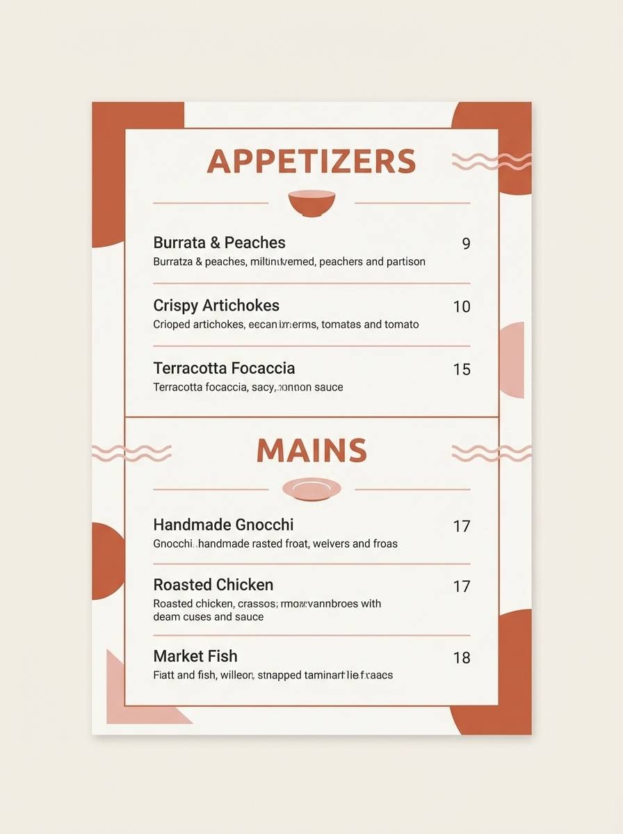
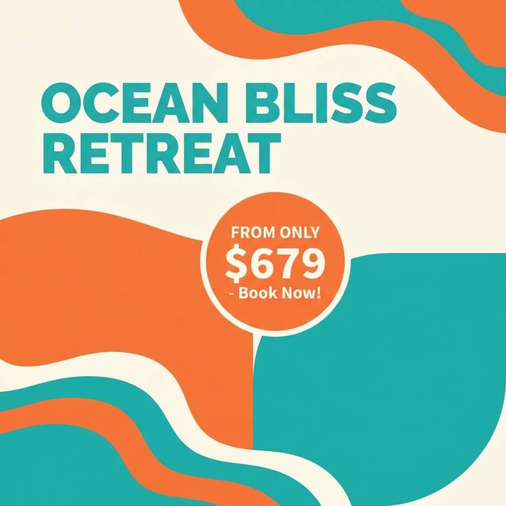
1) Sunset Terracotta
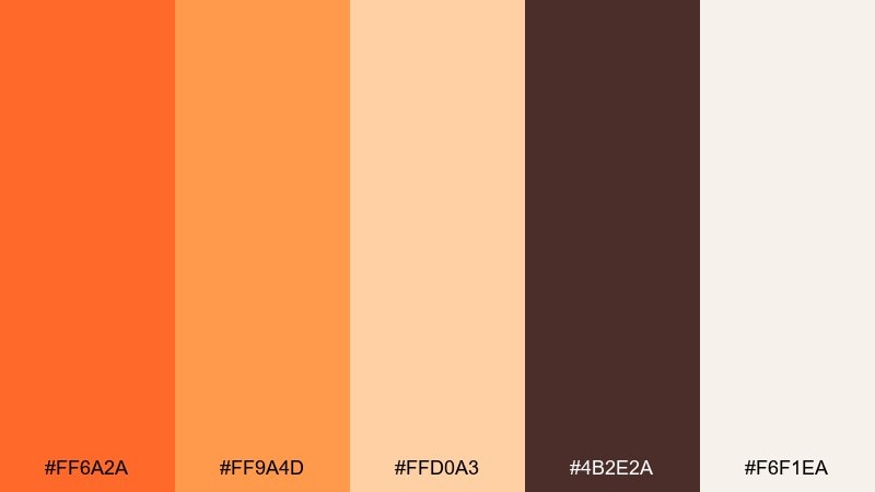
HEX: #ff6a2a #ff9a4d #ffd0a3 #4b2e2a #f6f1ea
Mood: cozy, rustic, welcoming
Best for: restaurant branding and menu design
Cozy heat and clay tones evoke a golden sunset over brick patios and wood-fired kitchens. The deep brown anchors headlines while the creamy off-white keeps layouts breathable. Use the brighter tones for callouts, icons, and price highlights, then pair with kraft textures or matte paper for extra warmth. Tip: keep the darkest color for typography to maintain readability on light backgrounds.
Image example of sunset terracotta generated using media.io
Media.io is an online AI studio for creating and editing video, image, and audio in your browser.

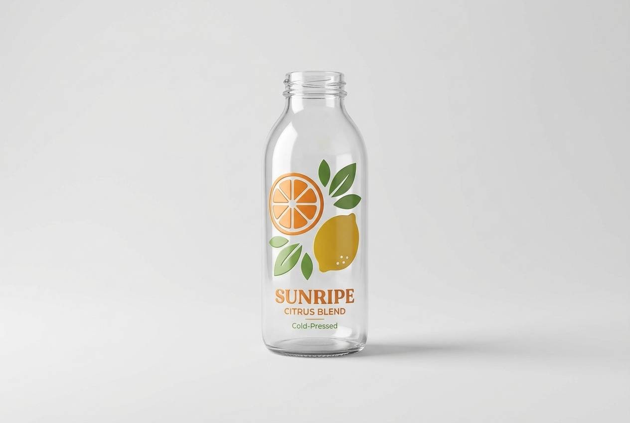
2) Citrus Grove
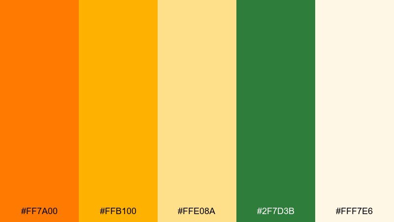
HEX: #ff7a00 #ffb100 #ffe08a #2f7d3b #fff7e6
Mood: fresh, zesty, energetic
Best for: juice packaging and product labels
Bright citrus tones feel like sunlit orchards and freshly sliced fruit. The green brings a natural counterpoint that prevents the warm hues from feeling flat. Use the boldest shade for the hero flavor badge, and reserve the pale cream for nutrition panels and small text. Tip: add subtle embossing or spot gloss on the main accent to boost shelf impact.
Image example of citrus grove generated using media.io
3) Apricot Latte
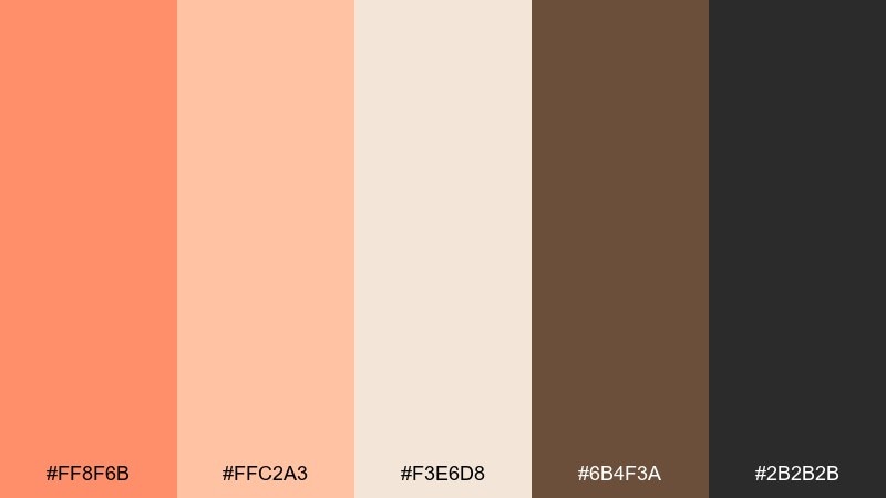
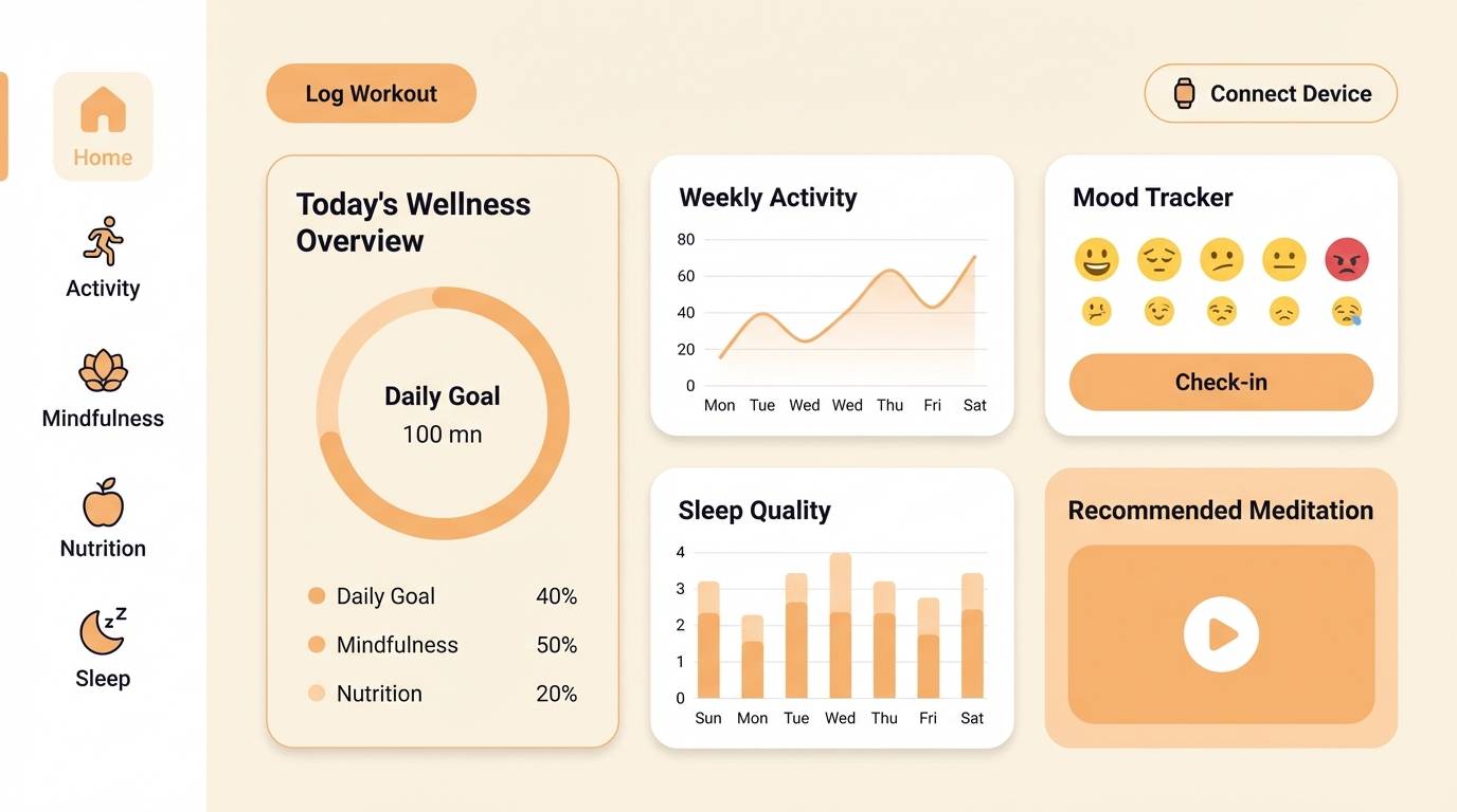
HEX: #ff8f6b #ffc2a3 #f3e6d8 #6b4f3a #2b2b2b
Mood: soft, comforting, modern
Best for: lifestyle UI and wellness apps
Soft apricot and milky neutrals evoke a calm cafe morning and a gentle glow on skin. This orange color palette works best when you treat the darkest shades as structure for nav, text, and dividers. Pair it with rounded cards and plenty of whitespace to keep the interface airy. Tip: use the medium apricot for primary buttons and keep alerts in charcoal to avoid visual noise.
Image example of apricot latte generated using media.io
4) Burnt Sienna and Sage
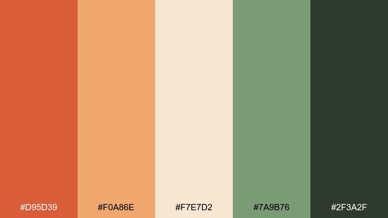
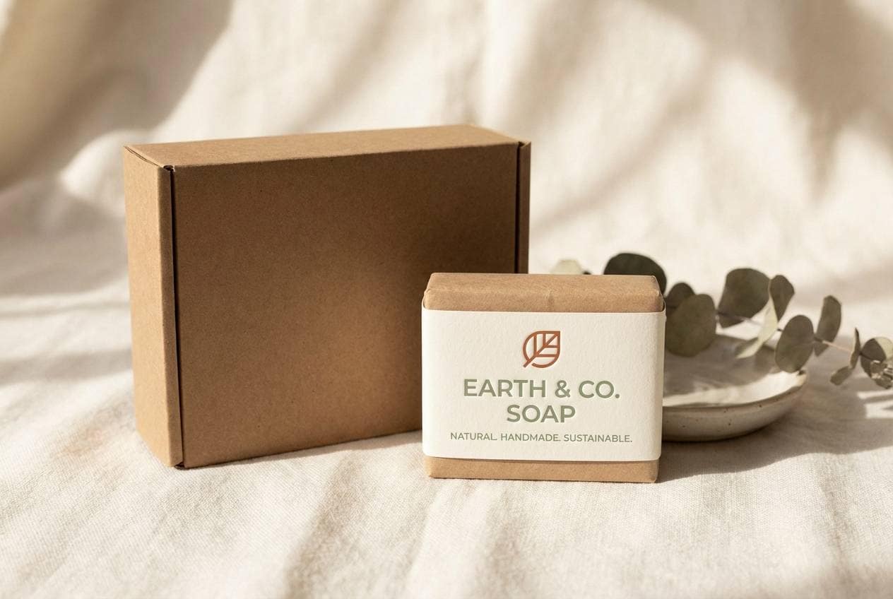
HEX: #d95d39 #f0a86e #f7e7d2 #7a9b76 #2f3a2f
Mood: grounded, artisanal, outdoorsy
Best for: craft branding and eco packaging
Burnt sienna feels like kiln-fired pottery, balanced by sage greens from dried herbs and hiking trails. The dark forest shade gives you a strong base for logos and ingredient lists. Pair with recycled paper textures, minimal line icons, and warm photography for a handmade look. Tip: keep the green as a secondary accent so the warm hues stay in the spotlight.
Image example of burnt sienna and sage generated using media.io
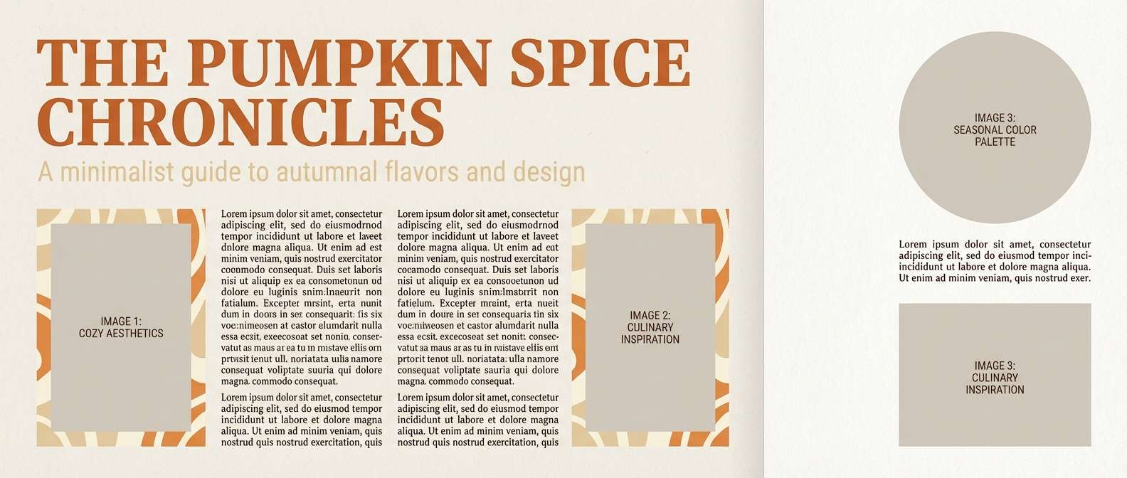
5) Pumpkin Spice Neutral
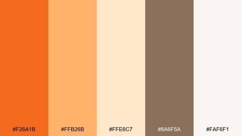
HEX: #f26a1b #ffb26b #ffe6c7 #8a6f5a #faf6f1
Mood: seasonal, cozy, editorial
Best for: autumn blog headers and magazine features
Pumpkin warmth and creamy neutrals bring to mind knit sweaters, cinnamon, and soft afternoon light. Use the deep spice tone for section headers and pull quotes, then lean on the pale shades for generous margins. Pair with serif typography and warm-toned photography to amplify the seasonal feel. Tip: limit the brightest accent to small badges so it reads premium, not loud.
Image example of pumpkin spice neutral generated using media.io
6) Tangerine Teal Punch
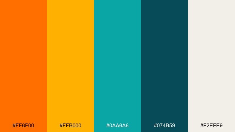
HEX: #ff6f00 #ffb000 #0aa6a6 #074b59 #f2efe9
Mood: bold, sporty, high-contrast
Best for: fitness posters and event promos
Electric tangerine against deep teal feels like stadium lights and high-tempo playlists. These orange color combinations shine when you push contrast: teal for backgrounds and orange for big type and CTA blocks. Pair with condensed sans fonts, sharp shapes, and dynamic diagonal grids for motion. Tip: keep the off-white for fine print so it stays readable on dark areas.
Image example of tangerine teal punch generated using media.io

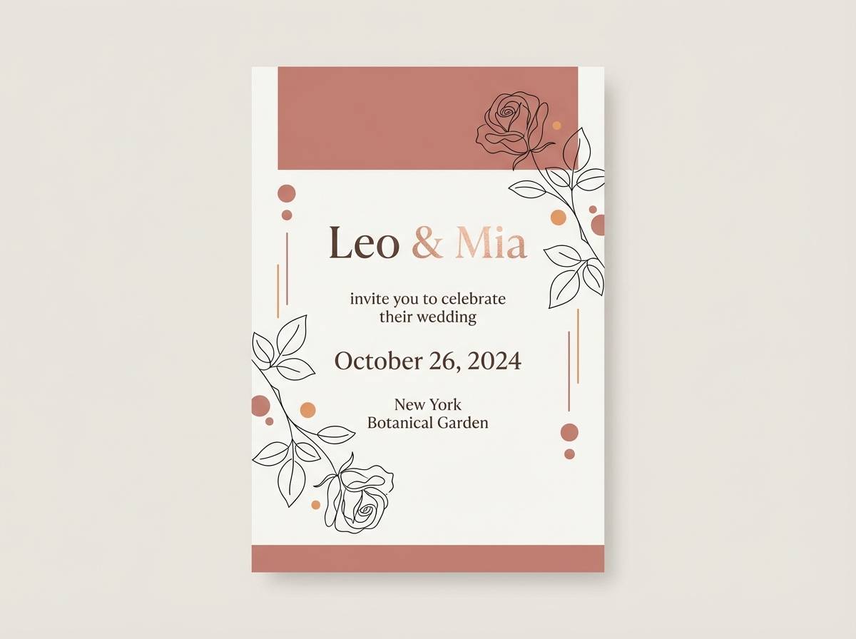
7) Coral Blush Wedding
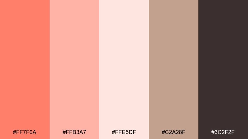
HEX: #ff7f6a #ffb3a7 #ffe5df #c2a28f #3c2f2f
Mood: romantic, soft, elegant
Best for: wedding invitations and save-the-dates
Coral blush and airy pastels evoke rose petals, candlelight, and gentle celebration. Use the darkest brown for names and key details to keep the typography crisp. Pair with thin line florals, deckled paper textures, and a warm neutral envelope. Tip: reserve the strongest coral for a monogram or small border to keep the look refined.
Image example of coral blush wedding generated using media.io
8) Neon Mandarin Night
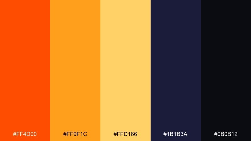
HEX: #ff4d00 #ff9f1c #ffd166 #1b1b3a #0b0b12
Mood: nightlife, edgy, energetic
Best for: music flyers and club posters
Neon warmth against inky blues feels like city nights, spotlights, and late sets. Let the darkest shades carry the background and use the bright accents for titles and performer names. Pair with gradients, grain textures, and oversized typography for a modern rave vibe. Tip: keep the yellow-gold as a secondary highlight so the main orange stays dominant.
Image example of neon mandarin night generated using media.io
9) Honey Amber Workspace
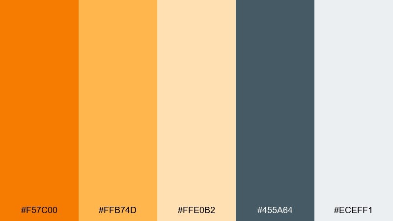
HEX: #f57c00 #ffb74d #ffe0b2 #455a64 #eceff1
Mood: focused, friendly, productive
Best for: SaaS dashboards and onboarding screens
Honeyed amber tones suggest clarity, momentum, and a positive nudge forward. The blue-gray creates a reliable foundation for navigation and data-heavy components. Use the brighter shade for progress states, success highlights, and key buttons, then keep the light neutrals for large surfaces. Tip: avoid using the warm accent on dense charts; reserve it for the one metric you want users to notice first.
Image example of honey amber workspace generated using media.io
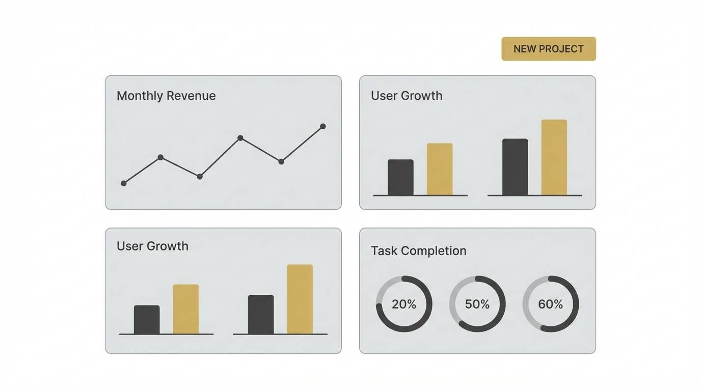
10) Desert Clay Minimal
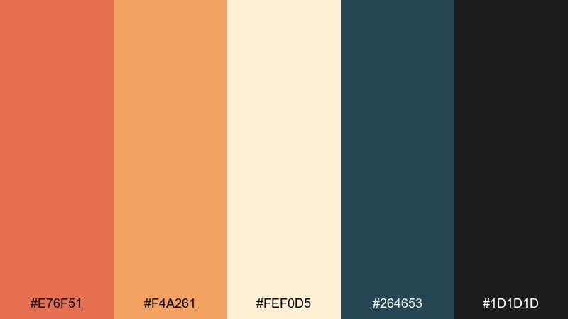
HEX: #e76f51 #f4a261 #fef0d5 #264653 #1d1d1d
Mood: minimal, architectural, sunbaked
Best for: portfolio sites and architecture decks
Sunbaked clay and pale sand evoke desert walls, clean shadows, and modern concrete lines. The teal-blue offers crisp contrast for headings, links, and diagram labels. Pair with grid-based layouts, large white space, and monochrome photos for a gallery feel. Tip: keep the warm tones in blocks and highlights, not body text, to maintain a premium look.
Image example of desert clay minimal generated using media.io
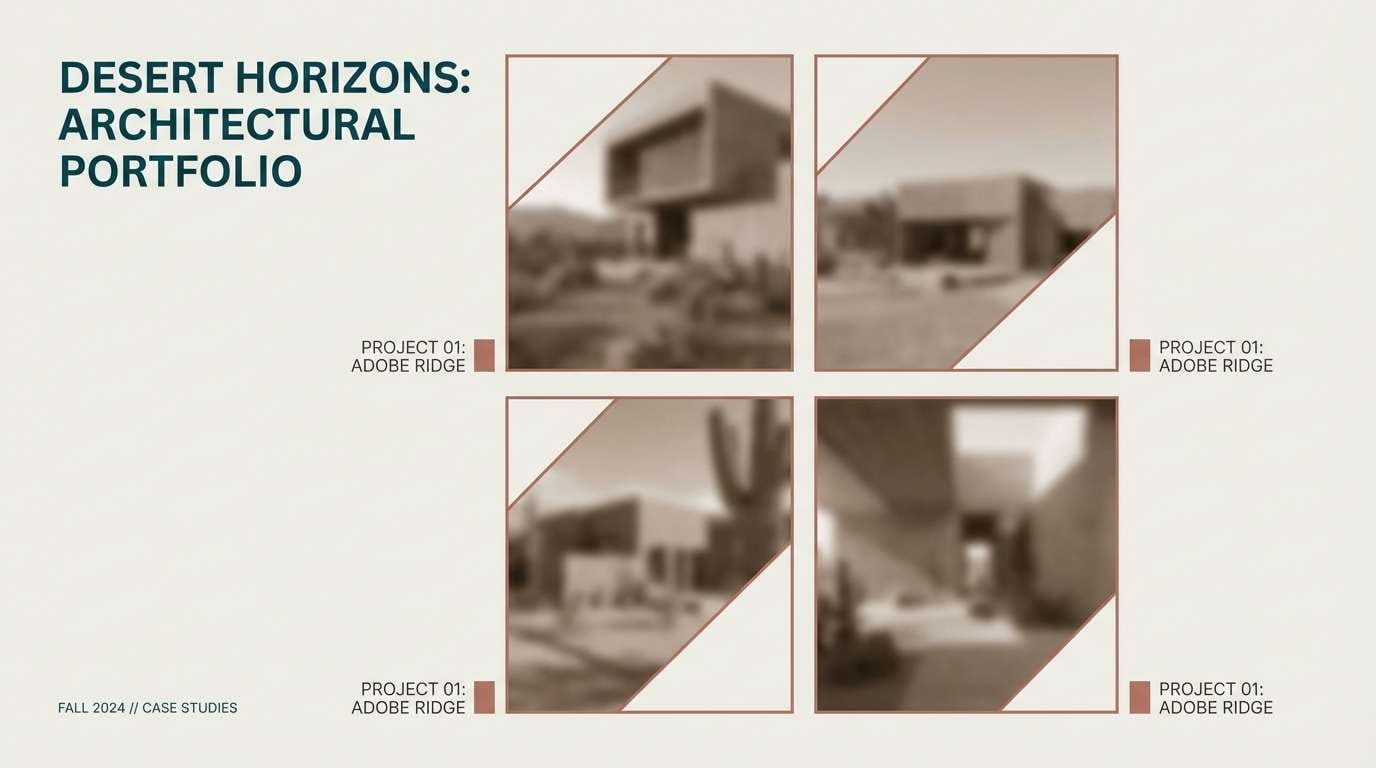
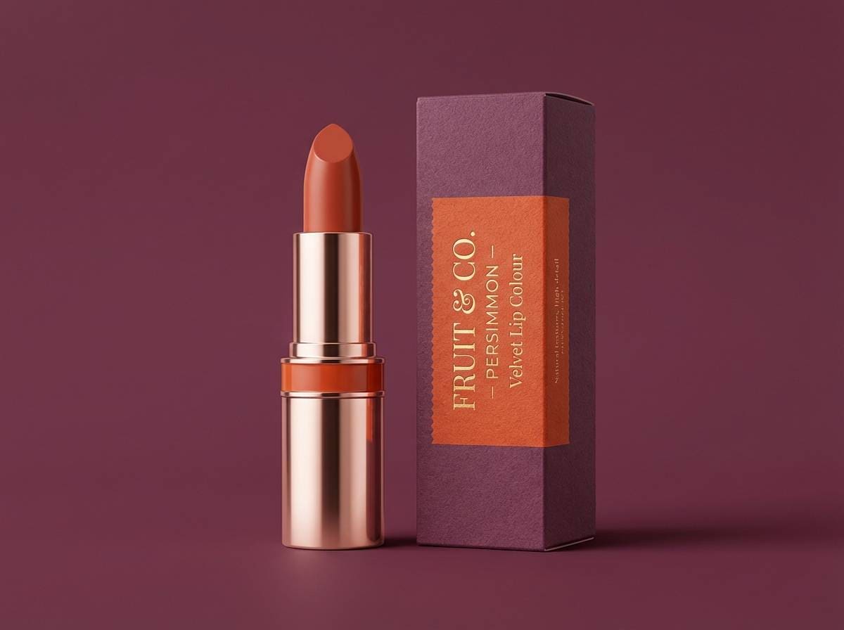
11) Persimmon and Plum
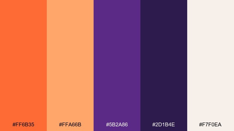
HEX: #ff6b35 #ffa66b #5b2a86 #2d1b4e #f7f0ea
Mood: playful, bold, beauty-forward
Best for: cosmetics ads and product launches
Persimmon glow with plum depth feels like glossy lipstick, evening glam, and confident color. Use plum for backgrounds and luxury type, then bring in the warm tones for the hero product and key claims. Pair with soft gradients and a hint of shine to make the contrast feel intentional. Tip: keep copy short and high-contrast so the palette reads premium rather than busy.
Image example of persimmon and plum generated using media.io
12) Campfire Glow
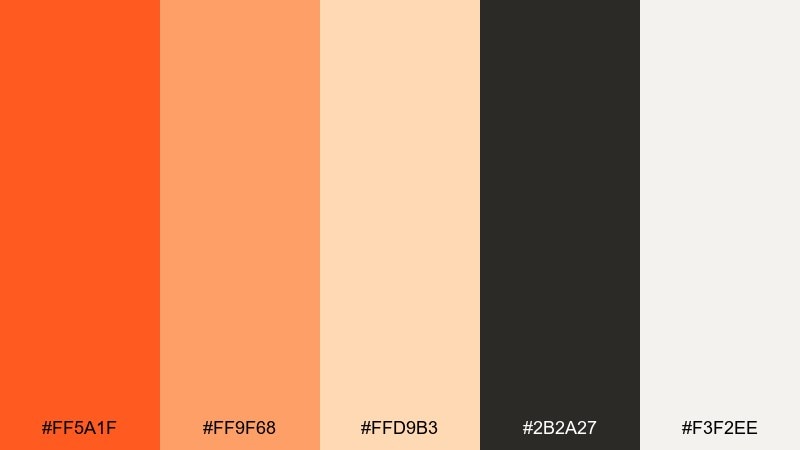
HEX: #ff5a1f #ff9f68 #ffd9b3 #2b2a27 #f3f2ee
Mood: adventurous, warm, rugged
Best for: outdoor gear branding and hangtags
Campfire tones bring to mind sparks, toasted marshmallows, and late-night stories under trees. This orange color palette looks strongest with dark charcoal as the base for logos and product specs. Pair with topographic lines, stitched textures, and matte finishes for an authentic gear vibe. Tip: use the light peach as a quiet background on tags to keep barcodes and sizing clear.
Image example of campfire glow generated using media.io
13) Soft Cantaloupe Kids
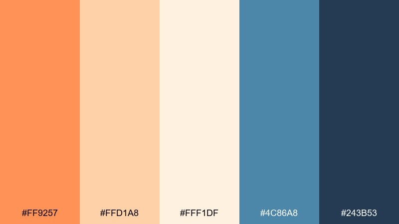
HEX: #ff9257 #ffd1a8 #fff1df #4c86a8 #243b53
Mood: cheerful, gentle, kid-friendly
Best for: kids learning apps and illustrations
Soft cantaloupe hues feel like friendly stickers, warm smiles, and playful learning. The calm blues add structure for navigation and help important elements stand out. Pair with rounded icons, big tap targets, and simple shapes to keep everything approachable. Tip: use the darkest blue for text and keep warm accents for rewards, badges, and progress moments.
Image example of soft cantaloupe kids generated using media.io
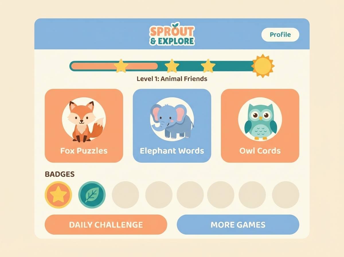
14) Retro Orange and Navy
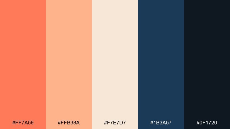
HEX: #ff7a59 #ffb38a #f7e7d7 #1b3a57 #0f1720
Mood: retro, confident, timeless
Best for: brand refresh and social templates
Retro warmth with navy depth evokes vintage signage, denim, and mid-century print ads. Use navy as the backbone for headers and grids, then let the warm tones carry accents and badges. Pair with geometric shapes, bold outlines, and simple patterns for an instant throwback that still feels clean. Tip: keep background areas light and use navy blocks sparingly to avoid a heavy layout.
Image example of retro orange and navy generated using media.io
15) Marmalade and Stone
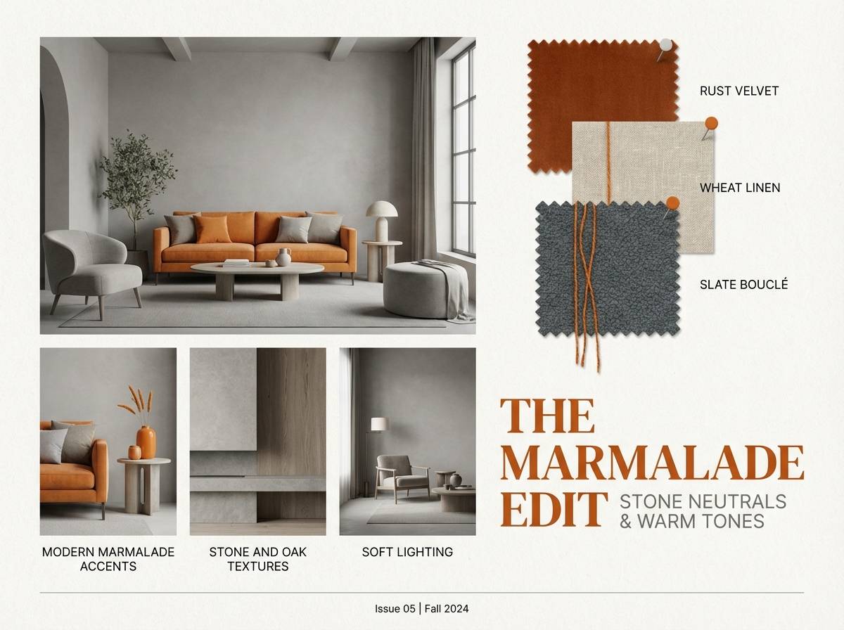
HEX: #f46f2c #ffa86a #f2e7dc #a9a9a9 #2e2e2e
Mood: modern, balanced, interior-inspired
Best for: interior design mood boards and lookbooks
Marmalade warmth against stone neutrals feels like sun hitting textured plaster and linen. Use the grays to keep layouts calm and professional, while the warm shades add life to headings and highlights. Pair with minimalist photography, thin rules, and plenty of spacing for an upscale editorial tone. Tip: apply the brightest hue to only one focal element per page to guide the eye.
Image example of marmalade and stone generated using media.io
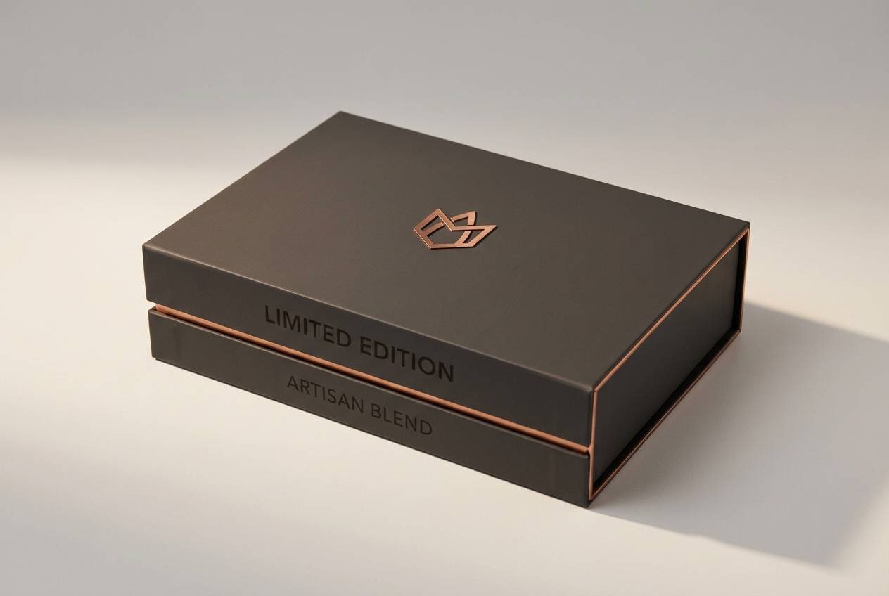
16) Spiced Copper Luxe
HEX: #c9552b #e07a3f #f2c9a0 #1f1b16 #f7f3ee
Mood: luxurious, rich, dramatic
Best for: premium branding and gift boxes
Spiced copper tones evoke candlelit lounges, leather goods, and warm metallic finishes. The near-black brings instant luxury and makes the copper feel deeper and more expensive. Pair with foil stamping, high-contrast typography, and restrained layouts to keep the mood upscale. Tip: use the light cream as negative space so metallic accents have room to shine.
Image example of spiced copper luxe generated using media.io
17) Papaya Lagoon
HEX: #ff6d3a #ffa85b #ffe0b0 #1aa6b7 #07575b
Mood: tropical, upbeat, travel-ready
Best for: travel campaigns and social ads
Papaya warmth with lagoon blues feels like beach umbrellas, fresh smoothies, and bright postcards. These orange color combinations work well when you use blue-green for large backgrounds and reserve the warm tones for headlines and offer tags. Pair with playful icons, rounded shapes, and high-saturation photos for a vacation vibe. Tip: keep small text in the darkest teal to stay legible over lighter areas.
Image example of papaya lagoon generated using media.io
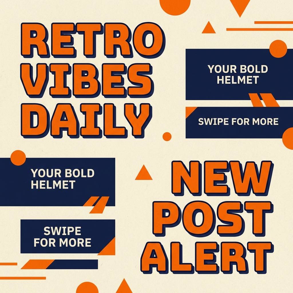
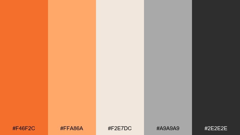
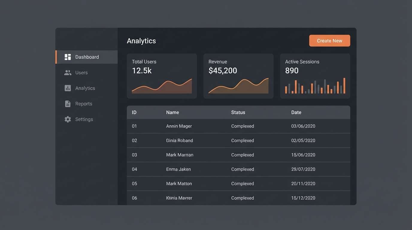
18) Carrot and Charcoal UI
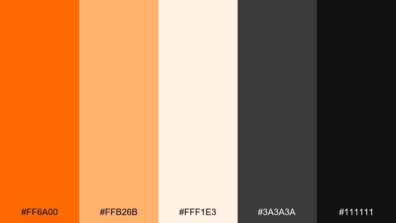
HEX: #ff6a00 #ffb26b #fff1e3 #3a3a3a #111111
Mood: clear, modern, high-contrast
Best for: admin panels and data dashboards
Carrot brights against charcoal feel decisive and streamlined, like a well-tuned control room. Use charcoal for navigation, tables, and charts, then bring the warm accent in for active states and key metrics. Pair with crisp typography and simple line icons to keep the interface efficient. Tip: keep the warmest shade for one primary CTA to avoid competing highlights.
Image example of carrot and charcoal ui generated using media.io
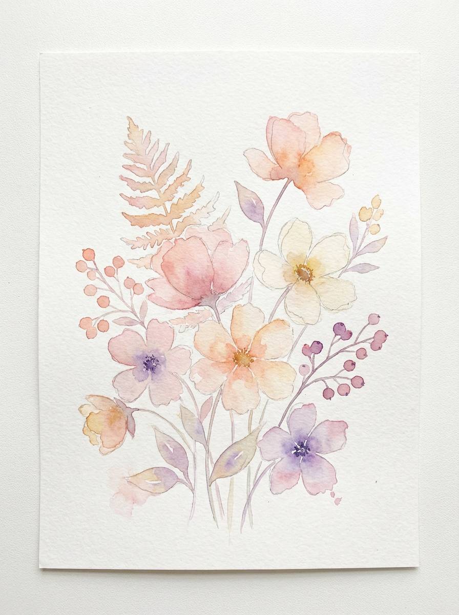
19) Sunrise Sherbet
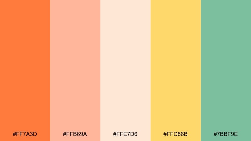
HEX: #ff7a3d #ffb69a #ffe7d6 #ffd86b #7bbf9e
Mood: light, airy, springlike
Best for: botanical prints and seasonal illustrations
Sherbet pastels evoke a soft sunrise, fresh blooms, and watercolor washes on textured paper. Use the warm tones for petals and highlights, while the gentle green supports stems and leaves. Pair with hand-lettered headings and subtle paper grain for an artisan feel. Tip: keep outlines minimal and let the gradients do the work for a dreamy finish.
Image example of sunrise sherbet generated using media.io
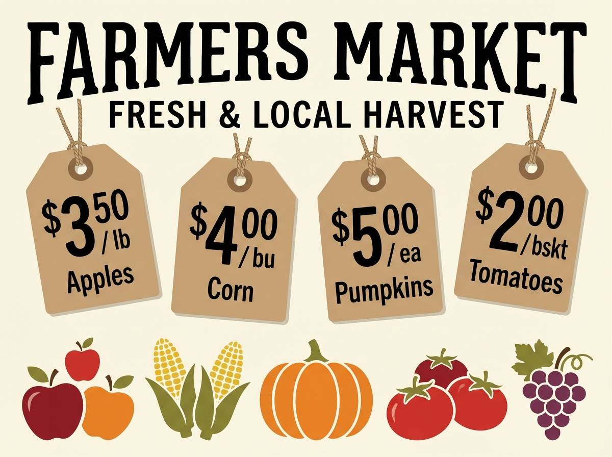
20) Orchard Harvest
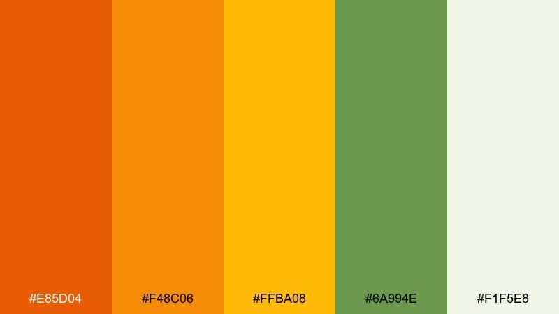
HEX: #e85d04 #f48c06 #ffba08 #6a994e #f1f5e8
Mood: wholesome, earthy, farm-fresh
Best for: farmers market signage and food labels
Harvest tones suggest ripe fruit, sun-warmed fields, and handwritten market boards. Use the green as a grounding accent for authenticity, and keep the pale background for easy readability in bright daylight. Pair with friendly serif type, simple icons, and natural paper textures to reinforce the farm-to-table story. Tip: print the darkest shade for headlines so signs stay visible from a distance.
Image example of orchard harvest generated using media.io
What Colors Go Well with Orange?
Blue is one of the strongest partners for orange—especially teal, navy, and blue-gray—because it creates clean complementary contrast that looks modern in UI, posters, and branding.
If you want a softer look, pair orange with warm neutrals like cream, off-white, tan, and cocoa brown. This keeps the palette welcoming and works well for food, wellness, and editorial layouts.
For a more nature-forward scheme, add greens like sage, forest, or olive. Green keeps orange from feeling overly “loud,” and it supports eco, craft, and outdoorsy aesthetics.
How to Use a Orange Color Palette in Real Designs
Assign roles to each color: choose one orange as your primary accent (CTAs, badges, highlights), then lean on dark neutrals for typography and structure. This prevents orange from overwhelming the layout.
In UI, reserve the brightest orange for interactive states and key metrics, and keep large surfaces neutral (cream, light gray, or charcoal depending on your theme). This improves hierarchy and reduces eye fatigue.
In print, orange often looks best with texture—kraft stock, matte finishes, or subtle grain—while high-contrast dark inks keep text crisp and accessible.
Create Orange Palette Visuals with AI
If you already have HEX codes, you can turn them into matching posters, UI mockups, labels, and mood boards by describing the layout and specifying your orange palette as the core accent.
Start with one of the prompts above, then iterate: swap “poster” for “landing page hero,” change the subject (product, app, invitation), and keep lighting/background notes consistent for a cohesive set.
With Media.io’s text-to-image workflow, you can generate multiple orange palette directions quickly—then pick the one that fits your brand voice and contrast needs.
Orange Color Palette FAQs
-
What does orange communicate in branding?
Orange is commonly associated with warmth, energy, friendliness, and appetite appeal. It’s often used to create upbeat brand personalities, highlight promotions, and draw attention to CTAs without feeling as formal as red. -
What’s the best contrasting color for orange?
Blue is the classic contrast for orange (complementary on the color wheel). Teal, navy, and blue-gray are especially practical because they provide strong readability and a modern look in both digital and print. -
How do I keep an orange color scheme from looking too loud?
Use orange as an accent, not the base. Pair it with soft neutrals (cream, off-white, warm gray) for large backgrounds and rely on dark neutrals (charcoal, deep brown, navy) for typography and structure. -
Which orange shades feel more premium?
Deeper, muted oranges like burnt sienna, terracotta, and copper often read more premium—especially when paired with near-black, cream negative space, and restrained layouts. -
Is orange a good UI color for buttons?
Yes—orange works well for primary buttons and active states because it’s naturally attention-grabbing. For accessibility, ensure sufficient contrast with the button text and avoid using multiple competing orange accents on the same screen. -
What are good neutral pairings for orange in print?
Cream, off-white, tan, stone gray, and charcoal are reliable neutrals for orange. They help orange inks feel warmer and more tactile, while keeping text legible and layouts editorial. -
Can I generate orange palette mockups quickly with AI?
Yes. Use a text-to-image tool like Media.io and describe your design format (poster, label, UI, invitation) plus your lighting/background style. Reuse a consistent prompt structure to generate a cohesive set of orange palette visuals.


