

A beige tan color palette is one of the easiest ways to make a design feel warm, calm, and timeless. It works across interiors, branding, and UI because it supports content instead of competing with it.
Below you’ll find 20+ beige tan palette ideas with HEX codes, plus quick pairing tips and AI prompts you can reuse to generate matching visuals.
In this article
- Why Beige Tan Palettes Work So Well
-
- desert linen
- cafe au lait
- sandstone studio
- warm clay and cream
- sage dune
- vintage camel
- terracotta trail
- oat milk minimal
- mocha marble
- pebble and parchment
- sunlit adobe
- neutral nomad
- honeyed birch
- cocoa canvas
- dusty rose sand
- rustic lodge
- golden wheat
- stonewashed khaki
- seashell taupe
- charcoal sand contrast
- maple latte
- gallery sandstone
- What Colors Go Well with Beige Tan?
- How to Use a Beige Tan Color Palette in Real Designs
- Create Beige Tan Palette Visuals with AI
Why Beige Tan Palettes Work So Well
Beige and tan sit in a “comfort zone” of color: warm enough to feel inviting, neutral enough to stay flexible. That makes them a reliable base for layouts where typography, product photos, or textures need to lead.
They also create natural depth through subtle value shifts (light cream to deep cocoa), so you can build hierarchy without relying on loud hues. This is especially useful in UI design, editorial layouts, and premium packaging.
Finally, beige tan tones pair easily with both cool and warm accents—think sage, navy, terracotta, or charcoal—so you can refresh a look seasonally without rebuilding the whole system.
20+ Beige Tan Color Palette Ideas (with HEX Codes)
1) Desert Linen
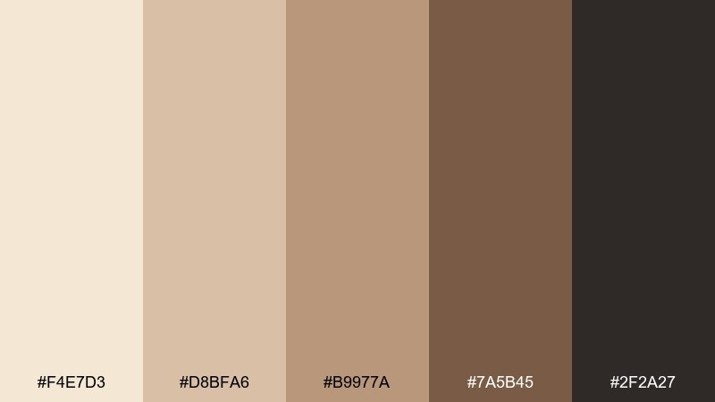
HEX: #F4E7D3 #D8BFA6 #B9977A #7A5B45 #2F2A27
Mood: airy, grounded, sunbaked
Best for: minimalist interior moodboard
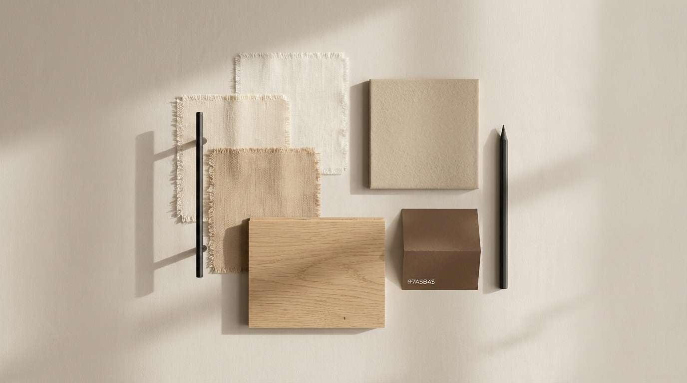
Airy linen tones and sunbaked sand create a calm, grounded look that feels effortlessly lived-in. Use it for minimalist interiors, lifestyle brands, or warm editorial layouts that need softness without looking flat. Pair with matte black fixtures, light oak, and plenty of texture like boucle or raw linen. Tip: keep #F4E7D3 as your wall or background base, then anchor contrast with #2F2A27 in small, deliberate hits.
Image example of desert linen generated using media.io
Media.io is an online AI studio for creating and editing video, image, and audio in your browser.

2) Cafe Au Lait
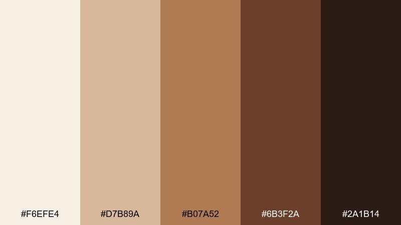
HEX: #F6EFE4 #D7B89A #B07A52 #6B3F2A #2A1B14
Mood: cozy, aromatic, inviting
Best for: coffee packaging mockup
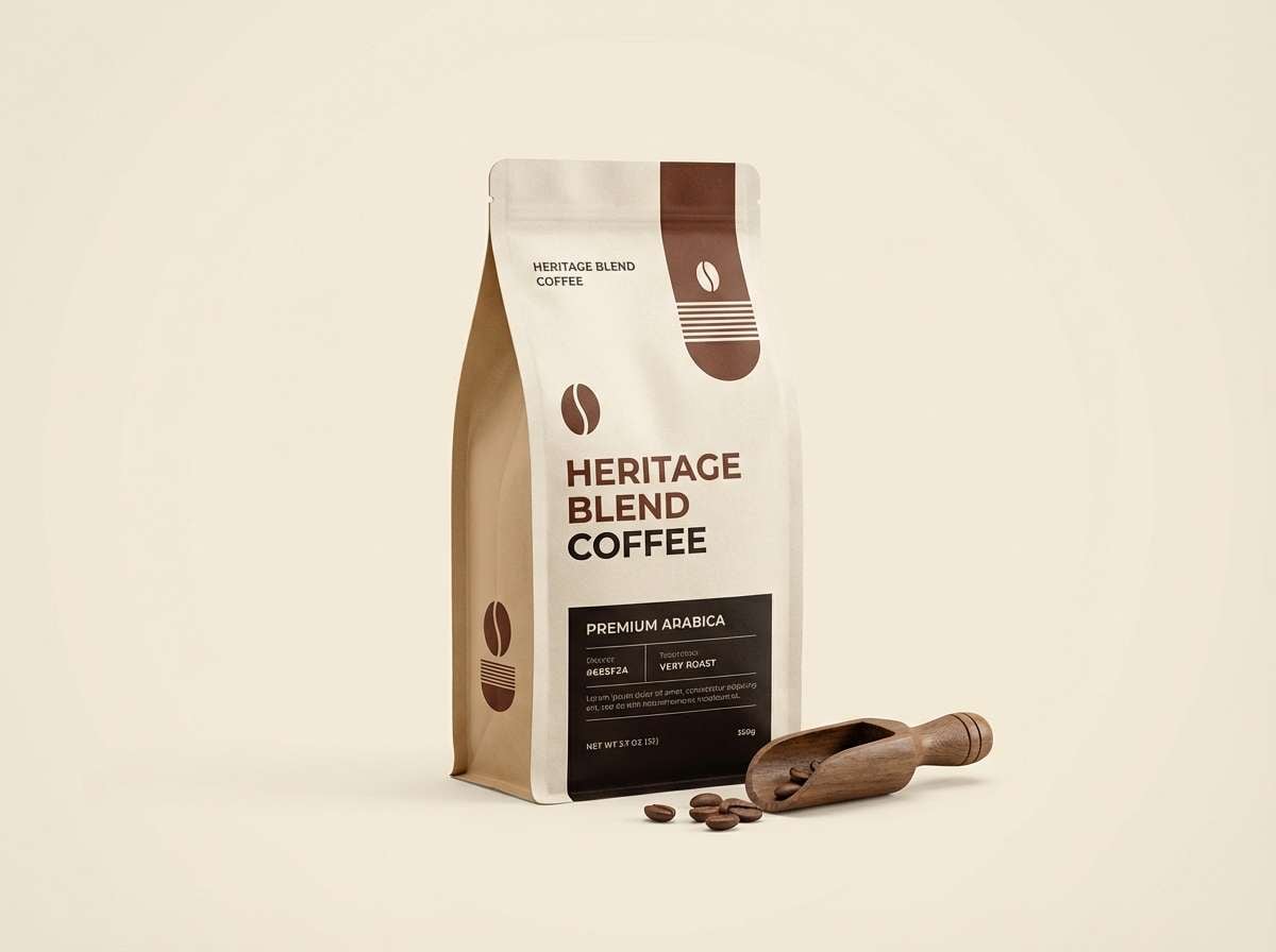
Cozy crema and roasted coffee notes make the palette feel aromatic and welcoming, like a quiet morning cafe. It shines on coffee packaging, bakery labels, and product photography that needs warmth and appetite appeal. Pair with cream paper stock, embossed details, and simple sans-serif type to keep it modern. Tip: let #B07A52 carry the hero label color while #2A1B14 stays for small text and barcodes.
Image example of cafe au lait generated using media.io
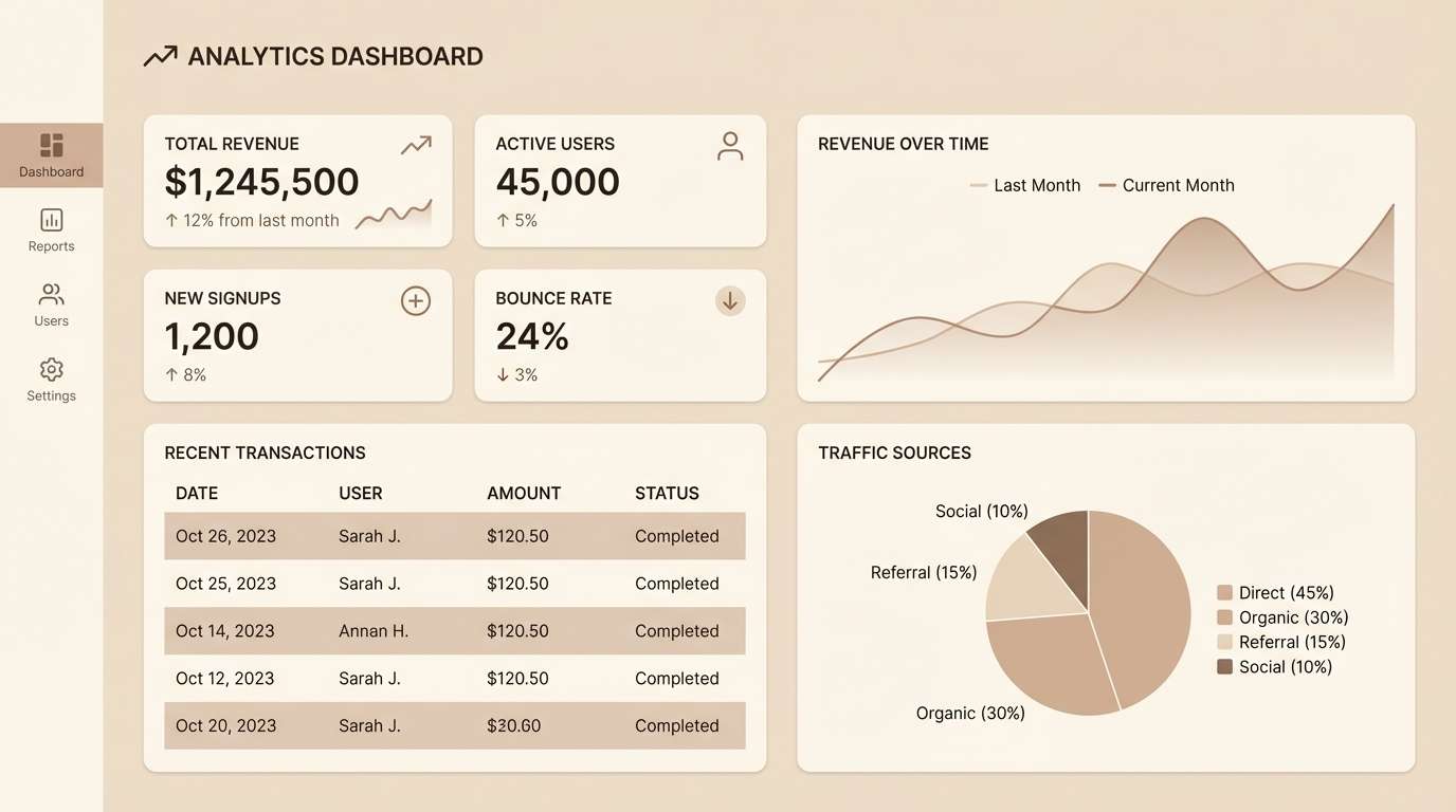
3) Sandstone Studio
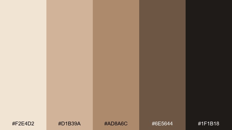
HEX: #F2E4D2 #D1B39A #AD8A6C #6E5644 #1F1B18
Mood: modern, practical, quietly luxe
Best for: analytics dashboard UI
Warm sandstone neutrals give a modern, quietly luxe feel that stays easy on the eyes for long sessions. Use it for analytics dashboards, finance tools, or creator platforms where readability matters. Pair with plenty of whitespace and thin dividers so the mid-tones do not crowd the layout. Tip: reserve #1F1B18 for headings and key numbers, and keep surfaces in #F2E4D2 for a soft, paper-like UI.
Image example of sandstone studio generated using media.io
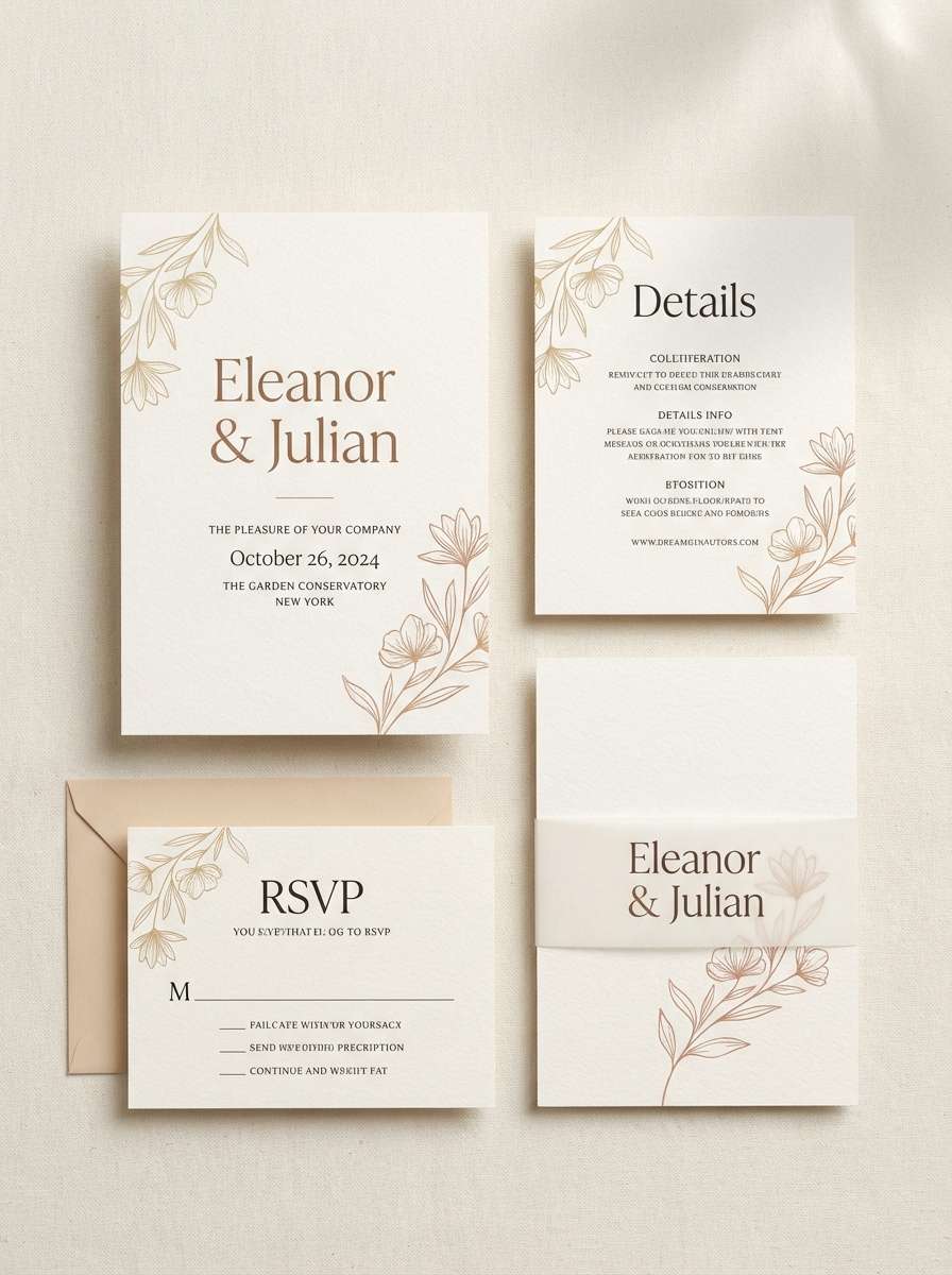
4) Warm Clay and Cream
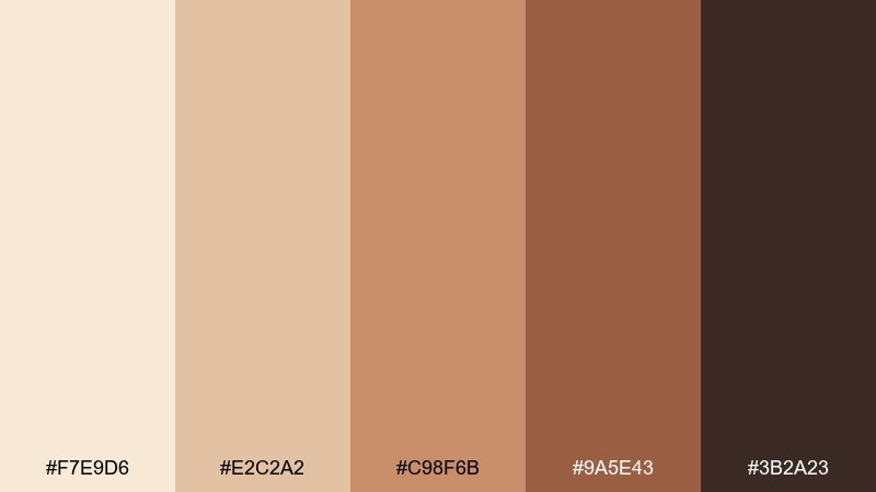
HEX: #F7E9D6 #E2C2A2 #C98F6B #9A5E43 #3B2A23
Mood: romantic, handmade, softly rustic
Best for: wedding invitation design
Romantic clay and cream hues evoke handmade paper, dried florals, and candlelit evenings. These beige tan color combinations work beautifully for wedding invitations, save-the-dates, and event suites that need warmth without sparkle. Pair with deckled edges, serif typography, and a touch of metallic foil in champagne. Tip: set body copy in #3B2A23 for crisp legibility and use #C98F6B for line art and monograms.
Image example of warm clay and cream generated using media.io
5) Sage Dune
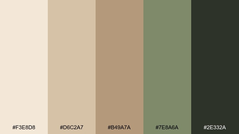
HEX: #F3E8D8 #D6C2A7 #B49A7A #7E8A6A #2E332A
Mood: fresh, earthy, restorative
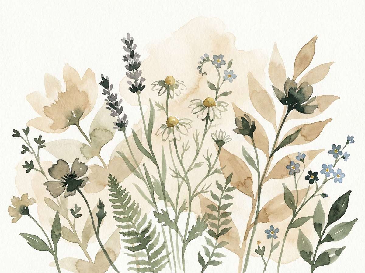
Best for: botanical illustration
Fresh dune neutrals with a sage breeze feel restorative, like a quiet garden walk after rain. Use it for botanical illustrations, wellness branding, and natural product labels that should read clean and calm. Pair with delicate line work and negative space so the sage accent stays elegant rather than muddy. Tip: keep greenery limited to #7E8A6A and let the beige base do most of the work.
Image example of sage dune generated using media.io
6) Vintage Camel
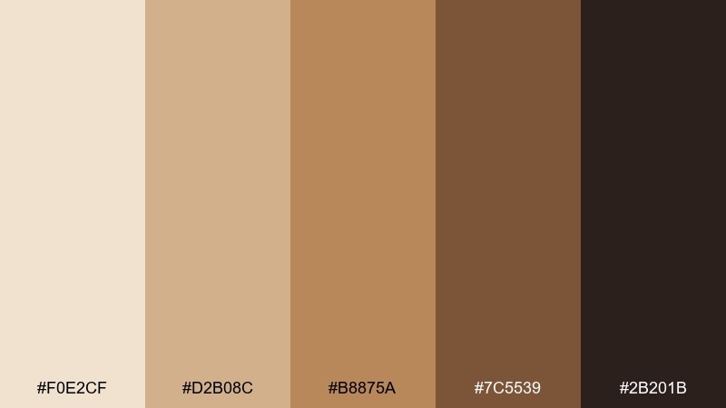
HEX: #F0E2CF #D2B08C #B8875A #7C5539 #2B201B
Mood: heritage, tailored, confident
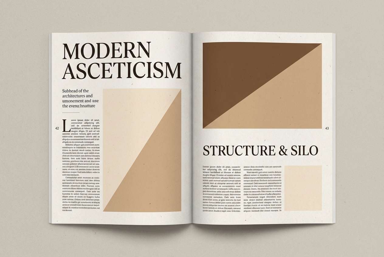
Best for: fashion editorial layout
Heritage camel and cocoa tones feel tailored and confident, like a classic trench coat in golden hour light. It fits fashion editorials, lookbooks, and premium retail campaigns that want warmth and restraint. Pair with high-contrast typography and generous margins for a refined magazine vibe. Tip: use #B8875A for pull quotes or section markers and keep backgrounds in #F0E2CF.
Image example of vintage camel generated using media.io
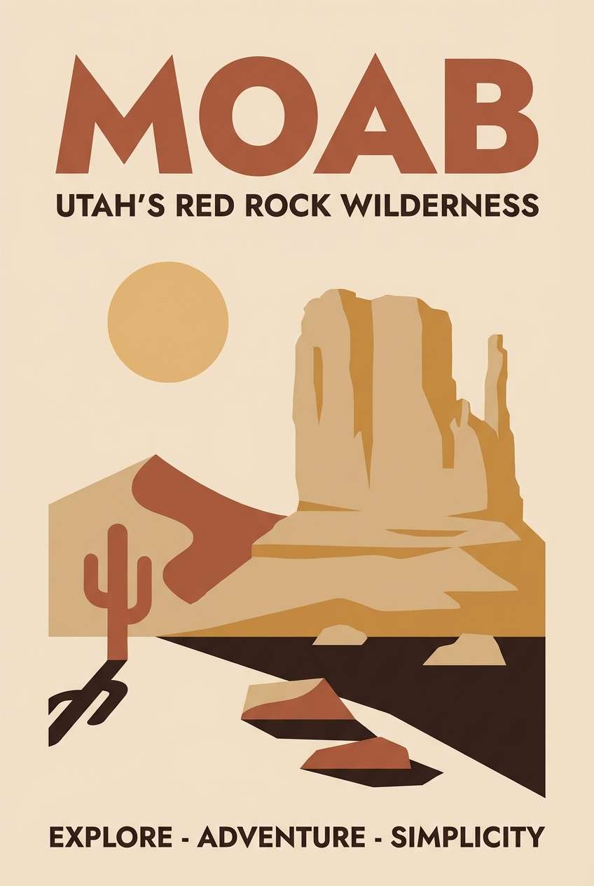
7) Terracotta Trail
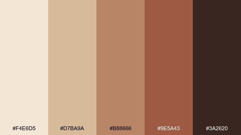
HEX: #F4E6D5 #D7BA9A #B88666 #9E5A43 #3A2620
Mood: adventurous, warm, grounded
Best for: travel poster design
Warm trail dust and terracotta accents bring an adventurous, grounded energy, like desert roads and clay canyons. Use it for travel posters, outdoor events, and destination branding with a sunlit story. Pair with bold shapes and a slightly condensed typeface to add movement. Tip: let #9E5A43 be the hero accent and keep the background in #F4E6D5 for a clean print finish.
Image example of terracotta trail generated using media.io
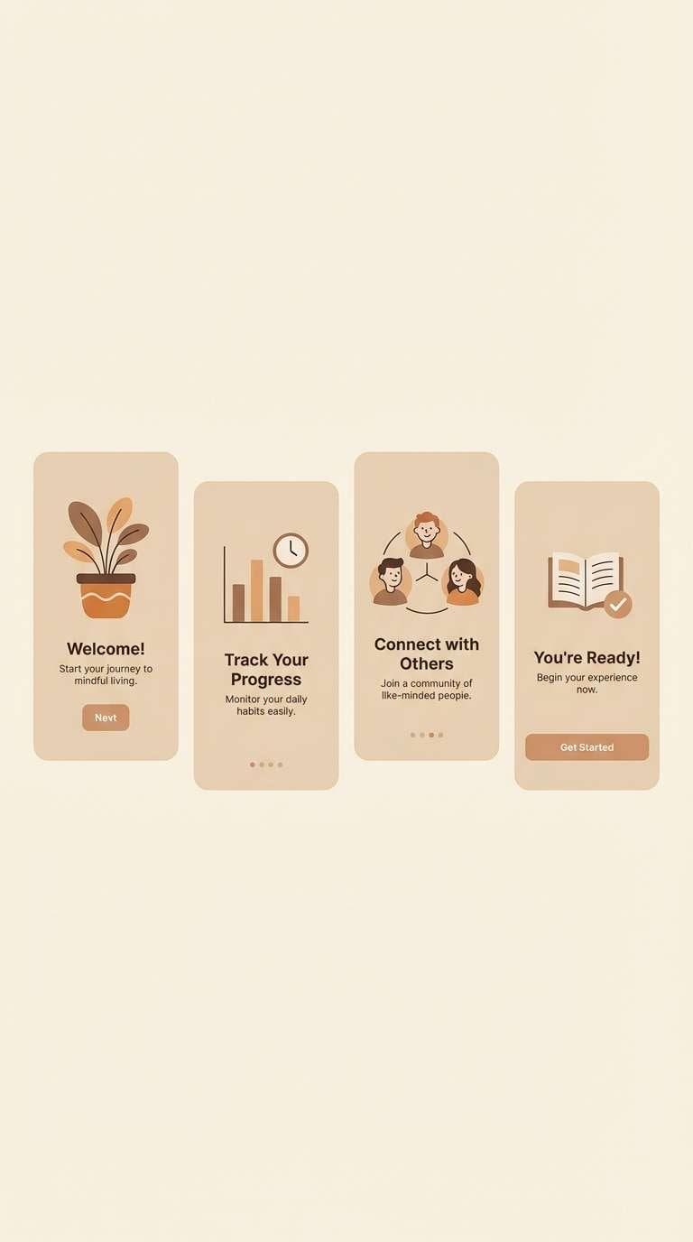
8) Oat Milk Minimal
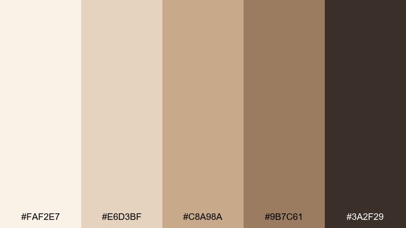
HEX: #FAF2E7 #E6D3BF #C8A98A #9B7C61 #3A2F29
Mood: soft, clean, contemporary
Best for: app onboarding UI
Soft oat tones and clean contrast feel contemporary and comforting, like a bright studio with warm light. Use it for onboarding screens, habit trackers, and subscription apps that need a friendly first impression. Pair with rounded UI components and subtle shadows to keep the experience gentle. Tip: use #3A2F29 for primary text and buttons, and keep large surfaces in #FAF2E7 to avoid visual fatigue.
Image example of oat milk minimal generated using media.io
9) Mocha Marble
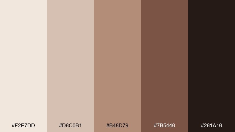
HEX: #F2E7DD #D6C0B1 #B48D79 #7B5446 #261A16
Mood: elegant, polished, spa-like
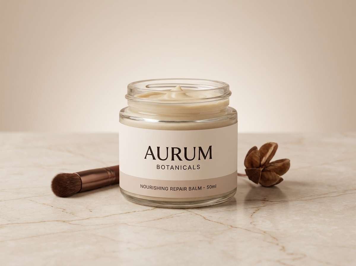
Best for: skincare product ad
Polished mocha and marble-like neutrals feel spa-luxe and quietly elegant. Use it for skincare ads, fragrance launches, or premium landing pages where softness signals quality. Pair with glossy highlights, minimal copy, and plenty of breathing room. Tip: keep the product label in #261A16 for clarity and let #B48D79 tint the background gradient.
Image example of mocha marble generated using media.io
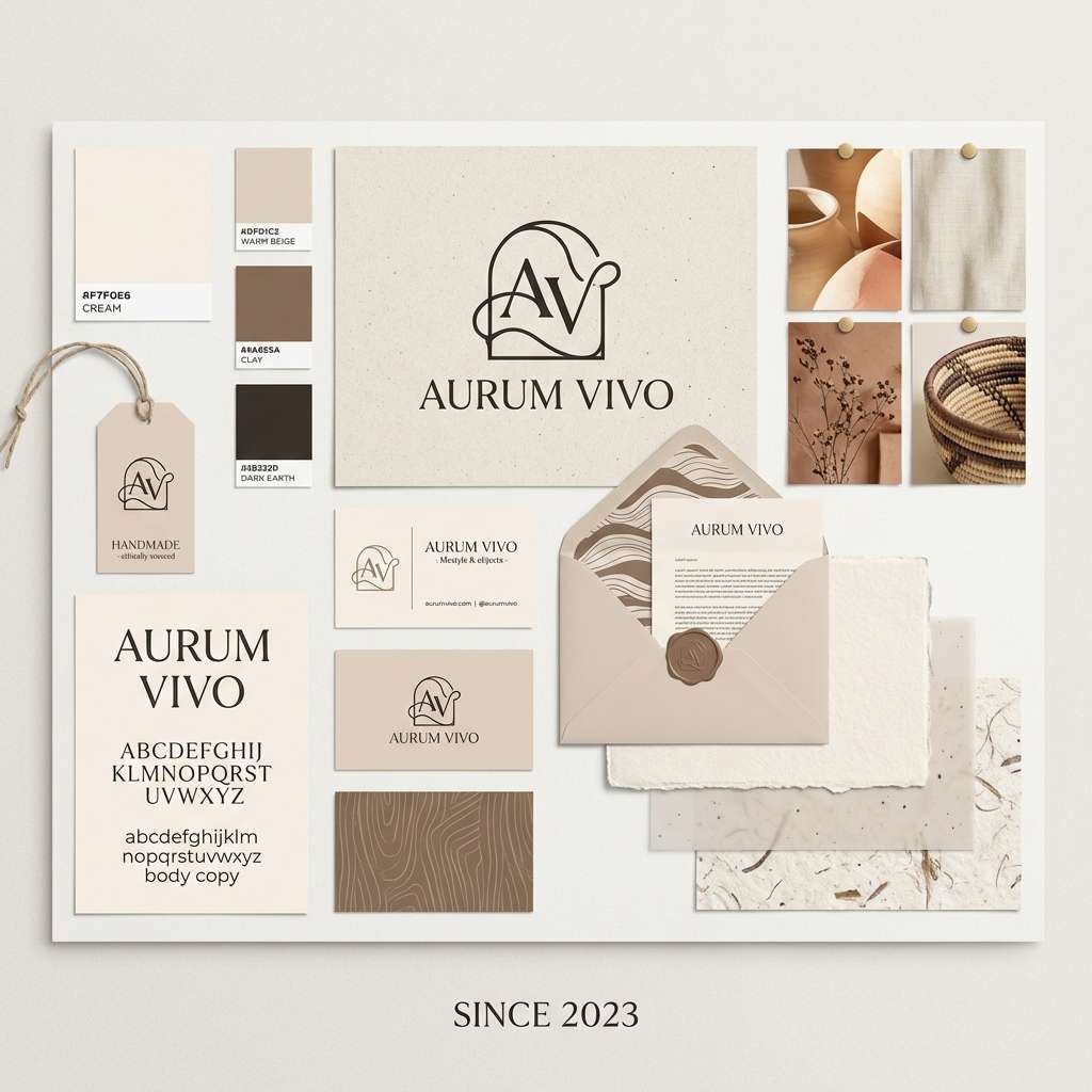
10) Pebble and Parchment
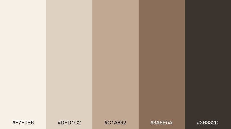
HEX: #F7F0E6 #DFD1C2 #C1A892 #8A6E5A #3B332D
Mood: calm, refined, craft-forward
Best for: stationery brand identity
Calm parchment and pebble tones feel refined and craft-forward, like a well-kept sketchbook. Use it for stationery branding, logo systems, and packaging where texture matters more than loud color. Pair with tactile finishes like letterpress, debossing, or recycled stock for authenticity. Tip: use #8A6E5A sparingly for marks and icons, and let #F7F0E6 stay dominant for a premium look.
Image example of pebble and parchment generated using media.io
11) Sunlit Adobe
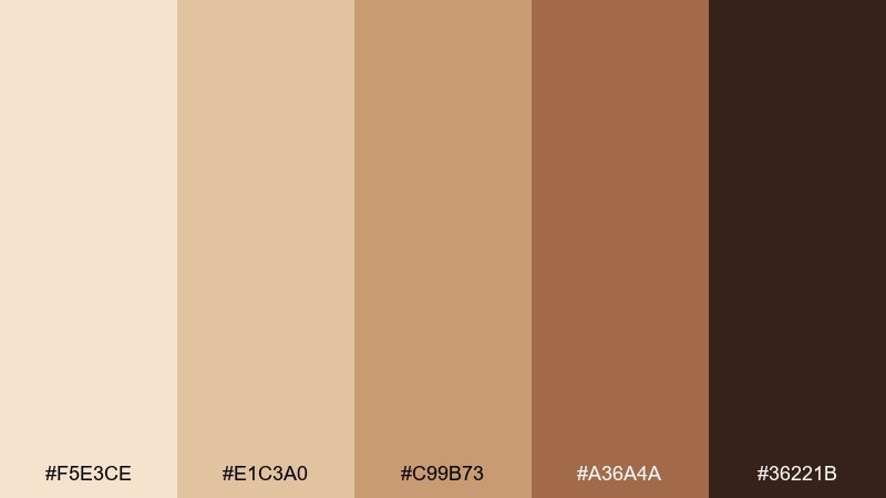
HEX: #F5E3CE #E1C3A0 #C99B73 #A36A4A #36221B
Mood: sunny, welcoming, artisanal
Best for: restaurant menu design
Sunlit adobe warmth feels welcoming and artisanal, like a small bistro with clay walls and fresh bread. As a beige tan color palette, it works beautifully for restaurant menus, cafe signage, and hospitality branding that needs warmth without clutter. Pair with hand-drawn icons and a simple two-font system for a polished, approachable vibe. Tip: print on uncoated stock and keep #36221B for all body text to maintain contrast under warm lighting.
Image example of sunlit adobe generated using media.io

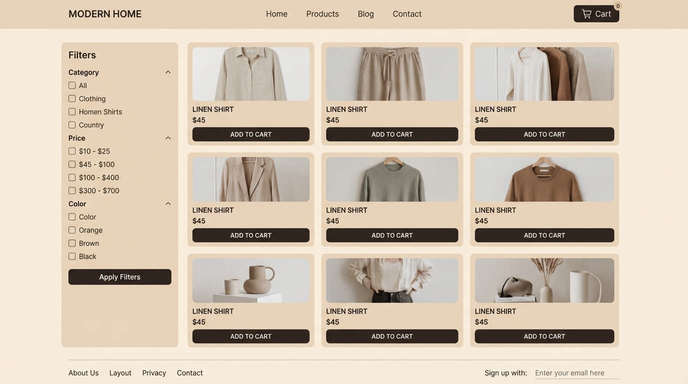
12) Neutral Nomad
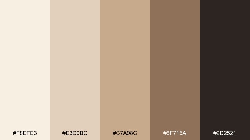
HEX: #F8EFE3 #E3D0BC #C7A98C #8F715A #2D2521
Mood: friendly, versatile, modern
Best for: ecommerce website theme
Friendly neutrals with a deeper anchor feel modern and versatile, like a curated boutique shelf. Use it for ecommerce themes, product grids, and content-heavy pages where photos need to shine. Pair with crisp white spacing and one strong accent element, such as a dark CTA button. Tip: set the primary action in #2D2521 and keep secondary UI states in #8F715A for a cohesive hierarchy.
Image example of neutral nomad generated using media.io
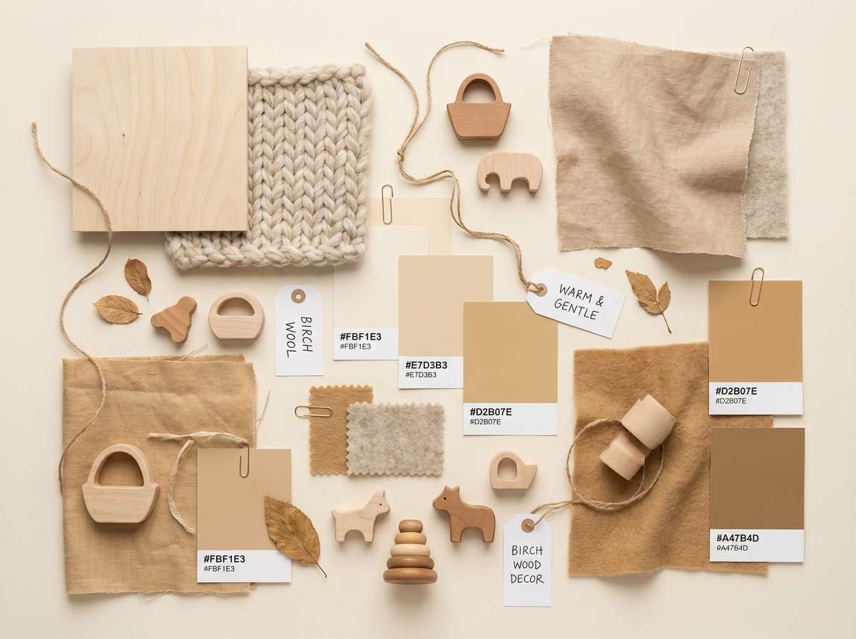
13) Honeyed Birch
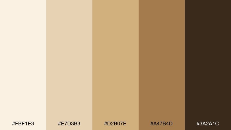
HEX: #FBF1E3 #E7D3B3 #D2B07E #A47B4D #3A2A1C
Mood: cheerful, gentle, cozy
Best for: nursery decor moodboard
Honeyed birch tones feel cheerful and gentle, like sunlight on pale wood floors. Use it for nursery decor, baby brand packaging, and soft home goods where comfort is the priority. Pair with simple animal illustrations and rounded shapes for a playful touch. Tip: keep #FBF1E3 dominant and use #A47B4D for small accents so the space stays light and airy.
Image example of honeyed birch generated using media.io
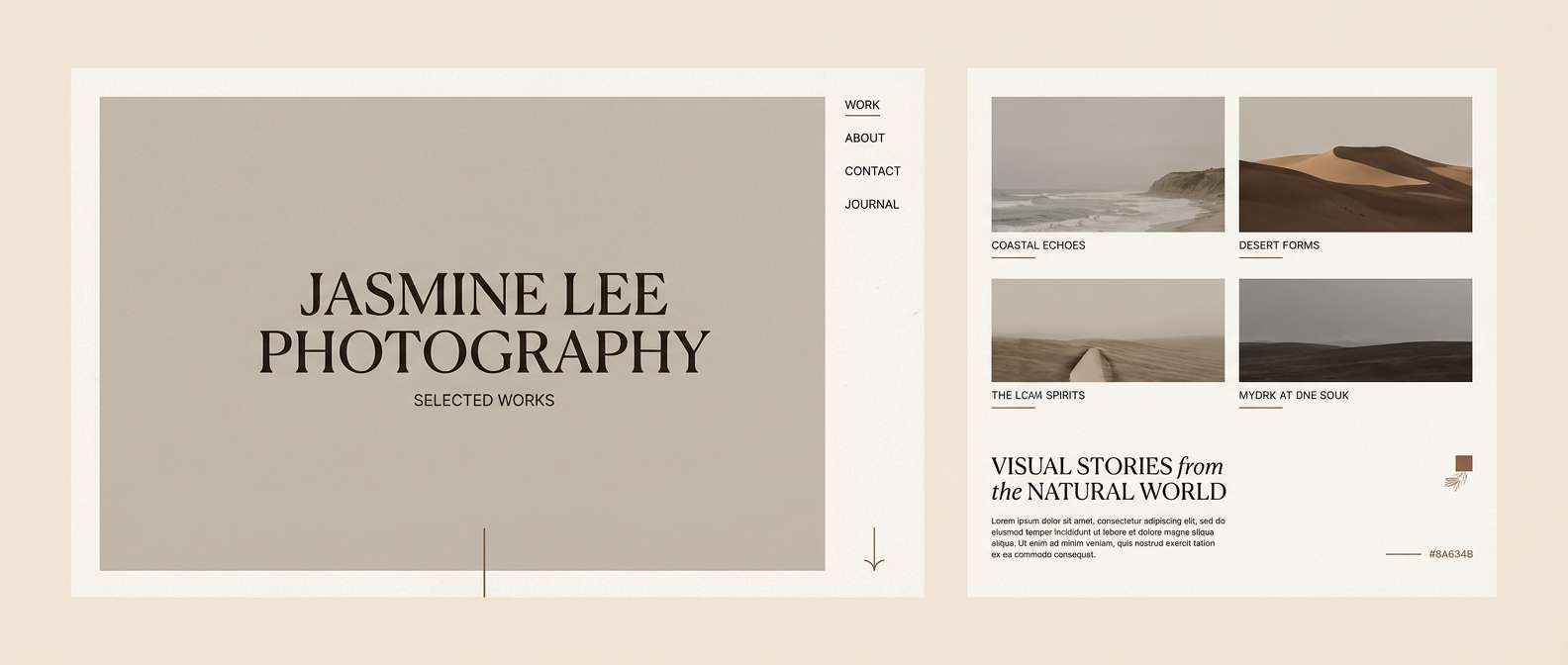
14) Cocoa Canvas
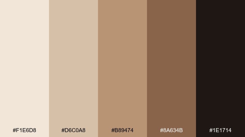
HEX: #F1E6D8 #D6C0A8 #B89474 #8A634B #1E1714
Mood: moody, creative, gallery-like
Best for: photography portfolio website
Moody cocoa neutrals feel gallery-like and creative, letting imagery take center stage. Use it for photography portfolios, case studies, and personal sites where you want warmth instead of stark white. Pair with large image blocks, minimal navigation, and generous spacing. Tip: keep UI chrome in #D6C0A8 and use #1E1714 only for typography and active states.
Image example of cocoa canvas generated using media.io
15) Dusty Rose Sand
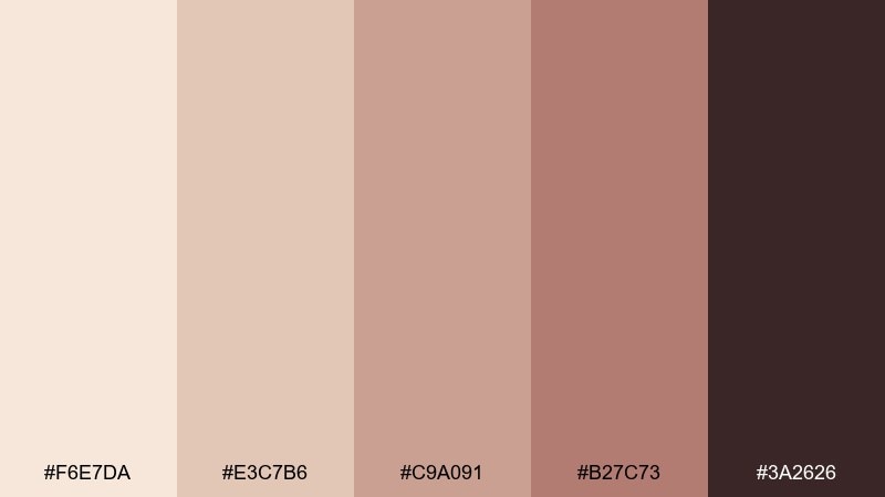
HEX: #F6E7DA #E3C7B6 #C9A091 #B27C73 #3A2626
Mood: soft, romantic, modern feminine
Best for: beauty promo flyer
Soft dusty rose sand feels romantic without going overly sweet, like blush makeup in warm light. These beige tan color combinations are great for beauty promo flyers, salon pricing sheets, and social promos that need a gentle, modern feminine touch. Pair with thin line icons and clean sans-serif type to keep it contemporary. Tip: make #B27C73 your highlight color for badges, then ground the layout with #3A2626 for text.
Image example of dusty rose sand generated using media.io
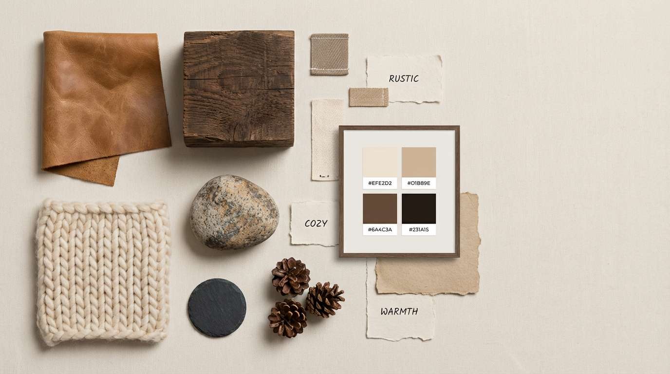
16) Rustic Lodge
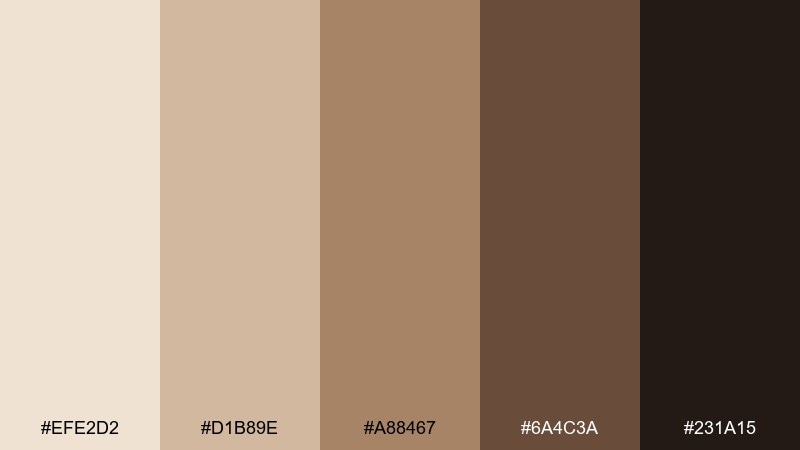
HEX: #EFE2D2 #D1B89E #A88467 #6A4C3A #231A15
Mood: rustic, cozy, outdoorsy
Best for: cabin interior moodboard
Rustic lodge neutrals feel cozy and outdoorsy, like worn leather, timber beams, and a stone fireplace. Use it for cabin interior boards, outdoor gear branding, or hospitality visuals that want a grounded story. Pair with deep wood grains, wool textures, and warm lighting to boost the snug vibe. Tip: keep #6A4C3A for key accents and let #EFE2D2 soften the overall scene.
Image example of rustic lodge generated using media.io
17) Golden Wheat

HEX: #F8EBD6 #E7D0A9 #D2B071 #B48A4D #3B2B18
Mood: optimistic, sunny, harvest-warm
Best for: autumn social post template
Golden wheat hues feel optimistic and harvest-warm, like late afternoon sun in a field. Use it for autumn social templates, seasonal promos, and community event posts that need cheerful warmth. Pair with bold headers and simple shapes so the mid-tones stay crisp on screens. Tip: use #D2B071 for highlight blocks and keep type in #3B2B18 for strong readability.
Image example of golden wheat generated using media.io
18) Stonewashed Khaki
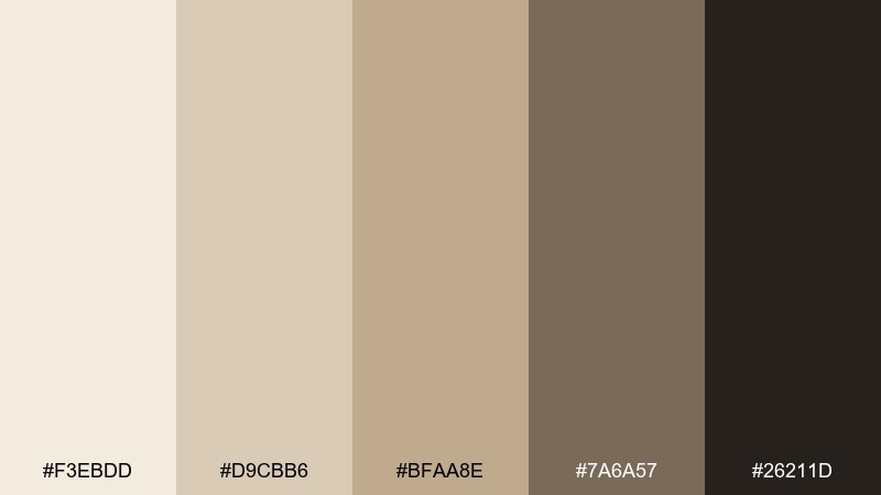
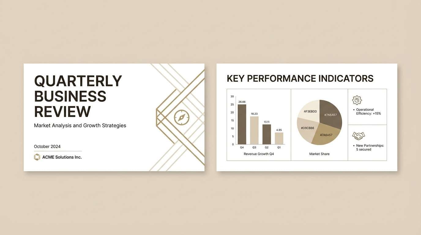
HEX: #F3EBDD #D9CBB6 #BFAA8E #7A6A57 #26211D
Mood: steady, professional, understated
Best for: corporate branding deck
Stonewashed khaki feels steady and understated, like well-made paper and worn-in fabric. For a beige tan color scheme in corporate work, it fits branding decks, strategy slides, and B2B websites that need warmth without losing authority. Pair with simple iconography and a strict grid to keep everything sharp. Tip: set headers in #26211D and use #7A6A57 for charts and secondary labels.
Image example of stonewashed khaki generated using media.io
19) Seashell Taupe
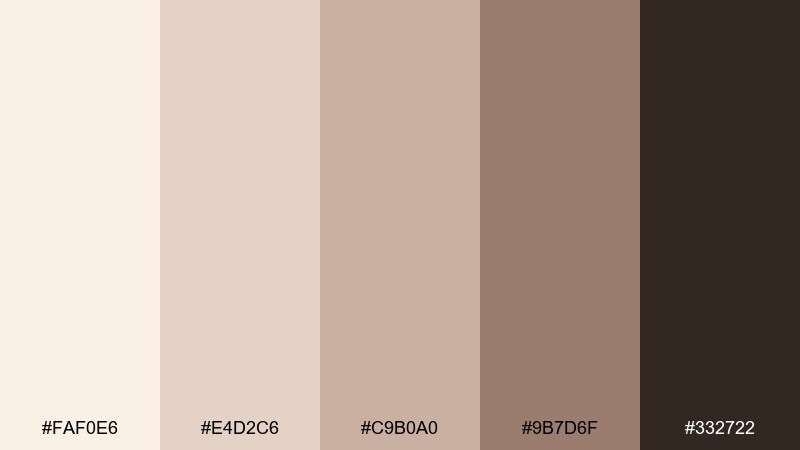
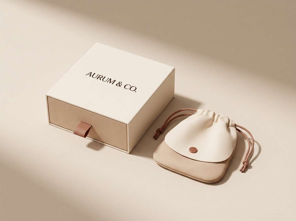
HEX: #FAF0E6 #E4D2C6 #C9B0A0 #9B7D6F #332722
Mood: soft, coastal, refined
Best for: jewelry packaging design
Seashell taupe feels soft and coastal, like smooth stones collected at the shoreline. Use it for jewelry packaging, boutique unboxing, and premium gift sets that should feel calm and refined. Pair with minimal logo stamping and tissue paper in the lightest tone for a clean reveal. Tip: use #332722 for the brand mark and keep the box base in #FAF0E6 for a high-end, airy look.
Image example of seashell taupe generated using media.io
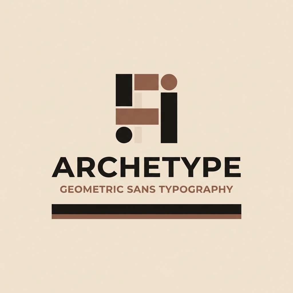
20) Charcoal Sand Contrast
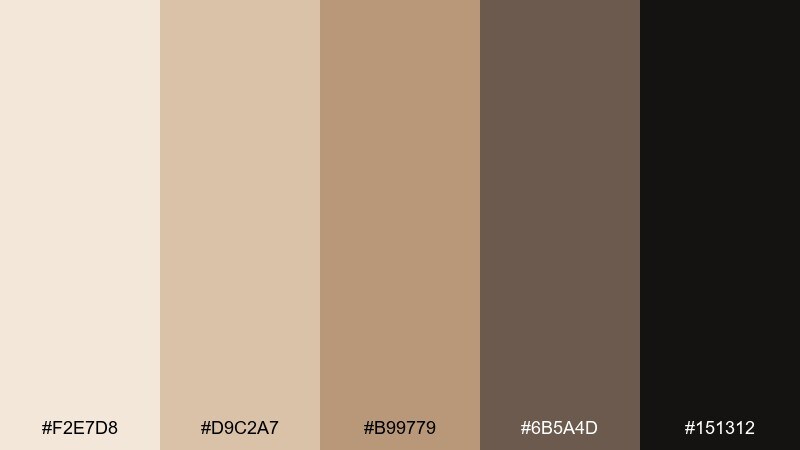
HEX: #F2E7D8 #D9C2A7 #B99779 #6B5A4D #151312
Mood: bold, minimalist, high-contrast
Best for: logo and typography lockup
Bold charcoal against soft sand feels minimalist and confident, like modern architecture lit by warm sun. Use it for logo lockups, typography experiments, and brand systems that need strong contrast while staying warm. Pair with clean geometric fonts and plenty of negative space for a premium finish. Tip: test small sizes and keep #151312 for type to prevent the darker tones from turning muddy.
Image example of charcoal sand contrast generated using media.io
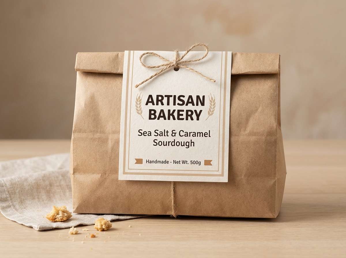
21) Maple Latte
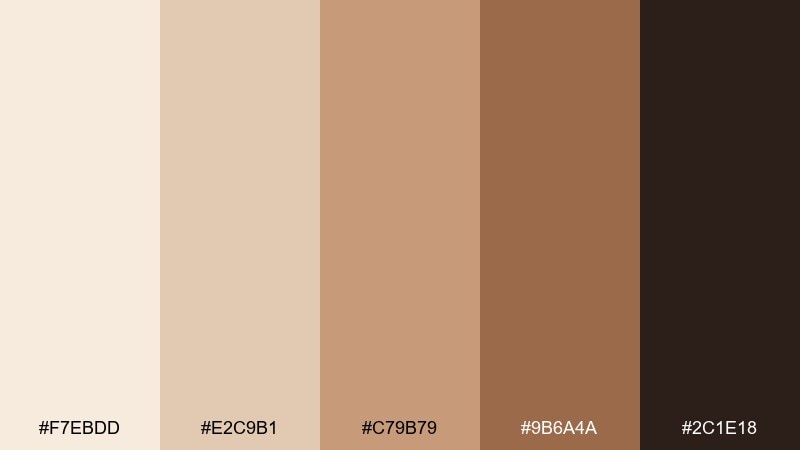
HEX: #F7EBDD #E2C9B1 #C79B79 #9B6A4A #2C1E18
Mood: comforting, sweet, cozy-modern
Best for: bakery product label
Comforting maple latte tones feel sweet and cozy-modern, like warm pastries and brown sugar. Use it for bakery labels, cafe signage, and seasonal product tags that need a friendly, homemade vibe. Pair with hand-lettered accents and a clean block of nutrition or ingredient info for balance. Tip: let #9B6A4A carry the highlight stamp and keep #2C1E18 for mandatory fine print.
Image example of maple latte generated using media.io
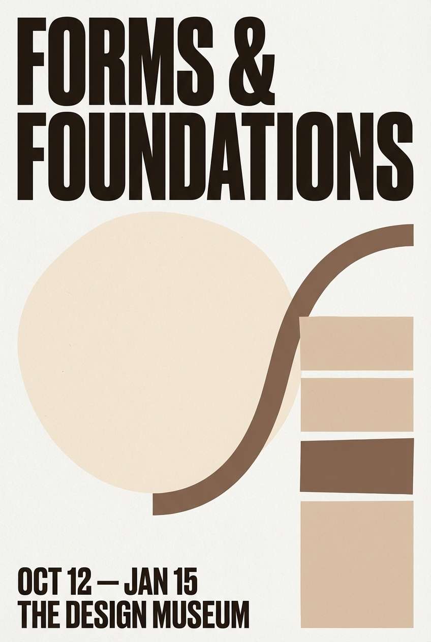
22) Gallery Sandstone
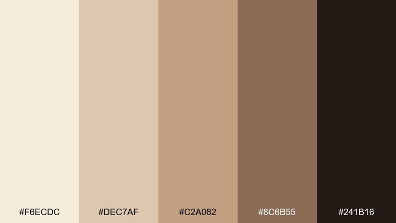
HEX: #F6ECDC #DEC7AF #C2A082 #8C6B55 #241B16
Mood: artful, curated, quietly dramatic
Best for: museum event poster
Curated sandstone neutrals feel artful and quietly dramatic, like a gallery wall under warm spotlights. These beige tan color combinations suit museum event posters, exhibition invites, and cultural campaigns where typography should lead. Pair with bold type scales and minimal imagery to keep it sophisticated. Tip: choose #241B16 for the headline and use #C2A082 for small callouts or date blocks.
Image example of gallery sandstone generated using media.io
What Colors Go Well with Beige Tan?
Beige tan pairs beautifully with deep anchors like charcoal, espresso, and near-black because they sharpen contrast while keeping the palette warm. This is ideal for typography, UI buttons, and packaging labels.
For a fresher feel, add muted greens (sage, olive) or dusty blues. These cooler accents balance beige without making it feel cold, and they work well for wellness, natural products, and modern home styles.
If you want energy, introduce terracotta, rust, or golden wheat tones. These warm accents keep everything cohesive and add “sunlight” to neutral layouts.
How to Use a Beige Tan Color Palette in Real Designs
Start with a light beige as your main surface color, then layer mid-tone tans for sections, cards, or background shapes. Reserve the darkest tone for text, icons, and key UI actions so the hierarchy stays clear.
Texture matters with warm neutrals: paper grain, linen, wood, or soft shadows can prevent the design from feeling flat. In print, uncoated stock and subtle embossing/debossing often elevate beige tan schemes.
Keep accent colors intentional—one accent is usually enough. Use it for highlights like badges, links, price tags, or small illustrations, and let beige do the heavy lifting.
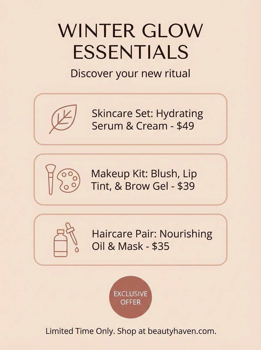
Create Beige Tan Palette Visuals with AI
If you already have HEX codes, you can generate matching moodboards, UI mockups, posters, and product scenes by describing the style and lighting—then letting AI handle the composition.
Reuse the prompts above, swap in your brand objects (menu, packaging, slides, app screens), and keep the palette callout consistent so results stay on-color across variations.
With Media.io, you can quickly iterate on multiple looks for the same beige tan palette and pick the one that best fits your brand tone.
Beige Tan Color Palette FAQs
-
What is a beige tan color palette?
A beige tan color palette is a set of warm neutral shades that typically range from light cream and sand to deeper camel, cocoa, or charcoal-brown accents. It’s used to create calm, natural-looking designs with flexible pairing options. -
Are beige and tan the same color?
They’re related but not identical. Beige is usually lighter and more muted (often with a creamy or slightly pink/yellow undertone), while tan is typically deeper and more “sun-baked,” leaning toward brown. -
How do I make beige tan palettes look modern (not dull)?
Use strong contrast (near-black or deep brown for text), add whitespace, and introduce subtle texture (paper grain, linen, soft shadows). One controlled accent color—like sage or terracotta—also helps keep the palette feeling current. -
What accent colors work best with beige tan?
Muted greens (sage/olive), dusty blues, terracotta/rust, and charcoal tones are the easiest pairings. Choose accents based on the mood: greens for natural calm, blues for clean balance, terracotta for warmth and energy. -
Is beige tan good for UI and web design?
Yes—especially for content-heavy pages and calm brand experiences. Just ensure accessibility by keeping text in a dark anchor color and checking contrast ratios for buttons, links, and small labels. -
Which HEX codes are popular for beige tan backgrounds?
Light background favorites often sit around creamy off-whites like #FAF0E6, #F8EFE3, #F6ECDC, and #F4E7D3. Pair them with a deep anchor like #2D2521 or #151312 for readable typography. -
Can I generate beige tan palette images with AI?
Yes. Use a text-to-image tool and describe the design type (moodboard, packaging, UI, poster), lighting (soft diffused, warm spotlight), and specify the HEX colors you want dominant and used as accents.


