

Rust orange sits right between burnt orange and terracotta—warm, earthy, and instantly grounding. It’s a reliable “hero color” for brands and visuals that need comfort, craft, and confidence.
Below are 20 rust orange color combinations with HEX codes, plus real-use tips and AI prompts you can reuse to generate matching visuals.
In this article
- Why Rust Orange Color Combinations Work So Well
-
- canyon clay
- copper cream
- desert apricot
- brickwood neutral
- saffron ember
- rustic sage
- autumn workshop
- terra cafe
- burnt citrus pop
- clay minimal ui
- spiced linen
- orchard dusk
- vintage travel poster
- kiln fired ceramic
- adobe sunset
- harvest market
- leather bound journal
- rosewood blush
- charcoal pumpkin
- warm industrial loft
- What Colors Go Well with Rust Orange?
- How to Use a Rust Orange Color Palette in Real Designs
- Create Rust Orange Palette Visuals with AI
Why Rust Orange Color Combinations Work So Well
Rust orange feels warm without becoming neon or sugary, which makes it versatile across branding, interiors, packaging, and UI. It naturally suggests clay, spice, leather, and late-afternoon light—textures people trust.
It also pairs easily: light creams keep it breathable, deep charcoals make it premium, and muted greens/blues add modern contrast. That balance is why rust orange works equally well in minimal layouts and bold campaigns.
Most importantly, rust orange reads “human” and tactile on screens. If your design needs warmth, authenticity, or craft energy, rust is a dependable anchor color.
20+ Rust Orange Color Palette Ideas (with HEX Codes)
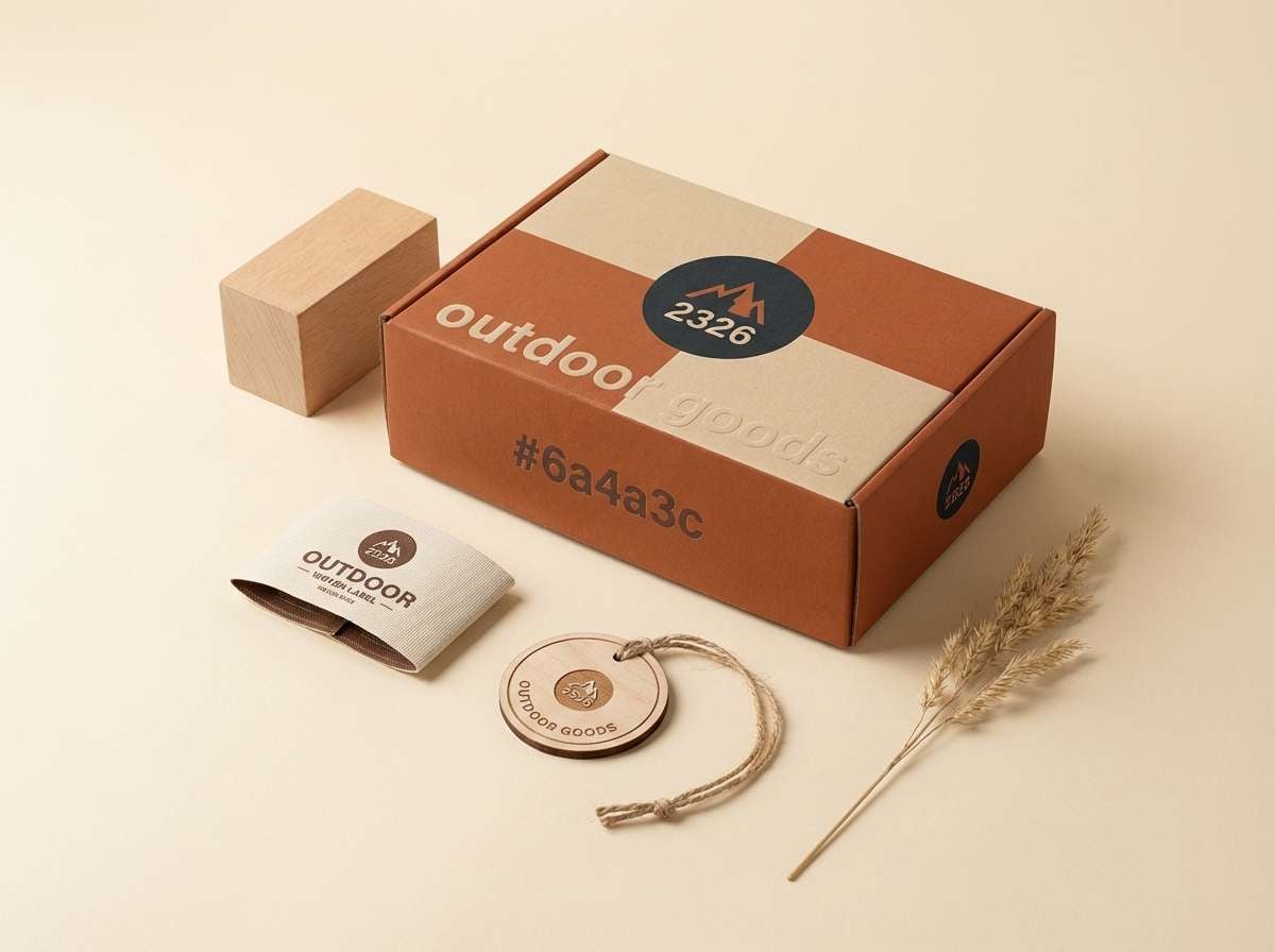
1) Canyon Clay
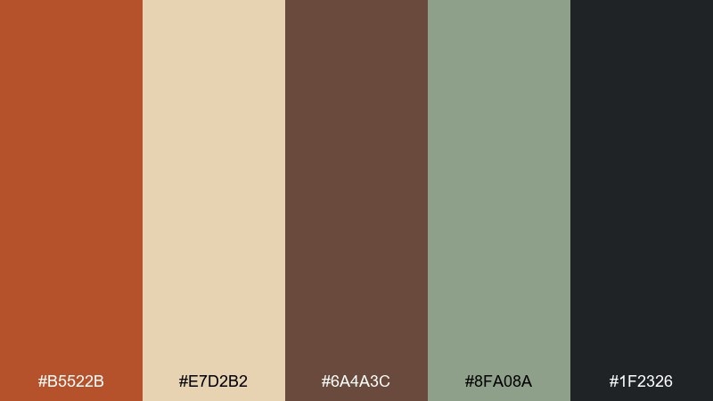
HEX: #b5522b #e7d2b2 #6a4a3c #8fa08a #1f2326
Mood: earthy, grounded, sunbaked
Best for: outdoor brand identity and packaging
Earthy and sunbaked, this mix feels like canyon walls, dry grass, and warm stone. Use it for rugged packaging, workwear branding, or adventure labels that need authenticity. Pair the rust with the sandy cream for headlines and keep the charcoal for legibility and barcodes. Tip: let the sage act as a quiet secondary color on badges and patterns so the orange stays premium, not loud.
Image example of canyon clay generated using media.io
Media.io is an online AI studio for creating and editing video, image, and audio in your browser.

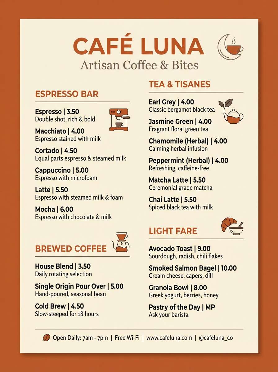
2) Copper Cream
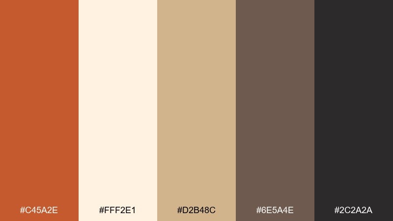
HEX: #c45a2e #fff2e1 #d2b48c #6e5a4e #2c2a2a
Mood: warm, polished, inviting
Best for: cafe menu design and storefront signage
Warm and polished, these rust orange color combinations evoke copper cookware, steamed milk, and cozy counters. They shine on cafe menus, bakery signage, and loyalty cards where comfort sells. Keep the cream as your main background, then use copper for section headers and callouts. Tip: add the deep brown for icons and small text to avoid the washed-out look that beige-heavy designs can create.
Image example of copper cream generated using media.io
3) Desert Apricot
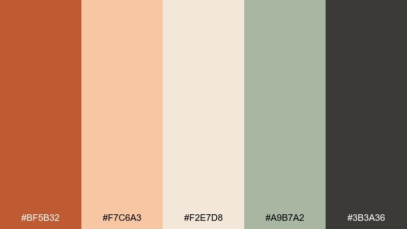
HEX: #bf5b32 #f7c6a3 #f2e7d8 #a9b7a2 #3b3a36
Mood: soft, airy, sunlit
Best for: wellness branding and social templates
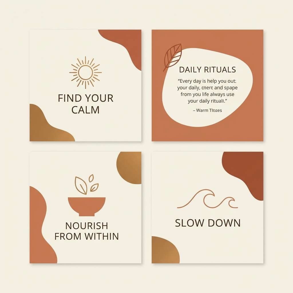
Soft and sunlit, this rust orange palette feels like apricot skies and pale desert sand. It works beautifully for wellness brands, mindful social templates, and gentle product launches. Pair the apricot tint with the off-white for backgrounds, then bring in rust for buttons or key phrases. Tip: use the muted sage in charts or highlights to keep the look calm while still feeling modern.
Image example of desert apricot generated using media.io
4) Brickwood Neutral
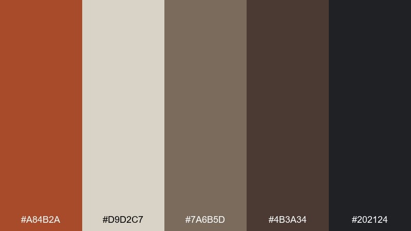
HEX: #a84b2a #d9d2c7 #7a6b5d #4b3a34 #202124
Mood: moody, architectural, refined
Best for: interior mood boards and real estate brochures
Moody and architectural, these rust orange hues recall brick facades, weathered timber, and quiet stone. Use them for interior mood boards, boutique real estate brochures, or editorial layouts that need sophistication. Let the warm gray run as the page base, and reserve the brick tone for section dividers and pull quotes. Tip: keep the darkest charcoal for typography to maintain crisp contrast in print.
Image example of brickwood neutral generated using media.io
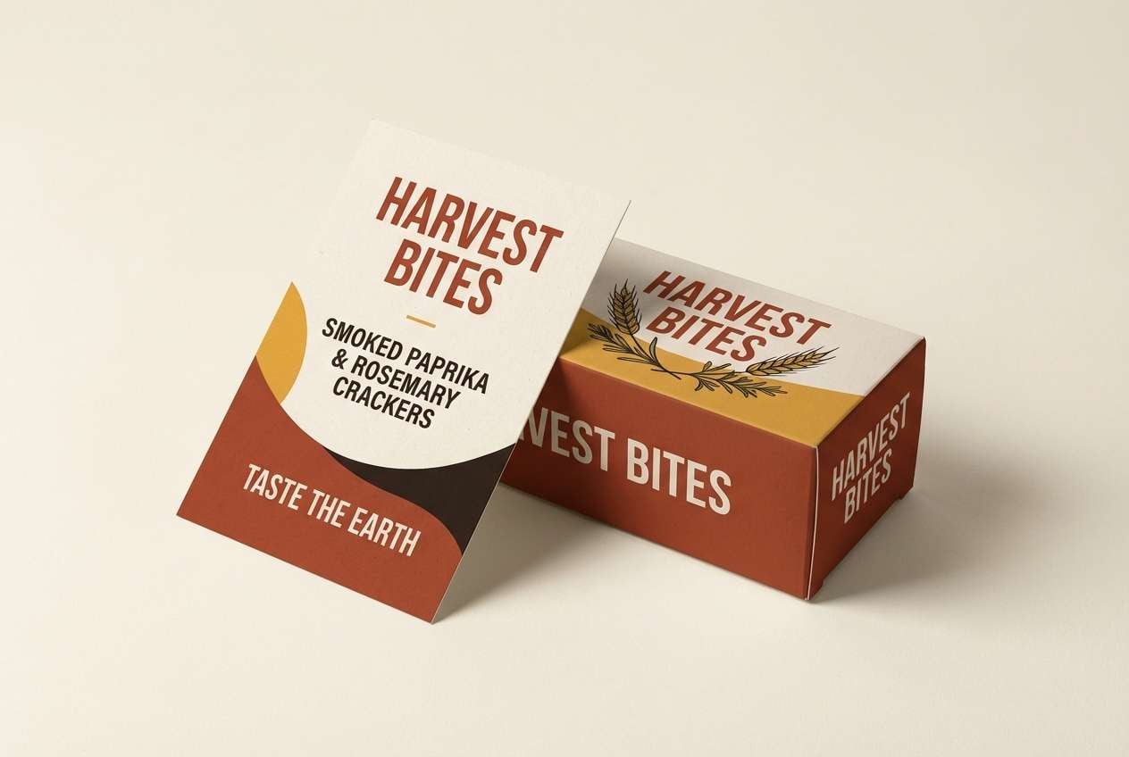
5) Saffron Ember
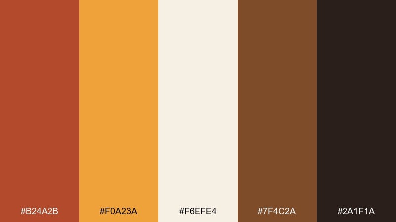
HEX: #b24a2b #f0a23a #f6efe4 #7f4c2a #2a1f1a
Mood: spicy, energetic, festive
Best for: food delivery ads and seasonal promos
Spicy and festive, the colors feel like embers, saffron rice, and toasted crust. They fit food delivery ads, seasonal promos, and recipe cards where appetite matters. Use the bright saffron as a highlight for discounts, while rust anchors the brand color. Tip: keep backgrounds creamy and add the dark espresso only for prices and small copy so the design stays warm, not heavy.
Image example of saffron ember generated using media.io
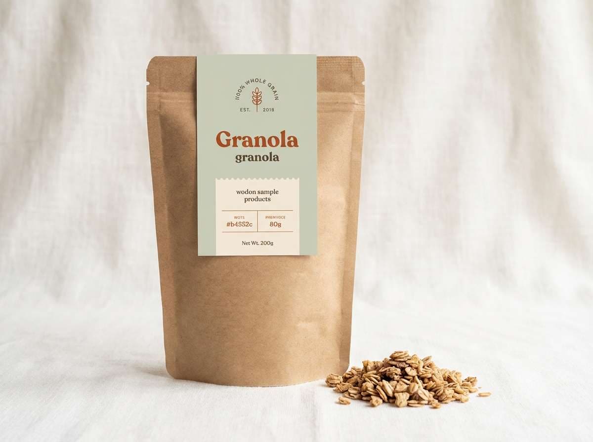
6) Rustic Sage
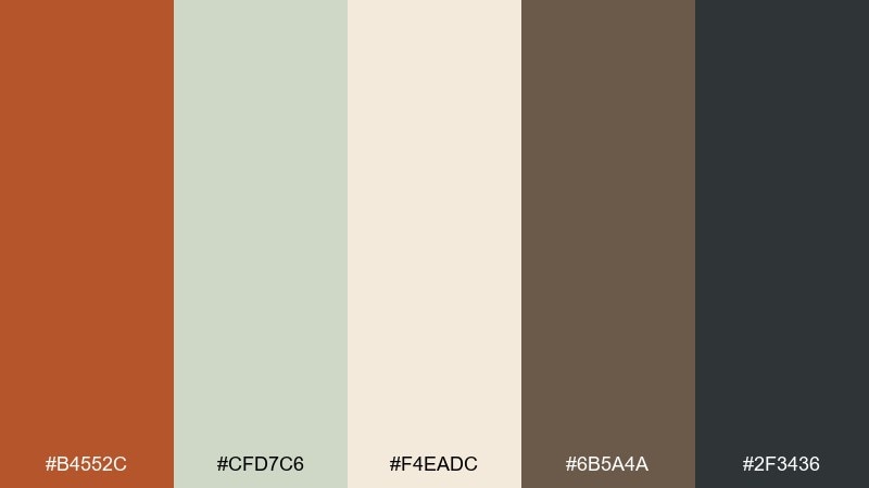
HEX: #b4552c #cfd7c6 #f4eadc #6b5a4a #2f3436
Mood: calm, organic, balanced
Best for: eco-friendly product packaging
Calm and organic, this pairing suggests herb gardens, clay pots, and recycled paper. It is a strong fit for eco-friendly packaging, farmers market labels, and sustainable DTC brands. Use sage as a large color field and bring rust in for seals, stamps, and key product benefits. Tip: choose the warm brown for thin line art so illustrations feel handmade without sacrificing clarity.
Image example of rustic sage generated using media.io
7) Autumn Workshop
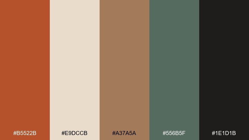
HEX: #b5522b #e9dccb #a37a5a #556b5f #1e1d1b
Mood: crafty, warm, hands-on
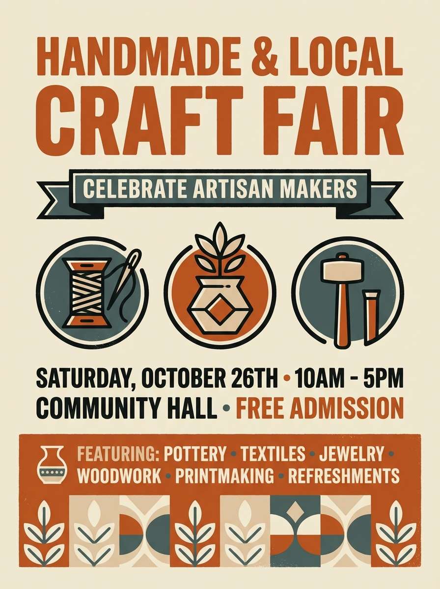
Best for: maker logos and craft fair flyers
Crafty and warm, these rust orange tones evoke sawdust, leather aprons, and late-afternoon light in a small studio. For maker logos and craft fair flyers, this rust orange color palette feels authentic without looking rustic-forced. Pair the cream background with the deep charcoal for strong typography, then use rust as the signature stamp color. Tip: repeat the muted green in small UI-like tags or category chips to organize information cleanly.
Image example of autumn workshop generated using media.io
8) Terra Cafe
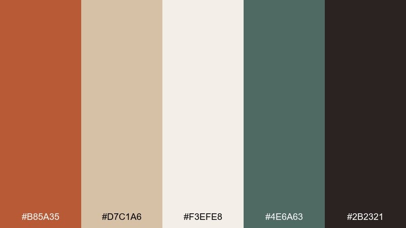
HEX: #b85a35 #d7c1a6 #f3efe8 #4e6a63 #2b2321
Mood: cozy, modern, grounded
Best for: restaurant branding and tableware
Cozy and modern, this mix feels like terracotta cups and linen napkins. Use it for restaurant branding, tableware patterns, and loyalty emails that need warmth without clutter. Keep the light neutral as your base, then alternate rust and deep green for category blocks or dish labels. Tip: apply the dark espresso to outlines and small type so printed menus remain readable under warm lighting.
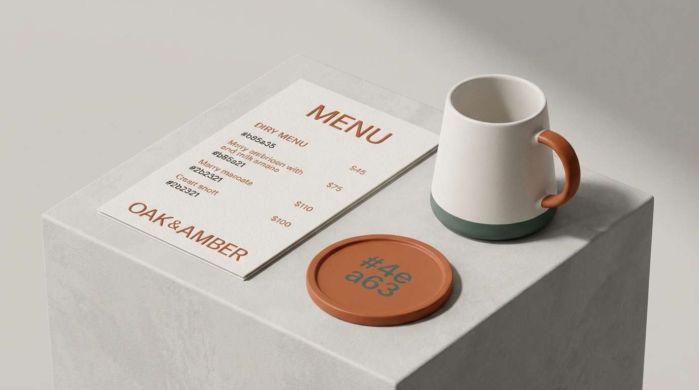
Image example of terra cafe generated using media.io
9) Burnt Citrus Pop
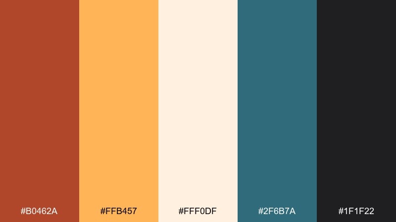
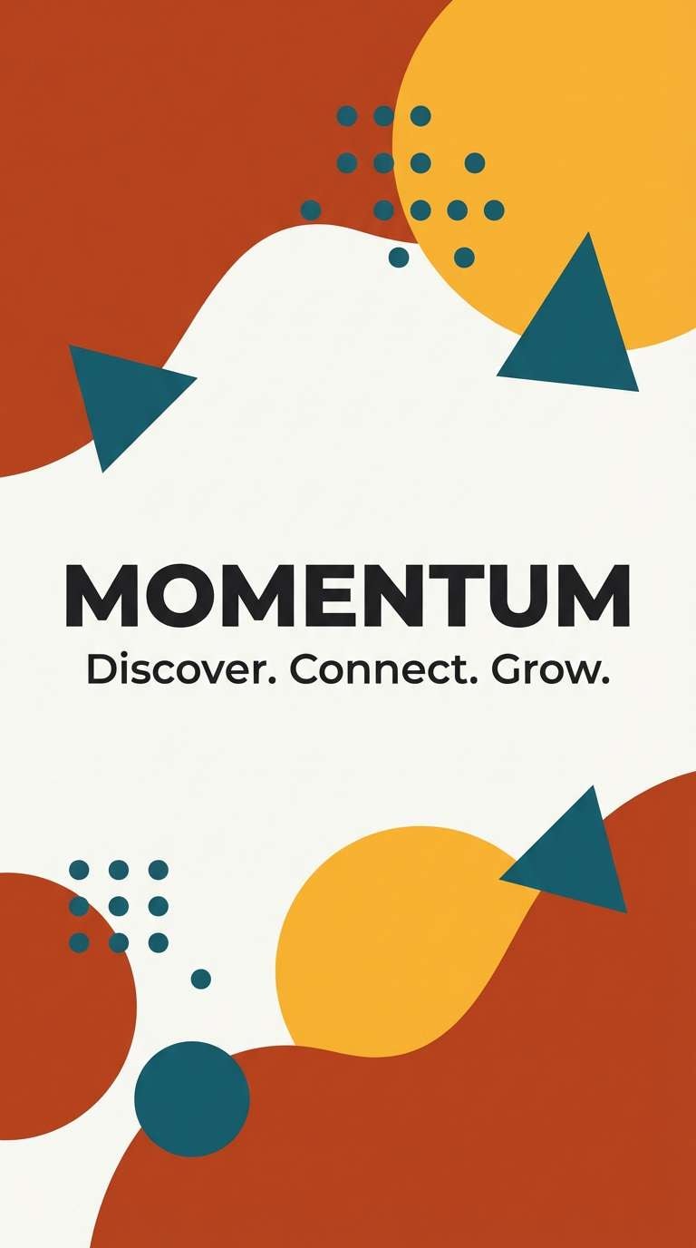
HEX: #b0462a #ffb457 #fff0df #2f6b7a #1f1f22
Mood: bold, playful, contemporary
Best for: social ad creatives and splash screens
Bold and playful, these colors bring to mind candied orange peel and bright citrus zest. For energetic campaigns, rust orange color combinations like this pair beautifully with a cool teal to create modern contrast. Use the peachy white as breathing room, then let saffron and rust drive buttons and promo stickers. Tip: keep teal to blocks or shapes rather than body text so the palette stays punchy, not busy.
Image example of burnt citrus pop generated using media.io
10) Clay Minimal UI
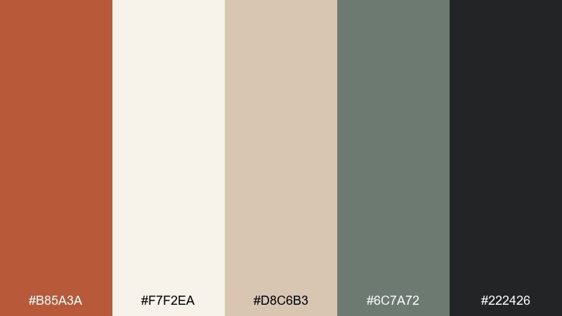
HEX: #b85a3a #f7f2ea #d8c6b3 #6c7a72 #222426
Mood: minimal, warm, user-friendly
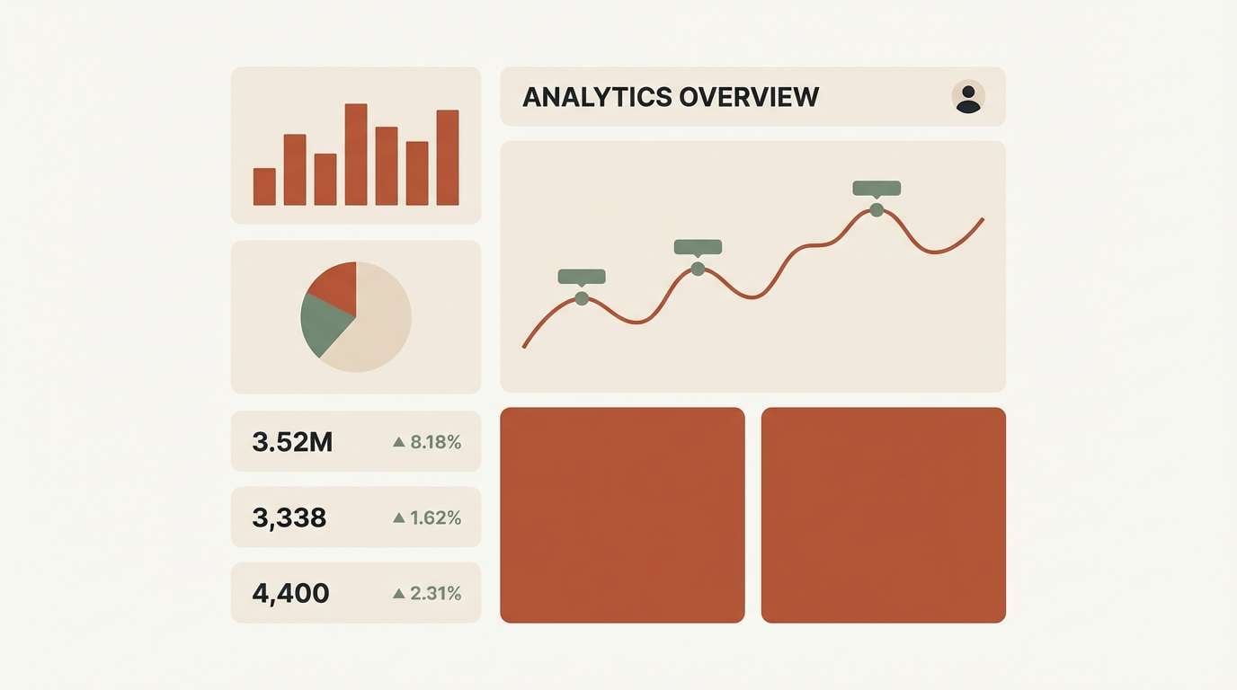
Best for: dashboard UI and SaaS landing pages
Minimal and warm, these rust orange colors read like clay, paper, and soft graphite. They are ideal for dashboards and SaaS landing pages that want friendliness without losing trust. Use the off-white for the main canvas, then apply rust for primary CTAs and active states. Tip: keep the cool gray-green for secondary buttons and subtle borders so the interface feels structured and calm.
Image example of clay minimal ui generated using media.io
11) Spiced Linen
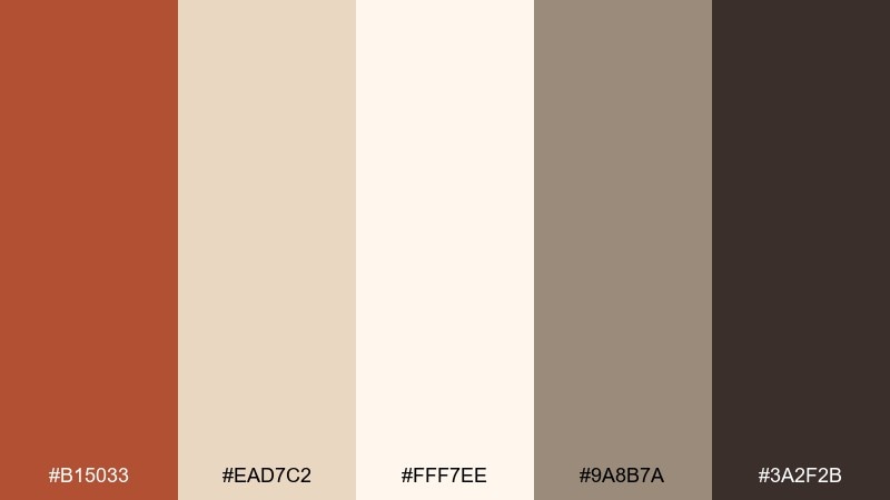
HEX: #b15033 #ead7c2 #fff7ee #9a8b7a #3a2f2b
Mood: soft, comforting, elegant
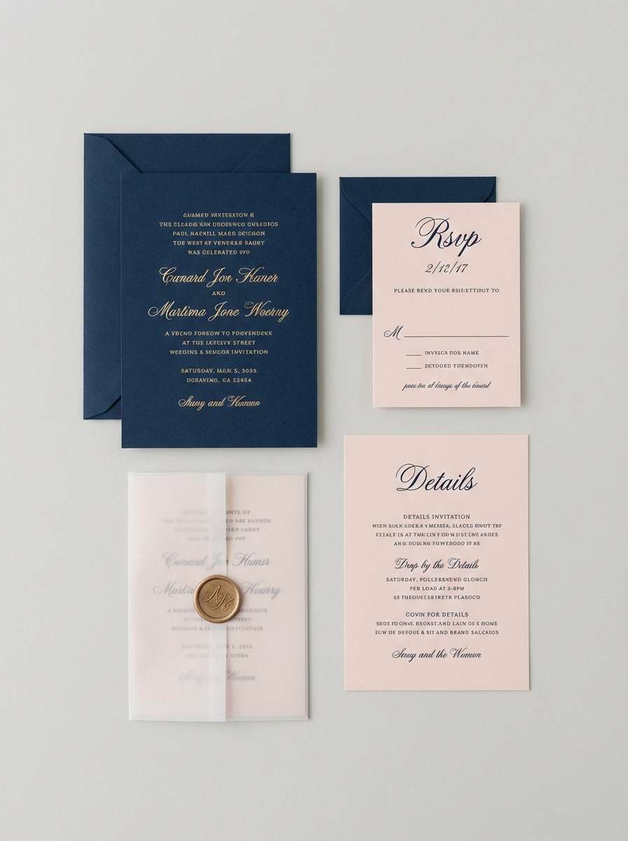
Best for: wedding invitations and stationery
Soft and comforting, these colors feel like spiced tea over crisp linen. They suit wedding invitations, stationery sets, and event programs that need warmth with restraint. Pair the creamy background with rust for monograms or border details, and keep taupe for supporting text. Tip: use the deep cocoa sparingly for names and dates to preserve a light, airy look.
Image example of spiced linen generated using media.io
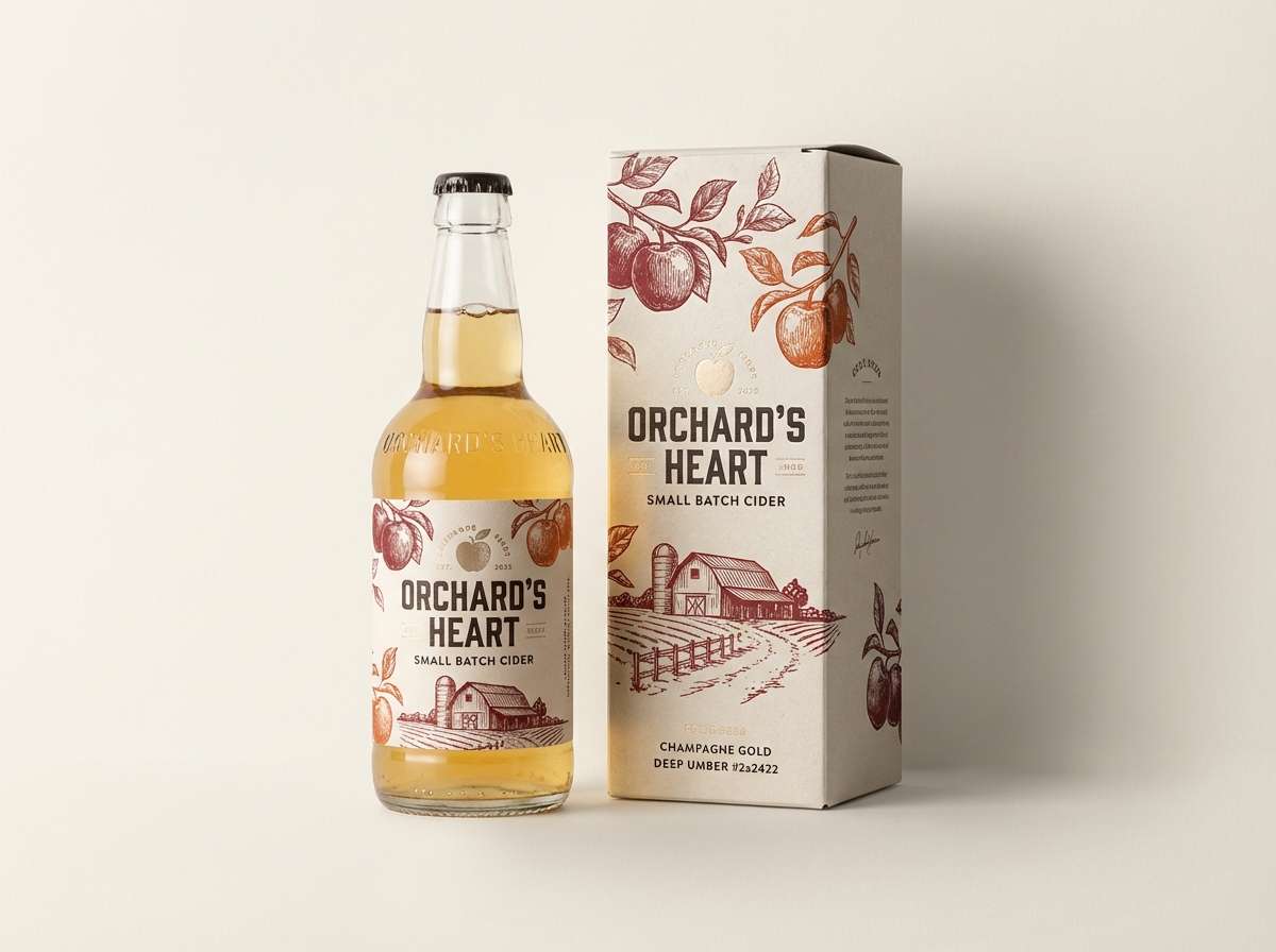
12) Orchard Dusk
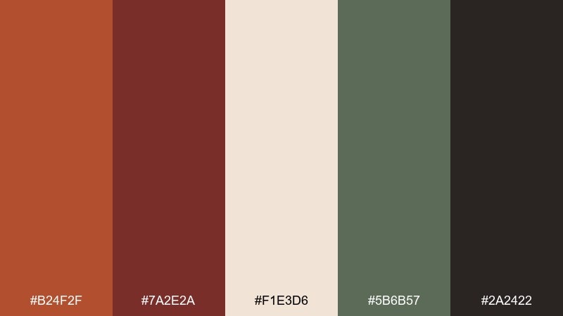
HEX: #b24f2f #7a2e2a #f1e3d6 #5b6b57 #2a2422
Mood: rich, rustic, evening
Best for: cider labels and fall campaign posters
Rich and evening-toned, this rust orange color palette suggests orchard rows at dusk and ripe fruit in wooden crates. It is great for cider labels, fall campaign posters, and artisanal food branding. Use rust as the hero color, then layer in the deep berry for premium accents like foiled seals or badges. Tip: keep the cream for negative space so the darker hues feel intentional, not muddy.
Image example of orchard dusk generated using media.io
13) Vintage Travel Poster
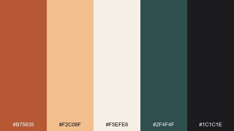
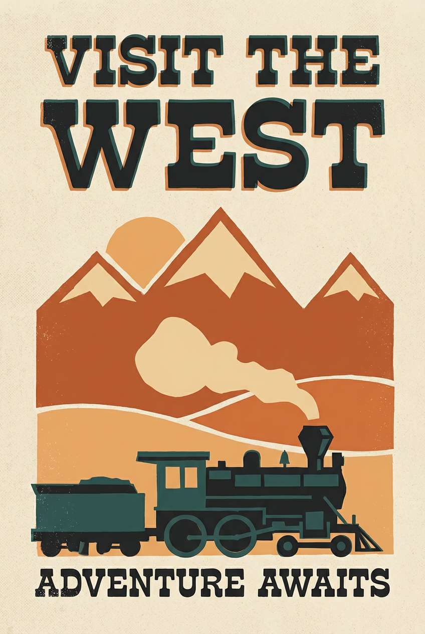
HEX: #b75835 #f2c08f #f5efe6 #2f4f4f #1c1c1e
Mood: nostalgic, graphic, adventurous
Best for: poster design and retro merch prints
Nostalgic and graphic, the colors recall sun-faded travel posters and inked typography. Use this mix for posters, retro merch prints, or editorial covers with bold shapes. Pair the warm sand and rust for large blocks, then add the deep sea green for shadows and depth. Tip: reserve the near-black for titles and outlines to keep the vintage vibe crisp.
Image example of vintage travel poster generated using media.io
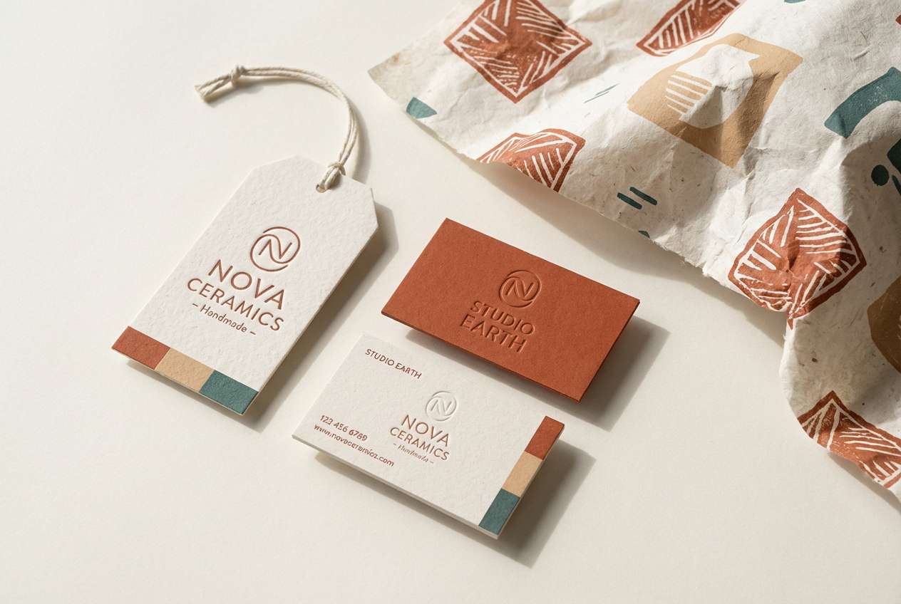
14) Kiln Fired Ceramic
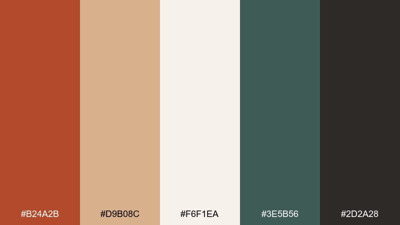
HEX: #b24a2b #d9b08c #f6f1ea #3e5b56 #2d2a28
Mood: artisanal, tactile, serene
Best for: handmade shop branding and product photos
Artisanal and tactile, these rust orange tones feel like glazed clay, kiln heat, and soft studio light. They work well for handmade shop branding, pottery tags, and product listings that highlight texture. Use the pale neutral as a clean photo backdrop and bring rust into logo marks or price labels. Tip: add the deep teal-green to elevate the look from rustic to design-forward, especially in patterns and icons.
Image example of kiln fired ceramic generated using media.io
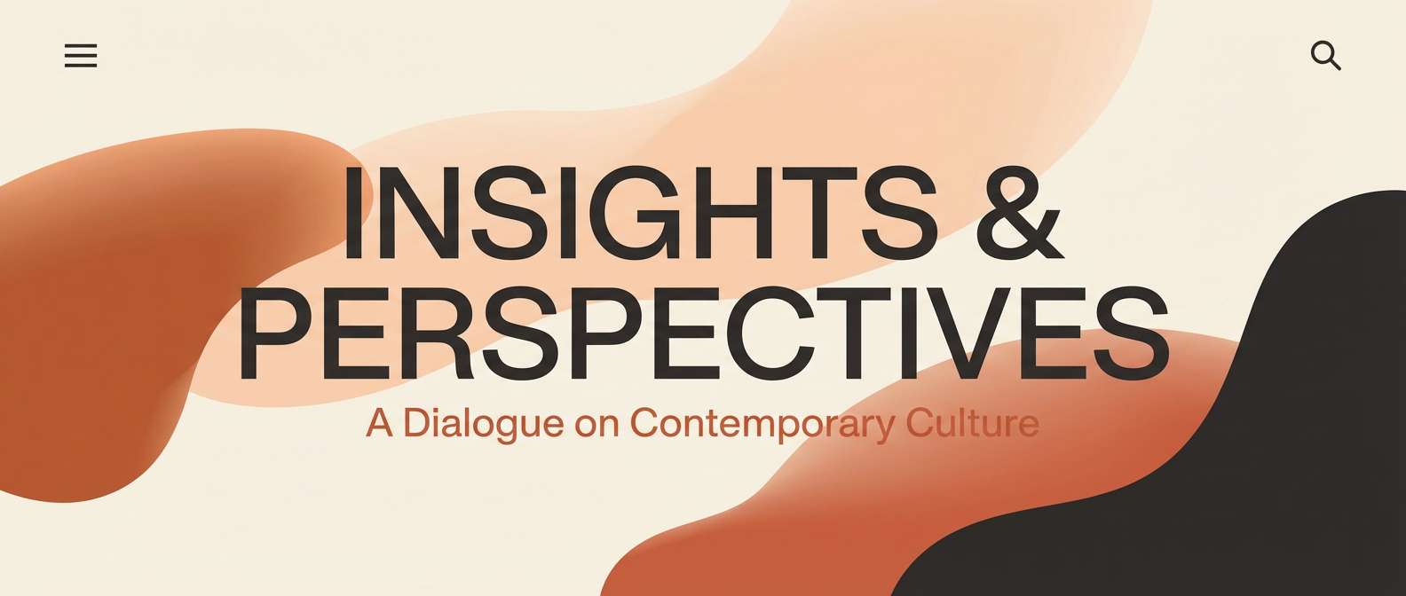
15) Adobe Sunset
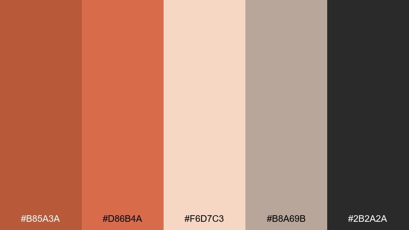
HEX: #b85a3a #d86b4a #f6d7c3 #b8a69b #2b2a2a
Mood: sunset, soft, romantic
Best for: lifestyle photography presets and blog headers
Sunset-soft and romantic, these colors echo adobe walls glowing at golden hour. Use them for lifestyle blog headers, creator media kits, and photo preset branding. Pair the peach tint with the mid rust for gradients, and anchor the layout with warm gray for navigation. Tip: keep the darkest tone for only key text so the palette stays airy and luminous.
Image example of adobe sunset generated using media.io
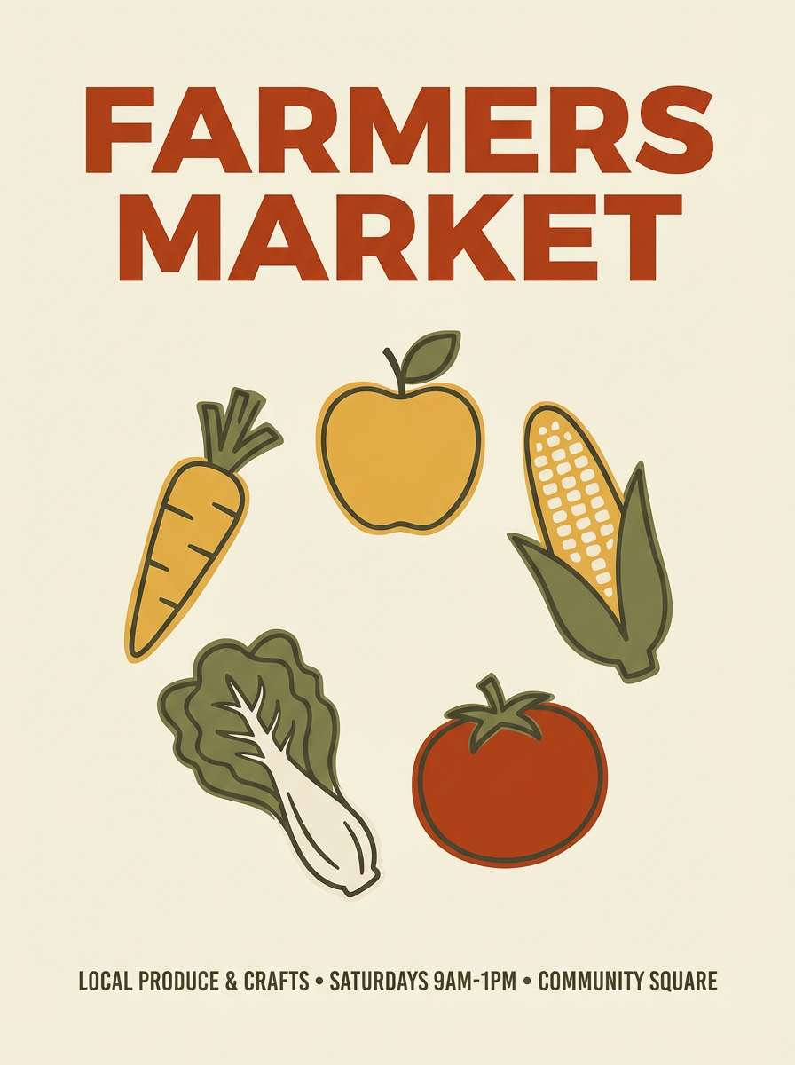
16) Harvest Market
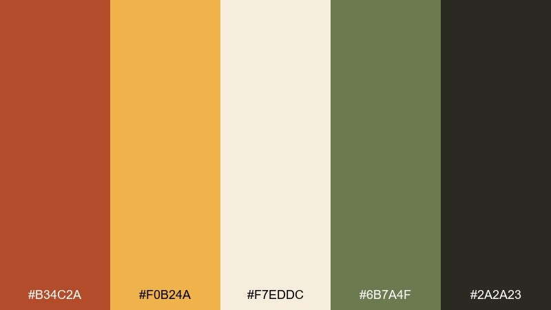
HEX: #b34c2a #f0b24a #f7eddc #6b7a4f #2a2a23
Mood: cheerful, seasonal, wholesome
Best for: farmers market posters and product stickers
Cheerful and seasonal, the hues feel like stacked pumpkins, honey, and fresh herbs. Rust orange color combinations like this are perfect for farmers market posters, produce stickers, and seasonal email banners. Let the golden tone do the attention-grabbing work, while rust provides the brand anchor. Tip: use the green for category labels and wayfinding arrows so layouts stay easy to scan.
Image example of harvest market generated using media.io
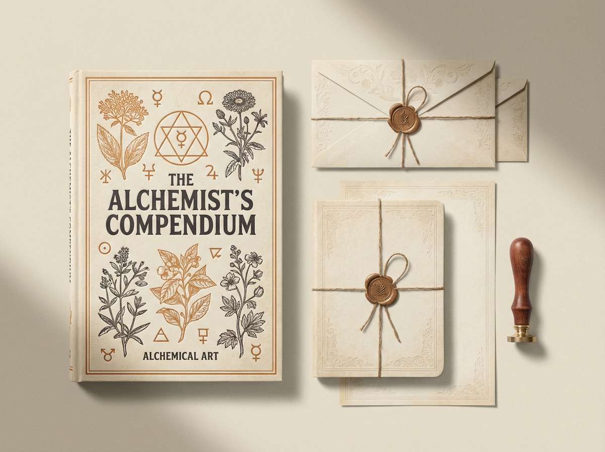
17) Leather Bound Journal
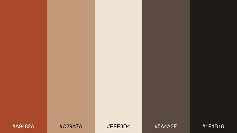
HEX: #a9482a #c29a7a #efe3d4 #5a4a3f #1f1b18
Mood: classic, scholarly, nostalgic
Best for: book covers and stationery branding
Classic and scholarly, these shades evoke worn leather, paper edges, and quiet libraries. They are a natural fit for book covers, stationery branding, and heritage-inspired logos. Use the parchment tone as a base, then bring rust into titles or spine accents for a vintage pop. Tip: keep the near-black for small type and ornamental borders to maintain that old-world crispness.
Image example of leather bound journal generated using media.io
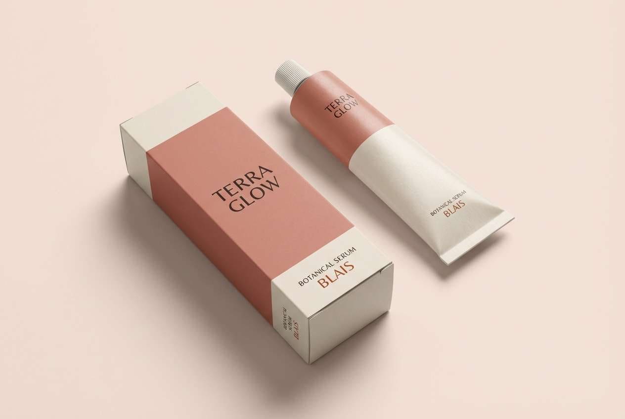
18) Rosewood Blush
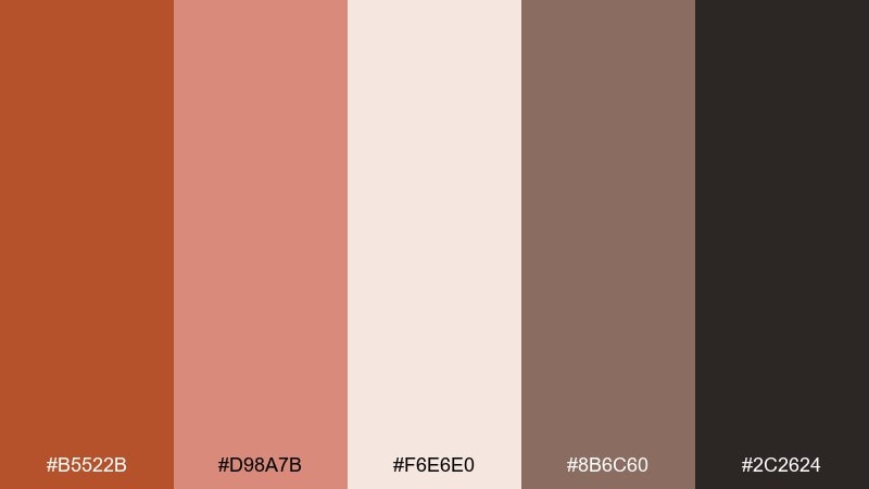
HEX: #b5522b #d98a7b #f6e6e0 #8b6c60 #2c2624
Mood: soft, romantic, modern
Best for: beauty branding and boutique ecommerce
Soft and romantic, these rust orange hues suggest rosewood, blush makeup, and warm candlelight. Use them for beauty branding, boutique ecommerce banners, and elegant product pages. Pair the blush and cream for backgrounds, then let the rust tone define buttons and key benefits. Tip: keep the muted brown for typography and fine lines so the look stays refined rather than overly sweet.
Image example of rosewood blush generated using media.io
19) Charcoal Pumpkin
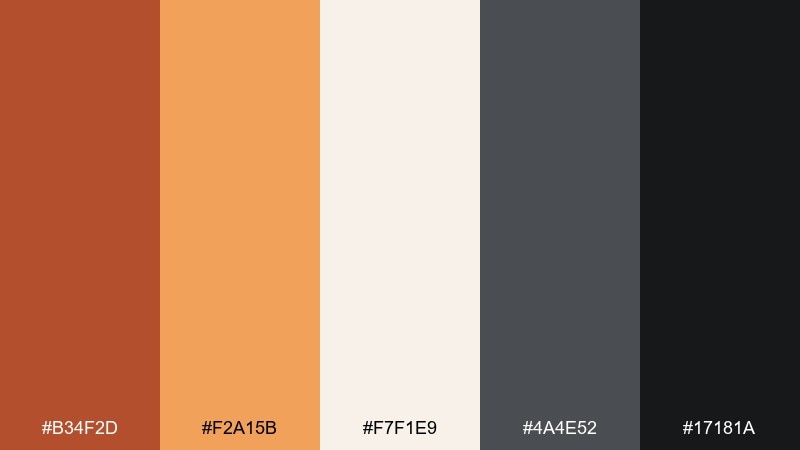
HEX: #b34f2d #f2a15b #f7f1e9 #4a4e52 #17181a
Mood: bold, high-contrast, modern
Best for: tech event banners and keynote slides
Bold and high-contrast, the palette feels like pumpkin glow against dark charcoal nights. It works for tech event banners, keynote slides, and announcements that need instant punch. Use charcoal as the stage, then pop rust and apricot for headlines and icons. Tip: keep body text on the warm off-white to reduce eye strain while preserving the dramatic vibe.
Image example of charcoal pumpkin generated using media.io
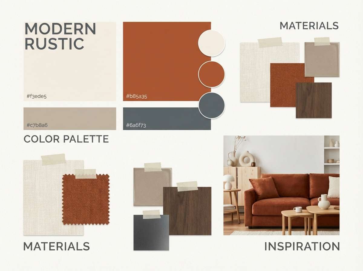
20) Warm Industrial Loft
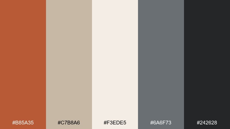
HEX: #b85a35 #c7b8a6 #f3ede5 #6a6f73 #242628
Mood: urban, warm, sophisticated
Best for: interior design presentations and mood boards
Urban but warm, these colors conjure brick, concrete, and sunlit loft windows. They are ideal for interior design presentations, mood boards, and renovation proposals. Pair rust with the soft stone neutral for feature walls, then use the cool gray for plans and annotations. Tip: keep the darkest tone for titles and key measurements to make layouts feel professional and easy to review.
Image example of warm industrial loft generated using media.io
What Colors Go Well with Rust Orange?
Rust orange pairs beautifully with creamy whites, sand, and parchment tones when you want a soft, organic look. These light neutrals keep rust feeling premium and breathable—great for packaging, editorial layouts, and lifestyle branding.
For contrast, lean on charcoal, espresso browns, and near-black. This makes rust feel sharper and more modern, and it improves readability in UI or slide decks.
Muted greens (sage, olive) and deep blue-greens (teal, sea green) are excellent complementary partners. They cool down the warmth just enough to create a contemporary, balanced palette.
How to Use a Rust Orange Color Palette in Real Designs
Use rust orange as a “signal” color: buttons, badges, price tags, section headers, and key highlights. Because it naturally draws attention, a little goes a long way—especially in interfaces and ads.
Start with a neutral base (cream, off-white, warm gray), then add one dark anchor for type (charcoal/espresso). After that, introduce one supporting accent (sage, teal, or golden saffron) to create hierarchy without clutter.
In print, test under warm lighting and on real paper stock. Rust can shift redder on coated stock or browner on uncoated; your dark text color choice is what keeps the design crisp.
Create Rust Orange Palette Visuals with AI
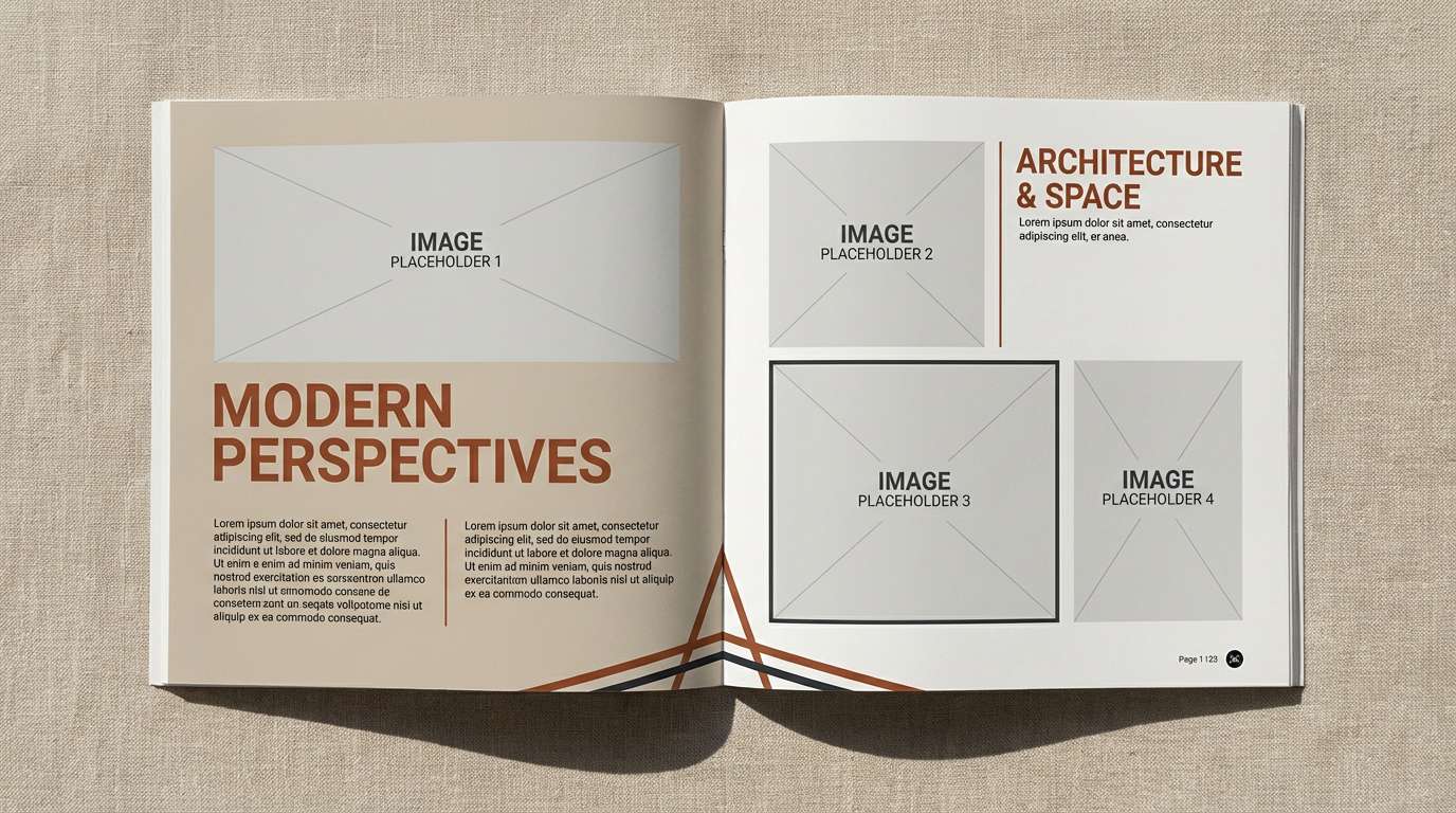
If you already have HEX codes, you can turn them into on-brand mockups fast by generating consistent visuals (menus, packaging, UI screens, posters) with the same color direction.
Reuse the prompts above and swap in your product type, layout, or aspect ratio. Keep your dominant colors in the prompt, then specify accents for typography, icons, or shadows to maintain control.
Generate a few variations, then pick the one with the cleanest contrast and most consistent color temperature—especially if you’re building a full brand kit.
Rust Orange Color Palette FAQs
-
What is the HEX code for rust orange?
A common rust orange reference is #b5522b. Depending on lighting and context, “rust” can shift more red (brick-like) or more brown (terracotta-like), so it’s best to choose a rust tone that matches your brand’s materials and neutrals. -
Is rust orange the same as terracotta or burnt orange?
They’re close but not identical. Terracotta often looks dustier and more clay-like, burnt orange can be brighter or more saturated, and rust orange usually reads deeper and earthier—like oxidized metal or baked clay. -
What colors complement rust orange best?
Great complements include muted greens (sage/olive), blue-greens (teal), warm creams, sand, and dark charcoals. These pairings either soften rust (with neutrals) or create modern contrast (with cool greens/blues). -
How do I make a rust orange palette look modern (not too “fall”)?
Use more off-white/stone neutrals, add a cool contrast color like teal or gray-green, and keep the darkest tone for clean typography. Avoid using too many warm accents (gold, red, brown) at the same time. -
Can rust orange work for UI and SaaS design?
Yes—rust can be an excellent CTA or active-state color when paired with an off-white background and a strong dark text color. Use rust sparingly for primary actions and keep secondary UI elements in soft grays/gray-greens for clarity. -
How can I generate images that match my rust orange brand colors?
Use an AI image generator and specify your dominant rust HEX plus 1–2 accent HEX codes directly in the prompt. Describe where each color should appear (background, typography, icons, packaging) to keep results consistent. -
What’s a safe background color for rust orange text or buttons?
Warm off-whites (cream/parchment) are safest for a soft look, while charcoal backgrounds create high-impact contrast. Always check accessibility contrast—especially for button labels and small text.
Next: Medieval Color Palette


