A river color palette is one of the easiest ways to get a “natural but designed” look—cool blues and teals for clarity, plus stone, sand, or warm accents for balance.
Below are 20+ river color palette ideas with HEX codes and real-use directions for UI, branding, print, and more.
In this article
- Why River Palettes Work So Well
-
- glacier current
- mossy bank
- pebble ford
- sunset reflection
- silt and steel
- canyon rapids
- misty tributary
- reed and sandbar
- deep pool
- spring runoff
- urban riverwalk
- moonlit estuary
- driftwood cabin
- wildflower delta
- stormwater channel
- alpine stream
- copper kelp
- foggy weir
- indigo confluence
- tropical backwater
- riverstone neutral
- braided channel
- What Colors Go Well with River?
- How to Use a River Color Palette in Real Designs
- Create River Palette Visuals with AI
Why River Palettes Work So Well
River palettes naturally mix depth and freshness: darker blues act as an anchor (like deep water), while teals and aquas add energy without becoming neon. That makes them reliable for both brand systems and interface design.
They also come with built-in neutrals—stone grays, silt beiges, and warm off-whites—so you can keep layouts readable and avoid overly saturated screens or prints.
Most importantly, river color combinations feel familiar and calming, which helps users trust what they’re seeing (perfect for dashboards, wellness, finance, education, and editorial designs).
20+ River Color Palette Ideas (with HEX Codes)
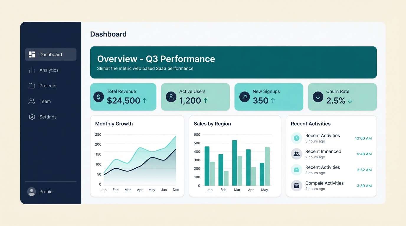
1) Glacier Current
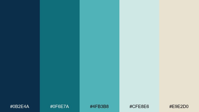
HEX: #0B2E4A #0F6E7A #4FB3B8 #CFE8E6 #E9E2D0
Mood: crisp, clean, and refreshing
Best for: saas dashboard ui
Crisp and refreshing like meltwater cutting through rock, these tones feel modern and breathable. The deep navy anchors headers, while aqua and seafoam keep charts and cards light. Pair it with warm ivory for a softer, less clinical finish. Usage tip: reserve the darkest blue for key navigation and use the teal for primary buttons.
Image example of glacier current generated using media.io
Media.io is an online AI studio for creating and editing video, image, and audio in your browser.

2) Mossy Bank
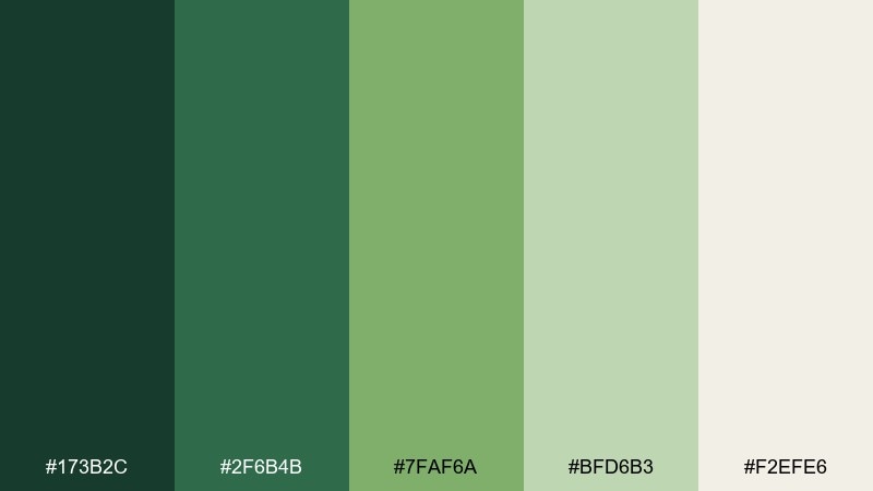
HEX: #173B2C #2F6B4B #7FAF6A #BFD6B3 #F2EFE6
Mood: grounded, earthy, and calm
Best for: organic skincare packaging
Grounded and calm, it evokes moss-covered stones and shaded banks after rain. The forest greens read premium on labels, while the pale sage keeps layouts airy. Pair with uncoated paper textures and minimal typography for a natural feel. Usage tip: let the darkest green carry the logo mark, then use sage as the main label field.
Image example of mossy bank generated using media.io
3) Pebble Ford
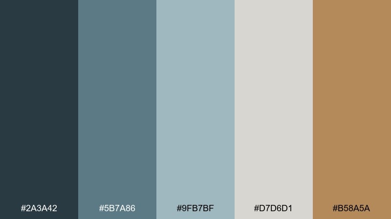
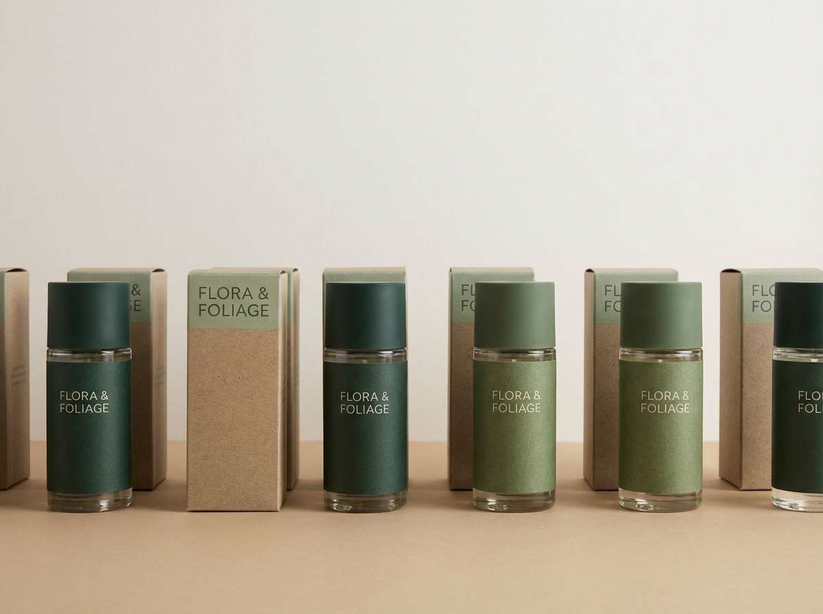
HEX: #2A3A42 #5B7A86 #9FB7BF #D7D6D1 #B58A5A
Mood: quiet, balanced, and dependable
Best for: architectural presentation slides
Quiet and dependable, it feels like smooth pebbles under shallow water with a hint of warm clay. The blue-grays make diagrams and floor plans look refined without feeling cold. This river color palette works best with plenty of whitespace and a single warm accent for highlights. Usage tip: use the clay tone sparingly for callouts and key metrics.
Image example of pebble ford generated using media.io

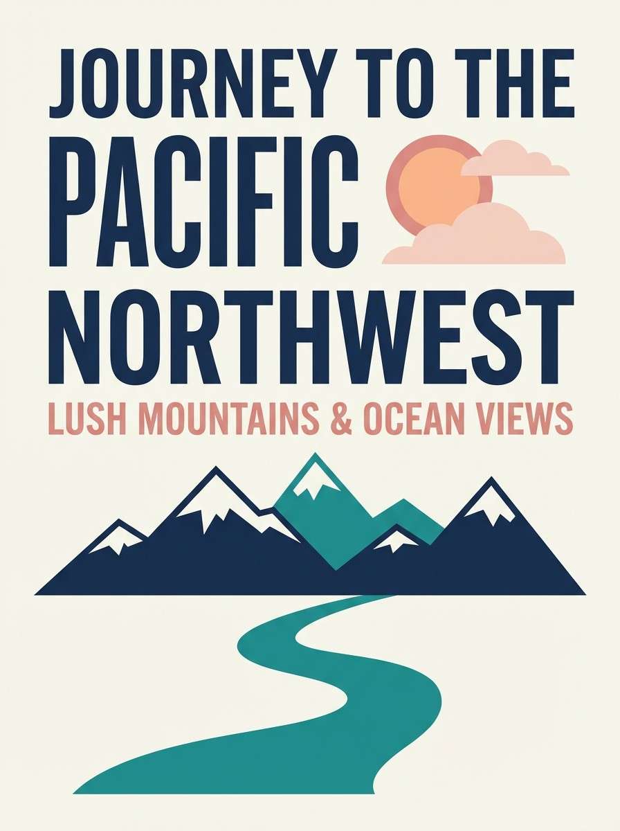
4) Sunset Reflection
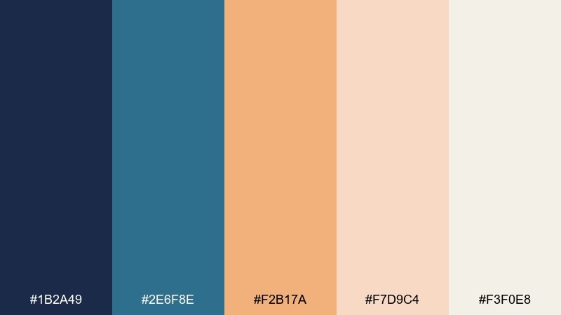
HEX: #1B2A49 #2E6F8E #F2B17A #F7D9C4 #F3F0E8
Mood: romantic, warm, and optimistic
Best for: travel poster design
Romantic and optimistic, it looks like dusk light bouncing across moving water. Navy and teal give structure, while peach and blush create a welcoming glow. These river color combinations shine on posters, hero banners, and social ads where contrast matters. Usage tip: keep text in navy for readability and let peach sit behind key headings as a soft highlight.
Image example of sunset reflection generated using media.io
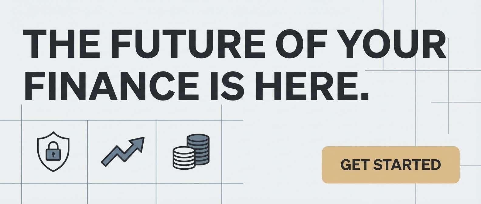
5) Silt and Steel
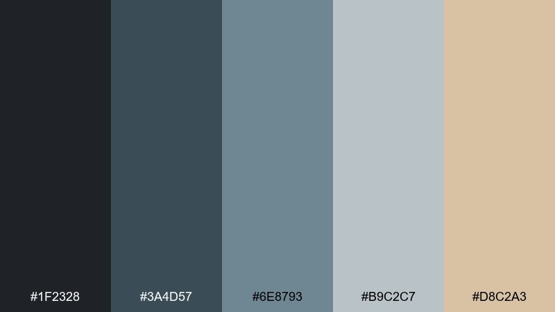
HEX: #1F2328 #3A4D57 #6E8793 #B9C2C7 #D8C2A3
Mood: industrial, moody, and polished
Best for: fintech landing page
Moody and polished, it recalls steel bridges, dark water, and silt-toned banks. The charcoal and slate build trust, while the sandy beige adds warmth without turning playful. Pair with sharp sans-serif type and thin-line icons for a confident, modern look. Usage tip: make beige the accent for CTAs and badges so the page feels premium, not heavy.
Image example of silt and steel generated using media.io
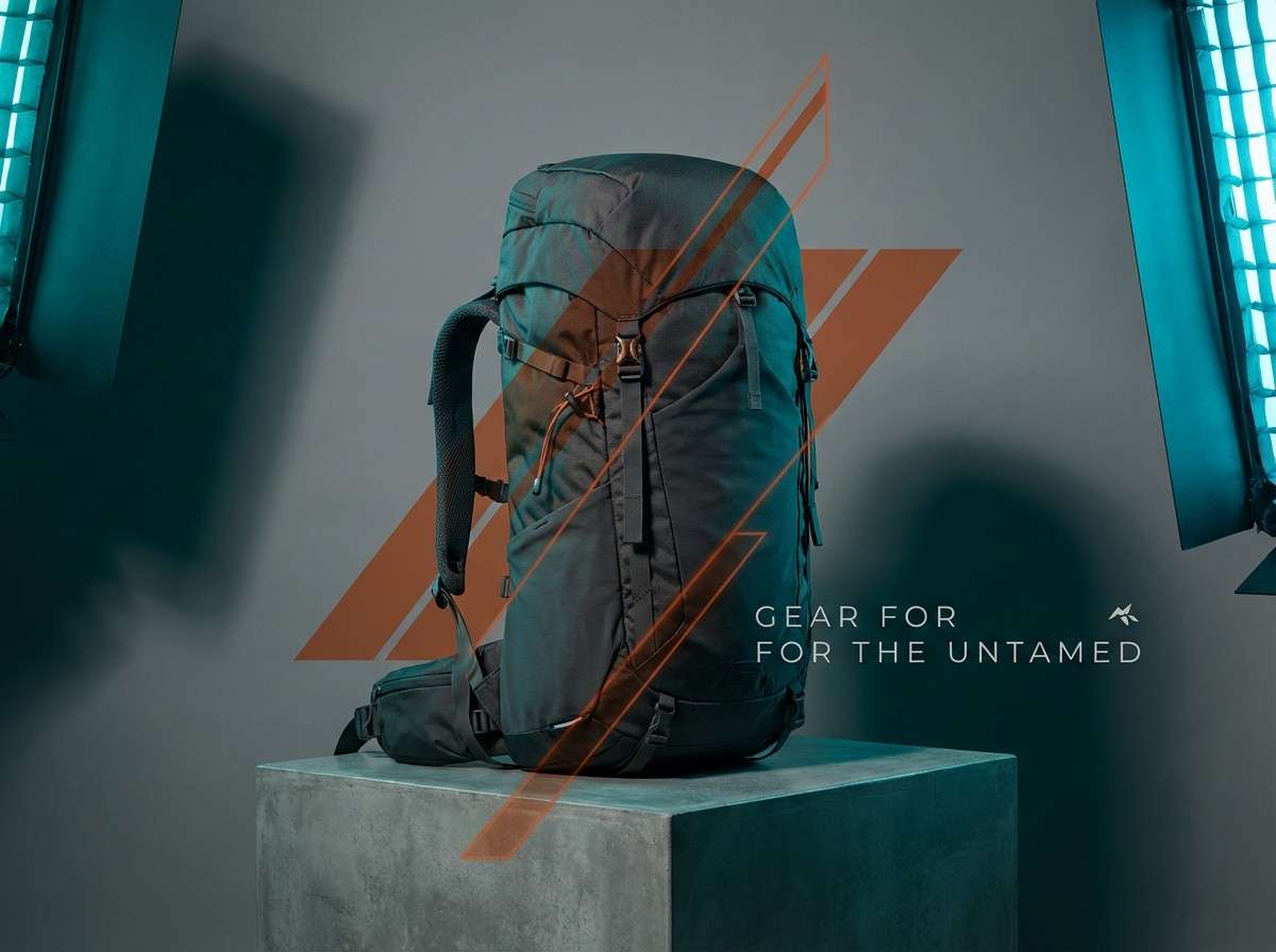
6) Canyon Rapids
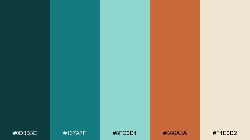
HEX: #0D3B3E #137A7F #8FD6D1 #C86A3A #F1E6D2
Mood: adventurous, energetic, and bold
Best for: outdoor gear product ad
Adventurous and bold, it brings to mind rapids cutting through canyon walls. The teal range gives a fresh, athletic base, and the rust orange hits like sun on rock. Pair with high-contrast product photography and strong, condensed headings. Usage tip: use orange only on the most important price or action elements to keep the energy controlled.
Image example of canyon rapids generated using media.io
7) Misty Tributary
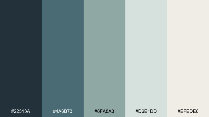
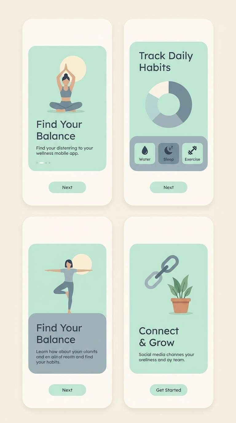
HEX: #22313A #4A6B73 #8FA8A3 #D6E1DD #EFEDE6
Mood: soft, airy, and contemplative
Best for: wellness app onboarding screens
Soft and contemplative, it feels like morning fog hovering above quiet water. Muted blue-grays keep the mood gentle, while pale mint and warm off-white calm the interface. Pair with rounded UI components and light motion for a soothing first impression. Usage tip: keep backgrounds in off-white and use the mid teal-gray for progress and focus states.
Image example of misty tributary generated using media.io
8) Reed and Sandbar
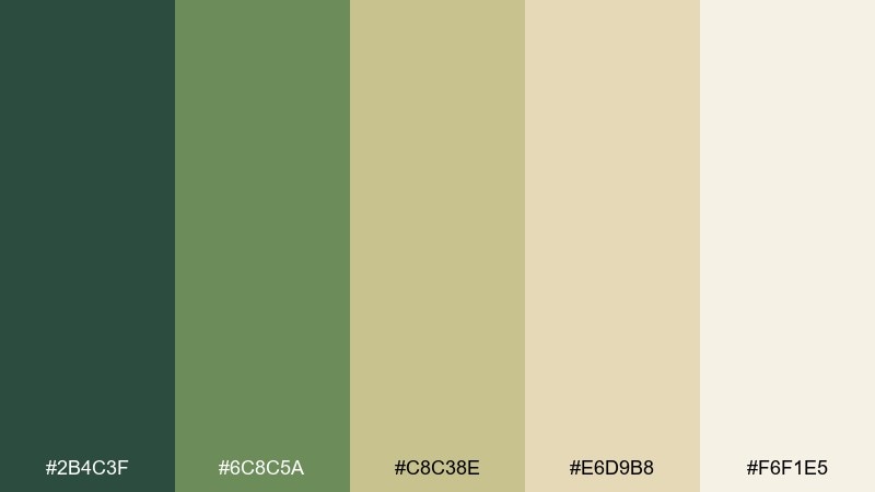
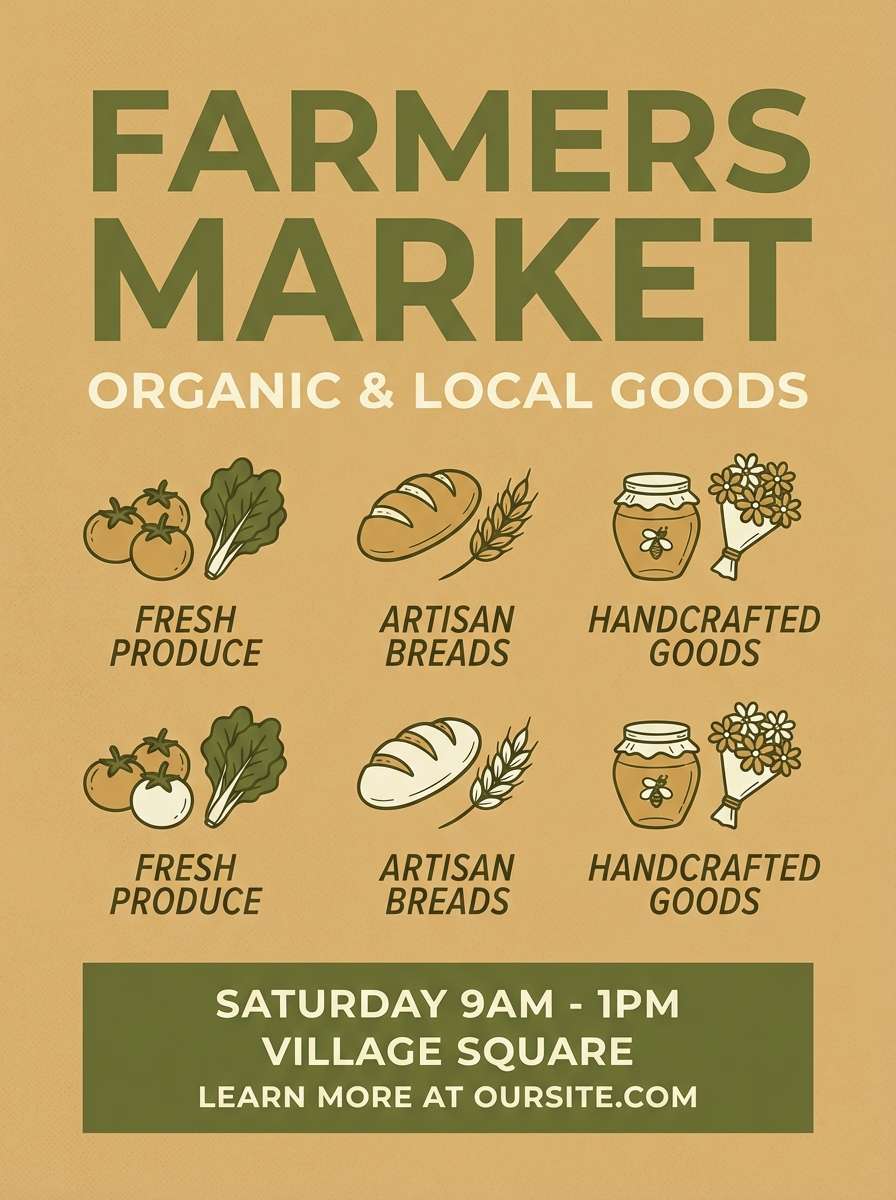
HEX: #2B4C3F #6C8C5A #C8C38E #E6D9B8 #F6F1E5
Mood: sunlit, natural, and friendly
Best for: farmers market flyer
Sunlit and friendly, it suggests tall reeds, dry grasses, and warm sandbars. The olive greens feel organic, while the wheat and cream tones keep the page inviting. Pair with hand-drawn icons or simple illustrations for a community-forward look. Usage tip: set the headline in deep green and use wheat as a broad background block behind vendor details.
Image example of reed and sandbar generated using media.io
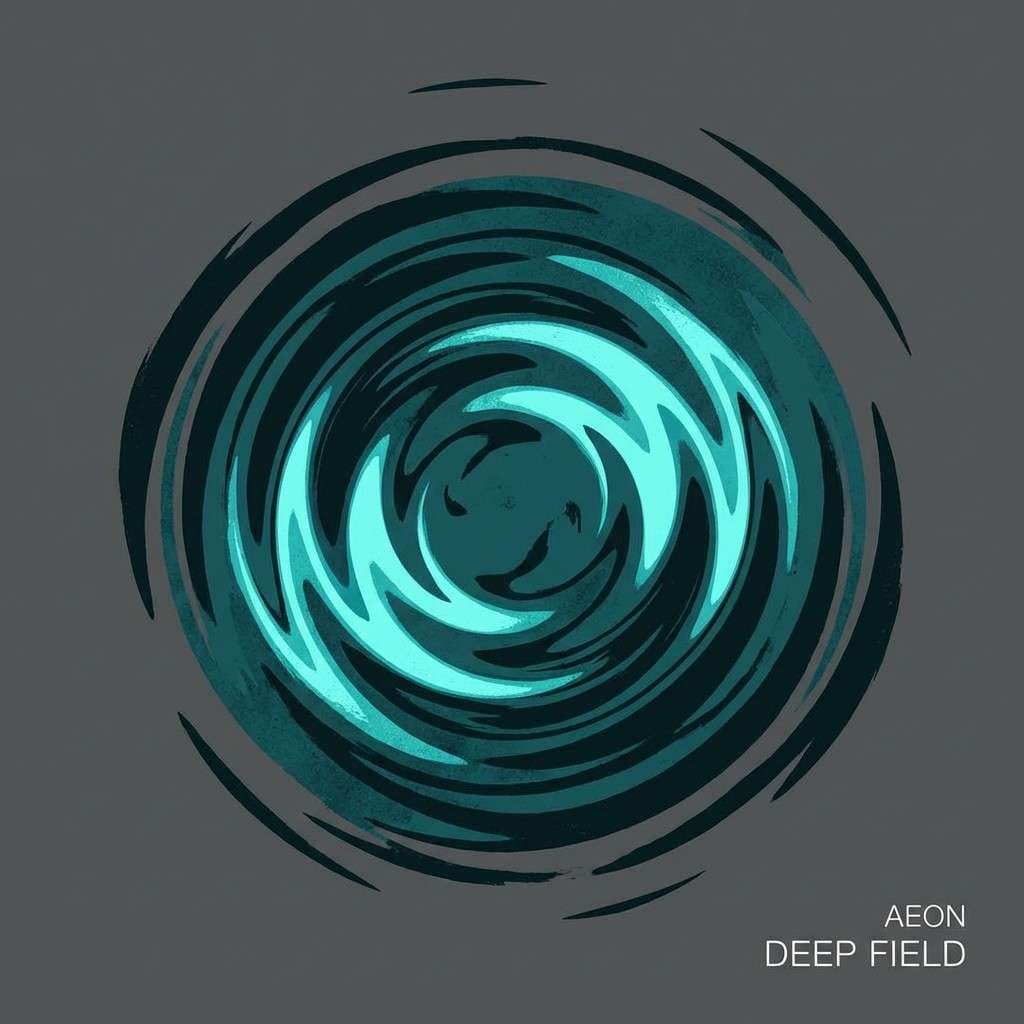
9) Deep Pool
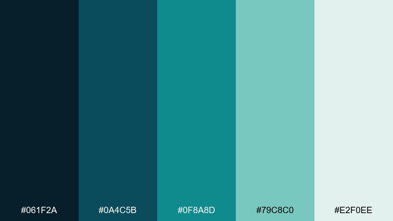
HEX: #061F2A #0A4C5B #0F8A8D #79C8C0 #E2F0EE
Mood: mysterious, cool, and sleek
Best for: music album cover artwork
Mysterious and sleek, it mirrors a deep pool where light fades into blue-green shadows. The near-black teal adds drama, while bright aqua and soft seafoam keep it luminous. Pair with minimal type and bold shapes for a modern cover that still feels atmospheric. Usage tip: keep the darkest tone for the background and let aqua form a single focal element.
Image example of deep pool generated using media.io
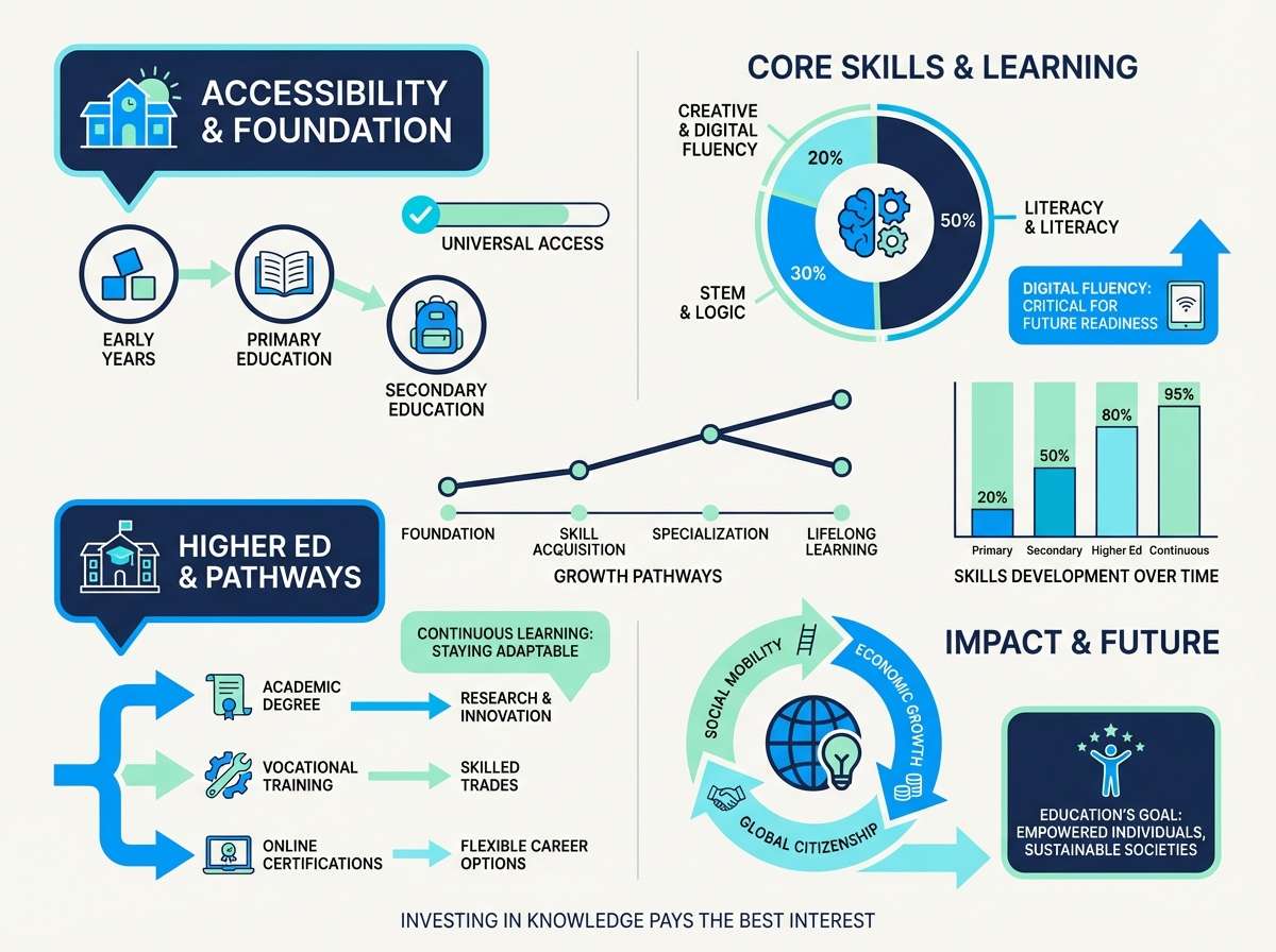
10) Spring Runoff
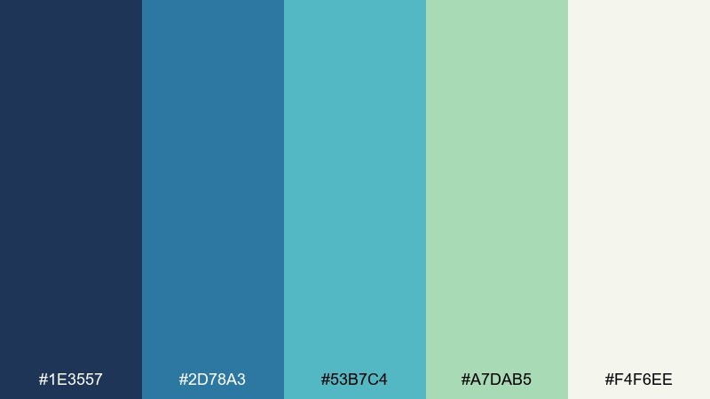
HEX: #1E3557 #2D78A3 #53B7C4 #A7DAB5 #F4F6EE
Mood: fresh, lively, and bright
Best for: education infographic
Fresh and lively, it captures quick runoff, bright skies, and new green along the banks. The blues keep data visuals clear, while the minty green adds an upbeat, positive tone. Pair with simple icons and generous spacing so the colors do the organizing work. Usage tip: assign one color per data category and repeat it consistently across charts and labels.
Image example of spring runoff generated using media.io
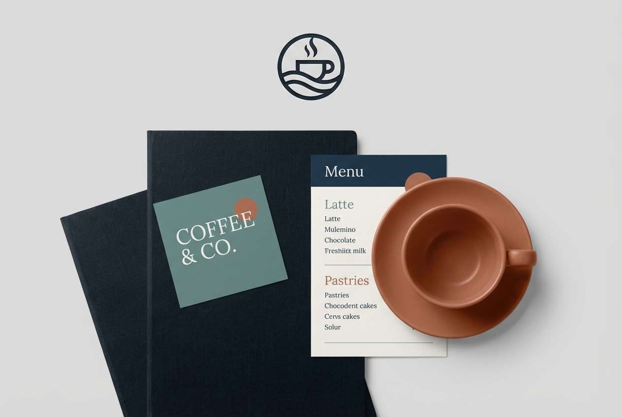
11) Urban Riverwalk
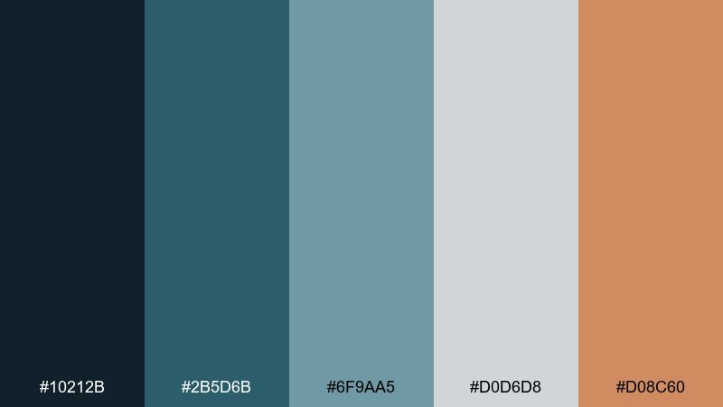
HEX: #10212B #2B5D6B #6F9AA5 #D0D6D8 #D08C60
Mood: contemporary, confident, and stylish
Best for: cafe brand identity
Contemporary and stylish, it feels like city water, concrete, and warm brick storefronts. The dark blue-black grounds logos, while muted teal and cool gray keep the system modern. A single terracotta accent turns the whole set more welcoming and food-friendly. Usage tip: for a strong river color combination, use terracotta on stamps, loyalty cards, and small highlight marks only.
Image example of urban riverwalk generated using media.io
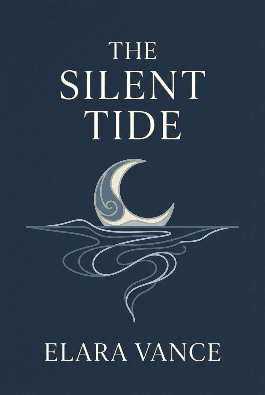
12) Moonlit Estuary
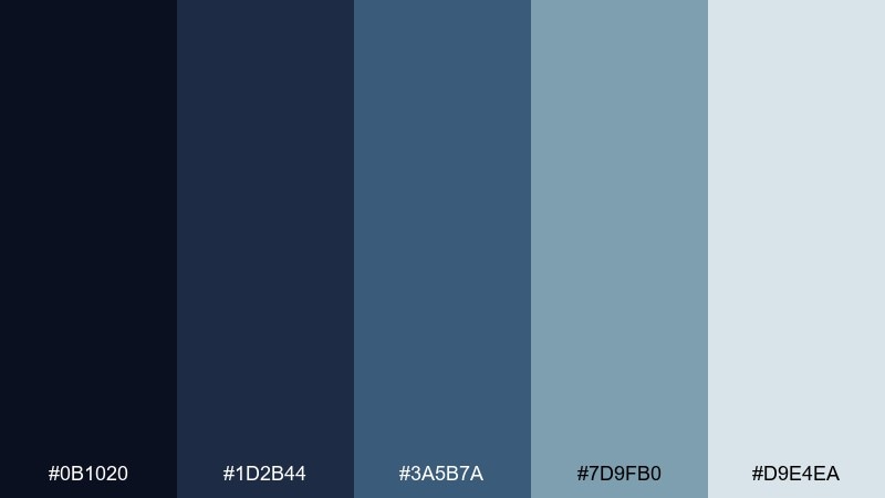
HEX: #0B1020 #1D2B44 #3A5B7A #7D9FB0 #D9E4EA
Mood: cinematic, quiet, and elegant
Best for: book cover design
Cinematic and quiet, it resembles moonlight on an estuary with layered blue shadows. The inky base makes titles feel dramatic, while dusty blue and pale mist add readability. Pair with serif typography and subtle grain for a literary, grown-up finish. Usage tip: keep the lightest tone behind text blocks so small type stays crisp.
Image example of moonlit estuary generated using media.io
13) Driftwood Cabin
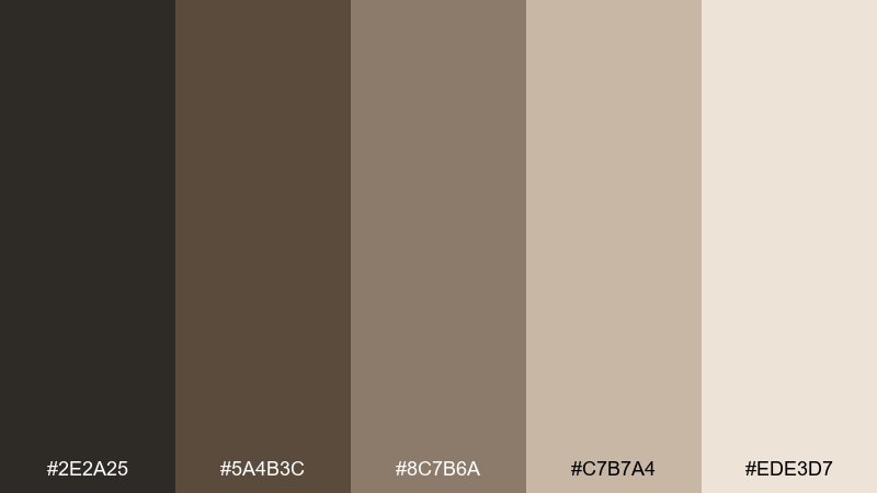
HEX: #2E2A25 #5A4B3C #8C7B6A #C7B7A4 #EDE3D7
Mood: rustic, warm, and comforting
Best for: interior design mood board
Rustic and comforting, it reads like driftwood, wet bark, and sun-warmed sand. The browns create a cozy foundation, while the light beige keeps the look airy and modern. Pair with linen textures, natural wood photography, and simple black type. Usage tip: use the darkest brown as a thin frame or divider to make the board feel curated.
Image example of driftwood cabin generated using media.io
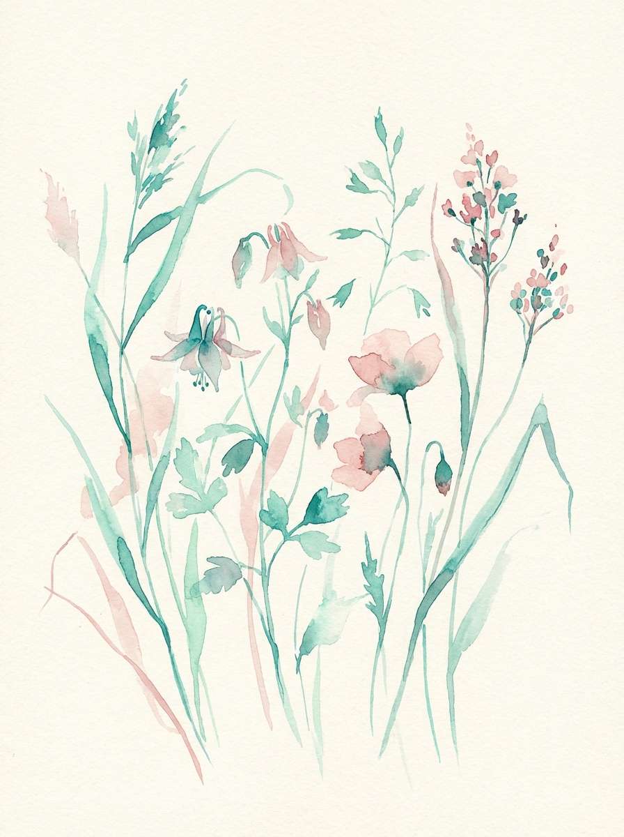
14) Wildflower Delta
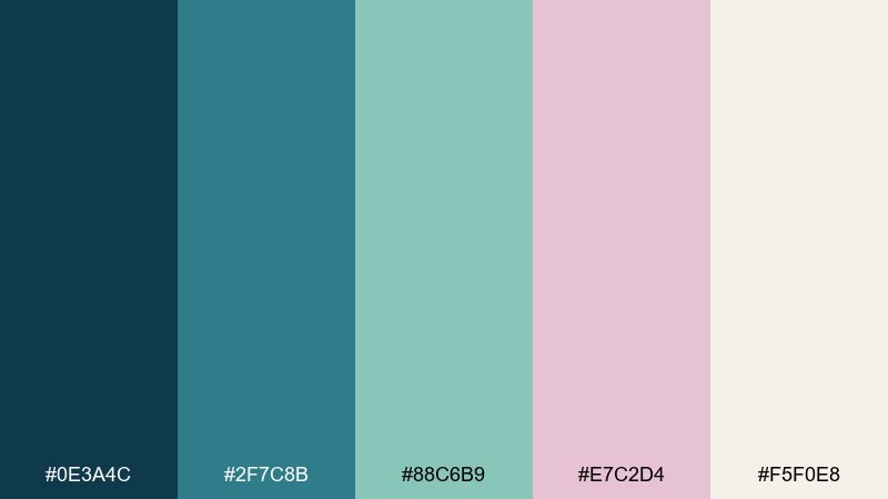
HEX: #0E3A4C #2F7C8B #88C6B9 #E7C2D4 #F5F0E8
Mood: playful, airy, and springlike
Best for: watercolor botanical illustration
Playful and springlike, it mixes cool water tones with a soft blush like wildflowers at the delta edge. Teal and mint keep the composition fresh, while pink adds a gentle, human warmth. Pair with light linework and plenty of negative space so the colors breathe. Usage tip: keep blush to petals and small accents, and let teal define stems and shadows.
Image example of wildflower delta generated using media.io
15) Stormwater Channel
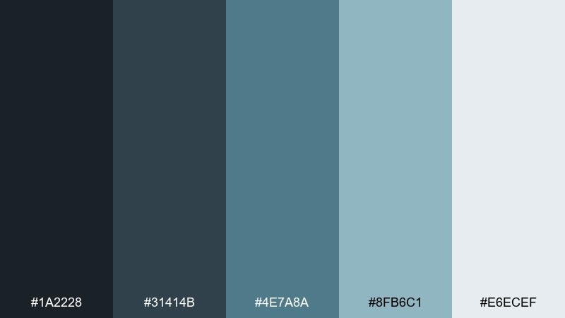
HEX: #1A2228 #31414B #4E7A8A #8FB6C1 #E6ECEF
Mood: serious, technical, and focused
Best for: data analytics web app
Serious and focused, it feels like rain-fed channels and overcast skies. The charcoal-to-slate range creates a strong hierarchy for dense dashboards, while the blue-gray adds clarity. Pair with thin borders, small type, and consistent spacing to avoid visual noise. Usage tip: use the lightest tone for cards and the mid blue-gray for selected states and trend lines.
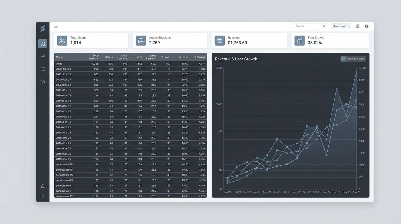
Image example of stormwater channel generated using media.io
16) Alpine Stream
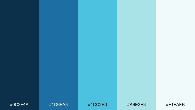
HEX: #0C2F4A #1D6FA3 #4CC2E0 #A9E3E8 #F1FAFB
Mood: bright, airy, and invigorating
Best for: sports event poster
Bright and invigorating, it evokes icy stream water and high-altitude skies. The saturated blues deliver instant energy, and the pale aqua keeps the layout feeling clean. Pair with bold typography and simple geometric shapes for fast readability at a distance. Usage tip: keep background near-white and use the two strongest blues for headline and date.
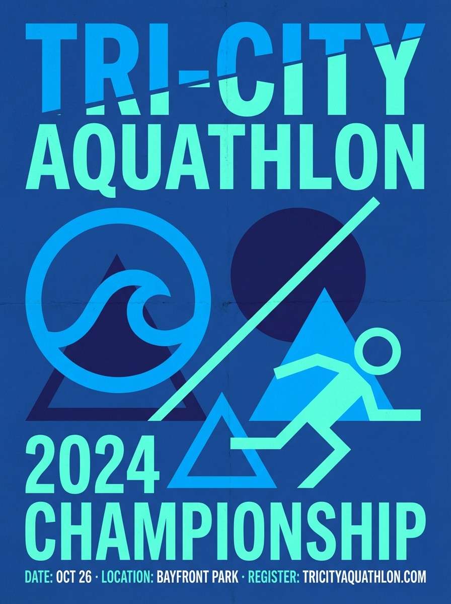
Image example of alpine stream generated using media.io
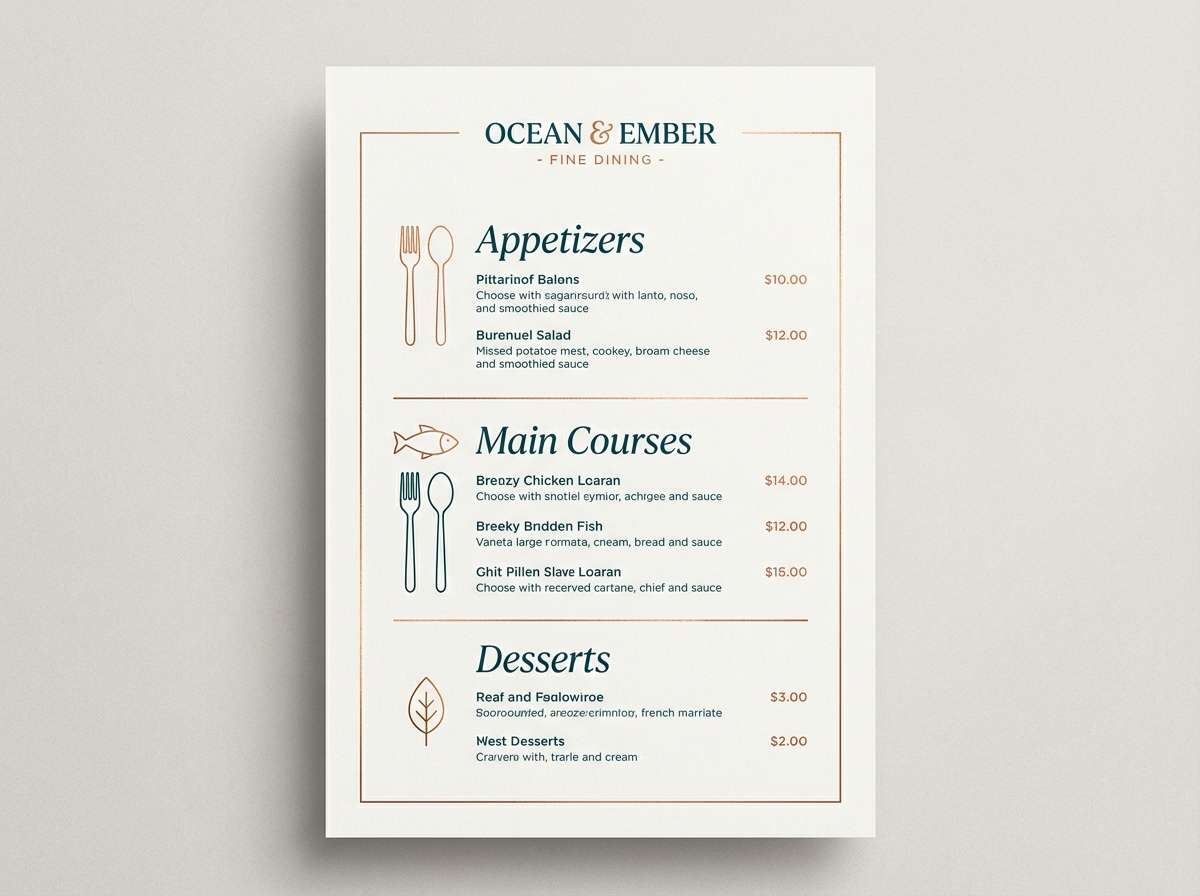
17) Copper Kelp
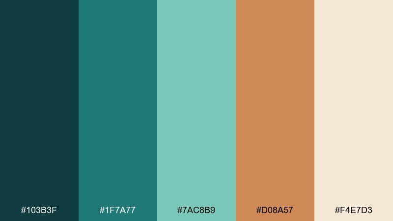
HEX: #103B3F #1F7A77 #7AC8B9 #D08A57 #F4E7D3
Mood: artisanal, rich, and inviting
Best for: restaurant menu design
Rich and inviting, it suggests dark water greens balanced by coppery highlights. The teal family feels fresh and coastal, while the warm orange-brown adds appetite and craft. Pair with cream paper backgrounds and elegant serif headings for a premium menu vibe. Usage tip: use copper for section dividers and special items, and keep body text in deep teal for contrast.
Image example of copper kelp generated using media.io
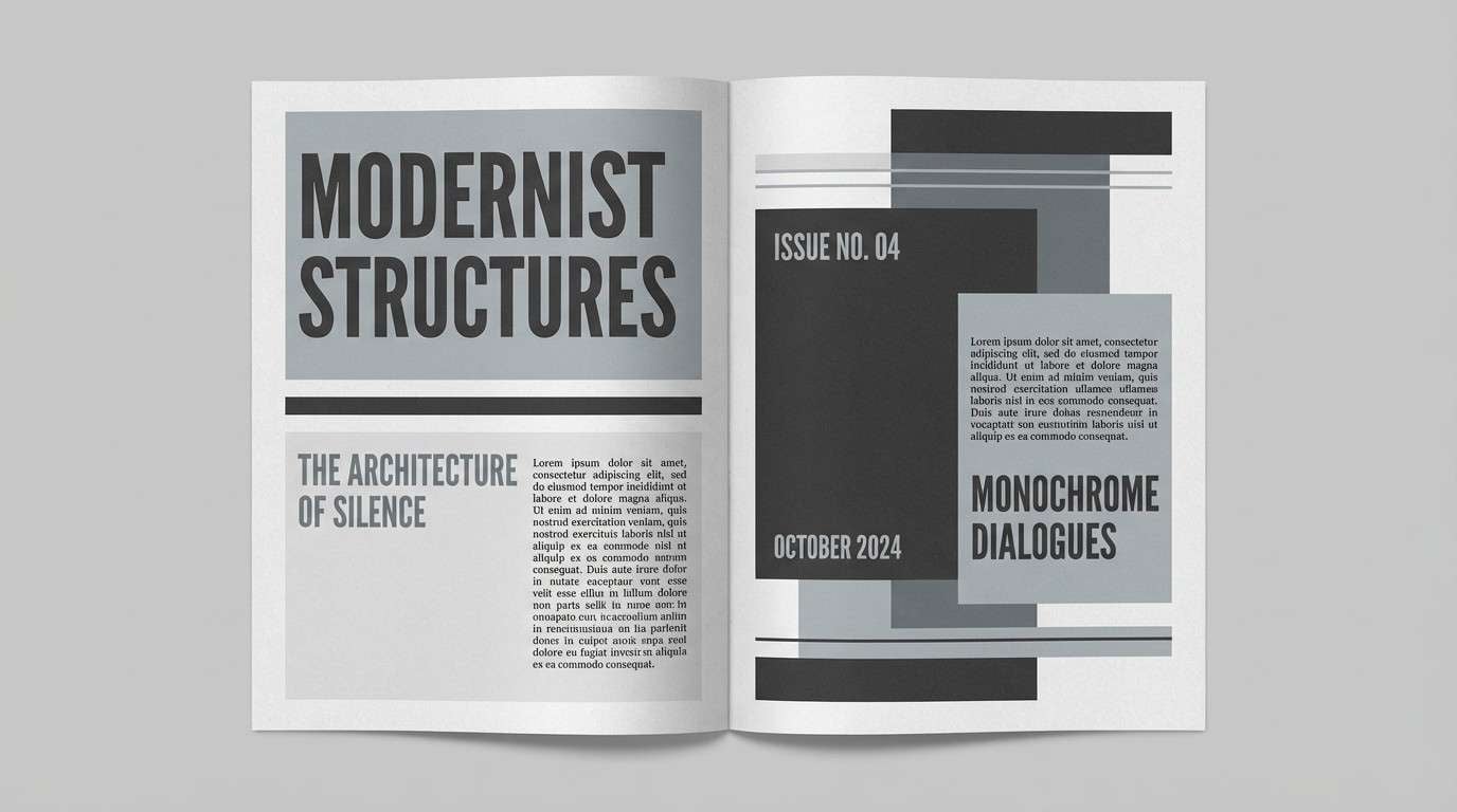
18) Foggy Weir
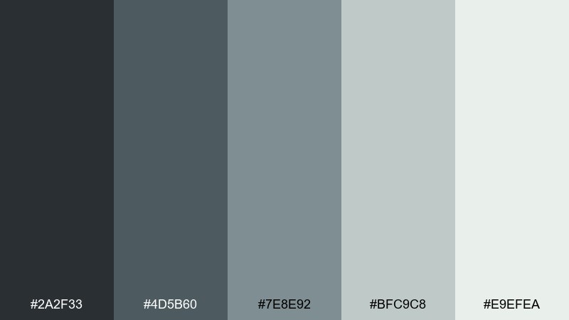
HEX: #2A2F33 #4D5B60 #7E8E92 #BFC9C8 #E9EFEA
Mood: minimal, muted, and sophisticated
Best for: editorial magazine layout
Muted and sophisticated, it echoes fog, concrete, and water spray near a weir. The grayscale range feels editorial and timeless, with enough contrast for clean typographic systems. Pair with one bold photo per spread and keep supporting elements subtle. Usage tip: set captions in the mid gray and use the near-black only for headlines to avoid harshness.
Image example of foggy weir generated using media.io
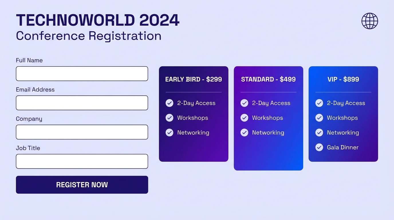
19) Indigo Confluence
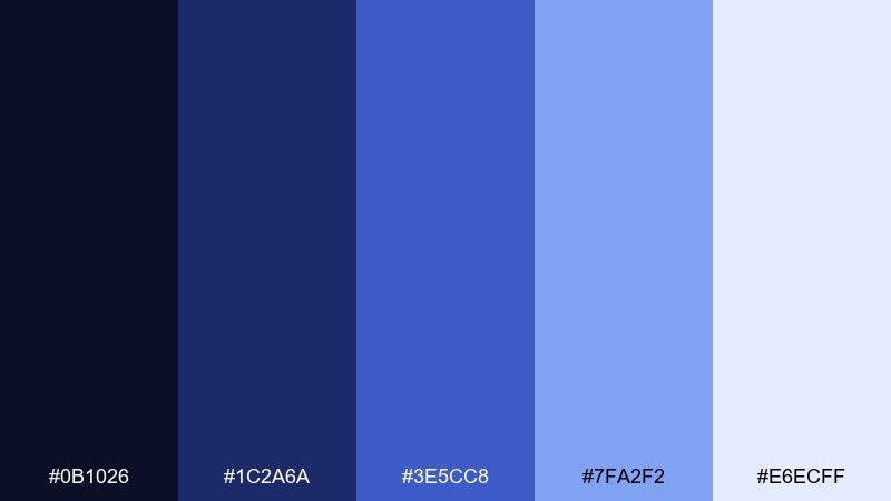
HEX: #0B1026 #1C2A6A #3E5CC8 #7FA2F2 #E6ECFF
Mood: bold, modern, and high-contrast
Best for: tech conference registration page
Bold and high-contrast, it feels like two currents meeting under a midnight sky. Indigo and electric blue create instant focus, while the pale periwinkle keeps forms readable. Pair with crisp sans-serif type and simple iconography to stay modern. Usage tip: keep the brightest blue for the primary action button and repeat it sparingly for links.
Image example of indigo confluence generated using media.io
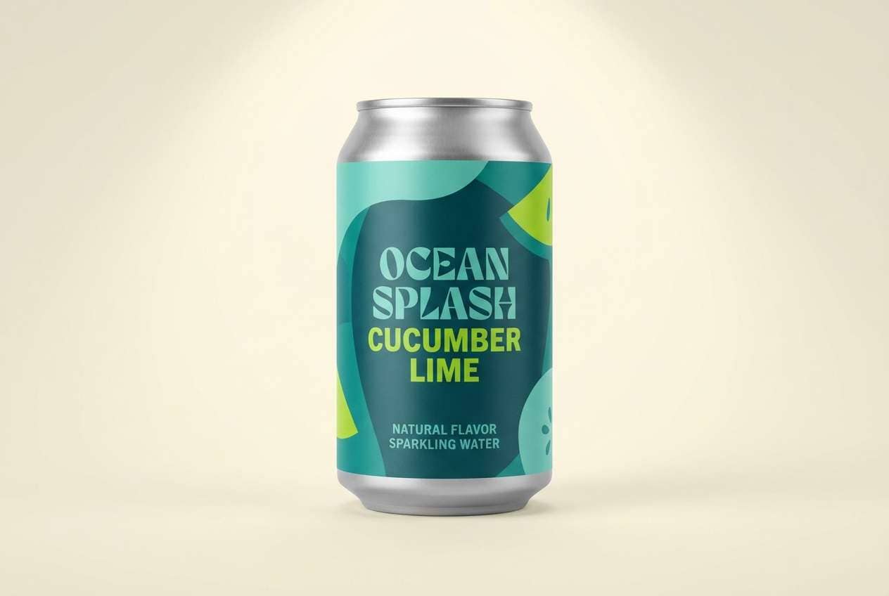
20) Tropical Backwater
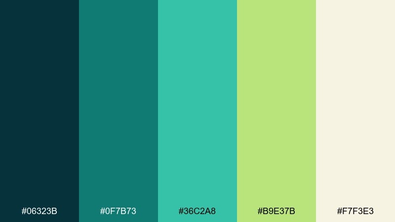
HEX: #06323B #0F7B73 #36C2A8 #B9E37B #F7F3E3
Mood: lush, vibrant, and upbeat
Best for: beverage can packaging
Lush and upbeat, it brings tropical water, bright leaves, and sunlit shallows to mind. Teal and minty aqua feel refreshing, while the lime-green pop adds a juicy twist. Pair with bold shapes and a clean cream background to keep it readable on shelves. Usage tip: let teal dominate the can body and use lime only for flavor cues and small graphics.
Image example of tropical backwater generated using media.io
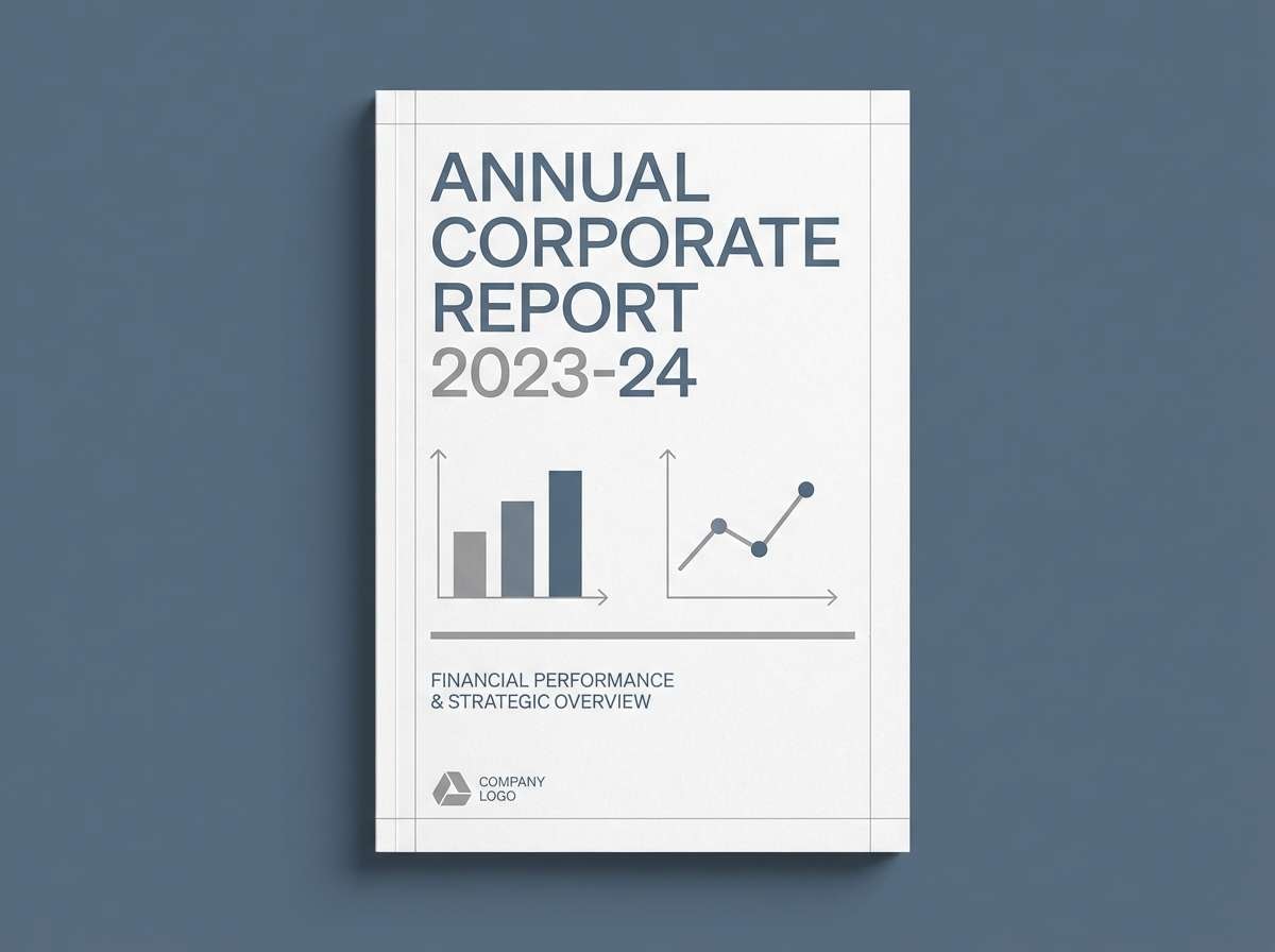
21) Riverstone Neutral
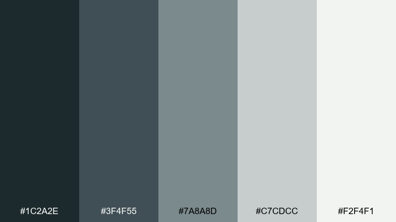
HEX: #1C2A2E #3F4F55 #7A8A8D #C7CDCC #F2F4F1
Mood: calm, neutral, and professional
Best for: corporate report template
Calm and professional, it recalls smooth riverstones and soft light reflecting off gray water. The dark slate supports strong headings, while the pale grays keep pages clean and readable. This river color palette is a safe pick for reports, proposals, and serious B2B decks. Usage tip: use the mid gray for charts and keep the darkest tone for section titles only.
Image example of riverstone neutral generated using media.io
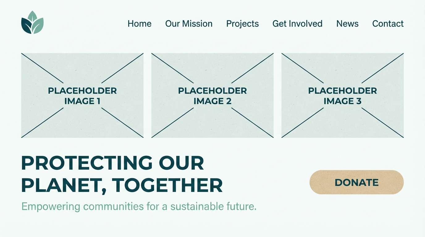
22) Braided Channel
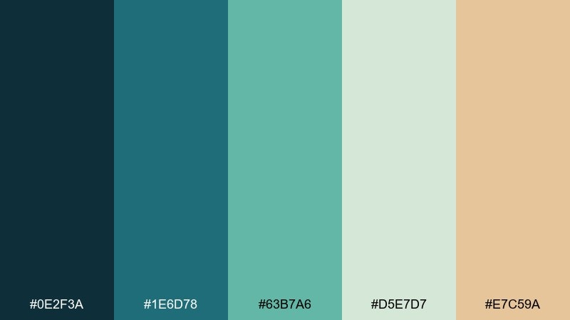
HEX: #0E2F3A #1E6D78 #63B7A6 #D5E7D7 #E7C59A
Mood: natural, balanced, and versatile
Best for: eco nonprofit website homepage
Natural and versatile, it feels like braided channels weaving through reeds and sand. Teal and seafoam build a friendly foundation, and the warm sand accent keeps the design human. These river color combinations work well with nature photography, soft gradients, and simple navigation. Usage tip: use sand as a subtle highlight behind donation CTAs so they stand out without shouting.
Image example of braided channel generated using media.io
What Colors Go Well with River?
River tones pair best with grounded neutrals: stone gray, slate, warm ivory, and sand. These colors keep the “water” hues from feeling too cold, especially in print and brand identity work.
For contrast, use deep navy/charcoal for text and structure, then add one warm accent (terracotta, clay, copper, peach) to create a focal point without breaking the calm.
If you want a modern UI feel, combine river teals with near-white backgrounds and restrained cool grays; if you want a natural brand vibe, mix them with olive greens and uncoated paper-like off-whites.
How to Use a River Color Palette in Real Designs
Start with roles, not just colors: pick one darkest tone for headings/navigation, one mid-tone for primary UI elements, one light tone for surfaces, and one warm accent for CTA or highlights.
In charts and dashboards, keep data colors consistent across pages and reserve the brightest aqua/blue for the most important series. This reduces cognitive load and makes the interface feel “flowing” rather than noisy.
For branding and print, lean on texture-friendly neutrals (cream, sand, stone) and use teals/blues in blocks, borders, or illustrations—then add a small warm highlight to guide attention.
Create River Palette Visuals with AI
If you already have HEX codes, the fastest way to validate a river palette is to generate a few realistic mockups—UI screens, posters, packaging, or covers—and compare readability and mood in context.
With Media.io, you can turn a simple prompt into on-brand visuals, then iterate quickly by adjusting the accent color (sand vs. terracotta vs. copper) or shifting the base tone (navy vs. teal).
Use the sample prompts above as templates: swap the subject (dashboard, label, flyer) and keep the palette keywords consistent to get cohesive variations.
River Color Palette FAQs
-
What is a river color palette?
A river color palette is a set of water-inspired hues (navy, teal, aqua, blue-gray) balanced with natural neutrals like stone, sand, foggy gray, or warm off-white for harmony and readability. -
Which river colors are best for UI design?
Deep navy/charcoal for navigation and text, a mid teal for primary actions, and very light seafoam or off-white for surfaces usually work best. Add one warm accent (sand/copper/terracotta) for key highlights. -
How do I keep river palettes from looking too cold?
Introduce a warm neutral (ivory, sand, beige) and limit pure grays. Even a small warm accent used sparingly can make teal-and-blue systems feel more welcoming. -
What’s a good accent color for teal river tones?
Terracotta, clay, copper, peach, and sandy beige all pair well with teal. Choose one accent and use it for CTAs, badges, or key callouts to avoid visual clutter. -
Are river palettes good for branding?
Yes—river palettes signal calm, trust, and nature. They’re popular for wellness, sustainability, SaaS, education, finance, and hospitality brands because they feel clean and credible. -
How many colors should I use from a river palette?
In most real designs, 3–4 is enough: one dark anchor, one mid primary, one light background, and optionally one accent. Keep the fifth color as a reserve for special states or secondary sections. -
Can I generate river palette mockups automatically?
Yes. You can use Media.io’s text-to-image tool to generate posters, UI screens, packaging, and brand scenes using prompts that specify your river tones and overall style.
Next: Black Hole Color Palette