

A black hole color palette is all about ultra-deep neutrals, shadowy midtones, and a few “cosmic” accents that pop like distant starlight.
Use these combinations for branding, posters, packaging, and UI—anywhere you want high contrast, modern mood, and a premium feel without relying on loud neon.
In this article
Why Black Hole Palettes Work So Well
Black hole palettes create instant hierarchy: deep near-blacks become the canvas, smoky midtones build structure, and a single accent color can carry all your interaction states or focal points.
They also feel premium by default. Dark neutrals read as cinematic, modern, and minimal—great for brands that want confidence without clutter.
Most importantly, these schemes are flexible. You can lean colder (navy, teal, slate) for tech and finance, or warmer (bronze, cocoa, sand) for hospitality and product packaging.
20+ Black Hole Color Palette Ideas (with HEX Codes)
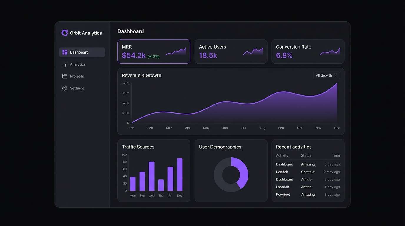
1) Event Horizon
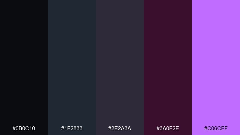
HEX: #0b0c10 #1f2833 #2e2a3a #3a0f2e #c06cff
Mood: intense, cinematic, futuristic
Best for: dark mode SaaS dashboard UI
Intense and cinematic, these tones feel like starlight getting pulled into a velvet void. It works beautifully for dark mode dashboards where contrast and hierarchy matter. Pair the violet highlight with soft gray typography and keep the near-black as your primary canvas. For a clean black hole color combination, reserve the bright accent for active states and key metrics only.
Image example of event horizon generated using media.io
Media.io is an online AI studio for creating and editing video, image, and audio in your browser.

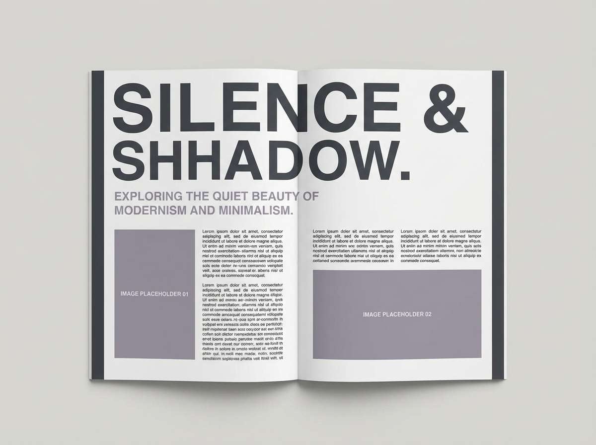
2) Singularity Smoke
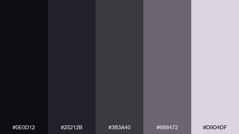
HEX: #0e0d12 #25212b #3b3a40 #6b6472 #d9d4df
Mood: quiet, smoky, minimal
Best for: editorial magazine layout
Quiet and smoky, this mix evokes graphite shadows and soft cosmic haze. It shines in editorial layouts where you want the page to feel premium without going fully black. Pair it with crisp white margins and keep imagery desaturated for a cohesive spread. Tip: use the light lavender-gray for pull quotes to guide scanning.
Image example of singularity smoke generated using media.io
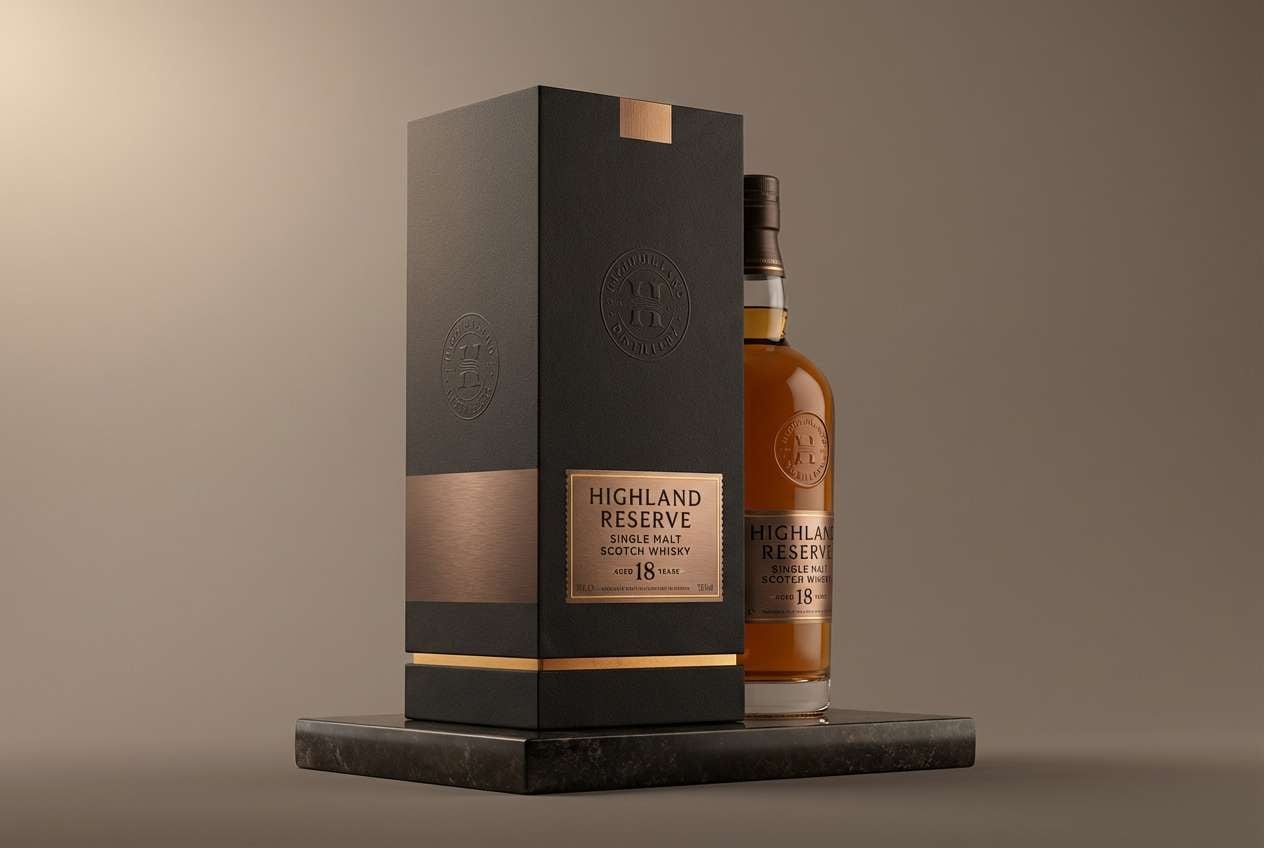
3) Accretion Glow
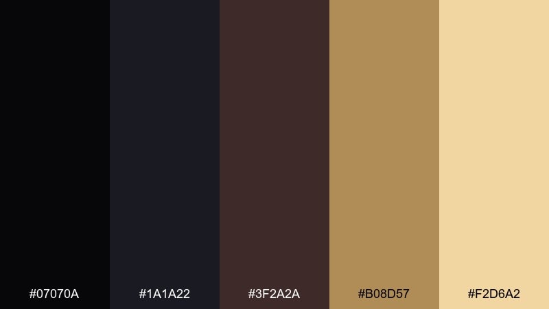
HEX: #07070a #1a1a22 #3f2a2a #b08d57 #f2d6a2
Mood: warm, dramatic, luxe
Best for: premium whiskey packaging
Warm and dramatic, it suggests a ring of light circling a deep shadow. The bronze and honey notes add instant luxury for spirits, coffee, or specialty foods. Pair with matte black stock and subtle foil details to amplify the glow. Tip: keep the gold tones to logos and seals so the design stays refined.
Image example of accretion glow generated using media.io
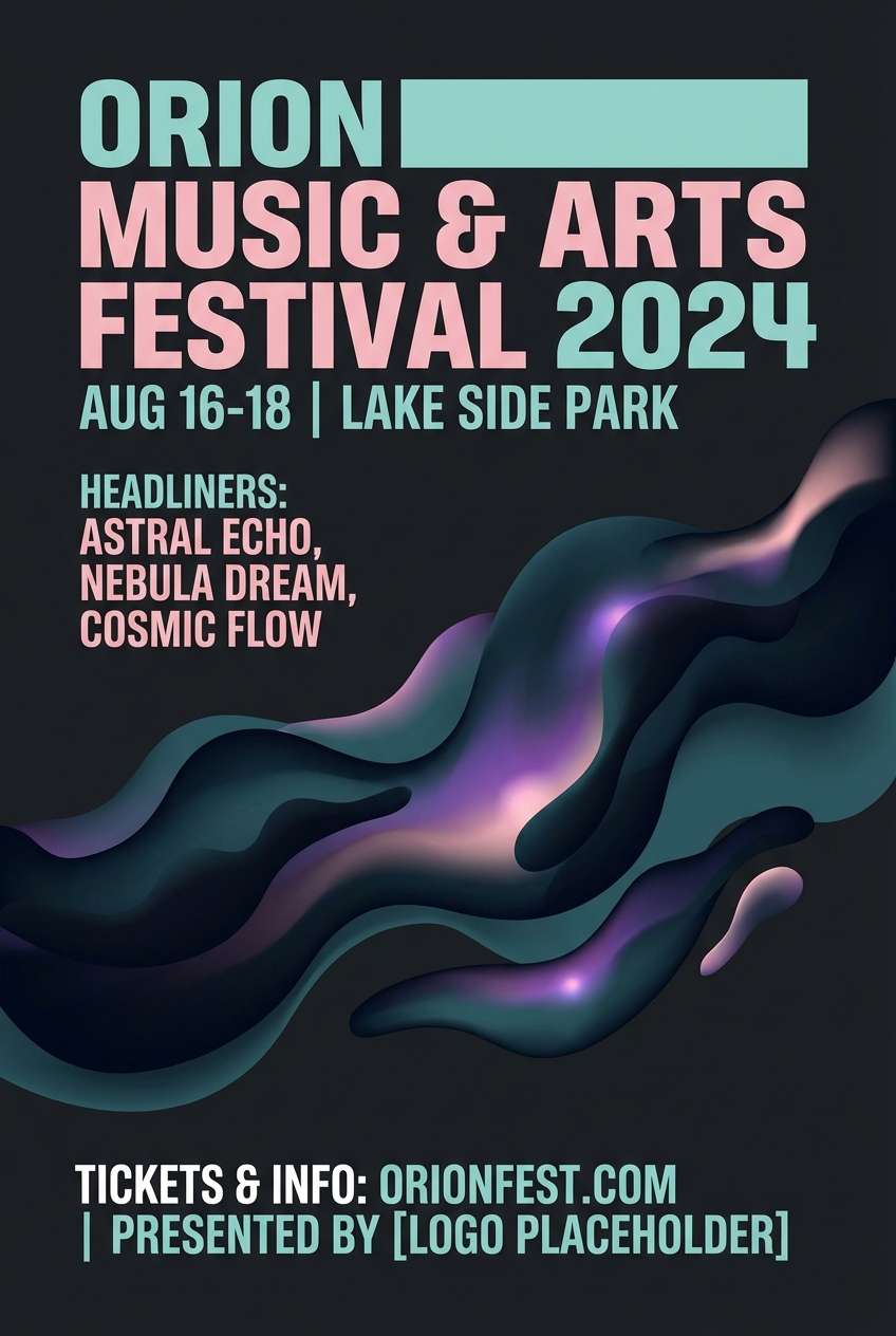
4) Nebula Dust
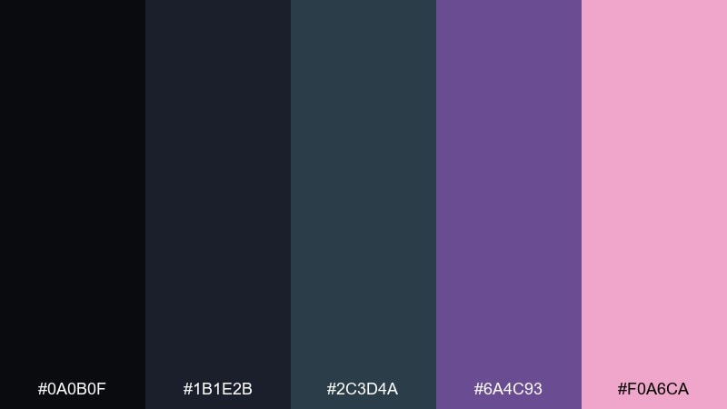
HEX: #0a0b0f #1b1e2b #2c3d4a #6a4c93 #f0a6ca
Mood: dreamy, cosmic, playful
Best for: music festival poster design
Dreamy and cosmic, these shades feel like colored dust drifting through deep space. It is a strong fit for posters that need energy without harsh neon. Pair the pink haze with bold sans-serif type and keep backgrounds in the blue-black range for legibility. Tip: use a soft gradient between purple and pink to add depth without clutter.
Image example of nebula dust generated using media.io
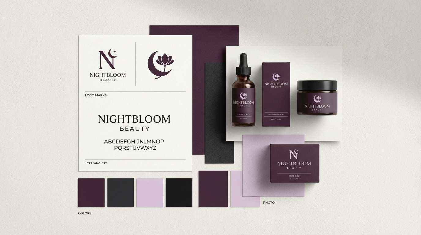
5) Void Plum
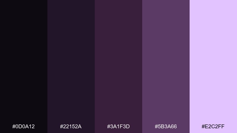
HEX: #0d0a12 #22152a #3a1f3d #5b3a66 #e2c2ff
Mood: mysterious, elegant, nocturnal
Best for: beauty brand identity
Mysterious and nocturnal, it reads like plum velvet under low light. These tones work well for beauty branding where you want sophistication with a hint of fantasy. Pair with minimalist line art and plenty of negative space to keep it modern. Tip: set the light lilac as a secondary background for social templates and product callouts.
Image example of void plum generated using media.io
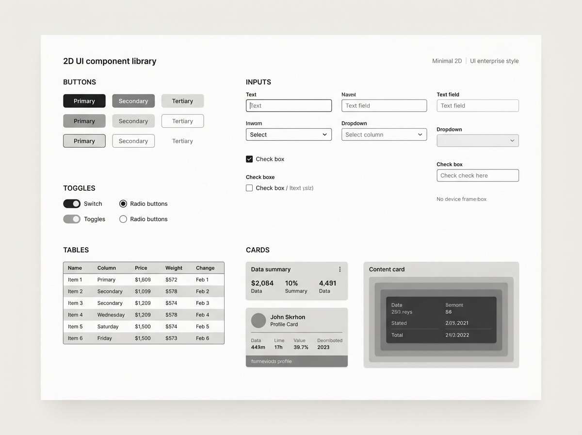
6) Quantum Ash
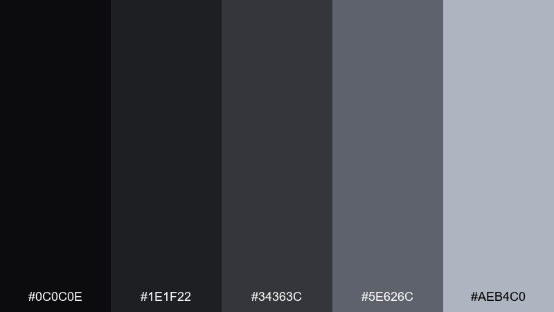
HEX: #0c0c0e #1e1f22 #34363c #5e626c #aeb4c0
Mood: technical, calm, modern
Best for: enterprise app UI components
Technical and calm, this set feels like brushed metal and clean lab surfaces. It is ideal for component libraries where consistent neutrals keep the interface focused. Pair with a single bright accent color from your brand to avoid a flat look. Tip: use the mid-gray for borders and dividers so cards separate without heavy lines.
Image example of quantum ash generated using media.io
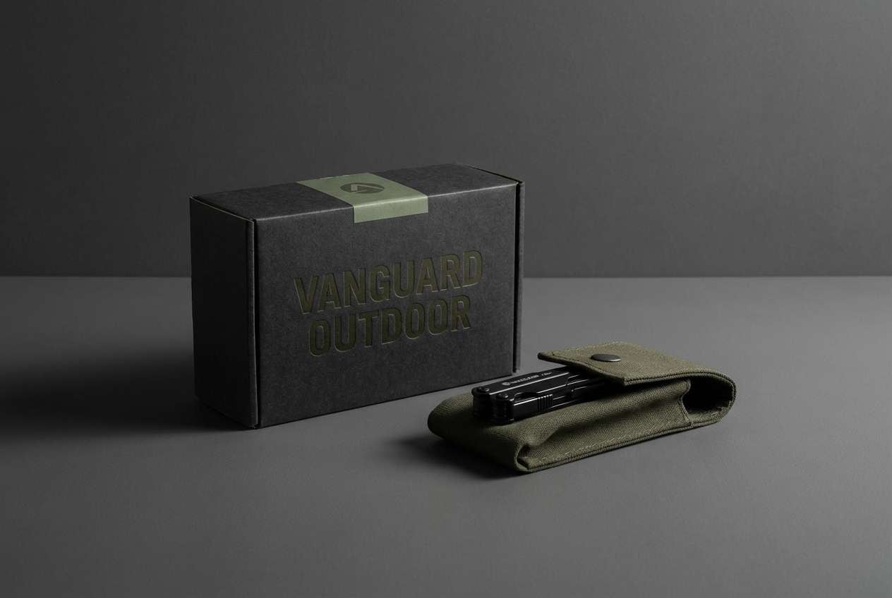
7) Darkmatter Olive
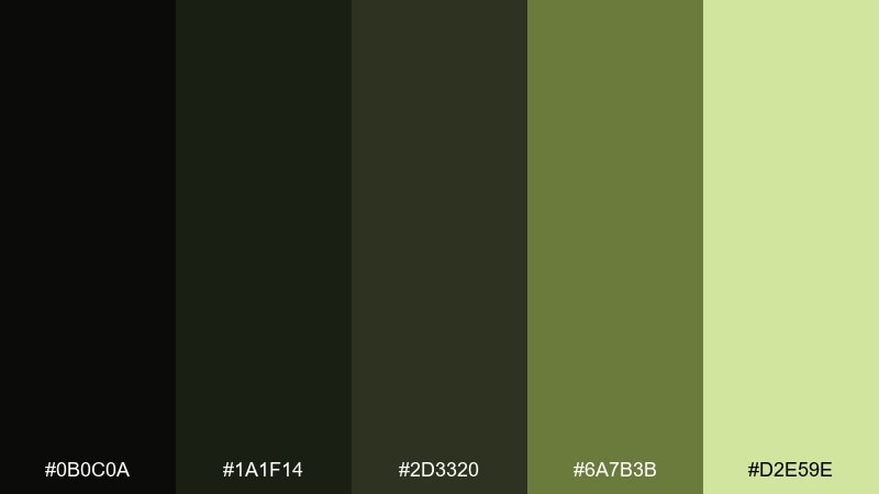
HEX: #0b0c0a #1a1f14 #2d3320 #6a7b3b #d2e59e
Mood: earthy, stealthy, modern
Best for: outdoor gear product ad
Earthy and stealthy, the olive tones feel like night hiking under a dim sky. It is a smart choice for outdoor brands that want rugged confidence without loud color. Pair with crisp black typography and textured materials like canvas or recycled paper. Tip: use the pale green only for small badges and feature icons to keep it grounded.
Image example of darkmatter olive generated using media.io
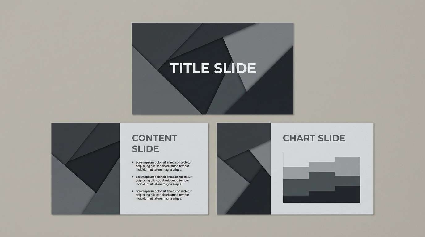
8) Lunar Charcoal
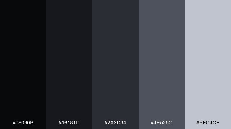
HEX: #08090b #16181d #2a2d34 #4e525c #bfc4cf
Mood: clean, understated, professional
Best for: corporate slide deck template
Clean and understated, it evokes moon rock and soft shadow. These neutrals are dependable for corporate decks where readability and polish matter. Pair with one saturated brand color for charts, and keep backgrounds mostly in the darkest two values. Tip: use the light gray for section breaks so slides feel structured without heavy blocks.
Image example of lunar charcoal generated using media.io
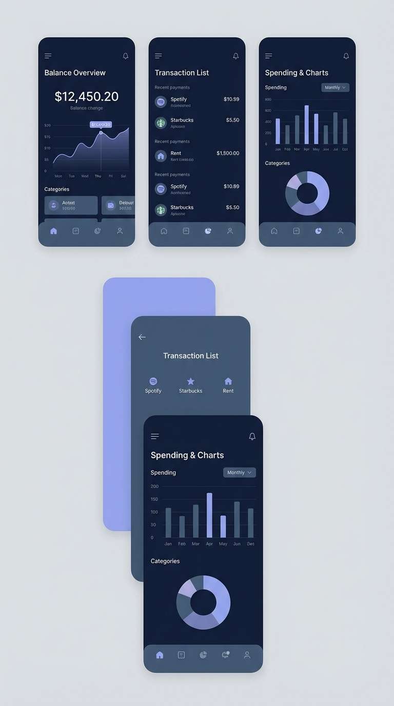
9) Gravity Well
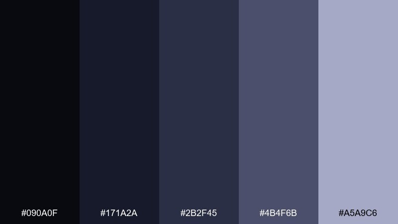
HEX: #090a0f #171a2a #2b2f45 #4b4f6b #a5a9c6
Mood: cool, focused, sleek
Best for: fintech mobile app UI
Cool and focused, these blues feel like deep orbit and controlled momentum. They are great for fintech interfaces where trust and clarity are essential. Pair with clean icons and generous spacing, then reserve the pale periwinkle for highlights and totals. Tip: keep charts in two tones max to avoid visual noise on small screens.
Image example of gravity well generated using media.io
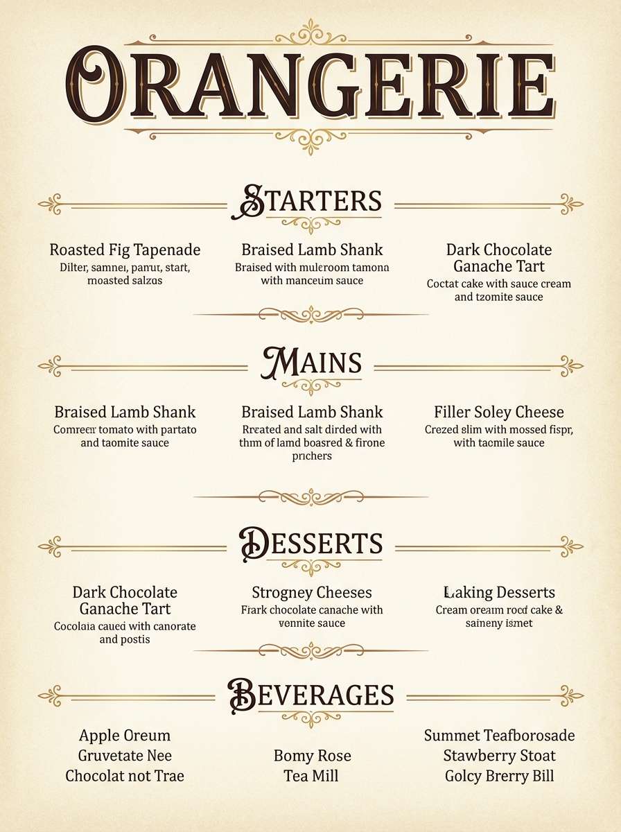
10) Eclipse Bronze
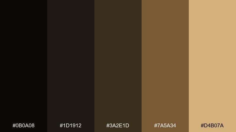
HEX: #0b0a08 #1d1912 #3a2e1d #7a5a34 #d4b07a
Mood: heritage, upscale, grounded
Best for: restaurant menu design
Heritage and upscale, the browns and bronze read like candlelight against dark stone. It fits menus and hospitality branding that want warmth without looking rustic. Pair with serif headings and subtle line dividers for an old-world feel. Tip: use the light bronze sparingly on prices or section labels to guide the eye.
Image example of eclipse bronze generated using media.io
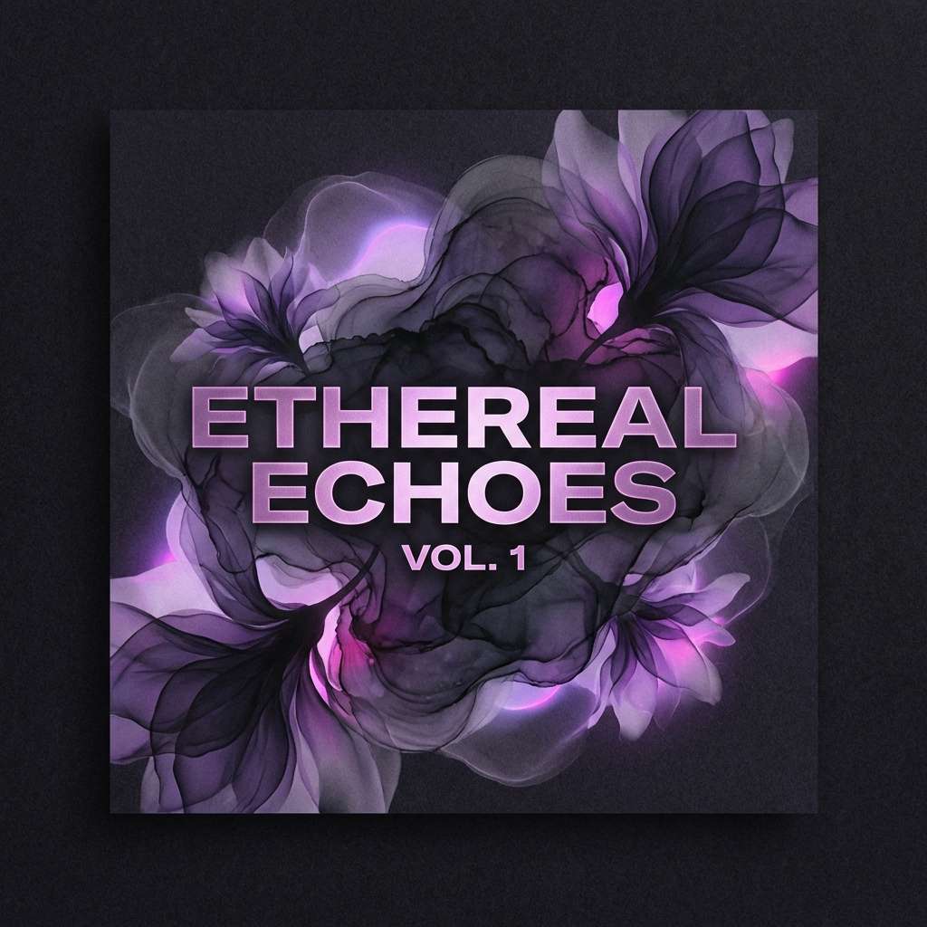
11) Midnight Orchid
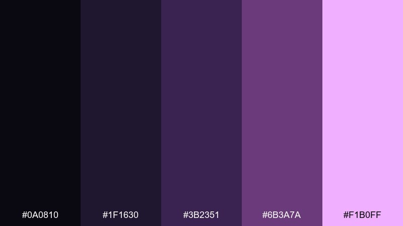
HEX: #0a0810 #1f1630 #3b2351 #6b3a7a #f1b0ff
Mood: romantic, bold, electric
Best for: album cover artwork
Romantic and electric, it feels like neon petals blooming in the dark. The mix is perfect for album covers that need drama and a crisp focal point. Pair the orchid highlight with tight, high-contrast typography and keep the background nearly black for impact. For bold black hole color combinations, let the bright lilac sit on edges and glows rather than filling large areas.
Image example of midnight orchid generated using media.io
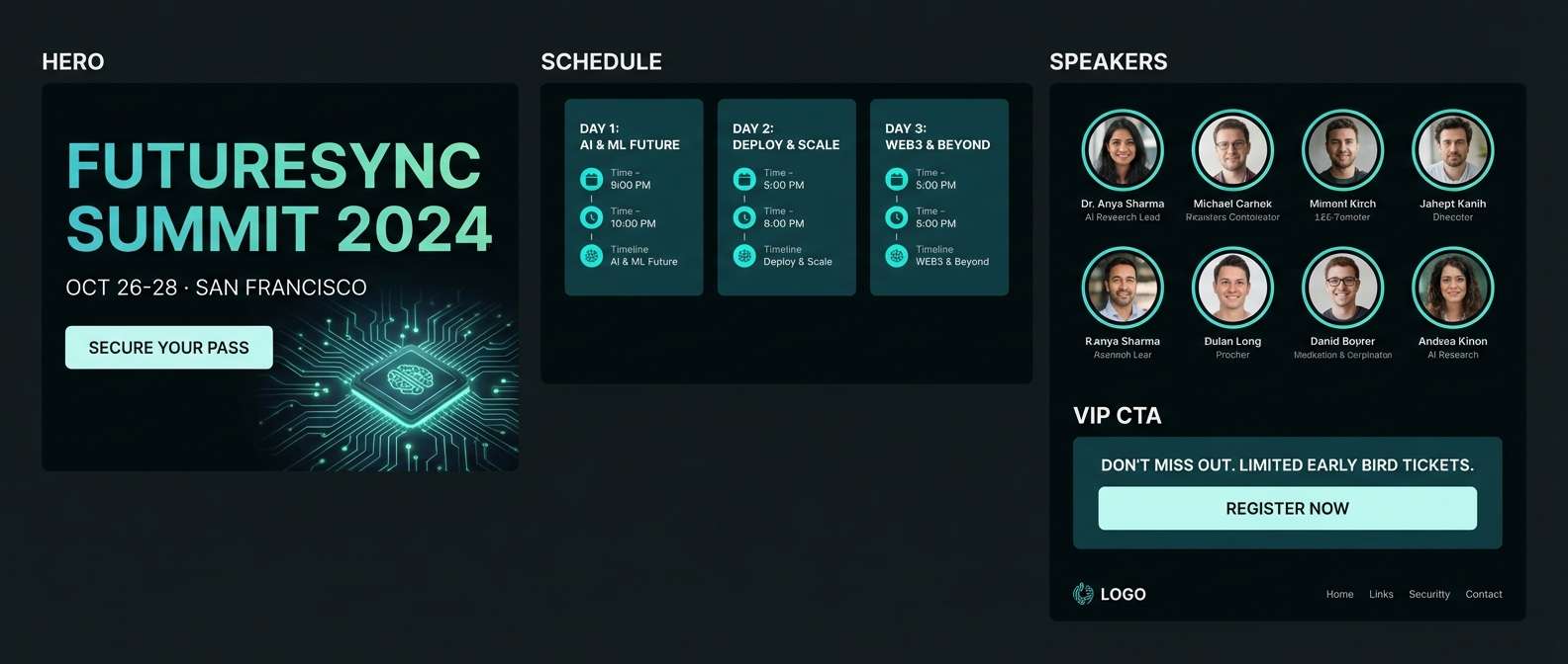
12) Deep Space Teal
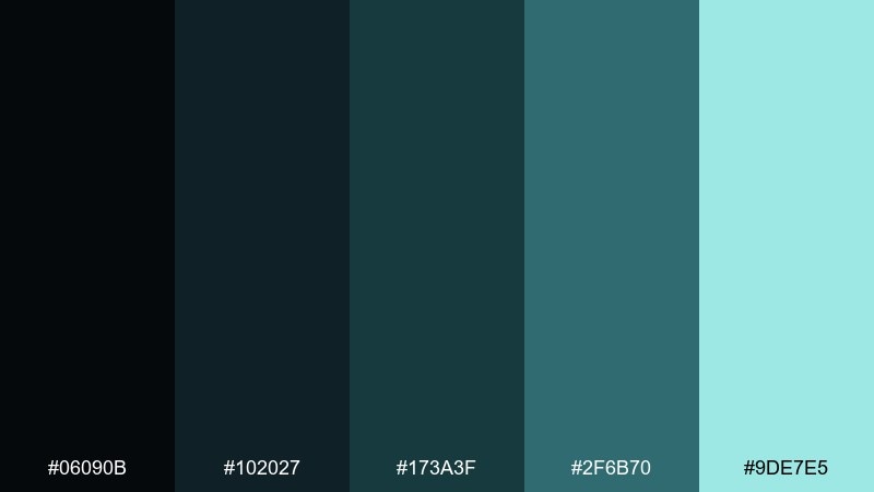
HEX: #06090b #102027 #173a3f #2f6b70 #9de7e5
Mood: fresh, sci-fi, crisp
Best for: tech conference landing page UI
Fresh and sci-fi, the teal reads like instrument lights on a quiet ship. It is excellent for landing pages that need a modern edge while staying readable. Pair with white or very light gray type and use the pale aqua for CTAs and key links. Tip: keep gradients subtle so the page feels sleek, not neon.
Image example of deep space teal generated using media.io
13) Cosmic Cocoa
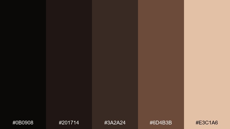
HEX: #0b0908 #201714 #3a2a24 #6d4b3b #e3c1a6
Mood: cozy, artisanal, rich
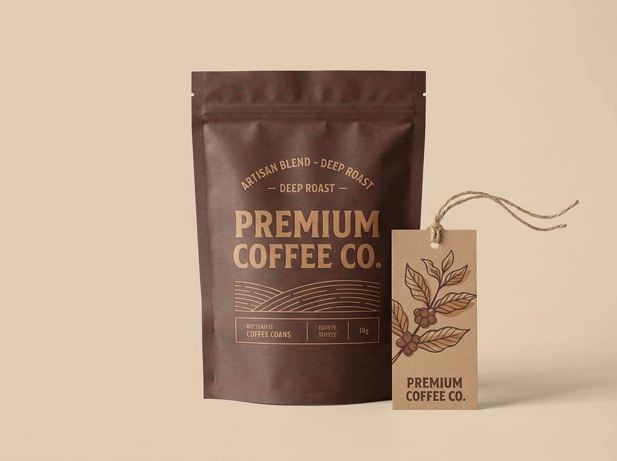
Best for: coffee brand packaging
Cozy and rich, these browns evoke roasted beans and late-night warmth. They are made for coffee packaging and labels where authenticity matters. Pair with cream stock, tactile textures, and simple iconography for a craft feel. Tip: use the light latte tone for background panels so copy stays easy to read.
Image example of cosmic cocoa generated using media.io
14) Shadow Iris
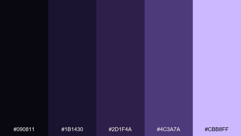
HEX: #090811 #1b1430 #2d1f4a #4c3a7a #cbb8ff
Mood: mysterious, refined, creative
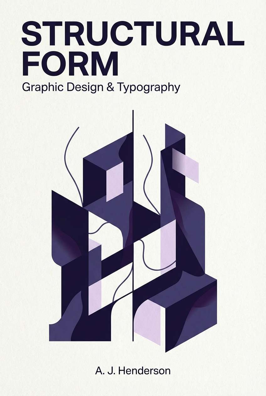
Best for: book cover design
Mysterious and refined, it suggests ink shadows with a soft iris glow. It works well for fiction covers, especially fantasy and literary sci-fi. Pair with minimal illustration and high-contrast type to keep the cover sharp at thumbnail size. Tip: place the pale lavender behind the title to boost legibility without a harsh box.
Image example of shadow iris generated using media.io
15) Stellar Soot
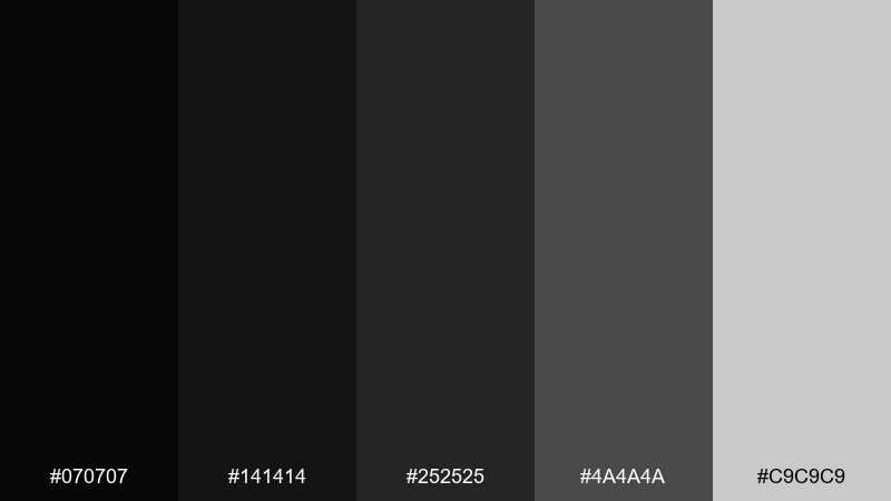
HEX: #070707 #141414 #252525 #4a4a4a #c9c9c9
Mood: neutral, bold, timeless
Best for: monochrome logo system
Neutral and timeless, the grayscale range feels like soot, steel, and clean type. It is a reliable foundation for logos that must work in every context. Pair with one signature accent color when needed, but keep the core marks in pure monochrome. Tip: test your logo at tiny sizes using the mid-gray to avoid over-inking.
Image example of stellar soot generated using media.io
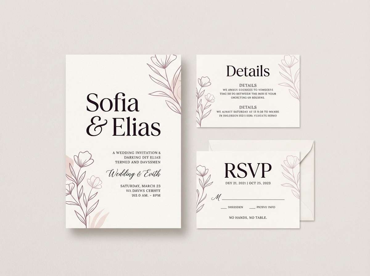
16) Phantom Mauve
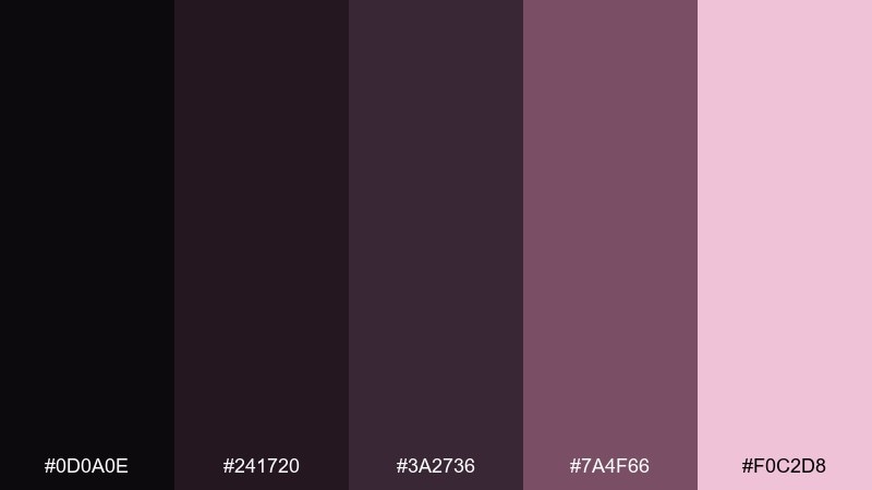
HEX: #0d0a0e #241720 #3a2736 #7a4f66 #f0c2d8
Mood: soft, moody, romantic
Best for: wedding invitation suite
Soft and moody, it feels like dried roses in a dim gallery. This set suits wedding stationery that aims for romance without being overly sweet. Pair with thin serif type and delicate linework, letting the blush tone carry the airy moments. Tip: print the darkest shade as text and use mauve for borders to keep everything readable.
Image example of phantom mauve generated using media.io
17) Riftstone
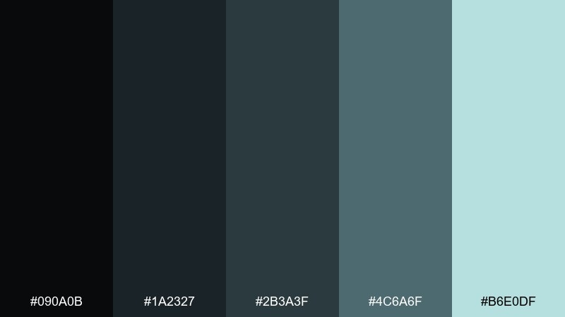
HEX: #090a0b #1a2327 #2b3a3f #4c6a6f #b6e0df
Mood: cool, natural, balanced
Best for: spa website redesign
Cool and balanced, these tones evoke smooth stone, steam, and quiet water. They are a natural fit for spa and wellness sites that want calm sophistication. Pair with soft photography, rounded UI elements, and plenty of breathing room. Tip: use the pale mint as a background wash behind booking sections and CTAs.
Image example of riftstone generated using media.io
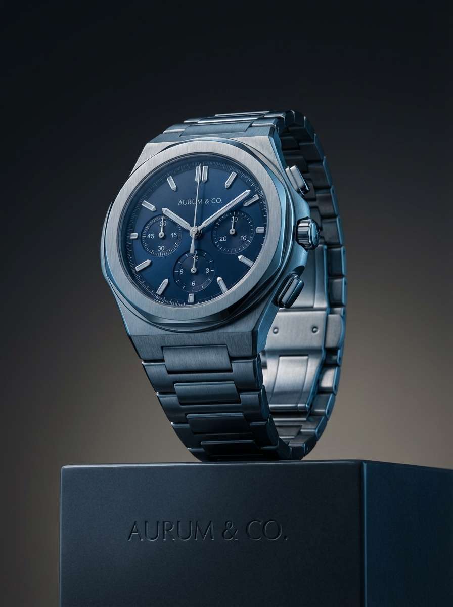
18) Black Pearl
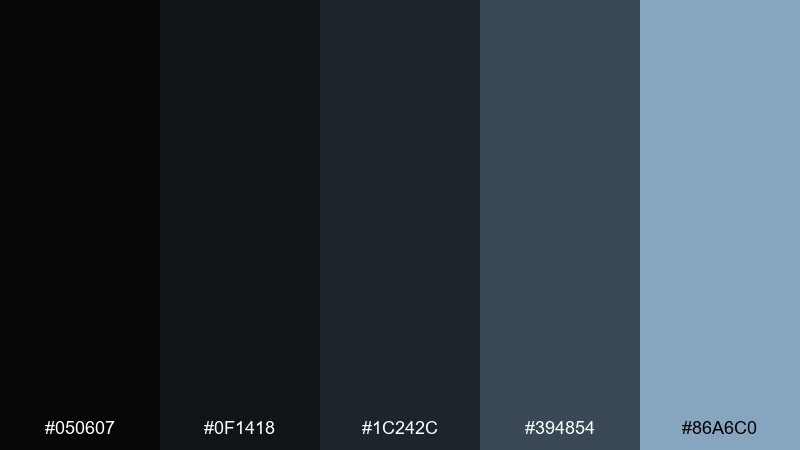
HEX: #050607 #0f1418 #1c242c #394854 #86a6c0
Mood: sleek, nautical, premium
Best for: watch product launch ad
Sleek and premium, it reads like polished metal with a cool ocean sheen. This palette works for watch and tech accessories where materials and highlights sell the product. Pair with sharp macro shadows and minimal copy so the tones do the talking. Tip: keep the light steel-blue for rim lighting and spec highlights, not large fills.
Image example of black pearl generated using media.io
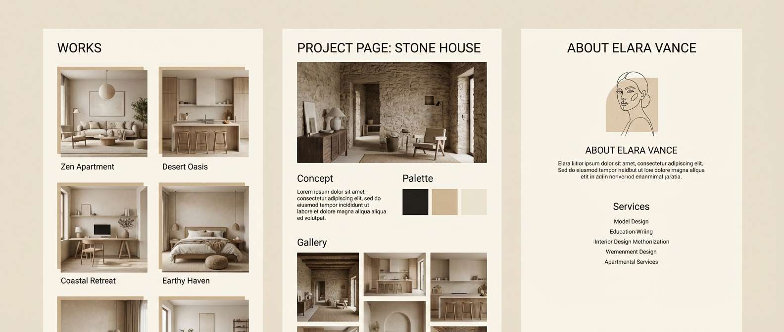
19) Orbit Sand
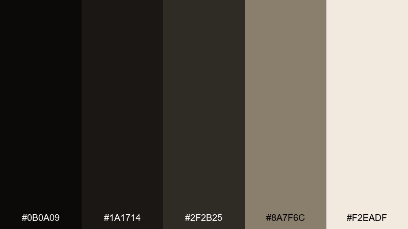
HEX: #0b0a09 #1a1714 #2f2b25 #8a7f6c #f2eadf
Mood: warm, minimal, architectural
Best for: interior design portfolio site
Warm and architectural, these neutrals feel like shadowed concrete and sunlit linen. They fit portfolio sites where the work should stay front and center. Pair with large imagery, quiet typography, and thin rules for structure. Tip: use the light cream as the main background and the darkest tone for navigation to frame the content.
Image example of orbit sand generated using media.io
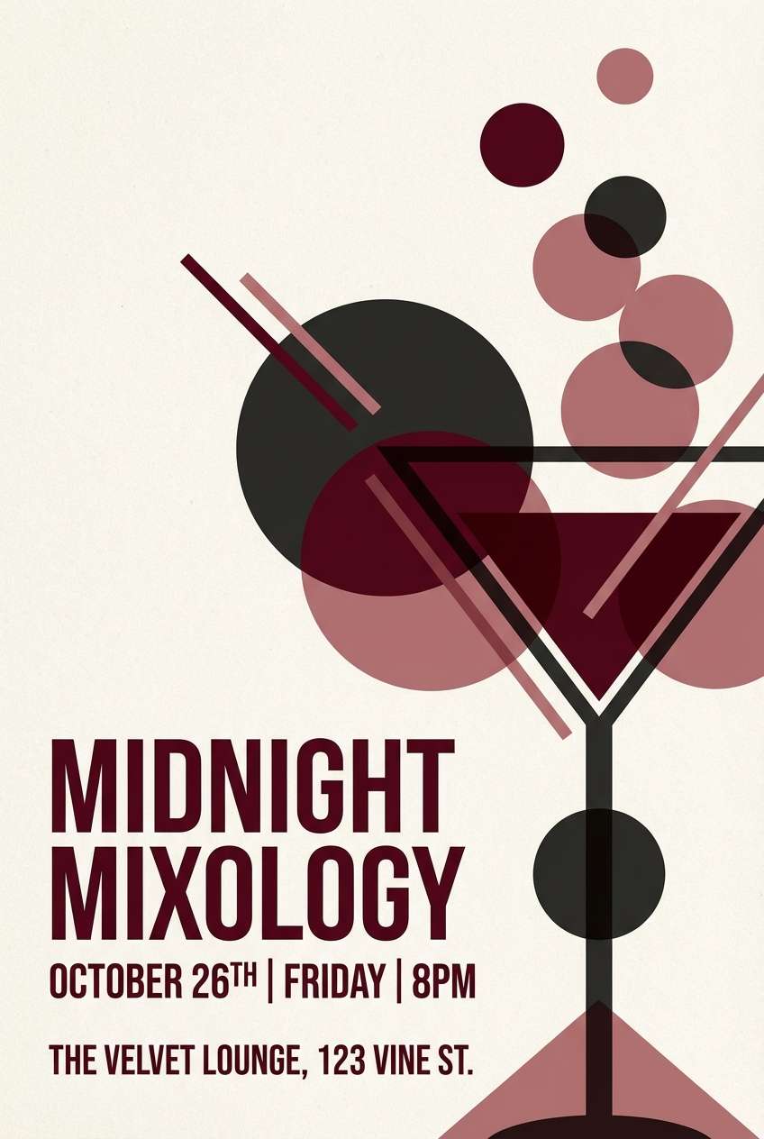
20) Hushed Garnet
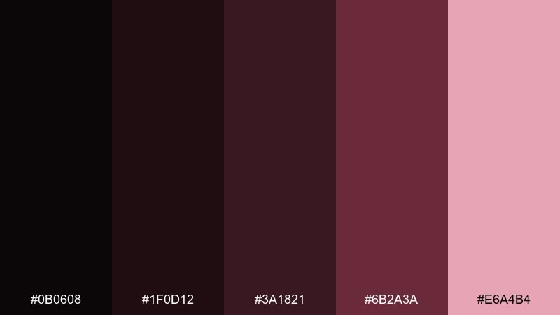
HEX: #0b0608 #1f0d12 #3a1821 #6b2a3a #e6a4b4
Mood: dramatic, intimate, vintage
Best for: cocktail bar flyer
Dramatic and intimate, it evokes garnet glassware and low lounge lighting. It is a strong direction for bar flyers that need mood and readability. Pair with condensed type, simple geometric shapes, and plenty of dark negative space. Tip: for striking black hole color combinations, keep blush pink as a spotlight for the event date and call-to-action.
Image example of hushed garnet generated using media.io
What Colors Go Well with Black Hole?
Black hole tones pair best with accents that look like “light” against darkness: violet, orchid, periwinkle, teal, and soft mint all feel futuristic while staying readable on near-black backgrounds.
For warmer, more premium direction, combine black hole neutrals with bronze, honey gold, cocoa, or sand. These add a tactile, material vibe that works well in menus, packaging, and product ads.
If you need a safe, universal match, lean on layered grays and off-whites. Monochrome plus one accent is often the cleanest black hole color combination for brand systems and UI.
How to Use a Black Hole Color Palette in Real Designs
Start with a near-black base, then assign one or two midtones for surfaces (cards, panels, overlays). This keeps your design from becoming a flat black slab while preserving the “void” mood.
Use the brightest color as a functional accent: CTAs, active navigation, key data points, or small badges. When the highlight is rare, it feels more powerful and more “cosmic.”
For accessibility, avoid pure #000 for large areas and ensure text contrast is strong. Slightly lifted blacks and soft light-gray type are easier on the eyes in dark UI.
Create Black Hole Palette Visuals with AI
If you want to preview how a black hole palette looks on a poster, UI, packaging, or brand board, generate fast mockups with AI and iterate in minutes.
Use clear prompts (layout + subject + style) and specify your accent color role (CTA, glow, rim light). Then refine by adjusting lighting, contrast, and the amount of highlight color.
When you find a look that fits, you can reuse the same prompt structure across ads, social templates, and landing pages to keep your brand consistent.
Black Hole Color Palette FAQs
-
What is a black hole color palette?
A black hole color palette is a set of very dark neutrals (near-black, charcoal, deep navy) paired with a few controlled accents (violet, teal, bronze, pink) to create high-contrast, cinematic designs. -
Is a black hole palette good for dark mode UI?
Yes. These palettes are ideal for dark mode because they use layered near-blacks and mid-grays for depth, with a single accent color for active states, charts, and CTAs. -
How many accent colors should I use with near-black?
Usually one primary accent is enough. If you add a second, keep it subtle (a tint for backgrounds or secondary highlights) so the interface or layout doesn’t look noisy. -
What warm colors work well with black hole tones?
Bronze, honey gold, cocoa, and sand work especially well. They add a luxe, material feel that’s great for packaging, menus, and product advertising. -
How do I keep black hole designs from looking “too dark”?
Avoid using pure black everywhere. Mix in charcoal and slate midtones for surfaces, and use light gray or off-white typography to maintain readability and visual comfort. -
Are black hole palettes good for print?
They can be, but you should test ink coverage and contrast. Using near-black instead of pure black and reserving bright accents for small areas helps prints look crisp and premium. -
Can I generate black hole palette mockups with AI?
Yes. With Media.io’s text-to-image tool, you can generate posters, UI mockups, packaging, and brand boards by describing the layout and specifying dark neutrals plus your chosen cosmic accent.


