

Midnight blue is the kind of dark blue that reads as premium, calm, and modern all at once. It’s deep enough to feel dramatic, but still easier on the eyes than pure black.
Below are midnight blue color combinations you can use for branding, UI, posters, packaging, and interiors—each with HEX codes plus an AI image prompt you can reuse in Media.io.
In this article
- Why Midnight Blue Color Combinations Work So Well
-
- night harbor
- velvet nebula
- arctic midnight
- ink & ivory
- sapphire espresso
- moonlit lavender
- coastal storm
- brass observatory
- forest at dusk
- cherry noir
- glacier steel
- coral after dark
- sandstone eclipse
- teal constellation
- rose smoke
- cyber midnight ui
- museum editorial
- luxe hotel lobby
- winter wedding suite
- spacebound gradient
- What Colors Go Well with Midnight Blue?
- How to Use a Midnight Blue Color Palette in Real Designs
- Create Midnight Blue Palette Visuals with AI
Why Midnight Blue Color Combinations Work So Well
Midnight blue (like #0b1320) sits in a sweet spot: it’s dark enough to feel cinematic and upscale, yet it keeps more color character than black. That makes it a strong anchor for brands that want “serious” without feeling cold.
Because it’s naturally low-glare, midnight blue is also excellent for interfaces—especially dark mode—where contrast and readability matter. Pair it with controlled accents (cyan, coral, gold) and you get clarity without visual noise.
Design-wise, midnight blue pairs smoothly with both warm neutrals (ivory, parchment, sandstone) and cool tones (steel, teal, icy aqua). That flexibility is why it works across posters, packaging, interiors, and editorial layouts.
20+ Midnight Blue Color Palette Ideas (with HEX Codes)
1) Night Harbor
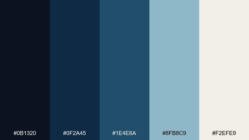
HEX: #0b1320 #0f2a45 #1e4e6a #8fb8c9 #f2efe9
Mood: cinematic, calm, nautical
Best for: travel brand landing page hero UI
Cinematic and calm, it feels like harbor lights cutting through fog over deep water. Use the dark base for headers and navigation, then let the soft sea-glass blue handle highlights and charts. Warm off-white keeps layouts readable without turning stark. Tip: reserve the lightest tone for key calls-to-action so the page stays moody but still converts.
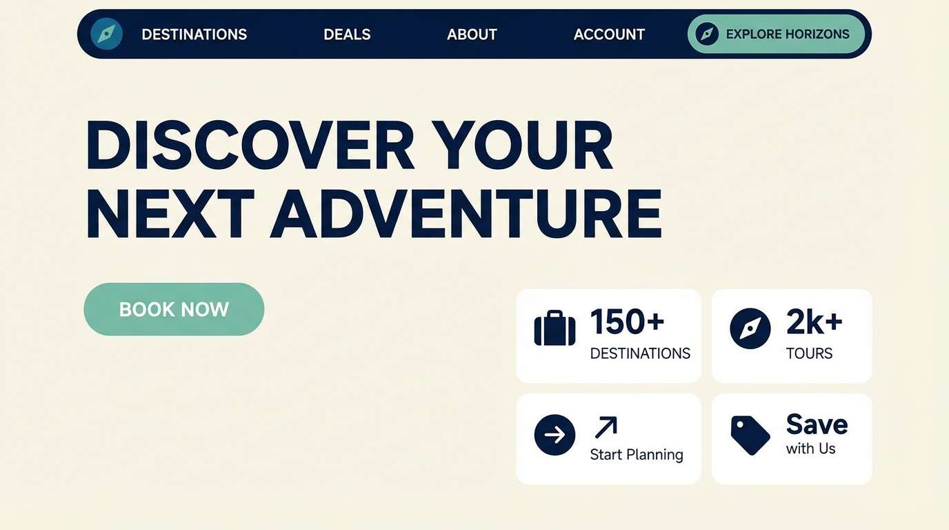
Image example of night harbor generated using media.io
Media.io is an online AI studio for creating and editing video, image, and audio in your browser.

2) Velvet Nebula
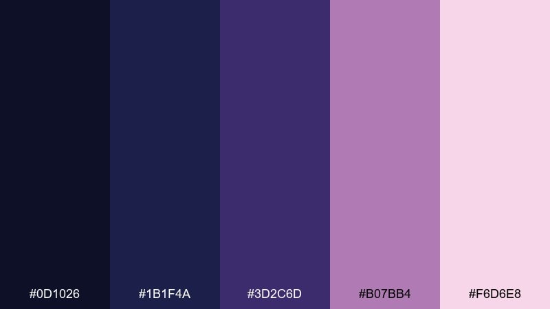
HEX: #0d1026 #1b1f4a #3d2c6d #b07bb4 #f6d6e8
Mood: dreamy, luxe, cosmic
Best for: album cover artwork
Dreamy and luxe, these tones read like velvet sky with a soft nebula glow. Keep the deepest navy for the background, then layer violet and plum for gradients and typography shadows. The blush pink works best as a subtle highlight rather than a full block. Tip: add grain and a gentle vignette to make the purples feel richer without getting loud.
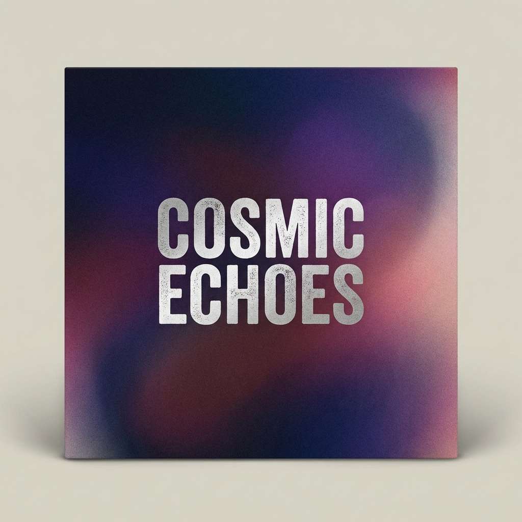
Image example of velvet nebula generated using media.io
3) Arctic Midnight
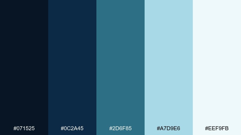
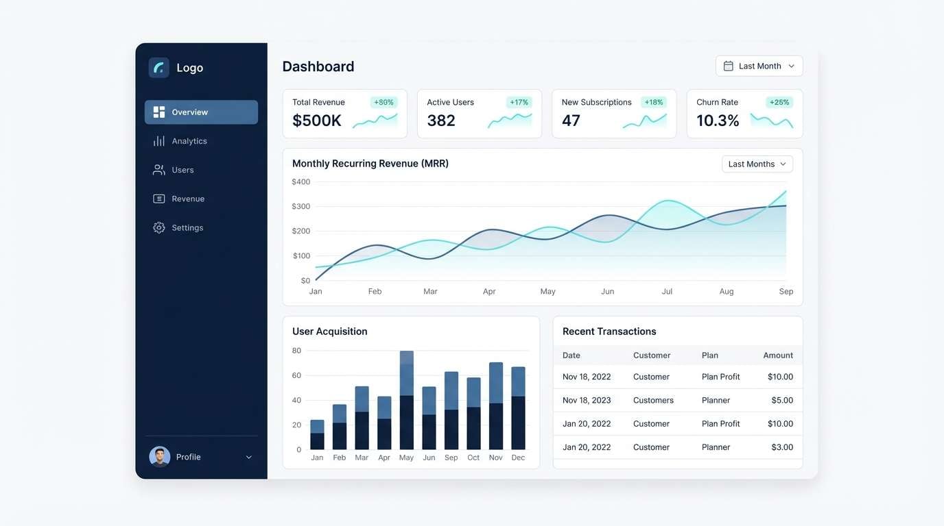
HEX: #071525 #0c2a45 #2d6f85 #a7d9e6 #eef9fb
Mood: crisp, airy, polar
Best for: SaaS dashboard charts and tables
Crisp and airy, this midnight blue color scheme suggests polar night with icy reflections and clean air. Build your table headers and sidebars with the darker blues, then use the pale aqua for selected states and data highlights. The near-white top tone prevents fatigue in dense dashboards. Tip: keep gridlines subtle and rely on the aqua highlight for focus to avoid visual noise.
Image example of arctic midnight generated using media.io
4) Ink & Ivory
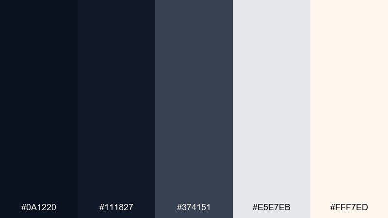
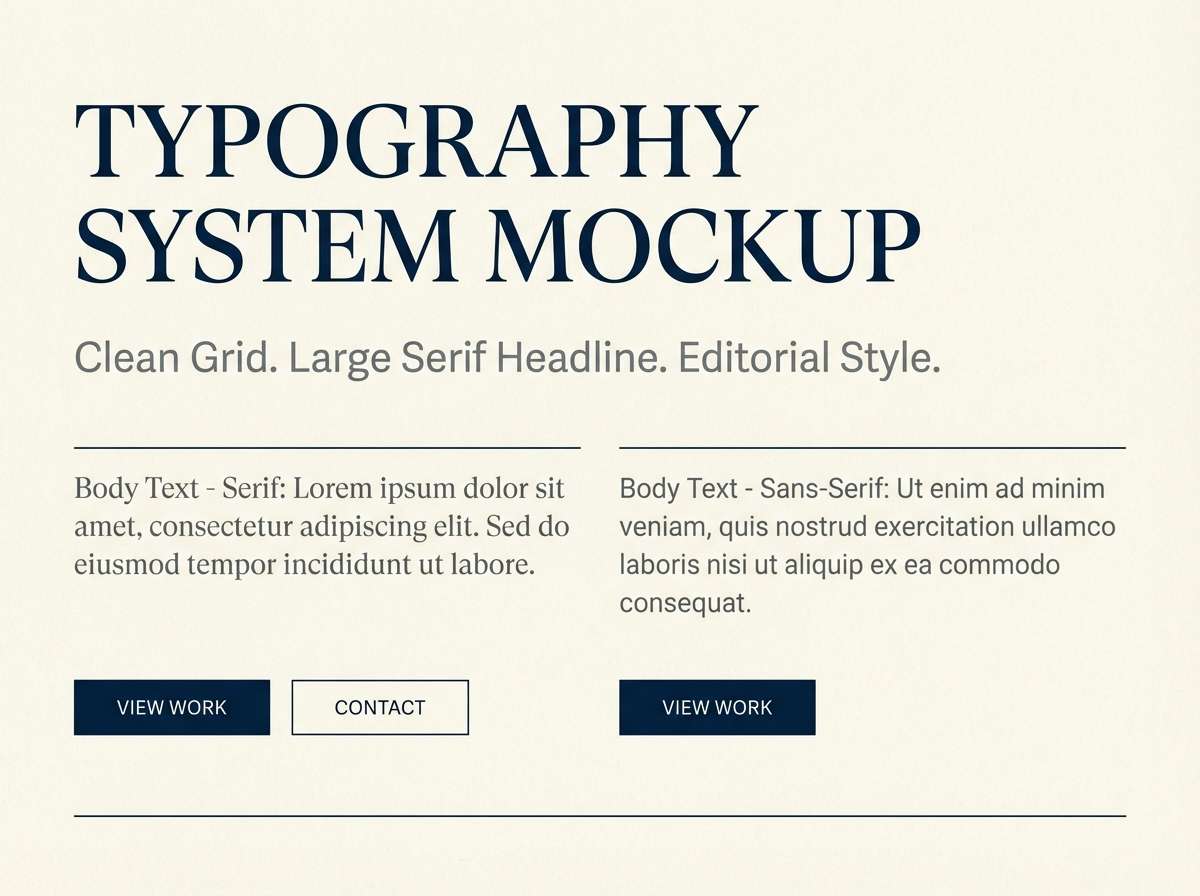
HEX: #0a1220 #111827 #374151 #e5e7eb #fff7ed
Mood: editorial, minimal, refined
Best for: portfolio website typography system
Refined and editorial, it feels like ink on thick ivory paper with quiet contrast. This midnight blue color palette is ideal for type-forward layouts, where hierarchy matters more than decoration. Use the darkest two tones for headlines and navigation, then let the warm ivory soften large white areas. Tip: swap pure black for the deep navy to keep the site looking premium and less harsh.
Image example of ink & ivory generated using media.io
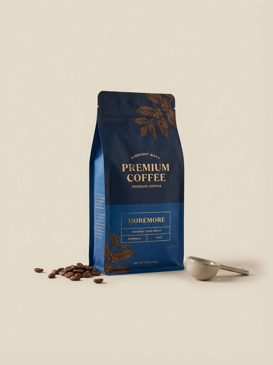
5) Sapphire Espresso
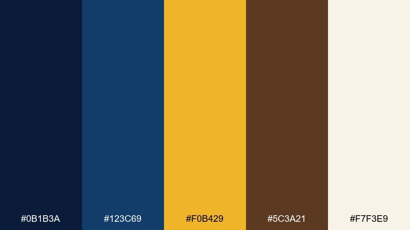
HEX: #0b1b3a #123c69 #f0b429 #5c3a21 #f7f3e9
Mood: bold, warm, sophisticated
Best for: coffee packaging and product ad
Bold and sophisticated, it reads like late-night espresso with a sapphire sheen. Pair the deep blues with the warm gold for labels, seals, and premium accents that pop at shelf distance. The coffee-brown grounds the design so the gold never looks flashy. Tip: keep gold elements small and intentional, like foil lines or a badge, to maintain an upscale feel.
Image example of sapphire espresso generated using media.io
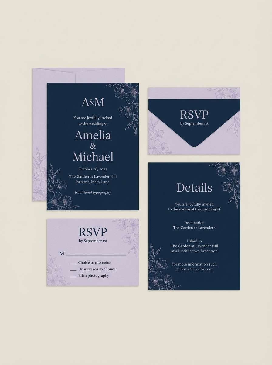
6) Moonlit Lavender
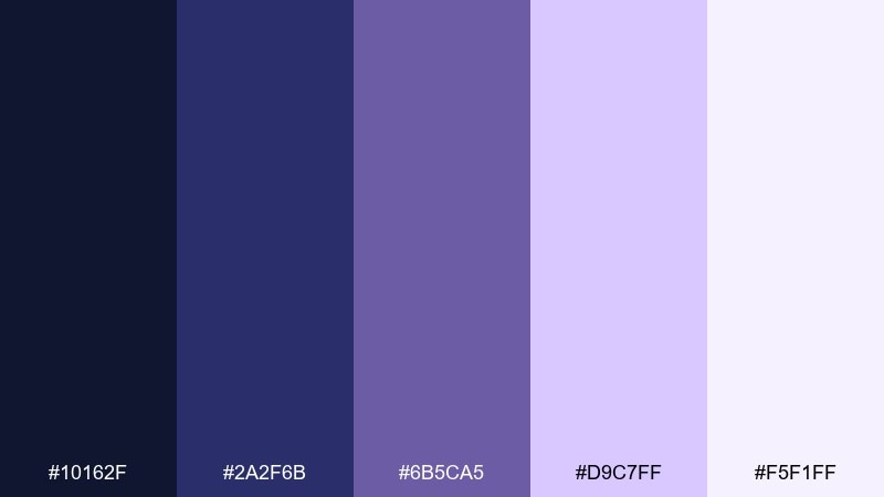
HEX: #10162f #2a2f6b #6b5ca5 #d9c7ff #f5f1ff
Mood: soft, romantic, nocturnal
Best for: wedding invitation suite
Soft and nocturnal, these midnight blue color combinations evoke moonlight falling on lavender petals and silk ribbon. Use the darkest tone for typography and monograms, then bring in lilac for borders, icons, and delicate patterns. The pale lavender-white keeps the paper look airy and romantic. Tip: emboss the dark ink elements and keep lilac accents thin so the suite feels elegant, not playful.
Image example of moonlit lavender generated using media.io
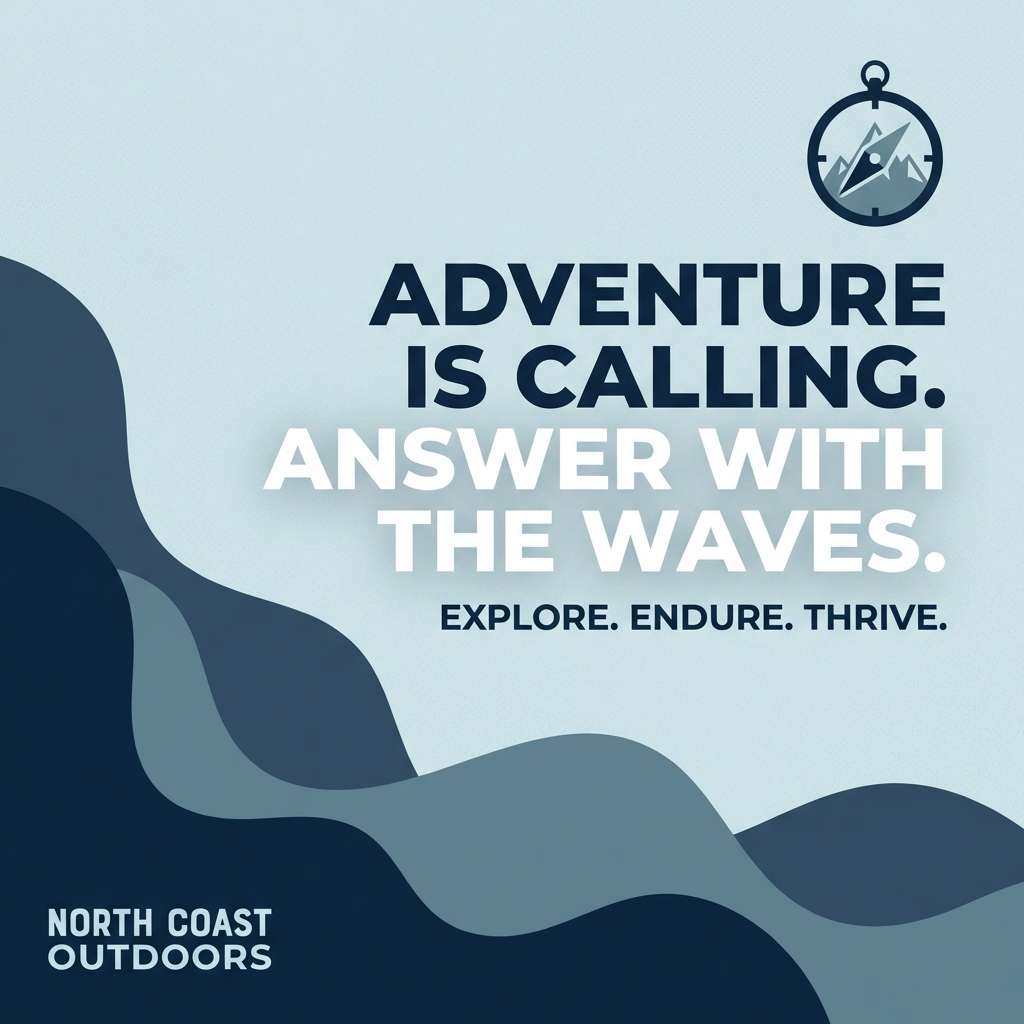
7) Coastal Storm
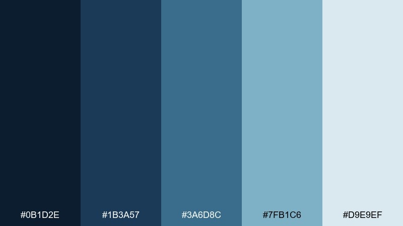
HEX: #0b1d2e #1b3a57 #3a6d8c #7fb1c6 #d9e9ef
Mood: fresh, windswept, confident
Best for: outdoor brand social post
Windswept and confident, it feels like a storm rolling in over bright coastal water. Let the navy anchor your headline blocks, then use the mid blues for shapes and layered waves. The pale mist tone works well as negative space so the post stays clean on mobile. Tip: keep contrast high by placing light text only on the two darkest shades.
Image example of coastal storm generated using media.io
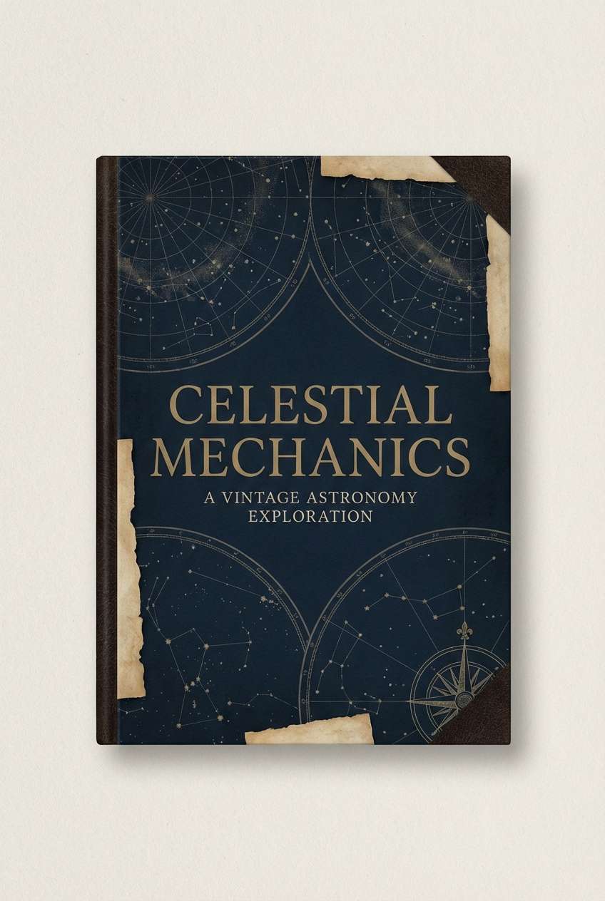
8) Brass Observatory
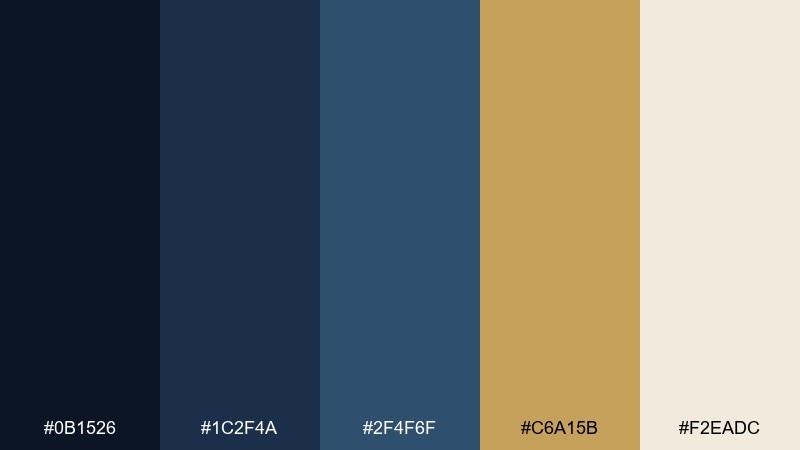
HEX: #0b1526 #1c2f4a #2f4f6f #c6a15b #f2eadc
Mood: vintage, scholarly, atmospheric
Best for: book cover design
Vintage and scholarly, it brings to mind brass instruments, old star charts, and a quiet observatory. These midnight blue color combinations shine when you need classic contrast: deep navy for the field, brass for titles and ornaments, and parchment for breathing room. Use the mid-blue as a bridge for gradients or illustrated constellations. Tip: keep brass accents slightly muted to avoid looking overly metallic on screens.
Image example of brass observatory generated using media.io
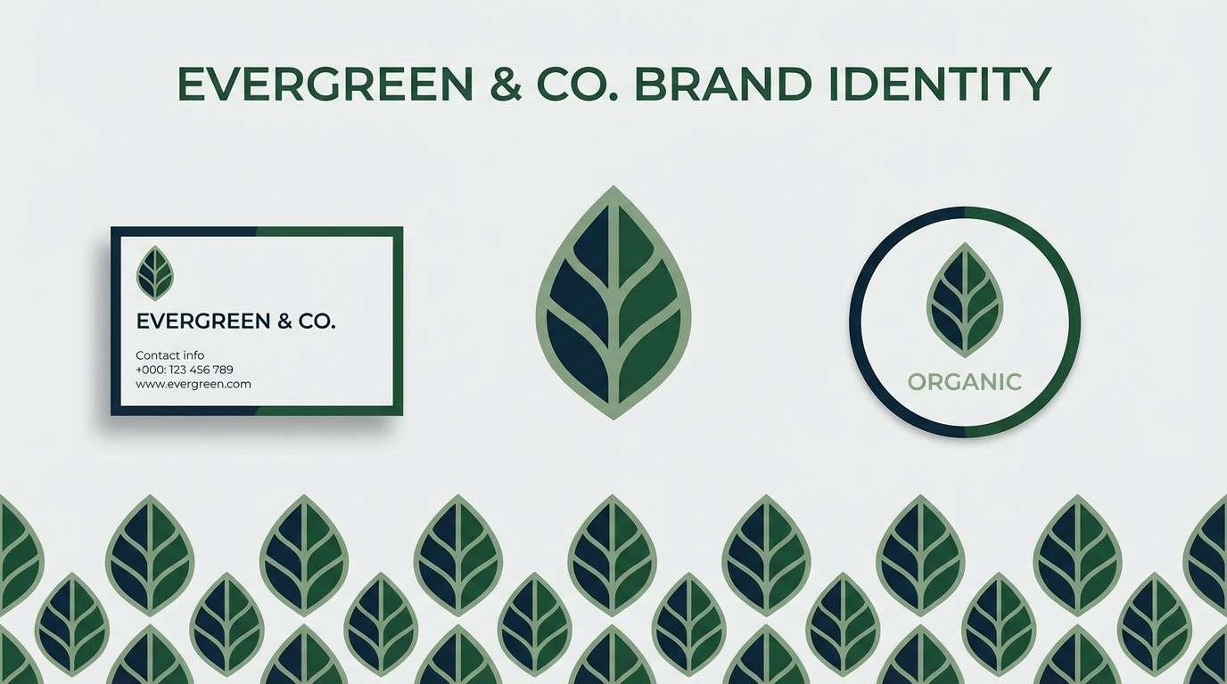
9) Forest at Dusk
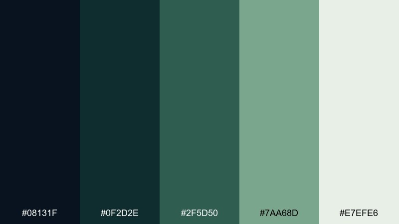
HEX: #08131f #0f2d2e #2f5d50 #7aa68d #e7efe6
Mood: earthy, quiet, grounded
Best for: eco-friendly brand identity
Quiet and grounded, it feels like pine shadows and cool air just before night settles in. Use the deep blue-green as your core brand tone, then lean on the mossy greens for supporting graphics and secondary buttons. The pale sage-white makes sustainable messaging feel calm and trustworthy. Tip: pair with recycled-paper textures and minimal iconography to keep the identity modern, not rustic.
Image example of forest at dusk generated using media.io
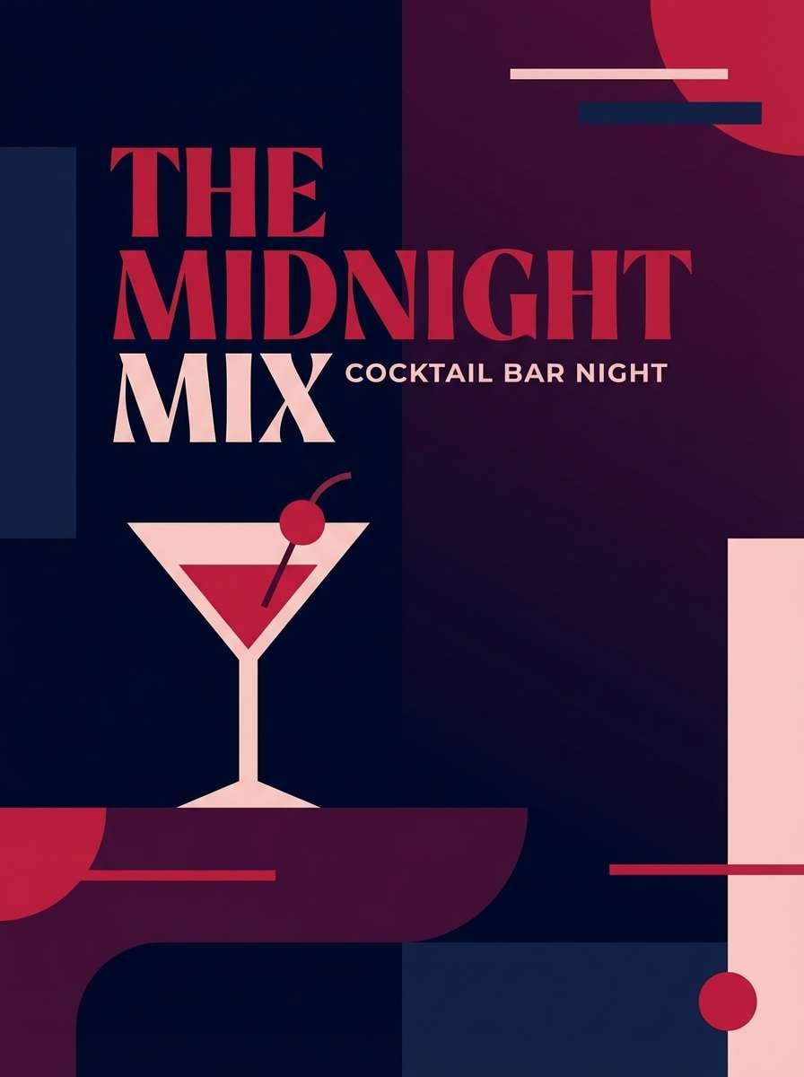
10) Cherry Noir
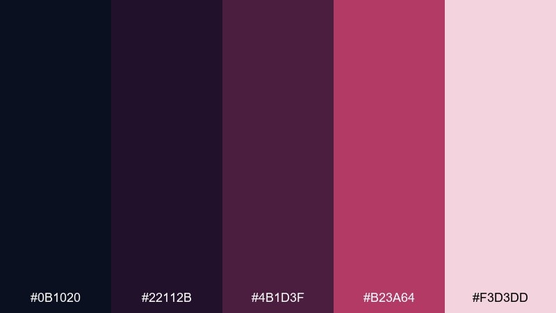
HEX: #0b1020 #22112b #4b1d3f #b23a64 #f3d3dd
Mood: moody, dramatic, romantic
Best for: cocktail bar event poster
Moody and dramatic, this midnight blue color scheme suggests candlelit cocktails with a cherry-red shimmer. Use the dark navy and aubergine as the base, then let the cherry accent guide key details like date, venue, and ticket price. The blush tone keeps the poster legible and adds softness around typography. Tip: try a duotone background and keep the cherry shade for only one focal element.
Image example of cherry noir generated using media.io
11) Glacier Steel
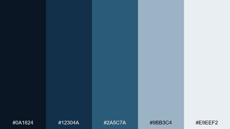
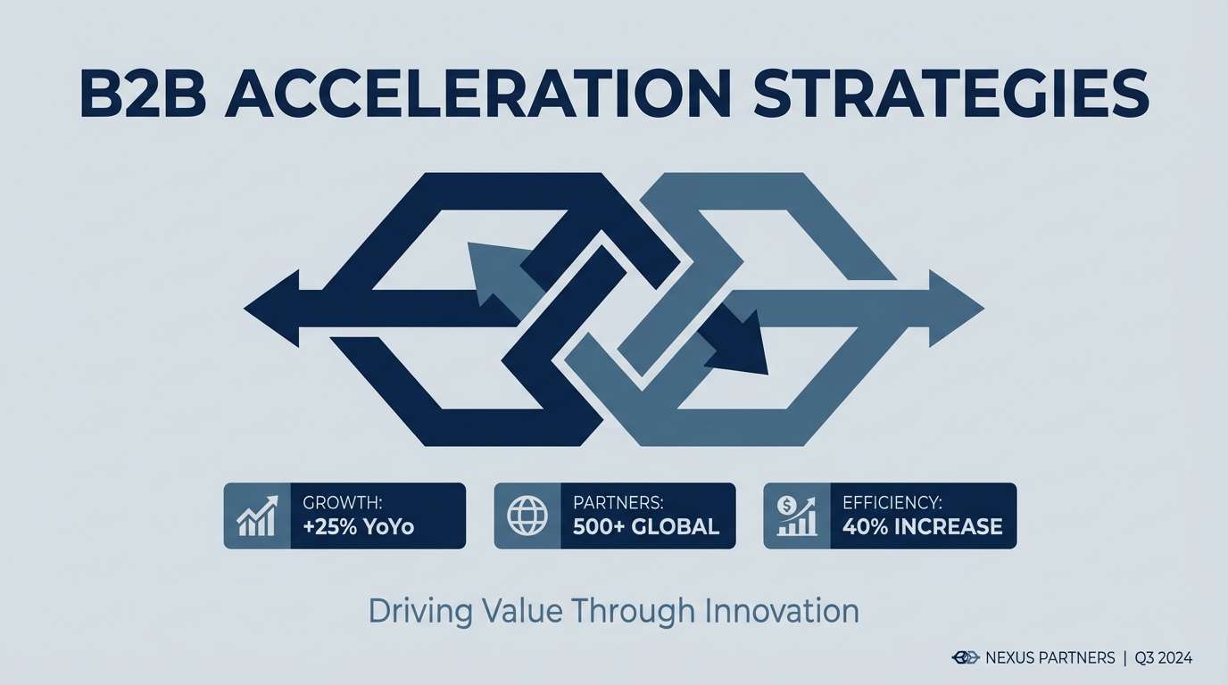
HEX: #0a1624 #12304a #2a5c7a #9bb3c4 #e9eef2
Mood: technical, cool, dependable
Best for: B2B pitch deck slides
Technical and dependable, it feels like cold steel, glass, and clean engineering. Use the deepest shade for slide titles and section dividers, then lean on the mid blues for diagrams and icons. The light gray-blue keeps charts readable while maintaining a cool temperature. Tip: keep one accent color per slide and rely on tint variations for the rest of the hierarchy.
Image example of glacier steel generated using media.io
12) Coral After Dark
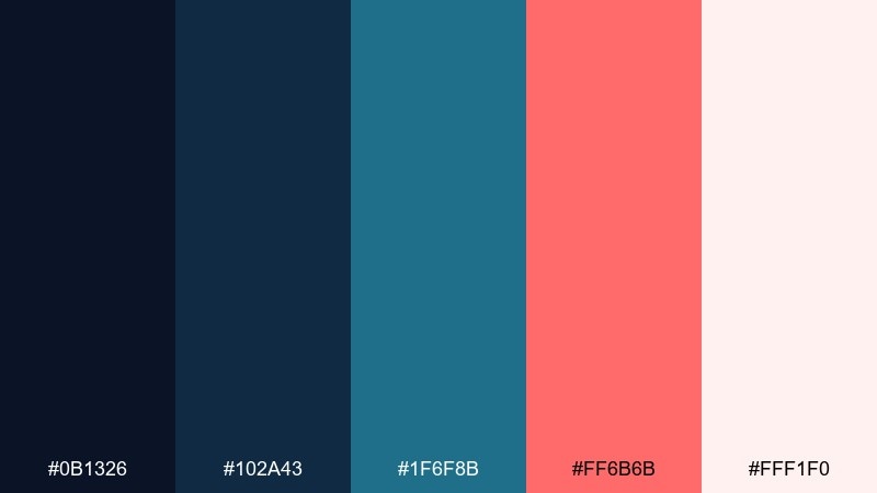
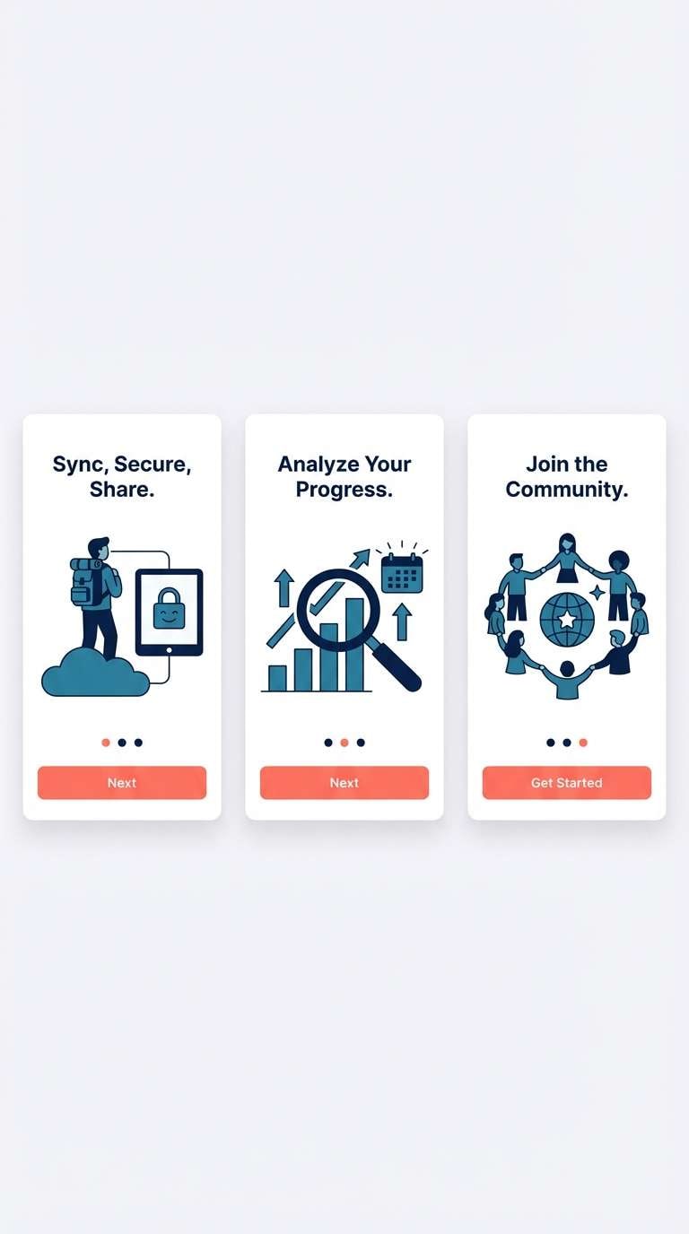
HEX: #0b1326 #102a43 #1f6f8b #ff6b6b #fff1f0
Mood: playful, modern, high-contrast
Best for: app onboarding screens
Playful and modern, it looks like neon coral glowing against a deep night sea. These midnight blue color combinations work well for onboarding because the coral reads instantly as progress and action. Use the mid teal-blue for secondary illustrations and friendly icon fills. Tip: keep coral to buttons and key highlights only, so it stays special and does not overwhelm the flow.
Image example of coral after dark generated using media.io
13) Sandstone Eclipse
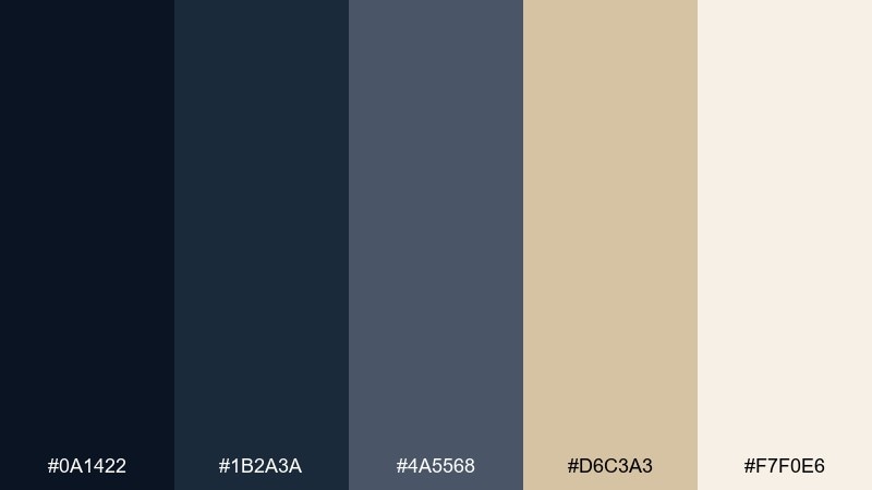
HEX: #0a1422 #1b2a3a #4a5568 #d6c3a3 #f7f0e6
Mood: warm neutral, architectural, timeless
Best for: living room interior mood board
Architectural and timeless, it feels like an evening sky over warm sandstone and linen. Use the deep tones for cabinetry, built-ins, or feature walls, then balance them with sandy beige in textiles and rugs. The soft cream keeps the space open and layered instead of heavy. Tip: add matte black hardware sparingly to sharpen edges without stealing warmth.
Image example of sandstone eclipse generated using media.io
14) Teal Constellation

HEX: #071a2d #0b3a4a #0f7a7a #7fe0d8 #e7fffb
Mood: energetic, aquatic, futuristic
Best for: tech conference flyer
Energetic and aquatic, this midnight blue color palette suggests glowing constellations over deep water. Use the midnight base for the flyer field, then set teal typography and icons for a sharp, modern contrast. The bright aqua is perfect for small highlights like dates, QR codes, and section markers. Tip: keep the background clean and let teal gradients carry the motion instead of adding extra shapes.
Image example of teal constellation generated using media.io

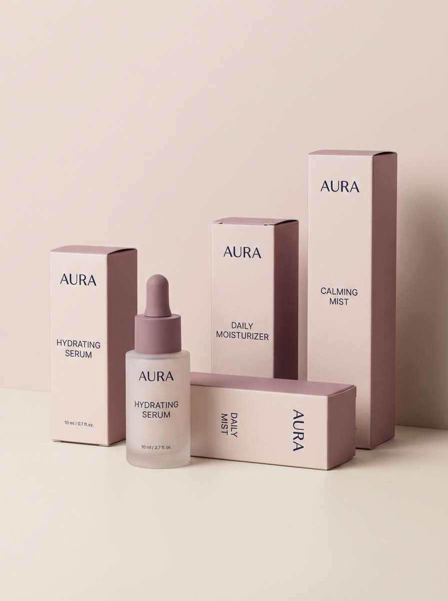
15) Rose Smoke
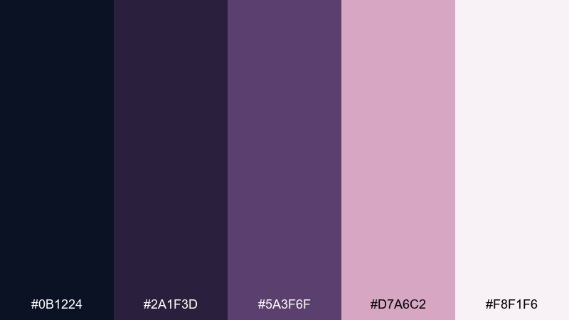
HEX: #0b1224 #2a1f3d #5a3f6f #d7a6c2 #f8f1f6
Mood: soft, nostalgic, elegant
Best for: beauty brand packaging
Soft and nostalgic, it looks like rose powder drifting through a dim evening room. Let the darkest shade handle the logo and small text, while mauve and rose build gentle blocks and gradients. The pale blush works best as the primary carton background for a light, premium look. Tip: use satin finishes and тонal patterning so the packaging feels tactile without becoming busy.
Image example of rose smoke generated using media.io
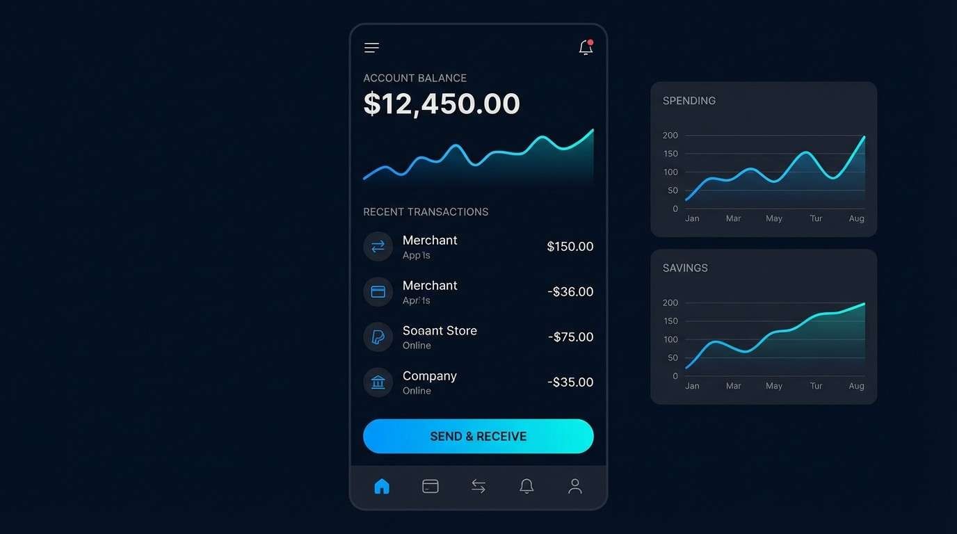
16) Cyber Midnight UI
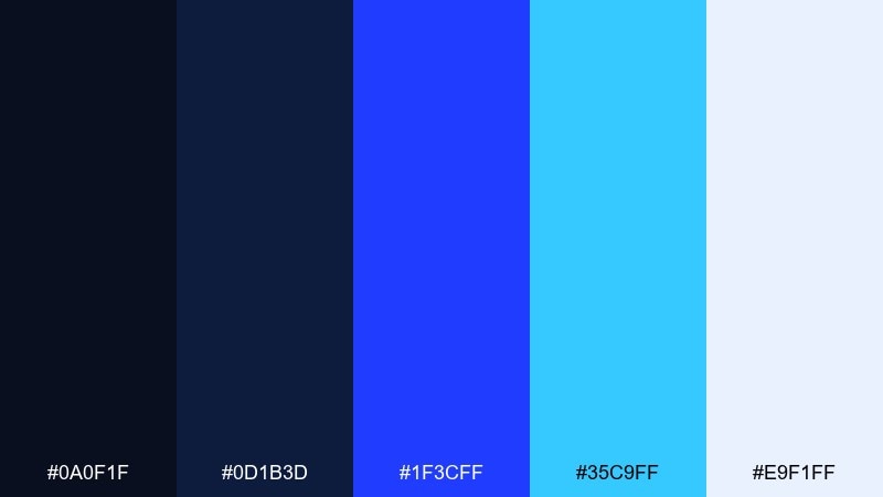
HEX: #0a0f1f #0d1b3d #1f3cff #35c9ff #e9f1ff
Mood: electric, sleek, high-tech
Best for: dark mode fintech app UI
Electric and sleek, it feels like city lights reflected on glass at 2 a.m. This midnight blue color palette is a strong fit for dark mode, where clarity depends on bright, controlled accents. Use the vivid blue for primary actions and the cyan for status and micro-interactions. Tip: limit the two bright accents to a few components per screen so the interface stays premium, not noisy.
Image example of cyber midnight ui generated using media.io
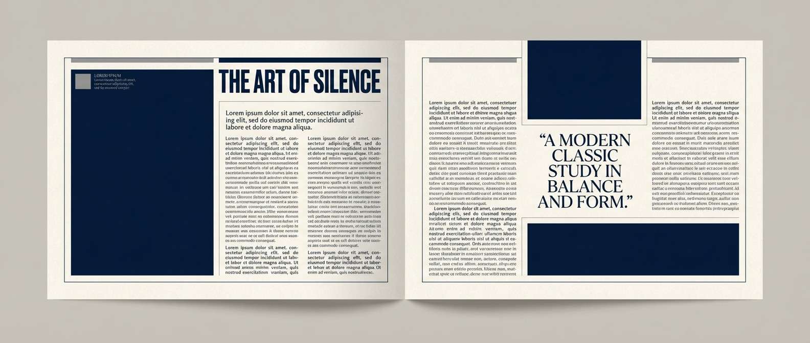
17) Museum Editorial
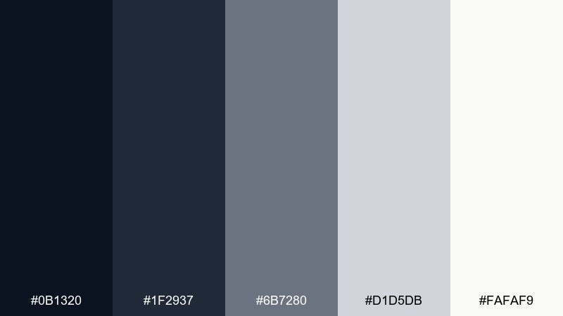
HEX: #0b1320 #1f2937 #6b7280 #d1d5db #fafaf9
Mood: curated, calm, modern classic
Best for: magazine feature layout
Curated and calm, it mirrors a gallery wall: deep frames, soft lighting, and plenty of negative space. Build strong typographic rhythm with the navy for headlines and the grays for captions and pull quotes. The warm off-white keeps the layout from feeling sterile, especially in long reads. Tip: use the darkest tone only for top-level hierarchy so the spread feels airy and expensive.
Image example of museum editorial generated using media.io
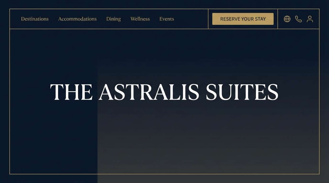
18) Luxe Hotel Lobby
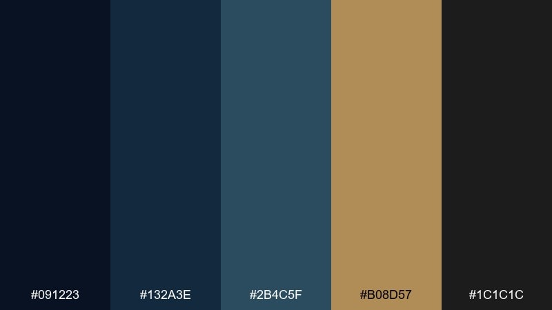
HEX: #091223 #132a3e #2b4c5f #b08d57 #1c1c1c
Mood: luxury, intimate, dramatic
Best for: hotel brand website header
Luxury and intimate, it evokes a dim lobby with brass fixtures and plush shadows. A midnight blue color scheme like this works best when the gold stays restrained, acting as a finishing touch on buttons, icons, or thin rules. Use the charcoal as a secondary depth tone for footers and overlays. Tip: choose warm photography and apply a navy overlay so visuals match the palette instead of fighting it.
Image example of luxe hotel lobby generated using media.io
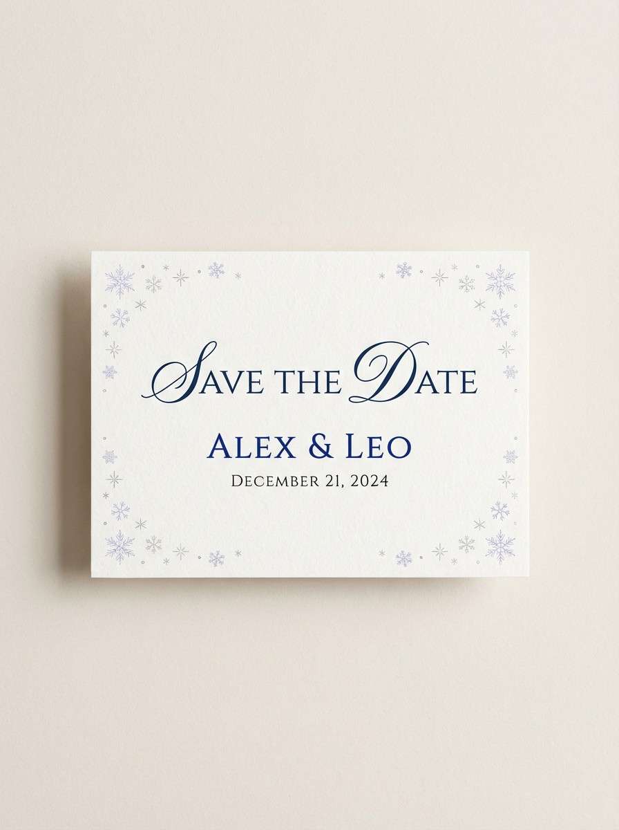
19) Winter Wedding Suite
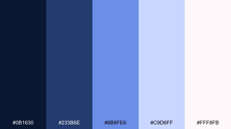
HEX: #0b1630 #233b6e #6b8fe6 #c9d6ff #fff8fb
Mood: crisp, celebratory, airy
Best for: winter wedding save-the-date
Crisp and celebratory, it feels like twilight snow and soft blue silk. Use the deep tone for names and venue details, then bring in the brighter blue for borders and small icons like stars or snowflakes. The pale icy lavender-blue makes a gentle background that still reads bridal. Tip: keep decorative elements sparse and let generous spacing do the elegance.
Image example of winter wedding suite generated using media.io
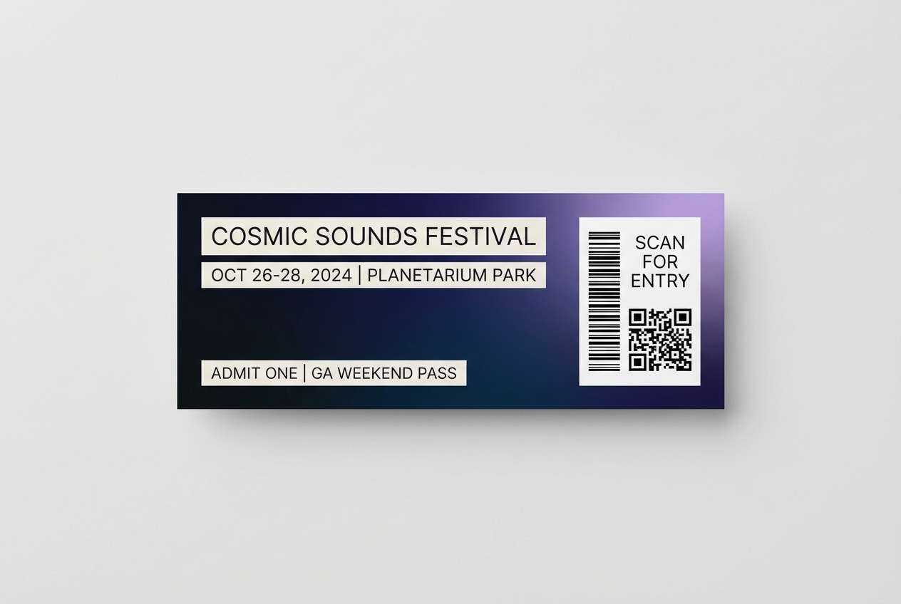
20) Spacebound Gradient
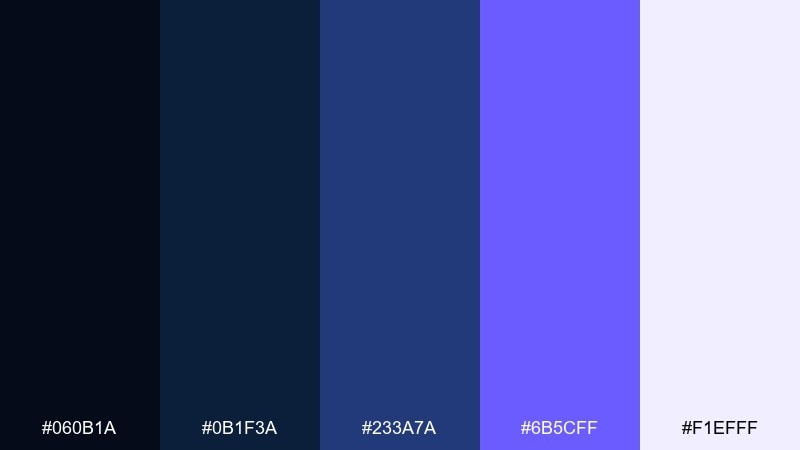
HEX: #060b1a #0b1f3a #233a7a #6b5cff #f1efff
Mood: expansive, modern, atmospheric
Best for: music festival ticket design
Expansive and atmospheric, these midnight blue color combinations read like a deep-space gradient with a violet lift at the edges. Use the near-black for the ticket base, then build a smooth transition through indigo to violet for the focal area. The soft off-white keeps QR codes and fine print crisp without breaking the mood. Tip: apply the gradient only to one panel so scanning areas stay high-contrast.
Image example of spacebound gradient generated using media.io
What Colors Go Well with Midnight Blue?
Midnight blue pairs beautifully with warm neutrals like ivory, cream, parchment, beige, and soft blush—these keep dark layouts readable and make the palette feel premium rather than heavy.
For a modern, high-contrast look, add a bright accent such as coral, cyan, or electric blue. Use the accent sparingly (buttons, badges, key numbers) so the design stays clean.
If you want a calmer, more “natural” direction, combine midnight blue with teal, sage, and mossy greens. This creates an earthy, grounded mood while still feeling contemporary.
How to Use a Midnight Blue Color Palette in Real Designs
Start by choosing midnight blue as your foundation for large surfaces: headers, nav bars, backgrounds, hero blocks, or packaging panels. Then pick one light neutral for breathing room and legibility (cards, page backgrounds, negative space).
Next, decide on a single accent role: action (CTA buttons), emphasis (key stats), or decoration (ornaments). When midnight blue is the base, accents feel stronger—so you typically need less of them.
Finally, manage contrast intentionally: put white/off-white text on the darkest two shades, and use mid-tones for secondary UI states, dividers, and illustrations. This keeps hierarchy clear without making everything shout.
Create Midnight Blue Palette Visuals with AI
If you want fast mockups for UI screens, posters, invitations, or packaging, you can generate on-brand visuals with AI using the palette prompts above. Swap the subject (e.g., “landing page hero” or “book cover”) while keeping the color language consistent.
Media.io Text-to-Image is useful for exploring variations—like adding grain, choosing a different ratio, or changing the design style—without rebuilding your layout from scratch.
Midnight Blue Color Palette FAQs
-
What hex code is considered “midnight blue”?
A common midnight blue base is #0b1320. You’ll also see close variants like #0a1220 or #091223 depending on how cool, inky, or navy you want the shade to feel. -
Is midnight blue the same as navy?
They’re related, but midnight blue is usually darker and moodier than classic navy, with a more “near-black” feel. Navy often reads more traditional and brighter in daylight contexts. -
What accent colors pop against midnight blue?
High-contrast accents like coral, cyan, electric blue, and muted gold stand out immediately on midnight blue. Use them for CTAs, highlights, icons, or small brand details. -
Does midnight blue work for dark mode UI?
Yes—midnight blue is a great dark-mode background because it’s softer than pure black but still creates strong contrast. Pair it with an off-white text color and limit bright accents to a few components per screen. -
How do I keep a midnight blue palette from feeling too dark?
Add a warm light neutral (ivory, parchment, cream) for larger negative-space areas, and reserve the deepest shade for headers or backgrounds. Using one mid-tone (steel blue or slate) also helps soften transitions. -
What are good print-friendly pairings with midnight blue?
Midnight blue with ivory/parchment and a restrained metallic-like gold is a classic print combination for invitations, book covers, and premium packaging. Keep the gold slightly muted for screens and use high-quality paper textures for a richer feel. -
Can I generate palette-based mockups automatically?
Yes. You can paste a palette prompt (like the ones in this article) into Media.io Text-to-Image to generate UI mockups, posters, packaging shots, and more—then iterate by changing layout, ratio, or style while keeping the same colors.
Next: Space Color Palette


