

Purple lilac sits in the sweet spot between playful and polished. It brings the calm of lavender with a slightly brighter, more modern lift that works across print and digital.
Below are 20+ purple lilac color palette ideas with HEX codes, plus practical pairing tips for branding, weddings, UI, packaging, and more.
In this article
- Why Purple Lilac Palettes Work So Well
-
- wisteria dawn
- orchid milk tea
- amethyst & oat
- lilac fog ui
- berry velvet
- spring lilac garden
- mauve linen interior
- iris neon edge
- lavender clay
- plum cocoa night
- pastel lilac study
- lilac pop social
- heather stone editorial
- grape soda kids
- lilac quartz skincare
- violet sage balance
- lilac chrome modern
- rose lilac bakery
- twilight lilac gradient
- lilac ink & paper
- soft lilac retail ad
- purple lilac studio set
- What Colors Go Well with Purple Lilac?
- How to Use a Purple Lilac Color Palette in Real Designs
- Create Purple Lilac Palette Visuals with AI
Why Purple Lilac Palettes Work So Well
Purple lilac reads as gentle, optimistic, and clean—without feeling bland. It’s a naturally “soft” hue, but it can still hold hierarchy when paired with deep violets, charcoal purples, or crisp whites.
Design-wise, lilac bridges warm and cool worlds. Depending on what you pair it with (cream, sage, gray, blush, neon accents), it can lean romantic, editorial, wellness-focused, or tech-forward.
It also plays nicely with modern gradients and subtle textures. That makes purple lilac a reliable base for brand systems where you need both mood and clarity across many touchpoints.
20+ Purple Lilac Color Palette Ideas (with HEX Codes)
1) Wisteria Dawn
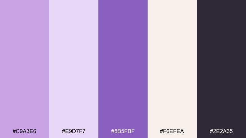
HEX: #C9A3E6 #E9D7F7 #8B5FBF #F6EFEA #2E2A35
Mood: airy, romantic, optimistic
Best for: wedding invitation suite
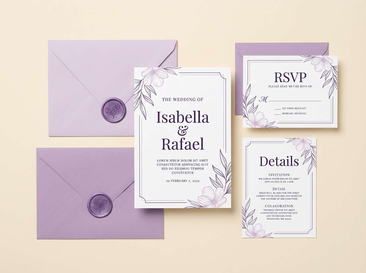
Airy and romantic like wisteria in early light, these tones feel gentle but polished. Use it for invitations, place cards, and RSVP pages where readability matters. Pair the deep violet with warm cream for type, then keep lilac as the main wash. Tip: print on uncoated stock to keep the pastels soft and true.
Image example of wisteria dawn generated using media.io
Media.io is an online AI studio for creating and editing video, image, and audio in your browser.

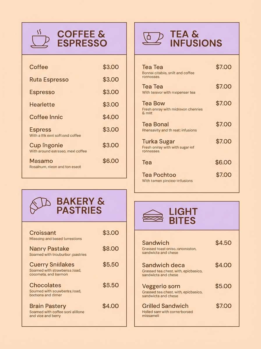
2) Orchid Milk Tea
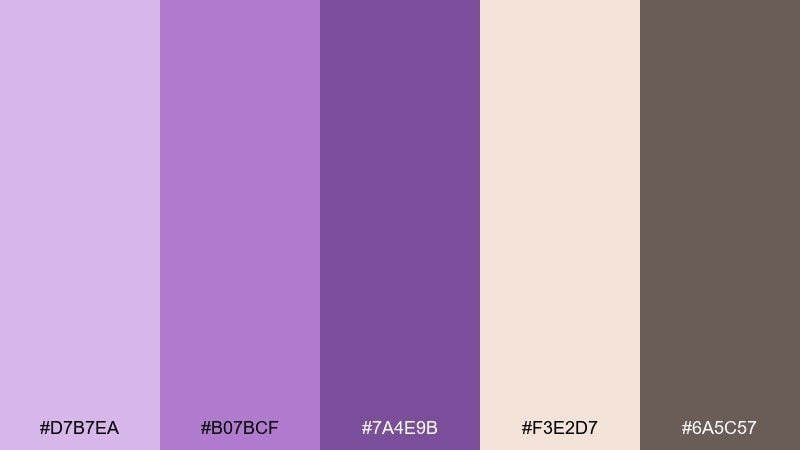
HEX: #D7B7EA #B07BCF #7A4E9B #F3E2D7 #6A5C57
Mood: cozy, sweet, approachable
Best for: cafe menu design
Cozy and sweet like a warm drink with a floral note, this mix balances pastel lilac with milky peach. It works beautifully for menus, loyalty cards, and seasonal promos where you want a friendly vibe. Use the cocoa brown for headings and the orchid tones for category chips or price highlights. Tip: keep body text in brown on peach for comfortable contrast.
Image example of orchid milk tea generated using media.io
3) Amethyst & Oat
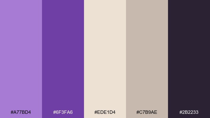
HEX: #A77BD4 #6F3FA6 #EDE1D4 #C7B9AE #2B2233
Mood: grounded, modern, calm
Best for: branding for wellness studio
Grounded and calming, it feels like soft linen paired with a polished amethyst stone. Use these tones for wellness branding, signage, and simple pattern systems. The oat and taupe keep the look mature while the deep purple adds authority for logos and headers. Tip: reserve the darkest shade for small text and outlines to keep everything crisp.
Image example of amethyst & oat generated using media.io
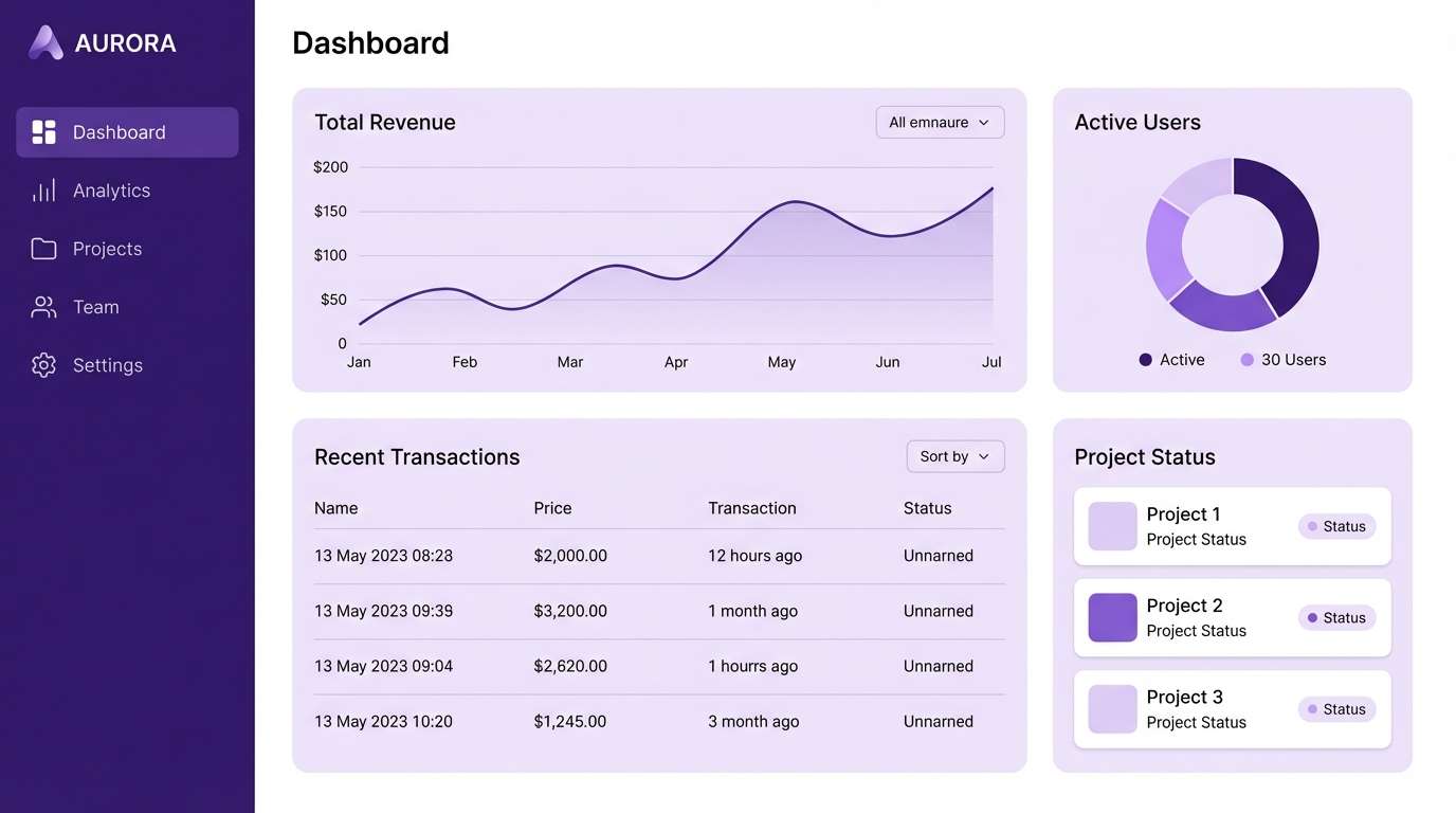
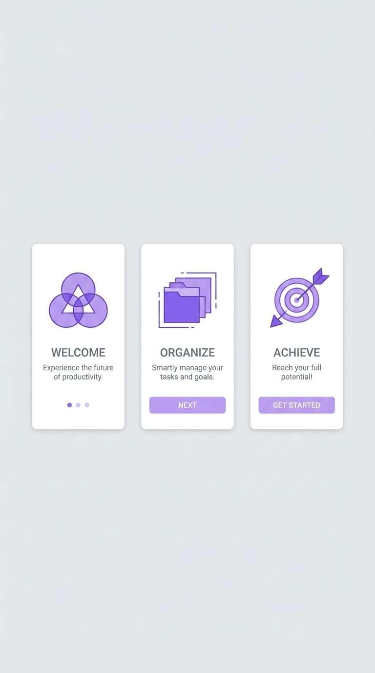
4) Lilac Fog UI
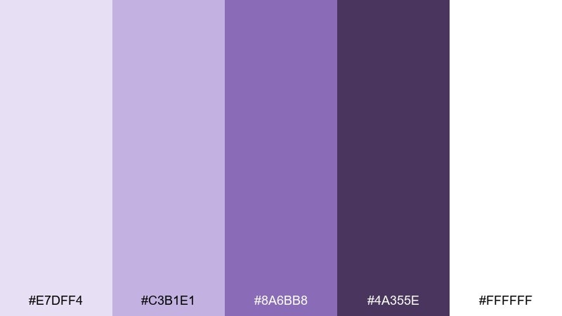
HEX: #E7DFF4 #C3B1E1 #8A6BB8 #4A355E #FFFFFF
Mood: clean, quiet, tech-forward
Best for: 2D UI dashboard mockup
Clean and quiet like a morning haze, this set keeps interfaces soft without losing structure. It is ideal for analytics dashboards, settings panels, and onboarding screens that need calm focus. Use white for space, lilac fog for panels, and the eggplant tone for navigation and active states. Tip: add subtle shadows only, and let color carry hierarchy.
Image example of lilac fog ui generated using media.io
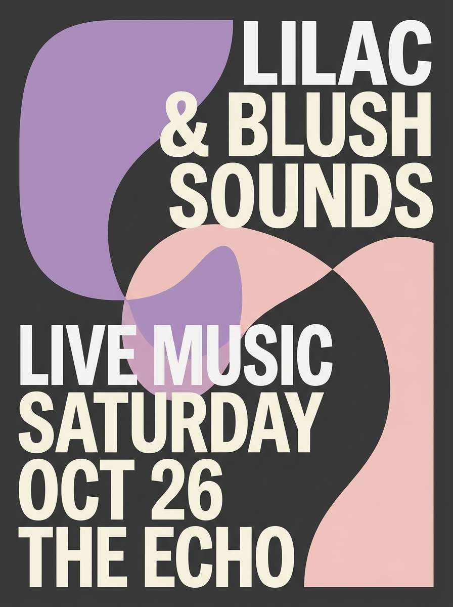
5) Berry Velvet
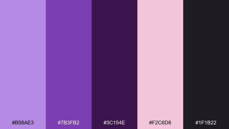
HEX: #B58AE3 #7B3FB2 #3C154E #F2C6D8 #1F1B22
Mood: bold, dramatic, luxe
Best for: music poster design
Bold and luxe like velvet curtains and ripe berries, these purples lean dramatic. Use them for posters, album art, or event graphics that need instant depth. Let the near-black handle background blocks while blush pink adds spotlight accents and callouts. Tip: keep gradients subtle so the dark plum does not swallow small details.
Image example of berry velvet generated using media.io
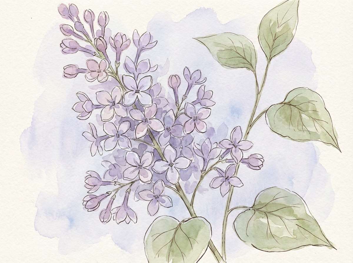
6) Spring Lilac Garden
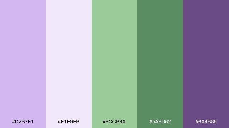
HEX: #D2B7F1 #F1E9FB #9CCB9A #5A8D62 #6A4B86
Mood: fresh, botanical, uplifting
Best for: watercolor botanical illustration
Fresh and uplifting like new blooms after rain, this palette pairs lilac with gentle greens. It shines in botanical prints, spring campaigns, and journal covers. Keep the pale lavender as paper tint, then layer sage leaves and violet shadows for depth. Tip: use the darkest purple sparingly for veins and tiny details.
Image example of spring lilac garden generated using media.io
7) Mauve Linen Interior
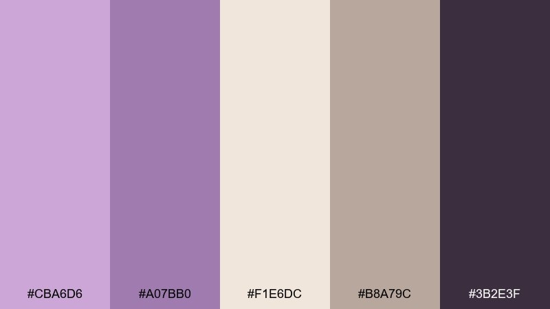
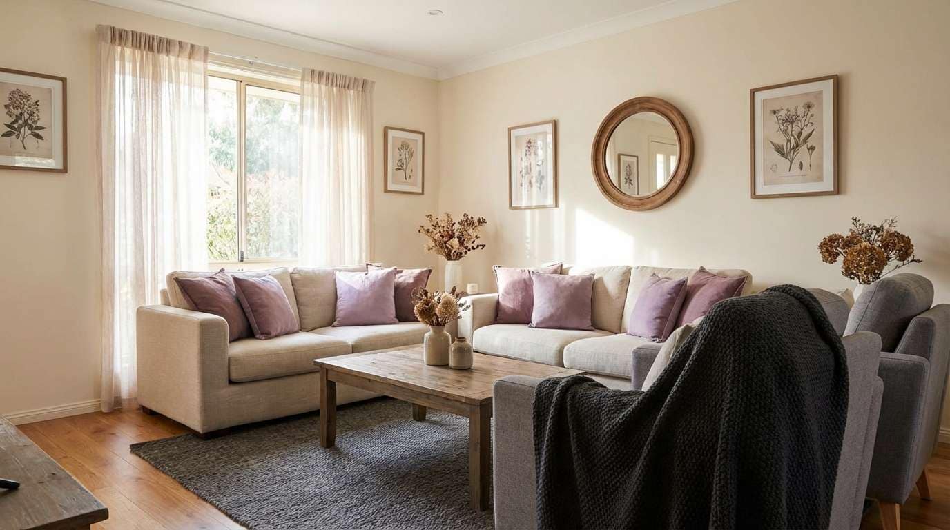
HEX: #CBA6D6 #A07BB0 #F1E6DC #B8A79C #3B2E3F
Mood: warm, serene, homey
Best for: living room interior styling
Warm and serene like sun on linen, these mauves feel effortlessly livable. Use them for interiors, mood boards, and furniture palettes where you want softness without looking childish. Pair creamy walls with mauve textiles, then ground the room with a charcoal accent or dark wood. Tip: repeat the mauve twice across the room to make it feel intentional.
Image example of mauve linen interior generated using media.io
8) Iris Neon Edge
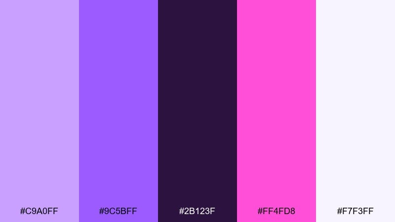
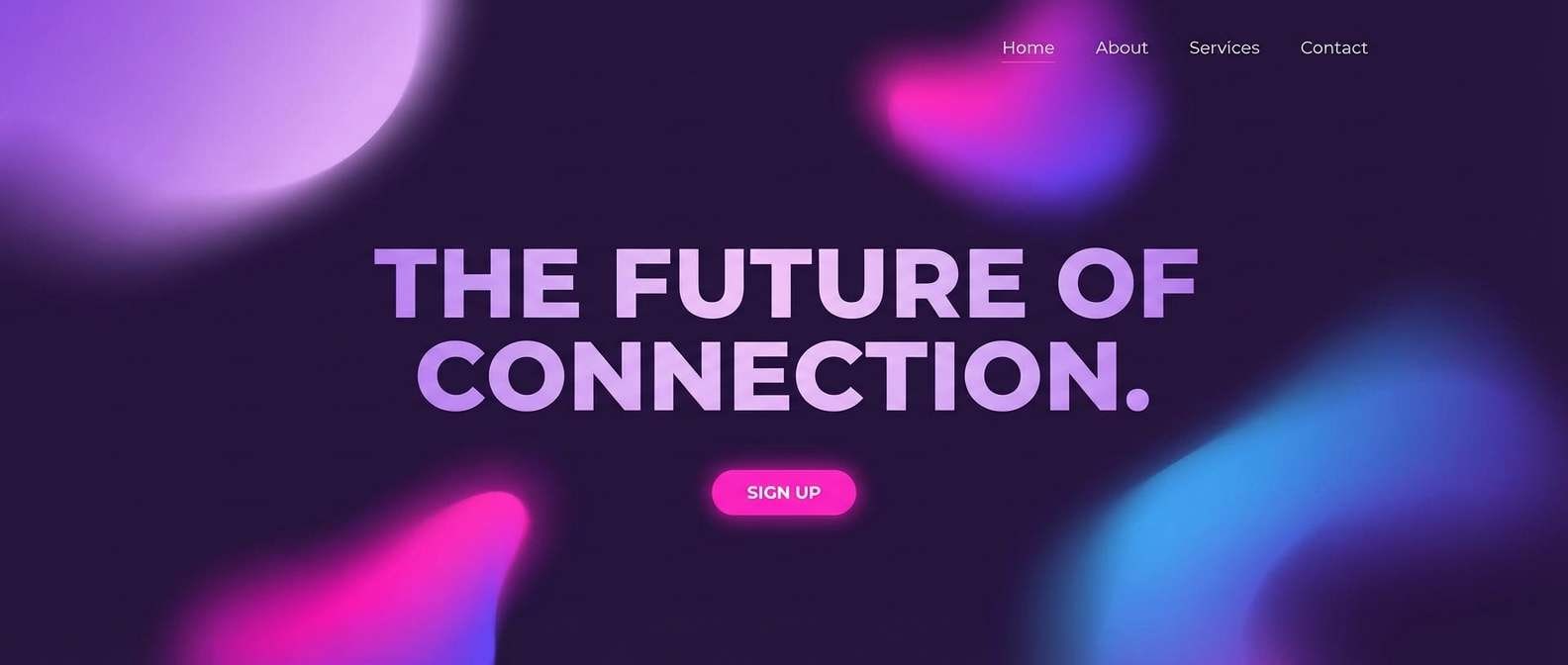
HEX: #C9A0FF #9C5BFF #2B123F #FF4FD8 #F7F3FF
Mood: playful, futuristic, energetic
Best for: tech startup landing hero
Playful and futuristic like city lights on a rainy night, this set adds an electric edge to lilac. It works well for startup hero sections, app launches, and punchy social ads. Use the dark grape as the base, then let iris and hot pink carry gradients and buttons. Tip: keep the neon pink as a small accent so the lilac stays dominant.
Image example of iris neon edge generated using media.io
9) Lavender Clay
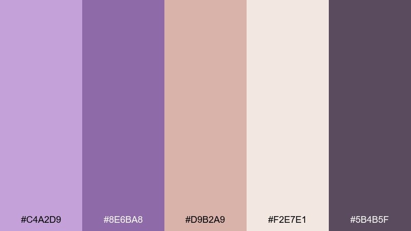
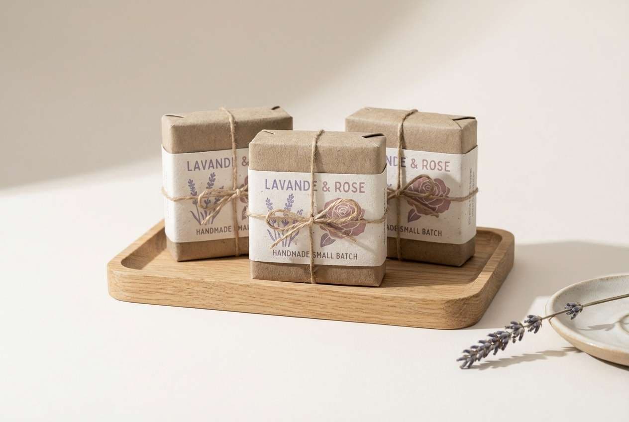
HEX: #C4A2D9 #8E6BA8 #D9B2A9 #F2E7E1 #5B4B5F
Mood: artisan, soft, earthy
Best for: handmade soap packaging
Artisan and earthy like lavender mixed into clay, these tones feel handcrafted and calm. They suit soap wraps, candle labels, and small-batch skincare where texture matters. Pair the dusty mauve with warm off-white, and use the deep muted purple for ingredient lists. Tip: choose matte paper and simple line icons to keep the handmade feel.
Image example of lavender clay generated using media.io
10) Plum Cocoa Night
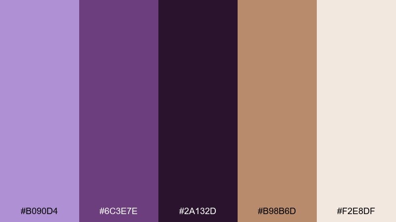
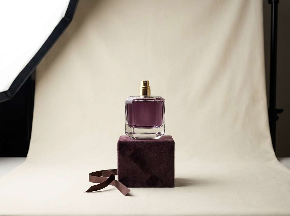
HEX: #B090D4 #6C3E7E #2A132D #B98B6D #F2E8DF
Mood: moody, elegant, intimate
Best for: luxury perfume ad
Moody and intimate like a candlelit lounge, these purples look striking next to cocoa and cream. Use them for fragrance ads, premium gift sets, and high-end lookbooks. Let the plum anchor the composition and bring cocoa in for warm contrast on typography or borders. Tip: add plenty of negative space so the dark shades feel intentional, not heavy.
Image example of plum cocoa night generated using media.io
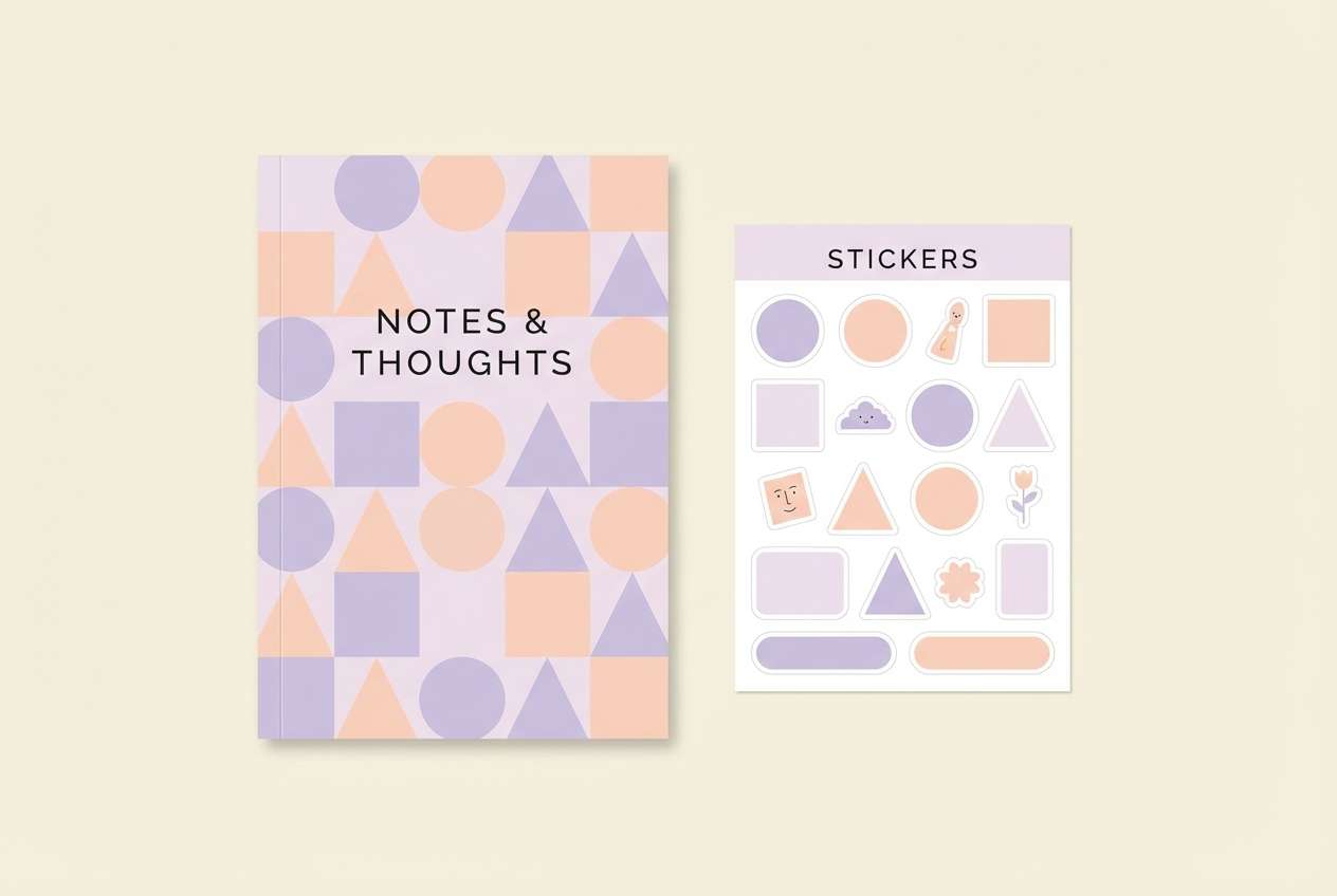
11) Pastel Lilac Study
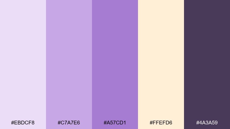
HEX: #EBDCF8 #C7A7E6 #A57CD1 #FFEFD6 #4A3A59
Mood: gentle, studious, friendly
Best for: stationery set design
Gentle and studious like annotated notes in a quiet library, these pastels feel inviting. They work well for planners, notebooks, stickers, and classroom handouts. Use the peach as a warm highlight for tabs, and rely on the deep purple for legible headings. Tip: keep patterns small-scale so the soft lilac background stays clean.
Image example of pastel lilac study generated using media.io
12) Lilac Pop Social
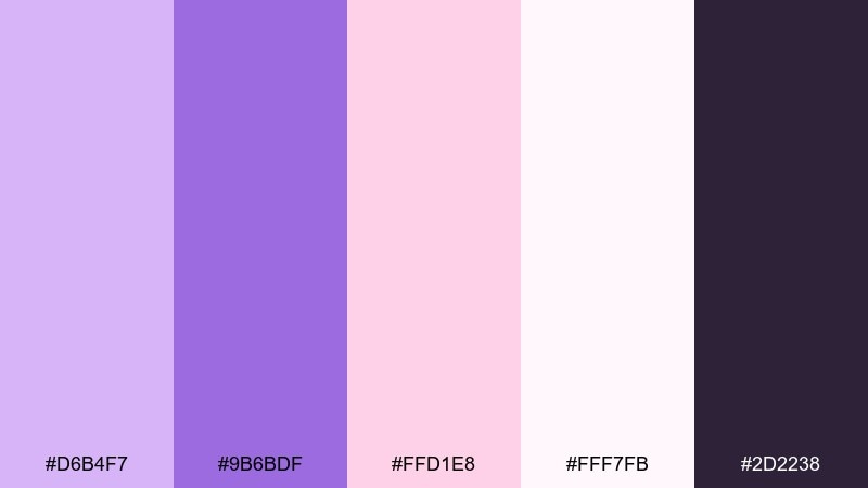
HEX: #D6B4F7 #9B6BDF #FFD1E8 #FFF7FB #2D2238
Mood: cute, bright, shareable
Best for: social media promo post
Cute and bright like a bubblegum sticker pack, this mix is made for scrolling. Use it for promos, story templates, and creator kits where you need clear hierarchy fast. The dark purple keeps text readable while pink adds friendly emphasis for prices or buttons. Tip: stick to two type weights to avoid visual noise in the soft background.
Image example of lilac pop social generated using media.io

13) Heather Stone Editorial
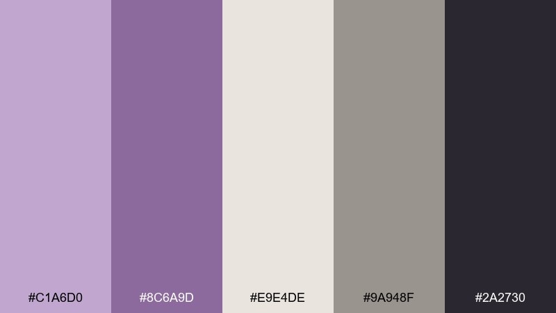
HEX: #C1A6D0 #8C6A9D #E9E4DE #9A948F #2A2730
Mood: editorial, refined, understated
Best for: magazine spread layout
Refined and understated like heather against stone, these tones feel quietly premium. They are ideal for editorials, essays, and portfolio spreads where imagery should lead. Use the warm gray for grids and captions, and keep lilac as a section color for pull quotes. Tip: avoid pure black and use the charcoal instead for a softer print finish.
Image example of heather stone editorial generated using media.io
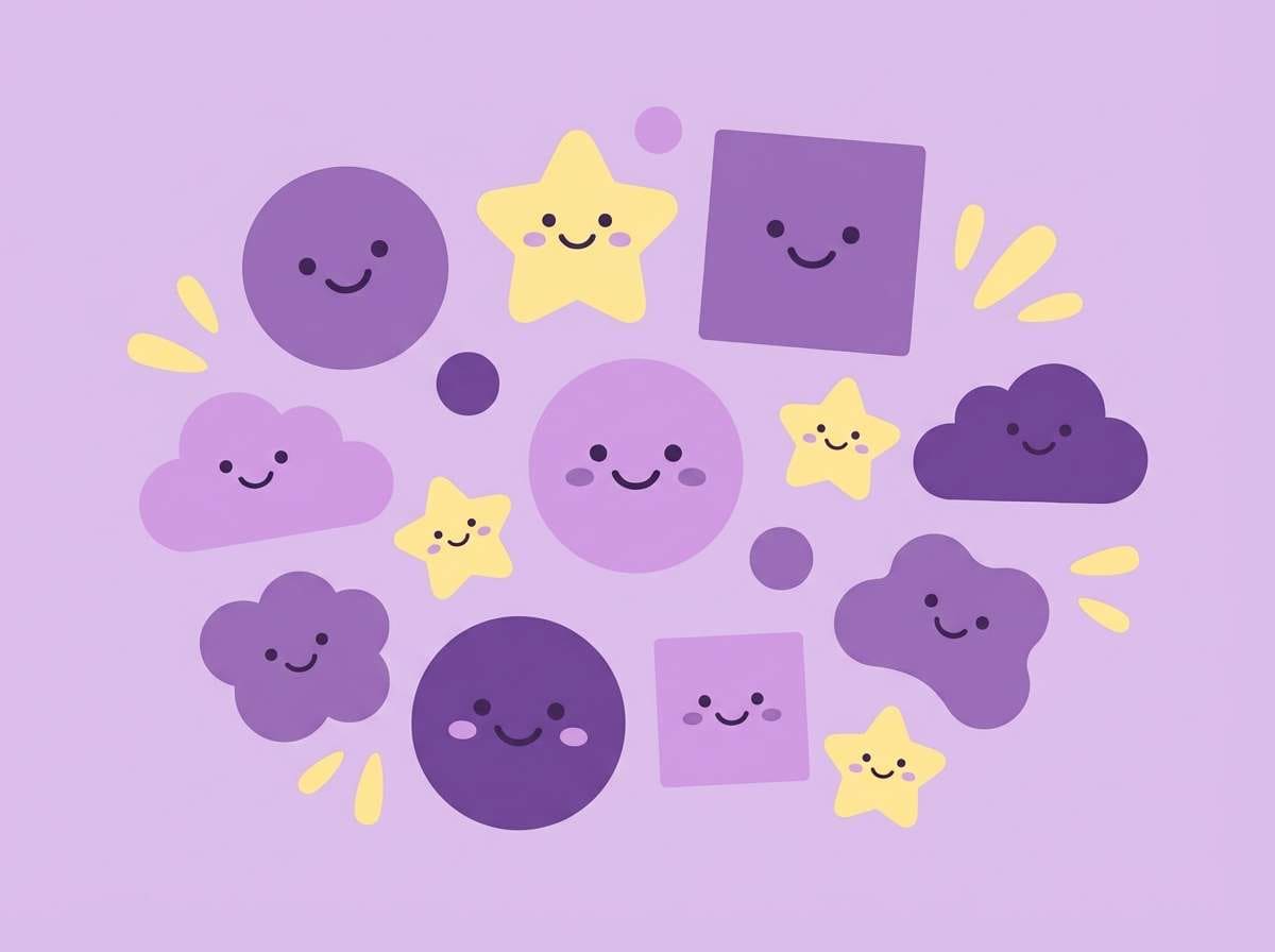
14) Grape Soda Kids
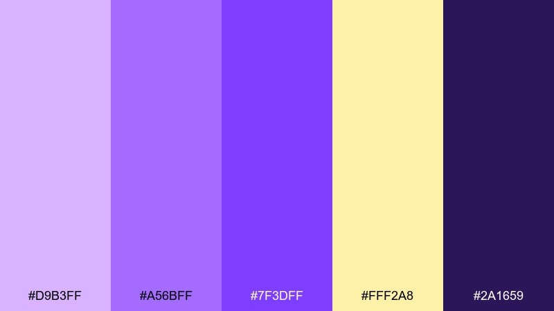
HEX: #D9B3FF #A56BFF #7F3DFF #FFF2A8 #2A1659
Mood: fun, bouncy, youthful
Best for: kids room wall art
Fun and bouncy like fizzy candy, these purples get a sunny lift from soft yellow. Use them for kids wall art, playful posters, or classroom decor that needs energy without neon overload. Keep the darkest purple for outlines and let lilac fill the big shapes. Tip: use chunky, simple icons so the contrast stays readable from across the room.
Image example of grape soda kids generated using media.io
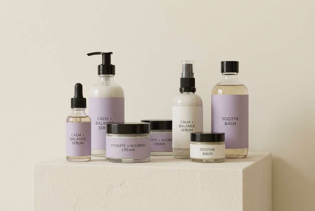
15) Lilac Quartz Skincare
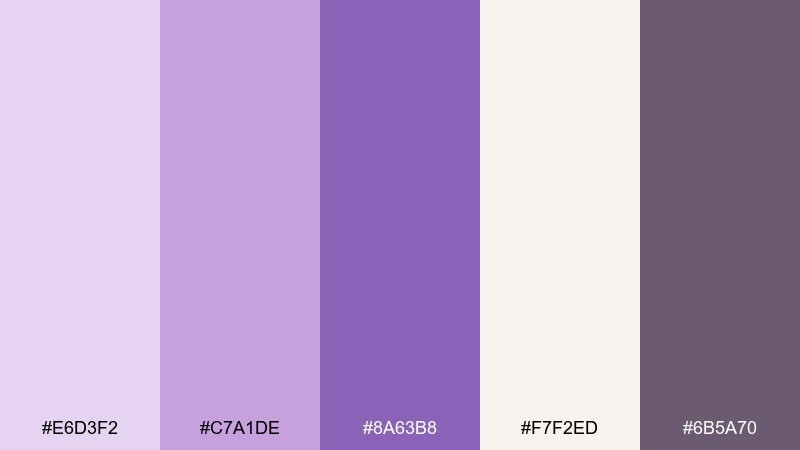
HEX: #E6D3F2 #C7A1DE #8A63B8 #F7F2ED #6B5A70
Mood: clean, soothing, premium
Best for: skincare packaging
Clean and soothing like a polished quartz stone, this set feels spa-ready. It is a strong purple lilac color combination for skincare packaging that needs softness plus credibility. Use the off-white as the main label field, then bring lilac into bands, seals, and small icons. Tip: keep the darkest tone for ingredients and legal copy so it remains readable at small sizes.
Image example of lilac quartz skincare generated using media.io
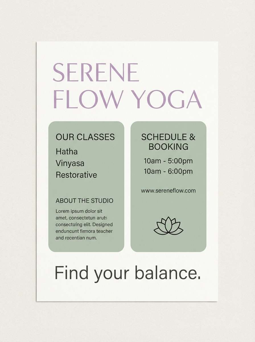
16) Violet Sage Balance
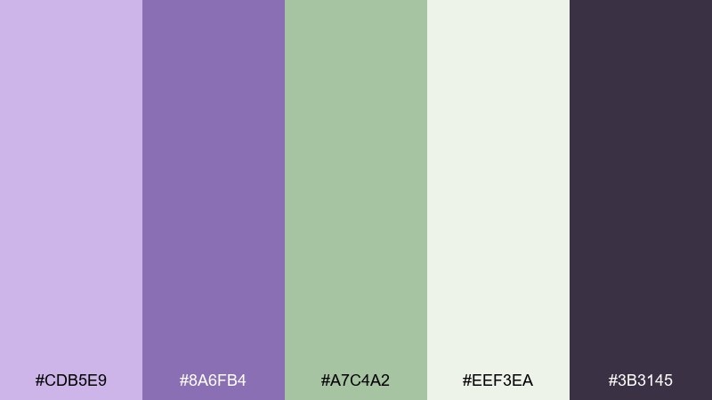
HEX: #CDB5E9 #8A6FB4 #A7C4A2 #EEF3EA #3B3145
Mood: balanced, natural, restorative
Best for: yoga studio flyer
Balanced and restorative like a quiet garden path, lilac and sage create instant calm. This purple lilac color palette fits yoga flyers, retreat schedules, and mindful newsletters. Pair the pale green as background blocks with violet headings, and use the charcoal for class details. Tip: add breathing room with wide margins to match the relaxed tone.
Image example of violet sage balance generated using media.io
17) Lilac Chrome Modern
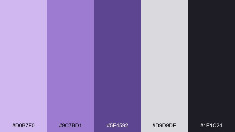
HEX: #D0B7F0 #9C7BD1 #5E4592 #D9D9DE #1E1C24
Mood: sleek, modern, confident
Best for: app onboarding screens
Sleek and modern like chrome against tinted glass, these tones look sharp in digital products. Use them for onboarding, feature highlights, and micro-illustrations where you want a refined tech feel. Lean on the cool gray for structure and let lilac handle emphasis states and progress indicators. Tip: keep gradients minimal and use flat fills for accessibility.
Image example of lilac chrome modern generated using media.io
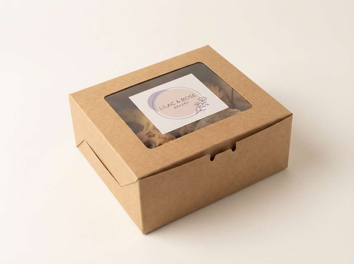
18) Rose Lilac Bakery
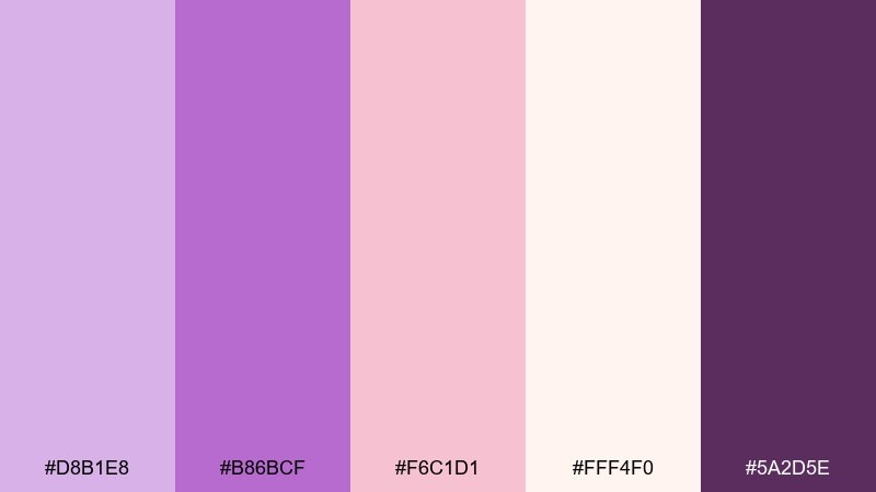
HEX: #D8B1E8 #B86BCF #F6C1D1 #FFF4F0 #5A2D5E
Mood: sweet, charming, inviting
Best for: bakery packaging label
Sweet and charming like frosting swirls, this lilac and rose pairing feels instantly inviting. It is a go-to purple lilac color combinations set for bakery labels, pastry boxes, and seasonal gift tags. Use the deep berry for the logo stamp, then keep the rest airy with blush and warm white. Tip: add a thin border in mid-lilac to make the label pop on kraft paper.
Image example of rose lilac bakery generated using media.io
19) Twilight Lilac Gradient
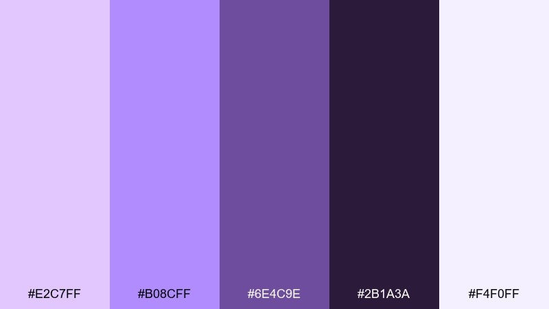
HEX: #E2C7FF #B08CFF #6E4C9E #2B1A3A #F4F0FF
Mood: dreamy, cinematic, immersive
Best for: event poster gradient background
Dreamy and cinematic like twilight slipping into night, these purples are made for gradients. Use them for event posters, stream thumbnails, and hero banners where mood matters. Let the darkest shade sit at the edges, and fade into pale lilac for text zones and logos. Tip: add a slight grain overlay to make banding less noticeable in large prints.
Image example of twilight lilac gradient generated using media.io
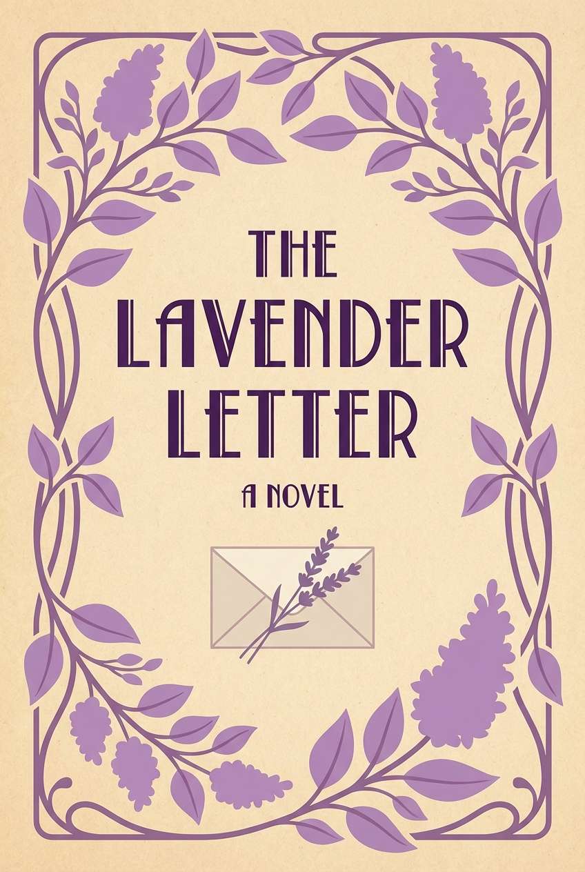
20) Lilac Ink & Paper
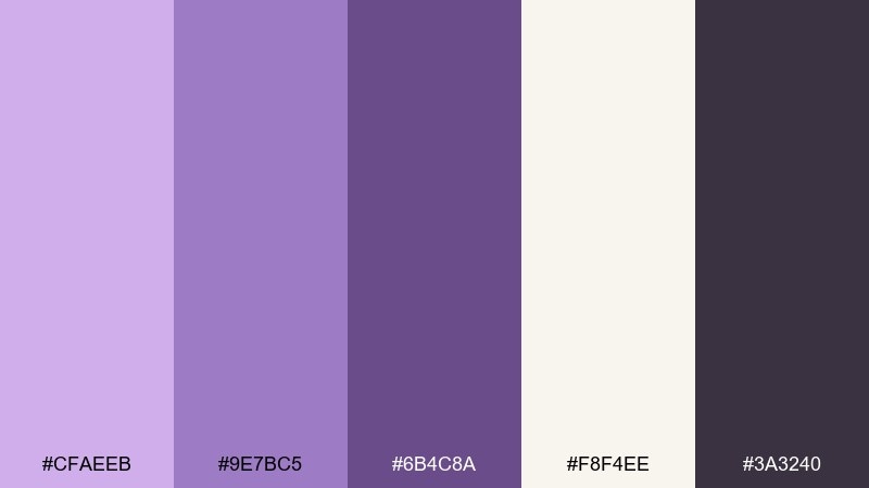
HEX: #CFAEEB #9E7BC5 #6B4C8A #F8F4EE #3A3240
Mood: classic, literary, trustworthy
Best for: book cover design
Classic and literary like ink on textured paper, this palette feels smart and composed. Use it for book covers, author brands, and long-form blog graphics. Keep the warm paper tone as the main field, then place lilac as a soft frame with deep purple for titles. Tip: test the mid-purple on screens and print, since it can shift cooler under LED lighting.
Image example of lilac ink & paper generated using media.io
21) Soft Lilac Retail Ad
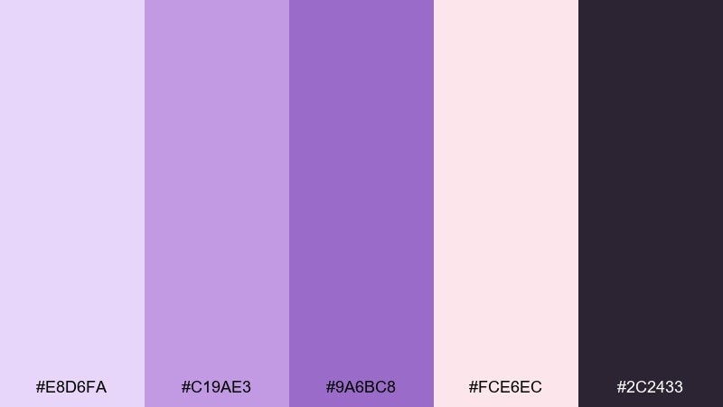
HEX: #E8D6FA #C19AE3 #9A6BC8 #FCE6EC #2C2433
Mood: soft, stylish, friendly
Best for: product promo banner
Soft and stylish like satin ribbons, these tints are perfect for gentle retail moments. Use them for promo banners, ecommerce tiles, and seasonal launches where you want warmth without heavy color. Combine blush as the background with lilac buttons, then set text in the deep charcoal-purple for clarity. Tip: keep product photos neutral so the pastel frame stays the star.
Image example of soft lilac retail ad generated using media.io
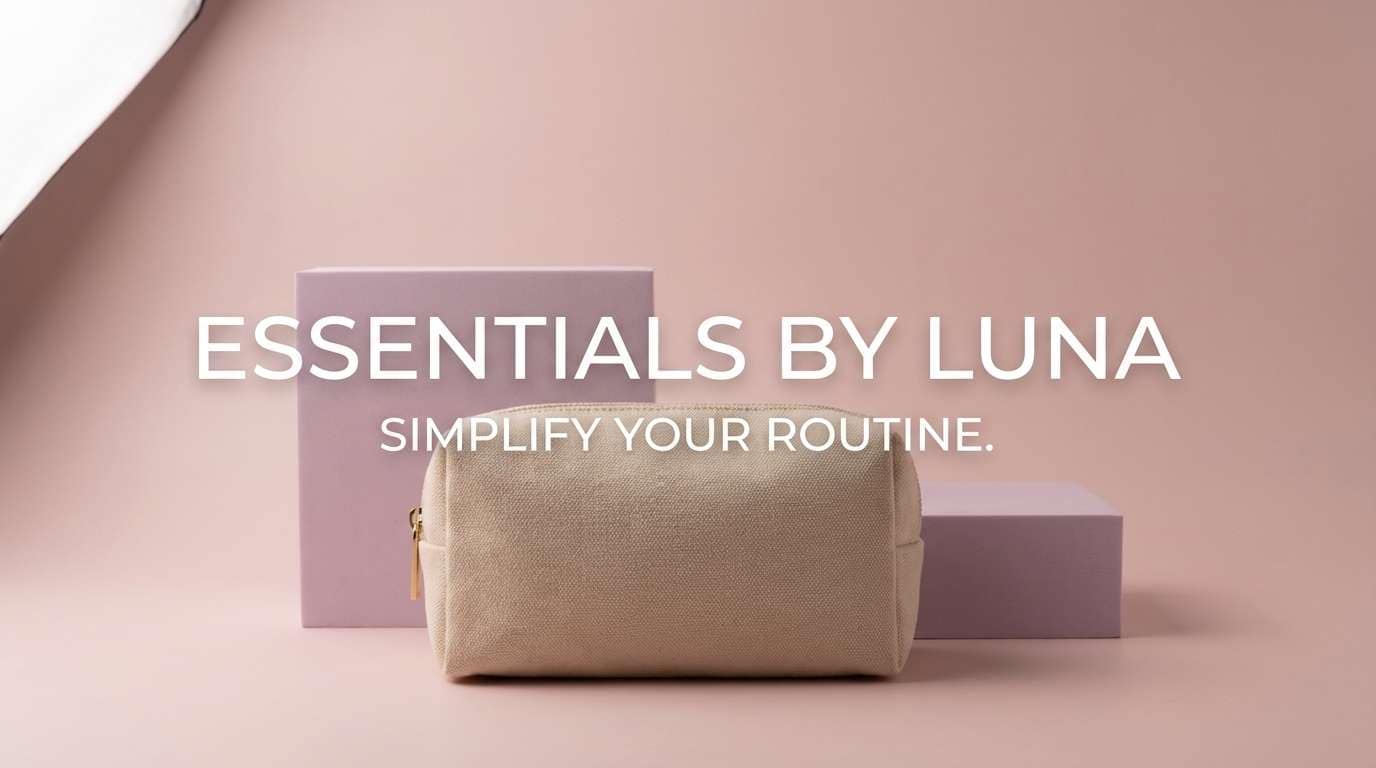
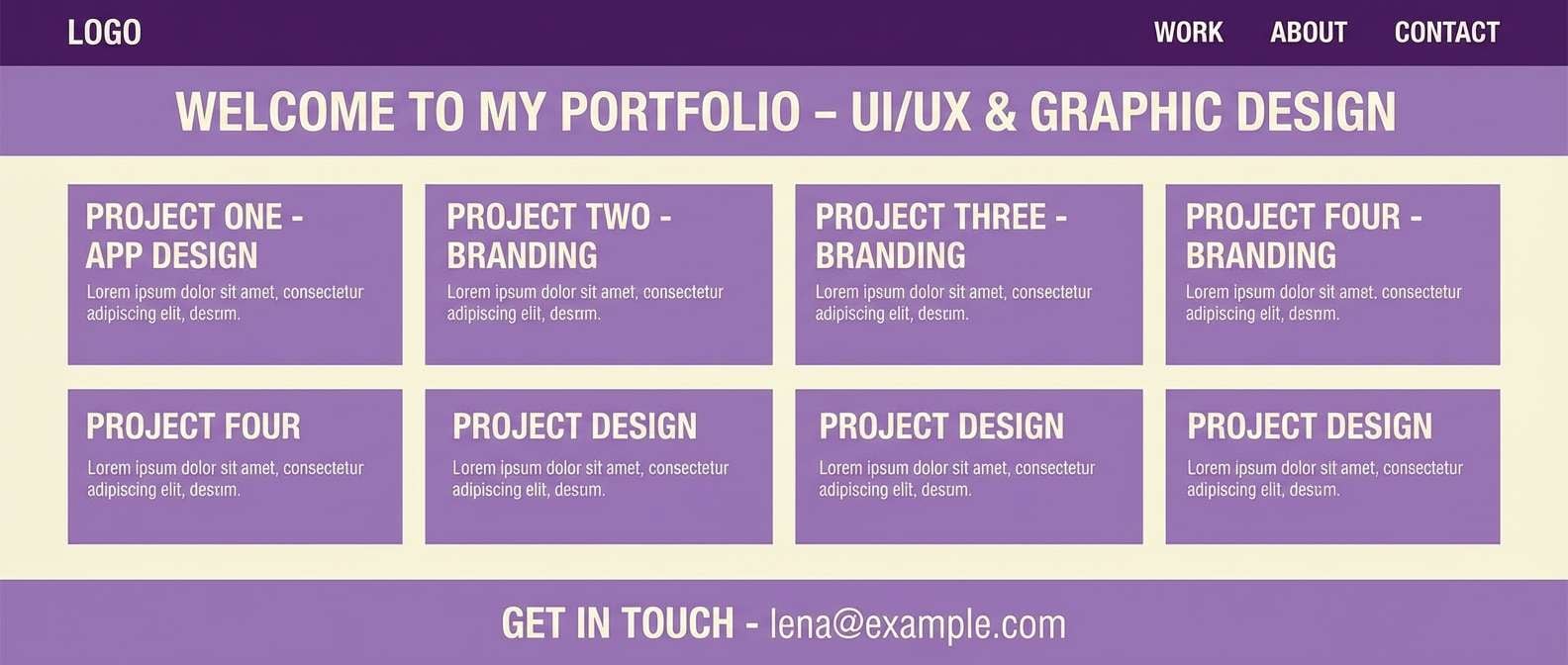
22) Purple Lilac Studio Set
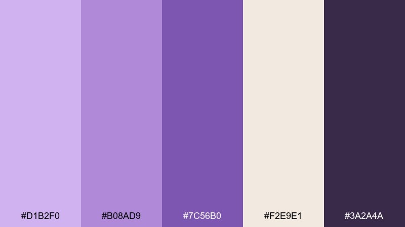
HEX: #D1B2F0 #B08AD9 #7C56B0 #F2E9E1 #3A2A4A
Mood: creative, calm, professional
Best for: design portfolio website
Creative and calm like a tidy studio corner, these violets feel professional without being cold. Use this purple lilac color palette for portfolio sites, case study pages, and project thumbnails. Pair the cream tone with mid-lilac for sections, then use the deep purple for links and active states. Tip: limit accents to one purple per page so your work stays in focus.
Image example of purple lilac studio set generated using media.io
What Colors Go Well with Purple Lilac?
Purple lilac pairs beautifully with warm neutrals like cream, oat, taupe, and soft cocoa—these keep lilac looking elevated and mature. For a cleaner, modern feel, add white and cool grays to sharpen structure.
For nature-inspired combinations, try sage, eucalyptus, and muted greens; they bring balance and calm. If you want more punch, use small accents of hot pink, berry, or buttery yellow while keeping lilac as the dominant field.
To avoid a “too pastel” look, ground the palette with a deep anchor (eggplant, charcoal purple, or near-black). That anchor improves readability for type, UI controls, and logos.
How to Use a Purple Lilac Color Palette in Real Designs
In branding, treat lilac as your signature tint and reserve darker violets for logos, headlines, and CTAs. This keeps the identity soft but still confident, especially across web and packaging.
In UI design, use lilac for surfaces (cards, panels, background blocks) and rely on deep purple or charcoal for text and navigation. Limit bright accents to one action color so the interface stays calm and accessible.
For print (weddings, posters, labels), test lilac on the final paper stock—pastels shift with lighting and material. Add negative space and thin rules/borders to keep layouts crisp instead of hazy.
Create Purple Lilac Palette Visuals with AI
If you have HEX codes but need real visuals—mockups, posters, packaging, or UI screens—AI can turn a palette into consistent design directions in minutes. The key is describing the style (minimal, editorial, watercolor, UI) and where each color should appear (background, text, accents).
Start with one palette and generate a few variations: swap the background color, change the mood (luxe vs. airy), or try different composition ratios for social, banners, and print. Save your best prompts so your outputs stay on-brand.
With Media.io Text-to-Image, you can quickly create purple lilac palette examples for client presentations, mood boards, and landing page concepts—right in the browser.
Purple Lilac Color Palette FAQs
-
What is the HEX code for a typical purple lilac?
A common purple lilac sits around a light violet tint such as #C9A3E6 or #D1B2F0, but “lilac” can shift warmer or cooler depending on the mix of red/blue. -
Does purple lilac work for professional branding?
Yes. Pair lilac with grounded neutrals (cream, taupe, cool gray) and a dark anchor (eggplant/charcoal) to keep the brand soft yet credible. -
What colors complement purple lilac best?
Cream/off-white, warm gray, sage green, dusty rose/blush, and deep purple/charcoal are reliable complements. For bold accents, try hot pink or soft yellow in small amounts. -
How do I keep lilac text readable on light backgrounds?
Avoid using lilac for body text. Use a dark purple or charcoal for text, and keep lilac for backgrounds, chips, dividers, or large decorative areas. -
Is purple lilac good for UI design?
It’s great for calm UI themes. Use lilac tints for surfaces and states, keep white for spacing, and choose a deep purple for navigation and key contrast. -
Can I print lilac accurately for invitations or packaging?
Pastel purples can shift on different paper stocks. Do a test print, consider uncoated/matte finishes for softness, and avoid overly subtle gradients that may band. -
How can I generate palette-based images quickly?
Use a text-to-image tool and specify the style, layout, and where each palette color should appear (background, typography, accents). Iterate by changing one variable at a time for consistent results.
Next: Sienna Color Palette


