

A pop art color palette is built for instant impact: bold primaries, loud neons, crisp blacks, and bright whites that read fast—just like a comic panel or a retro ad.
Below are 20 punchy pop art palette ideas (with HEX codes) you can use for posters, UI, packaging, and more—plus prompts to generate matching visuals in Media.io.
In this article
- Why Pop Art Palettes Work So Well
-
- comic primary pop
- neon bubblegum panels
- vintage dots and denim
- gallery pop contrast
- candy cyan magenta
- retro soda ad
- halftone pop remix
- pop noir and lemon
- electric peach splash
- sky pop pastel punch
- atomic lime on navy
- pop sunset blocks
- cherry cola highlights
- cyanotype pop clean
- studio pop bright basics
- soft pop with cream
- pop mint and charcoal
- urban sticker set
- pop minimal with gray
- high energy sports banner
- What Colors Go Well with Pop Art?
- How to Use a Pop Art Color Palette in Real Designs
- Create Pop Art Palette Visuals with AI
Why Pop Art Palettes Work So Well
Pop art colors are designed to compete for attention in the best way: high saturation, sharp contrasts, and simple color hierarchies that stay readable at a glance.
They also translate cleanly across mediums—from screen-printed tees and sticker packs to UI buttons and promo banners—because the palette relies on solid blocks more than subtle shading.
When you anchor bright hues with black, navy, or charcoal, you get that classic comic-book clarity: strong outlines, bold type, and punchy highlights that feel intentional rather than noisy.
20+ Pop Art Color Palette Ideas (with HEX Codes)
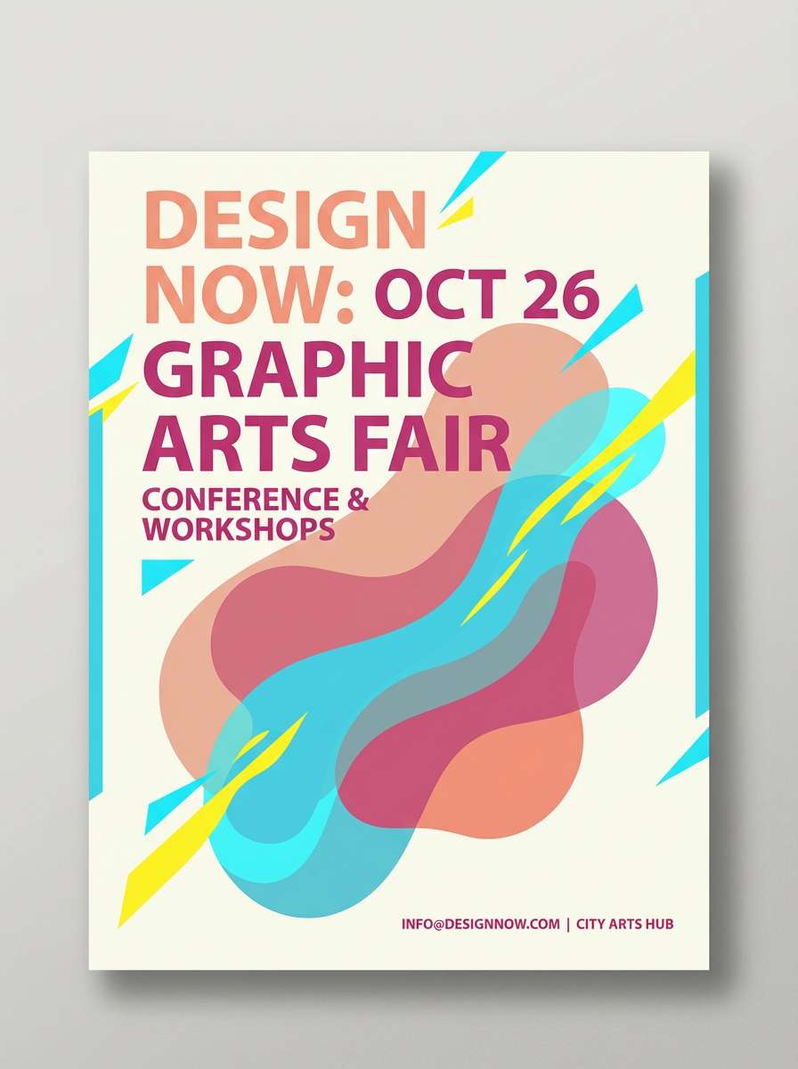
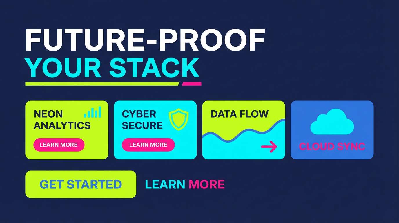
1) Comic Primary Pop
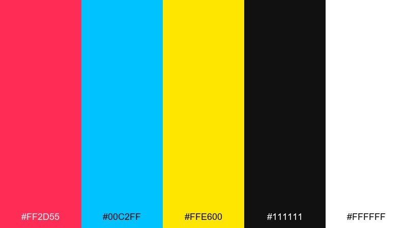
HEX: #ff2d55 #00c2ff #ffe600 #111111 #ffffff
Mood: bold, punchy, graphic
Best for: comic-style poster design
Bold and punchy like a classic comic cover, these tones feel loud, clean, and instantly readable. Use the black and white as structure for type and panel lines, then let cyan and hot pink fight for attention. Yellow works best as a spotlight color for badges, bursts, and highlights. Keep gradients minimal so the shapes stay crisp at a distance.
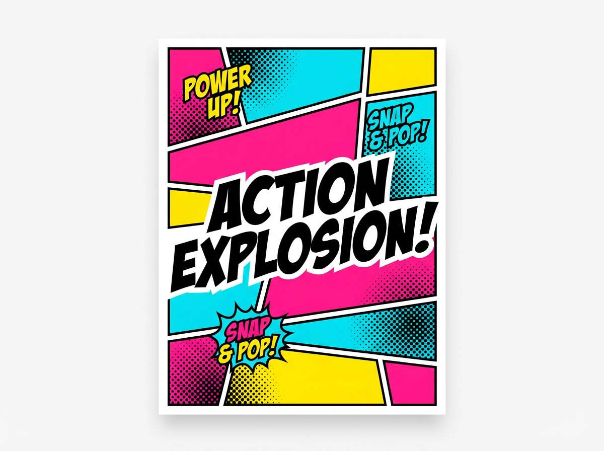
Image example of comic primary pop generated using media.io
Media.io is an online AI studio for creating and editing video, image, and audio in your browser.

2) Neon Bubblegum Panels
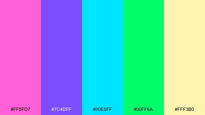
HEX: #ff5fd7 #7c4dff #00e5ff #00ff6a #fff3b0
Mood: playful, neon, bubbly
Best for: social media carousel graphics
Playful and neon like bubblegum stickers under a blacklight, this mix leans fun without turning messy. Use cream as breathing room, then choose two hero colors per slide so the layout stays readable. The violet and pink pair well for headings, while cyan or green can carry buttons and highlights. Add thick outlines or shadow blocks to keep the neon tones from vibrating on small screens.
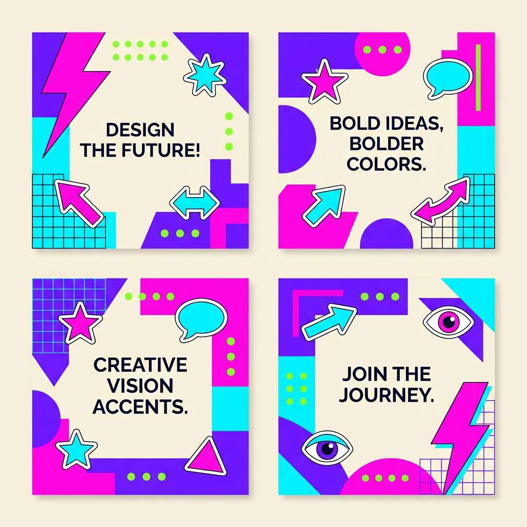
Image example of neon bubblegum panels generated using media.io
3) Vintage Dots and Denim
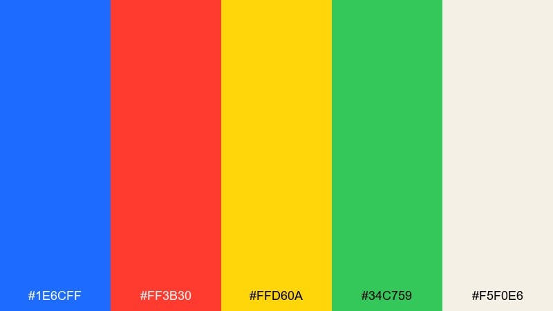
HEX: #1e6cff #ff3b30 #ffd60a #34c759 #f5f0e6
Mood: retro, upbeat, screen-printed
Best for: t-shirt graphic artwork
Retro and upbeat like a thrift-store tee with fresh ink, these colors love chunky shapes and imperfect halftone texture. Keep denim blue as the base so the red and yellow can pop without overwhelming the design. Green works best in smaller patches, like outlines or secondary icons. For a more authentic print feel, limit the design to two to three dominant inks and let the cream act as the fabric tone.
Image example of vintage dots and denim generated using media.io

4) Gallery Pop Contrast
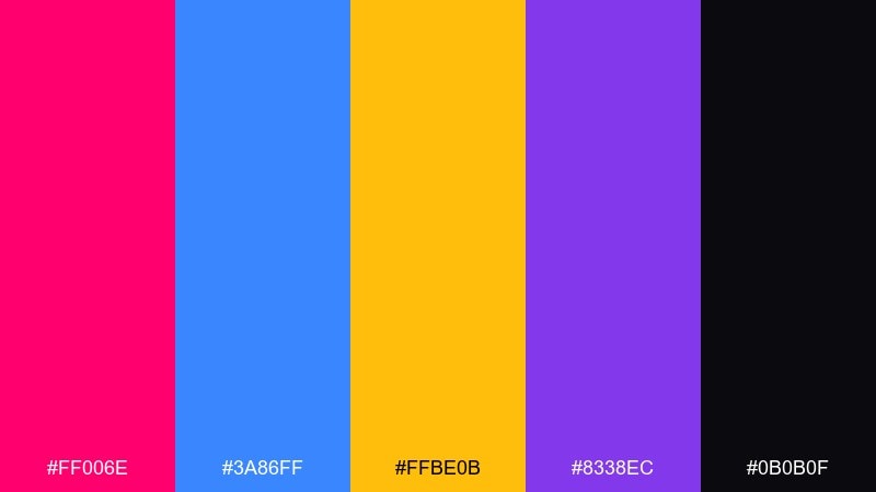
HEX: #ff006e #3a86ff #ffbe0b #8338ec #0b0b0f
Mood: confident, modern, gallery-bright
Best for: brand identity and logo systems
Confident and gallery-bright, this set feels like spotlighted artwork against a dark wall. Treat the near-black as your brand anchor, then rotate the saturated accents for campaigns and seasonal drops. The pink and blue make a sharp focal pairing, while gold is perfect for calls to action and premium highlights. In a pop art color palette like this, keep spacing generous so the saturation reads intentional, not chaotic.
Image example of gallery pop contrast generated using media.io
5) Candy Cyan Magenta
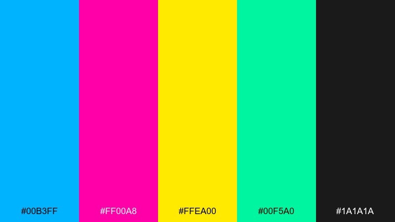
HEX: #00b3ff #ff00a8 #ffea00 #00f5a0 #1a1a1a
Mood: electric, glossy, high-energy
Best for: UI dashboards and data widgets
Electric and glossy like arcade lights on a rainy night, these colors bring instant energy to interfaces. Use the charcoal for navigation, charts, and text so the bright accents stay legible. Cyan and magenta are strong opposites for primary and secondary actions, while yellow is best reserved for alerts or key metrics. Keep gradients subtle and rely on solid blocks to avoid visual noise in dense screens.
Image example of candy cyan magenta generated using media.io
6) Retro Soda Ad
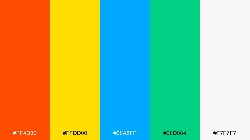
HEX: #ff4d00 #ffdd00 #00a8ff #00d084 #f7f7f7
Mood: cheerful, nostalgic, punchy
Best for: product ad banners and headers
Cheerful and nostalgic like a fizzy soda poster, this mix balances warm citrus with cool sparkle. Let orange lead headlines and hero shapes, then use blue to cool the composition and guide the eye. Yellow works as a light source color behind products, while green can signal freshness or limited editions. Add thin black strokes or deep shadows only where you need definition on pale backgrounds.
Image example of retro soda ad generated using media.io
7) Halftone Pop Remix
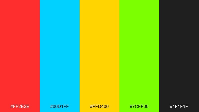
HEX: #ff2e2e #00d1ff #ffd400 #7cff00 #1f1f1f
Mood: loud, kinetic, rebellious
Best for: album cover artwork
Loud and kinetic like a record sleeve from a DIY scene, these tones are built for impact. Push red and cyan as the main duo, then use yellow for stickers, tracklist blocks, and spotlight moments. Lime works best in small jolts to keep the cover from feeling overly busy. If you want pop art color combinations that still feel modern, lean into halftone texture and bold cropping rather than extra gradients.
Image example of halftone pop remix generated using media.io
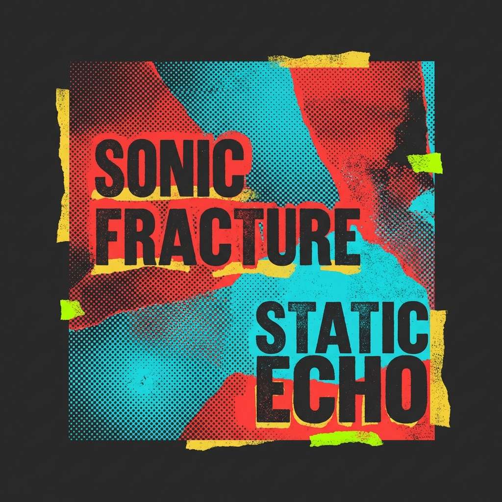
8) Pop Noir and Lemon
HEX: #0f0f10 #ffe100 #ff4d6d #4dffea #f2f2f2
Mood: sleek, edgy, editorial
Best for: magazine layouts and feature spreads
Sleek and edgy like nightlife photography with graphic overlays, this palette thrives on strong contrast. Use the near-black for columns and body text, then pop lemon yellow in pull quotes and section markers. Pink and aqua are best as accent blocks behind images or for small icons and captions. Keep the light gray as a paper tone so the page still feels premium, not neon-heavy.
Image example of pop noir and lemon generated using media.io
9) Electric Peach Splash
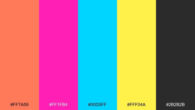
HEX: #ff7a59 #ff1fb4 #00d5ff #fff04a #2b2b2b
Mood: sunny, youthful, splashy
Best for: event flyers and club announcements
Sunny and youthful like paint splashes on a summer flyer, this mix looks best in big blocks and bold type. Pair peach with charcoal for readable headers, then punch in magenta for urgency and energy. Cyan adds a cool counterbalance, while yellow works for highlights, prices, or dates. Use one dominant warm tone and one cool tone per layout to keep the message clear at a glance.
Image example of electric peach splash generated using media.io
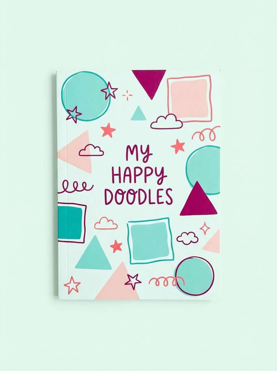
10) Sky Pop Pastel Punch
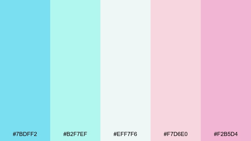
HEX: #7bdff2 #b2f7ef #eff7f6 #f7d6e0 #f2b5d4
Mood: soft, dreamy, playful
Best for: kids stationery and notebook covers
Soft and dreamy like cotton-candy clouds, these pastels give a gentler spin to graphic design. Use the nearly-white mint as the base, then layer aqua and blush for big shapes and background patterns. The deeper pink is perfect for titles and small icons that need to stand out. Add thin charcoal linework if you need contrast, but keep the overall look airy and light.
Image example of sky pop pastel punch generated using media.io
11) Atomic Lime on Navy
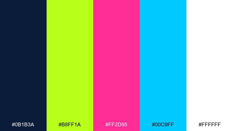
HEX: #0b1b3a #b8ff1a #ff2d95 #00c9ff #ffffff
Mood: futuristic, punchy, techy
Best for: startup landing pages
Futuristic and punchy like neon signage against a midnight sky, this set feels built for tech. Let navy handle the heavy lifting for sections and text, then use lime as your primary call-to-action color. Pink and cyan are great for feature badges, hover states, and small gradients inside charts. Keep plenty of white space in cards so the accents read sharp rather than overwhelming.
Image example of atomic lime on navy generated using media.io
12) Pop Sunset Blocks
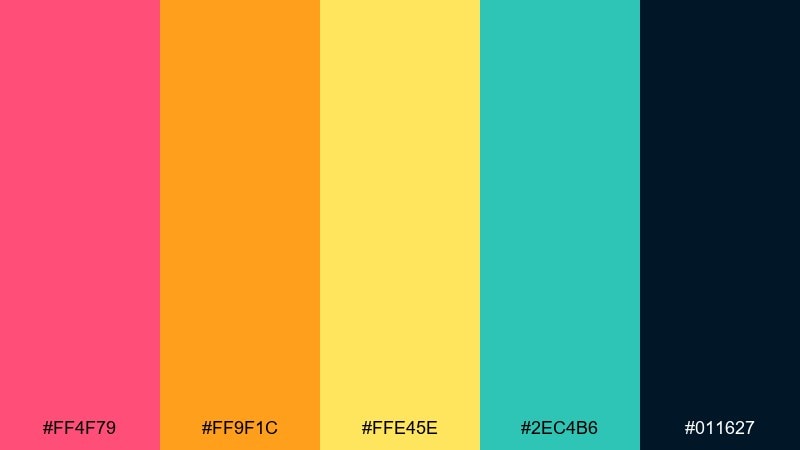
HEX: #ff4f79 #ff9f1c #ffe45e #2ec4b6 #011627
Mood: optimistic, warm, blocky
Best for: presentation slides and keynote themes
Optimistic and warm like a sunset made of paper cutouts, these blocks are ideal for clear slide hierarchies. Use the deep navy for titles and body text, then stack pink and orange for section dividers and charts. Teal is your cooler counterpoint for secondary series in graphs or emphasis bullets. For a cohesive pop art color scheme, keep shapes geometric and repeat the same two accent colors across a deck.
Image example of pop sunset blocks generated using media.io

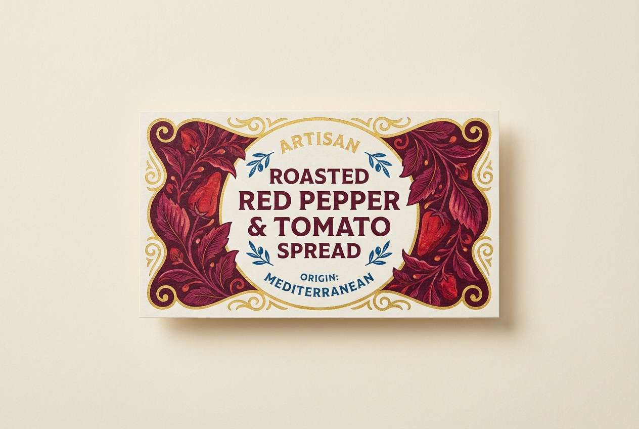
13) Cherry Cola Highlights
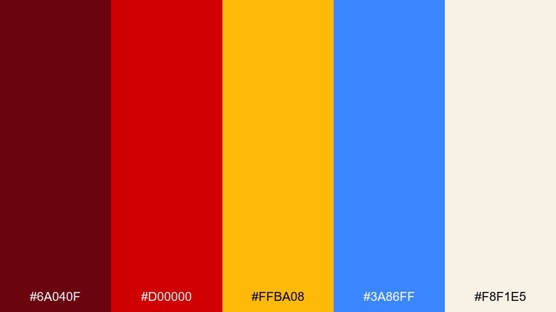
HEX: #6a040f #d00000 #ffba08 #3a86ff #f8f1e5
Mood: rich, punchy, vintage-modern
Best for: packaging labels and bottle wraps
Rich and punchy like cherry cola with a golden sparkle, this palette feels both retro and premium. Let the deep burgundy frame the label, then use bright red for the brand mark and key flavor cues. Gold works as a highlight for awards, callouts, and pricing, while blue adds a crisp contrast for secondary info. Keep the cream as the paper base so the darker tones feel printed and tactile.
Image example of cherry cola highlights generated using media.io
14) Cyanotype Pop Clean
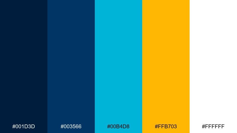
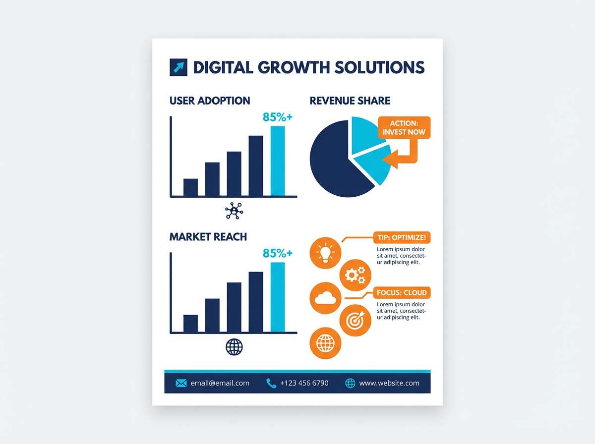
HEX: #001d3d #003566 #00b4d8 #ffb703 #ffffff
Mood: clean, confident, information-first
Best for: infographics and data posters
Clean and confident like a museum infographic, this set keeps data legible while still feeling lively. Use the two navy tones for text, axes, and grids, then reserve cyan for main data series. Orange is a strong callout color for key numbers, warnings, and badges. On white backgrounds, keep line weights consistent so the colors do the work without extra decoration.
Image example of cyanotype pop clean generated using media.io
15) Studio Pop Bright Basics
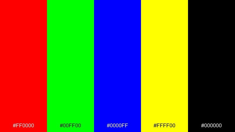
HEX: #ff0000 #00ff00 #0000ff #ffff00 #000000
Mood: classic, high-contrast, iconic
Best for: educational posters and classroom charts
Classic and iconic like primary paint straight from the tube, this set is all about instant recognition. Use black for labels and outlines so the brightest colors stay easy to read from across a room. Red, blue, and yellow work best as the main blocks, while green is a strong accent for checkmarks, highlights, or categories. For a pop art color palette with maximum clarity, keep typography bold and avoid soft shadows.
Image example of studio pop bright basics generated using media.io
16) Soft Pop with Cream
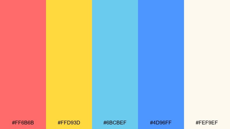
HEX: #ff6b6b #ffd93d #6bcbef #4d96ff #fef9ef
Mood: friendly, light, celebratory
Best for: afterparty invitations and playful invites
Friendly and celebratory like confetti on cream paper, these tones feel fun without the harsh neon edge. Use cream as the invitation base, then choose coral or blue for the main headline and layout blocks. Yellow is perfect for tiny bursts, RSVP icons, and date highlights. Add simple line art and keep spacing generous so the palette stays airy and modern.
Image example of soft pop with cream generated using media.io

17) Pop Mint and Charcoal
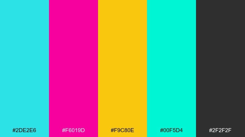
HEX: #2de2e6 #f6019d #f9c80e #00f5d4 #2f2f2f
Mood: fresh, sharp, high-contrast
Best for: app icon sets and micro-illustrations
Fresh and sharp like glossy stickers on a dark notebook, this mix loves small shapes with strong edges. Use charcoal as the consistent outline and background so the bright hues feel organized. Mint and cyan can carry most icons, while magenta and yellow work best as status states and notification cues. Keep icon details simple so the saturated colors read clearly at tiny sizes.
Image example of pop mint and charcoal generated using media.io
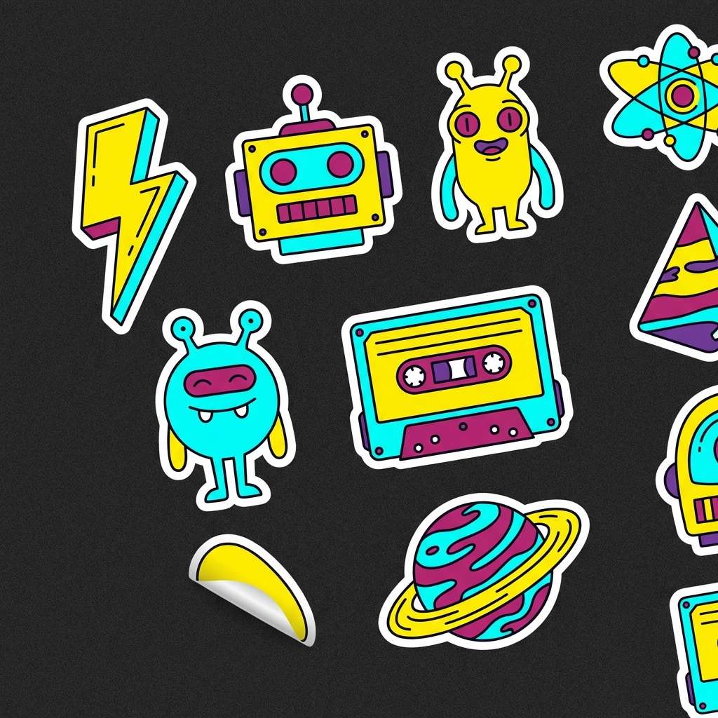
18) Urban Sticker Set
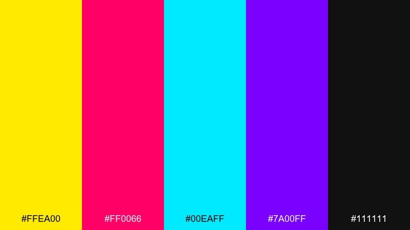
HEX: #ffea00 #ff0066 #00eaff #7a00ff #111111
Mood: street, energetic, graphic
Best for: sticker pack illustrations
Street and energetic like a wall of fresh stickers, these hues demand bold outlines and simple silhouettes. Black is the key to keeping the bright tones readable, especially when shapes overlap. Yellow and cyan make a clean high-visibility pair, while magenta and purple add attitude in smaller bursts. A pop art color combination like this works best when you repeat one signature accent across the whole set for cohesion.
Image example of urban sticker set generated using media.io
19) Pop Minimal with Gray
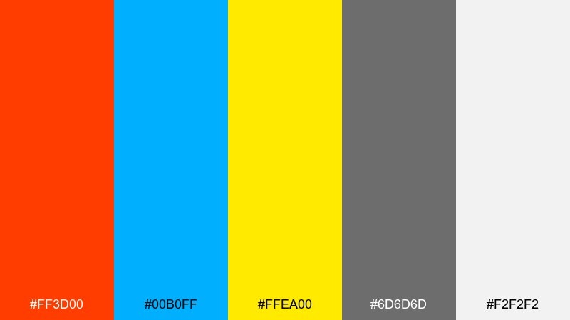
HEX: #ff3d00 #00b0ff #ffea00 #6d6d6d #f2f2f2
Mood: clean, modern, attention-grabbing
Best for: wayfinding signage and store signs
Clean and modern like a gallery wayfinding system, this mix keeps things readable while still feeling playful. Use light gray as the background, then rely on dark gray for text and arrows. Orange and cyan are strong for directions and category labels, while yellow can mark priority areas like exits or promos. Stick to large blocks and simple icons so the signs stay clear from a distance.
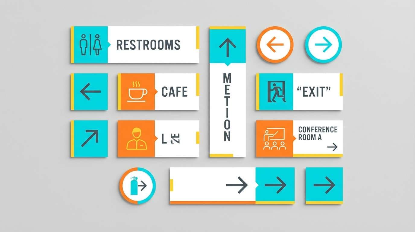
Image example of pop minimal with gray generated using media.io
20) High Energy Sports Banner
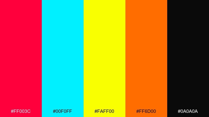
HEX: #ff003c #00f0ff #faff00 #ff6d00 #0a0a0a
Mood: fast, intense, competitive
Best for: sports promo banners and headlines
Fast and intense like a highlight reel, these tones are made for urgent promos. Use near-black for the base and typography, then push cyan and yellow for speed lines and key stats. Orange and red are strongest for pricing, limited-time labels, and team callouts. Keep text large and avoid thin fonts so the contrast holds up on mobile screens and outdoor displays.
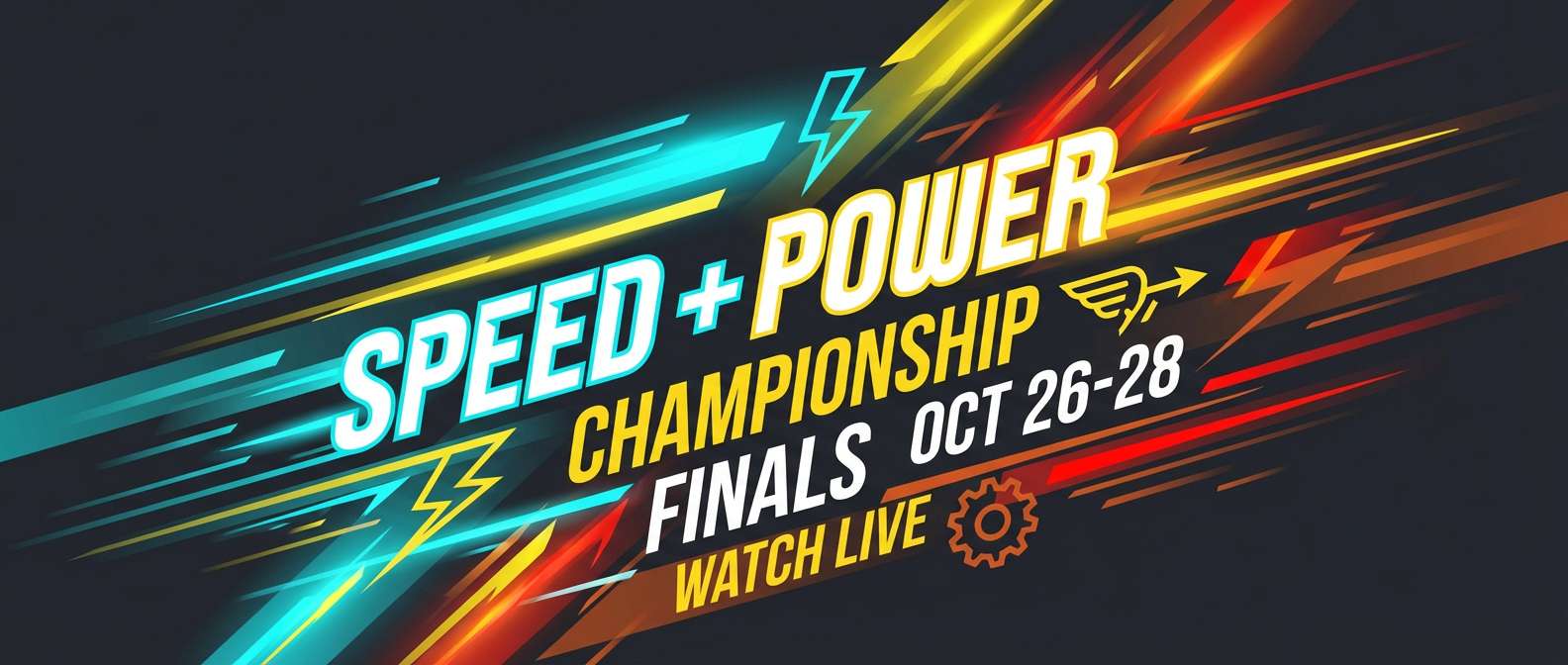
Image example of high energy sports banner generated using media.io
What Colors Go Well with Pop Art?
Pop art works best with high-contrast pairings: hot pink with cyan, lemon yellow with near-black, or saturated red against bright white. These combos mimic comic printing and signage, where clarity matters more than subtlety.
Neutrals are essential, not optional. Black, charcoal, navy, light gray, and cream create structure for type, grids, and outlines—so bright accents feel controlled instead of chaotic.
For a modern pop feel, add one “shock” accent (lime, magenta, electric cyan) and limit it to highlights like buttons, badges, bursts, or key numbers.
How to Use a Pop Art Color Palette in Real Designs
Start with a strict hierarchy: one base (white/cream/charcoal), one primary accent (your hero color), and one secondary accent. Use the remaining colors only for micro-details like icons, labels, and emphasis.
Pop art palettes love shapes. Think thick strokes, panel blocks, halftone textures, and sticker-like badges. If everything is loud, nothing is loud—so give your layout breathing room with margins and clean negative space.
For readable type, put text on a neutral, or add a solid backing shape (pill, rectangle, burst). Avoid thin fonts over vibrating color pairs (like neon pink on cyan) unless you add outlines or shadows.
Create Pop Art Palette Visuals with AI
If you want to preview a pop art color scheme fast, generate a few style frames first: a poster layout, a UI hero section, or a packaging label. That helps you validate contrast, readability, and balance before you commit.
In Media.io, you can paste a prompt (like the ones above) and iterate quickly—swap backgrounds, tighten the palette, or test different outline weights while keeping the same overall pop aesthetic.
Once you like the look, reuse the same prompt pattern to build a consistent set of assets (banners, stickers, slides, and social posts) that all feel like one campaign.
Pop Art Color Palette FAQs
-
What is a pop art color palette?
A pop art color palette uses high-saturation hues (often primaries and neons) paired with strong neutrals like black and white to create bold, comic-style contrast and fast readability. -
What are classic pop art colors?
Classic pop art colors include bright red, cyan/blue, and yellow, plus black and white for outlines and type. Many modern pop art palettes also add hot pink, lime, or purple for extra punch. -
How many colors should I use in a pop art design?
For clean results, use 1 base neutral + 2 hero colors, then reserve the remaining colors for small highlights. Too many equally-dominant brights can make layouts feel noisy. -
How do I keep pop art palettes readable for text?
Put text on a neutral (white/cream/charcoal) or add a solid shape behind it. If you must place text on bright colors, use bold fonts and consider outlines or shadow blocks. -
Do pop art palettes work for UI and apps?
Yes—use dark neutrals for navigation and body text, then apply saturated accents for buttons, active states, and key metrics. Limit neon-on-neon pairings for accessibility. -
What background works best for pop art colors?
White and cream create a classic comic-paper vibe, while charcoal and navy make neon accents feel more premium and techy. Choose the background that supports your contrast needs. -
How can I generate pop art visuals from a palette?
Use a text-to-image tool like Media.io and describe a clean vector layout, bold outlines, halftone dots, and your dominant colors. Generate a few variations to test balance and hierarchy.
Next: Drab Color Palette


