

Drab doesn’t mean dull—it’s a modern mix of muted olive, khaki, and earthy neutrals that feels calm, grounded, and quietly premium.
Below are ready-to-use drab color palette ideas with HEX codes, plus practical tips for branding, interiors, and UI that need restraint without looking flat.
In this article
- Why Drab Palettes Work So Well
-
- dusty olive ground
- mossy linen
- urban khaki
- smoke and sage
- clay fieldnotes
- muted forest walk
- pebble drift
- tarnished brass
- rainy parka
- vintage canteen
- ashen meadow
- concrete herb
- worn canvas
- dune patrol
- loden evening
- weathered barnwood
- olive latte
- foggy thicket
- sepia garden
- quiet utility
- siltstone studio
- What Colors Go Well with Drab?
- How to Use a Drab Color Palette in Real Designs
- Create Drab Palette Visuals with AI
Why Drab Palettes Work So Well
Drab palettes sit in the “quiet middle” of color: low-saturation olives, khakis, stone grays, and canvas browns. That muted range reduces visual noise, which makes layouts feel confident and considered.
Because drab tones are naturally close in value, they create smooth hierarchy and soft depth—ideal for interfaces, editorial layouts, and packaging where readability and restraint matter.
Done right, drab reads modern and premium, not washed out. The key is intentional contrast (dark text on light surfaces) and consistent spacing so the palette feels designed, not accidental.
20+ Drab Color Palette Ideas (with HEX Codes)
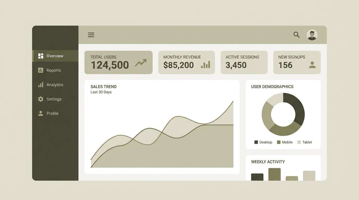
1) Dusty Olive Ground
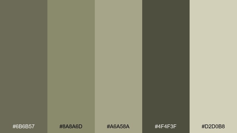
HEX: #6b6b57 #8a8a6d #a6a58a #4f4f3f #d2d0b8
Mood: steady, practical, calm
Best for: ui dashboard
Steady and utilitarian, these dusty olive neutrals feel like weathered canvas and well-loved field gear. They read clean on screens while keeping a warm, human edge. Use the deep olive as navigation and the pale stone as panels, then reserve the mid tones for charts and states. Tip: keep contrast strong by pairing #4f4f3f text with #d2d0b8 surfaces.
Image example of dusty olive ground generated using media.io
Media.io is an online AI studio for creating and editing video, image, and audio in your browser.

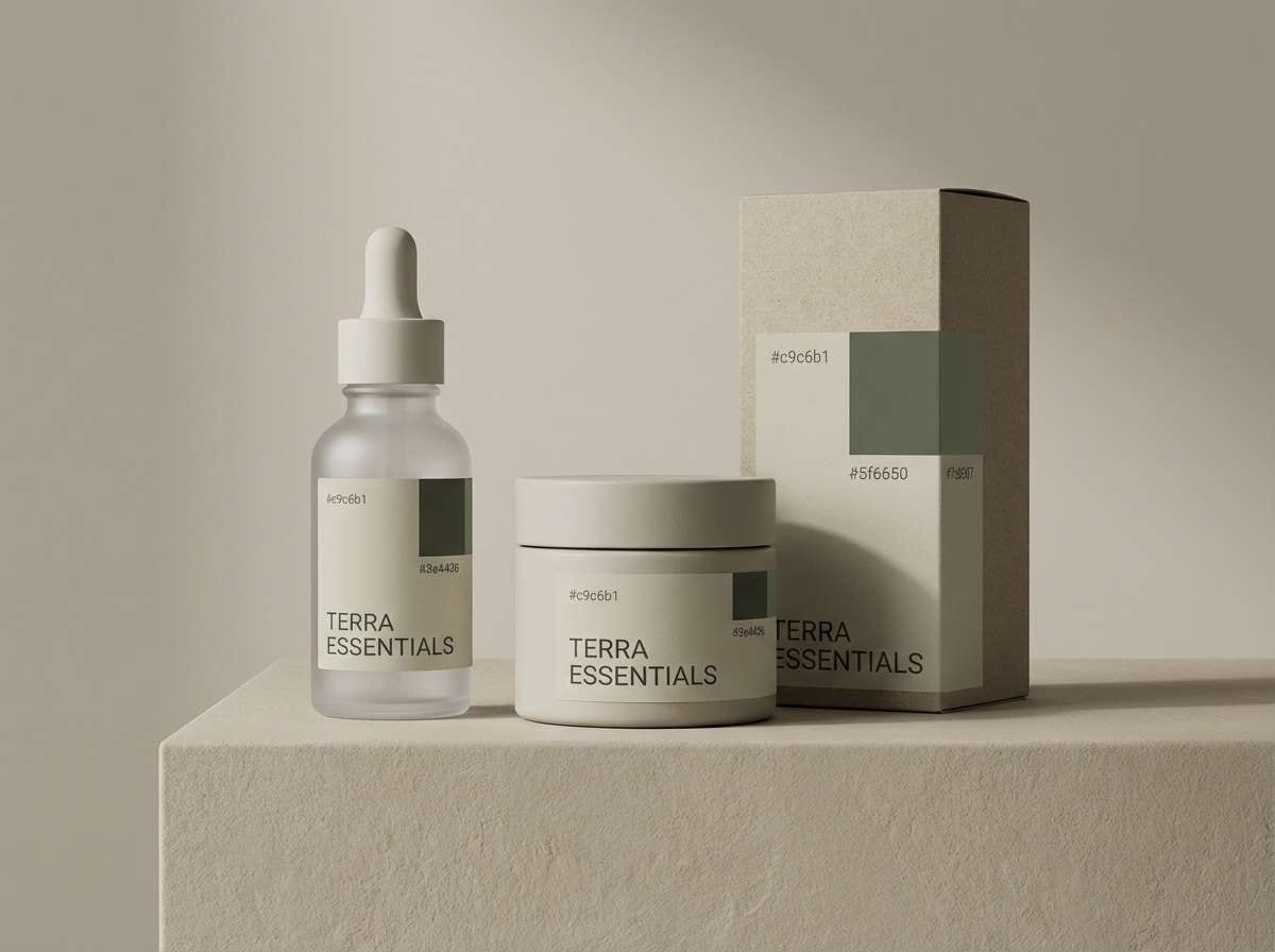
2) Mossy Linen
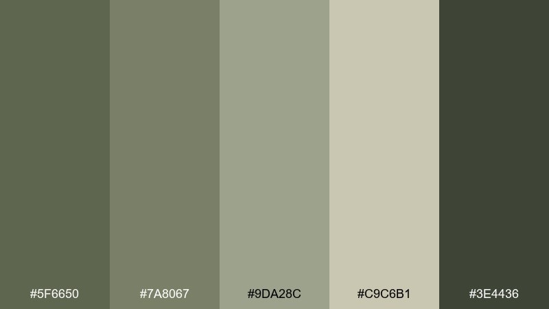
HEX: #5f6650 #7a8067 #9da28c #c9c6b1 #3e4436
Mood: soft, natural, approachable
Best for: skincare packaging
Soft moss and linen tones evoke herbal steam, stoneware jars, and a quiet apothecary shelf. The mix feels gentle enough for wellness branding while still looking premium. Let #c9c6b1 carry the label background, and use #3e4436 for typography to keep it crisp. Tip: add tactile finishes like matte paper to make the muted greens feel intentional, not faded.
Image example of mossy linen generated using media.io
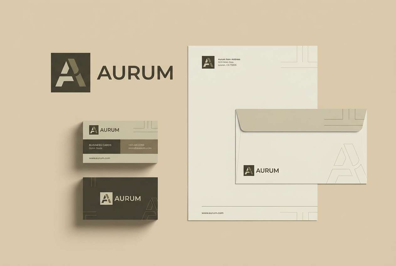
3) Urban Khaki
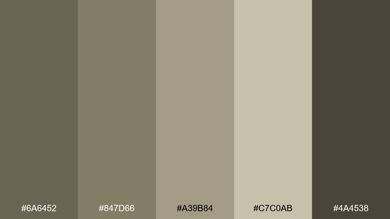
HEX: #6a6452 #847d66 #a39b84 #c7c0ab #4a4538
Mood: modern, grounded, architectural
Best for: brand identity kit
Architectural khakis and muted stone suggest concrete streets, brushed metal, and calm storefronts. These drab color combinations work well when you want seriousness without going full grayscale. Pair the darkest tone for logos and wordmarks, then build stationery with the lighter khaki blocks for a layered look. Tip: introduce one crisp neutral background to keep the palette feeling contemporary.
Image example of urban khaki generated using media.io
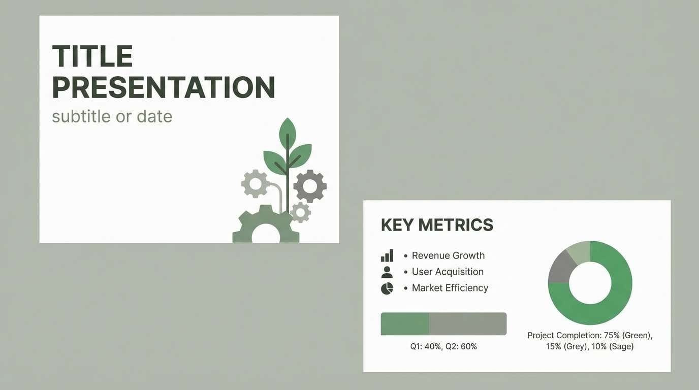
4) Smoke and Sage
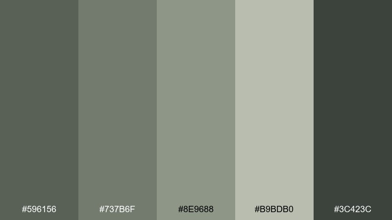
HEX: #596156 #737b6f #8e9688 #b9bdb0 #3c423c
Mood: cool, balanced, understated
Best for: presentation template
Cool smoke and sage tones feel like misty mornings and chalky stone walls. They keep slides readable while avoiding the harshness of pure black and white. Use #b9bdb0 for backgrounds and #3c423c for headings, then highlight key data with #8e9688. Tip: keep charts simple and use two tones only to maintain the quiet, editorial look.
Image example of smoke and sage generated using media.io
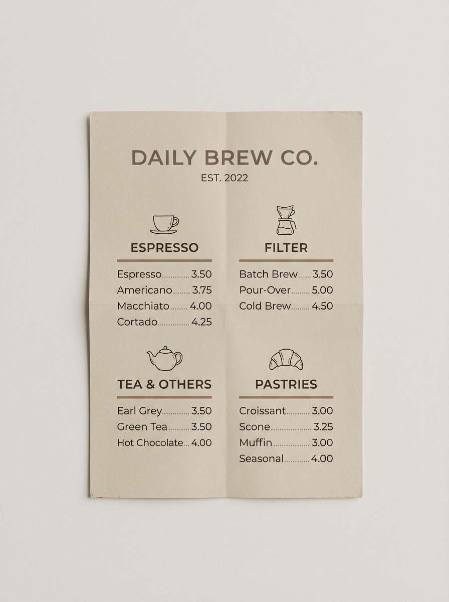
5) Clay Fieldnotes
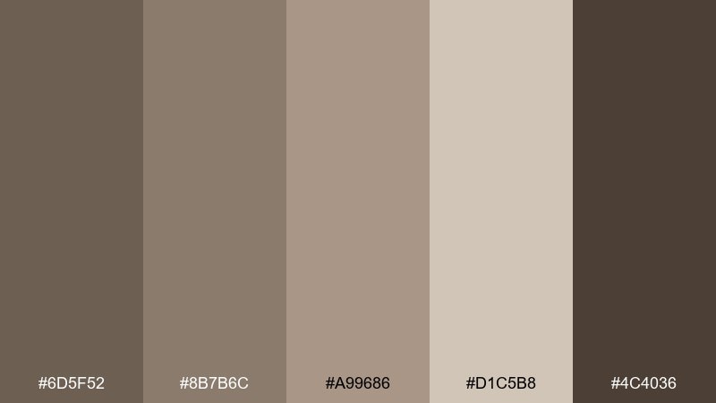
HEX: #6d5f52 #8b7b6c #a99686 #d1c5b8 #4c4036
Mood: warm, rustic, tactile
Best for: coffee shop menu
Warm clay and worn paper hues bring to mind leather journals, espresso crema, and cozy wood counters. The palette is ideal for menus where you want comfort and clarity at a glance. Set body text in #4c4036 on #d1c5b8, and use the mid clays for section headers and price tags. Tip: add small line icons in the darkest tone to keep the layout tidy and consistent.
Image example of clay fieldnotes generated using media.io
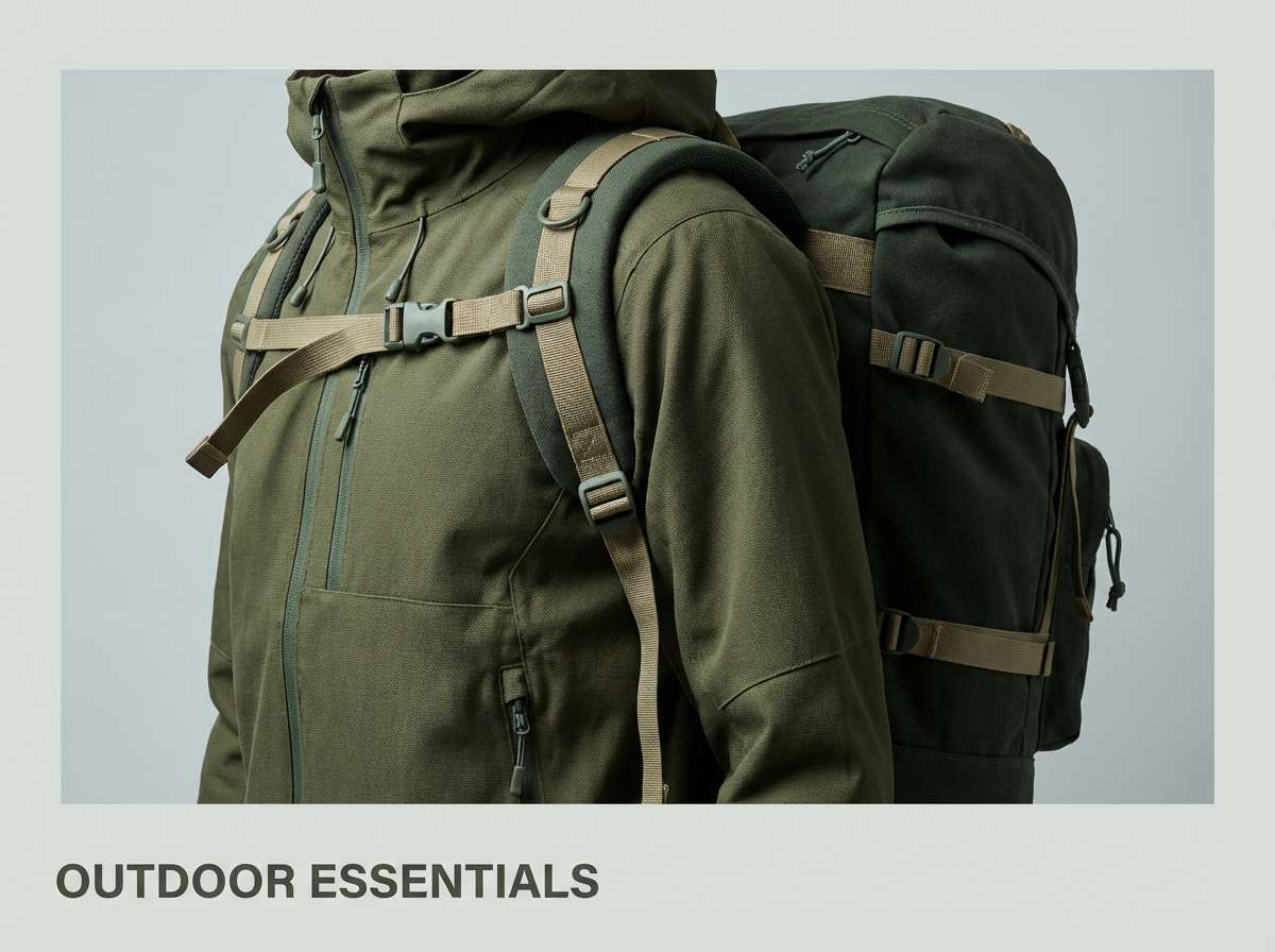
6) Muted Forest Walk
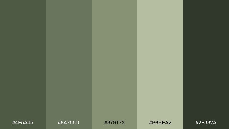
HEX: #4f5a45 #6a755d #879173 #b6bea2 #2f382a
Mood: earthy, outdoorsy, resilient
Best for: outdoor apparel ad
Earthy forest greens create the feeling of shaded trails and durable gear built for long weekends. The darker tones add grit, while the pale green reads like sun through leaves. Use #2f382a for headlines and #b6bea2 for open negative space, keeping product details sharp. Tip: stick to one bold callout color block so the ad stays rugged, not busy.
Image example of muted forest walk generated using media.io
7) Pebble Drift
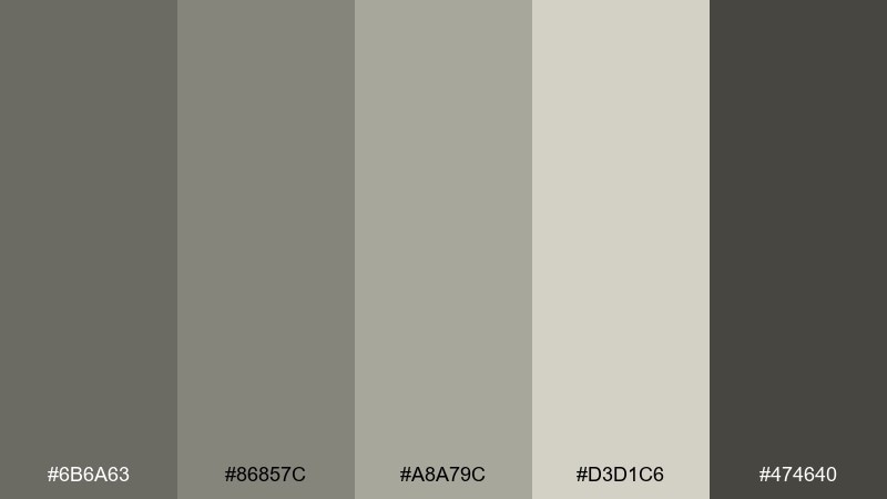
HEX: #6b6a63 #86857c #a8a79c #d3d1c6 #474640
Mood: quiet, minimal, airy
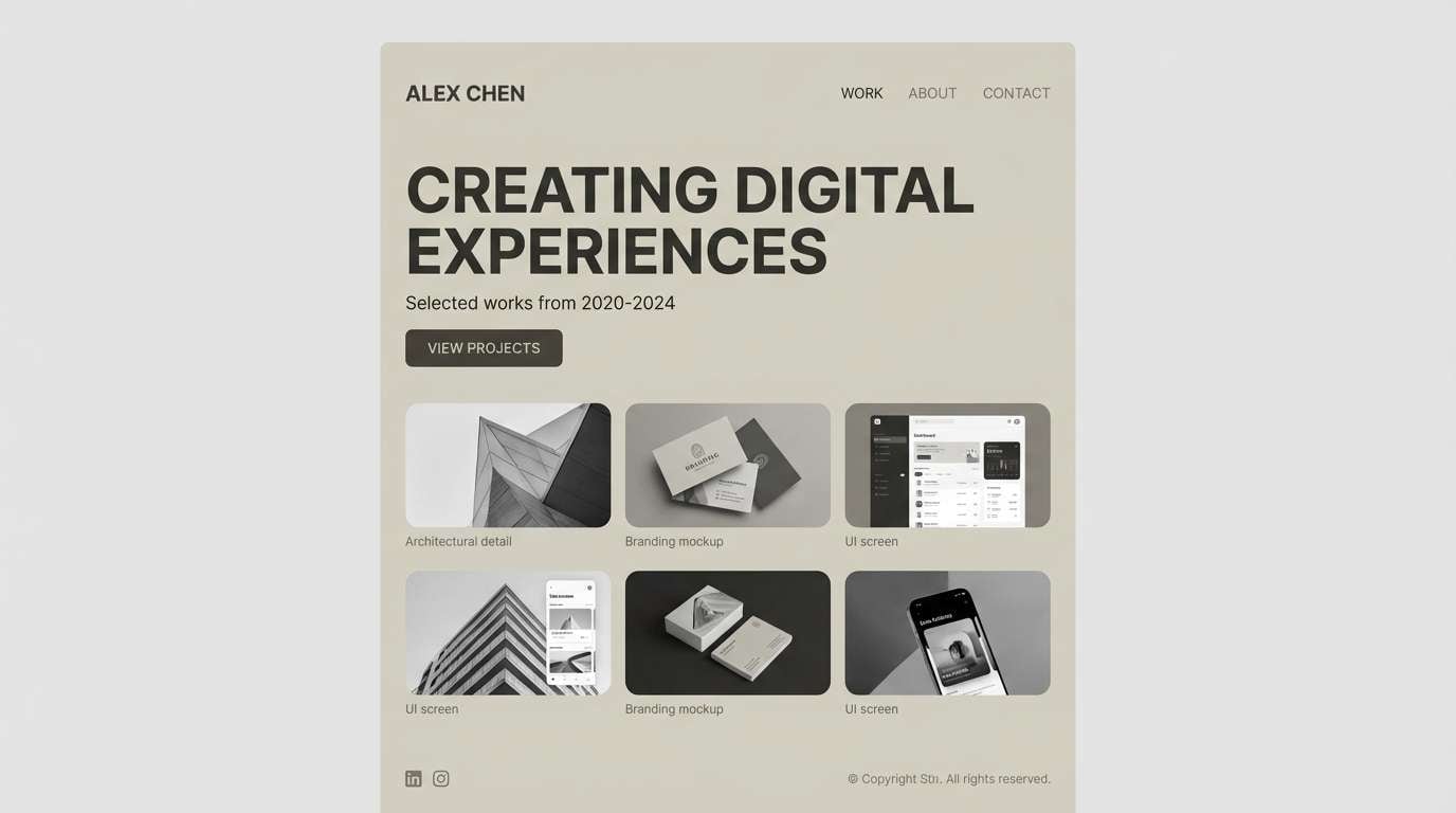
Best for: portfolio website
Quiet pebble grays feel like river stones and soft fog, giving work room to breathe. The range supports subtle hierarchy without distracting from imagery. Use #d3d1c6 as the page base, #474640 for text, and keep accents limited to one mid gray for links. Tip: pair with generous spacing and a single strong typeface to keep it gallery-clean.
Image example of pebble drift generated using media.io
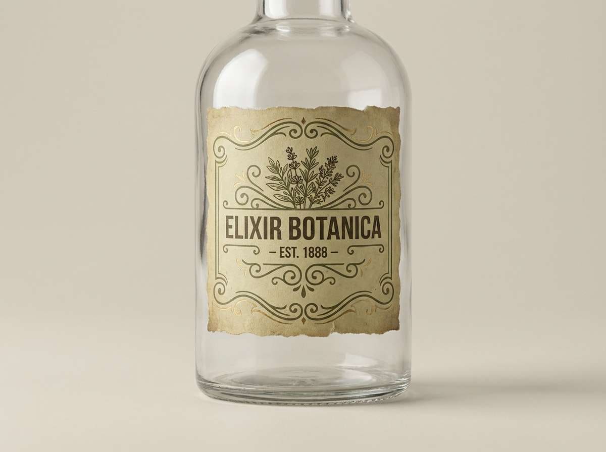
8) Tarnished Brass
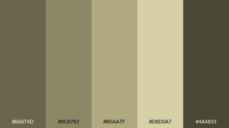
HEX: #6a674d #8c8763 #b0aa7f #d6d0a7 #4a4833
Mood: vintage, muted, refined
Best for: product packaging label
Muted brass and olive-gold tones evoke antique hardware, old maps, and softly aged metal. A single drab color combination like this can look luxe when you keep the layout spare and the typography confident. Use #d6d0a7 for label fields, then anchor brand marks in #4a4833 to avoid a washed look. Tip: add a thin border line in #8c8763 to frame the design without adding noise.
Image example of tarnished brass generated using media.io
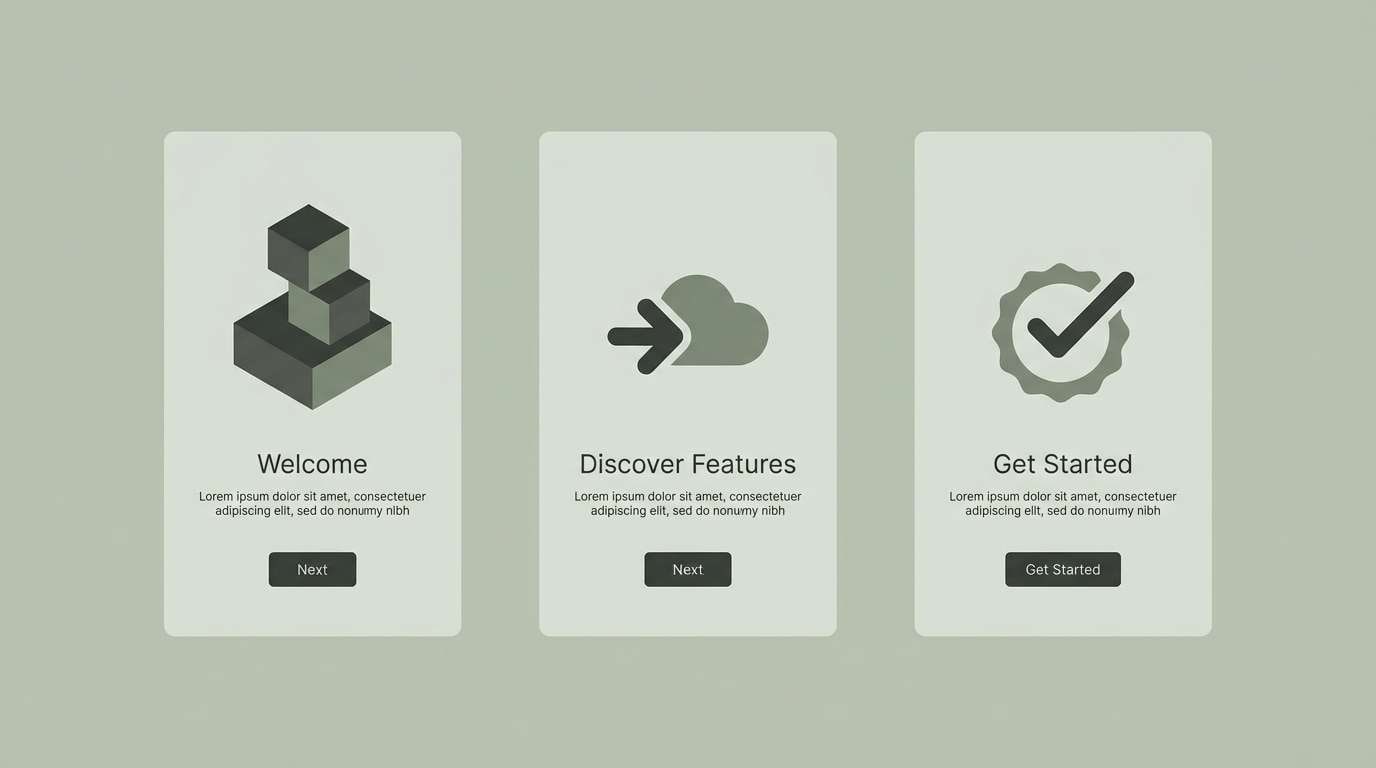
9) Rainy Parka
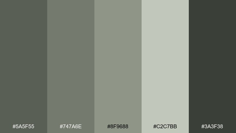
HEX: #5a5f55 #747a6e #8f9688 #c2c7bb #3a3f38
Mood: cool, subdued, functional
Best for: mobile app onboarding
Subdued parka greens and rainy grays feel dependable, like overcast skies and a reliable jacket. They keep onboarding screens calm so the copy can do the heavy lifting. Use #c2c7bb as the main canvas, with #3a3f38 for text and icons, and reserve #8f9688 for progress indicators. Tip: add one small high-contrast button style and repeat it consistently across steps.
Image example of rainy parka generated using media.io
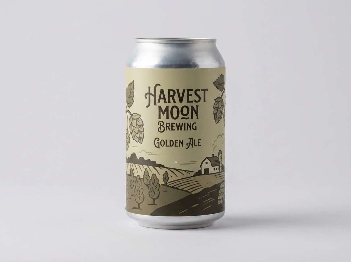
10) Vintage Canteen
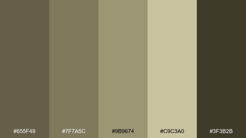
HEX: #655f49 #7f7a5c #9b9674 #c9c3a0 #3f3b2b
Mood: heritage, nostalgic, rugged
Best for: craft beer label
Heritage olive and canteen khaki bring a nostalgic, rugged vibe that suits handcrafted goods. The tones feel aged in a good way, like paper labels and old enamel. Use #3f3b2b for the brand lockup and #c9c3a0 for the label base, then layer #9b9674 in badges or medals. Tip: keep illustration linework simple so the muted colors stay punchy.
Image example of vintage canteen generated using media.io
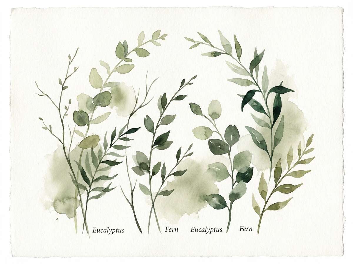
11) Ashen Meadow
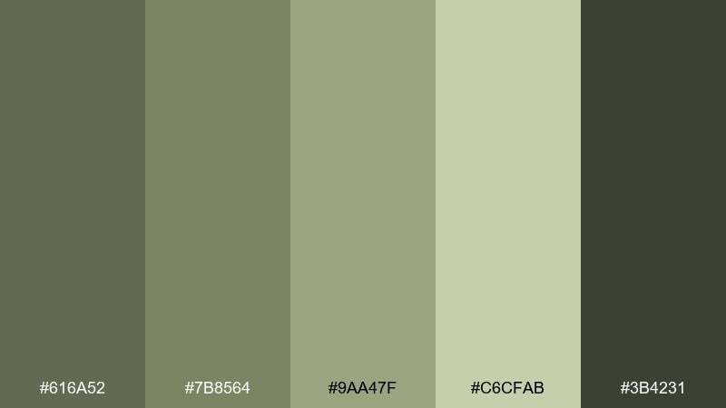
HEX: #616a52 #7b8564 #9aa47f #c6cfab #3b4231
Mood: calm, botanical, balanced
Best for: botanical poster illustration
Calm meadow greens with an ashen undertone suggest pressed leaves and late-summer fields. The palette is mellow enough for wall art but still distinctly nature-led. Let the lightest green be your paper tone and use the deepest shade for stems, labels, and small text. Tip: keep washes translucent so the mid greens stay soft rather than heavy.
Image example of ashen meadow generated using media.io
12) Concrete Herb
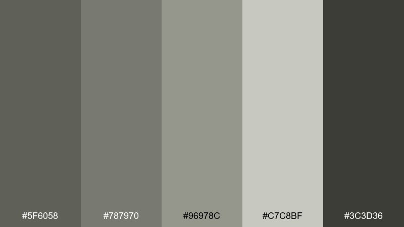
HEX: #5f6058 #787970 #96978c #c7c8bf #3c3d36
Mood: neutral, clean, modern
Best for: saas landing page
Concrete grays with a hint of herb feel modern, clean, and quietly technical. They make UI elements look crisp without leaning cold or sterile. Use #c7c8bf for large sections and #3c3d36 for headings, then apply #96978c to dividers and secondary buttons. Tip: pair with one strong product screenshot style so the page stays cohesive.
Image example of concrete herb generated using media.io

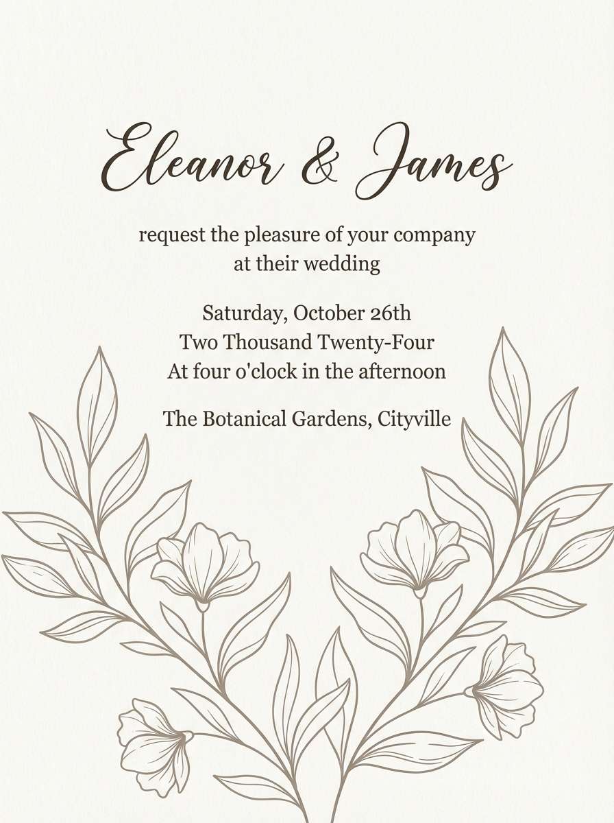
13) Worn Canvas
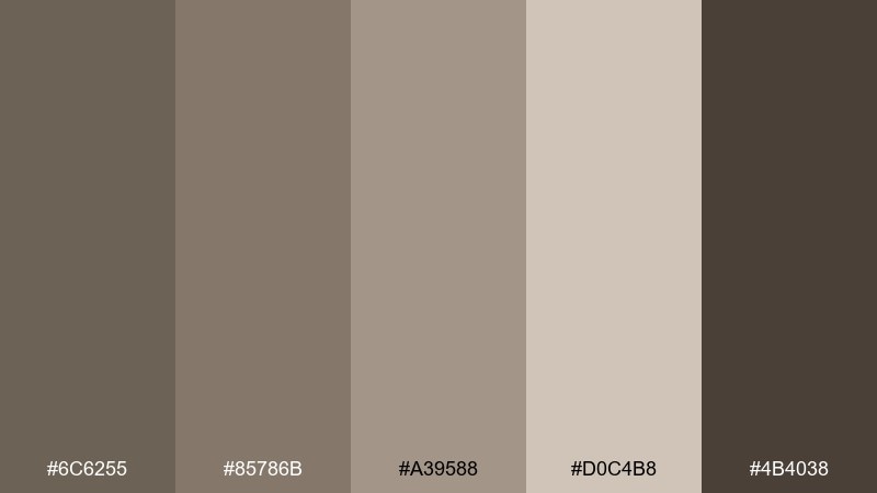
HEX: #6c6255 #85786b #a39588 #d0c4b8 #4b4038
Mood: cozy, handmade, timeless
Best for: wedding invitation
Cozy canvas browns and soft taupes feel like linen fabric, handwritten notes, and candlelit dinners. The tones are romantic without being sweet, perfect for modern rustic stationery. Use #d0c4b8 as the card base, #4b4038 for type, and keep embellishments in the mid browns for subtle depth. Tip: add a small monogram mark and give it plenty of breathing space.
Image example of worn canvas generated using media.io
14) Dune Patrol
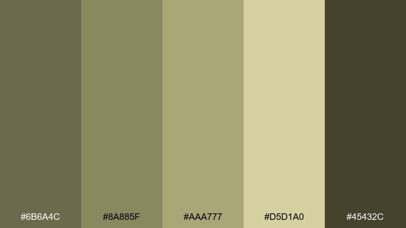
HEX: #6b6a4c #8a885f #aaa777 #d5d1a0 #45432c
Mood: sun-faded, adventurous, warm
Best for: travel blog header
Sun-faded dune tones recall desert trails, canvas tents, and dusty road trips. The warm yellow-green cast keeps the look outdoorsy without shouting. Use #d5d1a0 behind headline type and #45432c for strong contrast, then apply #aaa777 to buttons or tags. Tip: add grain texture lightly so the colors feel naturally weathered.
Image example of dune patrol generated using media.io
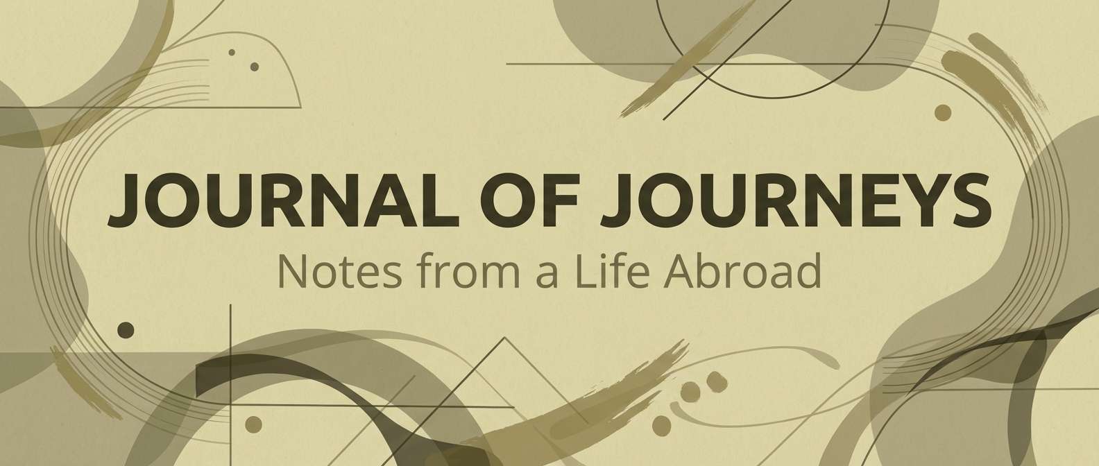
15) Loden Evening
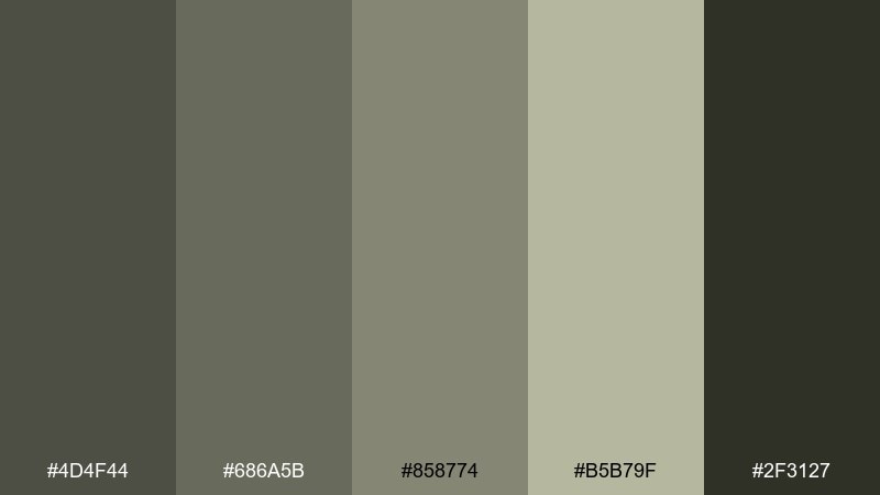
HEX: #4d4f44 #686a5b #858774 #b5b79f #2f3127
Mood: moody, elegant, restrained
Best for: restaurant brand moodboard
Moody loden greens feel like evening light, dark wood, and quiet conversation. The deep base tones set a premium mood without relying on black. Use #2f3127 for logotypes and #b5b79f as the primary paper or background tone, then bring in #858774 for secondary typography. Tip: keep photography warm and low-contrast so it harmonizes with the muted greens.
Image example of loden evening generated using media.io
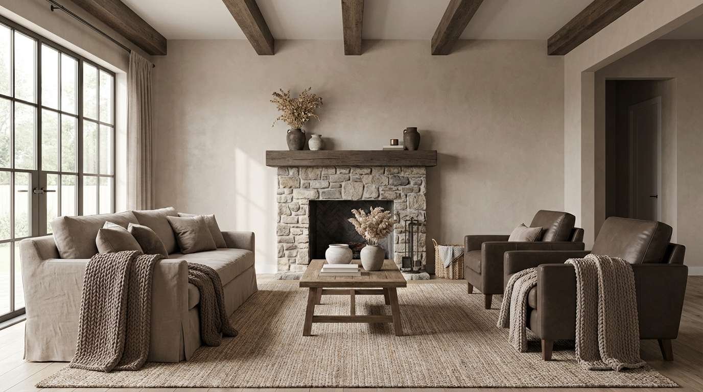
16) Weathered Barnwood
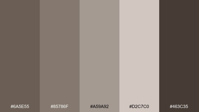
HEX: #6a5e55 #85786f #a59a92 #d2c7c0 #463c35
Mood: weathered, warm, welcoming
Best for: living room interior concept
Weathered browns and soft grays evoke barnwood, wool throws, and natural plaster walls. The mix is comfortable and lived-in, ideal for cozy interiors that still feel curated. Use the pale tone for walls and the darkest brown for wood accents or shelving, then layer mid tones through textiles. Tip: add small black or brass details sparingly to keep the room from feeling too flat.
Image example of weathered barnwood generated using media.io
17) Olive Latte
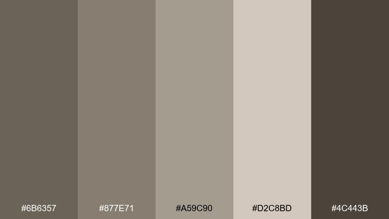
HEX: #6b6357 #877e71 #a59c90 #d2c8bd #4c443b
Mood: soft, creamy, refined
Best for: social media post template
Creamy olive-latte neutrals feel like ceramic mugs, steamed milk, and warm countertop light. They make product or quote posts look polished without needing loud accents. Use #d2c8bd as the background, #4c443b for text, and create depth with rounded blocks in #a59c90. Tip: keep imagery warm and desaturated so it blends naturally with the creamy tones.
Image example of olive latte generated using media.io

18) Foggy Thicket
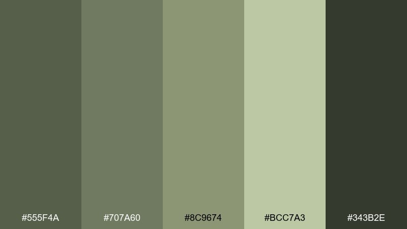
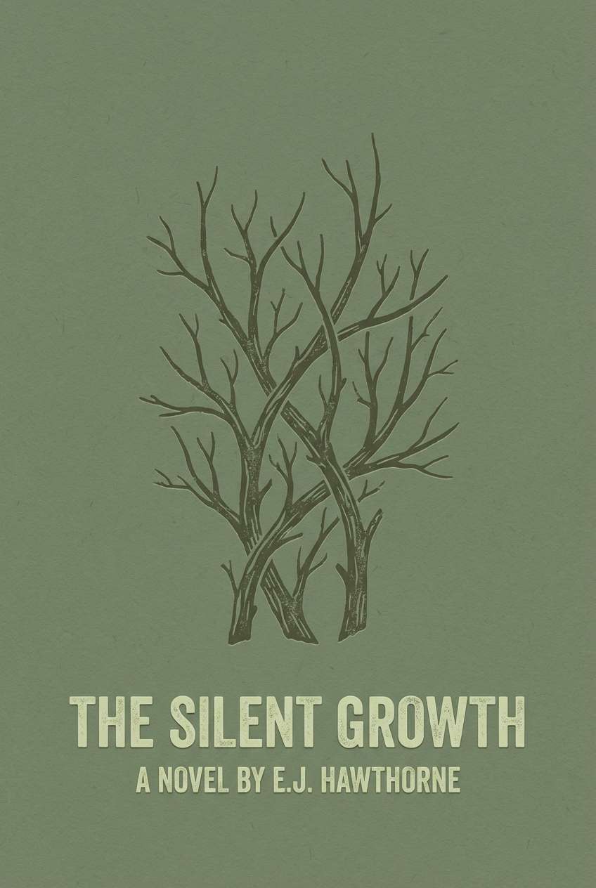
HEX: #555f4a #707a60 #8c9674 #bcc7a3 #343b2e
Mood: misty, organic, serene
Best for: book cover design
Misty greens and shadowy stems bring to mind a foggy thicket at dawn. The contrast range supports bold titles while keeping the mood literary and atmospheric. These drab color combinations shine with serif typography and generous margins, especially when you keep imagery simple. Tip: set the title in #bcc7a3 over #343b2e for a quiet, confident pop.
Image example of foggy thicket generated using media.io
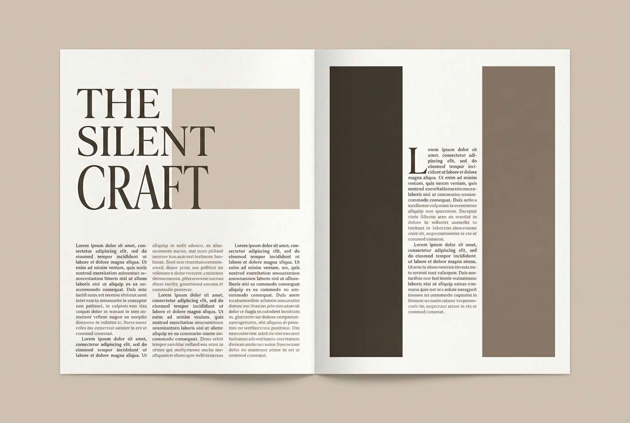
19) Sepia Garden
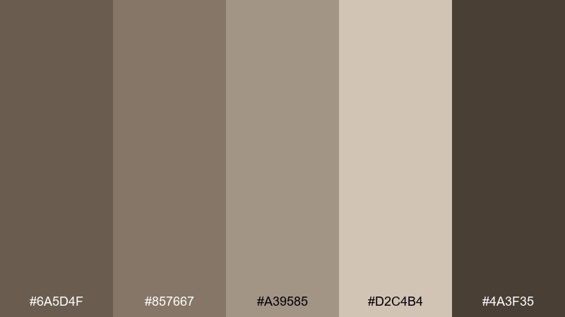
HEX: #6a5d4f #857667 #a39585 #d2c4b4 #4a3f35
Mood: warm, nostalgic, elegant
Best for: editorial magazine spread
Sepia garden browns feel like dried petals, old film photos, and pressed-paper textures. They give editorial layouts warmth while keeping everything sophisticated. Use #d2c4b4 as the page base, #4a3f35 for headlines, and #857667 for pull quotes and captions. Tip: let whitespace do the work and avoid heavy borders to maintain a premium feel.
Image example of sepia garden generated using media.io
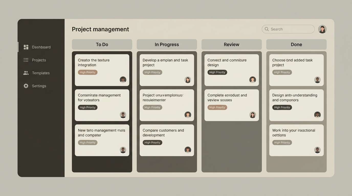
20) Quiet Utility
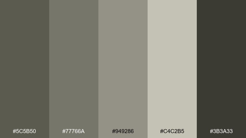
HEX: #5c5b50 #77766a #949286 #c4c2b5 #3b3a33
Mood: neutral, organized, dependable
Best for: project management ui
Neutral utility tones feel like tidy folders, label makers, and well-organized workbenches. This drab color palette is especially effective for productivity tools where clarity beats decoration. Use #c4c2b5 for boards and cards, #3b3a33 for text, and #949286 for selected states and dividers. Tip: apply one consistent highlight style for active items to prevent the interface from blending together.
Image example of quiet utility generated using media.io
21) Siltstone Studio
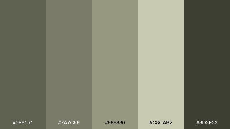
HEX: #5f6151 #7a7c69 #969880 #c8cab2 #3d3f33
Mood: studio, balanced, modern
Best for: logo and icon set
Siltstone greens and soft grays evoke a calm studio space with natural light and muted materials. The midrange makes icons feel friendly while the darker shade keeps marks sharp. Use the deepest tone for outlines, then fill shapes with #969880 and keep the lightest shade for negative space. Tip: test icon legibility at small sizes to ensure the subtle tones do not blur together.
Image example of siltstone studio generated using media.io
What Colors Go Well with Drab?
Drab pairs best with other grounded neutrals: warm off-whites, stone, putty, and soft charcoal. These keep the look cohesive while giving you enough contrast for typography and UI states.
For a modern lift, add one clean accent such as crisp white, deep ink, or a muted metallic (brass/bronze). This keeps drab from reading “muddy” and helps key elements stand out.
If you want a bolder twist, introduce a single warm counterpoint—rust, terracotta, or clay—so the palette feels intentional and contemporary without breaking its calm mood.
How to Use a Drab Color Palette in Real Designs
Start with a light drab tone as your base surface (background, paper, or wall color), then pick one dark tone for text and anchors. This simple two-step structure immediately improves clarity.
Use mid tones for layout components: cards, dividers, UI states, packaging bands, or secondary headings. Keeping those middle shades consistent prevents the design from looking “flat” or accidentally low-contrast.
Finish with texture rather than extra color—grain, matte paper, linen, concrete, or soft shadow. Drab palettes look most premium when material and spacing do the heavy lifting.
Create Drab Palette Visuals with AI
If you want to preview a drab color scheme in a real layout (UI, packaging, posters, or interiors), generate mock visuals first—then refine your palette choices before committing to production.
Media.io lets you turn a prompt into clean design examples quickly, so you can test contrast, mood, and typography pairing with your exact HEX codes.
Use one of the prompts above, swap in your preferred drab tones, and iterate until the result feels calm, modern, and readable.
Drab Color Palette FAQs
-
What is the HEX code for drab in this guide?
The featured drab base tone is HEX #6b6b57, a muted olive-gray that works well as a grounding neutral in modern designs. -
Is drab the same as olive or khaki?
Not exactly. Drab is a broader family of low-saturation olive/khaki/gray neutrals. Olive can be greener, while khaki often leans warmer and sandier. -
How do I keep a drab palette from looking dirty or faded?
Prioritize contrast (dark text on light surfaces), limit the number of mid tones in one view, and add structure with whitespace, grids, and subtle texture instead of extra colors. -
What accent colors pair best with drab?
Rust, terracotta, brass, off-white, and deep charcoal are reliable accents. Use one accent consistently (buttons, badges, highlights) so the design stays clean. -
Are drab palettes good for UI and dashboards?
Yes—drab palettes reduce glare and visual fatigue. Just ensure accessible contrast ratios for text, icons, and interactive states (hover, active, disabled). -
What finish or texture works well with drab for print projects?
Matte paper, uncoated stock, soft-touch lamination, and subtle grain textures enhance drab tones and make them feel intentional and premium. -
Can I generate drab palette mockups with AI before designing?
Yes. Use Media.io text-to-image prompts to generate quick mock visuals (packaging, slides, posters, UI) and iterate by swapping HEX codes until the mood and contrast feel right.


