

Pink lilac sits right between playful blush and soft lavender, giving designs a gentle, modern romance without feeling overly sweet. It’s a favorite for branding, weddings, and UI because it reads friendly, premium, and calming at the same time.
Below are 20 curated pink and lilac color combinations with HEX codes, plus practical pairing tips and AI prompts you can reuse to generate matching visuals.
In this article
- Why Pink and Lilac Color Combinations Work So Well
-
- cotton candy mist
- lilac rose latte
- orchid blush neutrals
- peony studio
- lavender macaron
- rosy mauve minimal
- berry petal pop
- dusted lilac clay
- spring tulip wash
- pastel glow grid
- vintage powder room
- soft sunset bouquet
- modern bridal suite
- kawaii sticker set
- editorial beauty spread
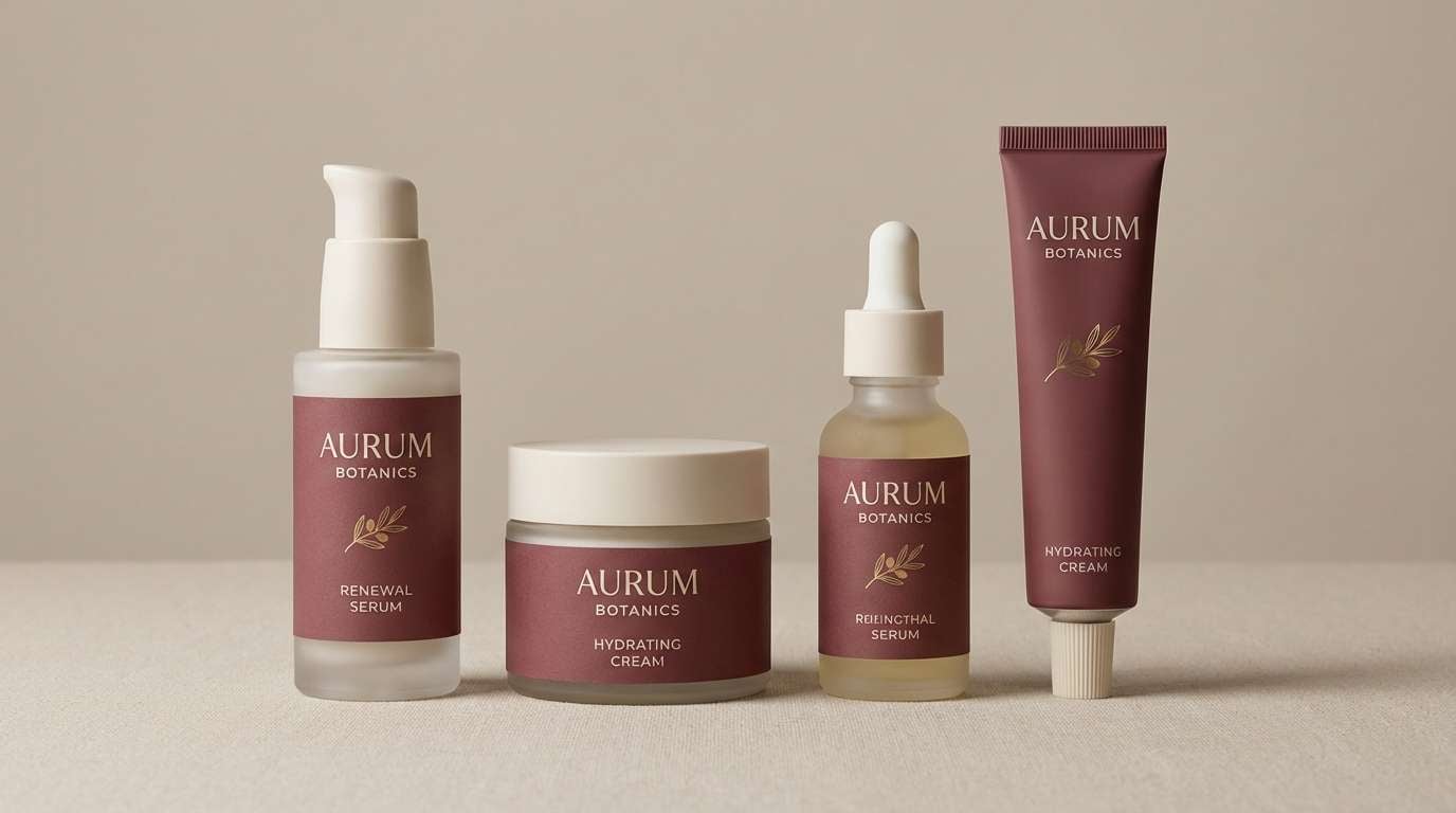
- cosmetic packaging blush
- app onboarding calm
- cafe menu pastels
- kids room dream
- floral wedding invite
- What Colors Go Well with Pink Lilac?
- How to Use a Pink Lilac Color Palette in Real Designs
- Create Pink Lilac Palette Visuals with AI
Why Pink and Lilac Color Combinations Work So Well
Pink lilac blends the warmth of pink with the calm of purple, which makes it emotionally versatile: romantic for weddings, soothing for wellness brands, and approachable for digital products.
Most pink lilac tones also have naturally “soft” contrast, so they’re ideal for backgrounds, gradients, and subtle UI states. Add a deep plum or charcoal anchor and you get instant readability without losing the airy vibe.
Because pink lilac sits comfortably in pastel and muted ranges, it pairs well with neutrals (cream, beige, warm gray) and can be pushed modern with violet, berry, or near-black typography.
20+ Pink Lilac Color Palette Ideas (with HEX Codes)
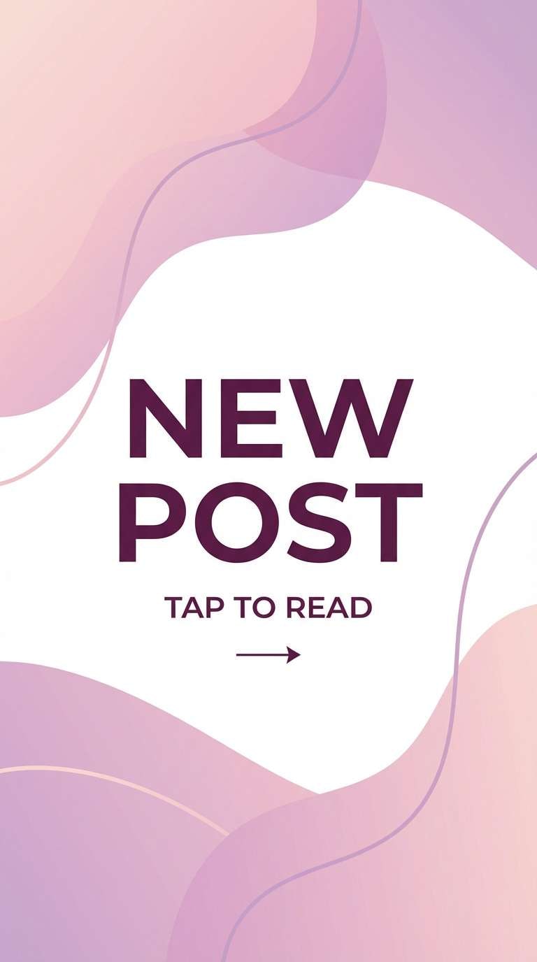
1) Cotton Candy Mist
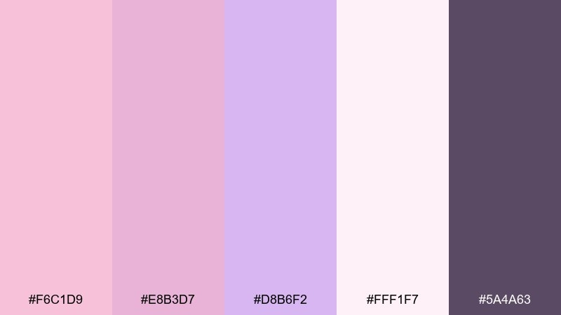
HEX: #F6C1D9 #E8B3D7 #D8B6F2 #FFF1F7 #5A4A63
Mood: airy, sweet, dreamy
Best for: social media story templates
Airy and sweet like spun sugar drifting through a spring breeze. These blush and lilac color combinations feel light on the page, with a deep plum anchor to keep contrast crisp. Use it for story templates, quote cards, and soft product promos where readability matters. Pair the darker shade with white space for headings, and keep the pastels for backgrounds and highlights.
Image example of cotton candy mist generated using media.io
Media.io is an online AI studio for creating and editing video, image, and audio in your browser.

2) Lilac Rose Latte
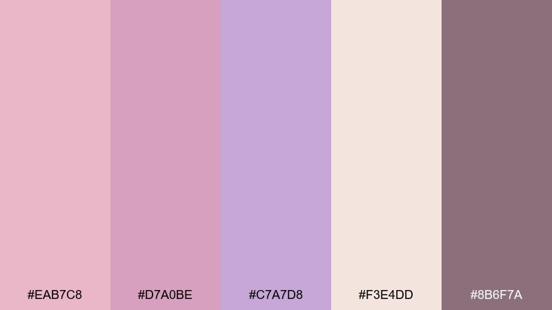
HEX: #EAB7C8 #D7A0BE #C7A7D8 #F3E4DD #8B6F7A
Mood: cozy, romantic, calm
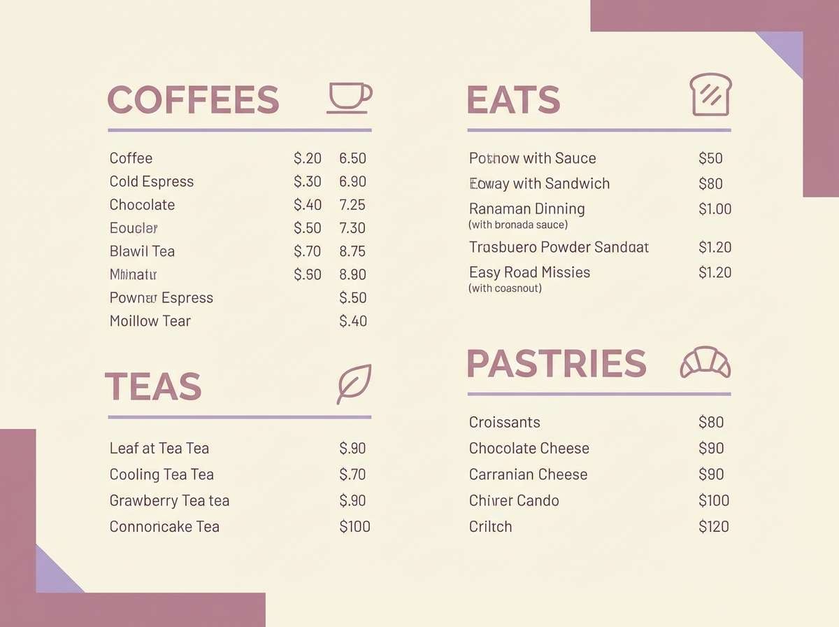
Best for: cafe menu design
Cozy and romantic, like rose foam swirled into a warm latte. The creamy beige keeps things grounded while mauve and lilac add a soft, modern twist. It works especially well for menus, loyalty cards, and small signage where you want warmth without feeling vintage. Use the deeper mauve for prices and section headers to maintain clear hierarchy.
Image example of lilac rose latte generated using media.io
3) Orchid Blush Neutrals

HEX: #F2B6D1 #D9A7C7 #BFA2D8 #EEE6E2 #3E3345
Mood: polished, soft, balanced
Best for: brand style guides
Polished and soft, like orchid petals against clean linen. The neutral base tones make the pinks feel more grown-up, while the charcoal-plum adds a professional edge. Use it for brand guidelines, presentation templates, and website systems where consistency is key. Keep the light neutral as the main background and reserve the brighter blush for callouts and badges.
Image example of orchid blush neutrals generated using media.io
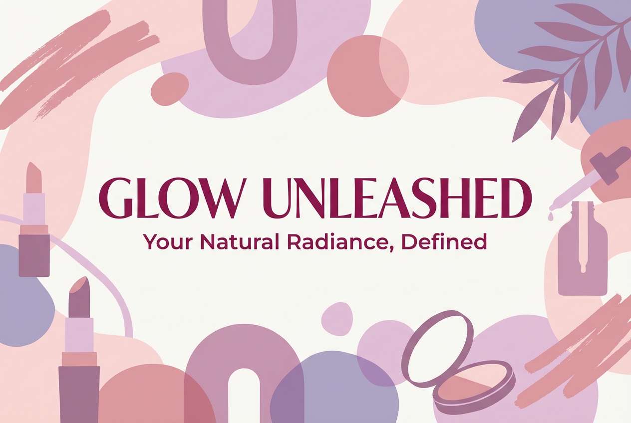
4) Peony Studio
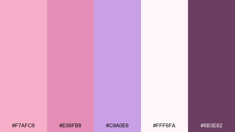
HEX: #F7AFC9 #E58FB8 #C9A0E6 #FFF6FA #6B3E62
Mood: creative, playful, boutique
Best for: beauty brand ads
Creative and playful, like peonies arranged in a sunlit studio. The brighter pinks bring energy, while lilac keeps the look modern rather than sugary. It shines in beauty ads, promo banners, and launch graphics where you want a boutique feel. Tip: use the deep berry tone for a single strong headline to keep the composition from getting too pastel-heavy.
Image example of peony studio generated using media.io
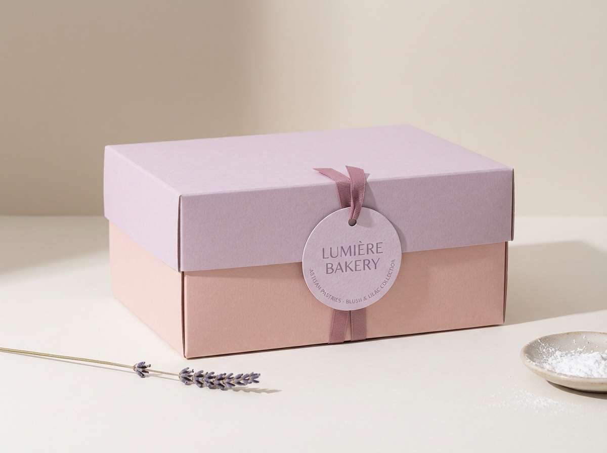
5) Lavender Macaron
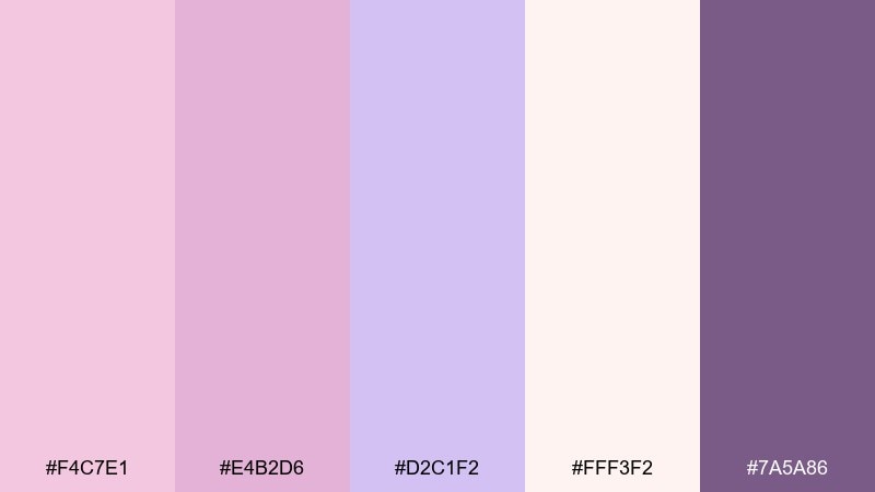
HEX: #F4C7E1 #E4B2D6 #D2C1F2 #FFF3F2 #7A5A86
Mood: delicate, pastel, charming
Best for: bakery packaging
Delicate and charming, like a lavender macaron box tied with ribbon. The pale lilac and blush read as sweet, while the violet-gray gives enough contrast for labels. Use it for bakery packaging, sticker seals, and small product tags that need to feel giftable. Pair with simple line art and keep text in the darker tone for clean readability.
Image example of lavender macaron generated using media.io
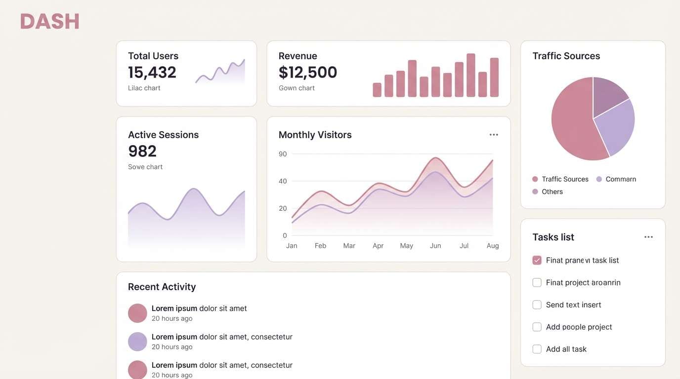
6) Rosy Mauve Minimal
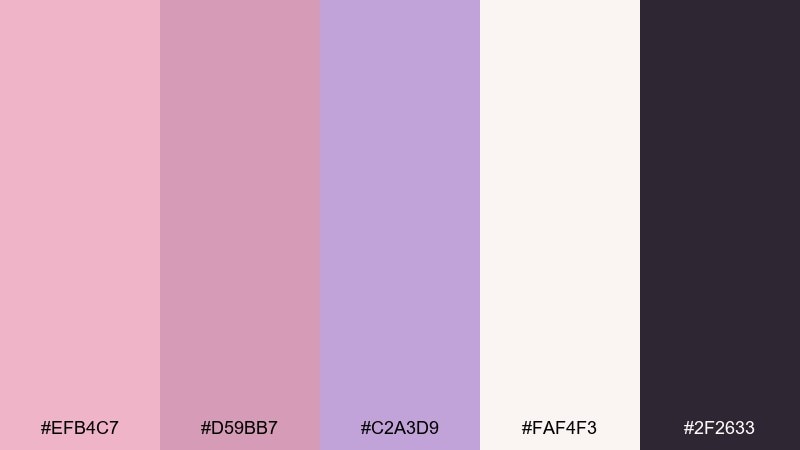
HEX: #EFB4C7 #D59BB7 #C2A3D9 #FAF4F3 #2F2633
Mood: minimal, modern, elegant
Best for: ui dashboards
Minimal and elegant, like matte makeup paired with a crisp blazer. The dusty pink and mauve tones keep the interface warm, while the near-black adds structure for charts and navigation. For a pink lilac color palette in dashboards, keep backgrounds very light and use mauve for active states and subtle highlights. Tip: reserve the darkest shade for text and data lines to protect accessibility.
Image example of rosy mauve minimal generated using media.io
7) Berry Petal Pop
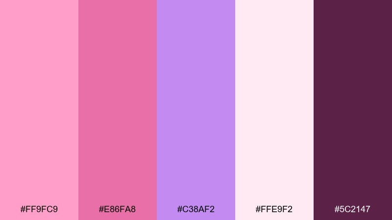
HEX: #FF9FC9 #E86FA8 #C38AF2 #FFE9F2 #5C2147
Mood: bold, fun, youthful
Best for: event posters
Bold and fun, like berry sorbet with a floral garnish. Hot pink brings the punch, lilac adds a playful twist, and the deep berry gives you instant headline contrast. Use it for event posters, party flyers, and limited-time promos that need to be seen fast. Keep the bright pink to one or two hero elements and let the lighter tint carry the background.
Image example of berry petal pop generated using media.io
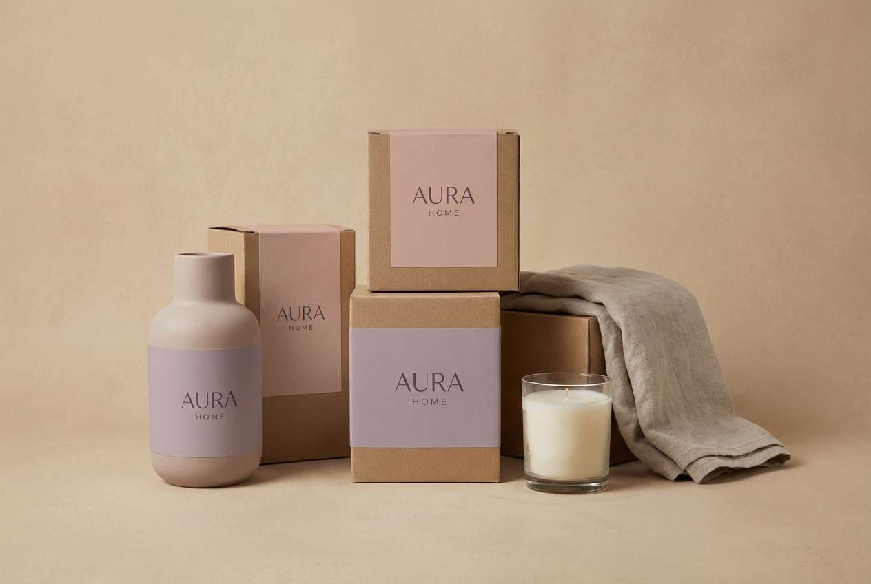
8) Dusted Lilac Clay
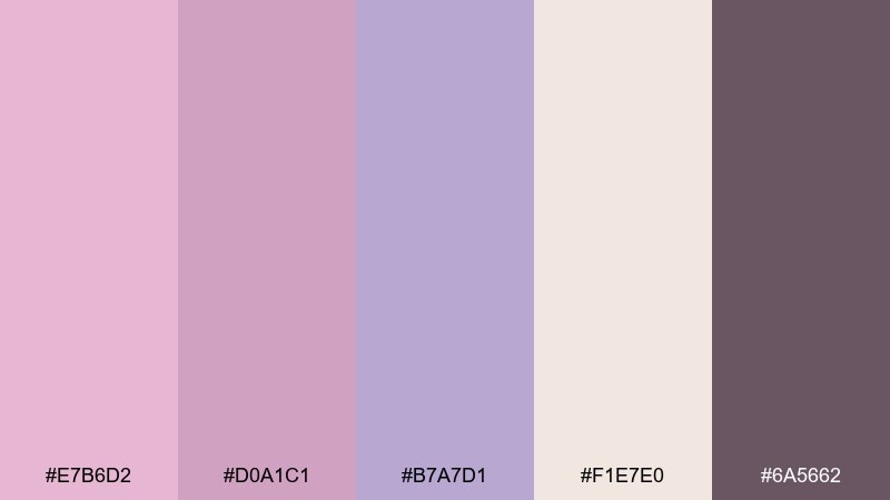
HEX: #E7B6D2 #D0A1C1 #B7A7D1 #F1E7E0 #6A5662
Mood: earthy, muted, calming
Best for: home decor branding
Earthy and muted, like lilac dusting over warm clay pottery. The tones feel calm and tactile, ideal for brands that want softness without looking overly cute. These pink lilac color combinations pair beautifully with natural textures like linen, kraft paper, and matte ceramics. Tip: use the warm neutral as the primary canvas and add lilac only in small accents for a refined look.
Image example of dusted lilac clay generated using media.io
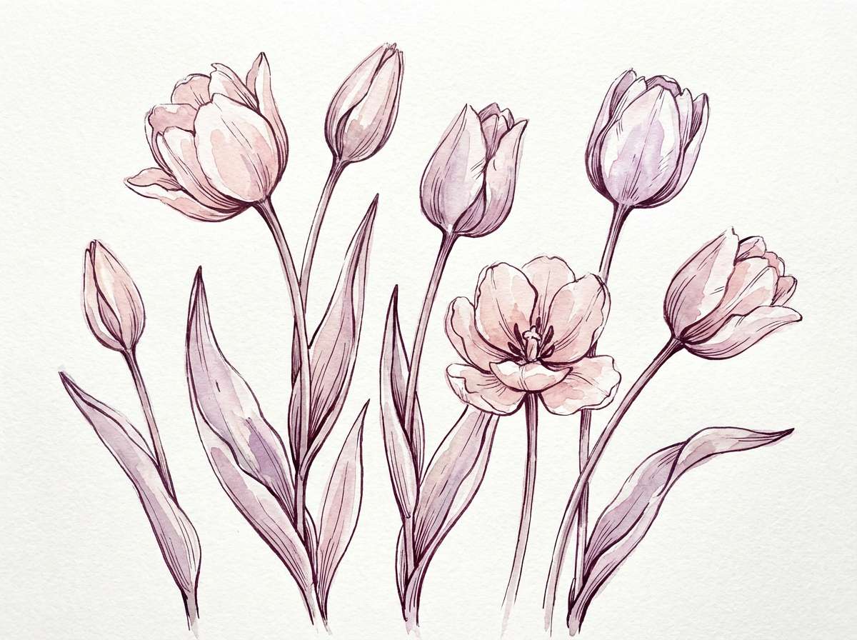
9) Spring Tulip Wash

HEX: #F9B7CE #E9A9C5 #D6B0F0 #FFF7FB #7C4C73
Mood: fresh, floral, optimistic
Best for: botanical illustrations
Fresh and optimistic, like tulips after a light rain. The blush-to-lilac shift feels naturally floral, while the deeper plum keeps outlines and captions clear. Use it for watercolor botanicals, spring campaigns, and gentle editorial accents. Tip: let the lightest shade dominate the paper and glaze the pink and lilac in transparent layers for a believable wash.
Image example of spring tulip wash generated using media.io
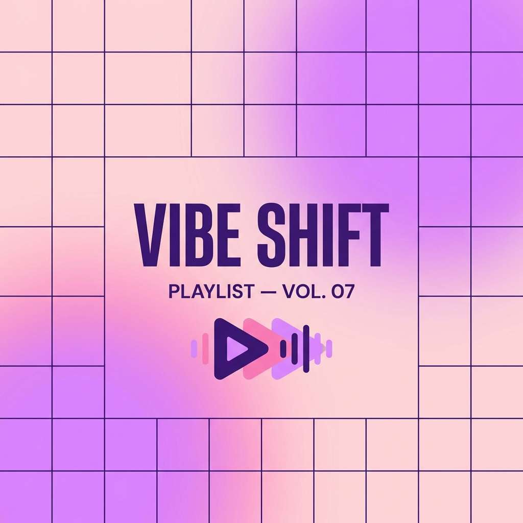
10) Pastel Glow Grid
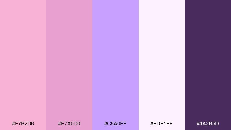
HEX: #F7B2D6 #E7A0D0 #C8A0FF #FDF1FF #4A2B5D
Mood: trendy, luminous, digital
Best for: music playlist covers
Trendy and luminous, like soft LEDs diffused through frosted glass. The brighter lilac leans modern and digital, while the dark violet gives you a strong focal point for type. It fits playlist covers, streaming thumbnails, and creator branding that wants a gentle glow instead of neon chaos. Tip: use a subtle gradient between pink and lilac, then set the title in the darkest shade for instant clarity.
Image example of pastel glow grid generated using media.io
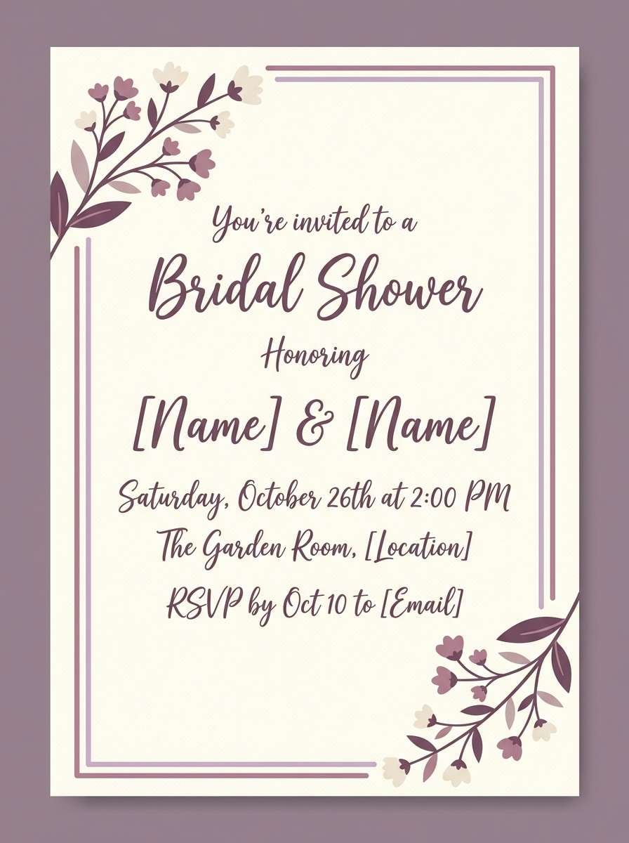
11) Vintage Powder Room
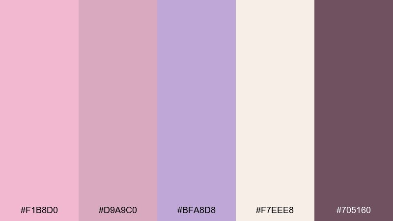
HEX: #F1B8D0 #D9A9C0 #BFA8D8 #F7EEE8 #705160
Mood: vintage, soft, intimate
Best for: bridal shower invites
Vintage and intimate, like a powder room mirror framed in soft rose tones. The warm cream makes the palette feel timeless, while lilac keeps it from turning sepia. It is a great fit for bridal shower invites, thank-you cards, and delicate stationery sets. Tip: add thin borders in the muted mauve and keep the main text in the deeper dusty plum for a classic finish.
Image example of vintage powder room generated using media.io
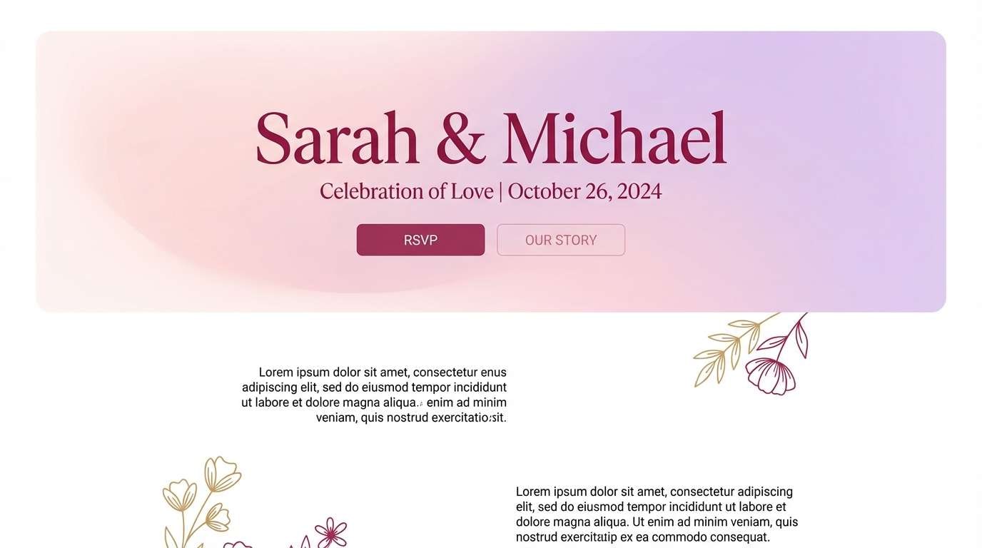
12) Soft Sunset Bouquet
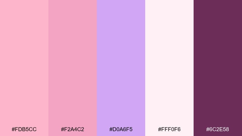
HEX: #FDB5CC #F2A4C2 #D0A6F5 #FFF0F6 #6C2E58
Mood: romantic, glowing, celebratory
Best for: wedding websites
Romantic and glowing, like a bouquet catching the last light at dusk. The peachy blush warms the lilac, giving you a celebratory feel that still reads soft. Use it for wedding websites, RSVP flows, and hero banners where emotion matters. Tip: keep the background near-white and use the berry tone for buttons so calls-to-action stay obvious.
Image example of soft sunset bouquet generated using media.io
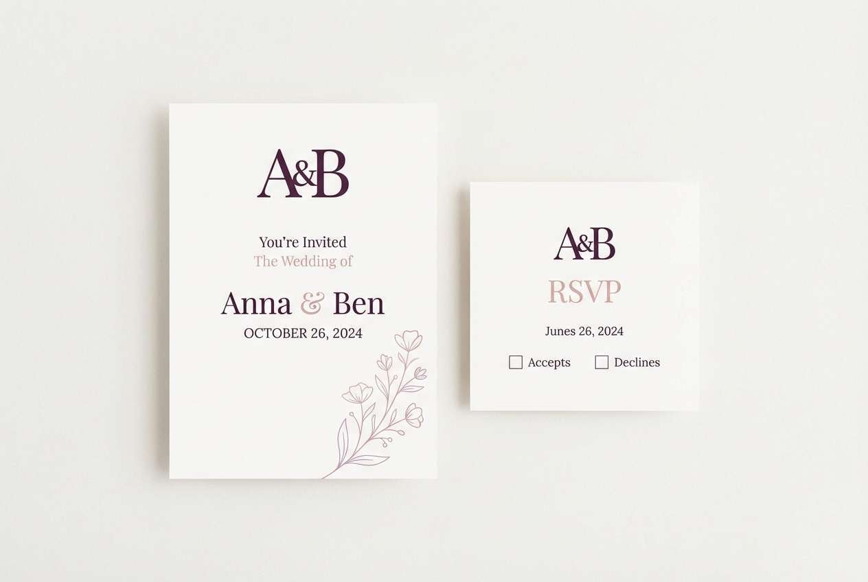
13) Modern Bridal Suite

HEX: #F3B6D3 #E3A2C9 #C7A6E8 #FAF7F8 #4B2F46
Mood: refined, airy, modern-romantic
Best for: wedding stationery sets
Refined and airy, like silk ribbons and fresh-cut florals laid on a clean desk. The tones feel modern-romantic, with enough depth for typography and monograms. A pink lilac color palette like this works beautifully across full stationery suites, from invites to place cards, when you keep the layout minimal. Tip: repeat the lilac as a tiny motif, then let blush lead as the dominant ink.
Image example of modern bridal suite generated using media.io
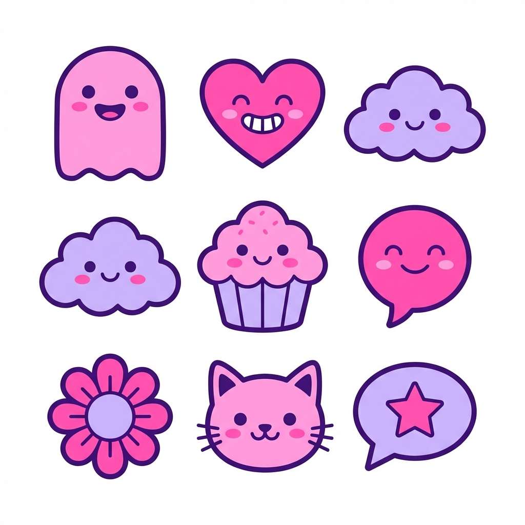
14) Kawaii Sticker Set
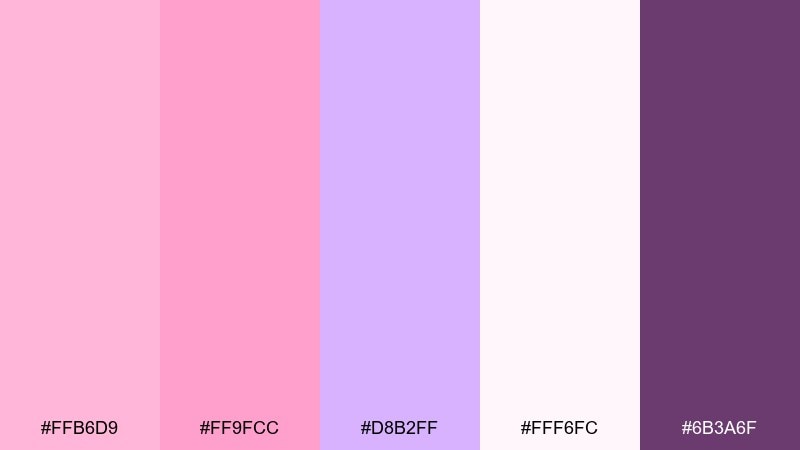
HEX: #FFB6D9 #FF9FCC #D8B2FF #FFF6FC #6B3A6F
Mood: cute, bubbly, cheerful
Best for: sticker packs
Cute and bubbly, like candy hearts and plush toys in pastel light. The brighter pinks bring instant cheer, while lilac keeps the mix fresh and balanced. Use it for sticker packs, emoji-style icons, and playful merch graphics. Tip: outline shapes in the deeper violet so the stickers pop cleanly on both light and colored backgrounds.
Image example of kawaii sticker set generated using media.io
15) Editorial Beauty Spread
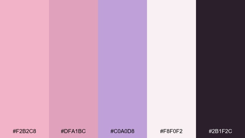
HEX: #F2B2C8 #DFA1BC #C0A0D8 #F8F0F2 #2B1F2C
Mood: editorial, chic, high-end
Best for: magazine layouts
Editorial and chic, like a beauty spread printed on premium matte paper. The near-black adds a fashion edge, and the pink-lilac midtones make photography and callouts feel luxe. Use it for magazine layouts, lookbooks, and landing pages that need clean hierarchy. Tip: keep body text in the darkest shade, then use blush blocks sparingly for pull quotes and section breaks.
Image example of editorial beauty spread generated using media.io
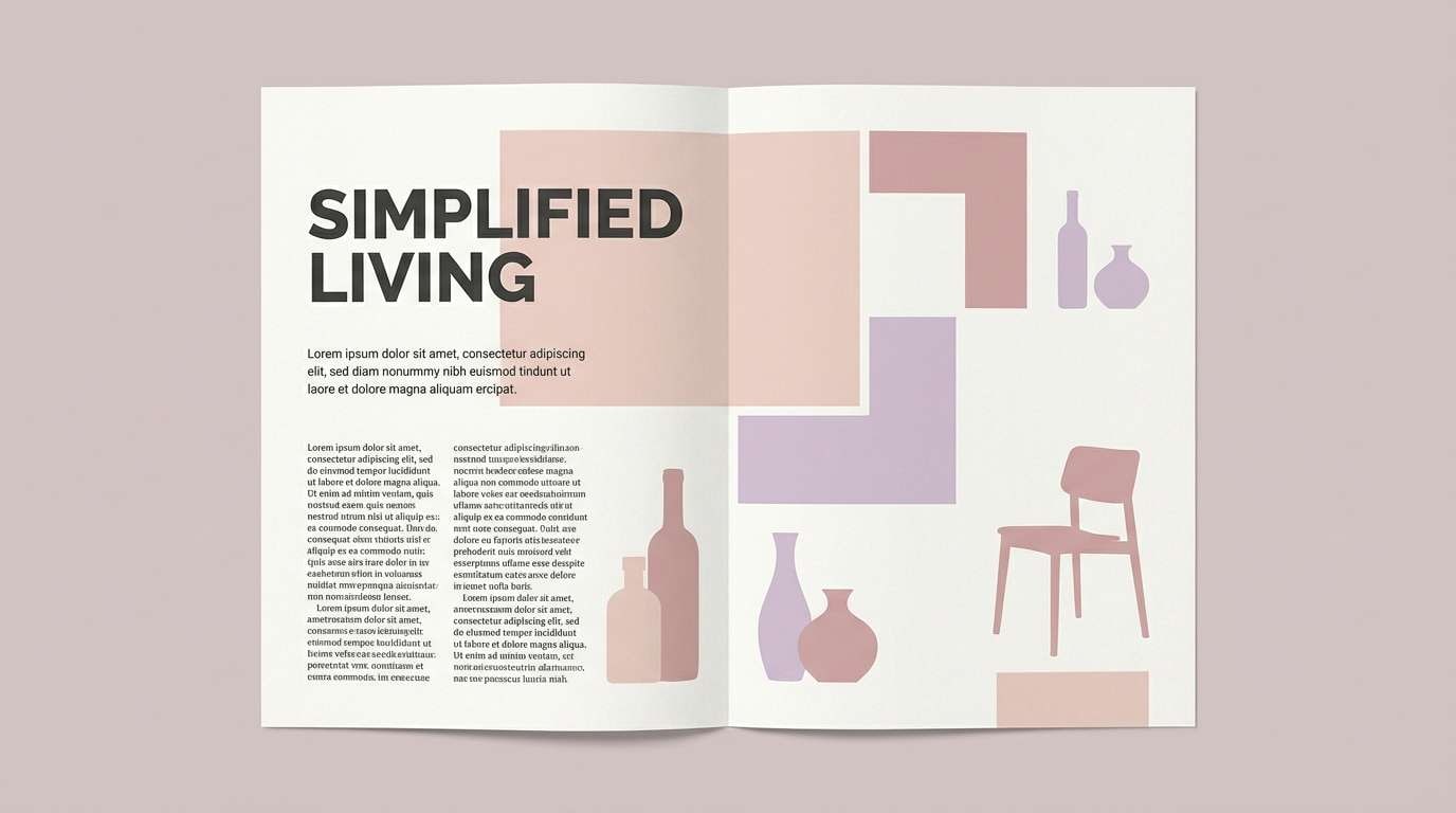
16) Cosmetic Packaging Blush
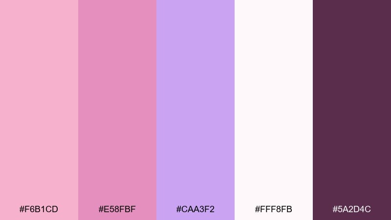
HEX: #F6B1CD #E58FBF #CAA3F2 #FFF8FB #5A2D4C
Mood: glam, clean, feminine
Best for: skincare packaging
Glam yet clean, like a fresh blush compact with a satin sheen. The soft white-pink background keeps the look clinical, while lilac adds a premium twist. It is ideal for skincare packaging, product labels, and ecommerce hero images. Tip: pick one accent color for caps or seals and let the rest of the design breathe with lots of light space.
Image example of cosmetic packaging blush generated using media.io
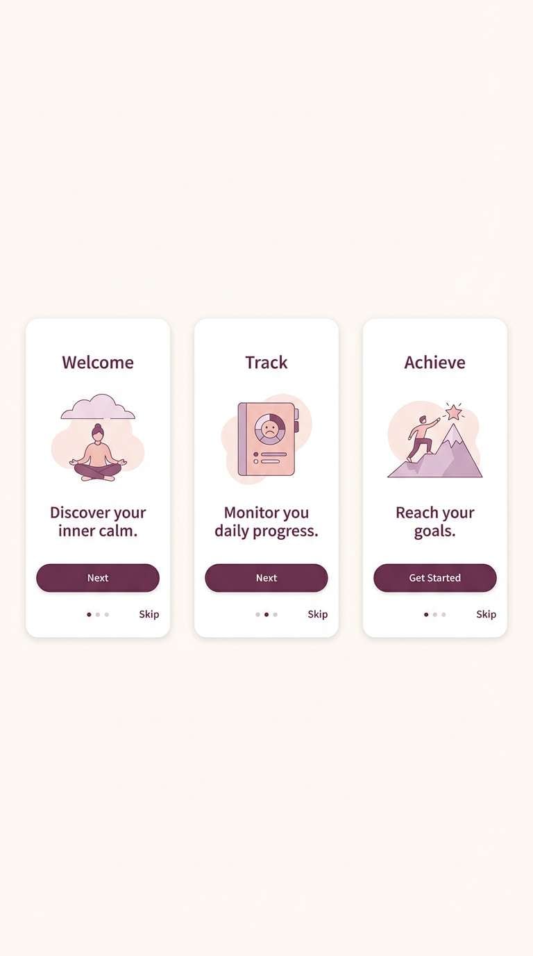
17) App Onboarding Calm
HEX: #F3BBD7 #E2A8CF #CDB4F5 #FDF7FB #403047
Mood: calm, friendly, reassuring
Best for: mobile onboarding screens
Calm and reassuring, like soft ambient light in a quiet room. The gentle pastels feel friendly for first-time users, while the dark plum supports legible navigation. These pink lilac color combinations work best when you limit gradients and rely on solid fills for buttons and icons. Tip: use the lightest shade for screen backgrounds and keep primary CTAs in the deeper plum for contrast.
Image example of app onboarding calm generated using media.io
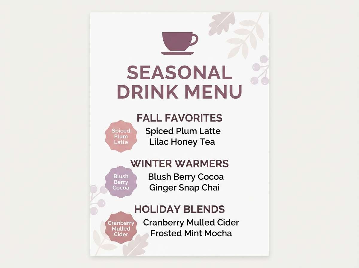
18) Cafe Menu Pastels
HEX: #F8B9D0 #E7A4C5 #D2A7EA #FFF4F6 #6D4A63
Mood: inviting, light, friendly
Best for: seasonal drink flyers
Inviting and light, like a spring special written on a clean counter sign. The pastel base keeps things friendly, while the muted plum prevents text from fading into the background. Use it for seasonal drink flyers, table tent cards, and digital menu boards. Tip: highlight one featured item with a lilac badge and keep the rest of the layout simple for quick scanning.
Image example of cafe menu pastels generated using media.io
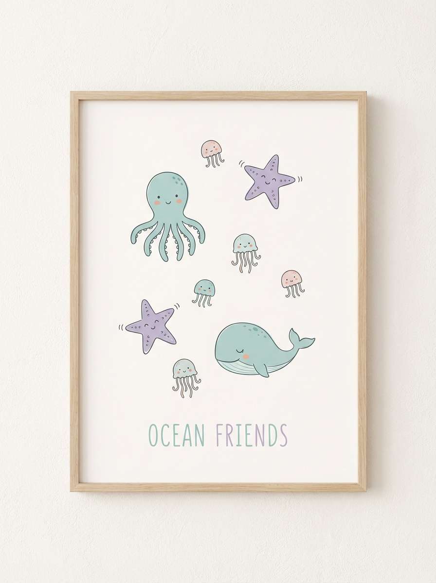
19) Kids Room Dream
HEX: #FFC0DC #F0A9D0 #DDBAF7 #FFF7FD #6A3E6E
Mood: gentle, whimsical, safe
Best for: nursery wall art
Gentle and whimsical, like bedtime stories under a soft night light. The pale tones feel safe and soothing, and the violet keeps details crisp for line drawings and titles. Use it for nursery wall art, baby shower signage, and playful learning prints. Tip: keep illustrations simple and use the darker shade only for small outlines and lettering.
Image example of kids room dream generated using media.io
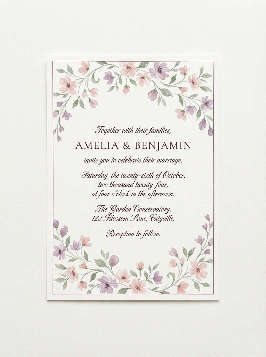
20) Floral Wedding Invite
HEX: #F4B2D4 #E39DCB #C6A0EE #FFF9FC #4E2A4F
Mood: romantic, floral, elegant
Best for: wedding invitation design
Romantic and floral, like pressed petals tucked into an invitation envelope. The blush and lilac balance each other so the design feels airy, not overly sweet. For a pink lilac color combination that prints well, use the deep plum for all typography and keep florals in lighter tints. Tip: add a thin lilac border to frame the card and improve structure on textured paper.
Image example of floral wedding invite generated using media.io
What Colors Go Well with Pink Lilac?
Neutrals are the easiest match: warm cream, almond, beige, and soft gray make pink lilac feel more refined and “design-system ready.” If you want a gentle, editorial look, pair it with off-white backgrounds and a plum or near-black for type.
For modern contrast, try deep berry, aubergine, charcoal, or ink-like purple—these anchors protect readability and keep pastels from washing out. Metallic accents (soft gold or rose gold) can also elevate wedding and beauty use cases.
If you need a fresher, brighter direction, add a cool mint, pale aqua, or icy blue sparingly. Keep the supporting accent small (badges, icons, tiny motifs) so pink lilac stays the hero.
How to Use a Pink Lilac Color Palette in Real Designs
Start with roles, not swatches: assign one very light tint for backgrounds, one mid pink and one mid lilac for components, and one dark plum/charcoal for text. This keeps your layouts consistent across web, print, and social templates.
When designing UI, prioritize accessibility by reserving the darkest color for body text, key icons, and data lines. Use pink/lilac as fills, borders, and subtle states (hover/selected), and keep gradients minimal so screens feel calm.
For print (invites, packaging), lean on paper texture and whitespace to add richness. Pink lilac inks look best when typography stays crisp and you avoid stacking too many similar pastels in the same area.
Create Pink Lilac Palette Visuals with AI
If you already have HEX codes you love, you can turn them into matching visuals fast by generating examples like posters, menus, brand guides, or UI mockups. Reuse the prompts above, swapping subject matter (e.g., “skincare label” → “candle label”) while keeping the color direction consistent.
Media.io makes it simple to create cohesive pink lilac visuals for campaigns and presentations without jumping between tools. Generate a few variations, pick the strongest layout, and then standardize the same shades across your design system.
To keep outputs consistent, mention the exact pink lilac tone (like #E8B3D7) and specify a clean background plus a dark plum typography color in your prompt.
Pink Lilac Color Palette FAQs
-
What hex code is commonly used for a pink lilac tone?
A popular reference point is #E8B3D7, a soft pink-lilac that works well as a primary pastel in branding, backgrounds, and gentle gradients. -
Is pink lilac better for warm or cool design themes?
It can do both. Pink lilac is often perceived as slightly cool because of the lavender influence, but it becomes warmer when paired with peachy blush, beige, or almond neutrals. -
What color should I use for text on pink lilac backgrounds?
Use a deep plum, near-black, or charcoal (similar to the dark swatches in the palettes) for reliable contrast. For small text, avoid mid mauves and use the darkest shade instead. -
What are the best accent colors with a pink lilac palette?
Great accents include deep berry, aubergine, warm cream, soft gold, and (for a fresher look) tiny pops of mint or pale aqua used sparingly. -
Does pink lilac print well for invitations and packaging?
Yes, especially on warm whites or lightly textured stock. To avoid a washed-out look, keep backgrounds light, limit the number of similar pastels together, and set typography in a dark plum. -
How do I keep a pink lilac UI accessible?
Assign a dark anchor color for all critical text and UI controls, keep pink/lilac for non-critical fills and highlights, and test contrast for buttons and labels before finalizing the palette. -
Can I generate matching pink lilac visuals with AI?
Yes. Include “blush pink and lilac,” name a dark plum typography color, specify a clean layout style (minimal, flat, editorial), and reuse consistent prompts across assets for a cohesive set.
Next: Almond Color Palette


