

Almond is a warm, soft neutral that makes designs feel clean, inviting, and premium without looking cold or sterile. It’s especially useful when you want a beige base that still holds enough color to feel intentional.
Below are almond pairing ideas you can copy instantly, with HEX codes and practical ways to use each scheme in UI, branding, print, and seasonal graphics.
In this article
Why Almond Palettes Work So Well
Almond sits in that sweet spot between cream and beige: warm enough to feel human, light enough to behave like “white space.” That makes it a reliable base color for modern minimalist layouts, product photography, and editorial pages.
Because almond has a gentle warmth, it pairs naturally with both earthy accents (terracotta, cocoa, olive) and cooler structure tones (blue-gray, slate, charcoal). You can push it cozy or contemporary just by changing the accent family.
It’s also forgiving in real-world use: almond backgrounds hide minor texture, paper grain, or compression artifacts better than stark white, while still keeping typography readable when you choose a solid dark neutral.
20+ Almond Color Palette Ideas (with HEX Codes)
1) Oat Milk Minimal
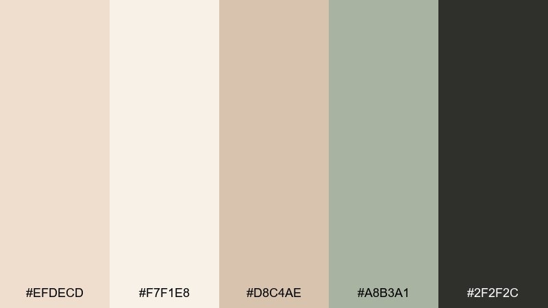
HEX: #EFDECD #F7F1E8 #D8C4AE #A8B3A1 #2F2F2C
Mood: calm, airy, modern
Best for: SaaS landing pages and clean UI layouts
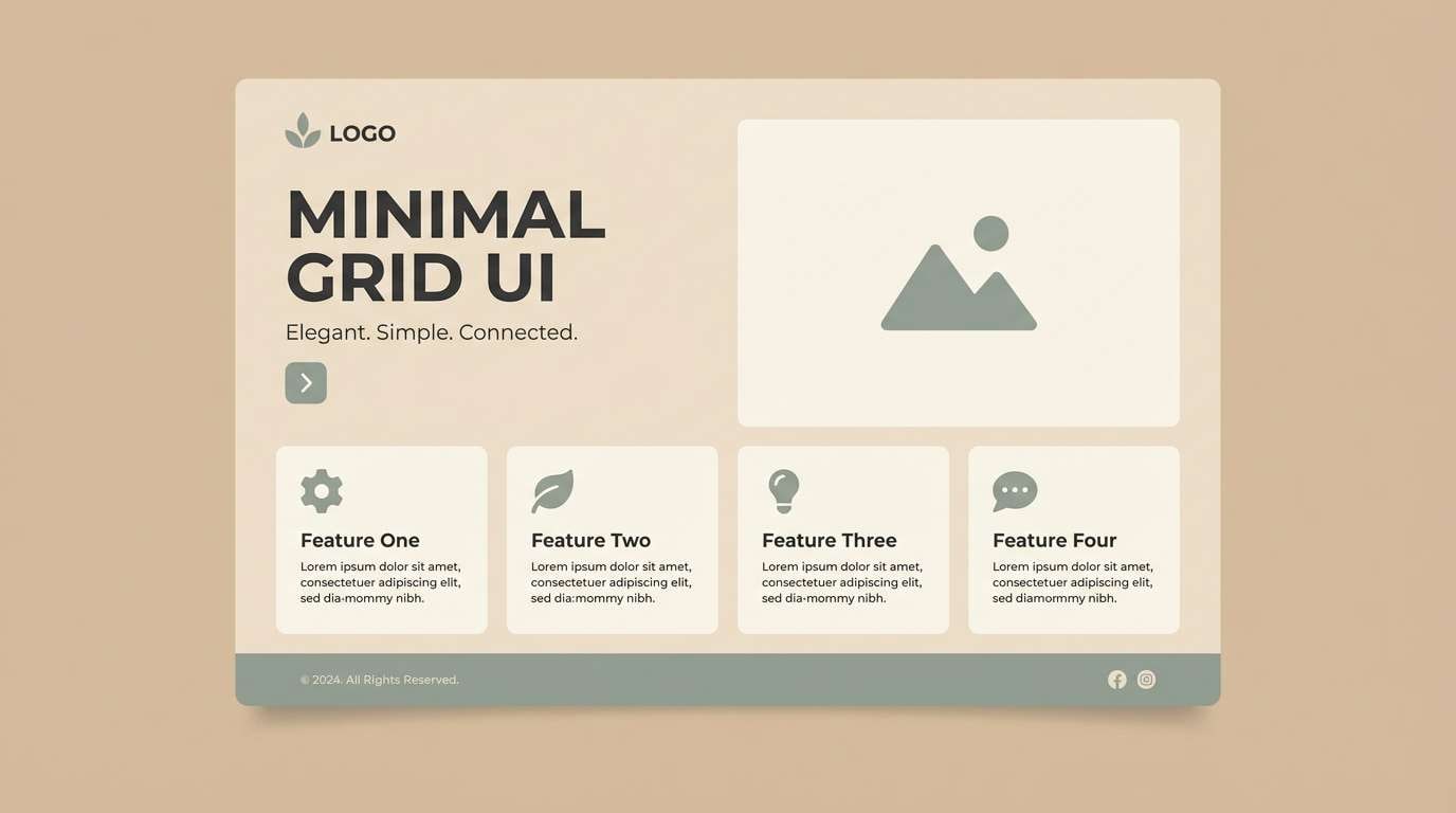
Calm and airy like a sunlit studio, these soft neutrals feel quiet but polished. Use the almond base for generous whitespace, then anchor sections with charcoal for readable type. Sage-gray accents work well for badges, toggles, and subtle highlights. Tip: keep contrast strong on primary buttons by pairing charcoal text with the lightest cream.
Image example of oat milk minimal generated using media.io
Media.io is an online AI studio for creating and editing video, image, and audio in your browser.

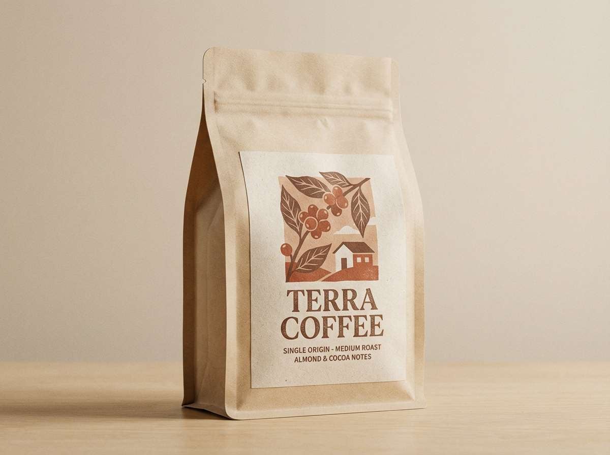
2) Terracotta Toast
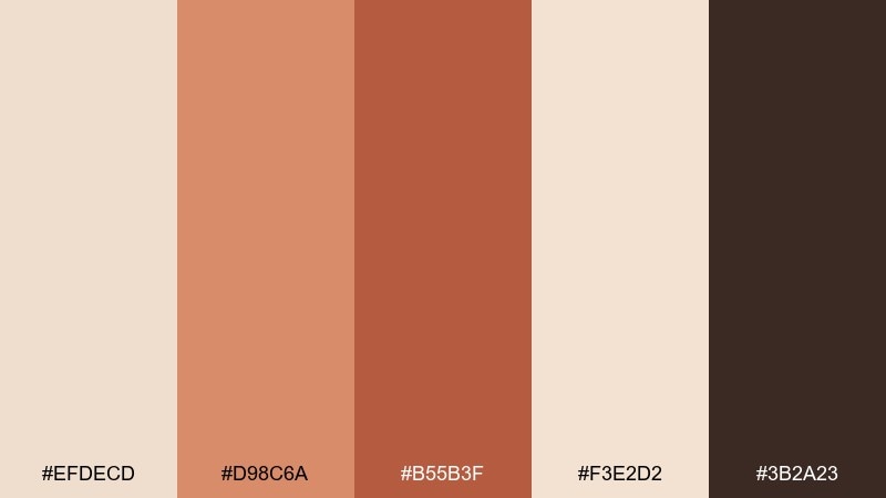
HEX: #EFDECD #D98C6A #B55B3F #F3E2D2 #3B2A23
Mood: warm, rustic, appetizing
Best for: coffee packaging and cafe branding
Warm and rustic like toasted clay and fresh espresso, this mix feels handmade and inviting. These almond color combinations shine on bags, labels, and menus where you want a cozy, craft-forward tone. Pair the terracotta and cocoa brown for bold marks, then use the pale cream for breathing room. Tip: print the darkest brown for text to keep small copy crisp on matte stock.
Image example of terracotta toast generated using media.io
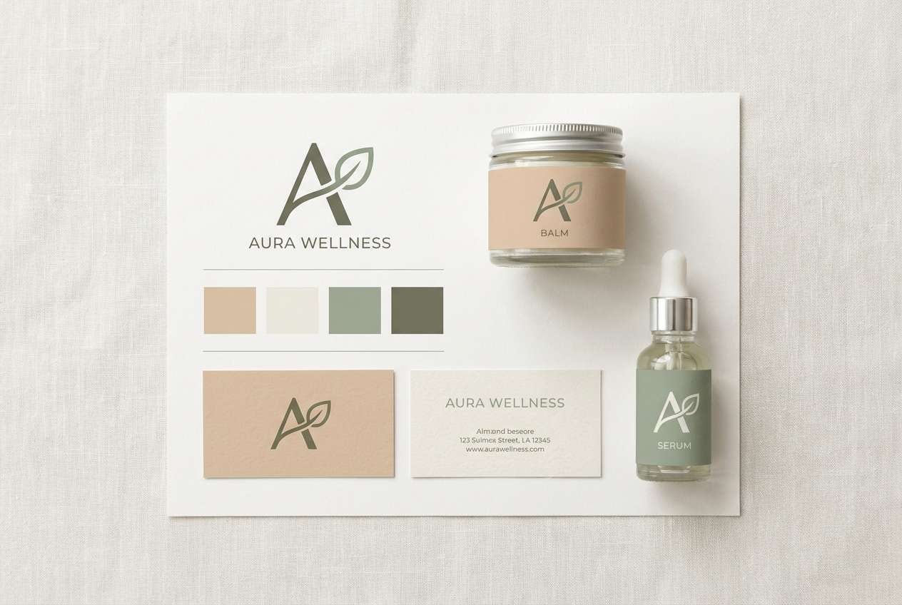
3) Sage Linen
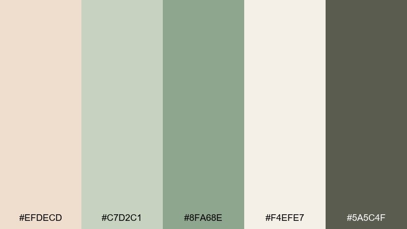
HEX: #EFDECD #C7D2C1 #8FA68E #F4EFE7 #5A5C4F
Mood: fresh, grounded, soothing
Best for: wellness branding and eco-friendly web design
Fresh and grounded like linen sheets and garden herbs, these tones feel restorative without going bland. Use almond and off-white as the base, then bring in sage for navigation, icons, and gentle callouts. The deeper olive-gray works as a smart substitute for pure black in headings. Tip: reserve the darkest shade for key CTAs so the overall page stays soft.
Image example of sage linen generated using media.io
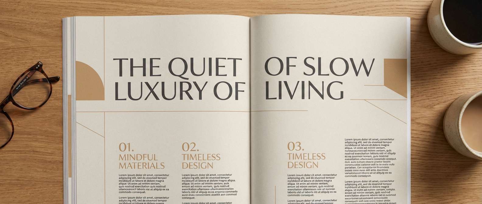
4) Midnight Almond
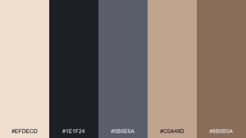
HEX: #EFDECD #1E1F24 #5B5E6A #C0A48D #8B6B5A
Mood: moody, elegant, editorial
Best for: magazine layouts and premium lookbooks
Moody and elegant like a gallery at night, this palette balances soft beige with inky depth. An almond color palette like this works beautifully for serif headlines, fashion spreads, and high-contrast photography captions. Use the midnight tone for type and frames, then warm everything up with the tan and cocoa accents. Tip: keep body text in the deep gray-blue instead of pure black to soften the contrast.
Image example of midnight almond generated using media.io
5) Peach Blossom
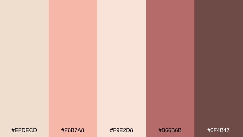
HEX: #EFDECD #F6B7A8 #F9E2D8 #B66B6B #6F4B47
Mood: romantic, gentle, celebratory
Best for: spring wedding invitations and bridal stationery
Romantic and gentle like blush petals on cream paper, these hues feel instantly celebratory. Use the light peach and almond tones as the background, then add the muted rose for names, monograms, or borders. The soft brown keeps typography grounded and avoids a sugary look. Tip: add plenty of spacing and let the darker rose appear only in small details for an elevated finish.
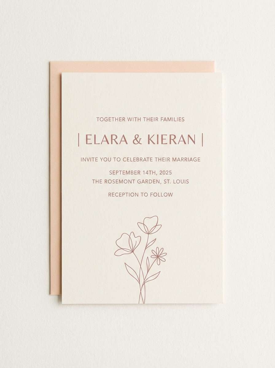
Image example of peach blossom generated using media.io
6) Coastal Sandstone
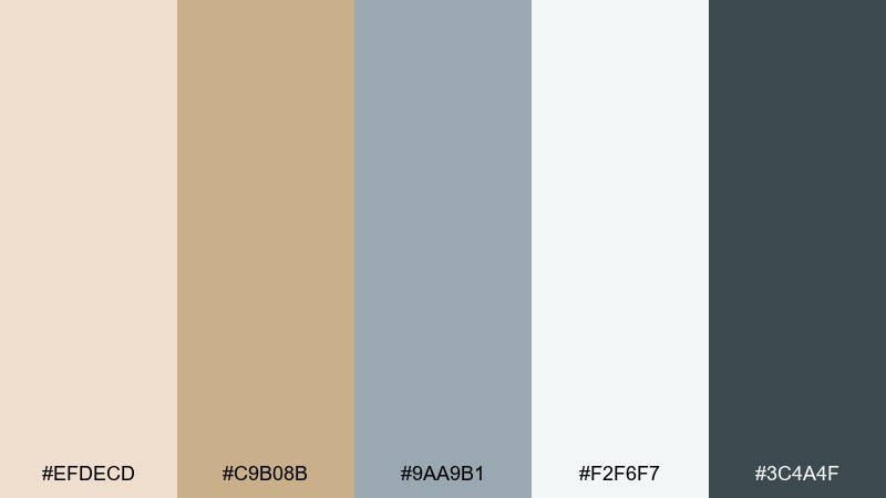
HEX: #EFDECD #C9B08B #9AA9B1 #F2F6F7 #3C4A4F
Mood: breezy, balanced, coastal
Best for: interior design mood boards and lifestyle blogs
Breezy and balanced like driftwood and pale stone, this mix feels calm but not sleepy. Pair the almond and misty white for walls or backgrounds, then bring in the cool blue-gray for textiles and UI accents. The deep slate is ideal for headings, hardware, or strong lines in a mood board. Tip: keep the blue-gray as the only cool accent to maintain a cohesive coastal read.
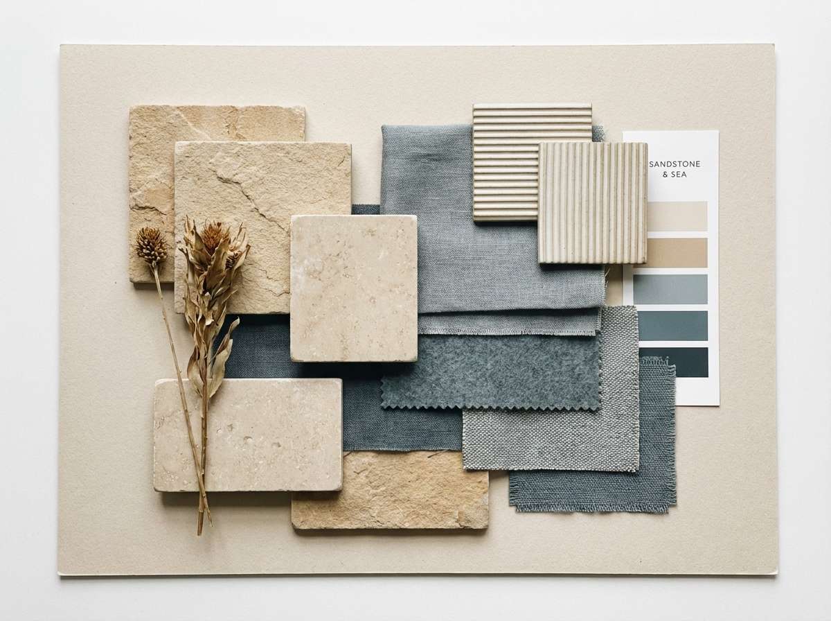
Image example of coastal sandstone generated using media.io
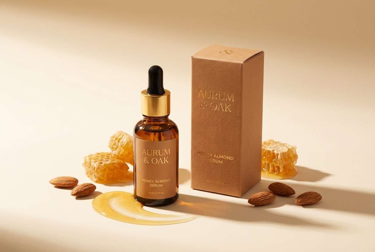
7) Golden Honey
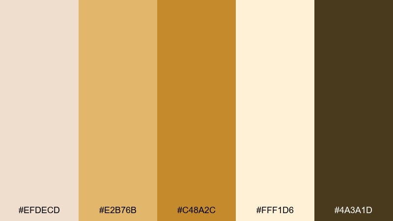
HEX: #EFDECD #E2B76B #C48A2C #FFF1D6 #4A3A1D
Mood: sunny, inviting, premium
Best for: skincare ads and warm product hero shots
Sunny and inviting like honey on warm toast, these golds add instant glow to soft neutrals. Use the creamy tints as a luminous backdrop, then highlight key benefits with the richer amber tones. Deep brown works well for ingredient lists and fine print, keeping the look premium. Tip: add subtle gradients between cream and honey to make product photos feel more dimensional.
Image example of golden honey generated using media.io
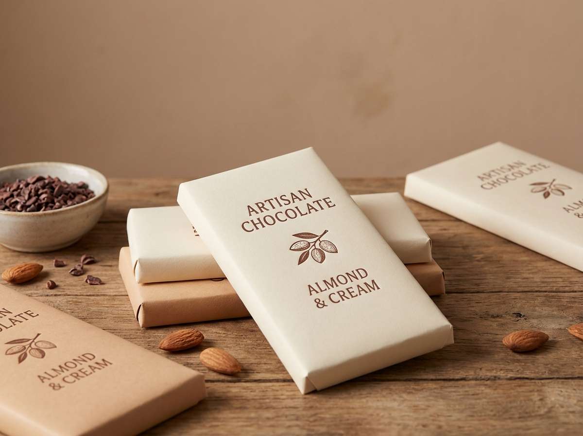
8) Cocoa Nibs
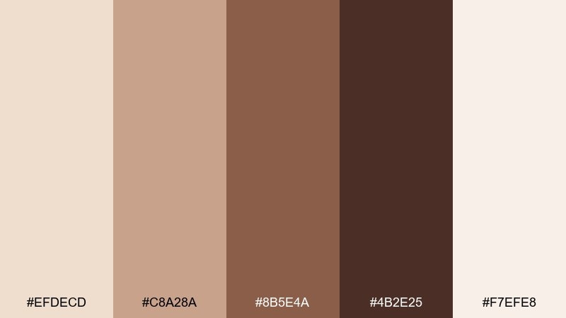
HEX: #EFDECD #C8A28A #8B5E4A #4B2E25 #F7EFE8
Mood: rich, comforting, handcrafted
Best for: chocolate labels and artisan food branding
Rich and comforting like cacao dusted on cream, these browns feel handcrafted and honest. An almond color combination with layered cocoa tones helps packaging look premium without needing bright color. Use the darkest chocolate shade for logos and borders, then reserve the lighter tan for background blocks and pattern work. Tip: add a tiny cream highlight around dark type to keep legibility on textured papers.
Image example of cocoa nibs generated using media.io
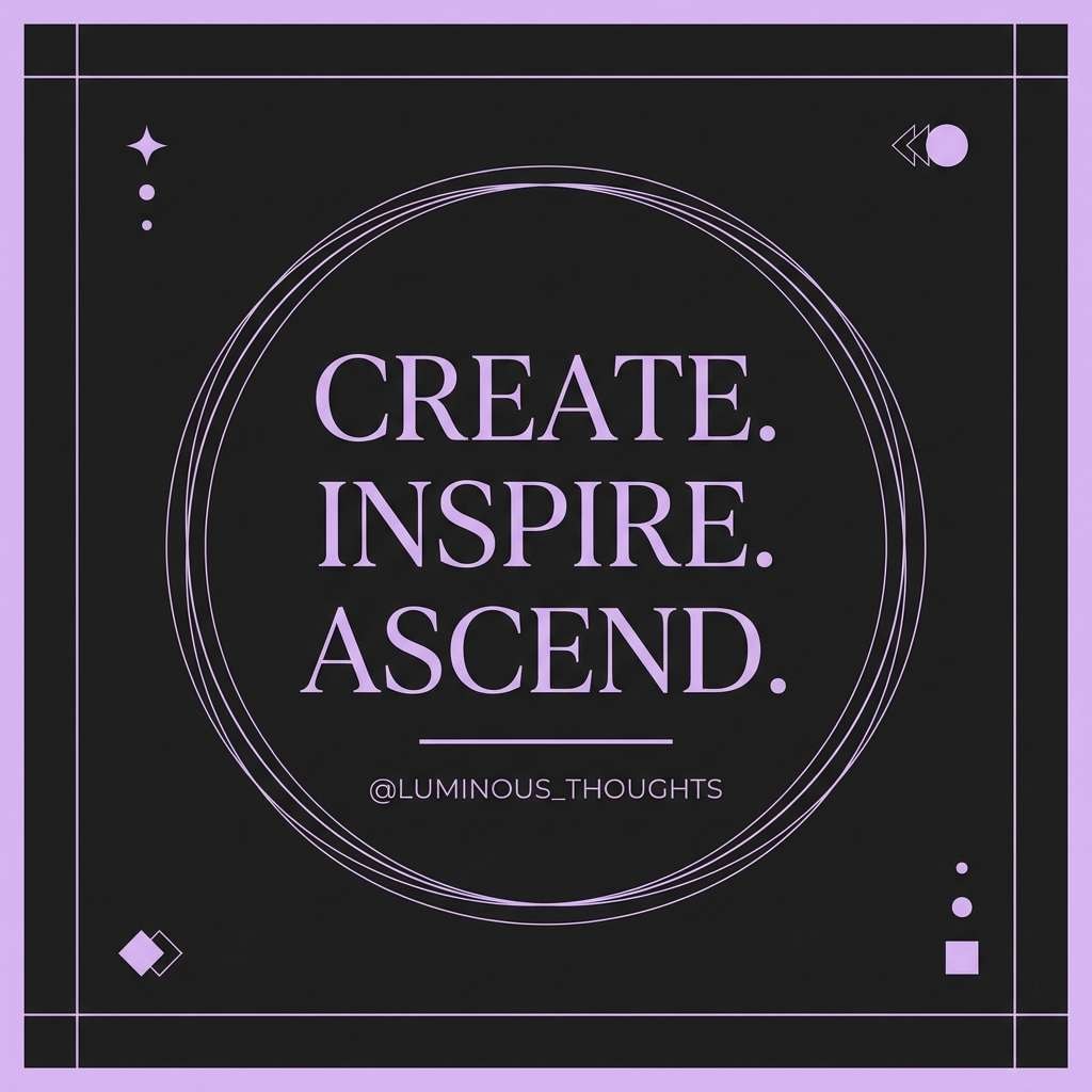
9) Lavender Latte
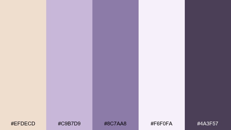
HEX: #EFDECD #C9B7D9 #8C7AA8 #F6F0FA #4A3F57
Mood: dreamy, soft, creative
Best for: social posts, quote graphics, and gentle promos
Dreamy and soft like lavender foam on a latte, these pastels add a creative twist to beige. Use the pale lavender as a supporting background and keep almond as the main canvas for text-heavy designs. The deeper violet-gray gives you contrast for headings and icons without feeling harsh. Tip: limit the darkest shade to one focal element, like a CTA button or signature line.
Image example of lavender latte generated using media.io
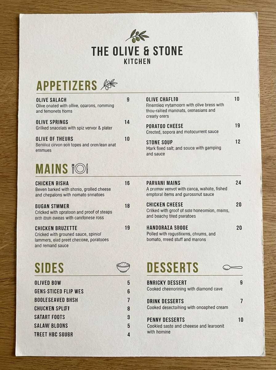
10) Olive Orchard
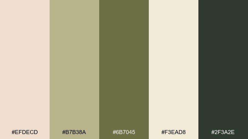
HEX: #EFDECD #B7B38A #6B7045 #F3EAD8 #2F3A2E
Mood: earthy, savory, organic
Best for: farm-to-table menus and sustainable restaurant branding
Earthy and savory like olive leaves and stoneware, these colors feel grounded and organic. Use almond and cream for menu pages, then add olive for section headers, dividers, and small icons. The deep forest charcoal is strong enough for body text and pricing. Tip: keep photos warm-toned so the greens read natural rather than cold.
Image example of olive orchard generated using media.io
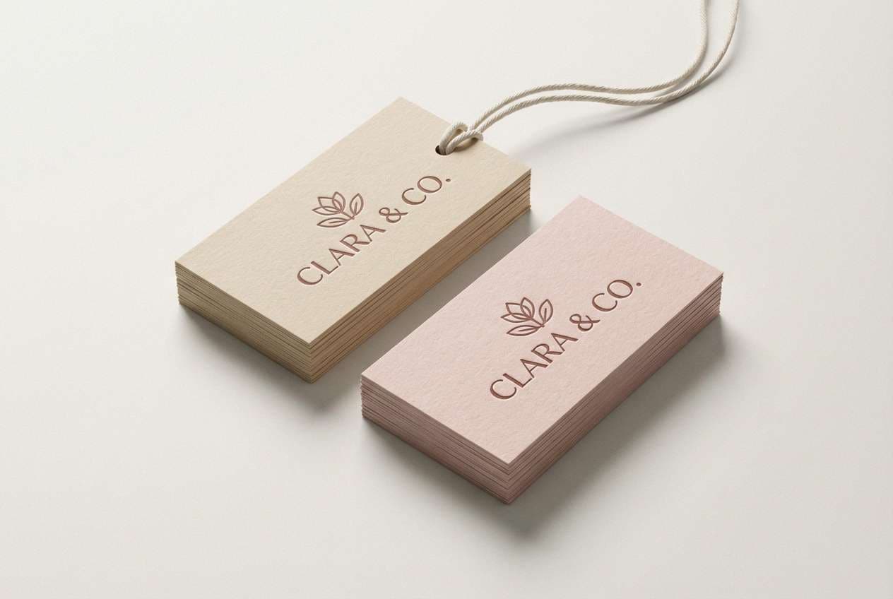
11) Rustic Rosewood
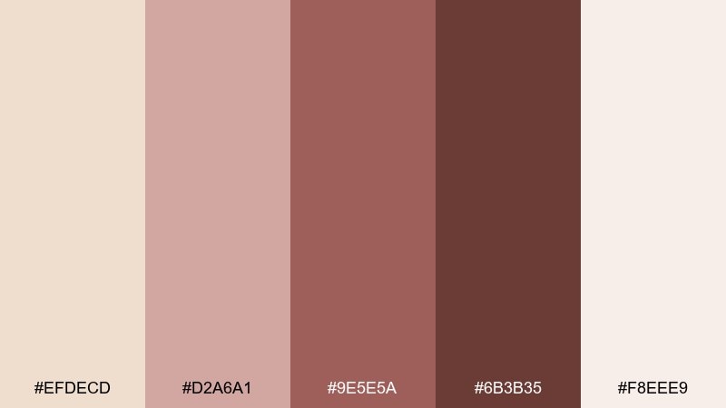
HEX: #EFDECD #D2A6A1 #9E5E5A #6B3B35 #F8EEE9
Mood: vintage, warm, boutique
Best for: boutique logos and product tags
Vintage and warm like rosewood drawers and faded lipstick, this set feels boutique-ready. Use the blush tones for secondary backgrounds and the deep wine-brown for marks, monograms, and headers. Almond and the pale pink-cream keep everything airy so it does not skew heavy. Tip: foil stamping looks great with the darkest shade if you keep the rest matte.
Image example of rustic rosewood generated using media.io
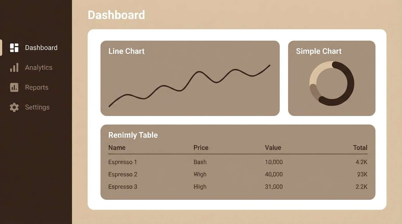
12) Iced Mocha UI
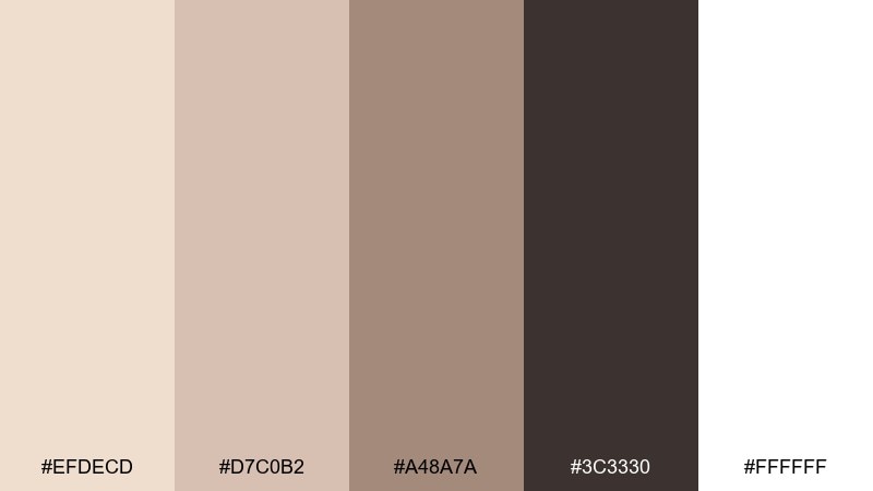
HEX: #EFDECD #D7C0B2 #A48A7A #3C3330 #FFFFFF
Mood: sleek, cozy, professional
Best for: dashboard UI and analytics products
Sleek and cozy like an iced mocha in a glass, these browns feel modern and dependable. This almond color scheme is great for dashboards where you want warmth without losing clarity. Use white and almond for surfaces, the mid-taupe for cards, and the deep espresso for navigation and charts. Tip: keep charts to one accent shade and rely on tint variations for additional data series.
Image example of iced mocha ui generated using media.io
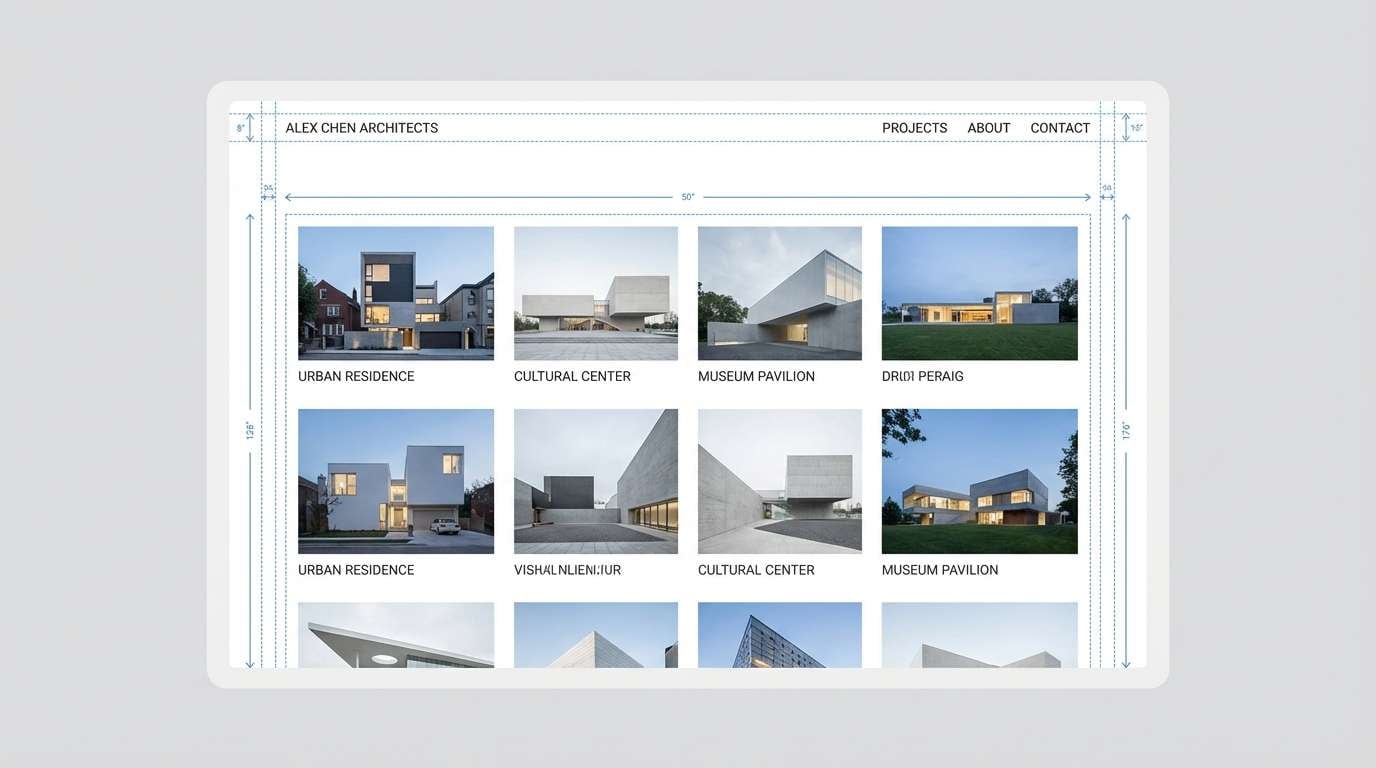
13) Blueprint Neutral
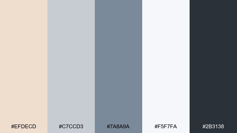
HEX: #EFDECD #C7CCD3 #7A8A9A #F5F7FA #2B3138
Mood: precise, cool, contemporary
Best for: architecture portfolios and case study pages
Precise and cool like drafting paper and steel, this neutral set feels contemporary and focused. Use almond to soften the overall page, then lean on the blue-grays for structure in grids, captions, and section rules. The near-black slate keeps text sharp and professional. Tip: pair with monochrome photos or concrete textures so the cool accents feel intentional.
Image example of blueprint neutral generated using media.io
14) Citrus Cream
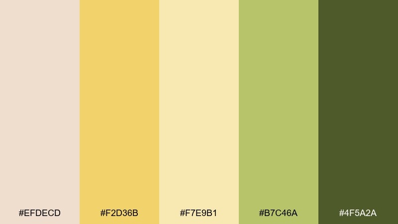
HEX: #EFDECD #F2D36B #F7E9B1 #B7C46A #4F5A2A
Mood: bright, fresh, upbeat
Best for: summer event flyers and outdoor market promos
Bright and fresh like lemon zest in whipped cream, these yellows lift the beige base without turning neon. Use the pale butter tone for large shapes, then add citrus gold for headlines and date callouts. The leafy green grounds the design and works well for icons and small dividers. Tip: keep the green to small areas so the flyer stays sunny, not earthy.
Image example of citrus cream generated using media.io

15) Berry Nougat
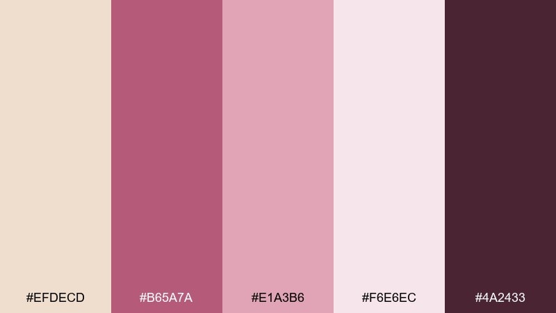
HEX: #EFDECD #B65A7A #E1A3B6 #F6E6EC #4A2433
Mood: playful, chic, romantic
Best for: cosmetics campaigns and beauty packaging
Playful and chic like berry nougat and satin ribbons, this mix reads modern romance. These almond color combinations work best when almond stays dominant and the berry tones become accents for lips, seals, or key claims. Use the deep plum for typography to keep everything crisp and luxe. Tip: on packaging, try a matte almond base with glossy berry details for contrast you can feel.
Image example of berry nougat generated using media.io
16) Stone & Smoke
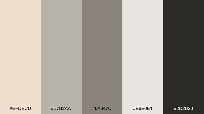
HEX: #EFDECD #B7B2AA #8A847C #E9E6E1 #2D2B28
Mood: industrial, muted, sophisticated
Best for: product photography backdrops and ecommerce
Industrial and muted like smooth stone in a smoky studio, these neutrals feel sophisticated and calm. Use the pale gray-beige for large surfaces, then rely on the deeper grays to define edges and shadow areas. Almond adds warmth so metal or glass products do not look cold. Tip: keep props minimal and let texture do the work, especially with concrete or linen.
Image example of stone & smoke generated using media.io
17) Mint Macaron
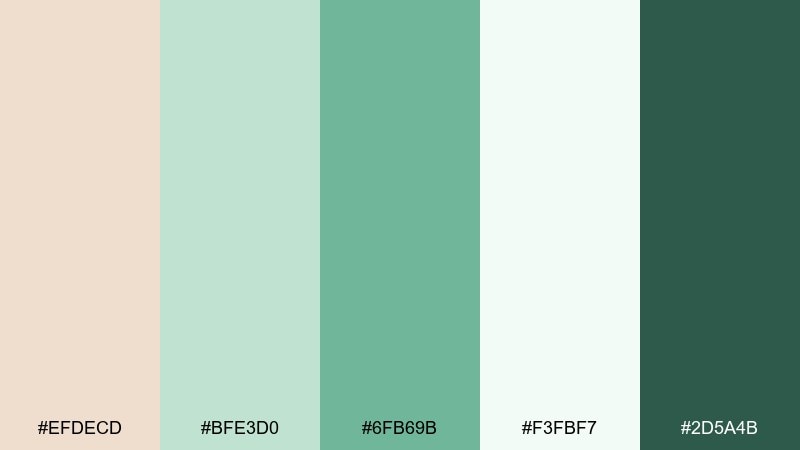
HEX: #EFDECD #BFE3D0 #6FB69B #F3FBF7 #2D5A4B
Mood: light, friendly, refreshing
Best for: app onboarding screens and feature callouts
Light and friendly like mint macarons on a bakery tray, these greens refresh the warm base. Use almond for the main background, then apply mint tones for progress states, icons, and friendly illustrations. The deep teal-green gives you an accessible contrast option for buttons. Tip: keep illustration outlines in the darkest green so the softer tints stay airy.
Image example of mint macaron generated using media.io
18) Autumn Orchard
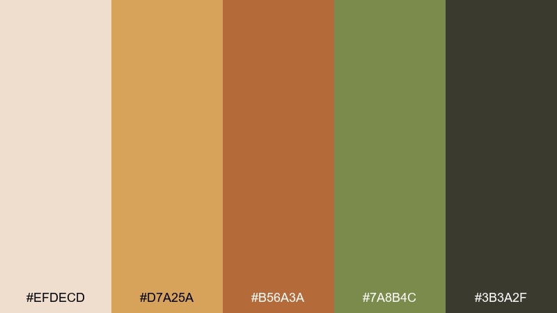
HEX: #EFDECD #D7A25A #B56A3A #7A8B4C #3B3A2F
Mood: seasonal, cozy, outdoorsy
Best for: fall sale posters and harvest event graphics
Seasonal and cozy like apple skins and warm cider, these tones bring autumn energy without feeling loud. Use almond and tan as the background, then pop the poster with pumpkin orange for headlines and pricing. The muted green makes a great secondary accent for dates, locations, and small icons. Tip: add subtle grain to the background to make the palette feel more tactile and vintage.
Image example of autumn orchard generated using media.io

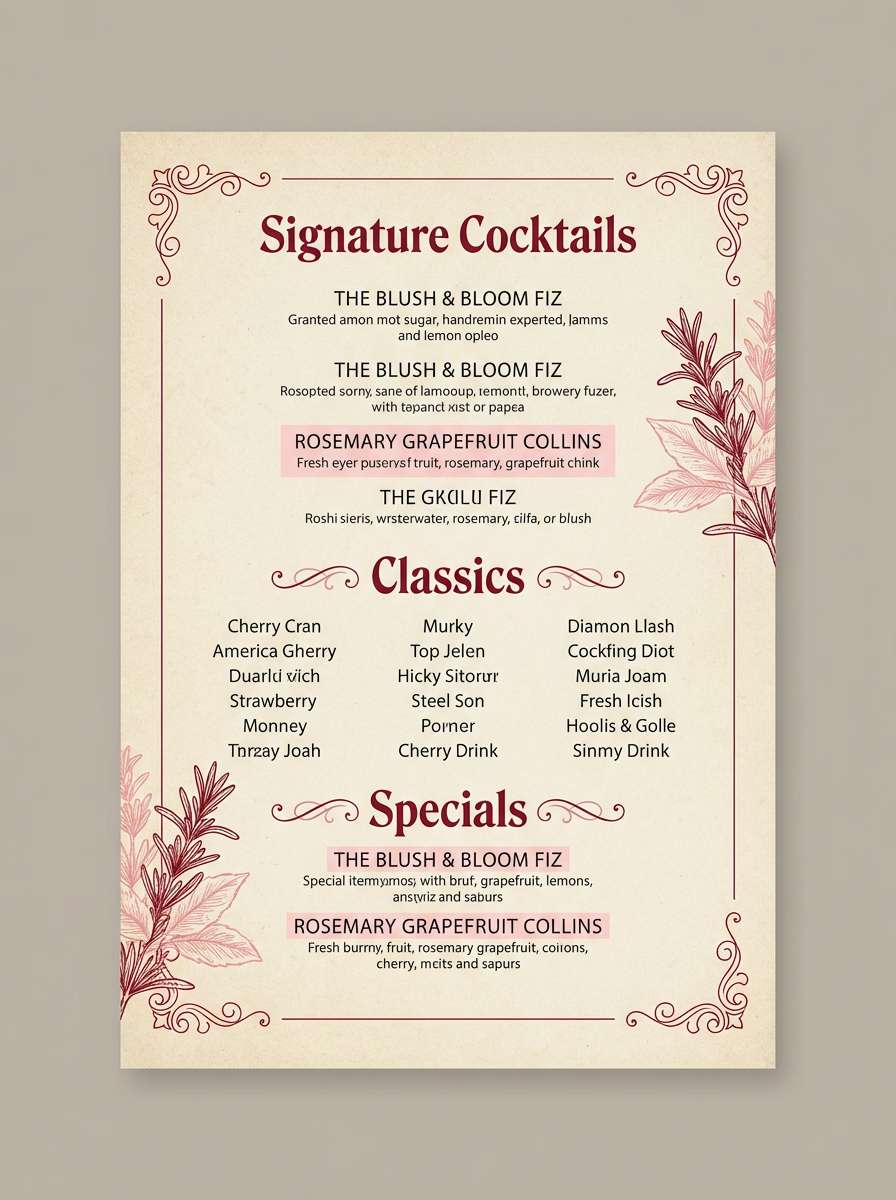
19) Cherry Cordial
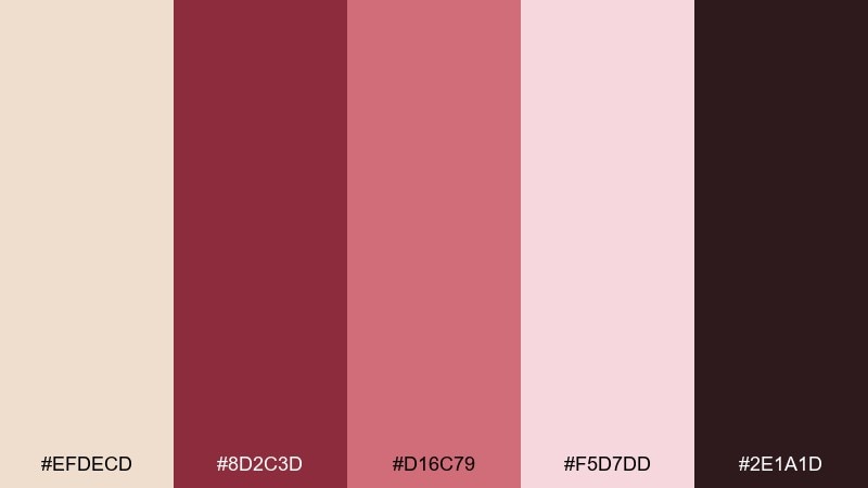
HEX: #EFDECD #8D2C3D #D16C79 #F5D7DD #2E1A1D
Mood: dramatic, intimate, upscale
Best for: cocktail menus and bar night promos
Dramatic and intimate like candlelight and cherry cordial, this palette feels upscale and a little mysterious. Use almond as the paper-like base so the wine reds stay readable and refined. The near-black shade is perfect for menu text and fine lines, while the rosy tint can highlight specials. Tip: keep photos dark and warm so the reds do not shift toward neon.
Image example of cherry cordial generated using media.io
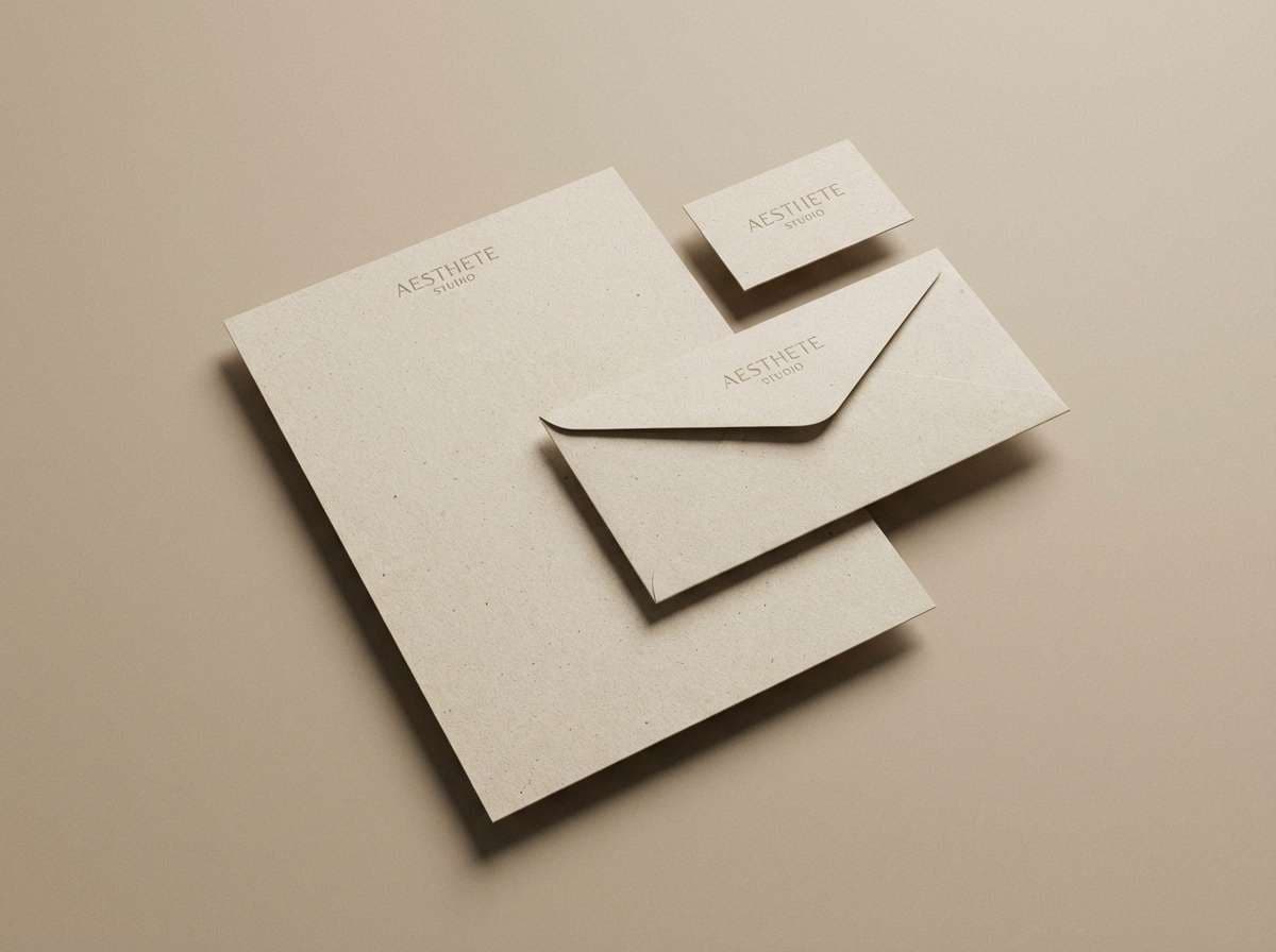
20) Monochrome Almond
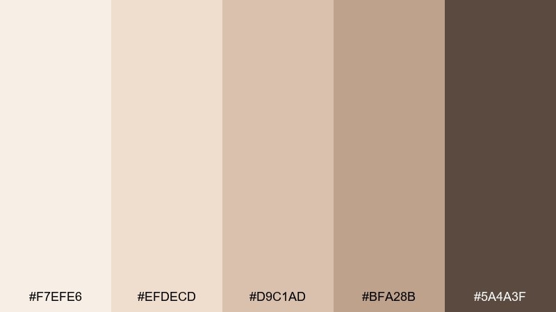
HEX: #F7EFE6 #EFDECD #D9C1AD #BFA28B #5A4A3F
Mood: minimal, warm, timeless
Best for: stationery sets and minimalist brand systems
Minimal and warm like layered parchment, these monochrome neutrals feel timeless and calm. An almond color palette built on close tonal steps works best when you emphasize texture, spacing, and typography. Use the darkest brown for logos and letterheads, then keep envelopes and cards in the lighter creams for a premium look. Tip: introduce contrast through embossing or thick paper edges rather than adding extra colors.
Image example of monochrome almond generated using media.io
What Colors Go Well with Almond?
Almond pairs best with grounded, natural hues: terracotta, rust, cocoa brown, olive, and honey-gold. These combinations amplify warmth and make layouts feel handcrafted, cozy, and premium.
For a cleaner, more contemporary direction, add cool structure tones like slate, blue-gray, or charcoal. Almond softens those cooler accents, so your design stays sharp without turning icy.
If you want a playful accent, try muted berries, dusty rose, or soft lavender. Keeping almond as the dominant background helps these colors read refined instead of overly sweet.
How to Use a Almond Color Palette in Real Designs
In UI and product design, treat almond like a warm “surface” color: backgrounds, cards, empty states, and subtle section blocks. Reserve the darkest shade (charcoal/espresso/slate) for typography and primary buttons to maintain accessible contrast.
In branding and packaging, almond works especially well on matte stocks and textured papers, where it feels premium and natural. Pair it with one strong accent (terracotta, berry, olive, or gold) and one deep neutral for logos and small print.
For interiors and seasonal graphics, almond is an easy base for mood boards. Keep your palette cohesive by choosing either warm accents (rust, honey, cocoa) or a single cool accent (blue-gray) rather than mixing too many competing undertones.
Create Almond Palette Visuals with AI
If you already have HEX codes, you can quickly turn an almond color scheme into mockups for landing pages, menus, packaging, posters, and brand sheets. The key is to describe the layout, materials, lighting, and where each color appears (background, typography, accents).
Start with one palette above, paste the prompt style you like, then iterate: adjust “matte paper,” “soft diffused lighting,” or “flat design” to match your use case. You’ll get consistent visuals faster when you keep the same composition and only swap colors.
Use Media.io to generate polished almond palette images for presentations, client reviews, and A/B tests without building full mockups from scratch.
Almond Color Palette FAQs
-
What is the HEX code for almond?
A common almond base used in palettes is #EFDECD. It’s a warm, light beige that works well as a background and pairs easily with both earthy and cool accents. -
Is almond a beige or a cream?
Almond sits between cream and beige: lighter and softer than many beiges, but warmer and more colored than an off-white cream. That in-between quality is why it’s popular for minimalist designs. -
What colors complement almond best?
Great complements include charcoal and espresso browns for contrast, terracotta and rust for warmth, olive and sage for organic looks, and slate/blue-gray for a modern, structured feel. -
How do I keep text readable on an almond background?
Use a dark neutral (charcoal, espresso, near-black slate) for body text and headings, and avoid very light gray typography. For buttons, increase contrast by pairing almond/cream fills with dark text or using dark fills with light text. -
Does almond work for modern UI design?
Yes—almond is excellent for warm, approachable UI. Use it for surfaces and whitespace, then rely on a clear dark neutral for typography and a restrained accent color for states (active, success, highlights). -
Which almond palettes are best for branding and packaging?
For food and craft brands, try Terracotta Toast or Cocoa Nibs. For beauty and boutique branding, Berry Nougat and Rustic Rosewood feel polished and premium on matte packaging. -
Can almond palettes look cool instead of warm?
Yes—pair almond with blue-grays and slate (like Blueprint Neutral) to introduce a cooler, more technical tone while keeping the overall design softer than pure white.


