

Pale lavender is a modern pastel purple that feels calm, airy, and quietly premium. It works beautifully for branding, weddings, and UI because it softens layouts without looking childish.
Below are 20+ curated pale lavender color palette ideas with HEX codes, plus practical tips for contrast, accents, and real design use.
In this article
- Why Pale Lavender Palettes Work So Well
-
- misty lilac neutrals
- lavender oat latte
- amethyst blossom
- dusty lavender and sage
- lavender dusk studio
- berry milkshake
- orchid paper
- nordic lavender gray
- lavender and copper glow
- lilac and navy contrast
- lavender citrus pop
- botanical lavender garden
- wedding lavender linen
- retro lavender teal
- minimal lavender ui
- lavender and charcoal ink
- soft lavender sunset
- lavender clay and sand
- fantasy lavender galaxy
- lavender frost and mint
- lavender monochrome layers
- lavender pearl and gold
- lavender ink and apricot
- What Colors Go Well with Pale Lavender?
- How to Use a Pale Lavender Color Palette in Real Designs
- Create Pale Lavender Palette Visuals with AI
Why Pale Lavender Palettes Work So Well
Pale lavender sits in a sweet spot between calming neutrals and expressive color. It adds personality without shouting, which is why it’s popular in modern UI, wellness, and lifestyle brands.
Because it’s light in value, pale lavender creates spacious layouts and “soft focus” backgrounds that make content feel more approachable. It also pairs easily with both cool grays and warm creams, so you can steer the mood from clean to romantic.
With the right dark anchor (ink, charcoal, navy), pale lavender can still meet readability and contrast needs. That makes it practical—not just pretty—for interfaces, print, and packaging.
20+ Pale Lavender Color Palette Ideas (with HEX Codes)
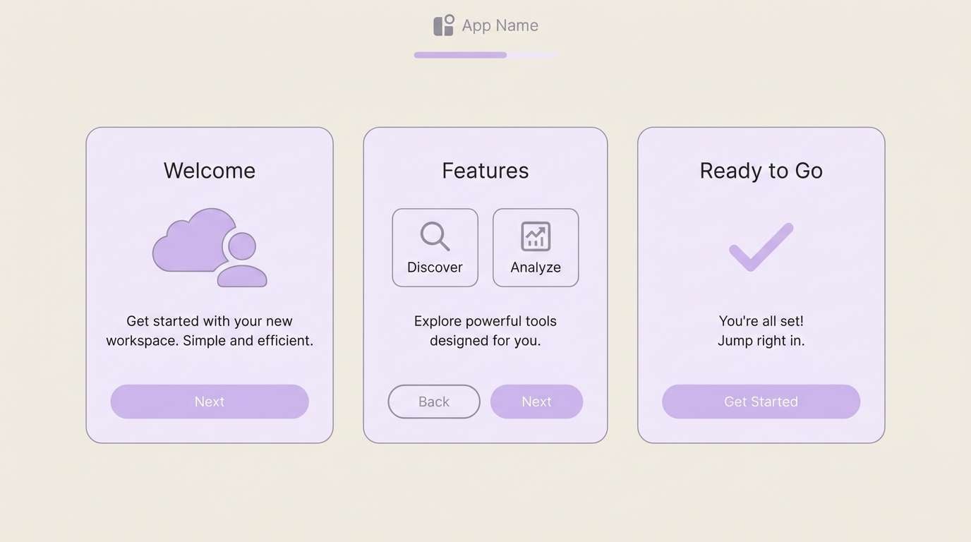
1) Misty Lilac Neutrals
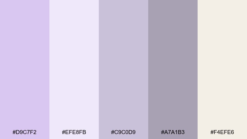
HEX: #d9c7f2 #efe8fb #c9c0d9 #a7a1b3 #f4efe6
Mood: airy, calm, minimal
Best for: clean UI mockups and onboarding screens
Airy and quiet like morning fog over lilac petals, these tones feel weightless and modern. Use the pale lavender as the primary surface color, then lean on warm cream for breathing room. Bring in the gray-lilac and muted graphite for text, dividers, and icon strokes so contrast stays readable. Usage tip: reserve the darkest shade for CTAs and key navigation to keep the interface crisp.
Image example of misty lilac neutrals generated using media.io
Media.io is an online AI studio for creating and editing video, image, and audio in your browser.

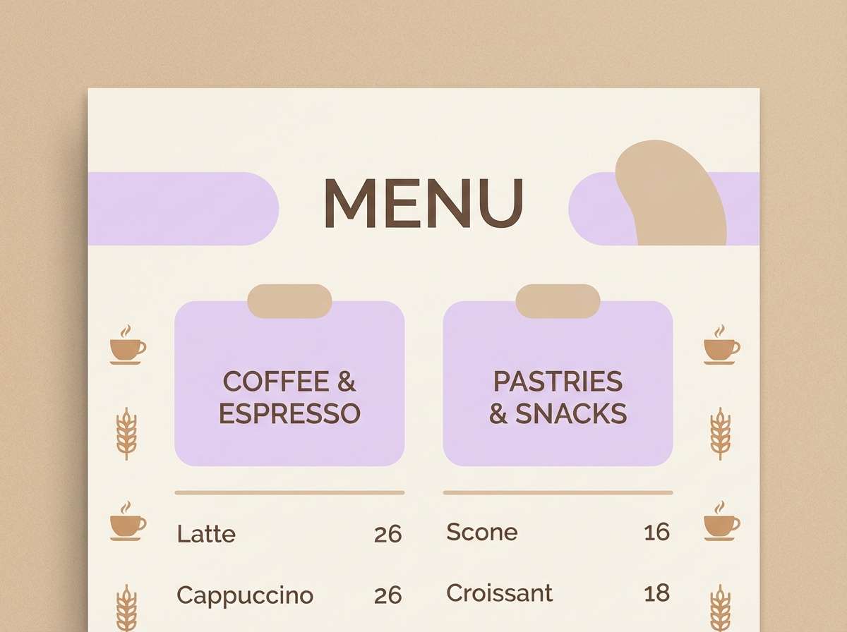
2) Lavender Oat Latte
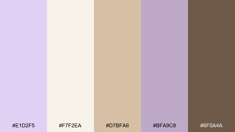
HEX: #e1d2f5 #f7f2ea #d7bfa6 #bfa9c8 #6f5a4a
Mood: cozy, warm, welcoming
Best for: cafe menus and cozy brand identities
Cozy and creamy like a latte with a floral twist, this mix softens lavender with oat and caramel notes. Pair the pale purple with warm beige backgrounds to avoid a cold, overly pastel feel. Use the cocoa brown for headings and pricing so information reads clearly. Usage tip: keep lavender in small highlights like section tabs, icons, or menu dividers for a tasteful finish.
Image example of lavender oat latte generated using media.io
3) Amethyst Blossom
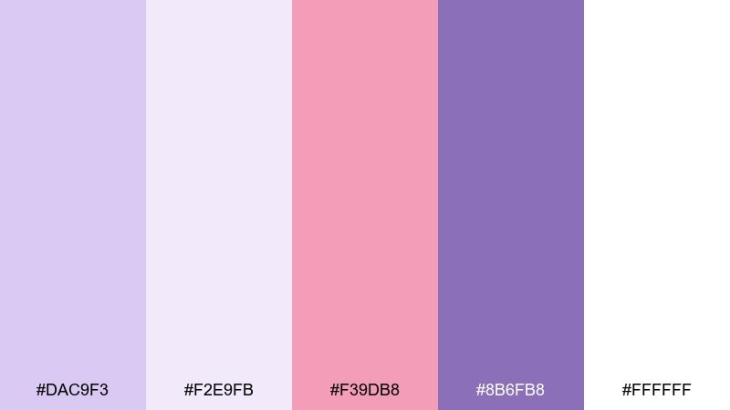
HEX: #dac9f3 #f2e9fb #f39db8 #8b6fb8 #ffffff
Mood: romantic, playful, bright
Best for: beauty promo posters and social graphics
Romantic and candy-bright, these shades evoke petals, gloss, and soft studio lights. Let lavender and white carry most of the layout, then add the blush pink as the hero accent for badges or sale stamps. Deep amethyst anchors the composition for headlines without turning heavy. Usage tip: use large, rounded shapes to echo the floral vibe and keep the look youthful.
Image example of amethyst blossom generated using media.io

4) Dusty Lavender and Sage
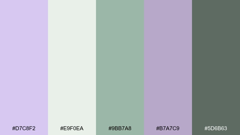
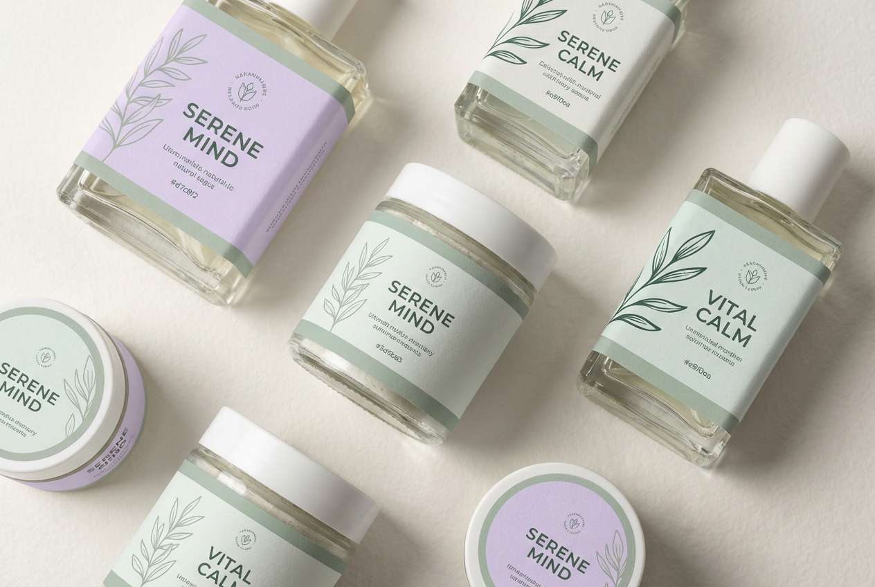
HEX: #d7c8f2 #e9f0ea #9bb7a8 #b7a7c9 #5d6b63
Mood: botanical, grounded, serene
Best for: wellness packaging and eco labels
Botanical and grounded, the dusty lavender feels like dried flowers beside fresh sage leaves. Use the pale purple for the main label tint and bring in soft minty white as negative space. Sage green makes a natural accent for claims, icons, and seal marks, while the deep green-gray keeps text legible. Usage tip: choose matte finishes so the palette stays organic and calm.
Image example of dusty lavender and sage generated using media.io
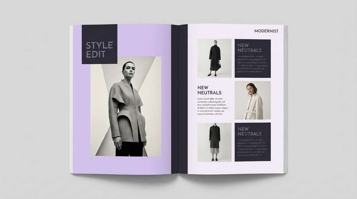
5) Lavender Dusk Studio
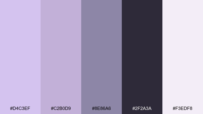
HEX: #d4c3ef #c2b0d9 #8e86a6 #2f2a3a #f3edf8
Mood: moody, modern, editorial
Best for: fashion lookbooks and editorial layouts
Moody and refined, these tones feel like a studio set at dusk with soft violet light. Layer pale lavender over near-black to create drama without going harsh. The mid lavender-grays work well for captions, rules, and grid systems in print. Usage tip: increase line spacing and keep photography monochrome so the purples stay the star.
Image example of lavender dusk studio generated using media.io
6) Berry Milkshake
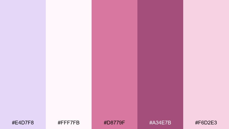
HEX: #e4d7f8 #fff7fb #d8779f #a34e7b #f6d2e3
Mood: sweet, cheerful, upbeat
Best for: dessert shop branding and sticker packs
Sweet and upbeat like berry foam and whipped cream, this palette leans playful without feeling loud. Keep the pale lavender and soft white as the background base, then punch in magenta for logos and callouts. The deeper berry shade works for outlines and type when you need more contrast. Usage tip: limit saturated accents to one or two elements per panel so the design stays airy.
Image example of berry milkshake generated using media.io
7) Orchid Paper
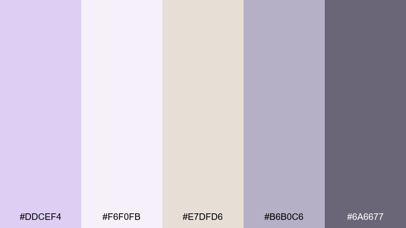
HEX: #ddcef4 #f6f0fb #e7dfd6 #b6b0c6 #6a6677
Mood: soft, refined, stationery-like
Best for: wedding stationery and minimalist invites
Soft and refined like thick cotton paper with a hint of orchid tint, these colors read timeless. Use pale lavender for the invitation background and keep copy in the cool gray for elegant clarity. Warm greige adds a natural touch for envelopes, wax seals, or RSVP cards. Usage tip: pair with a thin serif and lots of margin to make the design feel premium.
Image example of orchid paper generated using media.io
8) Nordic Lavender Gray
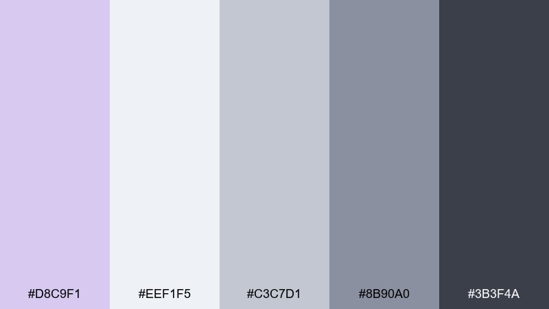
HEX: #d8c9f1 #eef1f5 #c3c7d1 #8b90a0 #3b3f4a
Mood: cool, tidy, Scandinavian
Best for: SaaS dashboards and data-heavy UI
Cool and tidy, this mix feels like Nordic interiors with a lavender twist. Pale lavender is ideal for subtle page sections, while the icy gray keeps panels and tables feeling organized. Use the slate and charcoal for charts, labels, and navigation to protect readability. Usage tip: add 1px borders in the mid gray to separate components instead of heavy shadows.
Image example of nordic lavender gray generated using media.io

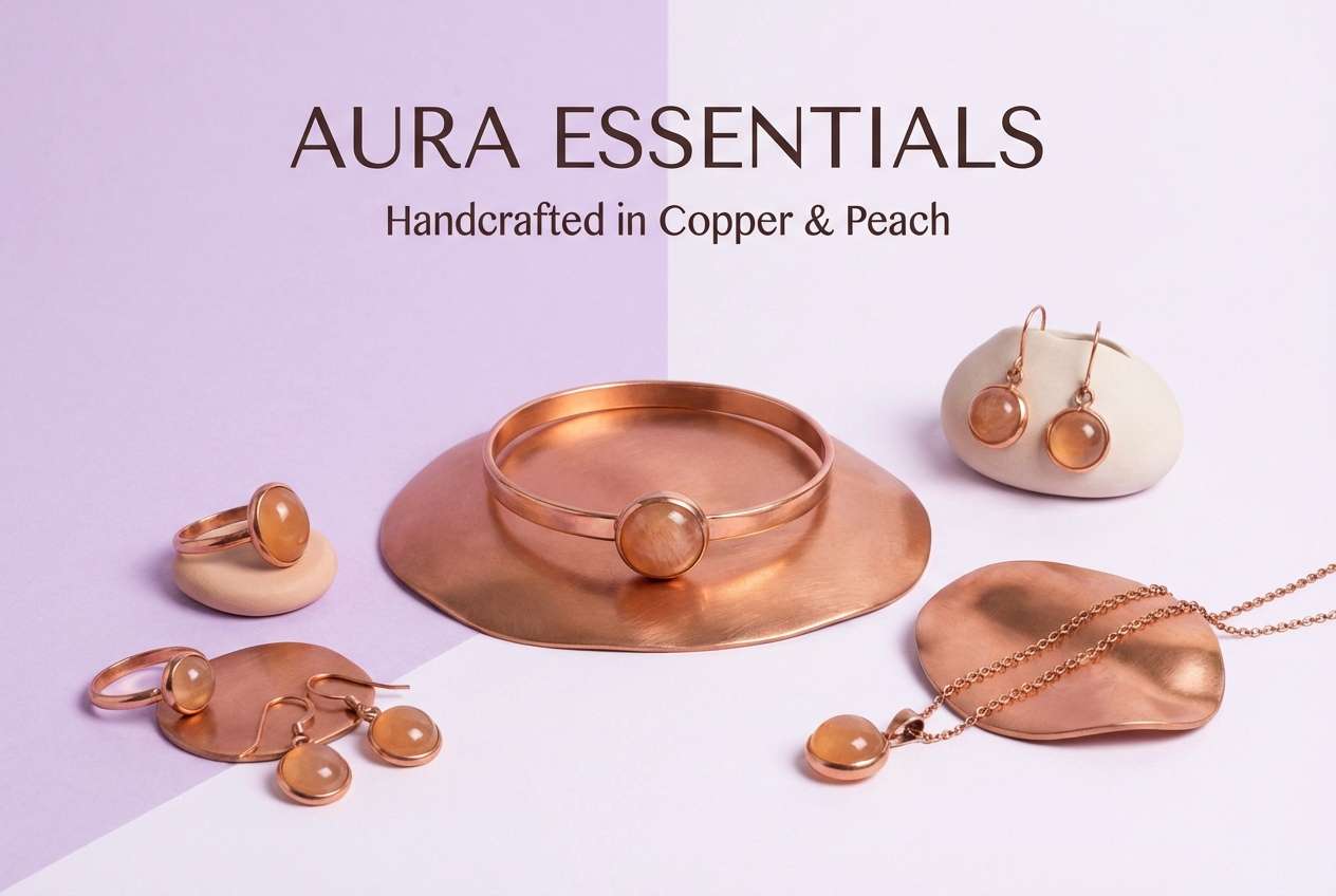
9) Lavender and Copper Glow
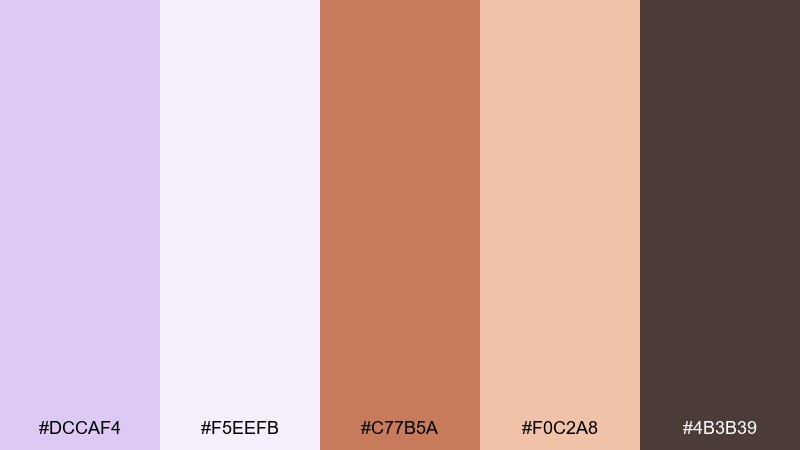
HEX: #dccaf4 #f5eefb #c77b5a #f0c2a8 #4b3b39
Mood: warm, luminous, boutique
Best for: jewelry product ads and premium promos
Warm and luminous, it evokes copper jewelry catching light against a soft violet backdrop. These pale lavender color combinations look best when copper is treated as a small, intentional highlight rather than a full block. Use the deep brown for typography and fine details to keep the overall look upscale. Usage tip: add gentle gradients in lavender to mimic glow without introducing extra colors.
Image example of lavender and copper glow generated using media.io
10) Lilac and Navy Contrast
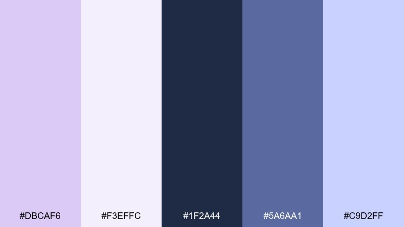
HEX: #dbcaf6 #f3effc #1f2a44 #5a6aa1 #c9d2ff
Mood: confident, clean, tech-forward
Best for: app landing pages and hero sections
Confident and tech-forward, this pairing feels like twilight skies with crisp, modern type. Use pale lavender for backgrounds and soft panels, then bring navy in for navigation and primary buttons. The periwinkle blue is great for links and hover states without looking neon. Usage tip: keep navy text on the lightest lavender tint to meet contrast guidelines.
Image example of lilac and navy contrast generated using media.io

11) Lavender Citrus Pop
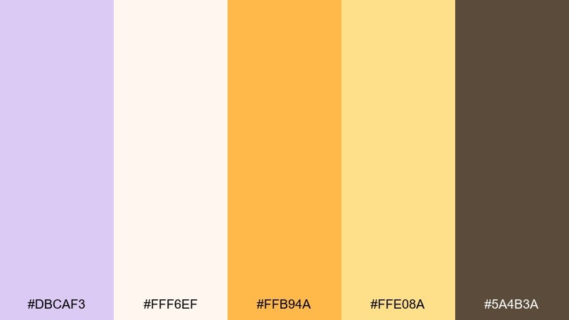
HEX: #dbcaf3 #fff6ef #ffb94a #ffe08a #5a4b3a
Mood: sunny, optimistic, energetic
Best for: event flyers and seasonal promos
Sunny and optimistic, it feels like lemonade light spilling onto soft lavender paper. Pale lavender and cream create a gentle base, while citrus yellow brings instant energy to headlines and stickers. The warm brown is perfect for body text so the layout stays grounded. Usage tip: use yellow only in small shapes or underlines for a bright accent that does not overpower.
Image example of lavender citrus pop generated using media.io

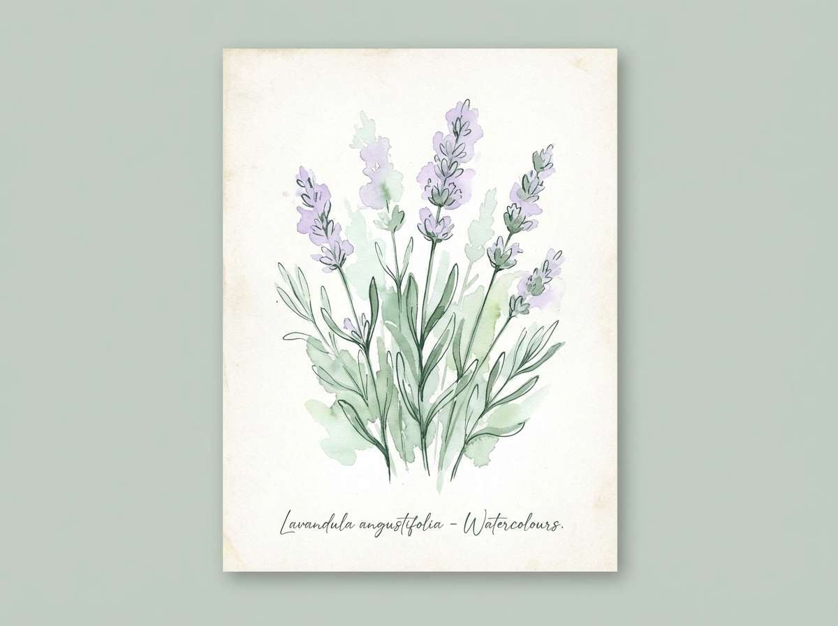
12) Botanical Lavender Garden
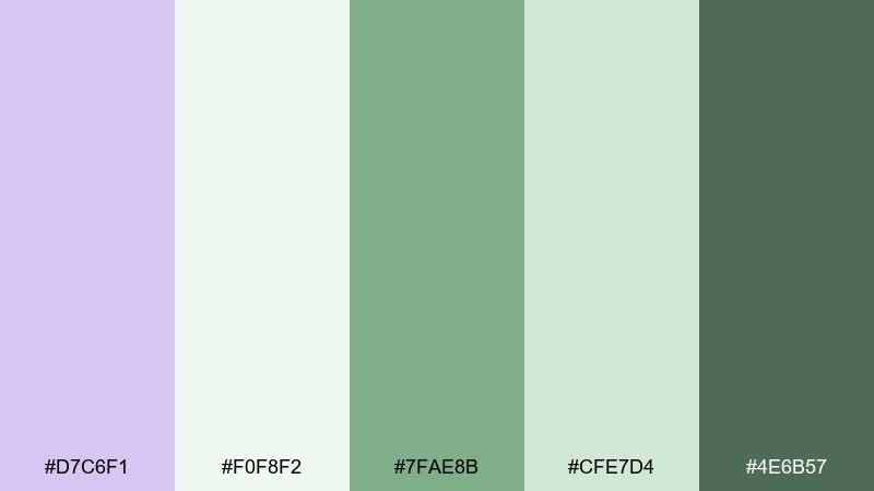
HEX: #d7c6f1 #f0f8f2 #7fae8b #cfe7d4 #4e6b57
Mood: fresh, natural, springlike
Best for: watercolor botanical illustrations and prints
Fresh and springlike, it evokes a garden sketchbook with lavender stems and new leaves. Use pale lavender for the blooms, then layer the minty whites and soft greens for airy foliage. The deeper forest green is best kept for stems and fine linework so the illustration holds detail. Usage tip: work with transparent watercolor washes to keep the palette light and breathable.
Image example of botanical lavender garden generated using media.io
13) Wedding Lavender Linen
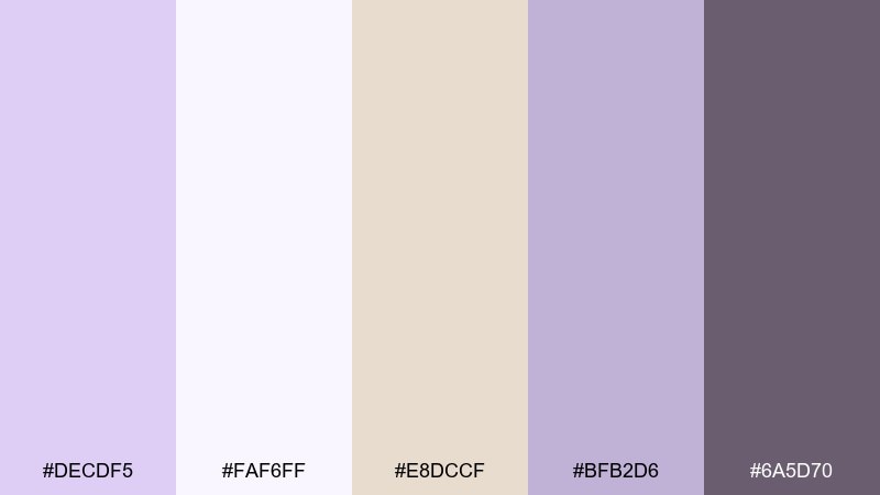
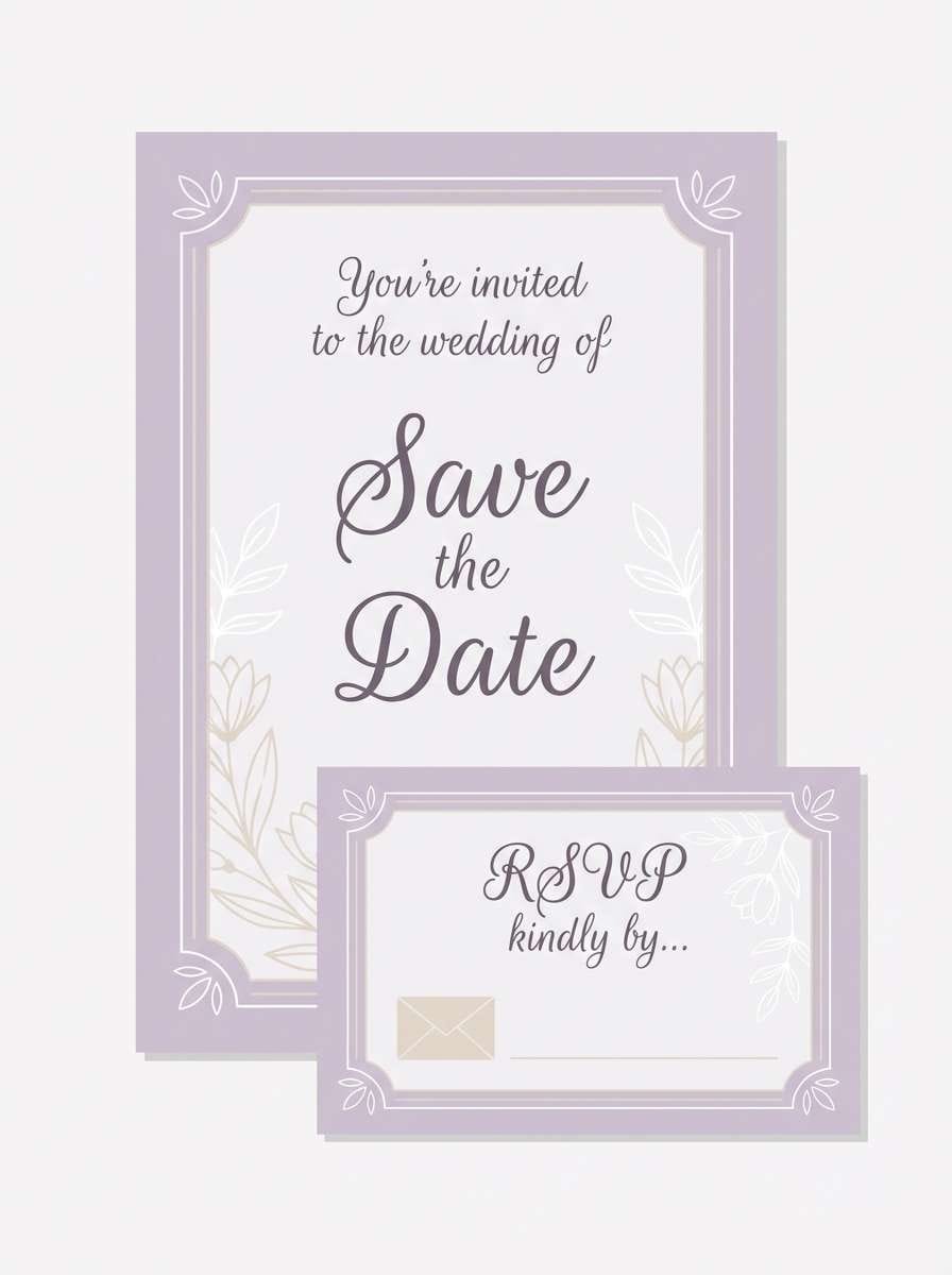
HEX: #decdf5 #faf6ff #e8dccf #bfb2d6 #6a5d70
Mood: romantic, elegant, soft
Best for: wedding suites and table stationery
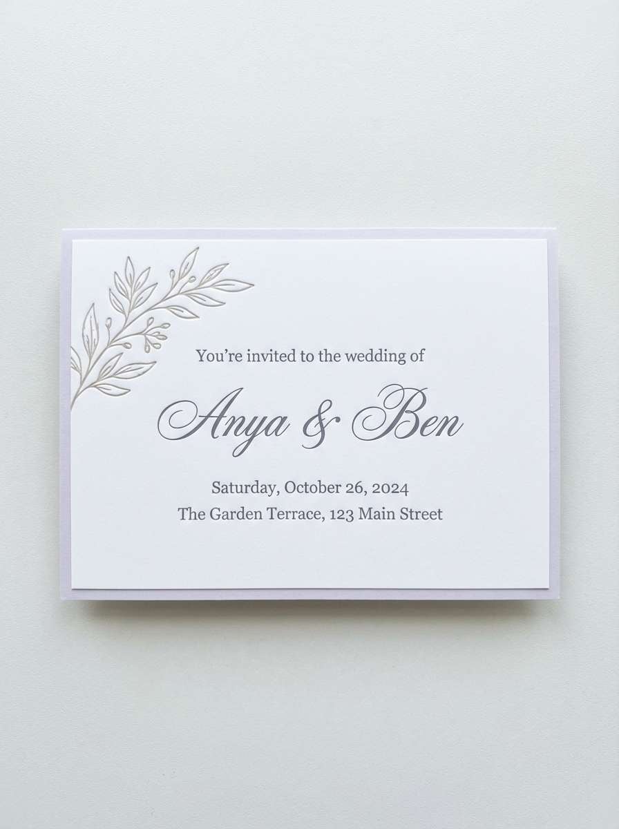
Romantic and elegant like linen napkins and soft florals, these tones are made for ceremonies. A pale lavender color palette like this shines on textured paper, with cream and sand tones keeping it grounded. Use the muted violet-gray for monograms and the deeper plum-gray for names and dates. Usage tip: add subtle embossing or foil only on one element to maintain a refined look.
Image example of wedding lavender linen generated using media.io
14) Retro Lavender Teal
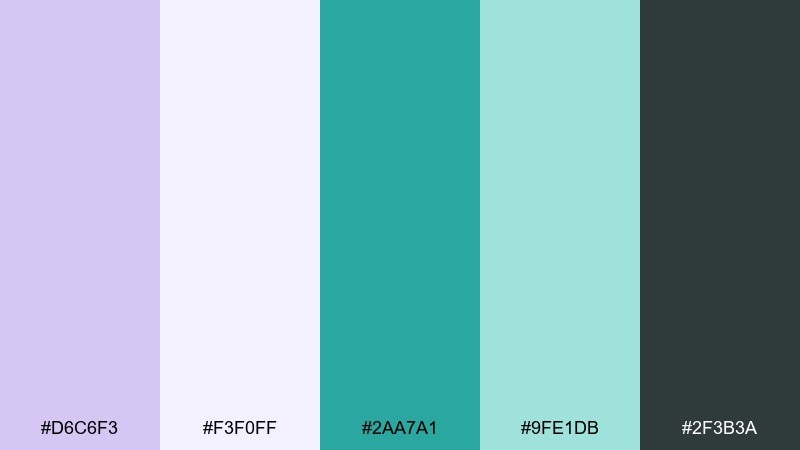
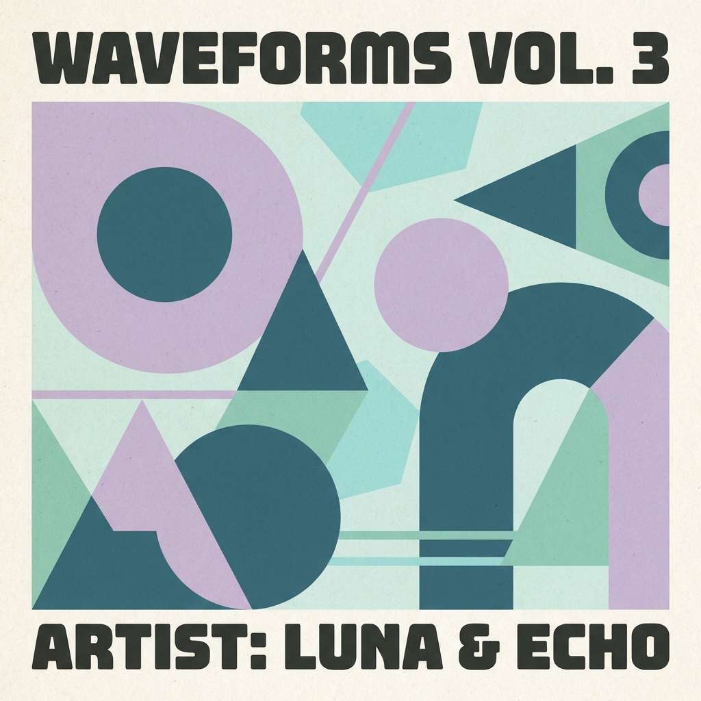
HEX: #d6c6f3 #f3f0ff #2aa7a1 #9fe1db #2f3b3a
Mood: retro, punchy, fun
Best for: album covers and playful posters
Retro and punchy, it brings to mind neon diner signs softened by pastel haze. Pale lavender keeps the background friendly, while teal delivers the bold graphic hit for shapes and titles. The seafoam tint works nicely for secondary blocks and pattern fills. Usage tip: stick to big, simple geometry and let teal do the heavy lifting for contrast.
Image example of retro lavender teal generated using media.io
15) Minimal Lavender UI
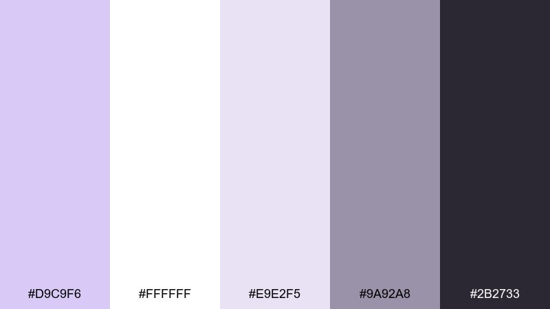
HEX: #d9c9f6 #ffffff #e9e2f5 #9a92a8 #2b2733
Mood: minimal, polished, modern
Best for: product UI kits and design systems
Minimal and polished, it feels like soft light on frosted glass. A pale lavender color palette works best here when used in tints for cards, modals, and empty states. Keep the near-black for text and primary actions, and use the mid gray-purple for secondary buttons and helper labels. Usage tip: define one lavender tint as your default surface token to keep the system consistent.
Image example of minimal lavender ui generated using media.io
16) Lavender and Charcoal Ink
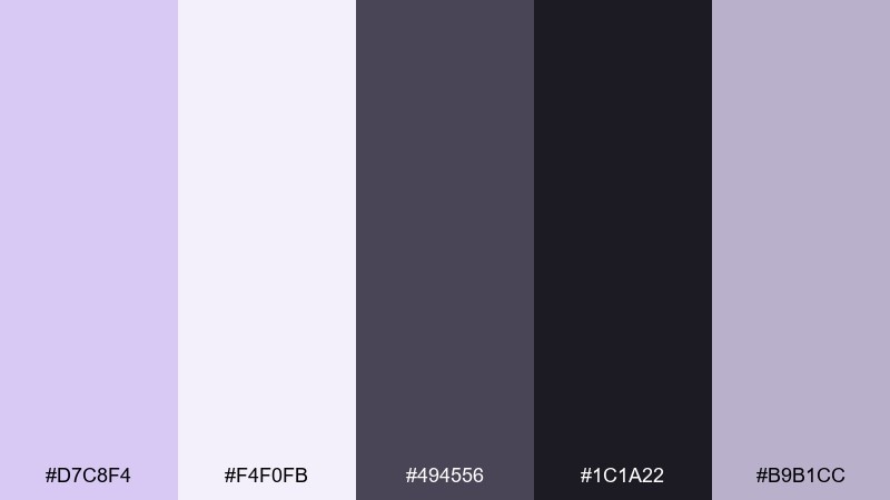
HEX: #d7c8f4 #f4f0fb #494556 #1c1a22 #b9b1cc
Mood: serious, elegant, high-contrast
Best for: legal or consulting brand materials
Serious and elegant, it suggests charcoal ink on lavender-tinted paper. Use pale lavender in backgrounds and subtle shapes to soften the overall tone, then rely on charcoal for headlines and key statements. The muted lilac-gray helps create hierarchy for subheads and footers. Usage tip: add thin dividers and generous margins to keep the dark elements from feeling heavy.
Image example of lavender and charcoal ink generated using media.io

17) Soft Lavender Sunset

HEX: #dfcff7 #ffe9ee #f6b08f #f9d5c3 #7a5b6d
Mood: dreamy, warm, uplifting
Best for: lifestyle blog headers and banners
Dreamy and warm, it feels like a pastel sunset blending violet haze into peach clouds. Pale lavender sets a gentle foundation, while peach gives you an inviting highlight for buttons or featured tags. The rosy brown works nicely for titles and navigation without turning stark. Usage tip: use a soft gradient from lavender to blush in the header for an effortless glow.
Image example of soft lavender sunset generated using media.io

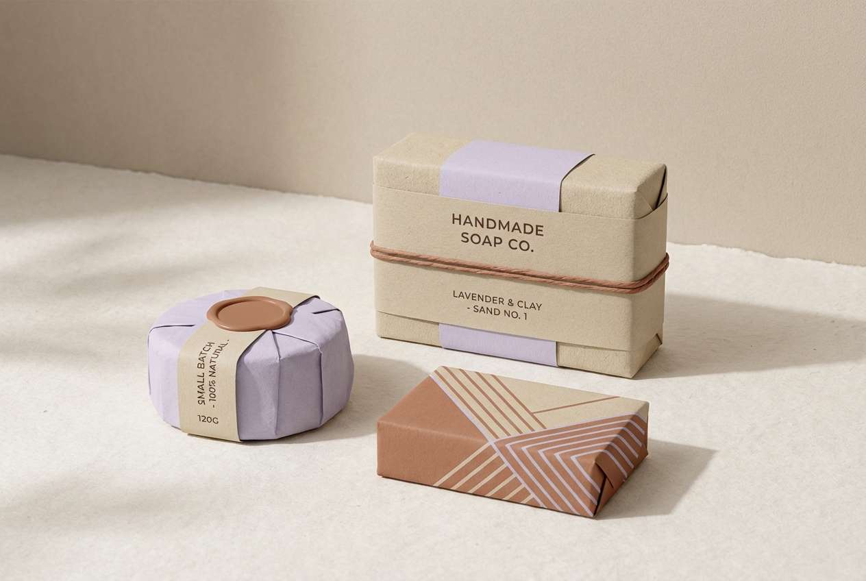
18) Lavender Clay and Sand
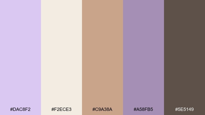
HEX: #dac8f2 #f2ece3 #c9a38a #a58fb5 #5e5149
Mood: earthy, artisan, calm
Best for: ceramics brands and handmade packaging
Earthy and artisan, it brings to mind hand-thrown clay with a lavender glaze. Use pale lavender as the soft brand tint, then let sand and terracotta-brown carry background panels and texture. The deep brown-gray is ideal for stamped logos and ingredient text. Usage tip: pair with natural paper and subtle grain to reinforce the handmade feel.
Image example of lavender clay and sand generated using media.io
19) Fantasy Lavender Galaxy
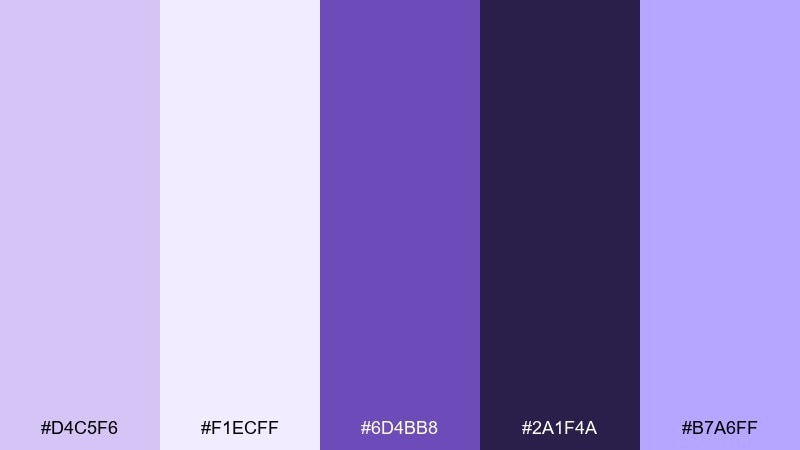
HEX: #d4c5f6 #f1ecff #6d4bb8 #2a1f4a #b7a6ff
Mood: mystical, bold, cinematic
Best for: stream overlays and gaming banners
Mystical and cinematic, it feels like starlight filtered through violet clouds. Pale lavender and soft white create glow effects, while deep purple and midnight shades add depth for panels and frames. The bright periwinkle is perfect for highlights like alerts or badges. Usage tip: keep most elements dark and use lavender only for glows so the design reads like a galaxy.
Image example of fantasy lavender galaxy generated using media.io
20) Lavender Frost and Mint
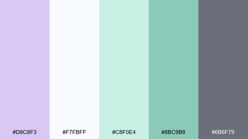
HEX: #d8c8f3 #f7fbff #c8f0e4 #8bc9b8 #6b6f79
Mood: fresh, light, spa-like
Best for: skincare landing pages and spa branding
Fresh and spa-like, it evokes cool mist, clean towels, and a faint lavender note in the air. Pale lavender pairs beautifully with icy white for backgrounds, while mint adds a clean accent for icons and feature chips. Use the soft slate for text so the look stays gentle but readable. Usage tip: keep mint to small UI signals like toggles and progress states for a calm, controlled feel.
Image example of lavender frost and mint generated using media.io
21) Lavender Monochrome Layers
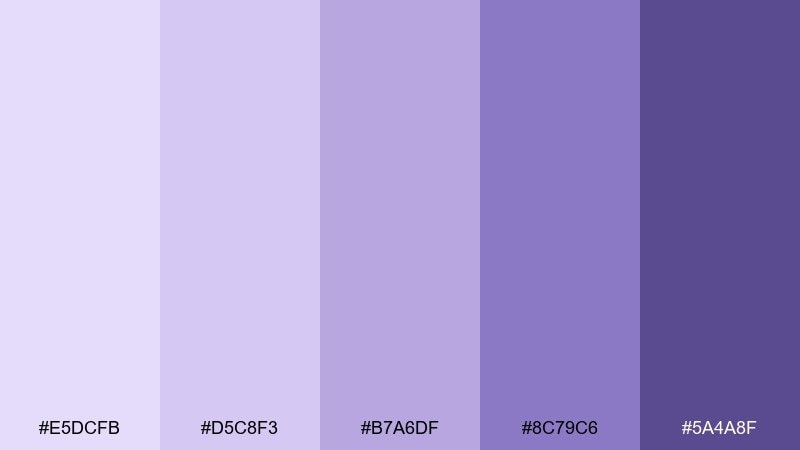
HEX: #e5dcfb #d5c8f3 #b7a6df #8c79c6 #5a4a8f
Mood: smooth, cohesive, sophisticated
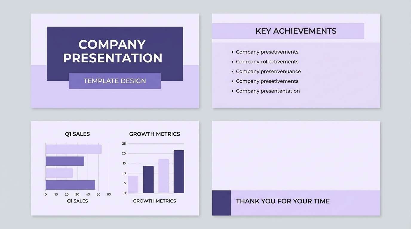
Best for: presentation templates and slide decks
Smooth and cohesive, the layered violets feel like a single note played in rich harmonies. These pale lavender color combinations make it easy to build hierarchy using only tints and shades. Use the lightest lavender for slide backgrounds and move darker for charts, section headers, and key takeaways. Usage tip: keep typography simple and let the shade steps do the organizing.
Image example of lavender monochrome layers generated using media.io
22) Lavender Pearl and Gold
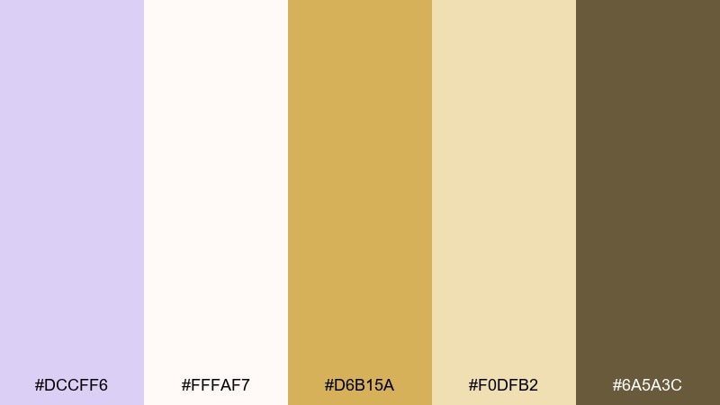
HEX: #dccff6 #fffaf7 #d6b15a #f0dfb2 #6a5a3c
Mood: luxurious, celebratory, soft-glam
Best for: holiday invites and premium gift tags
Luxurious and celebratory, it recalls pearl highlights with a warm gold shimmer. Use pale lavender as the main field color, then bring gold in as a thin border, icon, or foil-stamp detail. The warm tan helps bridge between purple and gold so the pairing feels natural. Usage tip: keep gold elements sparse and consistent, like repeating a small crest or line motif.
Image example of lavender pearl and gold generated using media.io
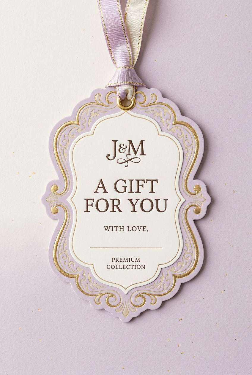
23) Lavender Ink and Apricot
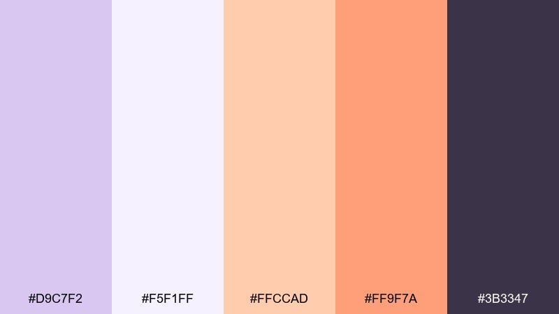
HEX: #d9c7f2 #f5f1ff #ffccad #ff9f7a #3b3347
Mood: friendly, modern, high-contrast
Best for: newsletter templates and announcement banners
Friendly and modern, it feels like soft violet stationery with a warm apricot highlight. The pale lavender base keeps sections calm, while apricot brings instant attention to buttons and promo badges. Use the deep ink shade for headings and body text so emails stay readable across devices. Usage tip: test your CTA color on both light and dark modes to keep the apricot pop consistent.
Image example of lavender ink and apricot generated using media.io

What Colors Go Well with Pale Lavender?
Pale lavender pairs naturally with soft whites, cool grays, and gentle greige because they keep the palette light while letting lavender stay noticeable. These combinations are especially reliable for clean interfaces, stationery, and minimal branding.
For stronger contrast, add deep anchors like charcoal, ink, or navy. If you want warmth, bring in copper, gold, sand, or cocoa browns—these make lavender feel less “icy” and more boutique.
For fresh accents, try sage, mint, or teal; for playful energy, use blush, berry, or apricot. The key is to keep accents intentional and let lavender remain the soft base.
How to Use a Pale Lavender Color Palette in Real Designs
Start by using pale lavender as a background tint or surface color (cards, sections, packaging base) rather than as your main text color. Then choose one dark neutral (charcoal/ink/navy) to carry typography and primary UI elements.
Use one accent color for attention moments: CTAs, badges, icons, or small borders. If your accent is saturated (teal, berry, citrus), limit it to a few components so the overall look stays airy.
For accessibility, test contrast early—especially for button text, links, and small labels. In many designs, the easiest win is pairing pale lavender backgrounds with near-black text and reserving mid-tones for dividers and secondary UI.
Create Pale Lavender Palette Visuals with AI
If you want to preview how a pale lavender color scheme looks in real layouts, generate quick mockups—UI screens, invites, posters, packaging, or banners—before committing to final design files.
With Media.io Text-to-Image, you can paste a prompt, include your HEX codes, and iterate fast on composition and style. This helps you validate contrast, mood, and accent balance in minutes.
Pale Lavender Color Palette FAQs
-
What is the HEX code for pale lavender in this article?
A commonly used base in these palettes is #d9c7f2, a soft pastel lavender that works well as a background or surface tint. -
Does pale lavender work for professional branding?
Yes—pair it with charcoal, ink, or navy for structure, and use lavender as a supportive tint (backgrounds, highlights, shapes) to keep the brand modern and credible. -
What neutral colors match pale lavender best?
Soft white, cool light gray, greige, and warm cream are the most reliable neutrals. They keep the palette calm and prevent lavender from feeling overly sweet. -
How do I make pale lavender accessible for UI text?
Use a dark text color (near-black/charcoal/navy) on lavender backgrounds, avoid mid-tone purple text for small sizes, and verify contrast for buttons, links, and captions with a contrast checker. -
What are good accent colors for a pale lavender palette?
For warm accents: gold, copper, sand, apricot. For fresh accents: sage, mint, teal. For playful accents: blush, berry pink, periwinkle. -
Is pale lavender a good wedding color?
Yes—pale lavender reads romantic and timeless on textured paper. Combine it with cream and linen beige for softness, then add a darker plum-gray for names, dates, and monograms.


