Phthalo green is a deep, blue-leaning green that instantly adds richness and clarity to a design system. It can read botanical, oceanic, or modern-tech depending on what you pair it with.
Below are 20+ phthalo green color palette ideas with HEX codes, plus ready-to-use AI prompts for generating matching visuals in seconds for branding, UI, and print.
In this article
- Why Phthalo Green Palettes Work So Well
-
- deep ocean botanica
- copper moss accent
- misty eucalyptus minimal
- night market neon
- forest ink editorial
- sea glass wellness
- clay and canopy
- arctic mint tech
- vintage apothecary
- tropical shade pop
- granite and fern ui
- rosewood botanical luxe
- citrus grove energy
- desert succulent
- monochrome evergreen
- pearl and pine ceremony
- slate harbor branding
- orchid jungle contrast
- linen studio neutral
- rainy park pastel
- brass compass heritage
- circuit aurora pop
- What Colors Go Well with Phthalo Green?
- How to Use a Phthalo Green Color Palette in Real Designs
- Create Phthalo Green Palette Visuals with AI
Why Phthalo Green Palettes Work So Well
Phthalo green has a naturally “ink-like” depth, so it feels premium even when used sparingly. As a primary brand color, it holds up across print and screens without looking flat.
Because it leans slightly blue, it pairs beautifully with cool neutrals (slate, granite, soft mint) for modern UI, while also looking grounded with warm materials like sand, brass, parchment, and clay.
It is also flexible in hierarchy: deep phthalo tones can replace black for headings and icons, while lighter sea-glass tints create calm backgrounds and negative space.
20+ Phthalo Green Color Palette Ideas (with HEX Codes)
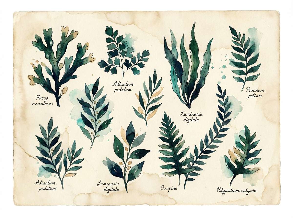
1) Deep Ocean Botanica
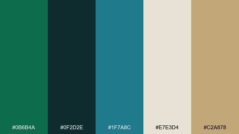
HEX: #0B6B4A #0F2D2E #1F7A8C #E7E3D4 #C2A878
Mood: calm, lush, grounded
Best for: watercolor botanical illustration set
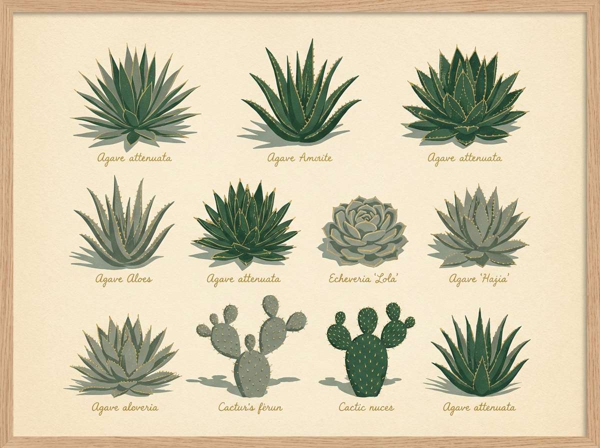
Calm, kelp-like greens and inky ocean tones bring to mind tidepools and shaded conservatories. Use it for botanical prints, packaging labels, or gentle wellness visuals where green should feel deep, not loud. Pair the cream with the teal for negative space and legibility, then reserve the sand tone for small highlights. Usage tip: keep outlines in the deep blue-green to avoid harsh black.
Image example of deep ocean botanica generated using media.io
Media.io is an online AI studio for creating and editing video, image, and audio in your browser.

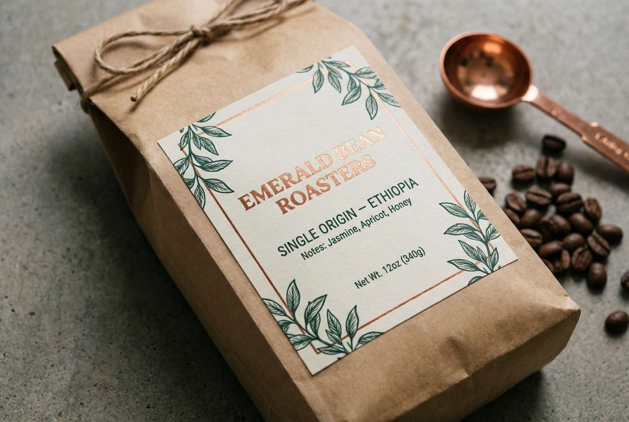
2) Copper Moss Accent
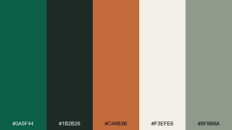
HEX: #0A5F44 #1B2B26 #C46B3B #F3EFE6 #8F9B8A
Mood: warm, crafted, confident
Best for: craft coffee packaging label
Warm copper against mossy greens feels like hand-tooled leather, roasted beans, and old apothecary drawers. These phthalo green color combinations work especially well when you want a natural base with a premium hit of warmth. Pair copper for stamps, borders, and key callouts while the off-white keeps copy clean. Usage tip: use the near-black green for barcodes and small text to stay on-brand without pure black.
Image example of copper moss accent generated using media.io
3) Misty Eucalyptus Minimal
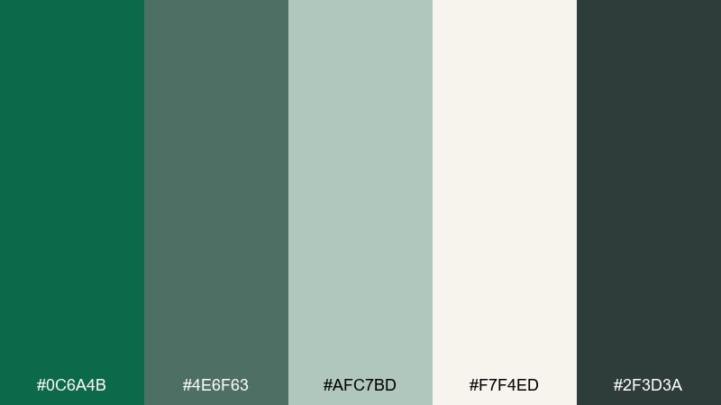
HEX: #0C6A4B #4E6F63 #AFC7BD #F7F4ED #2F3D3A
Mood: airy, clean, soothing
Best for: skincare brand landing page
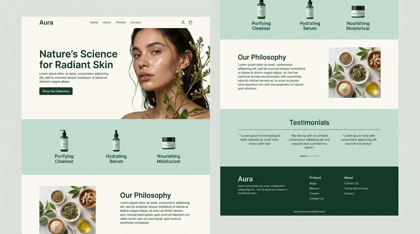
Airy eucalyptus greens and soft misty tones evoke a quiet spa morning. The pale mint and warm off-white give you plenty of breathing room for product photography and long-form copy. Pair the deepest green for headings and buttons, then use the gray-green for subtle dividers and form fields. Usage tip: keep call-to-action buttons in the darkest green to maintain contrast on the light background.
Image example of misty eucalyptus minimal generated using media.io
4) Night Market Neon
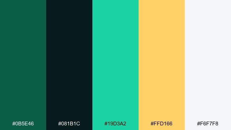
HEX: #0B5E46 #081B1C #19D3A2 #FFD166 #F6F7F8
Mood: electric, urban, playful
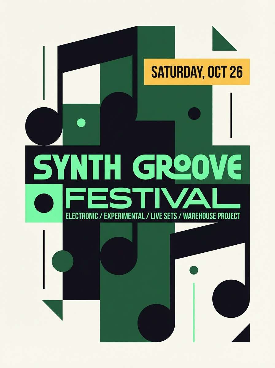
Best for: music event poster design
Electric green light on wet pavement is the vibe here, with neon mint and streetlamp gold cutting through the dark. Use it for posters, nightlife campaigns, or bold social ads where you want energy without going full rainbow. Pair the near-black with the neon mint for high-impact type, then bring in the yellow for badges and dates. Usage tip: limit the neon to one or two elements so it reads as intentional, not chaotic.
Image example of night market neon generated using media.io
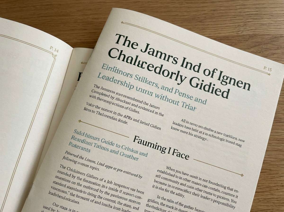
5) Forest Ink Editorial
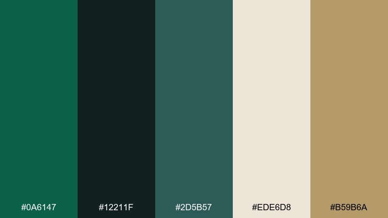
HEX: #0A6147 #12211F #2D5B57 #EDE6D8 #B59B6A
Mood: literary, moody, refined
Best for: magazine feature layout
Moody forest inks and warm paper tones feel like a hardback book and a late-night reading lamp. It suits editorial spreads, book covers, and heritage brands that want depth without heaviness. Pair the cream for margins and pull quotes, then use the brass tone sparingly for section markers. Usage tip: set body text in the deepest green-black for a softer, premium alternative to true black.
Image example of forest ink editorial generated using media.io
6) Sea Glass Wellness
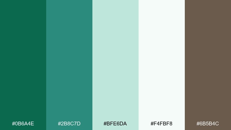
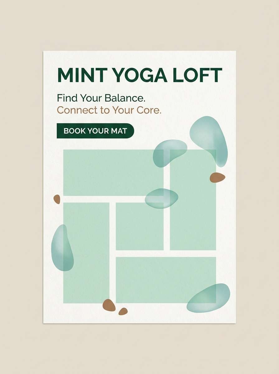
HEX: #0B6A4E #2B8C7D #BFE6DA #F4FBF8 #6B5B4C
Mood: fresh, restorative, gentle
Best for: yoga studio flyer
Fresh sea-glass greens and clean airy tints suggest breathwork, salt air, and soft morning light. Use it for wellness flyers, class schedules, or calming app screens that need to feel open and friendly. Pair the deep green with the pale mint for easy hierarchy, and use the warm brown only for small supportive text or icons. Usage tip: keep large areas in the very light mint to avoid visual fatigue.
Image example of sea glass wellness generated using media.io
7) Clay and Canopy
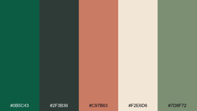
HEX: #0B5C43 #2F3B36 #C97B63 #F2E6D6 #7D8F72
Mood: earthy, homey, modern rustic
Best for: interior moodboard for living room
Earthy clay and canopy greens feel like terracotta planters under a shaded porch. This mix works for interior moodboards, home brands, and lifestyle photography overlays where warmth is key. Pair the clay as the accent and keep the cream dominant to maintain a light, inviting balance. Usage tip: repeat the mid sage in two to three materials to make the scheme feel curated rather than busy.
Image example of clay and canopy generated using media.io
8) Arctic Mint Tech
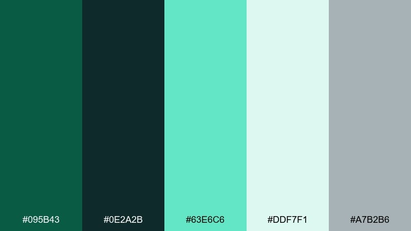
HEX: #095B43 #0E2A2B #63E6C6 #DDF7F1 #A7B2B6
Mood: crisp, modern, tech-forward
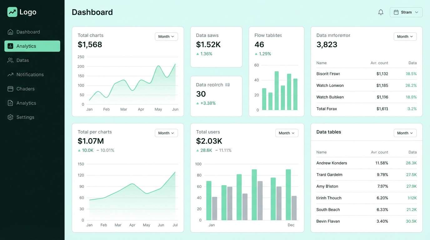
Best for: SaaS dashboard UI
Crisp mint on deep green-black reads like a cold glow on a clean workstation. It is a strong fit for dashboards, fintech tools, and analytics screens that need clear hierarchy. Pair the dark base for navigation and the mint for active states, then let the pale aqua handle charts and empty states. Usage tip: keep your grays cool so the mint stays fresh instead of turning muddy.
Image example of arctic mint tech generated using media.io
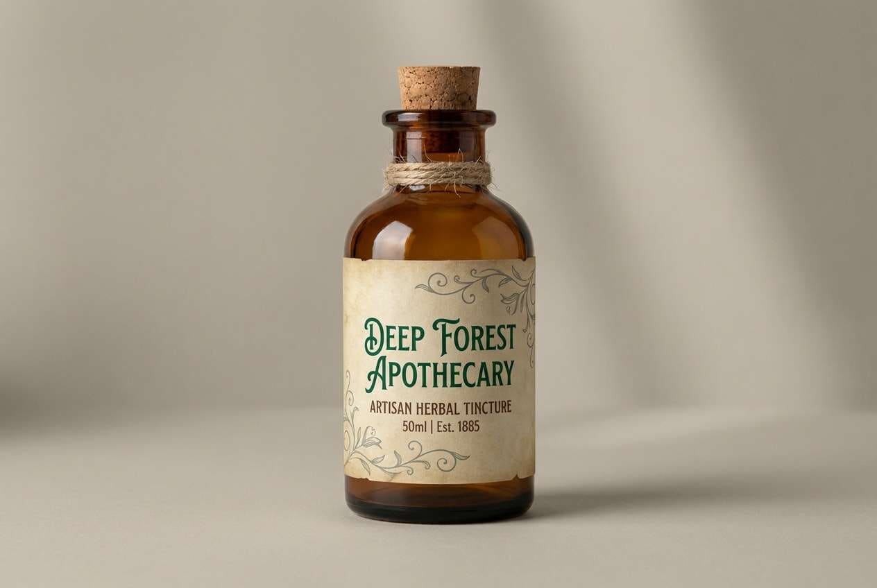
9) Vintage Apothecary
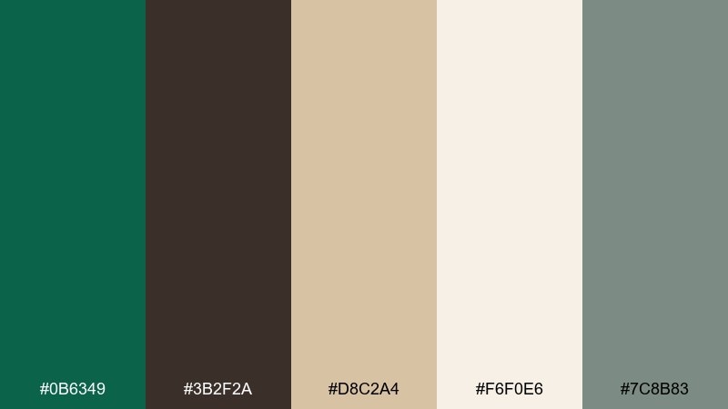
HEX: #0B6349 #3B2F2A #D8C2A4 #F6F0E6 #7C8B83
Mood: nostalgic, tactile, trustworthy
Best for: herbal tincture bottle label
Nostalgic greens with cocoa brown and aged parchment tones recall glass bottles and stamped paper labels. Use it for apothecary-style packaging, artisan foods, or story-driven branding. Pair parchment as the main label field, then use the deep green for the product name and the brown for supporting details. Usage tip: add fine line borders in the gray-green to tie the warm and cool tones together.
Image example of vintage apothecary generated using media.io
10) Tropical Shade Pop
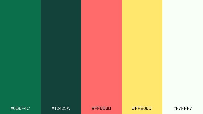
HEX: #0B6F4C #12423A #FF6B6B #FFE66D #F7FFF7
Mood: sunny, bold, vacation-ready
Best for: summer sale social ad
Tropical shade greens with punchy coral and sunny yellow feel like fruit stands under palm leaves. Use it for seasonal promos, festival graphics, or playful DTC ads that need quick attention. Pair coral for the primary callout and let the green hold the frame with buttons, borders, and headers. Usage tip: keep type mostly dark green to prevent the coral and yellow from competing.
Image example of tropical shade pop generated using media.io

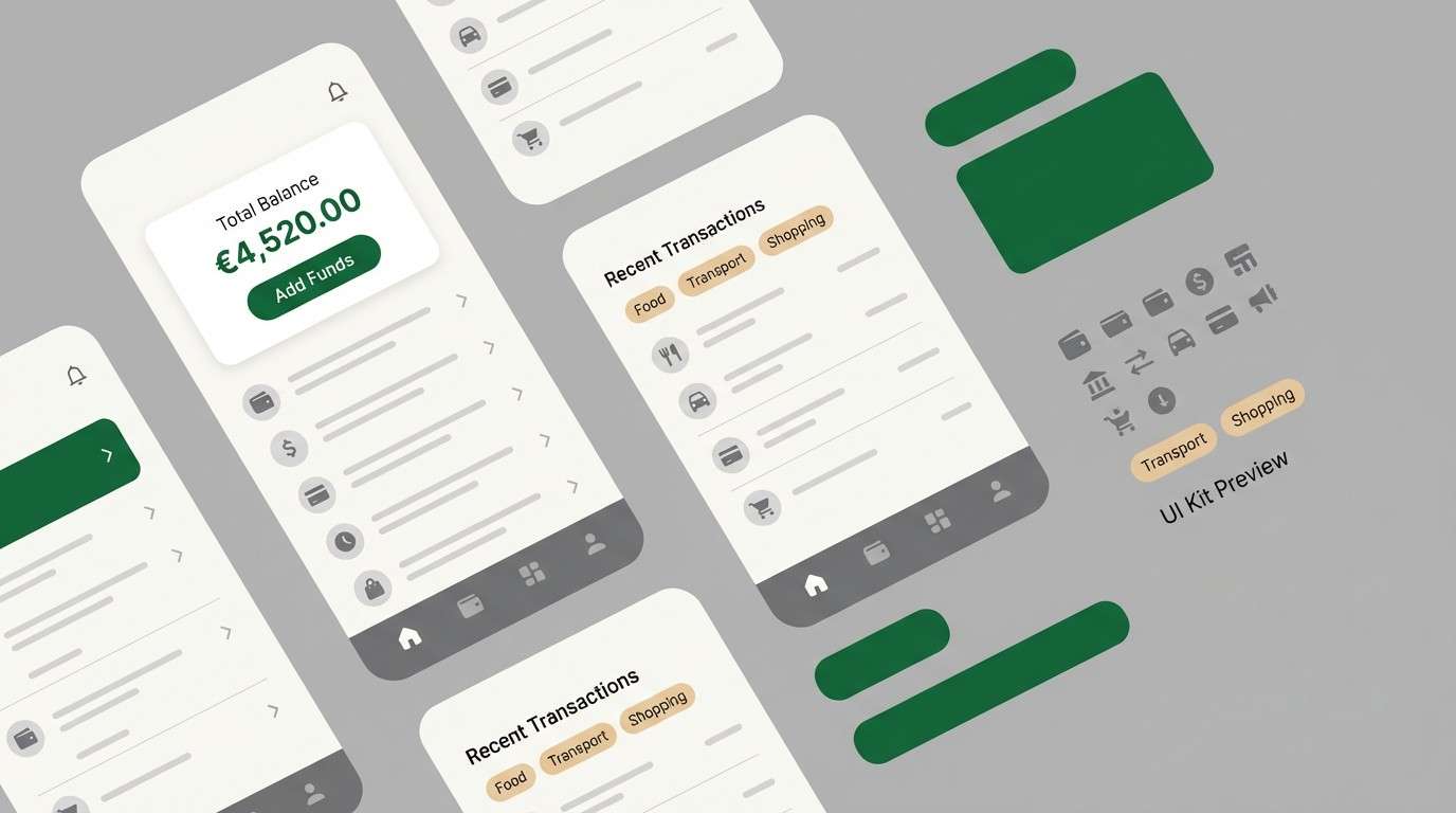
11) Granite and Fern UI

HEX: #0A5D45 #26302F #6D7C7A #EEF1F0 #C7B9A1
Mood: professional, steady, understated
Best for: finance app UI kit
Steady granite grays with fern green accents feel dependable and quietly premium. In a phthalo green color palette like this, the contrast is subtle but strong enough for serious interfaces. Pair the off-white for screens and cards, then use the deep green for primary actions and key numbers. Usage tip: keep secondary buttons in the mid gray to preserve a clear hierarchy.
Image example of granite and fern ui generated using media.io
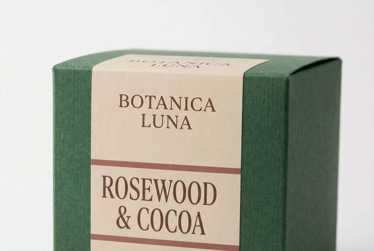
12) Rosewood Botanical Luxe
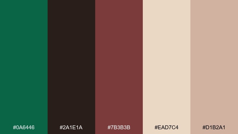
HEX: #0A6446 #2A1E1A #7B3B3B #EAD7C4 #D1B2A1
Mood: luxe, romantic, dramatic
Best for: premium candle packaging
Deep green with rosewood and cocoa notes creates a candlelit, boutique feeling. It is ideal for premium packaging, fragrance brands, and gift sets where color should signal richness. Pair the rosewood for small panels or seals and keep the beige as the main label to avoid over-darkening. Usage tip: use the cocoa tone for fine print so it remains readable without breaking the mood.
Image example of rosewood botanical luxe generated using media.io
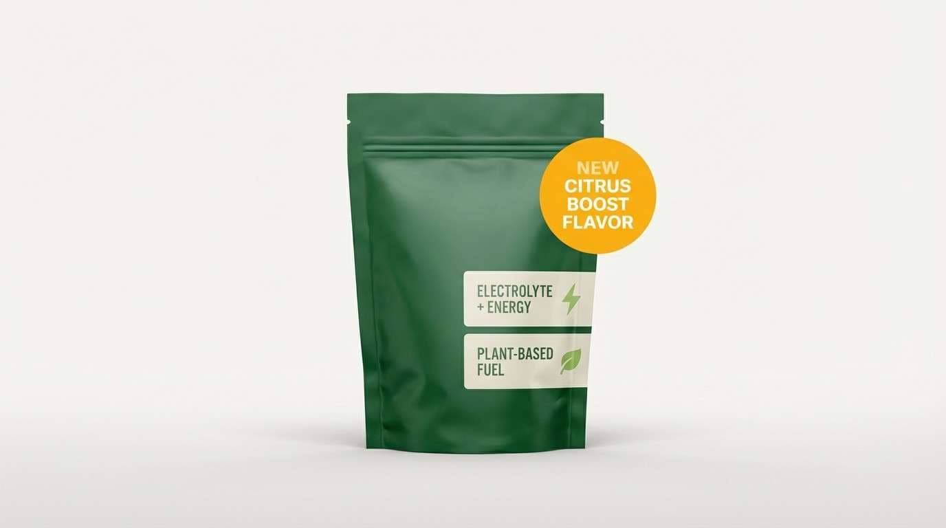
13) Citrus Grove Energy
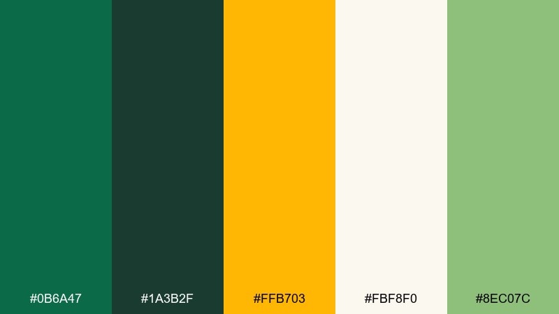
HEX: #0B6A47 #1A3B2F #FFB703 #FBF8F0 #8EC07C
Mood: bright, optimistic, outdoorsy
Best for: sports nutrition product ad
Bright citrus against deep green feels like trail sunlight through leaves. Use it for energetic ads, fitness packaging, or outdoor brands that need a clean pop without harsh neon. Pair the orange-yellow for benefit callouts and keep the off-white for breathing room around product claims. Usage tip: let the lighter green support charts and icons so the yellow stays special.
Image example of citrus grove energy generated using media.io
14) Desert Succulent
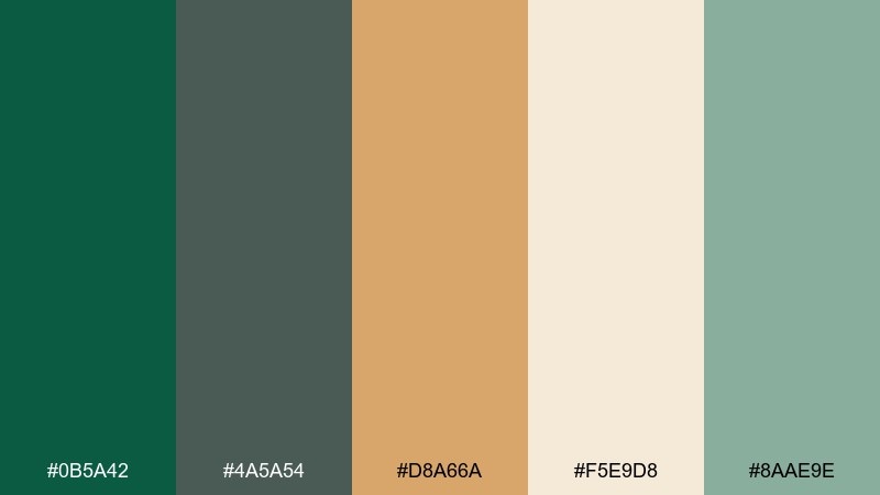
HEX: #0B5A42 #4A5A54 #D8A66A #F5E9D8 #8AAE9E
Mood: sunbaked, natural, relaxed
Best for: botanical wall art print
Sunbaked sand and succulent greens feel like a quiet desert garden after rain. It works for wall art, eco brands, and calm lifestyle layouts that need warmth without redness. Pair the sand as a dominant field and use the deep green for stems, titles, or frames. Usage tip: keep the gray-green as a bridge color for shadows and texture.
Image example of desert succulent generated using media.io
15) Monochrome Evergreen
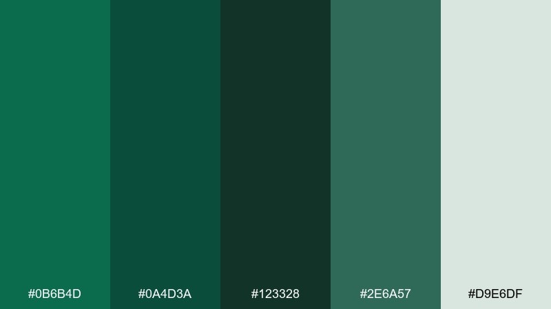
HEX: #0B6B4D #0A4D3A #123328 #2E6A57 #D9E6DF
Mood: focused, elegant, timeless
Best for: minimal brand identity set
Layered evergreen tones feel like dense needles, shadow, and soft fog in one restrained sweep. Use it when you want a minimal identity that still feels rich and dimensional. Pair the light mint-gray for backgrounds and keep the darkest green for logos and typography. Usage tip: rely on texture and spacing, not extra colors, to create contrast.
Image example of monochrome evergreen generated using media.io
16) Pearl and Pine Ceremony
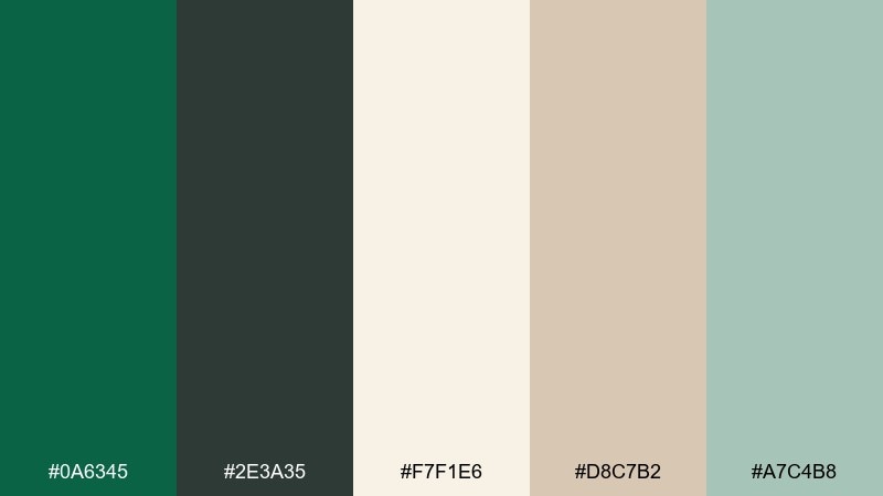
HEX: #0A6345 #2E3A35 #F7F1E6 #D8C7B2 #A7C4B8
Mood: soft, formal, understated
Best for: wedding invitation suite
Soft pearl and pine tones evoke linen, pressed greenery, and quiet elegance. Use it for invitations, menus, and ceremony signage where the green should feel classic rather than trendy. Pair the pearl as the main paper color and keep pine for names and headings, then add beige for subtle borders. Usage tip: print small details in the charcoal green to preserve readability on textured stock.
Image example of pearl and pine ceremony generated using media.io
17) Slate Harbor Branding
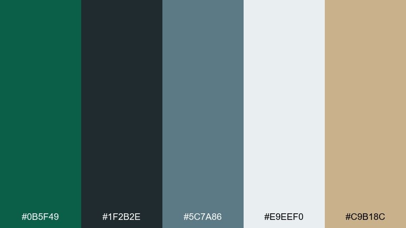
HEX: #0B5F49 #1F2B2E #5C7A86 #E9EEF0 #C9B18C
Mood: coastal, mature, corporate
Best for: consulting firm brand kit
Slate harbor blues and deep green feel like ships, steel, and calm authority. It is a strong fit for consulting, B2B services, and institutional branding that needs trust with a modern edge. Pair the light gray for documents and slides, and use the teal-blue for charts while the green anchors key headers. Usage tip: keep the warm tan strictly for emphasis like icons or small tags.
Image example of slate harbor branding generated using media.io
18) Orchid Jungle Contrast
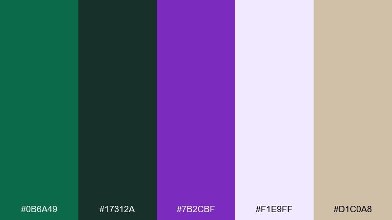
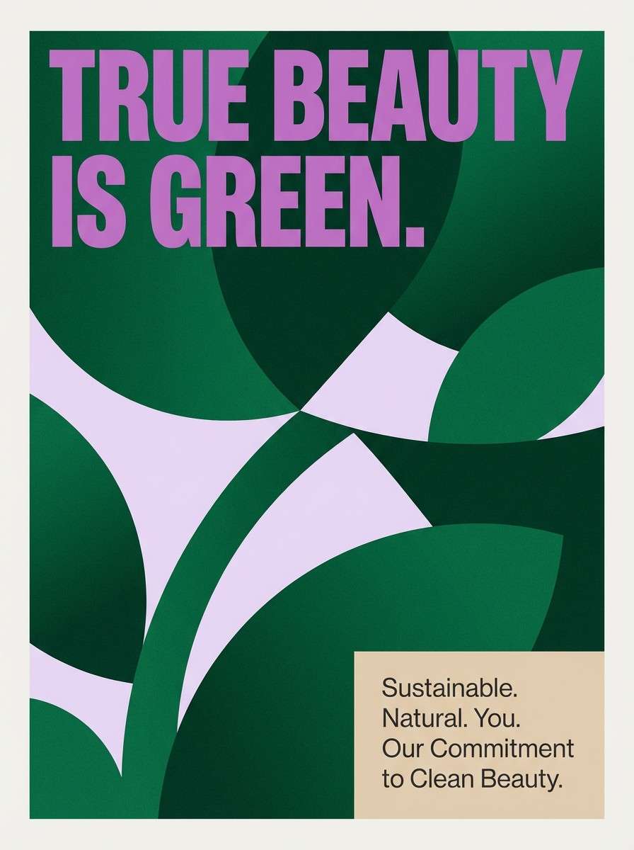
HEX: #0B6A49 #17312A #7B2CBF #F1E9FF #D1C0A8
Mood: bold, exotic, artistic
Best for: beauty campaign poster
Bold jungle greens with orchid purple feel like a tropical greenhouse lit at dusk. These phthalo green color combinations are great when you want a dramatic complementary pop without leaning into red. Pair purple for headline moments and keep the pale lavender as breathing room behind product shots or typography. Usage tip: use the warm beige to soften transitions between the green and purple blocks.
Image example of orchid jungle contrast generated using media.io
19) Linen Studio Neutral
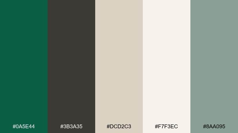
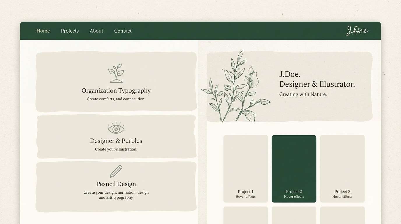
HEX: #0A5E44 #3B3A35 #DCD2C3 #F7F3EC #8AA095
Mood: studio-clean, warm, versatile
Best for: portfolio website theme
Linen neutrals with a deep green anchor feel like a tidy studio and natural daylight. Use it for portfolios, case-study pages, and personal brands where content needs to lead. Pair the off-white for most sections and use the green for navigation, links, and selected states. Usage tip: keep body copy in the charcoal to reduce eye strain on long reads.
Image example of linen studio neutral generated using media.io
20) Rainy Park Pastel
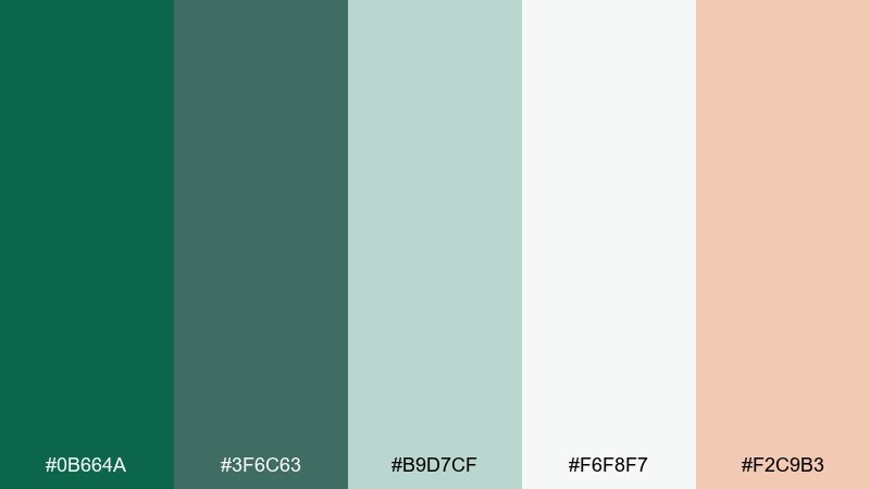
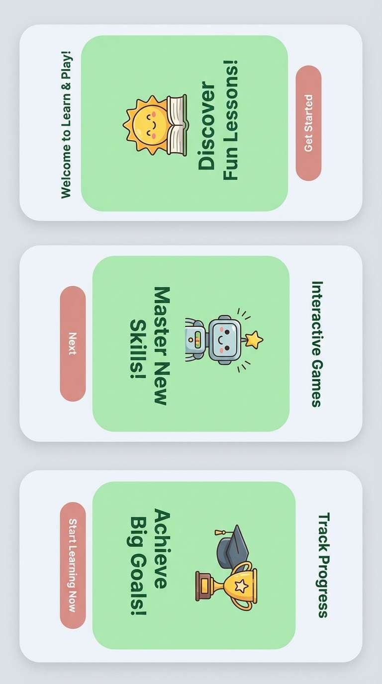
HEX: #0B664A #3F6C63 #B9D7CF #F6F8F7 #F2C9B3
Mood: soft, friendly, approachable
Best for: kids education app onboarding
Soft park greens with a peachy blush feel like puddles, raincoats, and gentle curiosity. It works for onboarding screens, illustrations, and kid-friendly interfaces that still look polished. Pair the blush for friendly prompts and keep the very light gray as the main background to avoid visual clutter. Usage tip: use the mid green for progress indicators so it reads clearly without feeling strict.
Image example of rainy park pastel generated using media.io
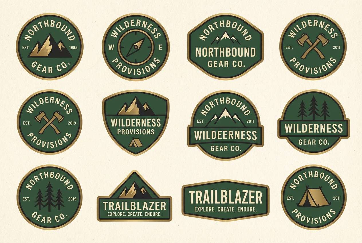
21) Brass Compass Heritage
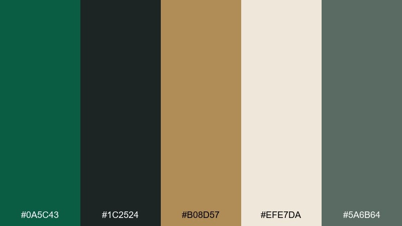
HEX: #0A5C43 #1C2524 #B08D57 #EFE7DA #5A6B64
Mood: heritage, rugged, premium
Best for: outdoor brand logo and badge set
Heritage greens and brass feel like compasses, canvas, and worn metal hardware. It is ideal for outdoor brands, badges, and merchandise marks that need to look established. Pair brass for outlines and emblem details, then keep the deep green as the main fill to maintain strength. Usage tip: test small sizes and simplify linework so the badge stays crisp when embroidered.
Image example of brass compass heritage generated using media.io
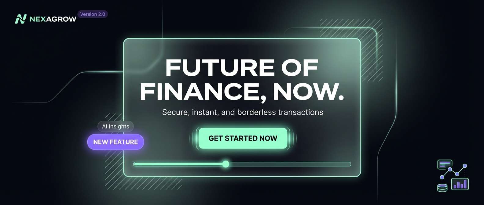
22) Circuit Aurora Pop
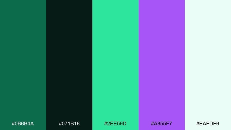
HEX: #0B6B4A #071B16 #2EE59D #A855F7 #EAFDF6
Mood: sleek, high-contrast, futuristic
Best for: app launch hero section
Sleek aurora greens with a violet spark evoke circuits, lasers, and glossy glass UI. A phthalo green color palette like this shines in launch pages and product teasers where contrast should feel premium and modern. Pair the near-black as a base, then use neon mint for primary highlights and violet for secondary accents. Usage tip: keep gradients subtle and limit glow effects to one focal element for a clean finish.
Image example of circuit aurora pop generated using media.io
What Colors Go Well with Phthalo Green?
Phthalo green pairs especially well with warm neutrals (cream, parchment, sand, linen) because they soften its depth and make layouts feel breathable. These combinations are strong for packaging, editorial, and lifestyle branding where you want “natural” without looking plain.
For modern UI, choose cool support colors like slate, granite gray, and pale aqua or mint. These keep the palette crisp and professional, while still letting phthalo green anchor buttons, navigation, and key metrics.
If you want bold contrast, try accents like copper, citrus yellow, coral, or orchid purple. The key is restraint: let phthalo green hold the structure, and use the bright accent for one job (CTA, badge, headline, or highlight) so the design stays intentional.
How to Use a Phthalo Green Color Palette in Real Designs
Start by assigning roles: use the darkest phthalo tone for primary text, navigation, or logo marks; a light neutral for backgrounds; and one accent for conversion moments. This makes the palette behave like a system instead of a collection of nice colors.
In print, swap pure black for a near-black green to keep the look cohesive and more premium. In UI, keep surfaces light and let phthalo green appear in high-contrast components (primary buttons, active states, charts) to maintain accessibility.
To avoid “heavy” layouts, increase spacing and use texture or subtle tints (mint-gray, off-white) to create depth. When you introduce metallics (brass/copper) or bright pops (neon/citrus), apply them in small areas like icons, dividers, or tags.
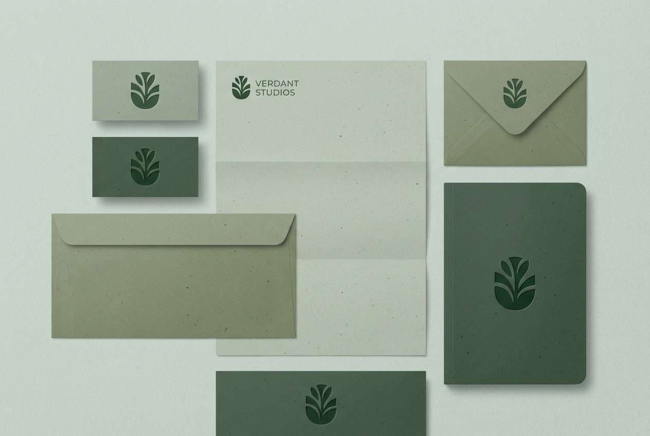
Create Phthalo Green Palette Visuals with AI
If you already have HEX codes, the fastest way to validate a palette is to see it on realistic mockups: labels, posters, landing pages, dashboards, and brand kits. Visual testing helps you catch contrast issues and balance accents before you commit.
With Media.io Text-to-Image, you can paste a prompt (like the examples above) and generate consistent palette-based artwork for presentations, moodboards, and social creatives. It is a practical way to explore “earthy,” “editorial,” or “futuristic” directions without rebuilding designs from scratch.
Try generating two to three variations per palette, then keep the layout constant while swapping colors. That makes it easier to compare which phthalo green scheme communicates your brand mood most clearly.
Phthalo Green Color Palette FAQs
-
What is phthalo green (in design terms)?
Phthalo green is a deep, cool green with a blue undertone. In design systems, it often functions like a “colored black” because it is dark, stable, and high-contrast without feeling neutral. -
Is phthalo green better for backgrounds or accents?
It works for both, but it is most reliable as an anchor color (navigation, headings, frames, packaging base). If you use it as a full background, add warm off-whites or pale mints for contrast and breathing room. -
What neutral colors pair best with phthalo green?
Cream, parchment, linen beige, warm gray, and light mint-gray pair especially well. These neutrals keep phthalo green rich while preventing the overall palette from feeling too dark. -
What are high-impact accent colors for phthalo green palettes?
Copper/brass, citrus yellow, coral, neon mint, and orchid purple create strong contrast. Use one accent for a clear purpose (CTA, badge, highlight) so it does not compete with the green. -
How do I keep text readable with dark phthalo greens?
Use an off-white (not pure white) for large text areas, and reserve the deepest green-black for small text or icons where contrast matters. In UI, test contrast ratios for buttons, links, and form fields. -
Can I replace black with phthalo green in branding?
Yes. A near-black phthalo green can replace black for typography and linework, keeping your brand palette cohesive while still looking refined and readable across print and digital. -
How can I quickly preview these palettes on real designs?
Generate mockups with AI using consistent prompts (poster, label, landing page, dashboard), then swap palettes and compare. Media.io Text-to-Image is a fast way to create those visuals without building full design files first.
Next: Futuristic Color Palette
