

A happy color palette is all about optimistic energy—bright warms, fresh cools, and clean neutrals that feel friendly and modern. Used well, these joyful tones make layouts feel more inviting without looking loud or messy.
Below are 20 happy color palette ideas with HEX codes, plus practical tips and AI prompts you can reuse for posters, UI, branding, and social designs.
In this article
Why Happy Palettes Work So Well
Happy palettes work because they lean on colors we naturally associate with sunlight, fruit, celebrations, and friendly products—yellows, corals, lively blues, and minty greens. That emotional shorthand can make a design feel approachable in seconds.
They also perform well in modern UI and branding because you can pair high-energy accents with soft neutrals for balance. When the brights are controlled, the result feels upbeat, not overwhelming.
Most “happy” schemes succeed by mixing warm and cool hues: warm tones create excitement, while cool tones add freshness and clarity. A single dark anchor color then keeps typography readable and layouts structured.
20+ Happy Color Palette Ideas (with HEX Codes)
1) Sunshine Spritz

HEX: #FFD84D #FF7A59 #2EC4B6 #F7F7FF #2D3047
Mood: sunny and upbeat
Best for: summer event flyer
Sunlit and fizzy, these tones feel like a fresh citrus drink on a warm afternoon. Use the yellow and coral as your headline colors, then let teal handle buttons or key icons for contrast. The off-white keeps layouts breathable while the deep navy anchors text and logos. Tip: keep navy as the only dark element so the brights stay crisp instead of chaotic.
Image example of sunshine spritz generated using media.io

Media.io is an online AI studio for creating and editing video, image, and audio in your browser.

2) Coral Confetti
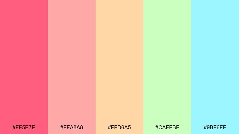
HEX: #FF5E7E #FFA8A8 #FFD6A5 #CAFFBF #9BF6FF
Mood: festive and sweet
Best for: birthday invitation card
Bright and celebratory, it reads like confetti drifting over a pastel party table. These happy color combinations work best when coral leads and the softer pink and peach fill in backgrounds and shapes. Add mint and light aqua as small accents to keep everything feeling airy. Tip: reserve the strongest coral for names and dates so the invite stays readable at a glance.
Image example of coral confetti generated using media.io

3) Citrus Pop

HEX: #FFB703 #FB8500 #8EECF5 #A3F7BF #3A86FF
Mood: energetic and punchy
Best for: product launch poster
Loud, zesty, and modern, this set feels like fresh fruit sliced under bright studio lights. Let orange and gold drive the hero area, then use the cool aqua and mint to refresh negative space and highlights. The blue is ideal for calls to action because it holds up against both warm tones. Tip: use a mostly light background so the oranges feel vibrant rather than heavy.
Image example of citrus pop generated using media.io
4) Lagoon Party
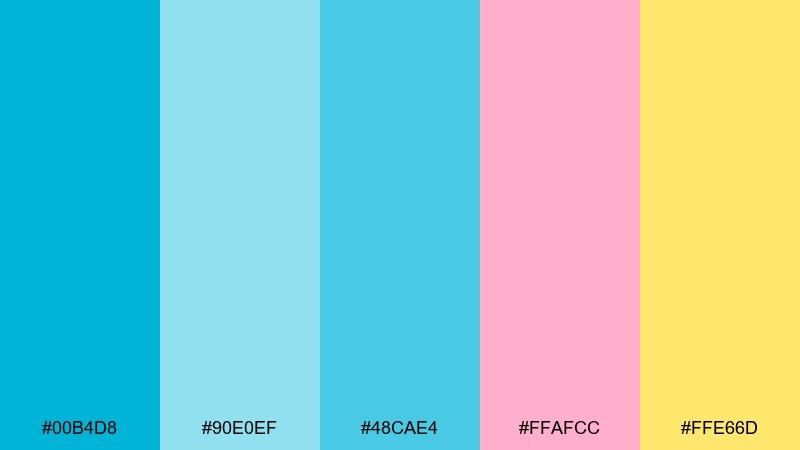
HEX: #00B4D8 #90E0EF #48CAE4 #FFAFCC #FFE66D
Mood: breezy and playful
Best for: travel blog header
Breezy blues and candy accents bring to mind a lagoon swim followed by sunset treats. Use the deeper cyan for titles and navigation, then layer the softer sky tones for gradients or sections. Pink and lemon are best as small bursts on icons, tags, and hover states. Tip: keep pink under 10 percent coverage to avoid competing with the blues.
Image example of lagoon party generated using media.io
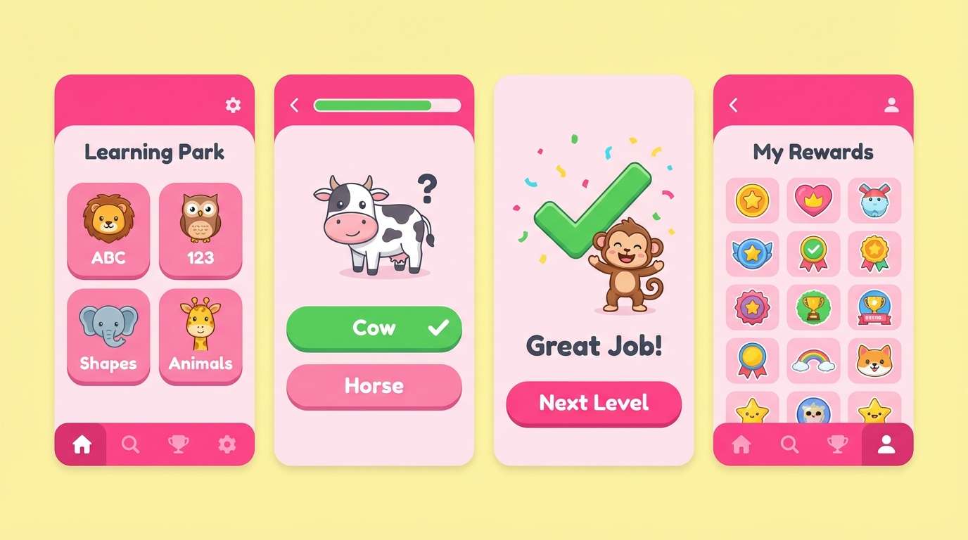
5) Bubblegum Picnic
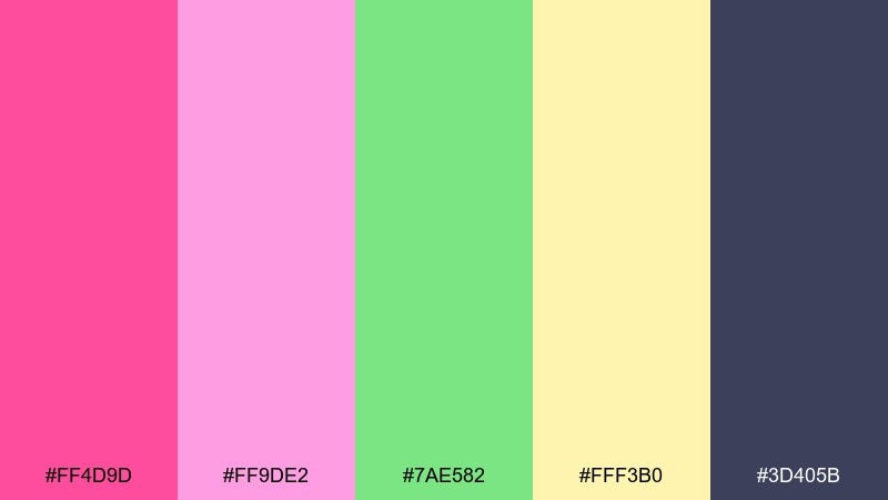
HEX: #FF4D9D #FF9DE2 #7AE582 #FFF3B0 #3D405B
Mood: cute and bold
Best for: kids app ui
Playful and sugary, it feels like bubblegum wrappers and lemonade in the park. Use hot pink for primary buttons and key badges, then soften screens with pale pink and buttery yellow panels. The green works great for success states, toggles, and friendly illustrations. Tip: rely on the dark slate for body text to keep the UI accessible.
Image example of bubblegum picnic generated using media.io
6) Mango Tango

HEX: #FF9F1C #FFBF69 #CBF3F0 #2EC4B6 #E71D36
Mood: tropical and lively
Best for: restaurant menu design
Tropical and lively, this mix evokes mango slices, sea glass, and a spicy garnish. Put the warm oranges on headings and category labels, with seafoam as the main background tone. Use teal for dividers and icons, then bring in red sparingly for specials or price highlights. Tip: keep red to small badges so it reads as appetizing, not alarming.
Image example of mango tango generated using media.io

7) Minty Smile

HEX: #B8F2E6 #AED9E0 #FFA69E #FAF3DD #5E6472
Mood: calm and cheerful
Best for: wellness brand landing page
Gentle and uplifting, it suggests spa towels, fresh mint, and a warm blush glow. For a calm happiness color palette, let the creamy neutral and mints carry the page while blush marks key moments like buttons and testimonials. The gray-blue is perfect for typography and subtle outlines. Tip: use lots of whitespace and soft shadows to keep the look airy.
Image example of minty smile generated using media.io
8) Rainbow Sherbet

HEX: #FFADAD #FFD6A5 #FDFFB6 #CAFFBF #9BF6FF
Mood: light and summery
Best for: spring social media post
Soft and summery, these pastel brights look like melting sherbet on a sunny day. Keep one color dominant per slide, then rotate the others as supporting shapes to avoid a washed look. Pair with a clean white background and bold sans-serif type for clarity. Tip: add thin outlines or drop shadows so pastel elements stay defined on mobile screens.
Image example of rainbow sherbet generated using media.io
9) Peachy Parade

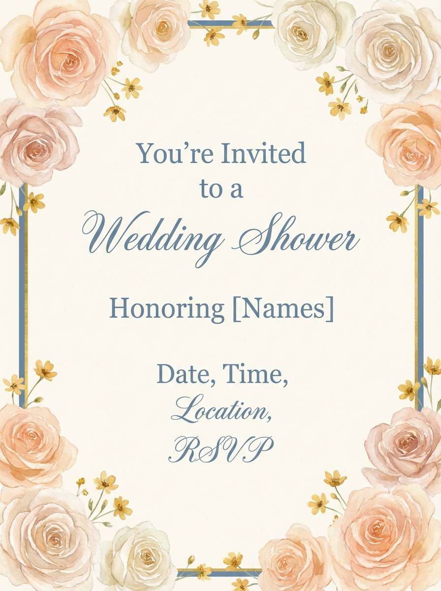
HEX: #FFB5A7 #FCD5CE #F8EDEB #F9C74F #577590
Mood: warm and friendly
Best for: wedding shower invitation
Warm and friendly, it feels like peach blossoms and golden afternoon light. Use the blush and cream tones for the card base, then add the sunny yellow for small motifs and section headers. The muted blue brings balance for names, RSVP details, and borders. Tip: pick one floral illustration style and keep it subtle so the colors do the talking.
Image example of peachy parade generated using media.io
10) Lemon Lime Lift
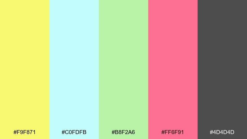
HEX: #F9F871 #C0FDFB #B8F2A6 #FF6F91 #4D4D4D
Mood: fresh and sporty
Best for: fitness app onboarding
Cheerful and sporty, it reads like a morning smoothie bar with a neon wink. Lemon and lime make great progress highlights, while aqua keeps screens feeling clean and cool. Pink is best reserved for one standout action like Start or Join to avoid visual noise. Tip: use the charcoal for all copy and icons to maintain contrast on bright backgrounds.
Image example of lemon lime lift generated using media.io

11) Sky Balloon

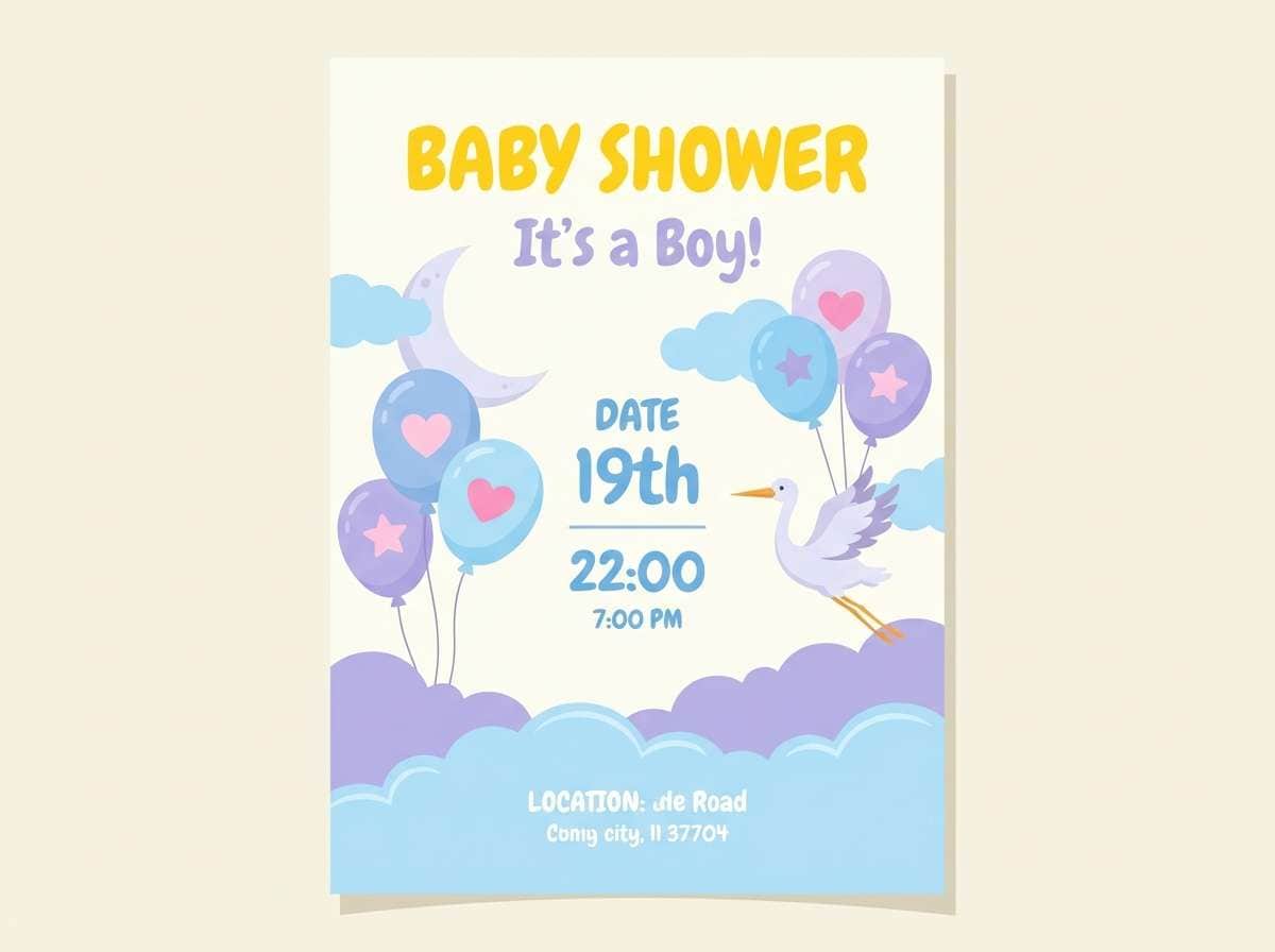
HEX: #A0C4FF #BDB2FF #FFC6FF #FFFFFC #FFEB3B
Mood: dreamy and bright
Best for: baby shower poster
Dreamy and bright, these joyful colors feel like balloons floating through a cotton-candy sky. Use the blues and lavender as soft backgrounds, then bring in pink for icons, confetti, or cute illustrations. The creamy white keeps everything gentle, while the yellow adds a cheerful sparkle for headings. Tip: keep typography simple and rounded so the poster stays sweet, not busy.
Image example of sky balloon generated using media.io
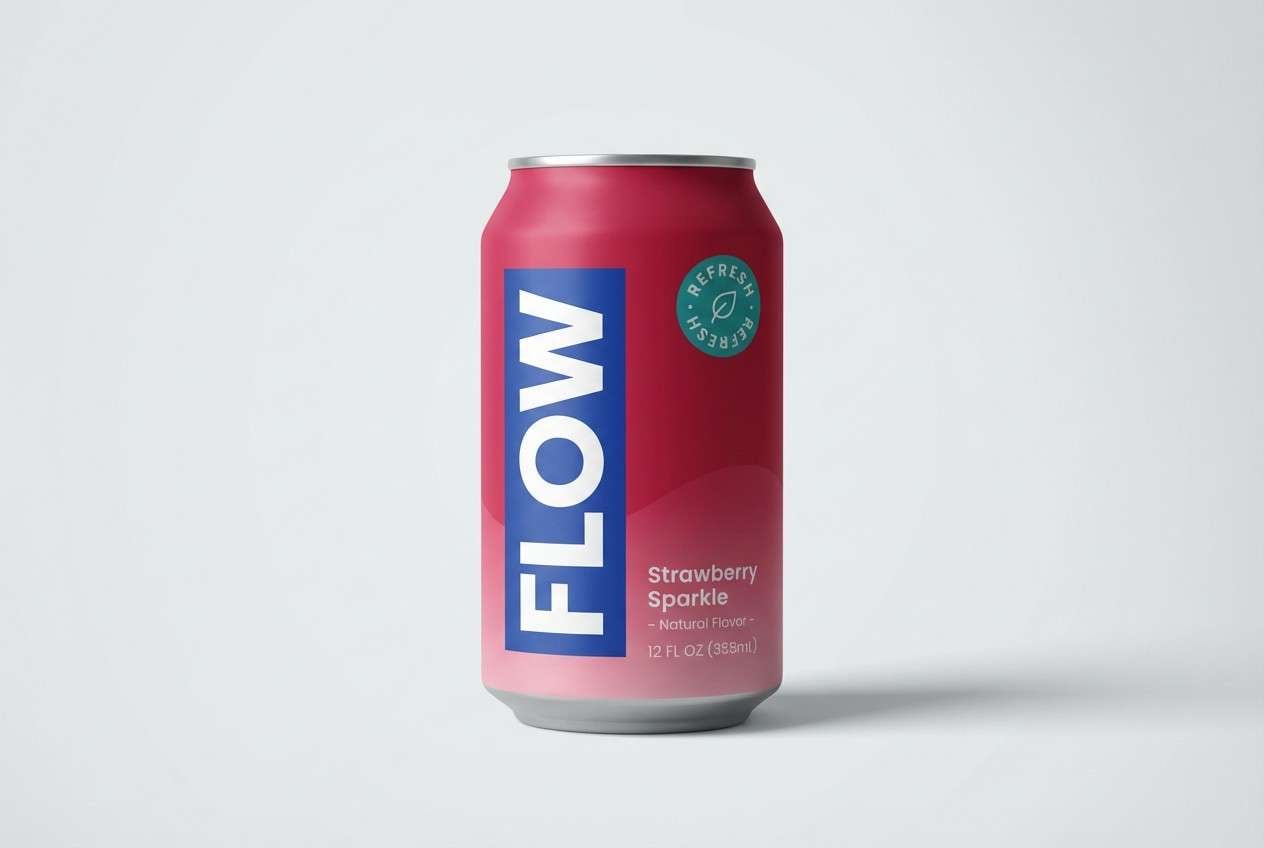
12) Strawberry Soda
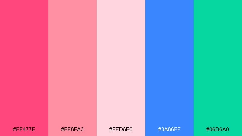
HEX: #FF477E #FF8FA3 #FFD6E0 #3A86FF #06D6A0
Mood: bubbly and modern
Best for: beverage can packaging
Bubbly and modern, it looks like strawberry fizz with an electric twist. These happy color combinations shine on packaging when the deep pink leads and the lighter pinks handle gradients and flavor cues. Use blue for brand blocks and teal for freshness signals like zero sugar or natural. Tip: limit gradients to one area so the can stays punchy from a distance.
Image example of strawberry soda generated using media.io
13) Tulip Carnival

HEX: #FF006E #FB5607 #FFBE0B #8338EC #3A86FF
Mood: bold and celebratory
Best for: music festival wristband design
Bold and celebratory, this cheerful color palette channels neon tulips and late-night stage lights. Make yellow the main base for legibility, then layer magenta and orange as big graphic shapes. Purple and blue work best for secondary patterns and small type blocks. Tip: test the wristband at small size so the magenta and purple do not blur together.
Image example of tulip carnival generated using media.io

14) Aqua Gelato
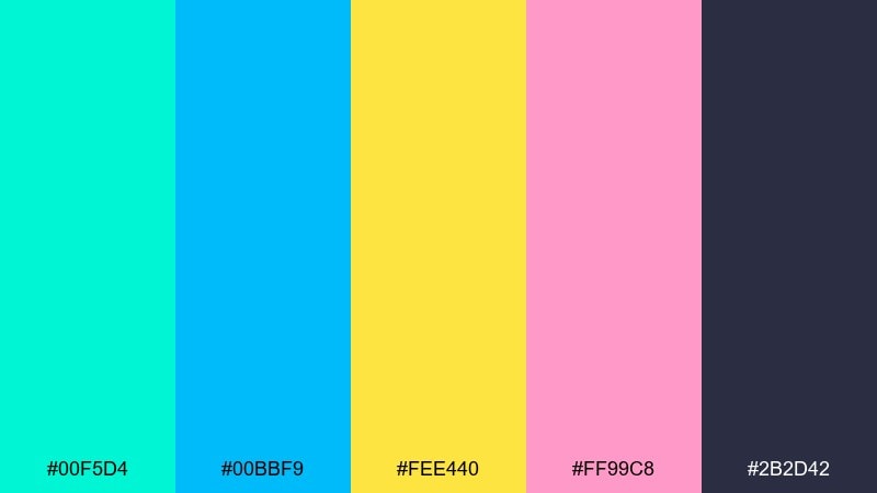
HEX: #00F5D4 #00BBF9 #FEE440 #FF99C8 #2B2D42
Mood: cool and playful
Best for: ice cream shop poster
Cool and playful, it suggests gelato scoops under bright seaside umbrellas. Use aqua and sky blue for big background blocks, then add yellow for price tags and highlights that pop. Pink works nicely for flavor names or illustrated sprinkles, while the deep navy keeps copy sharp. Tip: keep the navy text consistent across the layout to avoid a patchwork feel.
Image example of aqua gelato generated using media.io
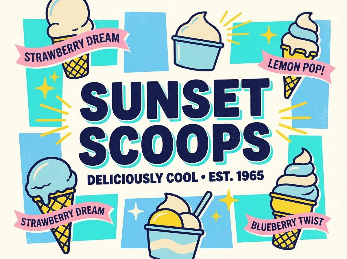
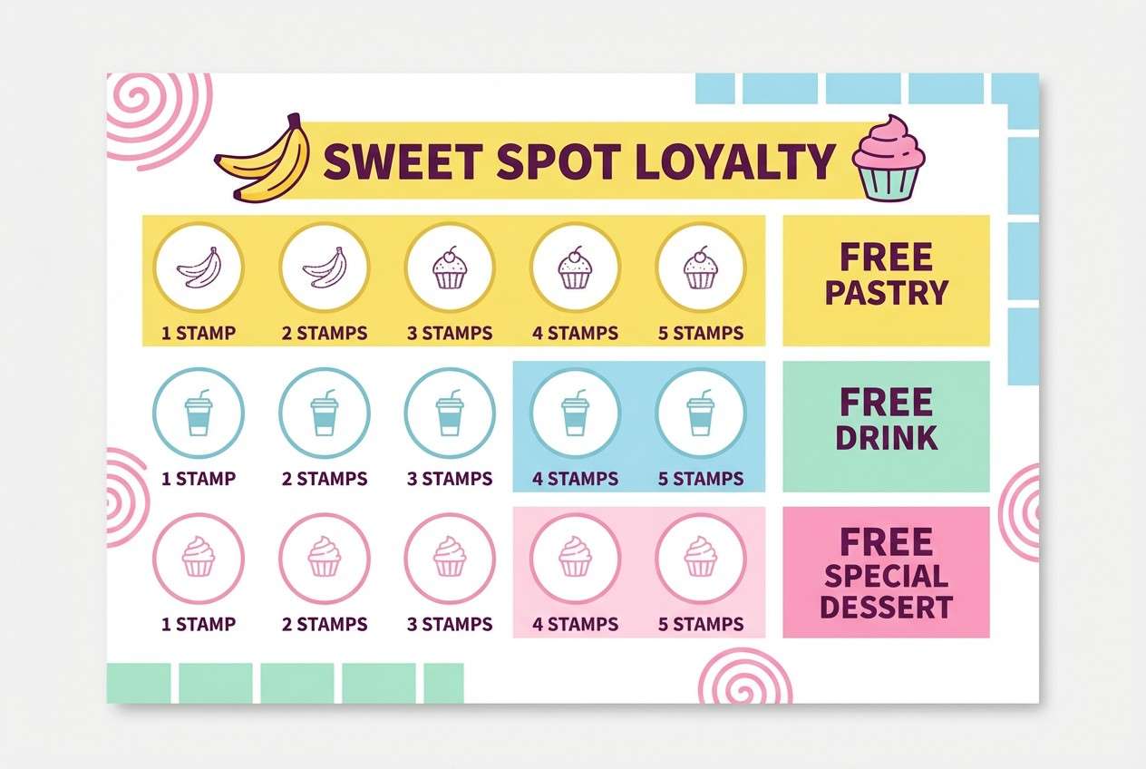
15) Banana Split
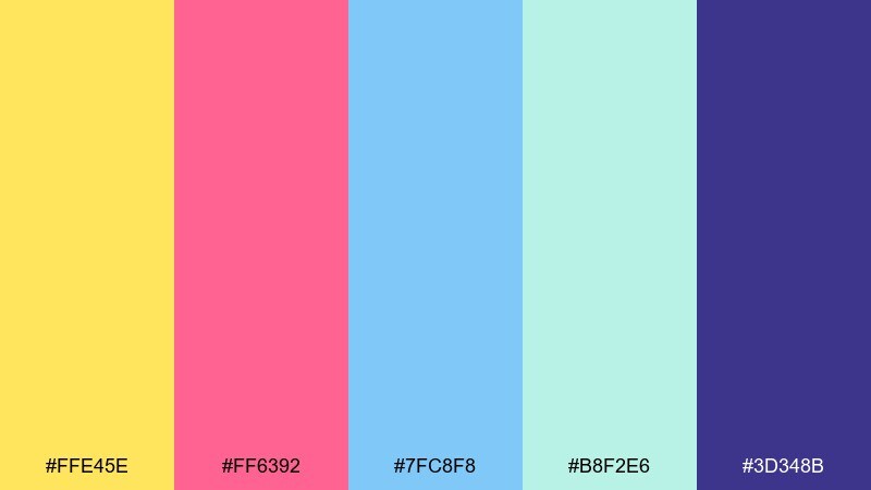
HEX: #FFE45E #FF6392 #7FC8F8 #B8F2E6 #3D348B
Mood: playful and polished
Best for: dessert cafe loyalty card
Playful and polished, it feels like a classic banana split with a modern café edge. Let yellow take the spotlight, with pink as the accent for stamps, points, or reward tiers. The blues keep the design refreshing and help separate sections cleanly. Tip: use the deep purple for all critical text so small print stays readable on glossy stock.
Image example of banana split generated using media.io
16) Flamingo Float

HEX: #FF85A1 #FEC8D8 #D0F4DE #A9DEF9 #FDE2E4
Mood: soft and bubbly
Best for: boutique skincare instagram story
Soft and bubbly, it looks like a flamingo pool float against pastel water. Use the brighter pink for product names and price callouts, then rely on the lighter blush tones for backgrounds and frames. Mint and sky blue are great for ingredient icons and gentle badges. Tip: keep fonts minimal and add plenty of spacing so the story remains premium, not childish.
Image example of flamingo float generated using media.io

17) Pineapple Punch
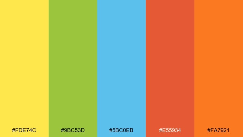
HEX: #FDE74C #9BC53D #5BC0EB #E55934 #FA7921
Mood: tangy and bright
Best for: smoothie bar wall menu
Tangy and bright, it brings up pineapple wedges, leafy greens, and a splash of citrus. Use yellow and green for category bars, then add blue for calm spacing and separators. Orange-red works best for limited-time specials or add-ons you want people to notice instantly. Tip: keep the background mostly light so the menu stays legible from across the room.
Image example of pineapple punch generated using media.io

18) Sunny Studio
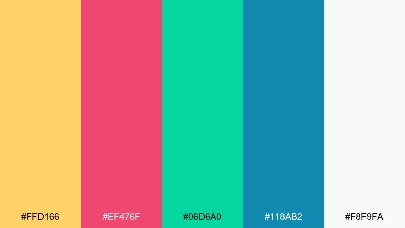
HEX: #FFD166 #EF476F #06D6A0 #118AB2 #F8F9FA
Mood: creative and confident
Best for: agency homepage hero
Creative and confident, it feels like a bright studio with bold markers and clean paper. For a modern happy color palette, keep the off-white as the canvas, then use yellow for warmth and teal for clarity. Magenta and blue are ideal for emphasis, links, and interactive states without overpowering the layout. Tip: set one accent per section so the page looks intentional from scroll to scroll.
Image example of sunny studio generated using media.io

19) Carnival Candies

HEX: #FF70A6 #FF9770 #FFD670 #E9FF70 #70D6FF
Mood: bright and nostalgic
Best for: school fair poster
Bright and nostalgic, it recalls carnival candy bags and hand-painted signs. Let warm pink and peach take the lead for large shapes, then use yellow as a bold spotlight behind key details. Lime and sky blue are great for playful stickers, arrows, and icon sets. Tip: add a simple border and keep typography heavy so the poster stays readable outdoors.
Image example of carnival candies generated using media.io

20) Meadow Mirth
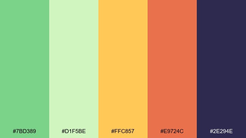
HEX: #7BD389 #D1F5BE #FFC857 #E9724C #2E294E
Mood: fresh and optimistic
Best for: spring botanical illustration
Fresh and optimistic, it feels like new leaves, warm sunbeams, and a pop of wildflower orange. Use the greens as the main wash, then add golden yellow for petals and highlights. Coral brings warmth to focal blooms, while the deep indigo gives definition for linework and titles. Tip: keep outlines thin so the illustration stays light and airy.
Image example of meadow mirth generated using media.io

What Colors Go Well with Happy?
Happy palettes pair best with sunny warms (yellow, coral, peach) plus a fresh cool counterpoint (aqua, teal, sky blue). This warm-cool mix creates an upbeat vibe while keeping the design from feeling flat.
To keep things modern, add a breathable neutral like off-white or creamy beige, and choose one deeper anchor (navy, charcoal, deep purple) for text and key structure. That single dark tone improves readability and makes the brights look more intentional.
If you want “happy” without neon energy, lean into pastel versions of the same hues and use subtle contrast tools like thin outlines, soft shadows, or a darker text color.
How to Use a Happy Color Palette in Real Designs
Start with one dominant color and one accent, then let neutrals handle most of the layout. A simple 60/30/10 balance (dominant/support/accent) helps joyful colors feel organized and brand-ready.
For UI, reserve the most saturated color for actions (primary buttons, active tabs, key badges) and keep body text on a dark anchor for accessibility. In print, test small type and check how colors reproduce on different paper finishes.
When using multiple brights, assign each color a job—headline, button, background panel, highlight—so the palette reads as a system, not a rainbow of unrelated swatches.
Create Happy Palette Visuals with AI
Want to preview these happy color palettes in real designs before you commit? Generate posters, landing pages, invitations, or product mockups using the included prompts, then iterate by swapping one color at a time.
With Media.io’s text-to-image, you can quickly test typography styles, layout density, and background brightness to keep your “happy” look clean, modern, and readable across formats.
Happy Color Palette FAQs
-
What makes a color palette feel “happy”?
Happy palettes usually combine bright warm hues (yellow, coral, orange, pink) with fresh cool tones (aqua, teal, sky blue) and a light neutral. The warmth brings energy, the cool tones add clarity, and the neutral keeps everything breathable. -
How do I keep a happy palette from looking childish?
Use one dark anchor (navy/charcoal/deep purple) for typography, limit the number of saturated accents, and keep plenty of whitespace. Clean type choices and consistent spacing make bright colors feel premium. -
What’s the best background color for happy designs?
Off-white, cream, or very light gray works best because it lets brights pop without harsh contrast. If you use a colored background (mint or sky blue), keep text on a dark anchor for readability. -
Are happy color palettes good for UI and apps?
Yes—when you treat brights as accents. Keep buttons, badges, and highlights saturated, and let surfaces stay light and neutral so screens don’t feel noisy. -
How many colors should a happy palette include?
Five is a great starting point: 1 dominant, 1–2 supporting, 1 accent, and 1 anchor/neutral. You can expand later by adding lighter tints of the same hues. -
What happy colors work best for branding?
Yellow and coral are strong “joy” signals, while teal and sky blue add modern freshness. Pair them with a stable dark tone for logos and text so the brand remains legible across print and digital. -
How can I generate happy palette mockups fast?
Use Media.io text-to-image with a clear design prompt (format + style + dominant colors + contrast rules). Generate a few variations, then refine by adjusting which color is dominant and keeping one consistent dark text color.
Next: Soft Color Palette


