

Pale brown is a modern neutral that feels warm without getting heavy. It’s ideal when you want designs to look calm, natural, and premium across web, print, and interiors.
Below are 20 pale brown color palette ideas with HEX codes, plus real-world pairing tips and AI prompts you can reuse for brand boards, UI mockups, and posters.
In this article
- Why Pale Brown Palettes Work So Well
-
- desert latte
- sandstone studio
- oat milk minimal
- cocoa linen
- clay and sage
- wheatfield sunrise
- vintage parchment
- sepia web ui
- soft toffee branding
- cozy cabin
- pebble and cream
- dusty rose mocha
- misty taupe office
- almond biscuit
- driftwood coastal
- maple candlelight
- light umber editorial
- mushroom and olive
- paper bag neutral
- warm stone poster
- What Colors Go Well with Pale Brown?
- How to Use a Pale Brown Color Palette in Real Designs
- Create Pale Brown Palette Visuals with AI
Why Pale Brown Palettes Work So Well
Pale brown sits in that “easy neutral” zone: warmer than gray, softer than black, and less stark than pure white. It gives layouts a natural, tactile feel that still reads clean and contemporary.
Because it’s low-saturation, pale brown supports content instead of fighting it. That makes it a strong choice for typography-heavy designs like menus, pitch decks, editorial pages, and dashboards.
It also pairs effortlessly with both warm and cool accents—cream, sage, charcoal, dusty rose, or muted blues—so you can shift the mood without rebuilding the entire palette.
20+ Pale Brown Color Palette Ideas (with HEX Codes)
1) Desert Latte
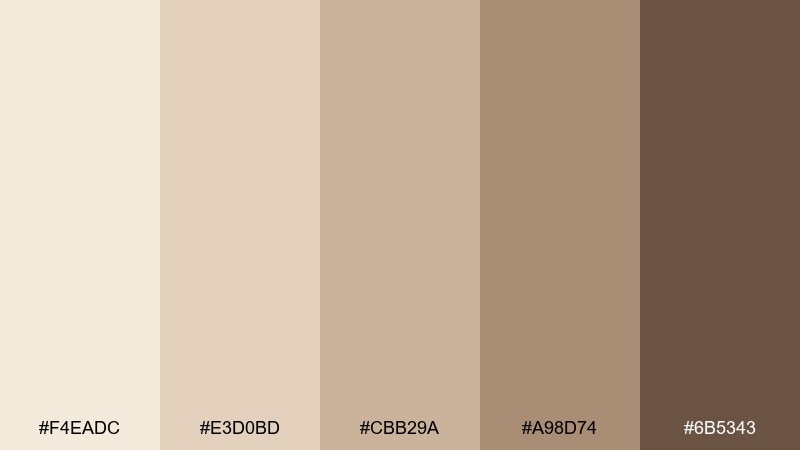
HEX: #f4eadc #e3d0bd #cbb29a #a98d74 #6b5343
Mood: warm, calm, airy
Best for: coffee shop menu design
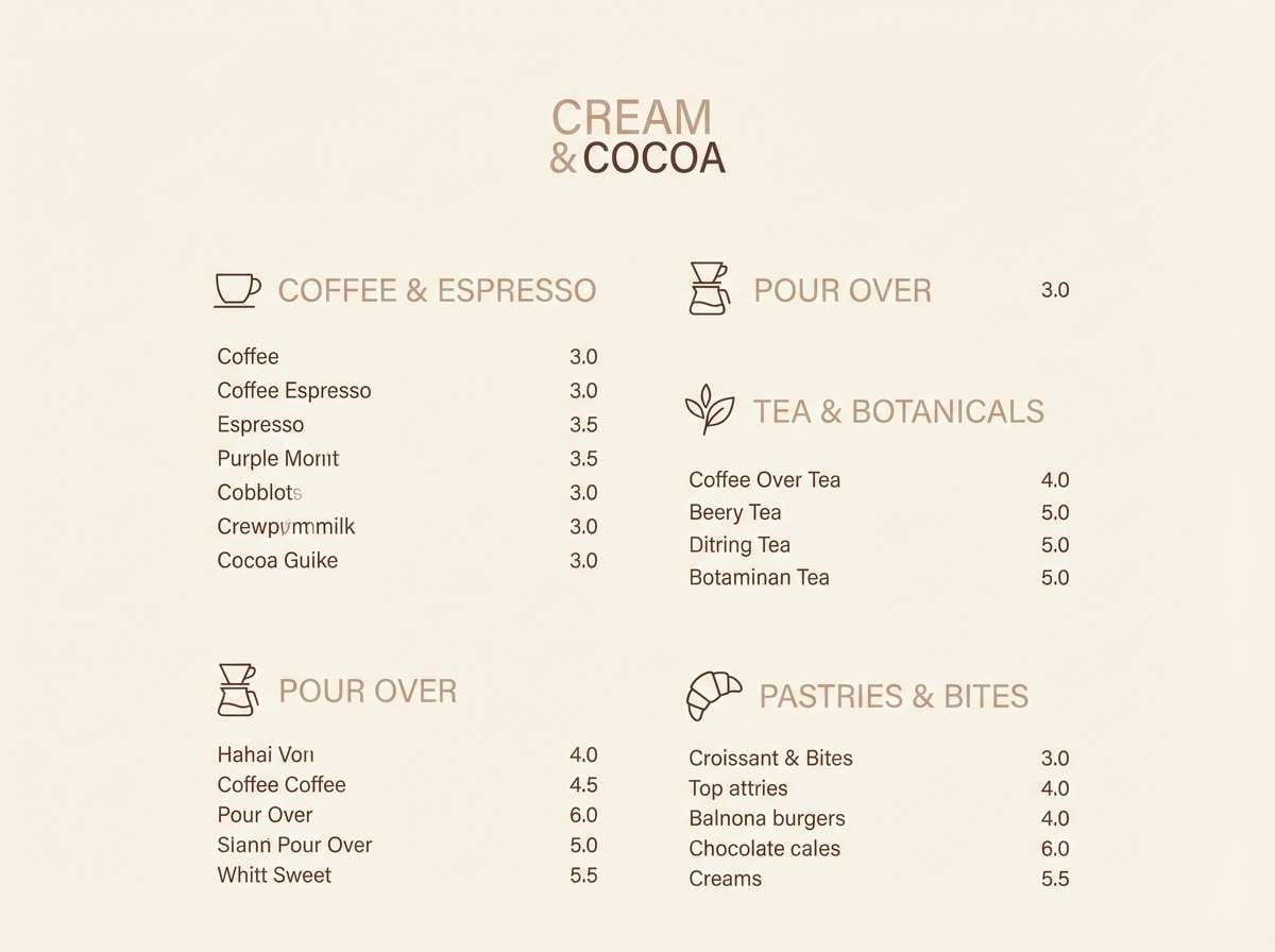
Warm latte tones bring to mind sunlit sand and foamy cappuccino. Use the creamy top shades for backgrounds and let the deeper cocoa brown anchor headings and prices. Pair with off-white paper texture and a tiny charcoal accent for icons. Tip: keep body text on #f4eadc or #e3d0bd for easy readability.
Image example of desert latte generated using media.io
Media.io is an online AI studio for creating and editing video, image, and audio in your browser.

2) Sandstone Studio
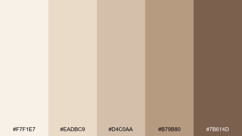
HEX: #f7f1e7 #eadbc9 #d4c0aa #b79b80 #7b614d
Mood: neutral, polished, modern
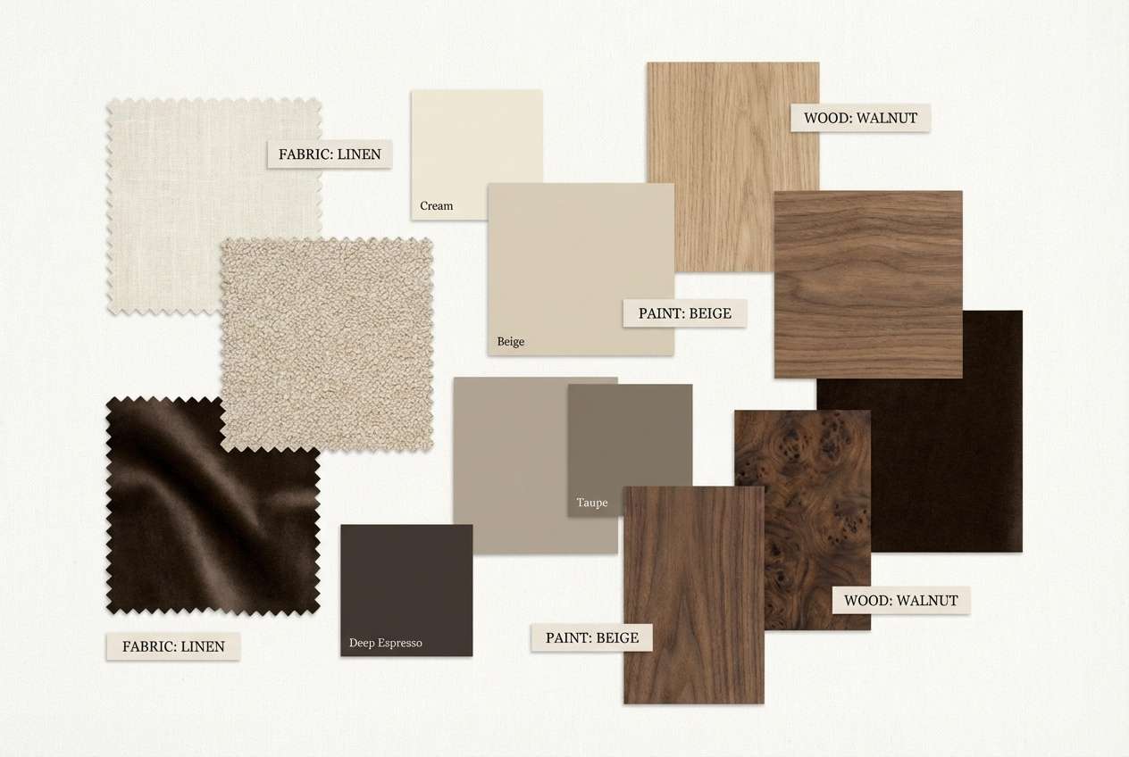
Best for: interior moodboard for a small apartment
Polished neutrals echo sandstone walls and soft woven textiles. Let the light creams carry large surfaces, then layer taupe and tan for furniture swatches and trims. A dark brown accent works best in small doses on hardware and outlines. Tip: repeat one mid-tone (#d4c0aa) across 2 to 3 elements to keep the room cohesive.
Image example of sandstone studio generated using media.io
3) Oat Milk Minimal
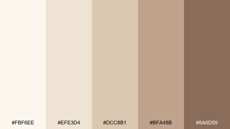
HEX: #fbf6ee #efe3d4 #dcc8b1 #bfa48b #8a6d59
Mood: soft, minimal, friendly
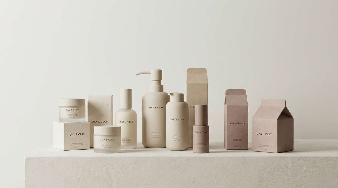
Best for: skincare product packaging
Soft oat tones feel clean, gentle, and quietly premium. This pale brown color palette works best with lots of whitespace and subtle type, letting the mid tans carry the brand warmth. Pair with matte paper, minimal line icons, and a single dark-brown stamp for authority. Tip: print testing matters here, since the lightest shades can shift warmer on uncoated stock.
Image example of oat milk minimal generated using media.io
4) Cocoa Linen
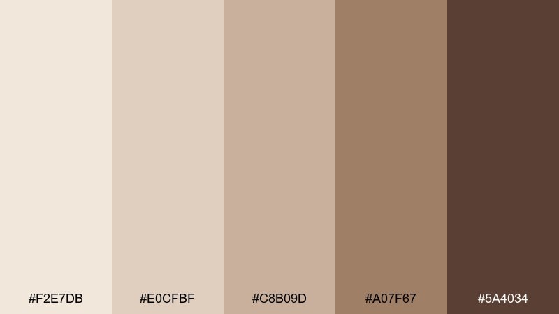
HEX: #f2e7db #e0cfbf #c8b09d #a07f67 #5a4034
Mood: cozy, grounded, tactile
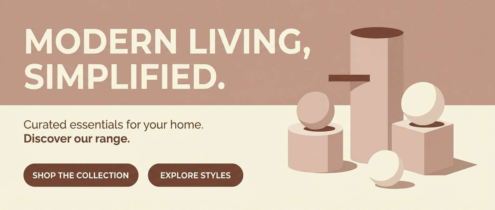
Best for: home decor ecommerce banner
Cozy linen-and-cocoa shades suggest natural fabric, warm light, and handmade details. Use the light creams as your banner base, then build product callouts with taupe and tan blocks. A deep espresso brown adds contrast for buttons and price tags without looking harsh. Tip: keep shadows subtle and warm so the palette stays inviting rather than muddy.
Image example of cocoa linen generated using media.io
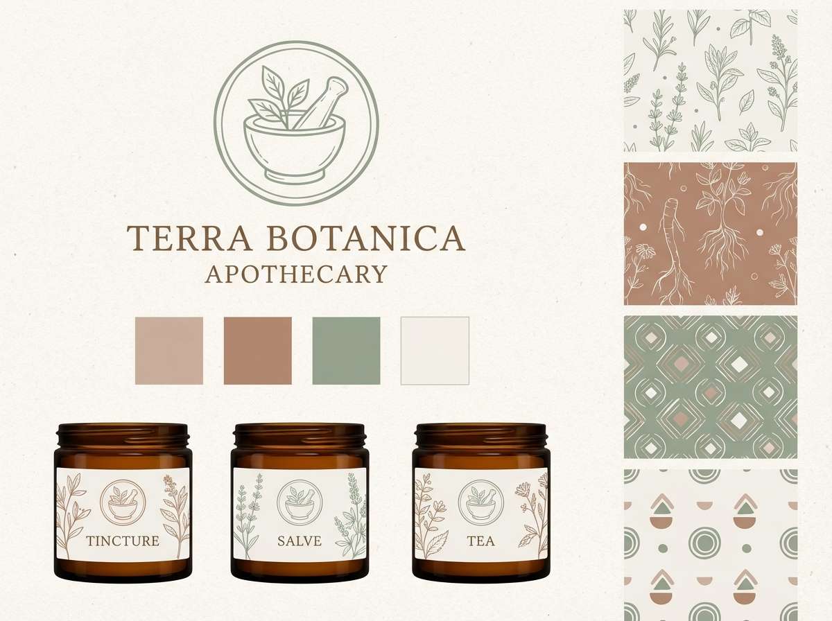
5) Clay and Sage
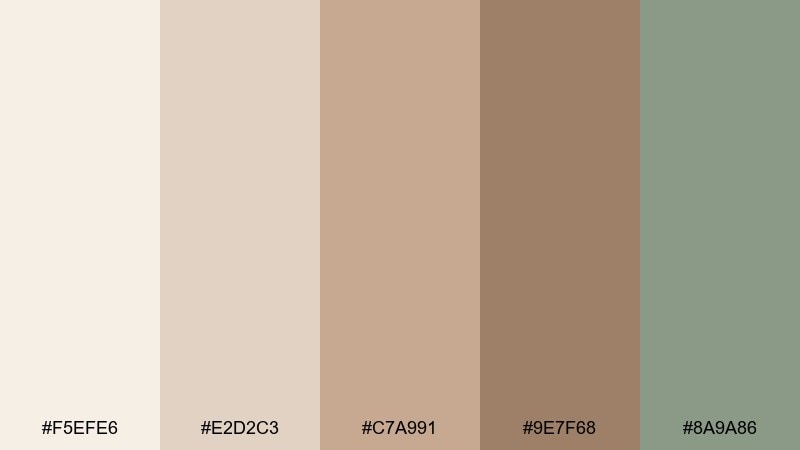
HEX: #f5efe6 #e2d2c3 #c7a991 #9e7f68 #8a9a86
Mood: earthy, fresh, balanced
Best for: botanical brand identity
Earthy clay paired with muted sage feels like a calm garden path after rain. These pale brown color combinations shine in logos and labels where you want warmth without sweetness. Use sage for stamps, secondary buttons, or subtle patterns, and reserve the clay browns for the main mark. Tip: keep greens slightly desaturated so they blend naturally with the browns.
Image example of clay and sage generated using media.io
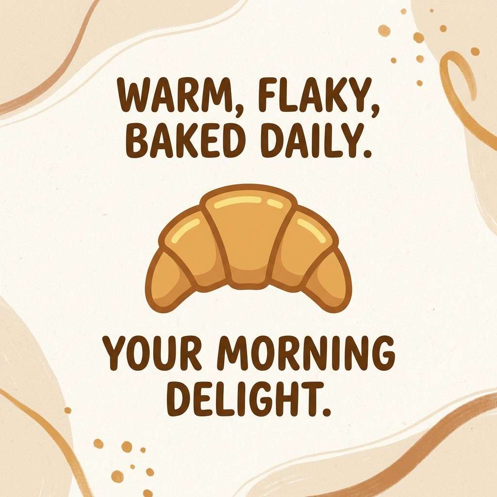
6) Wheatfield Sunrise
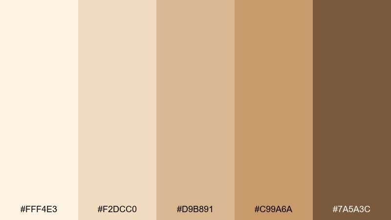
HEX: #fff4e3 #f2dcc0 #d9b891 #c99a6a #7a5a3c
Mood: sunny, rustic, optimistic
Best for: bakery social media post
Sunny wheat and toasted caramel tones evoke fresh bread and early morning light. Use the pale cream for the canvas, then let the honey brown handle headline shapes and stickers. A deeper brown helps with legible captions and small icons. Tip: add grainy texture lightly to keep the post feeling handmade and warm.
Image example of wheatfield sunrise generated using media.io
7) Vintage Parchment
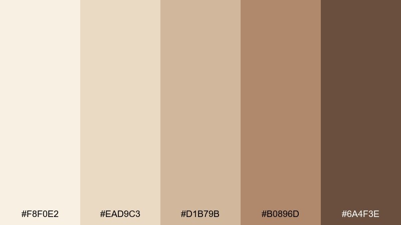
HEX: #f8f0e2 #ead9c3 #d1b79b #b0896d #6a4f3e
Mood: classic, nostalgic, refined
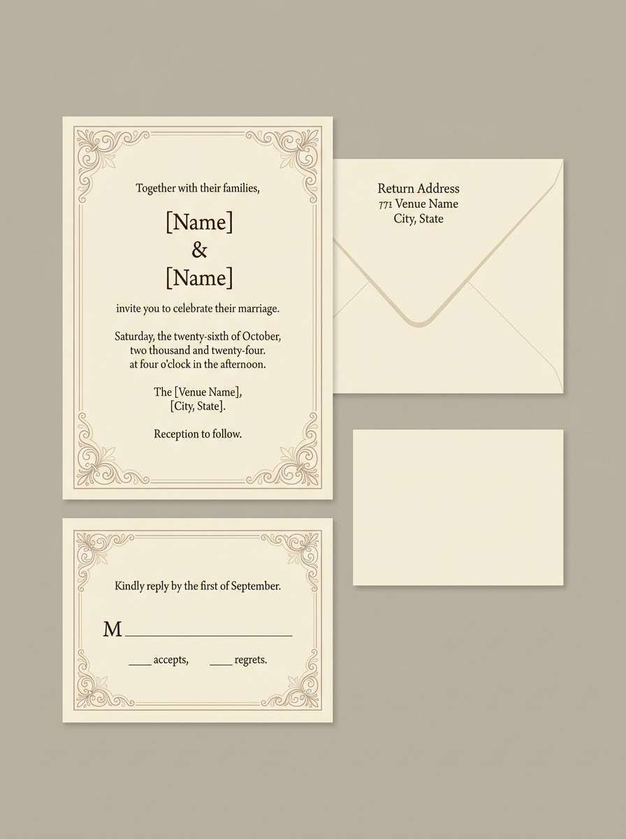
Best for: wedding invitation set
Classic parchment neutrals feel timeless, like heirloom paper and soft ink. Keep the lightest shade as the invitation stock, then use warm tan for borders and monograms. A deep brown works beautifully for serif type and RSVP details. Tip: choose one metallic accent in foil, but keep it minimal so the warm neutrals stay the star.
Image example of vintage parchment generated using media.io
8) Sepia Web UI
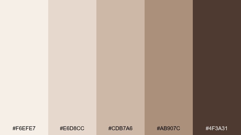
HEX: #f6efe7 #e6d8cc #cdb7a6 #ab907c #4f3a31
Mood: calm, trustworthy, understated
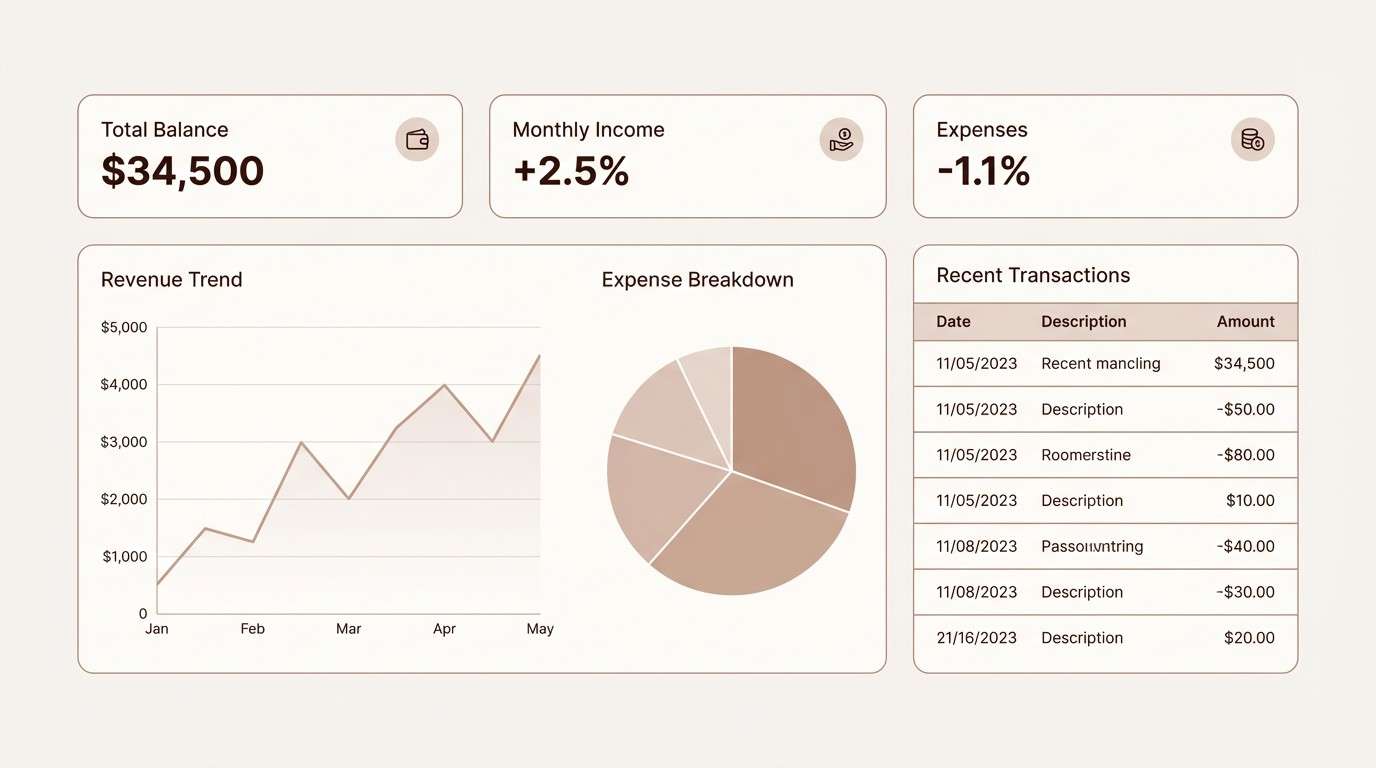
Best for: finance dashboard UI mockup
Sepia-tinted neutrals create a steady, reliable feel with a soft edge. A pale brown color scheme like this works well for dashboards where glare-free backgrounds matter. Use the darkest tone for primary text and charts, and keep cards in the two lightest shades to preserve hierarchy. Tip: add a single cool gray for dividers if you need extra separation without raising contrast too much.
Image example of sepia web ui generated using media.io
9) Soft Toffee Branding
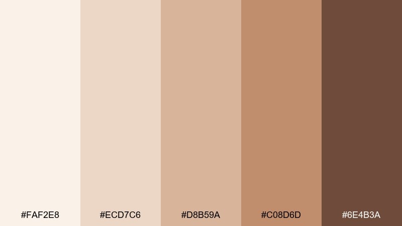
HEX: #faf2e8 #ecd7c6 #d8b59a #c08d6d #6e4b3a
Mood: approachable, sweet, modern
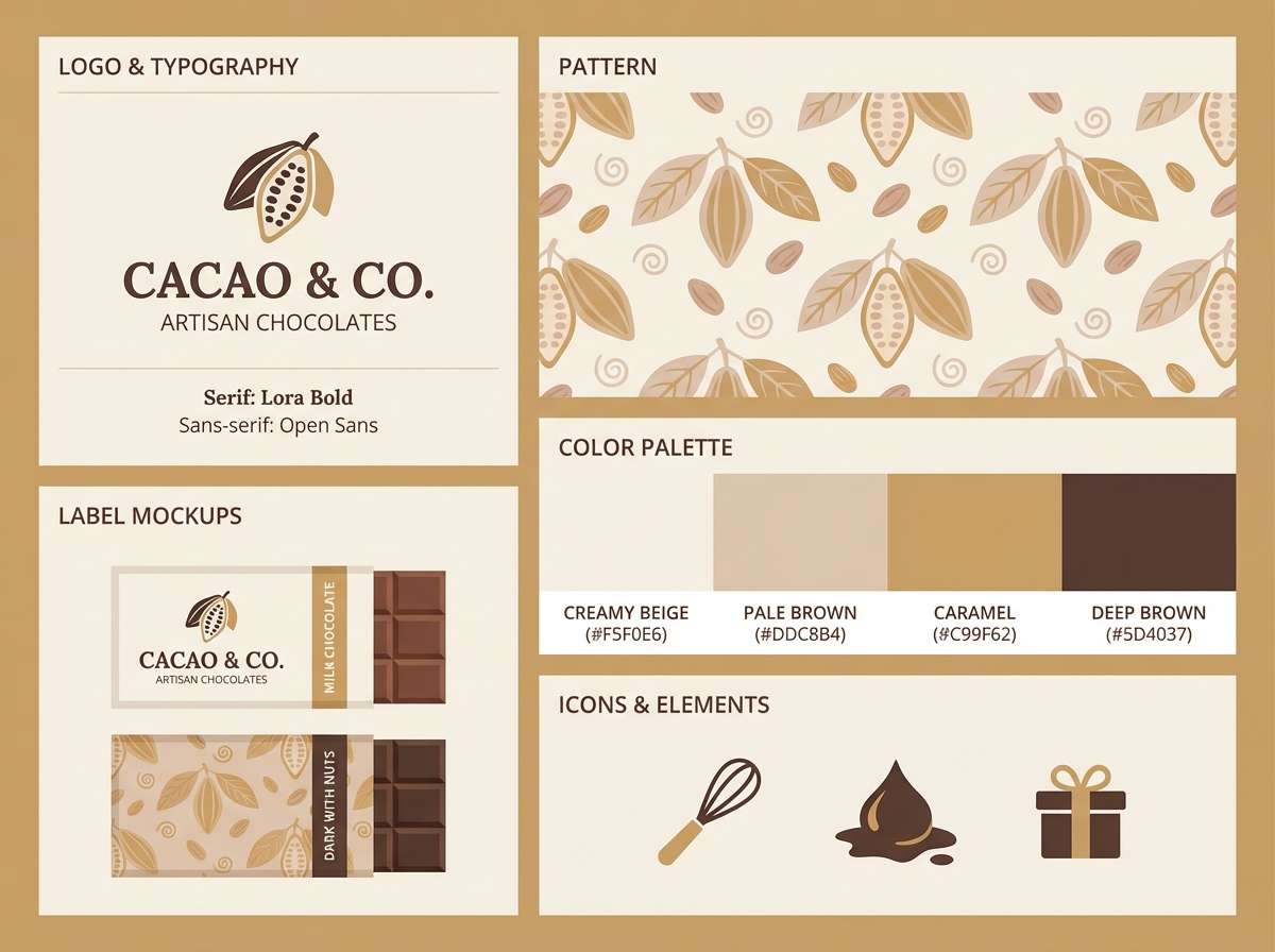
Best for: artisan chocolate brand kit
Soft toffee tones feel friendly and indulgent without turning overly dark. Use the pale shades for wrappers and web backgrounds, then layer caramel for badges and highlights. The deepest brown is ideal for logo type, ingredients lists, and small legal text. Tip: keep photography warm and low-saturation so it blends seamlessly with the palette.
Image example of soft toffee branding generated using media.io
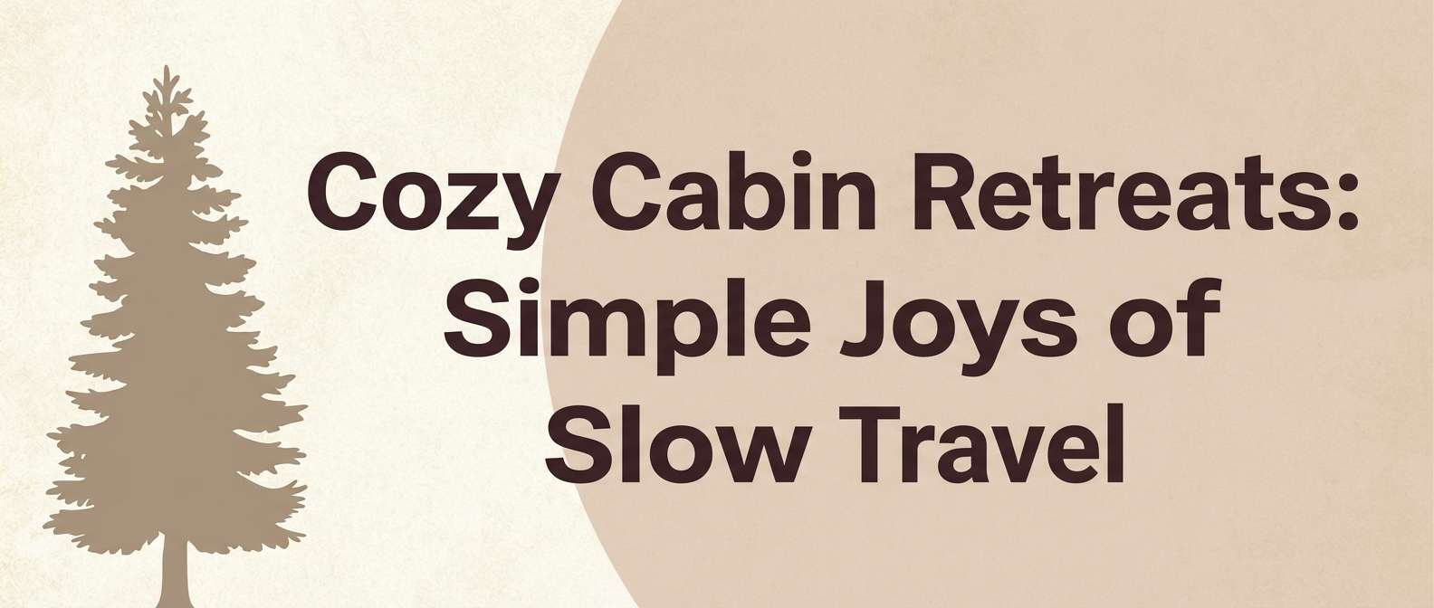
10) Cozy Cabin
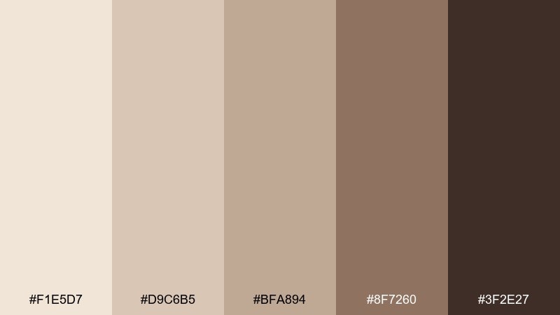
HEX: #f1e5d7 #d9c6b5 #bfa894 #8f7260 #3f2e27
Mood: cozy, woodsy, intimate
Best for: travel blog header
Woodsy browns and soft beige bring to mind cabin walls, wool blankets, and a quiet fire. Build the header with the lightest shade as the background and use the mid browns for overlays and tags. Deep espresso makes titles pop without feeling stark. Tip: add a subtle woodgrain pattern at low opacity to reinforce the cozy story.
Image example of cozy cabin generated using media.io
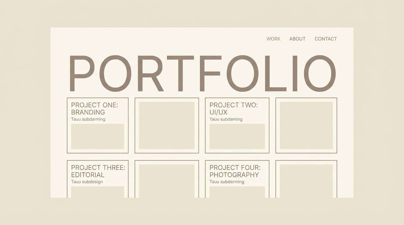
11) Pebble and Cream
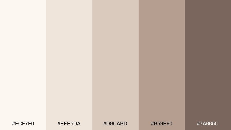
HEX: #fcf7f0 #efe5da #d9cabd #b59e90 #7a665c
Mood: clean, airy, gentle
Best for: minimal portfolio website
Airy cream and pebble tones feel quiet, modern, and easy to scan. Use the two lightest shades for page backgrounds and section breaks, then bring in the mid taupe for navigation states. A cooler brown-gray works well for body text and subtle dividers. Tip: keep your accent color limited to one element, like links or hover states, so the neutrals stay crisp.
Image example of pebble and cream generated using media.io
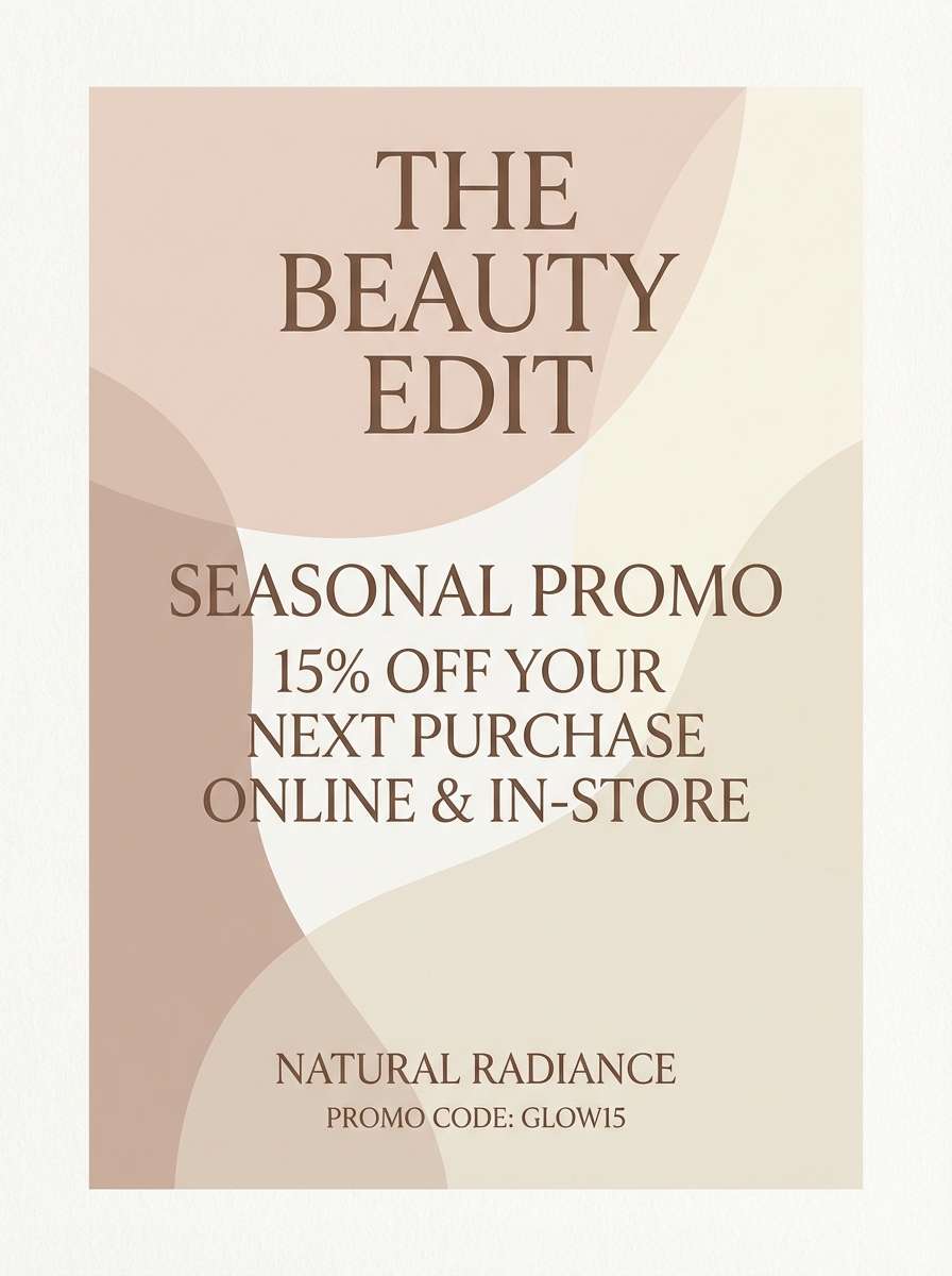
12) Dusty Rose Mocha
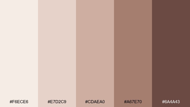
HEX: #f6ece6 #e7d2c9 #cdaea0 #a67e70 #6a4a43
Mood: soft, romantic, modern
Best for: beauty promo flyer
Dusty rose and mocha browns feel like satin, blush, and warm café light. Use the palest tone as a clean base, then let rose-taupe handle shapes behind headlines. The darker mocha is ideal for clear pricing and dates. Tip: choose one bold type weight and keep everything else light to avoid an overly sweet look.
Image example of dusty rose mocha generated using media.io
13) Misty Taupe Office
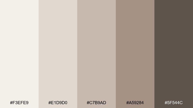
HEX: #f3efe9 #e1d9d0 #c7b9ad #a59284 #5f544c
Mood: professional, calm, organized
Best for: pitch deck template
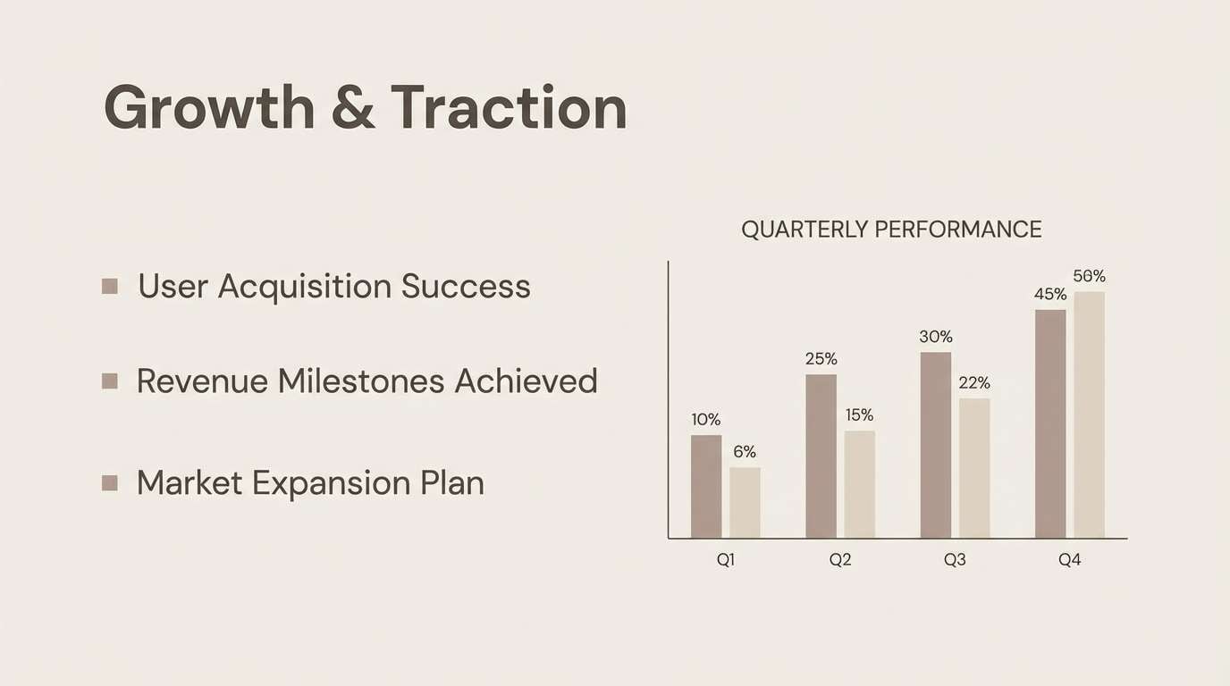
Misty taupe neutrals feel composed and quietly confident. Use the light gray-beige shades for slides and section headers, then rely on deeper taupe for charts and callout boxes. A muted brown-gray makes body text readable without the harshness of pure black. Tip: keep chart fills light and reserve the darkest tone only for axes and key numbers.
Image example of misty taupe office generated using media.io
14) Almond Biscuit
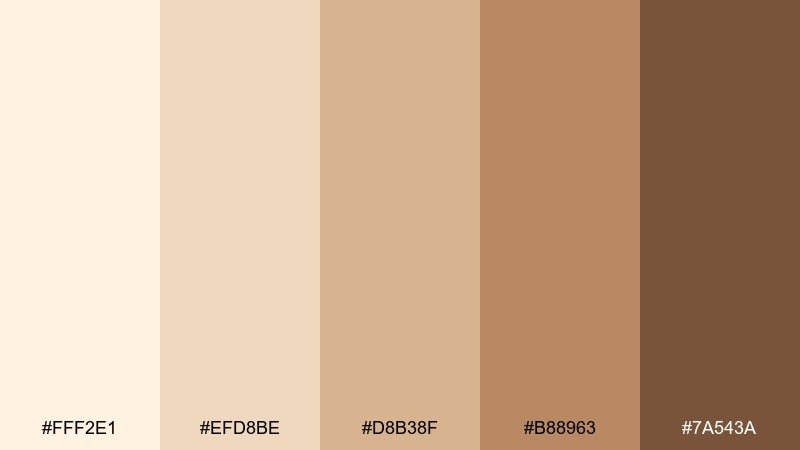
HEX: #fff2e1 #efd8be #d8b38f #b88963 #7a543a
Mood: sweet, warm, welcoming
Best for: recipe blog post cover
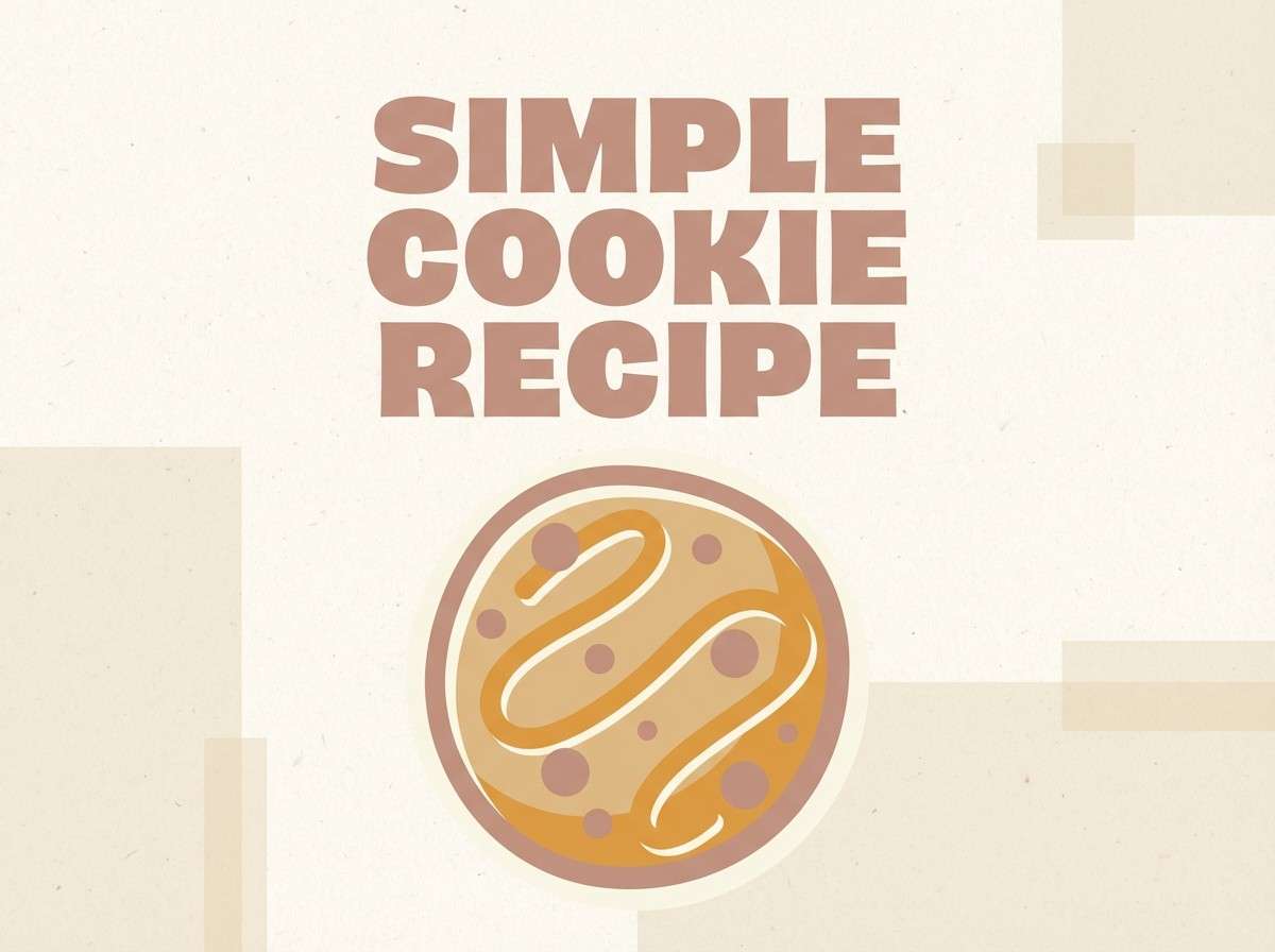
Almond and biscuit shades feel cozy and homemade, like cookies cooling on a rack. This pale brown color palette is great for recipe covers where you want warmth without heavy contrast. Use the lighter creams for large type areas and let the caramel brown frame the title and tags. Tip: keep icons simple and rounded to match the gentle tone.
Image example of almond biscuit generated using media.io
15) Driftwood Coastal
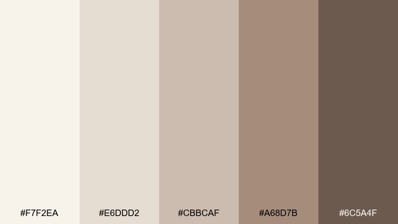
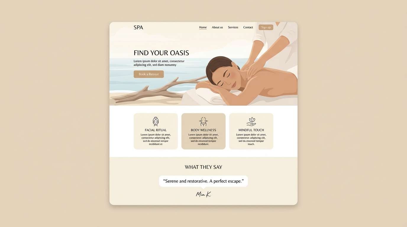
HEX: #f7f2ea #e6ddd2 #cbbcaf #a68d7b #6c5a4f
Mood: relaxed, coastal, natural
Best for: spa landing page
Driftwood neutrals feel like beach walks, sun-bleached wood, and soft towels. Use the palest shades for calm page sections and the mid taupes for cards, testimonials, and subtle separators. A deeper warm gray-brown works nicely for navigation and CTA outlines. Tip: keep imagery bright and desaturated so it harmonizes with the sandy tones.
Image example of driftwood coastal generated using media.io
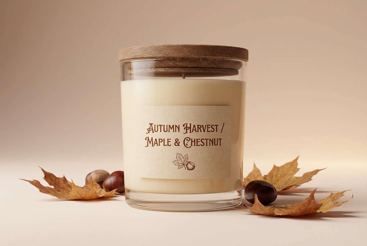
16) Maple Candlelight
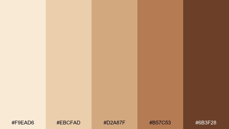
HEX: #f9ead6 #ebcfad #d2a87f #b57c53 #6b3f28
Mood: glowing, autumnal, cozy
Best for: seasonal product ad
Glowing maple shades capture candlelight, toasted sugar, and early autumn evenings. Use the light peachy cream for the backdrop and let the richer browns shape the headline and product callouts. A deep chestnut adds focus for small print and logo marks. Tip: add soft gradients sparingly to mimic warm light without losing clarity.
Image example of maple candlelight generated using media.io
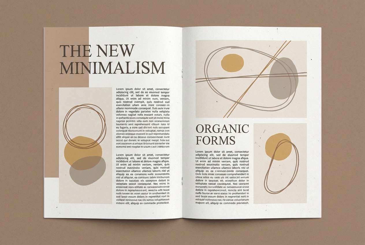
17) Light Umber Editorial
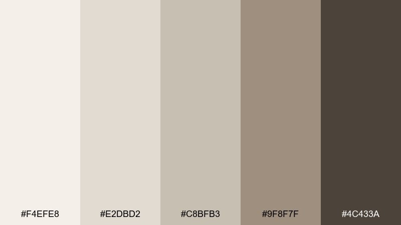
HEX: #f4efe8 #e2dbd2 #c8bfb3 #9f8f7f #4c433a
Mood: editorial, mature, understated
Best for: magazine feature layout
Light umber neutrals feel thoughtful and editorial, like a well-worn hardcover and matte paper. Use the palest shade as the page base, then layer mid tones for pull quotes and image captions. The darkest brown-gray is perfect for headers and page numbers. Tip: keep contrast consistent across spreads so the layout reads effortlessly.
Image example of light umber editorial generated using media.io
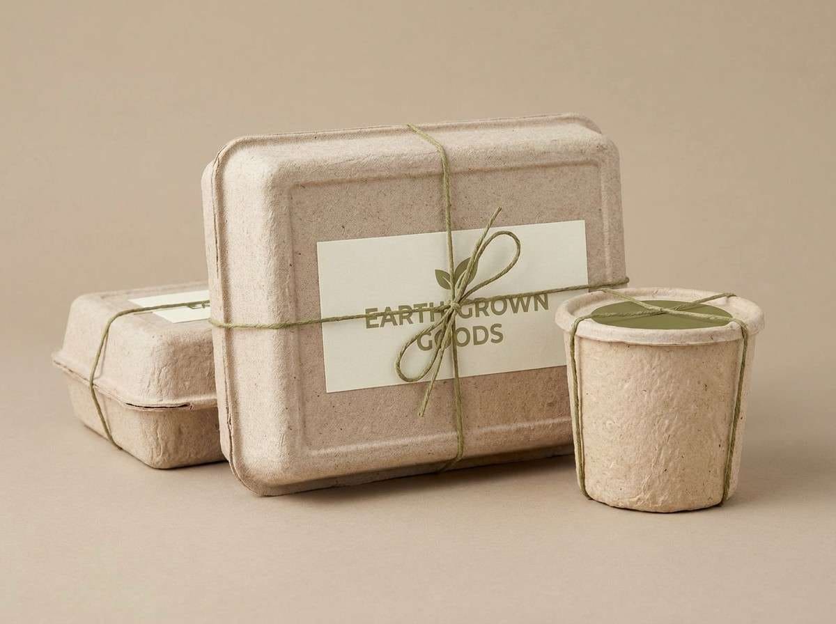
18) Mushroom and Olive
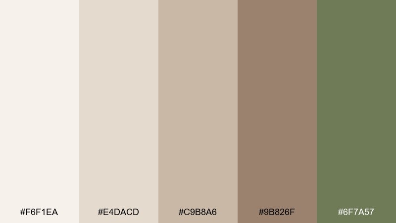
HEX: #f6f1ea #e4dacd #c9b8a6 #9b826f #6f7a57
Mood: organic, calm, outdoorsy
Best for: eco packaging label
Mushroom beige with a soft olive accent feels organic and quietly sustainable. These pale brown color combinations work especially well on kraft labels and recycled cartons. Let olive highlight key claims like organic or refillable, while the browns handle structure and type. Tip: print the olive slightly darker than you expect to prevent it from fading on textured stock.
Image example of mushroom and olive generated using media.io
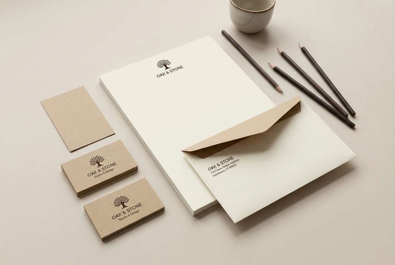
19) Paper Bag Neutral
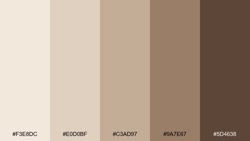
HEX: #f3e8dc #e0d0bf #c3ad97 #9a7e67 #5d4638
Mood: simple, practical, authentic
Best for: small business logo and stationery
Paper-bag browns feel honest and handmade, like stamped kraft and twine. This pale brown color palette suits small business stationery when you want warmth without fuss. Use the lightest shade on letterheads and envelopes, and bring in the darkest brown for your logo mark and address details. Tip: keep ink coverage low to avoid a heavy look on textured paper.
Image example of paper bag neutral generated using media.io
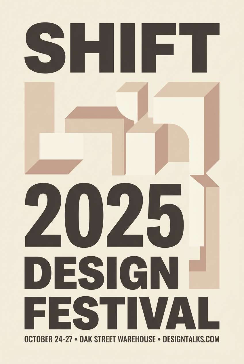
20) Warm Stone Poster
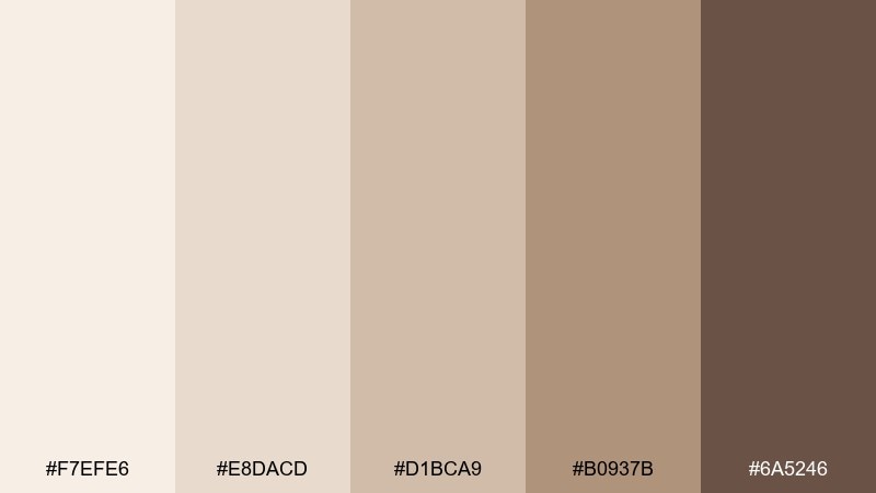
HEX: #f7efe6 #e8dacd #d1bca9 #b0937b #6a5246
Mood: modern, warm, gallery-like
Best for: minimal event poster
Warm stone neutrals feel like a modern gallery wall and soft spotlights. Build the poster with a creamy background, then use mid taupes for geometric blocks and section dividers. The deep brown-gray is best for the event title, date, and venue details. Tip: keep the layout strict and let texture or type choice add personality rather than extra colors.
Image example of warm stone poster generated using media.io
What Colors Go Well with Pale Brown?
Cream and off-white are the easiest partners for pale brown, helping it look bright and intentional rather than muddy. For contrast, charcoal and warm gray-browns keep text and UI elements readable without the harshness of pure black.
For a nature-forward feel, pair pale brown with muted greens like sage or olive. If you want something softer and more romantic, dusty rose and blush tones add gentle color while staying calm and modern.
When you need a contemporary edge, introduce one cool accent—like a blue-gray divider or a desaturated slate—so the palette feels balanced instead of overly warm.
How to Use a Pale Brown Color Palette in Real Designs
Start with the lightest shade as your base (background, paper stock, or wall paint), then pick one mid-tone for large supporting blocks (cards, sections, furniture, packaging panels). Save the darkest shade for high-importance elements like headings, buttons, and key numbers.
Keep contrast predictable: use dark brown/umber for text, and avoid placing mid-browns on mid-browns. If you need separation in UI, a tiny step toward cool gray for borders often helps while staying cohesive.
In print, test early—very light creams can shift warmer on uncoated paper. In interiors or branding photography, keep saturation low and lighting warm to let the pale browns read clean and premium.
Create Pale Brown Palette Visuals with AI
If you already have HEX codes, you can quickly turn them into on-brand visuals—moodboards, packaging mockups, posters, or UI concepts—by describing the layout and materials you want.
Reuse the prompts above as templates: swap the subject (menu, landing page, label) and keep the “dominant colors” line consistent with your palette for a cohesive result.
Media.io makes it simple to generate and iterate on pale brown palette imagery directly in your browser, so you can explore multiple directions before committing to a final design.
Pale Brown Color Palette FAQs
-
What is a pale brown color palette used for?
Pale brown palettes are commonly used for cozy branding, minimalist UI, editorial layouts, packaging, and interiors because they feel warm, calm, and natural while staying easy to read. -
Is pale brown the same as beige or taupe?
They’re related but not identical: beige is typically lighter and more yellow/cream-leaning, while taupe often includes a gray undertone. Pale brown sits between them and can lean warm (latte) or neutral (mushroom/stone). -
What text color works best on pale brown backgrounds?
Use a deep brown or brown-gray (espresso/umber) for body text and headings. It keeps contrast comfortable and avoids the harsh look of pure black on warm neutrals. -
What accent colors pair well with pale brown?
Sage and olive for an earthy look, dusty rose for a soft romantic feel, and charcoal for clean modern contrast. A restrained blue-gray can also add balance when a palette feels too warm. -
How do I keep pale brown designs from looking muddy?
Build clear value separation: very light base, mid-tone blocks, and a distinctly darker accent. Avoid stacking multiple mid browns together, and keep shadows warm and subtle. -
Are pale brown palettes good for web accessibility?
Yes, if you choose a sufficiently dark text shade and test contrast ratios. Pale browns are often great for low-glare backgrounds, but mid-tone text on mid-tone backgrounds can fail contrast checks. -
Do pale brown HEX colors print accurately?
They can shift depending on paper and ink (especially very light creams on uncoated stock). Always run a small proof print and adjust warmth or lightness if the result looks too yellow or too flat.
Next: Pink Lilac Color Palette


