

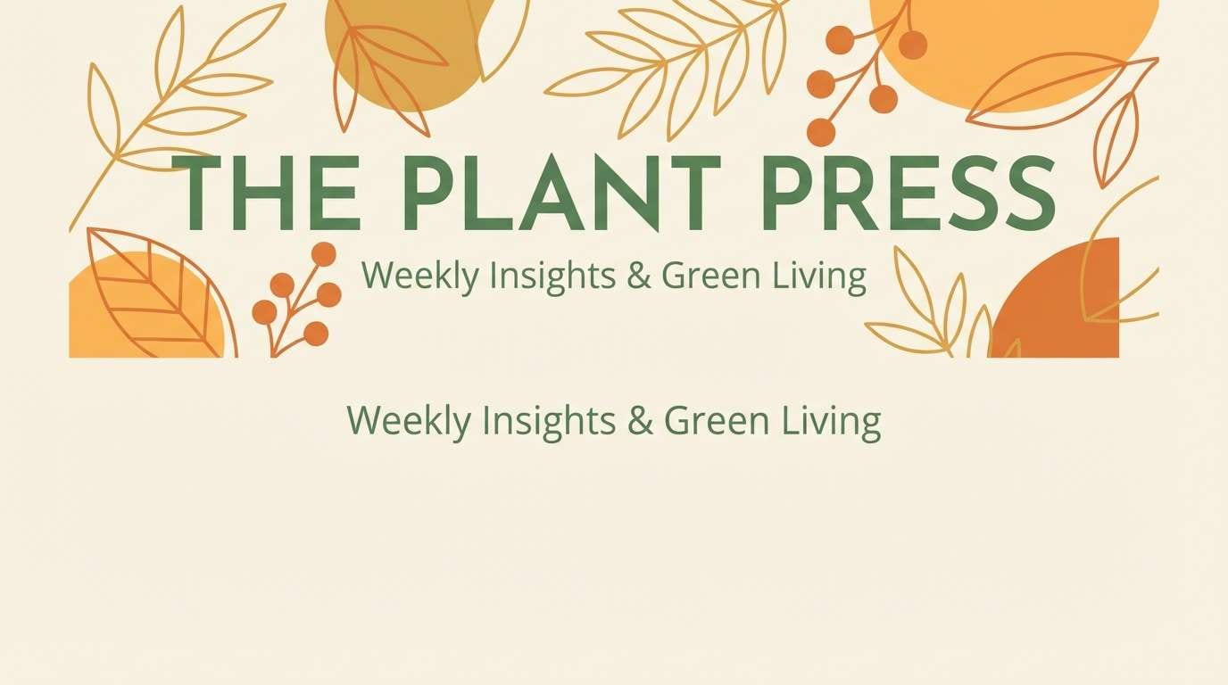
A nature color palette blends grounded greens, warm earth tones, and misty neutrals to create designs that feel calm, honest, and familiar.
Below are 20 ready-to-use nature color schemes with HEX codes, plus AI prompt examples you can reuse for branding, UI, print, and packaging.
In this article
Why Nature Color Palettes Work So Well
Nature color schemes feel intuitive because they mirror what we see outdoors: deep greens for depth, warm browns for stability, and soft neutrals for air and light. That familiarity makes them easy to trust in branding, packaging, and UI.
They also balance emotion and function. Earthy tones read calm and grounded, while brighter botanical accents can still bring energy without feeling artificial or overly saturated.
From print to screens, nature color schemes tend to be forgiving. They pair well with textures (paper, linen, stone) and keep typography readable when you anchor layouts with a dark evergreen or charcoal-like green.
20+ Nature Color Palette Ideas (with HEX Codes)
1) Forest Floor
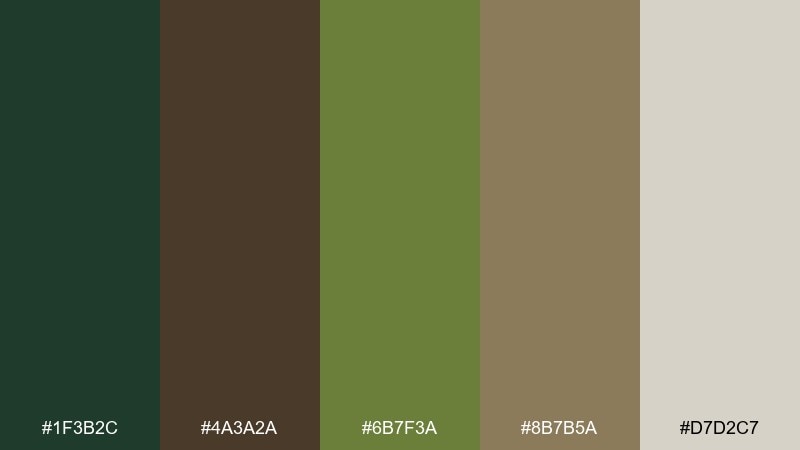
HEX: #1f3b2c #4a3a2a #6b7f3a #8b7b5a #d7d2c7
Mood: grounded and earthy
Best for: outdoor gear packaging
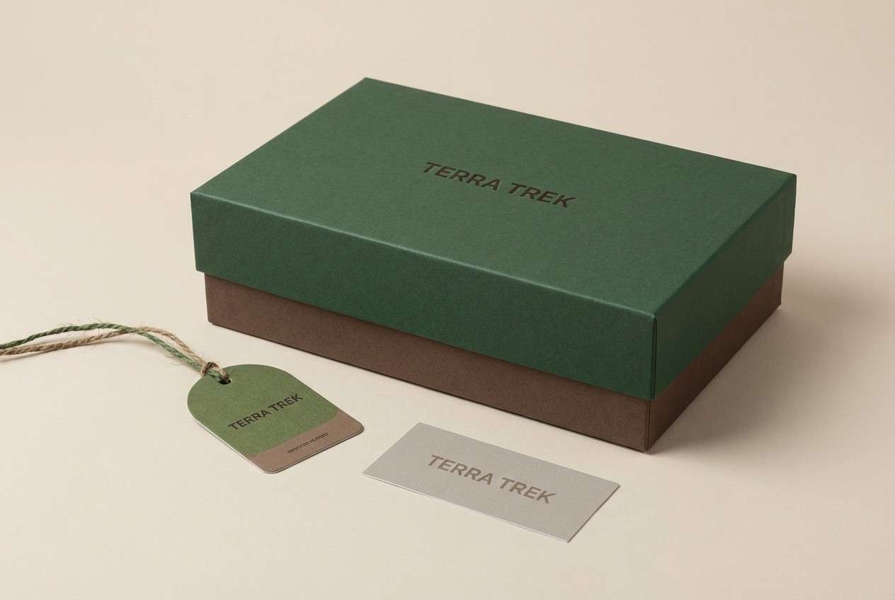
Grounded and earthy, like damp soil, pine bark, and moss after rain. The deep green anchors layouts, while the warm browns keep it tactile and honest. Use the light neutral for breathing room on labels and ingredient panels. Tip: keep typography in near-black or the darkest green to preserve that rugged clarity.
Image example of forest floor generated using media.io
Media.io is an online AI studio for creating and editing video, image, and audio in your browser.

2) Mossy Creek
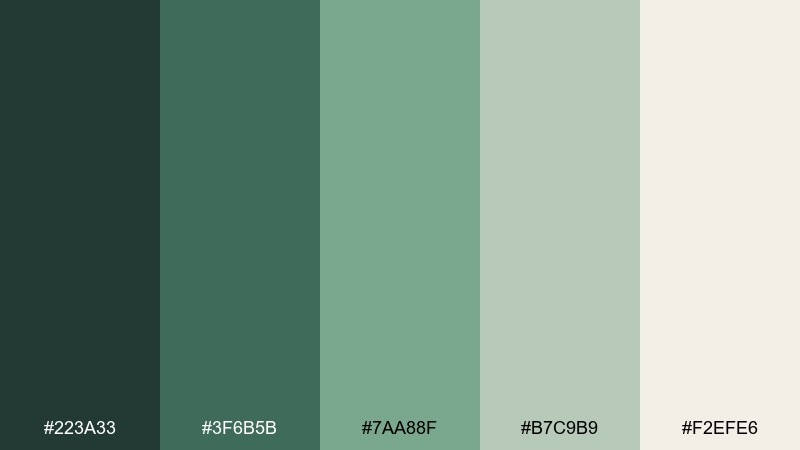
HEX: #223a33 #3f6b5b #7aa88f #b7c9b9 #f2efe6
Mood: cool and restorative
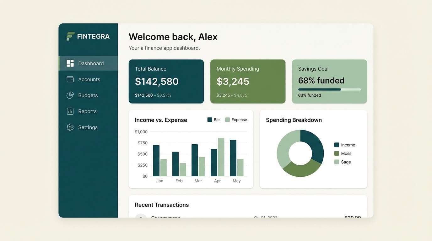
Best for: finance app dashboard ui
Cool and restorative, like shaded water rolling over stones and algae-soft banks. The darker greens make dependable headers, and the mid tones work well for charts and badges. Pair this nature color palette with plenty of off-white so the interface stays calm and legible. Tip: reserve the light sage for hover states to avoid muddy contrast.
Image example of mossy creek generated using media.io
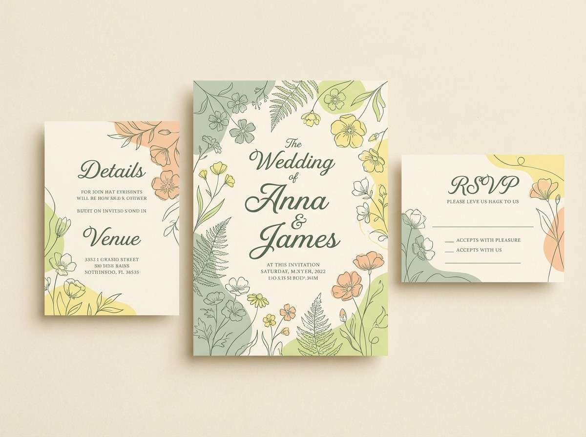
3) Sunlit Meadow
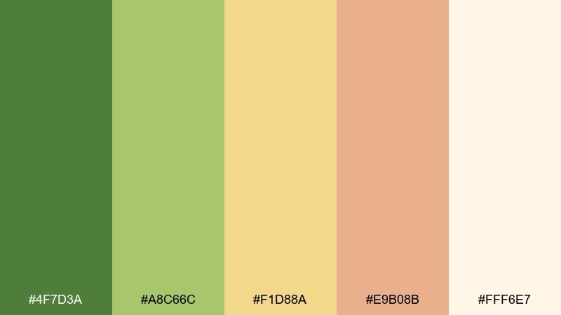
HEX: #4f7d3a #a8c66c #f1d88a #e9b08b #fff6e7
Mood: bright and hopeful
Best for: spring wedding invitation set
Bright and hopeful, like tall grass catching afternoon light and soft petals in the breeze. The buttery yellow brings warmth, while the meadow greens keep it fresh rather than sugary. Use the cream as the main paper tone and let peach act as a gentle highlight for names or borders. Tip: add fine-line florals in the darkest green to tie everything together.
Image example of sunlit meadow generated using media.io
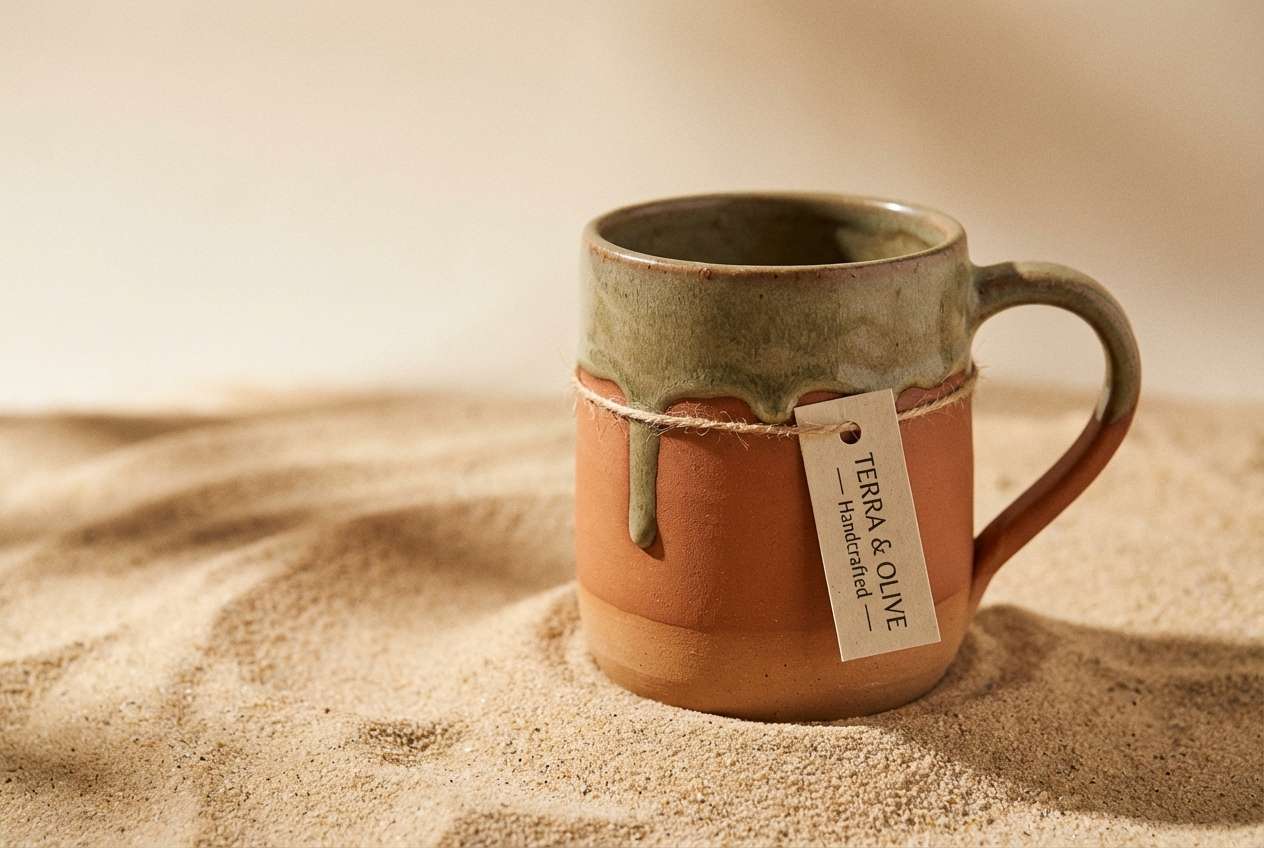
4) Canyon Clay
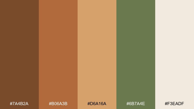
HEX: #7a4b2a #b06a3b #d6a16a #6b7a4e #f3eadf
Mood: sun-baked and adventurous
Best for: ceramic mug product ad
Sun-baked and adventurous, like canyon walls, clay dust, and sparse brush. These nature color combinations feel especially strong for artisanal goods because the warm terracotta range reads handmade and real. Balance the heat with the muted olive for a grounded accent on badges or secondary copy. Tip: use the pale sand as negative space so the browns do not overwhelm the layout.
Image example of canyon clay generated using media.io
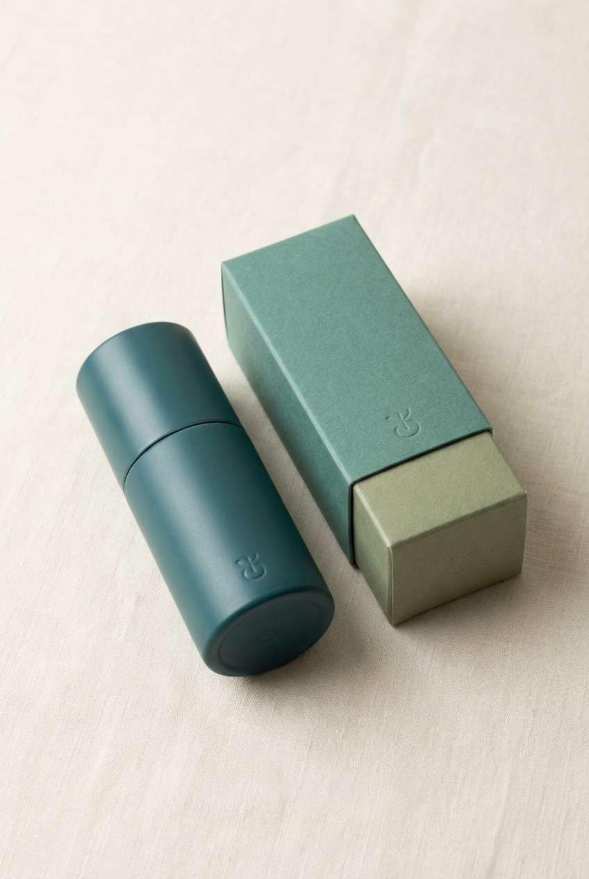
5) Ocean Kelp
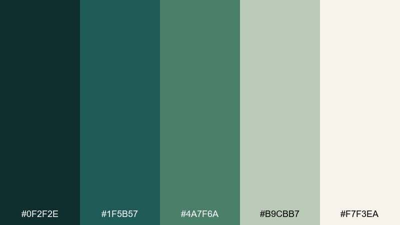
HEX: #0f2f2e #1f5b57 #4a7f6a #b9cbb7 #f7f3ea
Mood: deep and refreshing
Best for: skincare bottle packaging
Deep and refreshing, like seaweed forests just below the surface and cool salt air. The inky teal gives instant premium contrast, while the softer greens suggest clean, botanical ingredients. Pair it with a creamy background and minimal copy for that spa-level calm. Tip: make the darkest tone your cap or label band so the product reads crisp from a distance.
Image example of ocean kelp generated using media.io
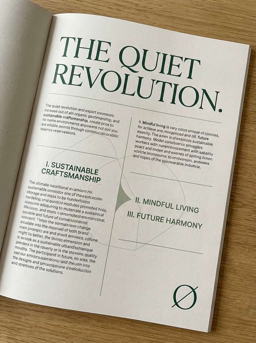
6) Pine Needle
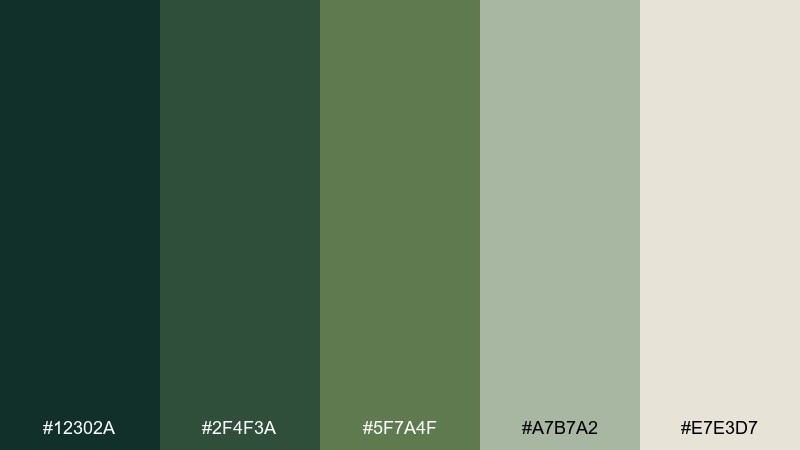
HEX: #12302a #2f4f3a #5f7a4f #a7b7a2 #e7e3d7
Mood: quiet and classic
Best for: magazine feature layout
Quiet and classic, like evergreen shadows and crisp winter air. The dark greens work beautifully for headlines and pull quotes, while the muted mid-green keeps body sections cohesive. Let the pale gray-beige act as paper tone to mimic an editorial page. Tip: use generous margins so the palette feels premium instead of heavy.
Image example of pine needle generated using media.io
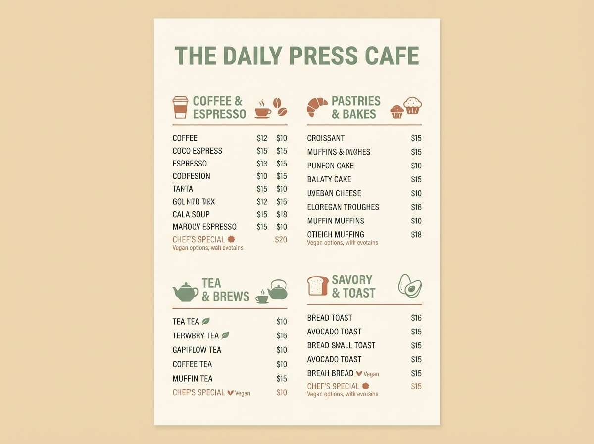
7) Desert Sage
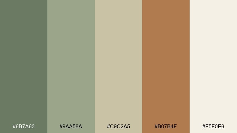
HEX: #6b7a63 #9aa58a #c9c2a5 #b07b4f #f5f0e6
Mood: soft and sun-faded
Best for: cafe menu design
Soft and sun-faded, like sagebrush, sand, and terracotta tiles at dusk. The sage tones are easy on the eyes for long menus, and the clay accent helps guide attention to specials. Pair this nature color scheme with warm cream backgrounds and simple iconography for a modern rustic feel. Tip: keep prices in the darkest sage to maintain hierarchy without harsh black.
Image example of desert sage generated using media.io
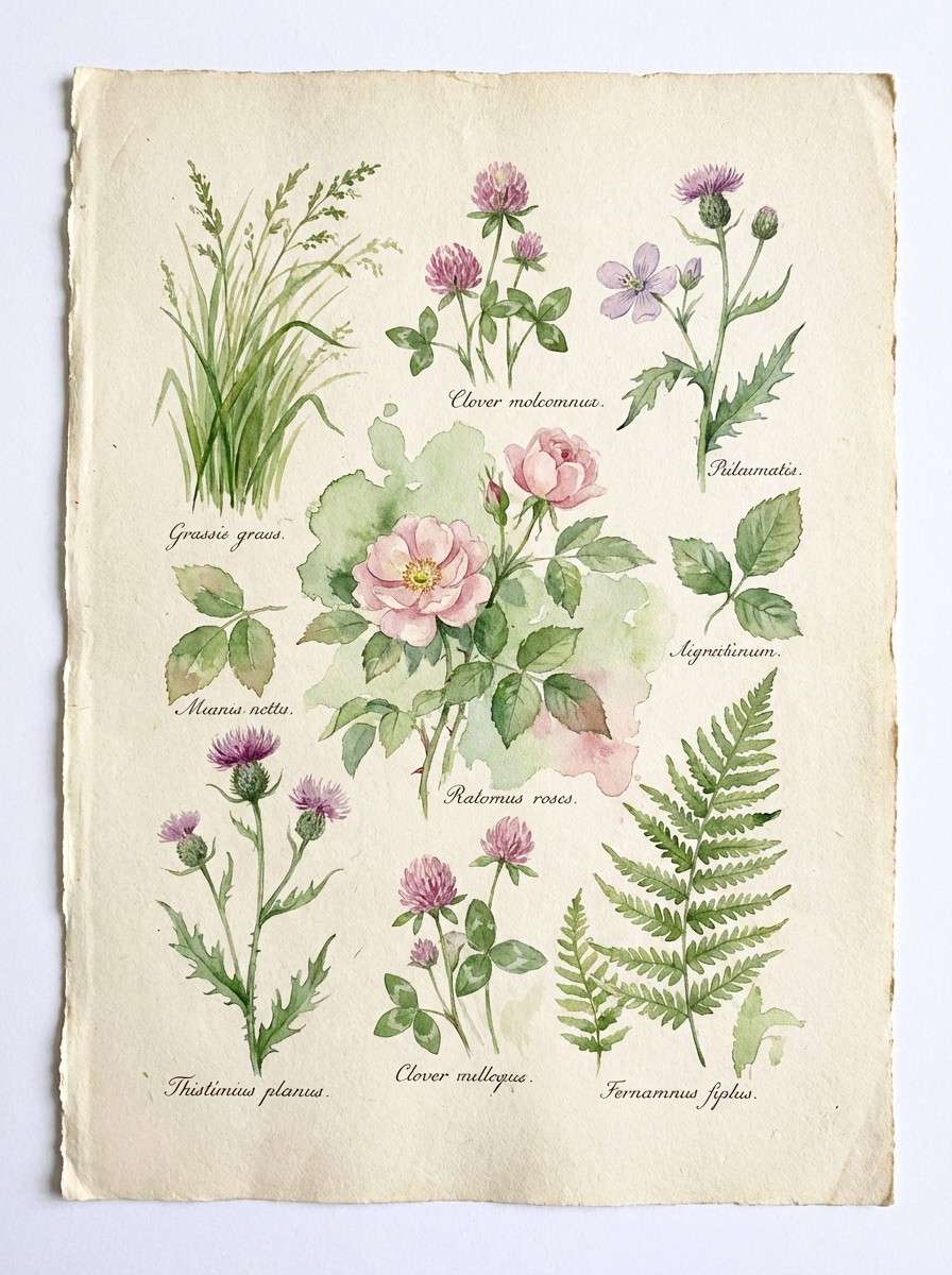
8) Wildflower Field
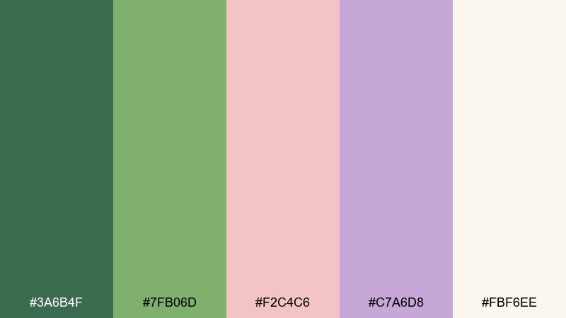
HEX: #3a6b4f #7fb06d #f2c4c6 #c7a6d8 #fbf6ee
Mood: playful and romantic
Best for: watercolor botanical print
Playful and romantic, like scattered blooms across fresh grass. The greens keep the pink and lavender from turning too sugary, making the overall look balanced and giftable. Use the cream as the paper base and let florals stay semi-transparent for a true watercolor feel. Tip: limit dark outlines so the pastel petals remain the star.
Image example of wildflower field generated using media.io
9) Rainy Granite
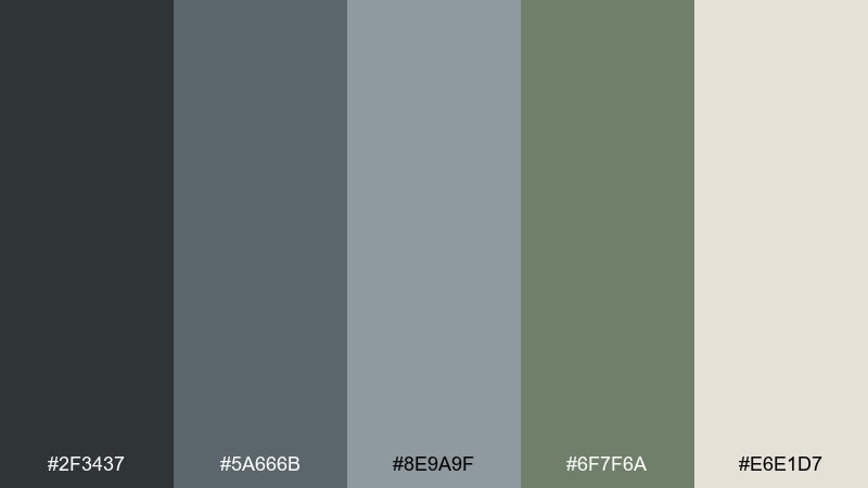
HEX: #2f3437 #5a666b #8e9a9f #6f7f6a #e6e1d7
Mood: moody and modern
Best for: architecture portfolio website ui
Moody and modern, like wet stone, fog, and muted greenery after a storm. The grays set a sophisticated foundation for image-heavy layouts, and the green-gray adds a subtle organic twist. Pair with crisp white space and thin rules for a gallery-like rhythm. Tip: use the darkest granite for navigation so content stays front and center.
Image example of rainy granite generated using media.io

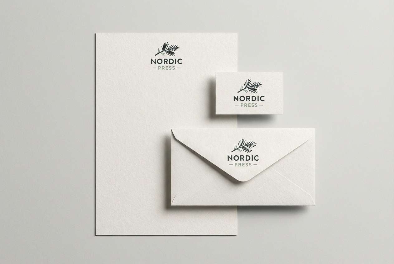
10) Birch Bark
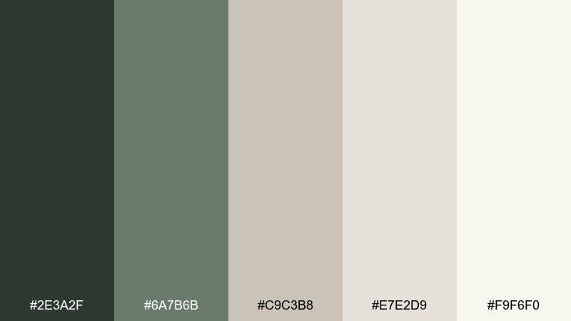
HEX: #2e3a2f #6a7b6b #c9c3b8 #e7e2d9 #f9f6f0
Mood: clean and airy
Best for: minimal logo and stationery
Clean and airy, like birch trunks against soft woodland haze. The palette leans neutral, so your logo forms and typography can do the talking without competing color noise. Use the pale tones for stationery stock and the dark green for marks, monograms, or seals. Tip: add texture with uncoated paper so the subtle grays do not feel flat.
Image example of birch bark generated using media.io
11) Autumn Fern
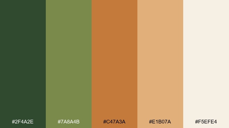
HEX: #2f4a2e #7a8a4b #c47a3a #e1b07a #f5efe4
Mood: warm and nostalgic
Best for: seasonal email newsletter header
Warm and nostalgic, like fern fronds turning gold beside sunlit leaves. The orange and amber shades create instant seasonal energy without feeling too loud. Pair these nature colors with the forest green for structure and use the cream for readable text blocks. Tip: keep gradients subtle so the palette still feels organic, not synthetic.
Image example of autumn fern generated using media.io
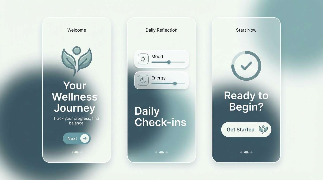
12) Glacier Mist
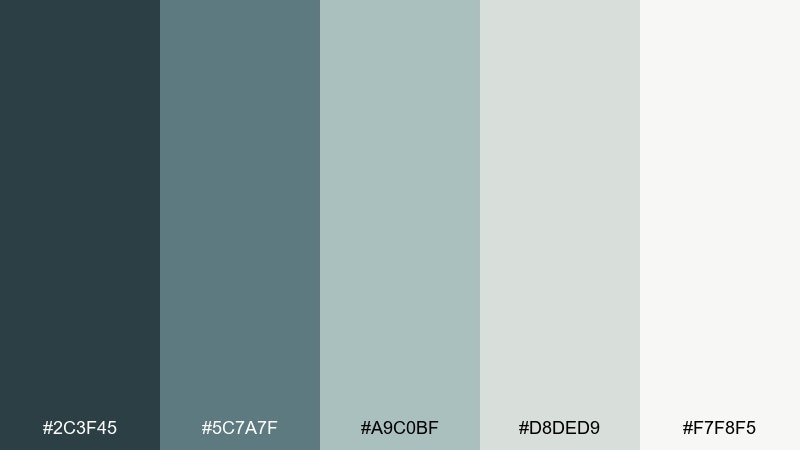
HEX: #2c3f45 #5c7a7f #a9c0bf #d8ded9 #f7f8f5
Mood: crisp and calming
Best for: wellness app onboarding ui
Crisp and calming, like cold air over a still lake with fog drifting in. The blue-green base reads fresh and trustworthy, perfect for wellness touchpoints. Use the light mist tones for screens and reserve the deep slate for primary buttons and key metrics. Tip: keep icon lines thin and soft to match the airy temperature.
Image example of glacier mist generated using media.io
13) Terracotta Trail
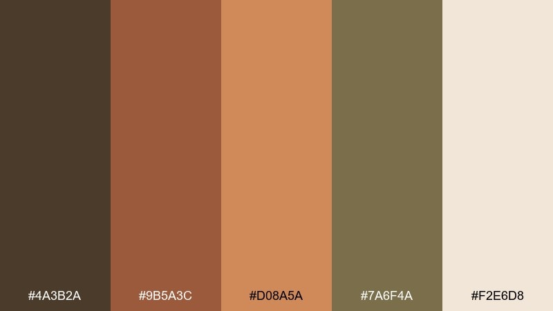
HEX: #4a3b2a #9b5a3c #d08a5a #7a6f4a #f2e6d8
Mood: earthy and bold
Best for: travel poster design
Earthy and bold, like a dusty trail cutting through sun-warmed rock. The terracotta range gives posters instant punch, while the olive-brown keeps the nature color palette grounded. Pair with simple silhouettes and large type for a modern retro vibe. Tip: use the cream tone as your sky or negative space so the warm hues stay readable.
Image example of terracotta trail generated using media.io
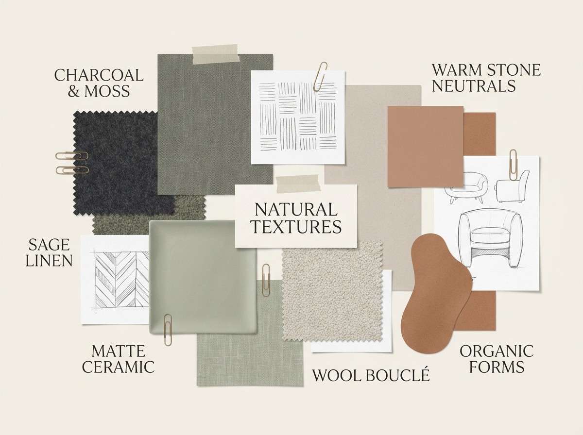
14) Lichen Stone
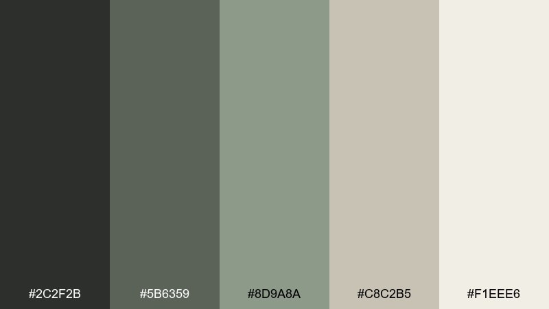
HEX: #2c2f2b #5b6359 #8d9a8a #c8c2b5 #f1eee6
Mood: minimal and organic
Best for: interior design mood board
Minimal and organic, like lichen on rock and weathered concrete. The grayscale greens make materials like linen, oak, and stone feel intentional rather than cold. Use the light warm neutral for backgrounds and the deepest tone for labels and swatches. Tip: keep accents matte and textured to avoid a sterile, glossy look.
Image example of lichen stone generated using media.io
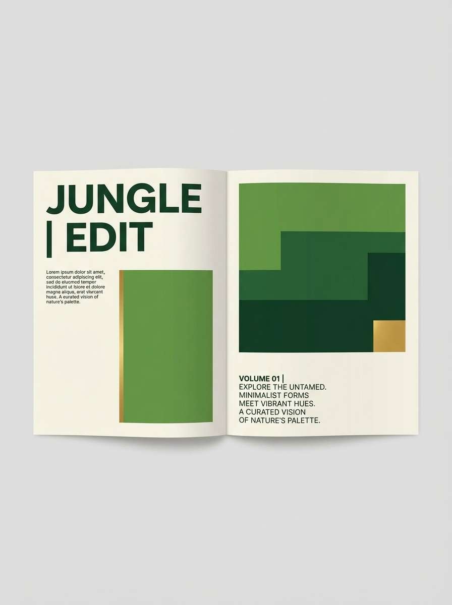
15) Tropical Canopy
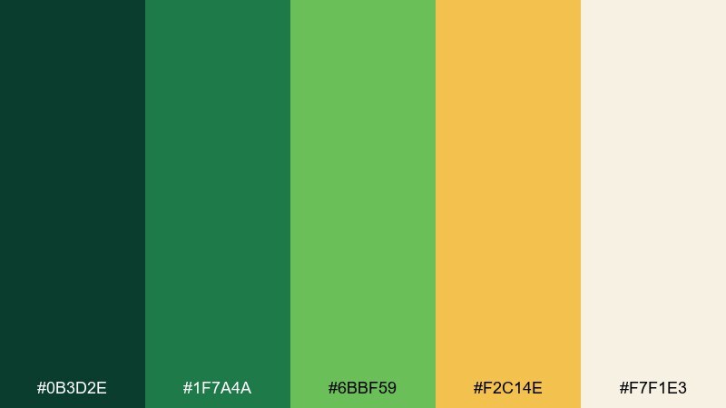
HEX: #0b3d2e #1f7a4a #6bbf59 #f2c14e #f7f1e3
Mood: lush and energetic
Best for: sustainable fashion lookbook spread
Lush and energetic, like dense leaves with sunbeams flashing through the canopy. These nature color combinations pop best when the bright leaf green and golden accent are used sparingly against deeper jungle tones. Pair with clean layouts and lots of cream space to keep it modern, not chaotic. Tip: let the yellow act as a single spotlight element, such as a callout or page number.
Image example of tropical canopy generated using media.io
16) River Pebble
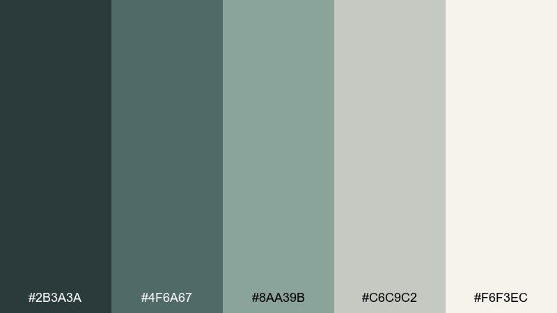
HEX: #2b3a3a #4f6a67 #8aa39b #c6c9c2 #f6f3ec
Mood: balanced and steady
Best for: business presentation slide deck
Balanced and steady, like smooth stones under clear moving water. The muted teals feel professional without going corporate-blue, and the soft gray gives charts an understated frame. Use the darkest shade for titles and the pale cream for slide backgrounds. Tip: keep data highlights to one mid-tone so the deck stays cohesive.
Image example of river pebble generated using media.io

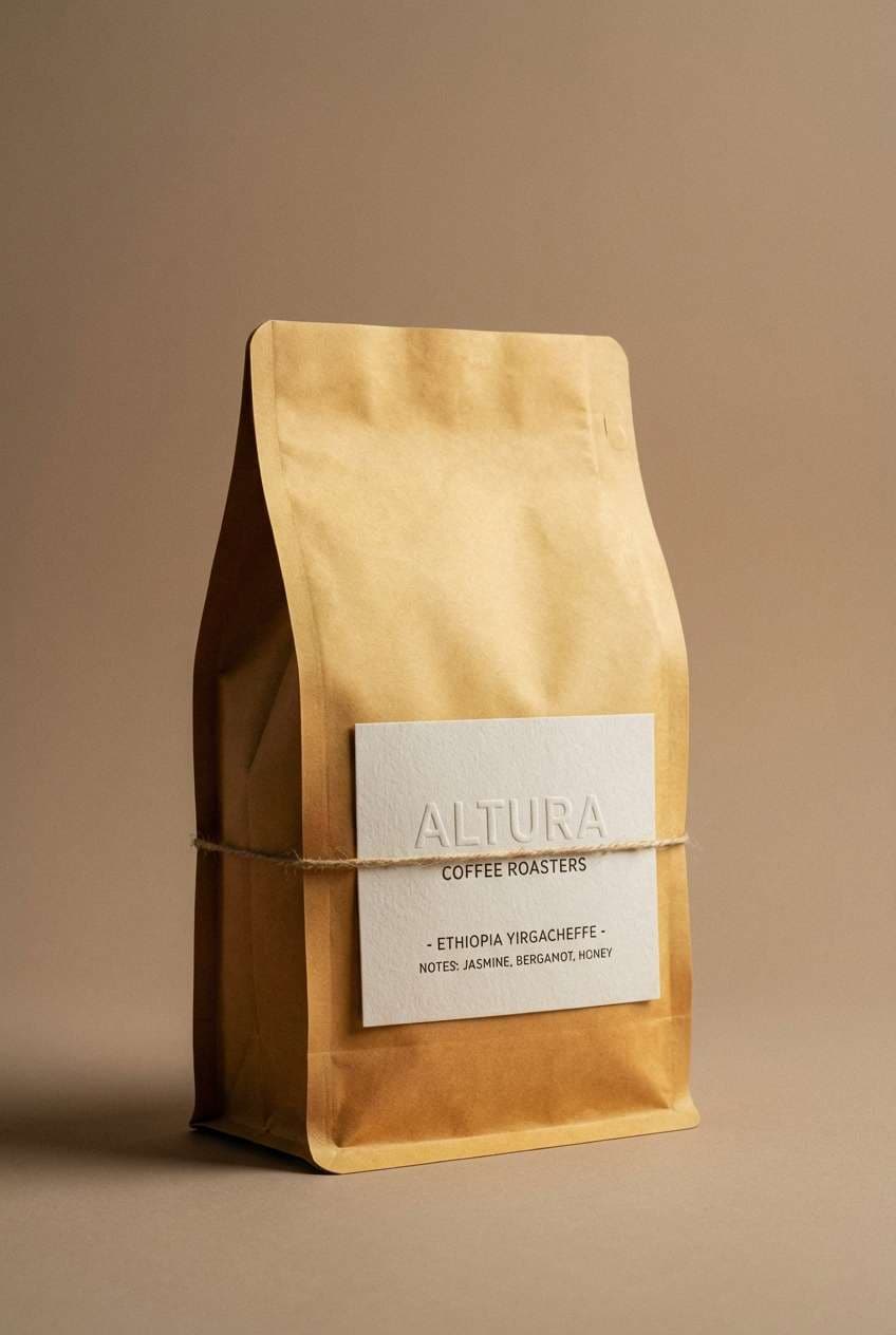
17) Golden Dune
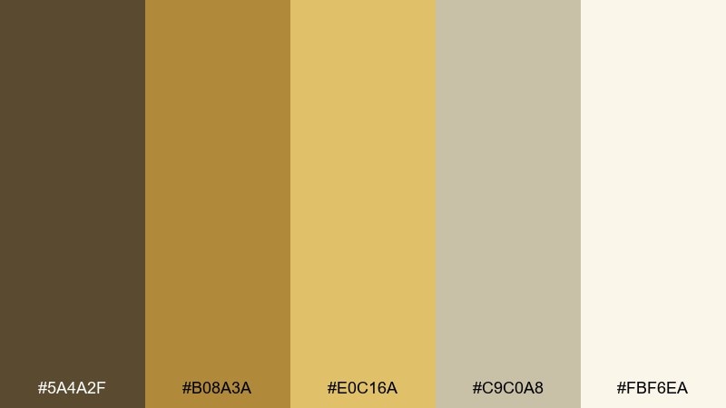
HEX: #5a4a2f #b08a3a #e0c16a #c9c0a8 #fbf6ea
Mood: warm and inviting
Best for: coffee bag packaging
Warm and inviting, like late sun on dunes and toasted grains. The golden tones make packaging feel rich and comforting, while the soft taupe keeps it refined. Pair with minimal line art and bold type for a specialty-roaster look. Tip: use the darkest brown for roast notes so readability stays strong on matte bags.
Image example of golden dune generated using media.io
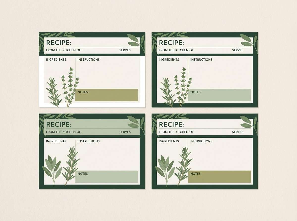
18) Herbal Garden
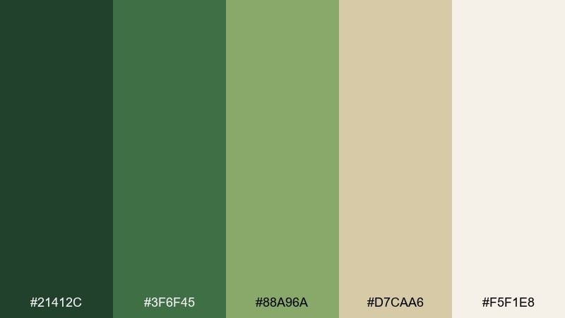
HEX: #21412c #3f6f45 #88a96a #d7caa6 #f5f1e8
Mood: fresh and wholesome
Best for: recipe card template set
Fresh and wholesome, like clipped herbs on a kitchen counter and warm sunlight through a window. The layered greens create an easy hierarchy for headings, ingredients, and notes. Use the oat-like neutral for cards so the layout feels cozy rather than clinical. Tip: keep accent shapes rounded to echo the softness of leaves.
Image example of herbal garden generated using media.io
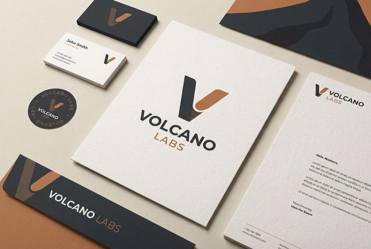
19) Volcanic Soil
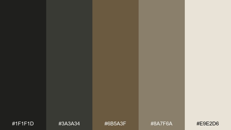
HEX: #1f1f1d #3a3a34 #6b5a3f #8a7f6a #e9e2d6
Mood: strong and elemental
Best for: tech startup brand kit
Strong and elemental, like black sand, ash rock, and sun-worn earth. As a nature color palette for tech, it feels grounded yet modern when paired with sharp grids and bold type. Let the dark tones own the logo and headers, and use the warm neutrals for backgrounds and product screenshots. Tip: add one restrained metallic finish (like foil on cards) to elevate the rugged base.
Image example of volcanic soil generated using media.io
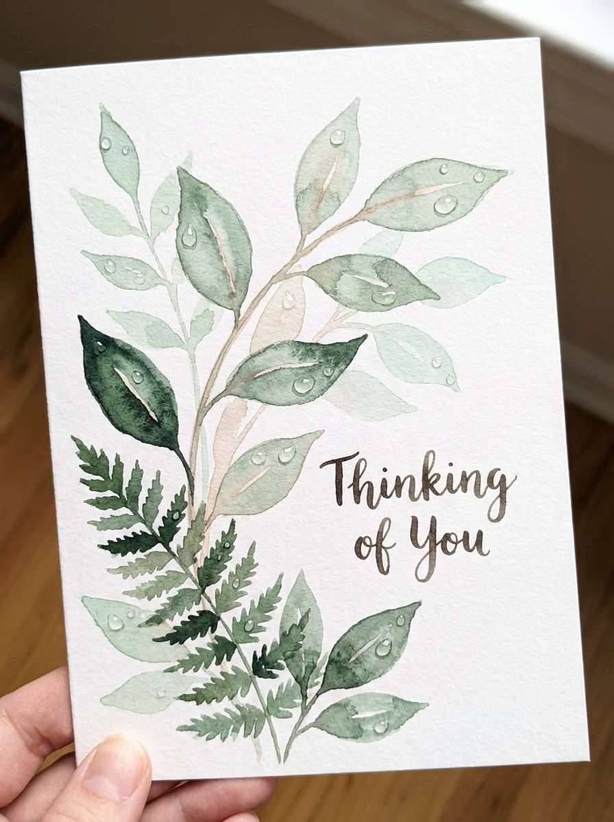
20) Morning Dew
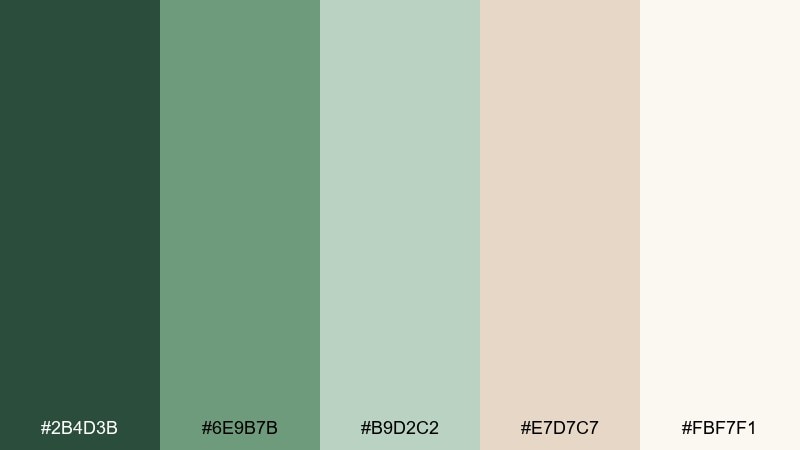
HEX: #2b4d3b #6e9b7b #b9d2c2 #e7d7c7 #fbf7f1
Mood: gentle and optimistic
Best for: watercolor greeting card
Gentle and optimistic, like dew on leaves with a pale sunrise in the background. The soft greens read soothing, and the blush-beige adds a quiet warmth that feels personal. Pair this nature color scheme with hand-lettered type and light botanical washes for a giftable finish. Tip: keep the darkest green to small details so the card stays airy.
Image example of morning dew generated using media.io
What Colors Go Well with Nature?
Nature tones pair best with other “quiet” colors: warm off-whites, stone grays, bark browns, and desaturated greens. These combinations keep the overall feel organic and reduce visual noise.
If you need extra contrast, add one deep anchor (evergreen, charcoal, or inky teal) and keep everything else lighter. This helps UI elements, headlines, and packaging labels stay crisp.
For a fresher look, introduce a single sunlit accent like golden yellow or muted peach. Used sparingly, it adds warmth without breaking the grounded, earthy mood.
How to Use a Nature Color Palette in Real Designs
Start with roles: pick one dark shade for text and primary UI, one mid tone for components, and a light neutral for backgrounds. This makes a nature color scheme feel intentional, not muddy.
Let materials do some of the work. Nature palettes shine on uncoated paper, kraft textures, matte packaging, and softly lit product photos where subtle shifts in green and brown stay visible.
Keep saturation under control. When you add a brighter leaf green, floral pink, or golden highlight, treat it as an accent for buttons, badges, or callouts so the design still feels calm.
Create Nature Palette Visuals with AI
Want to see your nature color palette in context (packaging, UI screens, posters, or stationery)? Generate quick mockups using the prompts above and adjust the subject, lighting, and layout to match your project.
With Media.io, you can iterate fast: try a “forest” direction with deep greens, then switch to “desert sage” neutrals, all while keeping a consistent composition for easy comparison.
Once you like the direction, export and refine the visuals for presentations, mood boards, or client approvals.
Nature Color Palette FAQs
-
What is a nature color palette?
A nature color palette is a set of colors inspired by outdoor environments—think forest greens, soil browns, stone grays, sand beiges, and soft sky or water tones—used together for a cohesive, organic look. -
Which HEX colors are most common in nature color schemes?
Common picks include deep greens (evergreen/teal-green), warm browns (bark/terracotta), muted olives, and light neutrals like cream, sand, or stone. Many of the palettes above follow that “dark anchor + mid greens + light neutral” structure. -
How do I keep a nature palette from looking muddy?
Use one dark anchor for type, keep backgrounds light (cream/off-white), and limit mid-tone greens in the same area. Also check contrast ratios and reserve the lightest sage tones for subtle UI states. -
What nature palettes work best for branding?
For premium, grounded branding, try Forest Floor, Volcanic Soil, or Birch Bark. If you want a fresher “botanical” vibe, Ocean Kelp and Herbal Garden are strong options. -
Can nature color combinations work for modern UI?
Yes. Palettes like Mossy Creek, Glacier Mist, Rainy Granite, and River Pebble feel modern when paired with clean typography, generous spacing, and a restrained accent color for buttons or highlights. -
What is a good accent color for earthy tones?
Muted golden yellow, warm peach, or terracotta works well as an accent against greens and neutrals. Use accents sparingly (for CTAs, badges, or key data points) to keep the palette calm. -
How can I generate nature palette mockups quickly?
Use Media.io text-to-image with a clear subject (like “packaging set” or “dashboard UI”), specify your palette colors, and keep the background neutral. Then iterate by swapping only one element (lighting, material, or accent usage) per version.
Next: Timberwolf Color Palette


