

Timberwolf is a soft greige neutral that sits between warm gray and beige, making it easy to pair with both cool and warm accents. It’s a go-to base for modern minimalism, calm interiors, and clean UI backgrounds.
Below are 20 ready-to-use timberwolf color palette ideas with HEX codes—each with a practical use case and an AI prompt you can reuse to generate matching visuals.
In this article
Why Timberwolf Palettes Work So Well
Timberwolf works because it’s neutral without feeling cold. As a balanced greige, it gives you the clarity of gray with a subtle warmth that keeps designs from looking sterile.
It also supports strong hierarchy. Light timberwolf tones create breathable backgrounds, while deeper charcoals and browns deliver contrast for readable typography, UI states, and print details.
Most importantly, timberwolf is flexible across mediums. It looks natural on paper, premium on packaging, calm in interior palettes, and highly usable in digital design systems.
20+ Timberwolf Color Palette Ideas (with HEX Codes)
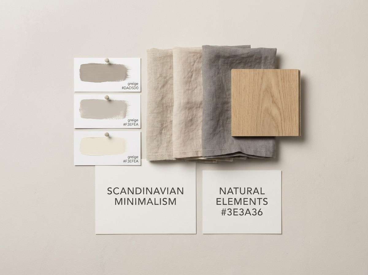
1) Fog Linen
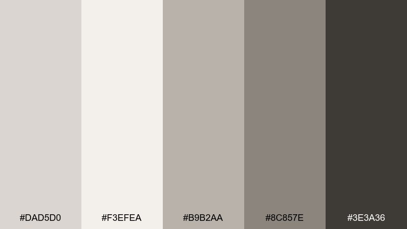
HEX: #DAD5D0 #F3EFEA #B9B2AA #8C857E #3E3A36
Mood: airy, calm, minimalist
Best for: scandinavian interior moodboard and home decor styling
Airy and quiet like morning fog over fresh linen, these soft greiges keep a space feeling open. Use the light tones for walls or backgrounds, then anchor with the deep charcoal for contrast and legibility. It works beautifully with natural wood, brushed steel, and matte black fixtures. Tip: keep texture doing the heavy lifting by mixing linen, boucle, and smooth stone in the same color family.
Image example of fog linen generated using media.io
Media.io is an online AI studio for creating and editing video, image, and audio in your browser.

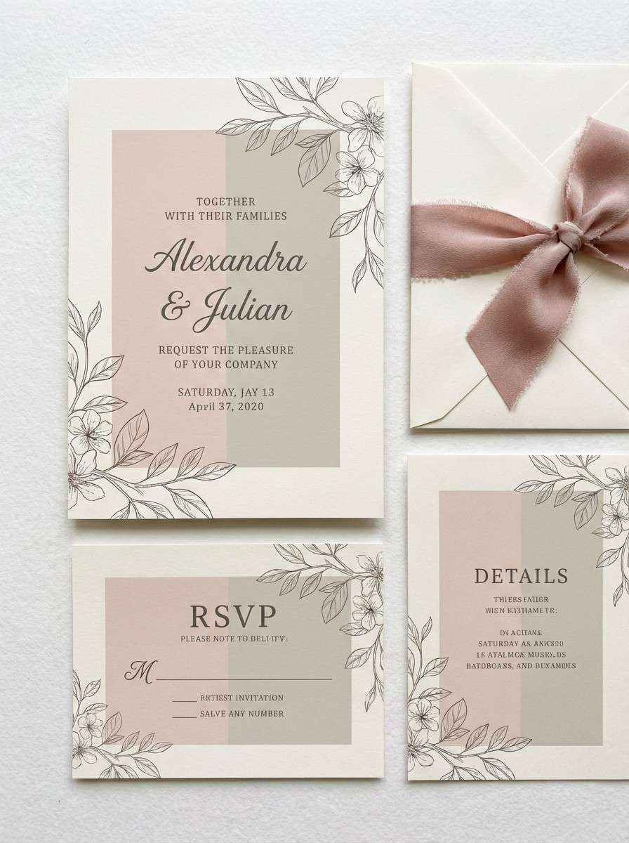
2) Driftwood Rose
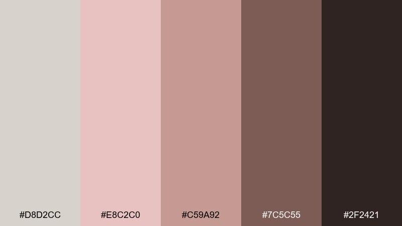
HEX: #D8D2CC #E8C2C0 #C59A92 #7C5C55 #2F2421
Mood: romantic, grounded, vintage
Best for: wedding invitation suite and stationery design
Romantic and grounded like sun-faded driftwood with a blush tint, this mix feels warm without turning sugary. These timberwolf color combinations shine on invitations, menus, and save-the-dates where you want softness plus readable type. Pair with ivory paper stock, copper foil, and a serif headline for a refined finish. Tip: set body text in the deep brown and keep blush for borders, florals, or monograms so the layout stays crisp.
Image example of driftwood rose generated using media.io
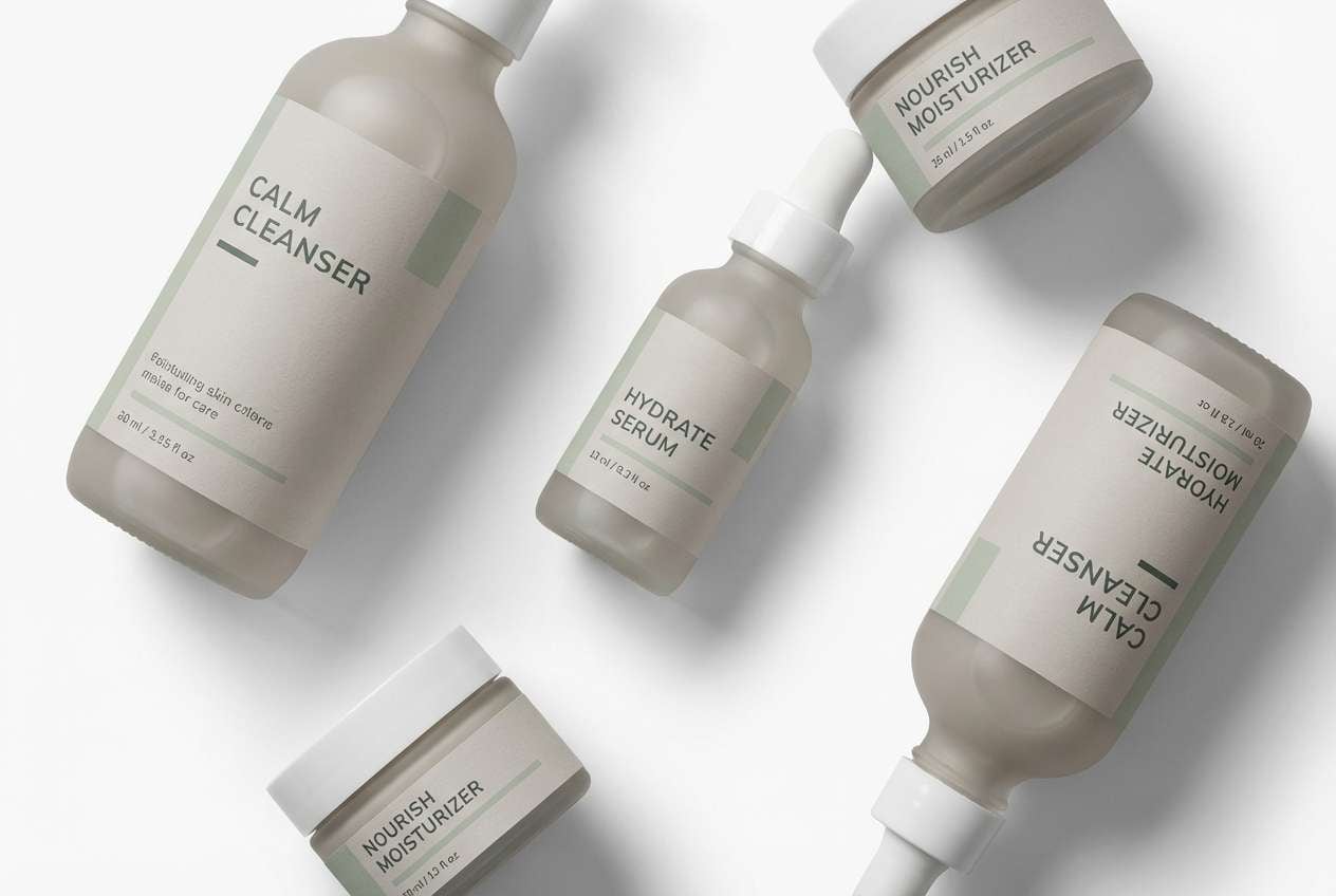
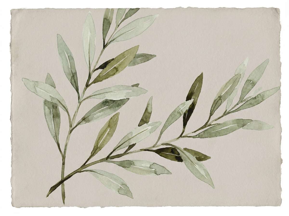
3) Sage Ash
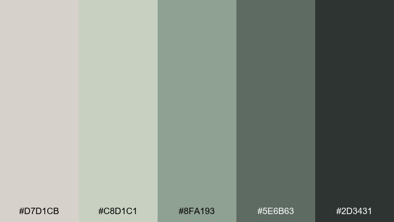
HEX: #D7D1CB #C8D1C1 #8FA193 #5E6B63 #2D3431
Mood: fresh, balanced, botanical
Best for: wellness branding and skincare packaging
Fresh and balanced like sage leaves dusted with soft ash, this palette reads clean and trustworthy. The muted greens add life while the neutrals keep everything premium and calm. It pairs naturally with recycled textures, uncoated paper, and simple icon systems. Tip: use the darkest green for logos and ingredient headers to avoid the washed-out look common in pastel packaging.
Image example of sage ash generated using media.io
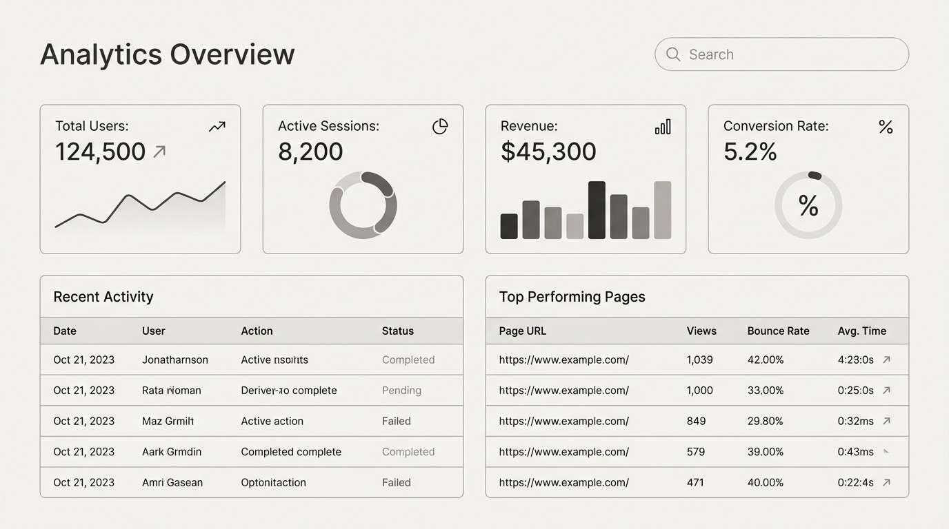
4) Modern Concrete
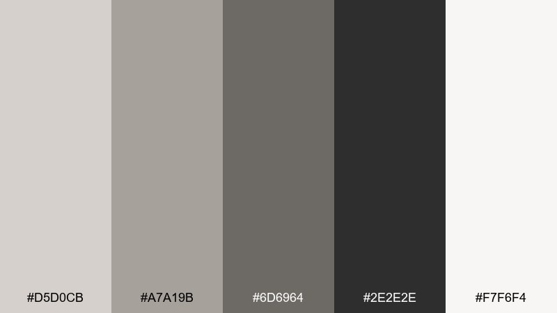
HEX: #D5D0CB #A7A19B #6D6964 #2E2E2E #F7F6F4
Mood: urban, sleek, modern
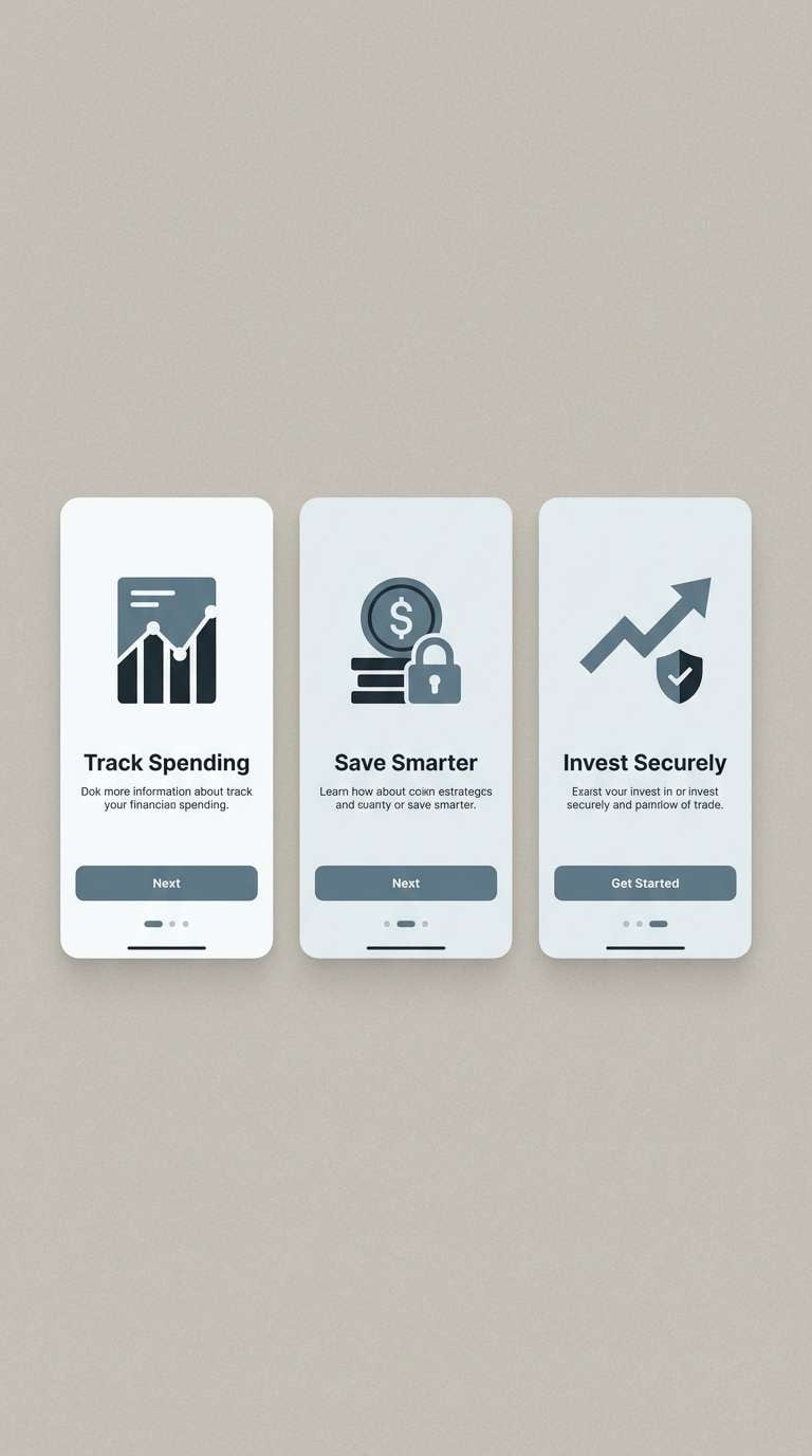
Best for: dashboard UI and data-heavy SaaS interfaces
Urban and sleek like polished concrete in a bright studio, these neutrals are built for clarity. A timberwolf color palette like this keeps charts and tables readable while still feeling modern. Pair it with one bold accent color for alerts and calls to action, and let the grays handle layout hierarchy. Tip: reserve the near-black for primary text only, then use mid-gray for dividers to reduce visual noise.
Image example of modern concrete generated using media.io
5) Cocoa Oat
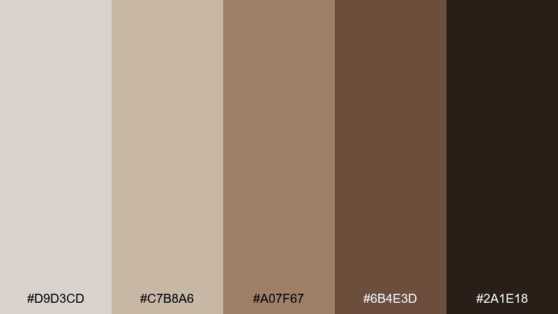
HEX: #D9D3CD #C7B8A6 #A07F67 #6B4E3D #2A1E18
Mood: cozy, earthy, artisanal
Best for: coffee brand labels and cafe menu design
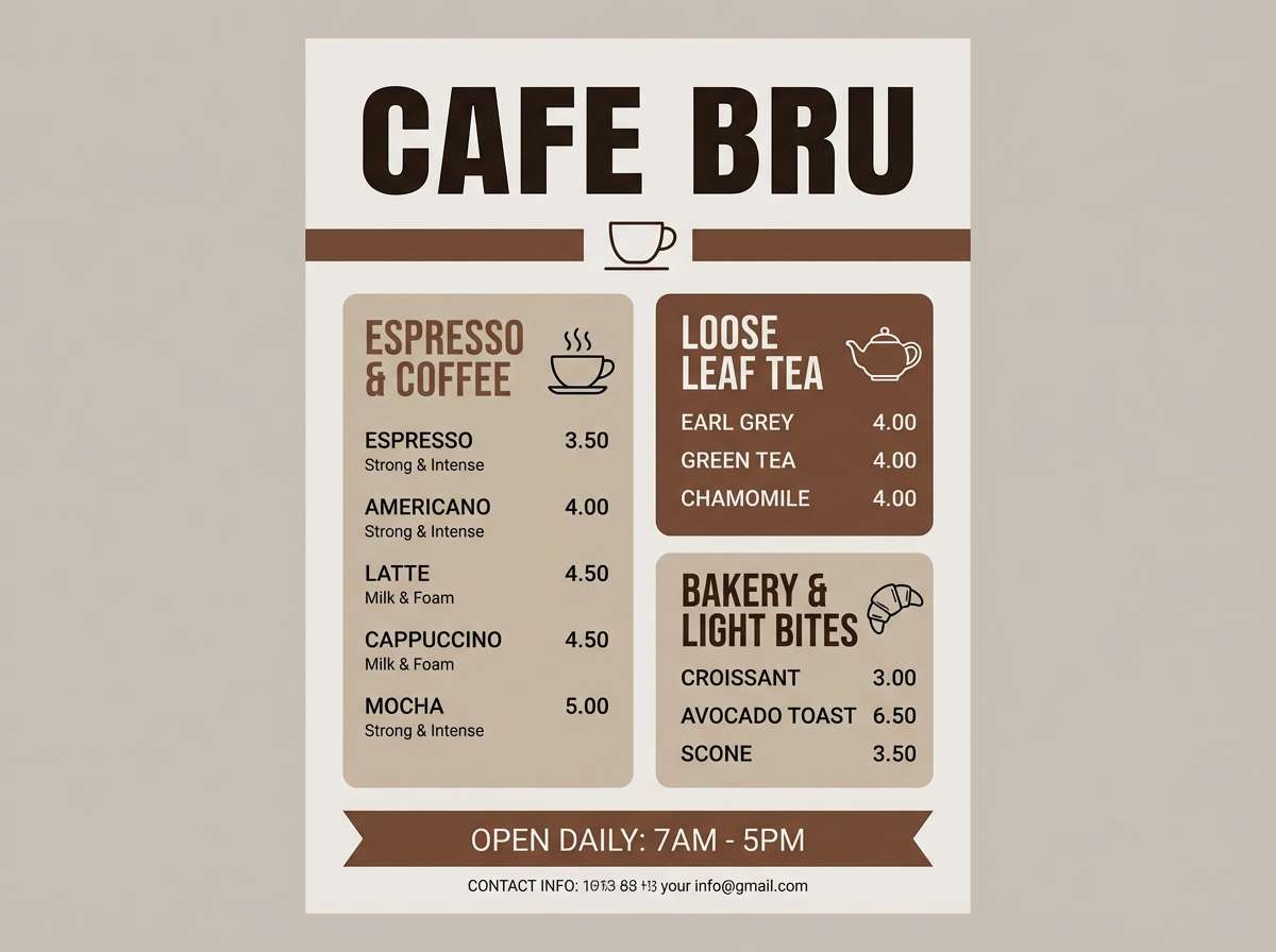
Cozy and earthy like toasted oats and cocoa powder, this set feels handmade and inviting. Use the warm mid-browns for headers and price highlights, with the pale greige as a clean canvas. It pairs well with kraft paper textures, stamped marks, and simple line illustrations. Tip: keep gradients out and lean into solid fills to preserve that artisanal, print-friendly look.
Image example of cocoa oat generated using media.io
6) Sea Mist Neutral
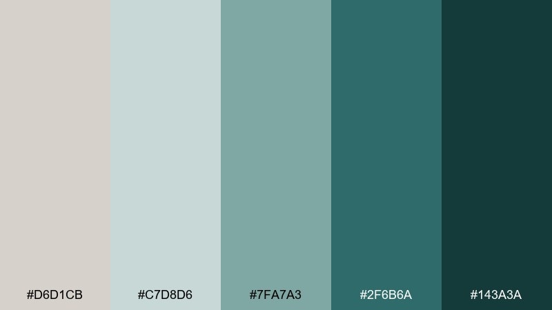
HEX: #D6D1CB #C7D8D6 #7FA7A3 #2F6B6A #143A3A
Mood: coastal, clean, soothing
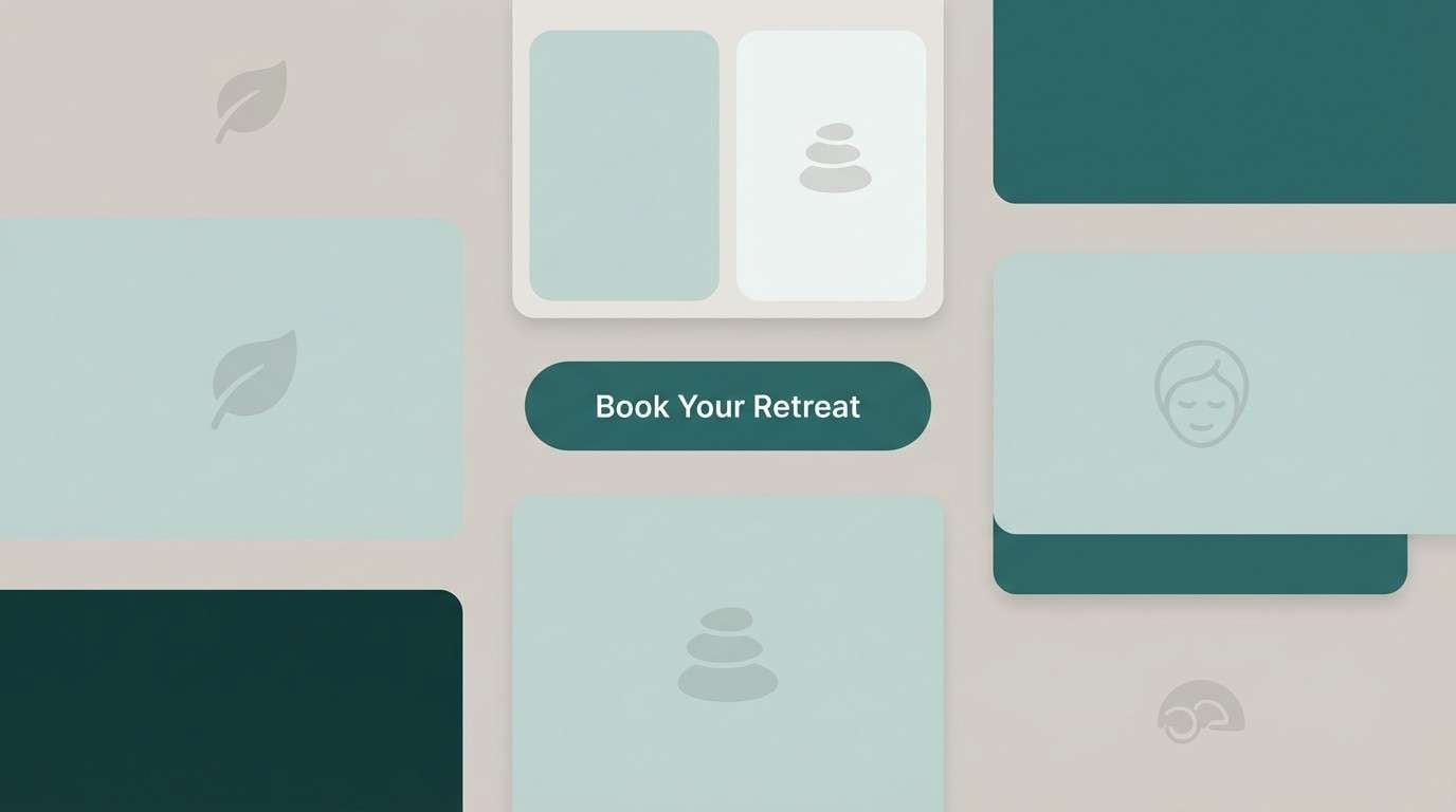
Best for: spa landing page UI and wellness web design
Coastal and soothing like sea mist rolling in over stone, these cool teals freshen up a soft neutral base. Use the pale tones for spacious sections and the deep teal for buttons and nav states. It looks best with lots of whitespace, rounded corners, and gentle photography. Tip: keep links and primary actions in the same teal family so the interface feels calm, not busy.
Image example of sea mist neutral generated using media.io
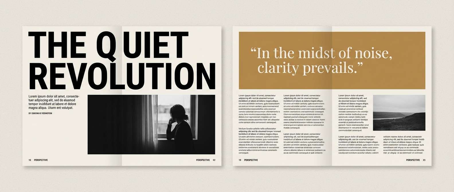
7) Ink and Parchment
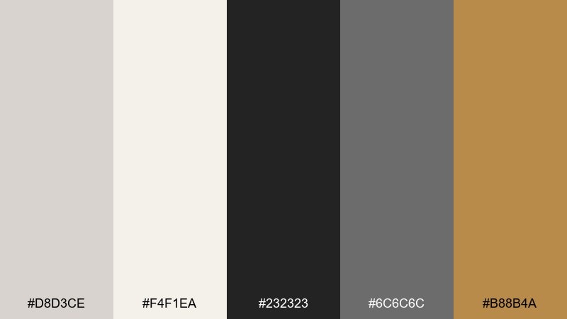
HEX: #D8D3CE #F4F1EA #232323 #6C6C6C #B88B4A
Mood: editorial, refined, classic
Best for: magazine layout and editorial design systems
Refined and editorial like ink on warm parchment, this mix is timeless and sharp. The golden tan works as a subtle highlight for pull quotes, section labels, or infographics. Pair with crisp grids, high-contrast photography, and a strong typographic scale. Tip: use the parchment tone for page backgrounds to soften pure white and reduce glare on long reads.
Image example of ink and parchment generated using media.io
8) Blush Sandstone

HEX: #DAD4CF #F2D6D3 #D9A6A0 #A36E66 #5A3C37
Mood: soft, friendly, approachable
Best for: beauty social posts and influencer brand templates
Soft and friendly like blush-tinted sandstone, these tones feel approachable and flattering. Use the pale pink as a background wash, then bring in the deeper rose for stickers, headings, or highlight bars. It pairs nicely with rounded sans fonts and simple product cutouts. Tip: keep skin tones natural by using the brown as the primary text color instead of pure black.
Image example of blush sandstone generated using media.io
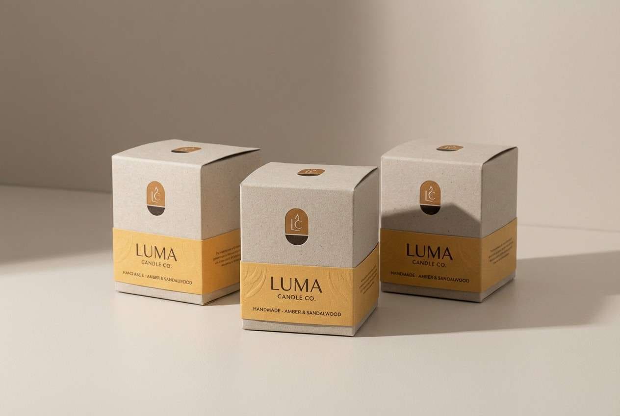
9) Amber Clay
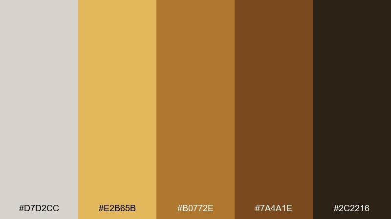
HEX: #D7D2CC #E2B65B #B0772E #7A4A1E #2C2216
Mood: sunlit, rustic, energetic
Best for: craft product ads and handmade goods packaging
Sunlit and rustic like amber glaze over warm clay, this set adds energy without going neon. A timberwolf color combination like this works great when you want a natural base plus a confident hero accent. Pair the gold with minimal typography and plenty of breathing room so it feels premium, not loud. Tip: use the deep brown for shadows and outlines to keep the amber from overpowering small elements.
Image example of amber clay generated using media.io
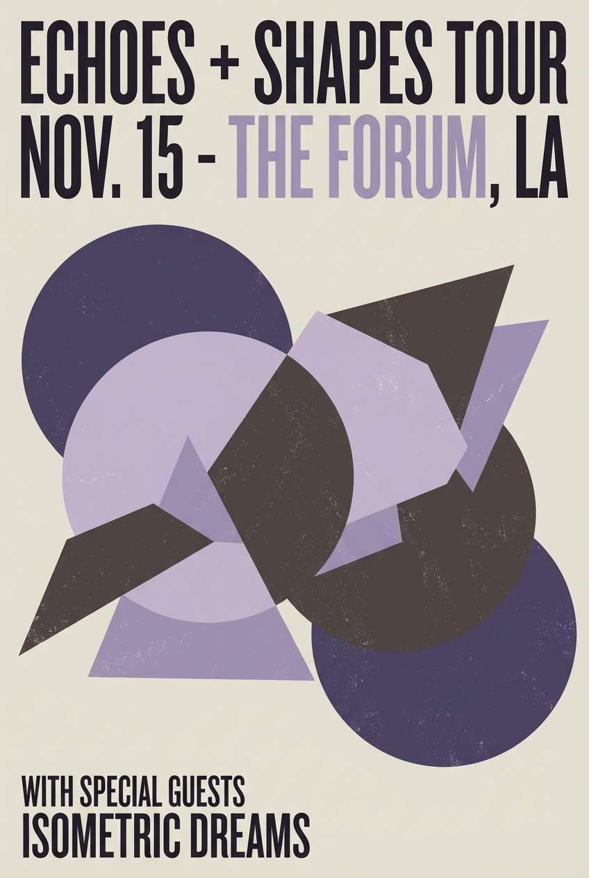
10) Lavender Smoke
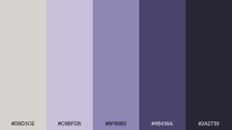
HEX: #D8D3CE #C8BFD8 #8F86B5 #4B436A #2A2735
Mood: dreamy, quiet, modern
Best for: music poster design and event flyers
Dreamy and quiet like lavender haze drifting through evening air, these purples feel modern and understated. Use the pale smoke tone as a base, then lean on the deep indigo for headlines and artist names. It pairs well with grain texture, geometric shapes, and minimal photography overlays. Tip: keep the mid lavender for secondary text or badges so the hierarchy stays clear.
Image example of lavender smoke generated using media.io
11) Glacier Greige
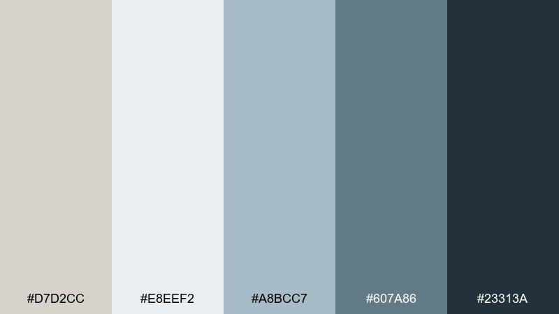
HEX: #D7D2CC #E8EEF2 #A8BCC7 #607A86 #23313A
Mood: crisp, professional, dependable
Best for: fintech branding and app onboarding screens
Crisp and dependable like glacier light on stone, this cool-leaning neutral set feels trustworthy. In a timberwolf color scheme, the blue-grays are perfect for UI depth, charts, and subtle emphasis without shouting. Pair with a single bright accent for success states, and keep typography high-contrast for accessibility. Tip: use the light icy tone for cards and modals to create clean separation from the main background.
Image example of glacier greige generated using media.io
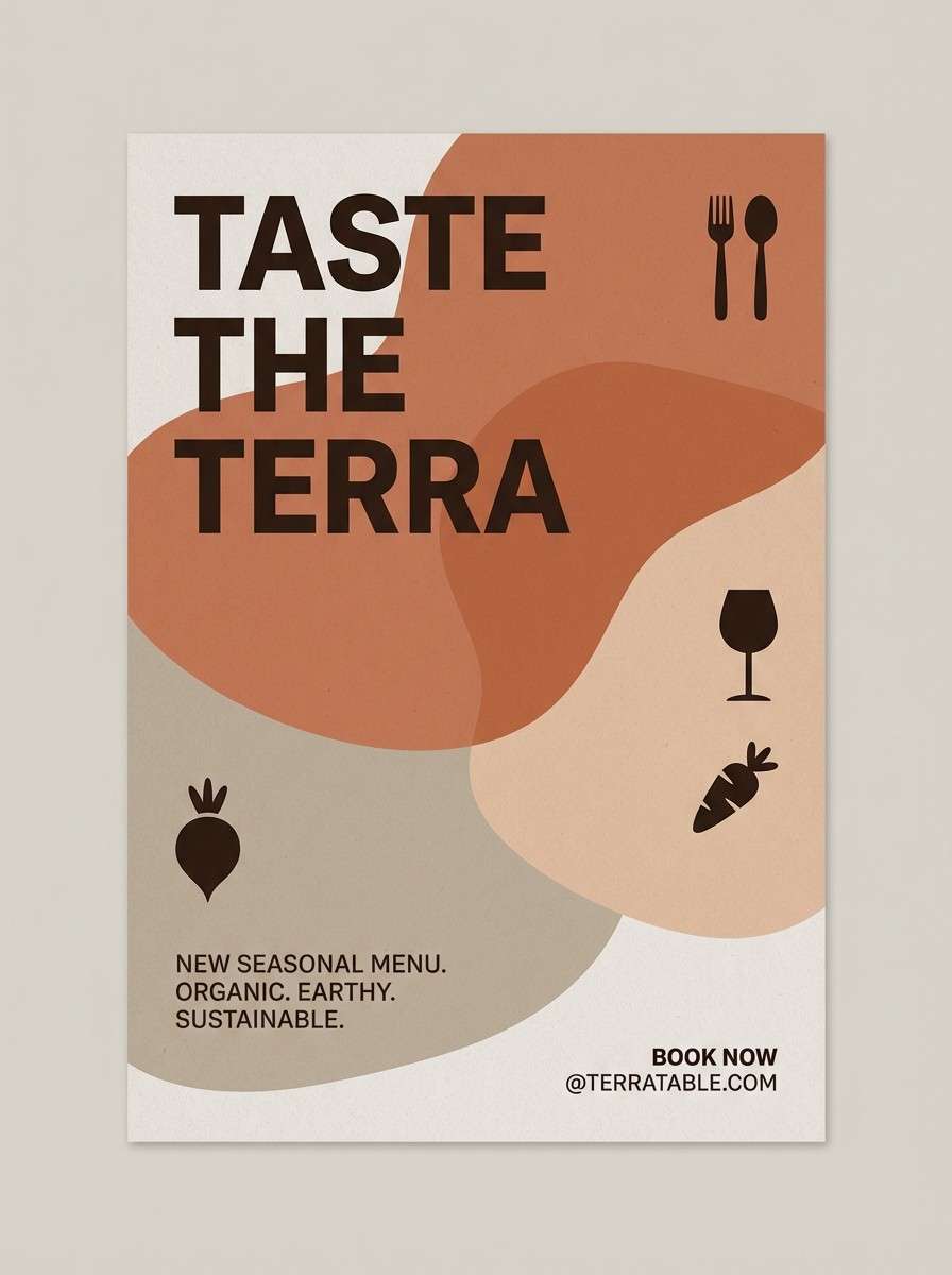
12) Terracotta Dust
HEX: #D9D3CD #E6C1A6 #C97D5D #8A4A34 #2F201A
Mood: warm, earthy, welcoming
Best for: restaurant branding and seasonal promo posters
Warm and welcoming like terracotta dust on sunbaked stone, these hues feel grounded and appetizing. Use the soft peachy beige for backgrounds and the terracotta for headers, stamps, and highlights. It pairs especially well with food photography, textured paper, and hand-drawn accents. Tip: keep the darkest brown for small type and logos so the warmer tones can stay the star.
Image example of terracotta dust generated using media.io
13) Olive Paper
HEX: #D8D2CC #D8DCC7 #A3A87B #5E5F3D #2D2E1B
Mood: natural, muted, organic
Best for: botanical illustration prints and eco packaging
Natural and muted like olive leaves pressed onto recycled paper, this mix is calm and earthy. The yellow-green notes add a gentle lift while the deep olive brings contrast for labels and linework. Pair with watercolor textures, kraft stock, and simple stamp-style graphics. Tip: use the darkest olive sparingly as an outline color to keep the overall look light and breathable.
Image example of olive paper generated using media.io
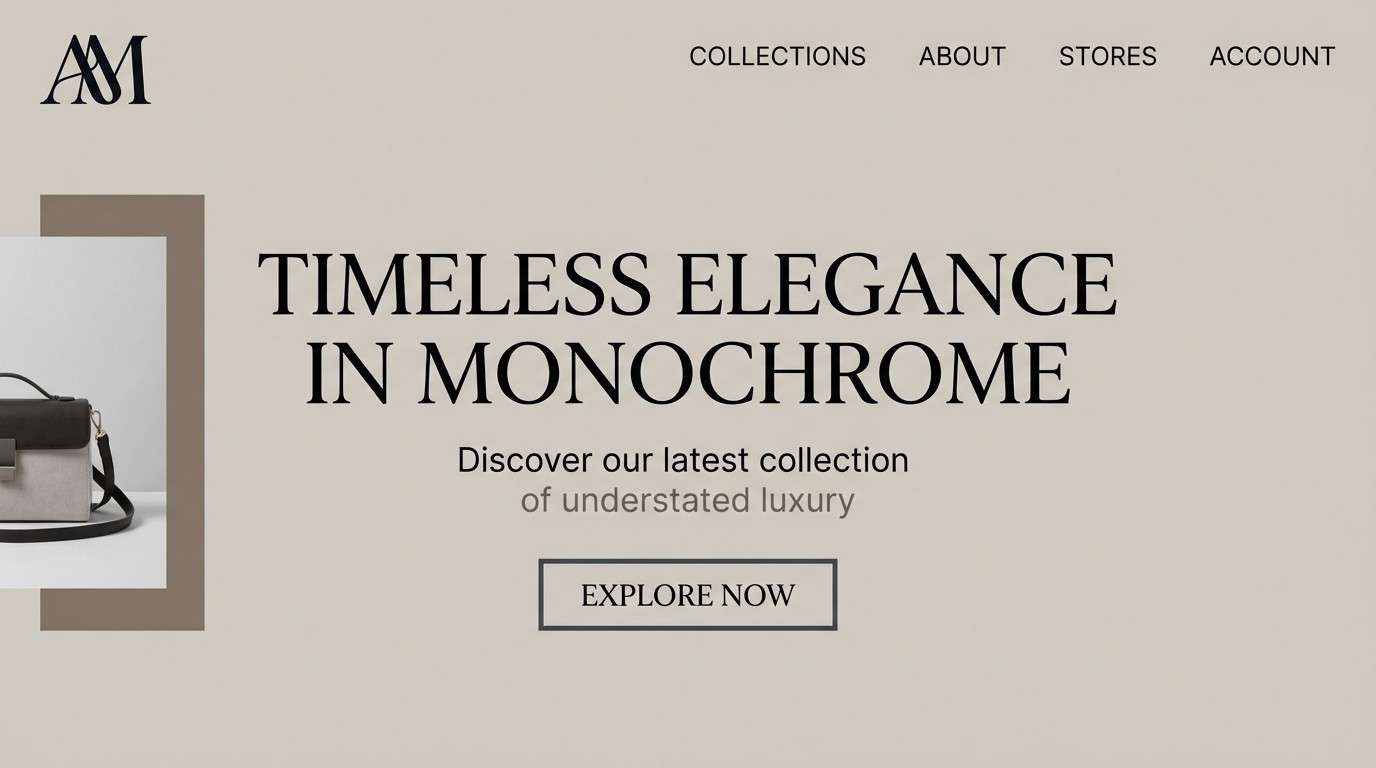
14) Nightfall Neutral
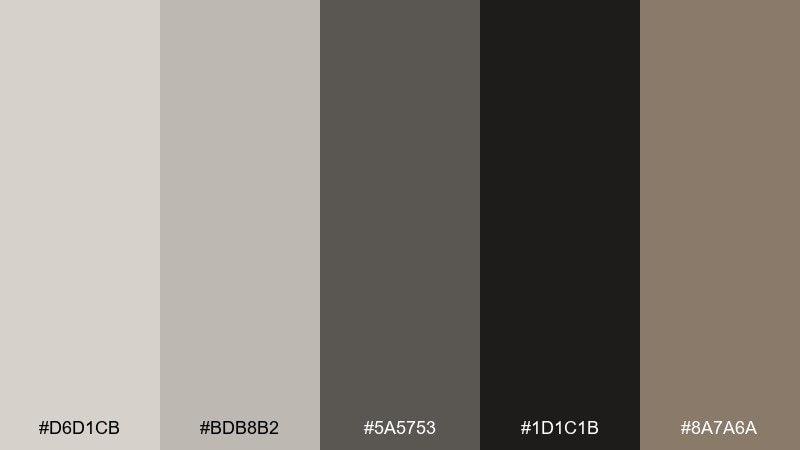
HEX: #D6D1CB #BDB8B2 #5A5753 #1D1C1B #8A7A6A
Mood: moody, elegant, high-contrast
Best for: luxury branding and monochrome web themes
Moody and elegant like night settling over stone, this neutral range feels premium and confident. Use the pale greige for negative space, then layer mid grays for components and dividers. It pairs well with metallic accents, large serif type, and minimal photography. Tip: shift shadows toward the warm taupe so the dark sections look rich rather than flat black.
Image example of nightfall neutral generated using media.io
15) Peach Milk
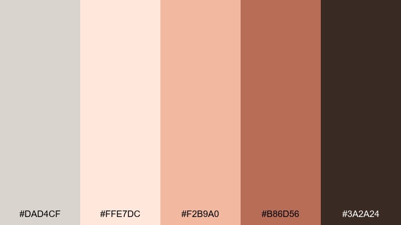
HEX: #DAD4CF #FFE7DC #F2B9A0 #B86D56 #3A2A24
Mood: sweet, soft, comforting
Best for: bakery packaging and dessert product labels
Sweet and comforting like peach milk in a ceramic cup, these warms feel friendly and nostalgic. A timberwolf color palette with peach accents is great for labels, stickers, and small-format packaging where warmth helps sell the taste. Pair with creamy backgrounds, rounded badges, and a playful script for highlights. Tip: keep the darkest brown for ingredients and barcodes so regulatory text stays readable.
Image example of peach milk generated using media.io
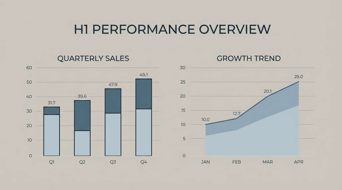
16) Steel Blue Greige
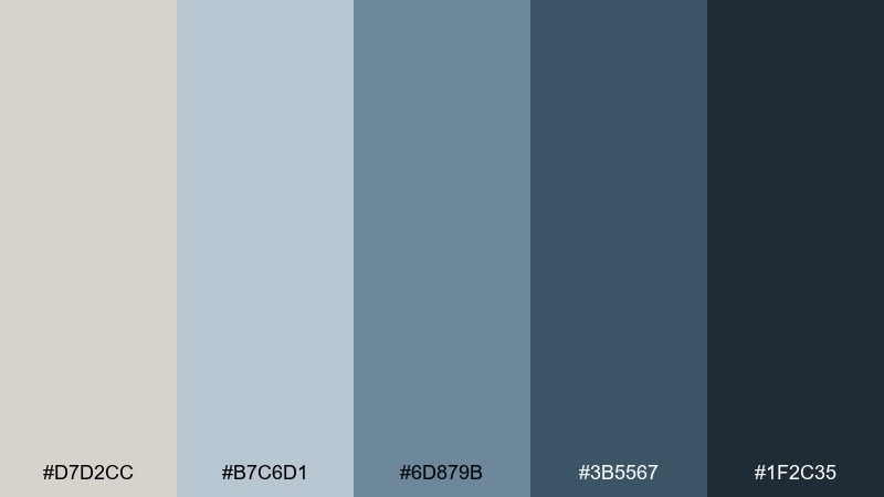
HEX: #D7D2CC #B7C6D1 #6D879B #3B5567 #1F2C35
Mood: technical, calm, modern
Best for: B2B presentation slides and reports
Technical and calm like steel under soft daylight, these blue-grays feel capable and modern. Use the light greige for slide backgrounds, then rely on the deeper blues for headings, charts, and callouts. It pairs well with clean sans typography and simple line icons. Tip: keep charts to two dominant data colors and let the neutrals handle everything else.
Image example of steel blue greige generated using media.io
17) Forest Ink
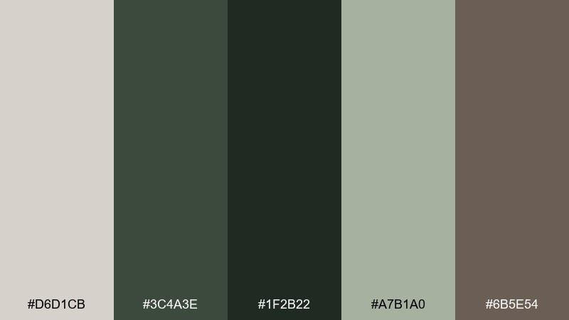
HEX: #D6D1CB #3C4A3E #1F2B22 #A7B1A0 #6B5E54
Mood: grounded, outdoorsy, sophisticated
Best for: outdoor gear branding and hang tag design
Grounded and outdoorsy like forest shade on weathered bark, these greens feel rugged but refined. Use the greige as a clean base, then bring in deep evergreen for logos and category labels. It pairs nicely with kraft textures, topographic lines, and subtle embossing. Tip: reserve the darkest green for small text and marks so it reads clearly on matte stocks.
Image example of forest ink generated using media.io

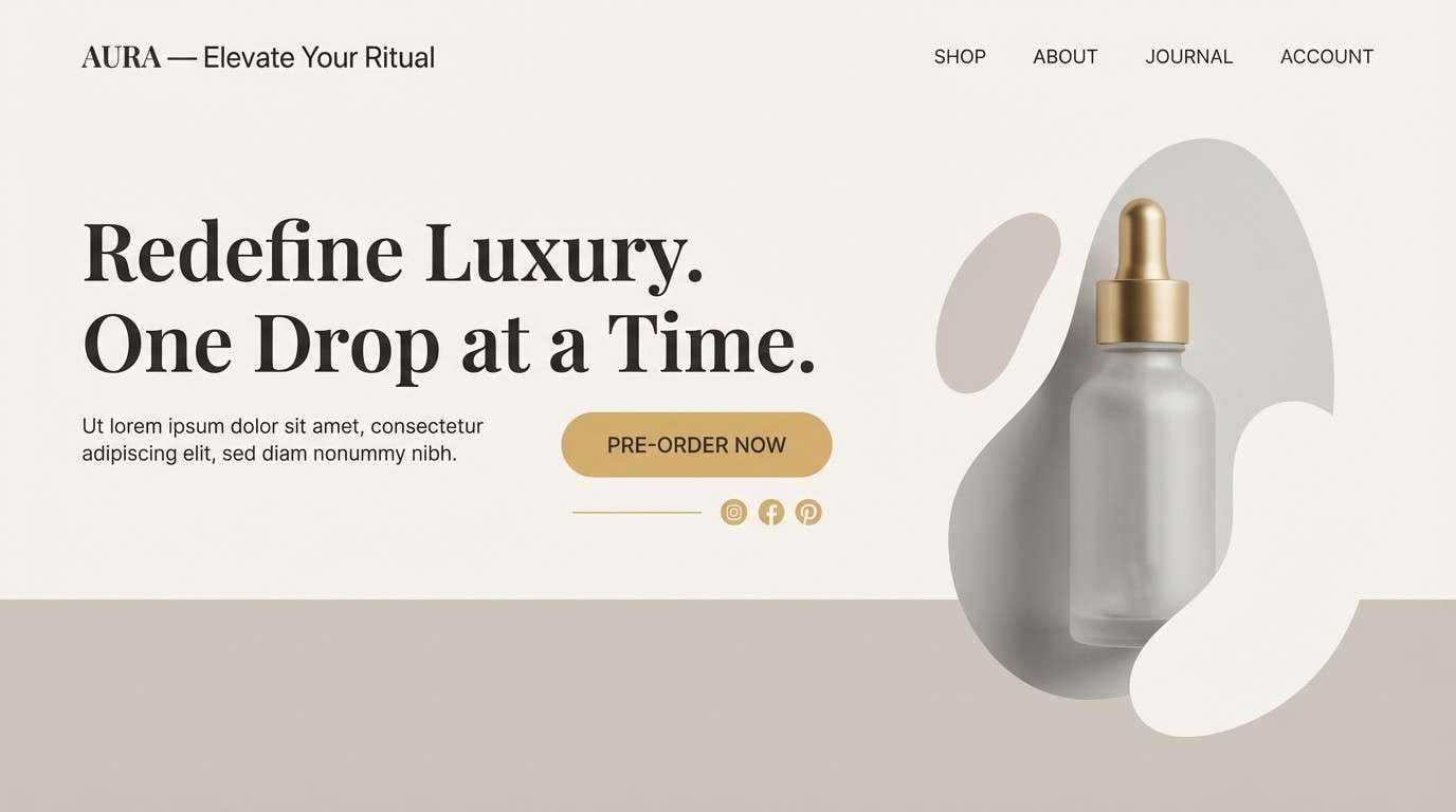
18) Golden Minimal
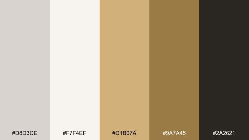
HEX: #D8D3CE #F7F4EF #D1B07A #9A7A45 #2A2621
Mood: clean, elevated, quietly luxe
Best for: premium product landing pages and hero banners
Clean and quietly luxe like warm gold on matte stone, this palette reads premium without trying too hard. These timberwolf color combinations work best when gold is used as a restrained accent for buttons, icons, or key stats. Pair with generous spacing, subtle shadows, and high-quality product photography. Tip: keep gold for interactive states and highlights, and set long-form text in the deep charcoal for comfort.
Image example of golden minimal generated using media.io
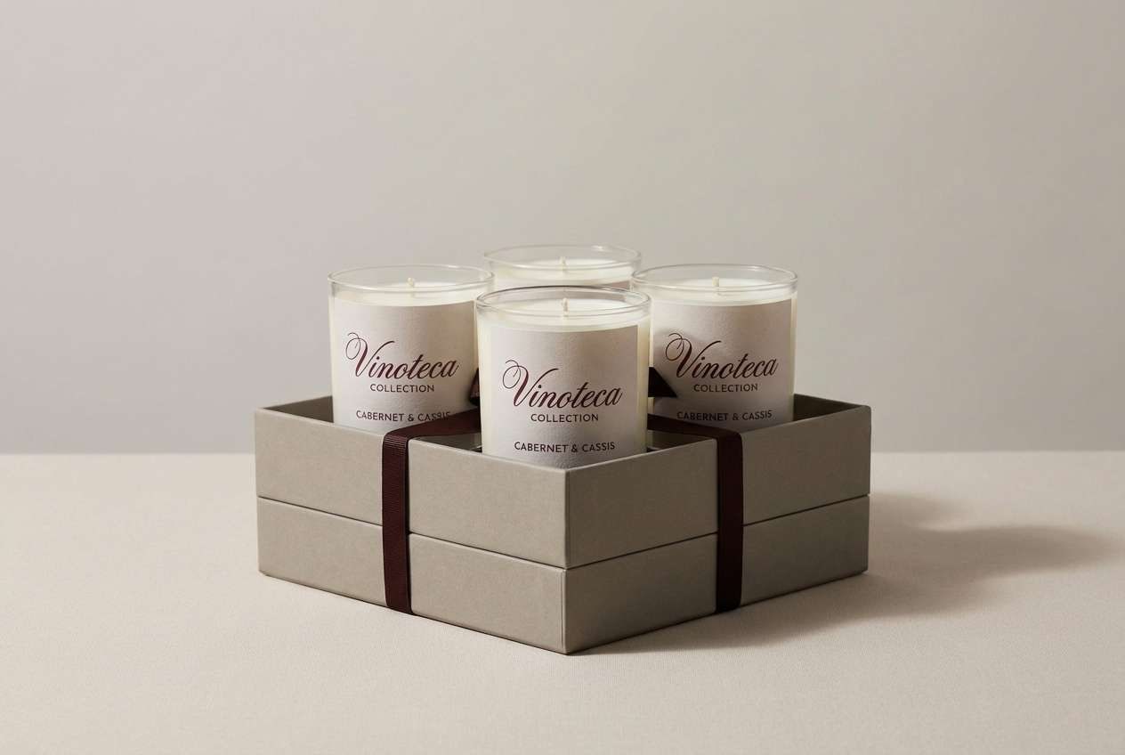
19) Berry Taupe
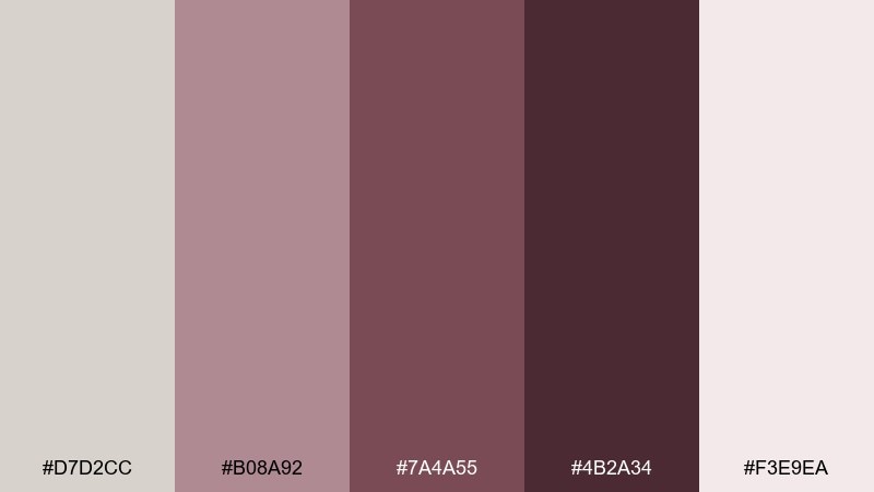
HEX: #D7D2CC #B08A92 #7A4A55 #4B2A34 #F3E9EA
Mood: artful, cozy, romantic
Best for: boutique candle labels and gift sets
Artful and cozy like crushed berries stirred into warm taupe, these tones feel intimate and giftable. Use the pale pink as a label base, then bring in wine shades for names, scent notes, and decorative borders. It pairs well with textured paper, wax seals, and minimal floral line art. Tip: limit the darkest wine to small areas so the overall label stays soft and elegant.
Image example of berry taupe generated using media.io
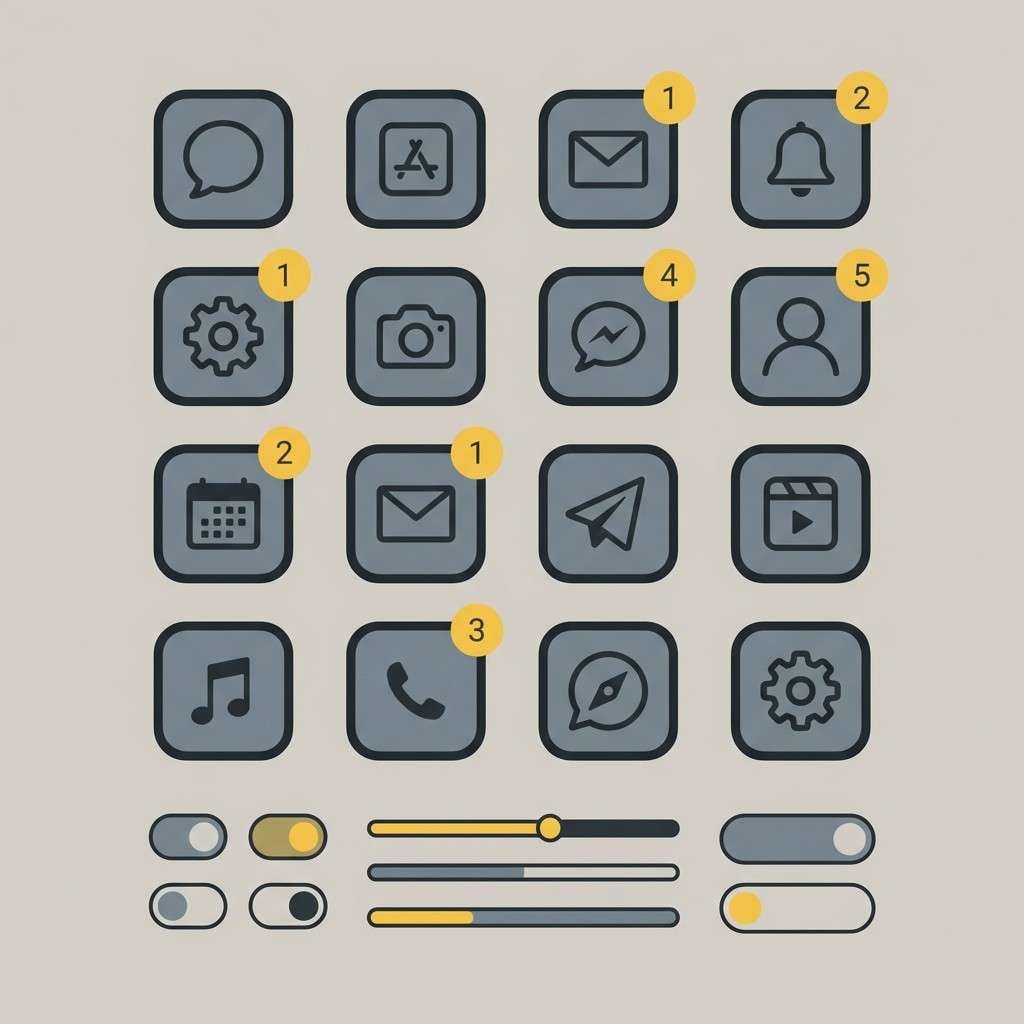
20) Citrus Slate
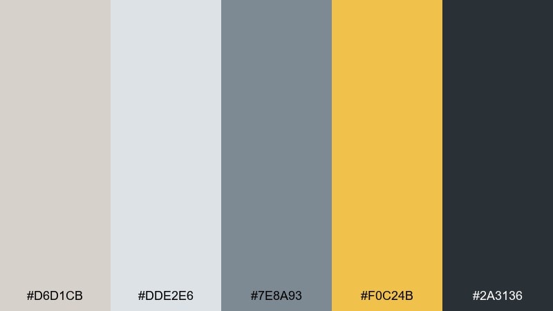
HEX: #D6D1CB #DDE2E6 #7E8A93 #F0C24B #2A3136
Mood: bright, smart, contemporary
Best for: app icon set and UI accent system
Bright and smart like citrus peel against slate, this mix brings a modern spark to cool neutrals. The yellow is perfect for notifications, toggles, and small UI moments where you need attention without alarm. Pair with clean geometry and consistent stroke weights so the accents feel intentional. Tip: keep yellow coverage under 10 percent of the screen to avoid fatigue while still guiding focus.
Image example of citrus slate generated using media.io
What Colors Go Well with Timberwolf?
Timberwolf pairs beautifully with warm accents like terracotta, cocoa browns, peach, and soft gold—these add warmth while keeping the overall look neutral and sophisticated.
For a cooler, more modern feel, combine timberwolf with blue-grays, steel tones, teal, or deep navy-charcoal. These combinations are especially effective in UI, dashboards, and professional branding.
If you want a natural, organic direction, muted greens (sage, olive, evergreen) complement timberwolf’s earthy undertone and work well in wellness, eco packaging, and interior styling.
How to Use a Timberwolf Color Palette in Real Designs
Start by assigning timberwolf to your largest surfaces: backgrounds, cards, packaging bases, or wall colors. This creates calm visual space and makes accent colors feel intentional rather than noisy.
Use the darkest shade in the palette for accessibility and structure—primary text, key icons, and critical UI states. Then use mid-tones for dividers, borders, secondary text, and subtle depth.
Keep accents restrained and consistent. One or two highlight colors (gold, blush, teal, or citrus) can guide attention across buttons, labels, or callouts without breaking the minimalist mood.
Create Timberwolf Palette Visuals with AI
If you’re building a moodboard, UI mockup, label concept, or social template, generating visuals from a timberwolf palette is a fast way to validate the vibe before production.
Reuse the prompts above, swap in your product type (app screen, packaging, interior scene), and keep the HEX tones consistent to get on-brand variations you can compare side-by-side.
With Media.io, you can go from color idea to polished palette imagery in minutes—perfect for brand exploration, client decks, and content design.
Timberwolf Color Palette FAQs
-
What color is timberwolf?
Timberwolf is a soft greige (a gray-beige blend) that reads as a calm, warm-leaning neutral. It’s lighter than typical warm grays and less yellow than many beiges. -
Is timberwolf a warm or cool color?
Timberwolf is usually considered warm-neutral. It can lean slightly cooler or warmer depending on surrounding colors, lighting, and the material (screen vs. print vs. paint). -
What are the best accent colors for a timberwolf color palette?
Great accents include terracotta, cocoa brown, blush/rose, muted teal, sage/olive greens, and soft gold. These shades add personality while keeping the palette understated. -
Can I use timberwolf for UI backgrounds?
Yes—timberwolf is excellent for UI backgrounds because it reduces harsh contrast compared with pure white. Pair it with deep charcoal for text and a single vivid accent for CTAs or alerts. -
How do I keep timberwolf palettes from looking flat?
Add contrast and texture: include one deep anchor color, use mid-tones for structure, and introduce texture through photography, paper grain, fabric, or subtle shadows in UI. -
What’s a good timberwolf palette for branding?
For premium branding, try timberwolf with charcoal and a restrained gold accent. For natural brands, timberwolf plus sage/olive and deep green creates an organic, trustworthy feel. -
How can I generate timberwolf palette images quickly?
Use an AI text-to-image tool with a clear prompt, specify the design style (UI mockup, packaging, moodboard), and include the dominant HEX tones so the output stays color-consistent.
Next: Flat Color Palette


