Amber is one of the easiest warm hues to design with: it feels energetic like orange, but more refined and golden—perfect for modern brands, UI highlights, and cozy seasonal visuals.
Below are curated amber color palette ideas with HEX codes, plus practical tips and AI prompts you can reuse to generate matching images in seconds.
In this article
- Why Amber Palettes Work So Well
-
- desert lantern
- honeyed clay
- golden hour ui
- saffron linen
- amber noir
- spiced orchard
- sunlit terracotta
- maple latte
- vintage marigold
- copper coast
- citrine mist
- smoked paprika
- autumn bazaar
- warm minimal
- glow and graphite
- candlelit cocoa
- museum brass
- amber blossom
- festival poster pop
- luxe packaging gold
- retro diner warmth
- quiet archive
- What Colors Go Well with Amber?
- How to Use a Amber Color Palette in Real Designs
- Create Amber Palette Visuals with AI
Why Amber Palettes Work So Well
Amber sits in the sweet spot between yellow and orange, so it reads as warm, optimistic, and attention-grabbing without feeling overly loud. It’s a natural choice for CTAs, hero highlights, icons, and product accents where you want “glow” more than “alarm.”
Because amber already carries a golden value, it pairs beautifully with both deep darks (charcoal, navy, espresso) and soft lights (cream, parchment, off-white). That gives you flexible contrast control across web, print, and packaging.
Design-wise, amber also adapts to seasons and industries: it can feel autumnal and cozy, Mediterranean and sunlit, or sleek and techy depending on the supporting neutrals and one contrasting accent color.
20+ Amber Color Palette Ideas (with HEX Codes)
1) Desert Lantern
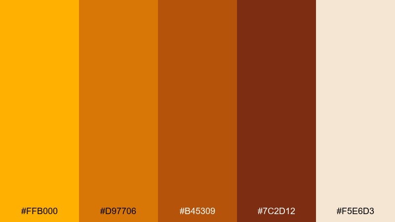
HEX: #FFB000 #D97706 #B45309 #7C2D12 #F5E6D3
Mood: warm, grounded, inviting
Best for: southwestern cafe branding and menu design
Warm dunes and lantern glow create a grounded, welcoming feel with a touch of spice. Use the bright gold as your lead accent, then let the terracotta-brown tones carry headers and dividers. Cream works best as the breathing space for menus and price lists. Tip: keep contrast crisp by using the deepest brown for body text on the light background.
Image example of desert lantern generated using media.io
Media.io is an online AI studio for creating and editing video, image, and audio in your browser.

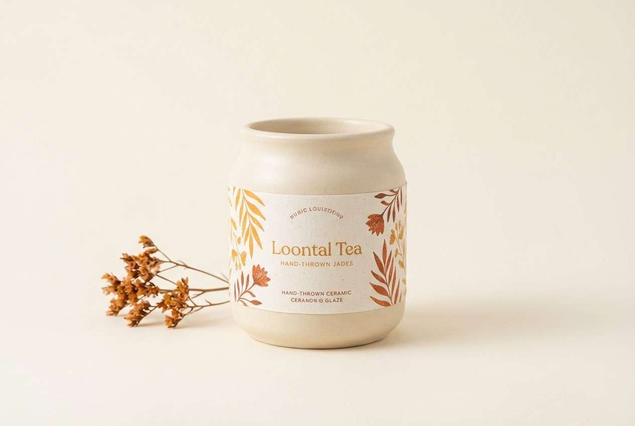
2) Honeyed Clay
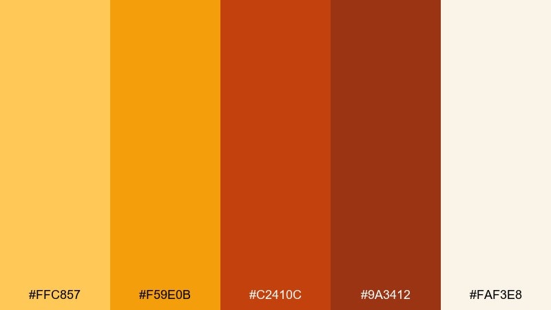
HEX: #FFC857 #F59E0B #C2410C #9A3412 #FAF3E8
Mood: cozy, rustic, handcrafted
Best for: ceramics shop packaging and labels
Cozy honey tones over earthy clay evoke handmade pottery fresh from the kiln. Let the soft cream carry your label base, then place the richer orange-browns as type and stamp details. The brighter honey is ideal for a small seal or product variant tag. Tip: use matte textures and keep the brightest color under 15% for a premium, crafted look.
Image example of honeyed clay generated using media.io
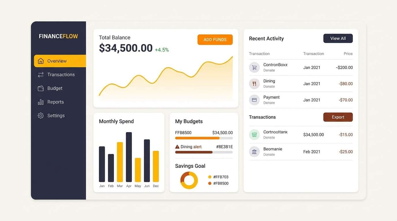
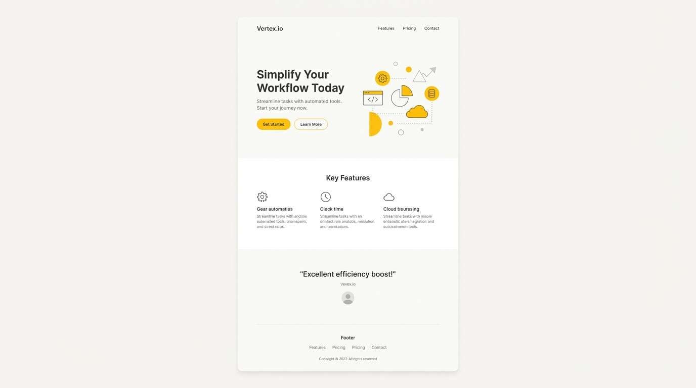
3) Golden Hour UI
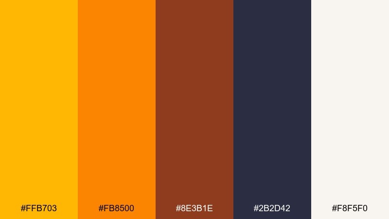
HEX: #FFB703 #FB8500 #8E3B1E #2B2D42 #F8F5F0
Mood: modern, high-contrast, energetic
Best for: finance app dashboard UI mockup
Golden-hour light meets sharp nightfall for a sleek, energetic interface vibe. Use the near-black for navigation and charts, then reserve the two bright oranges for primary buttons and key metrics. The off-white keeps screens readable and reduces glare. Tip: apply the strongest orange to only one primary action per view to avoid visual competition.
Image example of golden hour ui generated using media.io
4) Saffron Linen
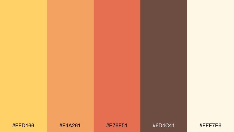
HEX: #FFD166 #F4A261 #E76F51 #6D4C41 #FFF7E6
Mood: soft, airy, sun-washed
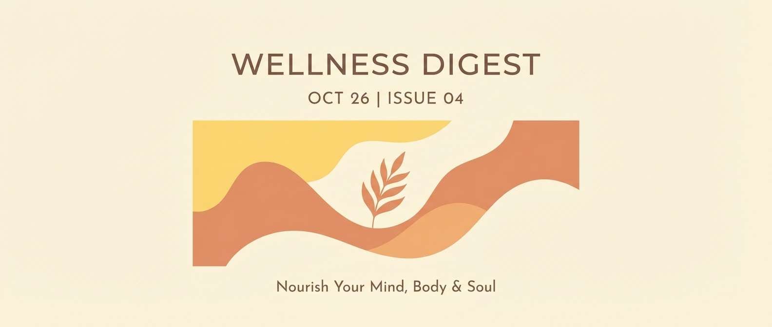
Best for: wellness newsletter and blog headers
Sun-washed linen and gentle saffron tones feel calm, optimistic, and easy to read. Keep the light cream as the main canvas, then layer the peachy orange for section bands and callouts. The deeper brown anchors typography without looking harsh. Tip: add plenty of whitespace and use the coral tone only for links or small highlights.
Image example of saffron linen generated using media.io
5) Amber Noir
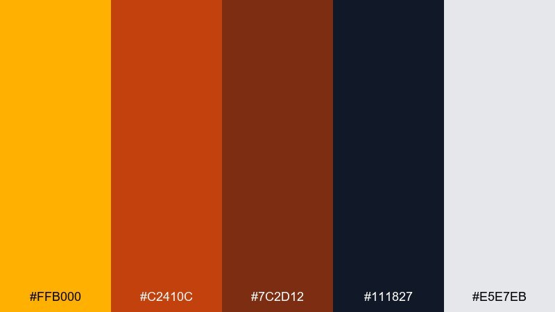
HEX: #FFB000 #C2410C #7C2D12 #111827 #E5E7EB
Mood: dramatic, luxe, cinematic
Best for: cocktail bar poster design
Cinematic glow against deep charcoal brings a luxe, late-night mood. Let the dark base carry most of the poster, then use the bright gold for the event title and key date. Burnt orange and auburn work well for secondary type and small decorative lines. Tip: add grain or subtle texture in the dark area to avoid banding in large prints.
Image example of amber noir generated using media.io

6) Spiced Orchard
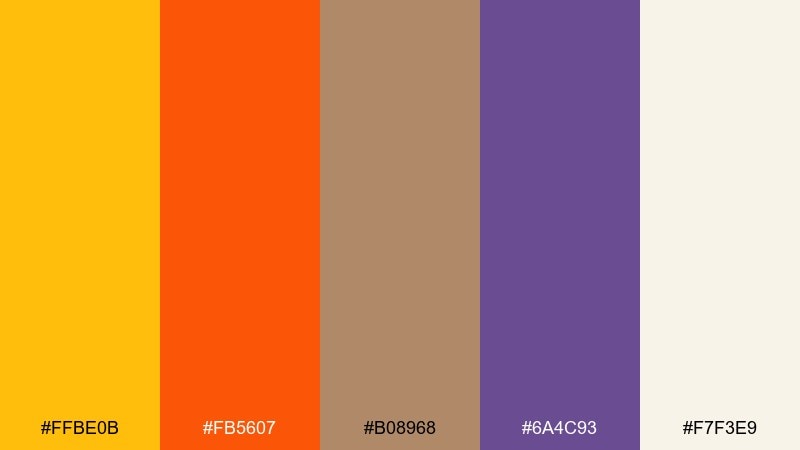
HEX: #FFBE0B #FB5607 #B08968 #6A4C93 #F7F3E9
Mood: playful, seasonal, punchy
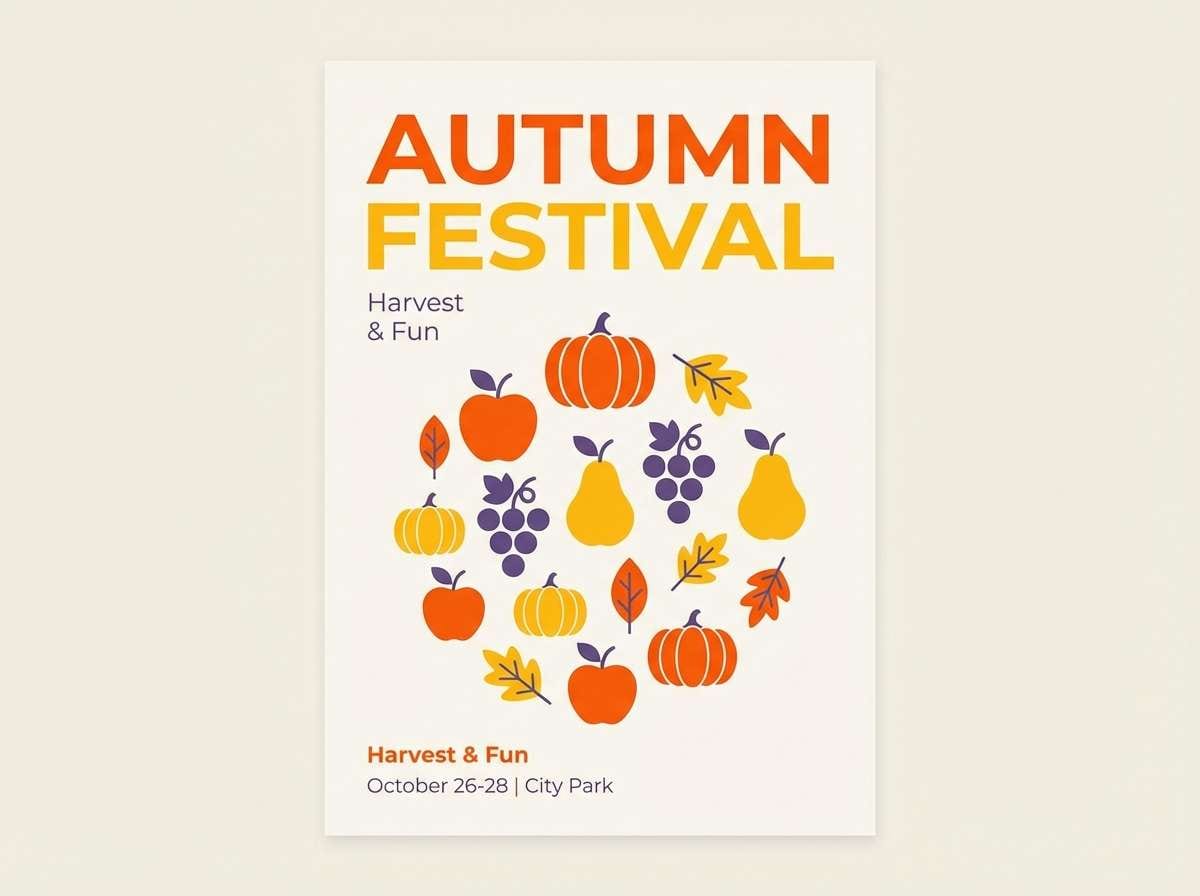
Best for: autumn festival flyer
Spiced fruit and market stalls come to mind, bright and a little mischievous. Use the punchy orange for headlines and icons, while the golden tone supports badges and price tags. The muted tan keeps the palette from feeling too loud. Tip: the purple is best as a small contrast accent for dates or CTA blocks, not as a full background.
Image example of spiced orchard generated using media.io
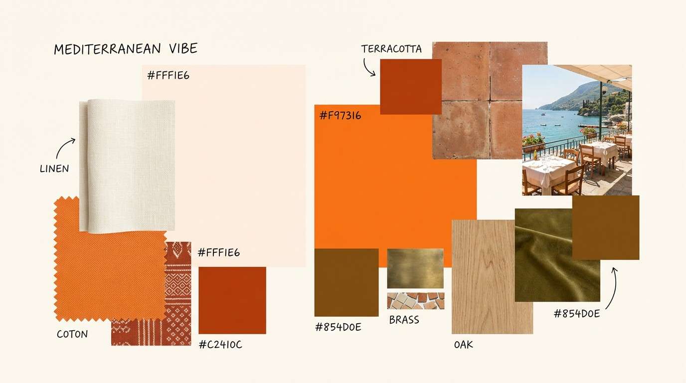
7) Sunlit Terracotta
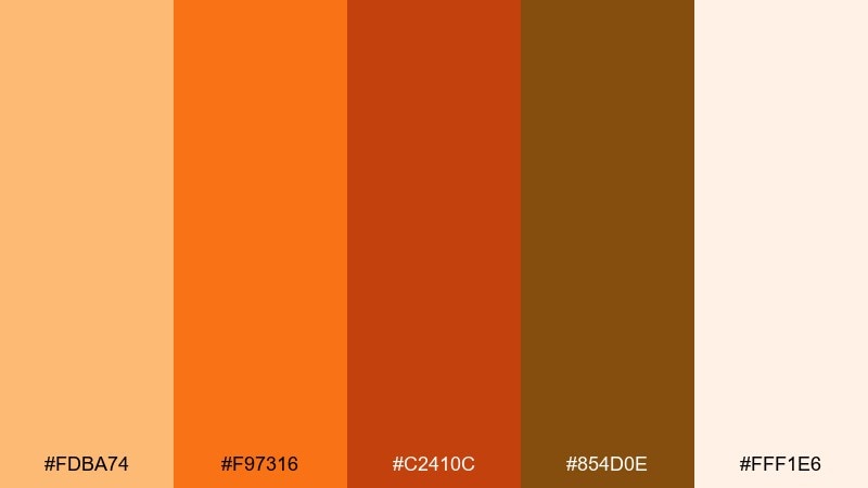
HEX: #FDBA74 #F97316 #C2410C #854D0E #FFF1E6
Mood: sunny, earthy, Mediterranean
Best for: restaurant interior mood board
Sunlit terracotta walls and baked citrus tones feel lively yet grounded. Pair the softer peach as a wall or background color, then layer the richer oranges in textiles and signage. The golden brown adds depth without turning heavy. Tip: keep lighting warm and diffuse so the brightest orange reads as glow rather than glare.
Image example of sunlit terracotta generated using media.io
8) Maple Latte
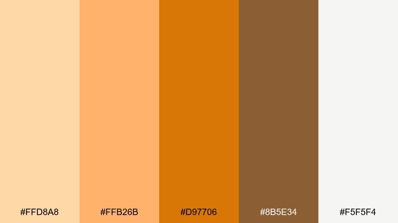
HEX: #FFD8A8 #FFB26B #D97706 #8B5E34 #F5F5F4
Mood: comforting, creamy, approachable
Best for: bakery product photography styling
Creamy latte foam and maple drizzle set a comforting, friendly tone. Use the off-white as the main surface, then bring in warm orange-brown props like napkins, packaging, or table cards. The mid amber works beautifully for accent ribbons or labels. Tip: avoid cool gray shadows in edits; keep highlights warm to preserve the cozy feel.
Image example of maple latte generated using media.io
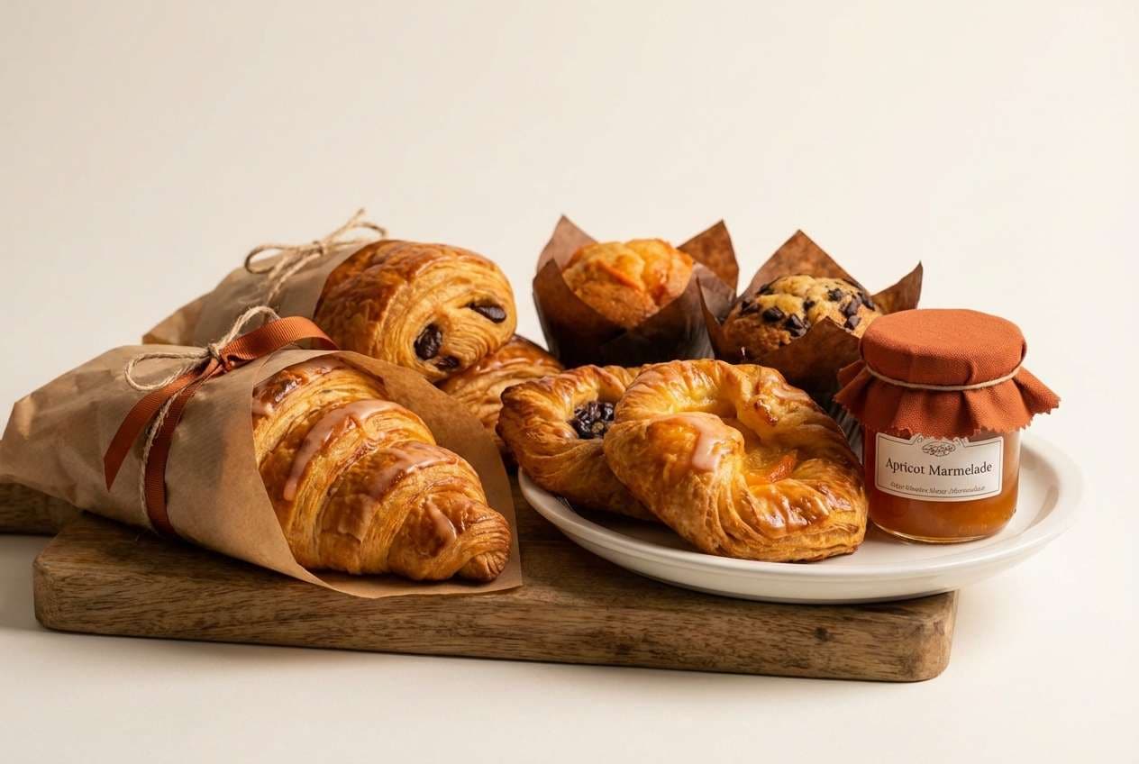
9) Vintage Marigold
HEX: #F2C14E #E09F3E #9E2A2B #540B0E #FFF3D6
Mood: retro, bold, nostalgic
Best for: record store poster series
Retro marigold with deep wine reds feels nostalgic, bold, and collectible. Use the pale cream for negative space so the darker reds stay readable from afar. The two yellows work best for big blocks, frames, and headline fills. Tip: add halftone or screen-print textures to reinforce the vintage vibe without adding extra colors.
Image example of vintage marigold generated using media.io

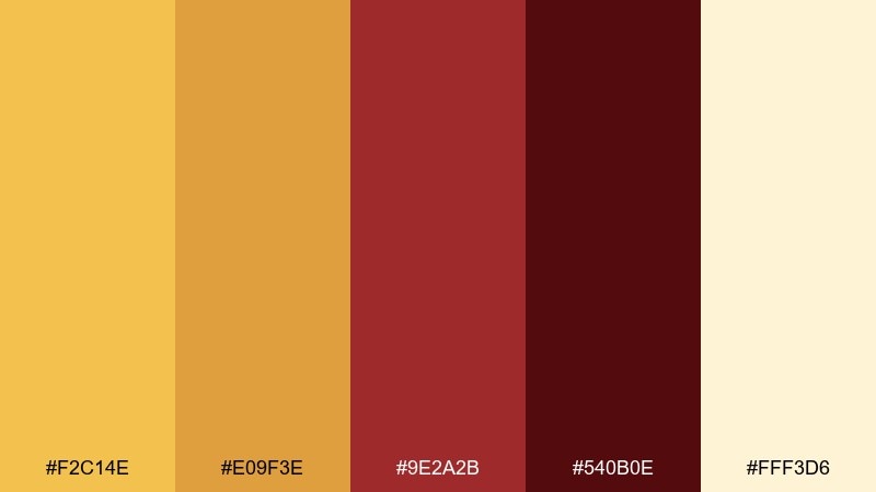
10) Copper Coast
HEX: #FFB703 #E07A5F #3D405B #81B29A #F4F1DE
Mood: fresh, coastal, modern
Best for: travel blog hero images and banners
Coastal air with a copper sunset feel keeps things fresh, modern, and inviting. Let the warm gold lead your buttons and highlights, while the navy supports readable headlines. The seafoam green is a clean secondary accent for tags and category chips. Tip: keep photos slightly desaturated so the warm accent color still pops on top.
Image example of copper coast generated using media.io

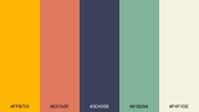
11) Citrine Mist
HEX: #FFE08A #FFC300 #A3A3A3 #525252 #FAFAF9
Mood: clean, bright, understated
Best for: SaaS landing page UI mockup
Bright citrine through morning mist feels clean, optimistic, and quietly premium. Use the pale near-white for the base, then apply the yellow as a focused highlight for primary CTAs and key stats. Grays handle typography and dividers without stealing attention. Tip: keep the yellow in solid fills rather than thin outlines to prevent it from looking washed out.
Image example of citrine mist generated using media.io
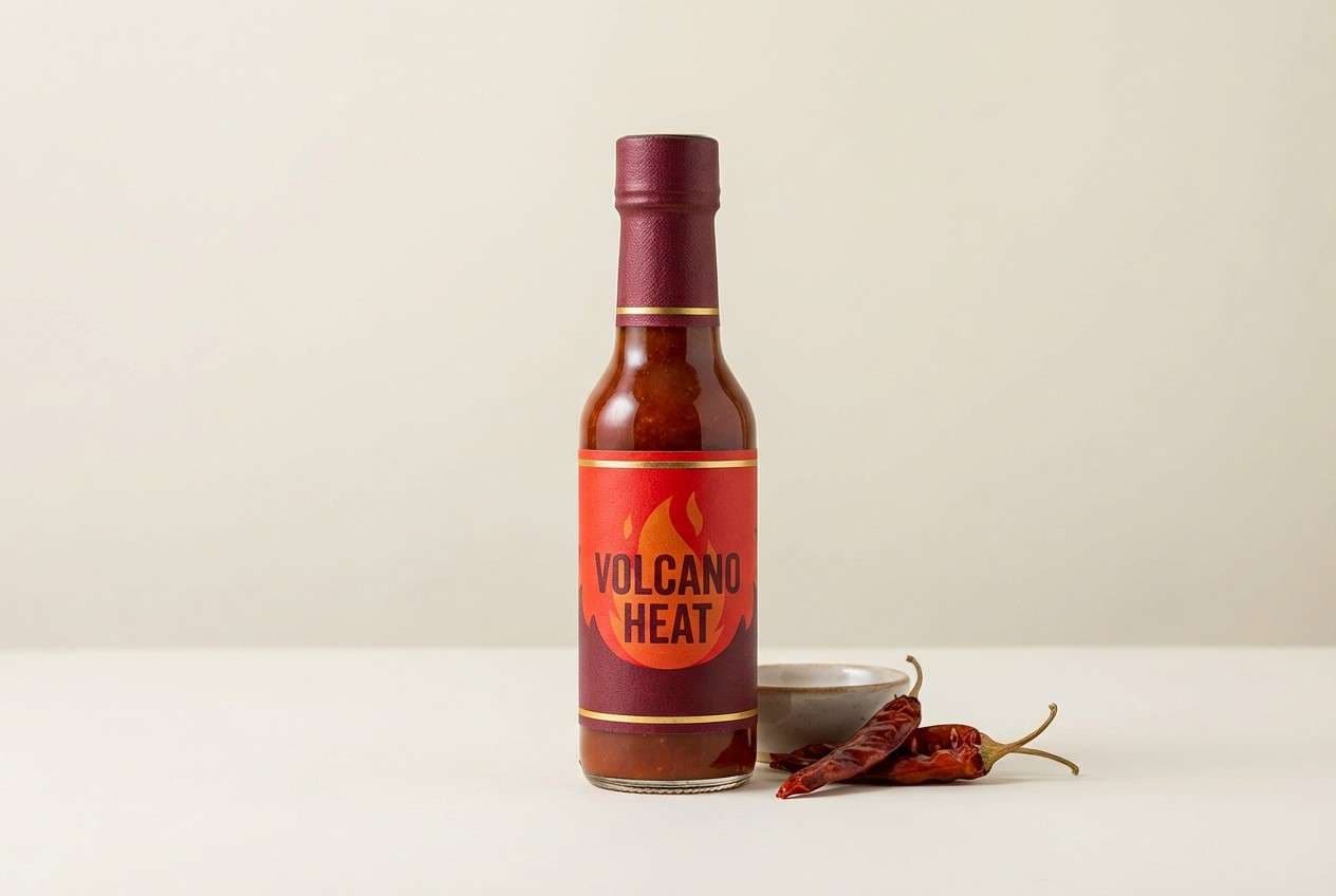
12) Smoked Paprika
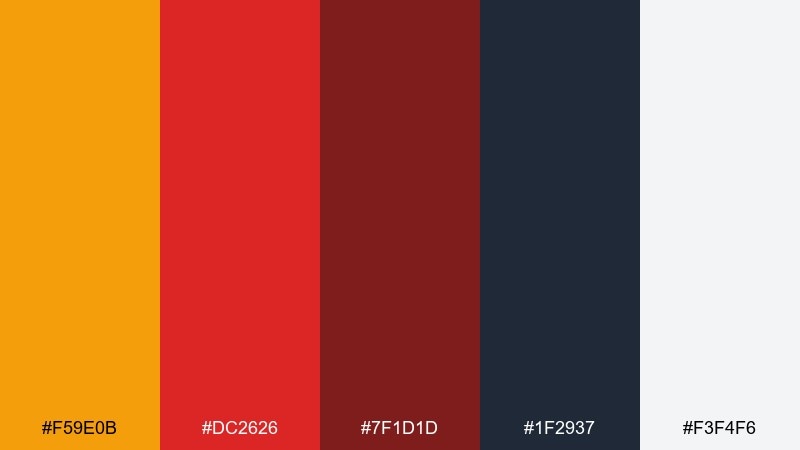
HEX: #F59E0B #DC2626 #7F1D1D #1F2937 #F3F4F6
Mood: spicy, bold, high-impact
Best for: hot sauce label and bottle design
Smoky paprika heat and charred depth make the palette feel bold and intense. Use the deep red for the label base and typography blocks, then hit the golden tone for the brand mark or heat indicator. Cool light gray keeps ingredients readable without adding new color noise. Tip: reserve the near-black for small text and outlines so it does not overpower the reds.
Image example of smoked paprika generated using media.io
13) Autumn Bazaar
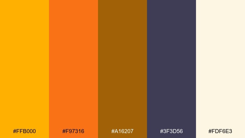
HEX: #FFB000 #F97316 #A16207 #3F3D56 #FDF6E3
Mood: busy, festive, handcrafted
Best for: market event signage and wayfinding
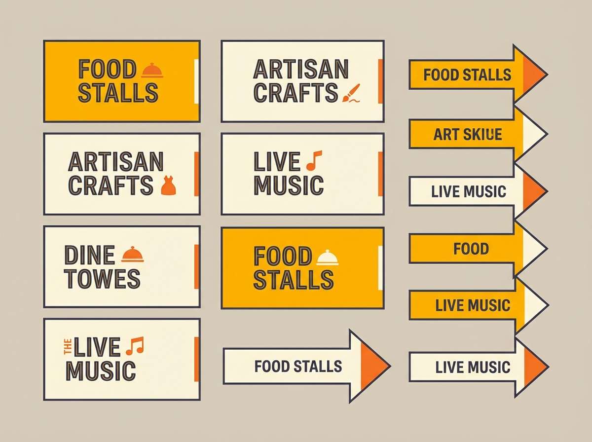
Bustling stalls, hand-lettered signs, and warm spices give this mix a festive, handcrafted energy. Use the pale cream for sign backgrounds, then layer the gold and orange for arrows and category headers. The deep violet-gray helps with legible, high-contrast copy at a distance. Tip: standardize icon strokes in the dark tone so the system feels consistent across all signs.
Image example of autumn bazaar generated using media.io
14) Warm Minimal
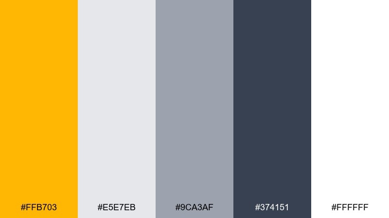
HEX: #FFB703 #E5E7EB #9CA3AF #374151 #FFFFFF
Mood: minimal, professional, friendly
Best for: startup brand guidelines slide deck
Warm minimalism keeps things professional while still feeling human. Use white as the primary background and rely on grays for typography, charts, and layout structure. The single golden accent is perfect for highlights, links, and one signature button style. Tip: define an accessibility rule set so the accent always meets contrast targets when used on white.
Image example of warm minimal generated using media.io
15) Glow and Graphite
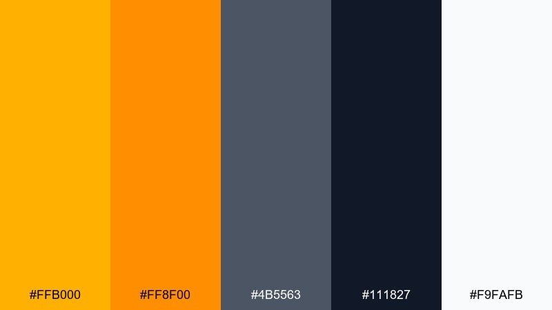
HEX: #FFB000 #FF8F00 #4B5563 #111827 #F9FAFB
Mood: techy, confident, punchy
Best for: hardware product landing page
Hot glow over graphite feels techy, confident, and built for contrast. Use the darkest tone for hero sections and navigation, then bring the bright oranges into CTAs and feature badges. The near-white keeps long-form specs readable. Tip: use the two oranges as a hierarchy, with the brighter one only for primary actions and key numbers.
Image example of glow and graphite generated using media.io

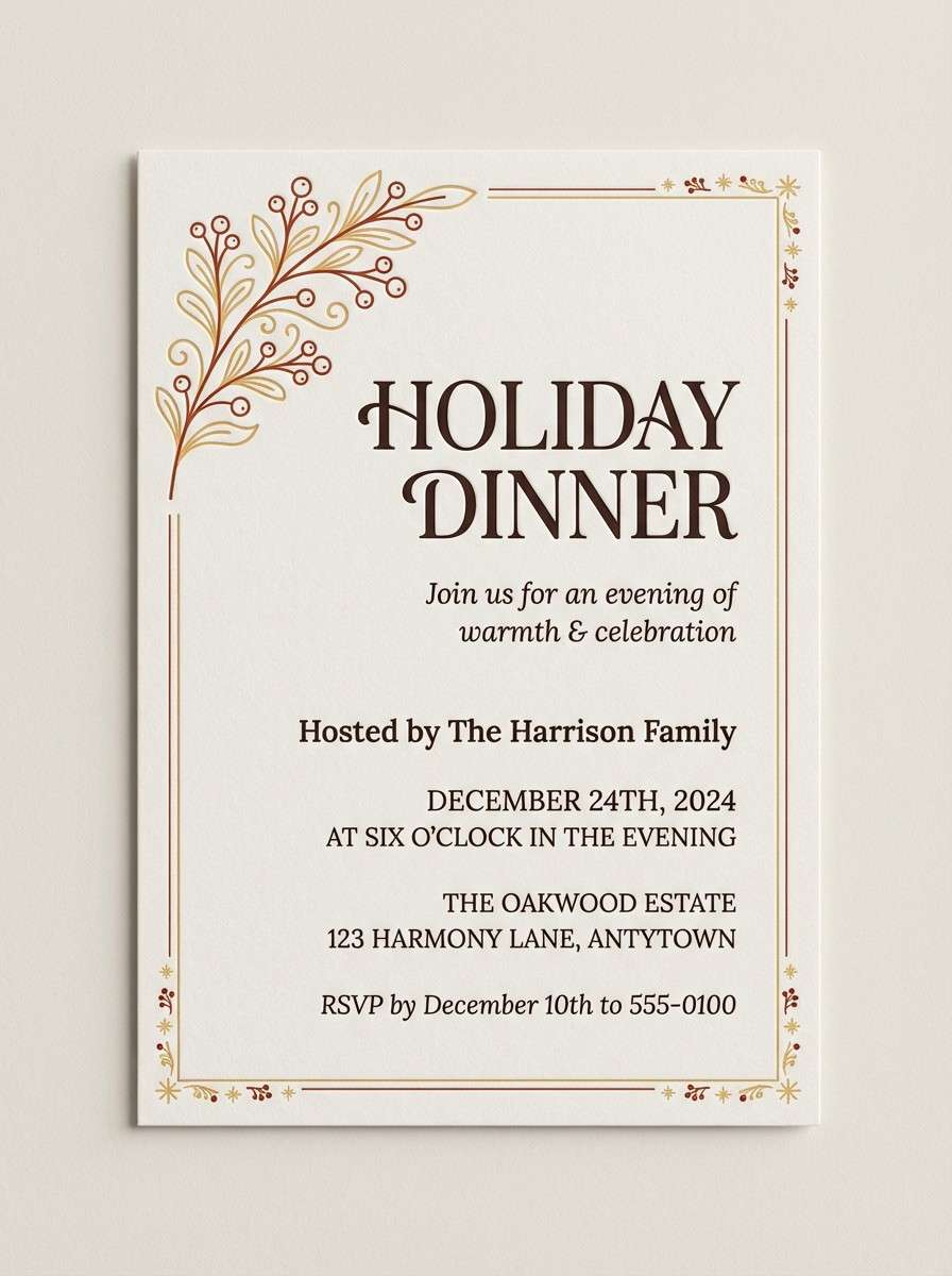
16) Candlelit Cocoa
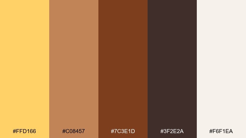
HEX: #FFD166 #C08457 #7C3E1D #3F2E2A #F6F1EA
Mood: intimate, comforting, winter-warm
Best for: holiday invitation card design
Candlelight on cocoa and wood feels intimate, comforting, and quietly festive. Keep the warm cream for the card stock base, then use the darker browns for elegant type and borders. The soft gold is best for a small monogram, foil effect, or date emphasis. Tip: choose one decorative motif and repeat it lightly instead of adding extra colors.
Image example of candlelit cocoa generated using media.io
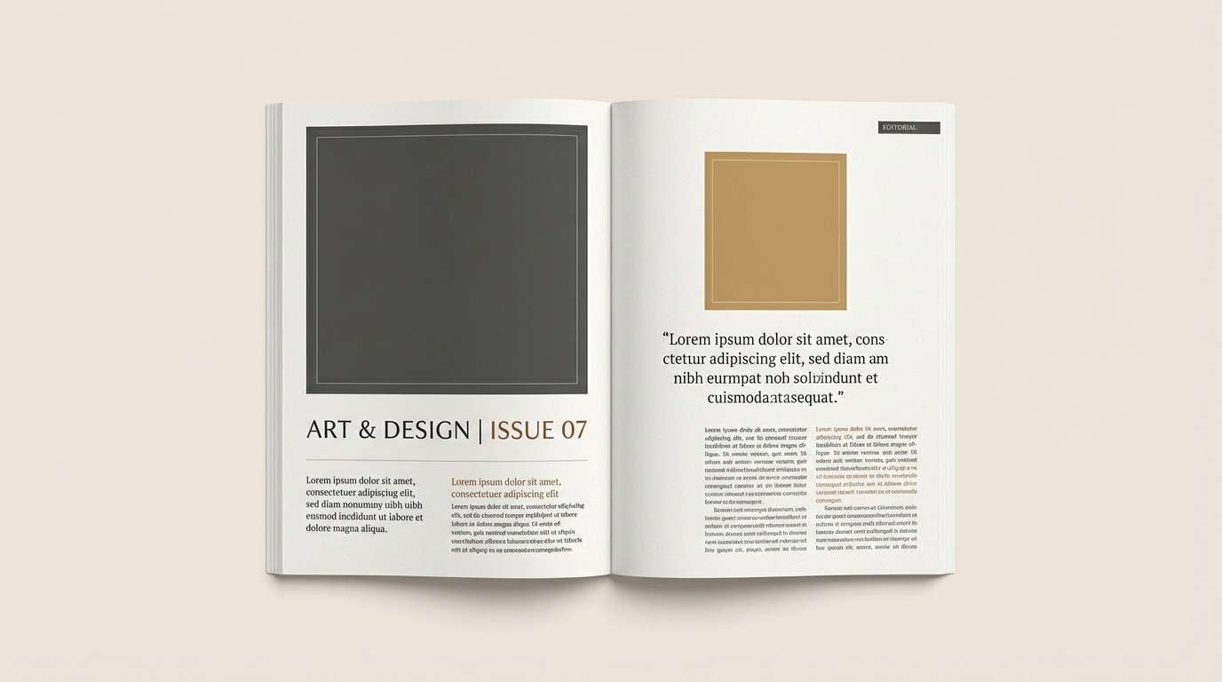
17) Museum Brass
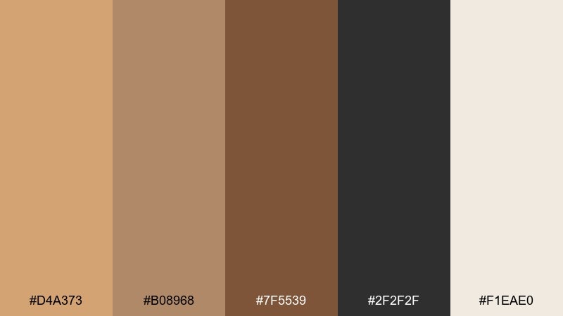
HEX: #D4A373 #B08968 #7F5539 #2F2F2F #F1EAE0
Mood: classic, curated, refined
Best for: editorial magazine spread
Curated brass and aged paper evoke galleries, archives, and quiet refinement. Use the warm paper tone as the page background, then set body text in charcoal for a timeless reading experience. The mid browns work well for pull quotes, rules, and small captions. Tip: keep color usage subtle and let typography do the heavy lifting for hierarchy.
Image example of museum brass generated using media.io
18) Amber Blossom
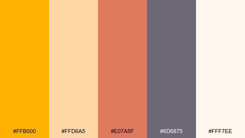
HEX: #FFB000 #FFD6A5 #E07A5F #6D6875 #FFF7EE
Mood: romantic, soft, modern
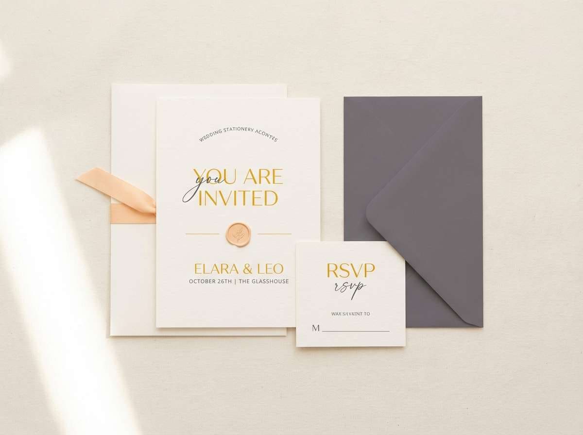
Best for: spring wedding stationery set
Soft petals and golden warmth feel romantic without turning overly sweet. This amber color palette works beautifully for invitations when you keep the cream as the base and use the gold for names or key details. Add the muted mauve-gray for typography to keep everything modern and legible. Tip: print the gold as a flat ink or subtle foil, and avoid using it for long paragraphs.
Image example of amber blossom generated using media.io
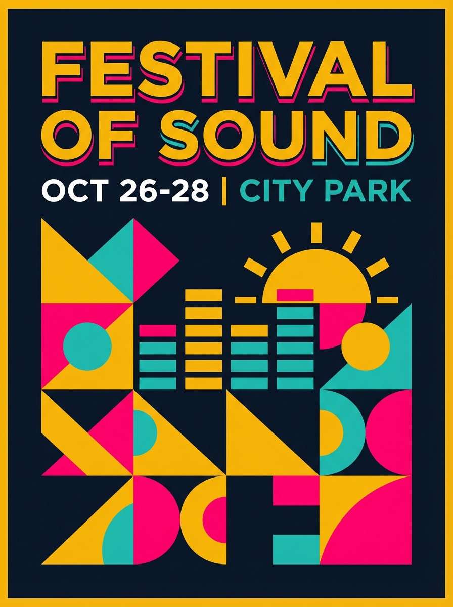
19) Festival Poster Pop
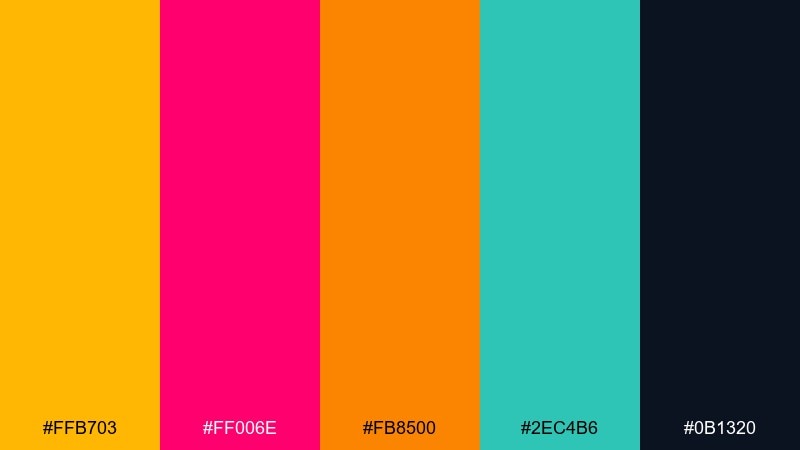
HEX: #FFB703 #FF006E #FB8500 #2EC4B6 #0B1320
Mood: electric, youthful, bold
Best for: music festival poster
Neon energy with a warm core makes the design feel loud, youthful, and ready for night crowds. These amber color combinations shine when you anchor the layout in deep navy and use the warm orange as the main title color. Pink and teal work best as secondary blocks for stages, dates, and highlights. Tip: keep type weights heavy so the bright accents remain readable against the dark base.
Image example of festival poster pop generated using media.io
20) Luxe Packaging Gold
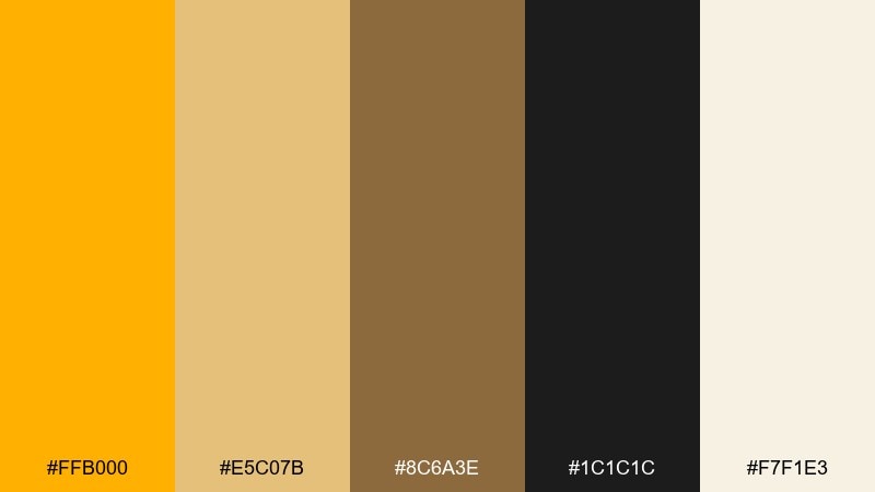
HEX: #FFB000 #E5C07B #8C6A3E #1C1C1C #F7F1E3
Mood: premium, elegant, polished
Best for: skincare box packaging and product ad
Polished gold with deep black feels premium, elegant, and giftable. An amber color combination like this works best when the light cream handles the label field and the black carries the logo and ingredient list. Use the metallic-like tones for borders, seals, or a subtle gradient panel. Tip: avoid thin gold text on cream; instead, use gold as a shape behind dark lettering for clarity.
Image example of luxe packaging gold generated using media.io
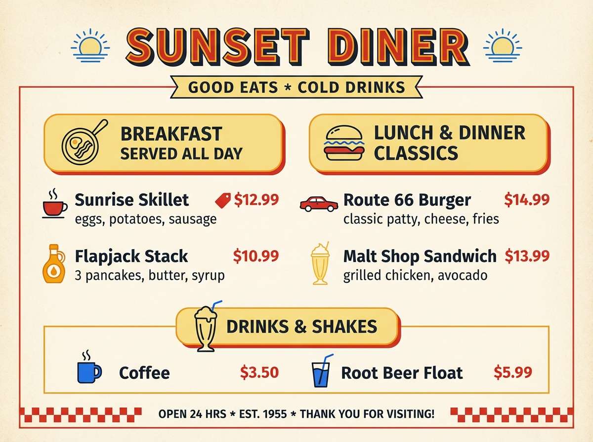
21) Retro Diner Warmth
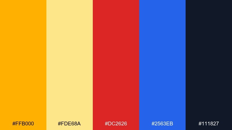
HEX: #FFB000 #FDE68A #DC2626 #2563EB #111827
Mood: retro, cheerful, high-energy
Best for: diner menu redesign
Retro diner lights and classic signage give this set a cheerful, high-energy punch. Use the deep charcoal for text and structure, then let the warm yellows handle backgrounds and section headers. Red and blue should stay as small, iconic accents for specials, icons, or separators. Tip: keep the layout grid tight and consistent so the bright colors read as intentional, not chaotic.
Image example of retro diner warmth generated using media.io
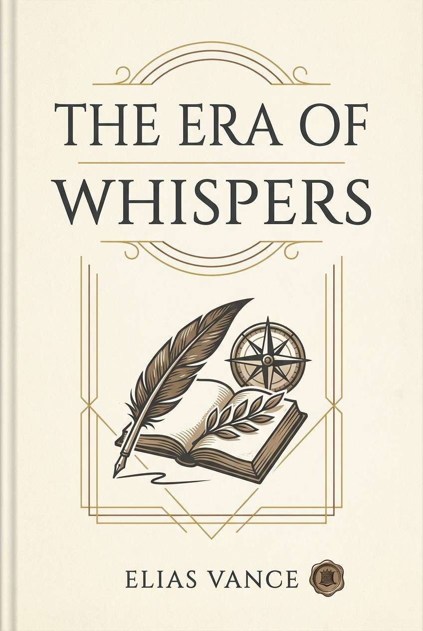
22) Quiet Archive
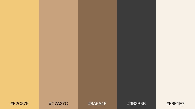
HEX: #F2C879 #C7A27C #8A6A4F #3B3B3B #F8F1E7
Mood: calm, scholarly, understated
Best for: book cover design for historical nonfiction
Quiet archives and sun-faded paper set a calm, scholarly tone. Use the light parchment as the full cover background, then place the charcoal for title and subtitle to keep readability high. The warm browns are ideal for small ornaments, rules, or a subtle spine color. Tip: pair with a classic serif and keep contrast strong to avoid a washed, antique look in thumbnails.
Image example of quiet archive generated using media.io
What Colors Go Well with Amber?
Neutrals are amber’s best friend. Cream, off-white, parchment, and warm grays keep amber looking luminous, while charcoal and near-black create a crisp, premium contrast that works well for typography and UI navigation.
For bolder pairings, try cool opposites: muted navy, slate blue, and deep violet make amber feel brighter by comparison. Small touches of teal or seafoam can also modernize amber palettes without turning them neon.
If you want a seasonal vibe, layer amber with terracotta, cinnamon brown, and brick red for autumn warmth—or soften it with peach and dusty rose for a gentle, romantic direction.
How to Use a Amber Color Palette in Real Designs
Start with roles, not swatches. Use a light neutral as your main background, a dark neutral for body text, and keep amber reserved for emphasis—buttons, links, icons, key numbers, and important labels.
In print and packaging, amber reads more “gold” when surrounded by deeper browns or black. Use amber as a block, border, or seal behind dark type rather than thin amber text on light paper to maintain clarity.
For UI, treat amber like a high-attention token: one primary action per screen, consistent hover/active states, and enough spacing so the warm accent feels intentional instead of noisy.
Create Amber Palette Visuals with AI
If you want your palette to look cohesive across ads, banners, product shots, and mockups, generate visuals that already match your HEX direction. That way, your designs feel “on-brand” before you even start compositing.
With Media.io Text to Image, you can paste a prompt (like the examples above), specify your amber tones, and quickly iterate different layouts, ratios, and styles for web or print.
Once you have a strong image set, reuse the same palette roles (background, text, accent, secondary accent) to keep consistency across your brand system.
Amber Color Palette FAQs
-
What is the HEX code for amber?
Amber is commonly represented around #FFB000 to #FFB703 depending on whether you want a deeper golden amber or a brighter yellow-leaning amber. -
Is amber closer to yellow or orange?
Amber sits between yellow and orange. It usually reads as a golden-orange, so it can act like “warm yellow” in minimal palettes or like “soft orange” in richer, earthy palettes. -
What colors complement amber best?
Deep, cool tones like navy, slate, and violet complement amber by contrast. For a simpler look, pair amber with charcoal and cream for a premium, readable combination. -
How do I keep an amber color scheme from looking too loud?
Use amber as an accent (often 5–15% of the layout) and let neutrals do most of the work. Choose one dark neutral for text and one light neutral for background to control contrast. -
Does amber work well for UI and app design?
Yes—amber is excellent for CTAs, notifications, and key metrics because it draws attention without feeling as aggressive as pure red. Keep accessibility in mind and test contrast against both light and dark backgrounds. -
What’s a good amber palette for luxury branding?
Try an amber + black + cream direction (like “Luxe Packaging Gold”). The dark base adds sophistication, while amber reads as gold for borders, seals, and hero accents. -
Can I generate brand-matching amber visuals with AI?
Yes. Include your exact HEX codes (or close values) directly in the prompt, specify lighting/style, and keep the same ratios across outputs to build a consistent visual set for your brand.
Next: Melon Color Palette
