

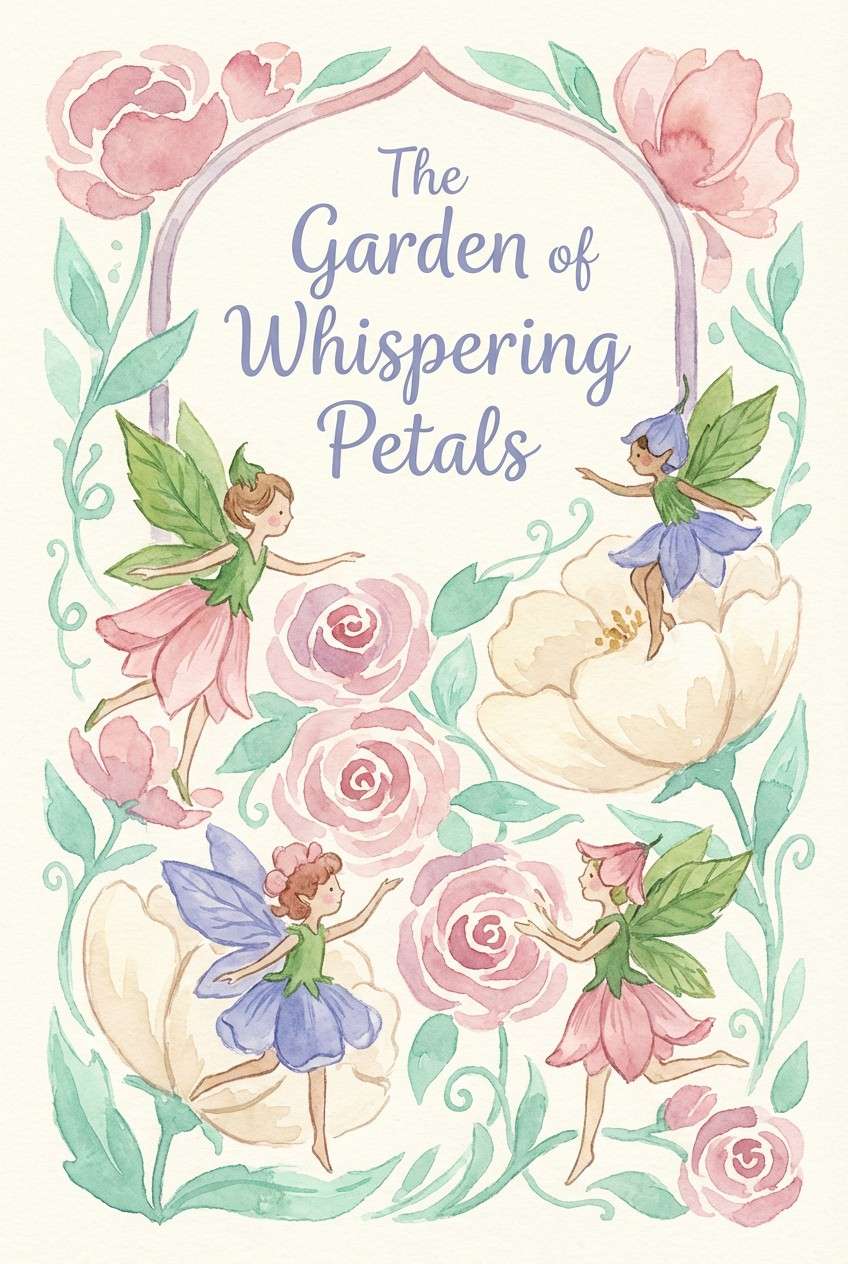
A fairy garden color palette blends botanical greens with petal pinks, dewy creams, and soft purples to create a gentle, storybook feel.
Below are 20+ fairy garden palette ideas with HEX codes, plus practical ways to use them in branding, invitations, UI, and packaging.
In this article
- Why Fairy Garden Palettes Work So Well
-
- mossy blossom
- dewdrop pastels
- pixie petal
- enchanted fern
- mushroom cottage
- sunlit meadow
- moonlit lilac
- rosehip nectar
- honeyed daffodil
- spring brook
- lavender mist
- wild mint
- peony parasol
- berry bramble
- tea party tulle
- garden gate neutrals
- glimmering sprout
- thistle & silk
- butterfly wing
- wisteria whisper
- petal pathway
- What Colors Go Well with Fairy Garden?
- How to Use a Fairy Garden Color Palette in Real Designs
- Create Fairy Garden Palette Visuals with AI
Why Fairy Garden Palettes Work So Well
Fairy garden colors feel inviting because they mirror nature in a softened way: leafy greens, flower tints, and creamy highlights that resemble sunlight on petals. The result is whimsical without being neon or harsh.
They also balance emotion and function. Pastels communicate warmth and charm, while deeper greens, navies, and purples add structure for legible typography and clear hierarchy.
Because the vibe is “gentle magic,” fairy garden palettes adapt easily across mediums—from wedding websites to skincare labels—while still feeling cohesive and intentionally styled.
20+ Fairy Garden Color Palette Ideas (with HEX Codes)
1) Mossy Blossom
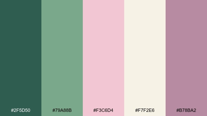
HEX: #2F5D50 #79A88B #F3C6D4 #F7F2E6 #B78BA2
Mood: lush, romantic, grounded
Best for: botanical skincare packaging
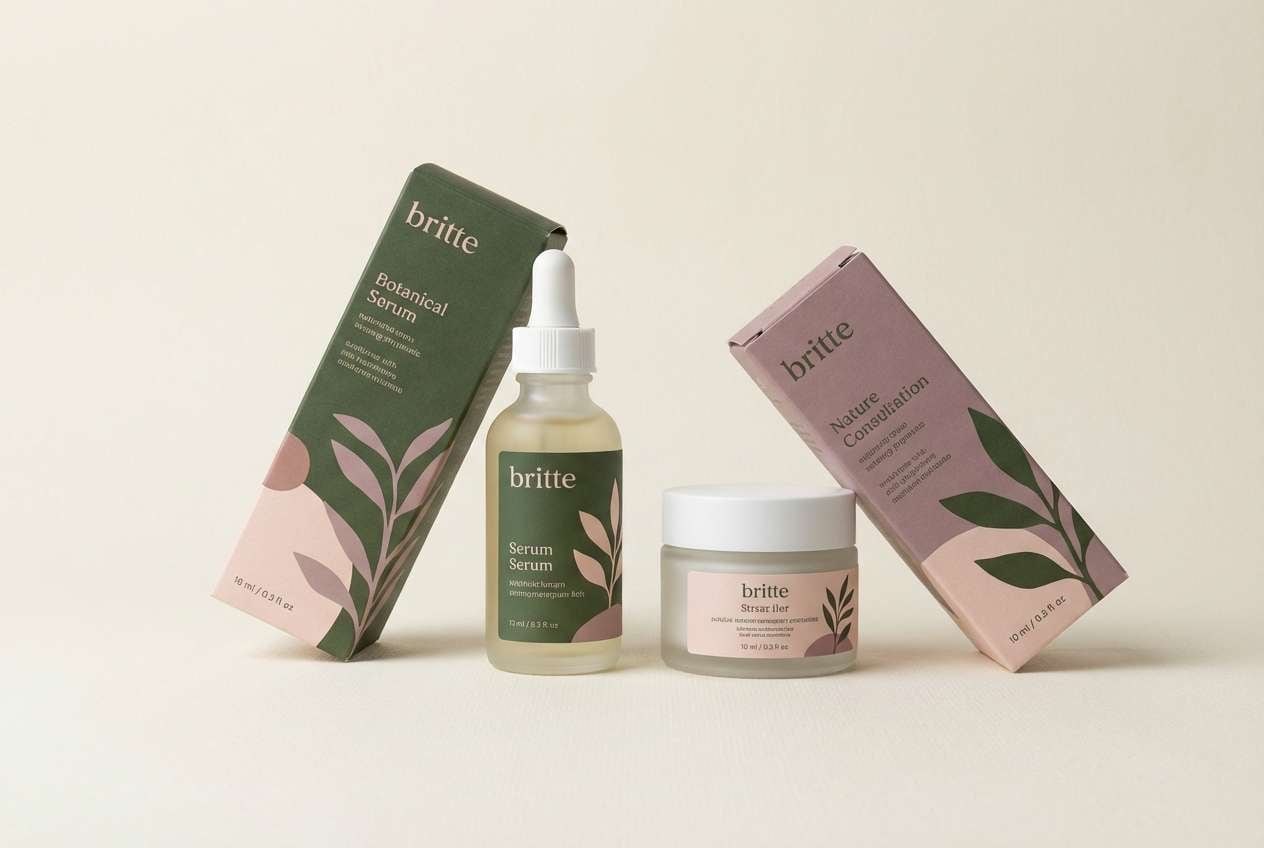
Lush moss greens and blush petals evoke a shaded garden path after rain. Use the deeper green for typography and the cream as breathing-room background. The pink and mauve work best as soft accents on labels, seals, and pattern details. Tip: add a subtle leaf texture in the mid green to keep the design organic without feeling busy.
Image example of mossy blossom generated using media.io
Media.io is an online AI studio for creating and editing video, image, and audio in your browser.

2) Dewdrop Pastels
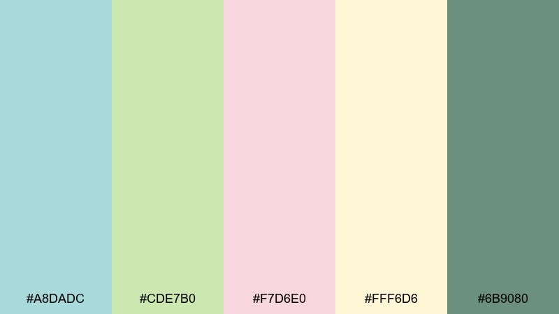
HEX: #A8DADC #CDE7B0 #F7D6E0 #FFF6D6 #6B9080
Mood: fresh, airy, playful
Best for: spring sale social ad
Airy aquas and butter-cream yellows feel like morning dew on new leaves. Keep the mint and aqua as your main blocks, then let the blush soften callouts and badges. The deeper sage works well for headline contrast without going harsh. Tip: use large rounded shapes to echo the gentle, bouncy tone of the colors.
Image example of dewdrop pastels generated using media.io

3) Pixie Petal
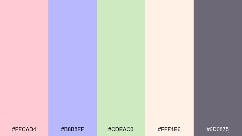
HEX: #FFCAD4 #B8B8FF #CDEAC0 #FFF1E6 #6D6875
Mood: whimsical, sweet, storybook
Best for: children book cover illustration
Cotton-candy pinks and periwinkle lilac suggest tiny lanterns and floating petals. These fairy garden color combinations shine in illustrated covers where charm matters more than realism. Pair the soft cream with the lilac for the main field, then anchor titles in the smoky purple-gray. Tip: keep outlines thin and warm so the pastels stay luminous rather than chalky.
Image example of pixie petal generated using media.io
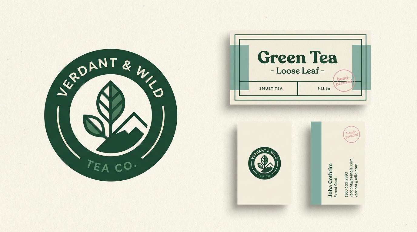
4) Enchanted Fern
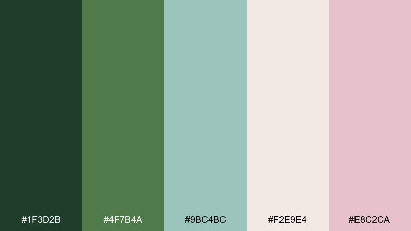
HEX: #1F3D2B #4F7B4A #9BC4BC #F2E9E4 #E8C2CA
Mood: mysterious, botanical, calm
Best for: premium tea brand identity
Deep forest greens and cool misty teal feel like ferns under moonlight. Use the darkest green for logos and fine linework to create a premium, grounded base. The pale cream keeps layouts airy, while the pink adds a quiet floral cue on secondary marks. Tip: print with a matte finish so the greens read velvety instead of glossy.
Image example of enchanted fern generated using media.io
5) Mushroom Cottage
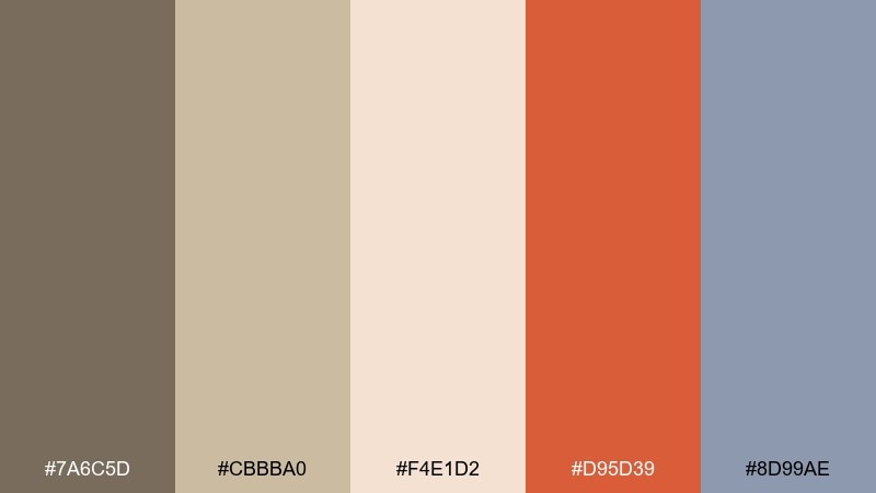
HEX: #7A6C5D #CBBBA0 #F4E1D2 #D95D39 #8D99AE
Mood: cozy, earthy, nostalgic
Best for: rustic cafe menu design
Warm clay and toasted beige evoke cottage doors and tiny mushroom caps. Use the taupe and oat tones for the menu base so the clay red can spotlight specials. The cool gray-blue balances the warmth and helps section headers feel tidy. Tip: pair with a serif headline font for a welcoming, storybook vibe.
Image example of mushroom cottage generated using media.io
6) Sunlit Meadow
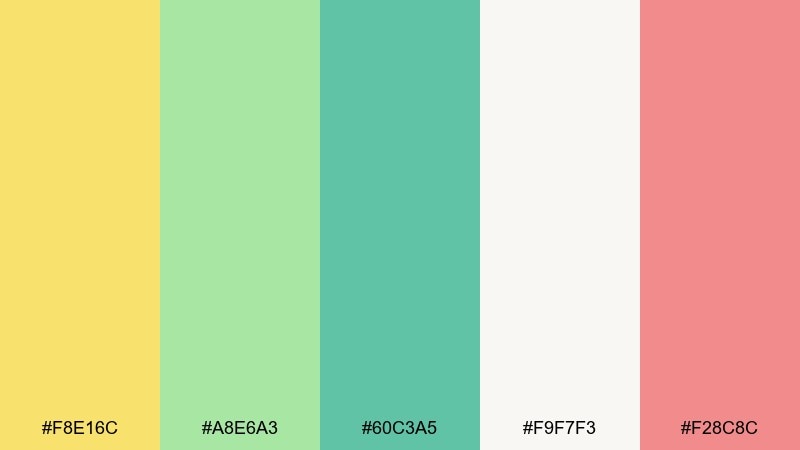
HEX: #F8E16C #A8E6A3 #60C3A5 #F9F7F3 #F28C8C
Mood: cheerful, bright, breezy
Best for: event poster for spring fair
Sunny yellow and fresh greens feel like open grass dotted with wildflowers. For a fairy garden color palette that stays readable, keep the off-white as the main background and reserve yellow for big shapes and headers. Coral works best as a sparing accent for dates, tickets, or buttons. Tip: add generous margins so the bright tones do not overwhelm the message.
Image example of sunlit meadow generated using media.io

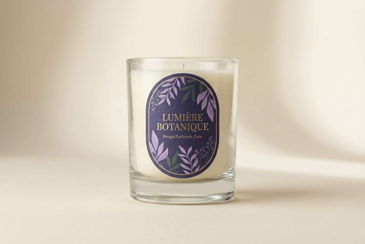
7) Moonlit Lilac
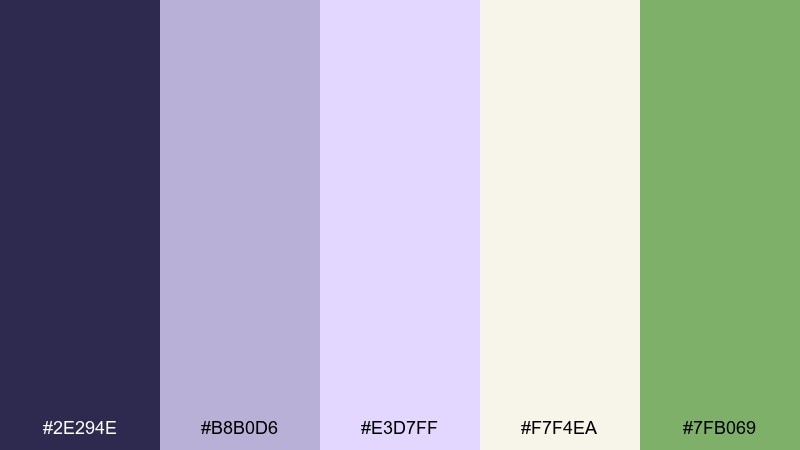
HEX: #2E294E #B8B0D6 #E3D7FF #F7F4EA #7FB069
Mood: dreamy, elegant, nocturnal
Best for: luxury candle label
Velvety indigo and lilac haze evoke twilight blooms and soft candle glow. Use the indigo for a refined label frame and typography, then let lilac gradients create gentle depth. The warm cream keeps the design inviting, while the green works as a quiet botanical note. Tip: foil-stamp small details in indigo to enhance the night-garden feel.
Image example of moonlit lilac generated using media.io
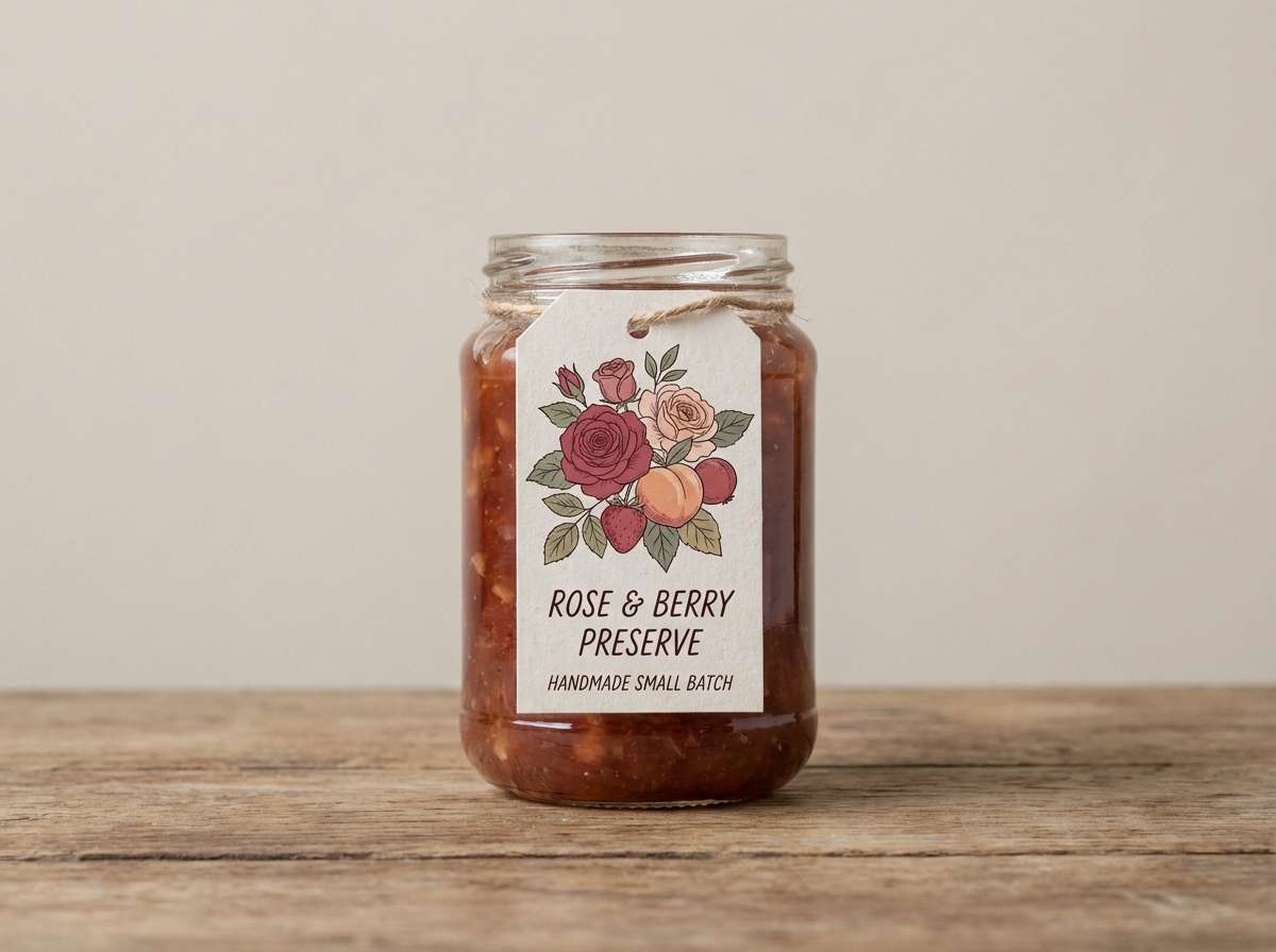
8) Rosehip Nectar
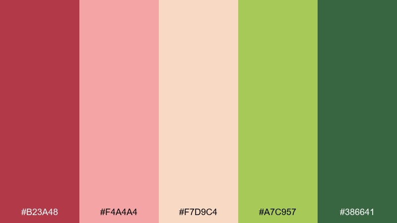
HEX: #B23A48 #F4A4A4 #F7D9C4 #A7C957 #386641
Mood: juicy, warm, botanical
Best for: jam jar label design
Rosehip red and soft blush feel like sweet preserves cooling on a windowsill. Let the creamy peach carry most of the label so the red can pop on the flavor name and badges. The two greens create a natural counterpoint that keeps the palette from turning too sugary. Tip: use a simple leaf icon in the dark green for a crisp, artisanal finish.
Image example of rosehip nectar generated using media.io
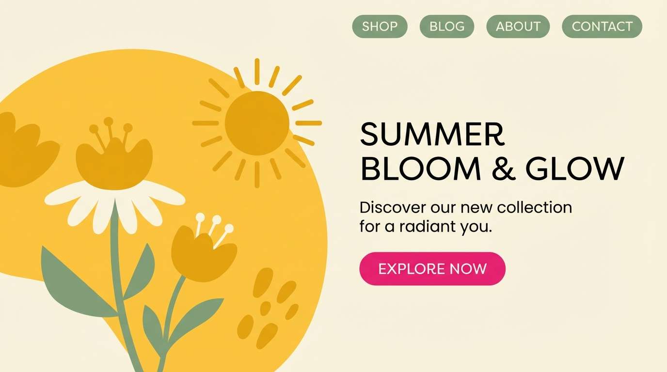
9) Honeyed Daffodil
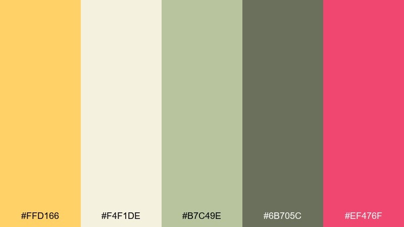
HEX: #FFD166 #F4F1DE #B7C49E #6B705C #EF476F
Mood: sunny, upbeat, modern
Best for: email newsletter header
Golden daffodil yellow with creamy vanilla feels bright, friendly, and spring-forward. Use the cream as the header base, then add yellow bands for energy without sacrificing readability. The sage and olive provide calm structure for navigation and small text, while the pink adds a confident click cue. Tip: keep the pink to one CTA to maintain a clean, modern hierarchy.
Image example of honeyed daffodil generated using media.io
10) Spring Brook
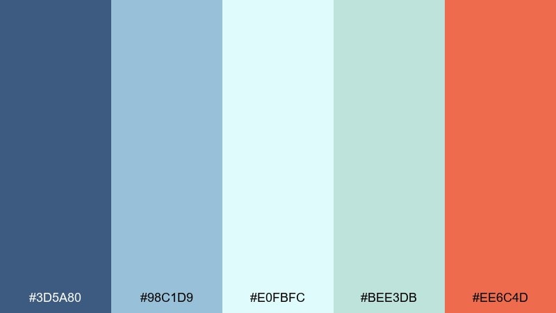
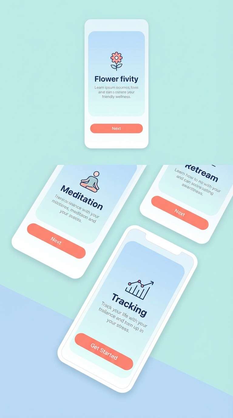
HEX: #3D5A80 #98C1D9 #E0FBFC #BEE3DB #EE6C4D
Mood: clean, refreshing, crisp
Best for: wellness app onboarding screens
Cool water blues and pale mint read like a clear brook running through fresh grass. Keep the light aqua as the main canvas and use the navy for titles to ensure accessible contrast. The coral is perfect for one primary button or progress indicator so it feels intentional. Tip: add soft gradients only in backgrounds, and keep UI components flat for clarity.
Image example of spring brook generated using media.io
11) Lavender Mist
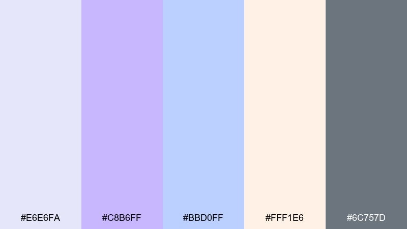
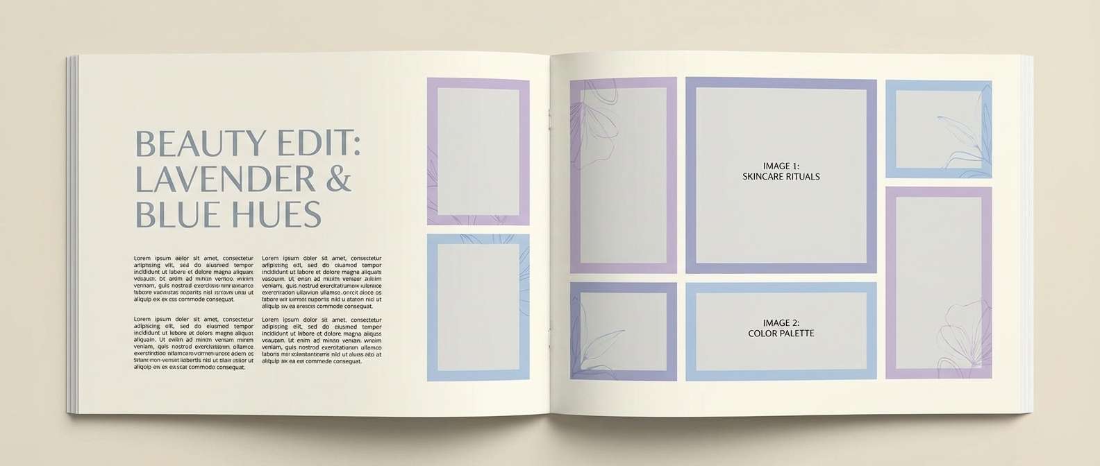
HEX: #E6E6FA #C8B6FF #BBD0FF #FFF1E6 #6C757D
Mood: soft, calm, airy
Best for: beauty blog editorial layout
Lavender fog and powdery blues evoke quiet mornings and clean linen. Use the cream as your page background, then layer lilac blocks behind pull quotes and product callouts. The cool gray keeps body text crisp and helps photos feel polished. Tip: maintain plenty of whitespace so the pastels look editorial rather than childish.
Image example of lavender mist generated using media.io
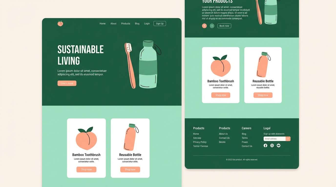
12) Wild Mint
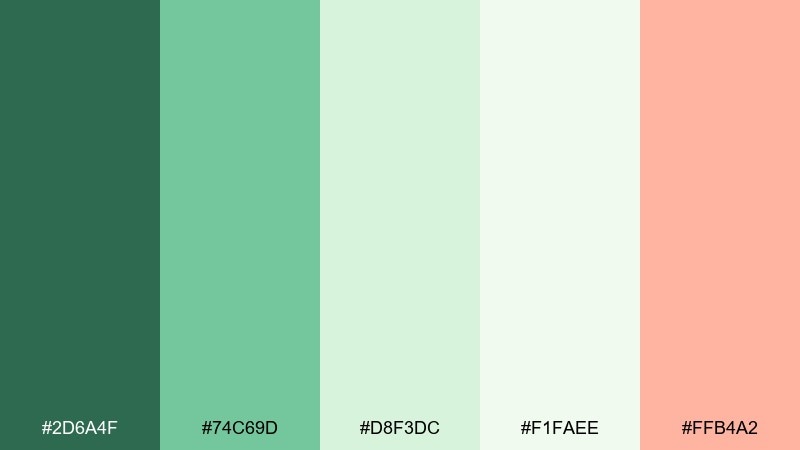
HEX: #2D6A4F #74C69D #D8F3DC #F1FAEE #FFB4A2
Mood: energetic, fresh, natural
Best for: eco product landing page UI
Crisp mint and leafy green feel like crushed herbs and clean air. Use the deep green for nav and headings, then let pale mint panels guide the eye through sections. Peach adds warmth for highlights so the design stays friendly, not clinical. Tip: pair with simple line icons and rounded cards to keep the page approachable.
Image example of wild mint generated using media.io
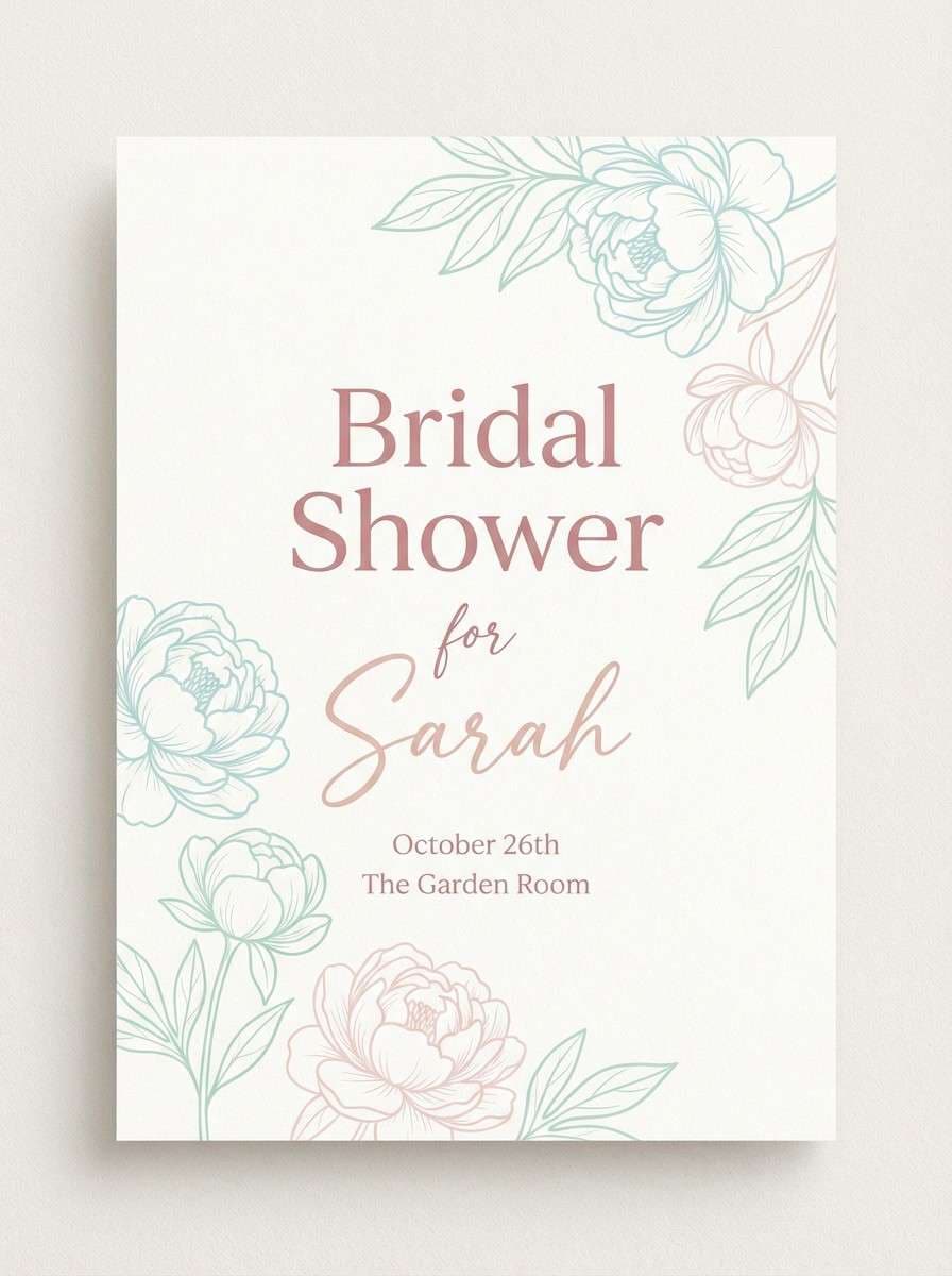
13) Peony Parasol
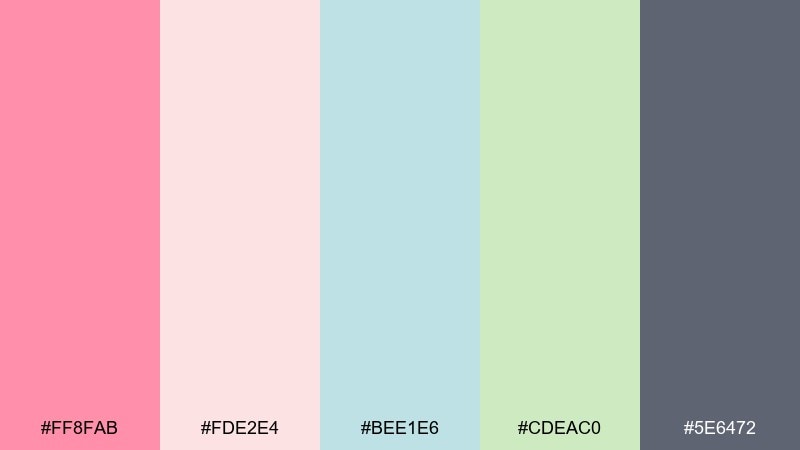
HEX: #FF8FAB #FDE2E4 #BEE1E6 #CDEAC0 #5E6472
Mood: flirty, light, modern
Best for: bridal shower invitation
Peony pink and airy blush bring a sweet, celebratory glow. These fairy garden color combinations are ideal for invitations when you want romance without heavy pastels. Use the charcoal gray for names and details, then reserve the bright pink for headings and monograms. Tip: keep florals minimal and let clean typography do most of the work.
Image example of peony parasol generated using media.io
14) Berry Bramble
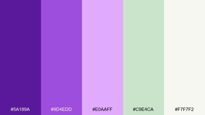
HEX: #5A189A #9D4EDD #E0AAFF #C9E4CA #F7F7F2
Mood: bold, magical, high-contrast
Best for: music festival flyer
Electric berry purples and pale lilac feel like wild brambles under glowing fairy lights. Use the deep purple for the headline and main blocks to create instant impact. Mint and off-white keep the layout breathable and prevent the brights from feeling heavy. Tip: add grainy gradients in the lighter purples for a modern, poster-ready texture.
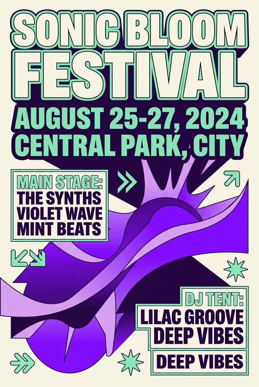
Image example of berry bramble generated using media.io
15) Tea Party Tulle
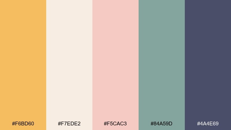
HEX: #F6BD60 #F7EDE2 #F5CAC3 #84A59D #4A4E69
Mood: charming, cozy, vintage
Best for: afternoon tea cafe table tent
Warm honey and soft blush feel like pastries on a lace tablecloth. Use the creamy tone for the main surface and the teal green for section dividers and small icons. The deep slate anchors pricing and fine print so it stays legible. Tip: keep the honey shade to one or two key highlights to maintain a refined vintage look.
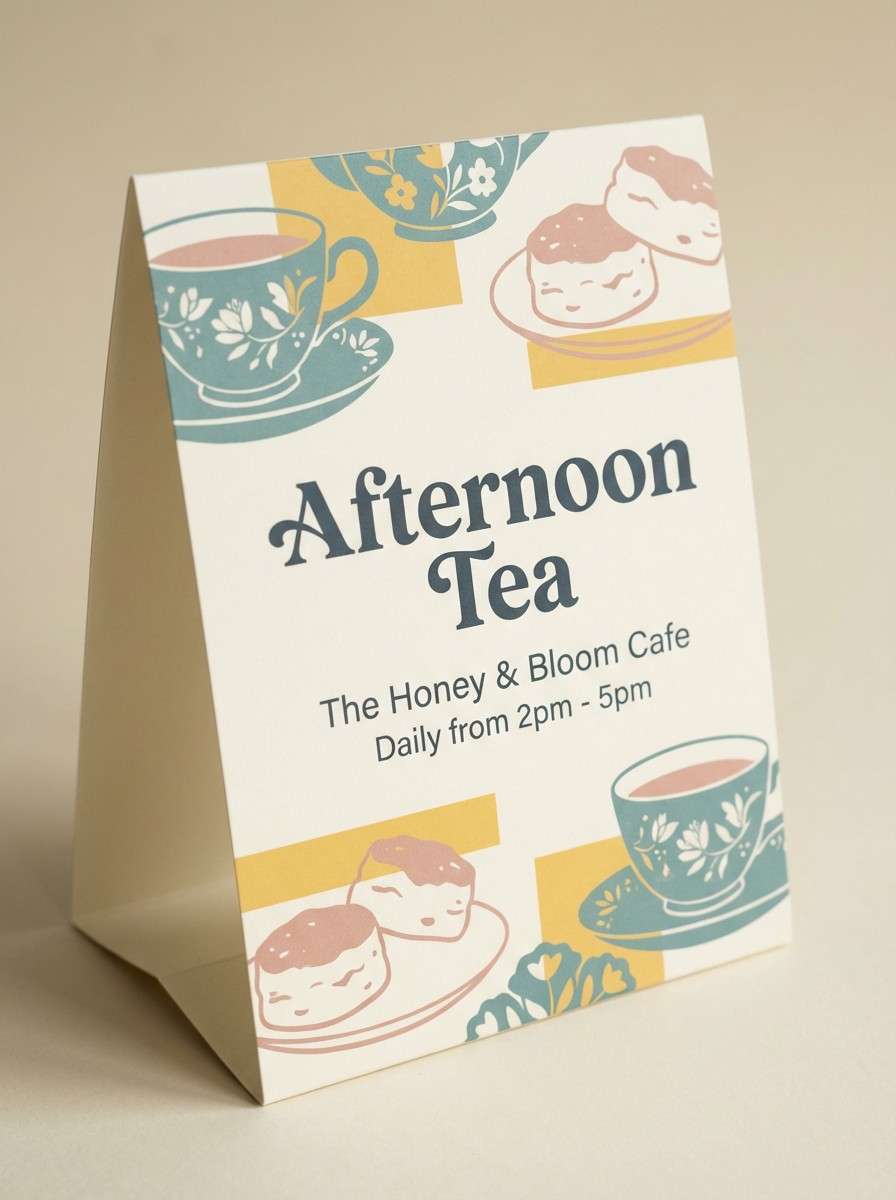
Image example of tea party tulle generated using media.io
16) Garden Gate Neutrals
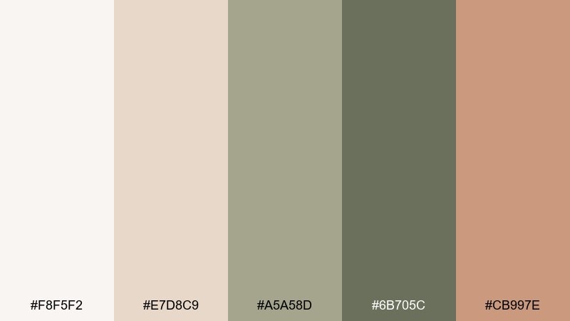
HEX: #F8F5F2 #E7D8C9 #A5A58D #6B705C #CB997E
Mood: quiet, timeless, organic
Best for: minimal brand guidelines page
Soft stone neutrals and muted leaf tones evoke weathered garden gates and sun-warmed paths. Use the off-white as the dominant base, then build structure with sage and olive for headings and UI elements. The warm clay-beige adds a subtle accent that feels handmade. Tip: rely on texture and spacing rather than bright color to create distinction between sections.
Image example of garden gate neutrals generated using media.io
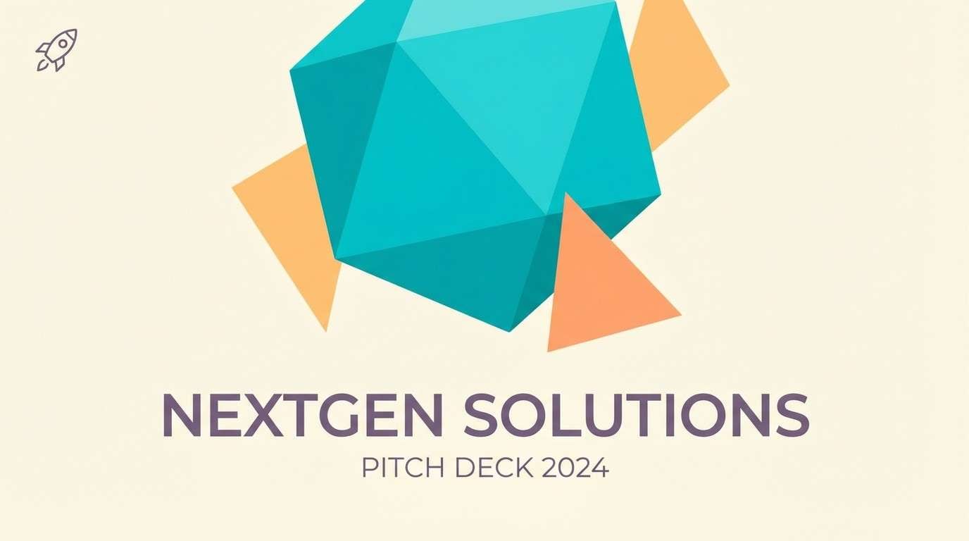
17) Glimmering Sprout
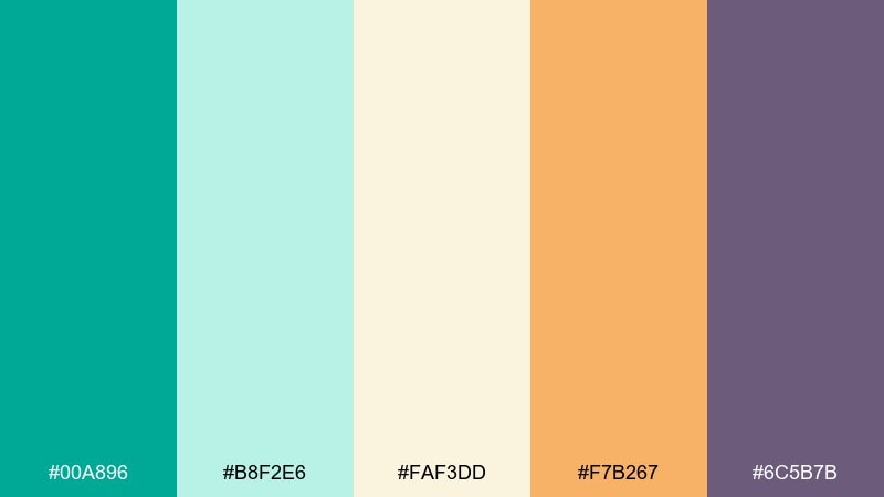
HEX: #00A896 #B8F2E6 #FAF3DD #F7B267 #6C5B7B
Mood: sparkly, upbeat, contemporary
Best for: startup pitch deck cover slide
Bright sprout teal and creamy vanilla feel like new growth catching the light. Use teal as the hero shape and keep vanilla as the background for a clean, high-confidence slide. Apricot adds friendly warmth, while the muted purple can support charts and subheads. Tip: stick to big geometric blocks so the colors look intentional and modern.
Image example of glimmering sprout generated using media.io
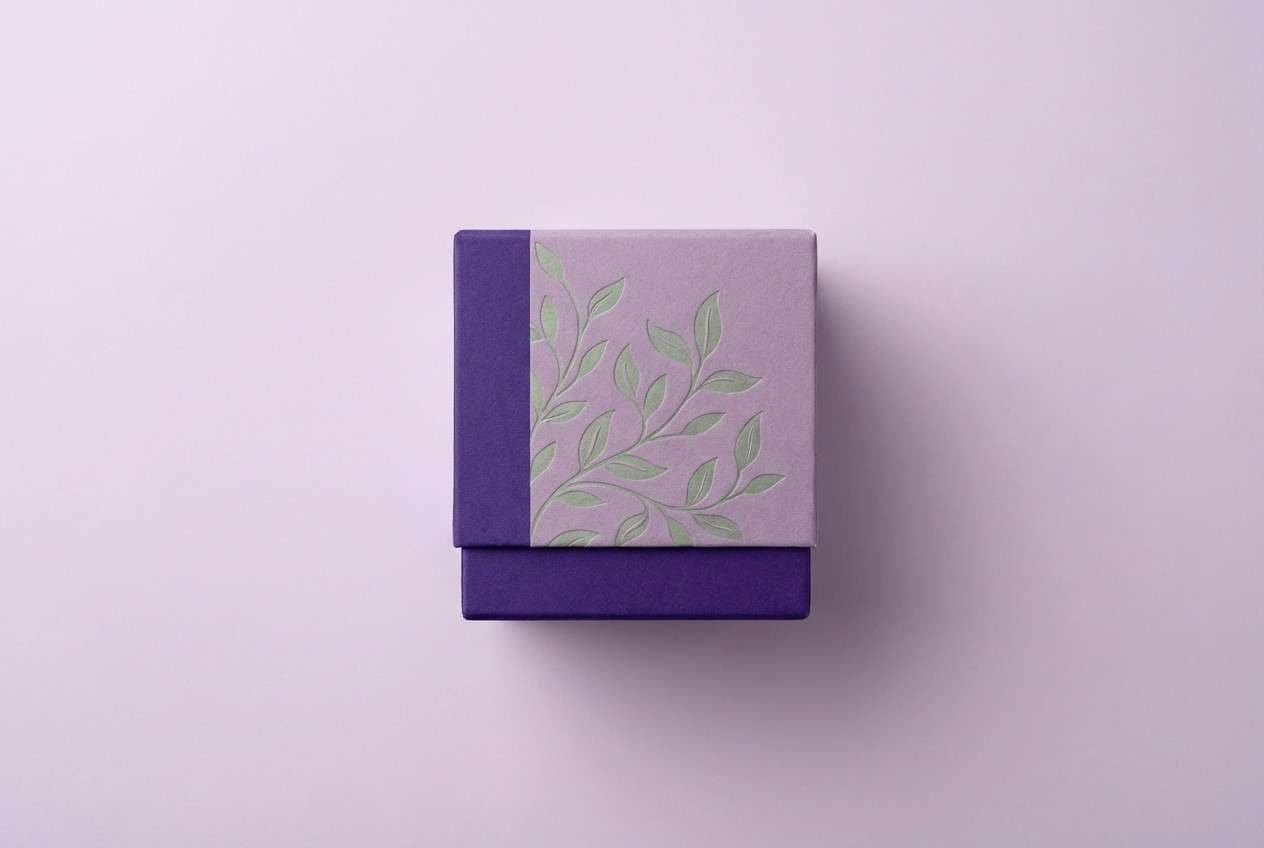
18) Thistle & Silk
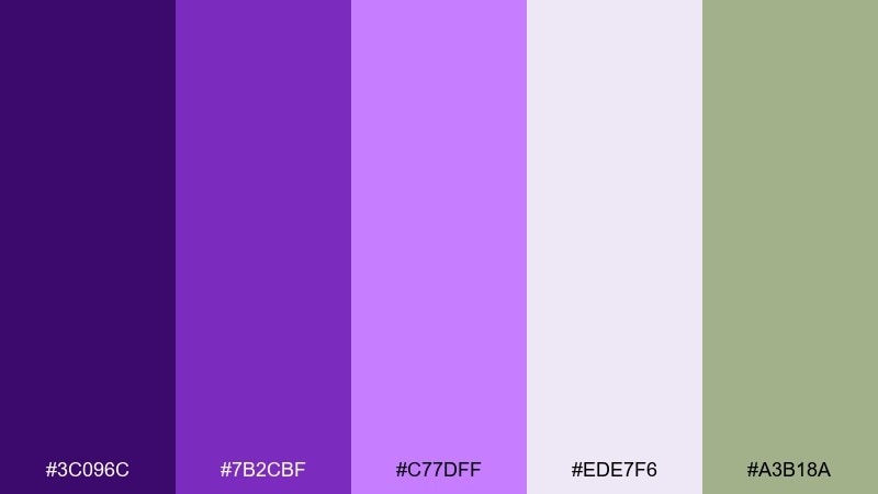
HEX: #3C096C #7B2CBF #C77DFF #EDE7F6 #A3B18A
Mood: opulent, mystical, refined
Best for: boutique perfume box
Royal violet and silky lilac suggest thistles, velvet ribbons, and hidden garden alcoves. Use the darkest purple for the brand mark and fine borders so the packaging feels luxe. The pale lavender keeps the overall look soft, while sage adds a botanical twist that prevents the purples from feeling too candy-like. Tip: emboss the logo and keep the sage to small leaf motifs for a premium finish.
Image example of thistle & silk generated using media.io
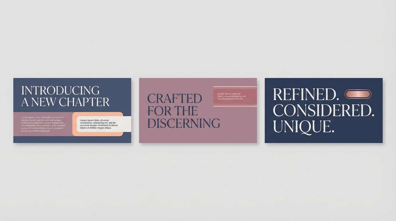
19) Butterfly Wing
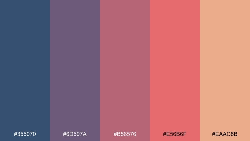
HEX: #355070 #6D597A #B56576 #E56B6F #EAAC8B
Mood: romantic, confident, warm
Best for: brand Instagram carousel
Dusty navy and rose tones feel like patterned butterfly wings in late afternoon sun. Use navy for strong anchors, then layer mauve and rose for panels, quotes, and product callouts. Peach warms up the set and keeps it approachable on small screens. Tip: keep one dominant background per slide to avoid muddy overlaps in the mid tones.
Image example of butterfly wing generated using media.io
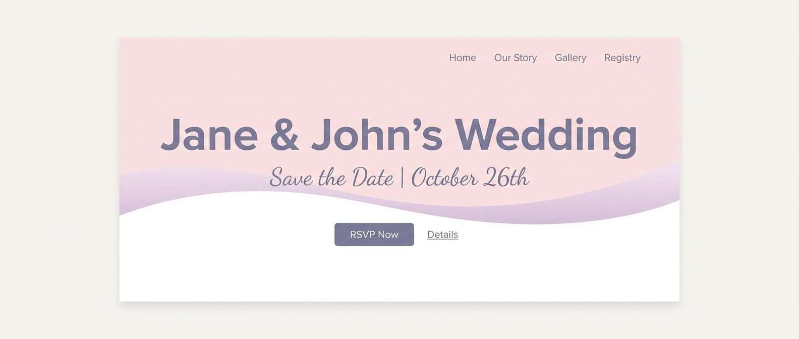
20) Wisteria Whisper
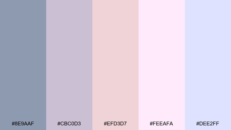
HEX: #8E9AAF #CBC0D3 #EFD3D7 #FEEAFA #DEE2FF
Mood: delicate, dreamy, airy
Best for: wedding website hero section
Wisteria lilac and sheer pink feel like petals drifting through a quiet breeze. For a fairy garden color palette that works on the web, use the pale pink as the hero background and the slate-lilac for text and navigation. The extra light tones can create subtle section breaks without harsh lines. Tip: avoid pure white overlays and use the soft lavender tint instead for a more romantic glow.
Image example of wisteria whisper generated using media.io
21) Petal Pathway
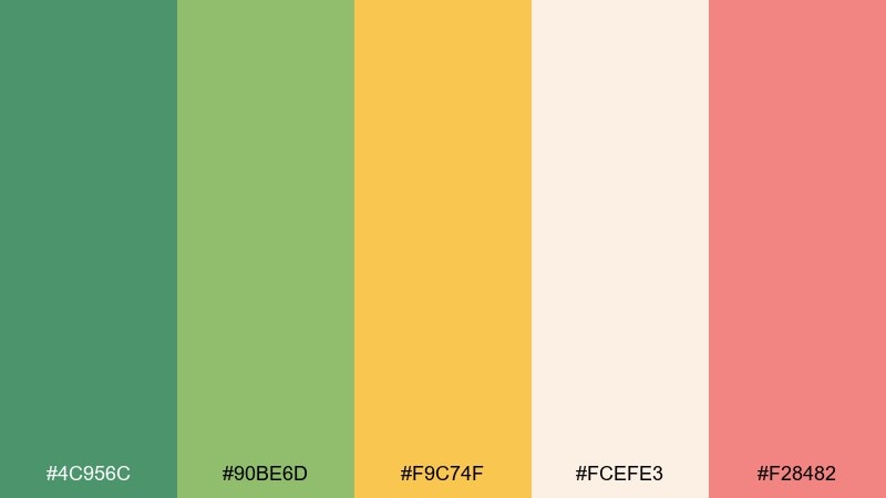
HEX: #4C956C #90BE6D #F9C74F #FCEFE3 #F28482
Mood: optimistic, sunny, nature-forward
Best for: garden workshop signup banner
Bright greens and warm petal coral evoke a sunny path lined with fresh blooms. These fairy garden color combinations are great for banners because the contrast stays lively and readable. Use the cream for the base, then stack green shapes behind the headline and reserve coral for the signup button. Tip: keep the yellow as a small highlight so it adds sparkle without stealing attention.
Image example of petal pathway generated using media.io

What Colors Go Well with Fairy Garden?
Fairy garden palettes pair best with softened naturals: cream, oat, stone, and warm off-white keep the look airy and prevent greens and pinks from feeling too sweet. Gentle grays also help typography stay crisp.
For contrast, add one grounding shade like deep forest green, indigo, or smoky purple-gray. That single dark anchor makes headings, logos, and UI labels readable while preserving the whimsical mood.
If you want extra sparkle, use a small hit of coral, apricot, or honey yellow as a controlled accent for buttons, dates, stickers, or pricing—just enough to guide attention.
How to Use a Fairy Garden Color Palette in Real Designs
Start with a “garden base” (cream or pale blush) for backgrounds, then choose one green as your primary brand or UI color. Reserve florals (pink/lilac) for highlights like badges, patterns, and secondary illustrations.
In print, consider matte finishes to keep greens velvety and premium. In digital work, keep gradients subtle and use the darkest shade only where you need clarity, like nav, titles, and icon strokes.
To avoid a muddy look, limit mid-tones on the same surface. Give each component a clear role—background, content surface, accent, and anchor—so the palette reads intentional.
Create Fairy Garden Palette Visuals with AI
If you already have HEX codes, you can turn them into on-brand mockups quickly by generating packaging, posters, invitations, or UI screens that match your fairy garden vibe.
Use prompts that describe the product, layout style, lighting, and “dominant tones,” then specify where accents should appear (buttons, badges, borders). This keeps outputs consistent across a full design system.
With Media.io, you can iterate fast—testing multiple compositions while keeping the same color mood—until you land on a look that feels magical and readable.
Fairy Garden Color Palette FAQs
-
What is a fairy garden color palette?
A fairy garden palette is a whimsical set of colors inspired by flowers, leaves, moss, and soft sunlight—typically pastel greens, blush pinks, lilacs, and creamy neutrals, often with one darker anchor shade for contrast. -
Which HEX colors feel most “fairy garden”?
Soft greens and botanical neutrals do most of the work (like #79A88B, #CDEAC0, #F7F2E6), while blush and lilac accents add the dreamy feel (like #F3C6D4, #B8B0D6, #E3D7FF). -
How do I keep fairy garden colors from looking childish?
Use more cream/off-white space, add one deep anchor (forest green, indigo, or smoky purple-gray), and keep bright accents minimal. Clean typography and generous whitespace also make the palette feel editorial and refined. -
What’s the best fairy garden palette for branding?
For premium branding, choose a grounded green-led set like Enchanted Fern or Mossy Blossom, then use cream as the main background and pink/lilac as secondary accents for stamps, seals, or patterns. -
Do fairy garden palettes work for UI design?
Yes—use light aqua/cream as the canvas, a dark navy/green for headings, and a single warm accent (coral or pink) for the primary button. This keeps the interface calm while maintaining accessible contrast. -
What are common mistakes when using pastel botanical palettes?
Common issues include using too many mid-tones together (which can look muddy), relying on pure white overlays (which can feel stark), and spreading accent colors everywhere instead of giving them one clear job (like CTA only). -
Can I generate fairy garden mockups with AI using these palettes?
Yes—use Media.io Text to Image and describe the design type (label, invitation, UI), then specify dominant colors and where accents should appear. This helps the AI keep the fairy garden mood consistent across variations.
Next: Ice Cream Color Palette


