

A space color palette blends deep, low-light neutrals with luminous accents—perfect for modern UI, cinematic posters, and sleek brand systems.
Below are 20 space palette ideas with HEX codes, plus practical tips and AI prompts you can reuse to generate matching visuals fast.
In this article
Why Space Color Palettes Work So Well
Space palettes are naturally high-contrast: dark foundations (near-black, midnight navy, deep indigo) create instant depth, while bright accents (cyan, violet, amber, starlight cream) pull focus to what matters.
They also feel “designed” with minimal effort. A single accent color on top of a deep base can establish a futuristic, cinematic tone—ideal for dashboards, landing pages, and poster layouts.
Finally, these palettes support readability when used thoughtfully: reserve the lightest tints for text, cards, and spacing, and keep saturated accents for actions, highlights, or key data points.
20+ Space Color Palette Ideas (with HEX Codes)
1) Midnight Orbit
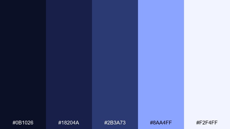
HEX: #0B1026 #18204A #2B3A73 #8AA4FF #F2F4FF
Mood: mysterious, sleek, cinematic
Best for: saas landing page hero and navigation
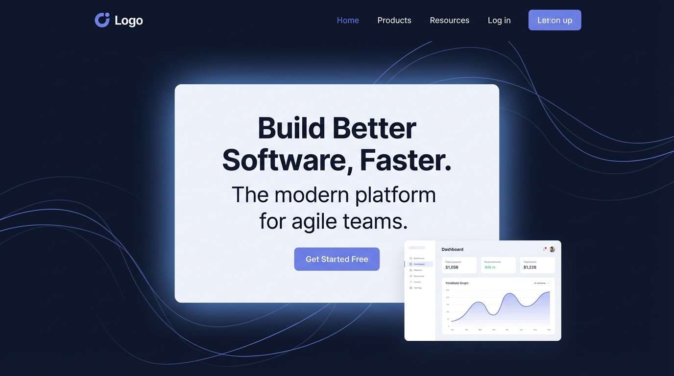
Mysterious and cinematic, these tones feel like a silent orbit over a lit horizon. Use the deep navy as your base, then let the periwinkle highlight CTAs and key metrics. Pair with clean white type and subtle gradients to keep it modern instead of moody. Tip: reserve the lightest tint for spacing and cards so the dark UI stays readable.
Image example of midnight orbit generated using media.io
Media.io is an online AI studio for creating and editing video, image, and audio in your browser.

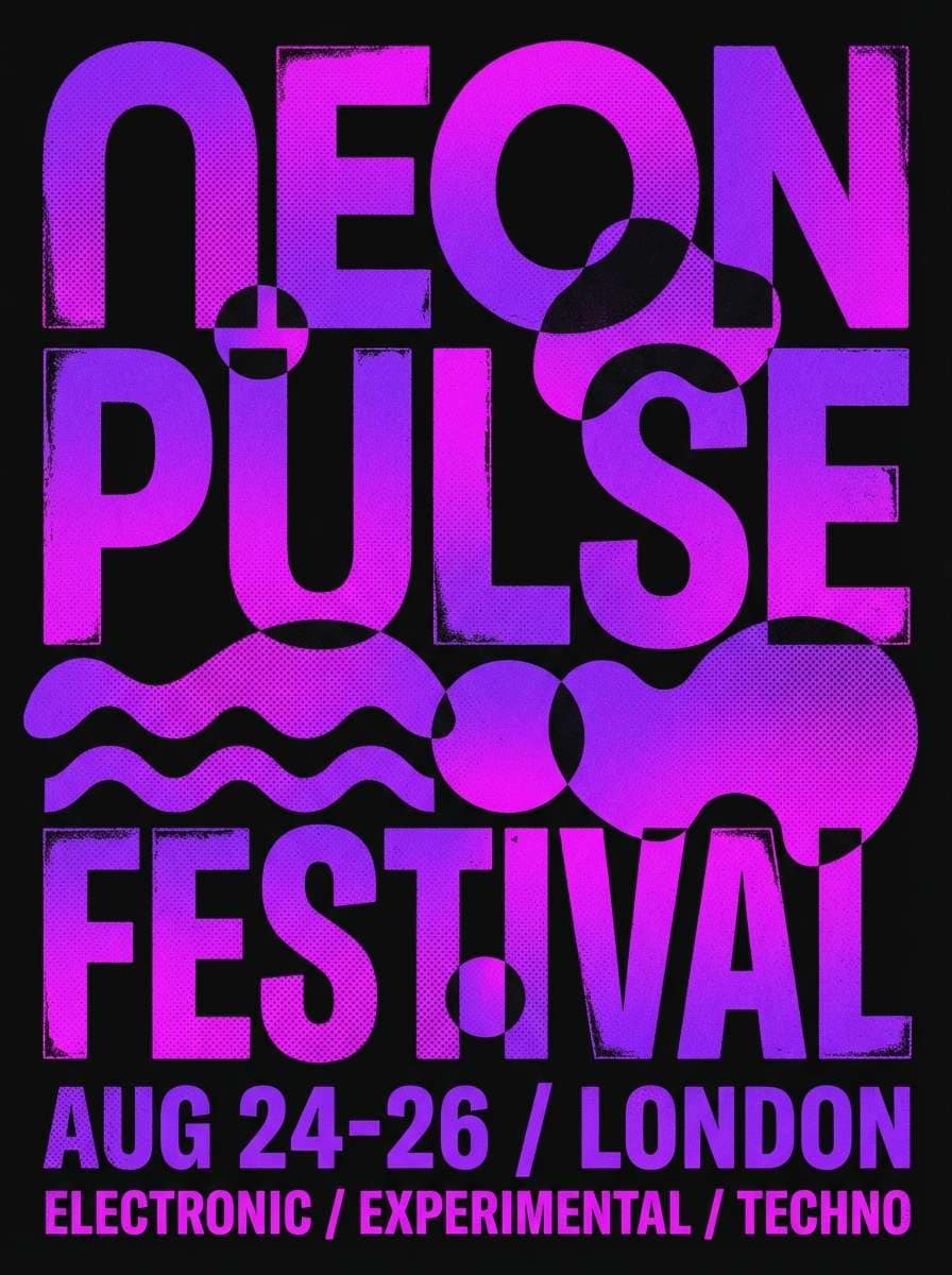
2) Nebula Bloom
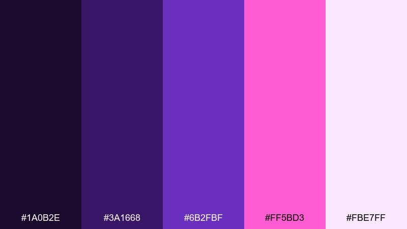
HEX: #1A0B2E #3A1668 #6B2FBF #FF5BD3 #FBE7FF
Mood: vivid, dreamy, energetic
Best for: music festival poster design
Vivid and dreamy, it reads like neon gas clouds swirling in slow motion. Keep the darkest purple for the background, then layer the magenta as a bold headline color. Add the pale lavender as negative space so the poster stays legible from a distance. Tip: use glow or soft blur effects sparingly to avoid muddy edges.
Image example of nebula bloom generated using media.io
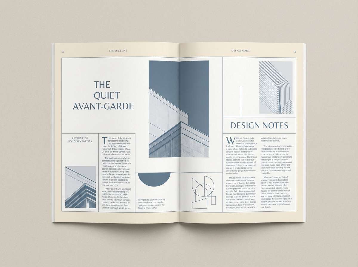
3) Starlight Dust
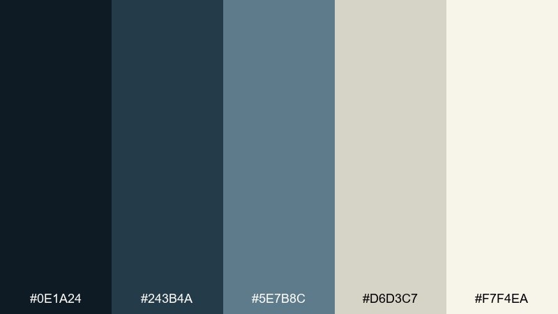
HEX: #0E1A24 #243B4A #5E7B8C #D6D3C7 #F7F4EA
Mood: calm, airy, refined
Best for: editorial magazine spread
Calm and refined, these tones evoke quiet star dust against a crisp night sky. Use the blue-grays for headings and rules, then bring in the warm creams for margins and captions. The mix works especially well with serif typography and high-resolution photography. Tip: keep the darkest tone for small accents so the page feels light, not heavy.
Image example of starlight dust generated using media.io
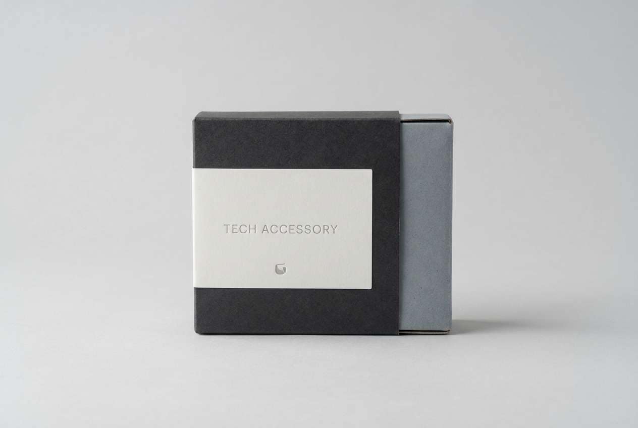
4) Lunar Surface
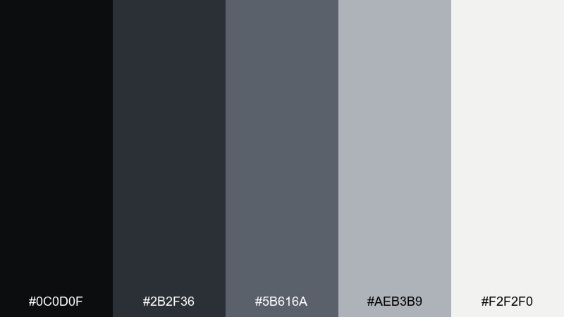
HEX: #0C0D0F #2B2F36 #5B616A #AEB3B9 #F2F2F0
Mood: industrial, grounded, minimal
Best for: product packaging for tech accessories
Industrial and grounded, it mirrors crater shadows and powdery light. Build the box and label system with the graphite and steel tones, then use the off-white for clean contrast. It pairs naturally with matte finishes, embossed details, and monochrome icon sets. Tip: add a single spot UV element to make the dark tones feel premium.
Image example of lunar surface generated using media.io
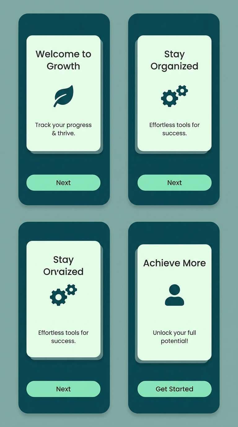
5) Aurora Drift
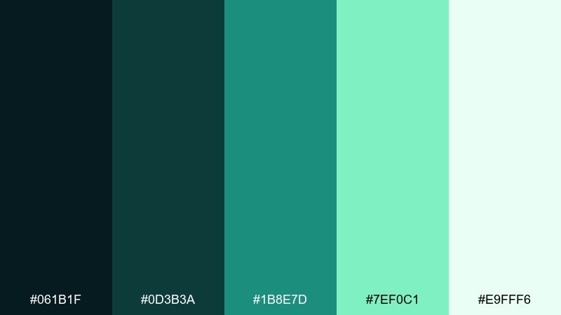
HEX: #061B1F #0D3B3A #1B8E7D #7EF0C1 #E9FFF6
Mood: fresh, luminous, serene
Best for: wellness app onboarding screens
Fresh and luminous, it feels like an aurora sliding across cold air. Use the deep teal for screen backgrounds and the mint as the primary action color. The pale green-white keeps onboarding panels calm and breathable. Tip: choose rounded UI components so the bright mint reads soothing, not sharp.
Image example of aurora drift generated using media.io
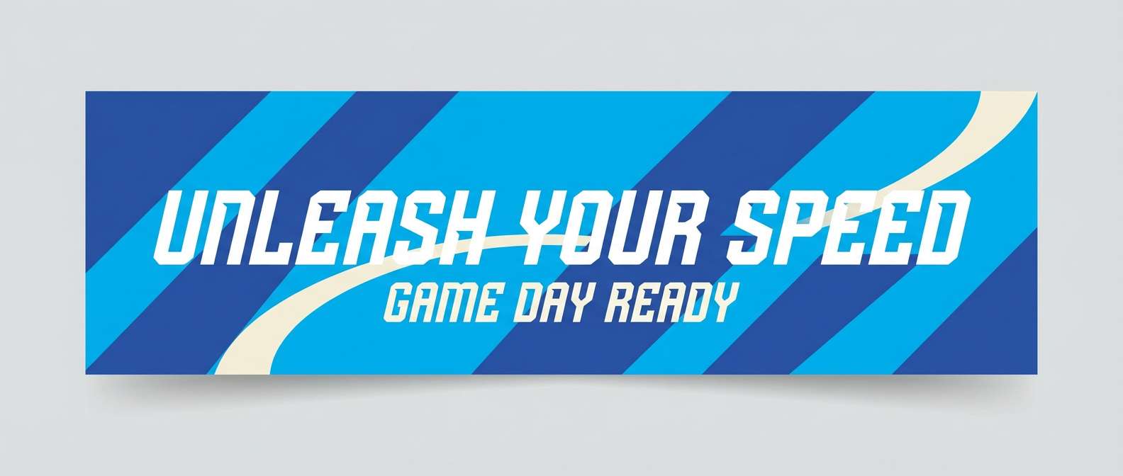
6) Comet Tail
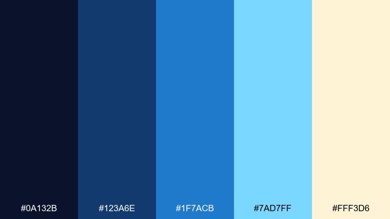
HEX: #0A132B #123A6E #1F7ACB #7AD7FF #FFF3D6
Mood: bright, optimistic, energetic
Best for: sports brand banner ads
Bright and optimistic, it suggests a comet streaking past a warm glow. These space color combinations work best when the cobalt and sky blue take the lead and the cream stays as a soft highlight. Pair with bold sans-serif type and diagonal shapes to reinforce motion. Tip: keep gradients subtle so the blues stay crisp on small screens.
Image example of comet tail generated using media.io
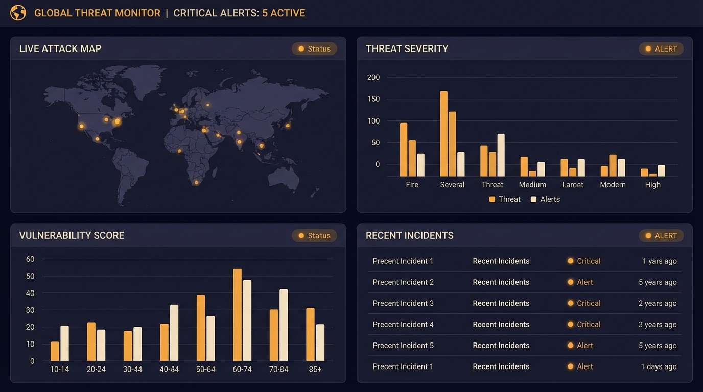
7) Deep Space Signal
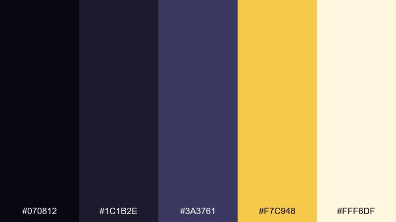
HEX: #070812 #1C1B2E #3A3761 #F7C948 #FFF6DF
Mood: moody, futuristic, high-contrast
Best for: cybersecurity dashboard UI
Moody and futuristic, it feels like a faint signal cutting through darkness. Use the near-black and indigo for panels, then let the amber act as a warning and status color. The warm light tint keeps charts readable without breaking the night vibe. Tip: limit amber to key states so alerts feel meaningful, not noisy.
Image example of deep space signal generated using media.io
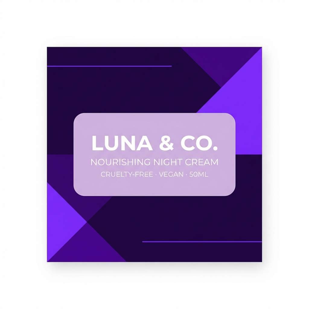
8) Void Violet
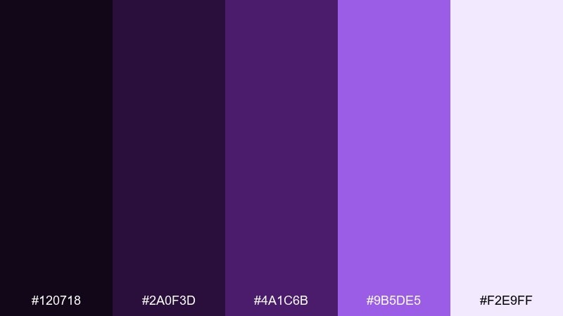
HEX: #120718 #2A0F3D #4A1C6B #9B5DE5 #F2E9FF
Mood: mystical, bold, elegant
Best for: beauty brand social media tiles
Mystical and elegant, it reads like violet light blooming in a dark void. Use the deepest purple as the tile background and the bright violet for product callouts. The pale lilac gives you room for text and ingredient icons without feeling stark. Tip: add a soft grain texture to keep gradients from banding on social feeds.
Image example of void violet generated using media.io
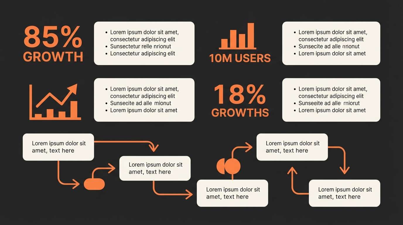
9) Rocket Fuel
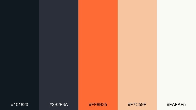
HEX: #101820 #2B2F3A #FF6B35 #F7C59F #FAFAF5
Mood: punchy, modern, confident
Best for: startup pitch deck slides
Punchy and confident, it feels like ignition against dark metal. Use charcoal for backgrounds and section dividers, then hit key numbers with the hot orange. The peach and soft white support charts and infographics without washing out. Tip: keep orange to one emphasis level so your hierarchy stays clear.
Image example of rocket fuel generated using media.io
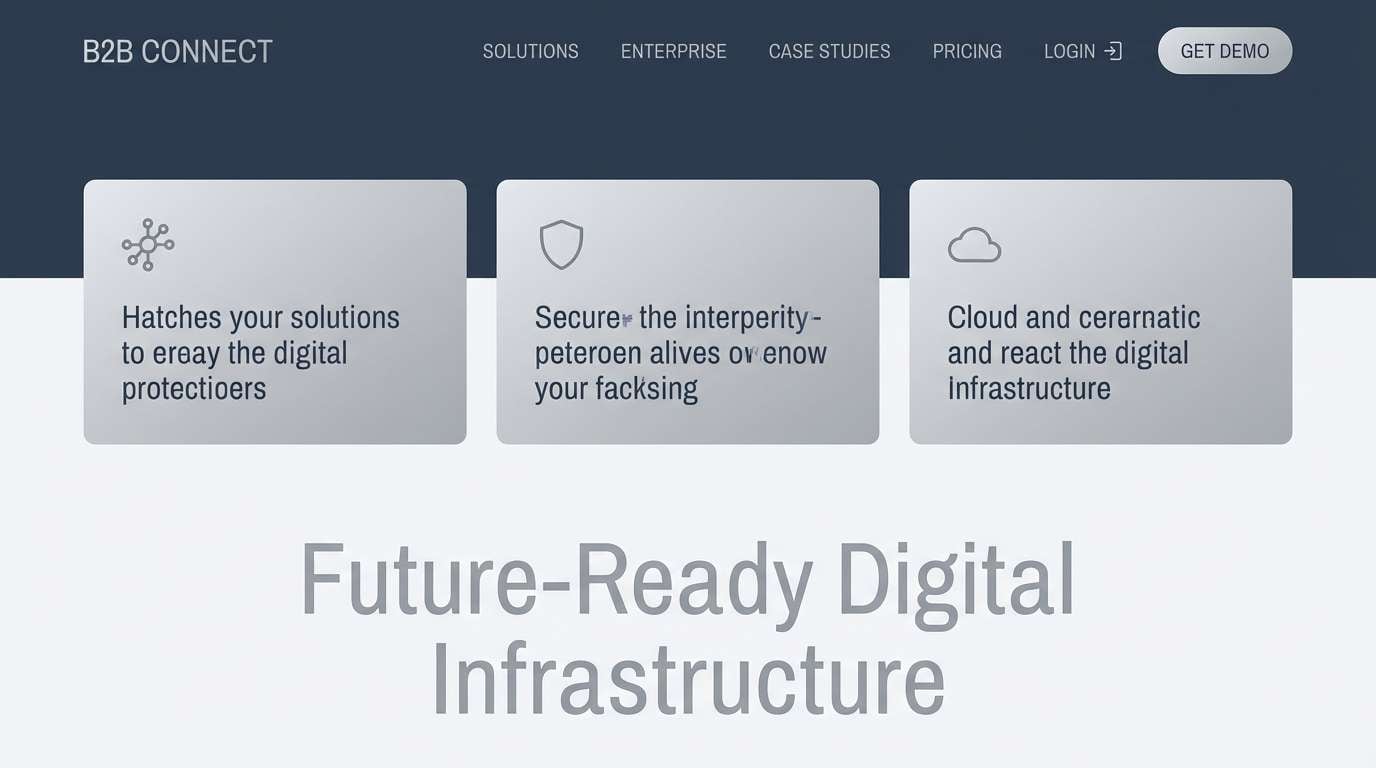
10) Satellite Silver
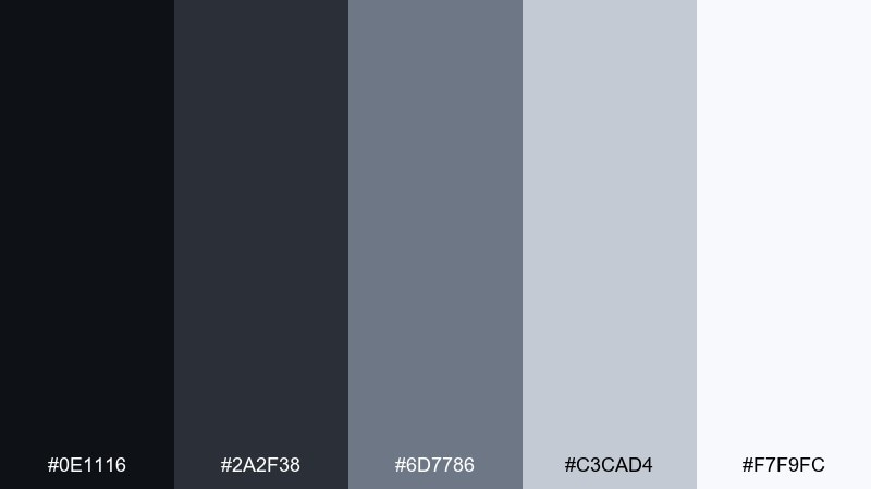
HEX: #0E1116 #2A2F38 #6D7786 #C3CAD4 #F7F9FC
Mood: clean, technical, understated
Best for: b2b website header and icon set
Clean and technical, it evokes brushed aluminum glinting in low light. Keep the dark tones for navigation and icon strokes, then use the silvers for cards and separators. It pairs well with geometric fonts and thin line illustrations. Tip: introduce subtle shadows rather than gradients to maintain a crisp, engineered look.
Image example of satellite silver generated using media.io
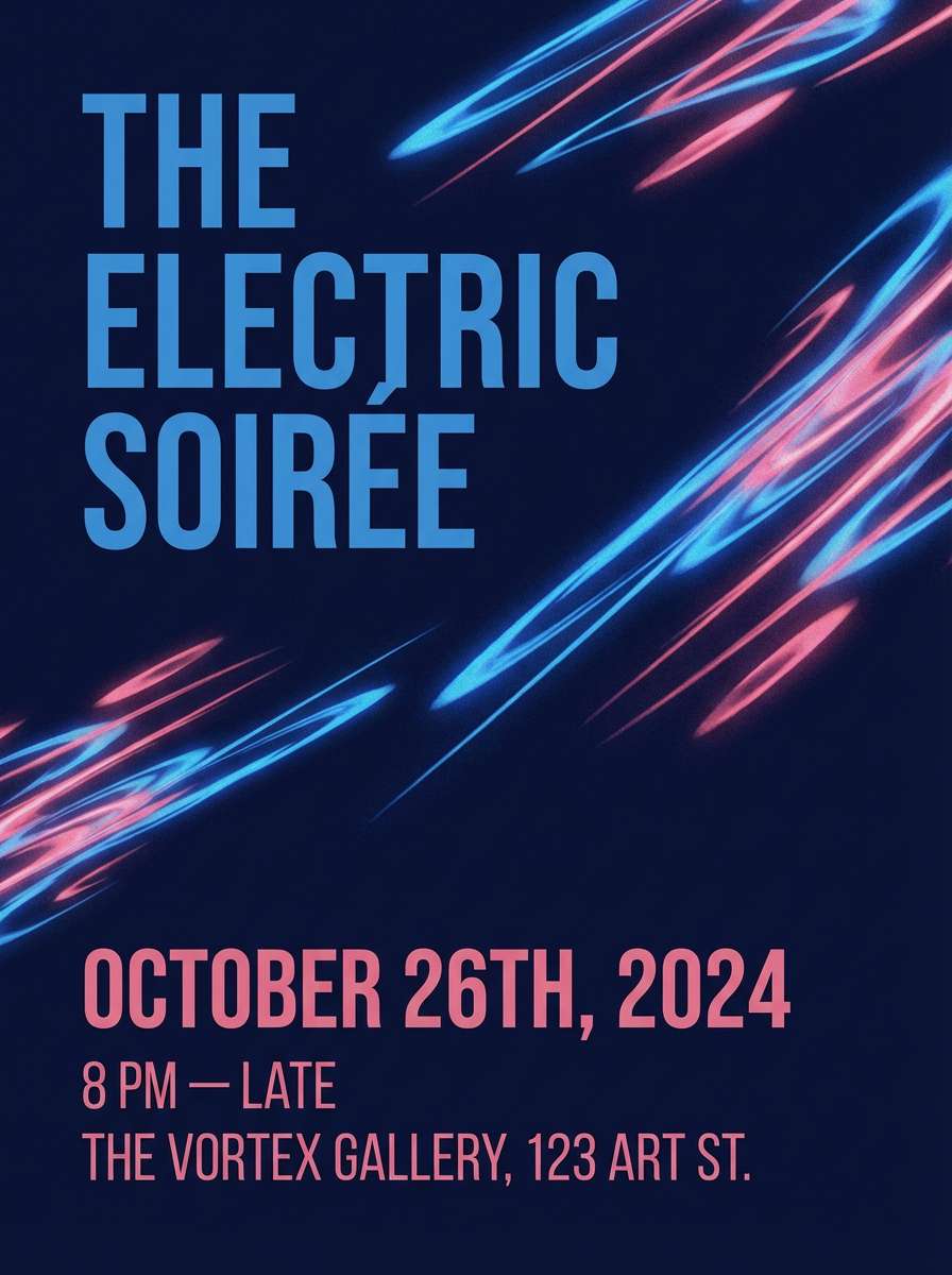
11) Meteor Shower
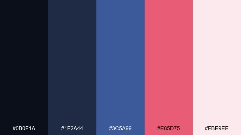
HEX: #0B0F1A #1F2A44 #3C5A99 #E85D75 #FBE9EE
Mood: dramatic, playful, high-impact
Best for: event invitation flyer
Dramatic and playful, it suggests bright meteor trails cutting through a cool night. Use the navy trio for the background and typography, then let the rose pop for dates or RSVP details. The pale blush keeps small text comfortable and adds softness to the overall contrast. Tip: use the rose as a repeating motif in dots or streaks for motion.
Image example of meteor shower generated using media.io
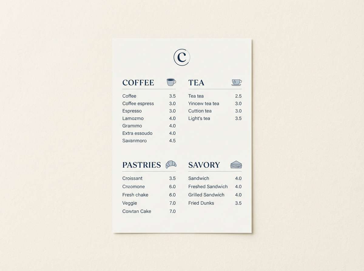
12) Cosmic Latte
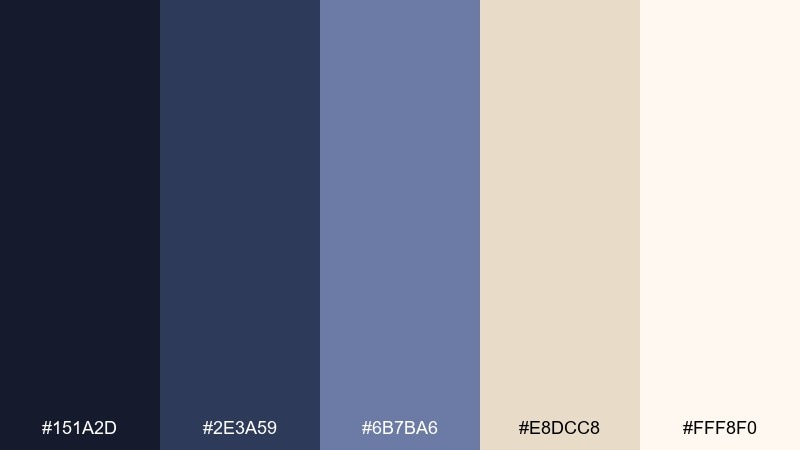
HEX: #151A2D #2E3A59 #6B7BA6 #E8DCC8 #FFF8F0
Mood: warm, balanced, sophisticated
Best for: cafe brand menu and signage
Warm and sophisticated, it feels like starlight reflecting in creamy foam. Use the navy-blue tones for headers and section blocks, and lean on the latte creams for the base. It pairs beautifully with minimal photography and thin-line illustrations. Tip: keep body text in the mid blue-gray so the cream background stays easy on the eyes.
Image example of cosmic latte generated using media.io
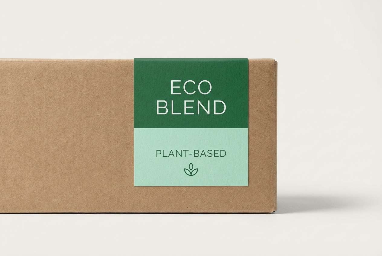
13) Galactic Garden
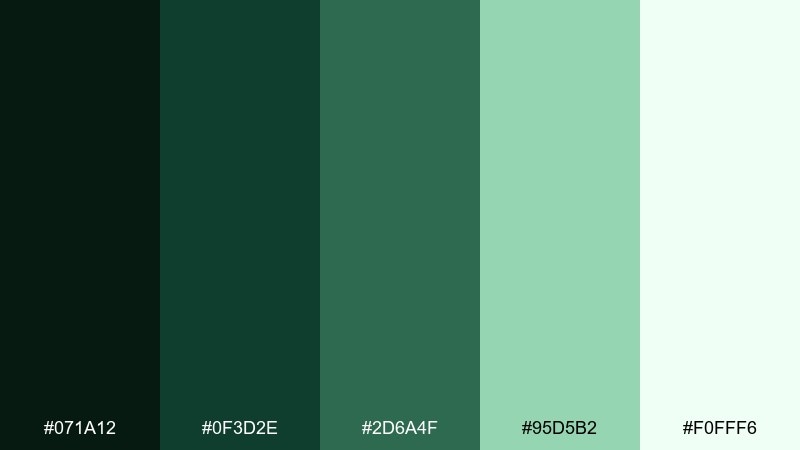
HEX: #071A12 #0F3D2E #2D6A4F #95D5B2 #F0FFF6
Mood: natural, calm, restorative
Best for: eco brand packaging label
Natural and restorative, it recalls deep greens lit by soft, distant glow. Use the forest tones for labels and seals, and keep the mint for highlights and sustainability badges. The near-white makes a clean base for ingredient lists and small-print details. Tip: choose uncoated paper textures so the greens feel grounded and organic.
Image example of galactic garden generated using media.io
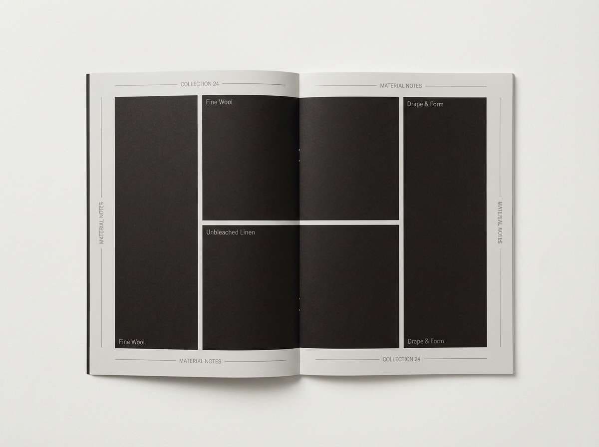
14) Event Horizon
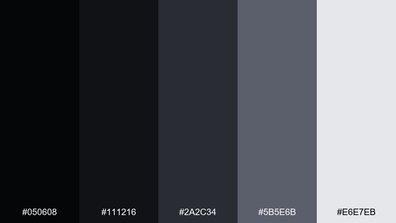
HEX: #050608 #111216 #2A2C34 #5B5E6B #E6E7EB
Mood: minimal, intense, premium
Best for: luxury brand lookbook layout
Minimal and intense, it evokes a sharp edge where light disappears. Use the near-black for full-bleed sections and the soft gray for typography and captions. This pairing shines with high-contrast photography and lots of whitespace. Tip: keep accent elements monochrome so the premium feel stays uninterrupted.
Image example of event horizon generated using media.io
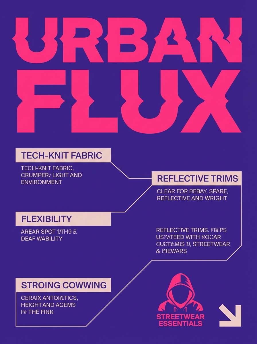
15) Plasma Pulse
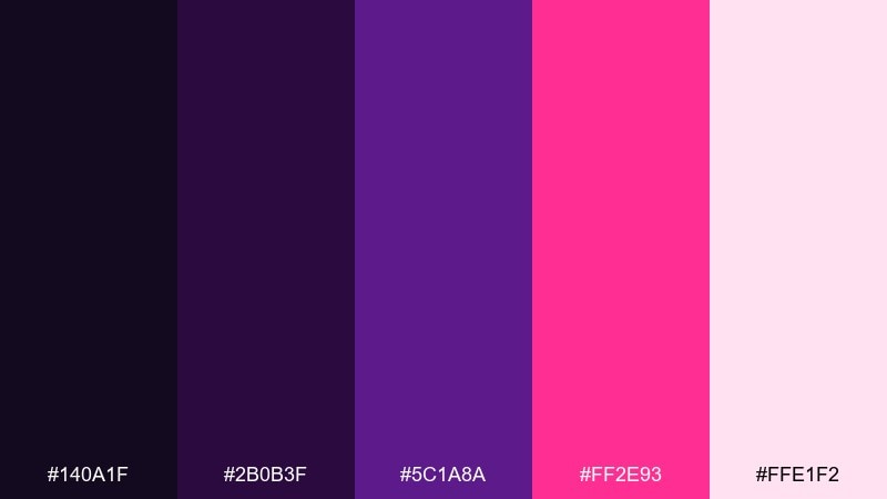
HEX: #140A1F #2B0B3F #5C1A8A #FF2E93 #FFE1F2
Mood: electric, trendy, expressive
Best for: streetwear product ad
Electric and expressive, it feels like plasma flickering in saturated violet light. Push the hot pink for the hero headline, then anchor the layout with deep purple shadows. The soft blush helps with pricing and details without fighting the intensity. Tip: use high-contrast type weights so the neon accents stay readable at a glance.
Image example of plasma pulse generated using media.io
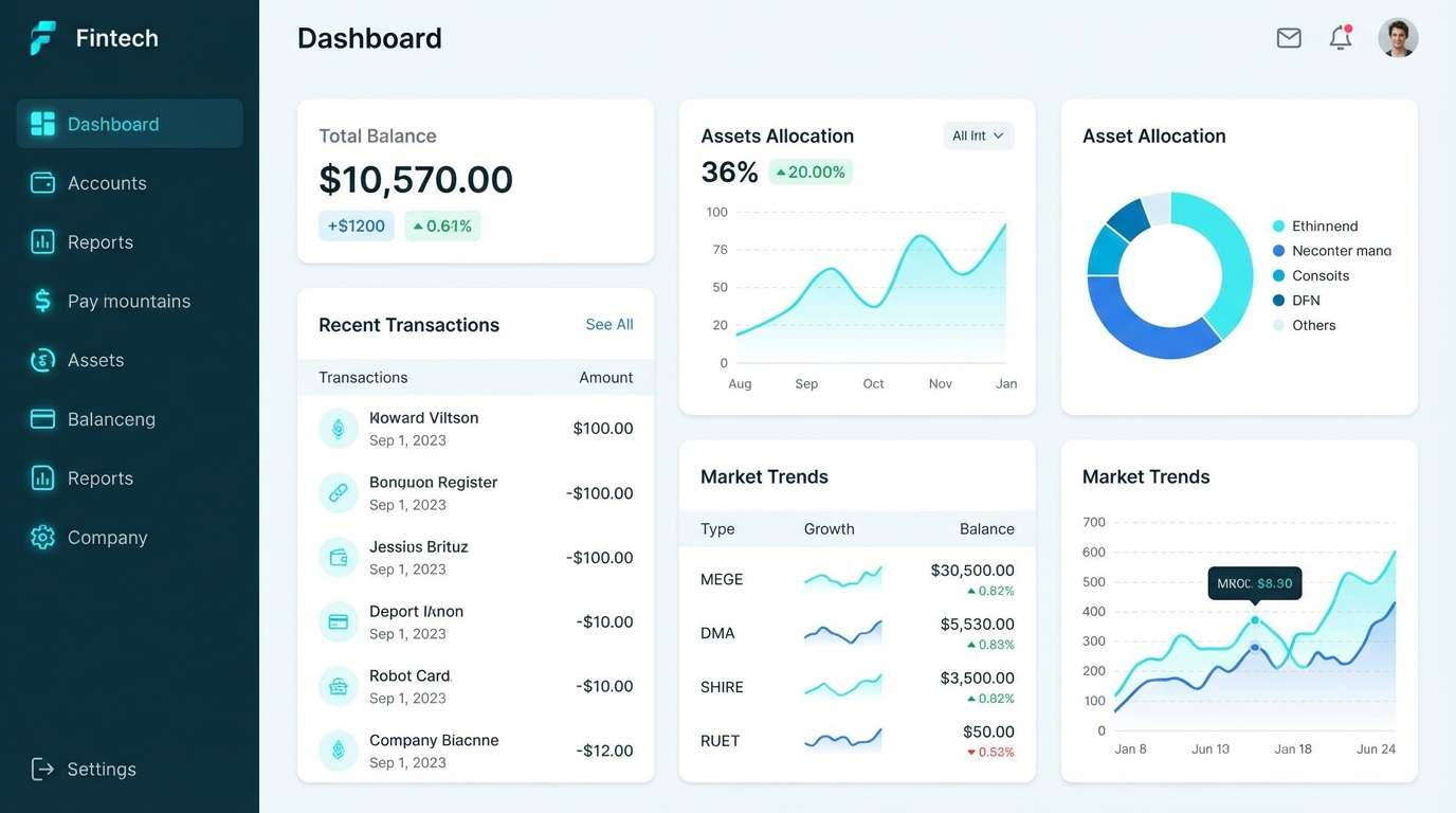
16) Ice Planet
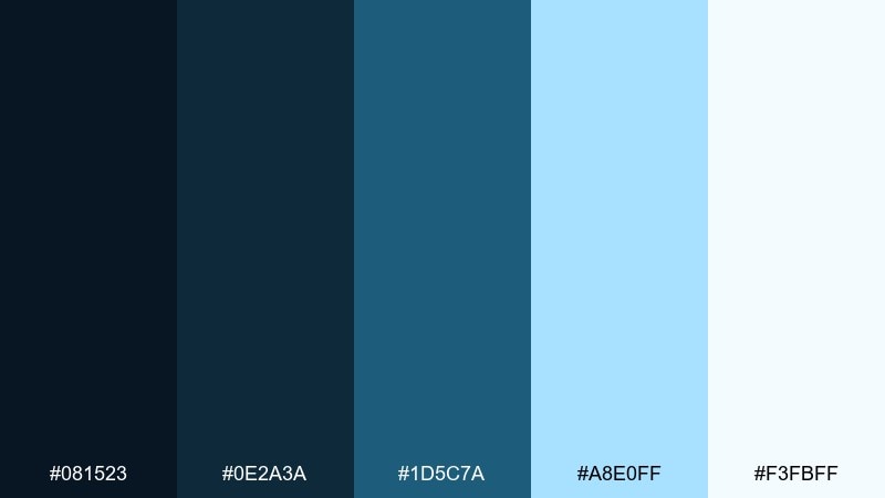
HEX: #081523 #0E2A3A #1D5C7A #A8E0FF #F3FBFF
Mood: cool, crisp, modern
Best for: fintech app dashboard
Cool and crisp, it brings to mind frozen atmosphere and clean, glassy light. Use the dark blue-greens for navigation and charts, and let the icy cyan highlight active states. The almost-white tint keeps tables and cards airy and professional. Tip: keep borders subtle and rely on spacing to separate sections.
Image example of ice planet generated using media.io
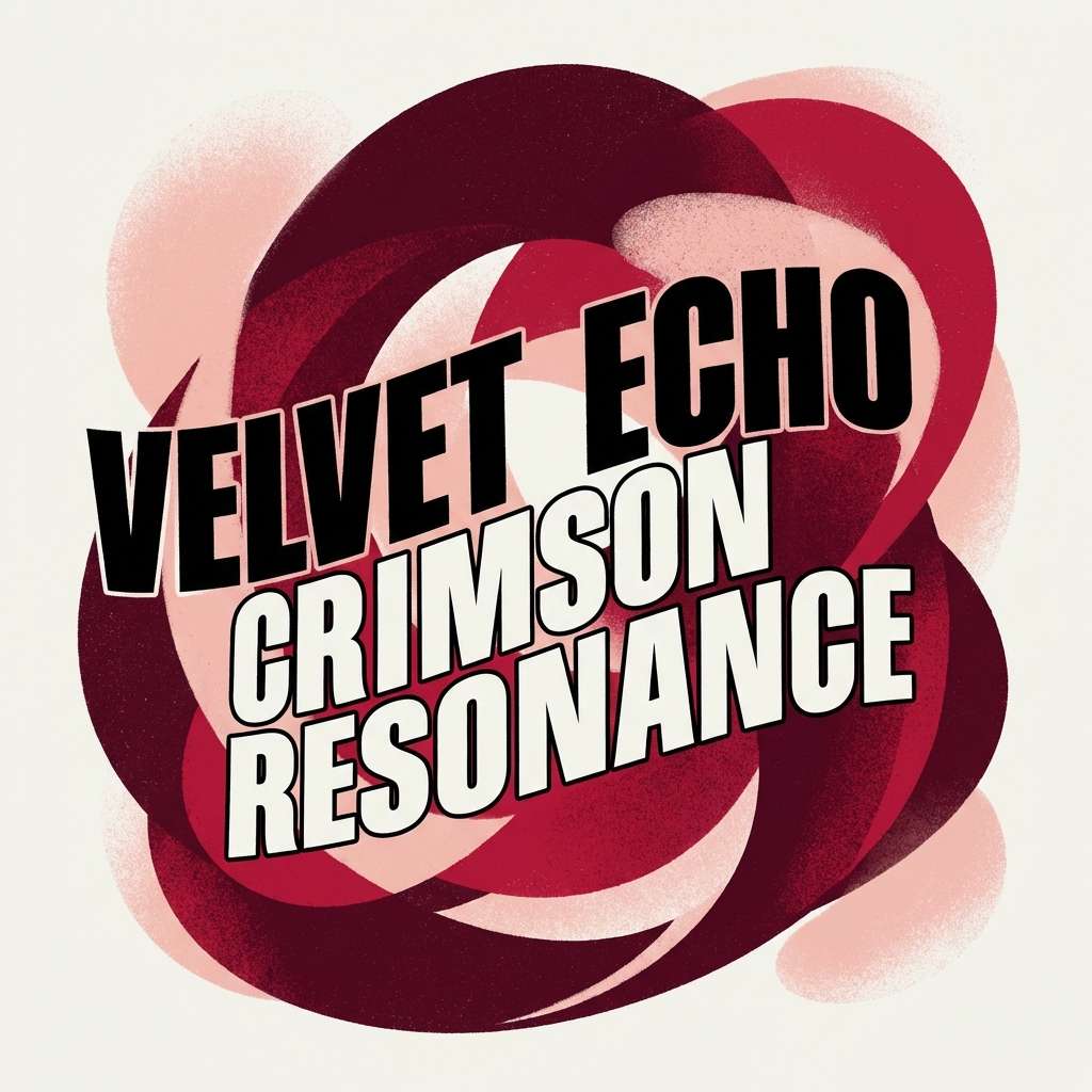
17) Redshift
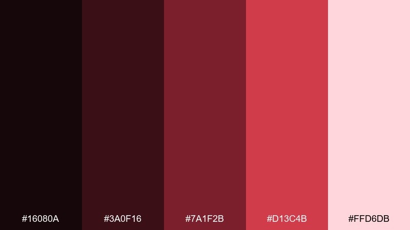
HEX: #16080A #3A0F16 #7A1F2B #D13C4B #FFD6DB
Mood: bold, cinematic, emotional
Best for: album cover artwork
Bold and cinematic, it suggests distant light stretching into deep reds. Let the darkest maroon frame the composition, and use the crimson for the artist name or focal shape. The blush tint balances the intensity and gives room for small credits. Tip: keep the palette tight and avoid extra neutrals so the cover feels intentional.
Image example of redshift generated using media.io
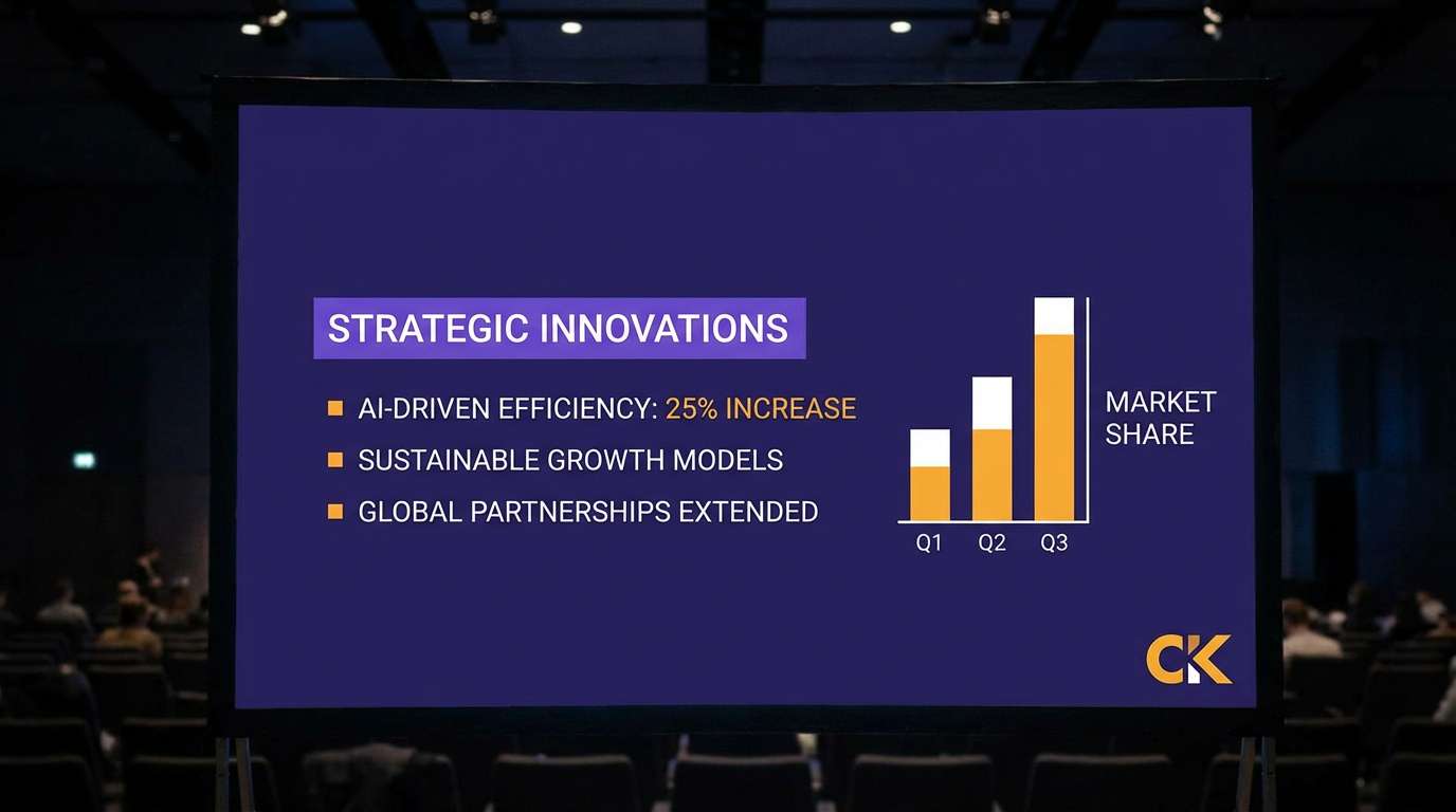
18) Solar Flare
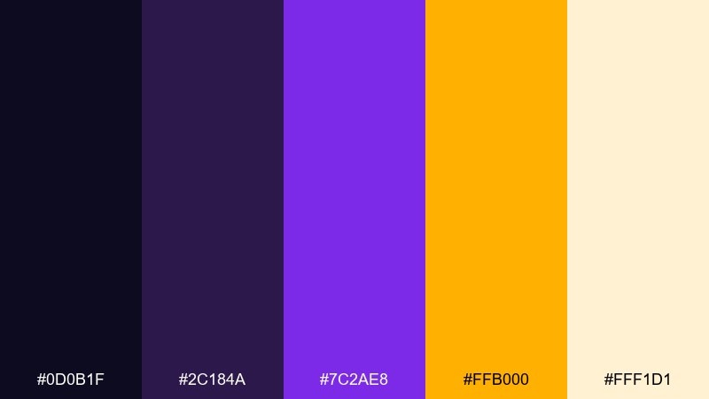
HEX: #0D0B1F #2C184A #7C2AE8 #FFB000 #FFF1D1
Mood: radiant, futuristic, attention-grabbing
Best for: conference keynote slide theme
Radiant and futuristic, it looks like a flare bursting through violet haze. Use the dark indigo for slide backgrounds and the violet for section headers. The amber brings instant focus to key takeaways and numbers, while the pale warm tint keeps supporting text readable. Tip: use amber for one highlight per slide to avoid visual fatigue.
Image example of solar flare generated using media.io
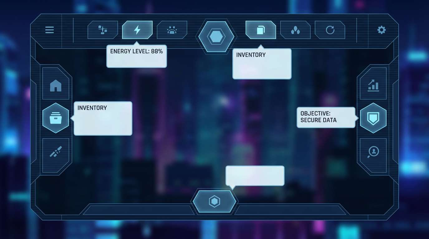
19) Starship UI
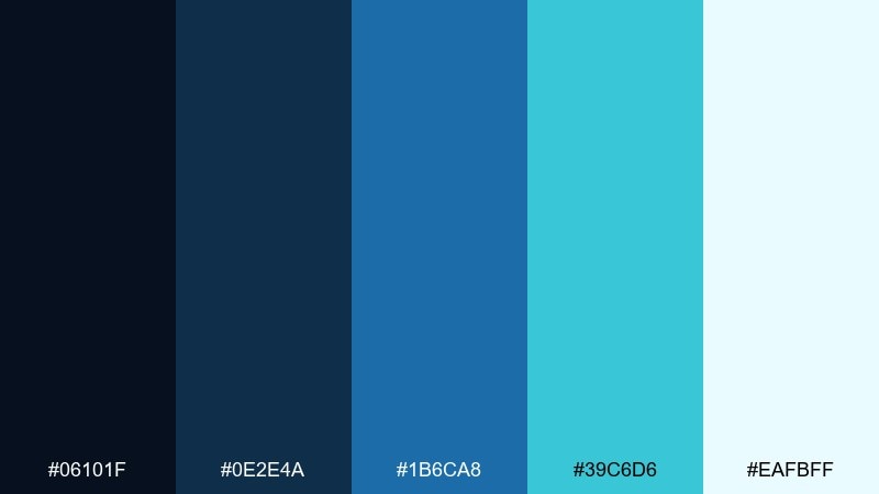
HEX: #06101F #0E2E4A #1B6CA8 #39C6D6 #EAFBFF
Mood: sleek, high-tech, precise
Best for: sci-fi game interface UI
Sleek and precise, it reads like a starship control panel lit in cold blues. This space color scheme works best with sharp grids, thin strokes, and small status chips. Use the cyan for interactive elements, and keep the light tint for overlays and tooltips. Tip: add subtle glow to cyan icons only, so the interface stays crisp.
Image example of starship ui generated using media.io
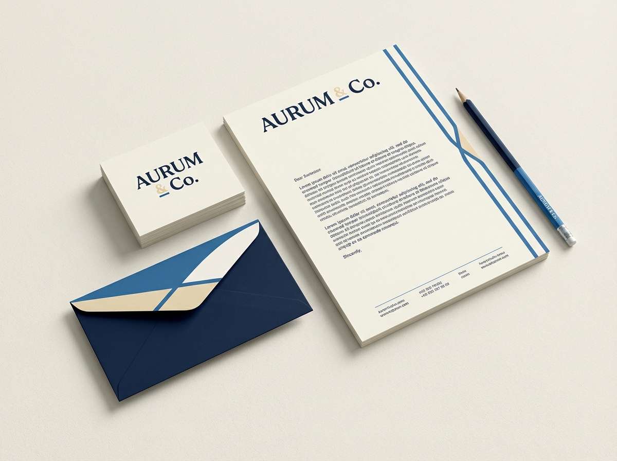
20) Creamy Constellation
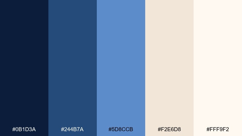
HEX: #0B1D3A #244B7A #5D8CCB #F2E6D8 #FFF9F2
Mood: cozy, polished, approachable
Best for: brand identity kit for a creative studio
Cozy yet polished, it feels like constellations mapped over warm paper. The mid blues make dependable primary tones, while the creams add an inviting, tactile balance. Use these as space color combinations for logos, stationery, and web sections where you want calm confidence. Tip: keep the deepest blue for wordmarks and use the lightest cream as your default background.
Image example of creamy constellation generated using media.io
What Colors Go Well with Space?
Space palettes pair best with anchored dark bases (near-black, midnight navy, graphite) because they create a “night sky” canvas that makes accents look brighter and cleaner.
For accents, cyan and periwinkle read as tech-forward, violet and magenta feel nebula-like and expressive, and amber or warm cream adds “starlight” contrast that prevents the design from feeling cold.
Neutrals matter too: blue-grays and soft off-whites help with typography, cards, and UI states—keeping dark themes readable and premium rather than heavy.
How to Use a Space Color Palette in Real Designs
Start with a hierarchy: pick one darkest color as your background, one mid-tone for surfaces (cards/panels), one light tint for text and spacing, and reserve one bright accent for actions or focal elements.
For UI, rely on contrast and spacing instead of too many outlines; for posters and branding, use gradients sparingly so colors stay crisp in print and on small screens.
If your design needs warmth, add a cream/amber highlight (like “starlight”)—it balances deep blues and purples without breaking the space vibe.
Create Space Palette Visuals with AI
If you already have a palette, the fastest way to validate it is to generate mockups: UI hero sections, posters, packaging, or social tiles in the exact colors and mood you want.
With Media.io Text-to-Image, you can paste a prompt (like the examples above), iterate variations, and quickly find a composition that matches your brand’s “cosmic” direction.
Once you like a result, reuse the same prompt structure and swap only the palette mood (sleek, dreamy, industrial) to keep your creative system consistent across formats.
Space Color Palette FAQs
-
What is a space color palette?
A space color palette is a set of colors inspired by night skies, galaxies, and sci-fi UI—usually built on deep navy/black tones with bright accents like cyan, violet, magenta, amber, or starlight cream. -
Which “space” colors are best for modern UI?
Midnight navy, indigo, and blue-gray work well for backgrounds and panels, while cyan/periwinkle are strong for interactive states. Add an off-white tint for text and card surfaces to maintain readability. -
How do I keep a dark space palette readable?
Use the lightest tint for body text and key surfaces, keep pure black to a minimum, and reserve saturated accents for CTAs or status. Strong contrast plus generous spacing usually beats heavy borders. -
What accent color feels like “starlight”?
Warm creams and soft ambers give a believable starlight effect. They add warmth and focus against blues/purples without looking like a random highlight. -
Are space palettes good for branding?
Yes—space palettes communicate premium, futuristic, and cinematic cues. They’re especially effective for tech, gaming, SaaS, and creative studios when paired with clean typography and restrained accent usage. -
How many colors should I use from a space palette?
In most designs, 3–4 is enough: one base dark, one surface mid-tone, one light tint, and one accent. Using all five is possible, but keep the accent count low to avoid visual noise. -
Can I generate space-themed visuals that match my palette?
Yes—use a text-to-image tool and describe the design format (UI, poster, packaging), the mood (sleek, dreamy, industrial), and your color intent (deep navy base + cyan accents + warm cream highlights) to get consistent results.
Next: Blue Cream Color Palette


