

Mahogany is a red-brown color family that instantly adds warmth, depth, and a sense of craftsmanship. It’s a go-to for brands and spaces that want to feel grounded, premium, and welcoming without looking overly rustic.
Below are 20+ mahogany color combinations with HEX codes, plus practical pairing tips for branding, interiors, UI, and print.
In this article
- Why Mahogany Palettes Work So Well
-
- cedar ember
- brass and burlwood
- cocoa velvet
- desert winery
- smoked rosewood
- copper clay
- old town brick
- quiet atelier
- harvest hearth
- mocha orchard
- garnet leather
- sandstone sienna
- nightfall mahogany
- maple and ink
- vintage maroon
- terracotta linen
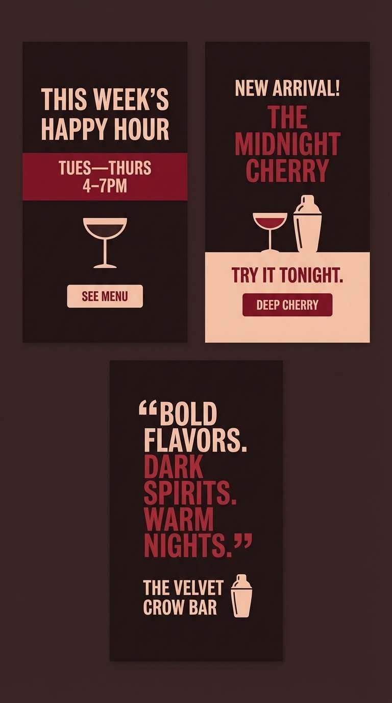
- espresso cherry
- clay pottery studio
- crimson walnut
- warm minimal ui
- fireside editorial
- What Colors Go Well with Mahogany?
- How to Use a Mahogany Color Palette in Real Designs
- Create Mahogany Palette Visuals with AI
Why Mahogany Palettes Work So Well
Mahogany sits in a sweet spot between red and brown, so it feels emotional (like red) but stable and mature (like brown). That balance makes it ideal when you want warmth without loudness.
These tones also pair naturally with tactile materials—wood, leather, paper, brass—so the color story feels “real” even in digital design. Add a soft neutral and mahogany instantly looks intentional and premium.
From a usability perspective, mahogany works well as a strong accent against light backgrounds, and it can become a dramatic base tone when balanced with creamy highlights for contrast.
20+ Mahogany Color Palette Ideas (with HEX Codes)
1) Cedar Ember
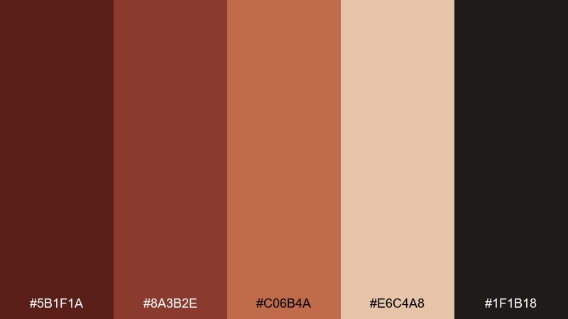
HEX: #5B1F1A #8A3B2E #C06B4A #E6C4A8 #1F1B18
Mood: warm, rustic, grounded
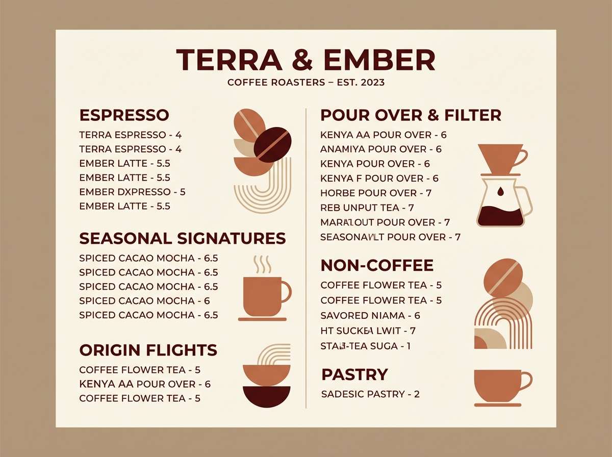
Best for: coffee shop branding and menu design
Warm and smoky like cedarwood by a fire, these mahogany color combination feel handcrafted and inviting. Use the deep brown-red as your anchor, then let clay and tan handle large areas like menus and labels. Pair with kraft paper textures, matte finishes, and a clean sans-serif for modern readability. Usage tip: keep the near-black for type only, so the reddish browns stay the hero.
Image example of cedar ember generated using media.io
Media.io is an online AI studio for creating and editing video, image, and audio in your browser.

2) Brass and Burlwood
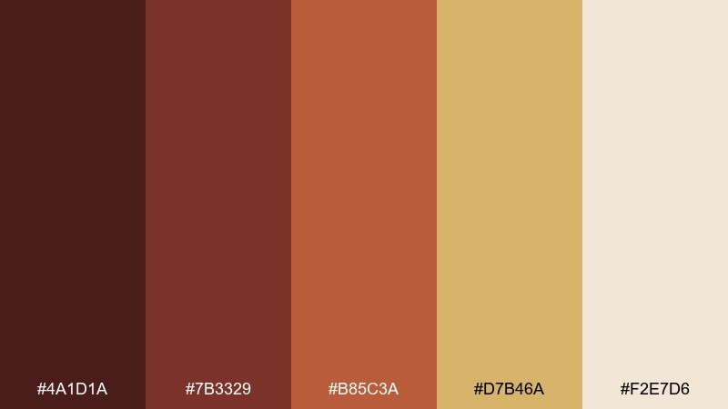
HEX: #4A1D1A #7B3329 #B85C3A #D7B46A #F2E7D6
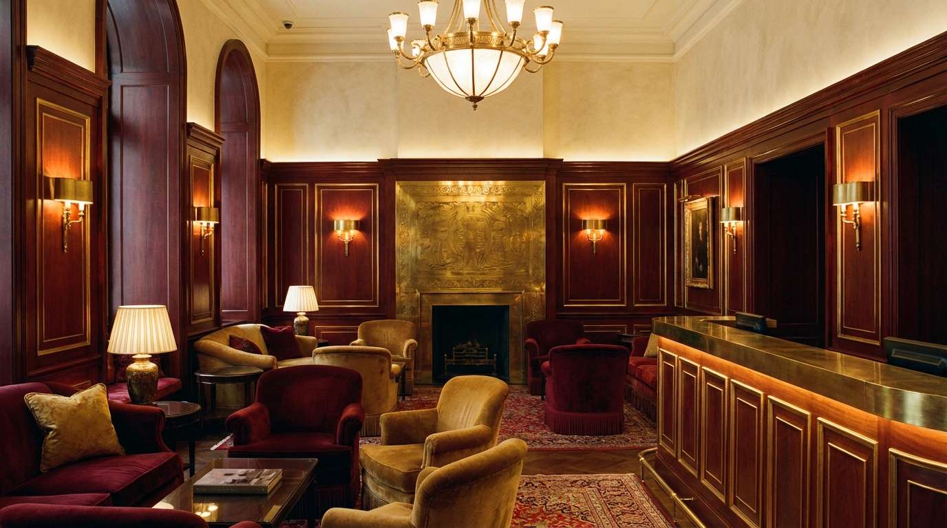
Mood: heritage, polished, cozy
Best for: boutique hotel lobby interior styling
Polished and nostalgic, this mahogany color scheme evokes brass fixtures, woodgrain, and soft lamp glow. Let the cream and warm gold brighten the room, then layer the red-browns through seating, millwork, or wall accents. Works beautifully with walnut, leather, and brushed metal details. Usage tip: repeat the gold tone in small highlights to make the space feel intentional, not busy.
Image example of brass and burlwood generated using media.io
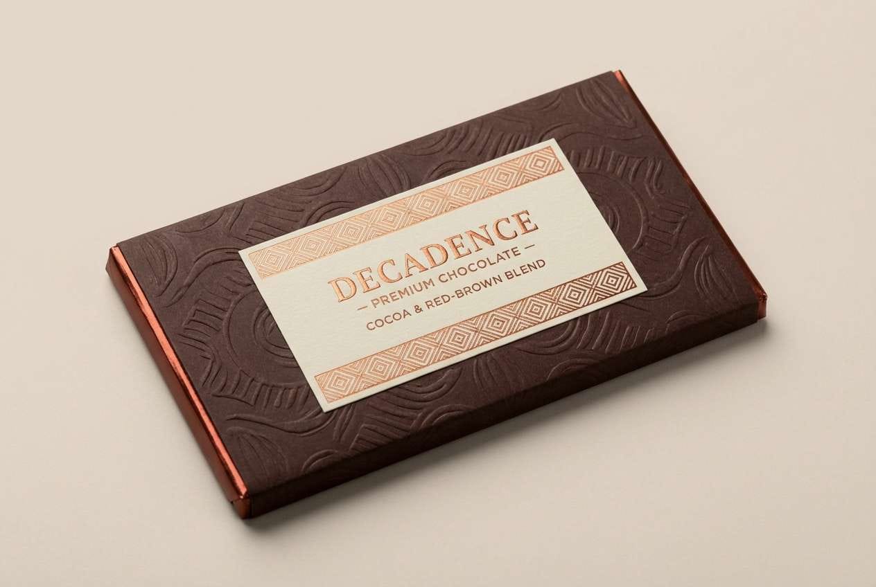
3) Cocoa Velvet
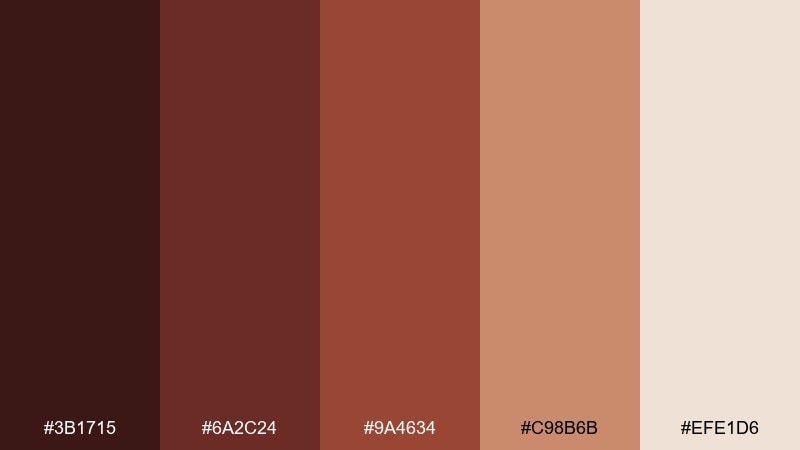
HEX: #3B1715 #6A2C24 #9A4634 #C98B6B #EFE1D6
Mood: luxurious, intimate, smooth
Best for: chocolate packaging and product ads
Luxurious and intimate, it brings to mind cocoa powder, velvet ribbon, and candlelit evenings. This mahogany color palette shines on premium packaging where rich contrast signals quality fast. Pair it with foil stamping in warm copper or soft cream labels to keep it upscale. Usage tip: use the light cream as breathing room around logos so the darker shades feel even richer.
Image example of cocoa velvet generated using media.io
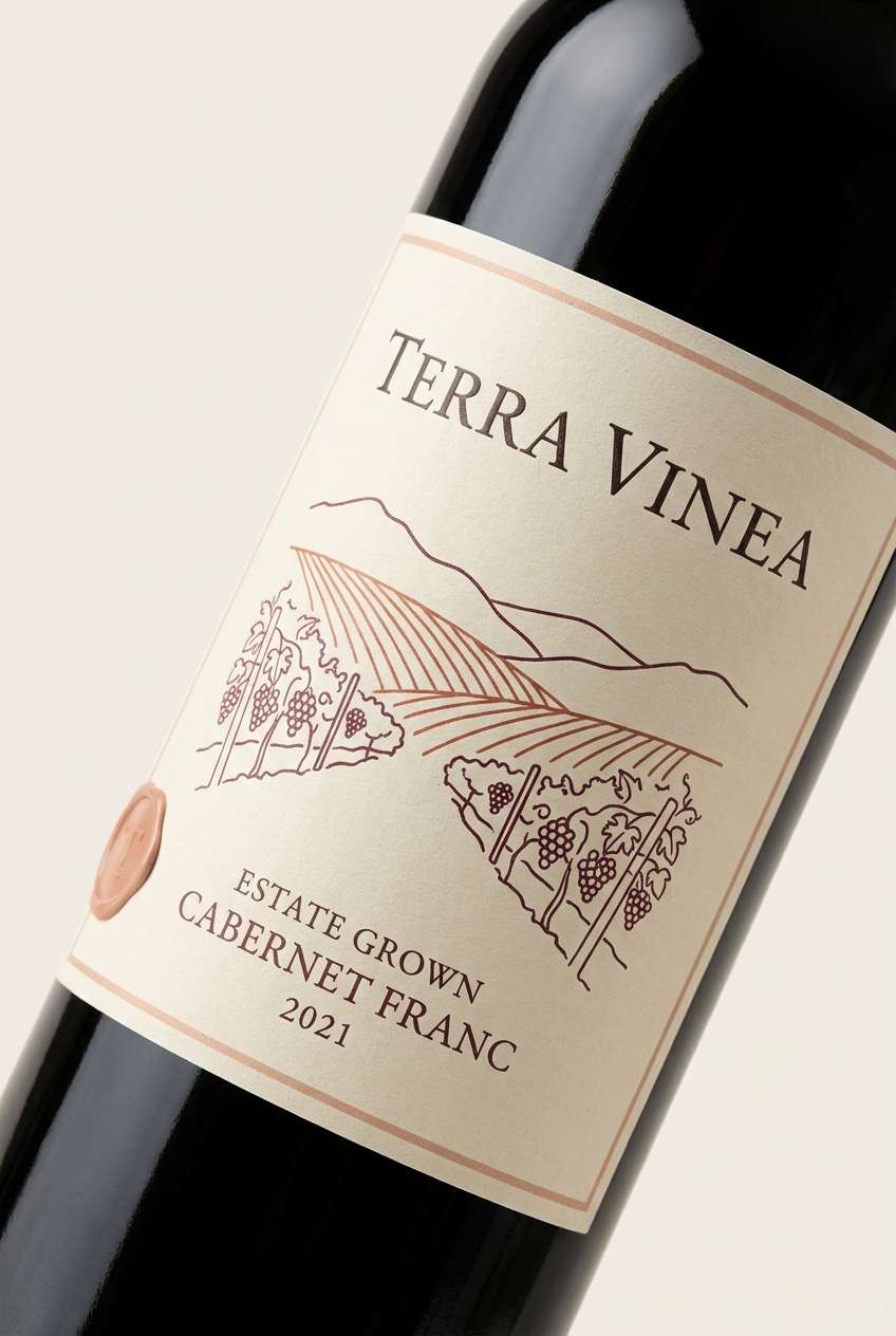
4) Desert Winery
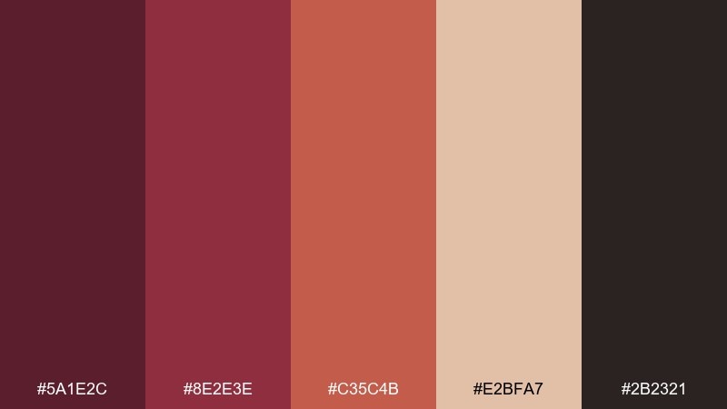
HEX: #5A1E2C #8E2E3E #C35C4B #E2BFA7 #2B2321
Mood: romantic, sunbaked, bold
Best for: wine label design and tasting room signage
Romantic and sunbaked, this mahogany color combination feels like a desert vineyard at golden hour. The berry-brown base gives labels a confident mood, while the sandy blush keeps the look approachable. Pair with serif typography and minimal line art for a modern winery vibe. Usage tip: reserve the darkest shade for borders and small icons to avoid heavy blocks of color.
Image example of desert winery generated using media.io
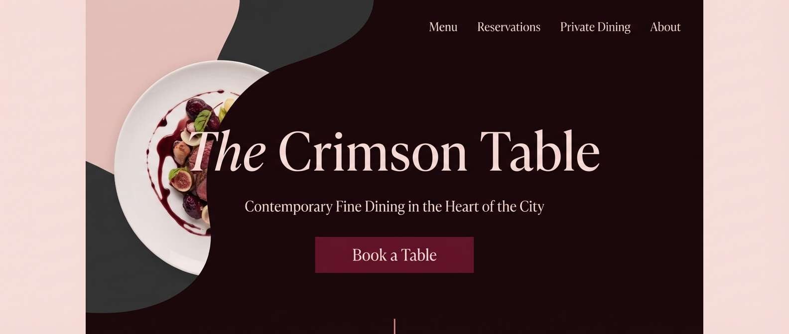
5) Smoked Rosewood
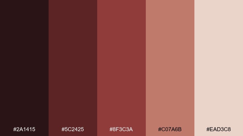
HEX: #2A1415 #5C2425 #8F3C3A #C07A6B #EAD3C8
Mood: moody, refined, romantic
Best for: fine dining website hero section
Moody and refined, these rosewood shades suggest dim lighting, linen napkins, and slow jazz. Use the near-black and deep wine tones for dramatic headers, then soften with dusty rose and blush for balance. Pairs well with high-contrast photography and thin rules for an editorial feel. Usage tip: keep body text on the palest blush for comfort and accessibility.
Image example of smoked rosewood generated using media.io
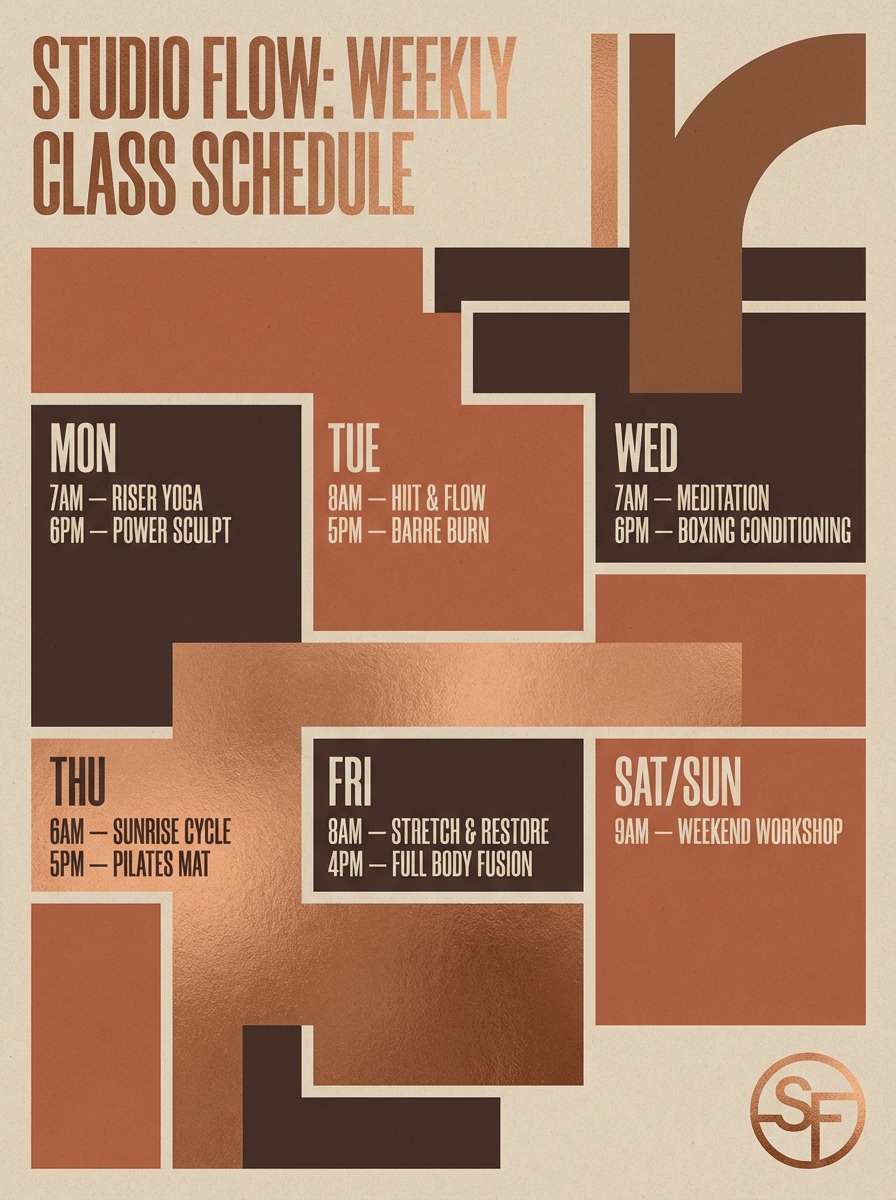
6) Copper Clay
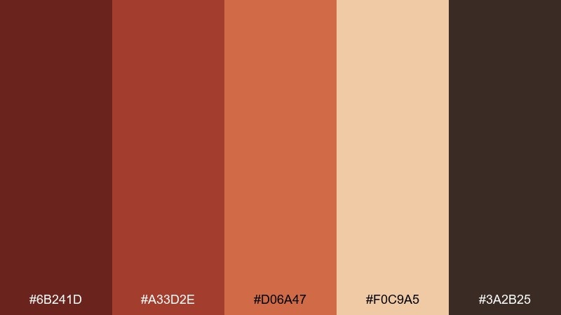
HEX: #6B241D #A33D2E #D06A47 #F0C9A5 #3A2B25
Mood: energetic, earthy, contemporary
Best for: fitness studio poster series
Energetic and earthy, this mahogany color scheme looks like sunlit clay, copper kettlebells, and warm shadows. The bright terracotta works great for callouts and pricing, while the darker brown stabilizes the layout. Pair with bold condensed type and simple geometric shapes to keep it modern. Usage tip: limit gradients and rely on solid blocks for a crisp, athletic look.
Image example of copper clay generated using media.io
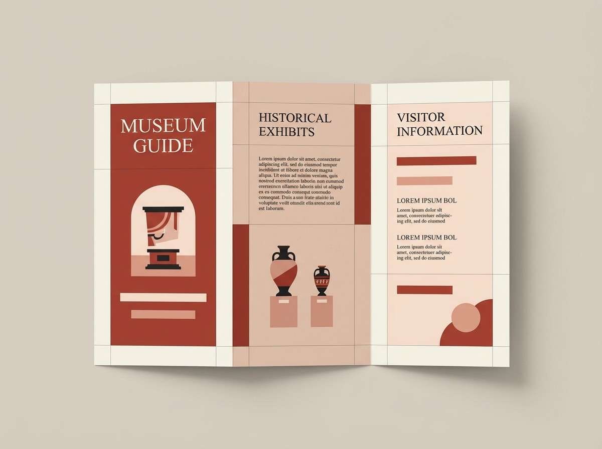
7) Old Town Brick
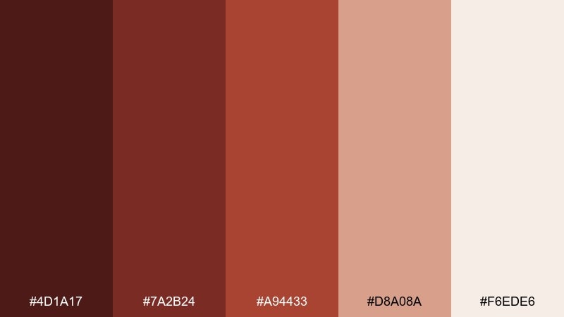
HEX: #4D1A17 #7A2B24 #A94433 #D8A08A #F6EDE6
Mood: historic, welcoming, artisanal
Best for: heritage museum brochure layout
Historic and welcoming, it recalls brick facades, worn leather, and paper ephemera. Use the pale background for readability, then let brick reds guide headings and pull quotes. Pair with archival photography and subtle texture overlays for authenticity. Usage tip: keep icons and rules in the mid brick tone for a cohesive, understated system.
Image example of old town brick generated using media.io
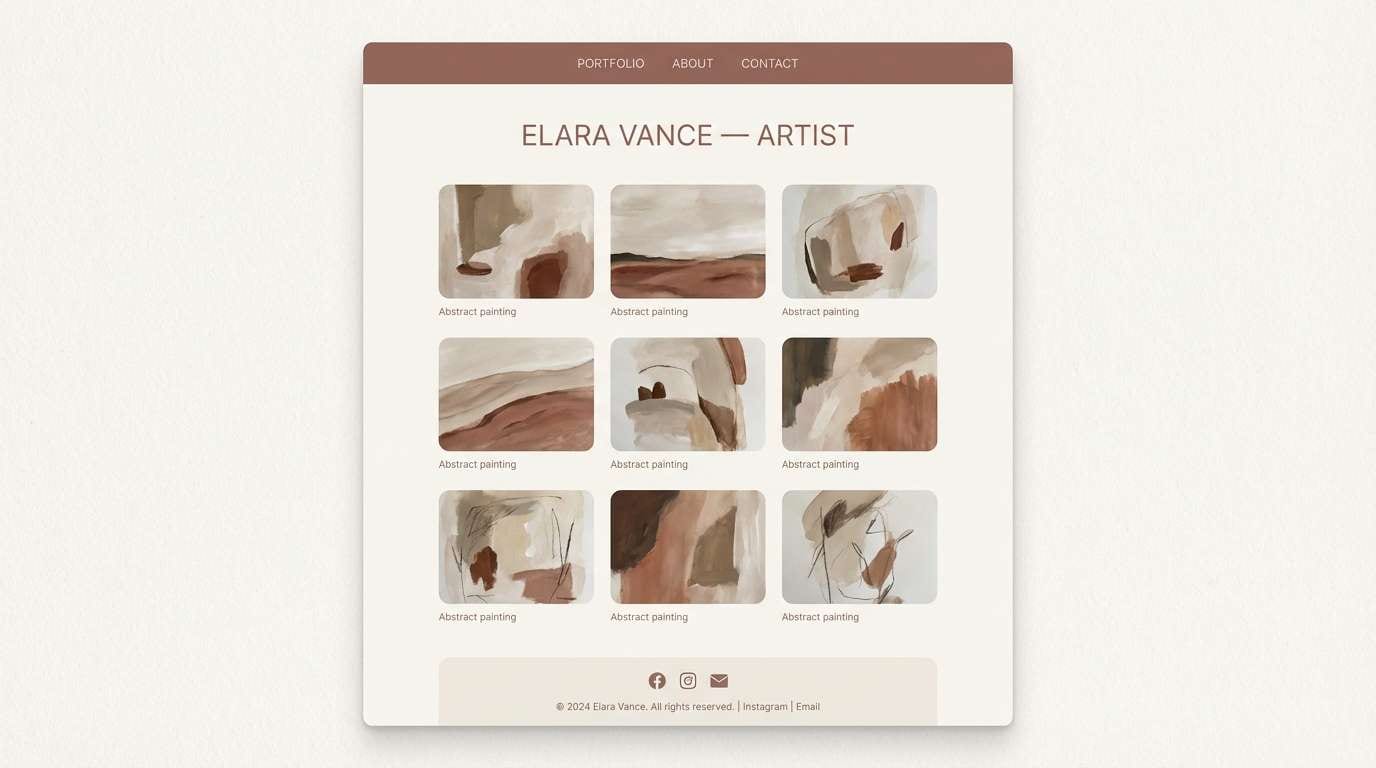
8) Quiet Atelier
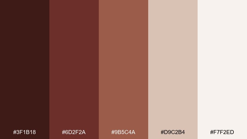
HEX: #3F1B18 #6D2F2A #9B5C4A #D9C2B4 #F7F2ED
Mood: soft, thoughtful, curated
Best for: portfolio website UI for an artist
Soft and thoughtful, it feels like a calm studio with linen canvases and warm wood shelves. This mahogany color scheme supports artwork without competing, especially when the light neutrals take the lead. Pair with generous whitespace, muted shadows, and a simple navigation bar. Usage tip: use the mid tone for hover states to keep interactions subtle and premium.
Image example of quiet atelier generated using media.io
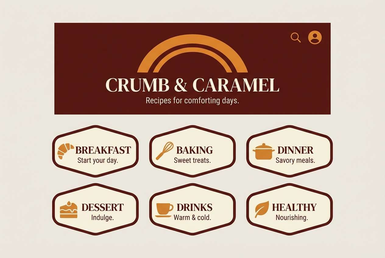
9) Harvest Hearth
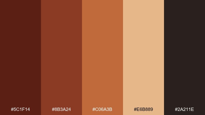
HEX: #5C1F14 #8B3A24 #C06A3B #E6B889 #2A211E
Mood: autumnal, hearty, comforting
Best for: recipe blog header and category badges
Autumnal and hearty, this mahogany color palette brings up roasted squash, wood smoke, and cozy kitchens. The pumpkin-like accent is perfect for badges and highlights, while the darker base grounds headings and nav elements. Pair with warm food photography and neutral backgrounds to keep the site feeling fresh. Usage tip: apply the light caramel tone to card backgrounds so content blocks feel soft, not stark.
Image example of harvest hearth generated using media.io
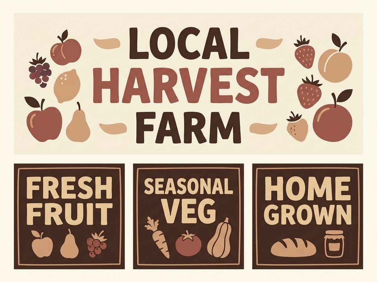
10) Mocha Orchard
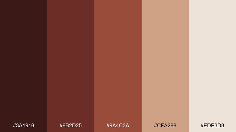
HEX: #3A1916 #6B2D25 #9A4C3A #CFA286 #EDE3D8
Mood: natural, mellow, approachable
Best for: farmers market stall signage
Natural and mellow, it suggests sun-warmed fruit crates and milky coffee. Use the creamy tones for the main sign field, then punch in product names with the deeper brown-red. Pair with hand-drawn produce illustrations for an artisanal look. Usage tip: stick to one accent color per sign to keep busy stalls readable from a distance.
Image example of mocha orchard generated using media.io
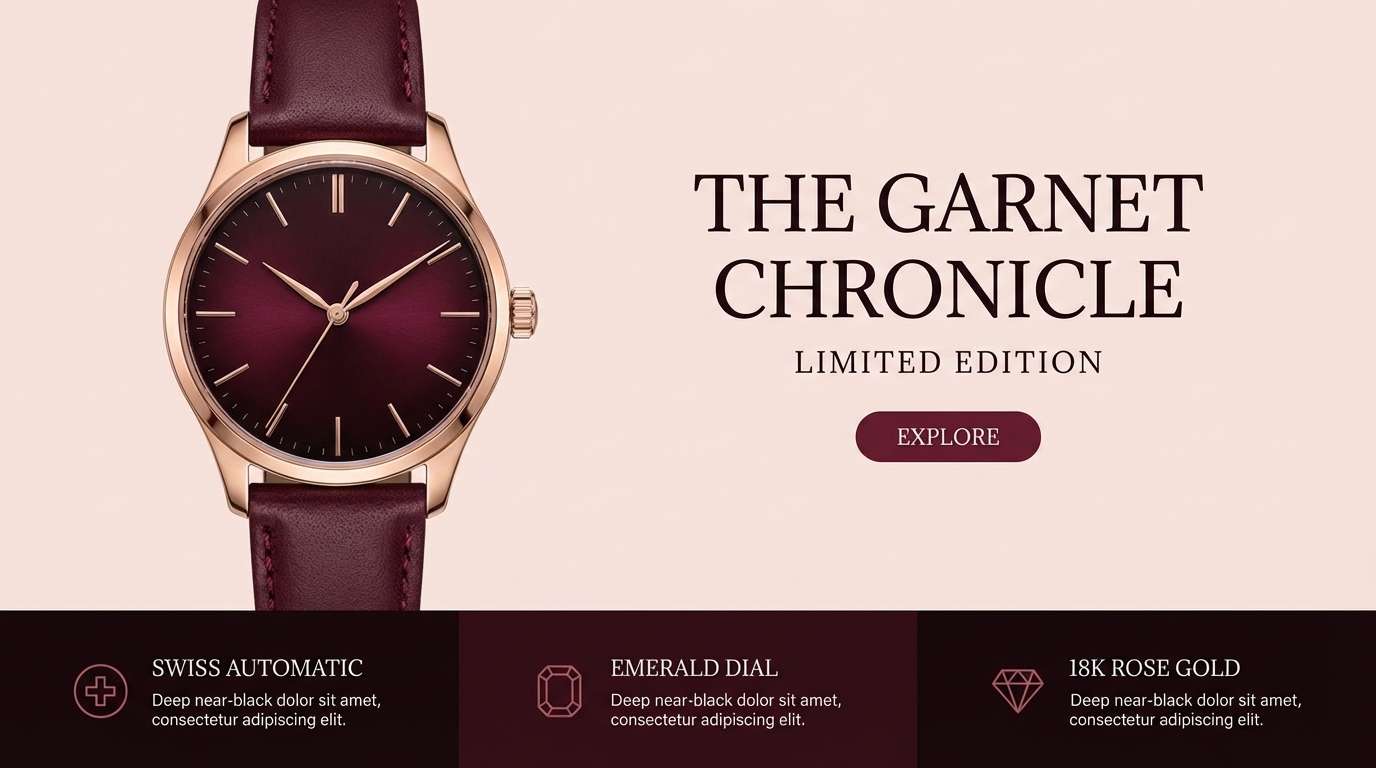
11) Garnet Leather
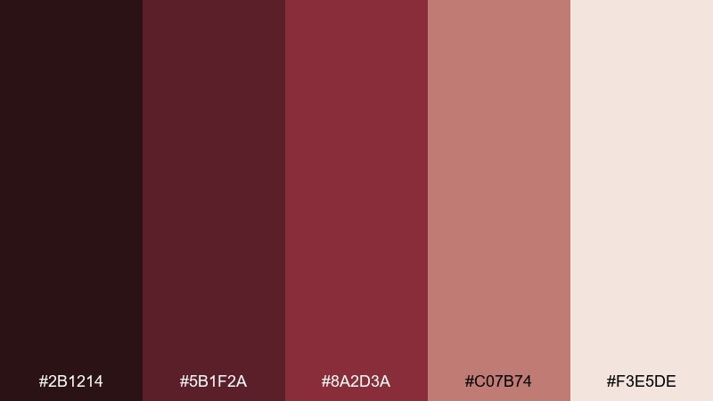
HEX: #2B1214 #5B1F2A #8A2D3A #C07B74 #F3E5DE
Mood: dramatic, upscale, confident
Best for: luxury watch product landing page
Dramatic and upscale, these mahogany color combinations feel like garnet gemstones against polished leather. Use the darkest shade for the header and footer to frame product shots, then bring in rosy mid tones for buttons and highlights. Pair with minimal copy, sharp product lighting, and plenty of negative space. Usage tip: keep CTA text on the pale background for maximum contrast and clarity.
Image example of garnet leather generated using media.io
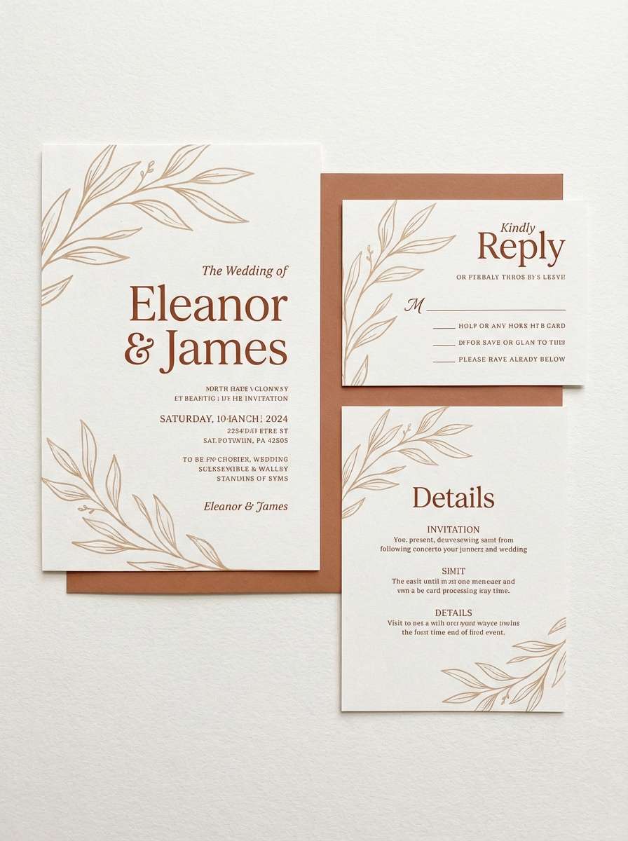
12) Sandstone Sienna
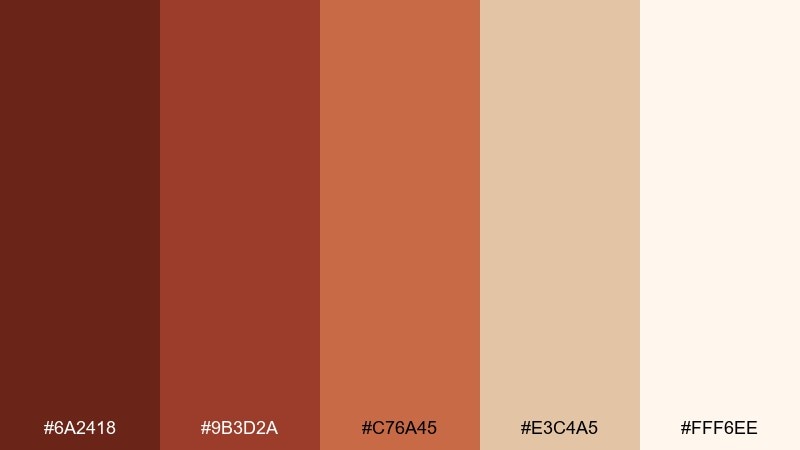
HEX: #6A2418 #9B3D2A #C76A45 #E3C4A5 #FFF6EE
Mood: sunlit, airy, earthy
Best for: wedding invitation suite
Sunlit and airy, it looks like sandstone, sienna glaze, and soft paper stock. These mahogany color combinations work best when the lightest tone becomes the background and the reds stay in typography and small motifs. Pair with delicate florals, blind emboss, or a subtle deckled edge for warmth. Usage tip: print the darkest shade sparingly to keep the suite feeling bright and modern.
Image example of sandstone sienna generated using media.io
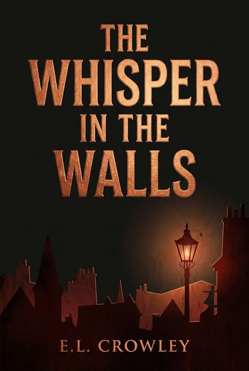
13) Nightfall Mahogany
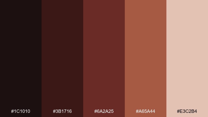
HEX: #1C1010 #3B1716 #6A2A25 #A65A44 #E3C2B4
Mood: cinematic, intimate, bold
Best for: book cover design for a mystery novel
Cinematic and intimate, it feels like dusk streets, worn wood, and a single warm light in a window. Let the near-black dominate for suspense, then use the copper-brown for the title and key graphic elements. Pair with grain texture and sharp serif typography for classic mystery energy. Usage tip: add a thin light border to separate the dark cover from online storefront backgrounds.
Image example of nightfall mahogany generated using media.io
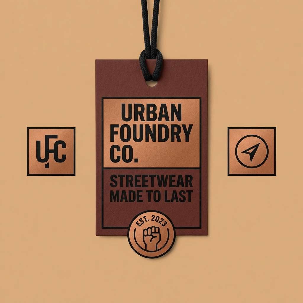
14) Maple and Ink
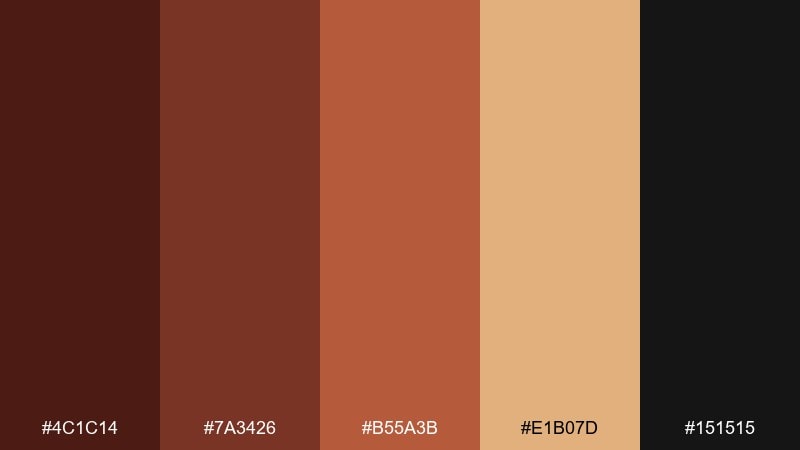
HEX: #4C1C14 #7A3426 #B55A3B #E1B07D #151515
Mood: modern, punchy, high-contrast
Best for: streetwear logo and hang tag set
Modern and punchy, this mahogany color palette channels maple syrup warmth with crisp ink-black contrast. Use black for typography and logos, then layer the caramel and copper tones as bold blocks on tags. Pair with oversized type, tight spacing, and minimal graphics for a confident retail look. Usage tip: keep the light caramel as a consistent background so the warmer shades stay readable.
Image example of maple and ink generated using media.io
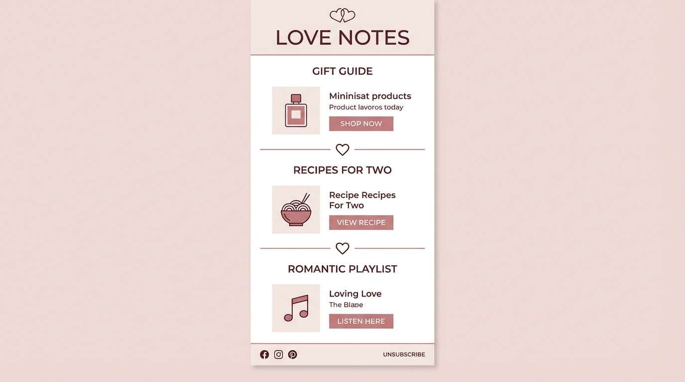
15) Vintage Maroon
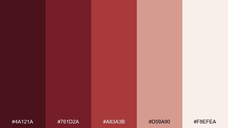
HEX: #4A121A #761D2A #A83A3B #D59A90 #F8EFEA
Mood: classic, romantic, nostalgic
Best for: valentines day email newsletter
Classic and romantic, it recalls pressed flowers, maroon ink, and soft stationery. Use the pale blush for the main canvas, then bring in maroon for headers and buttons so the message feels premium. Pair with subtle patterns like tiny hearts or floral linework, kept very light. Usage tip: reserve the bright red-maroon for one primary CTA to avoid visual fatigue.
Image example of vintage maroon generated using media.io
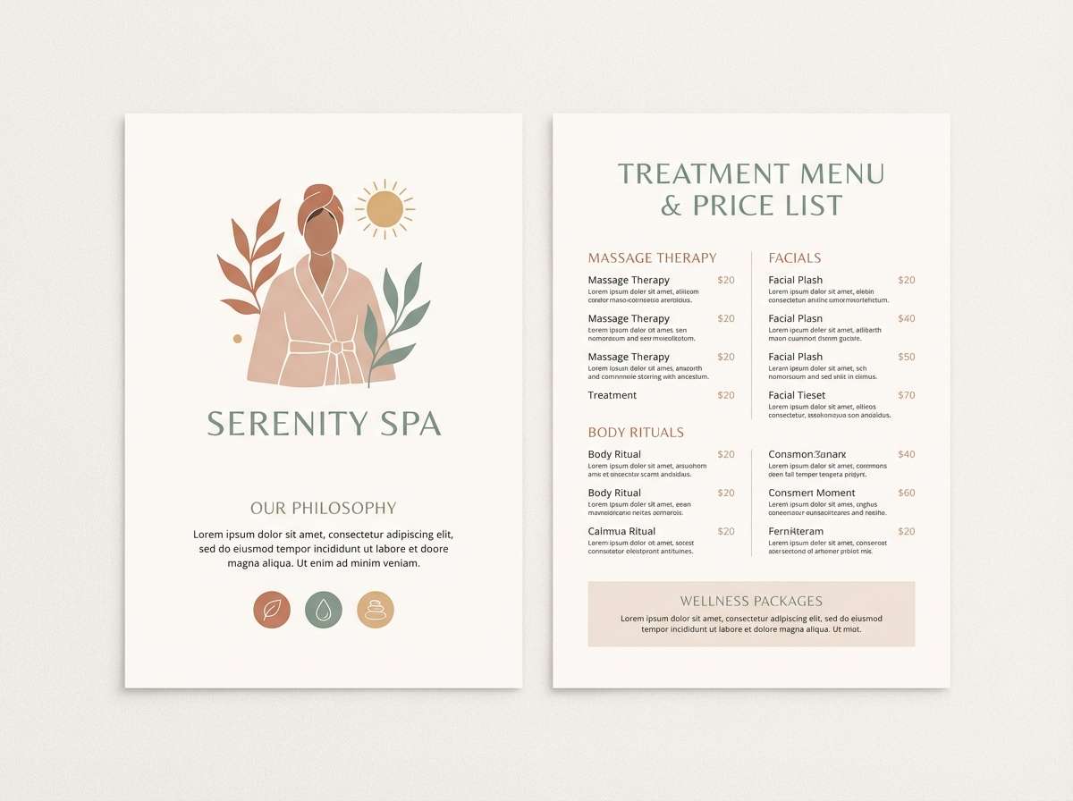
16) Terracotta Linen
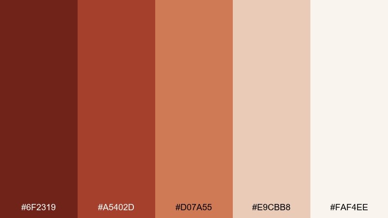
HEX: #6F2319 #A5402D #D07A55 #E9CBB8 #FAF4EE
Mood: light, warm, breathable
Best for: spa brochure and price list
Light and breathable, it feels like terracotta pots, clean linen, and warm steam. Let the off-white lead so the design stays calming, then use the terracotta tones for section headers and dividers. Pair with soft photography, rounded shapes, and gentle spacing. Usage tip: use the mid terracotta for icons to keep the brochure consistent across pages.
Image example of terracotta linen generated using media.io
17) Espresso Cherry

HEX: #2A0F12 #4B1B22 #7A2E34 #B15E55 #E7CFC7
Mood: rich, playful, cozy
Best for: cocktail bar social media templates
Rich and playful, this mahogany color scheme suggests espresso martinis, dark cherries, and low amber light. Use the deepest tone for backgrounds in story templates, then layer cherry reds for stickers and headings. Pair with grain overlays and bold type to capture nightlife energy without going neon. Usage tip: keep one light accent for text blocks so small captions remain easy to read.
Image example of espresso cherry generated using media.io
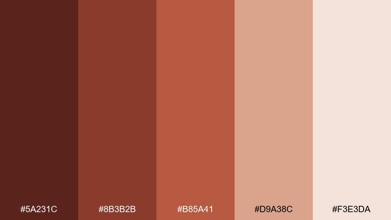
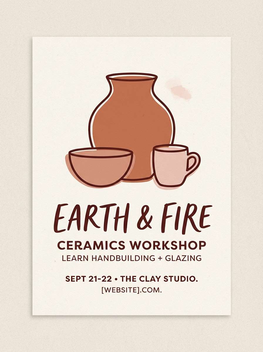
18) Clay Pottery Studio
HEX: #5A231C #8B3B2B #B85A41 #D9A38C #F3E3DA
Mood: handmade, earthy, friendly
Best for: ceramics workshop flyer
Handmade and earthy, it feels like freshly thrown clay drying on a studio shelf. The terracotta mid tones work perfectly for big headlines, while the soft blush neutrals keep the layout approachable. Pair with simple line drawings of bowls or vases and lots of margin space. Usage tip: use one dark shade for dates and location details so they stand out at a glance.
Image example of clay pottery studio generated using media.io
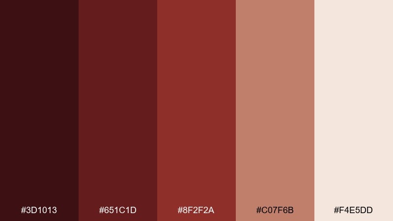
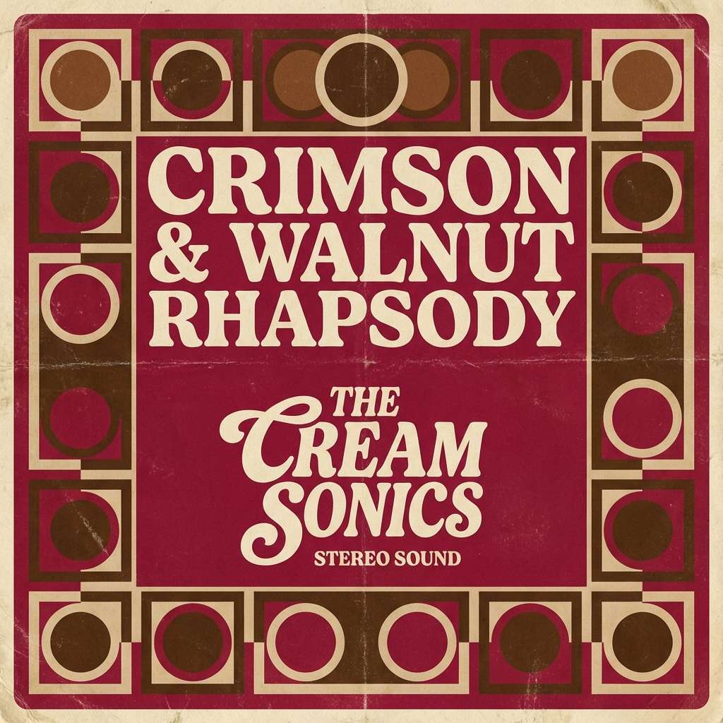
19) Crimson Walnut
HEX: #3D1013 #651C1D #8F2F2A #C07F6B #F4E5DD
Mood: bold, vintage, dramatic
Best for: album cover artwork
Bold and vintage, it recalls crimson velvet curtains against walnut wood. These tones make a strong focal point for typography and central artwork, especially when balanced by the pale neutral. Pair with retro textures, halftone effects, and simple geometric framing. Usage tip: keep the brightest red to a single element, like the artist name, to maintain hierarchy.
Image example of crimson walnut generated using media.io
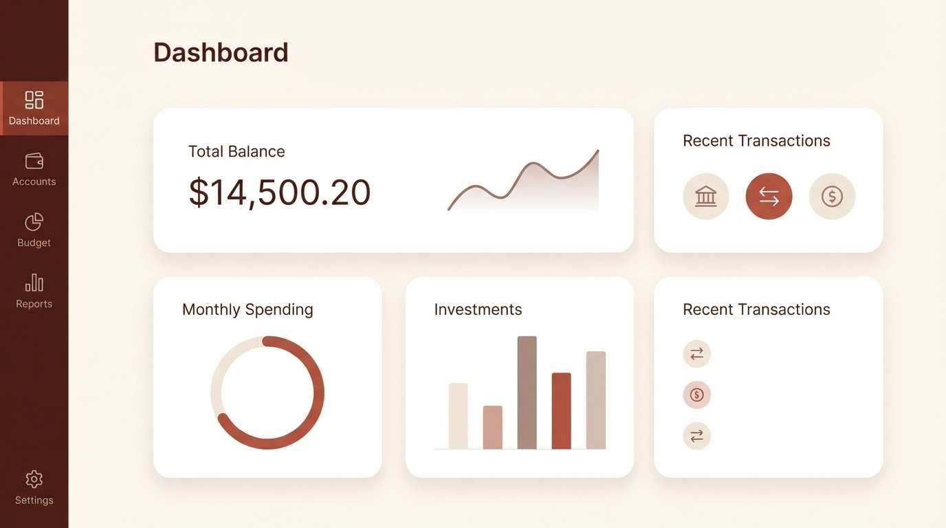
20) Warm Minimal UI
HEX: #4A1A16 #7A332A #A65A47 #D9B6A4 #F8F1EC
Mood: clean, warm, modern
Best for: finance dashboard UI
Clean and warm, it feels like polished wood next to soft matte paper. A strong mahogany color combination like this works well for dashboards when the light neutral is the main surface. Use the mid browns for charts and active states, and keep the darkest shade for critical labels. Usage tip: apply the accent brown consistently to one data series so users learn the color language quickly.
Image example of warm minimal ui generated using media.io
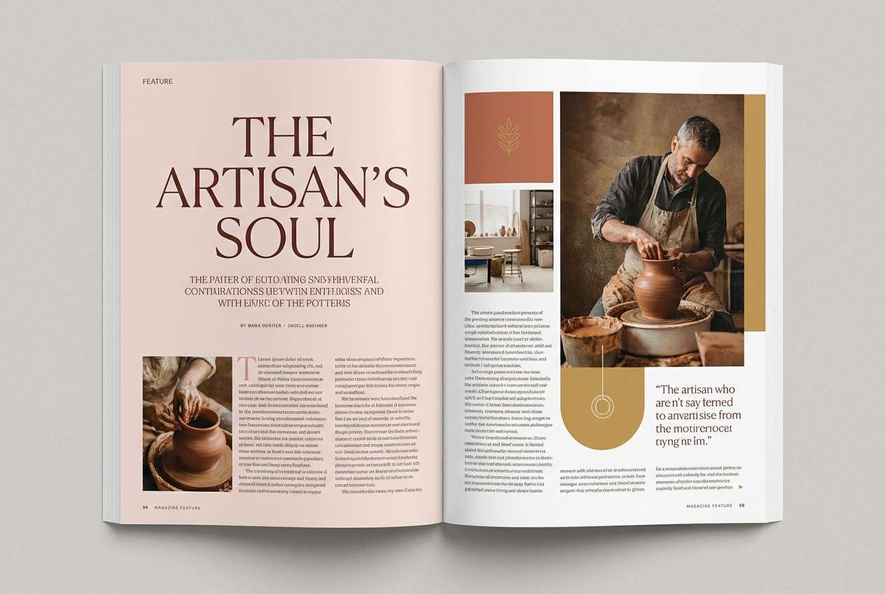
21) Fireside Editorial
HEX: #2B1412 #53201B #7C332A #B46B54 #E7D0C4
Mood: editorial, cozy, sophisticated
Best for: magazine feature layout
Editorial and cozy, it evokes a fireside reading nook with strong shadows and warm highlights. The deep tones create confident headlines, while the pale blush keeps columns legible and airy. Pair with thin rules, serif display type, and muted imagery for a premium feel. Usage tip: use the warm mid tone for pull quotes to guide the reader through long pages.
Image example of fireside editorial generated using media.io
What Colors Go Well with Mahogany?
Mahogany pairs beautifully with warm, light neutrals like cream, ivory, and sand because they amplify its richness without making the design feel heavy. This is the easiest path to a timeless, upscale look.
For extra character, add metallics (brass, copper, muted gold) or earthy accents like terracotta and clay. If you want sharper contrast, use ink black or near-black in small amounts for typography and framing.
Cool counterbalances can work too—think dusty sage, deep teal, or slate—especially when you keep the cool hue secondary and let mahogany stay the “story” color.
How to Use a Mahogany Color Palette in Real Designs
In branding, use mahogany as the anchor (logo, headers, packaging panels), then give it room with a light neutral background. This keeps the brand warm and premium while staying readable across web and print.
In interiors, treat mahogany like a “material color”: wood tones, leather, and textiles carry it naturally, while walls and large surfaces are best kept cream or sand to avoid visual heaviness.
In UI, reserve the darkest mahogany/near-black shades for navigation and key labels, and use mid tones for interactive states (hover, active). Always test contrast, especially when placing text on red-brown surfaces.
Create Mahogany Palette Visuals with AI
If you already have HEX codes, you can turn them into real-looking mockups fast by describing the layout (poster, landing page, invitation, label) and calling out which tones should dominate vs. accent.
For consistent results, mention the background color explicitly (often the lightest neutral), then specify where mahogany appears (typography, panels, buttons, borders). Add a style cue like “minimal,” “editorial,” or “premium packaging” to lock in the vibe.
Mahogany Color Palette FAQs
-
What is a mahogany color palette?
A mahogany color palette is built around red-brown tones inspired by mahogany wood, usually paired with soft neutrals (cream, sand, blush) and sometimes deep near-black shades for contrast. -
Is mahogany warm or cool?
Mahogany is typically warm because it leans red and brown. Some versions shift slightly toward burgundy (deeper red) or cocoa (more brown), but the overall temperature stays warm. -
What neutral colors pair best with mahogany?
Ivory, cream, warm beige, and “white sand” style off-whites pair best. They brighten mahogany and keep layouts clean, especially for web pages, invitations, and packaging. -
What accent colors look good with mahogany?
Brass/gold, copper, terracotta, dusty rose, and muted teal or sage all work well. Pick one accent family and repeat it consistently to avoid a cluttered look. -
How do I keep mahogany designs from feeling too dark?
Use a light neutral as the main background, reserve the darkest shades for small areas (type, borders, nav), and add breathing room with whitespace. Small metallic or caramel highlights also help lift the palette. -
Does mahogany work for modern UI design?
Yes—mahogany looks modern when paired with off-white surfaces, minimal typography, and consistent accent usage for charts or buttons. Use contrast checks to ensure accessibility on darker red-brown backgrounds. -
How can I generate mahogany palette mockups quickly?
Use an AI image generator and describe the design type (menu, label, dashboard, brochure), then specify which palette colors are dominant and which are accents. Including “no photography” or “minimal layout” can help control style.
Next: White Sand Color Palette


