

Luxury color palettes are built on contrast, restraint, and materials you can almost feel—matte black, brushed metal, marble whites, and deep jewel tones. The right mix makes a brand look premium before anyone reads a word.
Below are 20 refined luxury color combinations with HEX codes, plus practical tips for using metallic accents, rich neutrals, and high-contrast pairings across branding, UI, and print.
In this article
Why Luxury Palettes Work So Well
Luxury palettes succeed because they’re intentional: fewer hues, clearer hierarchy, and strong contrast that signals confidence. Instead of relying on loud color, they rely on composition—deep bases, soft neutrals, and one controlled accent.
They also reference “material colors” people associate with premium products: noir blacks, pearl ivories, sapphire/navy, emerald greens, and metallic gold or brass. These cues instantly suggest craftsmanship and value.
Most importantly, luxury schemes protect readability and calm. When your background is understated and your accent is rare, the design feels spacious, elevated, and expensive—even on a small mobile screen.
20+ Luxury Color Palette Ideas (with HEX Codes)
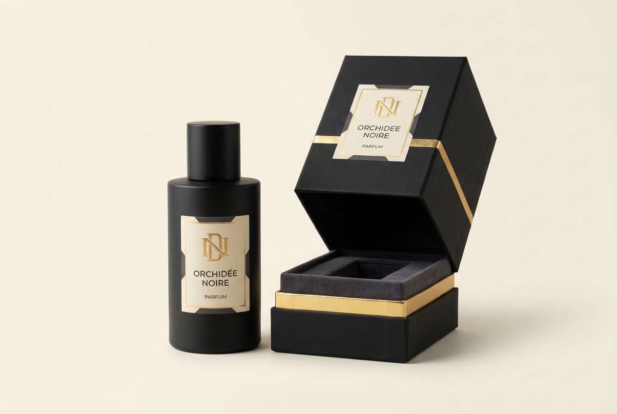
1) Gilded Noir

HEX: #0B0B0F #D4AF37 #F5F0E6 #3B3A40 #8A6F3A
Mood: dramatic, opulent, confident
Best for: premium fragrance packaging
Dramatic and opulent, this mix feels like candlelit velvet and gold foil catching the light. It shines on premium packaging, especially when the black and charcoal are used as the main base. Pair the gold with warm ivory to keep text readable and avoid a heavy look. Usage tip: reserve the metallic tone for logos and key seals so the luxury color palette stays sharp, not busy.
Image example of gilded noir generated using media.io
Media.io is an online AI studio for creating and editing video, image, and audio in your browser.

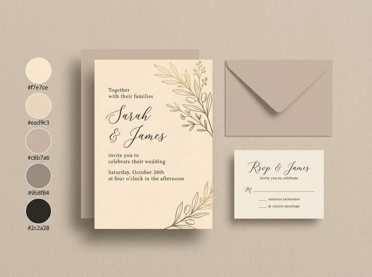
2) Champagne Pearl
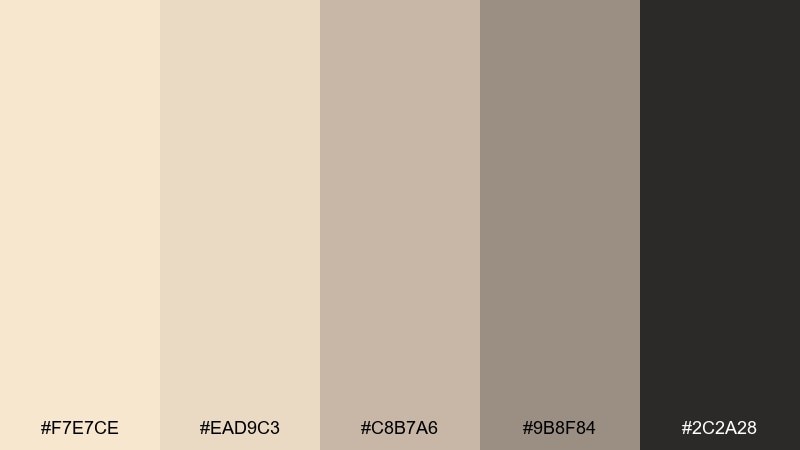
HEX: #F7E7CE #EAD9C3 #C8B7A6 #9B8F84 #2C2A28
Mood: soft, elevated, airy
Best for: bridal invitation suite
Soft and elevated, these champagne neutrals evoke satin, pearls, and quiet celebration. They work beautifully for wedding stationery, menus, and RSVP cards where you want refinement without harsh contrast. Pair the near-black only for names and small details to keep the overall feel light. Usage tip: print on textured stock and let the mid-taupe do most of the layout work for a cohesive look.
Image example of champagne pearl generated using media.io
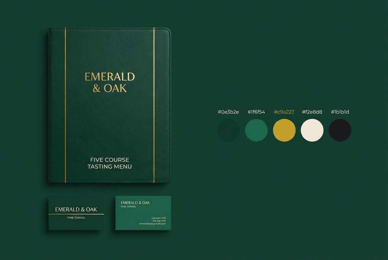
3) Emerald Velvet
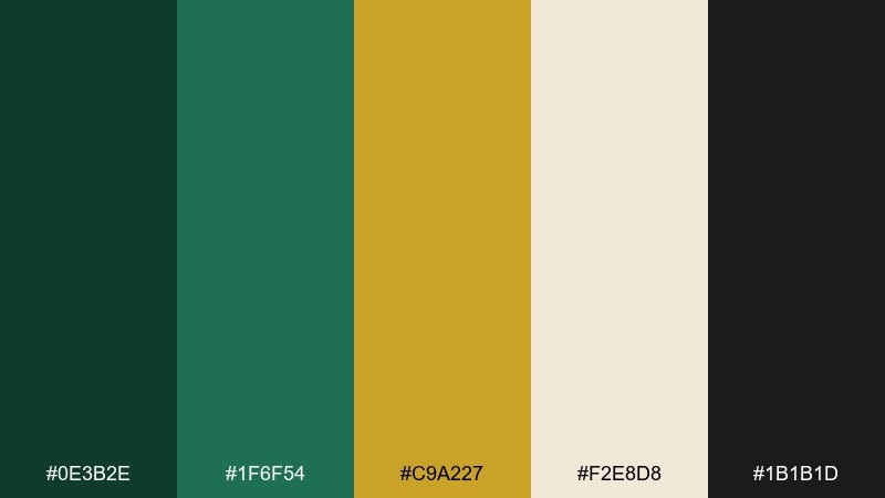
HEX: #0E3B2E #1F6F54 #C9A227 #F2E8D8 #1B1B1D
Mood: regal, lush, cinematic
Best for: fine dining restaurant branding
Regal and lush, these tones recall velvet banquettes, polished brass, and deep green glassware. They fit restaurant branding, menus, and loyalty cards where you want a classic, upscale mood. Pair emerald with warm cream for legible type and bring in gold sparingly as a highlight. Usage tip: keep backgrounds dark and use cream for body text to maintain a premium, cinematic contrast.
Image example of emerald velvet generated using media.io
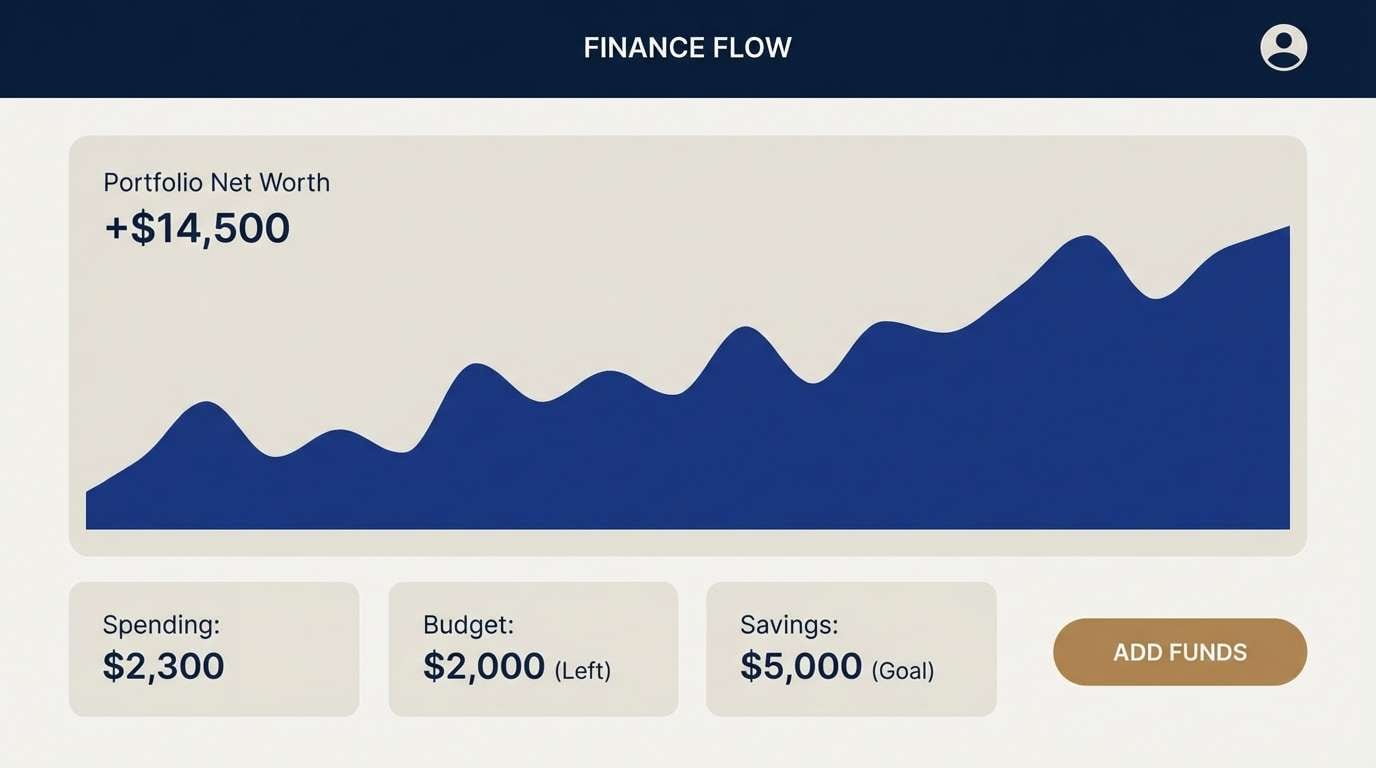
4) Sapphire Lounge
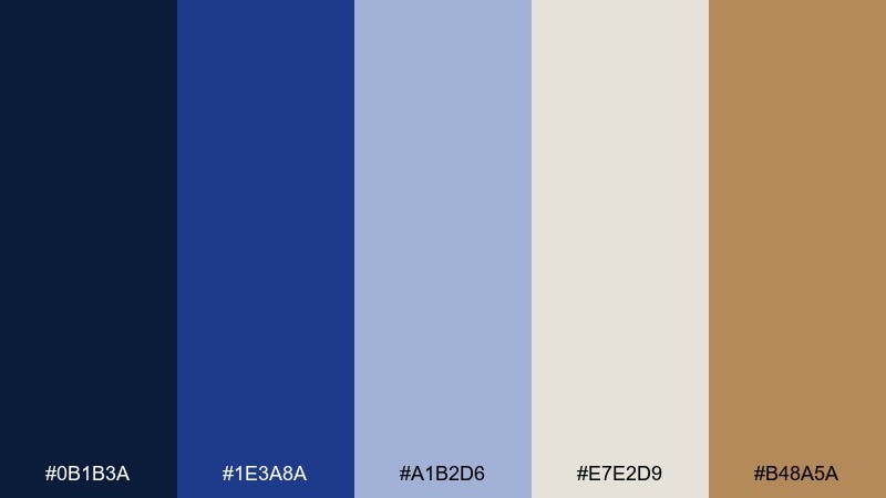
HEX: #0B1B3A #1E3A8A #A1B2D6 #E7E2D9 #B48A5A
Mood: sleek, modern, executive
Best for: finance app UI
Sleek and modern, these blues feel like a midnight skyline with warm brass details. They are strong for dashboards, fintech UI, and data-heavy screens that still need personality. Pair the deep navy with the soft gray-beige for backgrounds to reduce eye fatigue. Usage tip: use the brass tone for active states and key metrics so attention lands exactly where you want it.
Image example of sapphire lounge generated using media.io
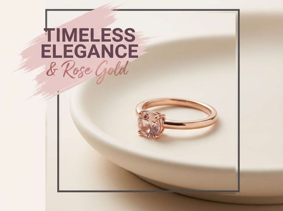
5) Rose Gold Dusk
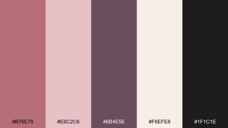
HEX: #B76E79 #E6C2C6 #6B4E5E #F6EFE8 #1F1C1E
Mood: romantic, polished, intimate
Best for: jewelry social ad creative
Romantic and polished, these rosy metals and soft neutrals suggest twilight reflections on jewelry. They are ideal for social ads, lookbooks, and landing pages where you want warmth with edge. The best luxury color combinations here come from pairing deep plum as the anchor and using rose gold only as a glow. Usage tip: keep product photography neutral and add the blush tones through typography, frames, and subtle gradients.
Image example of rose gold dusk generated using media.io
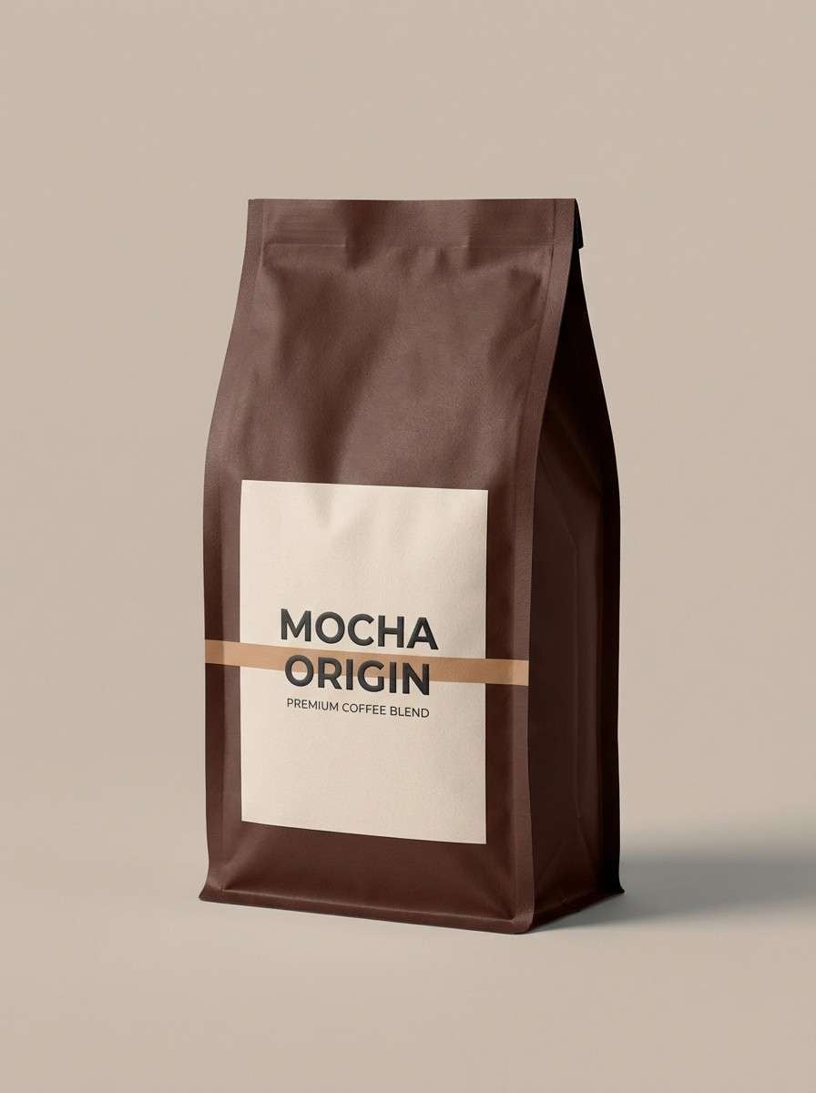
6) Mocha Silk

HEX: #4B2E2A #7A5645 #C6A58D #EFE3D6 #1E1A18
Mood: warm, grounded, artisanal
Best for: coffee brand packaging
Warm and grounded, these browns feel like espresso crema and soft silk textiles. They suit coffee packaging, craft foods, and boutique labels where material quality matters. Pair the darkest tone with the cream for bold legibility, then use caramel as the supporting accent. Usage tip: try a two-tone label with a dark header band to make the brand mark pop on shelves.
Image example of mocha silk generated using media.io
7) Ivory Marble

HEX: #F8F6F1 #D8D2C8 #AFA79C #5B5A57 #121212
Mood: minimal, architectural, serene
Best for: editorial magazine layout
Minimal and architectural, these tones evoke marble veins, clean galleries, and sharp tailoring. They work well for editorial layouts where whitespace and hierarchy do the heavy lifting. Pair charcoal headings with warm gray subheads to keep pages calm, not stark. Usage tip: let the near-black appear only in headlines and rules so the softer grays carry the layout rhythm.
Image example of ivory marble generated using media.io
8) Plum Regent
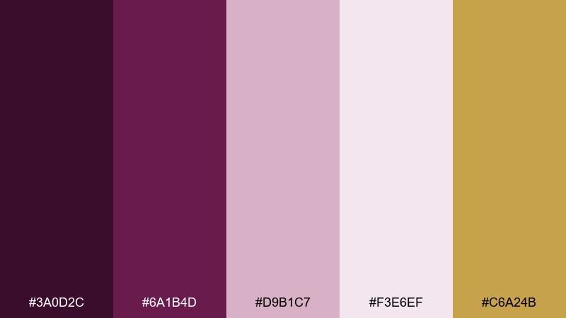
HEX: #3A0D2C #6A1B4D #D9B1C7 #F3E6EF #C6A24B
Mood: royal, moody, elegant
Best for: beauty brand identity
Royal and moody, these plum tones feel like velvet curtains with a flash of antique gold. They suit beauty branding, boutique cosmetics, and premium campaigns that lean feminine but bold. Pair soft blush backgrounds with plum typography to keep it readable and modern. Usage tip: use gold only for small icons or borders so the palette stays sophisticated rather than flashy.
Image example of plum regent generated using media.io
9) Copper Cashmere
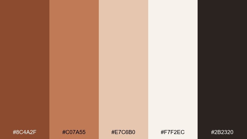
HEX: #8C4A2F #C07A55 #E7C6B0 #F7F2EC #2B2320
Mood: cozy, upscale, inviting
Best for: home decor product ad
Cozy and upscale, these coppery warms resemble cashmere throws and glazed terracotta. They are excellent for home decor ads, lifestyle banners, and seasonal campaigns that need warmth without looking rustic. Pair the inky brown with the pale cream for crisp copy and clean margins. Usage tip: keep imagery neutral and let copper accents appear in badges, price tags, or subtle gradient overlays.
Image example of copper cashmere generated using media.io
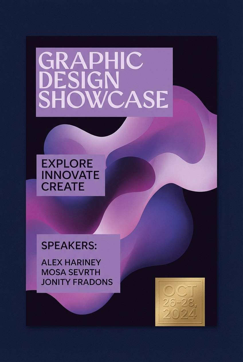
10) Midnight Orchid
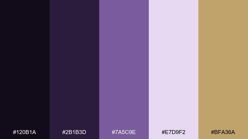
HEX: #120B1A #2B1B3D #7A5C9E #E7D9F2 #BFA36A
Mood: mysterious, artistic, high-fashion
Best for: event poster design
Mysterious and artistic, these purples read like nightclub lighting with a gilded edge. They are great for event posters, album covers, and cultural launches where you want drama without neon. Pair lavender highlights against the near-black base to keep text sharp at distance. Usage tip: use the gold tone as a thin frame or date stamp to add a premium touch without competing with type.
Image example of midnight orchid generated using media.io
11) Caviar & Cream
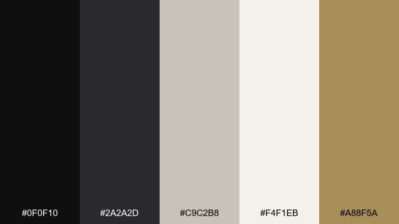
HEX: #0F0F10 #2A2A2D #C9C2B8 #F4F1EB #A88F5A
Mood: timeless, sharp, understated
Best for: law firm website UI
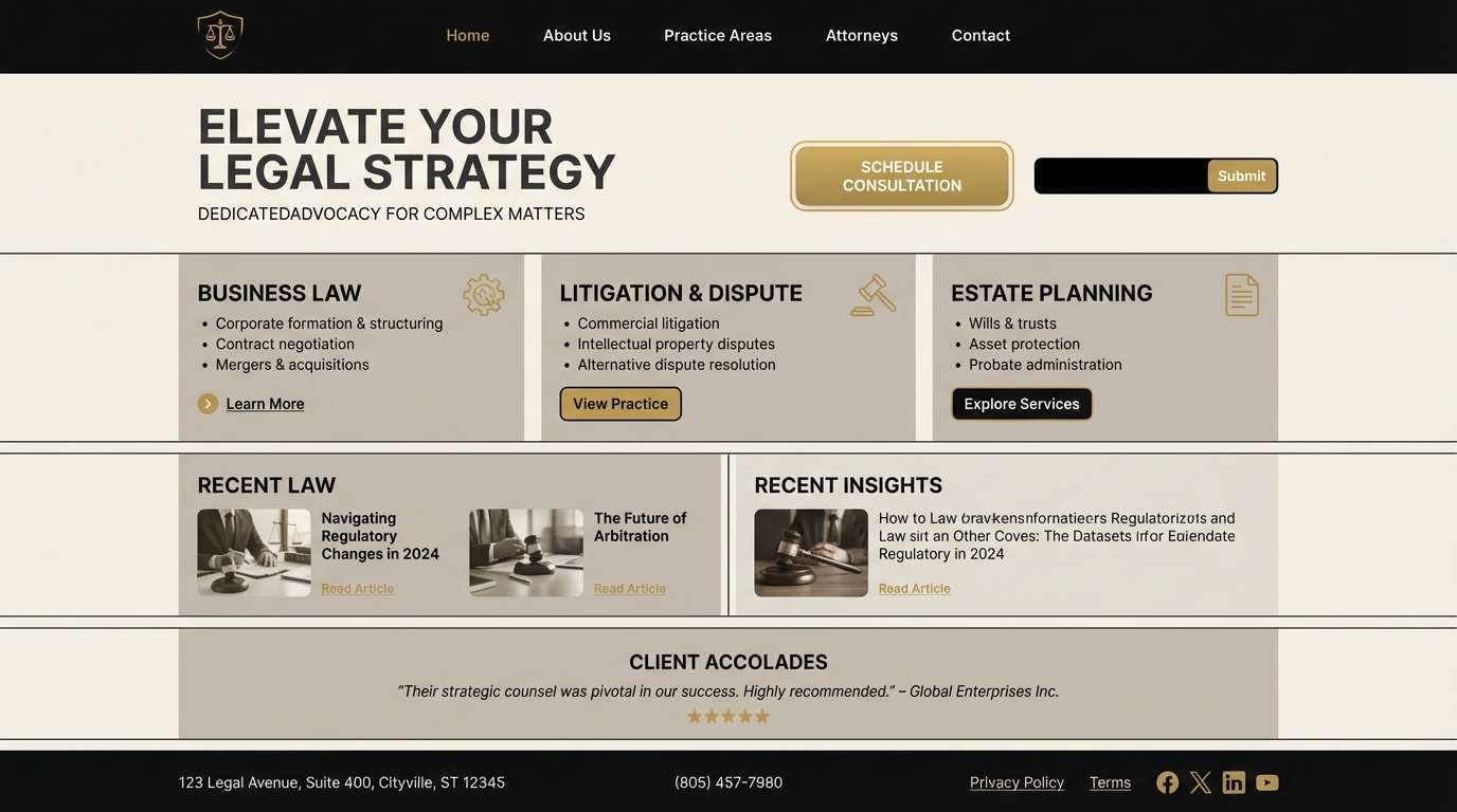
Timeless and sharp, this pairing feels like tailored suiting with a discreet gold cufflink. It is a strong choice for professional services websites where trust and clarity come first. Use the cream as your canvas and save black for navigation and headings so the page stays breathable. Usage tip: a restrained gold accent for buttons can turn a clean interface into a premium-feeling luxury color palette without losing credibility.
Image example of caviar & cream generated using media.io
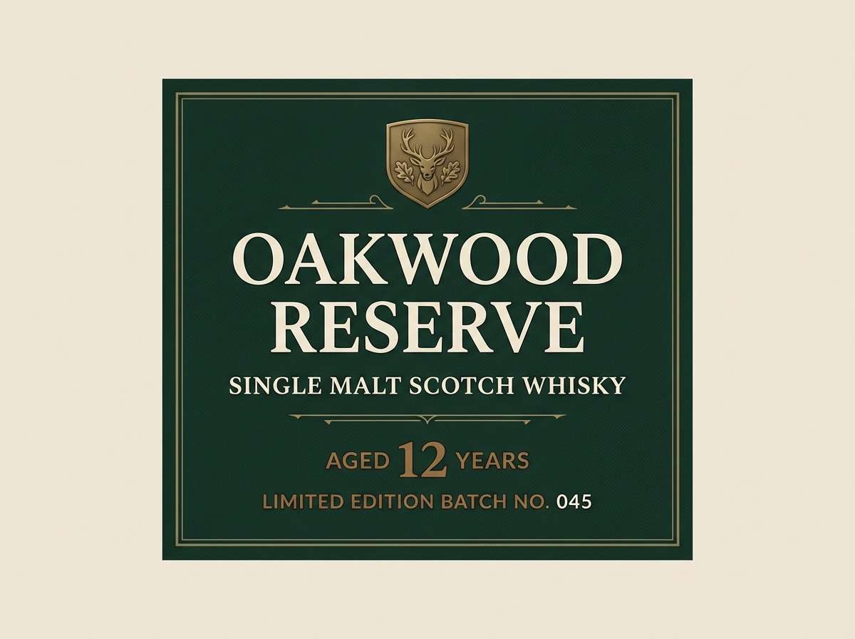
12) Forest Reserve
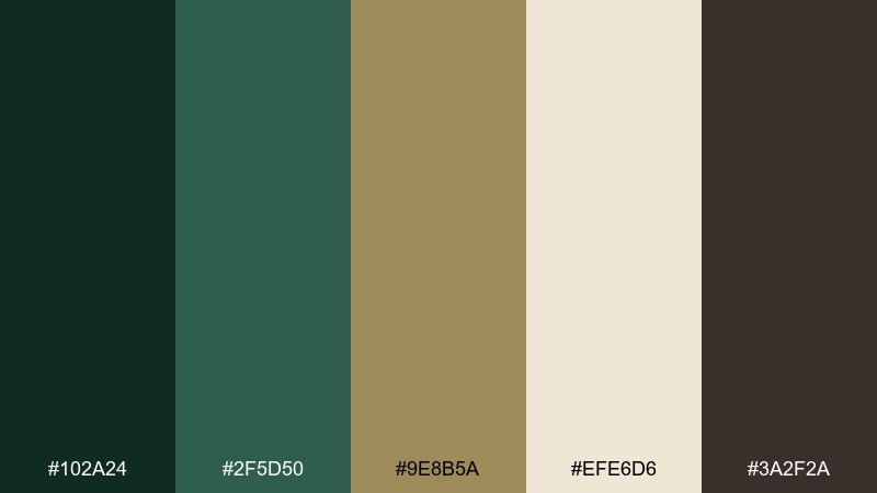
HEX: #102A24 #2F5D50 #9E8B5A #EFE6D6 #3A2F2A
Mood: heritage, outdoorsy, refined
Best for: premium whiskey label design
Heritage and refined, these greens and browns suggest old libraries, forest trails, and aged oak barrels. They fit spirits labels, gift boxes, and tasting notes where tradition matters. Pair the cream with deep green for readable text and use brass as a small emblem color. Usage tip: keep ornamentation minimal and let paper texture or embossing deliver the luxury feel.
Image example of forest reserve generated using media.io
13) Antique Brocade
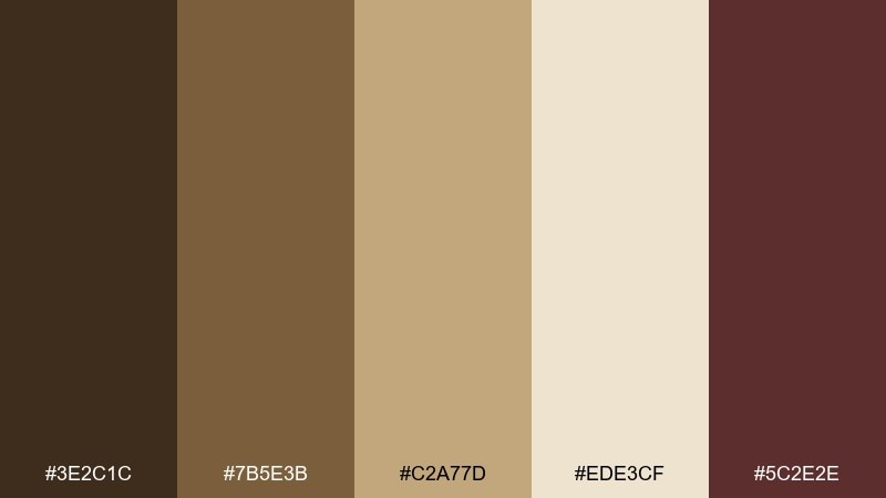
HEX: #3E2C1C #7B5E3B #C2A77D #EDE3CF #5C2E2E
Mood: vintage, ornate, warm
Best for: luxury hotel brochure
Vintage and ornate, these tones feel like brocade fabric, dark wood, and softly lit corridors. They work for hotel brochures, concierge cards, and upscale travel print where warmth is key. Pair the parchment background with deep brown headings and bring in burgundy for small callouts. Usage tip: use thin rules and generous margins to keep the richness from becoming cluttered.
Image example of antique brocade generated using media.io
14) Slate Penthouse
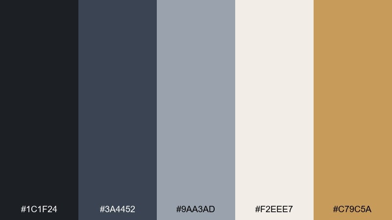
HEX: #1C1F24 #3A4452 #9AA3AD #F2EEE7 #C79C5A
Mood: urban, cool, high-end
Best for: real estate landing page UI
Urban and high-end, these slate blues and creamy neutrals evoke a penthouse at dusk with warm brass fixtures. They are ideal for real estate landing pages, architecture portfolios, and premium listings. The most effective luxury color combinations come from using slate as the structural base and letting brass act as the conversion accent. Usage tip: keep imagery cool-toned and use the cream for content sections to balance the darker hero area.
Image example of slate penthouse generated using media.io
15) Desert Luxe
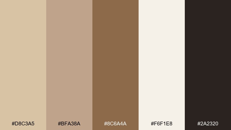
HEX: #D8C3A5 #BFA38A #8C6A4A #F6F1E8 #2A2320
Mood: sun-warmed, calm, sophisticated
Best for: spa website branding
Sun-warmed and calm, these sand and clay tones feel like a quiet resort morning. They suit spa branding, wellness sites, and packaging where softness and trust matter. Pair the creamy white with dark cocoa text for readability, then use the mid-tan for dividers and UI cards. Usage tip: add subtle gradients between the two lightest tones to avoid flat sections on large screens.
Image example of desert luxe generated using media.io
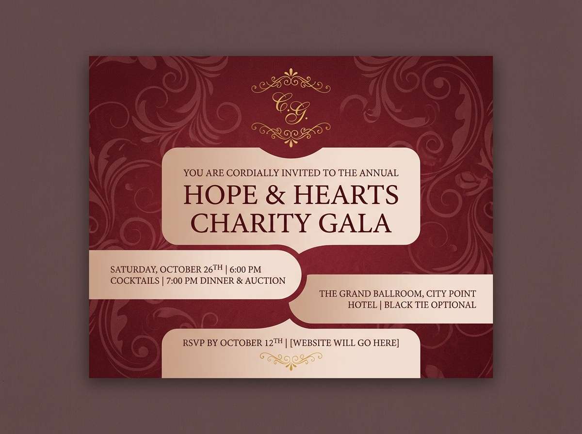
16) Garnet Gala

HEX: #4A0E16 #8E1B2F #D7B9A6 #F4ECE6 #C3A14A
Mood: festive, elegant, bold
Best for: charity gala invitation
Festive and elegant, these garnets and warm neutrals bring to mind velvet drapes and champagne toasts. They are perfect for gala invitations, fundraising event collateral, and RSVP pages. Pair the deep wine as the primary background with soft blush blocks for details and schedules. Usage tip: print gold as a thin foil line or monogram so the red remains the star of the layout.
Image example of garnet gala generated using media.io
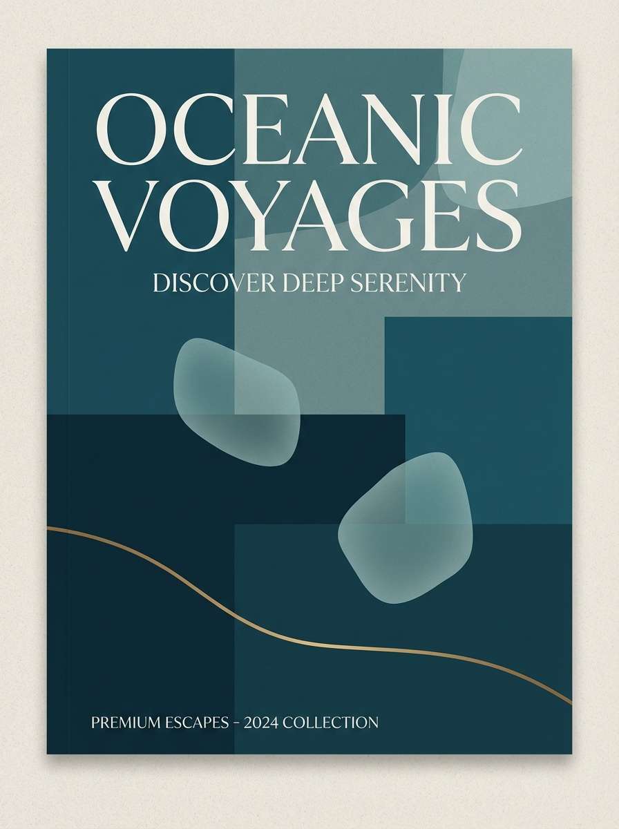
17) Ocean Suite
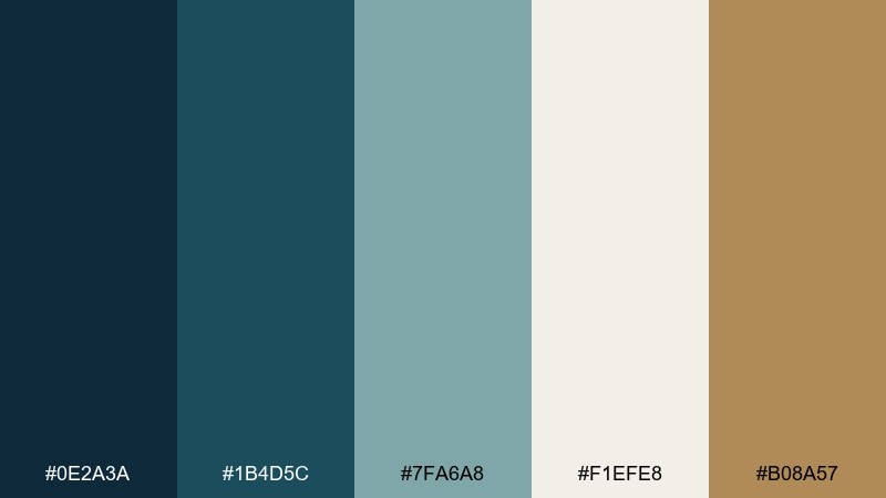
HEX: #0E2A3A #1B4D5C #7FA6A8 #F1EFE8 #B08A57
Mood: coastal, composed, upscale
Best for: travel brochure cover
Coastal and composed, these sea-glass tones feel like a quiet suite overlooking the water. They work for travel brochures, resort branding, and premium itineraries where calm sophistication sells. Pair the deep teal with off-white for headers and body copy, then use brass as a waypoint highlight. Usage tip: keep photography desaturated so the teal UI elements and titles stay cohesive.
Image example of ocean suite generated using media.io
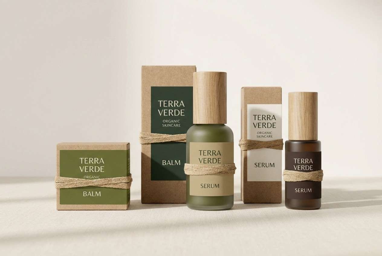
18) Olive Atelier
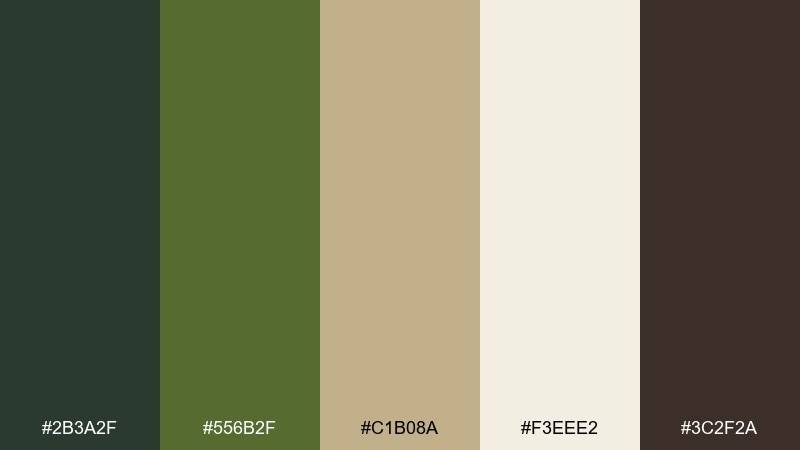
HEX: #2B3A2F #556B2F #C1B08A #F3EEE2 #3C2F2A
Mood: artisanal, earthy, refined
Best for: organic skincare packaging
Artisanal and earthy, this olive-forward mix evokes apothecary jars and sunlit studios. It suits organic skincare packaging, ingredient labels, and minimalist product ads. Pair the cream base with deep olive text for a natural, premium feel and use the sand tone for secondary panels. Usage tip: keep the palette matte and avoid glossy finishes so the colors read calm and trustworthy.
Image example of olive atelier generated using media.io
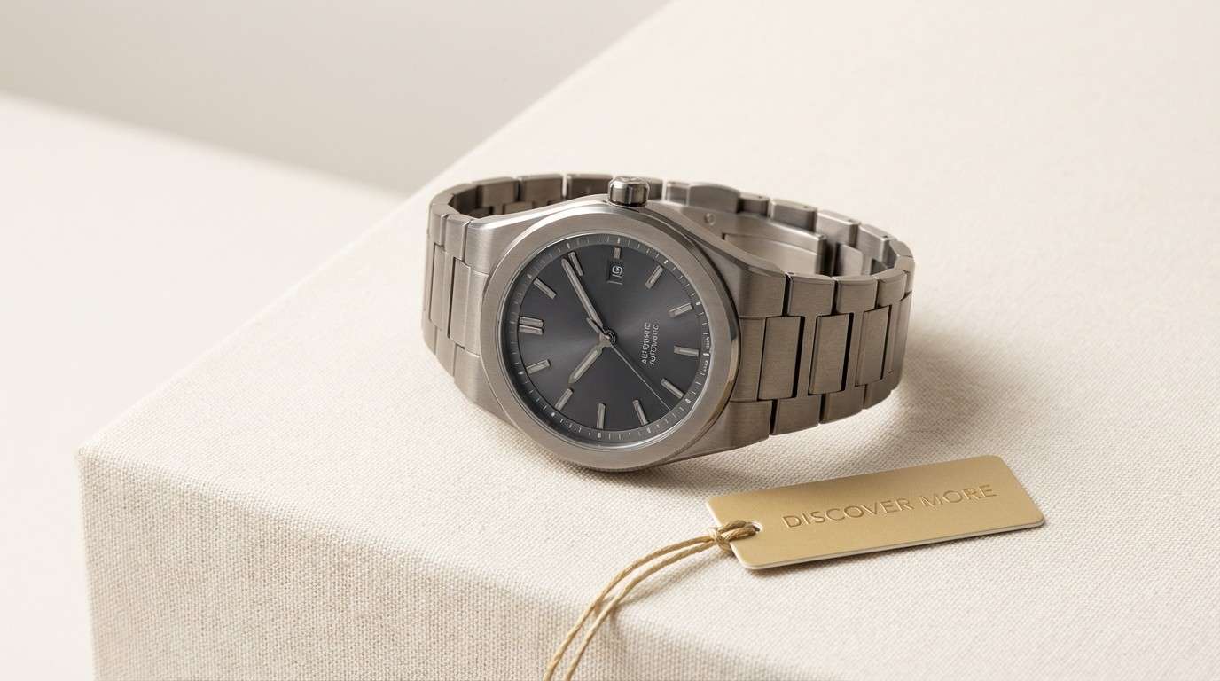
19) Pewter Regency
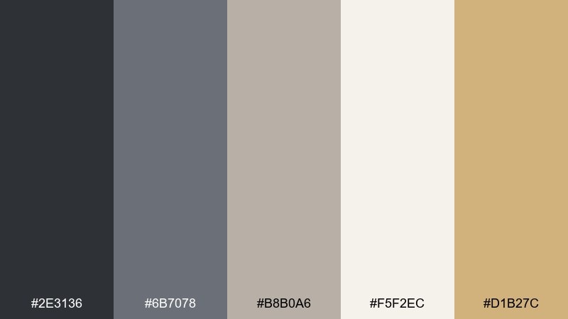
HEX: #2E3136 #6B7078 #B8B0A6 #F5F2EC #D1B27C
Mood: classic, cool, elegant
Best for: watch product ad
Classic and cool, these pewter grays feel like brushed metal and understated tailoring. They are a natural fit for watch ads, tech accessories, and product pages that need premium restraint. Pair the light cream with charcoal copy, then let the gold-beige show up only in the price, CTA, or logo. Usage tip: use soft gradients in the grays to mimic metal sheen without introducing extra colors.
Image example of pewter regency generated using media.io
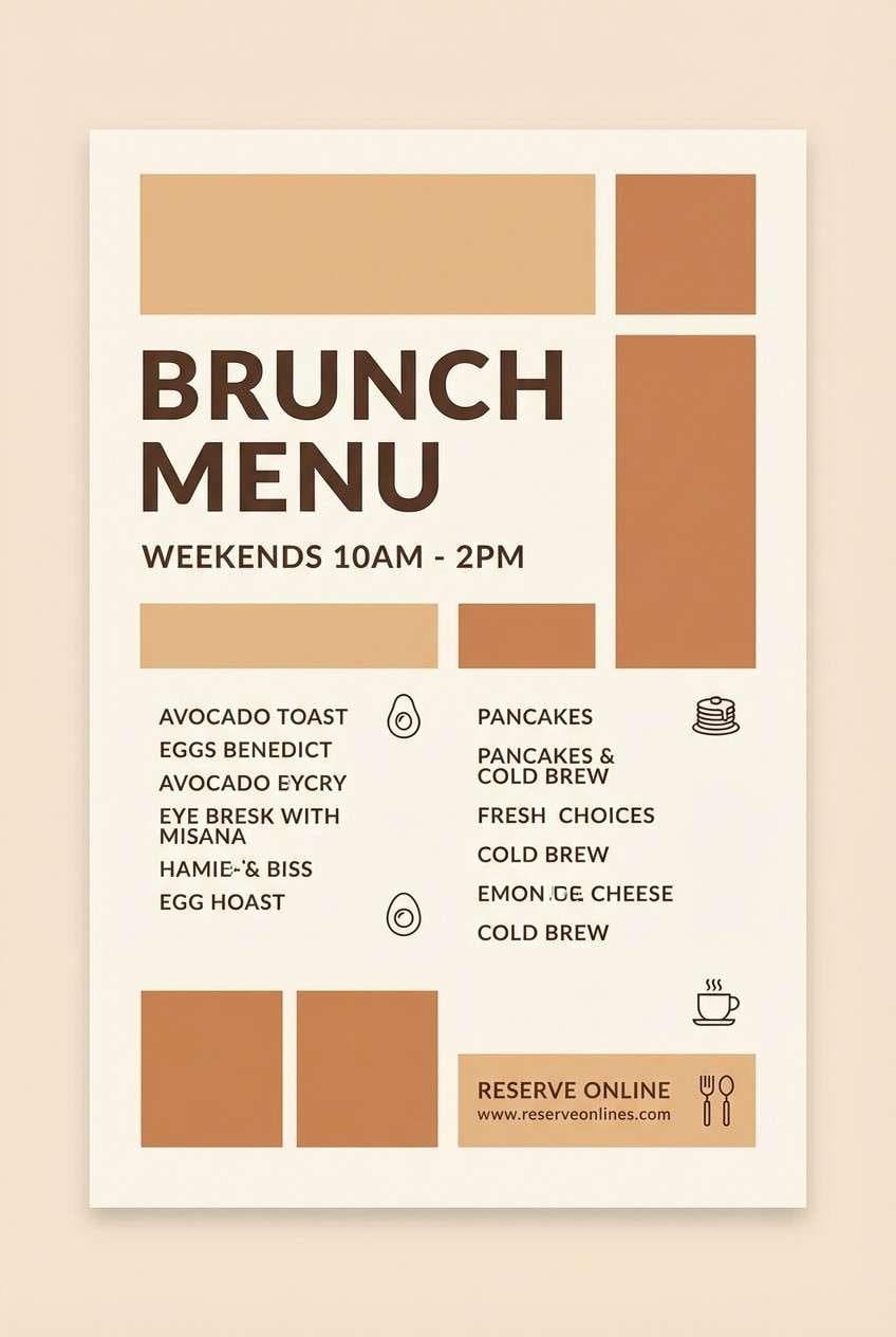
20) Sunlit Terrace
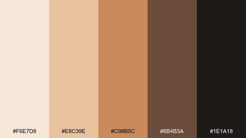
HEX: #F6E7D8 #E8C39E #C98B5C #6B4B3A #1E1A18
Mood: golden, welcoming, elevated
Best for: restaurant brunch flyer
Golden and welcoming, these warm tones evoke sunlit stone, baked pastry, and espresso shadows. They work for brunch flyers, seasonal menus, and social posts where you want appetizing warmth with a polished edge. Pair the light cream with dark brown type for clarity, then bring in the caramel as a highlight for prices or special items. Usage tip: keep background textures subtle so the warm mid-tones stay crisp in print and on mobile.
Image example of sunlit terrace generated using media.io
What Colors Go Well with Luxury?
Luxury palettes pair best with deep anchors (near-black, charcoal, navy, forest green) and warm light neutrals (ivory, champagne, parchment). This base creates calm, high-end contrast without looking harsh.
Metallic cues like gold, brass, and rose-gold work as “signal colors” for logos, CTAs, borders, and seals. When you use them sparingly, they read as premium rather than loud.
For modern luxury, add one desaturated supporting hue—slate blue, muted plum, sea-glass teal, or taupe—to keep the palette dimensional while staying refined.
How to Use a Luxury Color Palette in Real Designs
Start with a dominant neutral background (cream or deep charcoal), then define hierarchy with one strong text color and one accent. In UI, this often means: neutral surfaces, dark typography, and one metallic-like CTA color.
Keep accents rare and consistent. If gold is your highlight, use it for the same role everywhere (buttons, key icons, dividers), and avoid introducing extra bright hues that dilute the premium feel.
For print, let texture do part of the work: uncoated stock, embossing, and foil can elevate even simple elegant neutrals. Match your ink contrast to the paper tone so small text remains clean and readable.
Create Luxury Palette Visuals with AI
If you want to preview a luxury color scheme on realistic packaging, invitations, or UI screens, AI mockups help you iterate fast. You can keep the same composition and swap HEX-based colors to test contrast and mood.
With Media.io’s text-to-image tool, describe your layout (product, poster, landing page) and include your HEX codes directly in the prompt. This makes it easy to generate consistent, on-brand visuals for presentations and client reviews.
When you get a result you like, reuse the prompt structure and only change one variable at a time (background tone, accent metallic, or typography color) to maintain a cohesive premium system.
Luxury Color Palette FAQs
-
What makes a color palette look “luxury”?
Luxury palettes usually rely on deep anchors (black, charcoal, navy), warm neutrals (ivory, champagne), and a restrained accent (gold/brass/rose-gold). The “luxury” feeling comes from controlled contrast, plenty of whitespace, and consistent hierarchy—not lots of colors. -
Is black and gold always a good luxury color scheme?
It’s a classic, but it works best when gold is used sparingly (logos, borders, seals, CTAs) and balanced with a readable neutral like ivory. Overusing gold can make the design feel busy or costume-like. -
Which luxury colors work best for modern UI design?
Navy, slate, charcoal, and warm off-whites are reliable for modern UI because they reduce glare and support readability. Add one brass/gold accent for active states and key actions to create a premium feel without hurting usability. -
How do I keep luxury palettes readable in print?
Use dark text (charcoal/near-black) on warm light backgrounds (ivory, parchment), and avoid very light gray text. If you use a dark background, switch body text to a warm cream and reserve metallic foils for large marks or thin rules. -
What are safe alternatives to metallic gold for web?
Use muted gold-beige or brass tones (not pure yellow) and simulate “metal” with subtle gradients and highlights. Pair them with deep neutrals so the accent still reads premium even without real foil. -
How many colors should a premium color palette include?
Most premium palettes work best with 3–5 colors: one primary base, one text color, one surface/background neutral, one supporting tone, and one accent. Fewer colors make the system feel intentional and consistent. -
Can I generate luxury brand mockups with specific HEX codes?
Yes. Include the HEX codes in your prompt (like the examples above) and describe the scene (packaging, UI, invitation). This helps the AI stay closer to your intended luxury color palette across iterations.


