

Light academia is all about soft neutrals, vintage warmth, and quiet contrast—think sunlit paper, tweed textures, and ink-dark typography.
Below are 20 curated light academia color palette ideas with HEX codes, plus practical tips for using them in branding, interiors, and graphic design.
In this article
- Why Light Academia Palettes Work So Well
-
- quiet parchment
- old library linen
- sage lecture notes
- dusty rose margins
- antique brass bookmark
- oatmilk & ink
- weathered stone study
- sepia sketchbook
- vintage card catalog
- sunlit courtyard
- soft tweed blazer
- pressed olive leaves
- warm clay annotation
- cream & cocoa typewriter
- foggy campus morning
- cedar desk & paper
- faded ink wash
- honeyed walnut shelf
- ivory marble hall
- muted terracotta vase
- What Colors Go Well with Light Academia?
- How to Use a Light Academia Color Palette in Real Designs
- Create Light Academia Palette Visuals with AI
Why Light Academia Palettes Work So Well
Light academia palettes work because they’re built on readable, low-saturation neutrals—creams, oat beiges, warm grays, and ink browns—so text and layouts feel calm, clear, and timeless.
They also carry a built-in sense of story. Paper-like bases and vintage accents (sepia, brass, clay, olive) instantly evoke heritage, learning, and craft without needing literal “academic” imagery.
Most importantly, these palettes are flexible: you can go minimal with near-monochrome neutrals, or add a single muted accent (sage, dusty rose, terracotta) for a more expressive, modern-classic look.
20+ Light Academia Color Palette Ideas (with HEX Codes)
1) Quiet Parchment
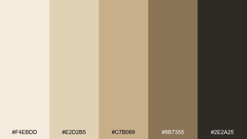
HEX: #F4EBDD #E2D2B5 #C7B089 #8B7355 #2E2A25
Mood: calm, studious, warm
Best for: editorial magazine layout
Calm and studious like sunlit pages in an old reading room, these tones feel warm without turning yellow. Use it for thoughtful spreads, essays, and bookish newsletters where legibility matters. Pair the deep ink with generous margins and let parchment and oat sit as the main fields. As a light academia color palette, it shines when you keep contrast high and reserve the darkest shade for headings only.
Image example of quiet parchment generated using media.io
Media.io is an online AI studio for creating and editing video, image, and audio in your browser.

2) Old Library Linen
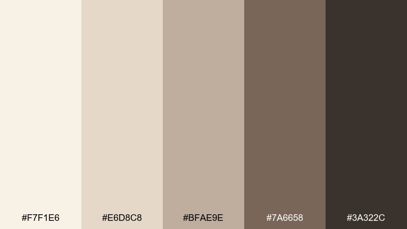
HEX: #F7F1E6 #E6D8C8 #BFAE9E #7A6658 #3A322C
Mood: heritage, quiet, refined
Best for: book cover design
Heritage and hush come through like linen covers and worn spines on a quiet shelf. The creamy base keeps the layout airy while the taupe and walnut add classic weight. Use the darkest tone for title type and the mid tones for borders or subtle texture. A small tip: add paper grain at low opacity to make the neutrals feel tactile.
Image example of old library linen generated using media.io
3) Sage Lecture Notes
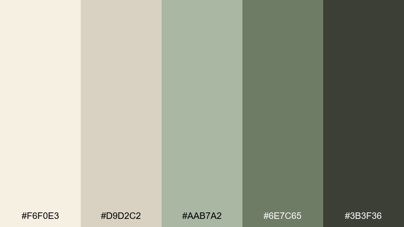
HEX: #F6F0E3 #D9D2C2 #AAB7A2 #6E7C65 #3B3F36
Mood: fresh, academic, grounded
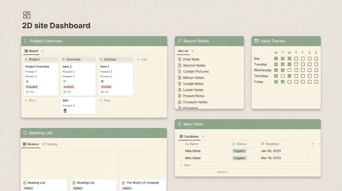
Best for: notion-style dashboard UI
Fresh and grounded like penciled notes with a sprig of sage tucked between pages. The green stays muted, so it reads mature rather than sporty. Use cream and warm gray as surfaces, then apply sage for active states and tags. Tip: keep buttons in the darker green and save the deepest tone for icons to avoid a heavy interface.
Image example of sage lecture notes generated using media.io
4) Dusty Rose Margins
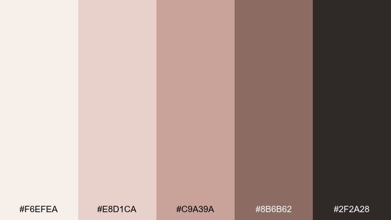
HEX: #F6EFEA #E8D1CA #C9A39A #8B6B62 #2F2A28
Mood: romantic, soft, literary
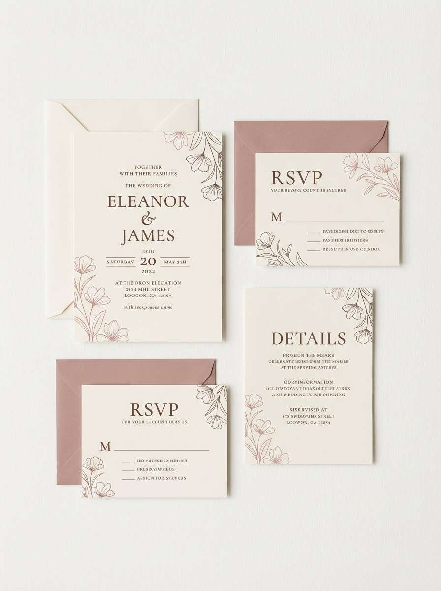
Best for: wedding invitation suite
Romantic and soft like blush notes scribbled in the margins of a well-loved poem. The rose tones are muted enough to stay tasteful, while the cocoa ink keeps details crisp. These light academia color combinations work beautifully for invitations, menus, and wax-seal stationery when paired with off-white paper. Tip: print the rose shades as background washes and keep body text in the deepest neutral for clarity.
Image example of dusty rose margins generated using media.io
5) Antique Brass Bookmark

HEX: #F2E9D8 #D7C5A1 #B79B5C #7B6440 #3A3126
Mood: vintage, warm, distinguished
Best for: coffee shop branding
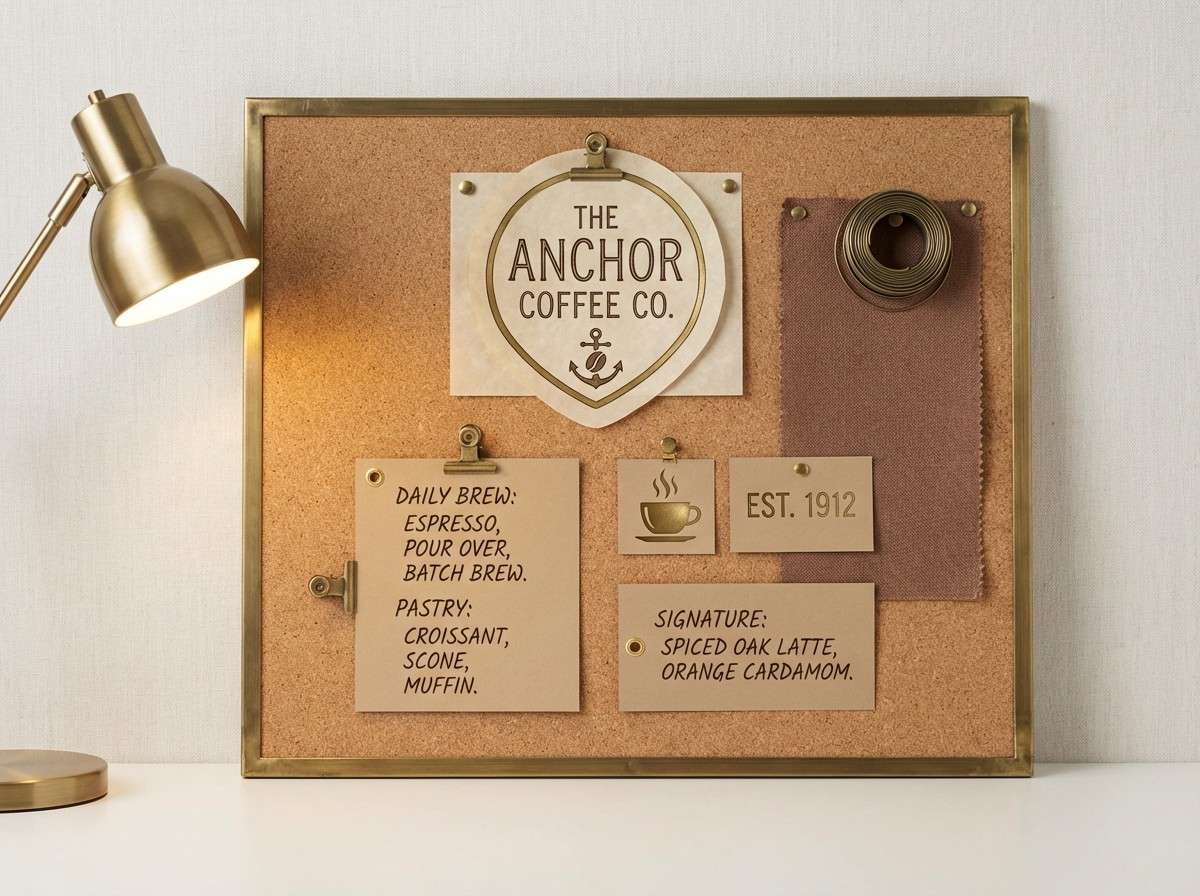
Vintage and distinguished like a brass bookmark catching late-afternoon light. The antique gold reads premium without shouting, especially against parchment and cocoa. Use the brass tone for logos, seals, or small highlights and keep the rest neutral to maintain restraint. Tip: a slightly textured background helps the gold feel less flat in digital designs.
Image example of antique brass bookmark generated using media.io
6) Oatmilk & Ink
HEX: #FAF3E6 #EADCC6 #C8B79E #5B5146 #1F1D1A
Mood: minimal, cozy, crisp
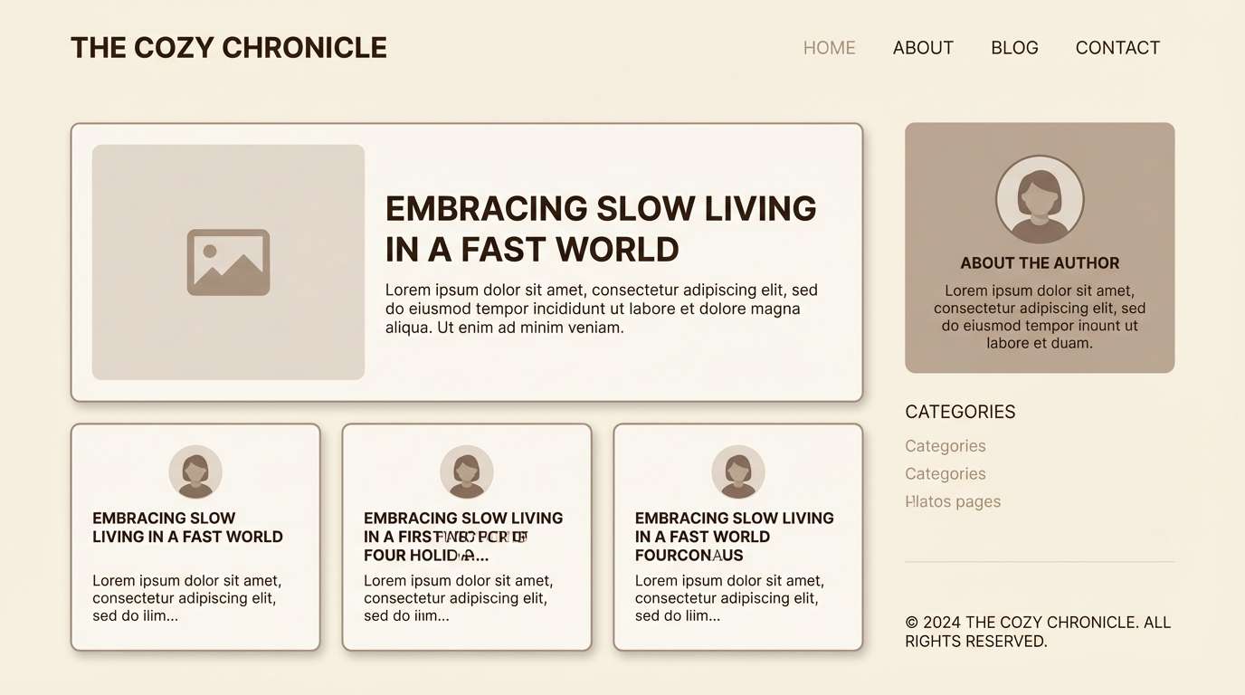
Best for: personal blog theme
Minimal and cozy like oatmilk foam beside a freshly filled fountain pen. The near-black ink gives strong readability while the creams keep the page soft and welcoming. Use the mid taupe for dividers, cards, and subtle hover states. Tip: limit pure black to small areas and let the deep espresso tone do the heavy lifting.
Image example of oatmilk & ink generated using media.io
7) Weathered Stone Study
HEX: #F3EFE6 #DCD6C9 #B5ADA0 #7D766C #3F3A34
Mood: quiet, structured, timeless
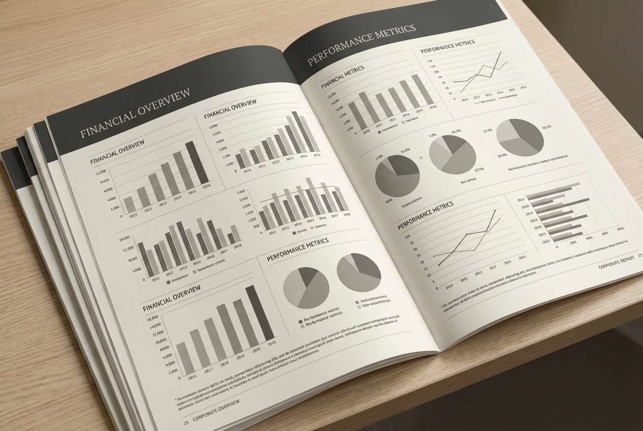
Best for: corporate report design
Quiet and structured like stone steps worn smooth by years of footsteps. These neutrals feel professional while still warm enough for human stories and research. Use the lightest shade for pages, the mid grays for charts, and the darkest for headings and callouts. Tip: introduce hierarchy with line weights rather than more colors to keep the look disciplined.
Image example of weathered stone study generated using media.io
8) Sepia Sketchbook
HEX: #F5ECDD #E0C7A9 #B68B62 #7A563B #2E231C
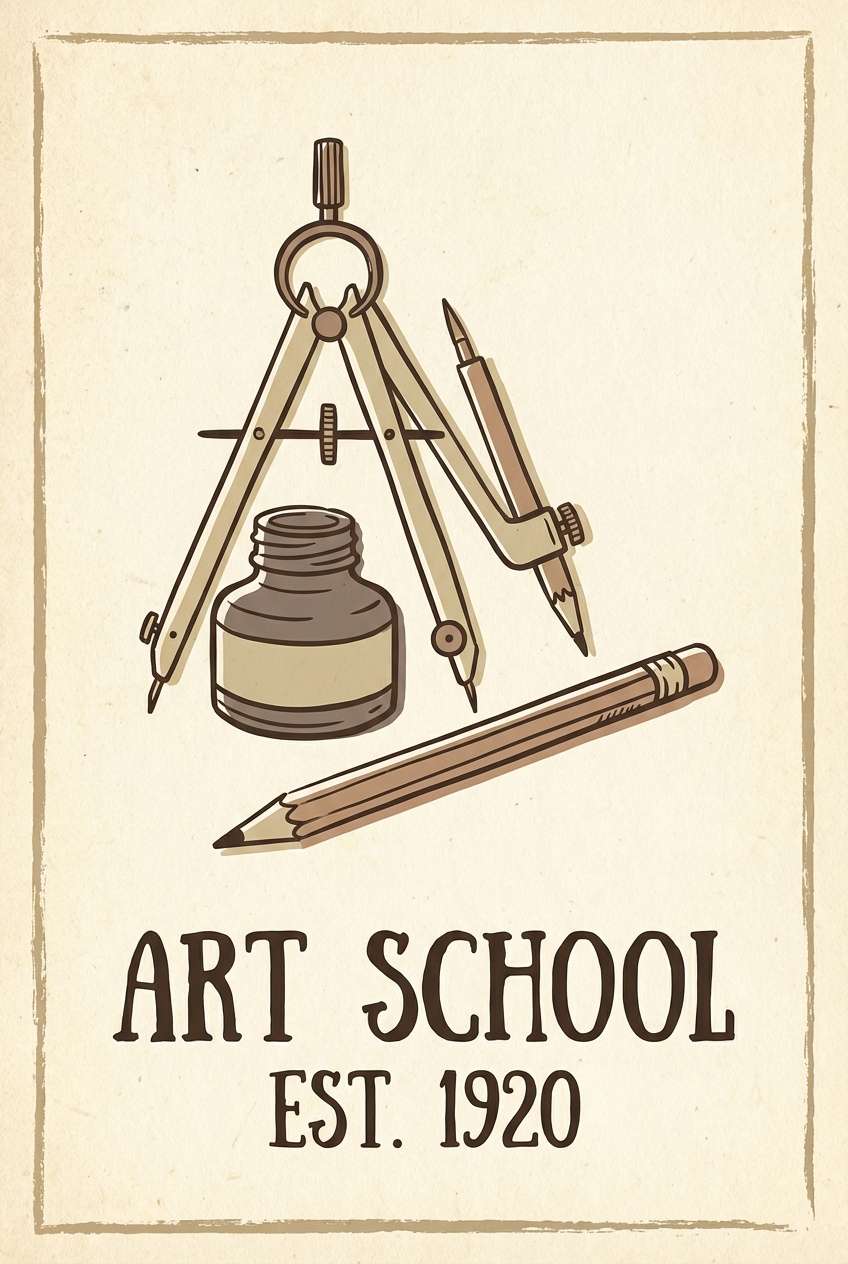
Mood: artsy, nostalgic, warm
Best for: illustration poster
Artsy and nostalgic like sepia sketches drying on thick paper. The sienna and chestnut create a handmade feel, while the pale base keeps it open and bright. Use it for posters, workshop flyers, or art prints where warmth is part of the story. Tip: keep shadows in chestnut instead of black to preserve the vintage tone.
Image example of sepia sketchbook generated using media.io
9) Vintage Card Catalog
HEX: #F7F0E1 #E5D4B8 #C2A67E #8A6E4D #362A20
Mood: organized, nostalgic, classic
Best for: library event flyer
Organized and nostalgic like labeled drawers in a card catalog. The caramel-to-walnut range gives plenty of contrast for type while staying soft. Use the lighter tones for backgrounds and the mid caramel for badges, dates, and section headers. Tip: a thin border in the darkest shade can instantly make layouts feel archival and tidy.
Image example of vintage card catalog generated using media.io
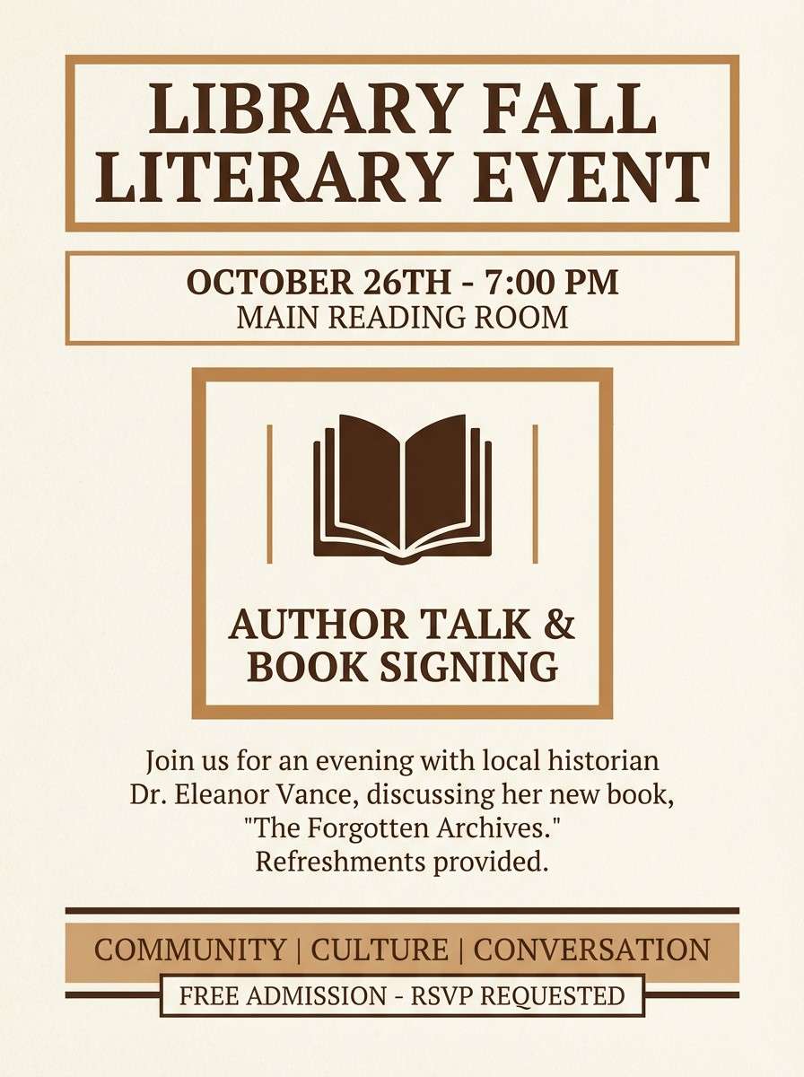
10) Sunlit Courtyard
HEX: #FBF4E6 #EBD7B0 #C9B48A #8D8F6B #3B3B32
Mood: airy, optimistic, botanical
Best for: watercolor botanical print
Airy and optimistic like dappled light across a quiet courtyard path. The buttery neutrals keep things bright, while the olive-gray adds a scholarly botanical twist. These light academia color combinations are ideal for prints, journal covers, or seasonal branding when you want warmth with a hint of green. Tip: let the lightest cream dominate and use the olive only for leaves or small anchors.
Image example of sunlit courtyard generated using media.io
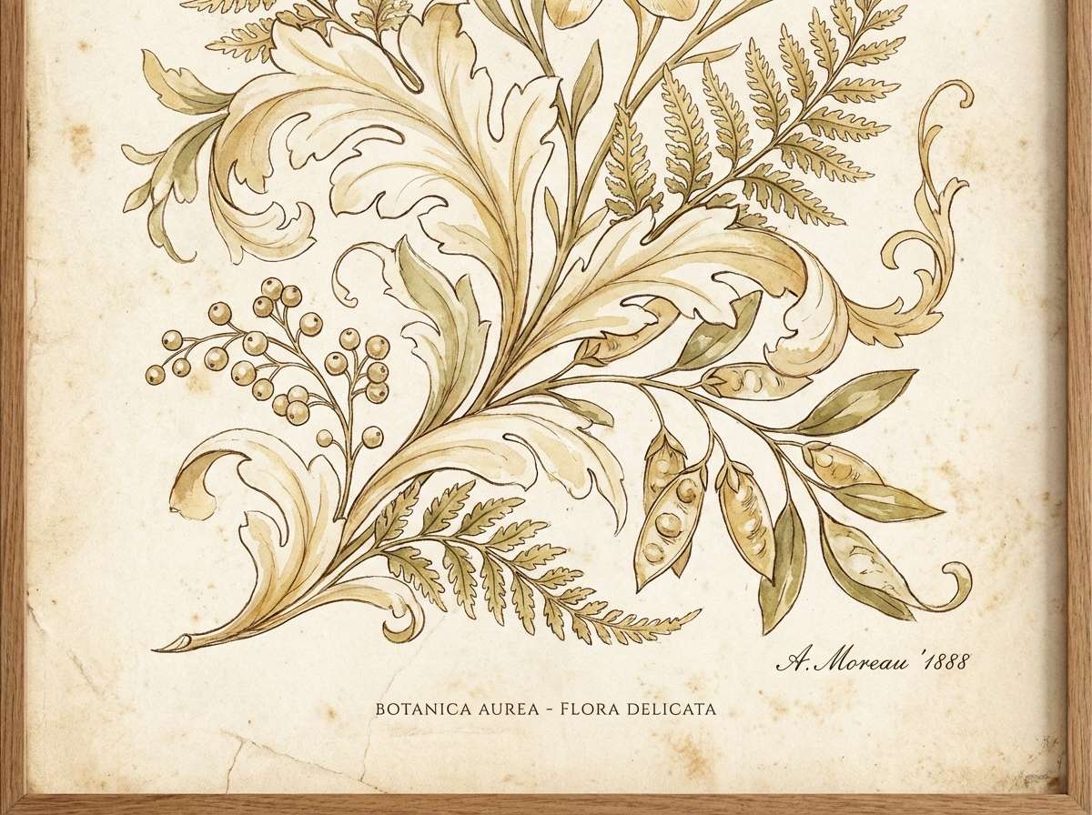
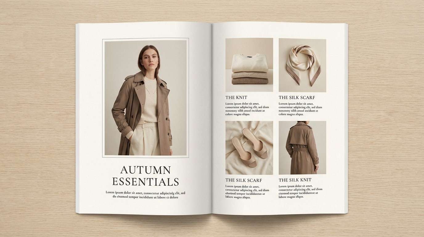
11) Soft Tweed Blazer
HEX: #F2EDE2 #D9CDBD #B6A999 #7A6F63 #2E2A26
Mood: tailored, understated, modern-classic
Best for: fashion lookbook layout
Tailored and understated like a well-cut tweed blazer in a quiet hallway. The palette sits comfortably between warm and cool, which makes it easy to style across seasons. Use it for lookbooks, portfolios, and boutique branding where the content should feel curated. Tip: keep photography in warm lighting so the taupes do not turn flat or cold.
Image example of soft tweed blazer generated using media.io
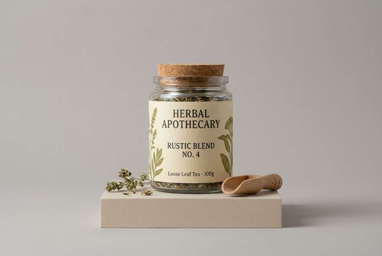
12) Pressed Olive Leaves
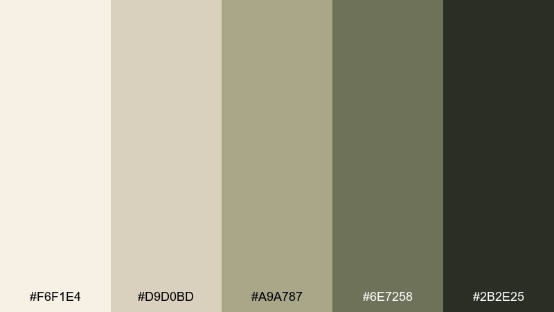
HEX: #F6F1E4 #D9D0BD #A9A787 #6E7258 #2B2E25
Mood: earthy, calm, scholarly
Best for: herbal product packaging
Earthy and calm like pressed leaves tucked inside a notebook. The muted olive tones feel natural and intelligent, especially beside warm cream. Use it for tea labels, apothecary-style packaging, or sustainable product lines. Tip: add small line drawings in the darkest shade and keep the label background in the lightest cream for a clean shelf look.
Image example of pressed olive leaves generated using media.io
13) Warm Clay Annotation
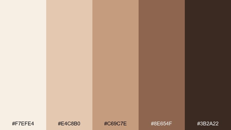
HEX: #F7EFE4 #E4C8B0 #C69C7E #8E654F #3B2A22
Mood: warm, expressive, grounded
Best for: museum exhibit poster
Warm and expressive like clay annotations on textured paper. The terracotta-brown range gives posters and signage a grounded, human feel without going rustic. Use it for museum events, lecture series, or cultural branding with a historical edge. Tip: set the headline in the deepest brown and use clay for big blocks or shapes to keep contrast readable from afar.
Image example of warm clay annotation generated using media.io
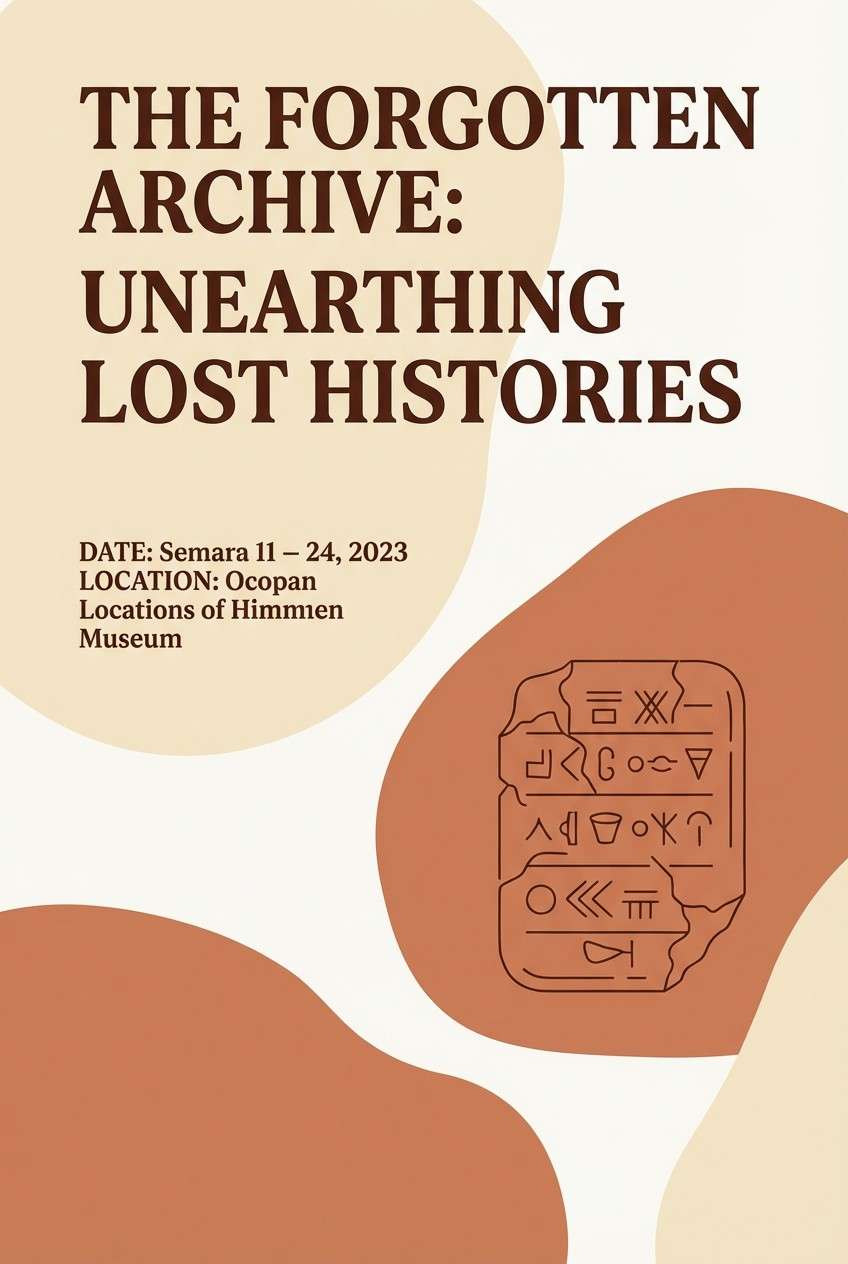
14) Cream & Cocoa Typewriter
HEX: #FFF6E8 #E8D6C2 #BFA58C #6A5345 #241F1C
Mood: classic, cozy, high-contrast
Best for: writer portfolio website
Classic and cozy like typewriter keys against cream paper. The cocoa range brings strong contrast, making it perfect for long-form reading and portfolio pages. Use large cream sections, then add cocoa for navigation and footers to frame content. For a light academia color palette, try using the mid beige for subtle link hovers so the design stays calm and intentional.
Image example of cream & cocoa typewriter generated using media.io
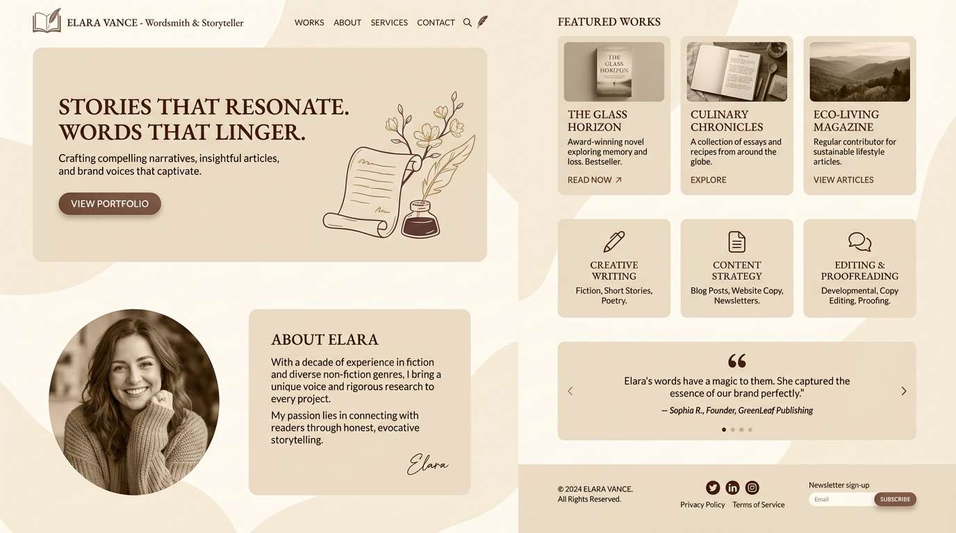
15) Foggy Campus Morning
HEX: #F4F1EA #DDD6CC #B8B1A8 #7C756F #2E2B29
Mood: misty, quiet, contemporary
Best for: minimal brand guidelines
Misty and quiet like a campus walkway before the first lecture. The grays are warm, so the look stays inviting rather than clinical. Use it for brand guidelines, stationery systems, and presentation decks that need calm authority. Tip: add one textured element, like a soft gradient or paper grain, to keep the neutrals from feeling sterile.
Image example of foggy campus morning generated using media.io
16) Cedar Desk & Paper
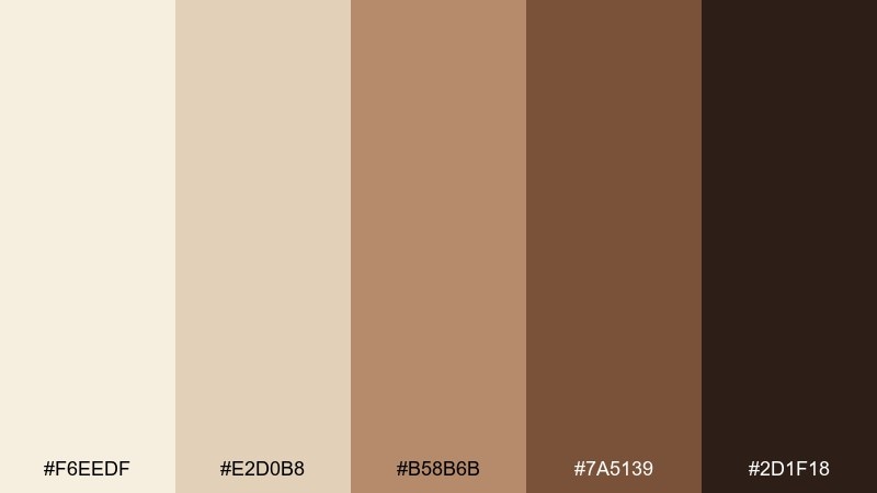
HEX: #F6EEDF #E2D0B8 #B58B6B #7A5139 #2D1F18
Mood: woody, focused, inviting
Best for: product ad for notebooks
Woody and focused like a cedar desk beside a stack of fresh paper. The warm browns feel practical and grounded, ideal for analog tools and craft goods. Use the pale tones as your main field, then layer cedar and chestnut for labels and accents. Tip: keep the darkest shade for small details to avoid making the layout feel heavy.
Image example of cedar desk & paper generated using media.io
17) Faded Ink Wash
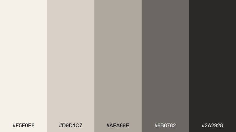
HEX: #F5F0E8 #D9D1C7 #AFA89E #6B6762 #2A2928
Mood: poetic, muted, introspective
Best for: poetry zine layout
Poetic and muted like an ink wash that softened over time. The gentle grays support quiet reading while still giving enough contrast for small captions. Use it for zines, essay PDFs, and minimalist prints that rely on typography. Tip: try large line spacing and thin rules in the mid gray to keep everything airy.
Image example of faded ink wash generated using media.io
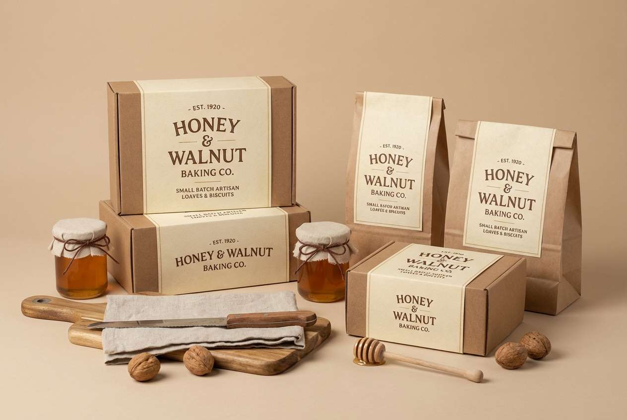
18) Honeyed Walnut Shelf
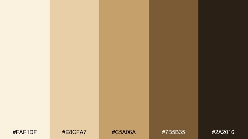
HEX: #FAF1DF #E8CFA7 #C5A06A #7B5B35 #2A2016
Mood: golden, cozy, vintage
Best for: bakery brand packaging
Golden and cozy like honeyed light on a walnut shelf. The caramel tones feel delicious and nostalgic, making them perfect for food and hospitality branding. Use cream as the main label base, then bring in honey and walnut for badges, borders, and signature marks. Tip: keep typography in the darkest brown and avoid thin fonts so it stays readable on warm backgrounds.
Image example of honeyed walnut shelf generated using media.io
19) Ivory Marble Hall
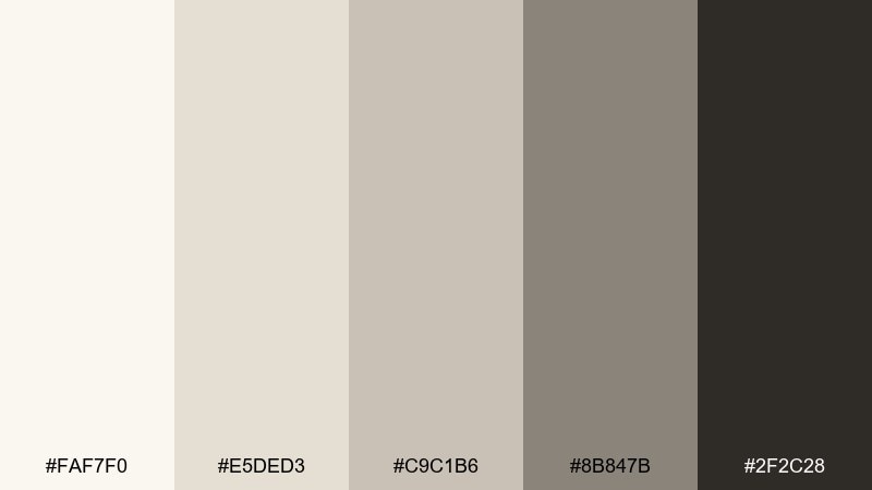
HEX: #FAF7F0 #E5DED3 #C9C1B6 #8B847B #2F2C28
Mood: elegant, airy, museum-like
Best for: gallery website UI
Elegant and airy like ivory marble in a quiet museum hall. The warm grays keep the palette modern, while the deep charcoal adds crisp structure. Use it for gallery sites, architecture portfolios, and refined landing pages. Tip: pair it with thin grid lines and large imagery frames so the neutrals feel intentional rather than empty.
Image example of ivory marble hall generated using media.io
20) Muted Terracotta Vase
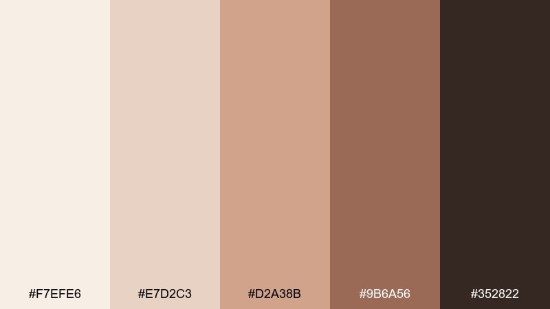
HEX: #F7EFE6 #E7D2C3 #D2A38B #9B6A56 #352822
Mood: artful, warm, grounded
Best for: interior moodboard
Artful and grounded like a terracotta vase on a pale plaster shelf. The warm clay shades add character, while the soft base keeps it light and livable. Use it for interior moodboards, lifestyle branding, or social posts with a handcrafted vibe. Tip: pick one clay tone as your hero and use the others as small swatches to avoid a muddy mix.
Image example of muted terracotta vase generated using media.io
What Colors Go Well with Light Academia?
Light academia pairs best with warm neutrals: parchment cream, oat beige, linen taupe, and cocoa brown. These shades create that “paper + ink” contrast that feels literary and easy to read.
For accents, choose muted tones that look aged or natural—sage/olive greens, dusty rose, antique brass, sepia, or soft terracotta. They add character while keeping the palette calm and refined.
If you need a more contemporary edge, introduce warm grays (fog, stone, marble) and keep saturation low across all elements so the aesthetic stays cohesive.
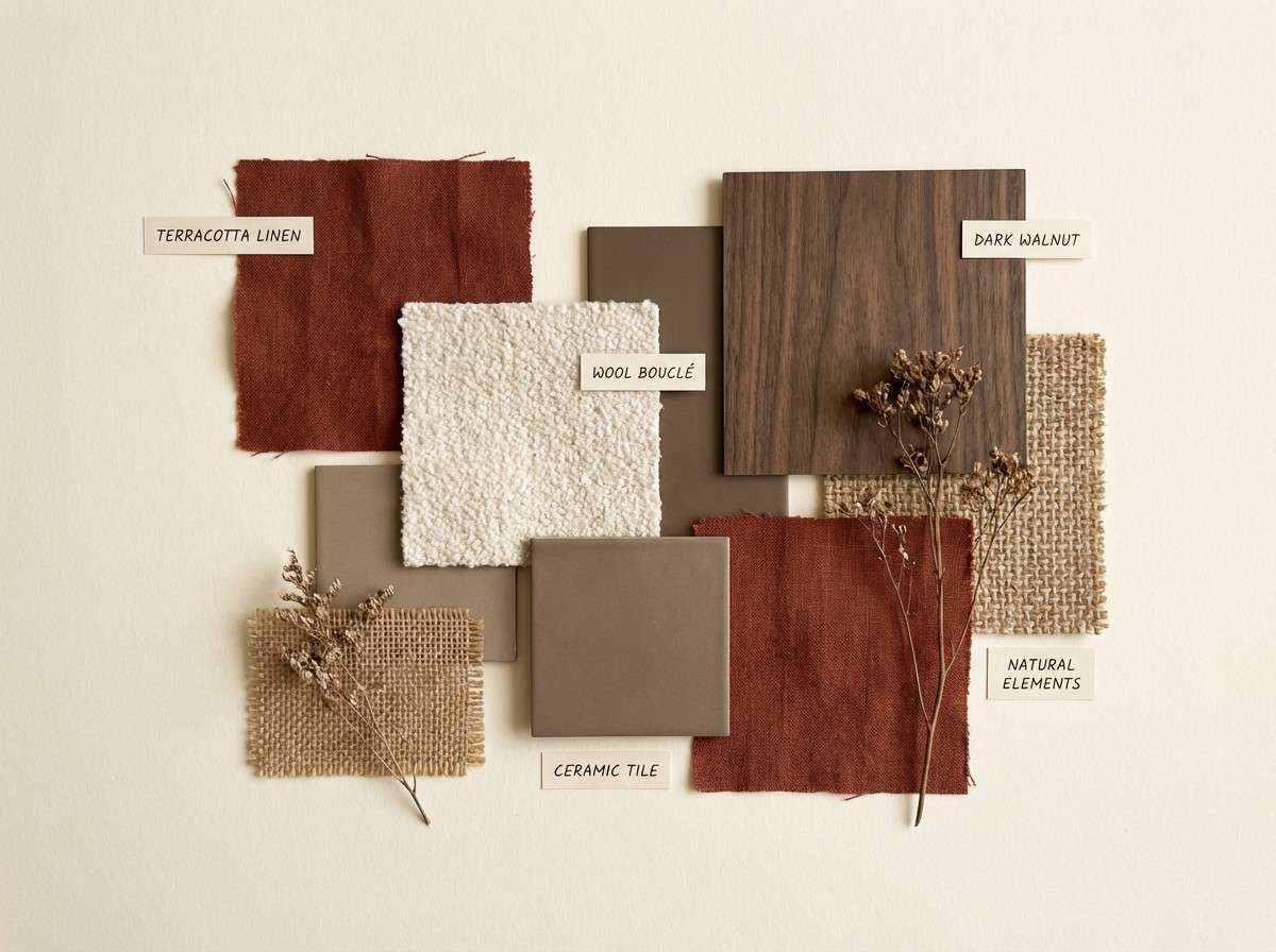
How to Use a Light Academia Color Palette in Real Designs
Start with a paper-like base (cream, ivory, or warm off-white) for backgrounds, then reserve the darkest “ink” shade for headings, navigation, and key labels. This creates instant hierarchy without adding extra colors.
Use mid-tones (taupe, caramel, warm gray) for cards, dividers, borders, and subtle UI states. In print, these same shades work beautifully for frames, rules, and background washes.
Add one accent color at a time—like sage for tags, brass for a seal, or clay for a poster shape—so the layout feels curated rather than busy.
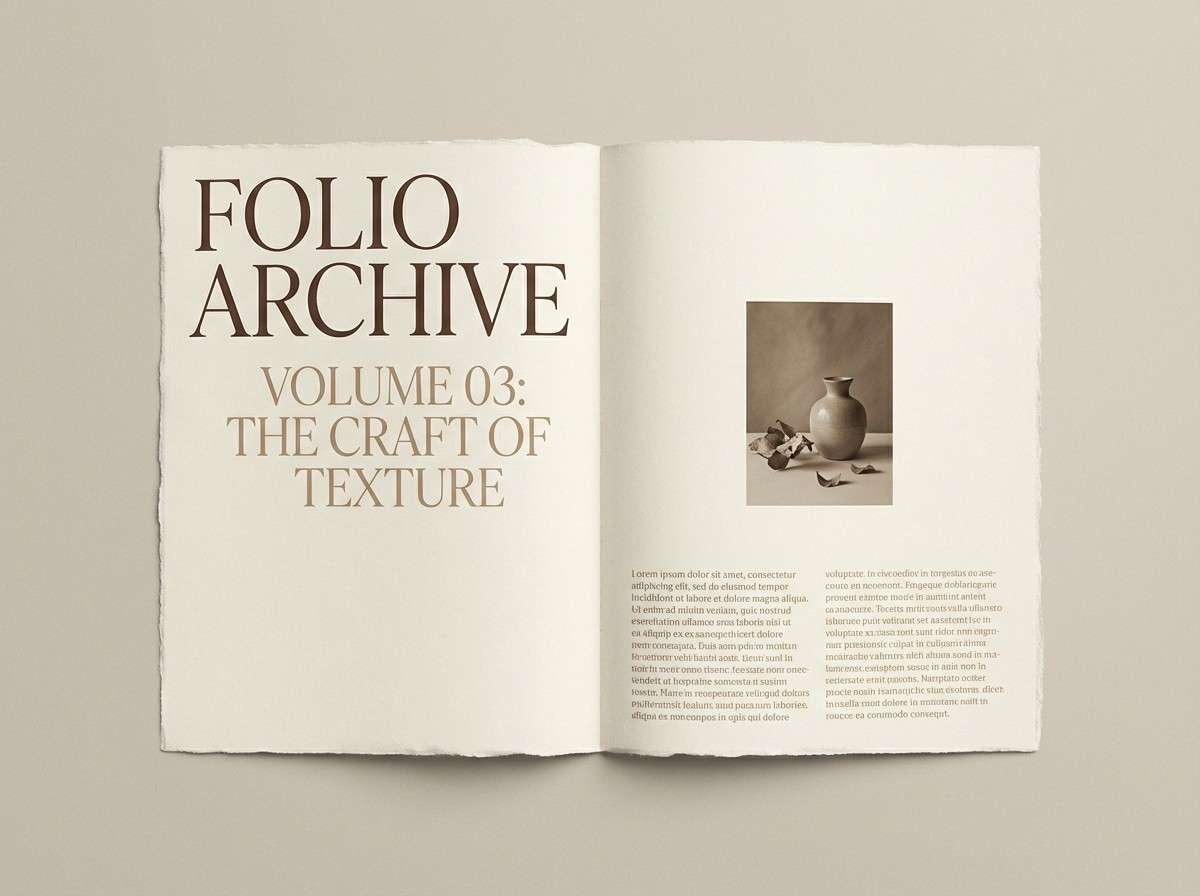
Create Light Academia Palette Visuals with AI
If you want to see how a light academia color scheme looks in a real layout, generate quick mockups using text prompts—perfect for branding boards, posters, packaging, and UI concepts.
Keep your prompt specific: mention “warm cream background,” “muted taupe,” “ink-dark typography,” and a style like “editorial,” “apothecary,” or “museum poster” to stay on-theme.
Once you like the direction, iterate by changing just one element (accent color, texture, or lighting) to refine the aesthetic while keeping the palette consistent.
Light Academia Color Palette FAQs
-
What is a light academia color palette?
A light academia color palette is a set of gentle, low-saturation neutrals (cream, beige, taupe, warm gray) with vintage accents like cocoa brown, sepia, olive, dusty rose, or terracotta—designed to feel scholarly, calm, and timeless. -
Are light academia colors warm or cool?
Mostly warm-leaning neutrals (parchment, oat, caramel, cocoa), but many palettes include warm grays or stone tones to keep the look modern and balanced. -
What’s the best text color for light academia backgrounds?
Deep espresso, charcoal, or ink-black-ish browns work best. They keep readability high while feeling softer than pure black on cream backgrounds. -
How many accent colors should I use?
One accent is usually enough (sage, brass, dusty rose, or clay). Light academia looks most “curated” when neutrals dominate and accents are reserved for highlights. -
How do I keep light academia from looking flat?
Add subtle texture (paper grain, linen, soft gradients) and use contrast via typography hierarchy, spacing, and thin rules instead of adding bright colors. -
Is light academia suitable for modern brands?
Yes—especially for publishing, cafés, galleries, education, lifestyle, and wellness. Use clean layouts and warm grays to make the aesthetic feel contemporary rather than antique. -
Can I use light academia palettes in UI design?
Definitely. Use cream and warm gray for surfaces, taupe for components, and keep interactive states subtle (slightly darker sage/taupe). Reserve the deepest shade for icons and key text to maintain clarity.
Next: Abstract Color Palette


