

Abstract color palettes are built for expressive design: gradients, collage-like shapes, and unexpected pairings that still feel intentional.
Below are 20 abstract color palette ideas with HEX codes, plus practical notes on mood, best uses, and AI prompts you can reuse for fresh visuals.
In this article
Why Abstract Palettes Work So Well
Abstract palettes shine because they're built around feeling and contrast, not literal realism. That gives you freedom to exaggerate highlights, shadows, and accents without breaking the “rules” of a scene.
They also support strong hierarchy: a deep anchor tone for text, mid-tones for surfaces, and a few high-energy accents for calls to action. Even playful colors can stay readable when the value range is planned.
Finally, abstract color schemes are naturally flexible across formats. The same five colors can become a gradient background, a poster collage, or a UI system—just by shifting which tones dominate.
20+ Abstract Color Palette Ideas (with HEX Codes)
1) Prism Drift
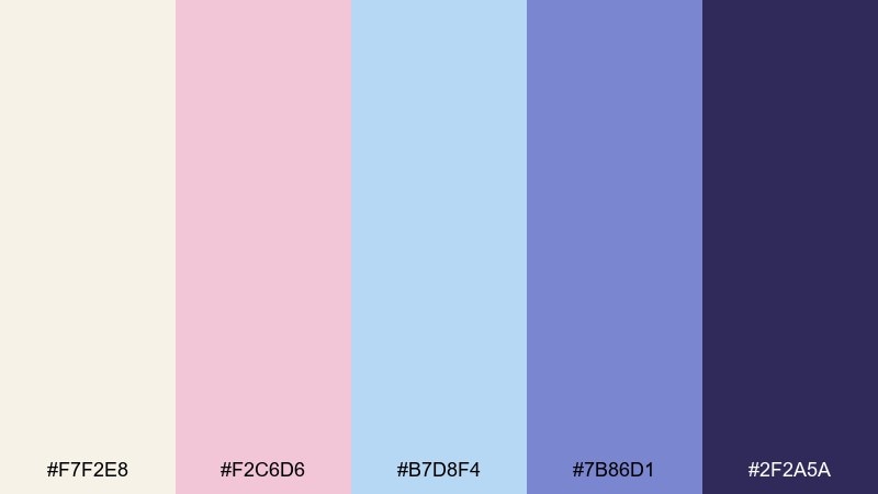
HEX: #f7f2e8 #f2c6d6 #b7d8f4 #7b86d1 #2f2a5a
Mood: dreamy, airy, modern
Best for: UI hero sections and gradient backgrounds
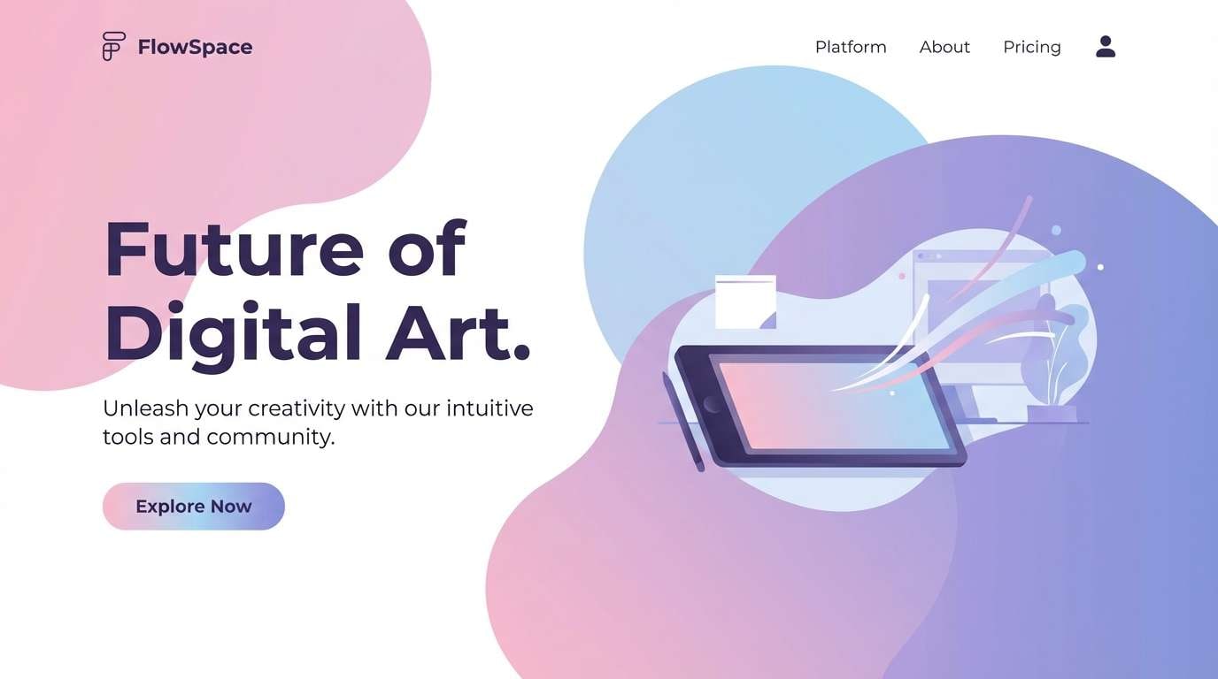
Dreamy and weightless, this abstract color scheme feels like light passing through frosted glass and soft clouds. The warm blush and cool sky tones balance each other, while indigo anchors the layout. Use it for hero gradients, splash screens, and gentle UI moments that still need contrast. Pair with clean sans serif typography, and reserve the deep indigo for buttons to keep accessibility strong.
Image example of prism drift generated using media.io
Media.io is an online AI studio for creating and editing video, image, and audio in your browser.

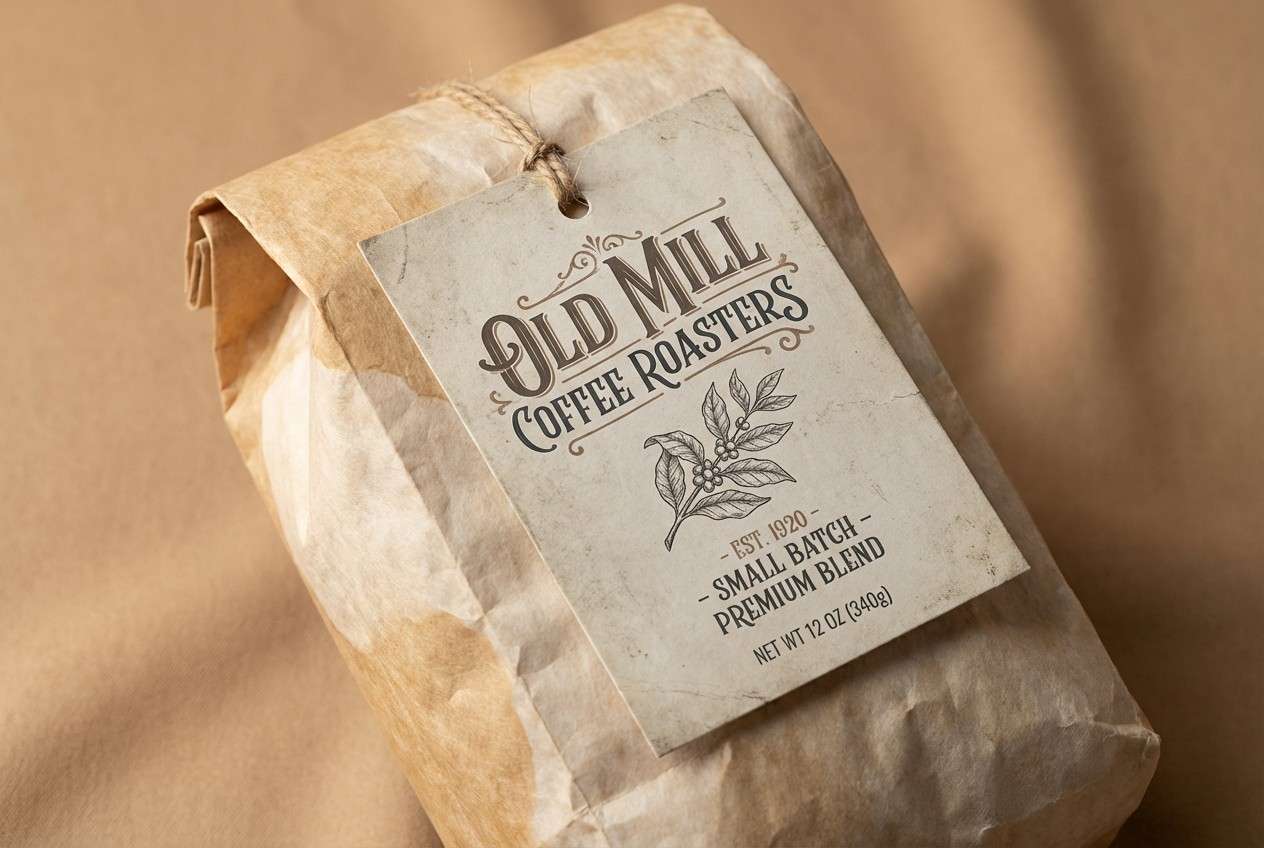
2) Clay Confetti
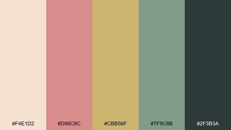
HEX: #f4e1d2 #d98c8c #cbb56f #7f9c8b #2f3b3a
Mood: earthy, playful, handcrafted
Best for: ceramics brand packaging and labels
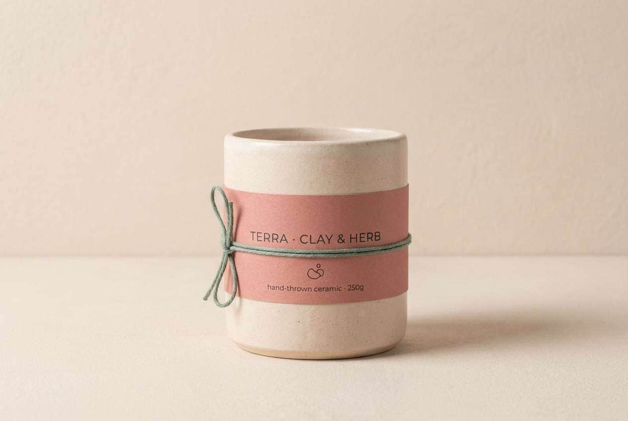
Earthy and upbeat, it evokes clay dust, dried flowers, and tiny paper confetti. The muted rose and olive feel friendly, while the dark charcoal-green keeps it grounded. It works beautifully on kraft paper textures, label systems, and small-batch product design. Tip: use the charcoal for type and barcodes, then let the rose or mustard become your signature accent stamp.
Image example of clay confetti generated using media.io
3) Neon Pastel Mirage
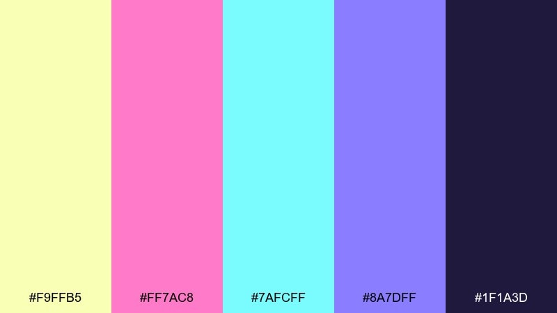
HEX: #f9ffb5 #ff7ac8 #7afcff #8a7dff #1f1a3d
Mood: electric, surreal, youthful
Best for: music festival posters and cover art
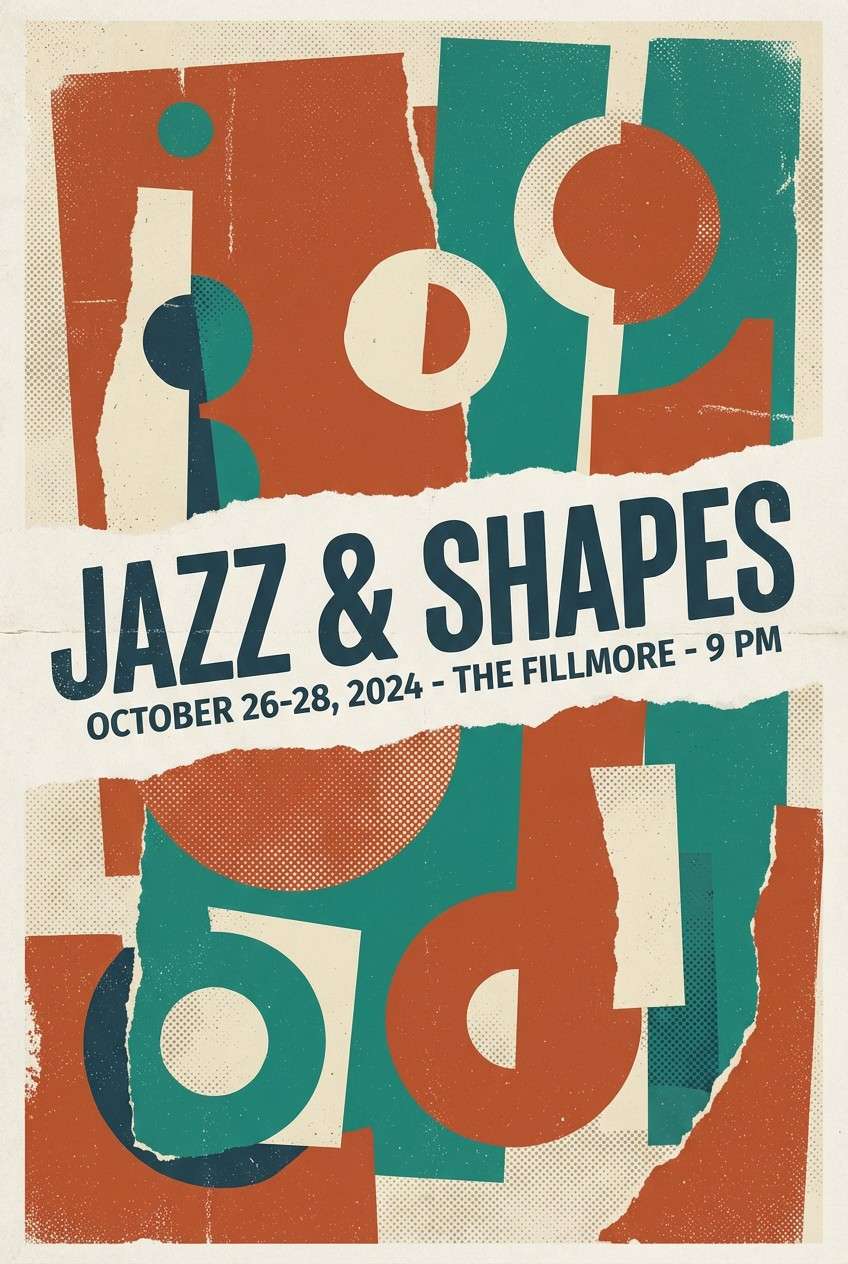
Electric and surreal, it feels like neon lights diffused through fog at midnight. Hot pink and icy cyan punch through the soft yellow, while deep violet-black keeps the whole mix readable. Use this abstract color palette for bold posters, album covers, and motion graphics where you want instant energy. Tip: let the dark base hold the type, then use cyan as the main highlight so the pink stays special.
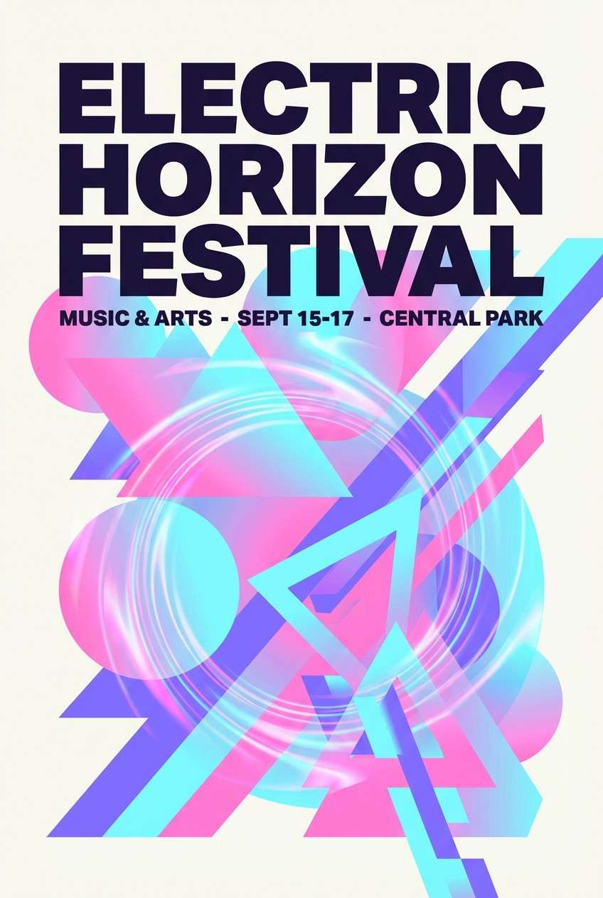
Image example of neon pastel mirage generated using media.io
4) Ink Wash Mineral
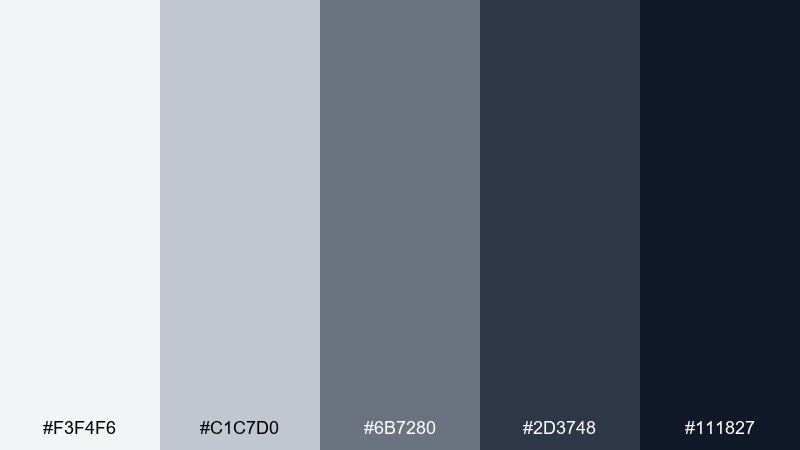
HEX: #f3f4f6 #c1c7d0 #6b7280 #2d3748 #111827
Mood: quiet, editorial, refined
Best for: magazine layouts and reports
Quiet and refined, this abstract palette recalls ink wash gradients on textured paper and cool stone. The grayscale steps give you natural hierarchy for headings, captions, and charts without feeling harsh. Use it for editorial spreads, annual reports, and minimalist portfolios where content needs to lead. Tip: keep backgrounds in the lightest gray and reserve near-black for key data points to avoid heavy pages.
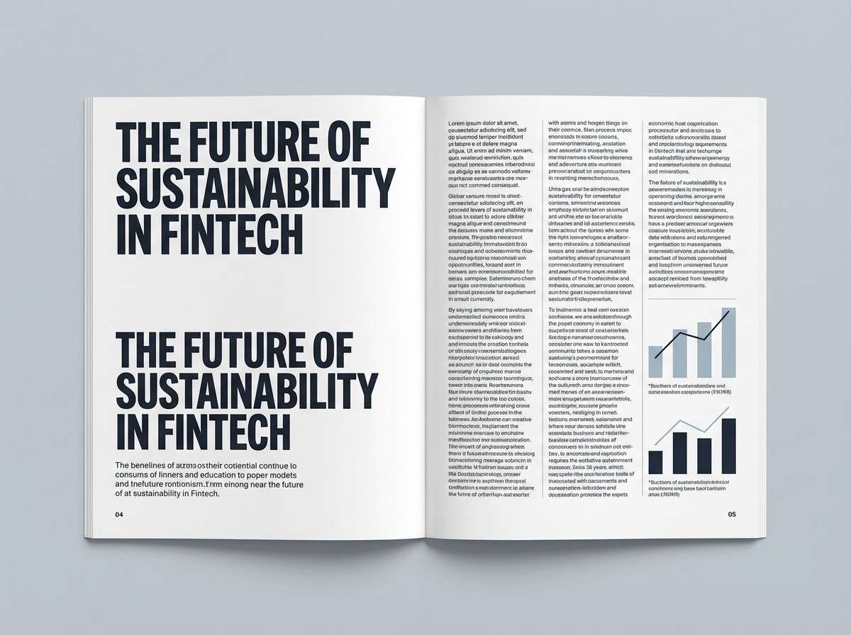
Image example of ink wash mineral generated using media.io
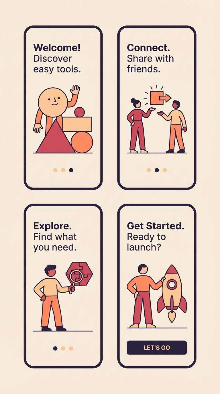
5) Sunset Geometry
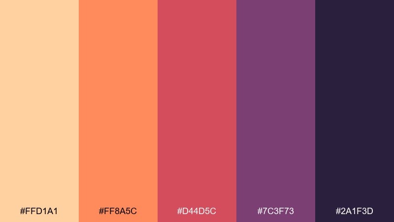
HEX: #ffd1a1 #ff8a5c #d44d5c #7c3f73 #2a1f3d
Mood: warm, bold, cinematic
Best for: app onboarding illustrations
Warm and cinematic, it looks like sunlit shapes sliding across a city wall at dusk. The peach-to-raspberry range gives smooth depth, and the dark plum makes highlights pop. These abstract color combinations shine in onboarding screens, explainer illustrations, and gradients that need a confident mood. Tip: use peach as the background wash, then place raspberry accents on icons to guide the eye through steps.
Image example of sunset geometry generated using media.io
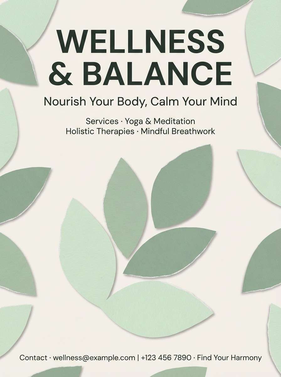
6) Paper Cut Sage
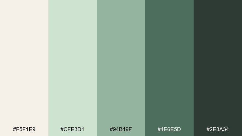
HEX: #f5f1e9 #cfe3d1 #94b49f #4e6e5d #2e3a34
Mood: calm, organic, airy
Best for: wellness flyers and workshop posters
Calm and organic, these abstract color combinations suggest paper-cut leaves and quiet morning light. The creamy base keeps it soft, while layered greens add gentle depth without turning muddy. It works for wellness flyers, yoga workshops, and lifestyle branding where you want a natural tone. Tip: keep text in the deepest green and add small cream margins so the palette feels breathable.
Image example of paper cut sage generated using media.io
7) Midnight Mosaic
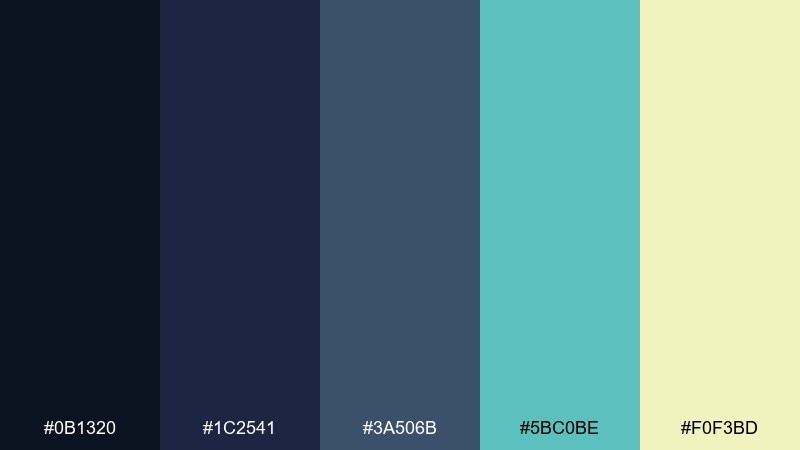
HEX: #0b1320 #1c2541 #3a506b #5bc0be #f0f3bd
Mood: moody, techy, luminous
Best for: tech conference stage backdrops
Moody and luminous, it feels like a mosaic of screens glowing in a dark auditorium. Teal and pale citron read as crisp highlights against layered navy tones. Use it for conference visuals, keynote slides, and signage that needs to look premium but readable from a distance. Tip: keep the pale citron for small callouts only, so it behaves like a spotlight rather than a fill color.
Image example of midnight mosaic generated using media.io

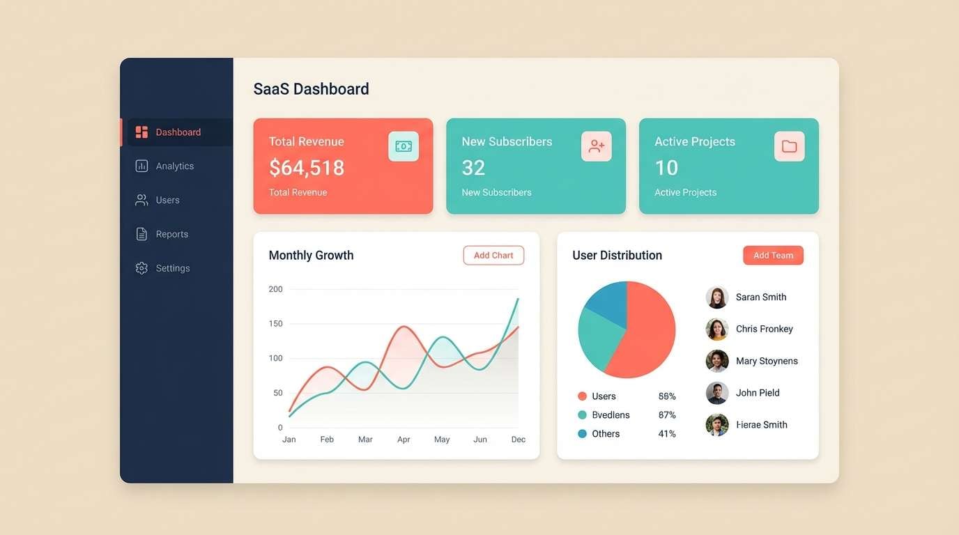
8) Coral Circuit
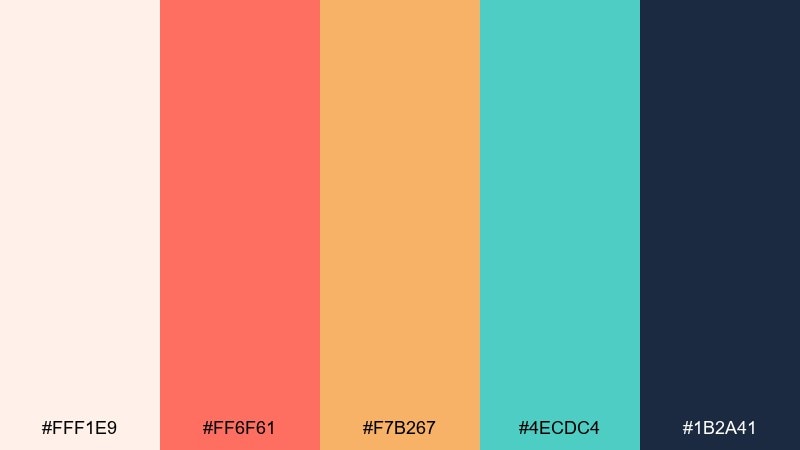
HEX: #fff1e9 #ff6f61 #f7b267 #4ecdc4 #1b2a41
Mood: fresh, upbeat, modern
Best for: SaaS dashboard UI and data cards
Fresh and upbeat, this abstract color palette brings to mind coral reefs and clean circuit lines on a bright board. The warm coral and apricot feel friendly, while mint-teal adds clarity for states and highlights. For a lively abstract color scheme in dashboards, use the dark navy for structure and the teal for success and active elements. Tip: limit coral to one primary action to avoid turning alerts and CTAs into the same visual weight.
Image example of coral circuit generated using media.io
9) Granite Blush
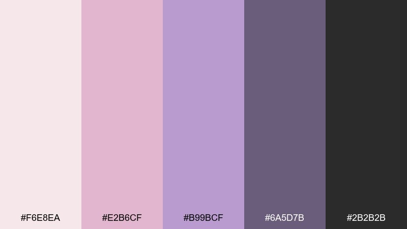
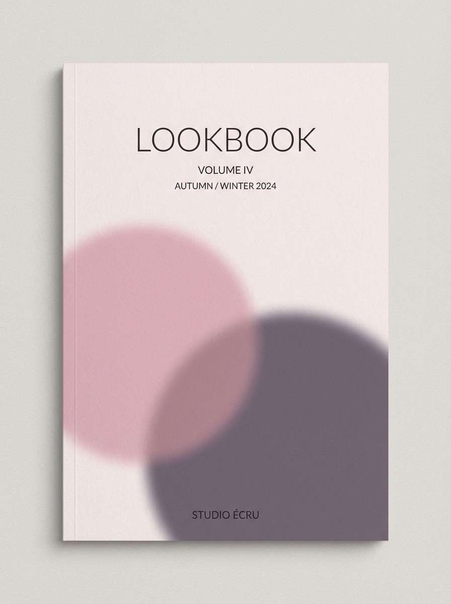
HEX: #f6e8ea #e2b6cf #b99bcf #6a5d7b #2b2b2b
Mood: soft, romantic, grounded
Best for: fashion lookbook covers
Soft and grounded, it feels like blush velvet against cool granite. The dusty pinks stay sophisticated thanks to the smoky violet and deep charcoal. Use it for fashion lookbooks, beauty editorials, and boutique branding where you want romance without sweetness. Tip: choose charcoal for body text and keep the mid-violet for small rules and dividers to maintain a premium feel.
Image example of granite blush generated using media.io
10) Citrus Ink
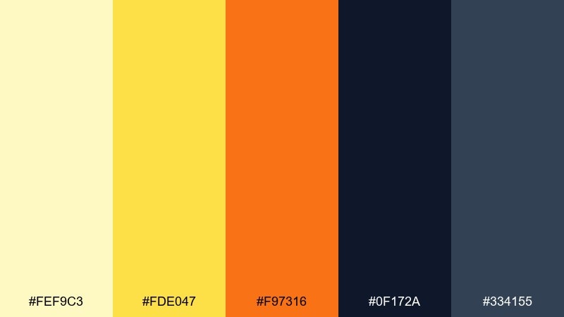
HEX: #fef9c3 #fde047 #f97316 #0f172a #334155
Mood: punchy, confident, high-contrast
Best for: social media quote cards
Punchy and confident, these abstract hues read like bright citrus peel splashed onto dark ink. Yellow grabs attention fast, while the oranges add warmth without losing contrast. Use it for quote cards, announcement tiles, and punchy headers where legibility matters. Tip: set text in the near-black and use yellow as a framing block, not a full background, to avoid glare.
Image example of citrus ink generated using media.io
11) Velvet Paper Planes
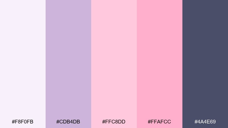
HEX: #f8f0fb #cdb4db #ffc8dd #ffafcc #4a4e69
Mood: sweet, soft, airy
Best for: greeting cards and stationery sets
Sweet and airy, it feels like folded paper planes drifting through cotton-candy skies. The lavender base keeps things calm, while pink layers add playful dimension. These abstract color combinations work especially well for greeting cards, planner stickers, and stationery that needs charm without looking childish. Tip: use the deep slate-purple for small type and outlines so the pastels stay crisp in print.
Image example of velvet paper planes generated using media.io
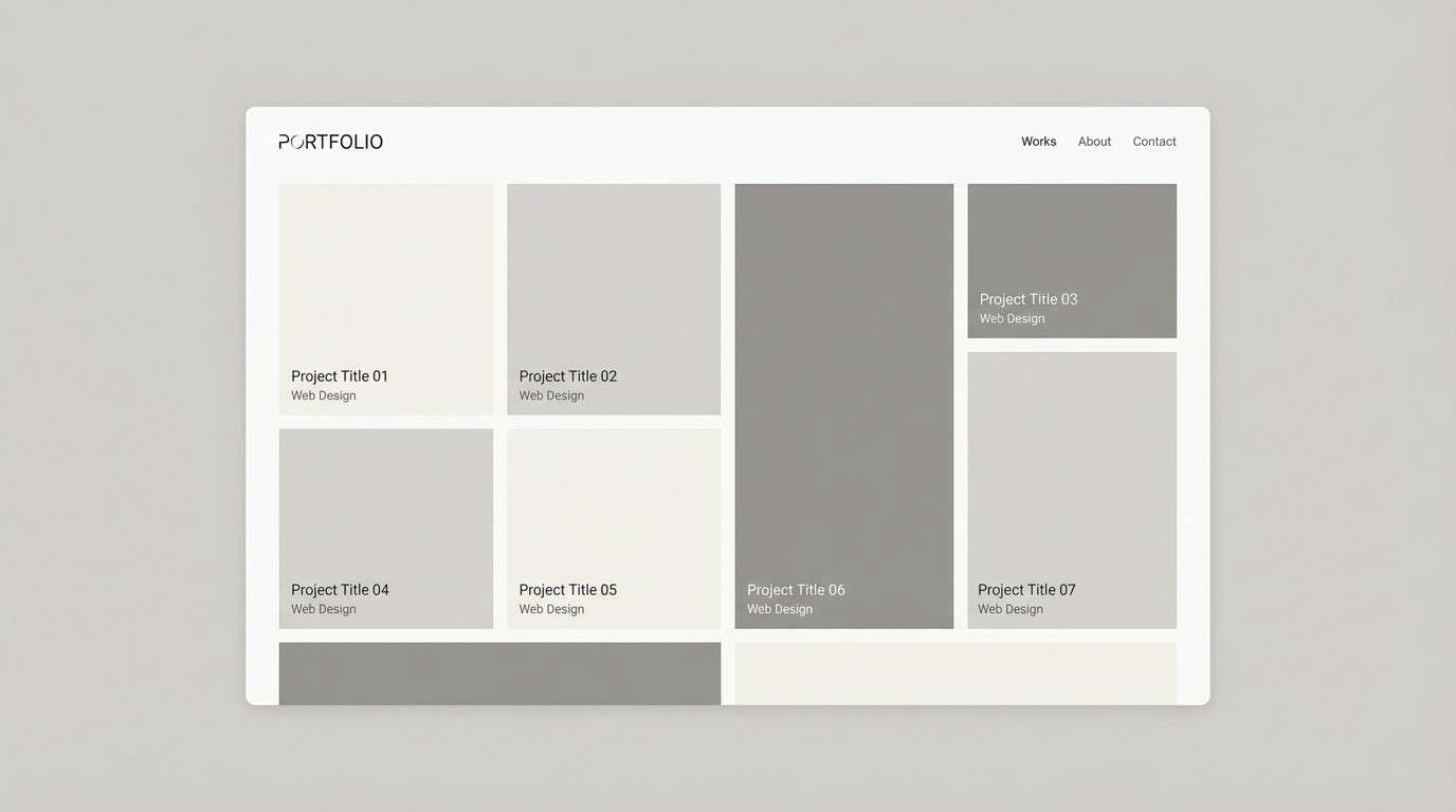
12) Urban Chalk
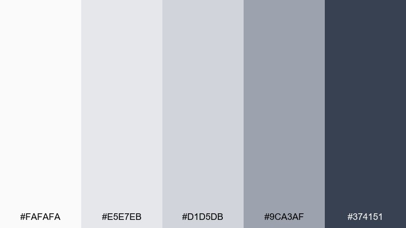
HEX: #fafafa #e5e7eb #d1d5db #9ca3af #374151
Mood: minimal, clean, practical
Best for: minimal portfolio websites
Minimal and practical, these abstract tones resemble chalk dust on concrete with crisp shadows. The stepped neutrals give you predictable spacing and hierarchy for grids, UI components, and typography. Use it for portfolios, case studies, and documentation sites where content should feel effortless. Tip: introduce a single brand accent elsewhere, and keep this set for structure so the design stays timeless.
Image example of urban chalk generated using media.io
13) Lagoon Pixel
HEX: #e0fbfc #98c1d9 #3d5a80 #ee6c4d #293241
Mood: bright, nautical, energetic
Best for: game UI and menu screens
Bright and nautical, these abstract colors feel like sun on shallow water with a flare of coral. The blues create dependable depth for panels, and the orange-red gives instant feedback for buttons and badges. Use it in game menus, achievement screens, and playful interfaces that need clear states. Tip: keep the darkest navy for text and outlines so the lighter blues can breathe as backgrounds.
Image example of lagoon pixel generated using media.io

14) Rusted Teal Collage
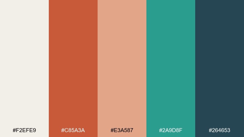
HEX: #f2efe9 #c85a3a #e3a587 #2a9d8f #264653
Mood: artsy, vintage, balanced
Best for: retro posters and event prints
Artsy and vintage, this abstract art color scheme brings to mind torn paper collage with rusted metal and sea-glass pieces. The warm terracotta and peach feel inviting, while teal and deep blue-green add smart contrast. Use this abstract color palette for retro posters, event prints, and branding that wants a crafted look. Tip: keep backgrounds light and textured, then let teal carry the headline so the terracotta can stay as supporting warmth.
Image example of rusted teal collage generated using media.io
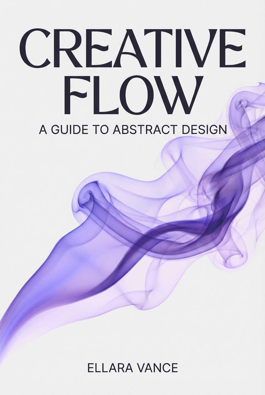
15) Orchid Smoke
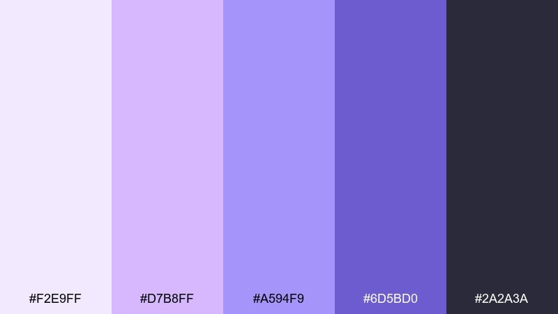
HEX: #f2e9ff #d7b8ff #a594f9 #6d5bd0 #2a2a3a
Mood: mysterious, elegant, modern
Best for: book covers and author branding
Mysterious and elegant, it feels like orchid petals fading into evening haze. The violet ladder makes it easy to build depth for gradients, shadows, and title treatments. Use it for contemporary fiction covers, author sites, and sleek digital banners. Tip: set titles in the deepest shade and add a pale lavender glow behind key words for a subtle spotlight effect.
Image example of orchid smoke generated using media.io
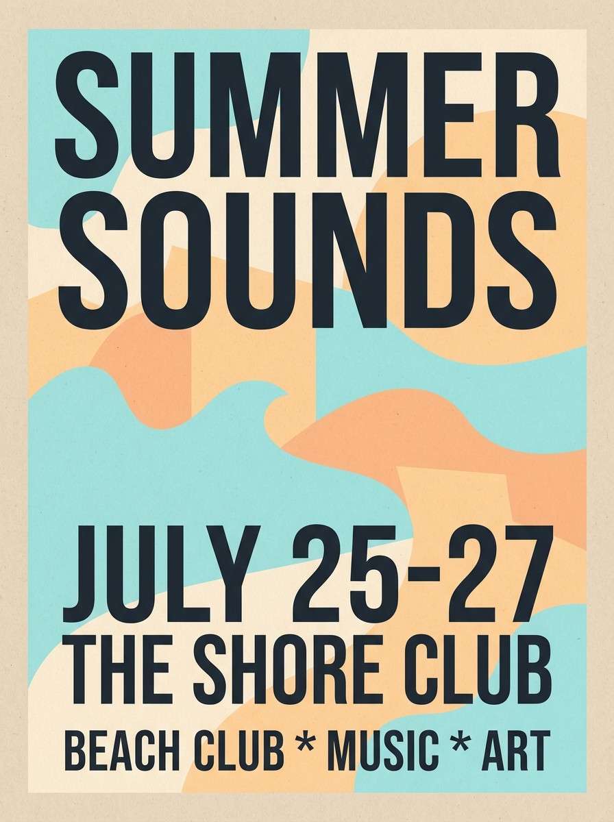
16) Sandstone Neon
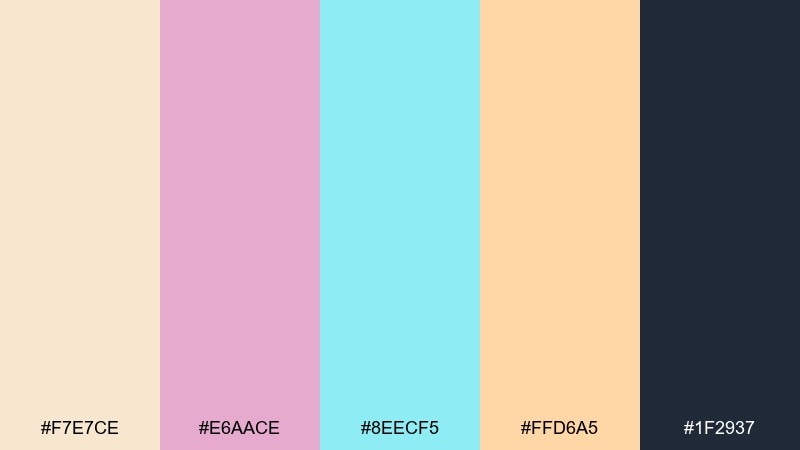
HEX: #f7e7ce #e6aace #8eecf5 #ffd6a5 #1f2937
Mood: playful, sunny, contemporary
Best for: beach club event flyers
Playful and sunny, it resembles sun-bleached sandstone with a splash of neon pool light. The warm creams and apricots keep it relaxed, and the bright aqua adds that modern twist. Use it for event flyers, summer promos, and social banners that need energy without going full fluorescent. Tip: let aqua handle the main graphic shape and keep the dark slate strictly for type to stay sharp.
Image example of sandstone neon generated using media.io
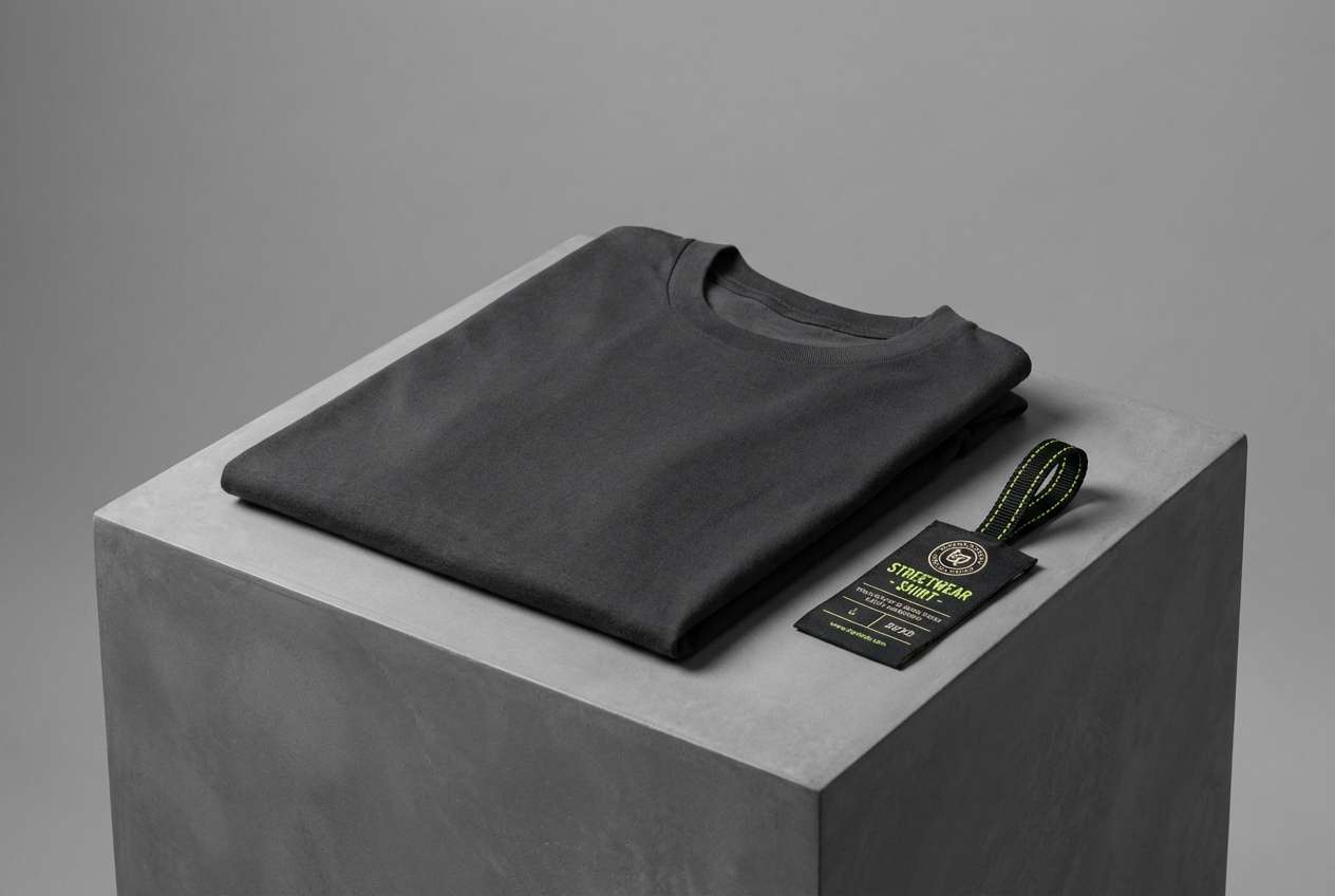
17) Lime Noir
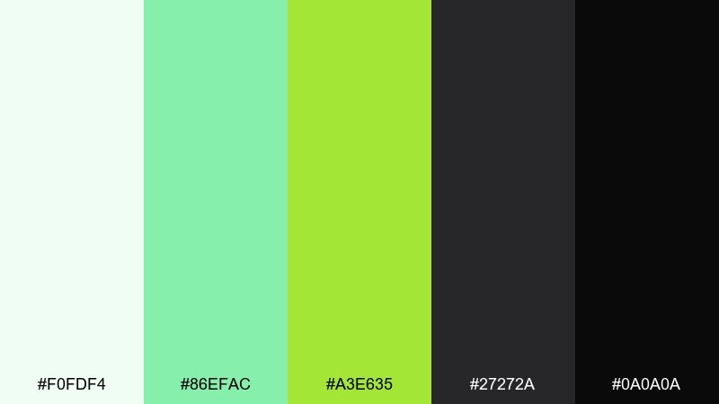
HEX: #f0fdf4 #86efac #a3e635 #27272a #0a0a0a
Mood: edgy, sporty, high-impact
Best for: streetwear product ads and tags
Edgy and sporty, it looks like night city asphalt lit by a sharp lime sign. The greens feel energetic, while the near-blacks give instant boldness for logos and sizing info. Use it for streetwear ads, hang tags, and product drops where contrast sells the attitude. Tip: keep lime for one focal mark per layout, otherwise the design can start to vibrate on screen.
Image example of lime noir generated using media.io
18) Copper Skyline
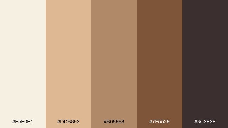
HEX: #f5f0e1 #ddb892 #b08968 #7f5539 #3c2f2f
Mood: cozy, vintage, grounded
Best for: coffee labels and café packaging
Cozy and grounded, it suggests steamed espresso, worn leather, and copper signage at dusk. The layered browns give you natural depth for badges, borders, and label typography. Use it on coffee bags, café menus, and craft goods where warmth matters. Tip: print the light cream as the main label field and use the darkest brown for small text so details stay readable.
Image example of copper skyline generated using media.io
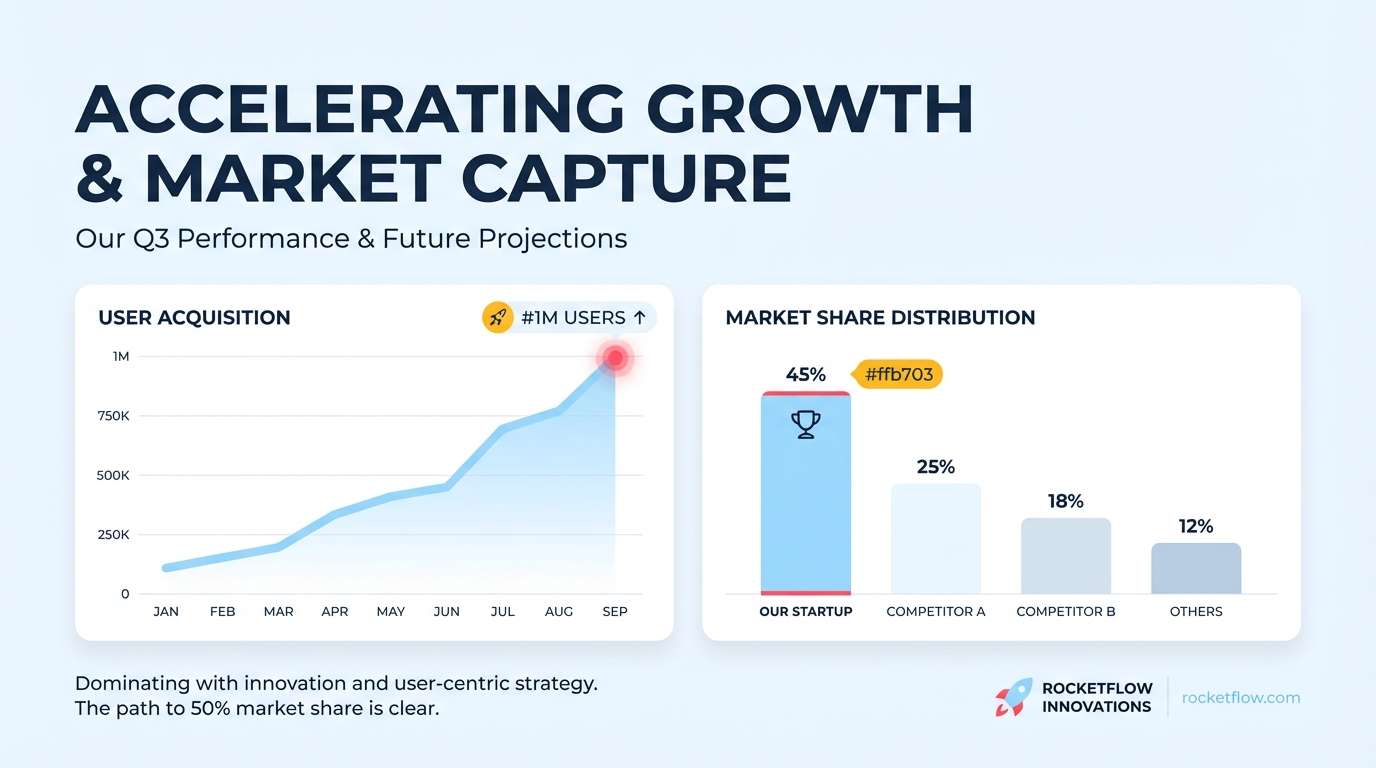
19) Glacier Punch
HEX: #eef7ff #9dd9ff #ff4d6d #ffb703 #1d3557
Mood: crisp, optimistic, bold
Best for: startup pitch decks and slide templates
Crisp and optimistic, it feels like glacier air with a hit of fruit punch. The cool blues create breathing room, while pink and golden amber work as confident highlights. For an abstract color combination in slides, use navy for headings, light blue for charts, and pick one bright accent per slide for focus. Tip: keep the amber limited to key numbers or callouts so it reads as a reward, not noise.
Image example of glacier punch generated using media.io
20) Monochrome Pop
HEX: #ffffff #f5f5f5 #111111 #ff2d55 #3b82f6
Mood: clean, bold, contemporary
Best for: modern icon sets and UI components
Clean and bold, it feels like a gallery-white wall with sharp ink lines and two bright stickers. The near-black gives strong structure, while pink and blue deliver instant interaction cues. Use it for icon sets, component libraries, and modern landing pages where clarity is non-negotiable. Tip: choose either pink or blue as the primary action color and keep the other for secondary states to avoid visual competition.
Image example of monochrome pop generated using media.io
What Colors Go Well with Abstract?
Abstract palettes pair best when you balance temperature and value: one warm family (peach, coral, terracotta) against one cool family (teal, sky, violet), plus a deep anchor for contrast.
Neutrals are the glue. Off-white, light gray, and near-black keep even surreal accents looking designed rather than random, especially in typography-heavy layouts.
If your abstract scheme already has multiple loud colors, add a “quiet” companion (misty blue, soft cream, stone gray) to give the eye a place to rest.
How to Use a Abstract Color Palette in Real Designs
Start with roles, not equal distribution: pick one background tone, one text/structure tone, and one accent for actions. The remaining two colors can support states, depth, and decorative shapes.
Use gradients intentionally by keeping the darkest color out of the blend. Instead, reserve it for type, icons, and key UI components so legibility stays consistent.
For print (posters, packaging, cards), test small text and thin lines in the darkest shade first. Abstract palettes often look soft at large scale but can lose clarity in details.
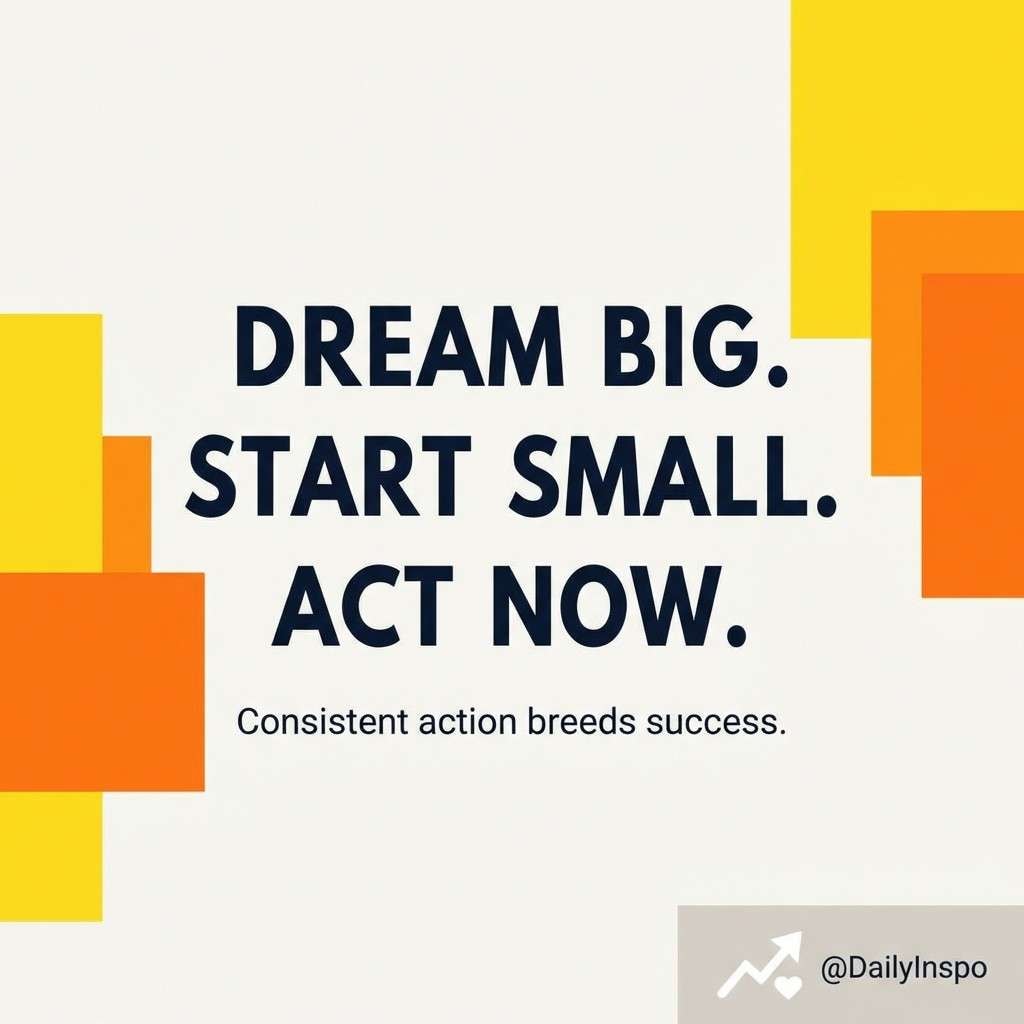
Create Abstract Palette Visuals with AI
If you want to preview how an abstract palette will feel in a real layout, generate a quick mockup: a UI hero, a poster, a label, or a slide. Seeing colors applied is the fastest way to confirm contrast and vibe.
Use the included prompts as templates and swap in your own HEX codes, layout type, and aspect ratio. Keep one dominant color group and one anchor tone for text to avoid visual chaos.
Media.io makes it easy to turn palette ideas into consistent visuals you can iterate on in minutes—perfect for early concepting and moodboard building.
Abstract Color Palette FAQs
-
What is an abstract color palette?
An abstract color palette is a curated set of colors designed for expressive, non-literal visuals—think gradients, geometric shapes, collage textures, and modern UI backgrounds—where mood and contrast matter more than realism. -
How do I keep an abstract palette from looking messy?
Assign clear roles: one background, one text/anchor, and one primary accent. Limit high-saturation colors to small areas, and rely on a deep neutral (navy/charcoal/near-black) for structure and legibility. -
How many colors should an abstract palette include?
Five is a practical sweet spot: light base, two mids, one accent, and one dark anchor. It's enough variety for depth without making your layout hard to control. -
What's the best way to use abstract colors in UI design?
Use the darkest shade for text and navigation, keep backgrounds light or softly tinted, and reserve the brightest color for primary actions. This preserves accessibility while still feeling playful. -
Can abstract palettes work for branding?
Yes—especially for modern brands, events, creative studios, and lifestyle products. Choose one signature accent as the “brand color,” then use the other tones for flexible supporting systems across web, print, and social. -
Do abstract palettes print well?
They can, but test first. Very light pastels may fade on uncoated paper, and neon-like colors can shift depending on printing. Keep small text in the darkest color and avoid ultra-light text on bright fills. -
How can I generate abstract palette visuals quickly?
Use an AI text-to-image tool and describe the layout (poster, UI, packaging), then list your HEX codes as dominant colors and specify where the darkest shade should be used for text and contrast.
Next: River Color Palette


