

Haunted house color palettes are built on shadowy neutrals, weathered browns, foggy grays, and murky greens that instantly signal mystery and suspense.
Below are 20 modern, ready-to-use haunted house color combinations (with HEX codes), plus practical pairing tips and AI prompts you can reuse for posters, UI, packaging, and branding.
In this article
Why Haunted House Palettes Work So Well
Haunted house palettes lean on low-saturation hues and deep values, so they feel like aged materials: damp wood, soot, fog, stone, and candlelit paper. That “worn realism” makes designs look atmospheric instead of costume-like.
They’re also naturally high-contrast. Near-black bases create instant hierarchy for titles and UI components, while pale parchment, mist, or blush tones keep text readable without breaking the mood.
Finally, haunted house colors are flexible: swap in a single glowing accent (mint, emerald, icy gray) and the same palette can shift from gothic luxury to modern cinematic suspense.
20+ Haunted House Color Palette Ideas (with HEX Codes)
1) Creaking Porch

HEX: #1f1b14 #3b3a2a #6b6a4a #9a9c7a #d2d0b8
Mood: dusty, eerie, antique
Best for: halloween event poster
Dusty and antique, these tones feel like moonlight on old porch boards and ivy-covered railings. The deep browns ground your layout while khaki and pale linen keep text readable. Use it for a Halloween event poster with distressed type, then add a single high-contrast accent in the lightest swatch for dates and location. Pair well with worn paper textures and subtle grain to keep the mood believable.
Image example of creaking porch generated using media.io

Media.io is an online AI studio for creating and editing video, image, and audio in your browser.

2) Moonlit Mist
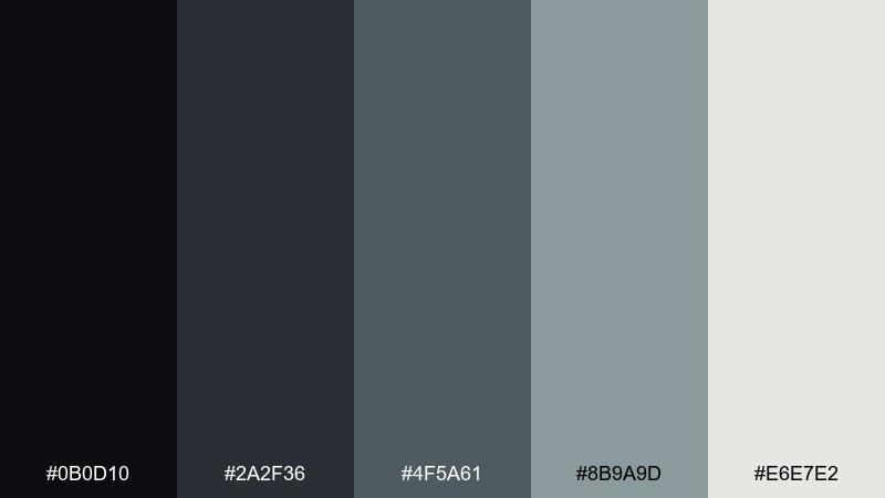
HEX: #0b0d10 #2a2f36 #4f5a61 #8b9a9d #e6e7e2
Mood: cold, cinematic, suspenseful
Best for: film title card
Cold and cinematic, the grays read like fog rolling across a quiet street under a dim streetlamp. The near-black and slate shades create instant contrast for bold titles, while misty gray softens edges and gradients. For a haunted house color palette that stays modern, keep the background in #0b0d10 and reserve #e6e7e2 for the main title. Pair with condensed sans type and restrained glow effects so it feels like a real opening sequence.
Image example of moonlit mist generated using media.io

3) Candlewax Relic

HEX: #2b1d12 #5a3a22 #a06a3b #d6b58a #f3e8d7
Mood: warm, vintage, mysterious
Best for: gothic dinner invitation
Warm and vintage, these browns and creams feel like candle drips on aged wood and old letters. The mid-copper and waxy beige create a welcoming base without losing the eerie undertone. Use it for a gothic dinner invitation with an ornate border, then keep body copy in the darker browns for readability. Pair with textured paper and a touch of emboss-style shading to sell the antique vibe.
Image example of candlewax relic generated using media.io

4) Attic Lace

HEX: #2a2420 #4d3f3b #7a6d70 #b6a9ad #f2efee
Mood: faded, romantic, unsettling
Best for: editorial magazine spread
Faded and romantic, the mauves and dusty neutrals evoke lace curtains, old portraits, and quiet rooms you should not enter. The palette balances softness with a shadowy base, making it ideal for long-form layouts. Use the near-white as negative space and bring in #7a6d70 for pull quotes to keep hierarchy clear. Pair with thin rules and classic typography for an eerie-but-elegant editorial feel.
Image example of attic lace generated using media.io
5) Graveyard Moss
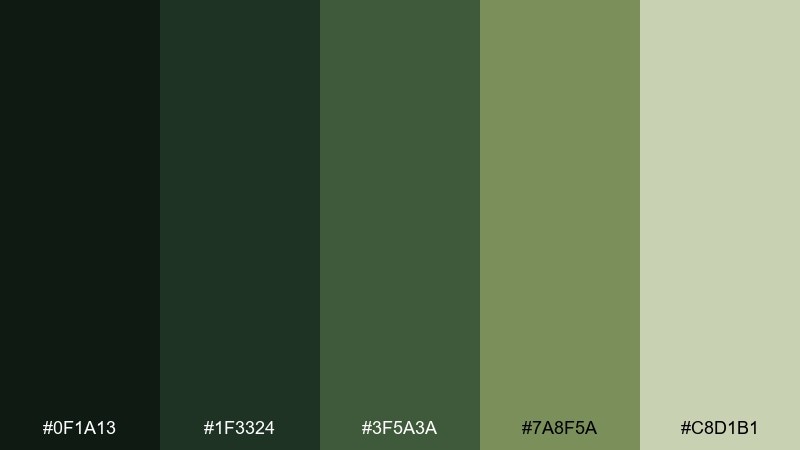
HEX: #0f1a13 #1f3324 #3f5a3a #7a8f5a #c8d1b1
Mood: earthy, ominous, overgrown
Best for: scented candle packaging label
Earthy and overgrown, these greens look like moss climbing stone and damp leaves underfoot. The dark forest shades make labels feel premium, while the pale sage keeps ingredient text clean. Use it on a scented candle packaging label with simple line art and plenty of breathing room. Pair with matte finishes and minimal gold foil if you want a subtle, upscale edge.
Image example of graveyard moss generated using media.io

6) Cobweb Silver

HEX: #0e0f12 #2b2d33 #5b5f6a #a2a7b3 #f5f6f8
Mood: sleek, shadowy, modern
Best for: dark mode ui mockup
Sleek and shadowy, these silvers feel like a thin web catching light in a dark corner. The near-black base supports high contrast components, while the lighter grays create calm, readable structure. For haunted house color combinations that work in product design, use #a2a7b3 for secondary text and keep #f5f6f8 for key actions only. Pair with soft blurs and subtle dividers instead of heavy borders.
Image example of cobweb silver generated using media.io
7) Raven Velvet

HEX: #120b12 #2b0f1e #4a1f35 #7b4b62 #d6c3ca
Mood: dramatic, gothic, luxe
Best for: brand identity kit
Dramatic and luxe, the wine and plum tones read like velvet curtains in a quiet hall. The palette gives you strong contrast without relying on harsh black, so it feels premium and wearable. Use it in a brand identity kit with deep plum backgrounds and dusty pink accents for highlights and patterns. Pair with high-contrast serif logos and minimal ornamentation to keep it refined, not costume-like.
Image example of raven velvet generated using media.io

8) Rusty Gate

HEX: #1a1210 #3b2320 #6a3b2f #a06a4b #d7c1a5
Mood: gritty, aged, haunted
Best for: horror book cover
Gritty and aged, these rusted browns feel like iron hinges and weathered locks. The darker shades build tension, while the sandy neutral gives you space for author name and taglines. Use it for a horror book cover with bold type and a single distressed texture layer to avoid visual clutter. Pair with simple silhouettes and keep the background in the two deepest colors for maximum drama.
Image example of rusty gate generated using media.io

9) Phantom Teal
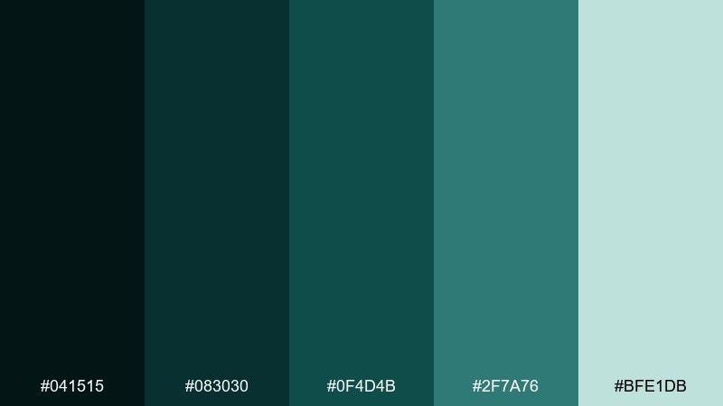
HEX: #041515 #083030 #0f4d4b #2f7a76 #bfe1db
Mood: eerie, aquatic, electric
Best for: night mode analytics ui
Eerie and electric, the teals look like cold light seeping through cracks in the floorboards. The dark base keeps screens comfortable, while the bright minty tint makes charts and toggles pop. Use the lightest swatch sparingly for highlights, and let #0f4d4b carry most surfaces and panels. Pair with thin-line icons and subtle gradients to amplify the ghostly glow.
Image example of phantom teal generated using media.io

10) Dusty Lantern

HEX: #181513 #3a2f26 #6f5b3f #b69a6a #f0e6cf
Mood: cozy, dim, old-world
Best for: seasonal menu design
Cozy and dim, these browns and golds evoke a lantern glow in a long hallway. The palette works especially well with parchment backgrounds and dark, readable headings. Use it for a seasonal menu design, keeping the light cream as the base and #181513 for section titles. Pair with small flourishes like dividers or stamps, but avoid heavy illustrations so the typography stays the hero.
Image example of dusty lantern generated using media.io

11) Chapel Stone

HEX: #101311 #2b302a #4c554c #7f8a7f #d7ded7
Mood: quiet, solemn, atmospheric
Best for: social media quote template
Quiet and solemn, these stone-like greens and grays feel like a candlelit chapel at dusk. The tonal range is perfect for layered type and soft gradients without losing contrast. Use it for a social media quote template with large text blocks and subtle texture in the background. Pair with a single thin-line icon and keep spacing generous for a calm, eerie elegance.
Image example of chapel stone generated using media.io
12) Witch Hazel Smoke

HEX: #12140c #2d3318 #586536 #8b9a64 #e1e3c8
Mood: herbal, smoky, enchanted
Best for: watercolor botanical label
Herbal and smoky, these greens look like crushed leaves, dried stems, and a hint of ash. The darker olives add depth, while the pale sage keeps the composition airy and readable. For haunted house color combinations with a natural twist, use the mid-greens for botanical shapes and reserve the lightest tone for paper space. Pair with delicate serif type and minimal ornament to keep it refined.
Image example of witch hazel smoke generated using media.io

13) Soot and Parchment

HEX: #0f0f10 #2a2520 #6a6257 #b8ae9d #f6f1e6
Mood: smoky, classic, readable
Best for: website hero banner
Smoky and classic, these neutrals feel like soot on linen and old paper pulled from a drawer. The palette is incredibly flexible for web layouts because it supports both bold contrast and soft sections. Use it for a website hero banner with large headings in near-black and supporting text in #6a6257. Pair with subtle grain and keep imagery minimal so the typography stays sharp.
Image example of soot and parchment generated using media.io

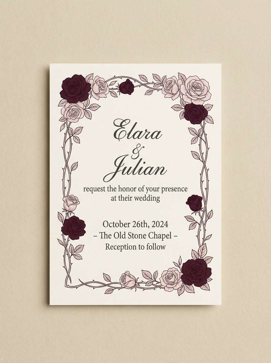
14) Bloodless Rose

HEX: #1a1012 #3a1d22 #6d3a45 #b07a86 #f1dde2
Mood: romantic, eerie, soft gothic
Best for: gothic wedding invitation
Romantic but unsettling, these rose and burgundy tones suggest dried petals pressed in a forgotten book. The deep shades make ornate type feel dramatic, while the blush keeps it elegant and readable. Use it for a gothic wedding invitation with a pale background and burgundy accents for borders and monograms. Pair with fine linework florals and avoid bright reds so the mood stays subdued.
Image example of bloodless rose generated using media.io
15) Ectoplasm Glow

HEX: #0b120d #133021 #1d5a39 #39a36d #d7f3e3
Mood: glowing, playful, supernatural
Best for: escape room social ad
Glowing and supernatural, these greens feel like ectoplasm catching light in a dark corridor. The bright emerald adds energy, while the deep green-black keeps it grounded and spooky. Use it for a haunted house color palette in an escape room social ad, making #39a36d the call-to-action and #0b120d the background. Pair with bold sans type and simple icons so the glow effect stays clean and modern.
Image example of ectoplasm glow generated using media.io

16) Stormcellar Navy

HEX: #060b12 #0f1a2b #213a5a #4c6d8a #cfd9e2
Mood: brooding, stormy, tense
Best for: thriller movie poster
Brooding and stormy, these navies feel like thunder outside and cold air seeping under a door. The deep blues create a dramatic base, while the pale blue-gray adds sharp title contrast. Use it for a thriller movie poster with a strong diagonal layout and minimal texture. Pair with tight tracking and a single spotlight-style gradient to keep the tension high.
Image example of stormcellar navy generated using media.io

17) Ashen Lilac

HEX: #131115 #2b2433 #55445f #8a7898 #e7e0ee
Mood: dreamy, haunted, modern
Best for: app onboarding screens
Dreamy and haunted, these lilacs feel like twilight haze in a quiet upstairs room. The dark plum anchors screens, while the soft lavender lifts cards and illustrations without turning sugary. Use it for app onboarding screens with simple gradients and plenty of whitespace. Pair with rounded sans type and keep icons monochrome for a calm, contemporary vibe.
Image example of ashen lilac generated using media.io

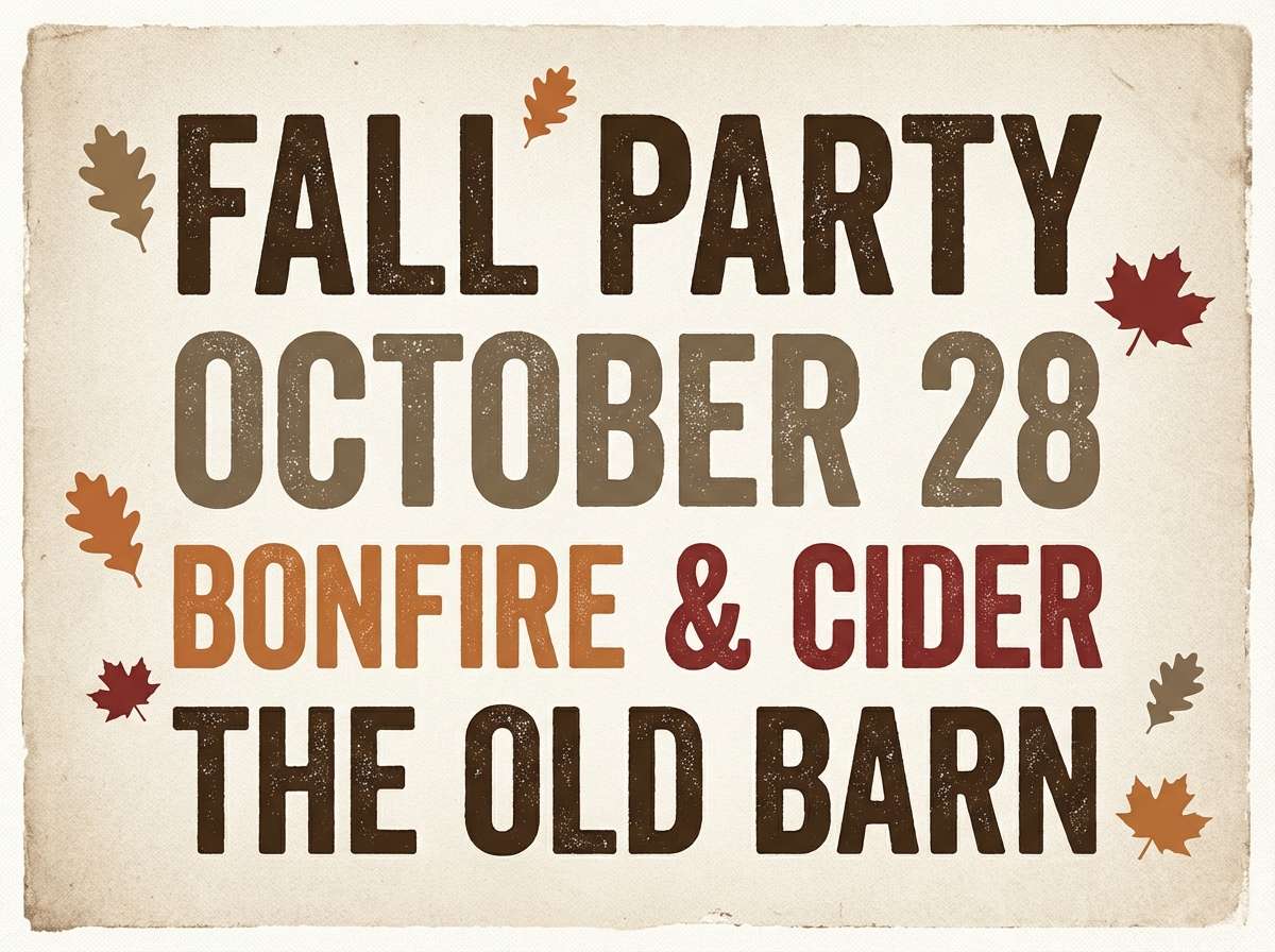
18) Barnwood Sepia

HEX: #17120c #3b2a1b #6a4b31 #a6805a #e6d5c3
Mood: rustic, worn, cinematic
Best for: fall party flyer
Rustic and worn, these sepias read like barnwood, leather, and dust in late afternoon light. The contrast is strong enough for bold headers, but the palette still feels soft and approachable. Use it for a fall party flyer with chunky type and a subtle paper texture. Pair with simple leaf or branch motifs and keep the layout clean to avoid looking overly themed.
Image example of barnwood sepia generated using media.io
19) Iron Bloom

HEX: #0f1211 #28302b #4a5a52 #7a8f86 #d6e0db
Mood: industrial, muted, calm eerie
Best for: minimal logo and stationery
Industrial and muted, these tones feel like iron, rain, and greenhouse glass. The cool greens work as refined neutrals, letting logos and marks look sharp without feeling sterile. Use it for minimal logo and stationery where #0f1211 handles the wordmark and #d6e0db keeps the page bright. Pair with a single geometric motif and avoid heavy textures for a clean, modern finish.
Image example of iron bloom generated using media.io
20) Hollow Hearth

HEX: #120f0a #2f2517 #5a4a2a #8d7a4a #e2d6b8
Mood: smoldering, nostalgic, shadowy
Best for: interior mood board graphic
Smoldering and nostalgic, these browns and khakis evoke a fireplace that has gone cold and a room lit by fading embers. The palette works beautifully for layered blocks, fabric swatches, and typography in a single cohesive layout. Use it as a haunted house color palette for an interior mood board graphic, keeping the darkest tone for headings and the lightest for negative space. Pair with subtle woodgrain patterns and limit accents to one mid-gold swatch for balance.
Image example of hollow hearth generated using media.io

What Colors Go Well with Haunted House?
Haunted house palettes pair best with moody neutrals: soot black, charcoal, stone gray, weathered brown, and aged parchment. These shades create believable “old house” surfaces and make typography feel grounded.
To add modern contrast, introduce one controlled cool tone like foggy blue-gray, muted teal, or ashen lilac. Keep saturation low so it reads like atmosphere rather than neon.
For a supernatural pop, use a single glow accent (mint, emerald, icy white) on top of a dark base. This works especially well for CTAs, icons, and focal details in posters or UI.
How to Use a Haunted House Color Palette in Real Designs
Start with a value plan: choose one near-black as your background, one light parchment/mist as your text highlight, and reserve midtones for panels, borders, and texture layers. This prevents the design from turning flat.
Use texture strategically. Subtle grain, paper fibers, or stone-like noise can make haunted house colors feel cinematic and authentic, but keep it light so readability stays high.
Finally, keep accents intentional. One “glow” color or one warm metallic-like tone (muted gold/copper) is usually enough to create hierarchy without breaking the eerie mood.
Create Haunted House Palette Visuals with AI
If you want to preview these haunted house colors on posters, invitations, UI screens, or brand boards, generating quick mock visuals is the fastest way to validate contrast and mood.
With Media.io’s text-to-image tool, you can paste a prompt (like the examples above), specify the aspect ratio, and iterate until the scene looks modern, spooky, and on-brand.
Haunted House Color Palette FAQs
-
What is a haunted house color palette?
A haunted house color palette is a set of moody, low-saturation colors (deep browns, charcoals, foggy grays, muted greens, and parchment lights) designed to evoke mystery, age, and cinematic suspense. -
What HEX color feels most “haunted” for backgrounds?
Near-black tones like #0b0d10, #0e0f12, or #120f0a work well because they create instant drama and make lighter text or misty highlights stand out. -
How do I keep a spooky palette readable for text?
Use a light swatch (like parchment or mist) for body text and reserve the darkest swatch for headers and backgrounds. Avoid placing mid-gray text on mid-dark panels without enough contrast. -
Can haunted house colors work for modern UI (dark mode)?
Yes. Palettes like Cobweb Silver or Phantom Teal are ideal for dark mode: keep the base near-black, use muted midtones for surfaces, and limit the lightest color to key actions and critical highlights. -
What accent colors pair well with haunted house palettes?
Muted mint/emerald glows, dusty rose, pale blue-gray, and antique gold work well. The key is to use accents sparingly so the palette stays atmospheric instead of festive. -
What’s the difference between “gothic” and “haunted house” color schemes?
Gothic palettes often lean into luxe, dramatic hues (wine, plum, black) with elegant contrast, while haunted house palettes emphasize weathered realism—soot, fog, stone, moss, and aged paper. -
How can I generate haunted house palette images quickly?
Use Media.io text-to-image: describe the design (poster, invitation, UI), mention the mood (foggy, antique, cinematic), and keep composition minimal for high legibility.


