

Blue emerald is a modern blue-green that feels both trustworthy (blue) and alive (emerald). It’s a go-to choice for brands and interfaces that need clarity, calm energy, and premium polish.
Below are 20+ ready-to-use blue emerald color palette ideas with HEX codes, plus practical tips for contrast, accents, and real-world usage.
In this article
- Why Blue Emerald Palettes Work So Well
-
- deep reef glow
- emerald harbor
- arctic tide
- night aquarium
- silk mint contrast
- coastal blueprint
- peacock ink
- jade neon pop
- vintage seaglass
- rainy atrium
- modern museum
- tropical ledger
- calm clinic
- stormy lagoon
- botanical glasshouse
- midnight spa
- artisan tilework
- nordic kitchen
- futuristic terminal
- soft ceremony
- sea cave minimal
- crystal current
- What Colors Go Well with Blue Emerald?
- How to Use a Blue Emerald Color Palette in Real Designs
- Create Blue Emerald Palette Visuals with AI
Why Blue Emerald Palettes Work So Well
Blue emerald sits in a sweet spot between cool blue stability and green vitality, so it feels confident without being cold. That balance is why it shows up so often in modern UI, wellness, and “premium tech” branding.
It also scales beautifully from dark, inky navies to light mint tints, giving you a full system for backgrounds, surfaces, and accents. With the right contrast, it stays legible in data-heavy layouts and still looks refined in print.
Finally, blue emerald pairs naturally with both warm neutrals (cream, sand, beige) and crisp whites. Those neutrals keep the palette grounded and prevent teal-heavy designs from feeling overly synthetic.
20+ Blue Emerald Color Palette Ideas (with HEX Codes)
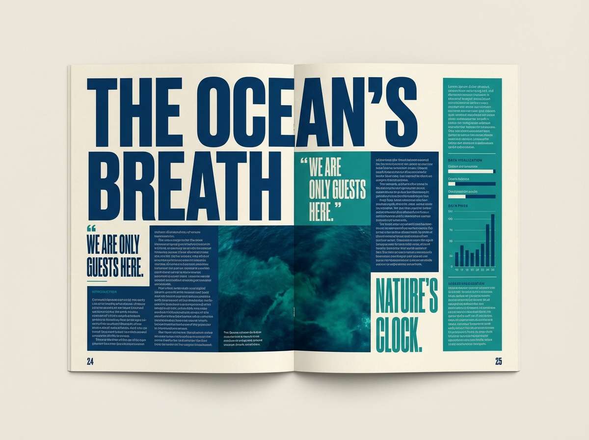
1) Deep Reef Glow
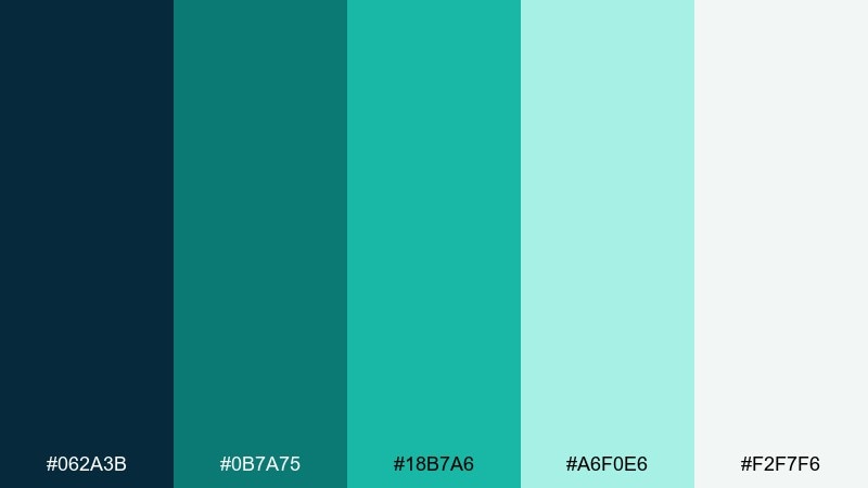
HEX: #062A3B #0B7A75 #18B7A6 #A6F0E6 #F2F7F6
Mood: moody, aquatic, polished
Best for: fintech dashboard UI
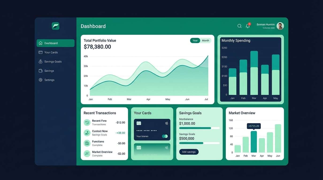
Moody reef blues and glowing teal highlights evoke deep water with a clean, high-tech sheen. It works beautifully for data-dense dashboards where contrast and legibility matter. Pair the dark navy with the mint tint for cards and tables, then use the brighter teal as the primary action color. Usage tip: reserve the lightest tone for background panels to keep charts crisp.
Image example of deep reef glow generated using media.io
Media.io is an online AI studio for creating and editing video, image, and audio in your browser.

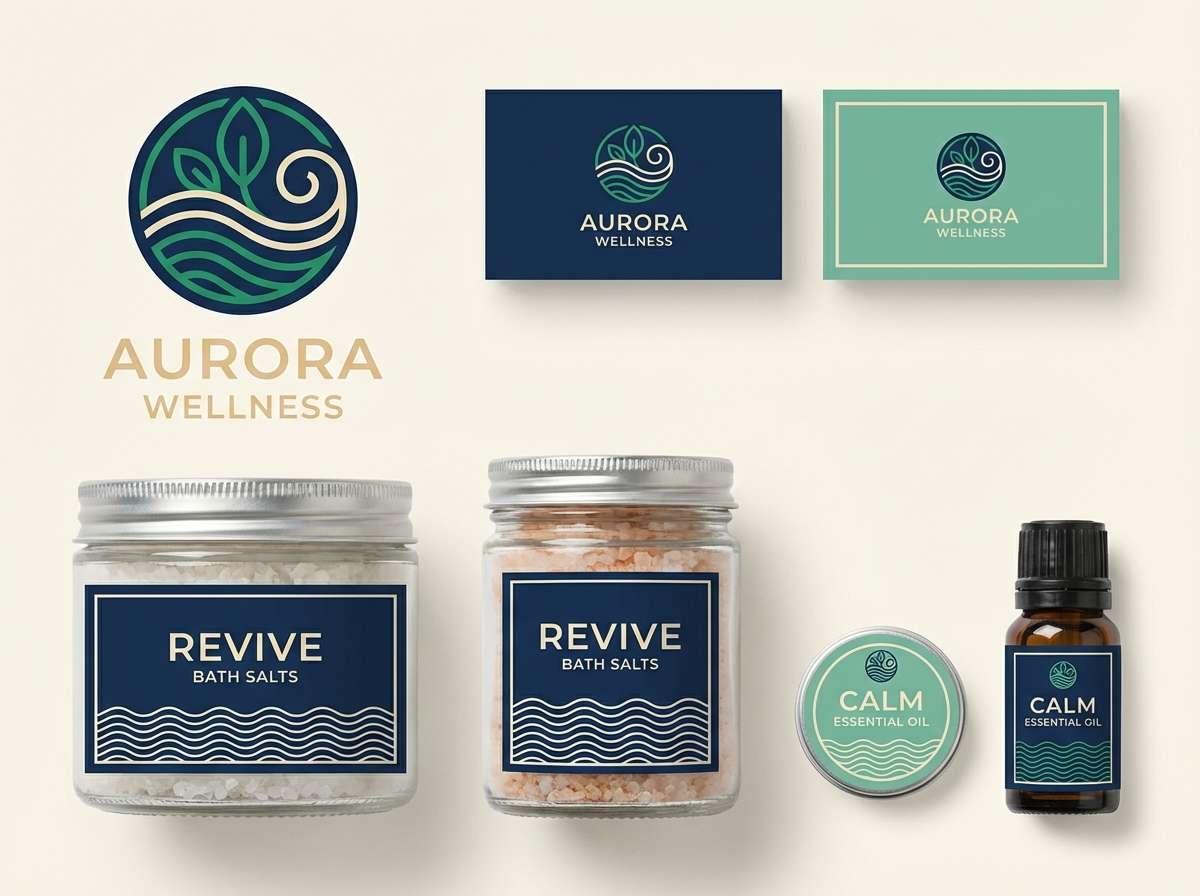
2) Emerald Harbor
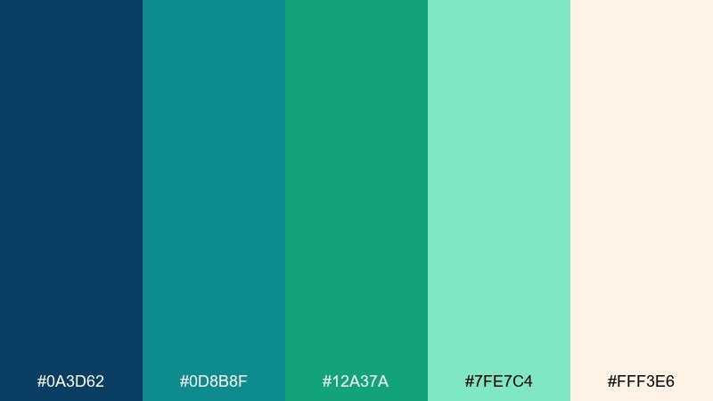
HEX: #0A3D62 #0D8B8F #12A37A #7FE7C4 #FFF3E6
Mood: fresh, coastal, welcoming
Best for: wellness brand identity
Fresh harbor blues and lively emerald greens feel like sea air and sunlit water. These blue emerald color combinations are ideal for wellness branding that needs trust and energy at the same time. Pair the warm cream as your background with navy for typography, then let the emerald carry logos, icons, and highlights. Usage tip: keep the mint as a supporting tint so the core green stays premium.
Image example of emerald harbor generated using media.io
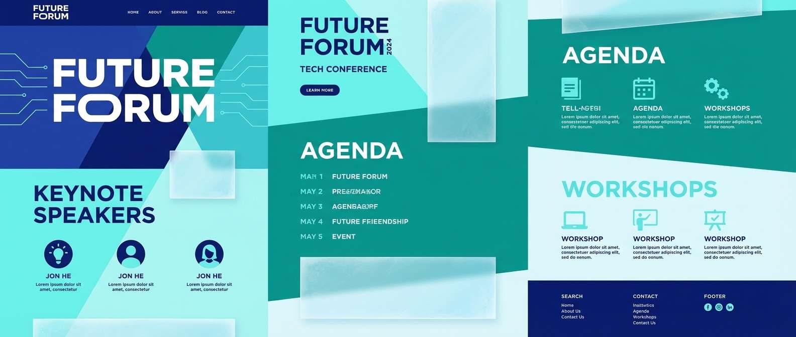
3) Arctic Tide
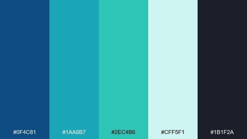
HEX: #0F4C81 #1AA6B7 #2EC4B6 #CFF5F1 #1B1F2A
Mood: cool, brisk, modern
Best for: tech conference landing page
Cool tide blues and icy aqua tones create a brisk, future-facing atmosphere. It suits landing pages that need clarity, speed, and a confident edge. Pair the near-black for headings and navigation, then use aqua and teal for CTAs and section dividers. Usage tip: apply the palest tint behind feature blocks to keep the page airy without losing contrast.
Image example of arctic tide generated using media.io
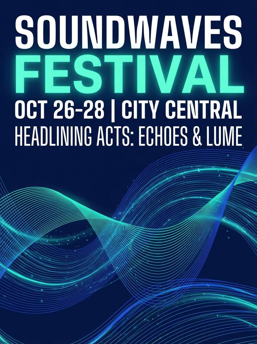
4) Night Aquarium
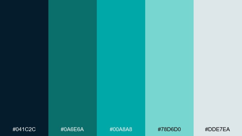
HEX: #041C2C #0A6E6A #00A8A8 #78D6D0 #DDE7EA
Mood: dramatic, luminous, sleek
Best for: music event poster
Dramatic midnight blues with luminous teal read like neon reflections in glass. It is a strong fit for posters where you want glow without going full neon. Pair the bright aqua for the event title and keep the darker teal for supporting shapes and gradients. Usage tip: add generous negative space in the pale gray so the headline feels electric.
Image example of night aquarium generated using media.io
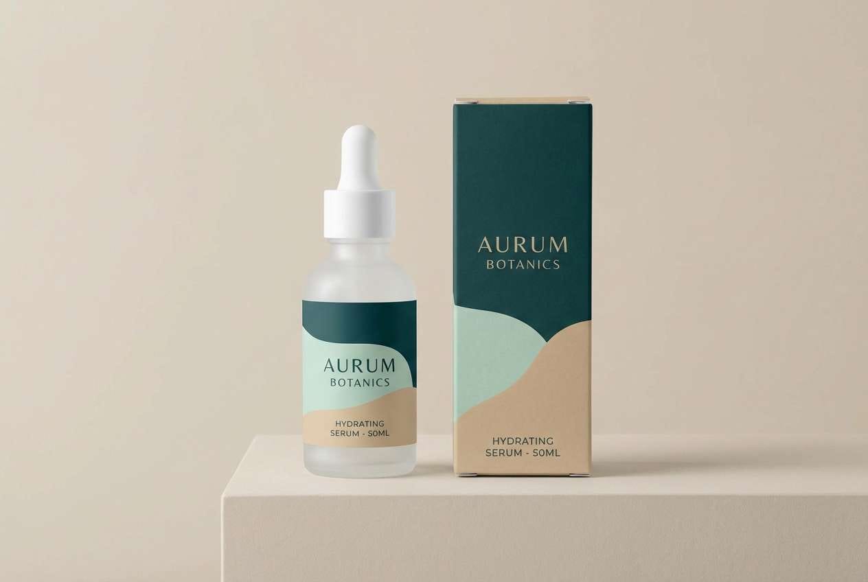
5) Silk Mint Contrast
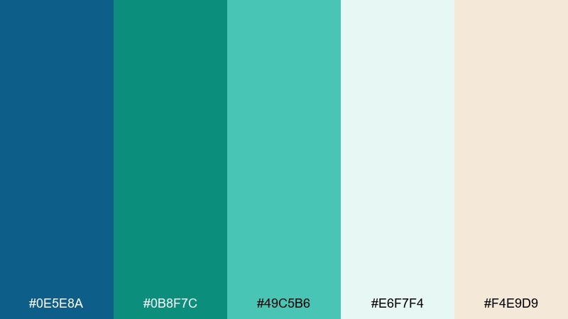
HEX: #0E5E8A #0B8F7C #49C5B6 #E6F7F4 #F4E9D9
Mood: soft, elegant, airy
Best for: skincare product packaging
Soft mint and silky teal feel clean, gentle, and quietly luxurious. The warm beige keeps the palette from turning sterile, making it great for skincare lines and spa-adjacent products. Pair the deep teal for brand marks and ingredient callouts, then use the pale mint as the main label field. Usage tip: keep finishes matte and let one glossy spot color carry the highlight.
Image example of silk mint contrast generated using media.io
6) Coastal Blueprint
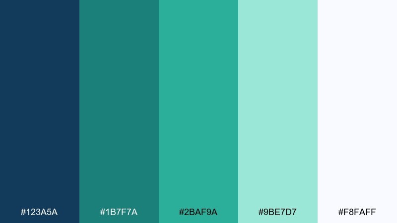
HEX: #123A5A #1B7F7A #2BAF9A #9BE7D7 #F8FAFF
Mood: confident, clean, contemporary
Best for: SaaS website UI kit
Confident blueprint blues with bright seafoam accents evoke clear skies over water. This blue emerald color palette is a safe, modern pick for SaaS UI kits where trust and freshness need to coexist. Pair navy for structure and navigation, then use the greener teal for success states and primary buttons. Usage tip: keep the lightest tint as your default page background to reduce visual fatigue.
Image example of coastal blueprint generated using media.io

7) Peacock Ink
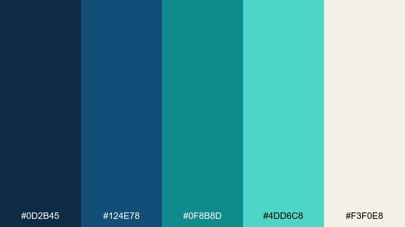
HEX: #0D2B45 #124E78 #0F8B8D #4DD6C8 #F3F0E8
Mood: bold, editorial, refined
Best for: magazine feature layout
Bold peacock blues and inky teal feel fashion-forward and editorial. It shines in print layouts where strong headings and clean columns do the heavy lifting. Pair the cream for page margins and body text areas, then use the teal range for pull quotes and section markers. Usage tip: limit the brightest aqua to one recurring element to create a signature rhythm.
Image example of peacock ink generated using media.io
8) Jade Neon Pop
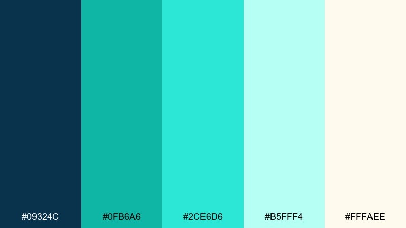
HEX: #09324C #0FB6A6 #2CE6D6 #B5FFF4 #FFFAEE
Mood: energetic, playful, crisp
Best for: startup social ads
Energetic jade and bright aqua pop like light on water, with a playful modern edge. It works well for punchy social ads where you need fast readability and high contrast. Pair the deep blue for the type layer and use the brightest aqua for stickers, badges, and price tags. Usage tip: keep the warm off-white as a calm backdrop so the accents stay sharp.
Image example of jade neon pop generated using media.io

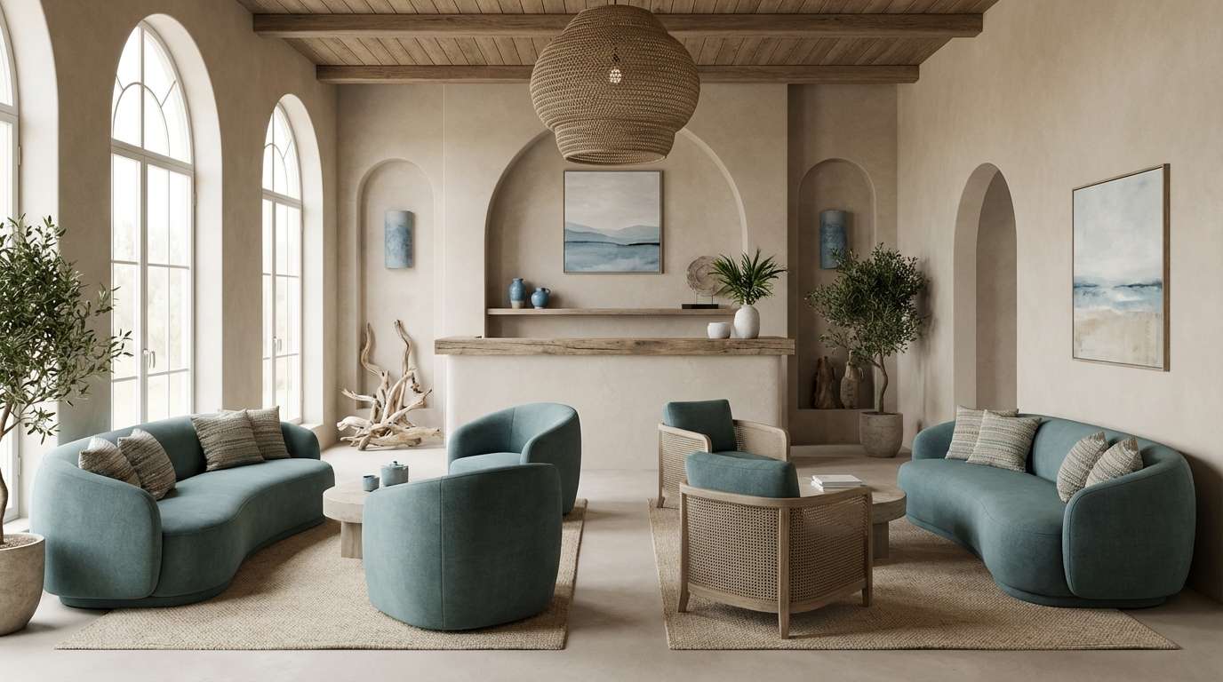
9) Vintage Seaglass
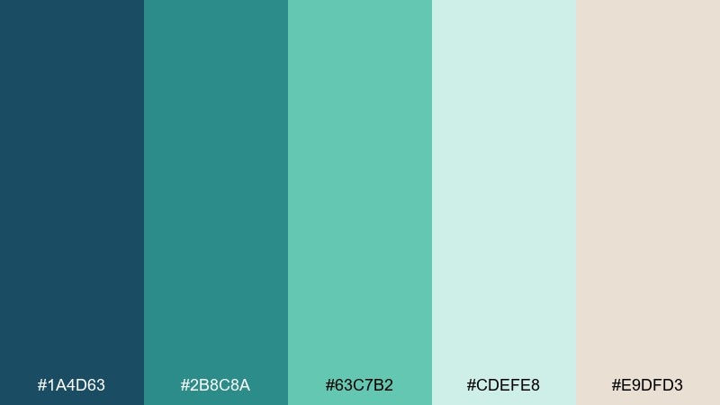
HEX: #1A4D63 #2B8C8A #63C7B2 #CDEFE8 #E9DFD3
Mood: nostalgic, calm, coastal
Best for: boutique hotel interiors
Nostalgic seaglass greens and muted blue-teal tones feel like weathered beach finds. These colors are ideal for boutique hotel interiors, especially in lounges and reception spaces. Pair the sand-beige with wood textures and brass hardware, then bring in teal through upholstery and art. Usage tip: repeat the soft mint in small decor pieces to tie different rooms together.
Image example of vintage seaglass generated using media.io
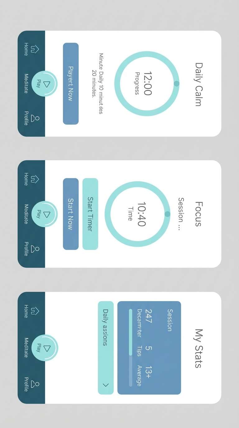
10) Rainy Atrium
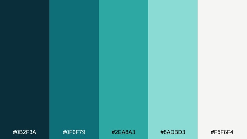
HEX: #0B2F3A #0F6F79 #2EA8A3 #8ADBD3 #F5F6F4
Mood: quiet, grounded, refreshing
Best for: meditation app UI
Quiet teal and slate blues feel like rain on glass, calm and steady. It is well suited to meditation apps where the interface should fade into the background. Pair the darkest tone for navigation and use the pale gray-green as the main canvas. Usage tip: choose one mid-tone teal for progress rings so the UI stays soothing rather than busy.
Image example of rainy atrium generated using media.io
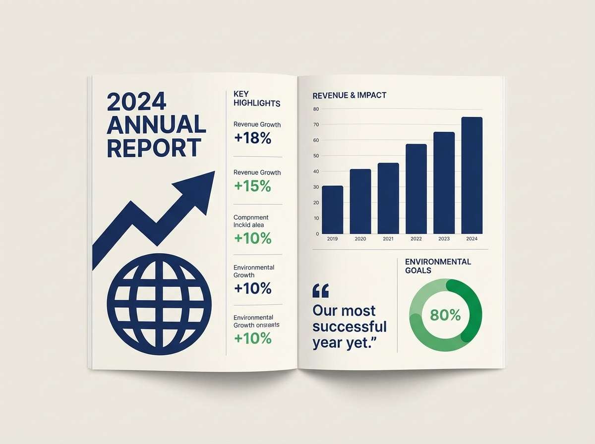
11) Modern Museum
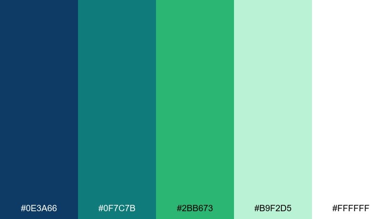
HEX: #0E3A66 #0F7C7B #2BB673 #B9F2D5 #FFFFFF
Mood: smart, curated, optimistic
Best for: nonprofit annual report design
Curated blues and optimistic greens feel like a modern gallery space, bright but disciplined. A blue emerald color scheme like this is excellent for nonprofit reports that need credibility with a hopeful tone. Pair the deep blue for headings and charts, then use the green as an emphasis color for impact stats. Usage tip: lean on white space and thin rules to keep spreads looking premium.
Image example of modern museum generated using media.io
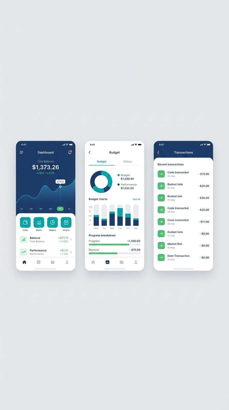
12) Tropical Ledger
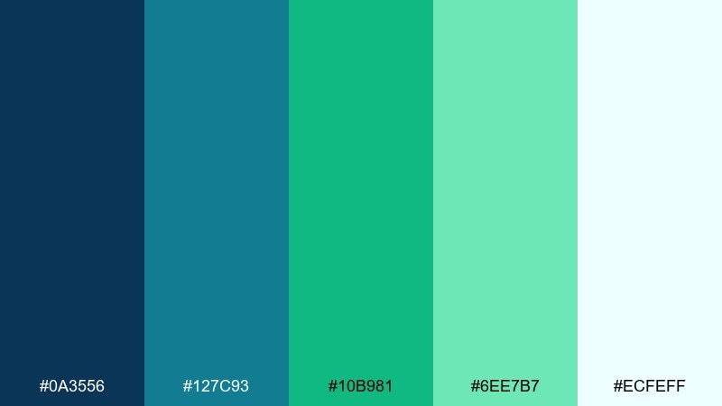
HEX: #0A3556 #127C93 #10B981 #6EE7B7 #ECFEFF
Mood: bright, productive, upbeat
Best for: finance mobile app screens
Bright tropical teal and mint feel productive and upbeat without losing seriousness. It fits finance mobile screens where positive signals should stand out clearly. Pair the dark blue for account headers and use the vivid green for gains, confirmations, and primary actions. Usage tip: keep the light aqua for secondary surfaces so the green remains the hero.
Image example of tropical ledger generated using media.io
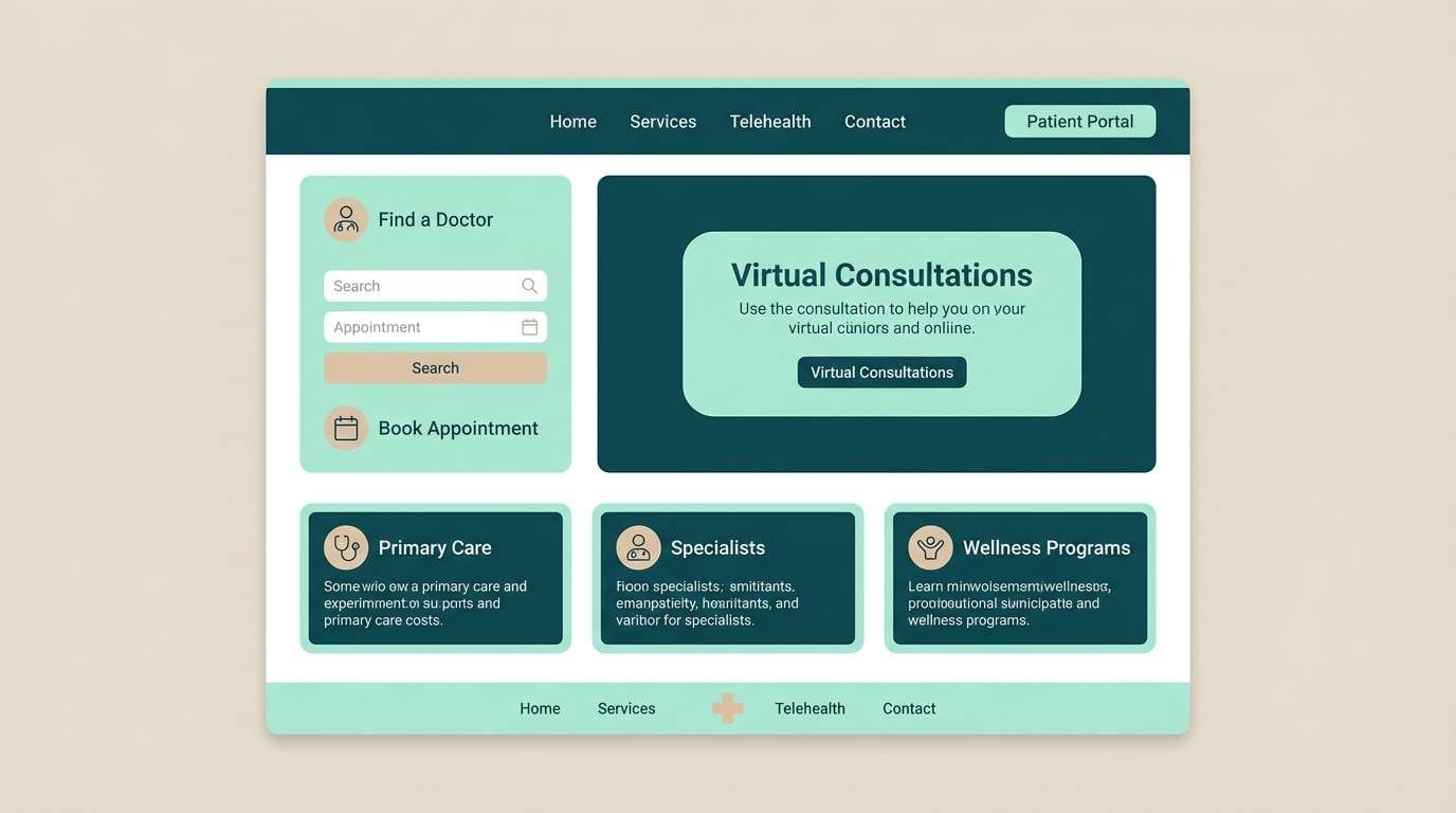
13) Calm Clinic
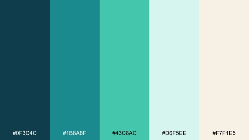
HEX: #0F3D4C #1B8A8F #43C6AC #D6F5EE #F7F1E5
Mood: reassuring, clean, gentle
Best for: healthcare web design
Reassuring teal and soft mint read as clean, calm, and patient-first. It works well for healthcare websites where clarity and trust are non-negotiable. Pair the deep teal for navigation and form labels, then use the light mint for section backgrounds and reassurance messages. Usage tip: keep the beige for warm human touches like testimonial blocks.
Image example of calm clinic generated using media.io
14) Stormy Lagoon
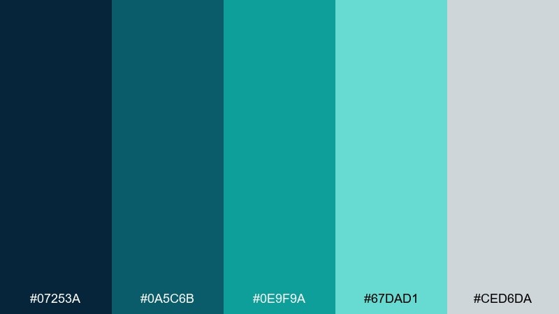
HEX: #07253A #0A5C6B #0E9F9A #67DAD1 #CED6DA
Mood: stormy, adventurous, cinematic
Best for: travel vlog YouTube banner
Stormy lagoon tones feel cinematic, like clouds breaking over tropical water. It is a strong match for travel creators who want mystery plus freshness in one look. Pair the darkest blue for the banner base and let the bright teal shape the channel name and highlights. Usage tip: add subtle texture or grain so the colors feel less flat on wide headers.
Image example of stormy lagoon generated using media.io

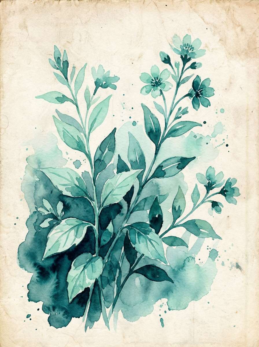
15) Botanical Glasshouse
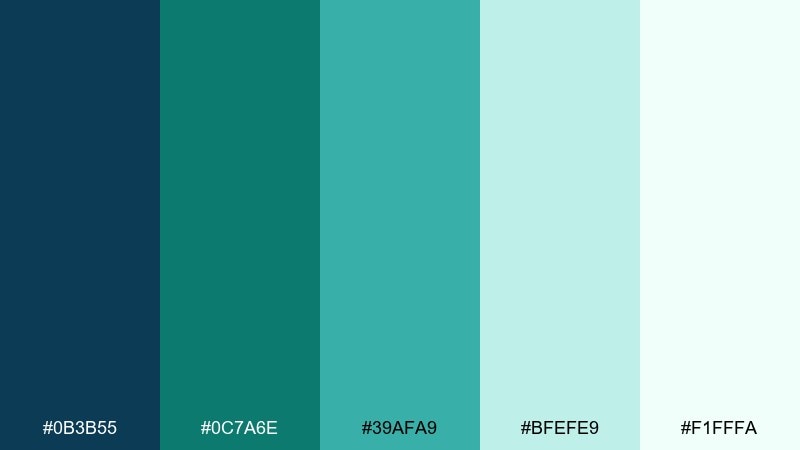
HEX: #0B3B55 #0C7A6E #39AFA9 #BFEFE9 #F1FFFA
Mood: fresh, botanical, luminous
Best for: watercolor botanical illustration
Fresh greenhouse teals and airy mints evoke dew on leaves and light through glass. It is perfect for botanical illustration where you want a cool, luminous wash instead of heavy greens. Pair the deeper teal for stems and shadows, then blend mint into petals and negative space. Usage tip: layer translucent washes so the palette stays delicate.
Image example of botanical glasshouse generated using media.io
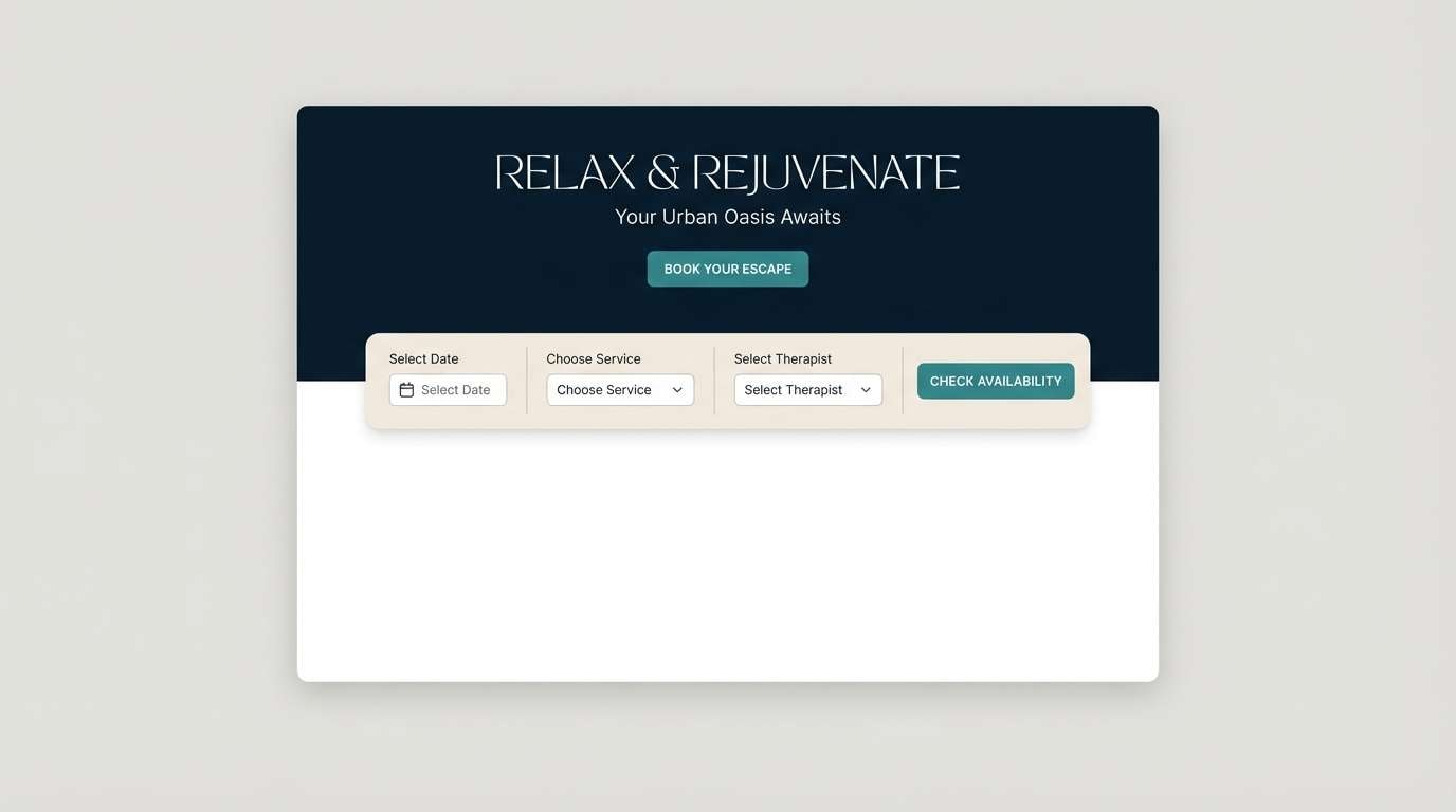
16) Midnight Spa
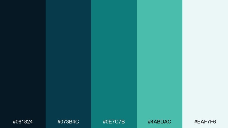
HEX: #061824 #073B4C #0E7C7B #4ABDAC #EAF7F6
Mood: luxurious, calm, intimate
Best for: spa booking website
Luxurious midnight blues with softened teal accents feel like a quiet spa after hours. It works best on booking sites where the experience should feel premium and unhurried. Pair the darkest shade for the header and hero area, then use the pale tint for form fields and availability cards. Usage tip: keep button states within the teal family so the mood stays serene.
Image example of midnight spa generated using media.io
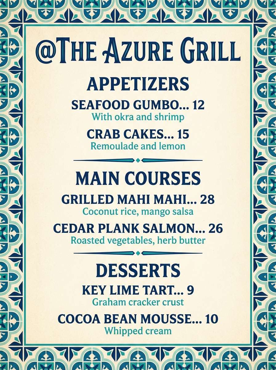
17) Artisan Tilework
HEX: #14324A #206A9A #0D9C90 #61D4C5 #F0EDE5
Mood: crafted, worldly, vibrant
Best for: restaurant menu design
Crafted blues and lively teal feel like glazed tiles in a seaside café. It is a great choice for restaurant menus that want personality while staying readable. Pair the deep blue for section headers and borders, then use teal for icons and highlights like chef specials. Usage tip: print on warm off-white stock to keep the palette inviting.
Image example of artisan tilework generated using media.io
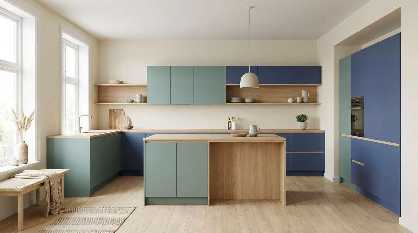
18) Nordic Kitchen
HEX: #0C2E4A #0F6C7A #1F9D88 #A7E8D8 #FAF5EC
Mood: minimal, cozy, balanced
Best for: kitchen interior styling
Minimal Nordic blues and gentle green-teal feel cozy, tidy, and balanced. It fits kitchens where you want cool cabinetry tones without losing warmth. Pair the cream with light oak and brushed steel, then bring in teal through backsplash tiles or bar stools. Usage tip: repeat the darker blue in small hardware details for a cohesive look.
Image example of nordic kitchen generated using media.io
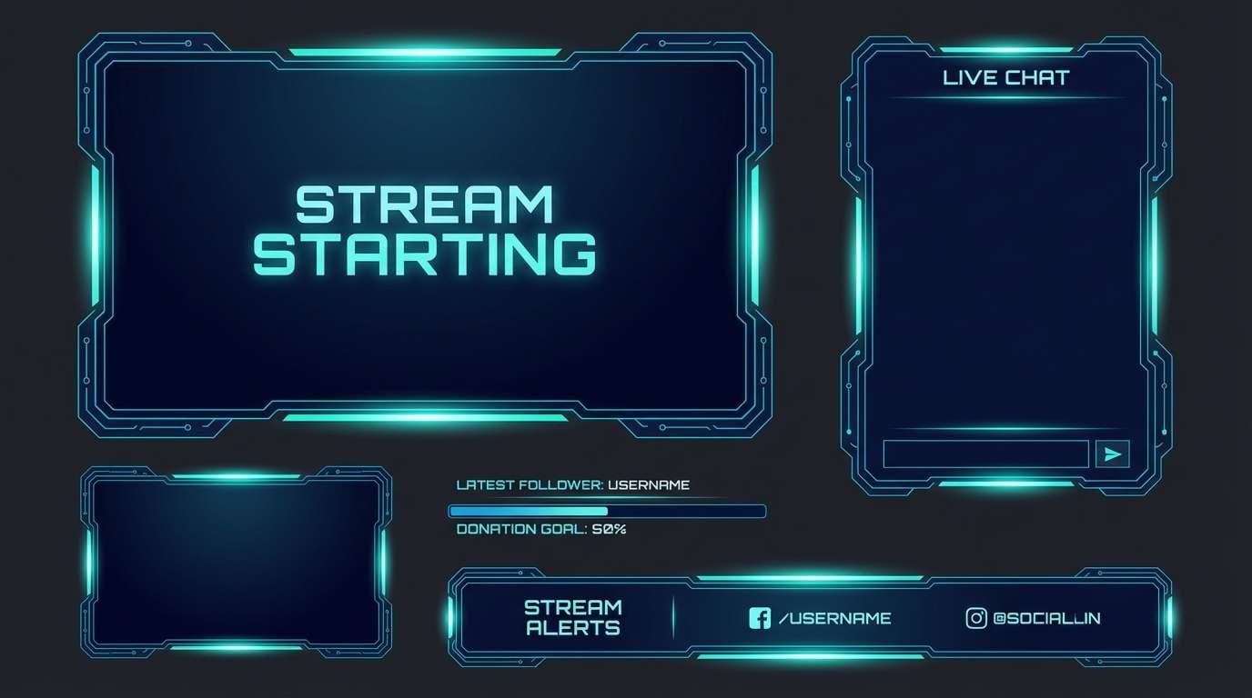
19) Futuristic Terminal
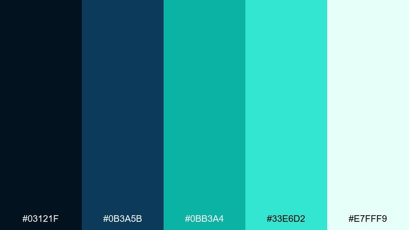
HEX: #03121F #0B3A5B #0BB3A4 #33E6D2 #E7FFF9
Mood: futuristic, sharp, electric
Best for: gaming stream overlay
Sharp navy and electric teal feel like a futuristic terminal glow. These blue emerald color combinations are made for overlays where you want energy without clashing with gameplay. Pair the darkest tone as the frame and info bars, then use the bright aqua for alerts and recent events. Usage tip: keep the pale mint for subtle separators so the overlay stays clean.
Image example of futuristic terminal generated using media.io
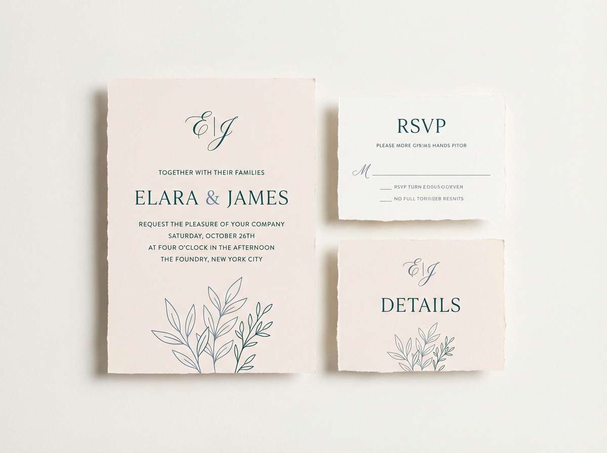
20) Soft Ceremony
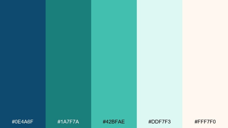
HEX: #0E4A6F #1A7F7A #42BFAE #DDF7F3 #FFF7F0
Mood: romantic, airy, modern
Best for: wedding invitation suite
Airy teal and soft blue feel romantic in a modern, understated way. It is ideal for wedding stationery that wants coastal elegance without the obvious nautical vibe. Pair the blush-cream for the paper base, then use teal for monograms and small line art. Usage tip: choose fine serif type and keep embellishments minimal so the colors carry the mood.
Image example of soft ceremony generated using media.io
21) Sea Cave Minimal
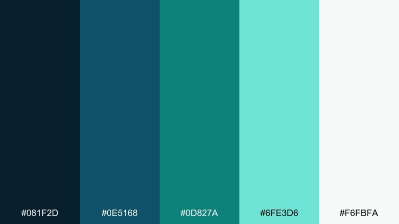
HEX: #081F2D #0E5168 #0D827A #6FE3D6 #F6FBFA
Mood: minimal, mysterious, crisp
Best for: portfolio website for designers
Minimal sea-cave blues with a crisp teal edge feel quiet, confident, and contemporary. It suits designer portfolios where the work needs space and the UI should feel intentional. Pair the darkest shade for the header and footer, then use teal sparingly for hover states and links. Usage tip: keep imagery framed on the near-white to maintain a gallery-like flow.
Image example of sea cave minimal generated using media.io
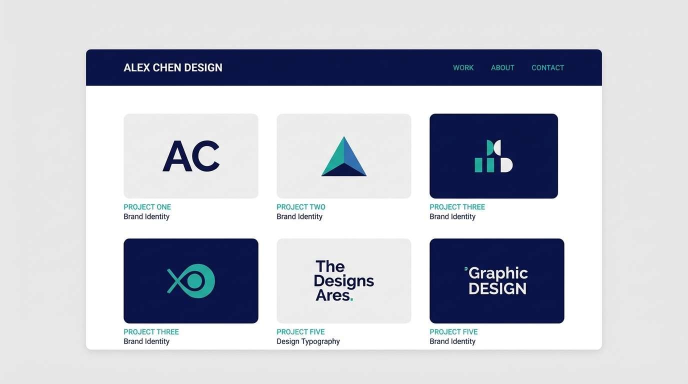
22) Crystal Current
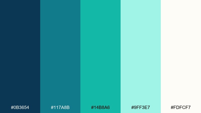
HEX: #0B3654 #117A8B #14B8A6 #9FF3E7 #FDFCF7
Mood: bright, optimistic, clean
Best for: ecommerce product page UI
Bright current blues and clean teals feel like clear water over stone, upbeat and trustworthy. It works for ecommerce pages where you want a fresh look that still converts. Pair the deep blue for price and key specs, then use teal for add-to-cart and trust badges. Usage tip: keep the pale mint for feature rows so the page stays light and scannable.
Image example of crystal current generated using media.io
What Colors Go Well with Blue Emerald?
Blue emerald pairs best with clean neutrals that let the blue-green do the talking: white, warm cream, soft gray, and sand beige. These backgrounds make teal accents feel sharper and more premium.
For bolder contrast, add near-black navy for typography and structure, then reserve bright aqua/mint for interactive highlights. If you want a warmer counterpoint, small touches of coral, peach, or brass-gold can add “human” energy without breaking the modern vibe.
In interiors, blue emerald works especially well with natural wood, brushed steel, terrazzo, and linen textures. Those materials soften the coolness and keep the palette from feeling overly digital.
How to Use a Blue Emerald Color Palette in Real Designs
Start by choosing one anchor dark (navy/near-black) and one primary blue emerald (like #0B7A75) for key actions. Then use a light mint/ice tone for surfaces such as cards, panels, and section backgrounds to maintain clarity.
Keep accent usage disciplined: one bright aqua for CTAs, highlights, or data points is usually enough. In UI, prioritize accessibility by checking contrast for text and interactive states, especially when teal is used on light backgrounds.
For branding, lean on cream or off-white to warm the system, and consider a subtle texture or grain in large teal areas. That small detail can make the palette feel more tactile and less flat.
Create Blue Emerald Palette Visuals with AI
If you want to see these palettes in action, generate quick mockups (posters, UI screens, packaging, interiors) before committing to a final direction. Visual testing helps you confirm contrast, mood, and how teal behaves under different lighting and textures.
With Media.io, you can turn a palette into consistent concept images by reusing the same prompt structure and swapping colors, materials, or layout type. This makes it easy to explore multiple creative routes fast.
When prompting, mention the design format (UI kit, poster, packaging), the mood (sleek, coastal, cinematic), and your key HEX colors for the most predictable results.
Blue Emerald Color Palette FAQs
-
What is a blue emerald color (and what HEX is it)?
Blue emerald is a blue-green shade that sits between teal and emerald. A popular reference HEX for a blue emerald tone is #0B7A75, which reads balanced and modern across screens. -
Is blue emerald the same as teal?
They’re close, but not identical. Teal often leans more cyan/blue, while “emerald” implies a slightly greener, richer feel. Many blue emerald palettes intentionally include both directions for flexibility. -
What background colors work best with blue emerald?
White and off-white are the easiest choices for clean contrast. Warm cream, light gray, and soft sand-beige also work well, especially if you want the palette to feel less clinical. -
What accent colors go with blue emerald?
For a crisp, modern look, use bright aqua or mint accents. For warmth, small touches of coral/peach or metallic gold/brass can complement blue emerald without overpowering it. -
Is blue emerald good for UI and product design?
Yes—blue emerald is widely used in UI because it communicates trust and freshness and can support a full system of dark-to-light tones. Just check text contrast when placing teal on light mint backgrounds. -
How do I keep a blue emerald palette from feeling too “aquatic”?
Add warm neutrals (cream, beige) and include a strong dark neutral (navy or near-black) for structure. You can also introduce natural textures (paper, wood, grain) to shift the mood away from “ocean” and toward “premium modern.” -
Can I generate blue emerald palette mockups with AI?
Yes. Use a text-to-image tool like Media.io, specify the design type (UI, poster, packaging, interior), the mood, and include your key HEX colors to guide consistent outputs.


