Mountain color palettes blend crisp air neutrals, stone grays, evergreen greens, and sun-warmed accents into combinations that feel modern and grounded.
Below are 20+ ready-to-use mountain color schemes with HEX codes, plus quick pairing and usage tips for branding, UI, posters, and more.
In this article
- Why Mountain Palettes Work So Well
-
- alpine dawn
- granite ridge
- pine shadow
- glacier mist
- wildflower meadow
- canyon sunset
- snowcap neutral
- lakeside spruce
- trail dust
- storm pass
- highland heather
- river stone
- summit gold
- alpine twilight
- birch bark
- moraine blue
- glacier night
- meadow fog
- ironwood camp
- peakberry punch
- evergreen granite
- sunlit ledge
- What Colors Go Well with Mountain?
- How to Use a Mountain Color Palette in Real Designs
- Create Mountain Palette Visuals with AI
Why Mountain Palettes Work So Well
Mountain tones naturally balance warm and cool: sunlight on rock and clay meets glacier air, misty blues, and deep forest greens. That contrast makes designs feel dimensional without becoming noisy.
They also lean on “useful neutrals” (stone, slate, snow, bark), which makes typography, photography, and UI components easy to organize. You get clean hierarchy with fewer color conflicts.
Finally, mountain color schemes feel authentic across industries—from outdoor brands to modern SaaS—because they borrow from materials we trust: granite, wood, metal, and mineral water.
20+ Mountain Color Palette Ideas (with HEX Codes)
1) Alpine Dawn
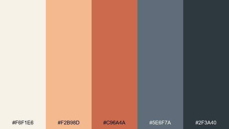
HEX: #f6f1e6 #f2b98d #c96a4a #5e6f7a #2f3a40
Mood: fresh, hopeful, crisp
Best for: travel brand hero banner
Fresh light over ridgelines comes through in warm apricot and clay against clean snow and slate air. It works beautifully for travel branding, tour operators, and destination landing pages where you want warmth without going tropical. Pair it with off-white space and simple sans-serif type for an airy feel. Usage tip: keep the peach as a highlight color for buttons or badges, and let slate carry the headlines.
Image example of alpine dawn generated using media.io

Media.io is an online AI studio for creating and editing video, image, and audio in your browser.

2) Granite Ridge
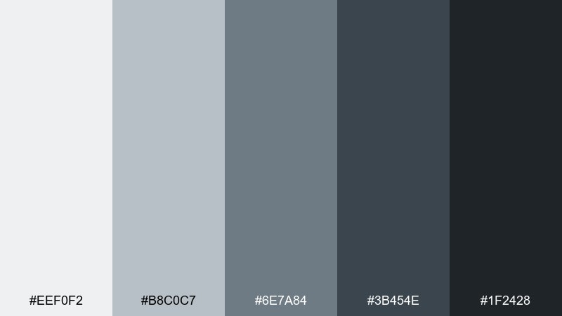
HEX: #eef0f2 #b8c0c7 #6e7a84 #3b454e #1f2428
Mood: minimal, sturdy, focused
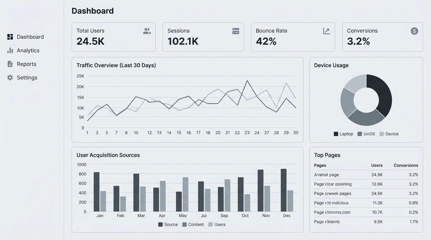
Best for: dashboard UI for analytics
Minimal and stone-cold, these grays feel like polished granite under overcast skies. The mountain color scheme is ideal for analytics dashboards, admin panels, and data-heavy screens where clarity matters most. Pair it with one small accent color elsewhere in your product, but keep core UI elements inside these neutrals. Usage tip: reserve the darkest tone for primary navigation so cards and charts stay readable.
Image example of granite ridge generated using media.io
3) Pine Shadow
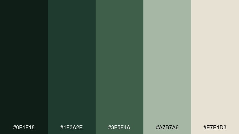
HEX: #0f1f18 #1f3a2e #3f5f4a #a7b7a6 #e7e1d3
Mood: moody, natural, grounded
Best for: outdoor apparel packaging
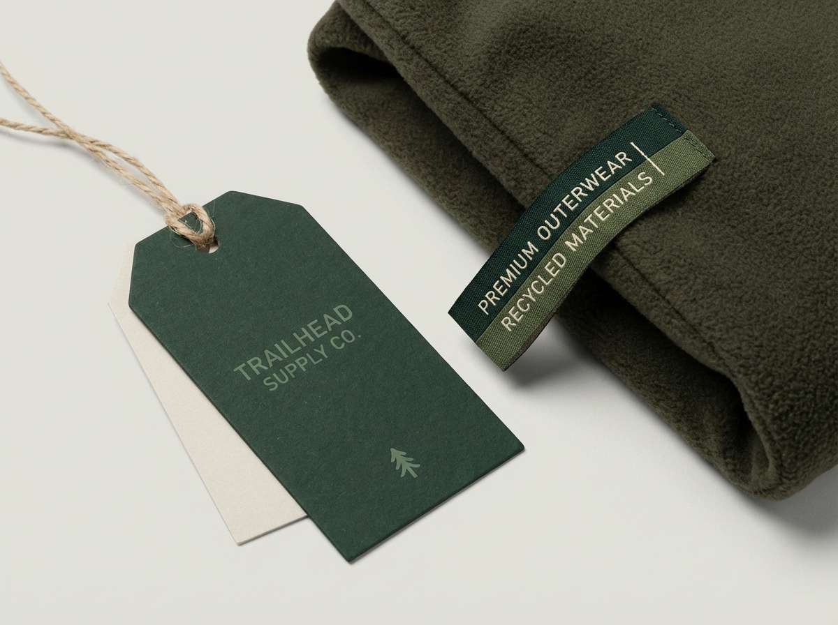
Deep pine and damp earth set a quiet, grounded tone like a forested switchback at dusk. This mountain color palette suits apparel packaging, hang tags, and heritage-style labels that need authenticity rather than gloss. Pair with kraft textures or matte finishes to amplify the outdoorsy feel. Usage tip: use the pale sand as the base so dark greens stay sharp and premium.
Image example of pine shadow generated using media.io
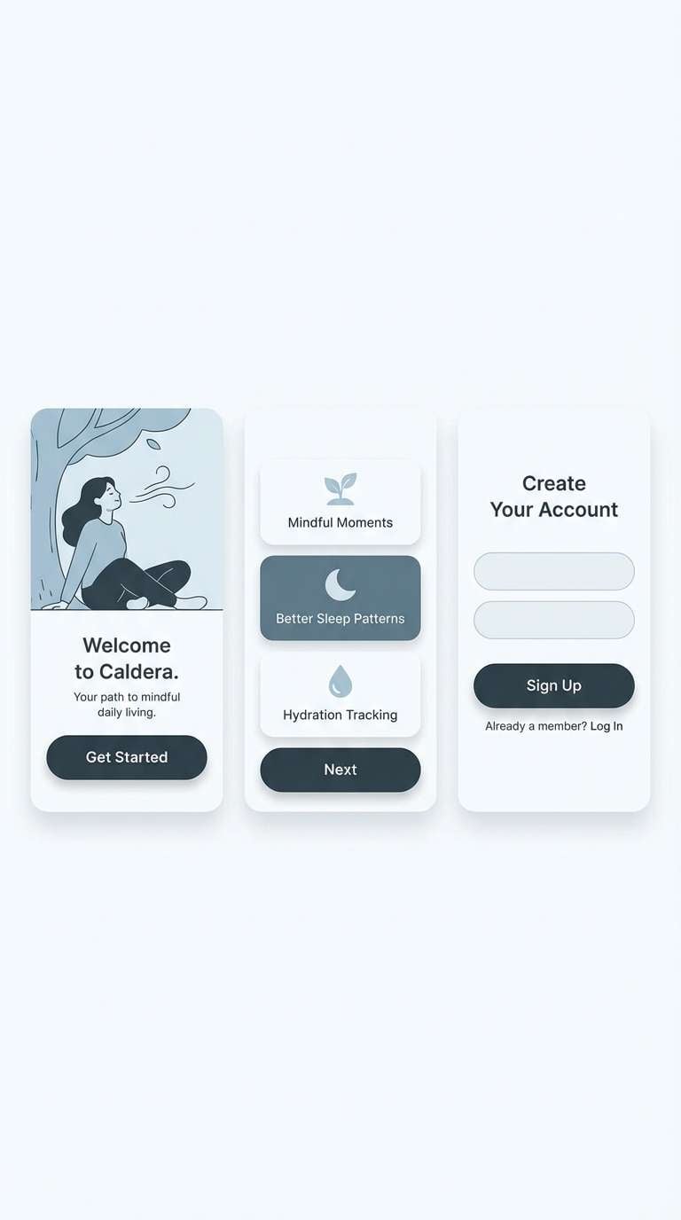
4) Glacier Mist
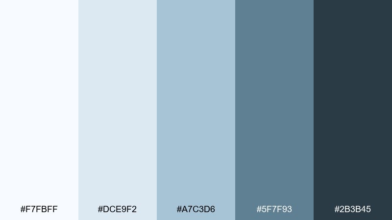
HEX: #f7fbff #dce9f2 #a7c3d6 #5f7f93 #2b3b45
Mood: clean, cool, calming
Best for: wellness app onboarding UI
Clean mist and soft blue ice make this feel calm, breathable, and modern. As a mountain color palette, it shines in wellness apps, clinics, and any product that benefits from a quiet sense of trust. Pair it with lots of white space and rounded components to keep the mood gentle. Usage tip: use the mid blue for progress indicators and save the deep slate for text contrast.
Image example of glacier mist generated using media.io
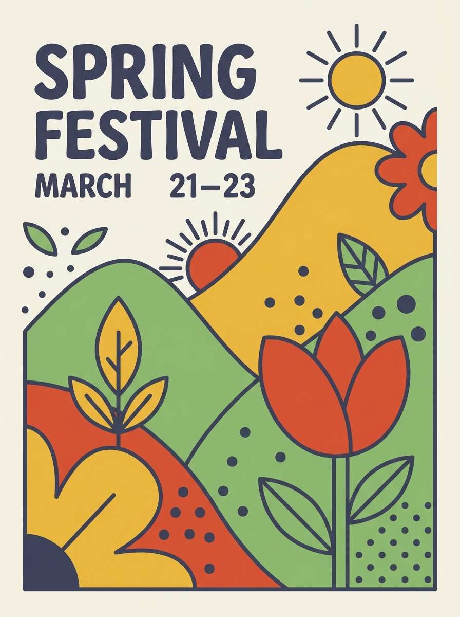
5) Wildflower Meadow
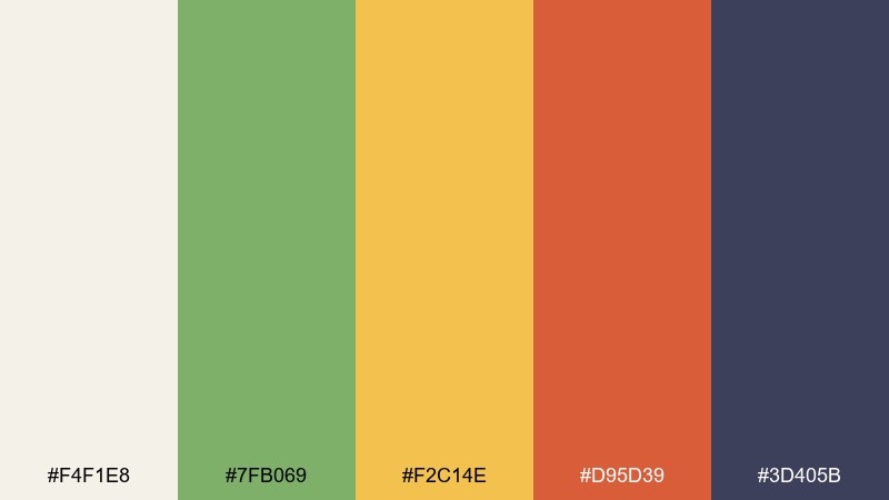
HEX: #f4f1e8 #7fb069 #f2c14e #d95d39 #3d405b
Mood: cheerful, sunny, lively
Best for: spring festival poster
Cheerful meadow energy pops with leafy green, honey gold, and a warm terracotta spark. This mountain color scheme is great for event posters, farmers markets, and community flyers where you want friendliness and motion. Pair with bold shapes and playful type, but keep the background creamy to prevent glare. Usage tip: let the navy anchor headers while the warm tones carry icons and callouts.
Image example of wildflower meadow generated using media.io
6) Canyon Sunset
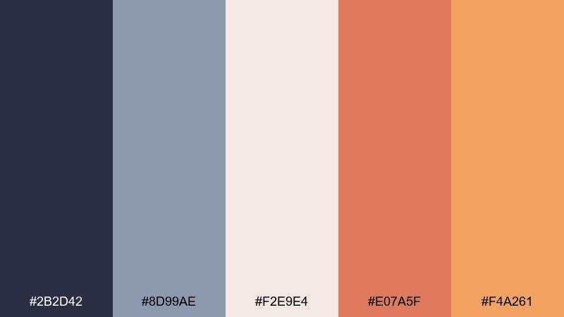
HEX: #2b2d42 #8d99ae #f2e9e4 #e07a5f #f4a261
Mood: warm, dramatic, cinematic
Best for: beverage product ad
Warm canyon light meets cool evening shadow, giving the palette a cinematic push and pull. It works for beverage ads, lifestyle promos, and bold landing pages where contrast drives attention. Pair with dark navy headlines and let the corals live in product highlights or ribbons. Usage tip: keep the warm hues clustered together so the ad reads like a single sunset gradient.
Image example of canyon sunset generated using media.io
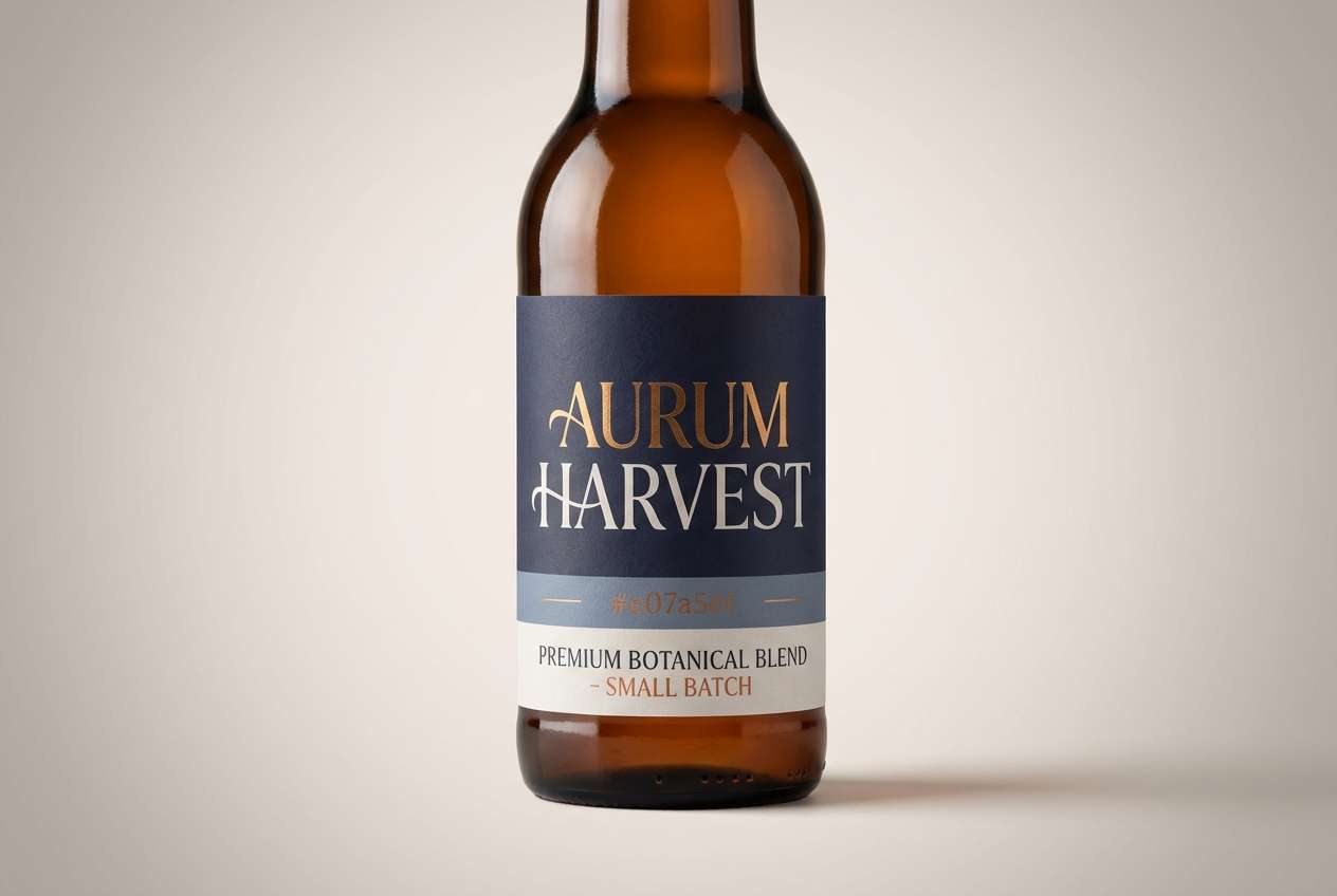
7) Snowcap Neutral
HEX: #fbfaf7 #e6e2d9 #b9b4aa #6f6b66 #2a2a29
Mood: quiet, refined, timeless
Best for: magazine editorial layout
Quiet snow and weathered stone create a refined neutral set with high-end restraint. It fits editorial spreads, lookbooks, and portfolios where photography should lead and color should whisper. Pair with serif headlines and thin rules for an elegant, print-first feel. Usage tip: use the mid taupe for captions and the near-black for pull quotes to keep hierarchy crisp.
Image example of snowcap neutral generated using media.io
8) Lakeside Spruce
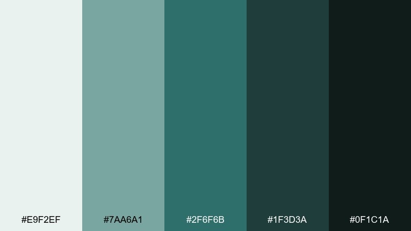
HEX: #e9f2ef #7aa6a1 #2f6f6b #1f3d3a #0f1c1a
Mood: cool, steady, outdoorsy
Best for: business presentation template
Cool lake air and evergreen depth make this set feel steady and trustworthy. It suits pitch decks, annual reports, and sustainability messaging where you want calm authority. Pair it with light backgrounds and simple charts so the dark teals do not overpower the page. Usage tip: use the medium teal for section headers and keep the near-black only for key numbers.
Image example of lakeside spruce generated using media.io
9) Trail Dust
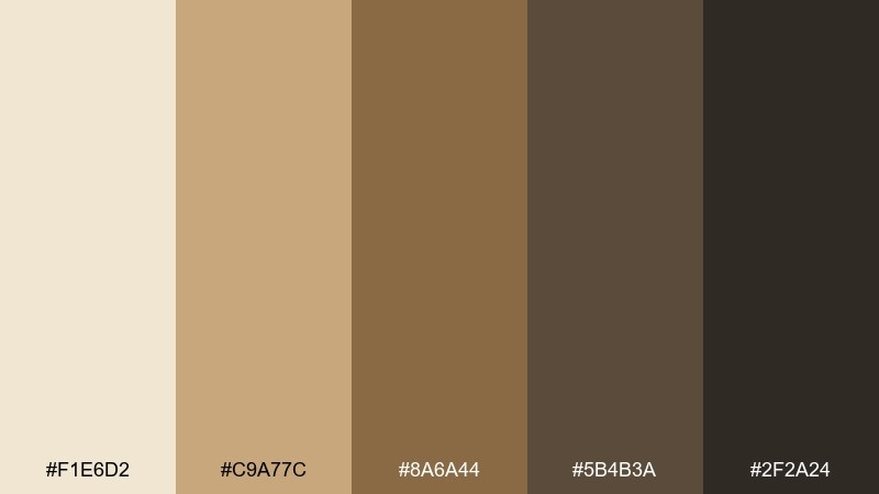
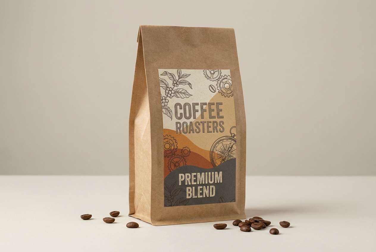
HEX: #f1e6d2 #c9a77c #8a6a44 #5b4b3a #2f2a24
Mood: rustic, cozy, earthy
Best for: coffee label packaging
Dusty switchbacks and sun-warmed wood show up as creamy tan, saddle brown, and deep bark. As a mountain color palette, it is a natural fit for coffee labels, craft foods, and small-batch packaging that leans handmade. Pair with stamped textures and dark ink illustrations for a vintage feel. Usage tip: keep the darkest brown for brand marks so they read clearly on kraft stock.
Image example of trail dust generated using media.io
10) Storm Pass
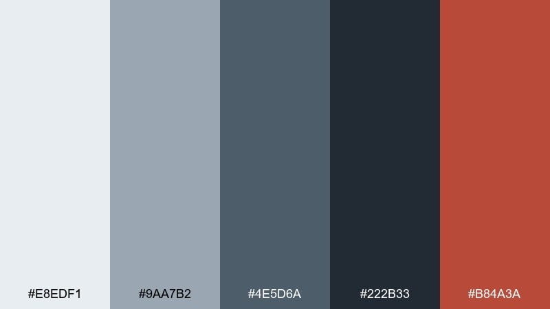
HEX: #e8edf1 #9aa7b2 #4e5d6a #222b33 #b84a3a
Mood: intense, bold, high-contrast
Best for: gaming stream overlay UI
Stormy skies and cold steel get a punch of warning-red, like a beacon cutting through fog. It works well for gaming overlays, esports graphics, and high-energy UI where you need instant emphasis. Pair with sharp angles, condensed type, and generous spacing so the dark tones do not feel heavy. Usage tip: use the red only for alerts, live badges, and key CTAs to keep it impactful.
Image example of storm pass generated using media.io
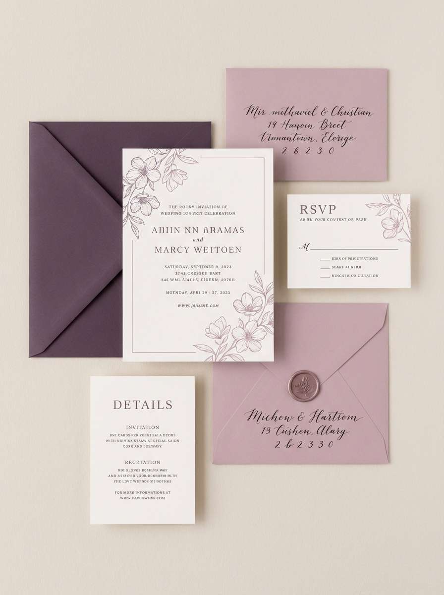
11) Highland Heather
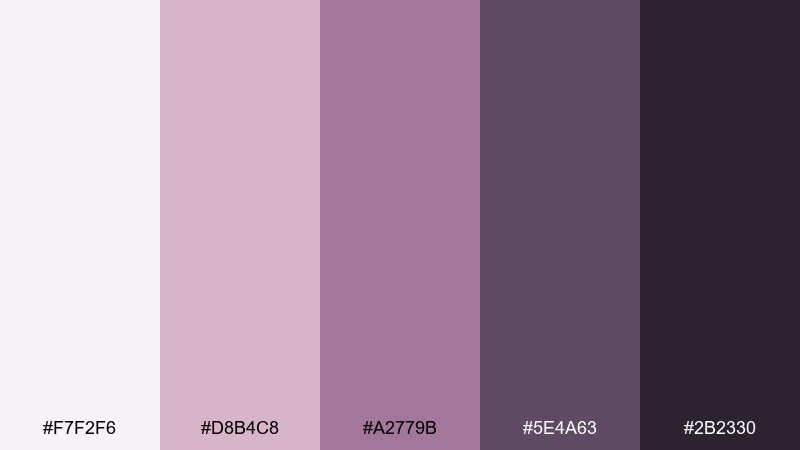
HEX: #f7f2f6 #d8b4c8 #a2779b #5e4a63 #2b2330
Mood: romantic, soft, atmospheric
Best for: wedding invitation suite
Soft heather blooms and twilight haze create a romantic, misty mood without turning sugary. This mountain color scheme is perfect for wedding invitations, vow cards, and elegant RSVP layouts. Pair with fine-line florals and a warm white paper stock for a tactile finish. Usage tip: use the plum tone for names and headings, and keep the light lavender for background panels.
Image example of highland heather generated using media.io
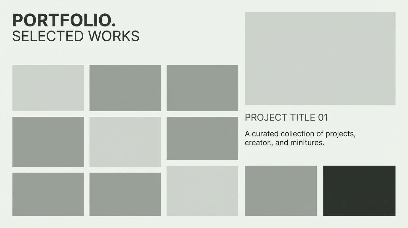
12) River Stone
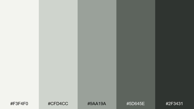
HEX: #f3f4f0 #cfd4cc #9aa19a #5d645e #2f3431
Mood: balanced, calm, professional
Best for: architecture portfolio site
Smooth river stones and pale silt give a balanced, professional look with soft contrast. It is ideal for architecture portfolios, design studios, and case study pages where you want images to take center stage. Pair with thin grid lines and muted iconography for a disciplined layout. Usage tip: keep body text in the deep charcoal and use the lightest tone for generous margins.
Image example of river stone generated using media.io
13) Summit Gold
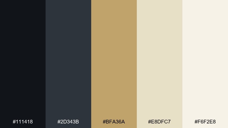
HEX: #111418 #2d343b #bfa36a #e8dfc7 #f6f2e8
Mood: luxurious, confident, sleek
Best for: premium watch advertisement
Midnight rock and refined gold feel like a summit reward after a long climb. It is strong for luxury ads, premium packaging, and brand systems that need quiet confidence. Pair with black-dominant layouts and let gold appear in small, precise moments like rules or monograms. Usage tip: treat the gold as a highlight only, and use the warm cream to keep the composition from feeling too cold.
Image example of summit gold generated using media.io

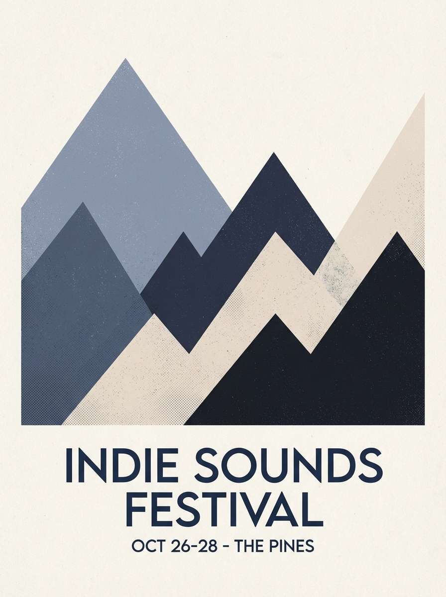
14) Alpine Twilight
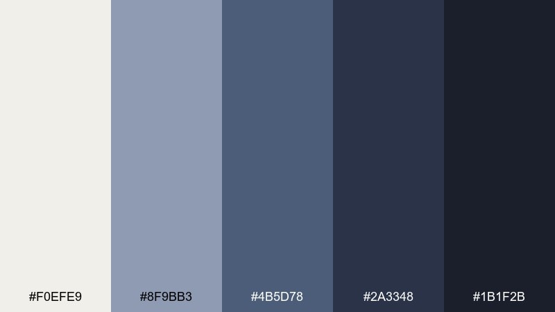
HEX: #f0efe9 #8f9bb3 #4b5d78 #2a3348 #1b1f2b
Mood: dreamy, cool, contemplative
Best for: indie music poster
Twilight blues and soft foggy light evoke quiet roads and late sets in small mountain towns. This mountain color palette works for indie music posters, album artwork, and moody announcements that need depth without loud color. Pair with grain textures and simple geometric shapes for a modern, atmospheric look. Usage tip: keep text in the pale off-white and use the mid blue for dates and secondary details.
Image example of alpine twilight generated using media.io
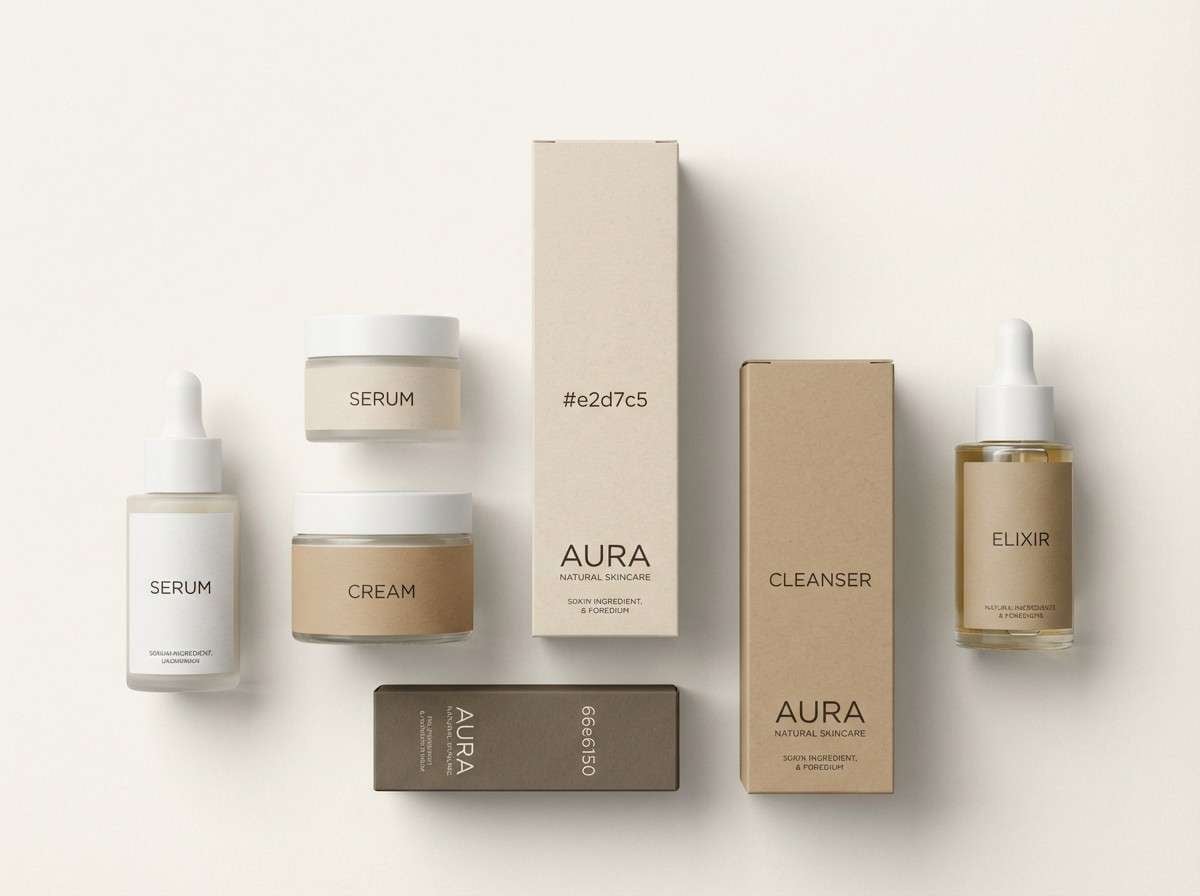
15) Birch Bark
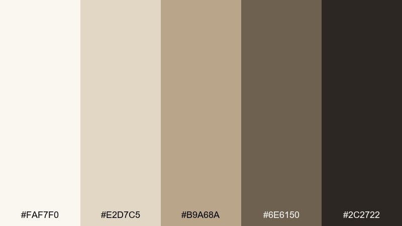
HEX: #faf7f0 #e2d7c5 #b9a68a #6e6150 #2c2722
Mood: warm, natural, understated
Best for: skincare packaging design
Warm bark neutrals feel clean and comforting, like a cabin shelf lined with simple essentials. It fits skincare packaging, apothecary labels, and minimalist product photography that relies on texture and restraint. Pair with thin line illustrations and lots of breathing room to emphasize purity. Usage tip: use the darkest brown for ingredient lists so they stay readable on pale paper stocks.
Image example of birch bark generated using media.io
16) Moraine Blue
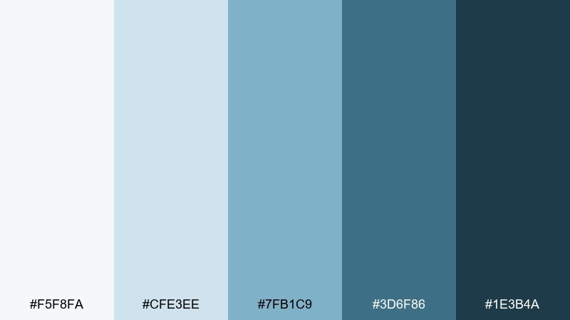
HEX: #f5f8fa #cfe3ee #7fb1c9 #3d6f86 #1e3b4a
Mood: bright, confident, modern
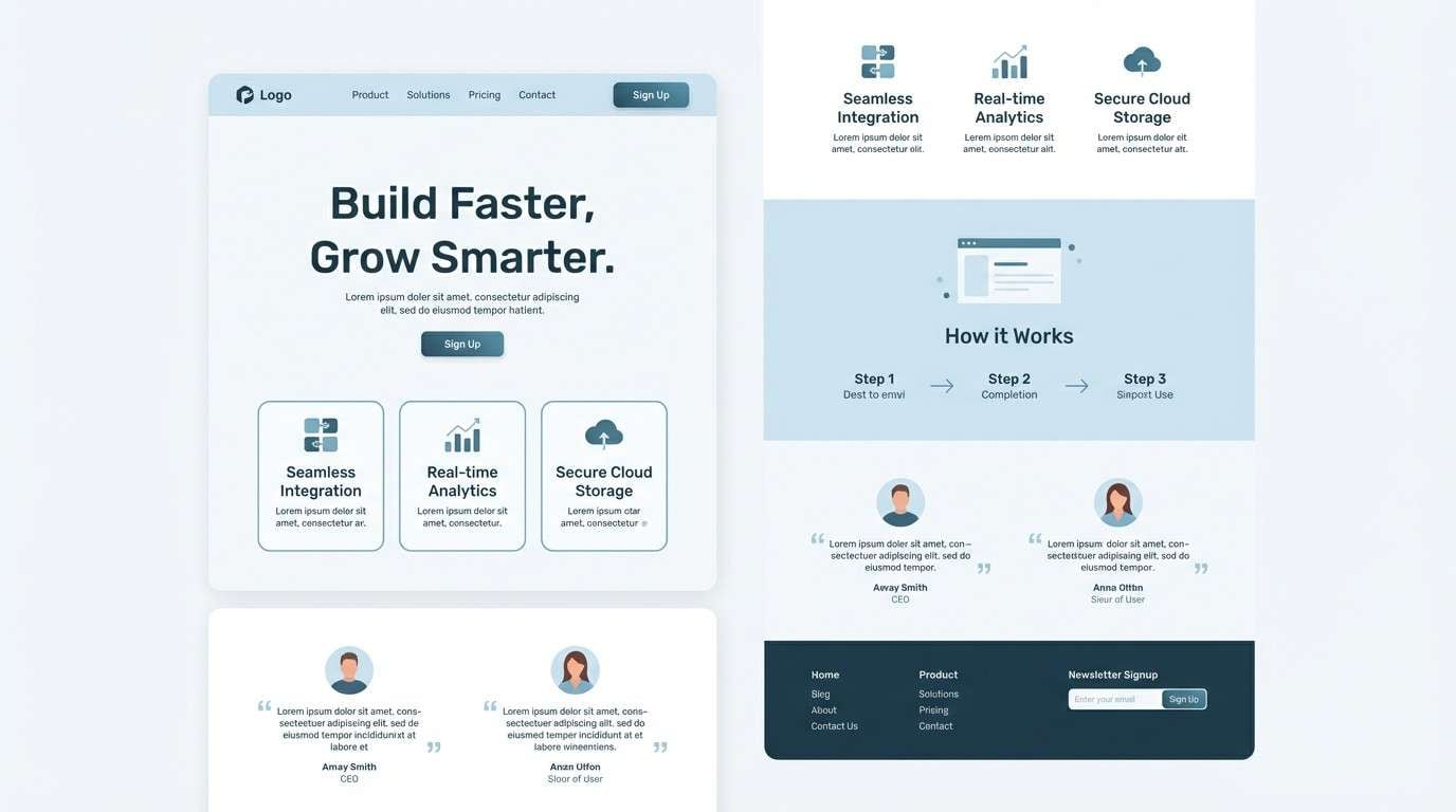
Best for: SaaS landing page UI
Bright moraine blues read as modern and capable, like clear water cutting through rock. It is a strong choice for SaaS landing pages, B2B startups, and product-led growth sites that need clarity and momentum. Pair it with neutral backgrounds and simple icon sets so the blues stay clean. Usage tip: make the mid blue your primary button color, and reserve the deep teal for nav and footers.
Image example of moraine blue generated using media.io
17) Glacier Night
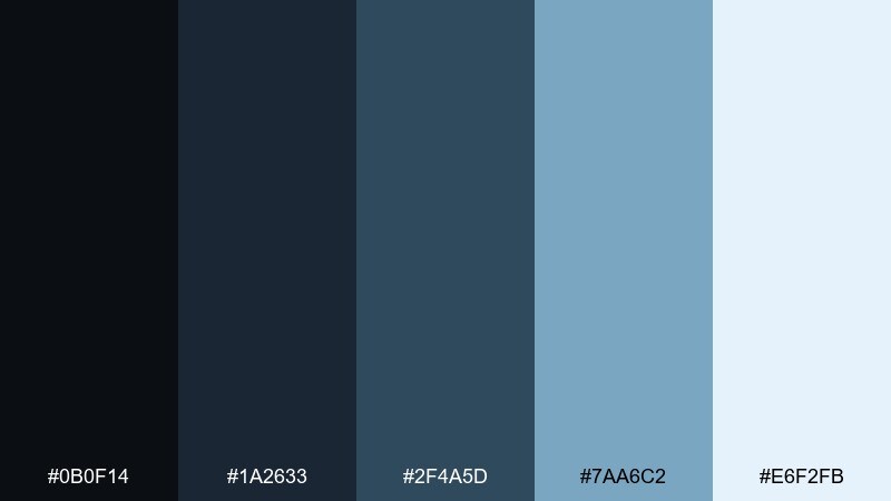
HEX: #0b0f14 #1a2633 #2f4a5d #7aa6c2 #e6f2fb
Mood: dark, icy, futuristic
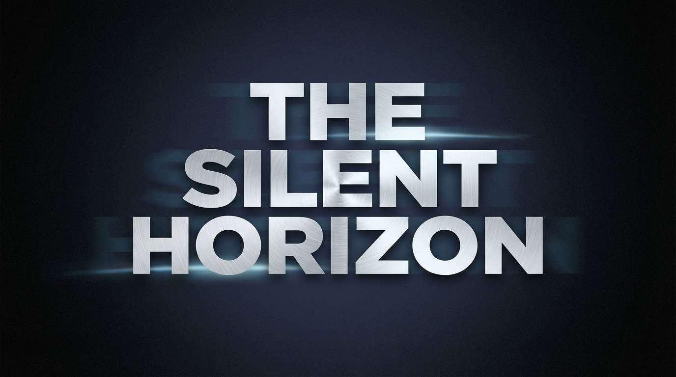
Best for: cinematic title card
Dark glacier shadows and icy highlights create a cinematic, high-contrast mood. It is great for title cards, video intros, and posters where you want cold drama and crisp readability. Pair with wide tracking and minimal elements to keep the look sharp. Usage tip: use the pale ice tone for the title text and keep the brightest accents small, like glints or thin borders.
Image example of glacier night generated using media.io
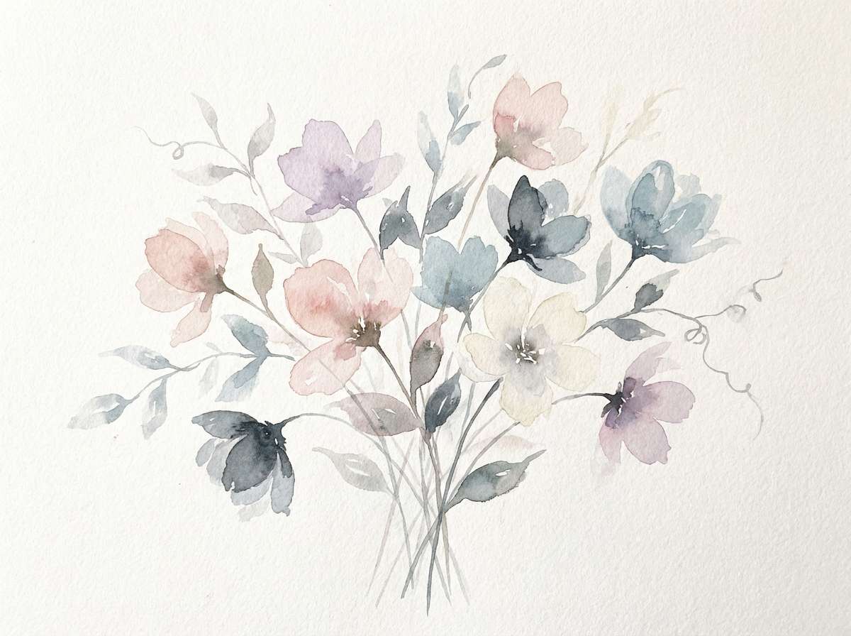
18) Meadow Fog
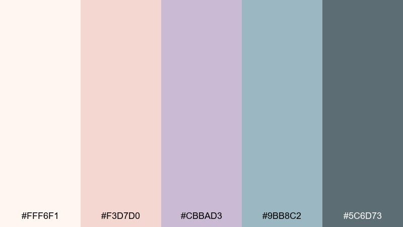
HEX: #fff6f1 #f3d7d0 #cbbad3 #9bb8c2 #5c6d73
Mood: soft, airy, gentle
Best for: watercolor botanical illustration
Soft fog over wild grasslands comes through in muted blush, lavender-gray, and misty blue-green. This mountain color scheme is lovely for botanical illustrations, stationery, and gentle social content that needs a calm, hand-painted vibe. Pair with subtle paper grain and fine brush textures to keep it organic. Usage tip: let the cream act as the page base and layer the pastels in translucent washes.
Image example of meadow fog generated using media.io
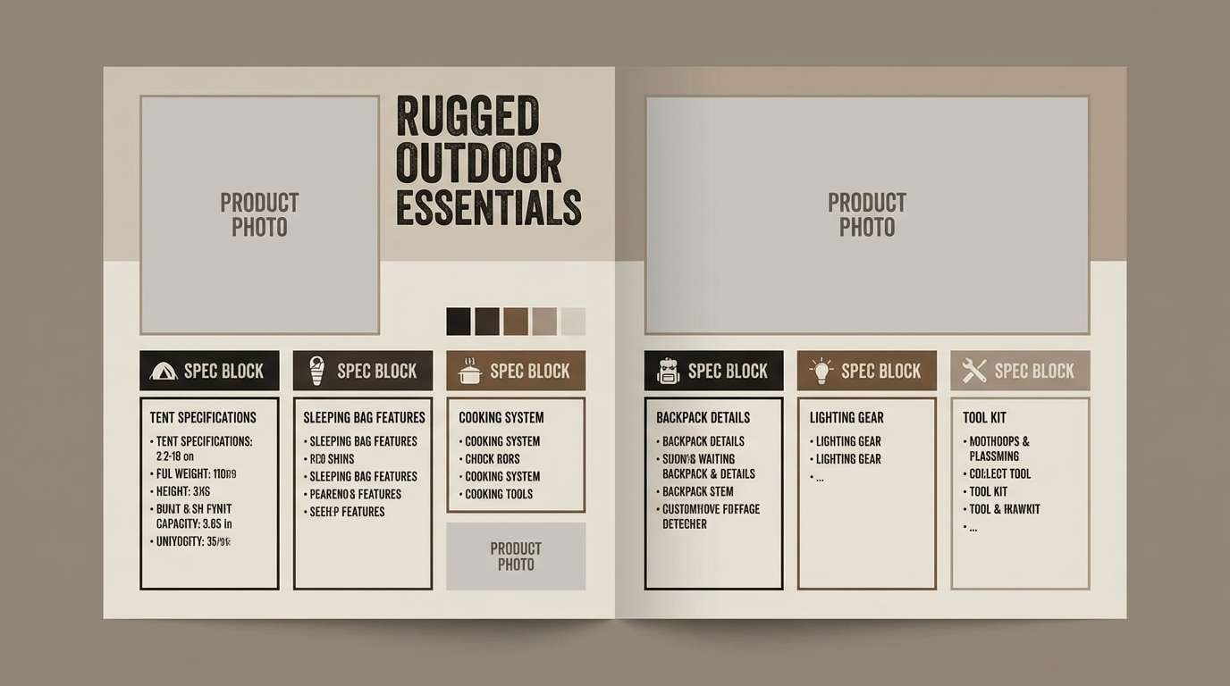
19) Ironwood Camp
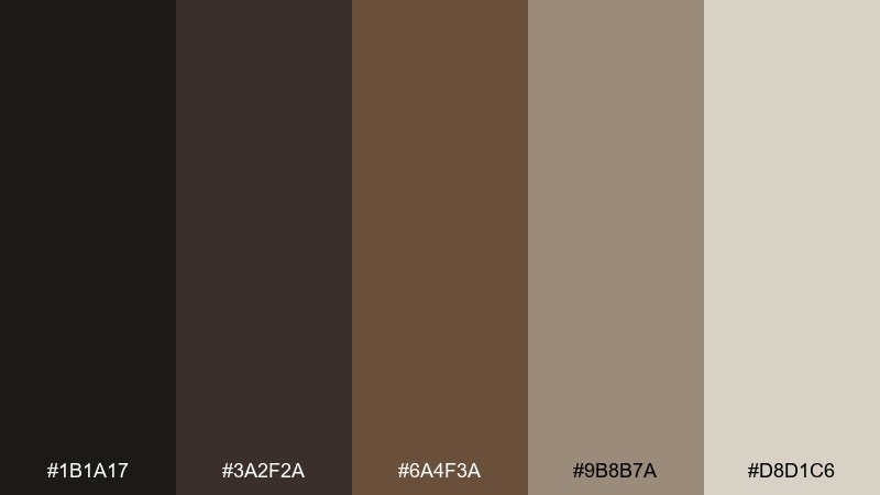
HEX: #1b1a17 #3a2f2a #6a4f3a #9b8b7a #d8d1c6
Mood: rugged, outdoorsy, durable
Best for: camping gear catalog spread
Rugged ironwood and campfire smoke create a durable, no-nonsense mood. It works for gear catalogs, survival brands, and rugged product pages where materials and grit matter. Pair with bold sans-serif type and strong grid spacing to keep the spread clean. Usage tip: use the light stone tone for product specs so they stay readable against dark imagery blocks.
Image example of ironwood camp generated using media.io
20) Peakberry Punch
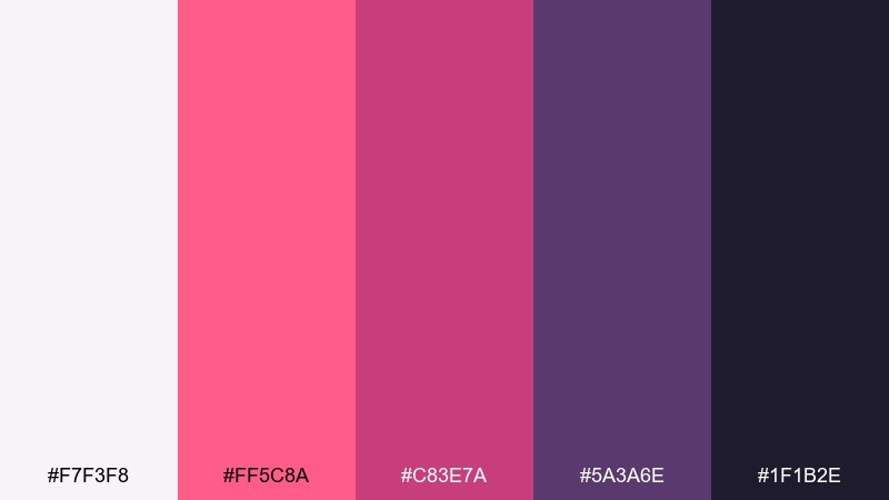
HEX: #f7f3f8 #ff5c8a #c83e7a #5a3a6e #1f1b2e
Mood: bold, playful, energetic
Best for: social media promo graphic
Bold berry pinks against deep violet feel like high-altitude sunsets with a modern edge. These mountain tones are ideal for social promos, limited drops, and creator announcements that need instant scroll-stopping impact. Pair with simple shapes and high-contrast type to keep the bright tones controlled. Usage tip: use the light lilac as negative space so the pink reads clean instead of harsh.
Image example of peakberry punch generated using media.io

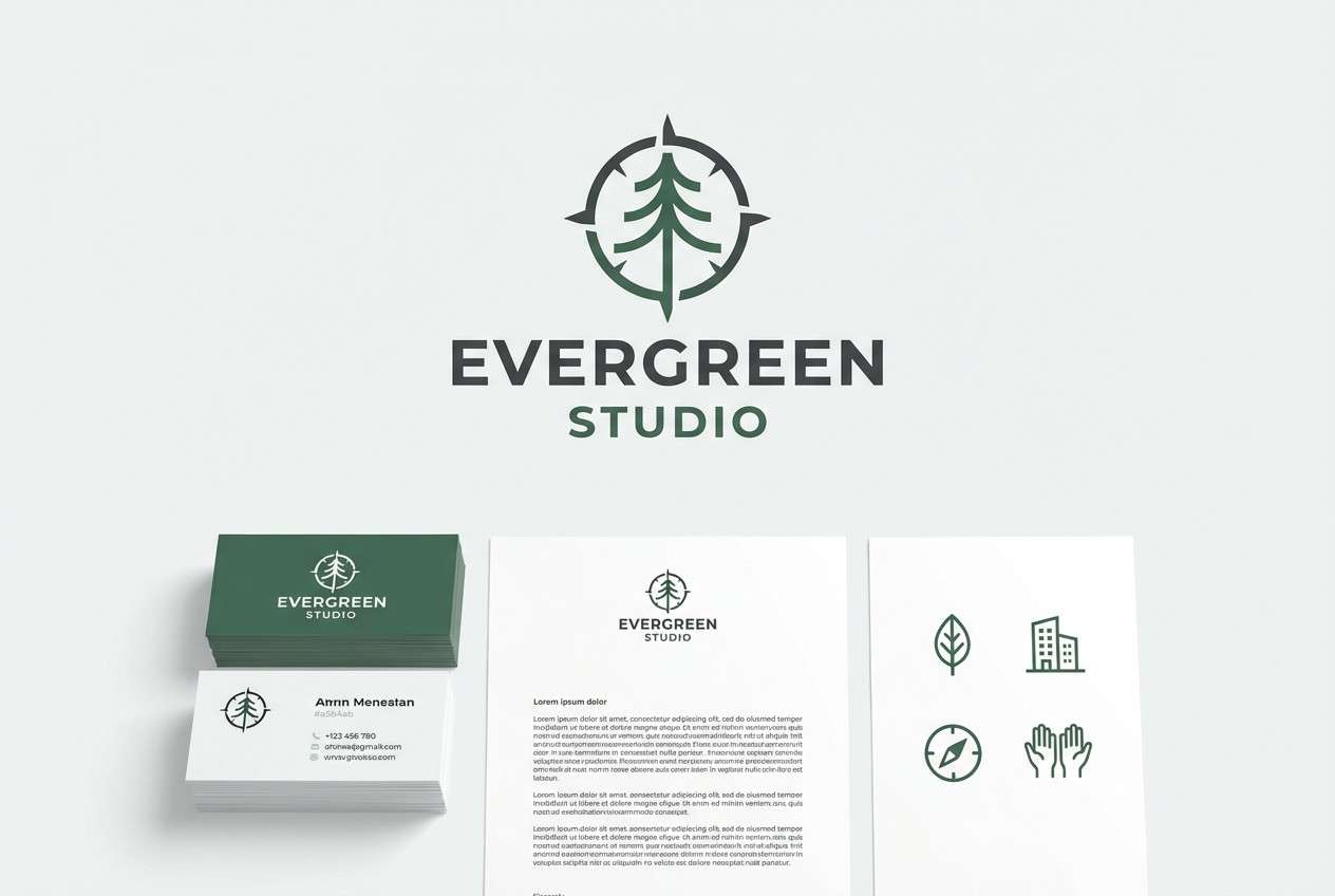
21) Evergreen Granite
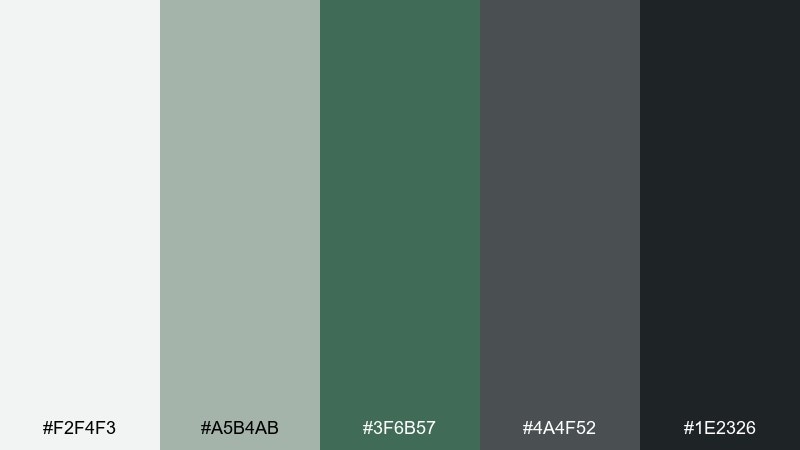
HEX: #f2f4f3 #a5b4ab #3f6b57 #4a4f52 #1e2326
Mood: classic, steady, outdoorsy
Best for: brand identity kit
Evergreen depth meeting granite gray feels classic, steady, and ready for the trail. It fits identity kits for outdoor services, local roasters, or makers who want a modern heritage look. Pair with monochrome photography and a single botanical icon to keep the system cohesive. Usage tip: use the green for logo marks and let the grays handle backgrounds and typography.
Image example of evergreen granite generated using media.io
22) Sunlit Ledge
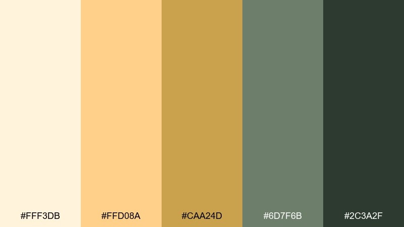
HEX: #fff3db #ffd08a #caa24d #6d7f6b #2c3a2f
Mood: sunny, optimistic, earthy
Best for: restaurant menu design
Sunlit stone ledges and dry grass glow with warm cream, soft amber, and grounded green. It suits restaurant menus, cafe boards, and seasonal specials where you want warmth that still feels natural. Pair with textured paper backgrounds and dark green type for a rustic-modern blend. Usage tip: keep the amber for section highlights and use the deep green for prices and key details.
Image example of sunlit ledge generated using media.io
What Colors Go Well with Mountain?
Mountain tones pair best with quiet neutrals (snow whites, stone grays, bark browns) because they preserve that clean, outdoorsy “air” around the design. These neutrals also help photos and UI elements feel organized instead of overly styled.
For accents, choose one temperature direction: warm alpine sunrise hues (apricot, terracotta, amber) or cool glacier hues (ice blue, steel, slate). Keeping the accent family consistent makes the palette feel intentional rather than random.
If you need extra punch, use a single high-contrast signal color (like a warning red) sparingly for alerts, buttons, or badges—so it reads as a tool, not decoration.
How to Use a Mountain Color Palette in Real Designs
Start with a base and text pair: pick a light snow/cream for backgrounds and a deep slate/charcoal for body text. This gives instant readability and makes the palette usable across web and print.
Next, assign roles: one mid-tone for UI surfaces (cards, panels), one cool tone for structure (nav, dividers), and one warm tone for attention (CTA, highlights). Mountain palettes work best when each color has a job.
Finally, let texture do some of the storytelling—paper grain, matte finishes, and subtle gradients can make simple mountain tones feel premium without adding extra colors.
Create Mountain Palette Visuals with AI
If you want to see these HEX combinations in context, generate quick mockups like posters, landing pages, labels, or UI screens using the prompts included under each palette. It’s an easy way to validate mood and contrast before you commit.
Try variations by changing only one variable at a time (layout type, lighting, or style) while keeping the color codes fixed. That helps you spot which tones should lead and which should support.
When you find a look you like, reuse the same prompt structure to build a consistent series—perfect for brand systems or campaign sets.
Mountain Color Palette FAQs
-
What is a mountain color palette?
A mountain color palette is a set of colors inspired by alpine environments—snow whites, granite grays, forest greens, and sunrise/sunset warms—chosen to feel natural, calm, and high-contrast where needed. -
Are mountain tones good for UI design?
Yes. Mountain palettes often include multiple neutrals (light to dark) that make UI hierarchy clear, with one controlled accent color for buttons, alerts, or progress states. -
How do I keep a mountain palette from looking dull?
Use a strong light/dark foundation for contrast, then add one warm highlight (amber/terracotta) or one cool highlight (ice blue/teal). Keep the accent area small so it feels intentional. -
Which mountain colors work best for branding?
Evergreen + slate/charcoal is a classic brand combo for steady, outdoorsy identity. For premium brands, pair near-black with muted gold and warm cream for a refined, confident look. -
What background color should I use with mountain tones?
Choose a snow white or warm off-white as the main background. It keeps layouts breathable and helps darker slate/green text stay readable without harsh contrast. -
Can I use mountain palettes for posters and events?
Absolutely. Warm mountain sets (sunlit creams, amber, clay) are great for festivals and menus, while twilight/glacier sets create moody, cinematic posters with strong readability. -
How can I generate mountain palette images quickly?
Use Media.io text-to-image with a clear design target (e.g., “landing page UI” or “product label”), then paste the five HEX codes into the prompt to keep color control consistent.
Next: Cyberpunk Color Palette