

A green cream color palette pairs grounded botanicals with soft, airy neutrals—making designs feel fresh, calm, and naturally premium.
Below are 20 curated green-and-cream color combinations with HEX codes, plus practical tips for branding, interiors, and UI layouts.
In this article
- Why Green Cream Palettes Work So Well
-
- sage linen morning
- pistachio gelato
- olive cream espresso
- mint chantilly
- forest cream library
- eucalyptus oat milk
- matcha butter kitchen
- mossy stone path
- celery pearl minimal
- fern and vanilla branding
- avocado cream retro
- seafoam biscuit web
- garden tea party
- spruce almond night
- soft khaki canvas
- chartreuse cream pop
- willow fog editorial
- lush meadow packaging
- botanical greenhouse
- antique sage wedding
- What Colors Go Well with Green Cream?
- How to Use a Green Cream Color Palette in Real Designs
- Create Green Cream Palette Visuals with AI
Why Green Cream Palettes Work So Well
Green brings the “nature signal”—growth, balance, and freshness—while cream softens the look with warmth and breathable negative space. Together, they feel clean without turning sterile.
Because cream sits in a light, neutral range, it improves readability for UI and print by giving greens a stable background. That contrast also helps branding elements (logos, buttons, headings) stand out without needing harsh black.
Green-and-cream schemes can swing modern, vintage, spa-like, or rustic depending on the green undertone (sage, olive, teal, chartreuse) and the warmth of the cream (ivory, oat, almond, butter).
20+ Green Cream Color Palette Ideas (with HEX Codes)
1) Sage Linen Morning
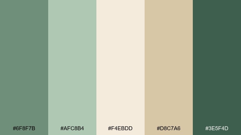
HEX: #6F8F7B #AFC8B4 #F4EBDD #D8C7A6 #3E5F4D
Mood: calm, airy, organic
Best for: scandinavian living room interiors
Calm and sunlit, these tones feel like fresh herbs on a linen tablecloth. Use the mid sage as your main wall or large surface color, then bring in the cream for trim, textiles, and negative space. The deeper green works well for built-ins or accent furniture, while the warm sand keeps the look inviting. Tip: add matte black hardware sparingly to sharpen the edges without cooling the palette.
Image example of sage linen morning generated using media.io

Media.io is an online AI studio for creating and editing video, image, and audio in your browser.

2) Pistachio Gelato
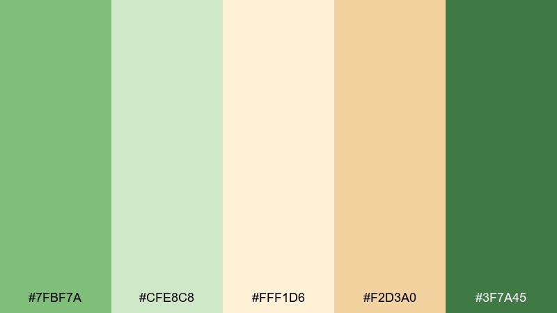
HEX: #7FBF7A #CFE8C8 #FFF1D6 #F2D3A0 #3F7A45
Mood: playful, fresh, sweet
Best for: ice cream shop branding
Bright and cheerful, it brings to mind pistachio gelato and waffle cones. Let the soft pistachio and cream do most of the heavy lifting, then use the caramel tone for highlights like badges and price tags. The darker green is best reserved for logos and headlines so the design stays readable. Tip: keep backgrounds mostly cream to prevent the lighter greens from looking washed out.
Image example of pistachio gelato generated using media.io
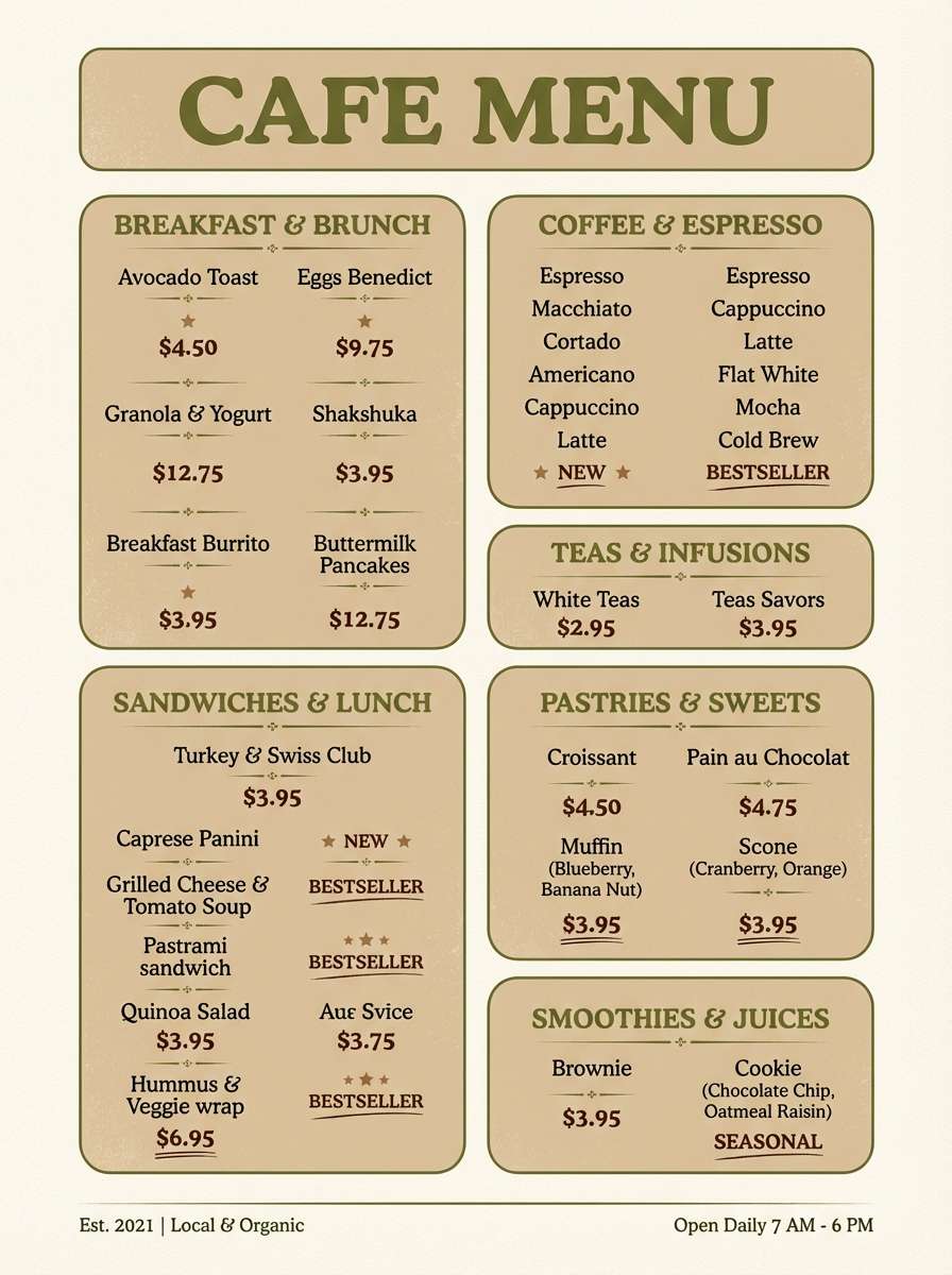
3) Olive Cream Espresso
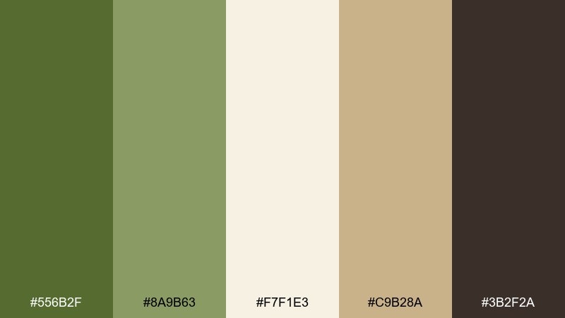
HEX: #556B2F #8A9B63 #F7F1E3 #C9B28A #3B2F2A
Mood: grounded, cozy, vintage
Best for: cafe menu design and signage
Earthy and comforting, it feels like a quiet corner table, olive leaves, and a shot of espresso. This green cream color palette shines when cream is used as the paper base and olive carries section headers and dividers. Pull in the coffee brown for key prices or callouts, and use the warm tan for secondary labels. Tip: pair with a serif headline font to lean into the classic cafe vibe.
Image example of olive cream espresso generated using media.io
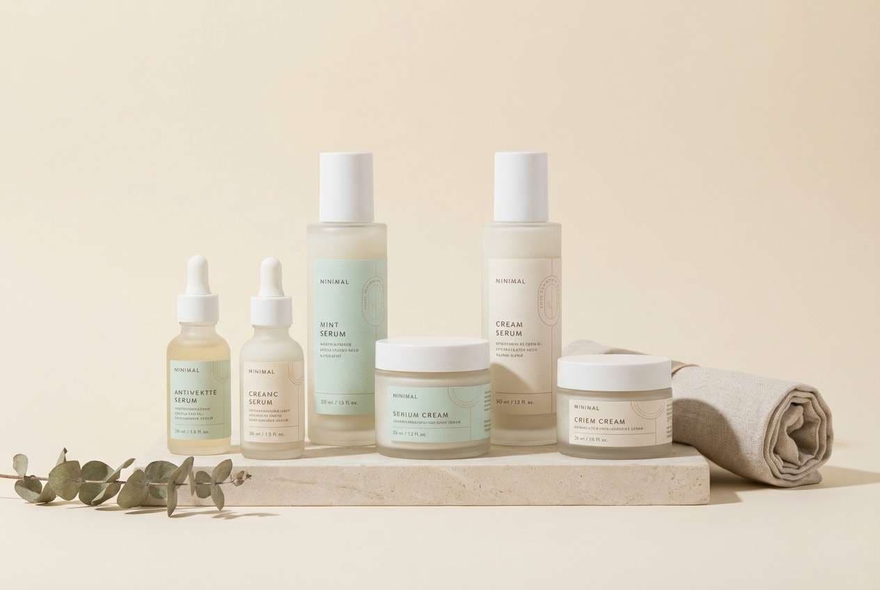
4) Mint Chantilly
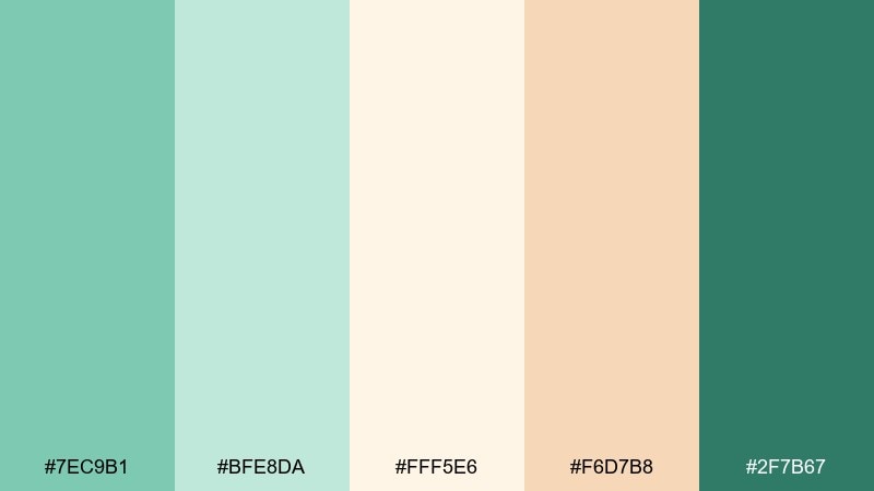
HEX: #7EC9B1 #BFE8DA #FFF5E6 #F6D7B8 #2F7B67
Mood: light, spa-like, uplifting
Best for: skincare product packaging
Clean and soothing, it evokes mint-infused water and whipped cream swirls. Use the pale mint and cream as the main packaging field colors, then add the deeper teal-green for ingredient labels and marks. The peachy nude is ideal for subtle claims and seals without turning the design too sweet. Tip: choose a soft-touch matte finish to amplify the calming feel.
Image example of mint chantilly generated using media.io
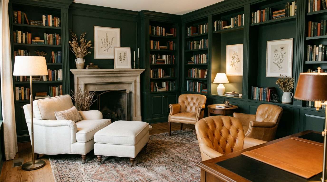
5) Forest Cream Library
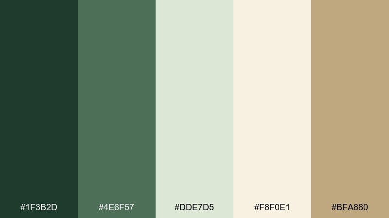
HEX: #1F3B2D #4E6F57 #DDE7D5 #F8F0E1 #BFA880
Mood: moody, classic, refined
Best for: home office and library styling
Deep and bookish, it recalls polished wood, shaded pines, and warm lamplight. Anchor the room with the forest green on built-ins or a feature wall, then lighten it with creamy textiles and pale botanical greens. The warm tan works well in leather, frames, and brass-adjacent decor. Tip: keep one large cream element, like a rug, to stop the dark green from feeling heavy.
Image example of forest cream library generated using media.io
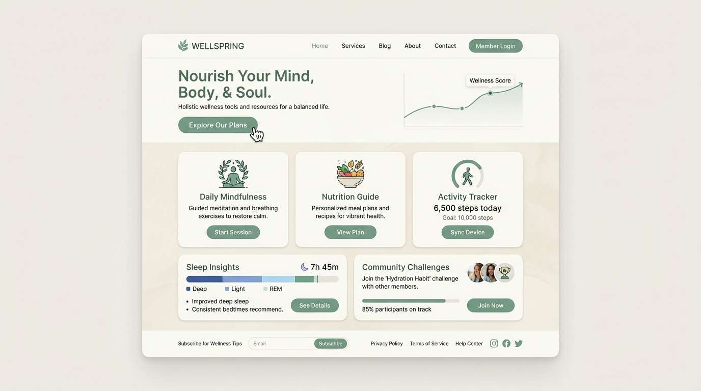
6) Eucalyptus Oat Milk
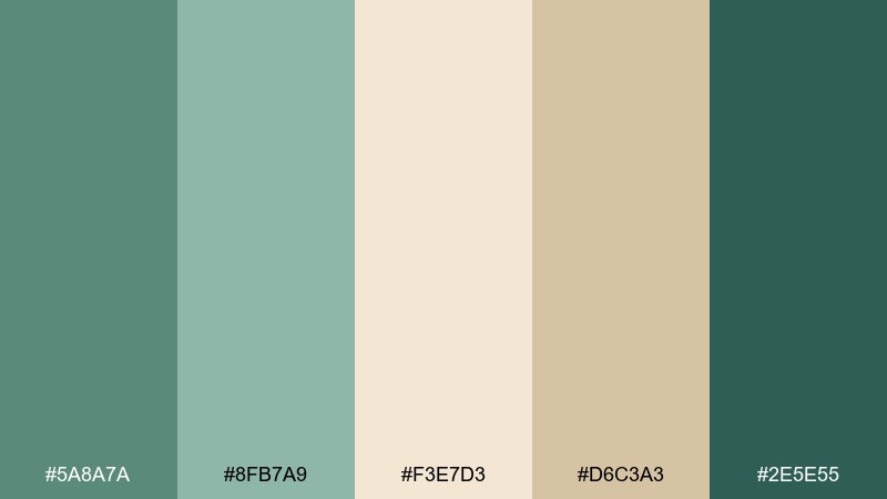
HEX: #5A8A7A #8FB7A9 #F3E7D3 #D6C3A3 #2E5E55
Mood: natural, soft, restorative
Best for: wellness website UI
Gentle and breathable, it feels like eucalyptus steam and a warm oat latte. Use cream for the page background, eucalyptus for navigation and cards, and the deeper teal-green for primary buttons. The warm oat tones make perfect hover states, tags, or subtle illustrations. Tip: maintain generous spacing so the muted greens read crisp rather than dull.
Image example of eucalyptus oat milk generated using media.io
7) Matcha Butter Kitchen
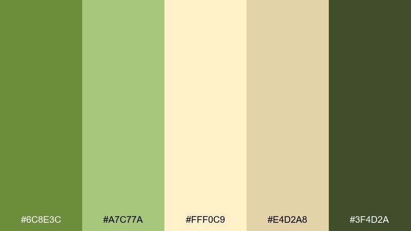
HEX: #6C8E3C #A7C77A #FFF0C9 #E4D2A8 #3F4D2A
Mood: warm, homey, cheerful
Best for: kitchen wall paint and decor
Warm and sunny, it suggests matcha powder, butter, and morning toast. Make the buttery cream your primary surface color, then bring in the lighter green for cabinets, tiles, or bar stools. Use the darker green for small accents like rails, planters, or a pantry door to add depth. Tip: pair with light wood and off-white ceramics for a cohesive, lived-in look.
Image example of matcha butter kitchen generated using media.io
8) Mossy Stone Path
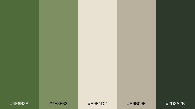
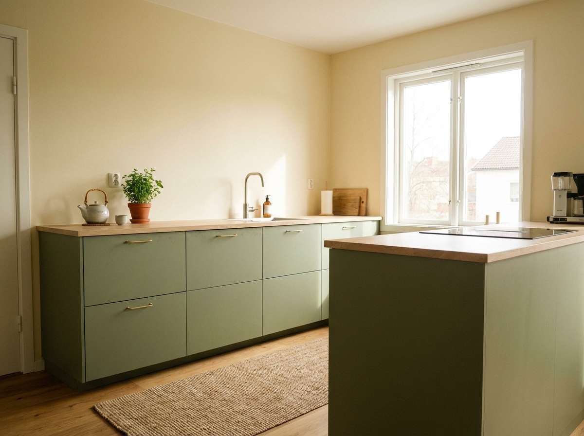
HEX: #4F6B3A #7E8F62 #E9E1D2 #B9B09E #2D3A2B
Mood: earthy, muted, outdoorsy
Best for: landscape photography presets and frames
Quiet and grounded, it looks like moss on stones after a rain. These green cream color combinations work best when the cream is used for borders and negative space, letting the mossy greens stay natural. Add the stone gray to captions, icons, or understated frames, and use the near-black green to anchor typography. Tip: avoid high saturation edits so the palette keeps its calm, film-like mood.
Image example of mossy stone path generated using media.io
9) Celery Pearl Minimal
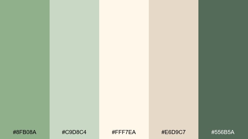
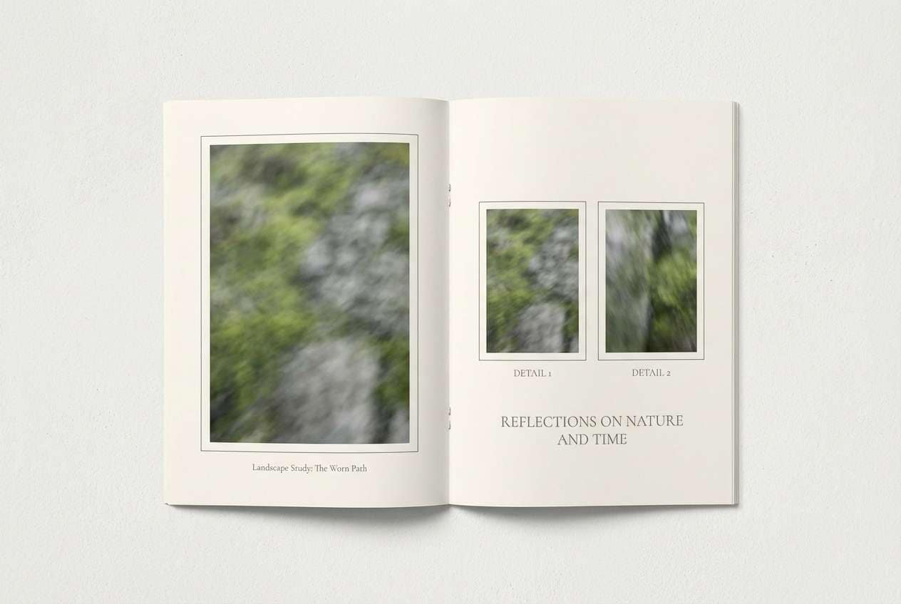
HEX: #8FB08A #C9D8C4 #FFF7EA #E6D9C7 #556B5A
Mood: minimal, clean, modern
Best for: presentation slides and reports
Polished and understated, it feels like crisp stationery with a hint of garden green. Use pearl cream for slide backgrounds, then layer celery tints in charts and section blocks. The muted dark green is perfect for titles and data labels where contrast matters. Tip: keep gradients off and rely on flat fills for a more professional, contemporary finish.
Image example of celery pearl minimal generated using media.io

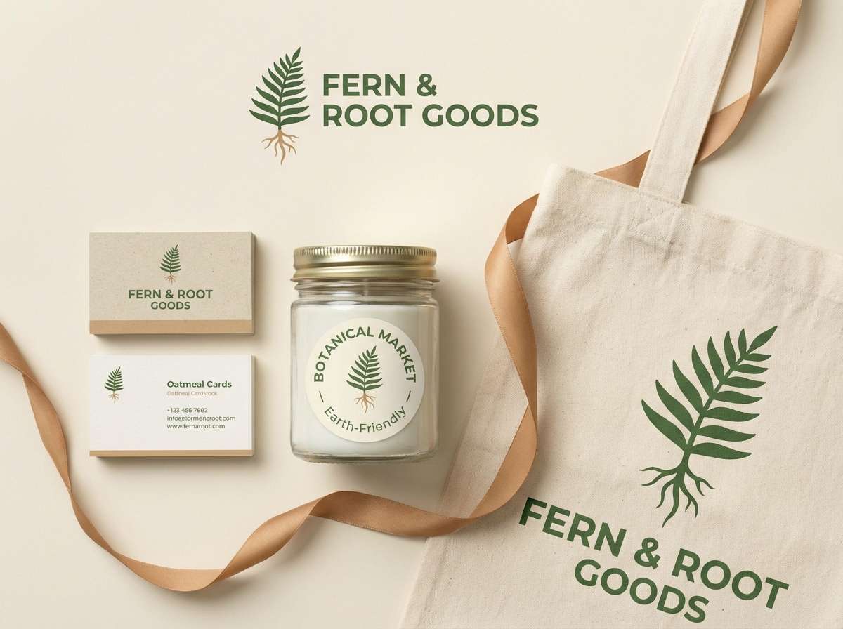
10) Fern and Vanilla Branding
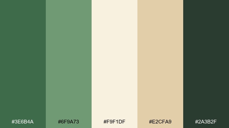
HEX: #3E6B4A #6F9A73 #F9F1DF #E2CFA9 #2A3B2F
Mood: natural, confident, premium
Best for: eco-friendly brand identity
Fresh yet polished, it brings to mind fern fronds against vanilla paper. Build the system with vanilla as the base, medium fern for brand blocks, and the darker green for your logotype and key headings. The warm tan adds a craft-like touch on packaging seals or texture overlays. Tip: pair with recycled paper textures, but keep the design simple so it still feels premium.
Image example of fern and vanilla branding generated using media.io
11) Avocado Cream Retro
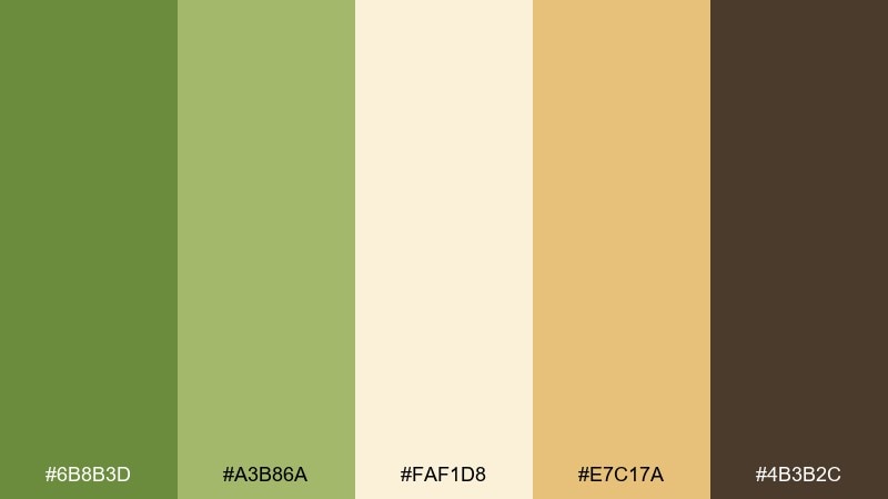
HEX: #6B8B3D #A3B86A #FAF1D8 #E7C17A #4B3B2C
Mood: retro, sunny, bold
Best for: poster and album cover design
Punchy and nostalgic, it feels like a vintage kitchen poster with a modern refresh. Let the creamy base keep things readable while the avocado greens carry big shapes and typography. The golden tone is great for starbursts, borders, or highlights, and the brown grounds the layout like old print ink. Tip: try a grain overlay to sell the retro vibe without muddying the greens.
Image example of avocado cream retro generated using media.io
12) Seafoam Biscuit Web
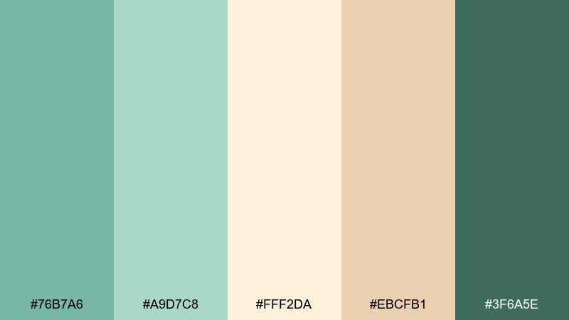
HEX: #76B7A6 #A9D7C8 #FFF2DA #EBCFB1 #3F6A5E
Mood: friendly, coastal, light
Best for: landing page design
Easygoing and bright, it suggests seafoam glass and warm biscuits on the shore. Use the cream as a primary background, seafoam for hero sections, and the darker teal for CTAs so buttons pop. The biscuit tan adds warmth in icons, badges, and subtle illustrations. Tip: keep shadows soft and low-contrast to match the gentle palette temperature.
Image example of seafoam biscuit web generated using media.io

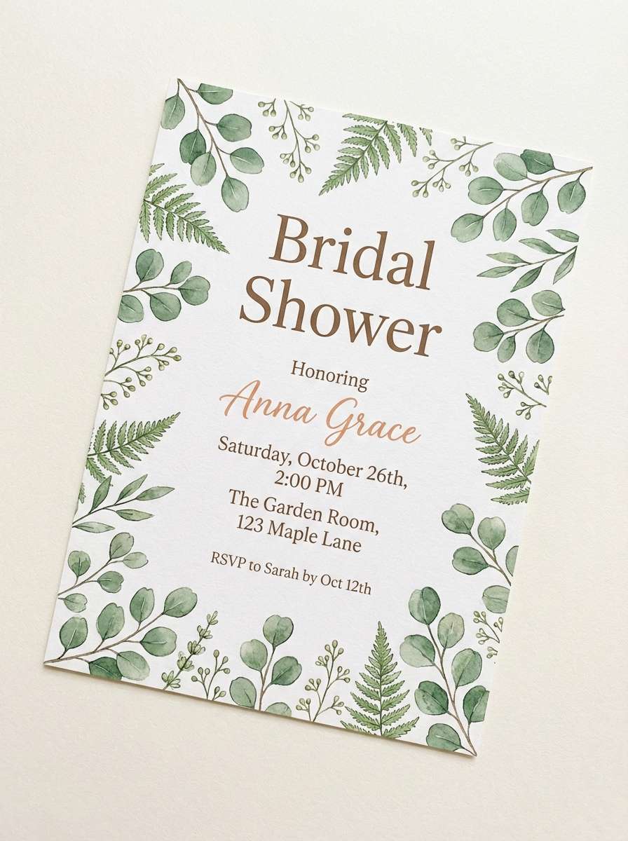
13) Garden Tea Party
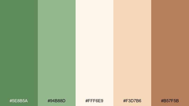
HEX: #5E8B5A #94B88D #FFF6E9 #F3D7B6 #B57F5B
Mood: romantic, welcoming, soft
Best for: bridal shower invitations
Romantic and garden-fresh, it evokes leafy hedges, cream cake, and warm tea. Set invitation backgrounds in creamy ivory, then use the soft greens for borders, florals, and headings. The tea-brown accent adds sophistication for names, dates, or monograms. Tip: print on textured stock to enhance the gentle, vintage feel.
Image example of garden tea party generated using media.io
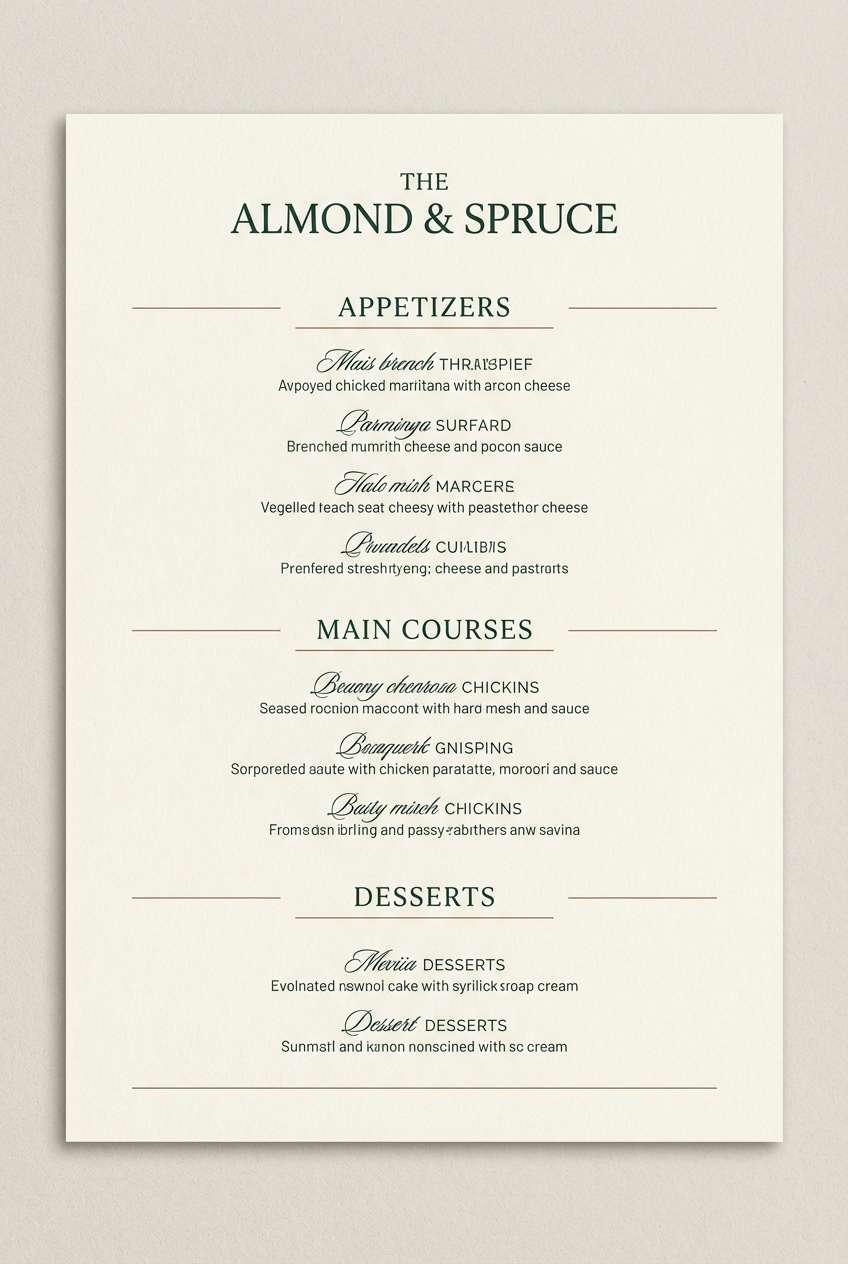
14) Spruce Almond Night
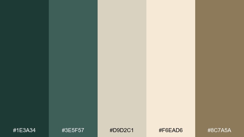
HEX: #1E3A34 #3E5F57 #D9D2C1 #F6EAD6 #8C7A5A
Mood: elegant, moody, upscale
Best for: restaurant menu and wine list
Dark and elegant, it reads like spruce needles against almond paper. Use the light creams for the menu base, then apply the deep greens for section titles and separators to create a fine-dining feel. The warm brown works well for subtle iconography or tasting notes. Tip: keep body text in the near-black green so it stays softer than pure black.
Image example of spruce almond night generated using media.io
15) Soft Khaki Canvas
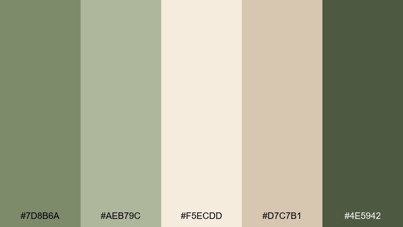
HEX: #7D8B6A #AEB79C #F5ECDD #D7C7B1 #4E5942
Mood: practical, calm, understated
Best for: capsule wardrobe styling
Relaxed and wearable, it feels like soft khaki trousers and a cream knit. Make the cream and light khaki your foundation, then add muted greens through outerwear and accessories. The darker olive-gray is great for belts, bags, or minimal prints to add definition. Tip: keep metals warm (brass or gold) to harmonize with the beige undertones.
Image example of soft khaki canvas generated using media.io

16) Chartreuse Cream Pop
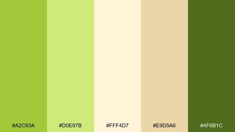
HEX: #A2C93A #D0E97B #FFF4D7 #E9D5A6 #4F6B1C
Mood: energetic, modern, punchy
Best for: app onboarding screens
Vibrant and zesty, it has the snap of citrus and fresh-cut greens. Use the creamy off-white for screen backgrounds and the lighter chartreuse for friendly illustration fills. Reserve the darker green for primary buttons and progress indicators so actions stay obvious. Tip: limit the brightest green to small areas to avoid eye fatigue.
Image example of chartreuse cream pop generated using media.io

17) Willow Fog Editorial
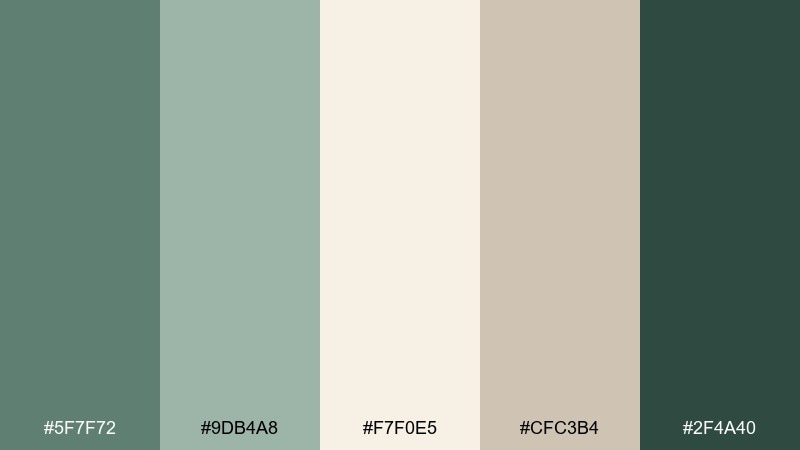
HEX: #5F7F72 #9DB4A8 #F7F0E5 #CFC3B4 #2F4A40
Mood: soft, editorial, sophisticated
Best for: magazine layout and lookbooks
Hazy and refined, it recalls willow branches in morning fog. This green cream color palette works beautifully for editorial grids where cream acts as the paper tone and muted greens support headings and pull quotes. Use the darkest green for small caps and page numbers to keep hierarchy crisp. Tip: add generous margins and thin rules to make the neutrals feel intentional.
Image example of willow fog editorial generated using media.io
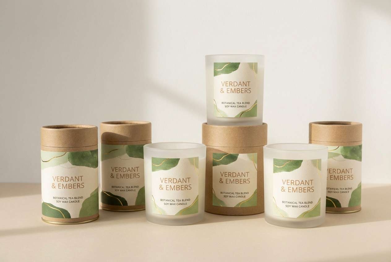
18) Lush Meadow Packaging
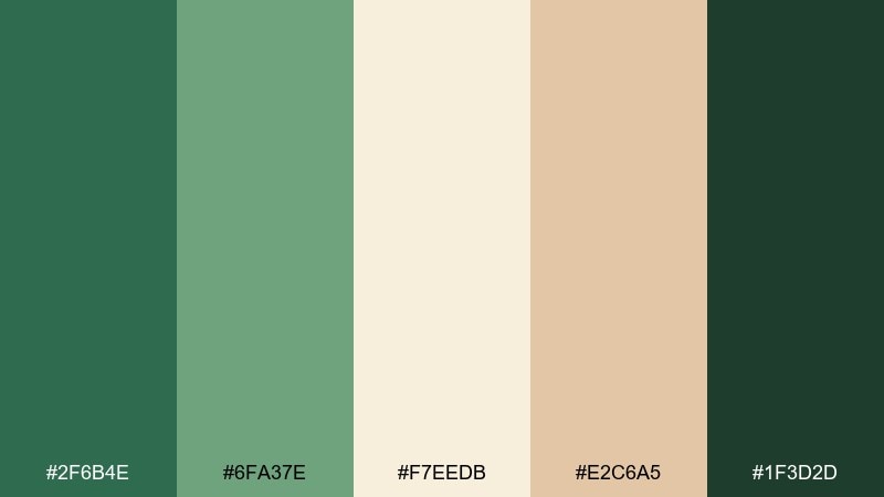
HEX: #2F6B4E #6FA37E #F7EEDB #E2C6A5 #1F3D2D
Mood: fresh, premium, botanical
Best for: tea or candle packaging
Lush and botanical, it feels like meadow leaves against creamy wax. Use the light cream for labels and the mid green for large brand blocks to signal natural ingredients. The warm tan brings a hand-crafted touch for scent notes or batch numbers, while the darkest green keeps type sharp. Tip: emboss the logo in the deepest green for a subtle, upscale finish.
Image example of lush meadow packaging generated using media.io
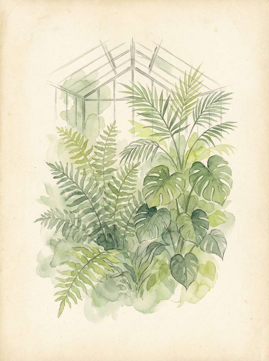
19) Botanical Greenhouse
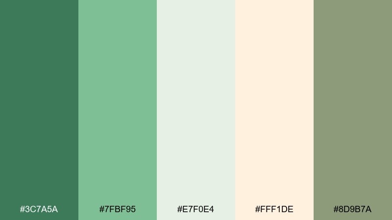
HEX: #3C7A5A #7FBF95 #E7F0E4 #FFF1DE #8D9B7A
Mood: bright, botanical, optimistic
Best for: watercolor prints and wall art
Fresh and plant-forward, it brings to mind greenhouse leaves against sunlit paper. Use the pale greens for washes and background foliage, then layer the deeper greens for stems and shadowed leaves. The warm cream works well as the paper tone, keeping the art light and display-ready. Tip: limit hard outlines and let overlapping washes create depth naturally.
Image example of botanical greenhouse generated using media.io
20) Antique Sage Wedding
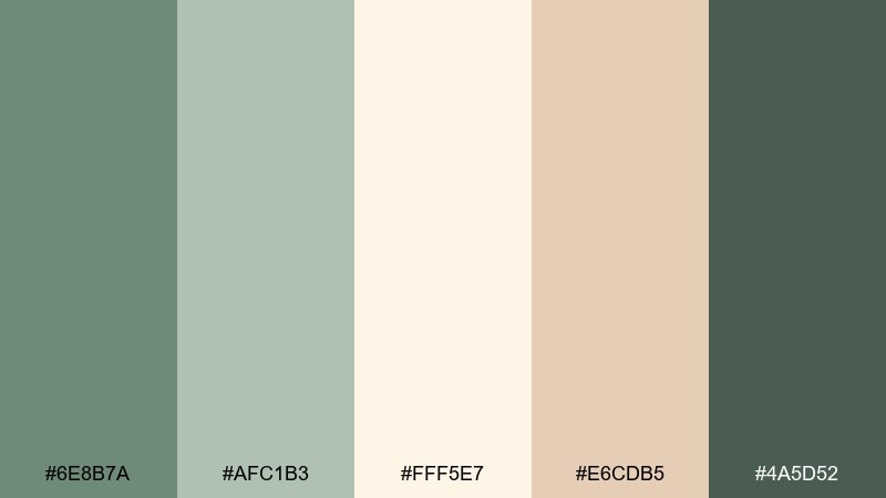
HEX: #6E8B7A #AFC1B3 #FFF5E7 #E6CDB5 #4A5D52
Mood: timeless, romantic, warm
Best for: wedding stationery suite
Classic and romantic, it feels like antique sage ribbons on creamy parchment. For cohesive green cream color combinations across invitations and day-of pieces, keep cream as the consistent base and use the dusty sage for frames, initials, and floral motifs. The warm beige is ideal for detail cards and envelope liners, while the deep green anchors names and dates. Tip: echo the darkest green in wax seals or ribbon to tie the suite together.
Image example of antique sage wedding generated using media.io
What Colors Go Well with Green Cream?
Green and cream pair beautifully with warm neutrals like tan, camel, and oat for a cohesive earthy look. These tones keep the palette soft and help avoid a stark “holiday green” vibe.
For sharper contrast, add near-black greens, espresso brown, or matte charcoal for typography and key UI elements. If you want a brighter twist, small accents of peach, terracotta, or muted gold can add warmth without overpowering the greens.
Cool companions work too—especially dusty blue-gray or soft teal—when your green leans mint or eucalyptus. Keep saturation controlled so the creamy base stays clean.
How to Use a Green Cream Color Palette in Real Designs
Start by choosing a role for each tone: cream for backgrounds and breathing room, mid-green for primary surfaces or sections, and the darkest green for text, icons, and CTA contrast. This keeps hierarchy clear and consistent.
In interiors, use cream for large reflective areas (walls, rugs, curtains) and greens for cabinetry, feature walls, or built-ins. Add warmth with wood and brass so the scheme reads inviting rather than cold.
In branding and web design, keep cream dominant (60–80%) to protect legibility, then use greens in blocks, buttons, and illustrations. Test contrast on key text sizes so lighter greens don’t fade on cream.
Create Green Cream Palette Visuals with AI
If you want to preview a green cream palette in a real scene—like a living room, packaging mockup, or landing page—AI image generation helps you validate the vibe before you design.
Use your palette’s keywords (sage, pistachio, olive, oat, vanilla) plus a clear style cue (minimal UI, realistic studio shot, watercolor print) to get consistent results.
Generate multiple variations, then reuse the strongest prompt as a baseline to keep your visuals cohesive across a campaign.
Green Cream Color Palette FAQs
-
What does a green and cream color palette communicate?
Most green-and-cream palettes communicate calm, freshness, and natural quality. Cream adds warmth and softness, while green signals balance, wellness, and growth. -
Is green and cream good for branding?
Yes—especially for eco-friendly, wellness, skincare, food, or lifestyle brands. Use cream as the base for clarity, and reserve darker greens for logos and headings to keep contrast strong. -
How do I keep light greens from looking washed out on cream?
Make cream the dominant background, but add a deeper green for typography and CTAs. You can also introduce a warm tan accent to separate light green elements from the background. -
What accent colors work best with green cream palettes?
Warm accents like tan, caramel, terracotta, muted gold, and espresso brown pair naturally with cream. For cooler looks, try dusty blue-gray or soft teal—kept low-saturation. -
Which green cream palette is best for UI design?
Muted sets like Eucalyptus Oat Milk or Seafoam Biscuit Web work well because cream supports whitespace and readability. Use the darkest green as your primary button or text color for accessible contrast. -
Can I use green and cream for a wedding theme?
Absolutely—sage and cream is a classic choice for stationery and florals. Keep cream consistent across pieces, then repeat the darkest green in small details (names, dates, wax seals) for cohesion. -
How can I generate green cream palette mockups quickly?
Use Media.io’s text-to-image tool with a prompt that names your greens (sage/olive/mint) and your cream tone (ivory/oat/vanilla), plus the target context (packaging, interior, landing page) and lighting style.
Next: Rustic Color Palette


