

Fun color palettes are built to feel upbeat, playful, and instantly attention-grabbing—perfect when your design needs energy at first glance.
Below are 20 copy-ready fun color combinations with HEX codes, plus visual examples and prompts you can reuse to generate fresh creative directions fast.
In this article
- Why Fun Palettes Work So Well
-
- confetti pop
- bubblegum carnival
- citrus splash
- retro arcade
- cotton candy sky
- tropical punch
- sunny side up
- rainbow sherbet
- picnic parasol
- neon boardwalk
- storybook garden
- jellybean jar
- punchy pastels
- coral lagoon
- firecracker night
- kawaii stationery
- skatepark graffiti
- birthday sprinkles
- pop art studio
- summer festival lights
- What Colors Go Well with Fun?
- How to Use a Fun Color Palette in Real Designs
- Create Fun Palette Visuals with AI
Why Fun Palettes Work So Well
Fun palettes lean on high contrast, saturated accents, and upbeat temperature shifts (warm-to-cool) that make designs feel lively and approachable.
They’re especially effective for fast-scrolling environments—social ads, banners, UI highlights—because bold hues create instant hierarchy and stop-the-scroll moments.
When used with enough whitespace and a clear type system, playful color schemes stay readable while still delivering personality and momentum.
20+ Fun Color Palette Ideas (with HEX Codes)
1) Confetti Pop
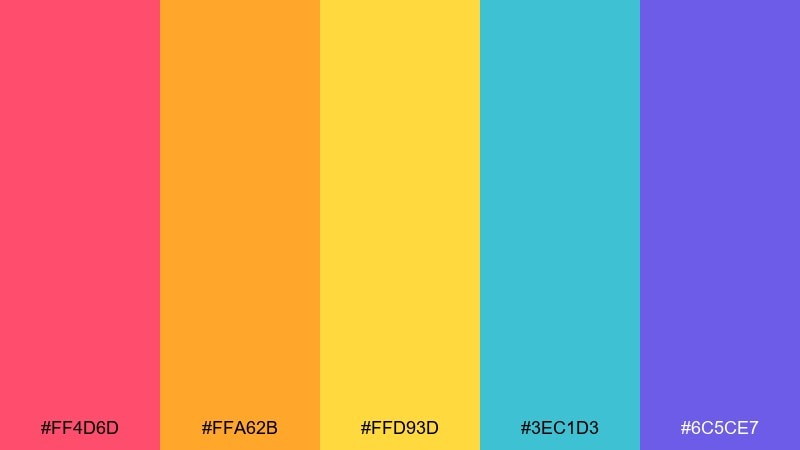
HEX: #FF4D6D #FFA62B #FFD93D #3EC1D3 #6C5CE7
Mood: celebratory and bold
Best for: event poster design
Celebratory bursts and poppy contrast feel like confetti mid-air at a daytime party. Use it on posters, promos, and social tiles where you need instant attention. Pair with plenty of white space and a clean sans-serif to keep the energy readable. Tip: set one color (like the teal) as a consistent background and rotate the warm accents for variety.
Image example of confetti pop generated using media.io

Media.io is an online AI studio for creating and editing video, image, and audio in your browser.

2) Bubblegum Carnival
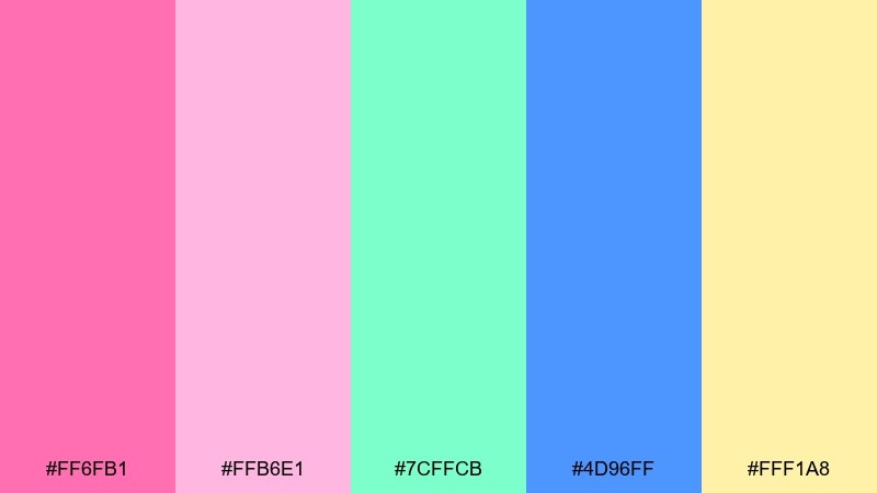
HEX: #FF6FB1 #FFB6E1 #7CFFCB #4D96FF #FFF1A8
Mood: sweet and playful
Best for: kids birthday invitation
Sweet, bouncy tones evoke cotton candy, balloons, and carousel lights. It shines on invitations, stickers, and kid-focused print where softness still needs contrast. Pair it with rounded type and simple icon shapes so the pastels stay crisp. Tip: reserve the blue for headings to anchor the lighter pinks.
Image example of bubblegum carnival generated using media.io

3) Citrus Splash

HEX: #FF7A00 #FFB000 #FFE66D #2EC4B6 #1B4965
Mood: zesty and fresh
Best for: summer beverage packaging
Zesty citrus and cool ocean tones feel like a cold drink on a hot afternoon. These colors work especially well on beverage labels, cans, and end-cap ads that need a clean punch. Pair with dark navy text for legibility and use teal as a brand anchor. Tip: print tests help, since the yellow can shift fast between screens and paper.
Image example of citrus splash generated using media.io
4) Retro Arcade

HEX: #FF2E63 #08D9D6 #F8F32B #252A34 #EAEAEA
Mood: nostalgic and high-contrast
Best for: gaming UI mockup
Neon nostalgia and pixel-era punch evoke arcade cabinets and late-night high scores. For a fun color palette in UI, keep the dark charcoal as the main canvas and let pink or cyan carry the interactive states. Pair with simple iconography and tight spacing so the brights do not overwhelm. Tip: use the yellow sparingly for warnings or achievement highlights.
Image example of retro arcade generated using media.io

5) Cotton Candy Sky

HEX: #FFC6FF #BDB2FF #A0C4FF #CAFFBF #FDFFB6
Mood: dreamy and airy
Best for: wellness app onboarding screens
Dreamy pastels feel like sunrise clouds and soft breathing space. Use these tones for onboarding, gentle reminders, and calm brand moments where clarity matters. Pair with lots of whitespace and thin-line illustrations to keep it light. Tip: increase contrast for body text by leaning on the lavender rather than the pale yellow.
Image example of cotton candy sky generated using media.io

6) Tropical Punch

HEX: #FF595E #FFCA3A #8AC926 #1982C4 #6A4C93
Mood: adventurous and sunny
Best for: travel blog hero banner
Adventurous sunshine and island fruit vibes make the palette feel instantly vacation-ready. It works great in hero banners, featured images, and section headers where you want bold color blocking. Pair the warm red and yellow with blue for structure, and keep purple as a small accent. Tip: use large, simple shapes to avoid a busy look.
Image example of tropical punch generated using media.io
7) Sunny Side Up

HEX: #FFD60A #FF9F1C #2EC4B6 #E71D36 #011627
Mood: cheerful and punchy
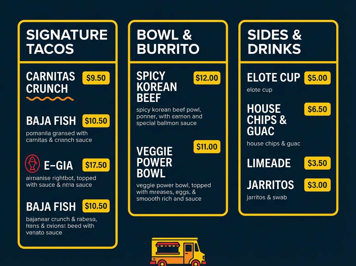
Best for: food truck menu design
Cheerful punch and tasty contrast feel like a brunch special on a chalkboard sign. Use it for menus, specials boards, and promo cards where quick scanning matters. Pair the bright yellow with the deep ink for type and pricing, and keep red for callouts. Tip: limit the teal to icons or dividers to keep the menu focused.
Image example of sunny side up generated using media.io
8) Rainbow Sherbet
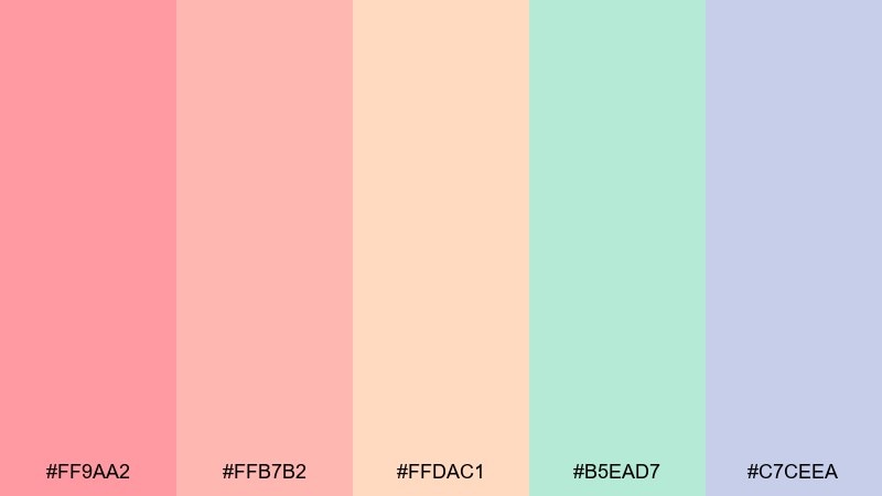
HEX: #FF9AA2 #FFB7B2 #FFDAC1 #B5EAD7 #C7CEEA
Mood: soft and nostalgic
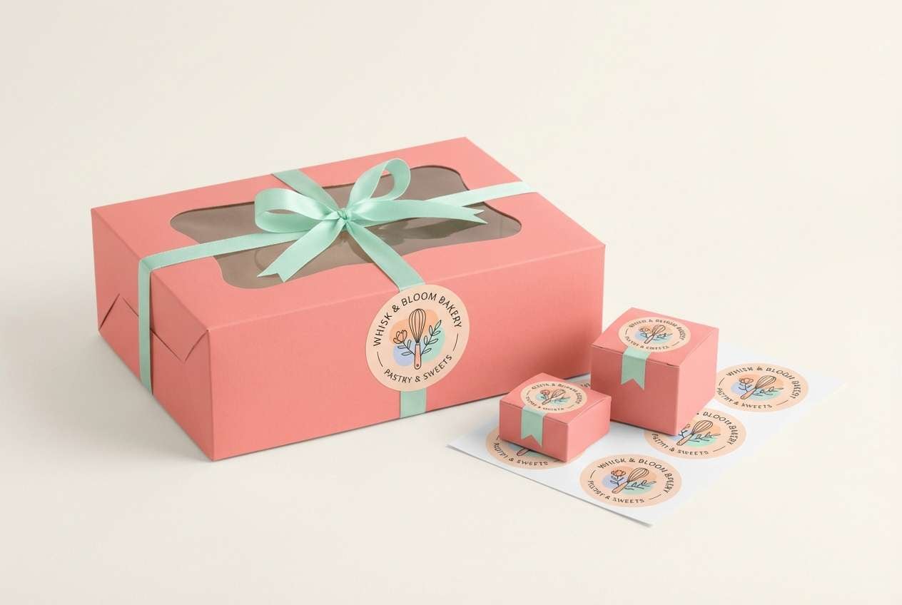
Best for: bakery brand identity
Soft scoops of color evoke sherbet swirls and vintage dessert counters. These tones are ideal for bakery branding, packaging stickers, and gentle social templates. Pair with cream backgrounds and a warm serif to lean into the nostalgic feel. Tip: choose one main pastel for the logo and keep the rest for seasonal flavors.
Image example of rainbow sherbet generated using media.io
9) Picnic Parasol
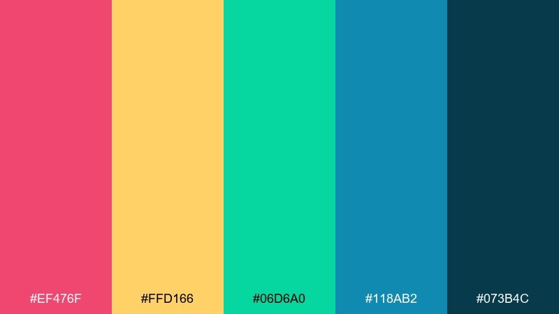
HEX: #EF476F #FFD166 #06D6A0 #118AB2 #073B4C
Mood: lively and balanced
Best for: outdoor market flyer
Lively, balanced tones bring to mind striped umbrellas, fresh fruit, and weekend markets. Use them for flyers, wayfinding, and vendor maps where you need distinct color coding. Pair the deep teal with the bright yellow for strong hierarchy, and keep the pink for featured items. Tip: apply color by section rather than sprinkling it everywhere.
Image example of picnic parasol generated using media.io

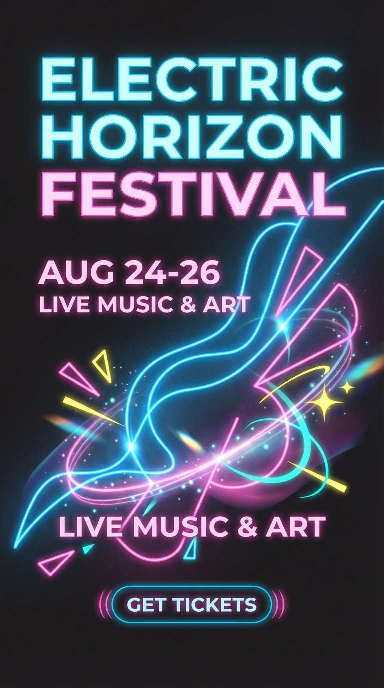
10) Neon Boardwalk

HEX: #00F5D4 #F15BB5 #FEE440 #9B5DE5 #00BBF9
Mood: electric and youthful
Best for: music festival social ads
Electric brights evoke boardwalk lights, roller skates, and summer music nights. They are perfect for social ads, story templates, and motion graphics where color needs to move fast. Pair with black or deep purple text panels for contrast and readability. Tip: pick two dominant hues per layout and let the rest act as punchy stickers.
Image example of neon boardwalk generated using media.io
11) Storybook Garden
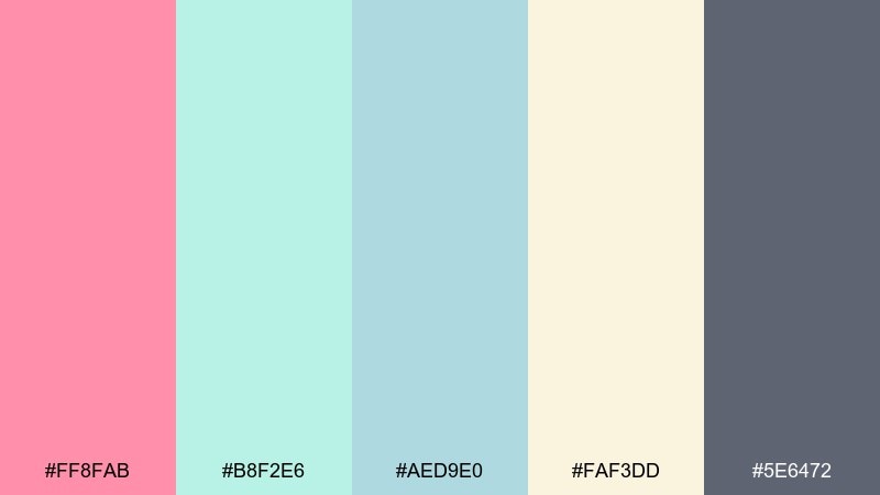
HEX: #FF8FAB #B8F2E6 #AED9E0 #FAF3DD #5E6472
Mood: whimsical and cozy
Best for: spring botanical illustration
Whimsical, cozy tones feel like pressed flowers tucked inside a well-loved storybook. Use them in botanical illustrations, greeting cards, and seasonal blog graphics. Pair the cream with the soft teal for open space, and use the gray for outlines and small labels. Tip: keep gradients subtle so the watercolor effect stays believable.
Image example of storybook garden generated using media.io

12) Jellybean Jar
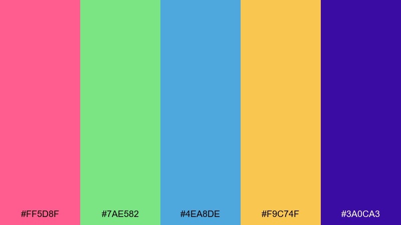
HEX: #FF5D8F #7AE582 #4EA8DE #F9C74F #3A0CA3
Mood: bright and playful
Best for: ecommerce product category tiles
Bright, candy-like contrast suggests a jar of jellybeans sorted by color. It works well for ecommerce category tiles and promo blocks that need quick differentiation. For a fun color scheme, keep purple or blue as the base and let pink and yellow signal discounts or new arrivals. Tip: add consistent icon styles so the saturated colors feel organized.
Image example of jellybean jar generated using media.io

13) Punchy Pastels

HEX: #F72585 #B5179E #7209B7 #3A0CA3 #4CC9F0
Mood: confident and trendy
Best for: beauty product ad banner
Confident, trendy tones feel like glossy editorial makeup with a neon twist. Use them in beauty ad banners, launch pages, and bold headlines where you want modern energy. Pair the darker purples with plenty of white or light gray to avoid visual fatigue. Tip: let cyan be the accent for buttons and prices so it pops cleanly.
Image example of punchy pastels generated using media.io
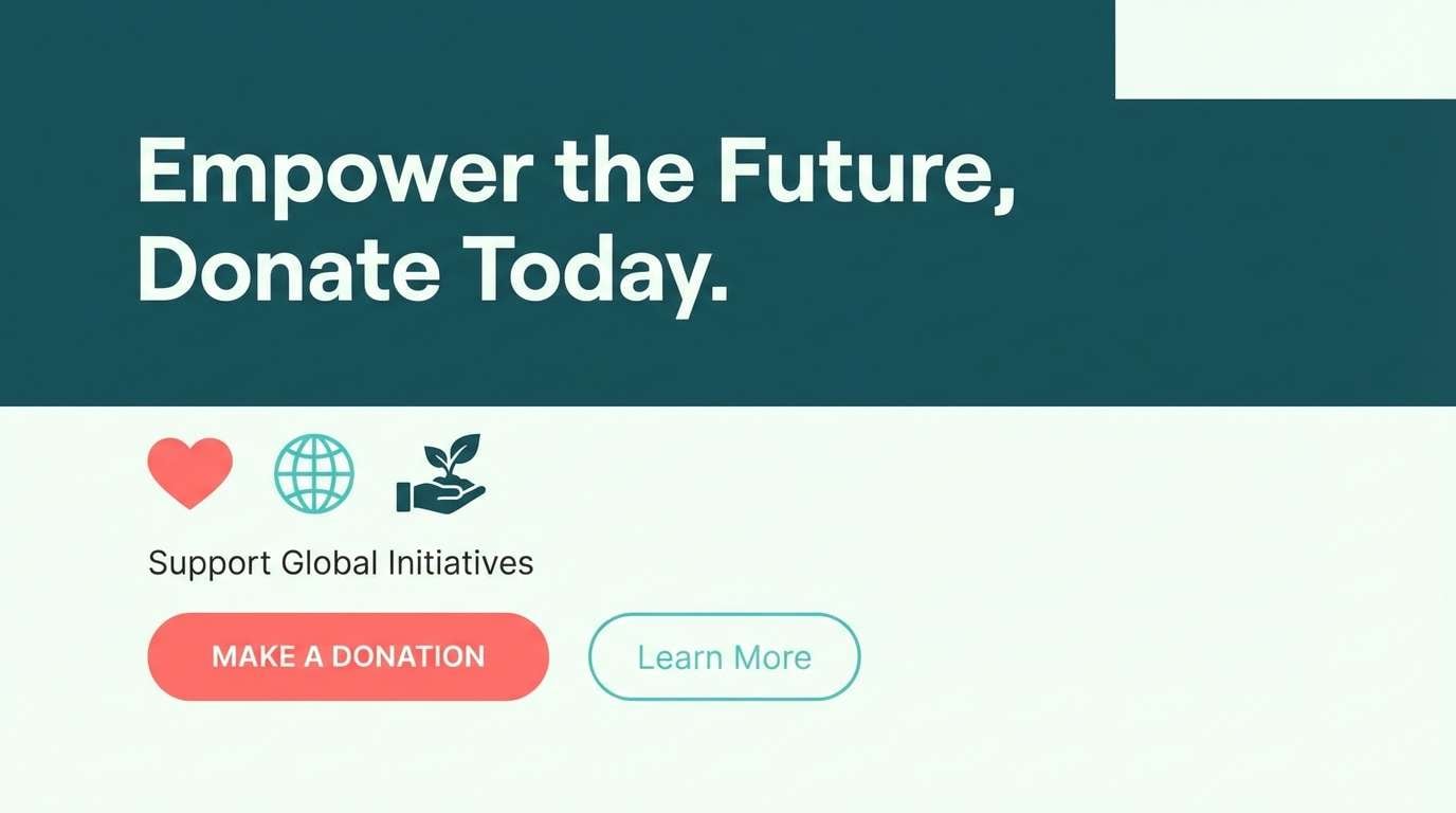
14) Coral Lagoon
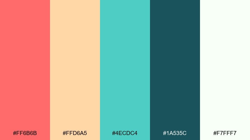
HEX: #FF6B6B #FFD6A5 #4ECDC4 #1A535C #F7FFF7
Mood: refreshing and friendly
Best for: nonprofit campaign landing page
Refreshing seaside tones evoke coral shallows and clear water. They suit nonprofit landing pages and donation flows that need warmth without feeling loud. Pair coral headlines with the deep teal for structure, and use the off-white as breathing room. Tip: keep buttons in teal for trust, and reserve coral for highlights and impact numbers.
Image example of coral lagoon generated using media.io
15) Firecracker Night

HEX: #FF3D00 #FFEA00 #00E5FF #651FFF #0B1320
Mood: dramatic and energetic
Best for: night event ticket design
Dramatic energy feels like fireworks against a midnight sky. Use it for ticket designs, night event promos, and bold digital banners where contrast is the hero. Pair the dark navy with cyan for legibility, and keep red as the emotional punch. Tip: add glow effects sparingly so the design stays sharp in print.
Image example of firecracker night generated using media.io

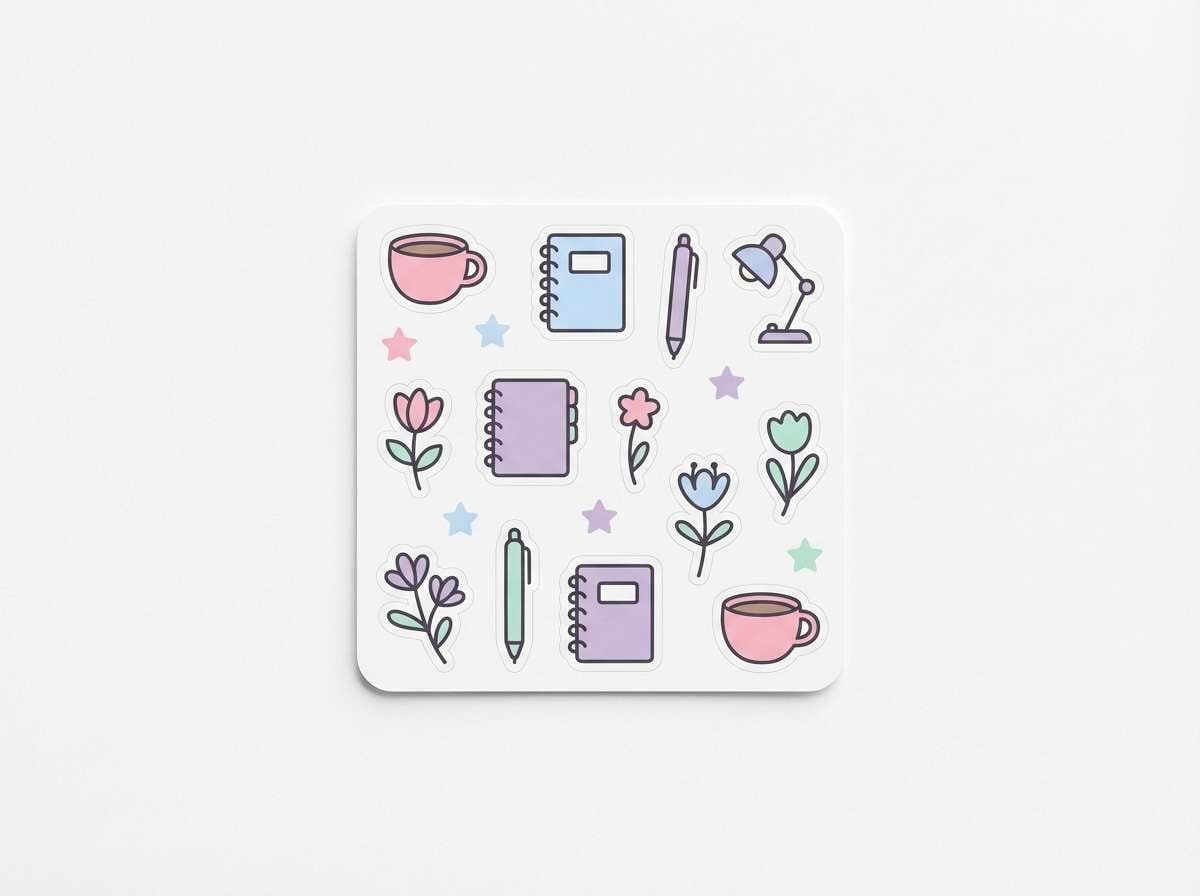
16) Kawaii Stationery
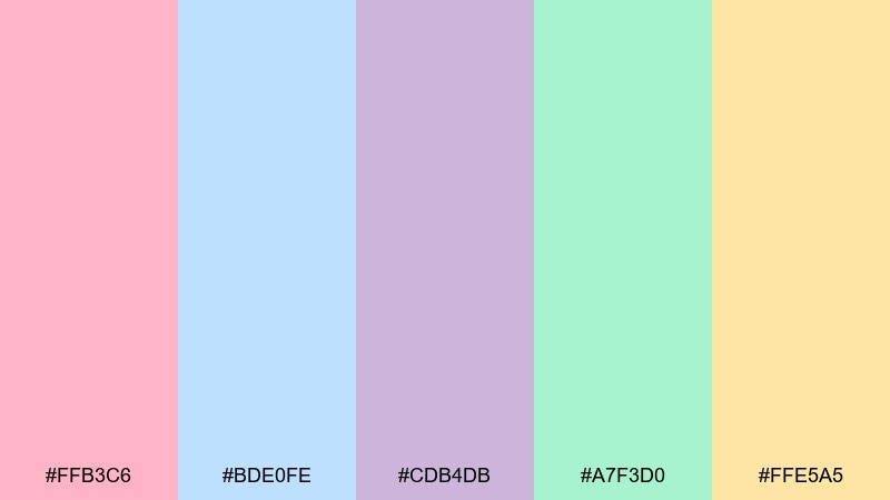
HEX: #FFB3C6 #BDE0FE #CDB4DB #A7F3D0 #FFE5A5
Mood: cute and gentle
Best for: planner sticker sheet
Cute, gentle pastels evoke sticky notes, doodles, and tidy desks. They work beautifully for planner sticker sheets, stationery sets, and printable templates. Pair with thin outlines and simple faces or icons to lean into the kawaii vibe. Tip: keep the yellow as a highlight color so the sheet does not look washed out.
Image example of kawaii stationery generated using media.io
17) Skatepark Graffiti

HEX: #FF0054 #00F0B5 #00A6FB #FFE74C #1B1B1E
Mood: street and high-impact
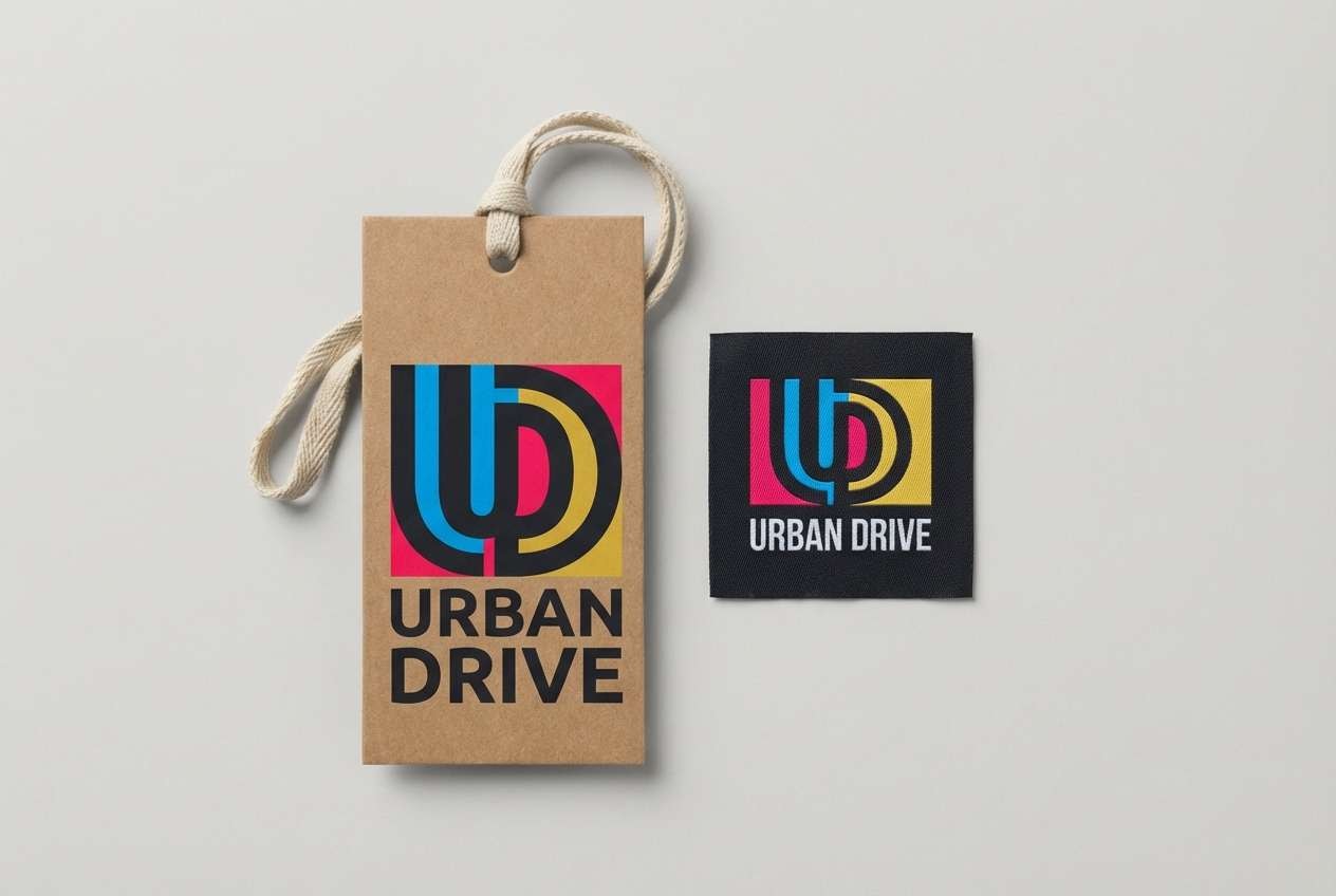
Best for: streetwear logo and hang tag
Street energy and sprayed color hits feel like fresh tags on concrete. Use it for streetwear logos, hang tags, and punchy merch graphics that need attitude. Pair the near-black with the cyan for the base, then bring in pink and yellow for accents. Tip: keep the logo one-color for flexibility and use the full mix on secondary graphics.
Image example of skatepark graffiti generated using media.io
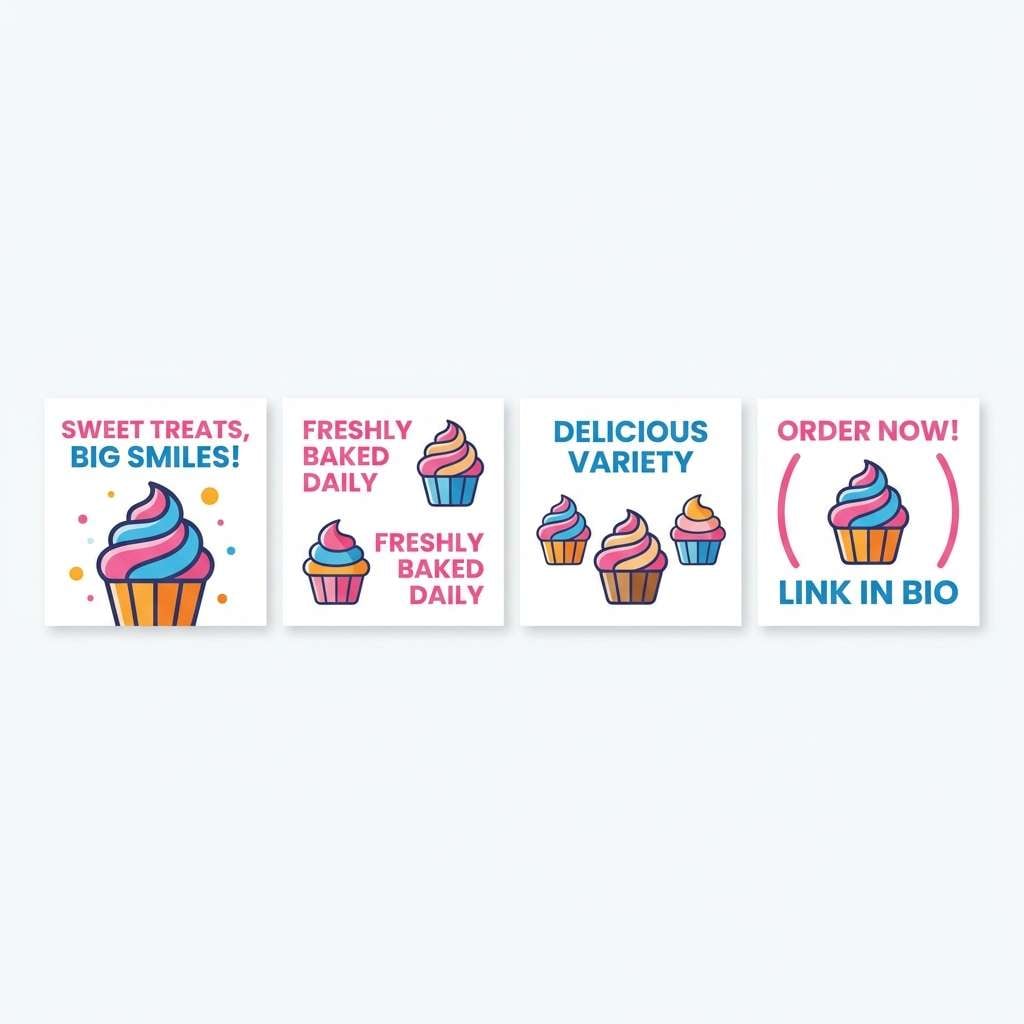
18) Birthday Sprinkles

HEX: #FF70A6 #FF9770 #FFD670 #E9FF70 #70D6FF
Mood: happy and colorful
Best for: bakery promo Instagram carousel
Happy, colorful sprinkles bring instant party vibes and sweet anticipation. For a fun color palette on Instagram carousels, use one warm slide (pink or orange) followed by a cool slide (blue) to keep the rhythm. Pair with bold, short headlines and simple product cutouts on white. Tip: keep the yellow as a thin border or sticker so it does not overpower photos.
Image example of birthday sprinkles generated using media.io
19) Pop Art Studio

HEX: #FF1B1C #FFCA00 #2EC4B6 #1F2A44 #F5F5F5
Mood: graphic and punchy
Best for: editorial magazine layout
Graphic punch and comic-book contrast evoke bold headlines and screen-printed textures. Use it in editorial spreads, feature openers, and section dividers where hierarchy matters. Pair the deep navy for body copy and let red and yellow drive the callouts. Tip: add halftone textures lightly so the page stays readable.
Image example of pop art studio generated using media.io

20) Summer Festival Lights
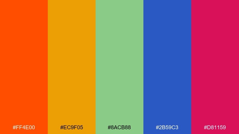
HEX: #FF4E00 #EC9F05 #8ACB88 #2B59C3 #D81159
Mood: festive and vibrant
Best for: brand refresh moodboard
Festive, vibrant color sparks feel like string lights and food stalls at dusk. These tones are great for a brand refresh moodboard that needs both warmth and structure. Pair orange with cobalt for confident contrast, and keep magenta as an accent for key messages. Tip: standardize tints for backgrounds so the palette stays cohesive across web and print.
Image example of summer festival lights generated using media.io

What Colors Go Well with Fun?
Fun palettes pair well with bright warms (coral, orange, sunshine yellow) plus at least one cool counterbalance (teal, cyan, cobalt) to keep the look fresh and modern.
To avoid chaos, add a grounding neutral like deep navy, charcoal, or off-white. This gives your typography a consistent home and makes saturated accents feel intentional.
If you want “playful but polished,” keep most backgrounds light and use the boldest hues for buttons, stickers, highlights, and small graphic shapes.
How to Use a Fun Color Palette in Real Designs
Start by choosing one anchor color for repeated elements (background panels, nav, or product label base), then assign two accents for CTAs and emphasis. This keeps the fun without losing hierarchy.
For UI, test contrast early: bright colors can look exciting but fail readability. Use darker tones for text, and reserve neon-like colors for states (hover, active, badges).
For print, run quick proofs—yellows and hot pinks can shift dramatically. Adjust with slightly deeper tints if you need better consistency across paper and screens.
Create Fun Palette Visuals with AI
If you already have HEX codes, you can turn them into on-brand visuals in minutes by generating posters, UI mockups, packaging, and social creatives from a single prompt.
Reuse the prompts above and swap subjects (ticket, menu, landing page) to explore multiple layouts while keeping the same playful color scheme.
With Media.io, you can iterate quickly—try different ratios, typography styles, and background neutrals until the palette feels perfectly balanced.
Fun Color Palette FAQs
-
What is a fun color palette?
A fun color palette is a set of playful, energetic colors—often bright or pastel—chosen to create a cheerful mood and strong visual contrast in designs like posters, apps, and branding. -
How do I keep fun color combinations from looking messy?
Use one anchor color (often a dark neutral or a consistent background hue), limit each layout to 2 dominant colors, and reserve the remaining colors for small accents like icons, badges, and highlights. -
What neutral colors work best with bright palettes?
Deep navy, charcoal, and off-white are the easiest neutrals to pair with bright palettes because they improve readability and help saturated hues feel more intentional. -
Are pastel palettes still considered “fun”?
Yes. Pastels can be very fun when you keep enough contrast (for example, a stronger blue or lavender for headings) and use clean typography with plenty of whitespace. -
Which fun palette is best for UI design?
High-contrast sets like Retro Arcade or Coral Lagoon work well for UI because they include a darker base for text and components, plus bright accents for interactive states. -
How can I generate matching visuals for my palette?
Use a text-to-image tool and include your HEX codes directly in the prompt, plus the design format you need (poster, landing page, packaging). Generate multiple variations and keep the best composition. -
What’s the fastest way to test a fun color scheme before launching?
Mock up 2–3 real use cases (a hero section, a social post, and a card/button set), then check contrast, legibility, and print shifts (especially for yellow and hot pink).


