

Fuchsia pink is a high-impact hue that instantly adds energy, personality, and modern flair to a design. Whether you’re building a brand system, a UI theme, or print collateral, the right fuchsia pink palette keeps that vibrancy looking intentional—not overwhelming.
Below are curated fuchsia pink color palettes with HEX codes, plus practical pairing tips for neutrals, metallics, and contrasting accents. Use them as ready-to-go color combinations for posters, product packaging, weddings, dashboards, and more.
In this article
- Why Fuchsia Pink Palettes Work So Well
-
- neon orchid night
- rose quartz latte
- tropical hibiscus
- berry velvet editorial
- sakura pop minimal
- sunset magenta glow
- raspberry mint splash
- fuchsia copper luxe
- ballet slipper modern
- electric carnival
- plum smoke ui
- peony sage wedding
- dragonfruit smoothie
- midnight bougainvillea
- candy store branding
- wildflower watercolor
- art deco fuchsia
- museum orchid neutral
- cozy knit home
- studio beauty ad
- cosmic fuchsia gradient
- What Colors Go Well with Fuchsia Pink?
- How to Use a Fuchsia Pink Color Palette in Real Designs
- Create Fuchsia Pink Palette Visuals with AI
Why Fuchsia Pink Palettes Work So Well
Fuchsia pink sits in a sweet spot between hot pink and magenta, which makes it feel both playful and premium depending on what you pair it with. It grabs attention quickly, so it’s ideal for highlights, calls to action, and headline moments.
Because fuchsia pink is naturally intense, it benefits from strong structure: deep anchors (charcoal, navy, aubergine) for contrast, and pale tints (white, cream, lavender) for breathing room. This balance keeps layouts readable and prevents visual fatigue.
It also bridges warm and cool palettes, which is why it works with oranges and golds (warm, energetic) as easily as with violets and cyans (futuristic, techy). That versatility makes fuchsia pink a reliable accent across branding, UI, print, and décor.
20+ Fuchsia Pink Color Palette Ideas (with HEX Codes)
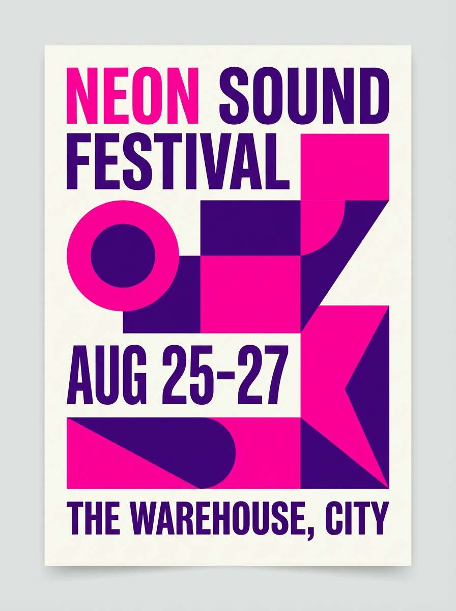
1) Neon Orchid Night
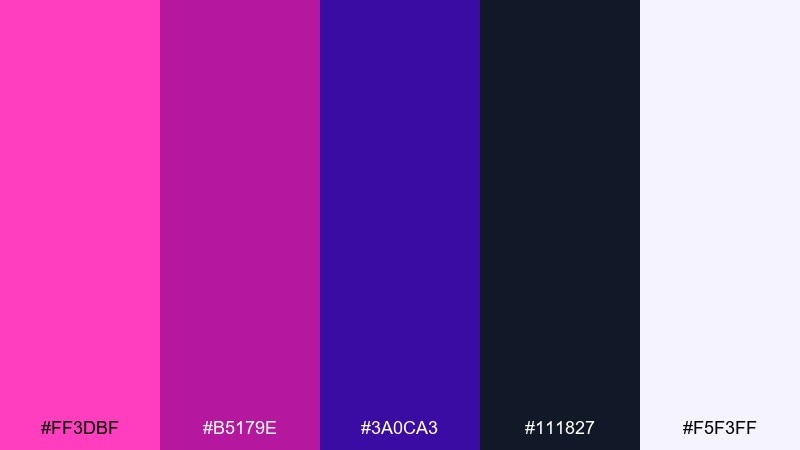
HEX: #ff3dbf #b5179e #3a0ca3 #111827 #f5f3ff
Mood: bold, nocturnal, electric
Best for: music festival poster design
Bold club lighting and neon petals set a dramatic, late-night vibe. The hot pink and deep violet feel loud without turning messy thanks to the near-black anchor. Use it for posters, event promos, or album cover graphics where type needs to pop. Pair with clean white space and keep gradients subtle so the headline stays crisp.
Image example of neon orchid night generated using media.io
Media.io is an online AI studio for creating and editing video, image, and audio in your browser.

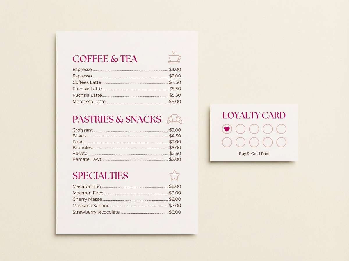
2) Rose Quartz Latte
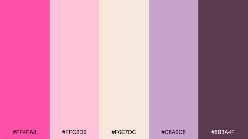
HEX: #ff4fa8 #ffc2d9 #f6e7dc #c8a2c8 #5b3a4f
Mood: soft, cozy, romantic
Best for: cafe menu and loyalty card
Soft sweetness like strawberry foam and warm café light makes this mix feel inviting. Blush and cream keep the mood gentle while the muted plum adds readability for text. It works well for menus, small business print, or packaging that should feel handcrafted. Use the darker plum for prices and body copy to avoid low-contrast text.
Image example of rose quartz latte generated using media.io
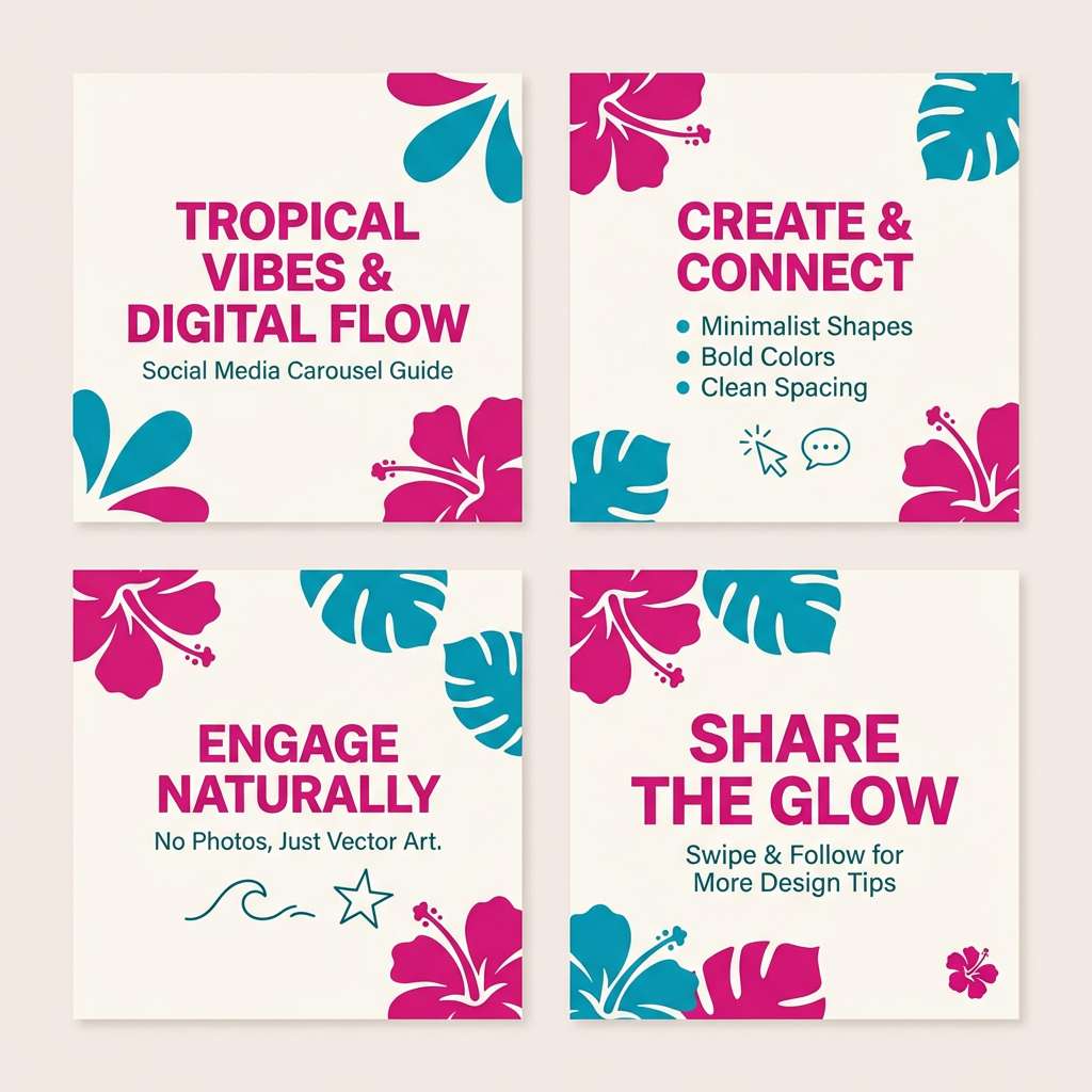
3) Tropical Hibiscus
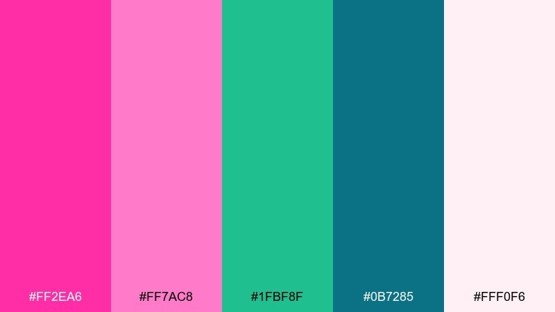
HEX: #ff2ea6 #ff7ac8 #1fbf8f #0b7285 #fff0f6
Mood: playful, sunny, resort-ready
Best for: summer social media carousel
Playful hibiscus petals and sea-breeze greens create a bright vacation mood. These fuchsia pink color combinations shine on social posts, promos, and travel graphics where you want instant energy. Balance the hot tones with the teal shades for buttons and labels, then keep backgrounds airy with the soft off-white. A simple rule is to let pink lead in headings and reserve teal for calls to action.
Image example of tropical hibiscus generated using media.io
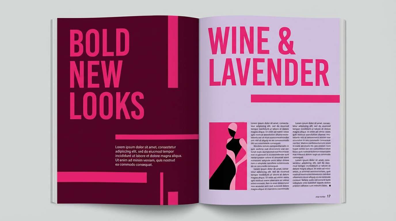
4) Berry Velvet Editorial
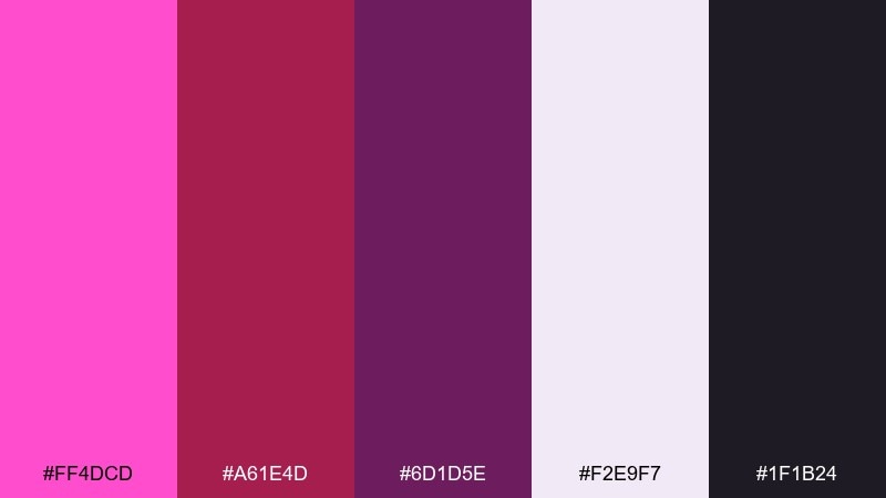
HEX: #ff4dcd #a61e4d #6d1d5e #f2e9f7 #1f1b24
Mood: luxurious, moody, editorial
Best for: magazine spread layout
Luxurious berry velvet and ink-dark shadows give this palette a high-fashion edge. The pale lavender provides breathing room while the deep wine tones carry drama in headlines. It suits editorial layouts, lookbooks, and premium announcements that need elegance with bite. Keep body text on the light background and use the darkest shade for thin rules and captions.
Image example of berry velvet editorial generated using media.io
5) Sakura Pop Minimal
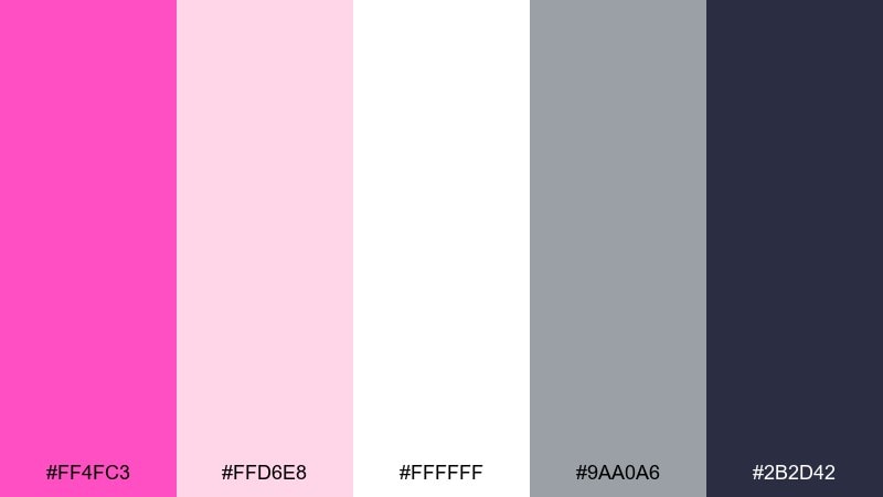
HEX: #ff4fc3 #ffd6e8 #ffffff #9aa0a6 #2b2d42
Mood: clean, cute, modern
Best for: minimal app landing page
Clean sakura-petal pink against bright white feels modern and friendly. The charcoal and cool gray keep layouts grounded so the accent color does not overwhelm. Use it for app landings, SaaS feature pages, or lightweight product pages. Tip: limit the hot pink to one primary button style and a few key highlights for a premium look.
Image example of sakura pop minimal generated using media.io
6) Sunset Magenta Glow
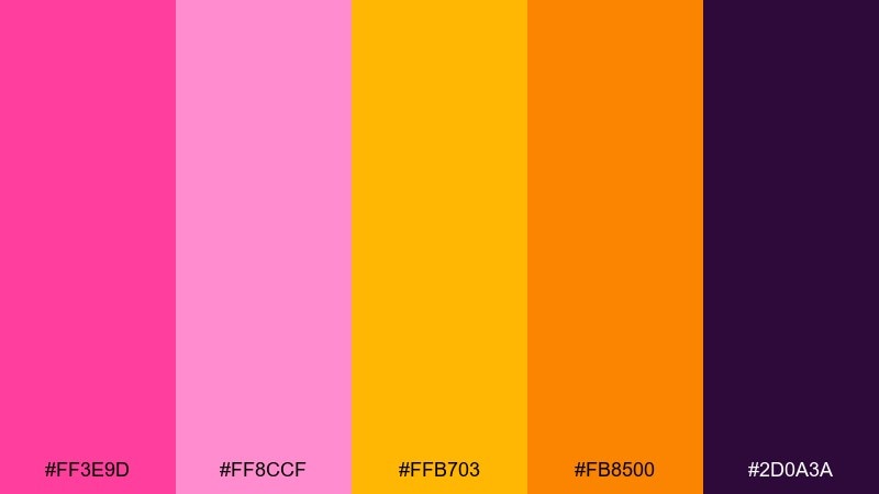
HEX: #ff3e9d #ff8ccf #ffb703 #fb8500 #2d0a3a
Mood: warm, radiant, optimistic
Best for: fitness class promo flyer
Warm sunset heat and magenta glow make this set feel energetic and motivating. The golden tones add friendliness, while the deep plum gives you contrast for bold typography. It is great for flyers, promo banners, or campaigns that need movement and positivity. Use the yellow sparingly as an accent to avoid overpowering the pink focus.
Image example of sunset magenta glow generated using media.io

7) Raspberry Mint Splash
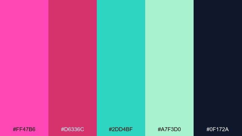
HEX: #ff47b6 #d6336c #2dd4bf #a7f3d0 #0f172a
Mood: fresh, fun, youthful
Best for: ice cream packaging concept
Fresh raspberry and minty swirls give a playful, snackable vibe. The bright teal brings a clean contrast that keeps the pink from feeling too sweet. It fits dessert packaging, seasonal launches, or upbeat brand visuals. Tip: put the darkest navy only in small type so the front panel stays light and delicious.
Image example of raspberry mint splash generated using media.io
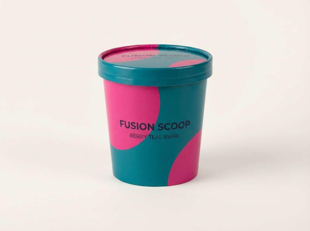
8) Fuchsia Copper Luxe
HEX: #ff2fb2 #c81d7a #b87333 #f3e5d8 #2a0f1f
Mood: glam, refined, upscale
Best for: beauty brand packaging and label
Glam copper shimmer and rich berry tones evoke vanity lights and satin fabric. This fuchsia pink color palette feels premium on cosmetics, fragrance, and boutique packaging. Pair the copper as foil-like accents with a creamy background to keep it elegant, then lean on the deep aubergine for ingredient text. A small copper border around the label instantly signals luxury.
Image example of fuchsia copper luxe generated using media.io
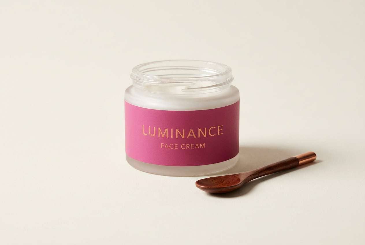
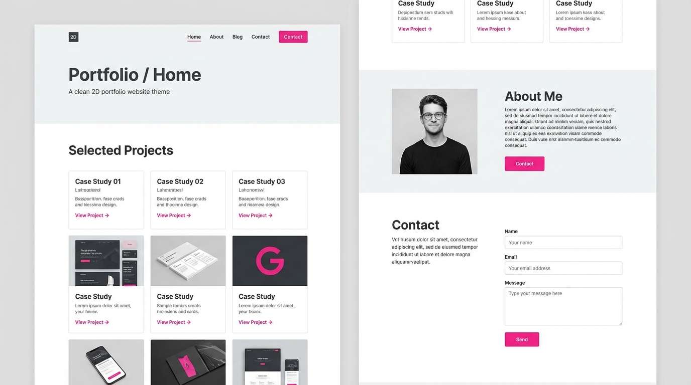
9) Ballet Slipper Modern
HEX: #ff5bbd #ffd1e8 #e9ecef #8d99ae #2b2d42
Mood: polished, airy, contemporary
Best for: portfolio website theme
Airy ballet tones with a crisp gray backbone feel calm and professional. The bright pink reads as a confident accent rather than a loud statement. Use it for portfolios, personal brands, or service sites where clarity matters. Tip: keep the pink for hover states and key badges to maintain an editorial feel.
Image example of ballet slipper modern generated using media.io
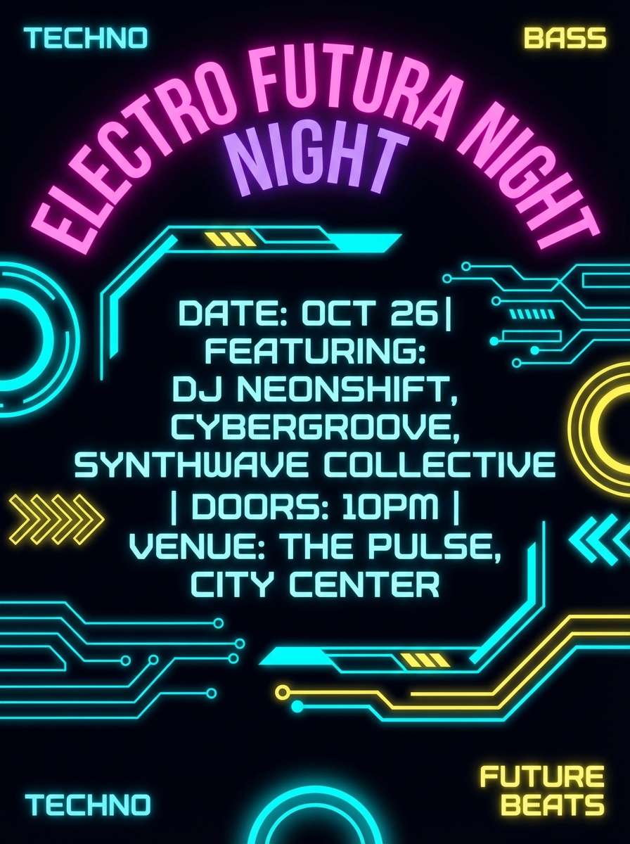
10) Electric Carnival
HEX: #ff1fb8 #8a00ff #00d4ff #f8f32b #0b1020
Mood: loud, futuristic, kinetic
Best for: nightclub event poster
Loud carnival lights and synthwave energy make this set feel fast and futuristic. The cyan and yellow act like strobe accents against the deep midnight base. It is ideal for nightclub posters, DJ announcements, and bold digital ads. Use the darkest shade as the main background so the neon colors stay controlled and readable.
Image example of electric carnival generated using media.io
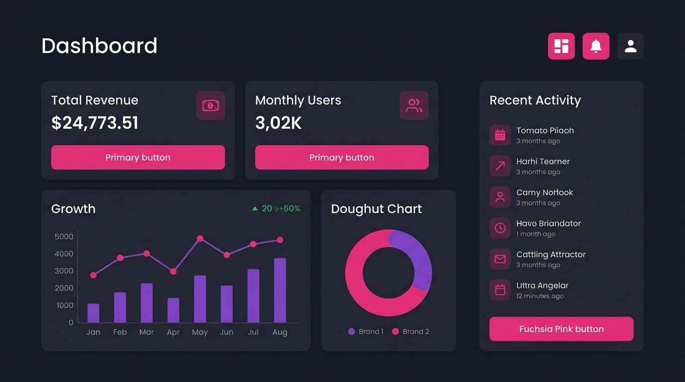
11) Plum Smoke UI
HEX: #ff4fcf #c026d3 #4c1d95 #111827 #e5e7eb
Mood: sleek, techy, confident
Best for: dark mode dashboard UI
Smoky plums with a punch of neon pink create a sleek, modern interface mood. The light gray keeps data tables legible while the dark base feels premium. It works beautifully for dashboards, analytics tools, and creator platforms. Tip: reserve the brightest pink for primary actions and use the purple tones for charts and status chips.
Image example of plum smoke ui generated using media.io
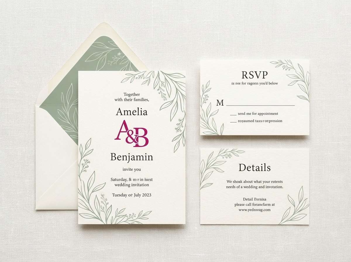
12) Peony Sage Wedding
HEX: #ff4abf #ffb3da #a3b18a #f6f1ea #5a3d5c
Mood: romantic, garden, timeless
Best for: wedding invitation suite
Garden peonies and soft sage greenery bring a romantic, timeless feel. The creamy paper tone makes the pink look refined, not flashy, and the mauve-plum supports elegant typography. Use it for invitation suites, save-the-dates, and ceremony signage. Tip: print the sage on envelopes and keep the brightest pink for monograms and small floral details.
Image example of peony sage wedding generated using media.io
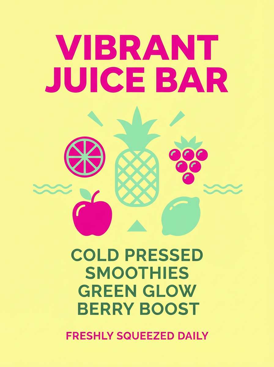
13) Dragonfruit Smoothie
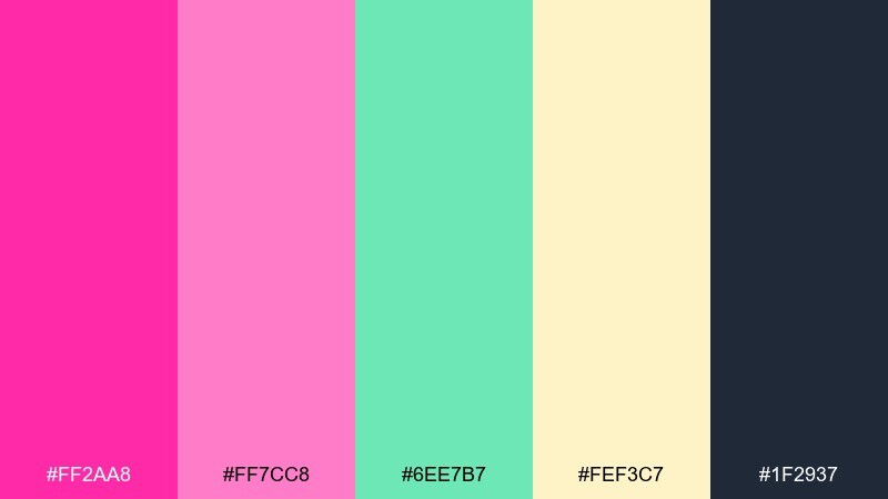
HEX: #ff2aa8 #ff7cc8 #6ee7b7 #fef3c7 #1f2937
Mood: bright, juicy, cheerful
Best for: juice bar product poster
Juicy dragonfruit and creamy fruit foam make the colors feel upbeat and refreshing. These fuchsia pink color combinations pair especially well with soft citrus and mint for food and beverage visuals. Use the pale yellow as a friendly background and keep the charcoal for nutrition info and disclaimers. Tip: add simple fruit icons in the mint tone to tie the layout together.
Image example of dragonfruit smoothie generated using media.io
14) Midnight Bougainvillea
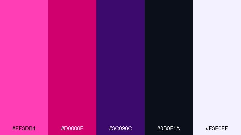
HEX: #ff3db4 #d0006f #3c096c #0b0f1a #f3f0ff
Mood: dramatic, romantic, cinematic
Best for: theater playbill cover
Cinematic midnight tones with bougainvillea pink feel dramatic and romantic. The deep violet-black base makes the bright hues look like stage lights. It is a strong fit for playbills, book covers, and moody campaign key art. Tip: keep most text in the pale lavender and use the brightest pink only for the title.
Image example of midnight bougainvillea generated using media.io
15) Candy Store Branding
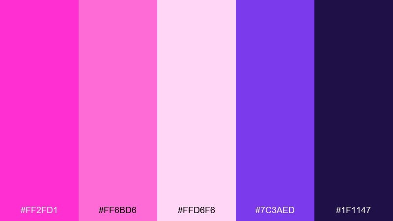
HEX: #ff2fd1 #ff6bd6 #ffd6f6 #7c3aed #1f1147
Mood: sweet, bold, youthful
Best for: startup brand kit and logo
Sweet candy gloss with a punchy purple base makes the palette feel playful and memorable. The light pinks help you build soft backgrounds while the deep violet carries strong brand contrast. Use it for a startup brand kit, playful logo explorations, or creator merch. Tip: set your logo in violet and use the brightest pink as a highlight stroke for instant recognition.
Image example of candy store branding generated using media.io
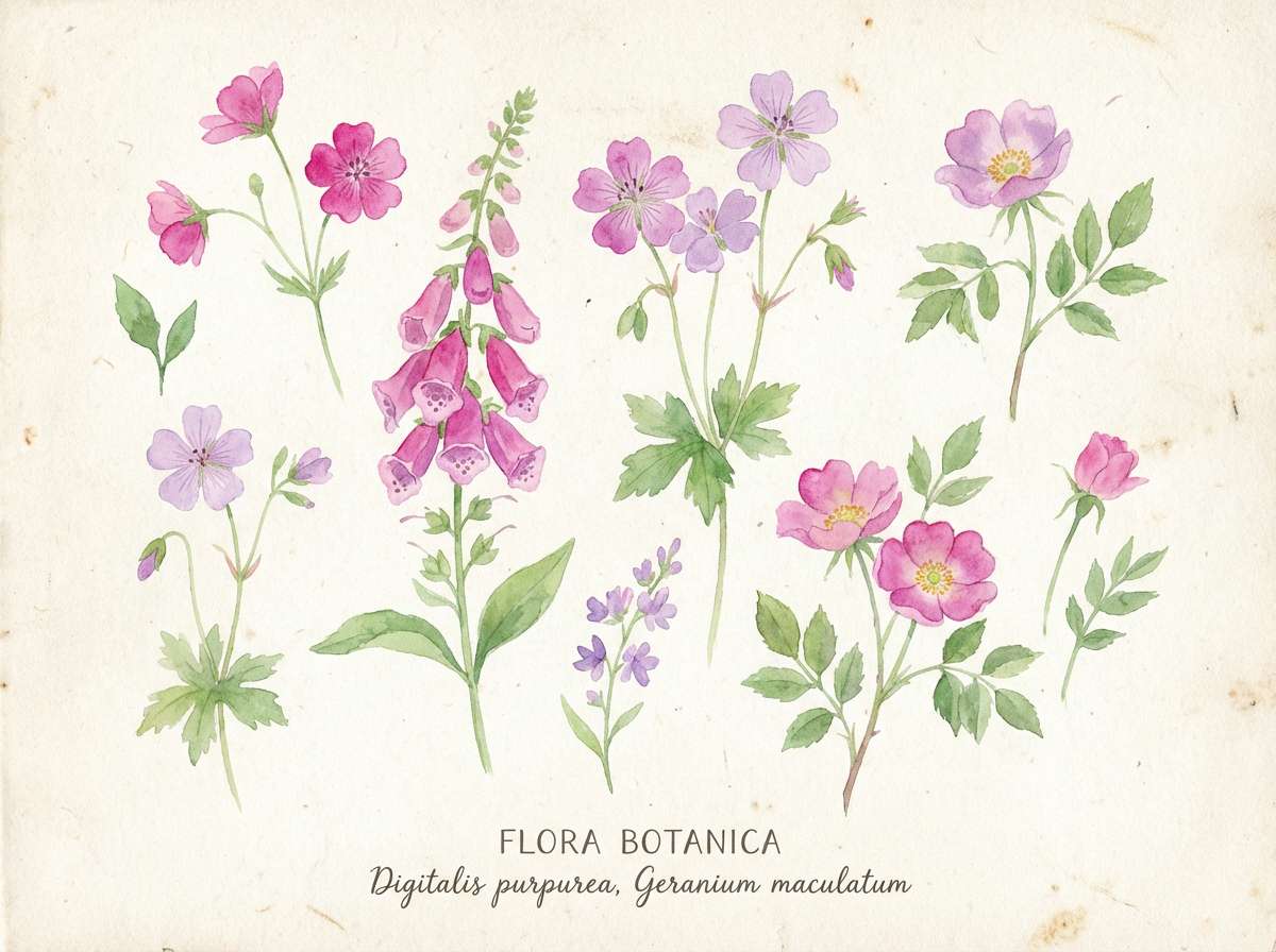
16) Wildflower Watercolor
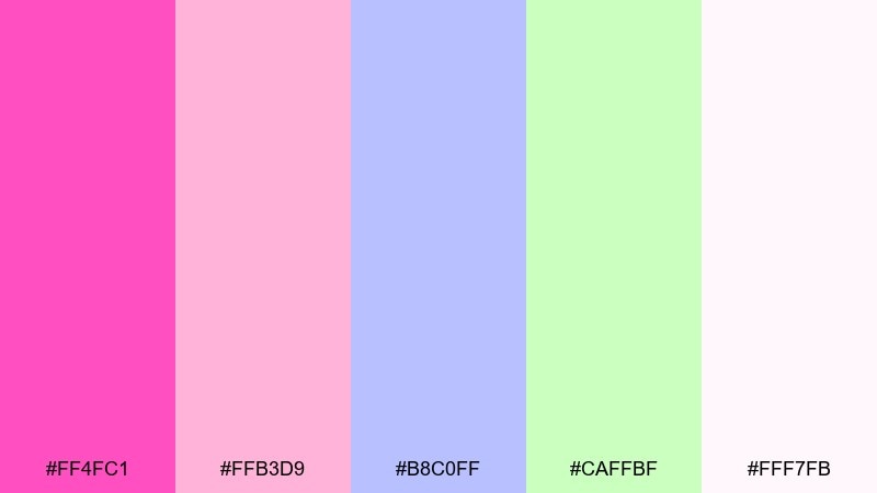
HEX: #ff4fc1 #ffb3d9 #b8c0ff #caffbf #fff7fb
Mood: dreamy, airy, springlike
Best for: botanical illustration print
Dreamy wildflower washes and airy pastels feel light, springy, and handmade. The soft lilac and gentle green keep the pink from taking over the page. It is perfect for botanical prints, stationery, and gentle social graphics. Tip: use the off-white as textured paper and layer watercolor blooms with plenty of negative space.
Image example of wildflower watercolor generated using media.io
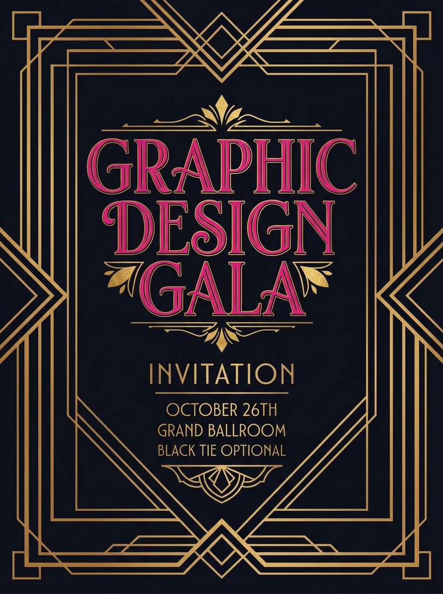
17) Art Deco Fuchsia
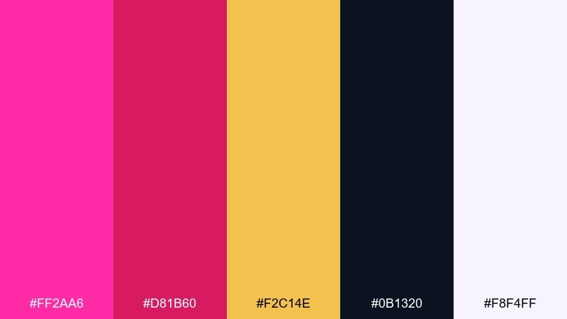
HEX: #ff2aa6 #d81b60 #f2c14e #0b1320 #f8f4ff
Mood: glamorous, geometric, vintage
Best for: gala invitation and poster
Glam geometric vibes and vintage theater glamour come through with fuchsia and gold. The black-blue base adds sophistication, while the warm metallic tone feels celebratory. Use it for gala invitations, cocktail posters, and retro-inspired branding. Tip: build symmetry with thin gold lines and keep the pink for central motifs and titles.
Image example of art deco fuchsia generated using media.io
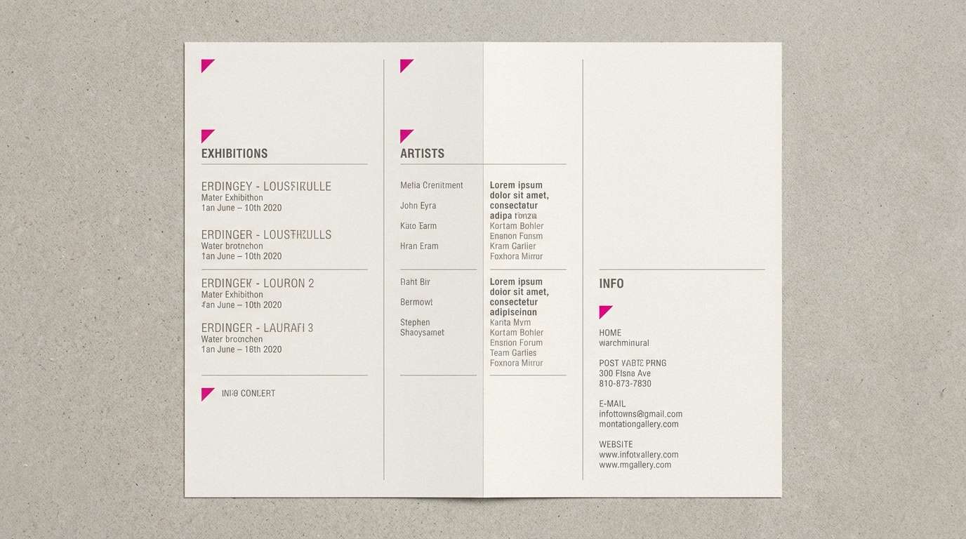
18) Museum Orchid Neutral
HEX: #ff49c7 #f4d9e9 #d6d3d1 #78716c #1c1917
Mood: quiet, cultured, balanced
Best for: gallery brochure layout
Quiet orchid pink layered with stone neutrals feels cultured and calm. The warm grays create a museum-like mood that lets images and captions breathe. It suits brochures, catalogs, and refined brand collateral. Tip: keep the pink as a section marker or small rule line so the layout stays understated.
Image example of museum orchid neutral generated using media.io
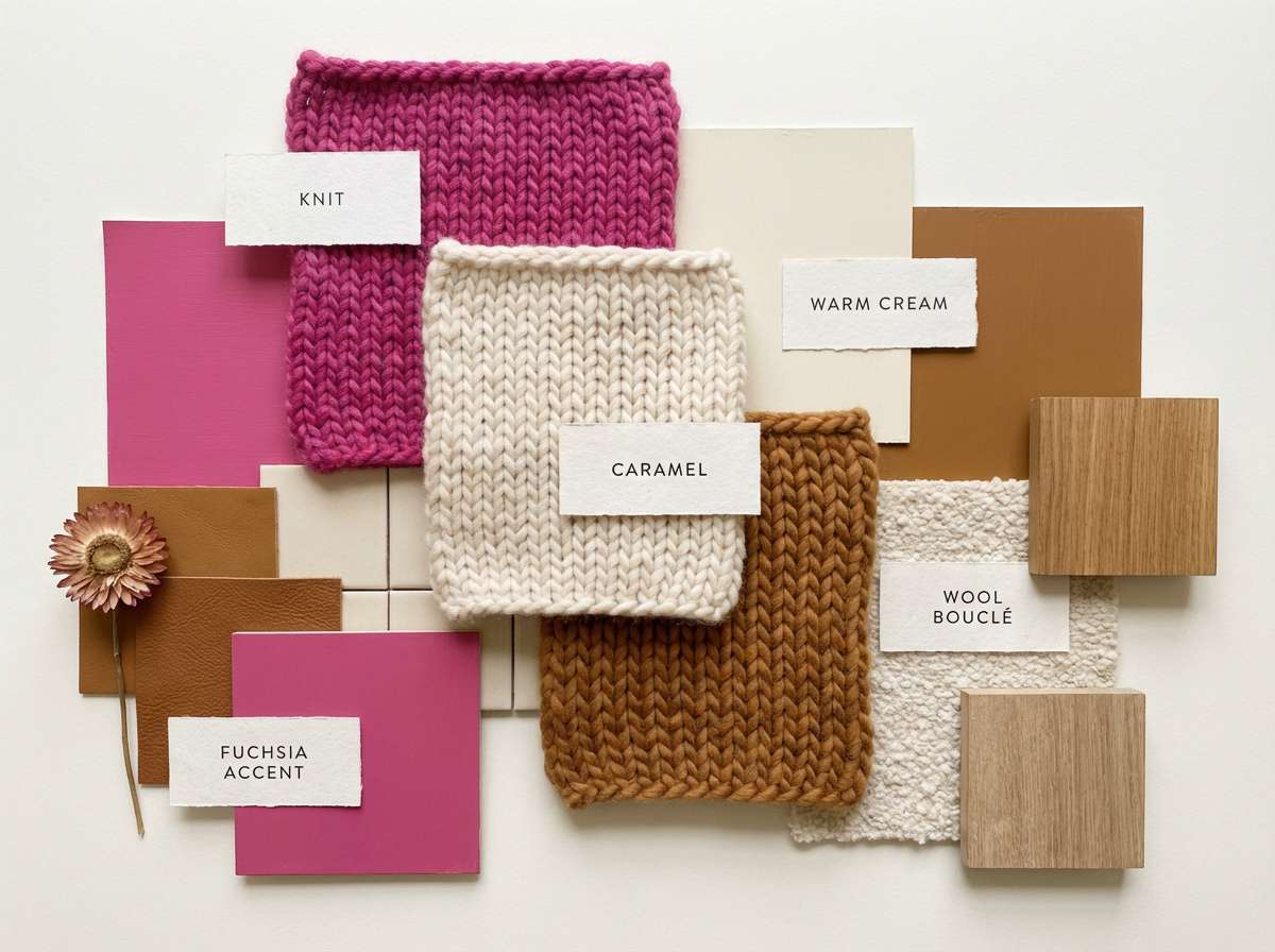
19) Cozy Knit Home
HEX: #ff55b7 #ffb3d1 #f2e9e4 #a98467 #4a2c2a
Mood: warm, homey, comforting
Best for: home decor mood board
Warm knit textures and rosy comfort make the palette feel cozy and lived-in. This fuchsia pink color palette works surprisingly well with caramel browns and creamy neutrals for interiors. Use it for mood boards, décor planning, or lifestyle branding that needs softness without looking washed out. Tip: choose the brown for furniture and flooring, then add the pink in textiles like pillows and throws.
Image example of cozy knit home generated using media.io
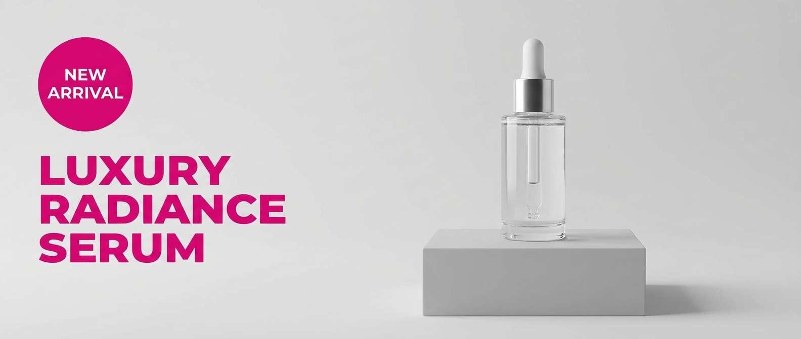
20) Studio Beauty Ad
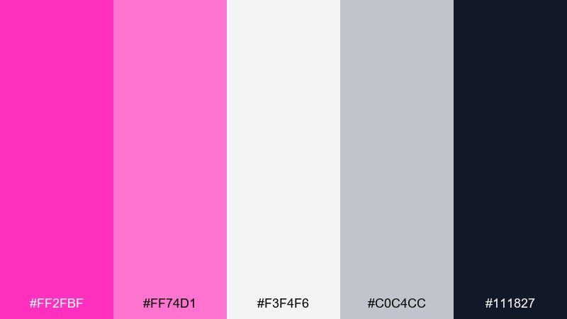
HEX: #ff2fbf #ff74d1 #f3f4f6 #c0c4cc #111827
Mood: clean, glossy, modern
Best for: skincare product ad banner
Clean glossy tones and soft studio lighting make the palette feel fresh and modern. The light grays keep everything clinical and trustworthy while the pink sells the glow. It is ideal for skincare ads, ecommerce banners, and product feature callouts. Tip: use the brightest pink for a single claim badge, then keep the rest of the layout monochrome for credibility.
Image example of studio beauty ad generated using media.io
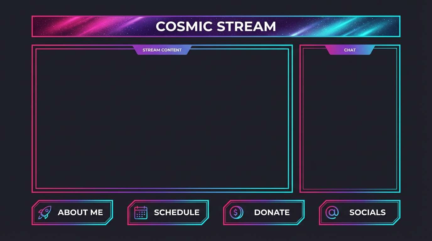
21) Cosmic Fuchsia Gradient
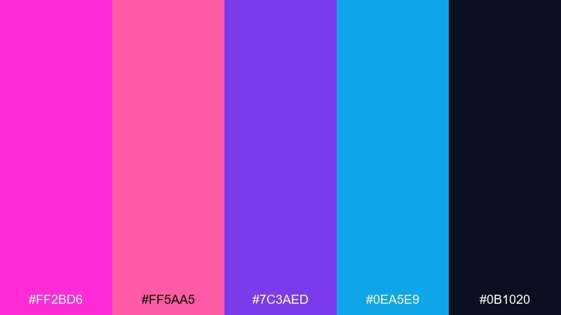
HEX: #ff2bd6 #ff5aa5 #7c3aed #0ea5e9 #0b1020
Mood: cosmic, modern, energetic
Best for: stream overlay and panels
Cosmic gradients and starfield contrast give this mix a modern, high-energy feel. The purple and cyan add depth so the bright pink reads like a highlight flare. Use it for stream overlays, panels, and creator branding where motion and glow effects matter. Tip: keep the background near-black and apply the gradient only to borders and headers for clarity.
Image example of cosmic fuchsia gradient generated using media.io
What Colors Go Well with Fuchsia Pink?
Neutrals are the easiest way to control fuchsia pink: white, cream, light gray, stone, and charcoal keep it crisp and readable. For a more sophisticated look, pair fuchsia with near-black navy, aubergine, or deep plum to create a premium contrast.
Analogous pairings (magenta, violet, lilac) feel cohesive and modern—great for gradients, creator branding, and dark-mode UI. Complementary accents like teal, mint, and cyan add freshness and keep the palette feeling contemporary instead of sugary.
Metallics can also elevate fuchsia pink: copper feels warm and boutique, gold reads glamorous and celebratory, and silver pushes it toward a sleek, tech-forward style. Use metallic tones as small borders, icons, or headline accents to avoid visual clutter.
How to Use a Fuchsia Pink Color Palette in Real Designs
Start by deciding whether fuchsia pink is your primary brand color or an accent. In most UI and branding systems, it works best as an accent for buttons, highlights, badges, and key illustrations, while neutrals handle backgrounds and long-form text.
For print and posters, treat fuchsia as a “spotlight” color: pair it with one dark anchor for contrast and one light tint for space. This creates hierarchy and keeps typography sharp, especially when you’re layering shapes or using bold display type.
If you’re building a full system (web + social + packaging), define a consistent role for each shade: a main fuchsia, a darker plum for text, a soft tint for backgrounds, and one contrasting accent (teal, gold, or cyan). That structure makes your visuals feel intentional across every format.
Create Fuchsia Pink Palette Visuals with AI
If you want to preview a fuchsia pink palette in real layouts, generate quick mockups before committing to a design direction. This helps you test contrast, mood, and how the colors behave in different compositions (posters, UI cards, labels, and invitations).
With Media.io’s text-to-image, you can turn any palette idea into on-brand visuals by describing the style (minimal, editorial, watercolor, art deco) and specifying how fuchsia should be used (headline, button, border, gradient). It’s a fast way to iterate without starting from scratch.
Pick a palette above, copy its prompt, then adjust the subject (poster, landing page, packaging) to match your project.
Fuchsia Pink Color Palette FAQs
-
What HEX code is commonly used for fuchsia pink?
Designers often use bright fuchsia values in the #FF2AA8–#FF4FCF range, but the best “fuchsia pink” HEX depends on whether you want it warmer (more pink) or cooler (more magenta). -
Is fuchsia pink the same as magenta?
They’re related but not identical. Magenta usually leans more purple, while fuchsia pink tends to feel slightly more pink-forward and playful, especially in lighter tints. -
What colors pair best with fuchsia pink for a modern look?
Charcoal or near-black for contrast, white or light gray for negative space, and one cool accent like teal/cyan for freshness. Purple tones also work well for gradients and techy vibes. -
How do I keep fuchsia pink from overwhelming a design?
Use it as an accent (buttons, badges, headings) and let neutrals handle backgrounds and body text. A dark anchor color (navy/charcoal) also helps control saturation and improve readability. -
What metallics work with fuchsia pink?
Copper reads warm and boutique, gold feels glamorous and event-ready, and silver gives a sleek, modern finish. Metallics look best as small details like borders, icons, or foil-style accents. -
Can I use fuchsia pink in dark mode UI?
Yes—fuchsia is a strong dark-mode accent when paired with deep charcoal backgrounds and light gray text. Reserve the brightest fuchsia for primary actions so the interface stays clean and scannable. -
What’s a good fuchsia pink palette for weddings or invitations?
Pair fuchsia with soft blush, cream, and a botanical green like sage for a timeless garden feel. Keep fuchsia for monograms, florals, or small highlight details for an elegant finish.


