

A fresh color palette keeps designs light, clean, and modern—perfect for brands and UIs that want to feel effortless and optimistic. Think airy mints, seafoam teals, soft creams, and one bright accent that adds energy without clutter.
Below are 20+ curated fresh color palette ideas with HEX codes, plus AI image prompts you can use to generate matching visuals for ads, landing pages, packaging, and editorial layouts.
In this article
- Why Fresh Palettes Work So Well
-
- mint citrus splash
- seafoam linen
- cucumber cream
- aloe sunrise
- rainwashed garden
- lime sorbet pop
- sage and snow
- pistachio peach
- glacier mint ui
- matcha minimal
- freshwater stone
- spring market
- green tea latte
- eucalyptus clay
- coastal herb
- basil bloom poster
- verdant neon accent
- pear blossom wedding
- celery denim
- morning dew editorial
- garden spritz
- crisp canopy
- palm glass studio
- herbarium notes
- What Colors Go Well with Fresh?
- How to Use a Fresh Color Palette in Real Designs
- Create Fresh Palette Visuals with AI
Why Fresh Palettes Work So Well
Fresh palettes feel breathable because they lean on high-lightness colors—mints, soft greens, and pale neutrals—so layouts look spacious even when content is dense. That “clean air” effect helps users scan faster and reduces visual fatigue.
They also balance emotion and clarity: greens and seafoam tones read as healthy, calm, and modern, while a single warm accent (lemon, coral, apricot) adds energy for calls to action. This makes fresh color combinations especially effective for UI, wellness branding, and seasonal campaigns.
Finally, fresh palettes pair well with accessibility-friendly typography. A deep slate or near-black green can deliver strong contrast for text without the harshness of pure black, keeping the overall design soft but readable.
20+ Fresh Color Palette Ideas (with HEX Codes)
1) Mint Citrus Splash
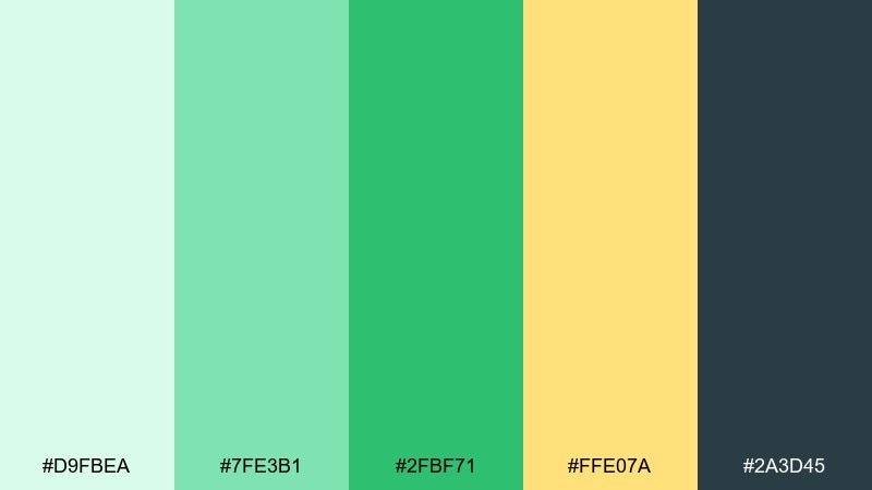
HEX: #D9FBEA #7FE3B1 #2FBF71 #FFE07A #2A3D45
Mood: zesty and upbeat
Best for: summer beverage product ad
Zesty and upbeat, it feels like sparkling water with lime on a sunny patio. Use the bright mint and leafy green as the hero tones, then let the soft yellow act as a highlight for price tags or calls to action. The deep slate keeps typography crisp without going harsh. Tip: reserve the yellow for small bursts so the greens stay clean and refreshing.
Image example of mint citrus splash generated using media.io
Media.io is an online AI studio for creating and editing video, image, and audio in your browser.

2) Seafoam Linen
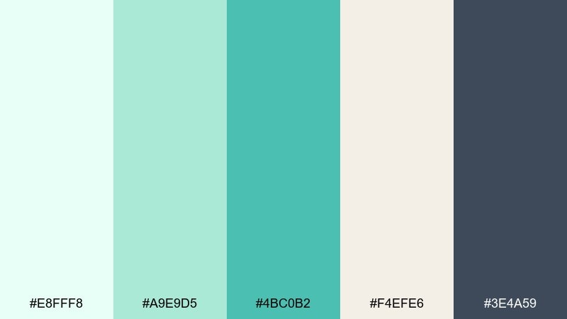
HEX: #E8FFF8 #A9E9D5 #4BC0B2 #F4EFE6 #3E4A59
Mood: clean and coastal
Best for: wellness brand landing page UI
Clean and coastal, these tones evoke seafoam rolling over pale sand. The linen neutral makes spacious backgrounds, while the teal anchors buttons and links without overpowering content. Pair with thin-line icons and generous white space for a calm, premium feel. Tip: set the darkest slate for headings to keep accessibility strong.
Image example of seafoam linen generated using media.io
3) Cucumber Cream
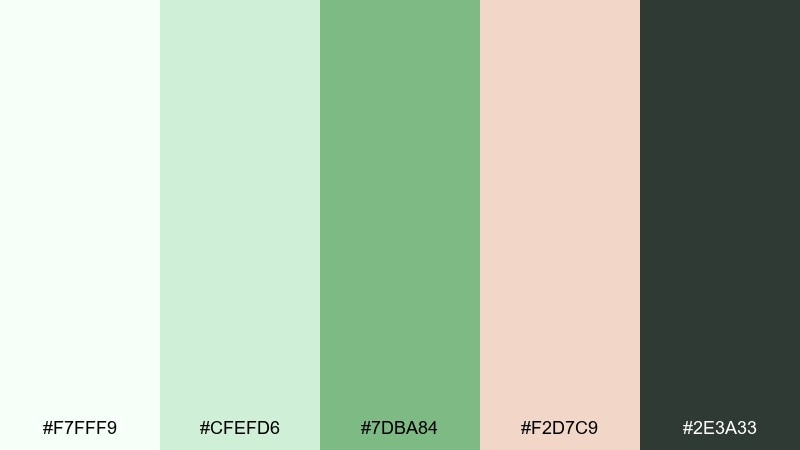
HEX: #F7FFF9 #CFEFD6 #7DBA84 #F2D7C9 #2E3A33
Mood: soft and nourishing
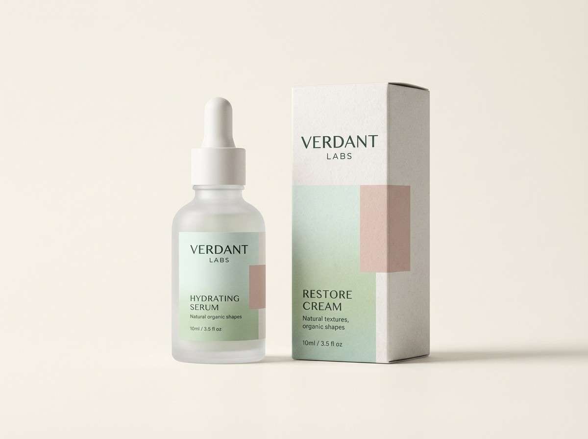
Best for: skincare packaging design
Soft and nourishing, it reads like cucumber slices on a spa towel. The creamy whites and pale greens create a gentle base, while the blush tone adds warmth for seals, labels, or ingredient callouts. Keep the dark green-charcoal for small text and regulatory info. Tip: use matte finishes to make the pastel greens feel more natural.
Image example of cucumber cream generated using media.io
4) Aloe Sunrise
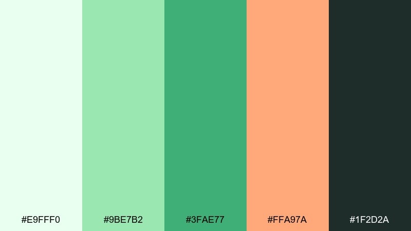
HEX: #E9FFF0 #9BE7B2 #3FAE77 #FFA97A #1F2D2A
Mood: bright and optimistic
Best for: social media promo graphic
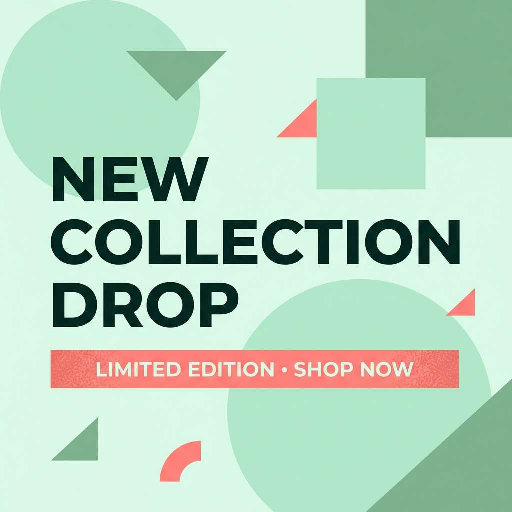
Bright and optimistic, it feels like an early walk through a greenhouse as the sun warms the glass. The coral accent creates fresh color combinations that pop for stickers, discount badges, or key phrases. Balance it with airy mint backgrounds and confident deep text. Tip: keep coral to one focal area per post for a clean, scroll-stopping layout.
Image example of aloe sunrise generated using media.io
5) Rainwashed Garden
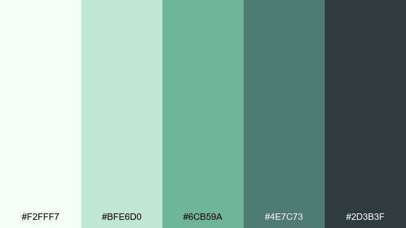
HEX: #F2FFF7 #BFE6D0 #6CB59A #4E7C73 #2D3B3F
Mood: cool and restorative
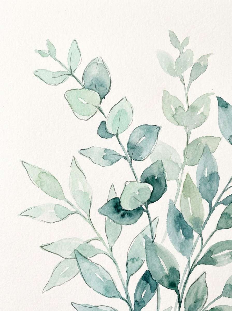
Best for: botanical watercolor illustration
Cool and restorative, it brings to mind leaves after a light rain and misty air. Layer the pale mint as paper tone, then build depth with sage-teal washes and darker stems. It pairs beautifully with minimal serif captions or plant labels. Tip: keep edges soft and let the mid-tone teal do most of the shading.
Image example of rainwashed garden generated using media.io
6) Lime Sorbet Pop
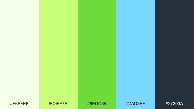
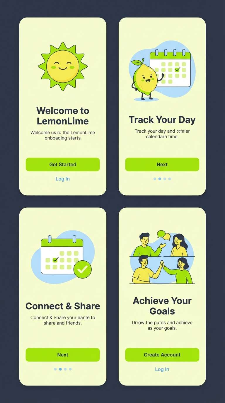
HEX: #F6FFE8 #C9FF7A #6EDC3B #7AD8FF #27303A
Mood: playful and energetic
Best for: startup app onboarding UI screens
Playful and energetic, it feels like sorbet colors splashed onto a clean interface. Use the light lemon background to keep screens airy, then bring in lime for primary actions and the sky-blue for secondary highlights. The dark slate grounds navigation labels and icons. Tip: avoid large areas of pure lime and keep it to buttons, toggles, and progress states.
Image example of lime sorbet pop generated using media.io
7) Sage and Snow
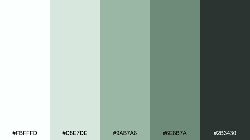
HEX: #FBFFFD #D8E7DE #9AB7A6 #6E8B7A #2B3430
Mood: quiet and minimal
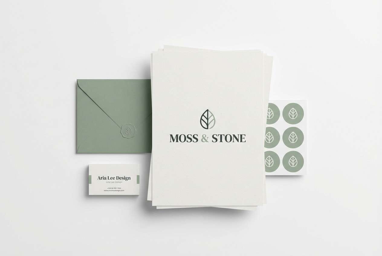
Best for: minimal brand identity kit
Quiet and minimal, these shades suggest crisp linen, gentle shadows, and evergreen calm. Build your base with snow-white and pale sage, then use the deeper greens for logo marks and packaging stamps. It pairs well with natural paper textures and simple monograms. Tip: use the darkest tone sparingly to keep the overall look light.
Image example of sage and snow generated using media.io
8) Pistachio Peach
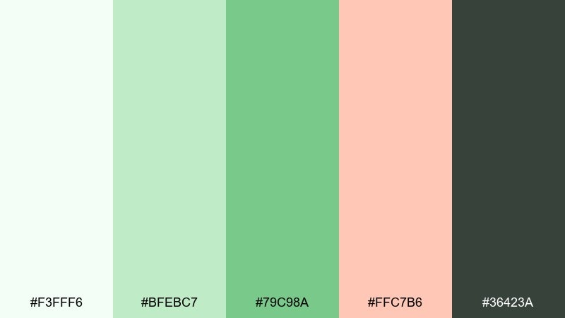
HEX: #F3FFF6 #BFEBC7 #79C98A #FFC7B6 #36423A
Mood: friendly and inviting
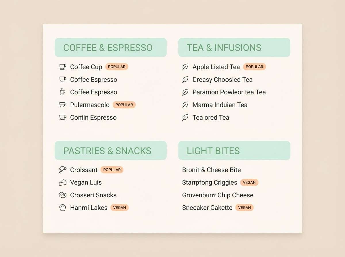
Best for: cafe menu design
Friendly and inviting, it feels like a pastry case with pistachio cream and peach compote. Let the pale mint sit behind the menu sections, then use peach for highlights like specials and seasonal notes. The medium green works well for section headers and icons. Tip: keep body text in the dark neutral to maintain readability on pastel panels.
Image example of pistachio peach generated using media.io
9) Glacier Mint UI
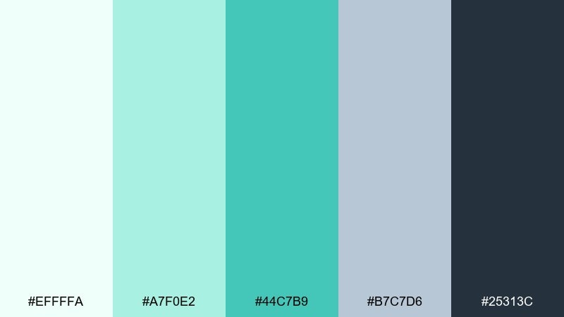
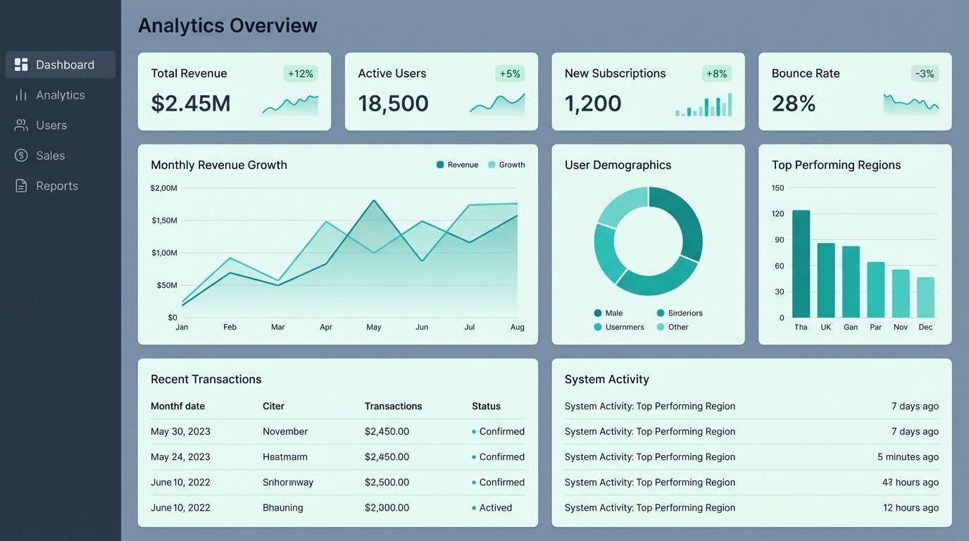
HEX: #EFFFFA #A7F0E2 #44C7B9 #B7C7D6 #25313C
Mood: crisp and modern
Best for: dashboard UI for analytics
Crisp and modern, it brings the clarity of glacial water and brushed metal. Use the pale mint for surfaces, then set charts and active states in teal to guide attention. The cool gray-blue supports tables and dividers without muddying the layout. Tip: keep the darkest tone for nav and key metrics to create a clear visual hierarchy.
Image example of glacier mint ui generated using media.io
10) Matcha Minimal
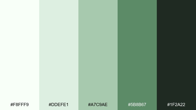
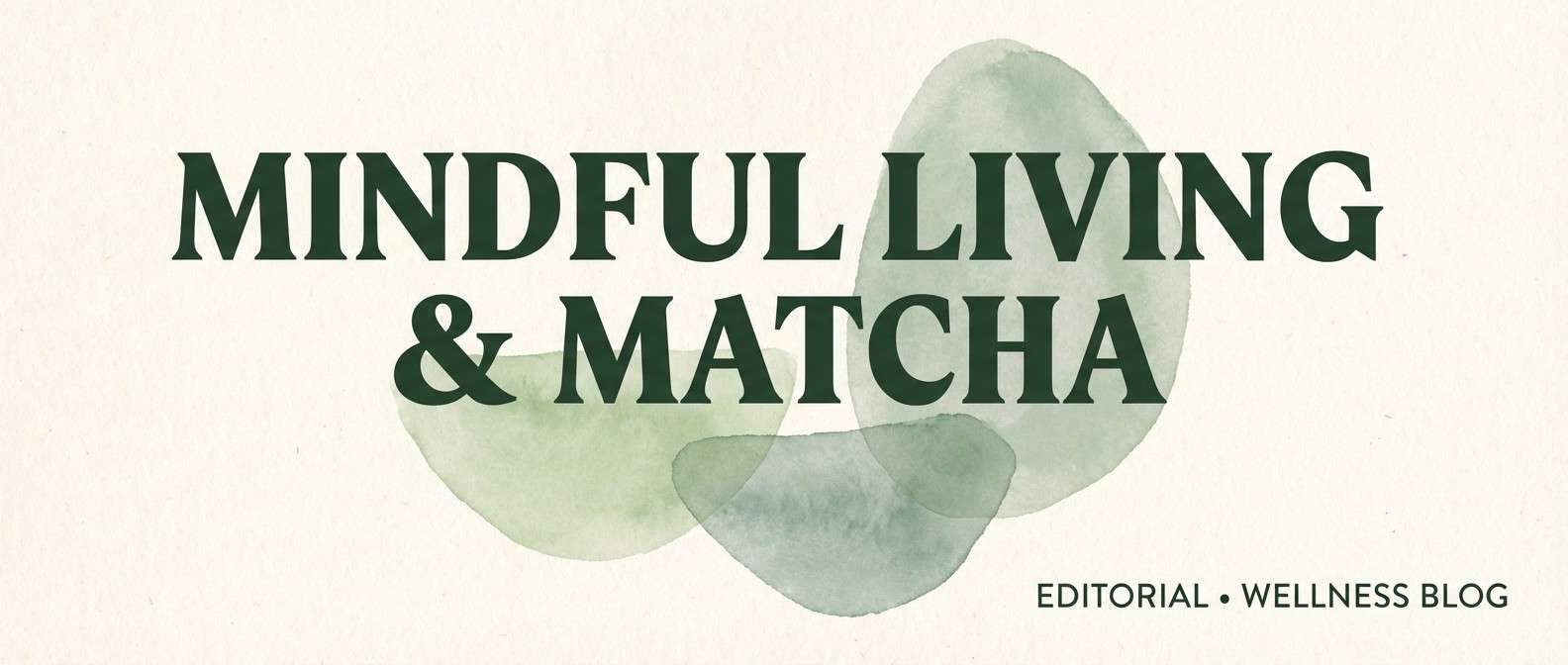
HEX: #F8FFF9 #DDEFE1 #A7C9AE #5B8B67 #1F2A22
Mood: grounded and airy
Best for: editorial blog header design
Grounded and airy, it feels like matcha foam on ceramic with soft morning light. This fresh color palette works especially well for editorial headers, pull quotes, and simple illustrations that need calm contrast. Pair it with off-white backgrounds, roomy margins, and a warm serif for headlines. Tip: use the mid sage for separators and small badges instead of heavy rules.
Image example of matcha minimal generated using media.io
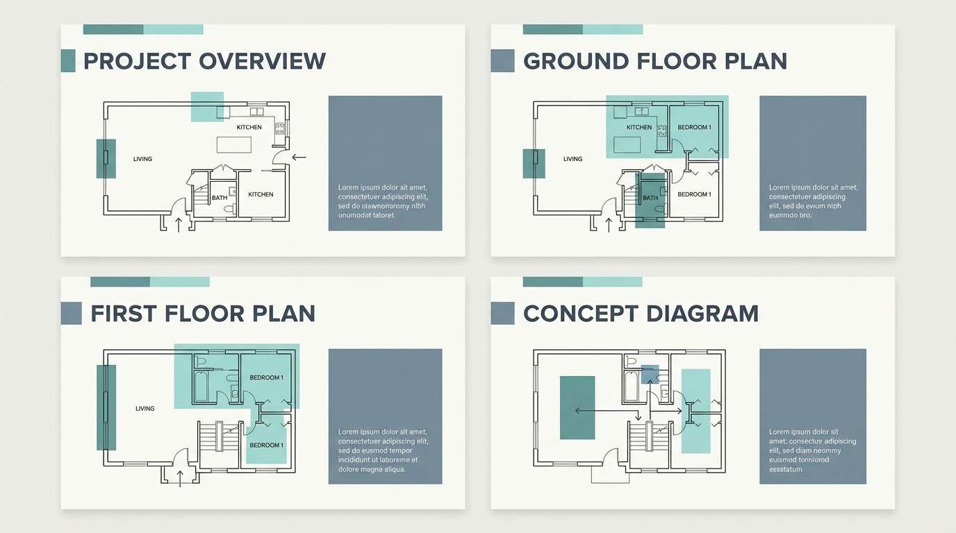
11) Freshwater Stone
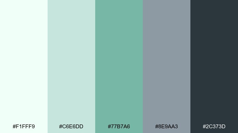
HEX: #F1FFF9 #C6E6DD #77B7A6 #8E9AA3 #2C373D
Mood: balanced and serene
Best for: architectural presentation slides
Balanced and serene, the mix suggests clear lake water against smooth river stones. The gray-blue is perfect for diagrams and grids, while the teal-green keeps key points feeling alive. Pair with lots of whitespace and thin strokes for plans and labels. Tip: keep accent shapes in the mid teal and save the darkest tone for titles only.
Image example of freshwater stone generated using media.io
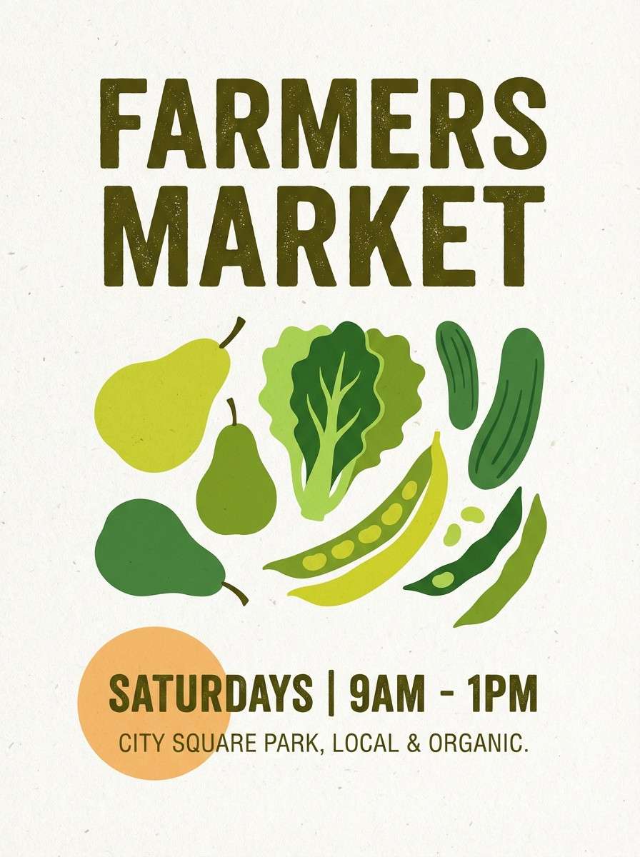
12) Spring Market
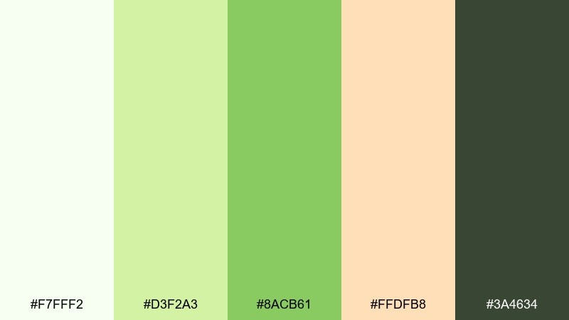
HEX: #F7FFF2 #D3F2A3 #8ACB61 #FFDFB8 #3A4634
Mood: cheerful and organic
Best for: farmers market poster
Cheerful and organic, it feels like crates of leafy greens beside sunlit fruit. The soft lime and green are great for big type and illustration fills, while the warm apricot keeps the design welcoming. Use the dark olive for event details and vendor lists. Tip: set the date in apricot on olive for a high-contrast focal point.
Image example of spring market generated using media.io
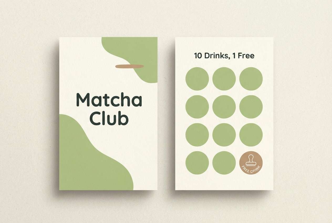
13) Green Tea Latte
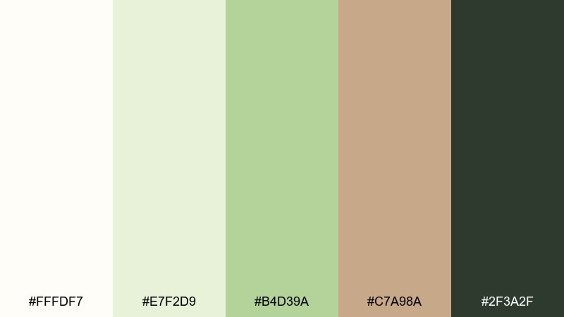
HEX: #FFFDF7 #E7F2D9 #B4D39A #C7A98A #2F3A2F
Mood: warm and comforting
Best for: coffee shop loyalty card
Warm and comforting, it brings to mind steamed milk with green tea and a sprinkle of spice. The creamy base keeps cards bright, while the latte brown adds a cozy accent for stamps or points. Pair the greens with simple line art and rounded type to maintain a friendly tone. Tip: keep the brown limited to one element so the greens stay the star.
Image example of green tea latte generated using media.io
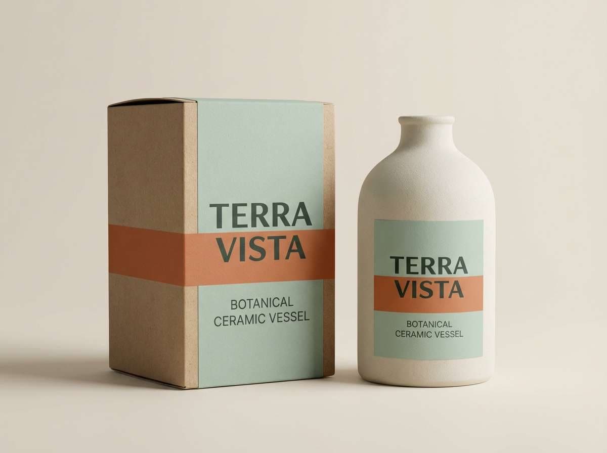
14) Eucalyptus Clay
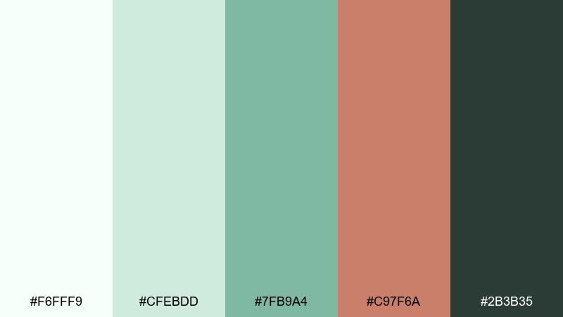
HEX: #F6FFF9 #CFEBDD #7FB9A4 #C97F6A #2B3B35
Mood: earthy and sophisticated
Best for: ceramic product packaging
Earthy and sophisticated, it feels like eucalyptus leaves against warm terracotta clay. The clay accent is ideal for seals, product names, or a single bold stripe that adds character. Use the pale greens for backgrounds and the deeper eucalyptus for icons and details. Tip: choose uncoated paper to emphasize the natural, handmade vibe.
Image example of eucalyptus clay generated using media.io
15) Coastal Herb
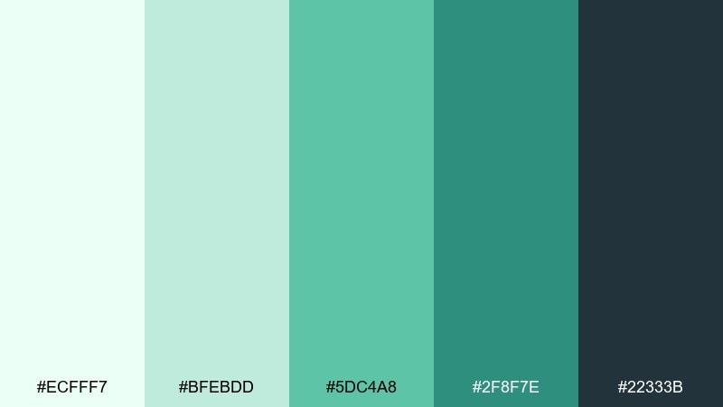
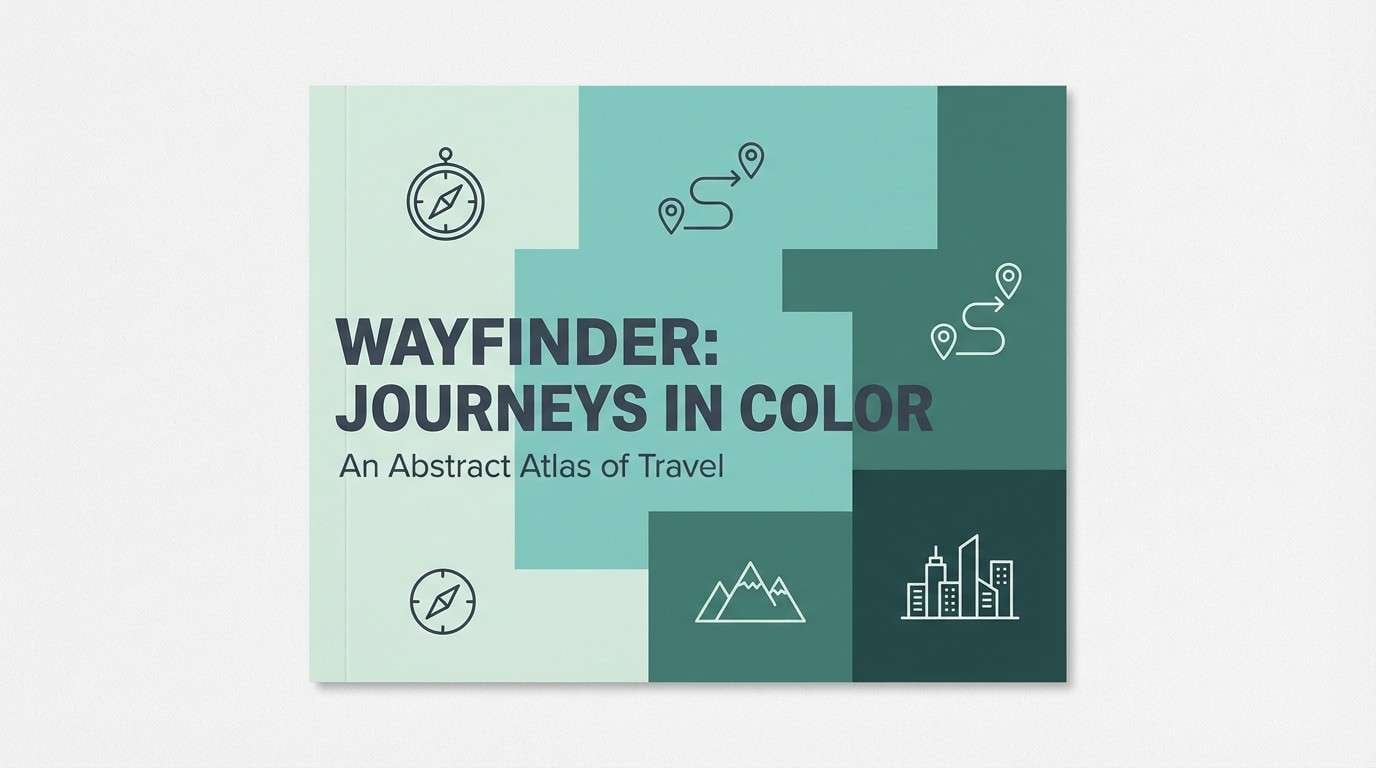
HEX: #ECFFF7 #BFEBDD #5DC4A8 #2F8F7E #22333B
Mood: fresh and breezy
Best for: travel blog cover image
Fresh and breezy, it reads like sea air, herb gardens, and sun-bleached boardwalks. Use the light mint for open space, then let the teal and deep green carry titles and navigation elements. It pairs nicely with clean photography and simple map icons. Tip: add teal overlays at low opacity to unify mixed images.
Image example of coastal herb generated using media.io
16) Basil Bloom Poster
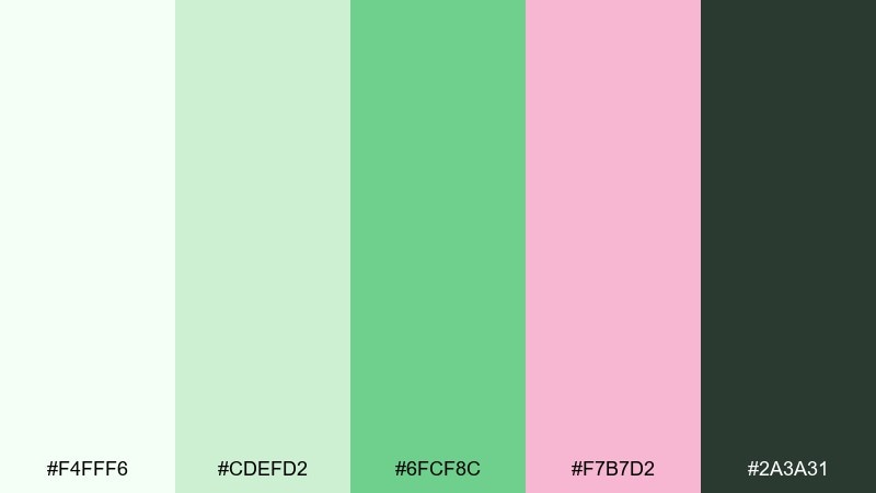
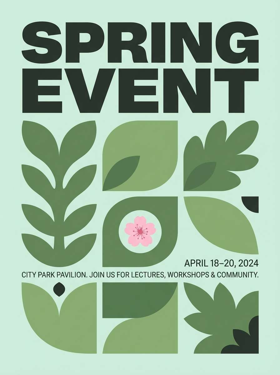
HEX: #F4FFF6 #CDEFD2 #6FCF8C #F7B7D2 #2A3A31
Mood: lively and modern
Best for: spring event poster design
Lively and modern, it feels like basil leaves with a pop of spring blossoms. The pink makes an excellent spotlight for dates, artist names, or a single graphic element that breaks the green rhythm. Keep backgrounds pale and type dark to avoid a pastel haze. Tip: try a two-color layout with green plus pink, and only bring in the light mint as breathing room.
Image example of basil bloom poster generated using media.io
17) Verdant Neon Accent
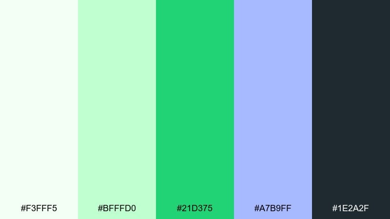
HEX: #F3FFF5 #BFFFD0 #21D375 #A7B9FF #1E2A2F
Mood: bold and techy
Best for: SaaS feature announcement banner
Bold and techy, it looks like a clean lab interface with a vivid green status light. The neon-leaning green is perfect for feature highlights, while the periwinkle adds a smart secondary accent for badges and tags. Keep the pale mint as background to prevent the bright tones from overwhelming the banner. Tip: use the bright green only on one button or icon set to keep it premium.
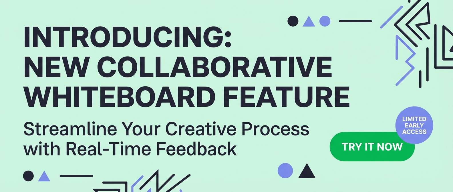
Image example of verdant neon accent generated using media.io
18) Pear Blossom Wedding
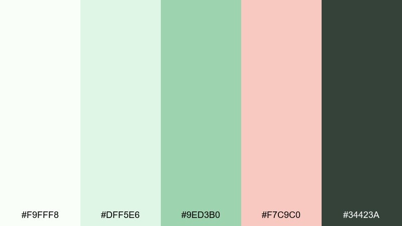
HEX: #F9FFF8 #DFF5E6 #9ED3B0 #F7C9C0 #34423A
Mood: romantic and airy
Best for: wedding invitation set
Romantic and airy, it suggests pear blossoms, soft greenery, and a blush ribbon. The pale greens make an elegant base for stationery, with blush used for monograms or small floral details. Pair with textured paper and delicate serif typography for a timeless look. Tip: keep the blush to fine accents so the invitation stays light and refined.
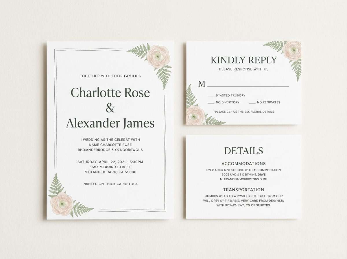
Image example of pear blossom wedding generated using media.io
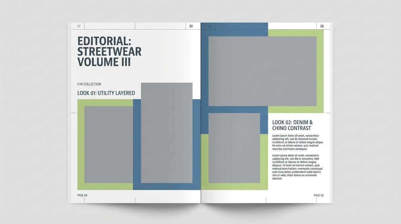
19) Celery Denim
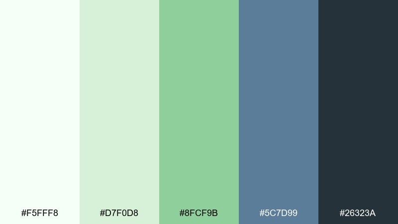
HEX: #F5FFF8 #D7F0D8 #8FCF9B #5C7D99 #26323A
Mood: casual and contemporary
Best for: streetwear lookbook layout
Casual and contemporary, it blends crisp celery greens with a denim-blue counterpoint. Use the blue for section headers and page numbers, and let the greens carry supporting blocks and highlights. It pairs well with grayscale photography and bold sans-serif type. Tip: set captions in the darkest tone and keep colored elements flat and simple.
Image example of celery denim generated using media.io
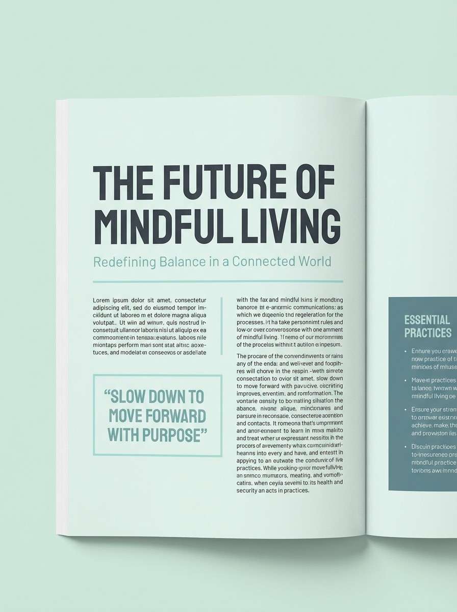
20) Morning Dew Editorial
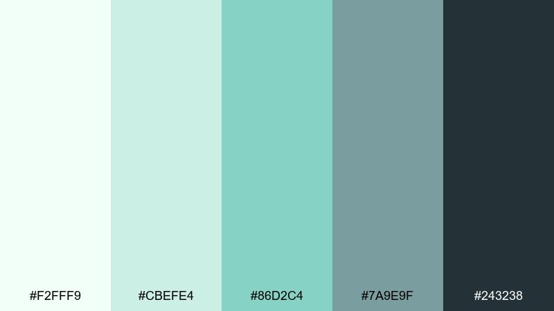
HEX: #F2FFF9 #CBEFE4 #86D2C4 #7A9E9F #243238
Mood: calm and polished
Best for: magazine feature layout
Calm and polished, it feels like dew on glass with a cool, quiet mood. Use the light mint as the page field, then bring in aqua for subheads and pull-quote bars. The muted slate-teal works nicely for side columns and infographics. Tip: keep accent blocks large and low-contrast to maintain a premium editorial pace.
Image example of morning dew editorial generated using media.io
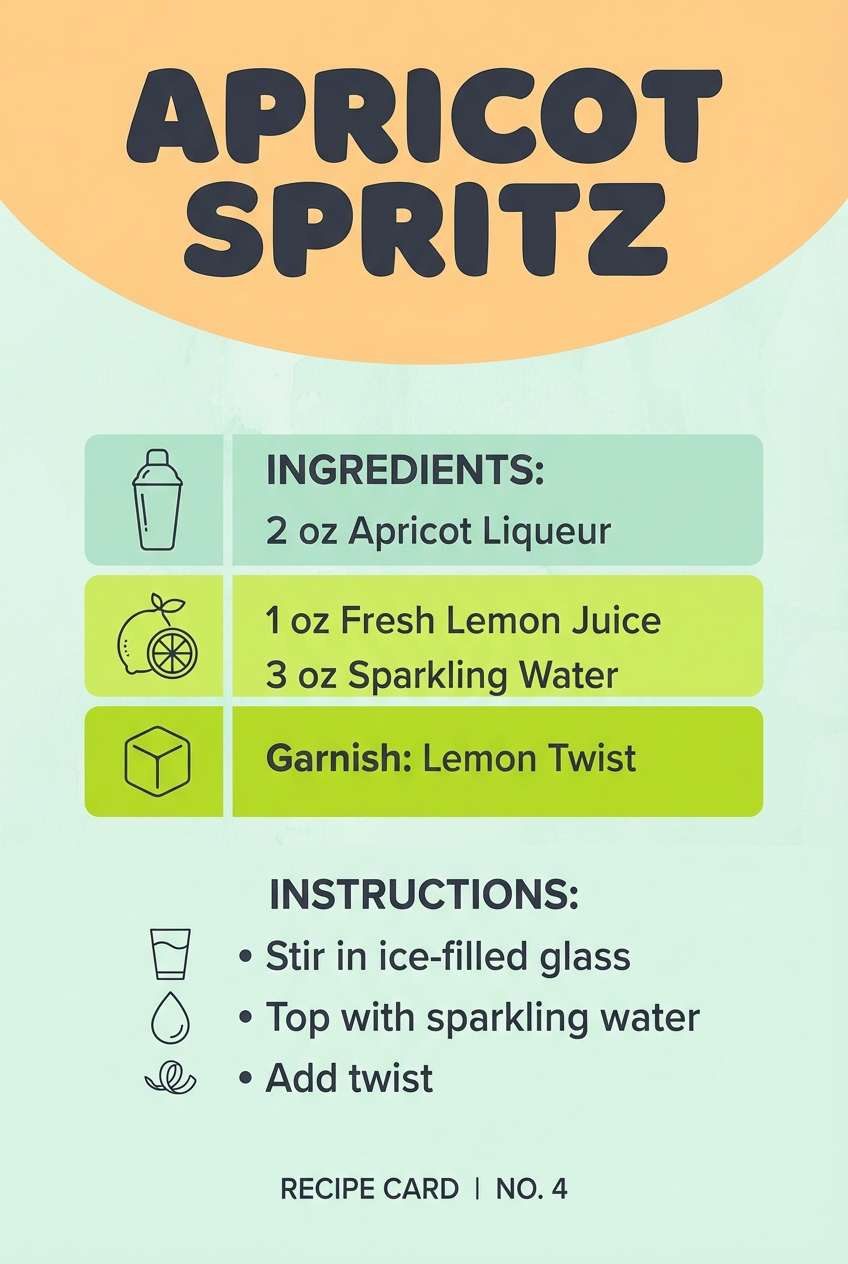
21) Garden Spritz
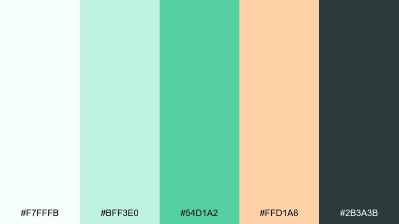
HEX: #F7FFFB #BFF3E0 #54D1A2 #FFD1A6 #2B3A3B
Mood: sparkling and light
Best for: cocktail recipe card graphic
Sparkling and light, it evokes a fizzy garden spritz with citrus peel. Use the mint and bright green for headers and icons, with apricot as the garnish-like accent for measurements or key steps. The deep slate keeps the recipe readable even on pale backgrounds. Tip: add a single apricot highlight behind the cocktail name to create instant focus.
Image example of garden spritz generated using media.io
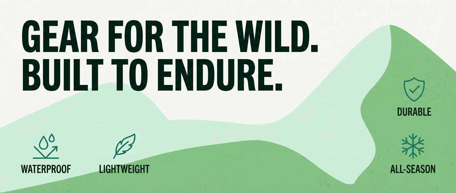
22) Crisp Canopy
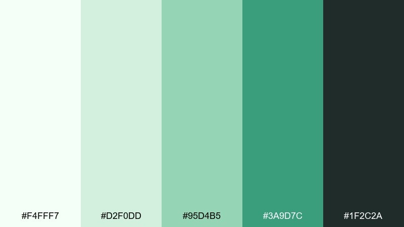
HEX: #F4FFF7 #D2F0DD #95D4B5 #3A9D7C #1F2C2A
Mood: fresh and structured
Best for: outdoor gear product banner
Fresh and structured, it feels like shaded trails and crisp air under a green canopy. The deeper teal-green is strong for product names and feature callouts, while the pale mints keep the layout breathable. It works well with rugged textures, but keep them subtle so the greens stay clean. Tip: use the mid green for icons and feature bullets to guide scanning.
Image example of crisp canopy generated using media.io
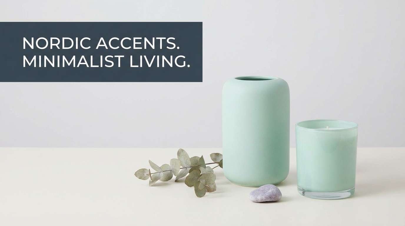
23) Palm Glass Studio
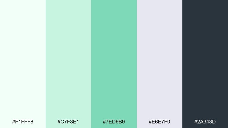
HEX: #F1FFF8 #C7F3E1 #7ED9B9 #E6E7F0 #2A343D
Mood: airy and studio-clean
Best for: home decor product ad
Airy and studio-clean, it suggests palm fronds seen through frosted glass. The mint family keeps the scene light, and the soft lilac-gray adds a modern, calm counter tone for props or secondary text. Use the darkest slate for high-contrast headlines and pricing. Tip: stick to two dominant tones in the hero image and let the rest support quietly.
Image example of palm glass studio generated using media.io
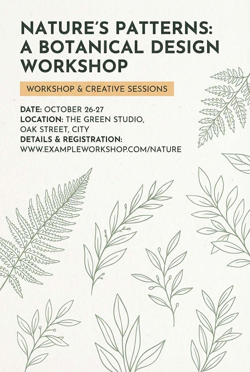
24) Herbarium Notes
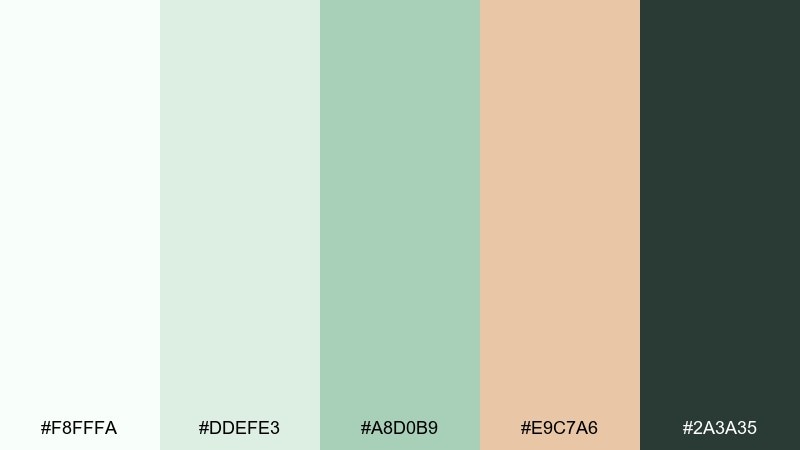
HEX: #F8FFFA #DDEFE3 #A8D0B9 #E9C7A6 #2A3A35
Mood: vintage botanical
Best for: nature workshop flyer
Vintage botanical, it recalls pressed leaves tucked into a journal with warm paper edges. The apricot-beige accent gives headings a handcrafted touch, while sage greens keep the layout grounded. These fresh color combinations are ideal when you want a natural look without going overly rustic. Tip: combine with thin illustration lines and leave plenty of margins for an airy, museum-label feel.
Image example of herbarium notes generated using media.io
What Colors Go Well with Fresh?
Fresh colors pair best with light neutrals (off-white, linen, soft gray) and cool greens (mint, seafoam, sage) to maintain that clean, open feeling. A deep slate, charcoal-green, or blue-gray is ideal for typography because it adds contrast without breaking the calm.
For accents, warm tones like lemon, apricot, peach, blush, or coral add a lively highlight that still feels natural. If you want a more tech-forward fresh look, try a single bright neon green or periwinkle as a restrained secondary accent.
How to Use a Fresh Color Palette in Real Designs
Start with a pale mint or cream background, then choose one mid green/teal as your primary UI or brand color for buttons, links, and key shapes. Reserve the darkest slate tone for headlines and body text to keep the design crisp and accessible.
Keep accents intentional: use one warm highlight color for badges, price tags, dates, or single focal elements. This prevents the palette from turning “pastel busy” and keeps your layout modern and premium.
In print and packaging, fresh palettes look especially good with matte or uncoated textures. In digital products, pair them with thin-line icons, generous spacing, and subtle dividers so the light tones stay structured.
Create Fresh Palette Visuals with AI
If you already have HEX codes, you can turn them into on-brand visuals fast by generating matching UI mockups, posters, ads, and packaging concepts with AI. The key is describing a clean layout, bright diffused lighting (for product shots), and clear roles for each color (background, primary, accent, text).
Use the prompts above as templates, then swap the subject (skincare, café, SaaS, wedding stationery) while keeping the same palette language. This helps you maintain a consistent fresh look across campaigns and platforms.
Fresh Color Palette FAQs
-
What is a fresh color palette?
A fresh color palette is a set of light, clean hues—often mint, seafoam, sage, and soft neutrals—paired with a darker slate for readable text and an optional bright accent (like lemon or coral) for energy. -
Which HEX colors make a design look fresh and modern?
High-lightness mints and seafoam greens (for backgrounds), a mid teal/green (for primary UI elements), and a deep slate or charcoal-green (for typography) create a modern fresh look. Adding a small warm accent like #FFE07A or #FFA97A can boost attention. -
What colors go well with mint green?
Mint green pairs well with off-white/linen, teal, sage, slate gray, and soft warm accents like peach, apricot, blush, or pale yellow. The safest readable text pairing is a deep slate or charcoal tone. -
How do I keep a fresh palette from looking too pastel?
Increase contrast by using a darker slate for text and navigation, keep accents limited to one focal element per layout, and avoid filling large areas with the most saturated green. Structure the design with spacing and subtle dividers. -
Is a fresh color palette good for UI design?
Yes—fresh palettes are great for UI because pale backgrounds reduce visual noise, while teal/green primaries guide attention. Just ensure accessible contrast for text and buttons by using a dark slate and testing key color pairs. -
What industries work best with fresh color combinations?
Wellness, skincare, food and beverage, eco-friendly products, travel, lifestyle editorial, and modern SaaS products commonly use fresh palettes because they signal cleanliness, trust, and calm energy. -
Can I generate images that match my fresh palette?
Yes. With Media.io Text-to-Image, you can describe your subject (UI, packaging, poster) and explicitly mention your palette roles (mint background, teal buttons, coral badge, slate text) to generate consistent visuals quickly.
Next: Succulent Color Palette


