

A succulent color palette blends muted greens, cool gray-greens, and soft desert neutrals to create a calm, modern look. It’s a go-to choice when you want designs to feel fresh, clean, and naturally premium.
Below are 20+ ready-to-use succulent color palette ideas with HEX codes, plus practical tips for pairing and applying them across branding, UI, print, and packaging.
In this article
- Why Succulent Palettes Work So Well
-
- aloe mist
- cactus bloom
- echeveria dust
- agave shadow
- sage terracotta
- mint pebble
- desert rosette
- prickly pear sorbet
- olive succulent
- jade linen
- seaglass sedum
- mossy clay pot
- saguaro night
- aloe latte
- pebble sage
- verdigris garden
- dusty aloe pink
- cactus concrete
- aloe sunset blush
- sage marble
- botanical gelato
- succulent stonewash
- aloe clay neutrals
- soft cactus pastels
- modern succulent contrast
- What Colors Go Well with Succulent?
- How to Use a Succulent Color Palette in Real Designs
- Create Succulent Palette Visuals with AI
Why Succulent Palettes Work So Well
Succulent palettes sit in the sweet spot between neutral and colorful: sage, aloe, jade, and moss tones read as “natural” without feeling dull. That makes them easy to trust in healthcare, lifestyle, and modern product design.
They also have built-in hierarchy. Light mint and warm off-white create breathable backgrounds, while deep green-gray shades provide reliable contrast for type, icons, and CTAs.
Finally, succulent color schemes pair well with materials and texture—linen, uncoated paper, ceramics, concrete—so they translate smoothly from UI to packaging and print.
20+ Succulent Color Palette Ideas (with HEX Codes)
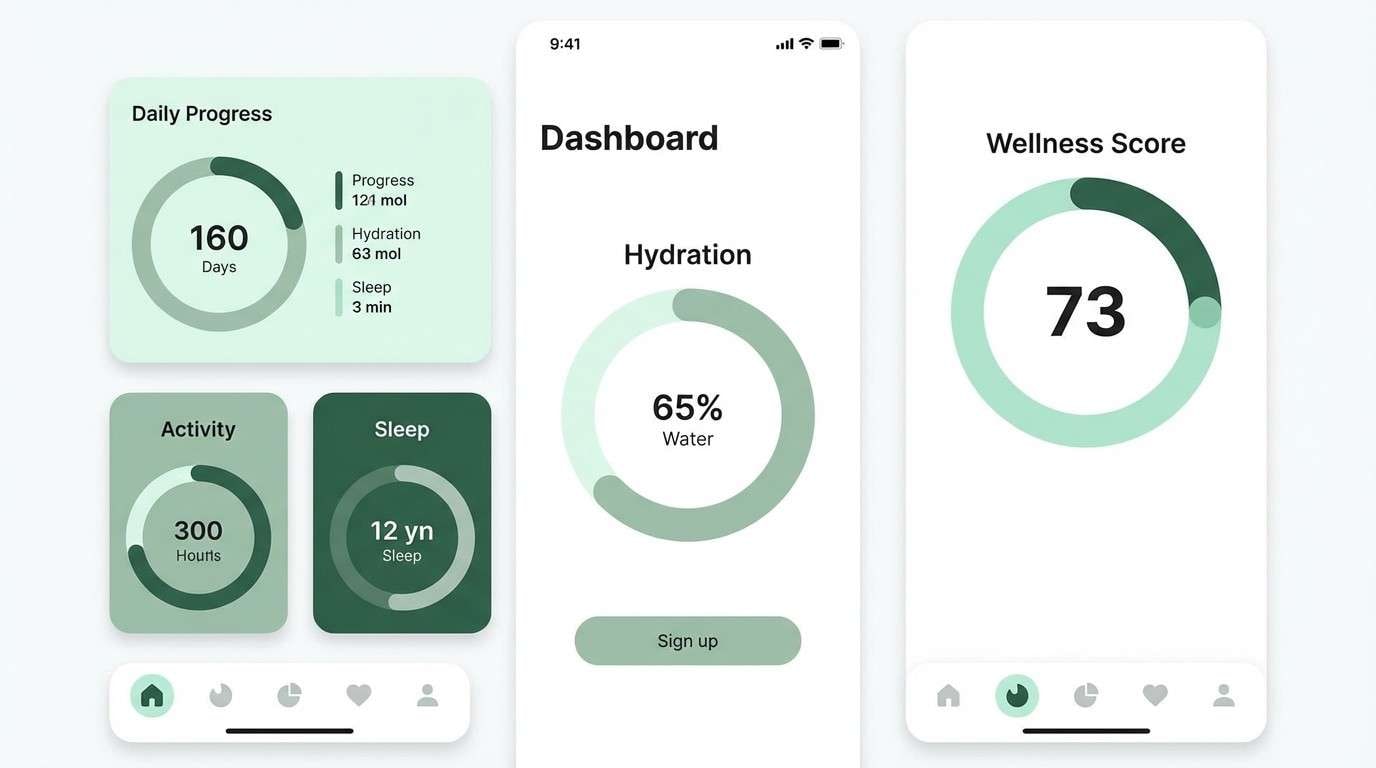
1) Aloe Mist
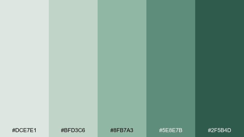
HEX: #DCE7E1 #BFD3C6 #8FB7A3 #5E8E7B #2F5B4D
Mood: fresh, airy, calm
Best for: wellness app UI
Fresh and airy like morning mist on aloe leaves, these tones feel clean without turning cold. The soft greens read beautifully in a wellness app UI, especially for onboarding and habit screens. Pair the deepest green with plenty of white space for clarity, and use the mid tones for cards and toggles. Tip: keep contrast high by reserving the darkest shade for key CTAs and active states.
Image example of aloe mist generated using media.io
Media.io is an online AI studio for creating and editing video, image, and audio in your browser.

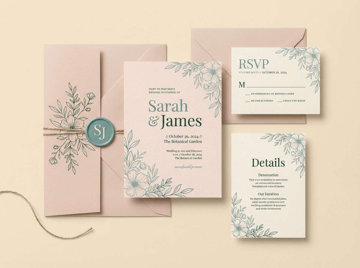
2) Cactus Bloom
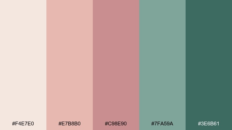
HEX: #F4E7E0 #E7B8B0 #C98E90 #7FA59A #3E6B61
Mood: romantic, modern, soft
Best for: wedding invitation set
Romantic and modern, it evokes cactus flowers against dusty leaves at sunset. It works especially well for a wedding invitation set where you want warmth without heavy golds. Pair the blush tones with the muted teal for contrast, and keep the cream as generous negative space. Tip: use the deeper green for names and headings to keep legibility crisp on textured paper.
Image example of cactus bloom generated using media.io
3) Echeveria Dust
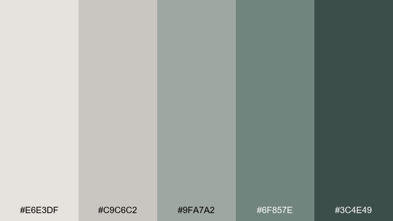
HEX: #E6E3DF #C9C6C2 #9FA7A2 #6F857E #3C4E49
Mood: minimal, grounded, editorial
Best for: magazine layout
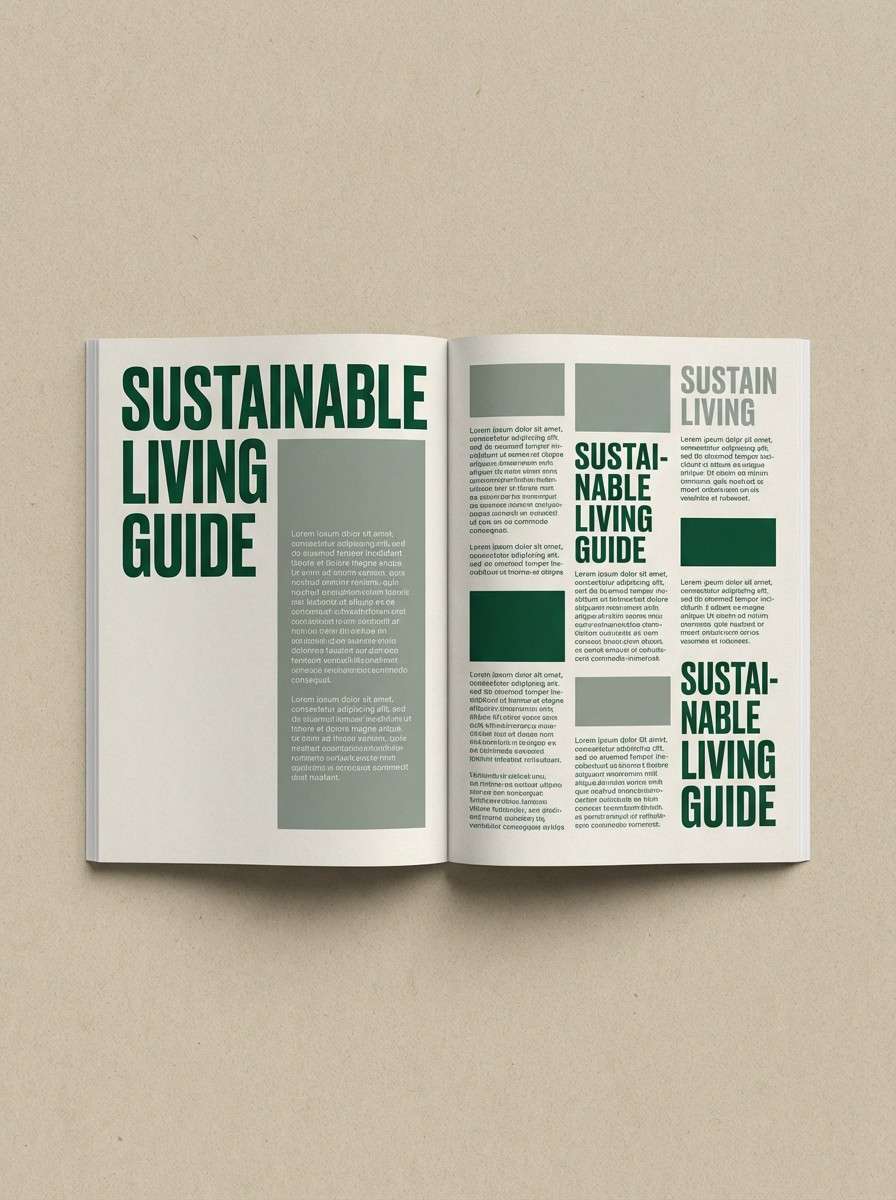
Minimal and grounded, it feels like powdery echeveria leaves and stone-washed ceramics. The neutral lean makes it ideal for a magazine layout with plenty of photography and strong typography. Pair the near-black green with warm gray for captions and pull quotes. Tip: keep backgrounds in the lightest shades to avoid muddy midtone blocks.
Image example of echeveria dust generated using media.io
4) Agave Shadow
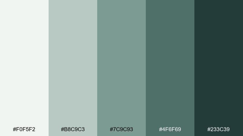
HEX: #F0F5F2 #B8C9C3 #7C9C93 #4F6F69 #233C39
Mood: cool, confident, structured
Best for: SaaS dashboard UI
Cool and confident, it brings to mind agave blades in shaded light with crisp edges. The structured contrast suits a SaaS dashboard UI where hierarchy needs to be obvious at a glance. Pair the mid sage with the pale mint for panels, and use the darkest tone for navigation and charts. Tip: reserve the deepest shade for active items to keep the interface calm.
Image example of agave shadow generated using media.io

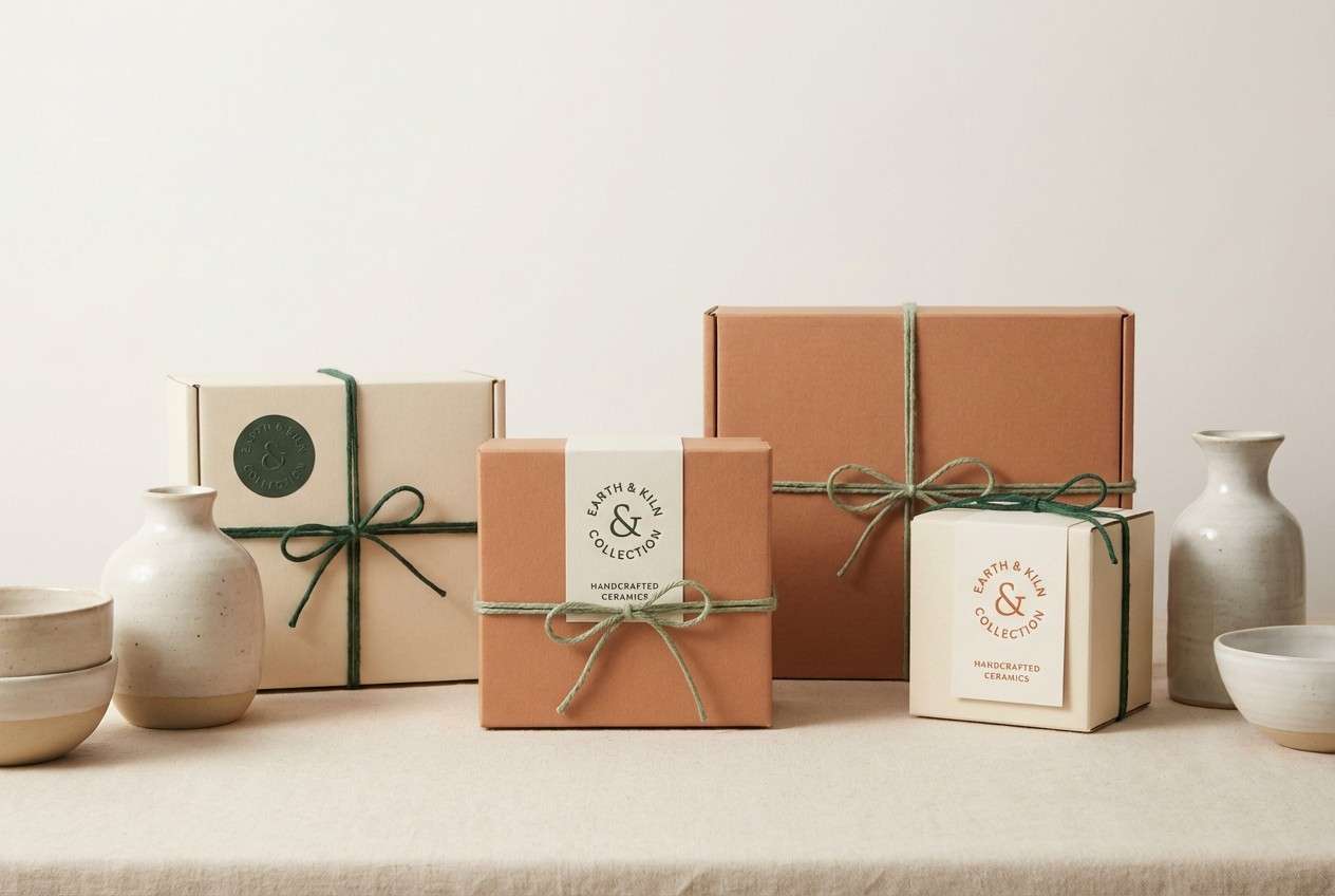
5) Sage Terracotta
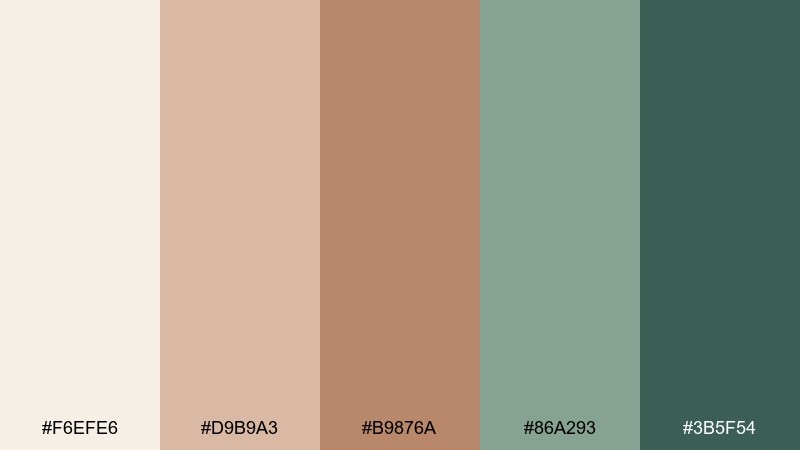
HEX: #F6EFE6 #D9B9A3 #B9876A #86A293 #3B5F54
Mood: earthy, cozy, artisan
Best for: ceramic brand packaging
Earthy and cozy, it feels like handmade clay pots next to soft sage leaves. These tones shine on ceramic brand packaging where texture and warmth matter. Pair terracotta with deep green for a premium contrast, and keep the cream for breathing room and labels. Tip: print the green as a spot color on uncoated stock to keep it rich, not muddy.
Image example of sage terracotta generated using media.io
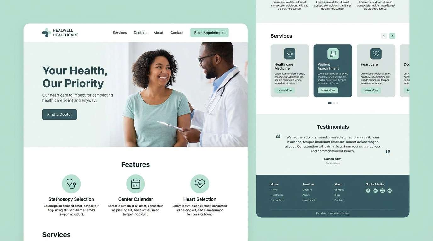
6) Mint Pebble
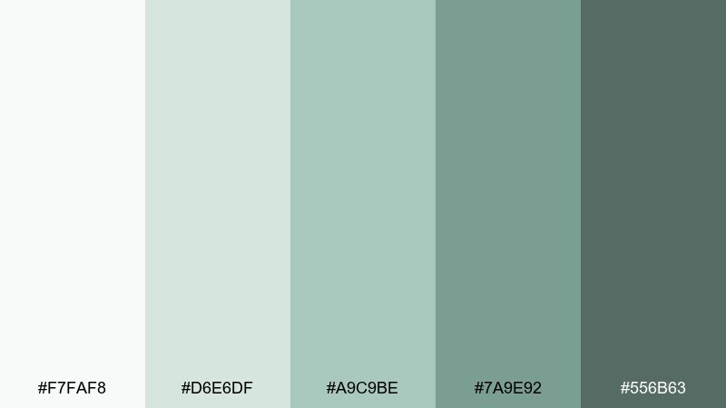
HEX: #F7FAF8 #D6E6DF #A9C9BE #7A9E92 #556B63
Mood: clean, friendly, approachable
Best for: healthcare landing page
Clean and friendly, it recalls mint leaves scattered over smooth river pebbles. The approachable balance makes it a strong fit for a healthcare landing page that needs trust and calm. Pair the pale mint with deeper green-gray for section headers and icons. Tip: use the darkest shade sparingly to keep the page feeling light and reassuring.
Image example of mint pebble generated using media.io
7) Desert Rosette
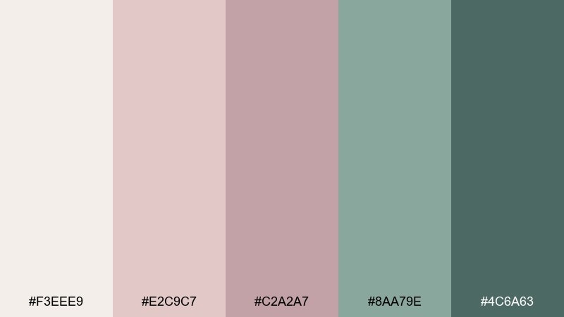
HEX: #F3EEE9 #E2C9C7 #C2A2A7 #8AA79E #4C6A63
Mood: soft, refined, contemporary
Best for: skincare product ad
Soft and refined, it suggests a rosette succulent in a warm, sandy room. The contemporary balance of blush and green works beautifully for a skincare product ad that needs gentle luxury. Pair the muted mauve with the dusty teal for a modern contrast, and keep the off-white for highlights. Tip: let one shade dominate and use the opposite family only for small callouts to avoid a candy look.
Image example of desert rosette generated using media.io
8) Prickly Pear Sorbet
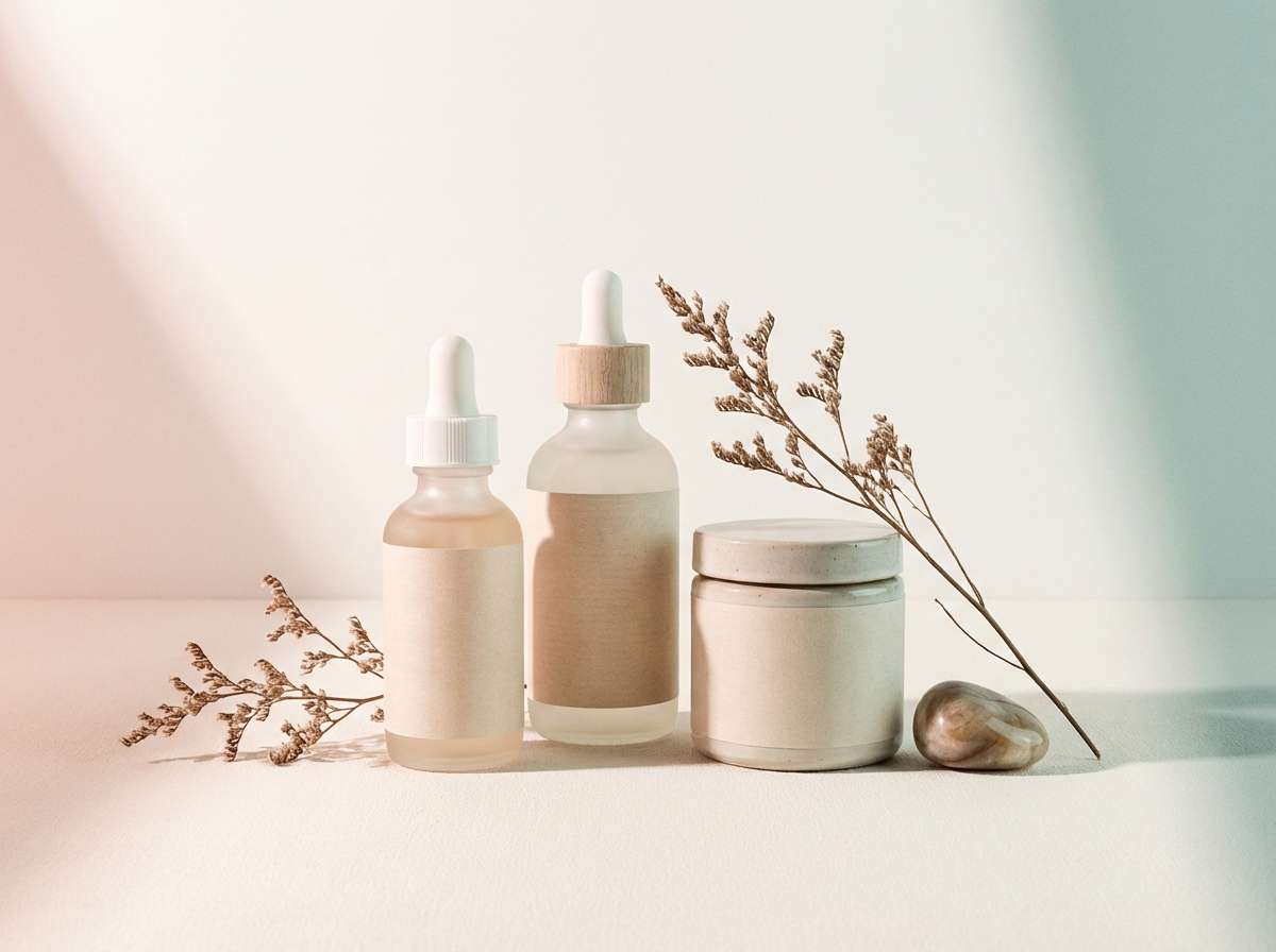
HEX: #FFF1F0 #F7C8C8 #DFA2A2 #9DB9AC #4E7D6C
Mood: playful, sweet, uplifting
Best for: summer cafe menu
Playful and sweet, it feels like prickly pear sorbet beside cool green pads. It is a great fit for a summer cafe menu where you want energy without harsh primaries. Pair the rosy midtones with the deep green for section titles, and keep the pale pink as a soft backdrop. Tip: use the strongest pink only for price tags or special badges so the design stays readable.
Image example of prickly pear sorbet generated using media.io
9) Olive Succulent
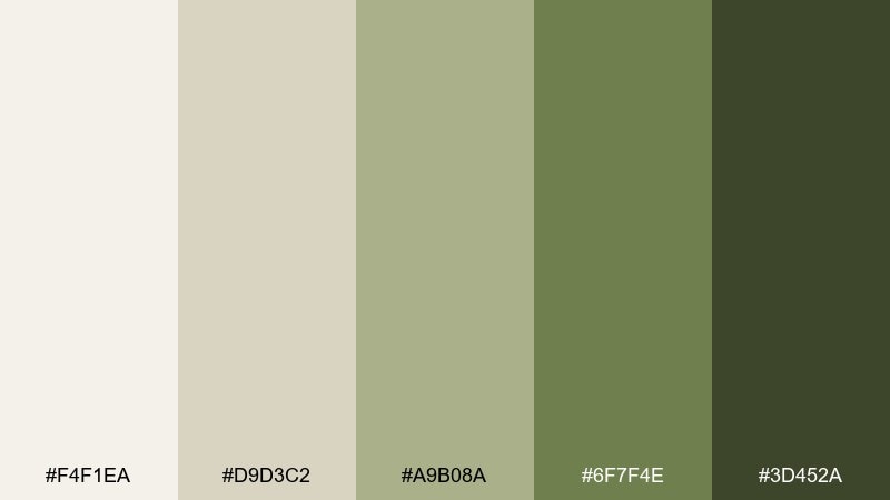
HEX: #F4F1EA #D9D3C2 #A9B08A #6F7F4E #3D452A
Mood: natural, rustic, confident
Best for: organic food label
Natural and rustic, it evokes olive branches and sun-dried succulent leaves in a pantry setting. These tones suit an organic food label where authenticity matters more than gloss. Pair the creamy neutrals with olive and deep moss for a grounded hierarchy. Tip: use the darkest green for ingredient lists to keep small text crisp in print.
Image example of olive succulent generated using media.io
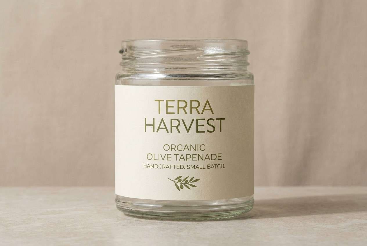
10) Jade Linen
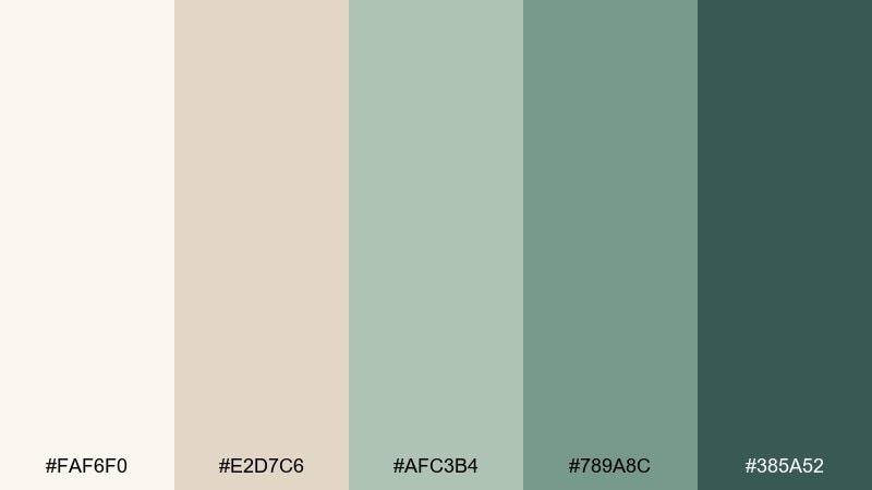
HEX: #FAF6F0 #E2D7C6 #AFC3B4 #789A8C #385A52
Mood: warm, airy, boutique
Best for: boutique hotel branding
Warm and airy, it looks like jade leaves against sunlit linen. The mix is well suited to boutique hotel branding, from stationery to signage, where calm sophistication is key. Pair the linen neutrals with jade midtones for backgrounds and patterns, then anchor with the deep green for logos. Tip: keep gradients subtle or skip them entirely to preserve the premium, tactile feel.
Image example of jade linen generated using media.io
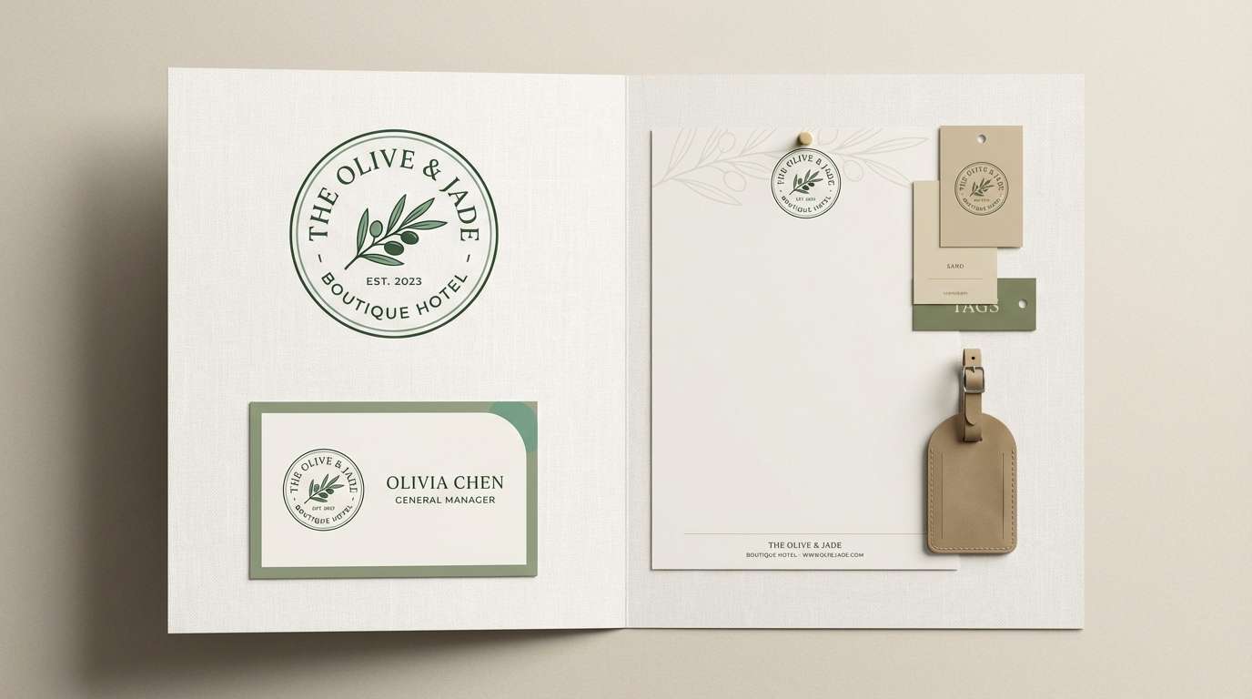
11) Seaglass Sedum
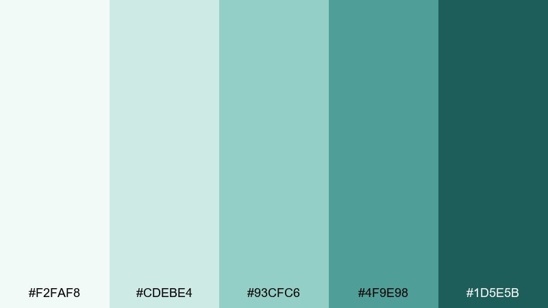
HEX: #F2FAF8 #CDEBE4 #93CFC6 #4F9E98 #1D5E5B
Mood: bright, coastal, refreshing
Best for: travel blog header
Bright and coastal, it channels sea-glass sparkle with sedum greens. The refreshing clarity is perfect for a travel blog header that needs to feel light, modern, and readable. Pair the palest aqua with the deep teal for strong type contrast, and use the midtones for icons and tags. Tip: keep imagery slightly desaturated so the teal accents do the heavy lifting.
Image example of seaglass sedum generated using media.io
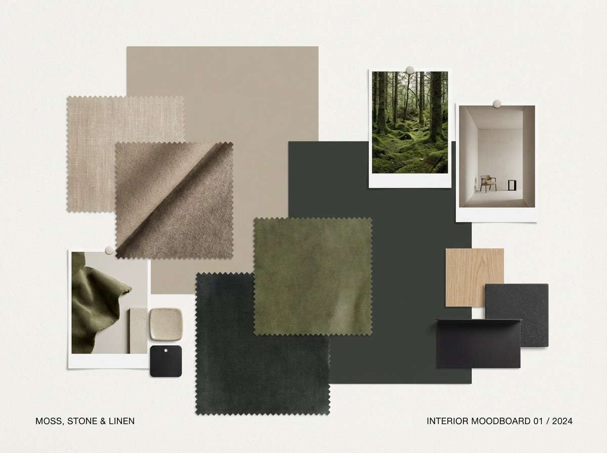
12) Mossy Clay Pot
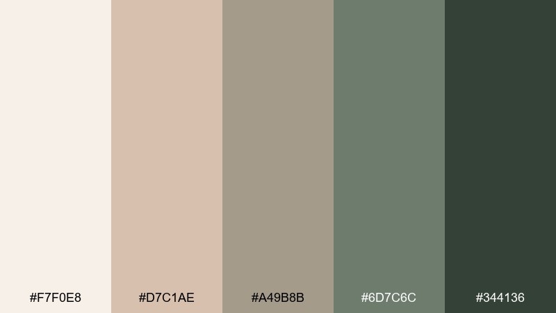
HEX: #F7F0E8 #D7C1AE #A49B8B #6D7C6C #344136
Mood: homey, grounded, vintage
Best for: interior design moodboard
Homey and grounded, it feels like a mossed clay pot on a wooden shelf. These muted neutrals are made for an interior design moodboard where materials matter more than bright color. Pair the warm beige with the moss green for textiles and accents, and use the charcoal green for typography. Tip: repeat one green tone across multiple swatches to make the board feel intentional, not random.
Image example of mossy clay pot generated using media.io
13) Saguaro Night
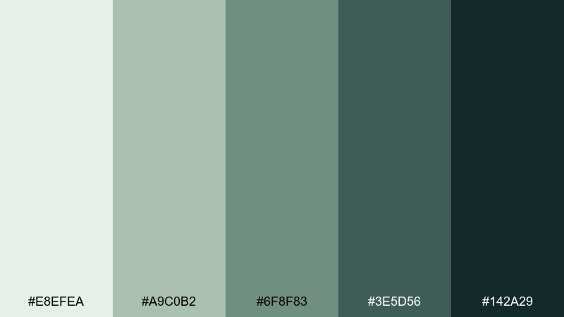
HEX: #E8EFEA #A9C0B2 #6F8F83 #3E5D56 #142A29
Mood: moody, cinematic, sleek
Best for: podcast cover art
Moody and cinematic, it brings desert silhouettes and saguaro shadows after dark. The deep contrast makes it a strong choice for podcast cover art that needs to pop at thumbnail size. Pair the near-black teal with pale mint for bold type, and keep the mid greens for subtle patterning. Tip: enlarge the title and use the lightest shade for lettering to stay readable on streaming apps.
Image example of saguaro night generated using media.io

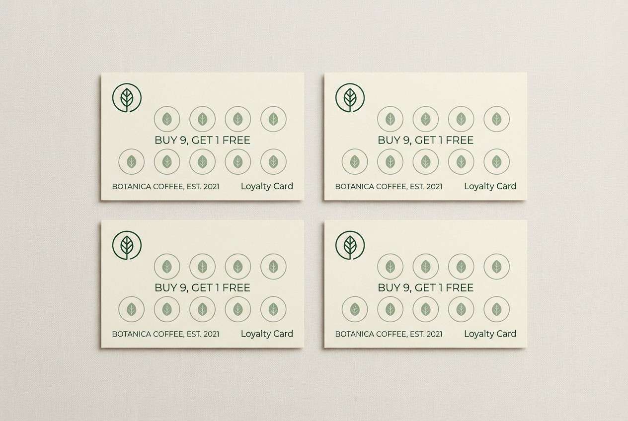
14) Aloe Latte
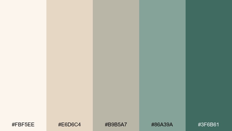
HEX: #FBF5EE #E6D6C4 #B9B5A7 #86A39A #3F6B61
Mood: soft, comforting, modern
Best for: coffee shop loyalty card
Soft and comforting, it reads like oat milk foam with a cool aloe tint. It works nicely on a coffee shop loyalty card where you want neutral warmth plus a fresh twist. Pair the latte creams with the sage midtone for stamps or icons, and use the deep green for the logo. Tip: keep text in the darkest shade and avoid light gray lettering that can disappear on warm paper.
Image example of aloe latte generated using media.io
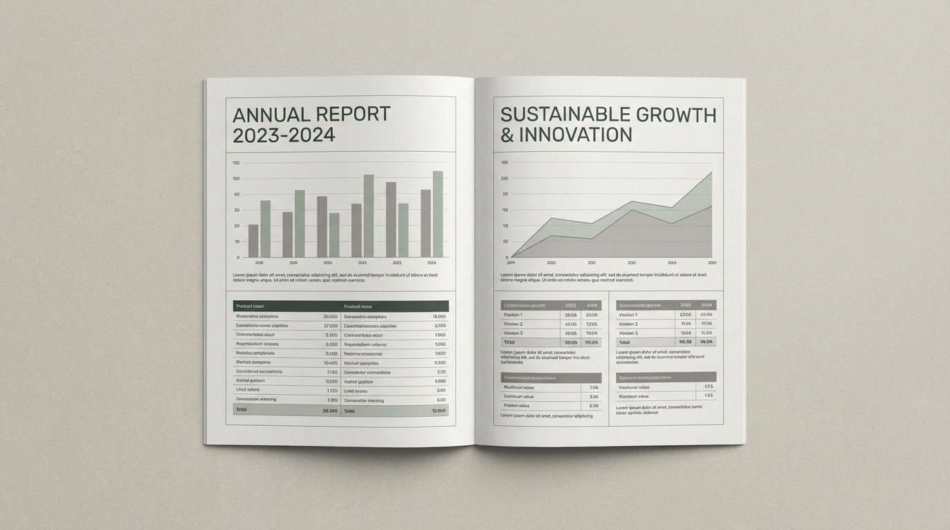
15) Pebble Sage
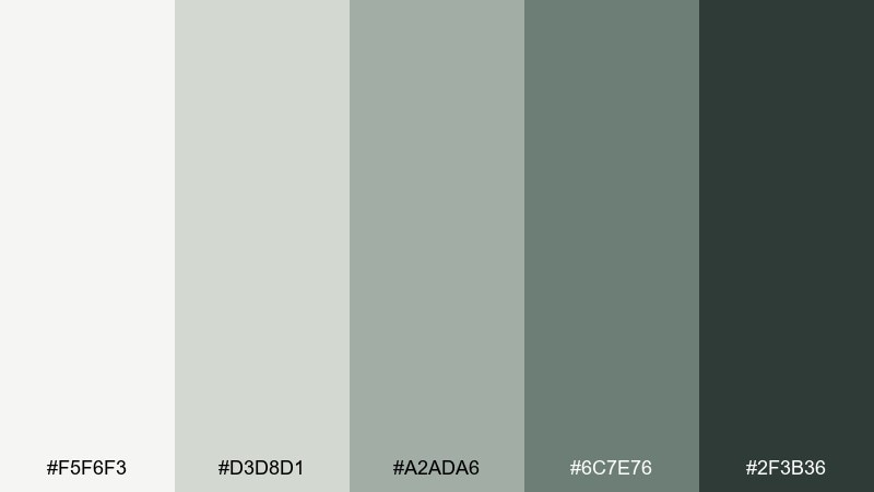
HEX: #F5F6F3 #D3D8D1 #A2ADA6 #6C7E76 #2F3B36
Mood: quiet, professional, timeless
Best for: corporate report design
Quiet and professional, it feels like smooth pebbles and dried sage tied with twine. The restrained contrast makes it ideal for a corporate report design that needs to stay readable and serious. Pair the light grays for charts and tables, then use the dark green-gray for headings and callouts. Tip: keep accent usage consistent by assigning one shade to each data series.
Image example of pebble sage generated using media.io
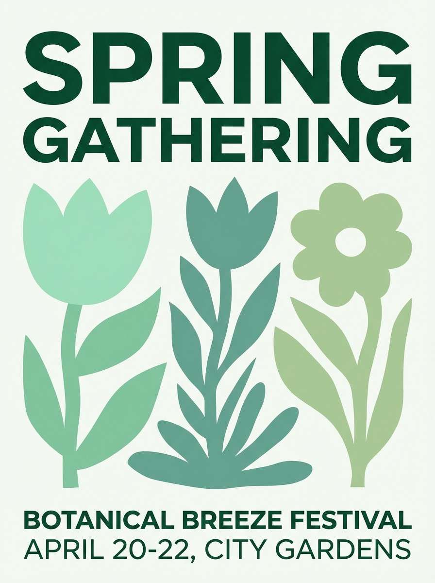
16) Verdigris Garden
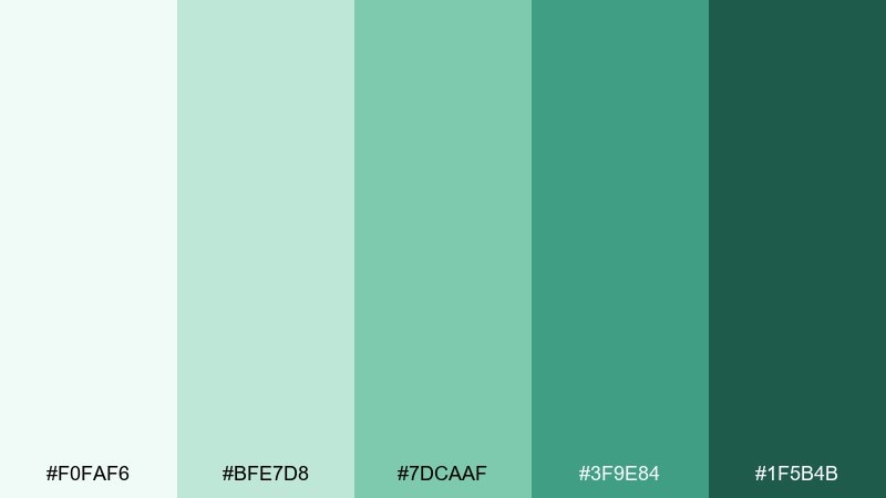
HEX: #F0FAF6 #BFE7D8 #7DCAAF #3F9E84 #1F5B4B
Mood: lively, botanical, optimistic
Best for: spring event poster
Lively and botanical, it suggests new shoots, watered soil, and a hint of copper patina. It is a great match for a spring event poster where you want freshness with enough punch to draw attention. Pair the brightest mint with the deep green for type contrast, and use the mid greens for shapes and borders. Tip: keep the background light and let a single saturated green carry the focal elements.
Image example of verdigris garden generated using media.io
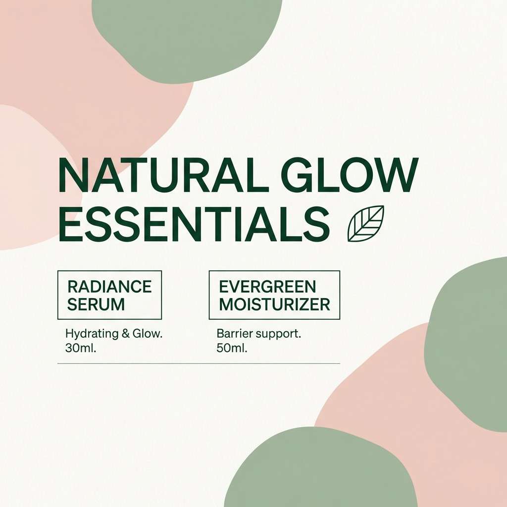
17) Dusty Aloe Pink
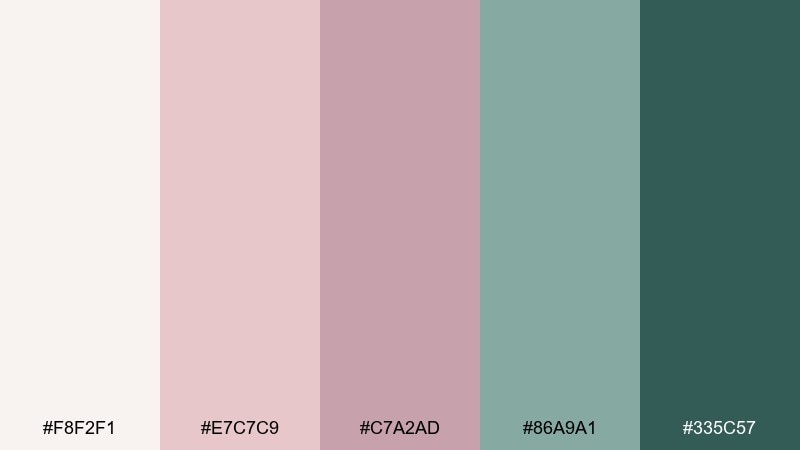
HEX: #F8F2F1 #E7C7C9 #C7A2AD #86A9A1 #335C57
Mood: gentle, stylish, balanced
Best for: beauty brand social post
Gentle and stylish, it looks like dusty aloe greens softened by a blush wash. These tones make a polished choice for a beauty brand social post that needs to feel calm, not loud. Pair the blush with the deep green for a clean contrast, and keep the lightest tone for breathing space around product copy. Tip: use the mauve as a subtle background block behind text to improve readability.
Image example of dusty aloe pink generated using media.io
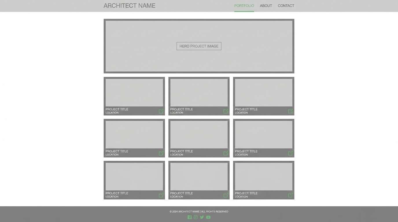
18) Cactus Concrete
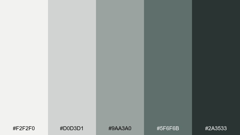
HEX: #F2F2F0 #D0D3D1 #9AA3A0 #5F6F6B #2A3533
Mood: urban, cool, understated
Best for: architecture portfolio site
Urban and cool, it evokes concrete walls with a hint of cactus green. The understated range suits an architecture portfolio site where photography should stay in the spotlight. Pair the light grays for page backgrounds and grids, and reserve the deep charcoal-green for navigation and captions. Tip: use one muted green-gray for link hover states so the interface feels intentional, not decorative.
Image example of cactus concrete generated using media.io
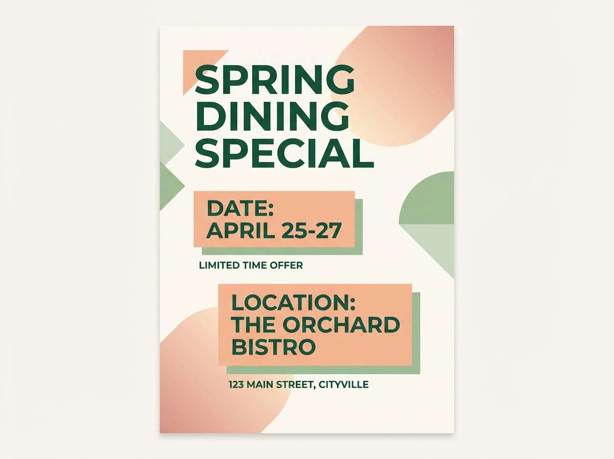
19) Aloe Sunset Blush
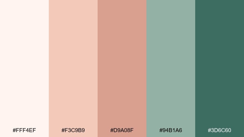
HEX: #FFF4EF #F3C9B9 #D9A08F #94B1A6 #3D6C60
Mood: warm, inviting, modern
Best for: restaurant promo flyer
Warm and inviting, it feels like sunset blush reflecting off aloe leaves on a patio. The mix gives restaurant promo flyers a welcoming vibe without going overly rustic. Pair the peach and blush tones with deep green for strong headlines, and keep the pale base for negative space. Tip: place the darkest shade behind small white text only in short bursts, like date and location badges.
Image example of aloe sunset blush generated using media.io
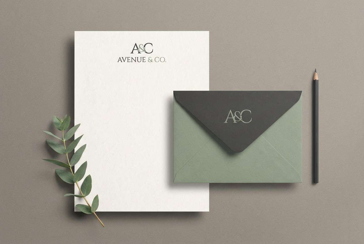
20) Sage Marble
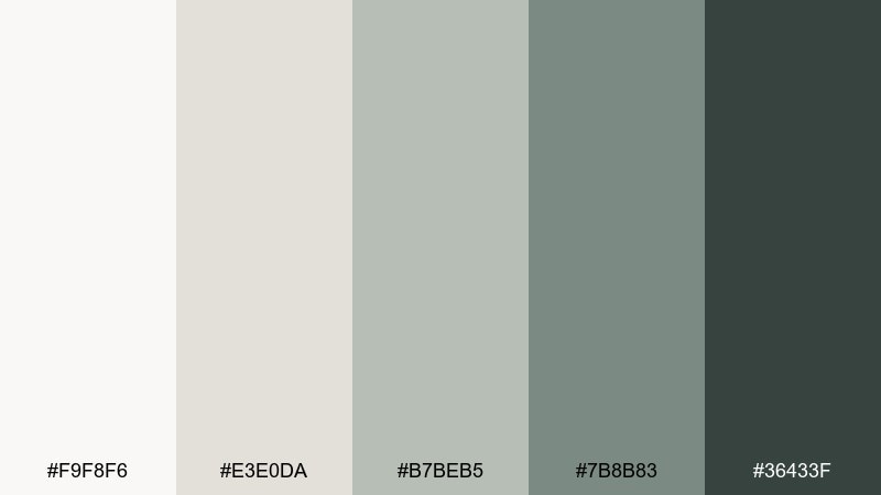
HEX: #F9F8F6 #E3E0DA #B7BEB5 #7B8B83 #36433F
Mood: elegant, calm, premium
Best for: luxury stationery
Elegant and calm, it resembles pale marble veining with sage shadows. The premium restraint makes it a strong fit for luxury stationery where typography and paper quality lead. Pair the light neutrals with the slate sage for monograms and borders, then anchor with the charcoal for key details. Tip: emboss or foil only the darkest tone elements to keep the look refined and not busy.
Image example of sage marble generated using media.io
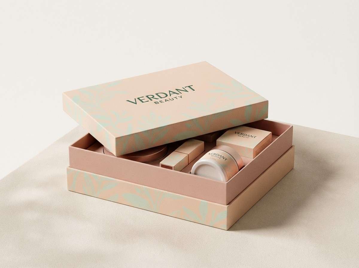
21) Botanical Gelato
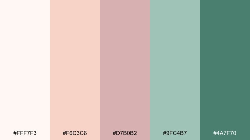
HEX: #FFF7F3 #F6D3C6 #D7B0B2 #9FC4B7 #4A7F70
Mood: sweet, airy, contemporary
Best for: cosmetics gift box
Sweet and airy, it brings to mind botanical gelato with a cool green finish. For packaging, these succulent color combinations feel modern and giftable without relying on loud saturation. Pair the soft peach with the deep green for a premium contrast, and use the mint tone for patterns or inner-box details. Tip: keep the outer box mostly light and save the darker green for logos and edges.
Image example of botanical gelato generated using media.io
22) Succulent Stonewash
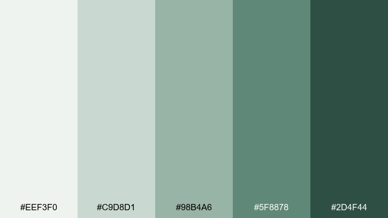
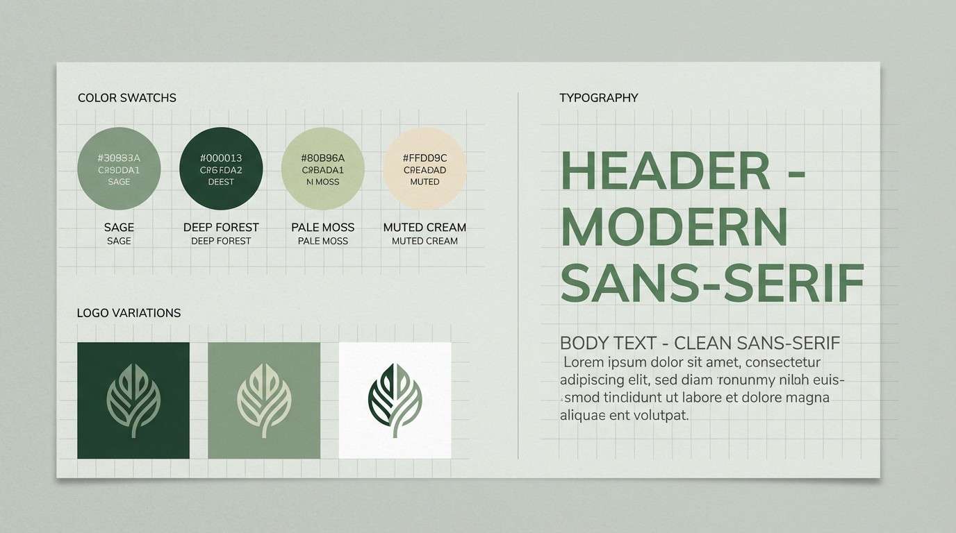
HEX: #EEF3F0 #C9D8D1 #98B4A6 #5F8878 #2D4F44
Mood: fresh, mature, versatile
Best for: brand style guide
Fresh yet mature, it feels like stonewashed fabric beside waxy green leaves. As a succulent color palette, it works well in a brand style guide because the range covers backgrounds, UI neutrals, and strong accents. Pair the pale gray-green with deep forest for typography, and use the mid sage for icons and secondary buttons. Tip: define one primary green and keep the others as supporting tones to avoid a scattered identity.
Image example of succulent stonewash generated using media.io
23) Aloe Clay Neutrals
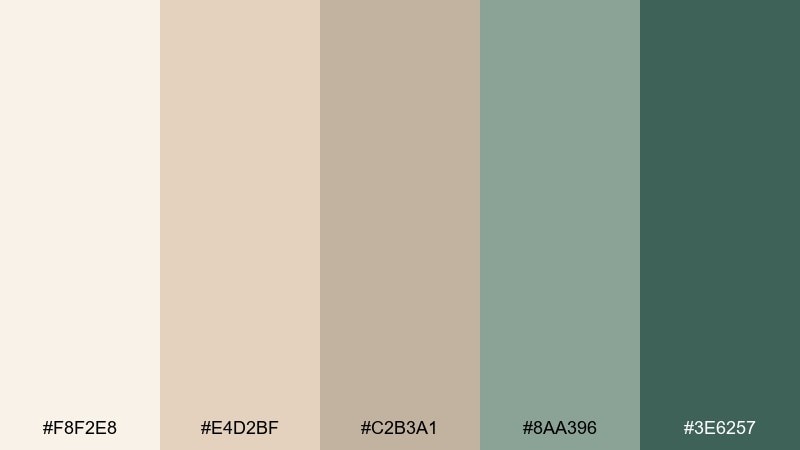
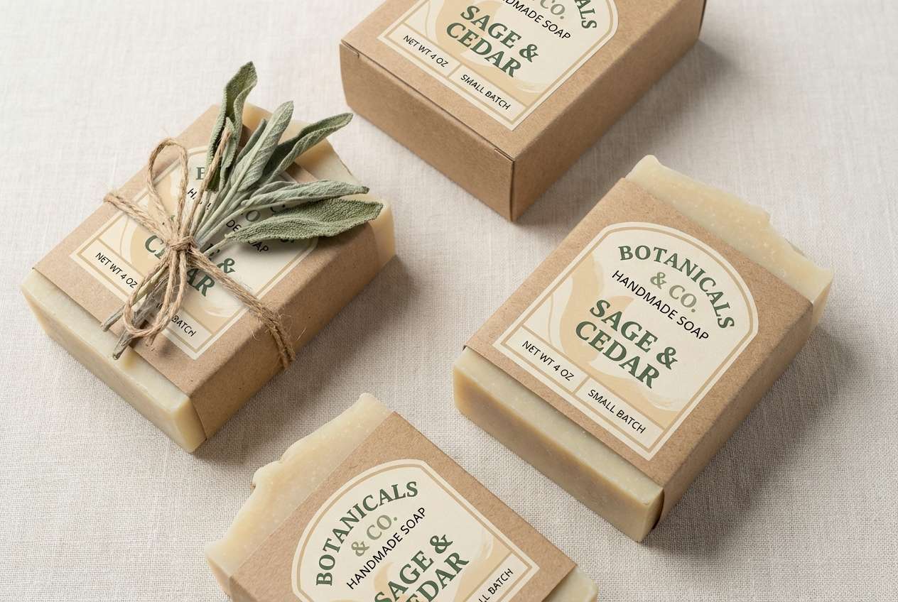
HEX: #F8F2E8 #E4D2BF #C2B3A1 #8AA396 #3E6257
Mood: calm, earthy, design-forward
Best for: handmade soap packaging
Calm and earthy, it recalls aloe gel tones layered with warm clay and sand. These succulent color combinations are especially good for handmade soap packaging where natural cues sell the story. Pair the warm neutrals with the deeper green for ingredient highlights, and keep the lightest shade for the main label field. Tip: use simple line illustrations in the midtone beige so the palette stays the hero.
Image example of aloe clay neutrals generated using media.io
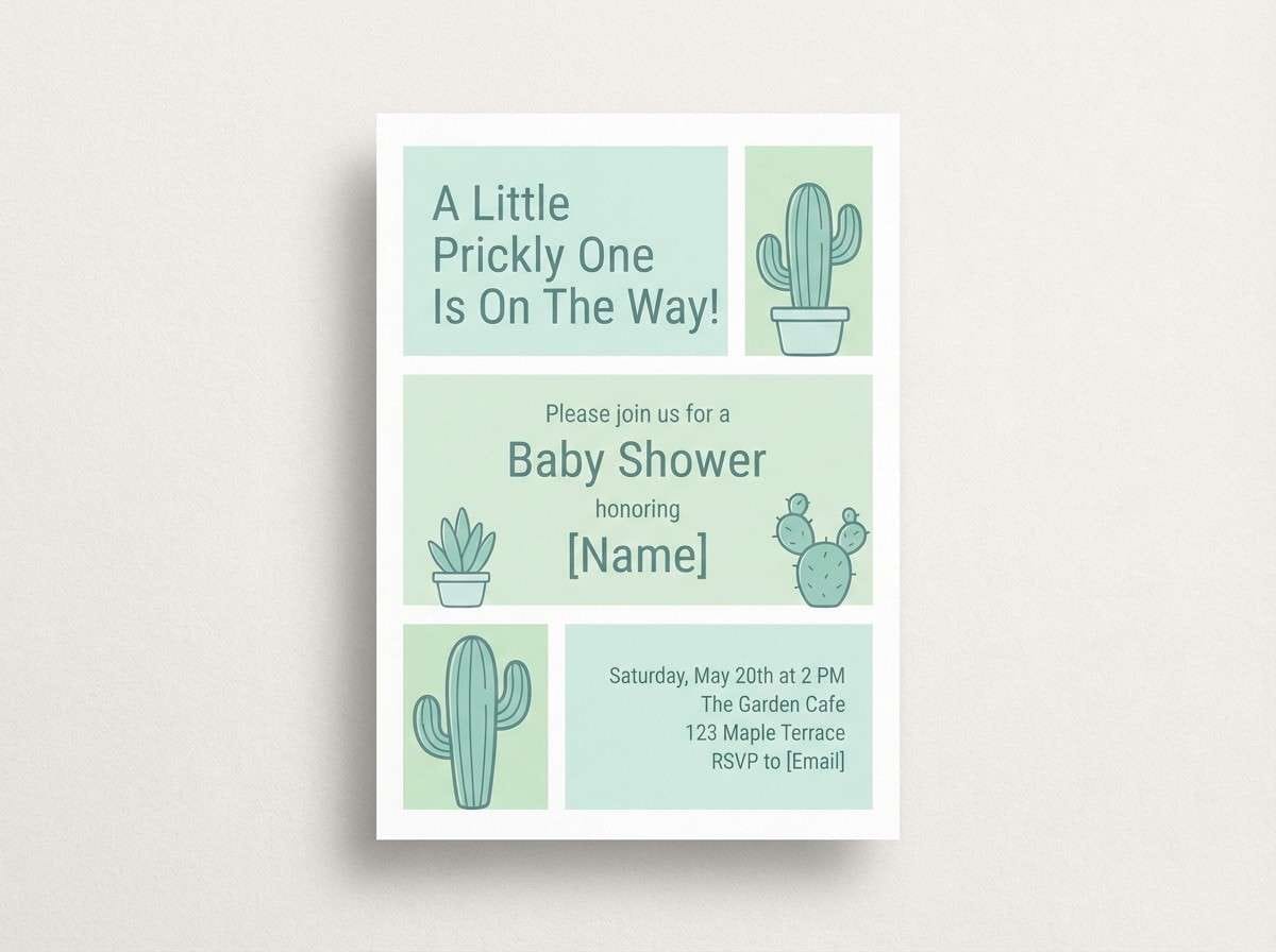
24) Soft Cactus Pastels
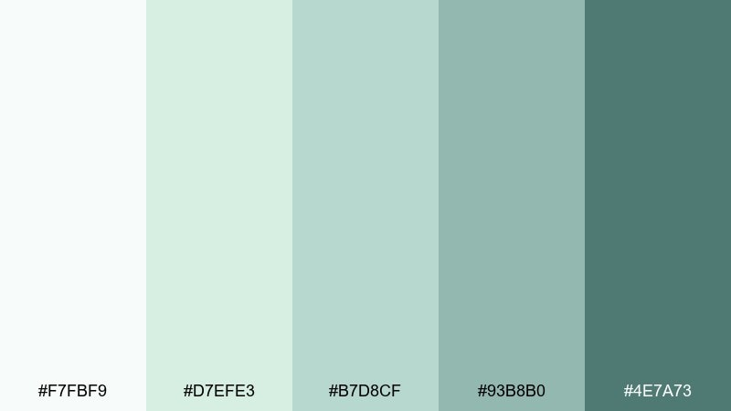
HEX: #F7FBF9 #D7EFE3 #B7D8CF #93B8B0 #4E7A73
Mood: light, soothing, optimistic
Best for: baby shower invitation
Light and soothing, it feels like pastel cactus pads in a sunlit nursery. The gentle contrast is a natural fit for a baby shower invitation that wants freshness without bright candy hues. Pair the palest mint with the teal for headings, and use the midtones for small icons or borders. Tip: keep typography simple and let rounded shapes echo the soft palette.
Image example of soft cactus pastels generated using media.io
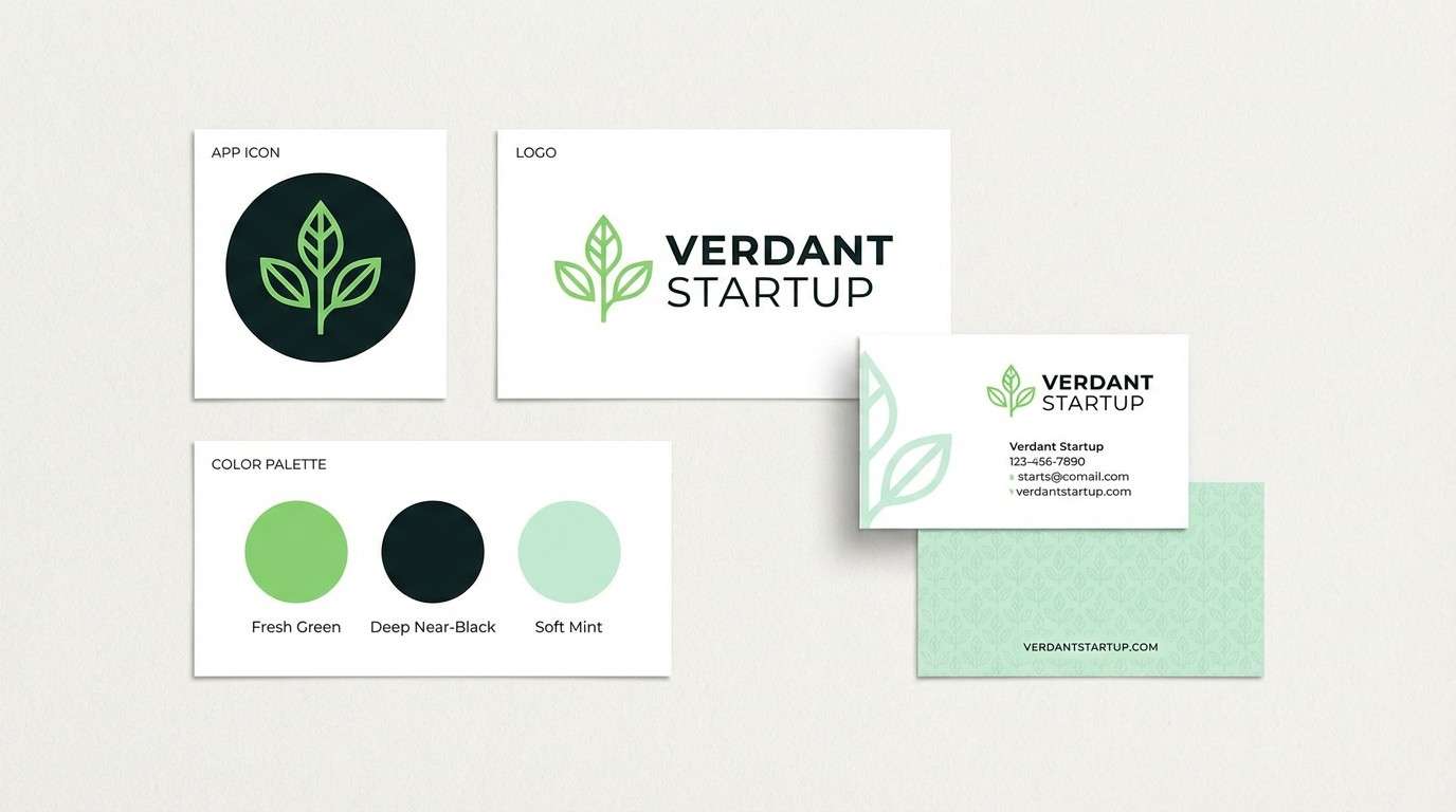
25) Modern Succulent Contrast
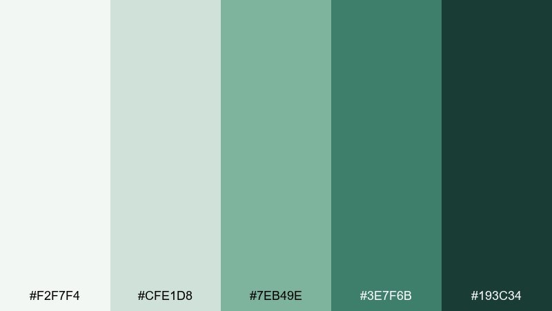
HEX: #F2F7F4 #CFE1D8 #7EB49E #3E7F6B #193C34
Mood: modern, bold, energetic
Best for: startup branding
Modern and bold, it evokes crisp succulent leaves with a confident, saturated edge. For startup branding, this succulent color palette gives you both clean neutrals and a strong green that reads instantly. Pair the bright green with the near-black for logos, buttons, and social headers, and keep the pale tones for web backgrounds. Tip: if you need a single hero color, choose the saturated green and support it with soft tints rather than adding extra accents.
Image example of modern succulent contrast generated using media.io
What Colors Go Well with Succulent?
Succulent greens pair naturally with warm neutrals like cream, sand, and linen because they echo real materials (paper, clay, stone). This keeps the palette grounded and helps product shots or typography feel more premium.
For contrast, add a deep anchor such as charcoal green, near-black teal, or slate gray. These darker tones improve readability for UI and print, especially for headings, navigation, and small text.
If you want a softer accent, blush, mauve, or muted terracotta can warm the scheme without turning it loud. Use these warm accents sparingly to avoid competing with the greens.
How to Use a Succulent Color Palette in Real Designs
Start by assigning roles: one light tone for backgrounds, one mid-tone for surfaces (cards, panels), one saturated green for emphasis, and one deep shade for text and CTAs. This keeps your succulent color palette consistent across pages and formats.
In UI design, reserve the darkest green for active states and primary buttons, while using pale mint/gray-green as the calm foundation. In print and packaging, lean into uncoated stocks and subtle textures so muted cactus colors don’t print muddy.
When mixing warm and cool families (like blush with teal), let one family dominate and treat the other as a highlight. That single decision prevents the “too pastel” or “too candy” look.
Create Succulent Palette Visuals with AI
If you already have HEX codes, the fastest way to validate them is to see them in context—on a landing page header, a label mockup, or a social post layout. Visual testing reveals contrast issues and helps you choose the right dominant color.
With Media.io’s AI image generation, you can turn each succulent palette idea into ready-to-review design mockups, then iterate prompts for different formats like posters, packaging, and UI screens.
Use your palette name, intended use (UI/print/packaging), and a few keywords like “minimal,” “premium,” or “editorial” to keep results consistent.


