

Flax is a warm, sunlit yellow-beige that instantly makes designs feel friendly, grounded, and easy to read. It’s the kind of neutral that doesn’t look “flat” because it carries a soft golden undertone.
Below are 20+ flax color combinations with HEX codes, plus practical tips for branding, interiors, and modern UI. You’ll also see AI-generated image examples you can recreate in minutes.
In this article
- Why Flax Palettes Work So Well
-
- sunlit linen
- wheatfield dusk
- honeyed sandstone
- oat milk minimal
- desert paper
- golden meadow
- clay and canvas
- antique brass glow
- sage drift
- terracotta whisper
- cocoa stitch
- coastal straw
- soft sepia studio
- olive herb market
- blush beige bloom
- charcoal contrast
- citrus grain
- foggy reed
- vintage bookshop
- copper harvest
- monochrome flax
- What Colors Go Well with Flax?
- How to Use a Flax Color Palette in Real Designs
- Create Flax Palette Visuals with AI
Why Flax Palettes Work So Well
Flax sits in the sweet spot between beige and muted gold, so it reads as neutral while still feeling warm. That warmth helps brands and interfaces feel more human—without relying on loud accent colors.
Because flax is naturally light, it supports clean layouts and strong readability. Pair it with dark browns, charcoal, or blue-gray for confident contrast, and it still feels soft rather than harsh.
Flax palettes also adapt across styles: minimal UI, rustic packaging, refined editorial layouts, and calm wellness themes. The key is using flax as the “light foundation” and letting deeper tones carry hierarchy.
20+ Flax Color Palette Ideas (with HEX Codes)
1) Sunlit Linen
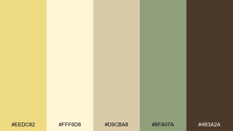
HEX: #EEDC82 #FFF6D8 #D9CBA8 #8FA07A #4B3A2A
Mood: airy and optimistic
Best for: lifestyle branding and landing pages
Airy and optimistic, like sunlight hitting fresh linen in a quiet room. These warm neutrals stay clean on the page while the muted green adds a calm, natural accent. Use it for lifestyle brands, wellness sites, and editorial hero sections where readability matters. Tip: keep the darkest brown for headlines and buttons so the softer tones can breathe.
Image example of sunlit linen generated using media.io
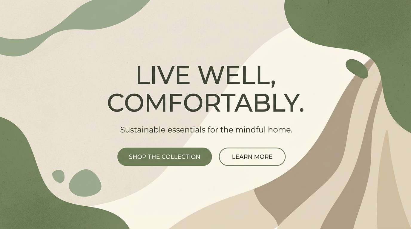
Media.io is an online AI studio for creating and editing video, image, and audio in your browser.

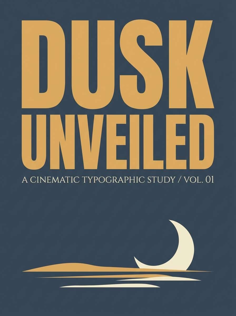
2) Wheatfield Dusk
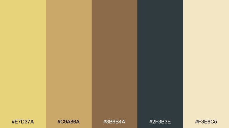
HEX: #E7D37A #C9A86A #8B6B4A #2F3B3E #F3E6C5
Mood: grounded and cinematic
Best for: poster design and book covers
Grounded and cinematic, like a wheatfield fading into dusk. The deep blue-gray brings drama while the grainy golds keep it warm and inviting. It works beautifully for posters, book covers, and packaging labels that need a rustic edge without looking dated. Tip: use the blue-gray as a large backdrop and let the lighter cream hold the text for crisp contrast.
Image example of wheatfield dusk generated using media.io
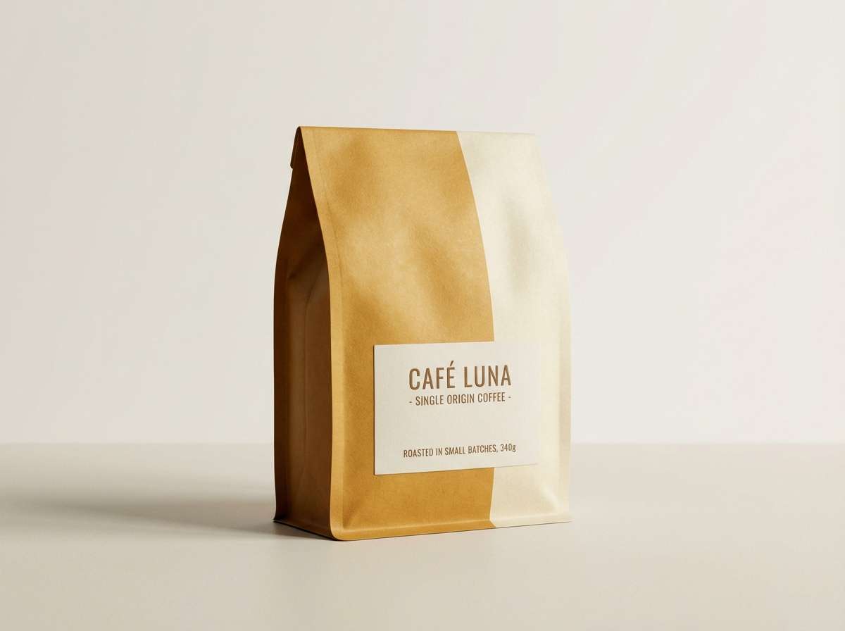
3) Honeyed Sandstone
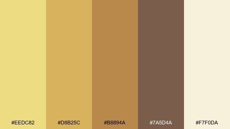
HEX: #EEDC82 #D8B25C #B8894A #7A5D4A #F7F0DA
Mood: rich and inviting
Best for: coffee packaging and product ads
Rich and inviting, like honey poured over warm sandstone. The golden midtones feel premium, while the pale cream keeps the look modern instead of heavy. This flax color palette fits coffee packaging, artisanal goods, and product ads that need warmth without visual clutter. Tip: print with a matte finish and reserve the darkest brown for logos and key claims.
Image example of honeyed sandstone generated using media.io
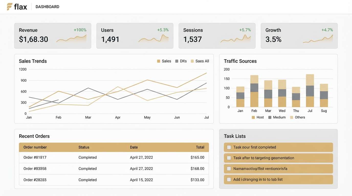
4) Oat Milk Minimal
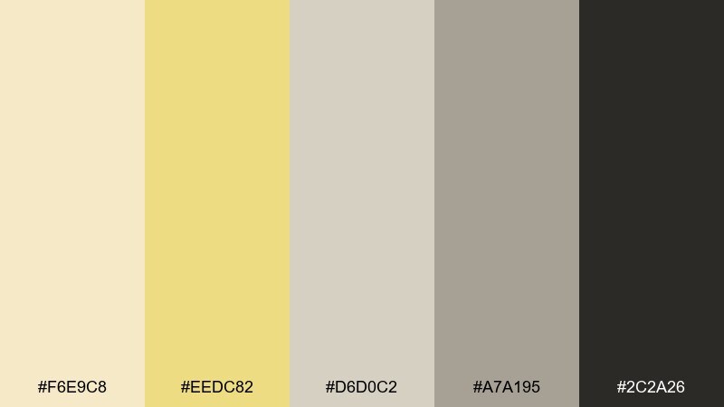
HEX: #F6E9C8 #EEDC82 #D6D0C2 #A7A195 #2C2A26
Mood: calm and modern
Best for: ui dashboards and SaaS sites
Calm and modern, like oat milk foam against a stone countertop. The warm flax tone softens the grays, and the near-black keeps interfaces sharp and accessible. Ideal for dashboards, SaaS marketing pages, and settings screens where long sessions should feel easy on the eyes. Tip: use the flax tint for highlights and empty states rather than full-width panels.
Image example of oat milk minimal generated using media.io
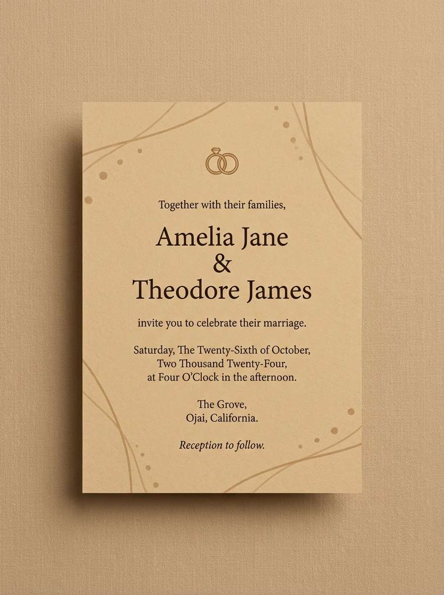
5) Desert Paper
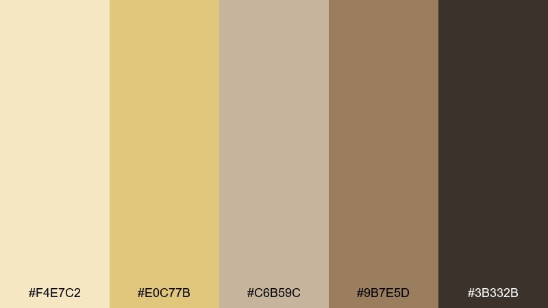
HEX: #F4E7C2 #E0C77B #C6B59C #9B7E5D #3B332B
Mood: soft and tactile
Best for: wedding invitations and stationery
Soft and tactile, like handmade paper warmed by desert light. The palette leans neutral but never feels flat thanks to the sandy midtones and grounded espresso brown. Use it for wedding invites, menus, and stationery where texture and elegance matter more than bright color. Tip: pair with a serif font and add subtle grain for a printed, crafted look.
Image example of desert paper generated using media.io
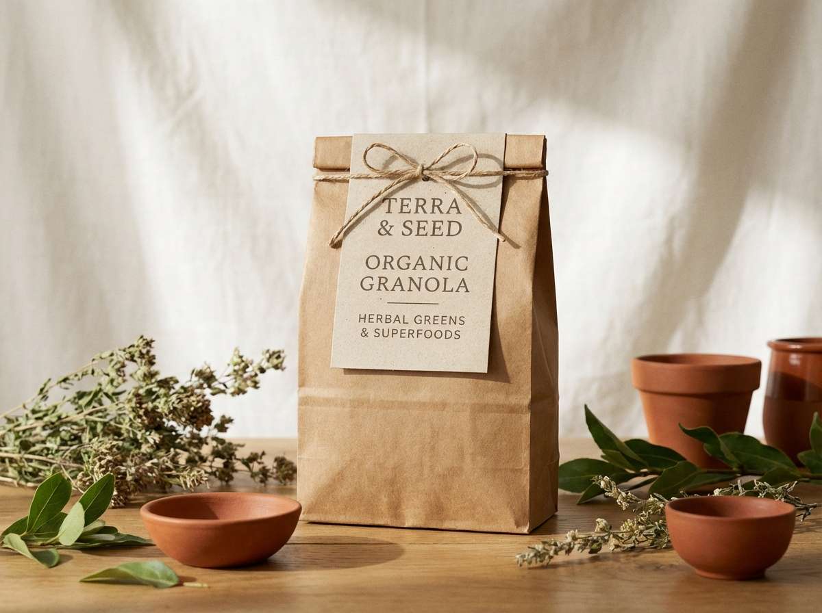
6) Golden Meadow
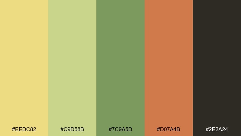
HEX: #EEDC82 #C9D58B #7C9A5D #D07A4B #2E2A24
Mood: fresh and outdoorsy
Best for: organic food branding and labels
Fresh and outdoorsy, like a meadow path with wild herbs and sun-warmed soil. The green and terracotta create flax color combinations that feel seasonal without going overly rustic. Great for organic food branding, farm labels, and eco-conscious product lines that want approachable color. Tip: keep black minimal and let the warm terracotta call attention to flavor notes or callouts.
Image example of golden meadow generated using media.io
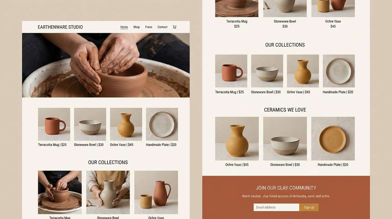
7) Clay and Canvas
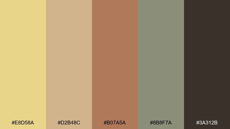
HEX: #E8D58A #D2B48C #B07A5A #8B8F7A #3A312B
Mood: crafty and warm
Best for: ceramics shops and maker brands
Crafty and warm, like clay dust on a canvas apron. The neutral base feels handmade, while the muted sage-gray keeps it contemporary and calm. Perfect for ceramics shops, maker brands, and small-batch marketplaces that want an earthy identity. Tip: use the clay tone for icons and patterns, and save the darkest brown for navigation and CTAs.
Image example of clay and canvas generated using media.io
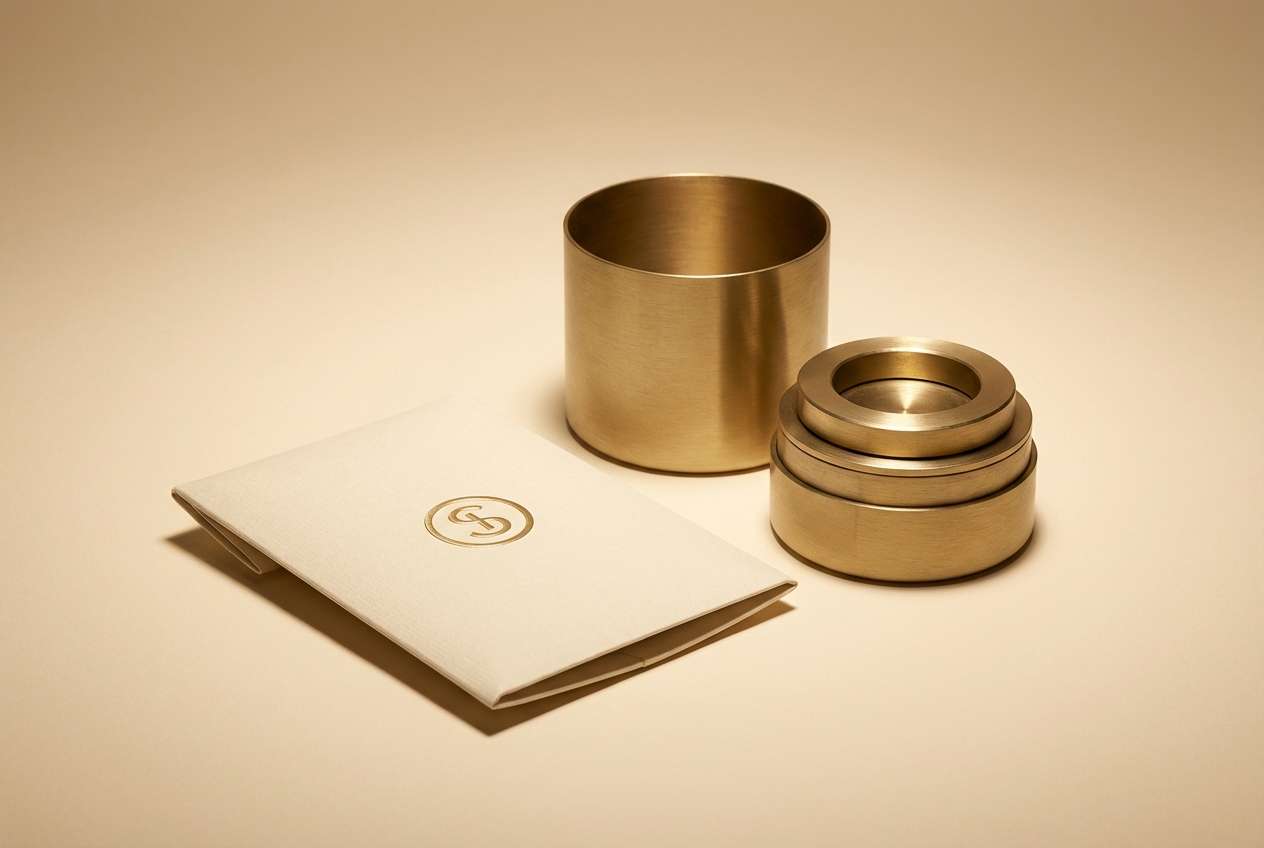
8) Antique Brass Glow
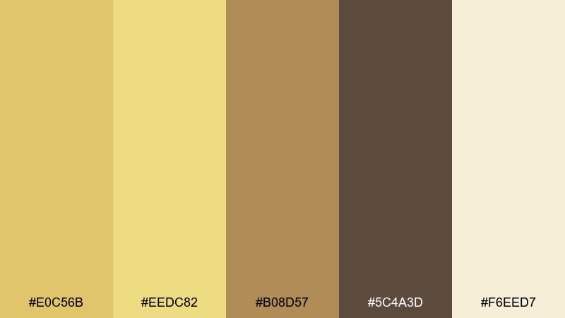
HEX: #E0C56B #EEDC82 #B08D57 #5C4A3D #F6EED7
Mood: vintage and luxe
Best for: jewelry ads and premium packaging
Vintage and luxe, like antique brass catching candlelight. The gold-forward tones read premium, while the pale cream prevents the design from feeling heavy. Use it for jewelry ads, premium packaging, or boutique lookbooks where warmth signals quality. Tip: add subtle foil or metallic effects only on the mid-gold, and keep text in the dark cocoa for clarity.
Image example of antique brass glow generated using media.io
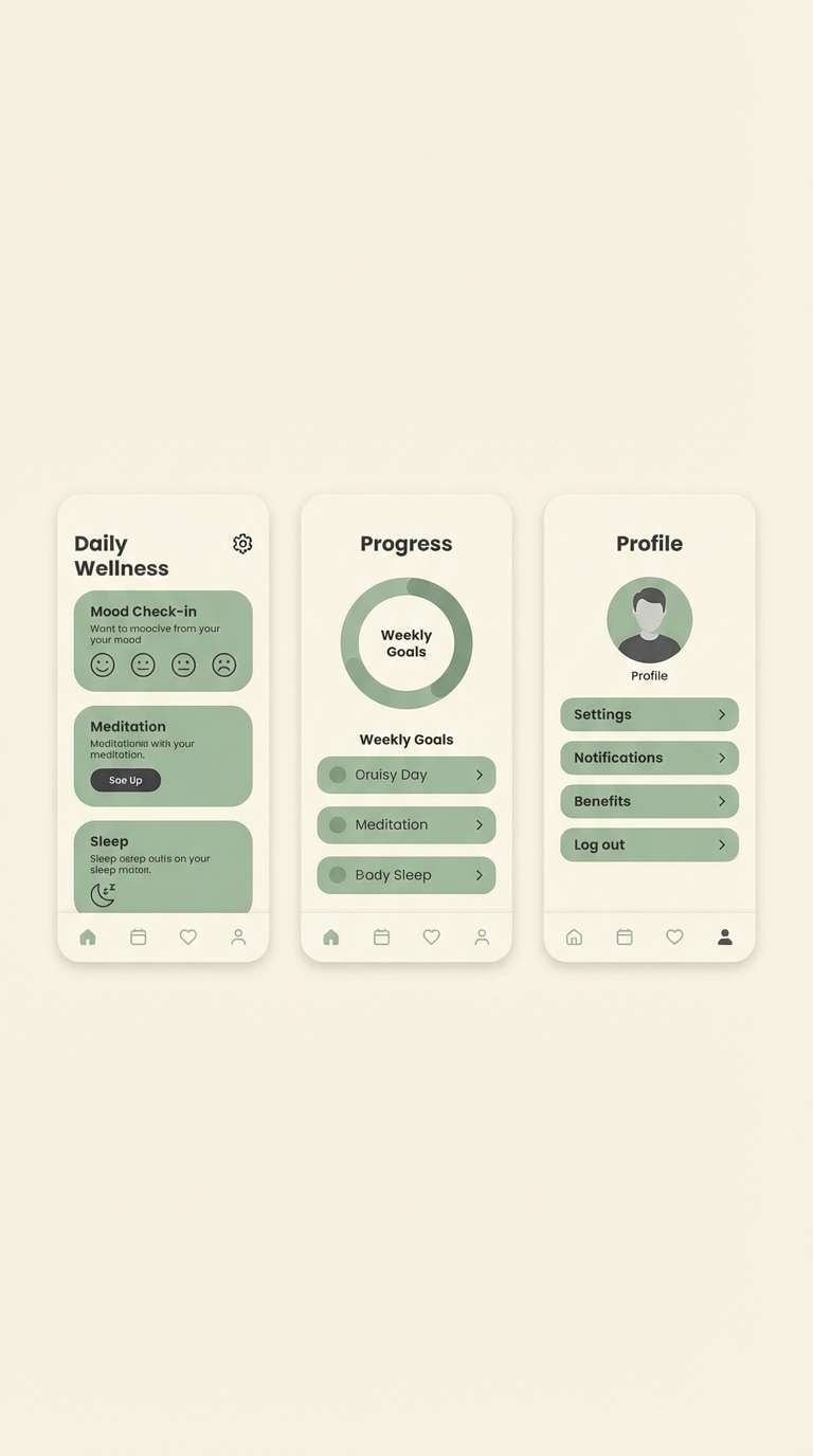
9) Sage Drift
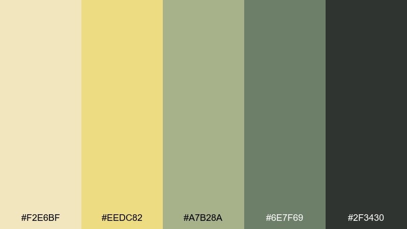
HEX: #F2E6BF #EEDC82 #A7B28A #6E7F69 #2F3430
Mood: quiet and restorative
Best for: spa websites and wellness apps
Quiet and restorative, like sage drifting through warm air. The gentle greens balance the buttery neutral, creating a flax color scheme that feels clean and grounded. It suits spa websites, wellness apps, and meditation content that should look soothing on repeat visits. Tip: use the lightest tone as the main background and apply the darker green sparingly for active states.
Image example of sage drift generated using media.io
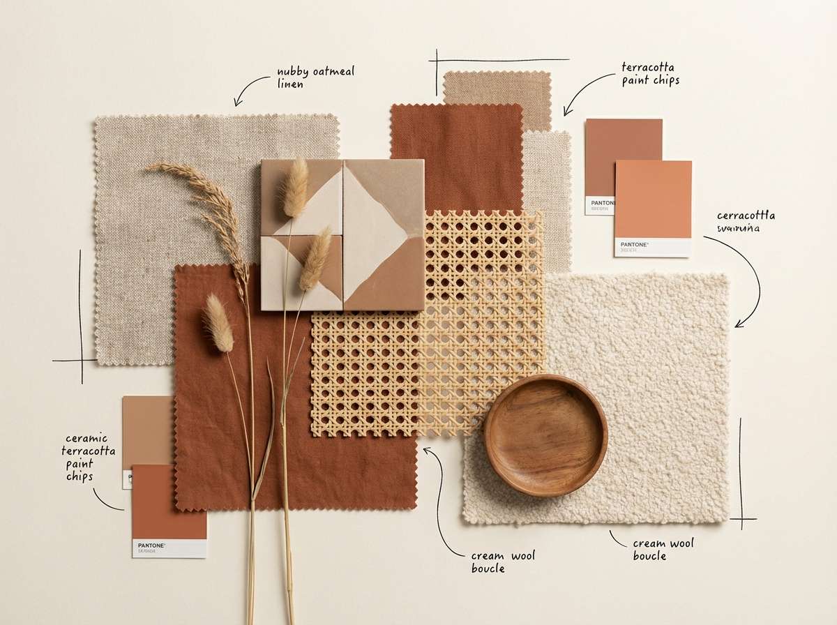
10) Terracotta Whisper
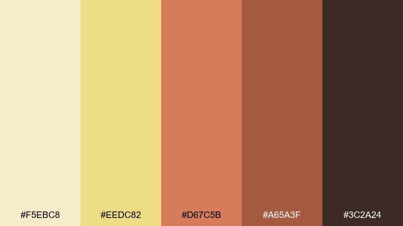
HEX: #F5EBC8 #EEDC82 #D67C5B #A65A3F #3C2A24
Mood: cozy and expressive
Best for: interior mood boards and home decor
Cozy and expressive, like terracotta pots on a sunlit windowsill. The warm orange-browns add personality while the creamy flax tones keep the room feeling open. Great for interior mood boards, home decor collections, and seasonal campaigns that lean welcoming. Tip: let terracotta lead in small doses, like pillows or headings, so the neutrals remain the hero.
Image example of terracotta whisper generated using media.io
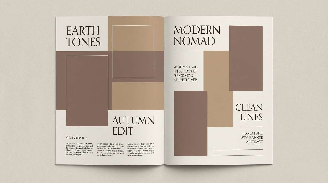
11) Cocoa Stitch
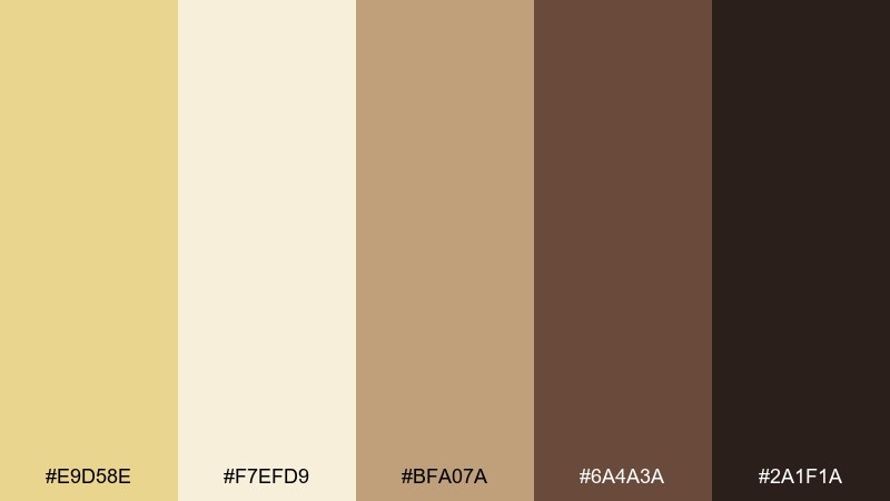
HEX: #E9D58E #F7EFD9 #BFA07A #6A4A3A #2A1F1A
Mood: heritage and comforting
Best for: fashion lookbooks and knitwear labels
Heritage and comforting, like cocoa beside a wool blanket. The deep browns bring weight and storytelling, while the creamy highlights keep layouts readable. Use it for fashion lookbooks, knitwear labels, and boutique ecommerce where warmth signals craft. Tip: set product photography on neutral cream so the darker tones can frame the page without feeling heavy.
Image example of cocoa stitch generated using media.io
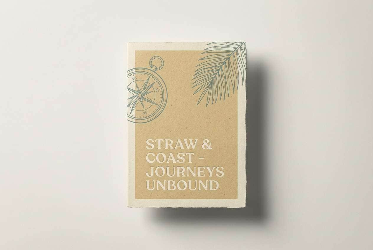
12) Coastal Straw
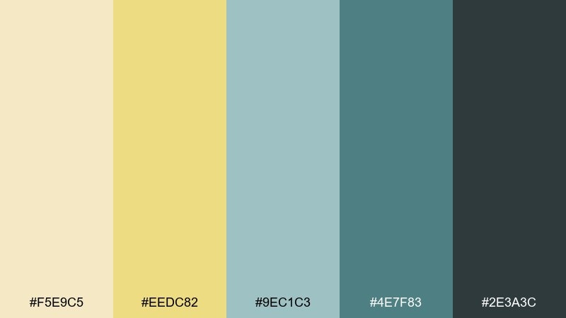
HEX: #F5E9C5 #EEDC82 #9EC1C3 #4E7F83 #2E3A3C
Mood: breezy and relaxed
Best for: travel branding and resort ads
Breezy and relaxed, like dried straw and sea glass on the shore. The cool teal notes modernize the warm base and create a clean, vacation-ready contrast. This flax color palette works for travel branding, resort ads, and coastal boutiques that want a calm but polished look. Tip: keep teal for accents and buttons, and let the light cream dominate large sections for an airy feel.
Image example of coastal straw generated using media.io
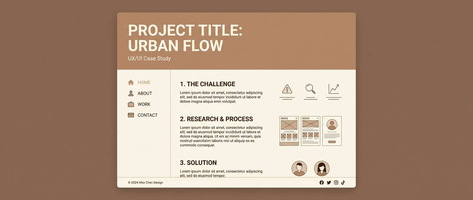
13) Soft Sepia Studio
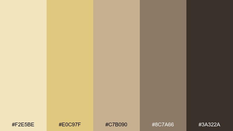
HEX: #F2E5BE #E0C97F #C7B090 #8C7A66 #3A322A
Mood: studio-neutral and refined
Best for: portfolio sites and case studies
Studio-neutral and refined, like soft sepia paper under balanced lighting. The tonal steps make layouts feel intentional, with enough contrast for type and captions. It shines on portfolio sites, case studies, and presentation slides where you want the work to stay in focus. Tip: use the mid-tan for dividers and cards to build structure without harsh lines.
Image example of soft sepia studio generated using media.io
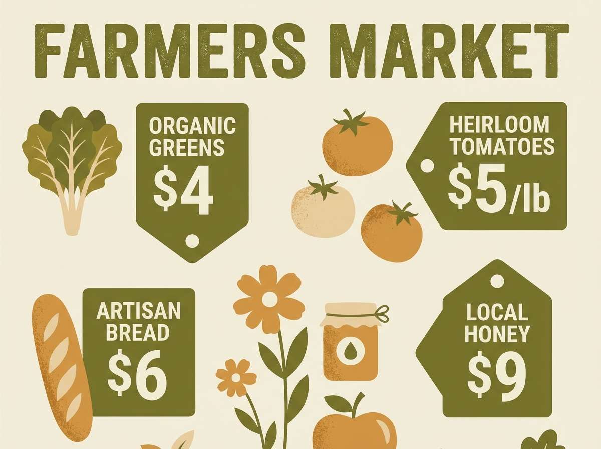
14) Olive Herb Market
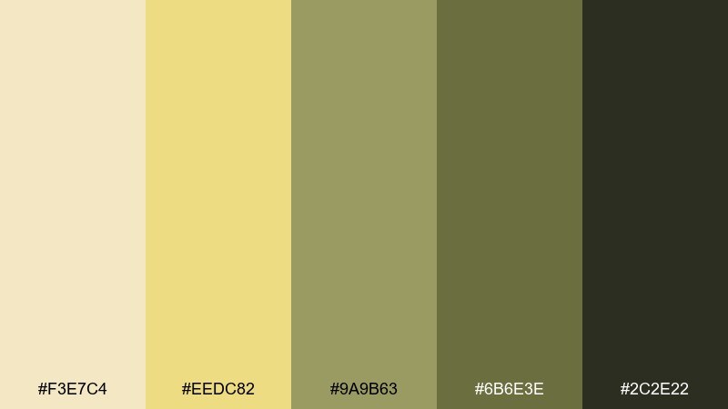
HEX: #F3E7C4 #EEDC82 #9A9B63 #6B6E3E #2C2E22
Mood: earthy and savory
Best for: grocery packaging and farmers market flyers
Earthy and savory, like olive leaves and paper bags at a weekend market. The yellow-beige base keeps it friendly, while the olive tones add a culinary edge. It suits grocery packaging, farmers market flyers, and restaurant specials that need a grounded, natural vibe. Tip: pair with off-white space and simple icons so the olive doesn't feel too dense.
Image example of olive herb market generated using media.io
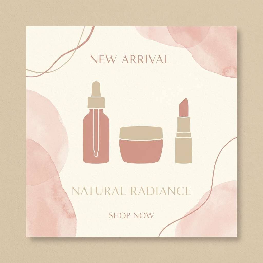
15) Blush Beige Bloom
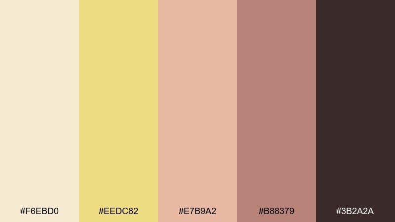
HEX: #F6EBD0 #EEDC82 #E7B9A2 #B88379 #3B2A2A
Mood: gentle and romantic
Best for: beauty branding and social posts
Gentle and romantic, like blush petals on warm parchment. The rosy accents soften the palette and make it feel personal, not overly sweet. Use it for beauty branding, social templates, and boutique skincare where warmth reads approachable and premium. Tip: keep blush as a highlight color for badges and icons, and use the deep brown for readable text.
Image example of blush beige bloom generated using media.io
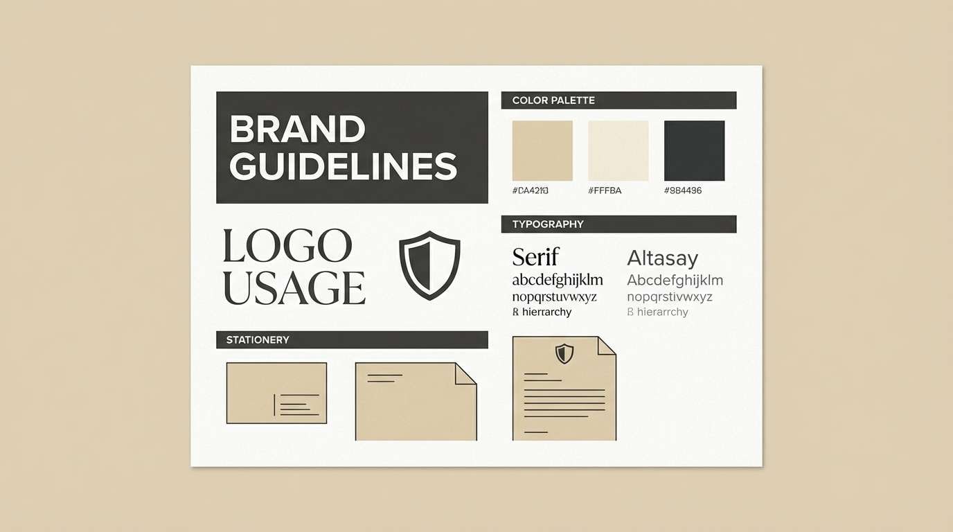
16) Charcoal Contrast
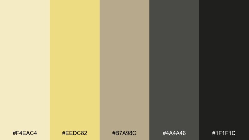
HEX: #F4EAC4 #EEDC82 #B7A98C #4A4A46 #1F1F1D
Mood: bold and editorial
Best for: modern branding and typography
Bold and editorial, like charcoal sketches on cream paper. The dark neutrals deliver strong hierarchy, while the warm tan tones prevent the look from feeling cold. Ideal for modern branding systems, typographic identities, and high-contrast web layouts. Tip: lean on the mid-tan for secondary backgrounds so the charcoal stays punchy without overpowering the page.
Image example of charcoal contrast generated using media.io
17) Citrus Grain
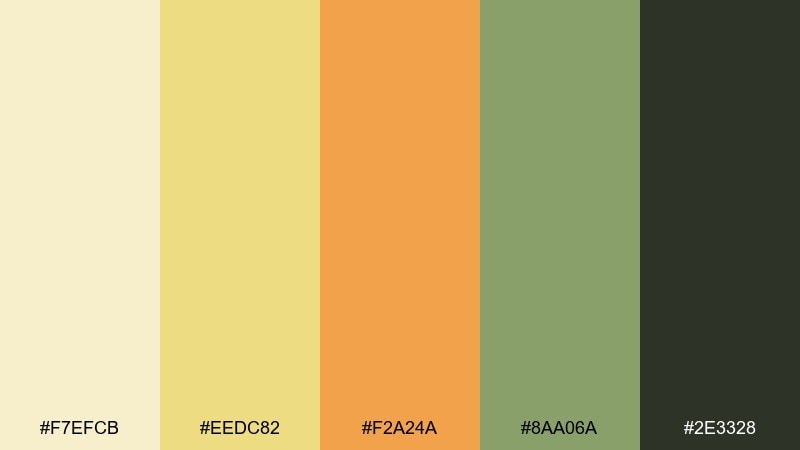
HEX: #F7EFCB #EEDC82 #F2A24A #8AA06A #2E3328
Mood: zesty and friendly
Best for: cafe menus and seasonal promos
Zesty and friendly, like orange peel over toasted grain. The lively citrus adds energy, while the muted green keeps the warmth feeling fresh rather than sugary. Great for cafe menus, seasonal promos, and food delivery banners that need a cheerful pop. Tip: use the orange only for highlights and pricing so it stays crisp against the soft base.
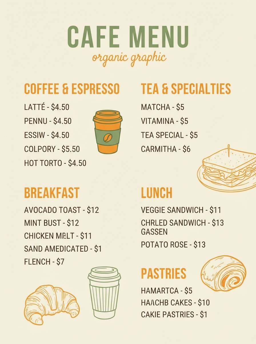
Image example of citrus grain generated using media.io
18) Foggy Reed
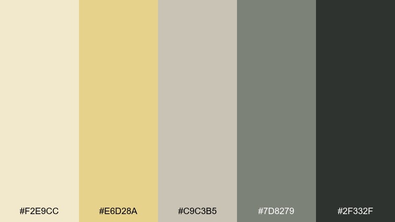
HEX: #F2E9CC #E6D28A #C9C3B5 #7D8279 #2F332F
Mood: muted and atmospheric
Best for: nature blogs and documentary thumbnails
Muted and atmospheric, like reeds fading into morning fog. The soft gray-green tones cool down the warm base and create a calm, contemplative feel. Use it for nature blogs, documentary thumbnails, and long-read layouts where subtlety matters. Tip: keep saturation low across photos and overlays so the palette stays cohesive from page to page.
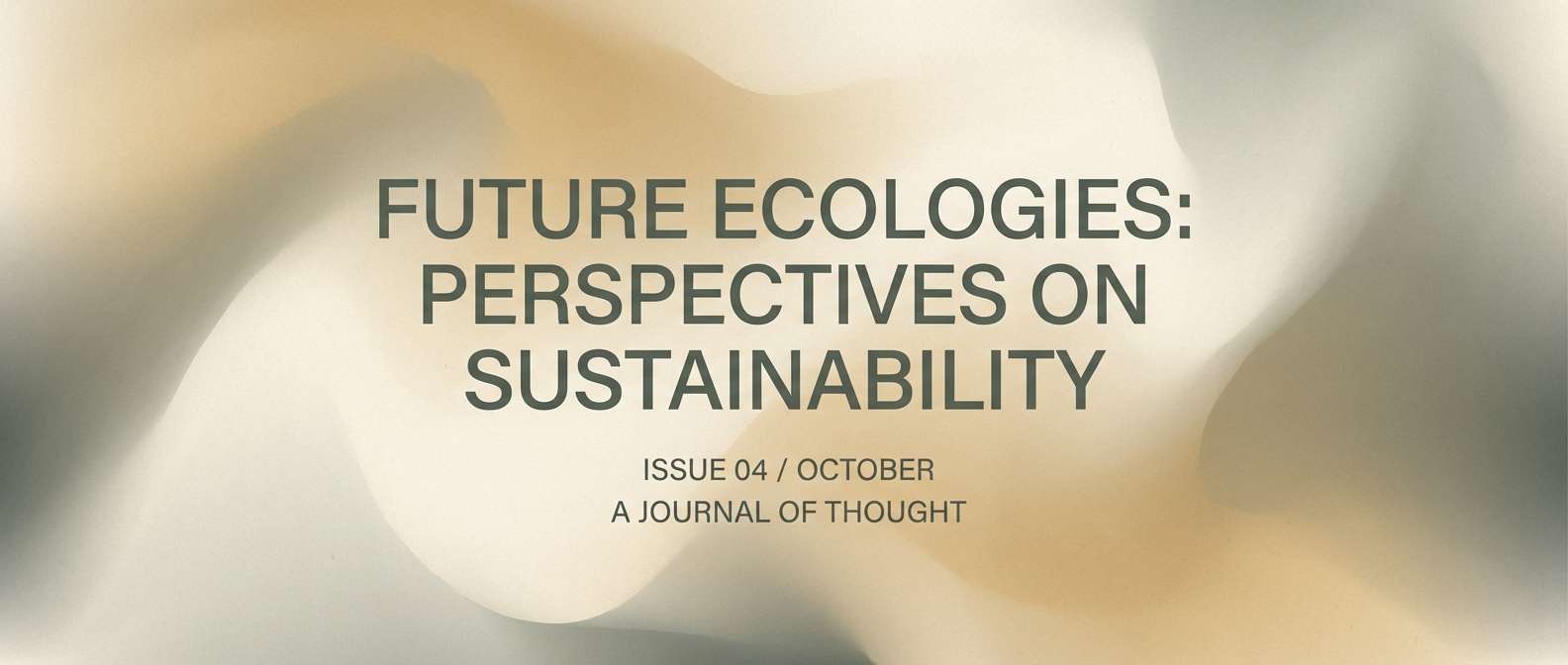
Image example of foggy reed generated using media.io
19) Vintage Bookshop
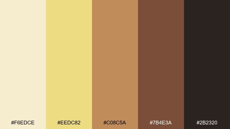
HEX: #F6EDCE #EEDC82 #C08C5A #7B4E3A #2B2320
Mood: nostalgic and cozy
Best for: bookstore branding and event posters
Nostalgic and cozy, like worn paperbacks and wooden shelves. The coppery browns add character while the buttery neutral keeps the overall look light and welcoming. It fits bookstore branding, reading events, and community posters that should feel warm and approachable. Tip: add a subtle paper texture behind large blocks of color to enhance the vintage vibe.
Image example of vintage bookshop generated using media.io

20) Copper Harvest
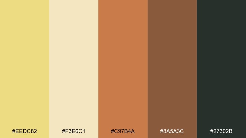
HEX: #EEDC82 #F3E6C1 #C97B4A #8A5A3C #27302B
Mood: warm and seasonal
Best for: autumn campaigns and email headers
Warm and seasonal, like copper leaves against late-summer fields. The orange-brown accents and deep green-gray make flax color combinations that look festive without turning loud. Use it for autumn campaigns, email headers, and promo banners where you need warmth plus strong contrast for CTAs. Tip: keep the copper as a gradient or small shape so it feels sophisticated rather than flat.
Image example of copper harvest generated using media.io
21) Monochrome Flax
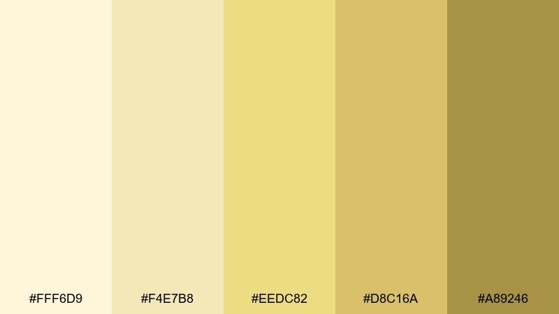
HEX: #FFF6D9 #F4E7B8 #EEDC82 #D8C16A #A89246
Mood: clean and sun-washed
Best for: minimal websites and product pages
Clean and sun-washed, like layered grains under bright daylight. Staying in one hue family makes the UI feel intentional, soft, and easy to scan. This flax color palette is a strong choice for minimal websites and product pages where texture and spacing do the heavy lifting. Tip: rely on type weight and subtle shadows for hierarchy since the tones are close.
Image example of monochrome flax generated using media.io
What Colors Go Well with Flax?
Flax pairs beautifully with deep neutrals like espresso brown, charcoal, and near-black because they create crisp hierarchy without feeling sterile. This is the easiest route for readable web design and branding systems.
For natural, earthy combinations, add sage, olive, or muted forest greens—these cool the warmth of flax and feel calm, organic, and modern. Terracotta and copper accents also work well when you want seasonal warmth and friendly contrast.
If you want a fresher, more contemporary look, introduce cool teals or blue-grays. The warm-cool balance keeps the palette airy while still anchored by flax’s softness.
How to Use a Flax Color Palette in Real Designs
Use flax as your primary background (or large surface color) and reserve darker tones for typography, navigation, and buttons. This keeps layouts breathable and makes calls-to-action feel intentional rather than loud.
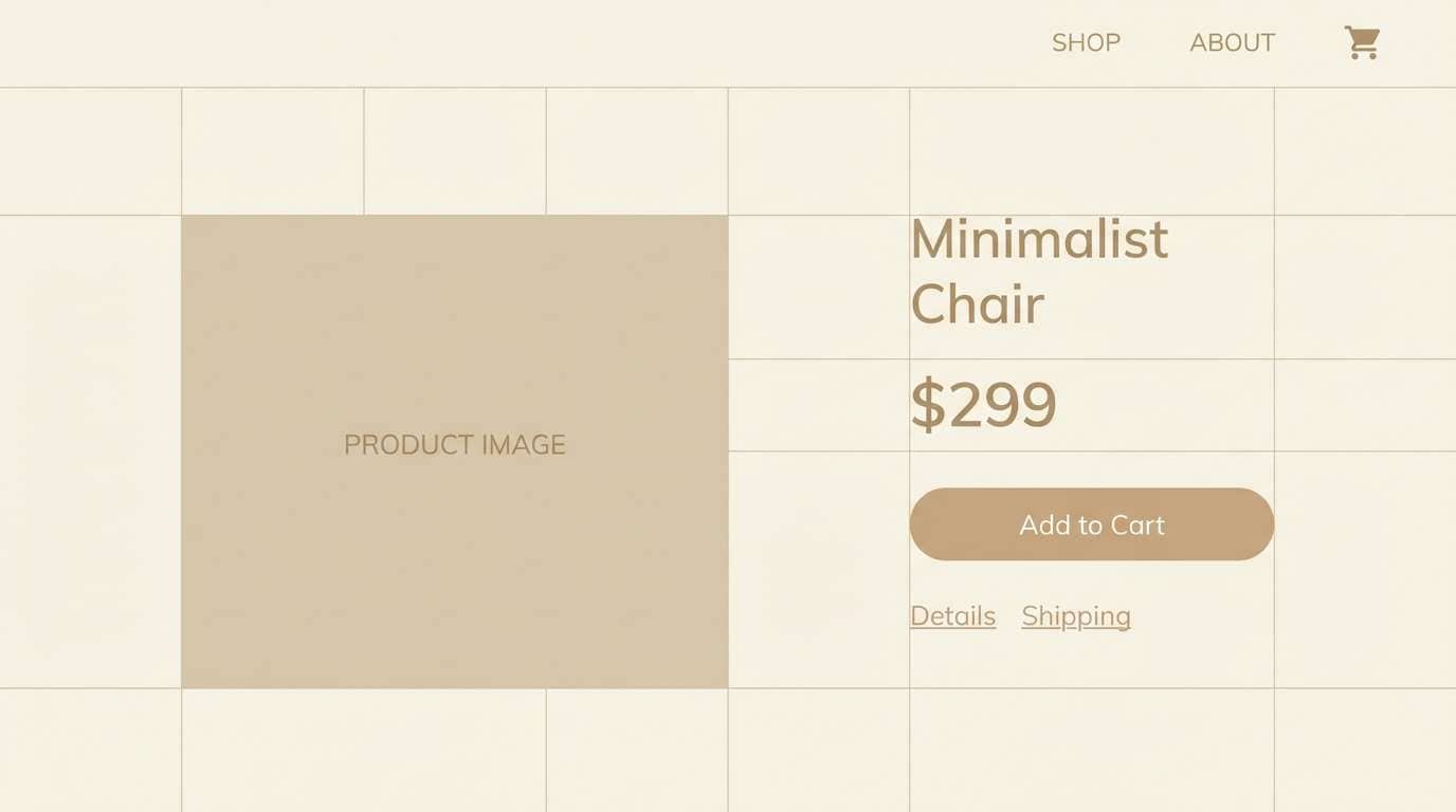
In UI, flax works best as a highlight: selected states, empty states, subtle badges, or soft card backgrounds. Pair it with grays to prevent “too much warmth,” and check contrast for accessibility when flax sits behind text.
For print and packaging, flax shines with tactile finishes—matte papers, subtle grain, and warm off-whites. Let one accent color (sage, terracotta, teal) do the attention-grabbing, and keep the rest tonal.
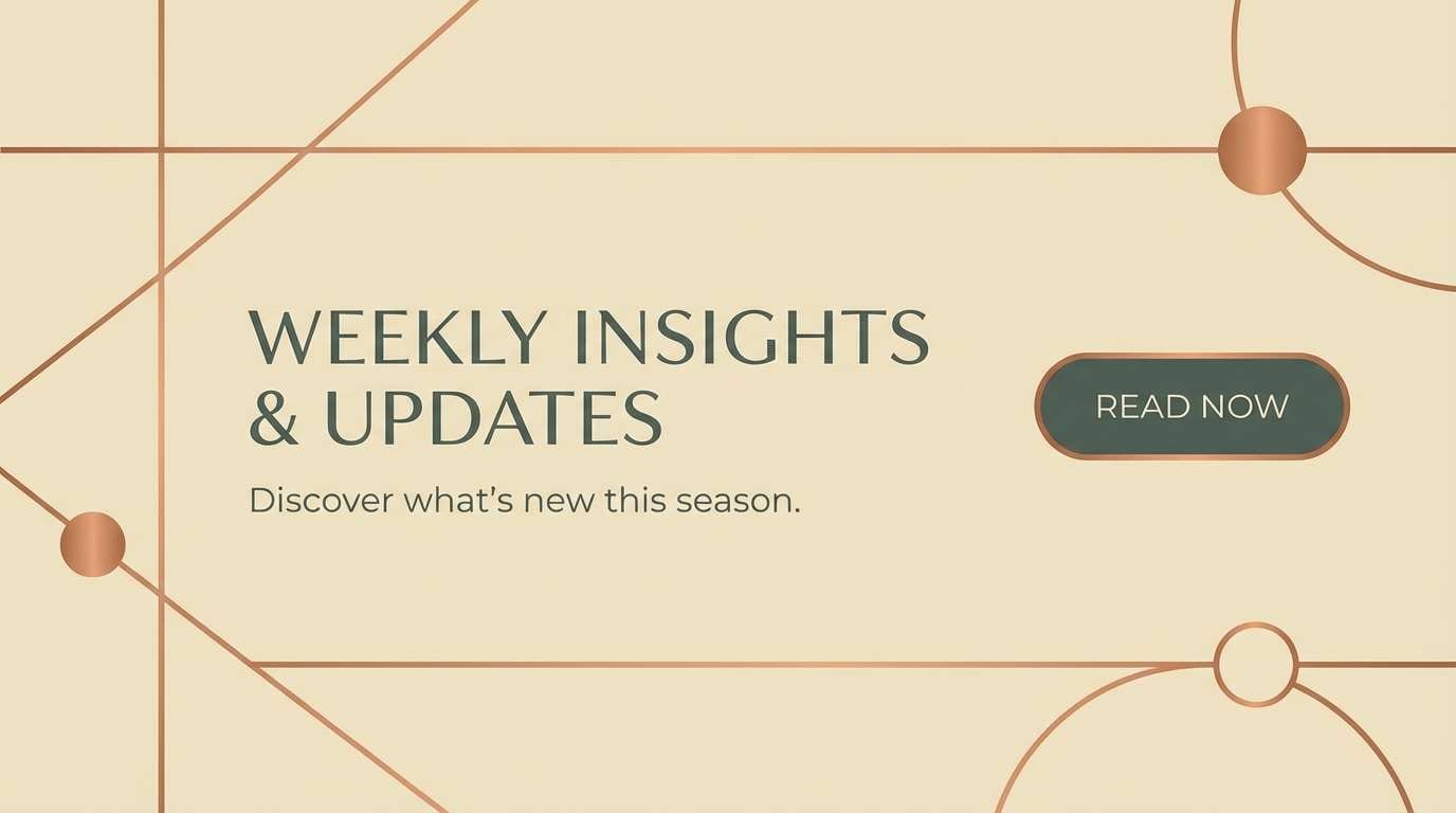
Create Flax Palette Visuals with AI
If you already have HEX codes, you can turn them into fast design directions by generating mood boards, UI mockups, posters, and packaging concepts. This is especially useful when you need to present multiple routes to a client.
With Media.io’s text-to-image tool, you can paste a prompt, specify a layout style, and iterate quickly until the palette “feels right.” Keep prompts focused on the design type, mood, and where flax should dominate.
Start with one of the prompts above, then swap design types (landing page, invitation, label) while keeping the same color intent to build a consistent set of visuals.
Flax Color Palette FAQs
-
What color is flax (in design terms)?
Flax is a warm yellow-beige with a soft golden undertone. It reads like a sunlit neutral—lighter than tan, warmer than standard beige. -
Is flax a good background color for websites?
Yes. Flax is light enough for clean, readable layouts, but warmer than plain white. Pair it with charcoal, espresso, or deep blue-gray text for strong contrast. -
What accent colors work best with flax?
Sage/olive greens, terracotta/copper, teal, and muted blue-gray are reliable accents. Choose one accent for emphasis and keep the rest neutral for balance. -
How do I keep flax palettes from looking “too yellow”?
Introduce cool balancing tones (teal, blue-gray, gray-green) and use off-whites/creams for negative space. Also limit saturated oranges and bright yellows in the same layout. -
What are the best dark text colors on flax?
Near-black, charcoal, and deep cocoa/espresso browns typically read best. They keep the warm feel while providing clear hierarchy for headings and buttons. -
Does flax work for modern UI and SaaS design?
It can, especially when used as a highlight color (selected states, badges, empty states) alongside soft grays and a near-black text color. Keep large panels mostly neutral to avoid visual fatigue. -
Can I generate flax palette mockups with AI?
Yes—use text-to-image prompts that describe the design format (UI, poster, packaging) and specify flax as the base with your chosen accent colors. Iterating a few variations helps you nail contrast and mood quickly.


