

Blue green orange palettes balance cool clarity with warm energy, making them a reliable choice for modern branding and UI. The blue-green range reads as clean and trustworthy, while orange adds focus and momentum.
Below are 20 blue green orange color palette ideas with HEX codes, plus practical use cases and AI image prompts you can reuse for mockups, ads, and product visuals.
In this article
- Why Blue Green Orange Palettes Work So Well
-
- coastal market
- citrus lagoon
- autumn surf
- retro aquarium
- desert oasis
- spruce and tangerine
- harbor carnival
- mint clay sunrise
- tropical blueprint
- copper kelp
- seaside terracotta
- alpine apricot
- peacock pantry
- reef and rust
- fresh herb soda
- canyon tide
- teal pumpkin
- chalkboard citrus
- lagoon lanterns
- sunlit evergreen
- What Colors Go Well with Blue Green Orange?
- How to Use a Blue Green Orange Color Palette in Real Designs
- Create Blue Green Orange Palette Visuals with AI
Why Blue Green Orange Palettes Work So Well
Blue-green hues (teal, aqua, lagoon, deep ocean) communicate stability, cleanliness, and modernity. They’re common in tech, travel, healthcare, and wellness because they feel calm and “organized” even in busy layouts.
Orange brings instant contrast and direction. Against cooler teals, it naturally becomes the attention color for CTAs, badges, pricing, or key metrics—without needing extra decoration.
Together, the combo supports both readability and personality: cool tones carry structure (backgrounds, headers, navigation), while warm tones create emphasis (buttons, highlights, tags).
20+ Blue Green Orange Color Palette Ideas (with HEX Codes)
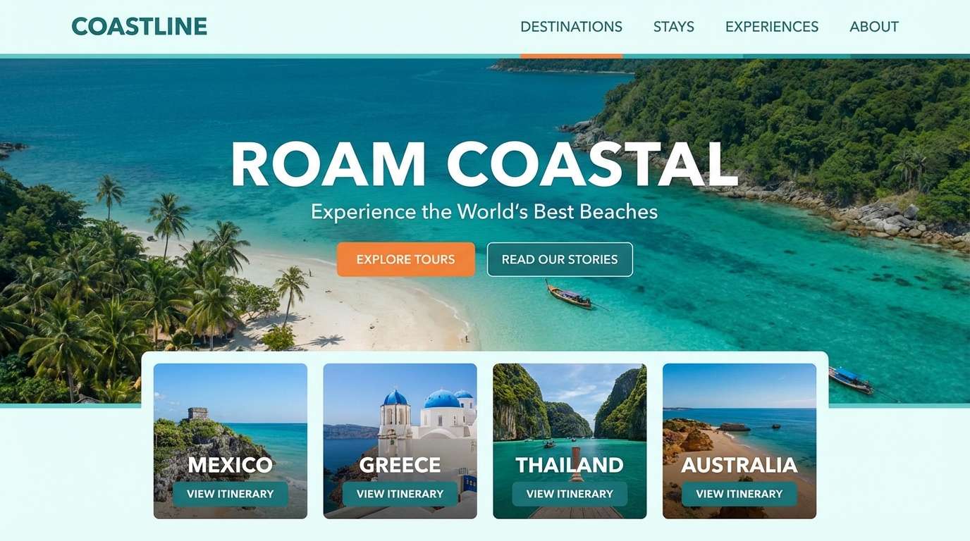
1) Coastal Market
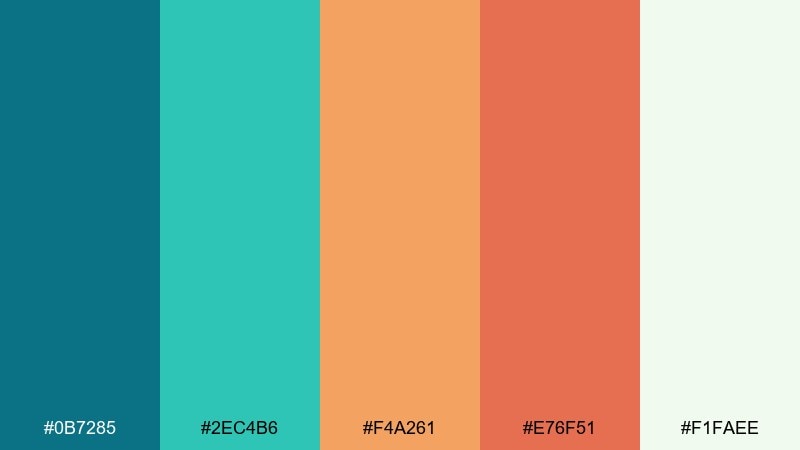
HEX: #0B7285 #2EC4B6 #F4A261 #E76F51 #F1FAEE
Mood: fresh, sunny, coastal
Best for: travel landing page UI mockup
Fresh sea air and sun-warmed stalls come to mind, mixing clean teal water with citrusy orange pops. It works beautifully for travel, hospitality, and upbeat lifestyle brands where clarity matters. Pair it with lots of white space and simple iconography so the orange can act as a clear call to action. Usage tip: reserve the deeper teal for headers and navigation to keep contrast strong.
Image example of coastal market generated using media.io
Media.io is an online AI studio for creating and editing video, image, and audio in your browser.

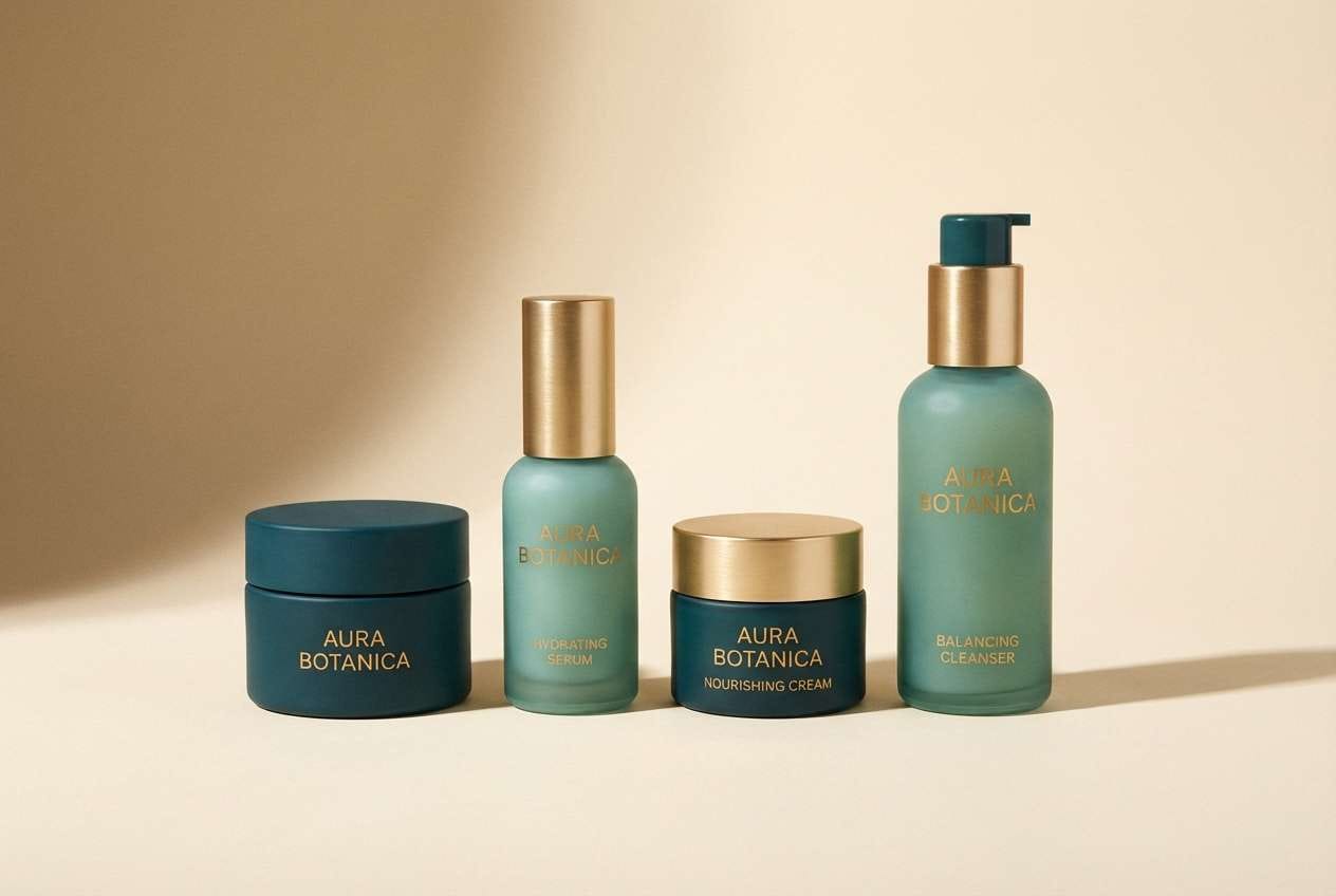
2) Citrus Lagoon
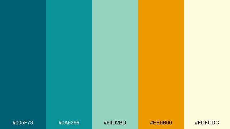
HEX: #005F73 #0A9396 #94D2BD #EE9B00 #FDFCDC
Mood: clean, tropical, optimistic
Best for: skincare product packaging
Clean lagoon tones meet bright citrus zest, giving a light and trustworthy vibe with a playful lift. This is a strong fit for skincare, wellness, and eco-forward packaging that needs to feel fresh without looking childish. Add a warm cream background and minimal line illustrations to keep it premium. Usage tip: use the golden orange sparingly for seals, flavor notes, or key benefits.
Image example of citrus lagoon generated using media.io
3) Autumn Surf
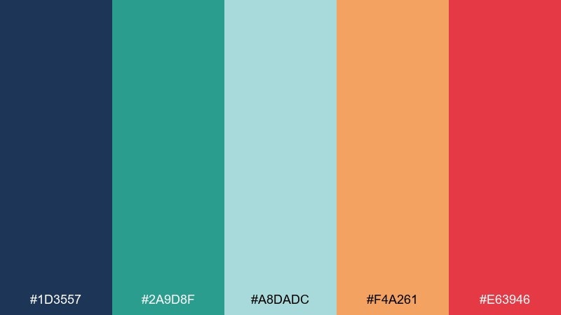
HEX: #1D3557 #2A9D8F #A8DADC #F4A261 #E63946
Mood: energetic, sporty, seasonal
Best for: event poster on plain background
Energetic waves and late-season sunsets blend into a punchy mix that feels athletic and bold. This blue green orange color palette is great for races, festivals, and promo graphics where you want motion and contrast. Pair it with heavy-weight type and simple geometric shapes for instant readability. Usage tip: keep the red as a tiny highlight so it does not compete with the orange.
Image example of autumn surf generated using media.io
4) Retro Aquarium
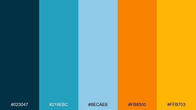
HEX: #023047 #219EBC #8ECAE6 #FB8500 #FFB703
Mood: retro, bright, playful
Best for: social media ad creative
Bright tank-glass blues with warm orange signage feel instantly retro and fun. It is ideal for attention-grabbing social ads, app promos, and playful DTC brands that want a nostalgic edge. Pair with rounded typography and chunky stickers or badges for a throwback look. Usage tip: set text on the deeper blue to keep the lighter aqua areas airy.
Image example of retro aquarium generated using media.io
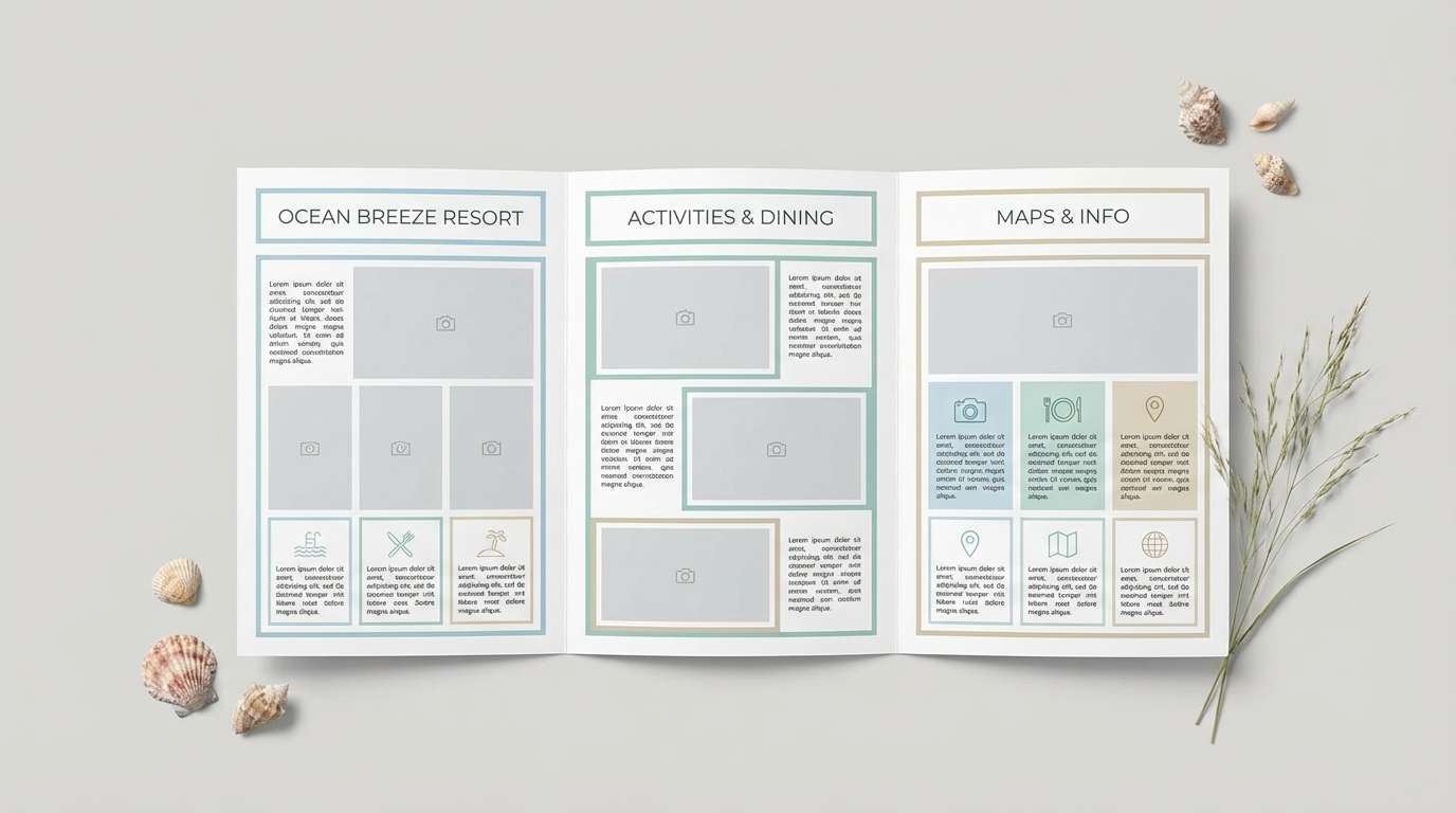
5) Desert Oasis
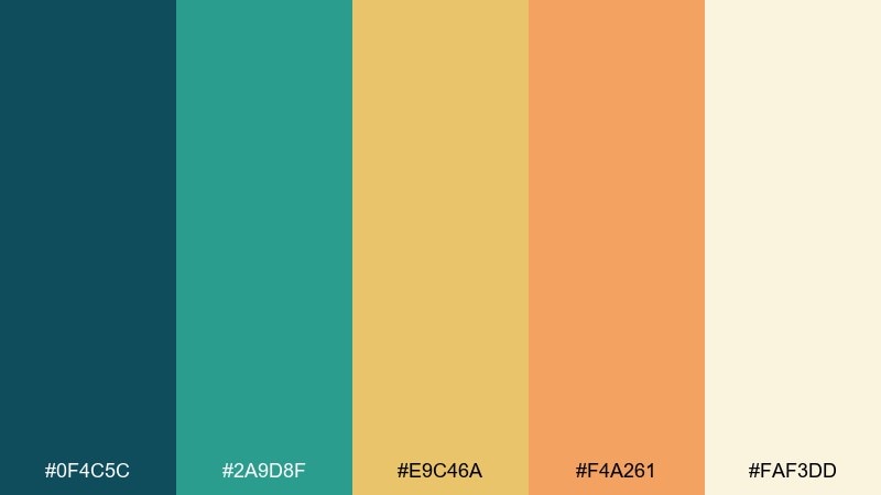
HEX: #0F4C5C #2A9D8F #E9C46A #F4A261 #FAF3DD
Mood: warm, calm, resort-like
Best for: hotel brochure layout
A calm oasis mood comes through with cool water tones against sand and sunbaked oranges. Use it for resort brochures, spa menus, and travel editorials where relaxation is the main message. Pair with natural textures like linen or paper grain and keep the typography airy. Usage tip: let the sandy yellow handle large backgrounds and keep teal for structure and headings.
Image example of desert oasis generated using media.io
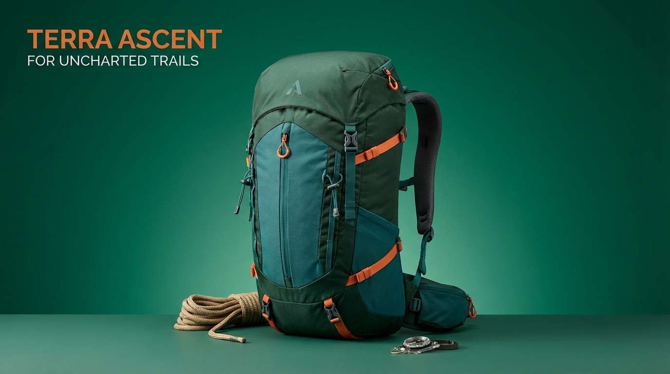
6) Spruce and Tangerine
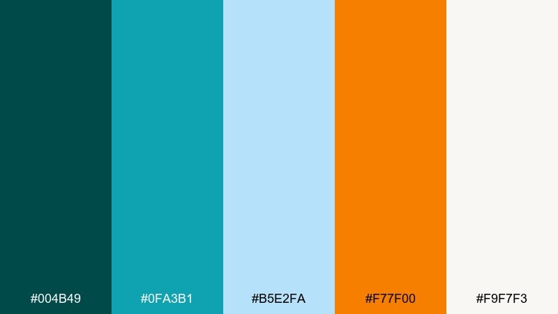
HEX: #004B49 #0FA3B1 #B5E2FA #F77F00 #F9F7F3
Mood: crisp, modern, outdoorsy
Best for: outdoor gear product ad
Crisp spruce greens and bright tangerine feel like a winter hike ending at a warm lodge. This set suits outdoor gear ads, adventure brands, and bold email headers where you need energy without neon. Pair it with matte black details and plenty of negative space for a clean, technical feel. Usage tip: use the pale blue as a soft backdrop to keep the orange from overpowering.
Image example of spruce and tangerine generated using media.io
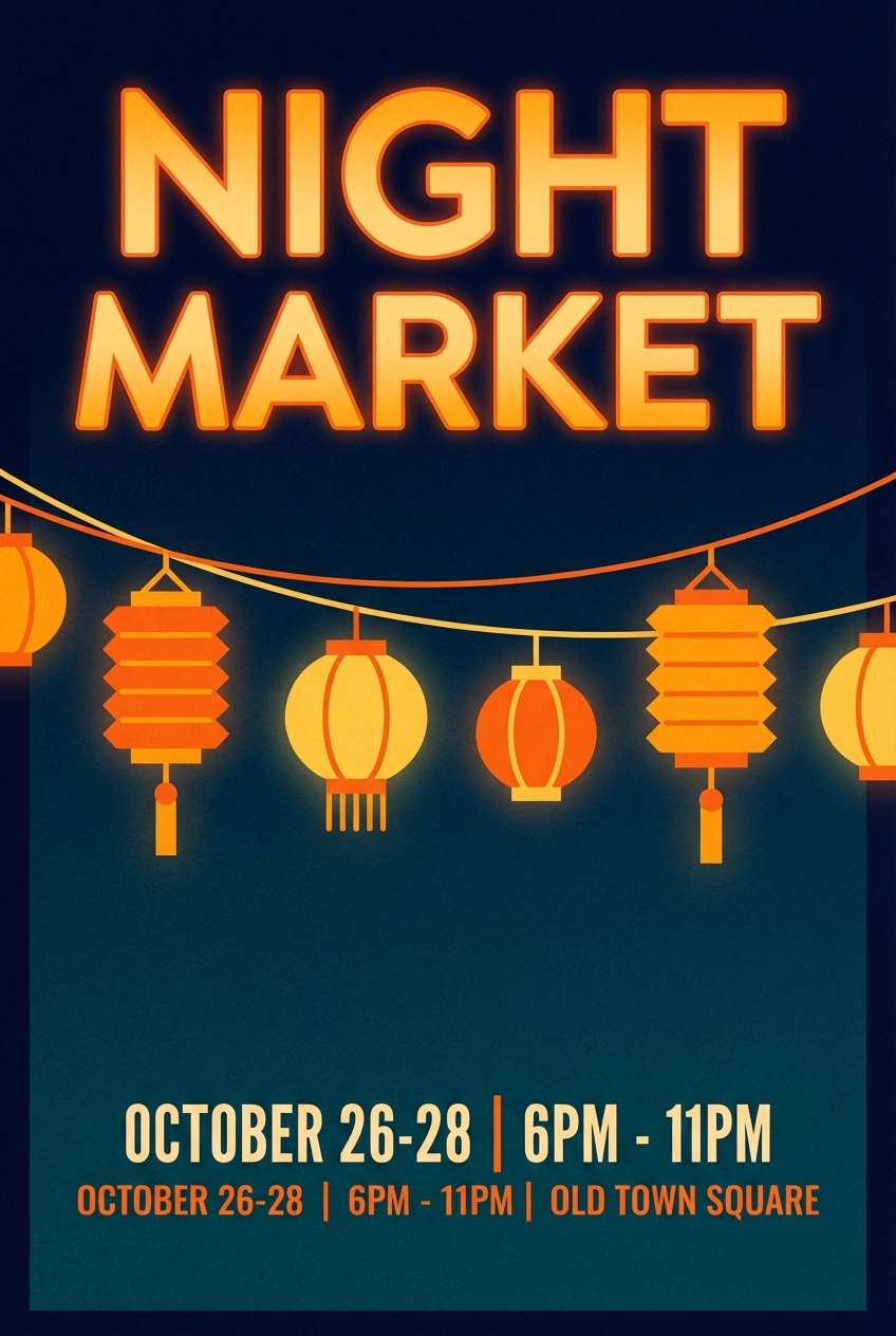
7) Harbor Carnival
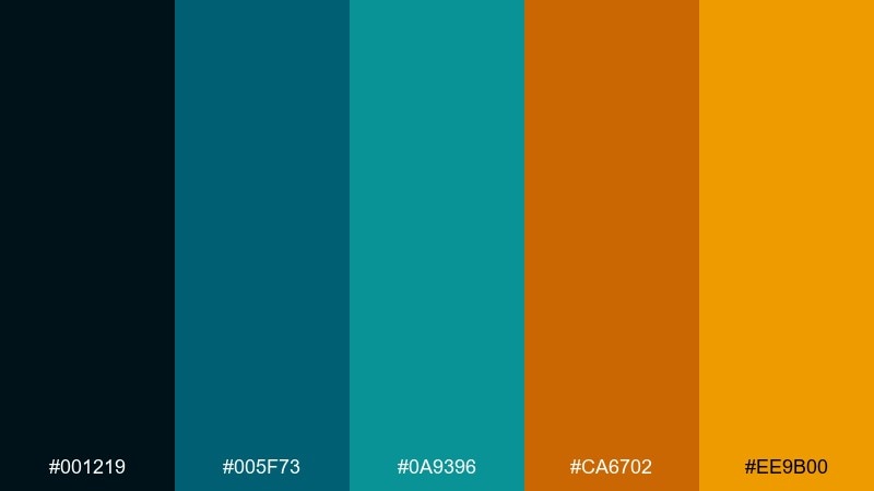
HEX: #001219 #005F73 #0A9396 #CA6702 #EE9B00
Mood: dramatic, festive, high-contrast
Best for: night market flyer on plain background
Harbor-dark blues with carnival amber lights create a dramatic, festive contrast. It is a strong choice for nightlife flyers, street-food promos, and bold headlines that need to glow. Pair with oversized type and simple line icons so the palette does the heavy lifting. Usage tip: keep the darkest navy as the main background for instant readability.
Image example of harbor carnival generated using media.io
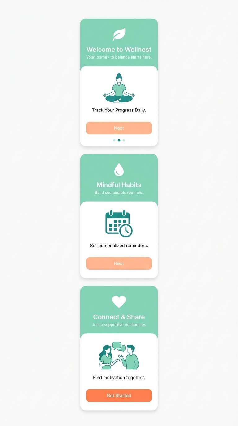
8) Mint Clay Sunrise
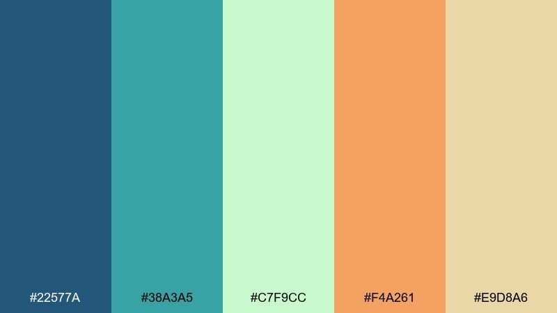
HEX: #22577A #38A3A5 #C7F9CC #F4A261 #E9D8A6
Mood: soft, friendly, airy
Best for: wellness app onboarding UI mockup
Soft mint and clay-orange feel like sunrise light through sheer curtains, gentle and welcoming. Use it for wellness onboarding, meditation flows, and friendly dashboards where calm is the goal. Pair with rounded cards and subtle shadows to keep the interface approachable. Usage tip: assign orange to progress states or key buttons while mint handles backgrounds.
Image example of mint clay sunrise generated using media.io
9) Tropical Blueprint
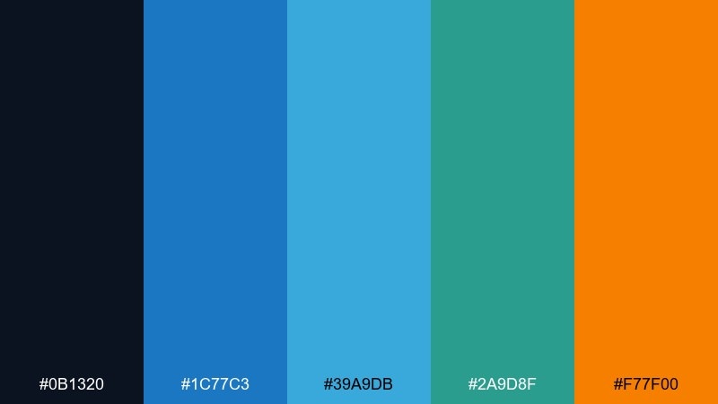
HEX: #0B1320 #1C77C3 #39A9DB #2A9D8F #F77F00
Mood: bold, techy, high-energy
Best for: startup pitch deck slide
Bold blueprint blues with a tropical teal hit feel fast, confident, and modern. It is excellent for pitch decks, SaaS one-pagers, and product announcements that need momentum. Pair it with sharp charts and thin line icons for a clean, data-forward look. Usage tip: place the orange only on key metrics or primary CTAs for maximum focus.
Image example of tropical blueprint generated using media.io

10) Copper Kelp
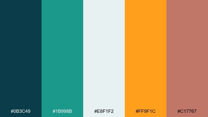
HEX: #0B3C49 #1B998B #E8F1F2 #FF9F1C #C17767
Mood: earthy, refined, coastal
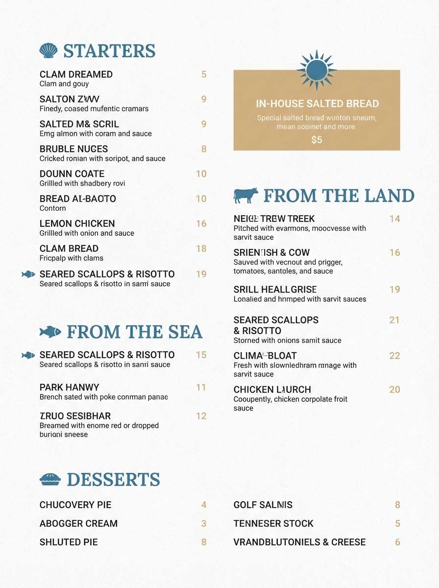
Best for: restaurant menu layout
Earthy kelp greens and copper-orange notes feel like a coastal kitchen with warm wood and salt air. Great for restaurant menus, craft beverage labels, and brand systems that want depth without going too dark. Pair with off-white paper tones and subtle grain for a tactile finish. Usage tip: use copper as a section divider color to guide scanning.
Image example of copper kelp generated using media.io
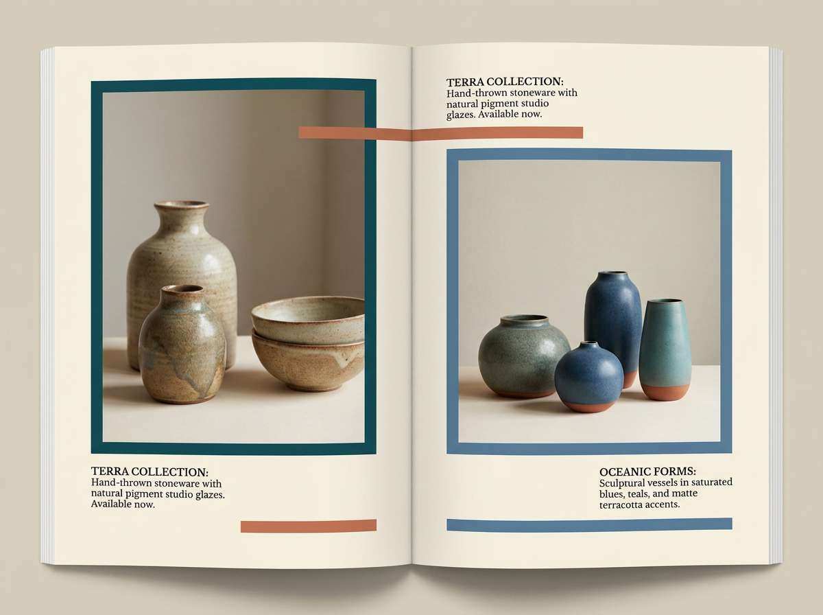
11) Seaside Terracotta
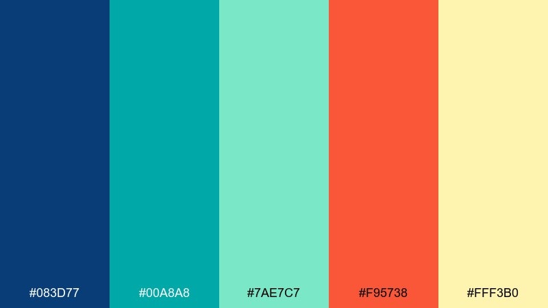
HEX: #083D77 #00A8A8 #7AE7C7 #F95738 #FFF3B0
Mood: bright, breezy, creative
Best for: ceramics brand lookbook page
Breezy seaside blues with terracotta warmth evoke handmade clay pieces drying in sun. Use it for ceramics lookbooks, artisan shops, and creative portfolios that need both freshness and craft. Pair with large photography blocks and minimal captions to let color accents frame the work. Usage tip: keep terracotta for labels and price tags while teal supports backgrounds.
Image example of seaside terracotta generated using media.io
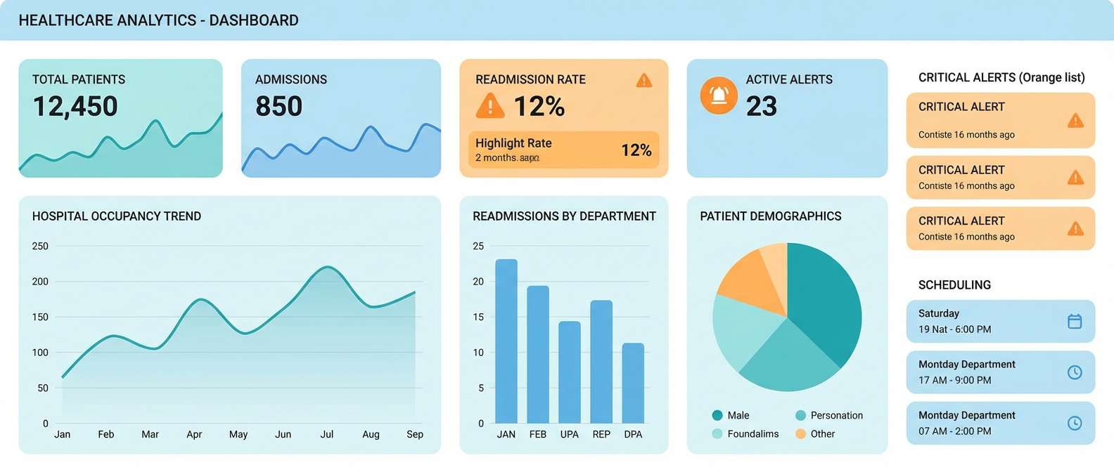
12) Alpine Apricot
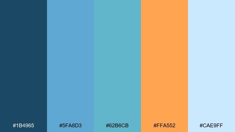
HEX: #1B4965 #5FA8D3 #62B6CB #FFA552 #CAE9FF
Mood: cool, uplifting, airy
Best for: healthcare dashboard UI mockup
Cool alpine blues with an apricot lift feel reassuring, clear, and easy on the eyes. These blue green orange color combinations are a good match for healthcare dashboards and analytics tools where calm usability is essential. Pair with neutral grays and thin dividers to keep the interface clinical but friendly. Usage tip: use apricot for alerts and key status tags, not for large fills.
Image example of alpine apricot generated using media.io
13) Peacock Pantry
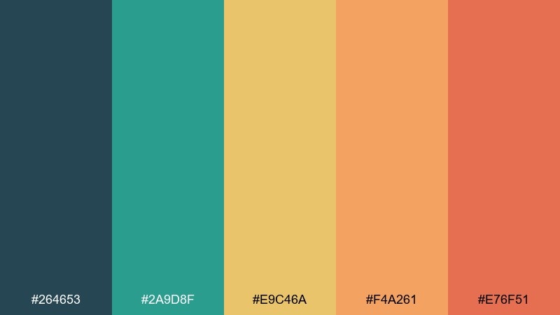
HEX: #264653 #2A9D8F #E9C46A #F4A261 #E76F51
Mood: rich, inviting, foodie
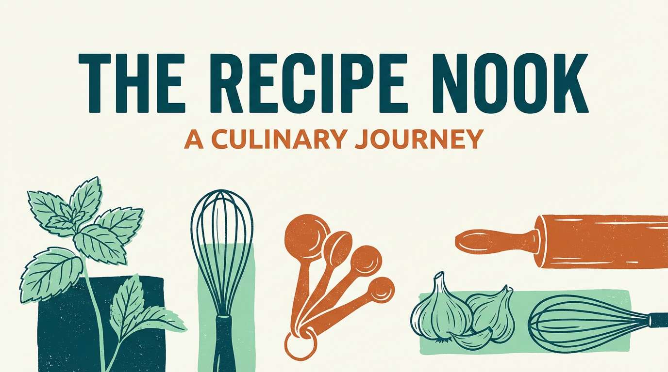
Best for: recipe blog header graphic
Rich peacock tones and warm pantry spices feel hearty and inviting, like a weekend cooking session. It suits recipe blog headers, food newsletter banners, and kitchen brands that want warmth without losing freshness. Pair with off-white backgrounds and simple ingredient illustrations for a friendly editorial look. Usage tip: treat the golden yellow as a bridge color between teal and orange elements.
Image example of peacock pantry generated using media.io
14) Reef and Rust
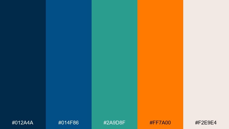
HEX: #012A4A #014F86 #2A9D8F #FF7A00 #F2E9E4
Mood: moody, modern, adventurous
Best for: tech conference badge design
Moody reef blues with a rust-orange spark feel adventurous and sleek, like city lights near the water. This set works well for conference badges, speaker cards, and modern identity systems that need strong contrast. Pair with bold condensed type and simple patterns for a confident, professional finish. Usage tip: keep rust for names and key labels so it reads from a distance.
Image example of reef and rust generated using media.io
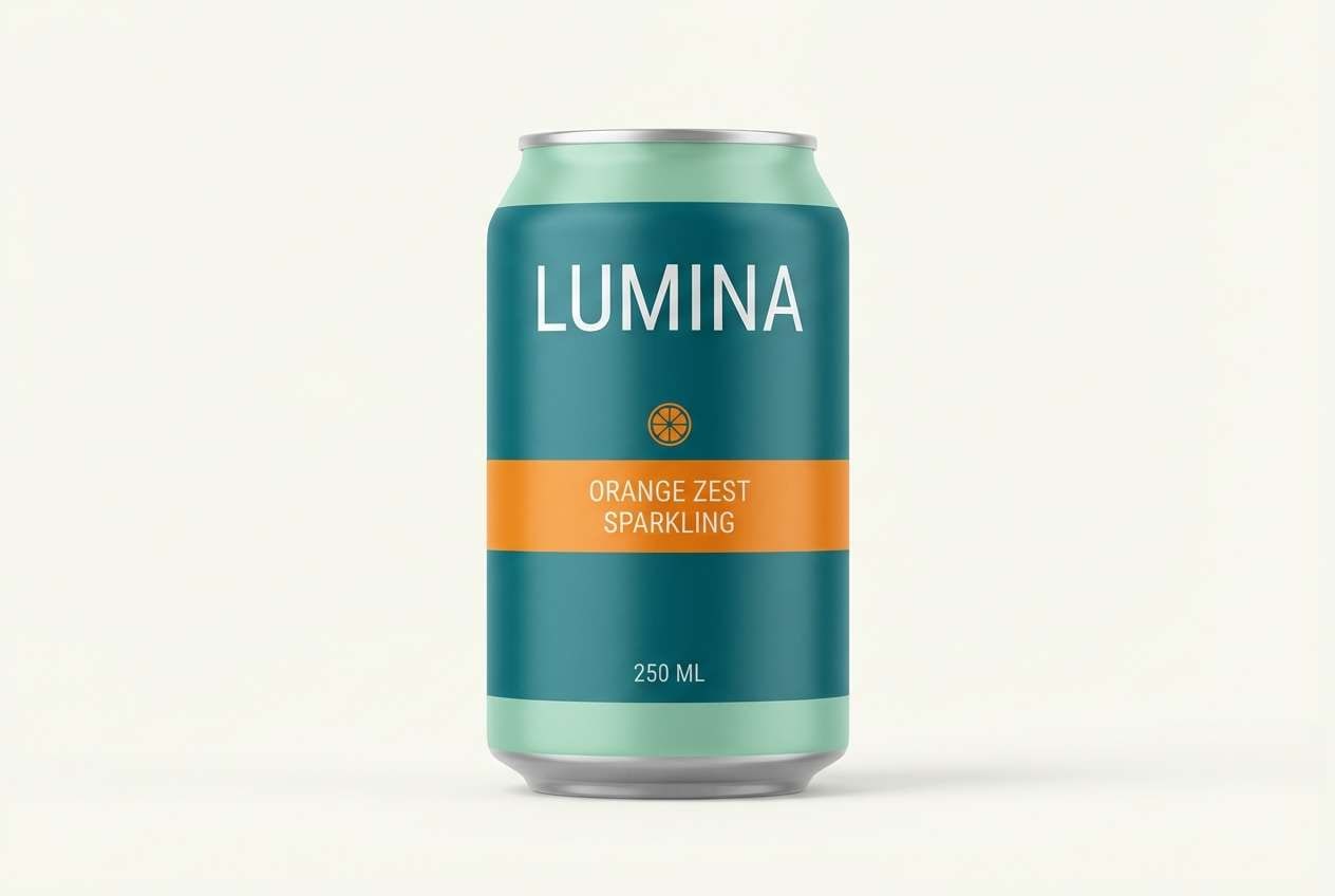
15) Fresh Herb Soda
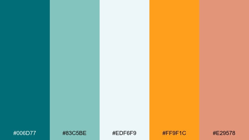
HEX: #006D77 #83C5BE #EDF6F9 #FF9F1C #E29578
Mood: light, friendly, refreshing
Best for: beverage can packaging
Refreshing herb greens and fizzy orange highlights feel like a sparkling drink over ice. Use it for beverage packaging, cafe promos, and summer launches that need to look clean and tasty. Pair with simple fruit icons and plenty of breathing room to keep it modern. Usage tip: make the bright orange a flavor marker while the teal anchors the brand name.
Image example of fresh herb soda generated using media.io
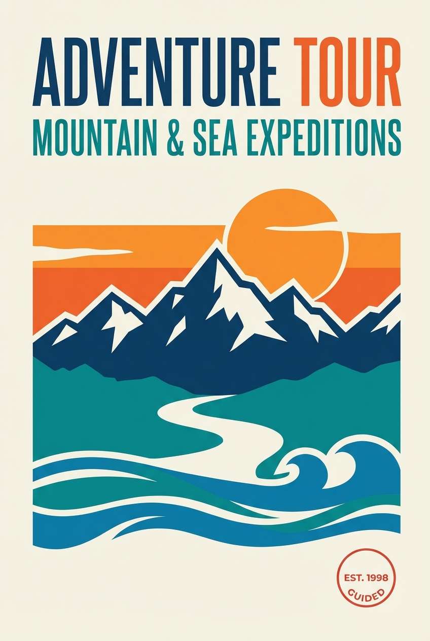
16) Canyon Tide
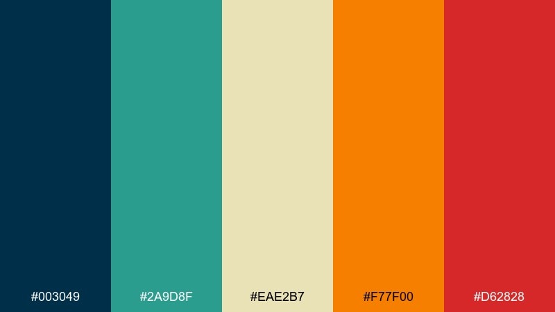
HEX: #003049 #2A9D8F #EAE2B7 #F77F00 #D62828
Mood: rugged, bold, outdoors
Best for: adventure tour poster on plain background
Rugged canyon heat meets cool tidewater, creating a bold, high-contrast look. It is ideal for adventure tour posters, outdoor clubs, and energetic campaigns that need to feel fearless. Pair with strong silhouettes and minimal copy so the color blocks can drive the impact. Usage tip: use the red only as a tiny warning or badge color to avoid visual clutter.
Image example of canyon tide generated using media.io
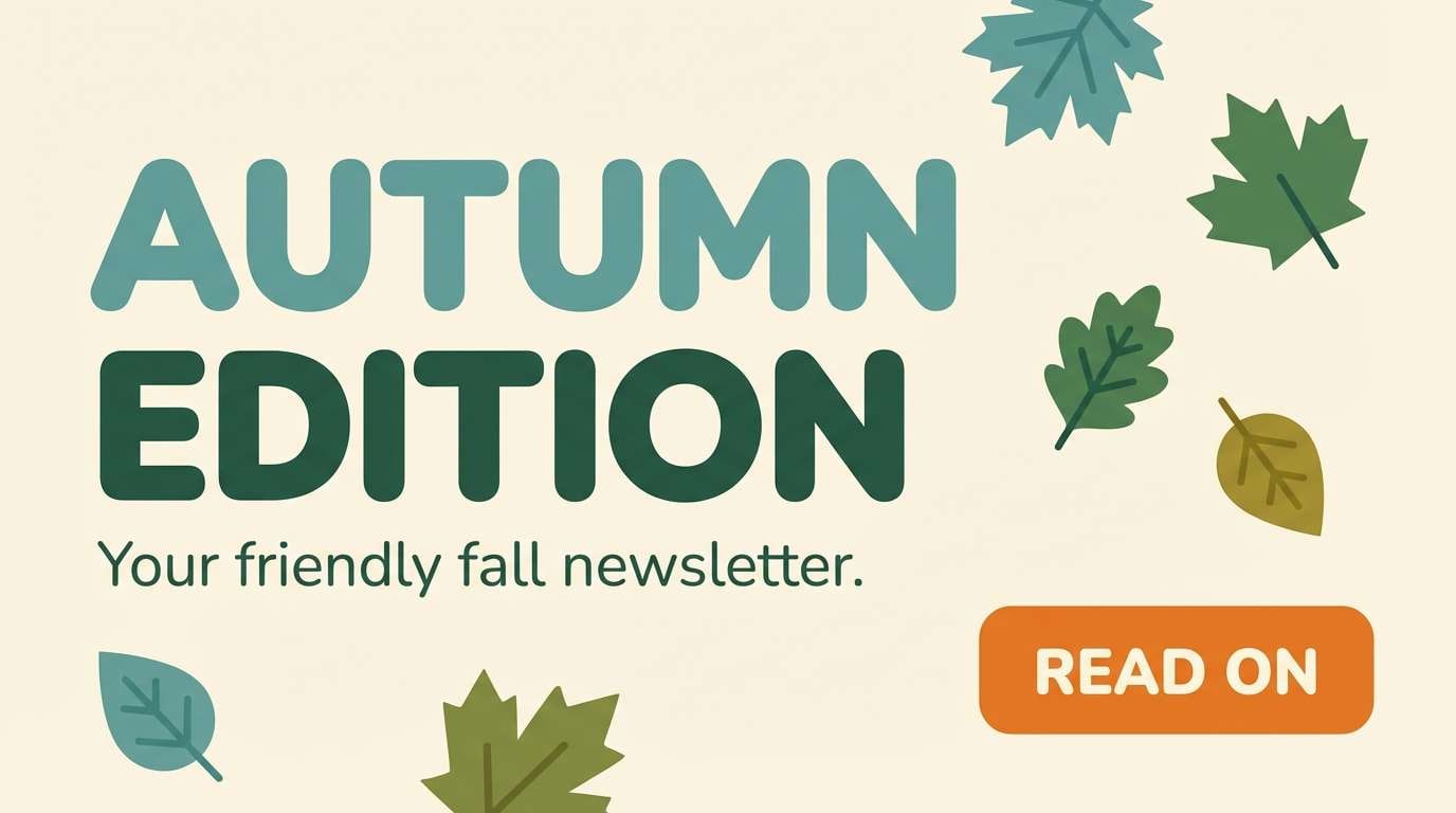
17) Teal Pumpkin
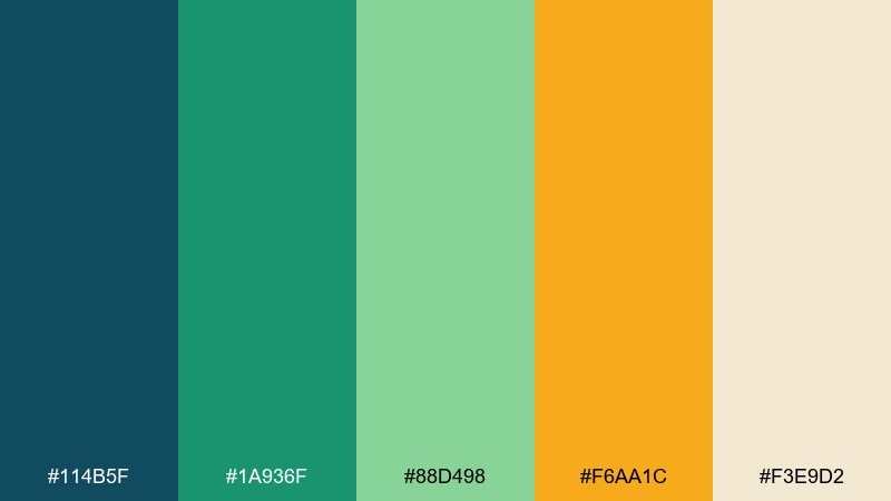
HEX: #114B5F #1A936F #88D498 #F6AA1C #F3E9D2
Mood: cozy, playful, approachable
Best for: seasonal email newsletter header
Cozy teal and leafy greens with pumpkin orange feel seasonal without leaning into clichés. It works for newsletters, retail drops, and community updates where you want warmth and friendliness. Pair with cream backgrounds and simple patterns like dots or subtle stripes. Usage tip: keep body text in dark teal for comfortable reading.
Image example of teal pumpkin generated using media.io
18) Chalkboard Citrus
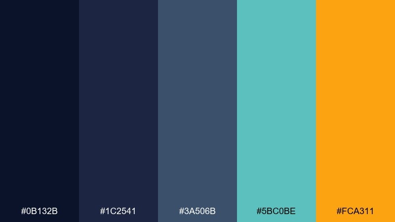
HEX: #0B132B #1C2541 #3A506B #5BC0BE #FCA311
Mood: smart, punchy, classroom-cool
Best for: online course thumbnail
Chalkboard blues with a citrus marker hit feel focused, clever, and a little rebellious. These blue green orange color combinations shine in course thumbnails, webinar promos, and educational brands that want to look modern. Pair with high-contrast titles and simple iconography for fast scanning at small sizes. Usage tip: keep the orange for the main keyword or badge, not the entire headline.
Image example of chalkboard citrus generated using media.io

19) Lagoon Lanterns
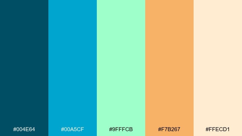
HEX: #004E64 #00A5CF #9FFFCB #F7B267 #FFECD1
Mood: dreamy, light, celebratory
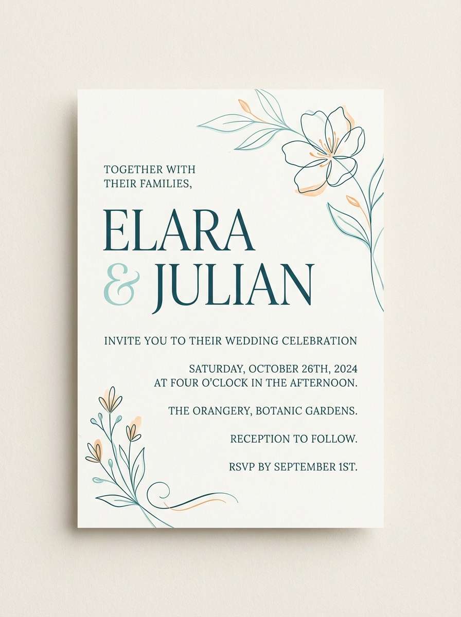
Best for: wedding invitation design on plain background
Dreamy lagoon tones with lantern-warm orange feel celebratory and soft, like an evening by the water. This blue green orange color palette works well for modern wedding invitations, save-the-dates, and event stationery with a relaxed vibe. Pair with delicate serif type and plenty of cream space to keep it elegant. Usage tip: use orange for small flourishes like date separators and envelope liners.
Image example of lagoon lanterns generated using media.io
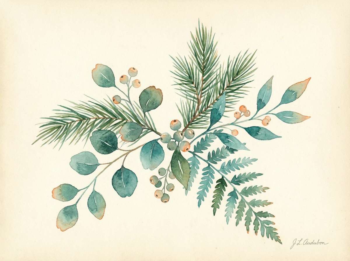
20) Sunlit Evergreen
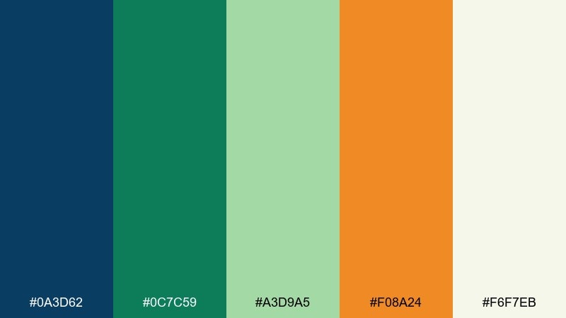
HEX: #0A3D62 #0C7C59 #A3D9A5 #F08A24 #F6F7EB
Mood: grounded, optimistic, natural
Best for: botanical watercolor illustration
Sunlit evergreens with a warm orange glow feel grounded and optimistic, like a trailhead at golden hour. It is great for botanical prints, eco packaging, and gentle brand accents where nature is the story. Pair with soft cream paper and minimal labels for a handcrafted look. Usage tip: let the orange appear as small blooms or fruit to keep the scene believable.
Image example of sunlit evergreen generated using media.io
What Colors Go Well with Blue Green Orange?
Neutrals are your best stabilizers: warm white, cream, and light sand help the palette breathe, while charcoal or deep navy improves readability when teal gets too bright. These choices keep the orange accent feeling intentional instead of loud.
For extra depth, add a muted red-brown (rust/terracotta) or a soft golden yellow as a bridge between teal and orange. If you need a “premium” direction, introduce subtle grays and reduce saturation across the board.
When you want a playful look, lean into lighter aquas and pair them with a punchier orange plus a clean white background. This combination keeps interfaces feeling friendly and modern.
How to Use a Blue Green Orange Color Palette in Real Designs
Assign roles first: use blue/teal for layout structure (headers, sidebars, sections), use off-white for background, and reserve orange for high-priority elements like primary buttons, notifications, or price tags. This keeps contrast predictable and scannable.
Balance saturation by limiting the number of “loud” areas on one screen or page. If orange is bright, let teal be slightly deeper, and keep large fills in a softer tint (pale aqua, cream, or light gray).
For typography, dark teal or deep navy usually reads better than pure black in this scheme. Test accessibility contrast (especially orange-on-white and teal-on-white) and adjust shade values when needed.
Create Blue Green Orange Palette Visuals with AI
If you’re building a brand board, UI mockup, packaging concept, or poster, you can generate quick image examples from any palette using text prompts. This helps you validate mood and contrast before committing to final design work.
Start with a clear subject (e.g., “landing page UI,” “product packaging,” “event poster”), then specify “dominant teal/aqua with orange accents” and the layout style (flat vector, studio photo, editorial layout). Keep prompts focused so color direction stays consistent.
Use Media.io to turn these palette ideas into visuals in minutes, then iterate by changing only one variable at a time (background color, orange intensity, lighting, or typography style).
Blue Green Orange Color Palette FAQs
-
Why does teal and orange look so good together?
Teal (blue-green) and orange sit on opposite sides of the color wheel family relationship (orange contrasts strongly with blue). That cool-vs-warm split creates clear visual hierarchy: teal supports structure, while orange naturally becomes the accent for emphasis. -
Is a blue green orange color scheme good for branding?
Yes. Blue-green signals trust, cleanliness, and modernity, while orange adds approachability and energy. It works especially well for travel, tech, wellness, outdoor, and food brands that want both clarity and personality. -
How do I keep orange from overpowering the design?
Use orange as an accent (buttons, badges, key numbers) and keep large areas in teal tints or neutrals like cream/white. A common approach is 60% neutral background, 30% blue-green structure, 10% orange highlights. -
What’s the best background color for blue green orange palettes?
Warm white, cream, and very light sand are the easiest backgrounds because they reduce glare and make both teal and orange feel balanced. For dark themes, use deep navy/blue-green and keep orange for small high-contrast highlights. -
Do blue green orange palettes work for UI design and dashboards?
They do, as long as you control contrast. Use deep teal/navy for text and navigation, lighter aqua/mint for surfaces, and orange for primary actions or status tags. Always check WCAG contrast for buttons and small text. -
How can I generate mockups using these palette ideas?
Pick one palette, choose a format (landing page, packaging, poster, badge), and write a prompt that specifies “dominant teal/aqua with orange accent highlights,” plus the style (flat vector or studio photo). Then generate and iterate quickly in Media.io. -
Which palette here is best for a modern, bold look?
Try Tropical Blueprint or Reef and Rust for a confident, high-contrast feel. If you want retro energy, Retro Aquarium is a strong pick with bright aqua and vivid orange/yellow accents.
Next: Pop Art Color Palette


