

Dark turquoise is a deep, teal-leaning color that instantly feels modern, grounded, and a little mysterious. It’s a reliable anchor for UI, branding, posters, and interiors because it reads “cool” without feeling sterile.
Below are 20 dark turquoise color palette ideas with HEX codes, plus quick pairing guidance and AI-ready prompts you can use to generate matching visuals in Media.io.
In this article
- Why Dark Turquoise Palettes Work So Well
-
- deep harbor teal
- rainforest lagoon
- vintage dive bar
- coastal nightfall
- arctic current
- peacock shadow
- patina workshop
- midnight aquarium
- stormy spruce
- ink and sea glass
- copper kelp
- celadon depths
- neon reef accent
- slatewave minimal
- mossy turquoise garden
- retro pool tile
- industrial teal steel
- desert oasis dusk
- winter fjord light
- gothic teal velvet
- What Colors Go Well with Dark Turquoise?
- How to Use a Dark Turquoise Color Palette in Real Designs
- Create Dark Turquoise Palette Visuals with AI
Why Dark Turquoise Palettes Work So Well
Dark turquoise sits between blue and green, so it blends easily with both cool and warm accents. That flexibility makes it a strong “base color” for systems like brand identities and UI kits.
Because it’s deeper than bright turquoise, it creates instant contrast with creams, off-whites, and pale mints—great for readable typography, dashboards, and poster layouts. It also pairs naturally with metallics like brass and copper for a premium finish.
Emotionally, dark turquoise feels calm and confident: oceanic, modern, and slightly cinematic. With the right accent, it can shift from spa-clean to nightlife bold without changing the core hue.
20+ Dark Turquoise Color Palette Ideas (with HEX Codes)
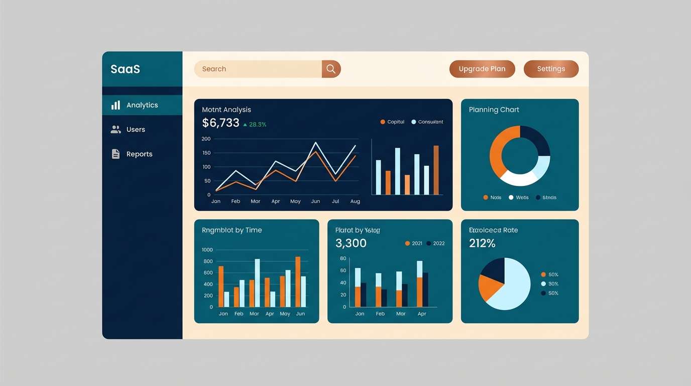
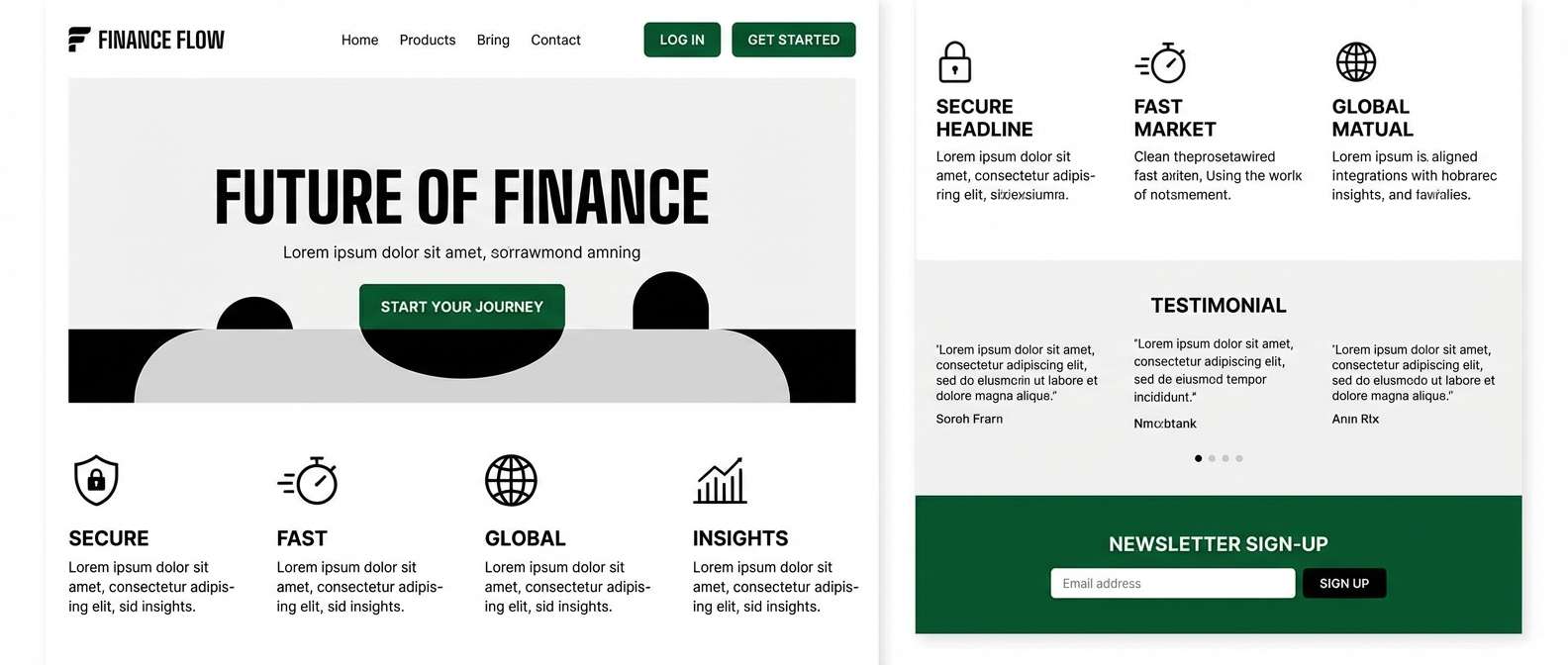
1) Deep Harbor Teal
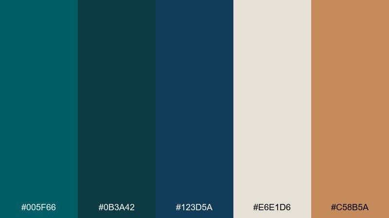
HEX: #005f66 #0b3a42 #123d5a #e6e1d6 #c58b5a
Mood: sleek, grounded, confident
Best for: SaaS dashboard UI and data-heavy products
Sleek and seaworthy, these tones feel like harbor water under city lights. The dark turquoise color palette stays readable thanks to inky blue depth and a calm warm neutral. Use the cream for charts, tables, and whitespace, then reserve the copper accent for primary buttons or key metrics. Tip: keep the darkest teal as the main background to reduce glare while preserving contrast.
Image example of deep harbor teal generated using media.io
Media.io is an online AI studio for creating and editing video, image, and audio in your browser.

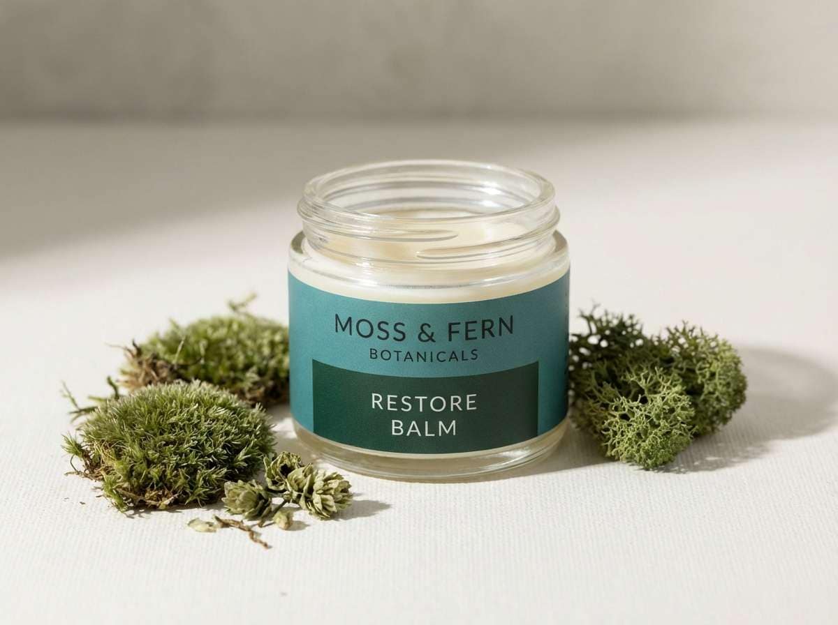
2) Rainforest Lagoon
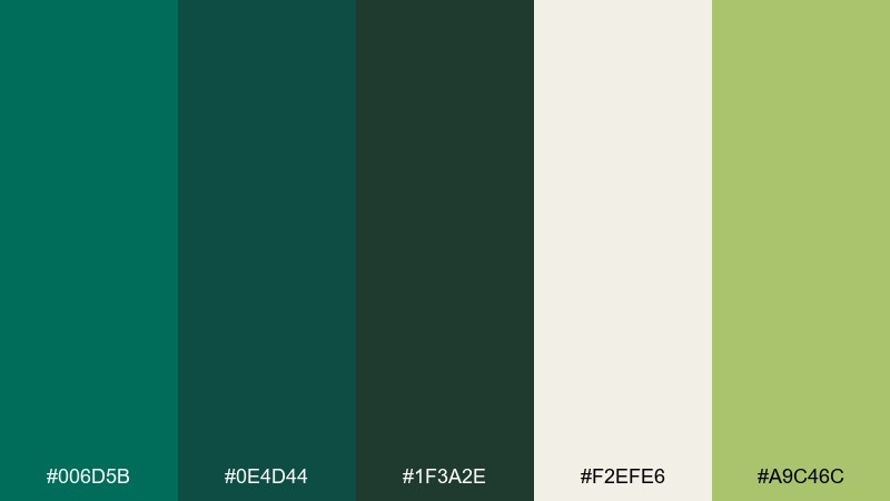
HEX: #006d5b #0e4d44 #1f3a2e #f2efe6 #a9c46c
Mood: lush, natural, restorative
Best for: eco branding, wellness labels, and green startups
Lush lagoon greens meet shaded jungle depth for a restorative, nature-first feel. The soft off-white keeps layouts breathable, while the mossy accent adds an organic highlight without turning neon. Pair with recycled paper textures, uncoated finishes, and minimal line icons. Tip: use the light neutral for ingredient lists or sustainability callouts to keep them easy to scan.
Image example of rainforest lagoon generated using media.io
3) Vintage Dive Bar

HEX: #004b52 #1b1b1b #6b4f3a #d2c2a4 #b33a3a
Mood: gritty, nostalgic, bold
Best for: gig posters, bar menus, and retro merch
Gritty and nostalgic, it feels like worn wood, dim bulbs, and a teal neon sign buzzing in the corner. The warm tan and brown bring analog warmth, while the red adds a punch for headlines. Use the charcoal for type and the turquoise for blocks, borders, or icon fills. Tip: keep the red to 5 to 10 percent so it reads as a deliberate highlight, not visual noise.
Image example of vintage dive bar generated using media.io
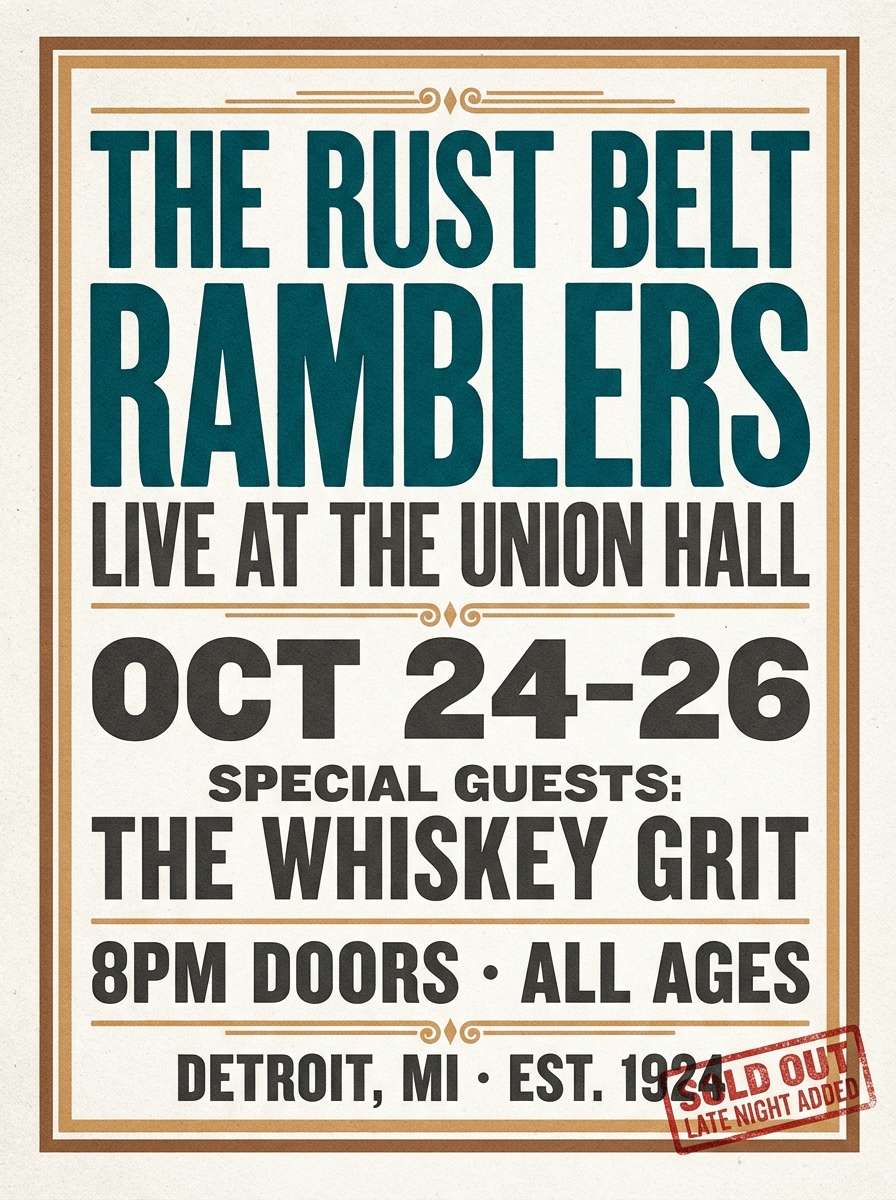
4) Coastal Nightfall
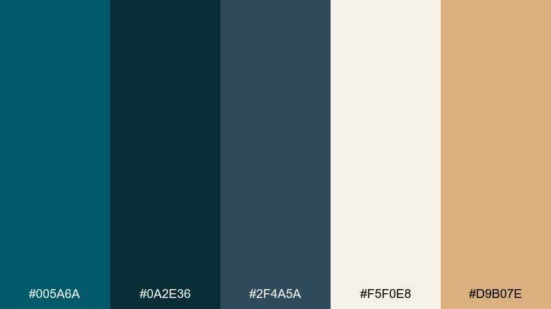
HEX: #005a6a #0a2e36 #2f4a5a #f5f0e8 #d9b07e
Mood: calm, upscale, evening
Best for: boutique hotel interiors and moodboards
Calm and upscale, it reads like ocean air after sunset with warm lamp glow. These dark turquoise color combinations shine when you mix matte charcoal, slate-blue textiles, and sandy metallic accents. Use the cream for walls or negative space, then bring in the gold tone through hardware, frames, or lighting. Tip: repeat the warm accent in small doses across the room to keep the palette cohesive.
Image example of coastal nightfall generated using media.io
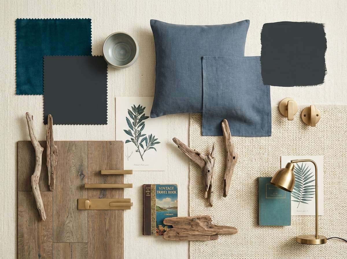
5) Arctic Current
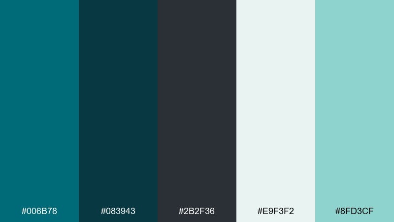
HEX: #006b78 #083943 #2b2f36 #e9f3f2 #8fd3cf
Mood: crisp, modern, techy
Best for: fintech landing pages and analytics reports
Crisp and modern, it feels like cold air, clean glass, and clear data. The pale mint supports spacious layouts, while the near-black keeps typography sharp and professional. Pair with simple geometric shapes and thin-line icons for a polished, contemporary look. Tip: use the light aqua for hover states and subtle chart fills to avoid overpowering the page.
Image example of arctic current generated using media.io
6) Peacock Shadow
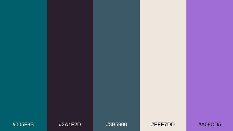
HEX: #005f6b #2a1f2d #3b5966 #efe7dd #a06cd5
Mood: dramatic, fashion-forward, artistic
Best for: fashion editorials and lookbooks
Dramatic and artistic, it evokes peacock feathers seen in low light with a hint of violet sheen. The purple accent adds runway energy, while the cream keeps spreads from feeling too heavy. Pair with high-contrast photography and generous margins for a luxe, editorial rhythm. Tip: keep the violet for pull quotes and section markers so it lands like a signature detail.
Image example of peacock shadow generated using media.io
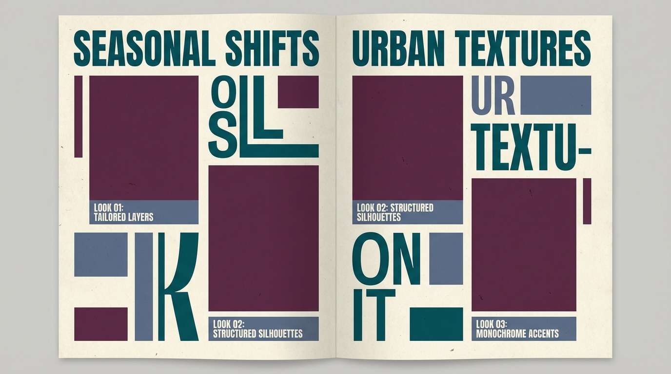
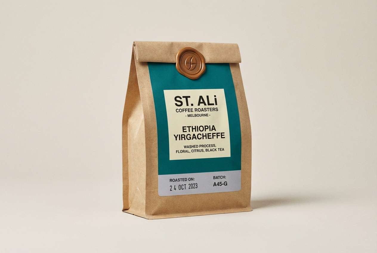
7) Patina Workshop
HEX: #006a70 #3a3f43 #7a5c46 #f1e6d6 #9aa5a9
Mood: crafty, industrial, warm
Best for: coffee packaging and artisan product labels
Crafty and industrial, it feels like patinaed metal, stoneware mugs, and a warm roastery. The dusty gray softens the contrast, while the brown brings a handmade, toasted note. Use the turquoise for the main brand block and the cream for product info and tasting notes. Tip: add subtle paper grain or stamped textures to amplify the workshop vibe.
Image example of patina workshop generated using media.io
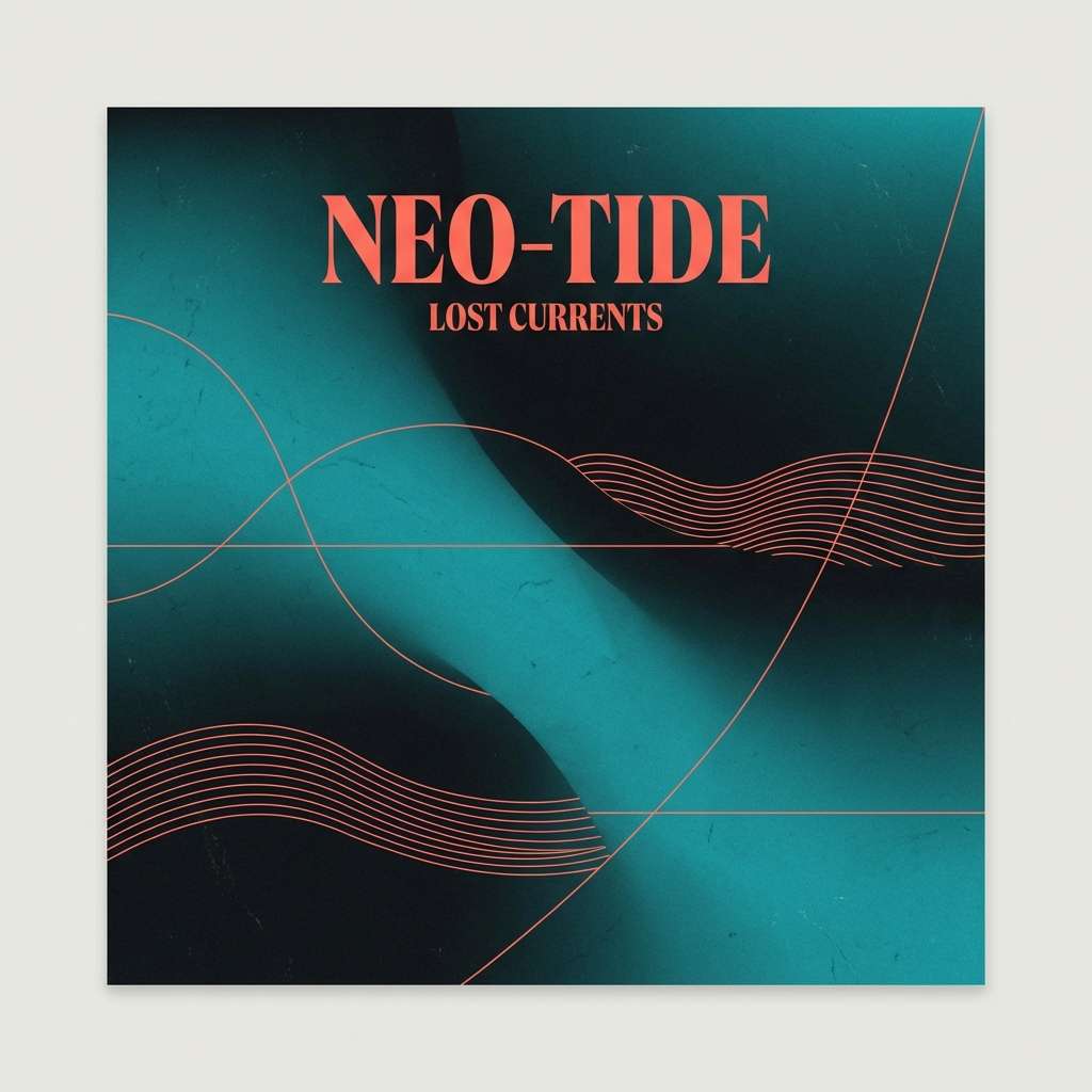
8) Midnight Aquarium
HEX: #004e5a #031b1f #0f3440 #d9f2f0 #ff6b6b
Mood: moody, cinematic, electric
Best for: music cover art and nightlife branding
Moody and cinematic, it conjures an aquarium tunnel at midnight with neon coral flashing past. The near-black anchors the composition, while the coral accent gives instant energy for titles or stickers. Pair with grain, glow effects, and bold sans type for a club-ready finish. Tip: keep the coral on key focal points only so the dark water tones stay dominant.
Image example of midnight aquarium generated using media.io
9) Stormy Spruce
HEX: #005c5f #1c2b2a #3c4f4e #e7e2d8 #7f8a5a
Mood: rugged, outdoorsy, steady
Best for: outdoor gear branding and catalog design
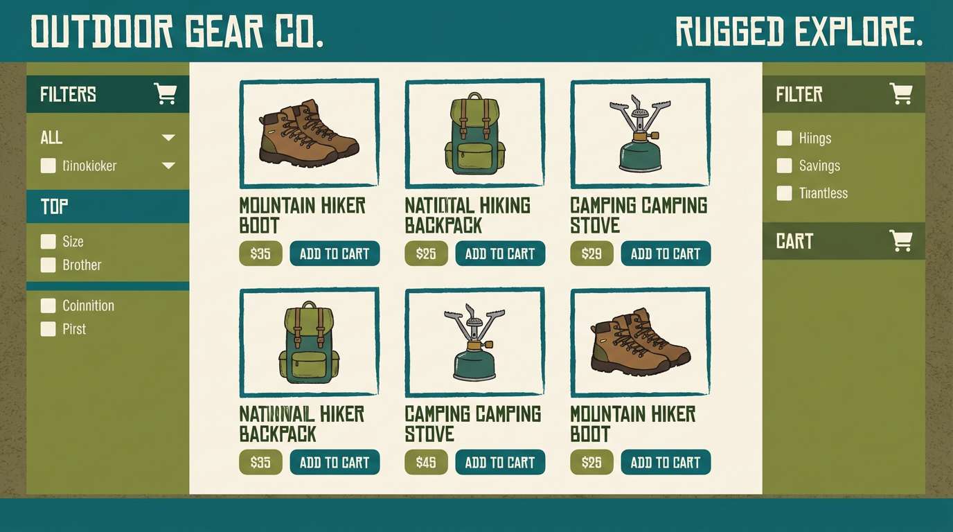
Rugged and steady, it feels like wet spruce needles and overcast trail weather. The warm light neutral keeps product pages readable, while the olive note adds a practical, utilitarian edge. Pair with matte finishes, topo lines, and sturdy typography. Tip: use the mid gray-green for secondary buttons and size selectors to avoid competing with primary actions.
Image example of stormy spruce generated using media.io
10) Ink and Sea Glass
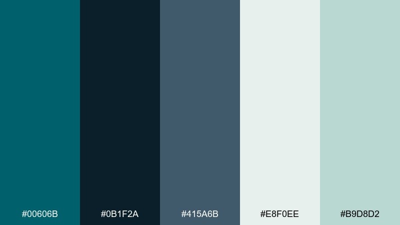
HEX: #00606b #0b1f2a #415a6b #e8f0ee #b9d8d2
Mood: quiet, literary, refined
Best for: book covers and longform blog design
Quiet and literary, it suggests ink on thick paper and sea glass smoothed by waves. The navy-ink tone strengthens type, while the pale aqua keeps pages feeling light and modern. Pair with serif headlines and minimal illustrations for a refined, readable look. Tip: set body text in the deep ink and save turquoise for section breaks and pull quotes.
Image example of ink and sea glass generated using media.io
11) Copper Kelp
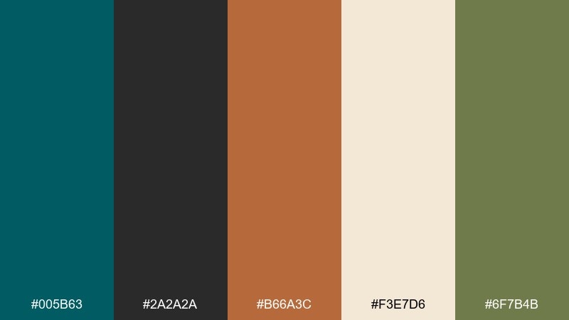
HEX: #005b63 #2a2a2a #b66a3c #f3e7d6 #6f7b4b
Mood: earthy, appetizing, modern rustic
Best for: restaurant menus and food brand identity
Earthy and appetizing, it brings to mind kelp forests, copper pans, and warm bread tones. The copper-orange instantly boosts food photography, while the deep teal keeps the brand feeling modern instead of farmhouse. Pair with textured paper menus or clean digital ordering screens equally well. Tip: use copper for prices and calls to action so diners spot the essentials fast.
Image example of copper kelp generated using media.io
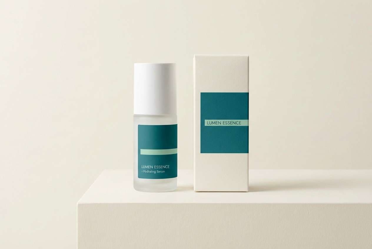
12) Celadon Depths
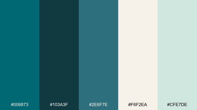
HEX: #006873 #103a3f #2e6f7e #f6f2ea #cfe7de
Mood: clean, spa-like, premium
Best for: skincare ads and minimalist product pages
Clean and spa-like, it feels like steam, glass, and cool water on stone. The dark turquoise color palette looks premium when you balance deep tones with airy celadon and creamy highlights. Pair with lots of negative space, thin rules, and understated product photography. Tip: choose one deep teal for headings and keep everything else soft to maintain that calm, clinical polish.
Image example of celadon depths generated using media.io
13) Neon Reef Accent
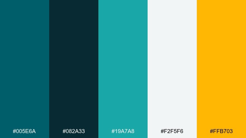
HEX: #005e6a #082a33 #19a7a8 #f2f5f6 #ffb703
Mood: energetic, playful, high-contrast
Best for: gaming UI, stream overlays, and esports banners
Energetic and playful, it feels like glowing reef lights cutting through deep water. The bright aqua and amber create instant hierarchy for badges, timers, and highlighted stats. Pair with dark panels and crisp white text to keep the experience readable at speed. Tip: reserve the amber for one key action so it stays unmistakably clickable.
Image example of neon reef accent generated using media.io
14) Slatewave Minimal
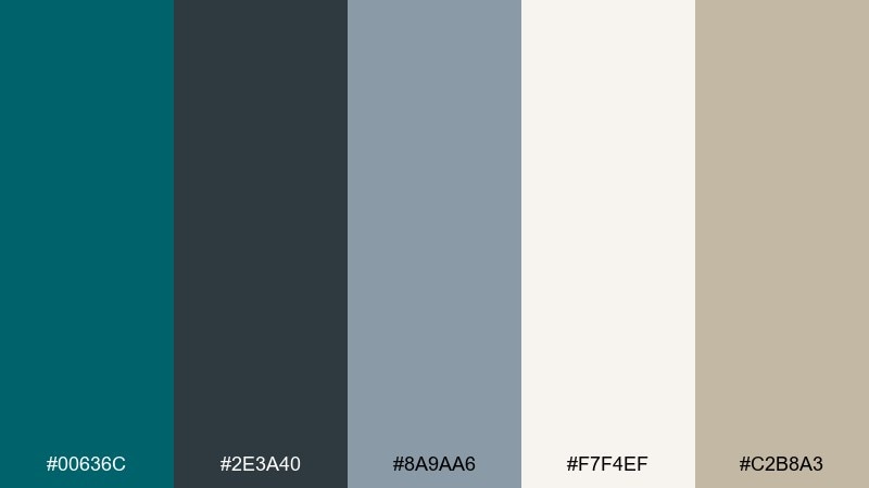
HEX: #00636c #2e3a40 #8a9aa6 #f7f4ef #c2b8a3
Mood: minimal, professional, calm
Best for: pitch decks and corporate presentations
Minimal and calm, it suggests slate stone, fog, and a steady ocean line. The cool grays keep slides professional, while the warm beige adds an approachable human touch. Pair with simple charts, wide margins, and a limited icon set. Tip: use turquoise only for section headers and key numbers to guide attention without clutter.
Image example of slatewave minimal generated using media.io
15) Mossy Turquoise Garden
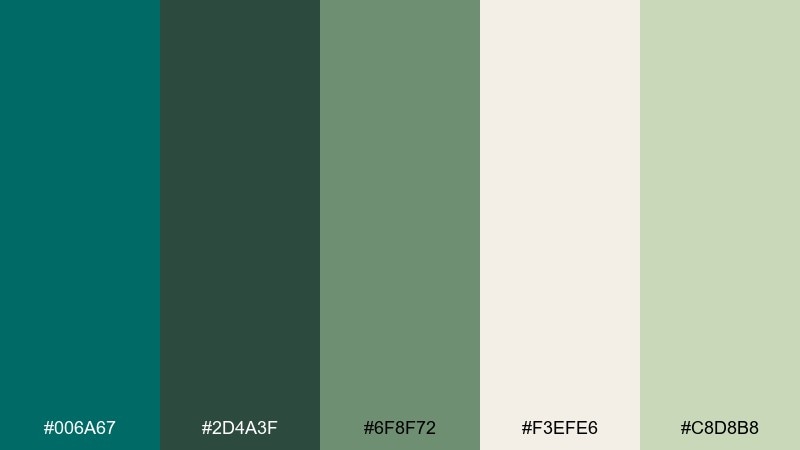
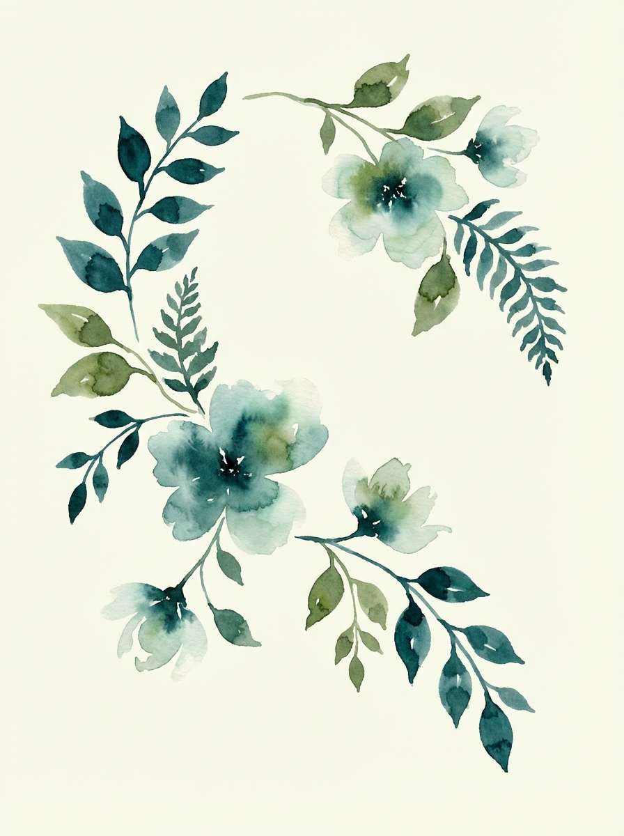
HEX: #006a67 #2d4a3f #6f8f72 #f3efe6 #c8d8b8
Mood: fresh, botanical, soothing
Best for: watercolor botanicals, stationery, and spring art prints
Fresh and botanical, it feels like shaded garden paths and dew on leaves. The soft greens blend naturally with turquoise, creating an easy, calming flow for illustrated work. Pair with light paper textures and delicate linework for an airy finish. Tip: keep the cream as the paper base and layer greens in translucent washes to preserve softness.
Image example of mossy turquoise garden generated using media.io
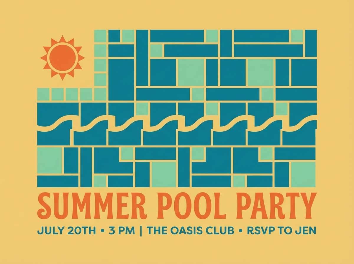
16) Retro Pool Tile
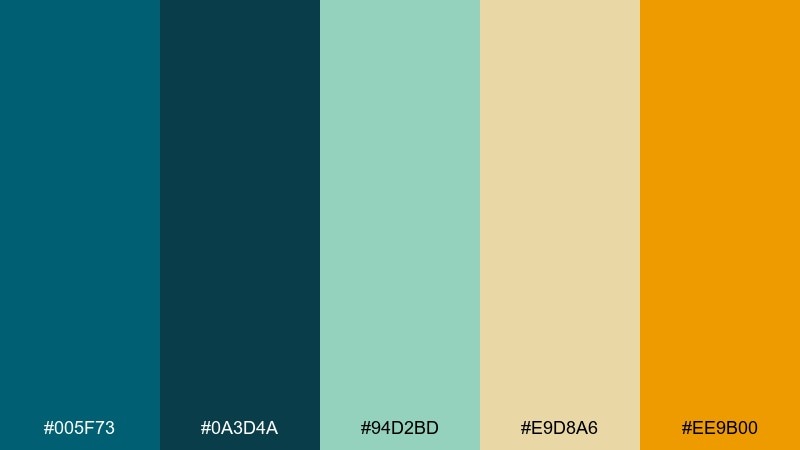
HEX: #005f73 #0a3d4a #94d2bd #e9d8a6 #ee9b00
Mood: sunny, retro, graphic
Best for: summer invitations and event flyers
Sunny and retro, it recalls pool tiles, sun-faded towels, and mid-century postcards. These dark turquoise color combinations pop when you contrast the deep teal with soft mint and a buttery yellow base. Pair with geometric patterns, thick borders, and playful type for a throwback vibe. Tip: print on uncoated stock to make the warm yellows feel more nostalgic.
Image example of retro pool tile generated using media.io
17) Industrial Teal Steel
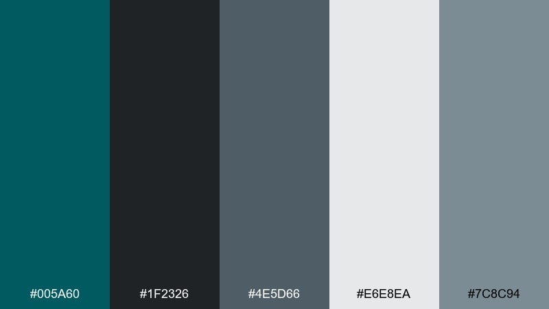
HEX: #005a60 #1f2326 #4e5d66 #e6e8ea #7c8c94
Mood: industrial, sharp, modern
Best for: app icon sets and product UI components
Industrial and sharp, it feels like brushed steel, machine panels, and clean workshop lighting. The grays provide structure for component libraries, while the turquoise gives a confident brand anchor. Pair with consistent stroke weights and simple, squared icon shapes. Tip: use the light gray as the default surface and push the teal into active states for clarity.
Image example of industrial teal steel generated using media.io
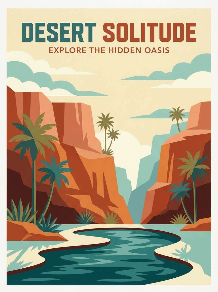
18) Desert Oasis Dusk
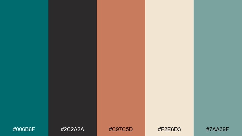
HEX: #006b6f #2c2a2a #c97c5d #f2e6d3 #7aa39f
Mood: wanderlust, warm, cinematic
Best for: travel posters and destination branding
Wanderlust and warm, it looks like an oasis at dusk with terracotta cliffs fading into cool water. The peachy clay tone pairs beautifully with deep teal for bold titles and sunlit accents. Use the cream for skies or negative space, then echo the muted aqua as a secondary background field. Tip: add subtle grain to make the poster feel printed and collectible.
Image example of desert oasis dusk generated using media.io
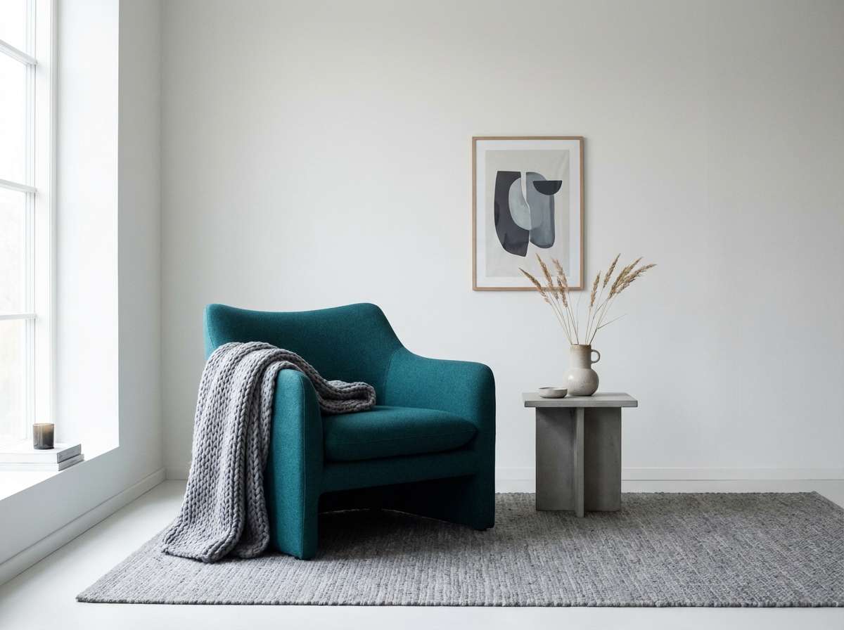
19) Winter Fjord Light
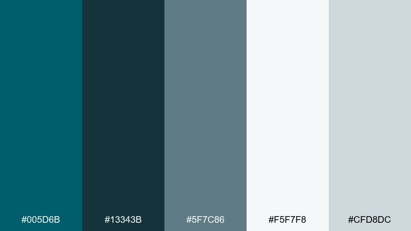
HEX: #005d6b #13343b #5f7c86 #f5f7f8 #cfd8dc
Mood: quiet, airy, Nordic
Best for: home decor styling and minimalist websites
Quiet and airy, it brings a Nordic fjord mood with cool air and pale daylight. The icy neutrals keep the look clean, while the deeper teal adds depth for headings or furniture accents. Pair with light woods, simple ceramics, and soft textiles for a calm, modern room. Tip: keep contrast gentle by using the mid blue-gray for secondary text instead of pure black.
Image example of winter fjord light generated using media.io
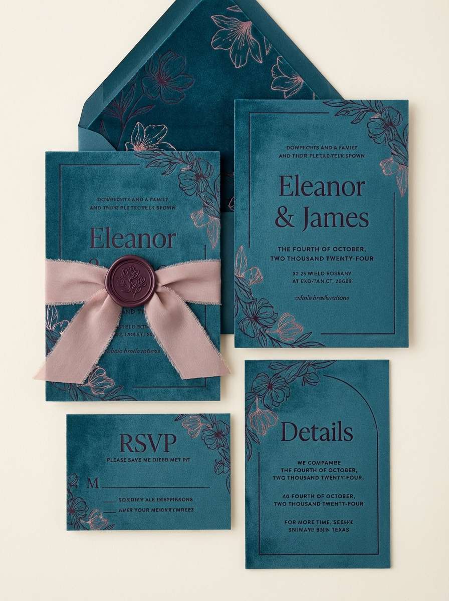
20) Gothic Teal Velvet
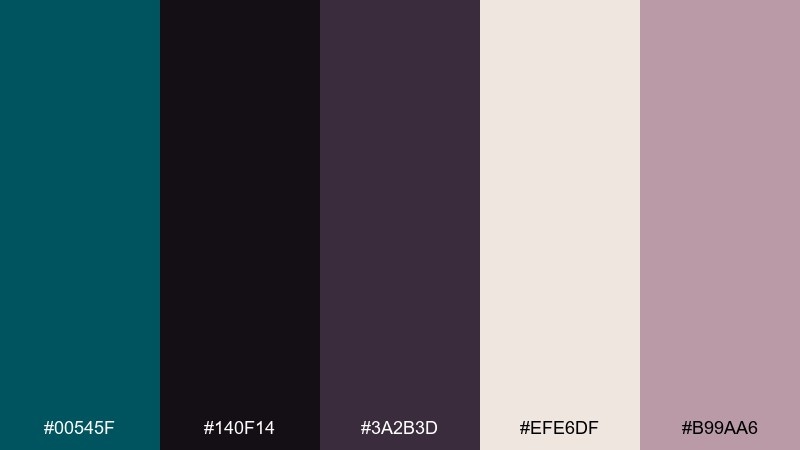
HEX: #00545f #140f14 #3a2b3d #efe6df #b99aa6
Mood: romantic, dark, elegant
Best for: wedding suites and luxe invitations
Romantic and dark, it feels like teal velvet in candlelight with plum shadows. The soft blush-mauve lifts the mood without breaking the evening elegance, and the cream keeps typography crisp. Pair with serif lettering, foil details, and minimal florals for a modern gothic look. Tip: print the deepest tones with a rich matte finish to make the palette feel tactile.
Image example of gothic teal velvet generated using media.io
What Colors Go Well with Dark Turquoise?
Dark turquoise pairs beautifully with warm neutrals (cream, sand, tan) because they soften the cool depth and keep designs inviting. For a more premium look, add metallic-inspired accents like copper, bronze, or muted gold.
If you want a modern UI feel, combine dark turquoise with near-black, slate gray, and icy off-whites. This creates clear hierarchy, strong readability, and a crisp “tech” mood.
For bolder contrast, try coral, amber, or violet accents in small doses. These colors pop against dark turquoise without needing to turn the whole palette neon.
How to Use a Dark Turquoise Color Palette in Real Designs
In branding, use dark turquoise as the primary anchor (logo fill, header bars, packaging blocks), then choose one warm accent for calls-to-action. Keep backgrounds light (cream/off-white) if you want approachable, or go dark for a more cinematic edge.
In UI, dark turquoise works especially well for navigation, hero sections, and active states. To maintain accessibility, reserve the darkest shade for surfaces, use high-contrast text (off-white), and keep accent colors limited to key actions and alerts.
For interiors and posters, repeat dark turquoise in a few consistent spots (a feature wall, a sofa, or large typography blocks), then echo it with mid-tone slates and warm details. That repetition keeps the scheme cohesive instead of “random teal.”
Create Dark Turquoise Palette Visuals with AI
Want to see these palettes in action before you commit? Generate mockups like UI screens, posters, labels, and moodboards using the prompts above, then tweak lighting, textures, and layout style to match your brand.
With Media.io’s text-to-image tools, you can quickly explore variations (more charcoal, more cream, brighter accents) while keeping the same dark turquoise base for consistency.
Dark Turquoise Color Palette FAQs
-
What is the HEX code for dark turquoise?
Dark turquoise can refer to multiple deep teal-leaning shades. In this article, examples include #005f66, #00606b, and #005a6a—choose the one that best matches your project’s lighting and contrast needs. -
Is dark turquoise more blue or more green?
It sits between blue and green, but most “dark turquoise” palettes lean teal (blue-green). You can push it greener with moss/olive accents or bluer with slate and navy. -
What neutral colors pair best with dark turquoise?
Creamy off-whites, warm beiges, and soft grays are the easiest matches. They reduce harsh contrast while keeping dark turquoise looking rich and readable. -
What accent colors make dark turquoise pop?
Copper, amber, coral, and violet are high-impact accents. Use them sparingly (often 5–10%) for buttons, prices, badges, or key headlines. -
Can I use dark turquoise for website backgrounds?
Yes—dark turquoise is great for low-glare backgrounds, especially in dashboards or landing page hero sections. Pair it with off-white text and keep interactive accents consistent for clarity. -
Does dark turquoise work for luxury branding?
It can feel very premium when paired with cream, charcoal, and metallic-inspired accents (gold/copper/brass). Matte textures, generous whitespace, and restrained typography help it read “luxury” instead of “sporty.” -
How do I generate palette-based mockups with AI?
Use a prompt that describes the design (UI, poster, label, interior moodboard) and explicitly mention your palette colors and materials (e.g., cream background, copper buttons, charcoal text). Media.io’s text-to-image makes it easy to iterate quickly until the vibe matches your brief.


