

Building a dinosaur color palette is an easy way to tap into nature-driven greens, fossil neutrals, and bold “adventure” accents without feeling generic.
Whether you’re designing a museum poster, kids party invite, or modern UI, these dinosaur color schemes help you balance wild energy with grounded readability.
In this article
Why Dinosaur Color Schemes Work So Well
Dinosaur palettes naturally combine “alive” greens with “excavated” neutrals like sand, bone, and charcoal. That blend makes designs feel both playful and credible, which is why it works for everything from kids graphics to science education.
They also come with built-in contrast: deep forest or navy shades handle typography and structure, while lighter creams and misty tones keep layouts open and readable.
Finally, a dinosaur color scheme is flexible with accents—ember orange, cyan, or violet can be used sparingly for calls to action, highlights, or badges without breaking the earthy mood.
20+ Dinosaur Color Palette Ideas (with HEX Codes)
1) Fossil Fern
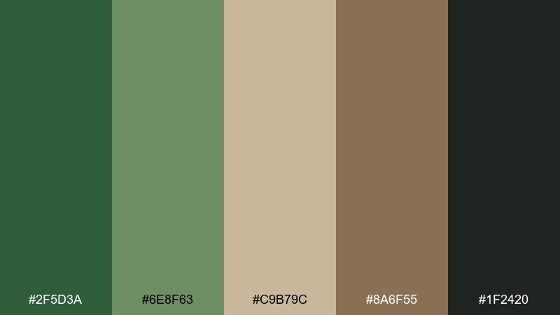
HEX: #2F5D3A #6E8F63 #C9B79C #8A6F55 #1F2420
Mood: earthy, grounded, natural
Best for: outdoor brand identity and eco packaging
Earthy and grounded, these tones feel like fern fronds, damp soil, and sun-warmed stone. It is an easy dinosaur color palette when you want nature-first credibility without looking dull. Use the deep green for headings, the sage for large blocks, and the sand tone as breathable negative space. Pair it with recycled paper textures and a matte finish for the most authentic result.
Image example of fossil fern generated using media.io
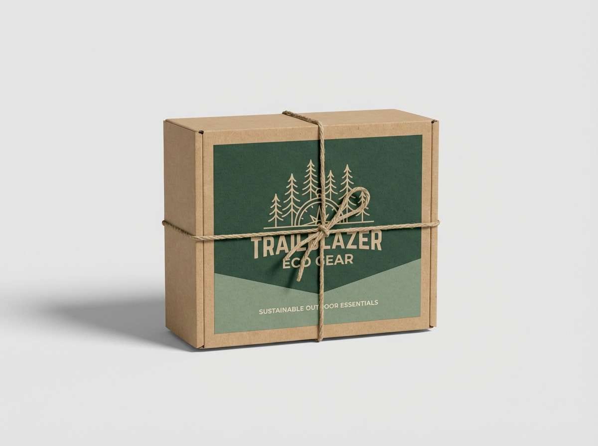
Media.io is an online AI studio for creating and editing video, image, and audio in your browser.

2) Jurassic Jungle
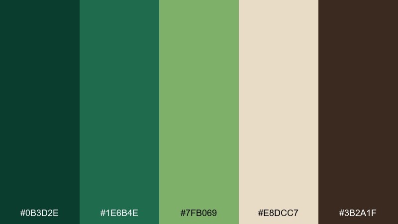
HEX: #0B3D2E #1E6B4E #7FB069 #E8DCC7 #3B2A1F
Mood: lush, adventurous, wild
Best for: travel posters and adventure branding
Lush and adventurous, it reads like a canopy trail with dappled light and muddy bark. The dark teal-green anchors logos and headlines, while the leafy green keeps layouts energetic. Use the warm cream to open up busy compositions and prevent the greens from feeling heavy. A touch of cocoa brown works best as a thin outline or type color, not a full background.
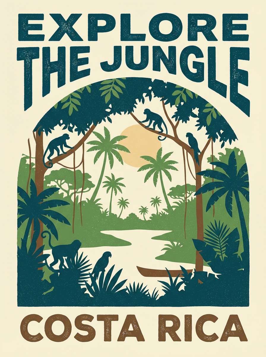
Image example of jurassic jungle generated using media.io
3) Amber Bone
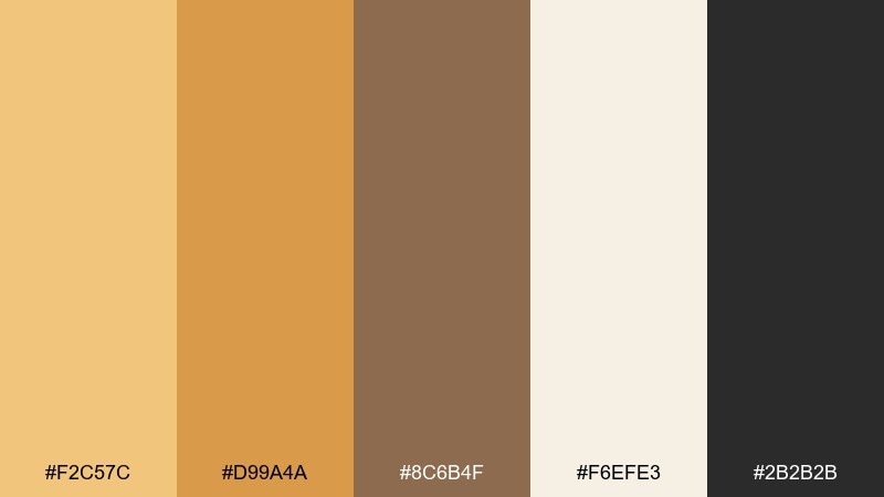
HEX: #F2C57C #D99A4A #8C6B4F #F6EFE3 #2B2B2B
Mood: warm, nostalgic, museum-chic
Best for: museum exhibit signage and editorial headers
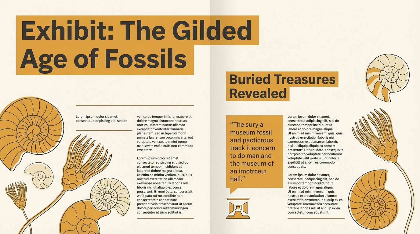
Warm and nostalgic, the dinosaur palette suggests amber resin, polished fossils, and gallery lighting. The honey tones bring friendliness to titles and callouts, while bone cream keeps the page airy. Use charcoal for legible body text and let the mid-brown support grid lines or captions. It pairs especially well with serif typography and archival illustration styles.
Image example of amber bone generated using media.io
4) Lava Ridge
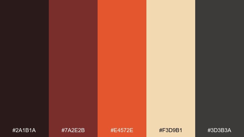
HEX: #2A1B1A #7A2E2B #E4572E #F3D9B1 #3D3B3A
Mood: bold, cinematic, intense
Best for: game key art posters and event flyers
Bold and cinematic, this dinosaur color scheme feels like glowing lava under ash-dark rock. Let the ember orange take the spotlight on buttons or key art highlights, then balance it with a creamy sand for breathing room. The burgundy works well for shadows and secondary blocks that still feel hot. Keep the darkest tones to borders and typography so the palette stays punchy, not muddy.
Image example of lava ridge generated using media.io

5) River Delta
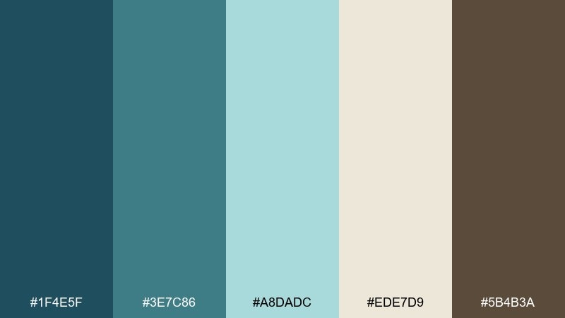
HEX: #1F4E5F #3E7C86 #A8DADC #EDE7D9 #5B4B3A
Mood: calm, fresh, exploratory
Best for: web hero sections and science education sites
Calm and fresh, these dinosaur hues evoke river water, reed beds, and silted banks. Use the deep blue-green as a strong header bar, then let the pale aqua carry large backgrounds. The off-white keeps content readable and helps charts feel less clinical. Add the earthy brown sparingly for icons or small dividers to keep the layout grounded.
Image example of river delta generated using media.io
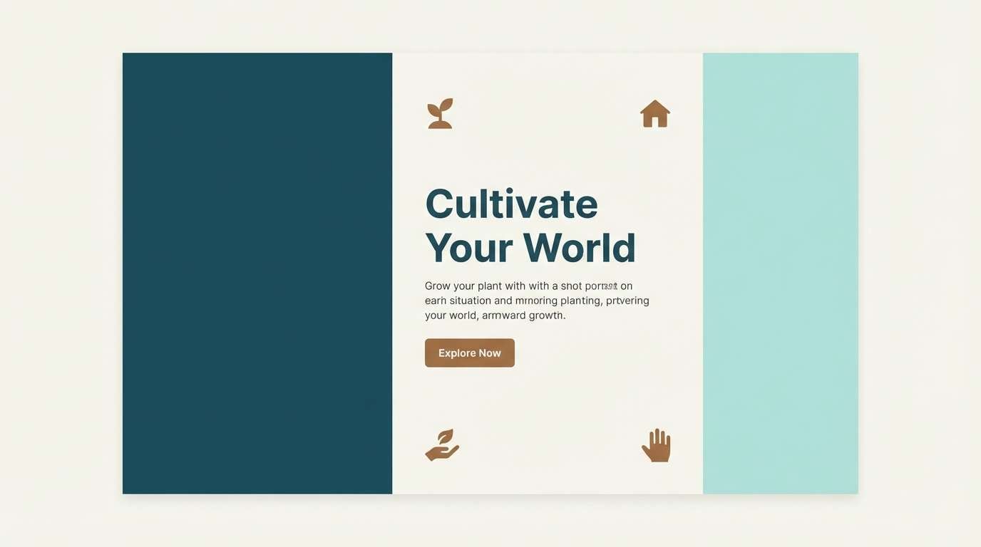
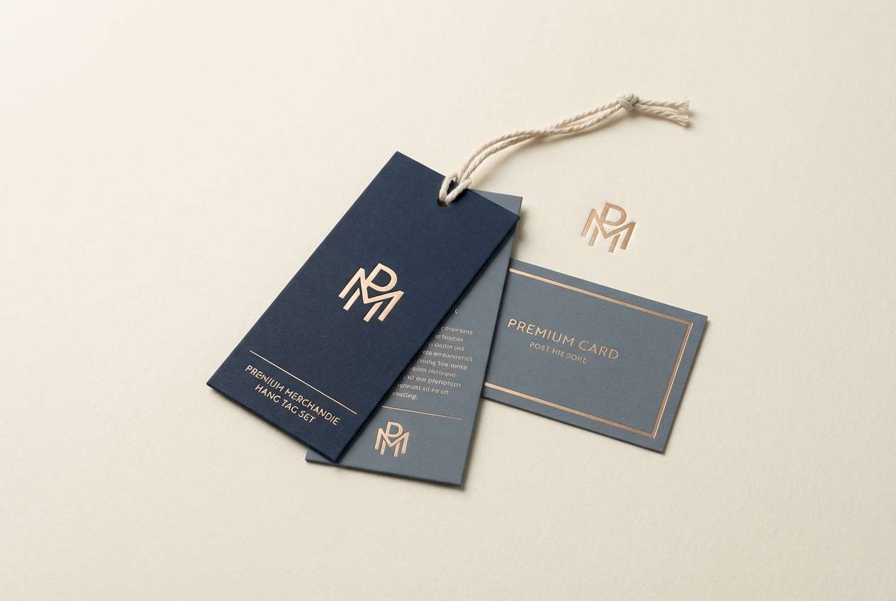
6) Night Museum
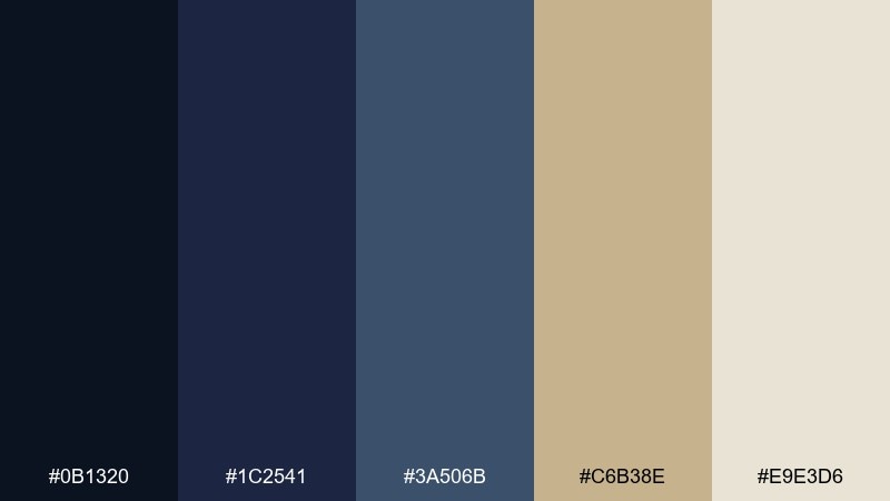
HEX: #0B1320 #1C2541 #3A506B #C6B38E #E9E3D6
Mood: moody, refined, nocturnal
Best for: luxury merch tags and museum membership ads
Moody and refined, it mirrors a dim gallery with brass plaques and soft spotlight glow. These dinosaur color combinations shine when you need a premium look without going fully black. Use navy for backgrounds, slate for panels, and reserve the warm metallic beige for badges and price points. A quick tip: add extra line height to light text on dark navy to keep it elegant and readable.
Image example of night museum generated using media.io
7) Herbivore Meadow
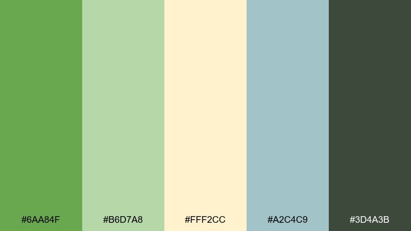
HEX: #6AA84F #B6D7A8 #FFF2CC #A2C4C9 #3D4A3B
Mood: playful, light, friendly
Best for: kids classroom printables and birthday invitations
Playful and light, the dinosaur color scheme feels like a sunny meadow with soft leaves and pastel skies. The bright green brings instant cheer, while mint and pale butter yellow keep everything gentle for kid-friendly layouts. Use the deep gray-green only for text and outlines to avoid harsh contrast. Pair it with rounded fonts and simple illustrated shapes for a clean, happy finish.
Image example of herbivore meadow generated using media.io
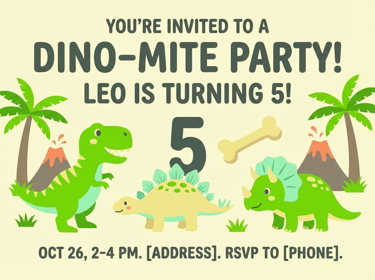
8) Predator Sunset
HEX: #2D1E2F #6D2E46 #E26D5A #F5E6C8 #1B2A41
Mood: dramatic, modern, energetic
Best for: album covers and social ads
Dramatic and modern, the dinosaur color palette looks like a hot horizon fading into a violet night. Let the coral act as the attention grabber for headlines and CTA shapes, then build depth with plum and inky blue. The soft cream keeps the palette from getting too heavy on mobile screens. For best results, use the darkest shade as a solid block behind text, not as a thin outline.
Image example of predator sunset generated using media.io
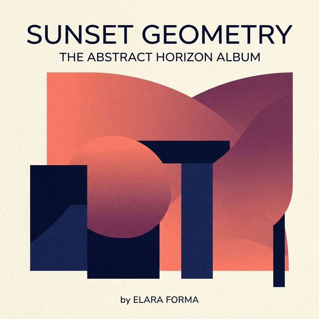
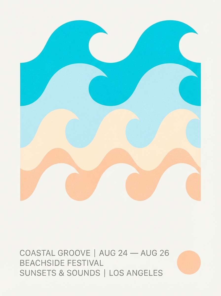
9) Cretaceous Coast
HEX: #0E4D64 #00A5CF #BDE0FE #FFE8D6 #4A5759
Mood: breezy, bright, coastal
Best for: summer merch graphics and beach event posters
Breezy and bright, it brings to mind coastal cliffs, sea spray, and sun-bleached shells. Use the saturated cyan for focal elements like titles or stickers, while the pale sky blue works for large fields. The peachy cream adds warmth so the blues do not feel sterile. Keep the gray as a neutral for type and thin borders to maintain a clean, airy poster.
Image example of cretaceous coast generated using media.io
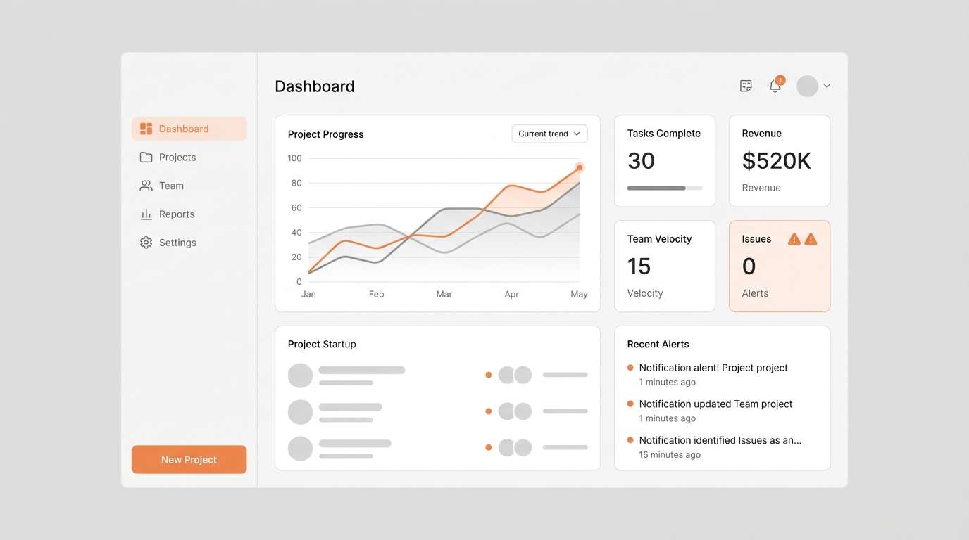
10) Volcanic Ash
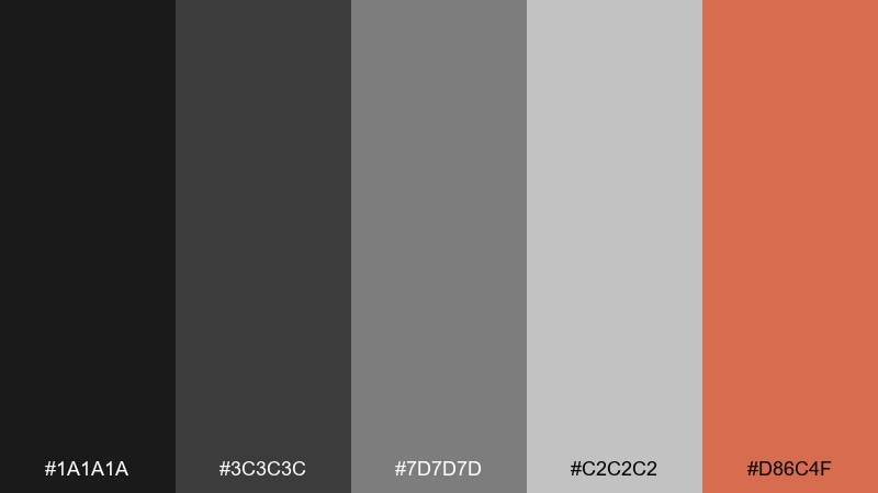
HEX: #1A1A1A #3C3C3C #7D7D7D #C2C2C2 #D86C4F
Mood: minimal, gritty, industrial
Best for: tech UI dashboards and monochrome branding
Minimal and gritty, it feels like cooled ash with a single ember still glowing. The grayscale stack makes data-heavy screens calm and structured, while the muted orange adds just enough urgency for alerts. Use light gray for panels and keep true black for key navigation. A simple tip: reserve the accent color for one action type so your hierarchy stays crystal clear.
Image example of volcanic ash generated using media.io
11) Eggshell Cream
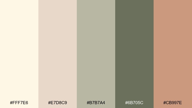
HEX: #FFF7E6 #E7D8C9 #B7B7A4 #6B705C #CB997E
Mood: soft, cozy, vintage
Best for: nursery wall art and gentle lifestyle branding
Soft and cozy, these dinosaur tones resemble eggshell, linen, and sun-faded clay. It is a calm dinosaur color palette for projects that should feel nurturing rather than loud. Use cream as the base, then layer sage-gray for type and simple shapes. The clay accent looks best in small details like stars, dots, or a single illustration highlight.
Image example of eggshell cream generated using media.io
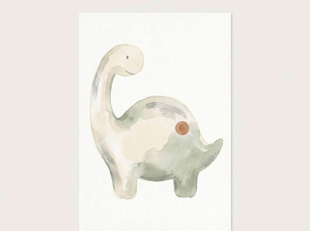
12) Swamp Mist
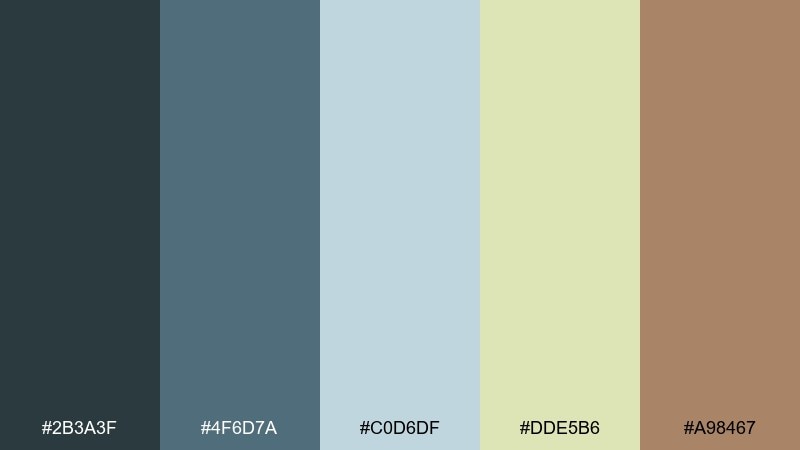
HEX: #2B3A3F #4F6D7A #C0D6DF #DDE5B6 #A98467
Mood: mysterious, muted, atmospheric
Best for: book covers and tabletop game sheets
Mysterious and muted, it suggests fog over still water with reeds and weathered wood nearby. Blue-gray and steel tones make a strong foundation for text-heavy layouts. Use the pale misty blue for large background areas and add the soft green as a subtle highlight color. The warm brown works best as a small accent for icons, seals, or section headers.
Image example of swamp mist generated using media.io
13) Canyon Rust
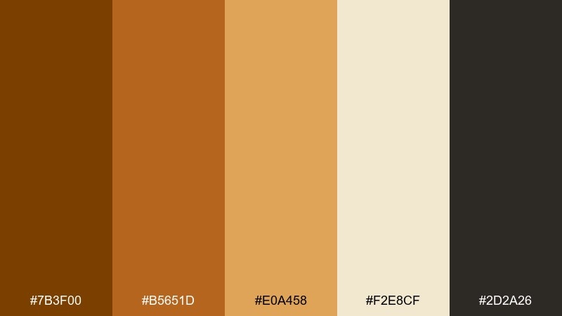
HEX: #7B3F00 #B5651D #E0A458 #F2E8CF #2D2A26
Mood: rugged, warm, adventurous
Best for: hiking badges and heritage branding
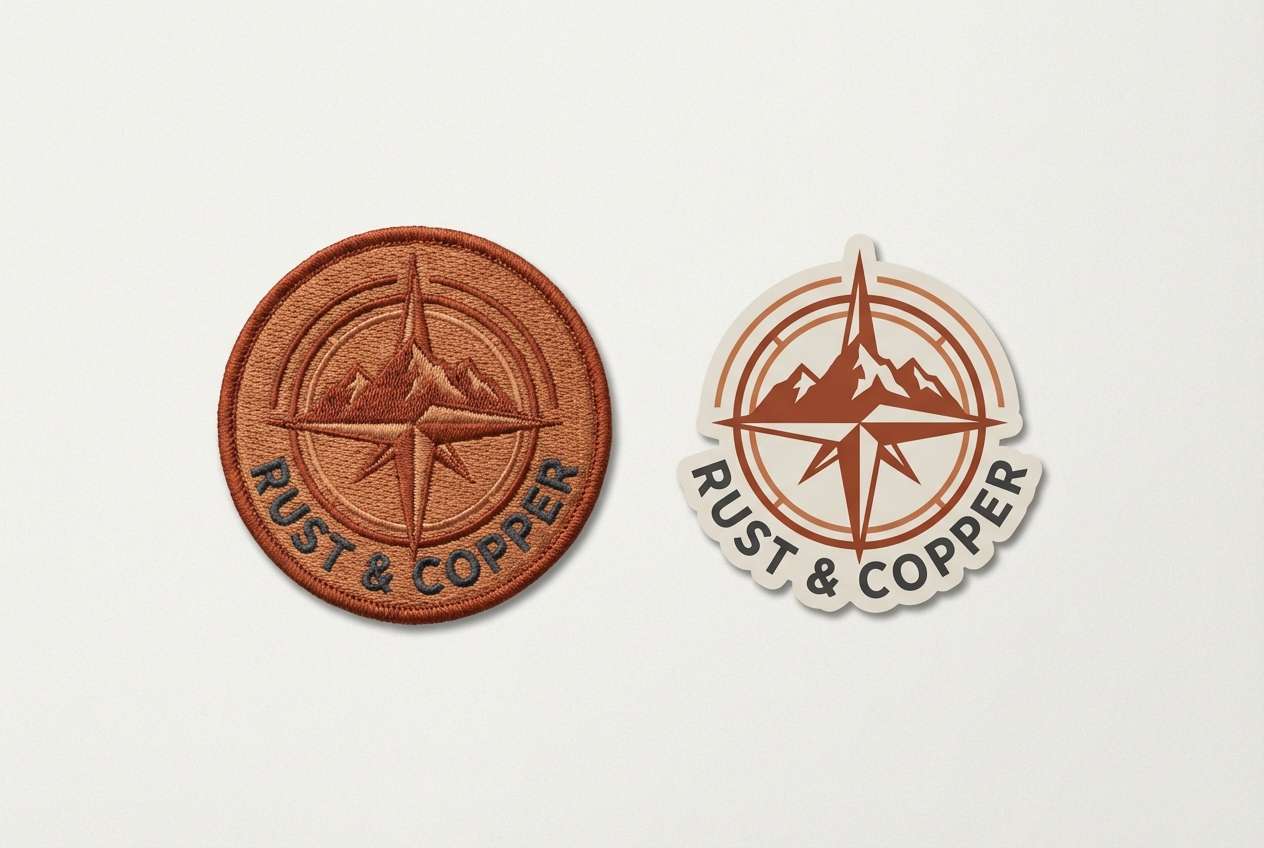
Rugged and warm, it recalls canyon walls, dusty trails, and late-afternoon light. The rust and copper tones are perfect for badges, patches, and stamp-style marks. Use the creamy off-white to keep designs from feeling too heavy, especially on web backgrounds. A good pairing is textured paper or subtle grain to amplify the outdoorsy character.
Image example of canyon rust generated using media.io
14) Meteoric Purple
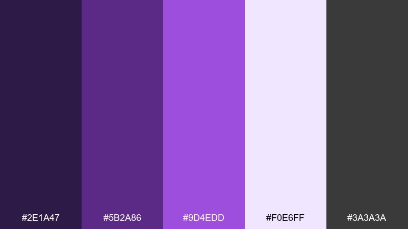
HEX: #2E1A47 #5B2A86 #9D4EDD #F0E6FF #3A3A3A
Mood: cosmic, bold, playful
Best for: stream overlays and sci-fi posters
Cosmic and bold, this dinosaur palette feels like a night sky cracked open by a purple meteor trail. Let the bright violet do the heavy lifting on titles and key shapes, then soften the look with a pale lavender background. Charcoal is the cleanest choice for small text and UI labels. Keep gradients subtle and within the purple range so the design stays cohesive.
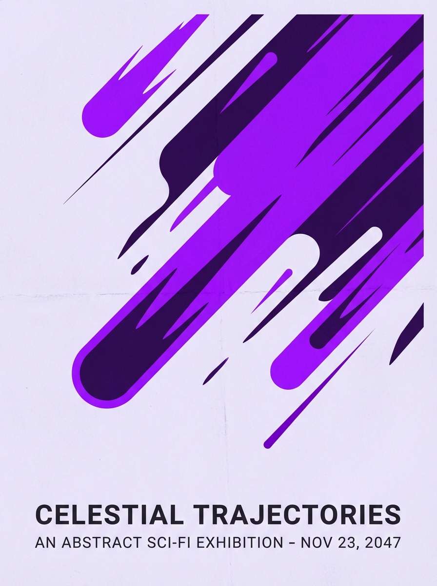
Image example of meteoric purple generated using media.io
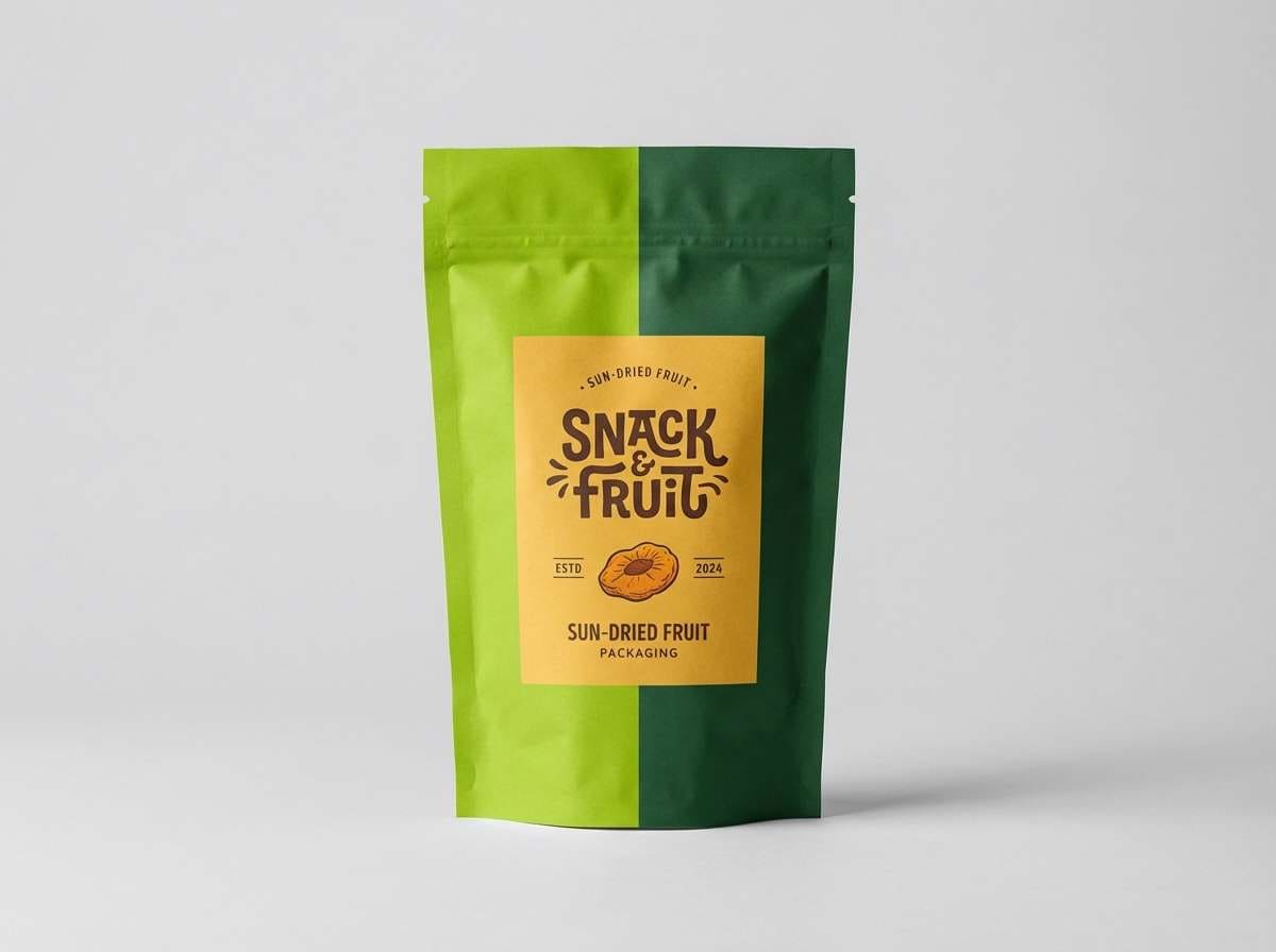
15) Tropical Canopy
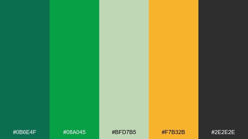
HEX: #0B6E4F #08A045 #BFD7B5 #F7B32B #2E2E2E
Mood: bright, energetic, adventurous
Best for: snack packaging and playful product ads
Bright and energetic, it looks like sunlit leaves with a pop of ripe fruit. This dinosaur color scheme is great when you want the greens to feel fun rather than serious. Use the yellow-orange as a hero accent for flavor badges or price bursts, then keep text in near-black for contrast. Tip: limit the orange to one or two shapes so the green story stays dominant.
Image example of tropical canopy generated using media.io
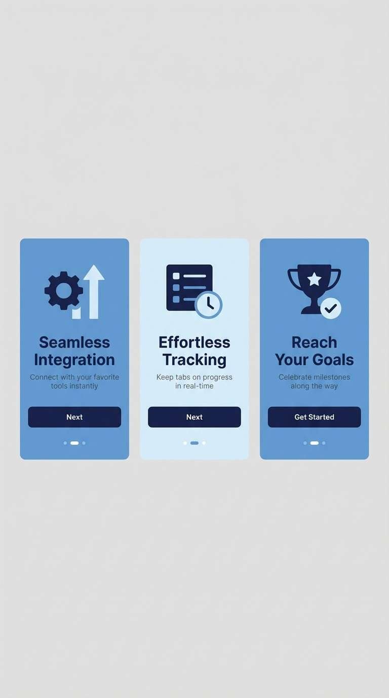
16) Glacier Scale
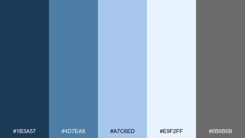
HEX: #1B3A57 #4D7EA8 #A7C6ED #E9F2FF #6B6B6B
Mood: cool, crisp, modern
Best for: app onboarding screens and SaaS landing pages
Cool and crisp, it suggests icy cliffs and smooth, scale-like gradients in cold light. Use the deep navy for navigation and the mid blue for primary buttons. The pale blues make excellent full-bleed backgrounds that still feel clean and modern. Add the neutral gray only for secondary text so the blues stay fresh and focused.
Image example of glacier scale generated using media.io
17) Desert Track
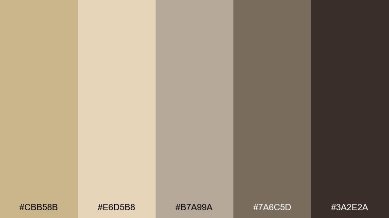
HEX: #CBB58B #E6D5B8 #B7A99A #7A6C5D #3A2E2A
Mood: quiet, earthy, minimalist
Best for: minimal logos and stationery sets
Quiet and earthy, it feels like wind-smoothed dunes and dusty footprints. The sand and oat tones make a calming base for stationery and simple brand systems. Use the deeper taupe for monograms and let the chocolate shade handle long-form text. A subtle emboss or blind-deboss detail pairs beautifully with these restrained neutrals.
Image example of desert track generated using media.io
18) Lagoon Teal
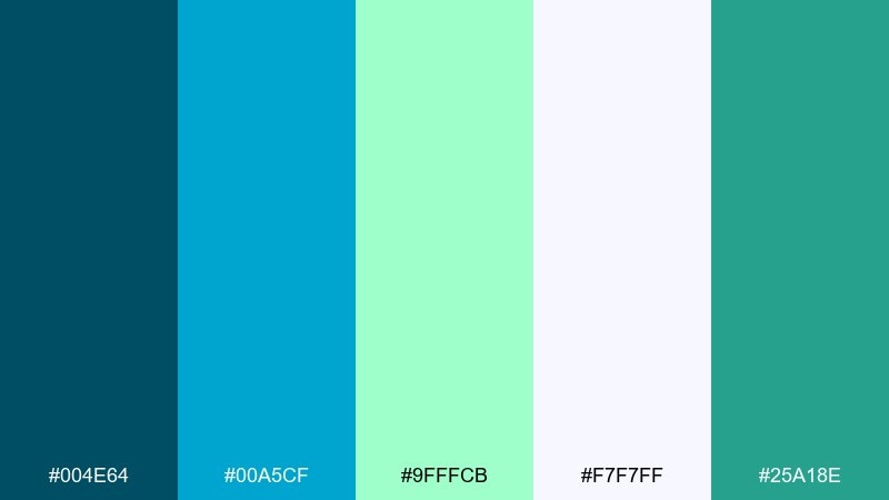
HEX: #004E64 #00A5CF #9FFFCB #F7F7FF #25A18E
Mood: fresh, playful, aquatic
Best for: summer social templates and wellness branding
Fresh and playful, it evokes clear lagoon water with bright reflections. Cyan and teal make energetic headers and sticker shapes, while the minty green keeps the mood light. Use near-white as the primary background so the saturated tones do not overwhelm. For a balanced look, choose one dominant blue and let the other act as a supporting accent.
Image example of lagoon teal generated using media.io
19) Stone Quarry
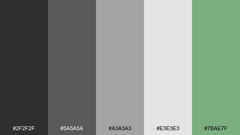
HEX: #2F2F2F #5A5A5A #A3A3A3 #E3E3E3 #7BAE7F
Mood: practical, sturdy, understated
Best for: documentation sites and product manuals
Practical and sturdy, it resembles stacked stone with a hint of moss at the edges. The grayscale range keeps long pages readable and organized. Add the muted green only for links, success states, or small highlights so it stays meaningful. A simple usage tip is to increase contrast between the two lightest grays for section separation without adding extra lines.
Image example of stone quarry generated using media.io
20) Plum Thicket
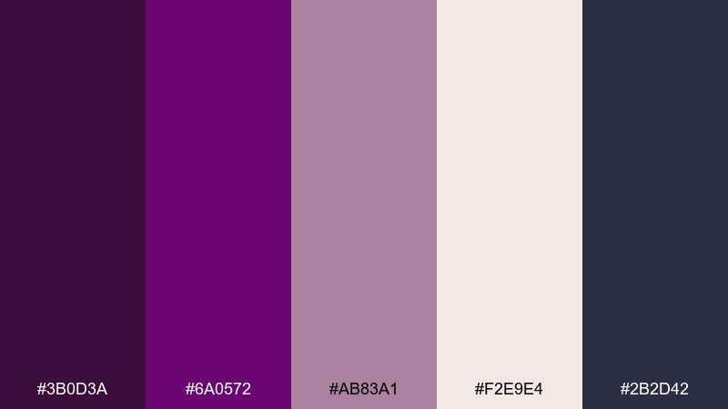
HEX: #3B0D3A #6A0572 #AB83A1 #F2E9E4 #2B2D42
Mood: whimsical, moody, artistic
Best for: boutique branding and illustrated posters
Whimsical and moody, it feels like twilight berries and shadowy leaves. The deep plum sets a dramatic base, while mauve softens the edges for more romantic layouts. If you are building a dinosaur color scheme for a creative brand, keep the cream as your main background to avoid visual heaviness. Use the inky blue-gray for fine typography and small line art to finish the look.
Image example of plum thicket generated using media.io
What Colors Go Well with Dinosaur?
Earthy greens are the core of many dinosaur color schemes, and they pair naturally with fossil-like neutrals such as sand, bone cream, taupe, and charcoal. This keeps the look grounded and believable.
For more energy, add a single bright accent that feels “prehistoric adventure,” like ember orange, cyan, or violet. Use that accent for small, high-impact areas—CTAs, icons, stickers, or headline blocks.
If you want a premium direction, swap bright accents for metallic-like beiges and deep navies. The result feels like museum signage, luxury merch, or a cinematic poster.
How to Use a Dinosaur Color Palette in Real Designs
Start by assigning roles: one dark anchor for text/navigation, one mid-tone for larger sections, one light neutral for background, and one accent for highlights. Dinosaur palettes work best when the accent is intentionally limited.
For branding, try pairing textured materials (kraft paper, grain, stone-like patterns) with these colors to reinforce the theme. For UI, keep neutrals clean and reserve saturated hues for interactive states and key metrics.
When printing posters or invitations, test contrast early—greens and browns can compress in low light. A bone/cream background is a simple way to preserve readability.
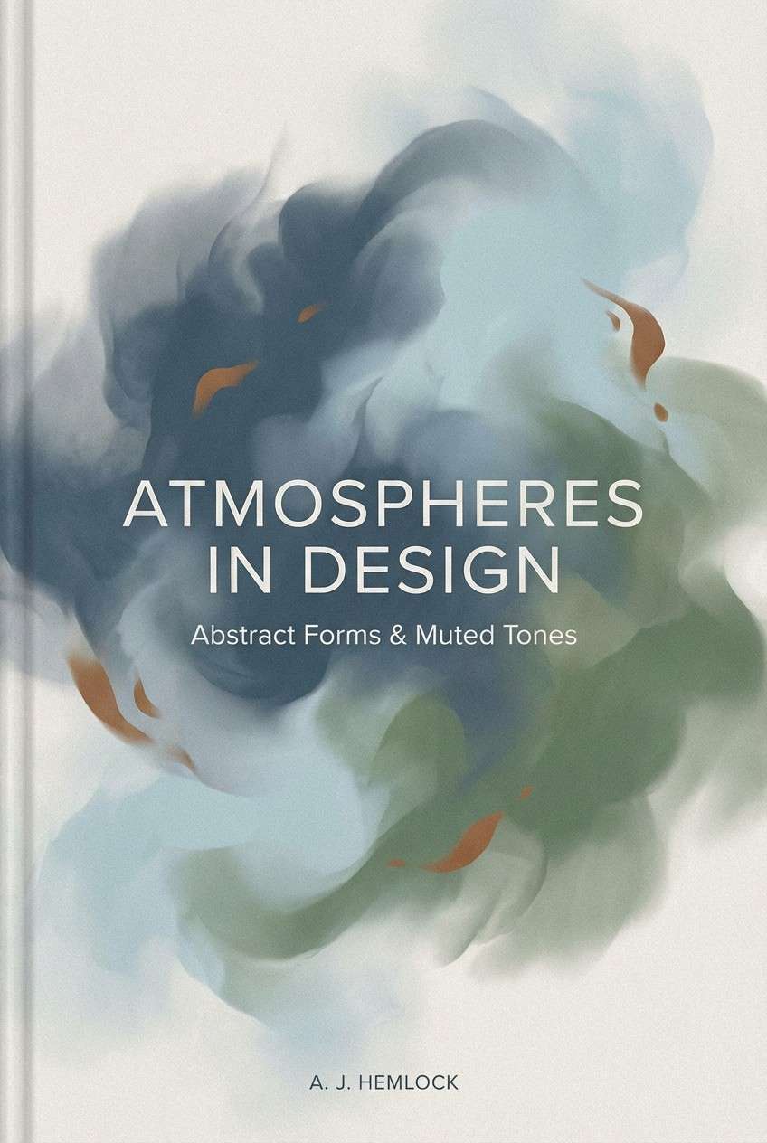
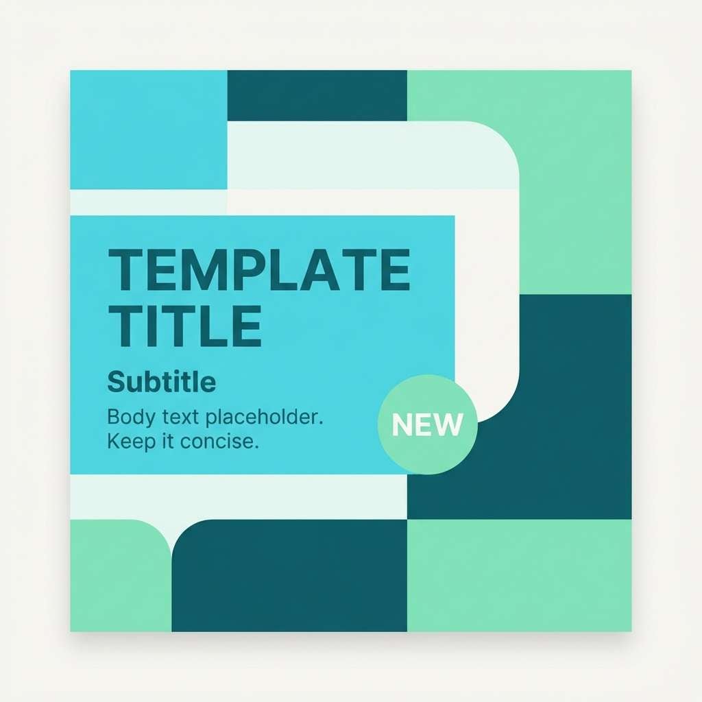
Create Dinosaur Palette Visuals with AI
If you want to preview a dinosaur color palette on real-looking designs, generate mockups with AI first. It helps you check contrast, vibe, and composition before committing to final artwork.
Use your favorite palette’s HEX codes as guidance, then describe the medium (poster, packaging, UI) and style (flat vector, realistic studio shot, watercolor). Small prompt changes can quickly produce multiple directions.
Media.io makes it easy to turn these dinosaur color combinations into on-brand visuals directly in your browser.
Dinosaur Color Palette FAQs
-
What is a dinosaur color palette?
A dinosaur color palette is a set of colors inspired by prehistoric themes—often earthy greens, fossil neutrals (bone, sand, stone), and an occasional bold accent like ember orange or bright cyan. -
What are the best “Jurassic” colors for branding?
Deep forest or teal greens paired with warm cream and a grounding brown/charcoal work well for Jurassic-style branding. They feel natural, adventurous, and trustworthy for outdoor, travel, or education brands. -
Which dinosaur color scheme is best for a kids design?
Pastel-forward sets like Herbivore Meadow or Eggshell Cream are ideal for kids invites, classroom printables, and friendly UI because they stay bright without harsh contrast. -
How do I keep green-heavy dinosaur palettes from looking too dark?
Use a light neutral (bone, cream, off-white) as the main background and keep the darkest green for headlines or navigation only. Add spacing and avoid filling entire pages with saturated green. -
What accent color works best with dinosaur greens?
Ember orange, amber/honey, cyan, or violet can all work—choose one based on your message. Orange/amber feels volcanic and adventurous, cyan feels coastal and modern, and violet feels playful or sci-fi. -
Can I use dinosaur color combinations for modern UI?
Yes. Palettes like River Delta, Volcanic Ash, Glacier Scale, and Stone Quarry are especially UI-friendly because they include structured neutrals and clear accent options for buttons, links, and alerts. -
How can I visualize a dinosaur palette before designing?
Generate quick posters, packaging, or UI mockups with an AI image tool using your chosen palette’s HEX codes as a guide. This helps you test mood and readability before final production.


