

Light gray is one of the most flexible neutrals in modern design. It can feel airy and minimal, or warm and grounded, depending on what you pair it with.
Below are 20 curated light gray color palette ideas with HEX codes, plus practical pairing tips for UI, branding, and interiors.
In this article
Why Light Gray Palettes Work So Well
Light gray creates a calm “canvas” that supports both cool and warm accents without fighting for attention. It also reduces glare compared to pure white, which can make layouts feel more comfortable over long reading sessions.
Because it sits in the middle of the value range, light gray helps you build hierarchy: you can separate cards, sections, and panels using subtle shifts in gray rather than heavy borders. This is especially useful in UI design where clarity and restraint matter.
Light gray also plays well with texture—linen, concrete, paper grain, brushed metal, and matte finishes. That makes it a practical neutral for branding systems and interiors where materials do a lot of the storytelling.
20+ Light Gray Color Palette Ideas (with HEX Codes)
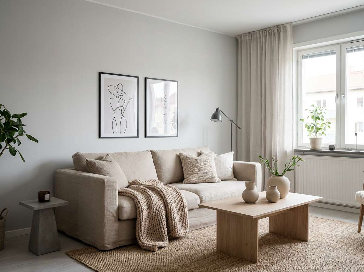
1) Foggy Linen
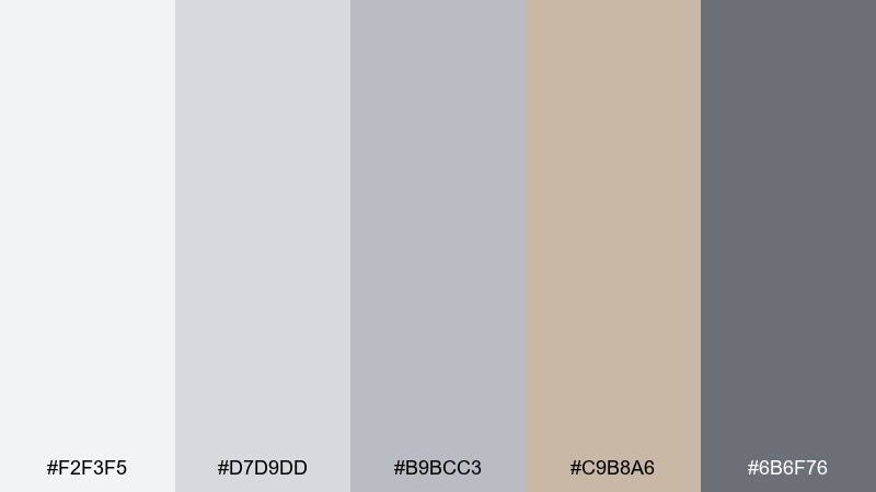
HEX: #f2f3f5 #d7d9dd #b9bcc3 #c9b8a6 #6b6f76
Mood: airy, calm, understated
Best for: minimal living rooms and Scandinavian interiors
Airy and quiet like early fog on fresh linen, these tones keep a space feeling open without turning sterile. Use the warm beige accent to soften the grays and make wood textures look richer. It works beautifully on walls, upholstery, and rugs with matte black hardware for contrast. Tip: repeat the darkest gray sparingly in trim or lighting to frame the room.
Image example of foggy linen generated using media.io
Media.io is an online AI studio for creating and editing video, image, and audio in your browser.

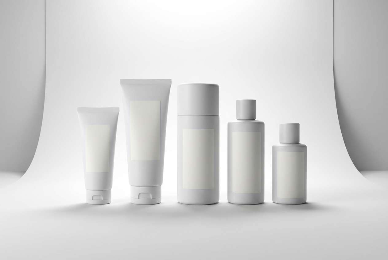
2) Concrete Blush
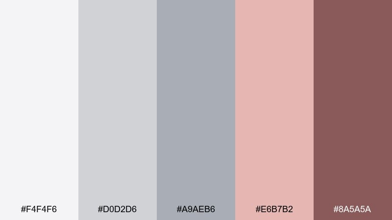
HEX: #f4f4f6 #d0d2d6 #a9aeb6 #e6b7b2 #8a5a5a
Mood: soft, modern, quietly romantic
Best for: skincare branding and wellness packaging
Soft and modern like concrete warmed by a blush sunset, this mix feels gentle but grown-up. For light gray color combinations that still feel inviting, let the pink sit in small blocks while the grays do the heavy lifting. It shines on labels, tubes, and minimal brand systems paired with plenty of white space. Tip: use the deeper rose-brown for ingredient headers to keep readability crisp.
Image example of concrete blush generated using media.io
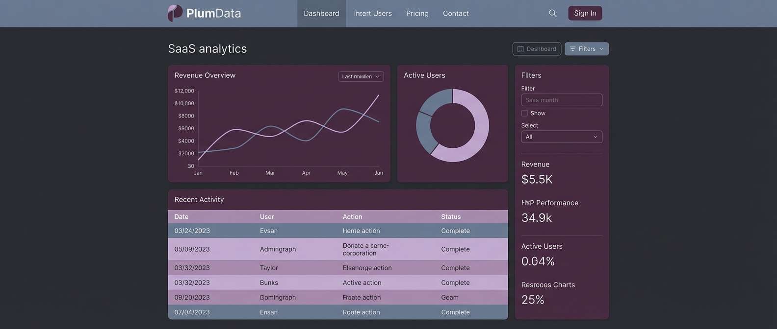
3) Pearl Blueprint
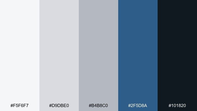
HEX: #f5f6f7 #d9dbe0 #b4b8c0 #2f5d8a #101820
Mood: clean, confident, technical
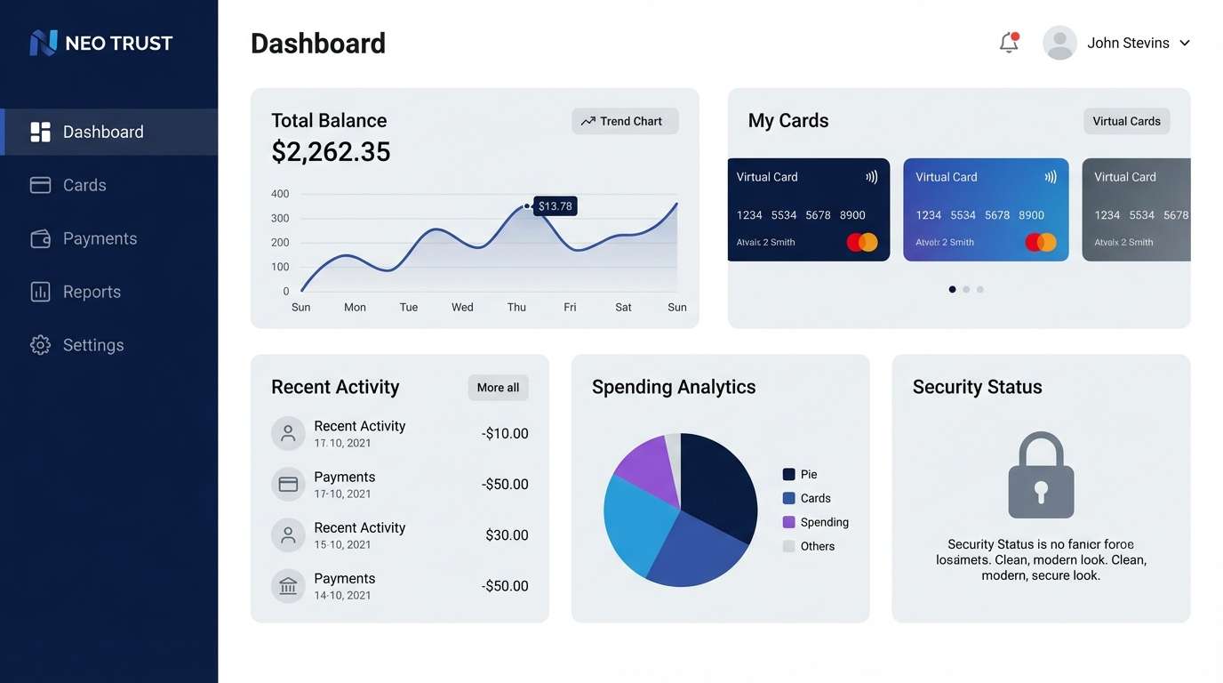
Best for: SaaS dashboards and data-heavy UI
Clean and confident like polished pearl beside a blueprint, the deep blue brings structure to the soft neutrals. This light gray color palette is ideal for tables, cards, and sidebars where hierarchy matters. Pair the navy-black for type and the mid-gray for dividers to keep screens calm under heavy data. Tip: reserve the brighter blue for primary actions so clicks feel intentional.
Image example of pearl blueprint generated using media.io
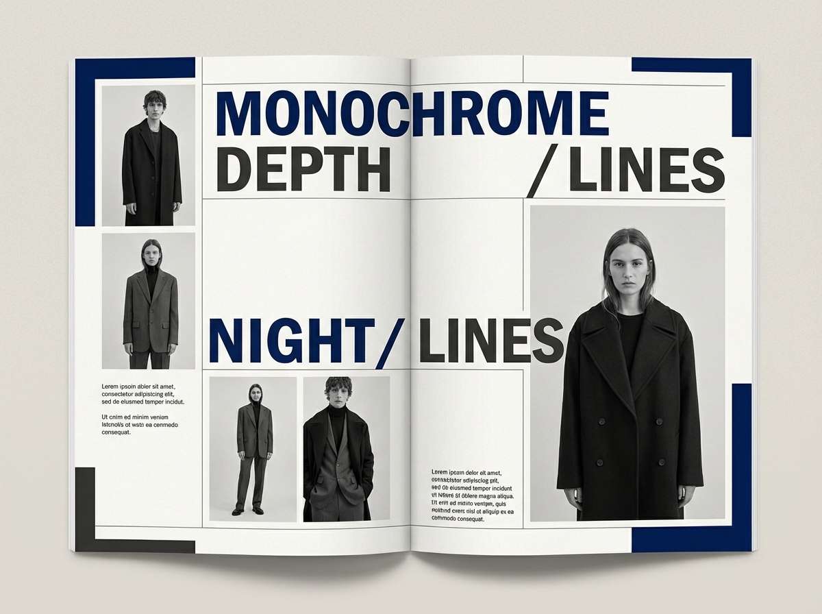
4) Winter Harbor
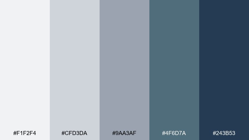
HEX: #f1f2f4 #cfd3da #9aa3af #4f6d7a #243b53
Mood: cool, grounded, coastal
Best for: editorial layouts and long-form reading
Cool and grounded like a quiet harbor in winter, the steel blues add depth without overpowering the page. Use the lightest gray as a paper-like background and save the darker shades for pull quotes and section breaks. It fits magazines, reports, and blog templates where you want calm, premium restraint. Tip: keep body text on the deepest blue for a softer alternative to pure black.
Image example of winter harbor generated using media.io
5) Cloud Citrus
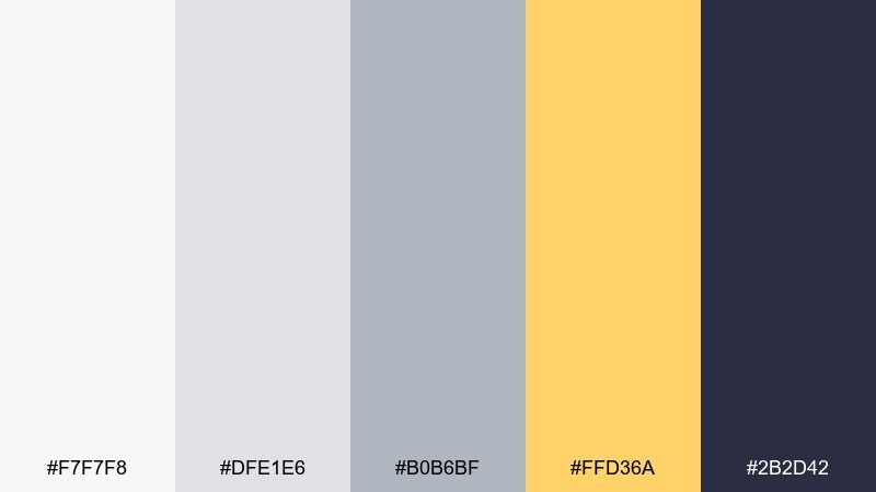
HEX: #f7f7f8 #dfe1e6 #b0b6bf #ffd36a #2b2d42
Mood: fresh, upbeat, modern
Best for: promo posters and seasonal sale graphics
Fresh and upbeat like sunshine breaking through cloud cover, the citrus yellow adds instant energy. Use the grays for structure and let yellow highlight prices, dates, or key claims. It works especially well for retail promos, event announcements, and social banners where clarity matters. Tip: pair yellow with the deep indigo for high-contrast typography that still feels refined.
Image example of cloud citrus generated using media.io

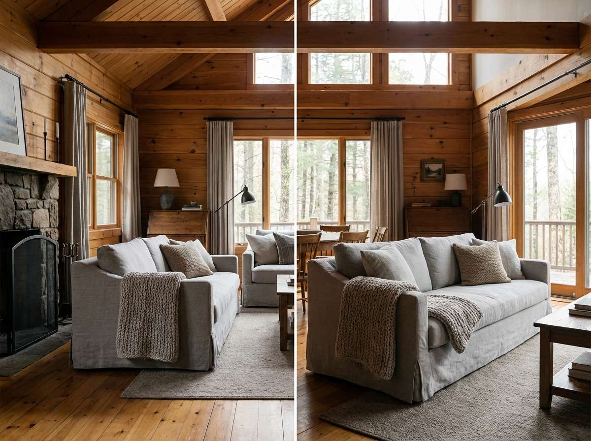
6) Ashwood Cabin
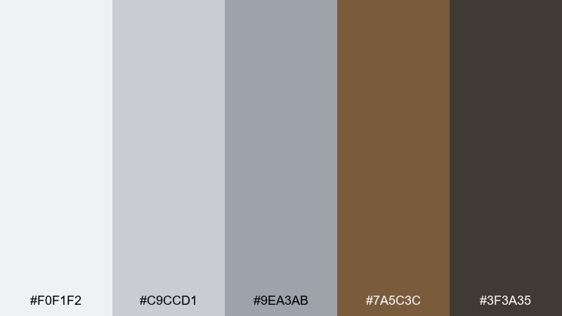
HEX: #f0f1f2 #c9ccd1 #9ea3ab #7a5c3c #3f3a35
Mood: cozy, rustic, grounded
Best for: cabin interiors and outdoor lifestyle brands
Cozy and grounded like ashwood by a fireplace, these grays feel warm thanks to the brown undertones. Use the taupe-brown for furniture or logo marks, and keep the darkest shade for framing and type. It fits rustic interiors, outdoor labels, and heritage-style packaging without looking dated. Tip: add texture through wood grain or kraft paper so the neutrals feel tactile.
Image example of ashwood cabin generated using media.io
7) Metro Chrome
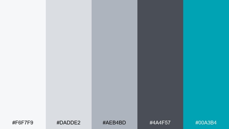
HEX: #f6f7f9 #dadde2 #aeb4bd #4a4f57 #00a3b4
Mood: sleek, urban, high-tech
Best for: electronics packaging and tech product pages
Sleek and urban like polished chrome in a metro station, the teal adds a precise tech edge. Keep the mid grays on backgrounds and use the dark slate for icons and copy. This mix is strong for product specs, feature callouts, and packaging where you want modern credibility. Tip: use teal only on key UI states or badges so it reads as a signal, not noise.
Image example of metro chrome generated using media.io
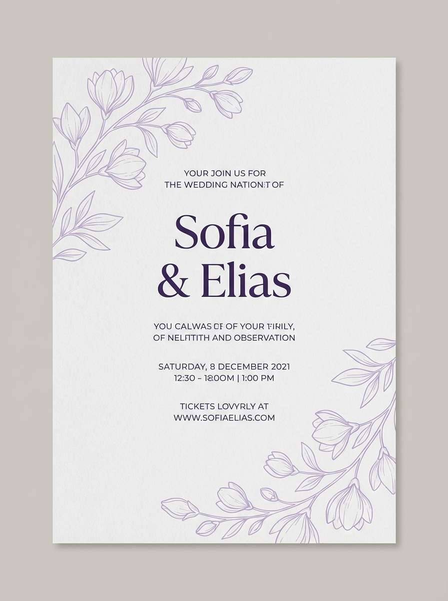
8) Misty Orchid
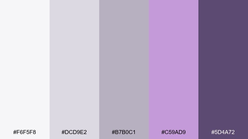
HEX: #f6f5f8 #dcd9e2 #b7b0c1 #c59ad9 #5d4a72
Mood: dreamy, elegant, soft
Best for: wedding invitations and beauty announcements
Dreamy and elegant like orchids in morning mist, the lavender tones feel delicate without becoming sugary. Use the pale grays as the paper base and let purple handle borders, monograms, or line art. It suits invitations, RSVP cards, and announcement designs with lots of breathing room. Tip: set body text in the deep violet for legibility while keeping the overall look airy.
Image example of misty orchid generated using media.io
9) Graphite Oat
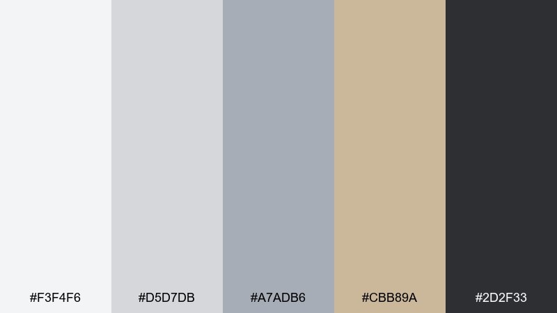
HEX: #f3f4f6 #d5d7db #a7adb6 #cbb89a #2d2f33
Mood: professional, warm, dependable
Best for: business presentations and pitch decks
Professional and warm like graphite on textured paper, the oat accent keeps things human. These tones are great when you need light gray color combinations that feel corporate but not cold. Use the oatmeal shade for highlights and callout boxes, and keep the dark graphite for charts and headings. Tip: limit slides to two neutrals plus the oat accent to maintain a clean rhythm.
Image example of graphite oat generated using media.io
10) Seaside Drift
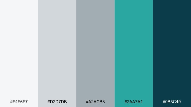
HEX: #f4f6f7 #d2d7db #a2acb3 #2aa7a1 #0b3c49
Mood: breezy, clean, refreshing
Best for: travel landing pages and booking UI
Breezy and refreshing like sea glass on pale sand, the teal gives a crisp sense of motion. Use light grays for content sections and reserve teal for CTAs, filters, and active states. It works well for travel, wellness, and service brands that want calm clarity. Tip: pair the deep ocean shade with plenty of whitespace to avoid a heavy header.
Image example of seaside drift generated using media.io
11) Quiet Terracotta
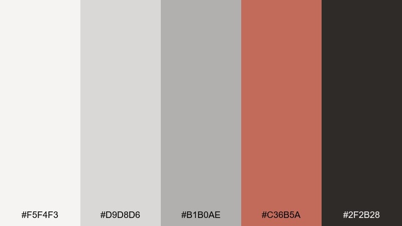
HEX: #f5f4f3 #d9d8d6 #b1b0ae #c36b5a #2f2b28
Mood: warm, artisanal, welcoming
Best for: cafe menus and small restaurant branding
Warm and welcoming like sunbaked clay beside chalky stone, the terracotta adds handcrafted character. Use the soft grays as the menu base so food photos and pricing stay readable. It pairs nicely with kraft textures, serif typography, and simple line icons. Tip: keep terracotta to section headers and stamps to maintain an upscale feel.
Image example of quiet terracotta generated using media.io
12) Glacier Mint
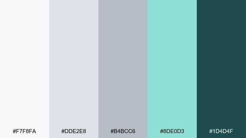
HEX: #f7f8fa #dde2e8 #b4bcc6 #8de0d3 #1d4d4f
Mood: bright, clean, optimistic
Best for: app onboarding screens and health tech UI
Bright and clean like mint water over glacier ice, the aqua accent feels fresh and reassuring. A light gray color palette like this keeps onboarding steps readable while still feeling friendly. Use mint for progress indicators and confirmations, and lean on the deep teal for text and icons. Tip: keep gradients subtle so the interface stays accessible and calm.
Image example of glacier mint generated using media.io
13) Stoneberry
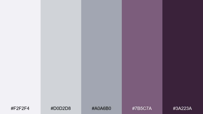
HEX: #f2f2f4 #d0d2d8 #a0a6b0 #7b5c7a #3a223a
Mood: moody, editorial, stylish
Best for: fashion lookbooks and portfolio sites
Moody and stylish like berries against cool stone, the purple tones add a luxurious edge. Use the light grays for page backgrounds and grid gutters, then let plum handle titles and dividers. It fits fashion editorials, creative portfolios, and brand stories that need sophistication without harsh contrast. Tip: keep photography slightly desaturated so the palette feels cohesive.
Image example of stoneberry generated using media.io
14) Chalkboard Latte
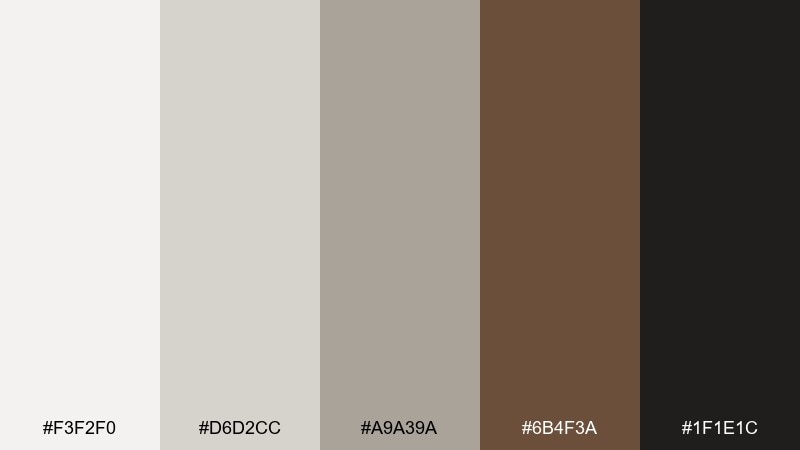
HEX: #f3f2f0 #d6d2cc #a9a39a #6b4f3a #1f1e1c
Mood: cozy, vintage, grounded
Best for: coffee packaging and craft labels
Cozy and grounded like chalk dust and a warm latte, these neutrals feel familiar and premium. Use the creamy gray for the base label, then layer brown for roast notes and origin details. It works well with embossed textures, stamp marks, and minimalist illustration. Tip: add the near-black sparingly for barcodes and small type so the design stays soft.
Image example of chalkboard latte generated using media.io
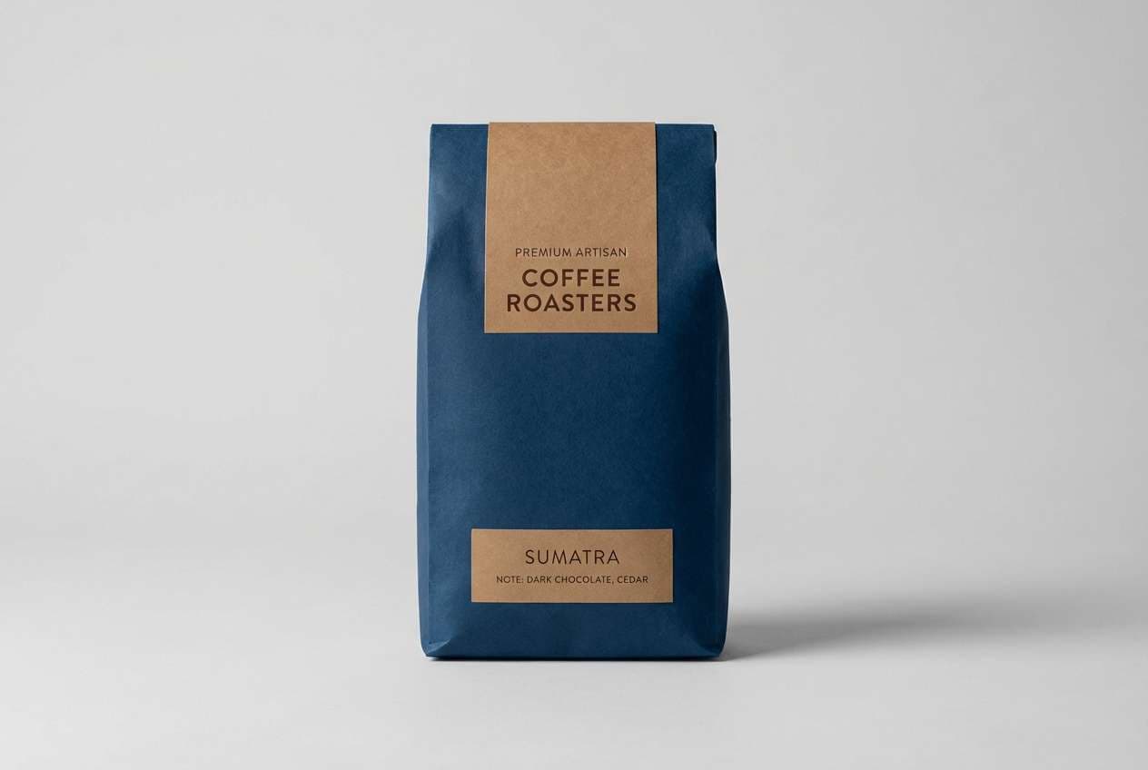
15) Lunar Navy
HEX: #f5f6f8 #d8dbe1 #b0b6c0 #1f3c88 #0a1026
Mood: focused, trustworthy, high-contrast
Best for: fintech apps and security dashboards
Focused and trustworthy like moonlight over deep water, the navy brings seriousness to the soft neutrals. This light gray color scheme is a strong choice for fintech because it balances calm surfaces with clear contrast. Use navy for navigation and key totals, and keep the lightest gray for cards and forms. Tip: reserve the near-black for error states and critical alerts to prevent visual fatigue.
Image example of lunar navy generated using media.io
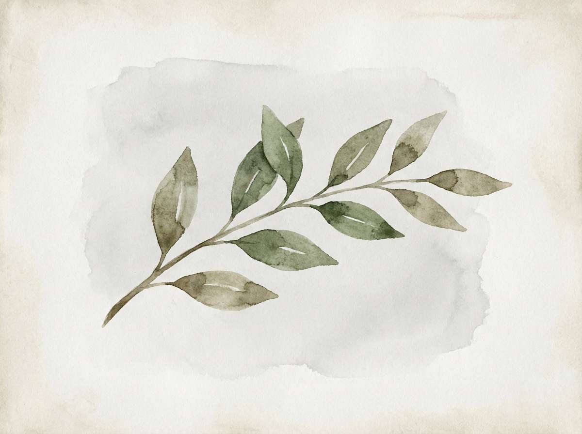
16) Rainy Meadow
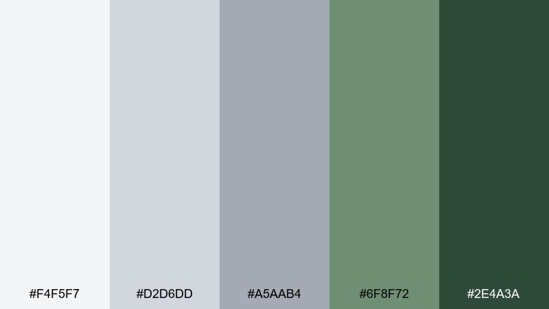
HEX: #f4f5f7 #d2d6dd #a5aab4 #6f8f72 #2e4a3a
Mood: natural, soothing, earthy
Best for: botanical illustrations and spring stationery
Natural and soothing like grass after rain, the greens feel muted and realistic against cool grays. Use the pale gray as a paper wash and layer the meadow green for leaves and stems. It is ideal for eco brands, garden notes, and seasonal prints that need restraint. Tip: keep outlines soft and watercolor textures visible for a more organic finish.
Image example of rainy meadow generated using media.io
17) Soft Charcoal Pop
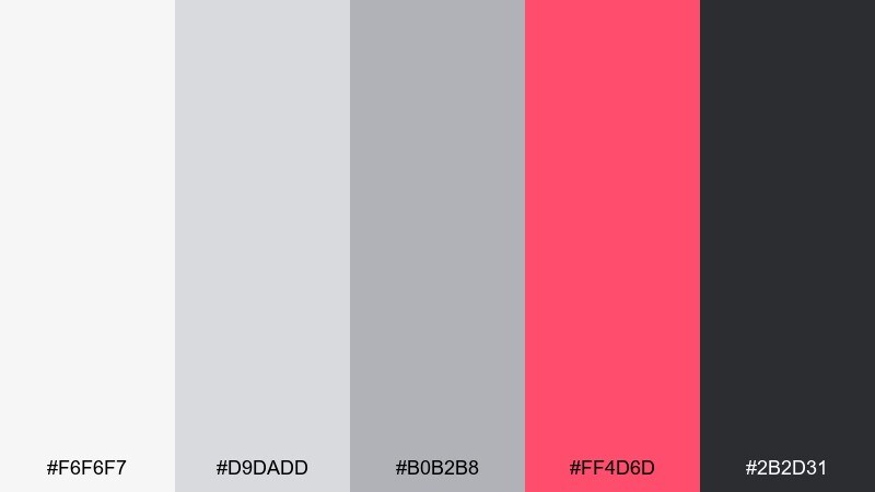
HEX: #f6f6f7 #d9dadd #b0b2b8 #ff4d6d #2b2d31
Mood: bold, playful, crisp
Best for: social media promos and creator templates
Bold and playful like neon ink on smooth paper, the pink punches through the soft grays instantly. Use charcoal for headlines and UI-like structure, and let the bright accent highlight one message at a time. This set works for reels covers, promo tiles, and creator kits that need fast readability. Tip: keep the pink to 10 to 15 percent of the layout to avoid overpowering the typography.
Image example of soft charcoal pop generated using media.io
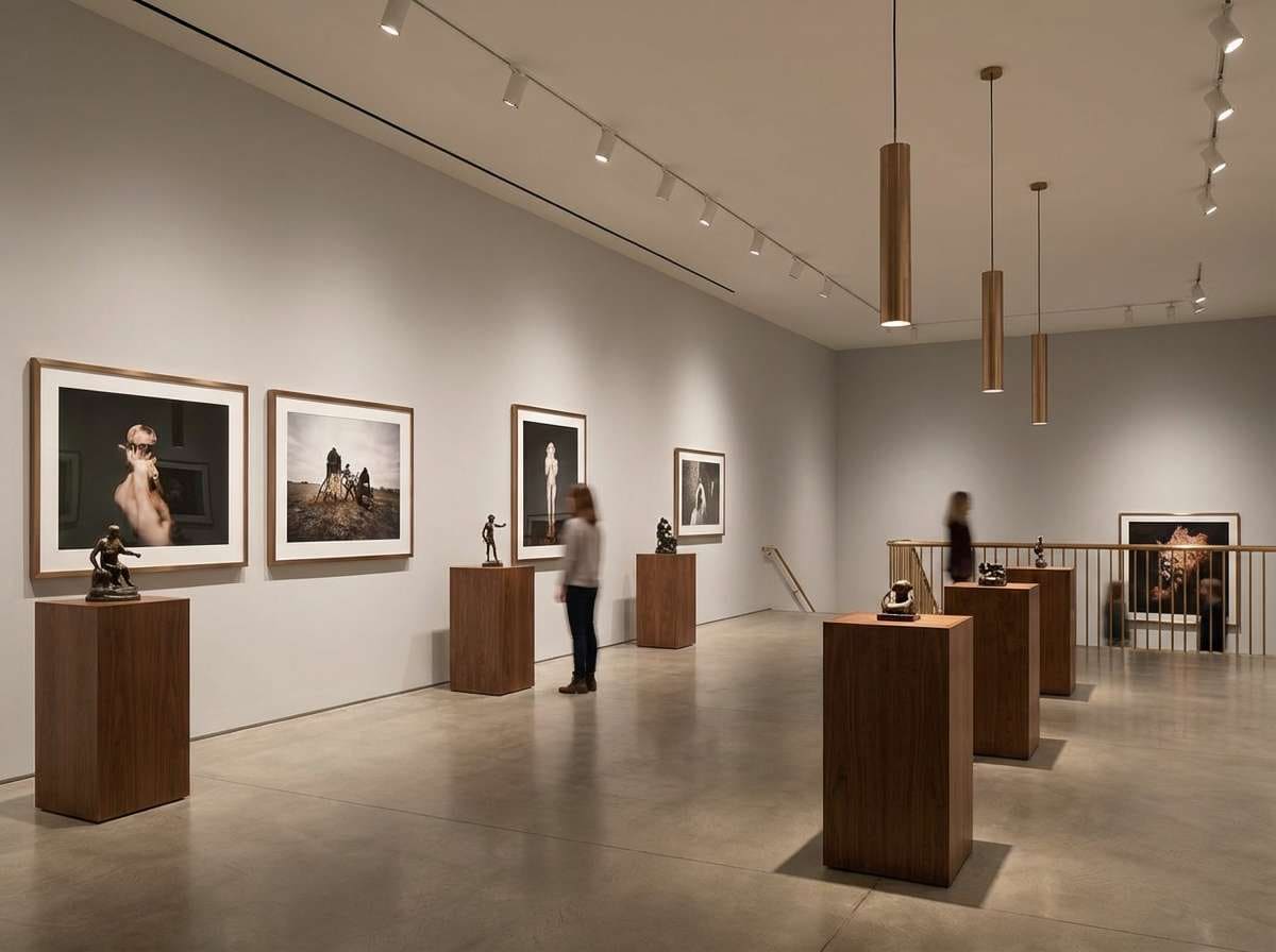
18) Museum Warmth
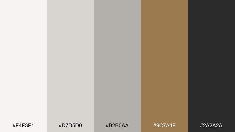
HEX: #f4f3f1 #d7d5d0 #b2b0aa #9c7a4f #2a2a2a
Mood: refined, warm, timeless
Best for: gallery interiors and premium home decor sites
Refined and timeless like a quiet museum room, the warm gold-brown brings a curated glow to the grays. Use the pale tones on walls and backgrounds, then echo the bronze accent in frames, fixtures, or button highlights. It suits premium decor branding, editorial home pages, and minimalist product grids. Tip: choose warmer lighting in photography so the accent reads as inviting rather than muddy.
Image example of museum warmth generated using media.io
19) Frosted Rose Gold
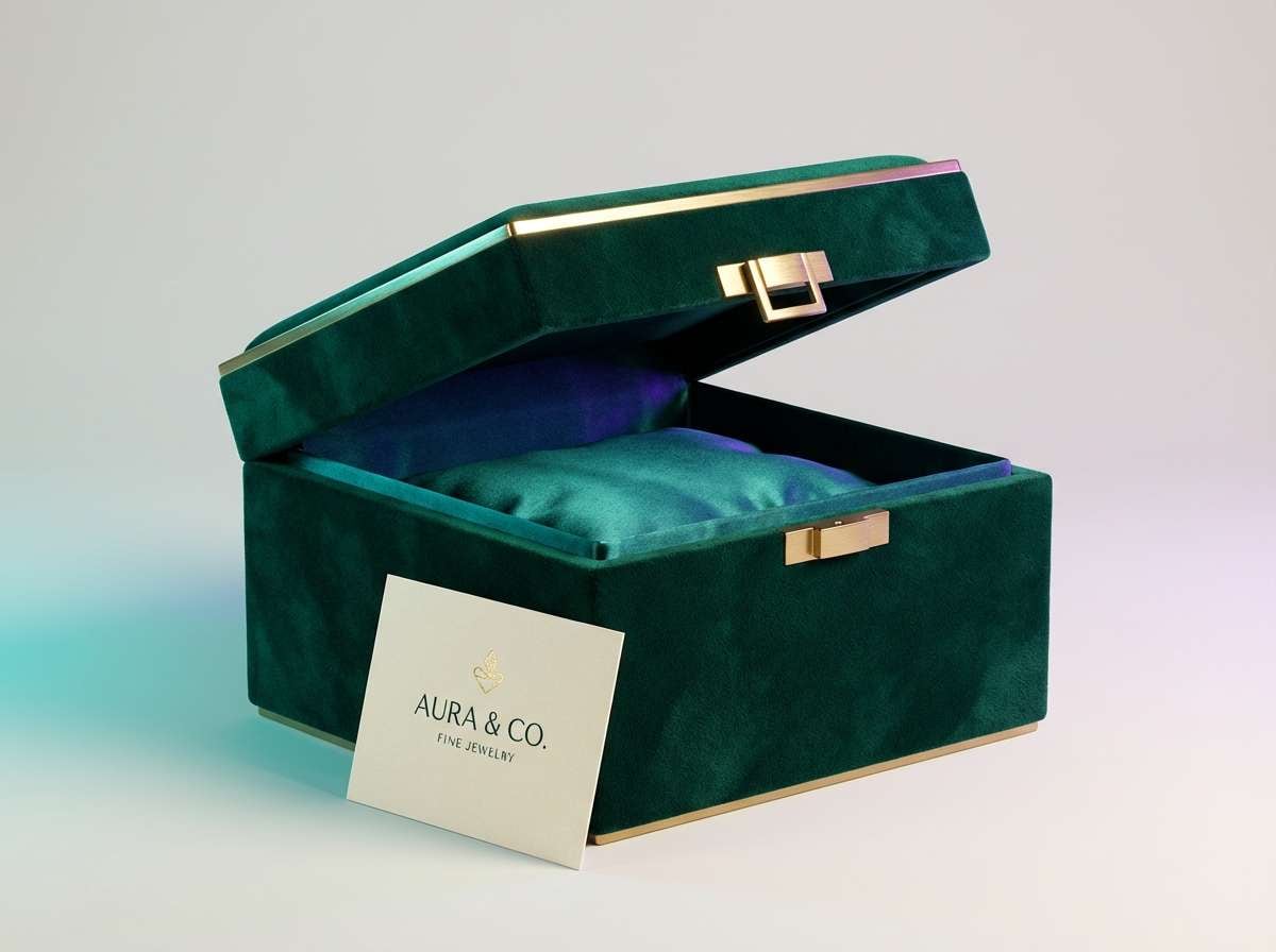
HEX: #f6f6f8 #dcdde2 #b6b8c0 #d7a1a7 #7a3e47
Mood: luxurious, soft, polished
Best for: jewelry ads and premium product launches
Luxurious and soft like frosted metal under studio lights, the rose tones feel premium without shouting. For light gray color combinations that read instantly upscale, keep backgrounds cool and let rose gold show up in highlights and small details. It works well for jewelry campaigns, beauty launches, and minimalist hero banners. Tip: add subtle grain or glow to the lightest gray so it feels like satin instead of flat white.
Image example of frosted rose gold generated using media.io
20) Paperclip Teal
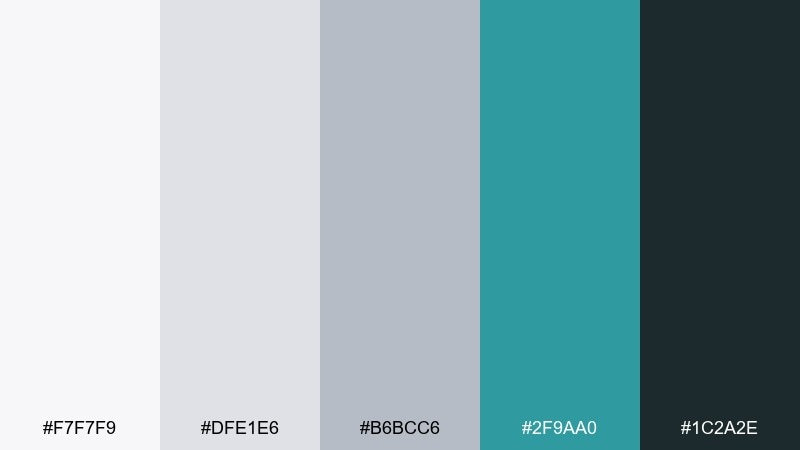
HEX: #f7f7f9 #dfe1e6 #b6bcc6 #2f9aa0 #1c2a2e
Mood: tidy, smart, contemporary
Best for: stationery branding and productivity tools
Tidy and contemporary like a well-organized desk, the teal feels crisp against paper-like grays. Use the lightest shade for backgrounds and the teal for stamps, accents, or navigation elements. It fits stationery brands, note-taking apps, and productivity visuals that need clean structure. Tip: pair with simple line icons and consistent spacing to reinforce the organized vibe.
Image example of paperclip teal generated using media.io
What Colors Go Well with Light Gray?
Light gray pairs naturally with deep neutrals like charcoal, near-black, and navy when you need strong contrast for typography, navigation, or UI states. These darker anchors help keep pale layouts from feeling washed out.
For a warmer, more inviting look, combine light gray with beige, oat, tan, terracotta, or rose-gold tones. These accents add personality while keeping the overall palette quiet and minimal.
If you want a fresh modern pop, choose one “signal color” like teal, mint, citrus yellow, or hot pink and use it sparingly. Light gray makes bright accents look cleaner and more intentional.
How to Use a Light Gray Color Palette in Real Designs
In UI, use light gray as the primary surface color for backgrounds, cards, and disabled states, then create hierarchy with slightly darker grays for dividers and containers. Keep your darkest shade for text to ensure consistent readability.
In branding, treat light gray like a premium stage: it elevates product photography, supports minimalist typography, and makes small metallic or pastel accents feel more expensive. One accent color is usually enough for a cohesive system.
In interiors, balance light gray with natural materials (wood, linen, stone) and one high-contrast element such as matte black fixtures. This keeps the space feeling modern without turning cold.
Create Light Gray Palette Visuals with AI
If you want to preview a light gray color palette in context, generate quick mockups for interiors, posters, packaging, or UI screens. Seeing the palette applied helps you confirm contrast, mood, and material feel before committing.
Start with a simple scene prompt, then add your style keywords (minimal, editorial, Scandinavian, premium) and an aspect ratio that matches your use case. Keep the palette consistent by repeating “light gray base” and naming your accent color.
Light Gray Color Palette FAQs
-
Is light gray a warm or cool color?
Light gray can be warm or cool depending on its undertone. Grays with blue or green undertones feel cooler, while grays with beige, brown, or pink undertones feel warmer. -
What accent color looks best with light gray?
For a clean modern look, teal or navy works well. For warmth, terracotta or oat/beige is a strong choice. For high energy, use citrus yellow or a bold pink in small amounts. -
How do I make a light gray UI accessible?
Use a dark text color (charcoal/navy) on light gray surfaces, and test contrast ratios for body text, buttons, and icons. Reserve very light grays for backgrounds, not key text. -
Does light gray work better than white for backgrounds?
Often yes—light gray reduces harsh glare and can make interfaces feel softer and more premium. It also helps white cards and content blocks stand out without heavy borders. -
What’s the best way to use light gray in branding?
Use light gray as a neutral base across packaging and layouts, then select one signature accent for recognition. Pair with consistent typography and texture (paper grain, matte finishes) to avoid a flat look. -
Can I mix light gray with metallics like rose gold?
Yes. Cool light grays make rose gold and bronze accents look polished and upscale. Keep metallic tones as highlights so the overall design stays minimal and refined. -
How many grays should I use in one palette?
Typically 2–3 grays (light background, mid for dividers, dark for text) plus 1–2 accent colors is enough. Too many similar grays can reduce clarity and make designs feel muddy.
Next: Moss Green Color Palette


