

Powder blue is a soft, airy pastel that reads as calm, clean, and approachable across digital and print designs. It’s especially useful when you want “blue” trust without the intensity of saturated navy.
Below are 20 powder blue color palette ideas with HEX codes, plus practical guidance for pairing, contrast, and real-world use in UI, branding, and interiors.
In this article
- Why Powder Blue Palettes Work So Well
-
- coastal haze
- cloudy minimal
- baby blue linen
- arctic bloom
- iced lavender drift
- powder blue and peach sorbet
- denim and dune
- winter sky ui
- bluebell wedding
- fresh laundry brand
- spa serenity
- blue steel editorial
- sea glass and sand
- minted breeze
- retro pastel pop
- nightfall contrast
- classroom calm
- frosted citrus
- ceramic studio
- aurora gradient
- What Colors Go Well with Powder Blue?
- How to Use a Powder Blue Color Palette in Real Designs
- Create Powder Blue Palette Visuals with AI
Why Powder Blue Palettes Work So Well
Powder blue sits in a “low-pressure” part of the spectrum: it feels cool and orderly, but not harsh. That makes it a reliable base color for backgrounds, large sections, and calm brand systems.
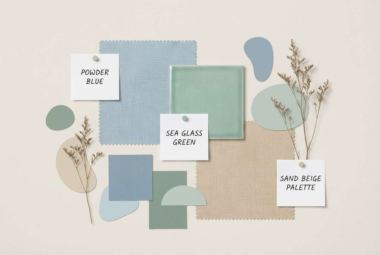
It also pairs easily with both warm neutrals (cream, sand, beige) and cool accents (mint, lavender, slate). You can push it toward coastal, spa, editorial, or tech simply by changing the supporting tones.
Most importantly, powder blue can improve perceived comfort in interfaces and print layouts. Use deeper anchors (slate, navy, charcoal) for legibility so the softness doesn’t reduce contrast.
20+ Powder Blue Color Palette Ideas (with HEX Codes)
1) Coastal Haze
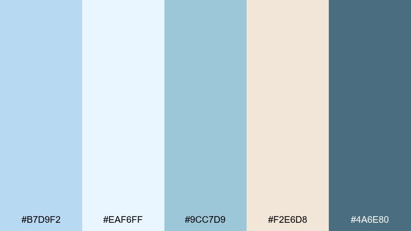
HEX: #B7D9F2 #EAF6FF #9CC7D9 #F2E6D8 #4A6E80
Mood: breezy, relaxed, coastal
Best for: travel posters and beach resort branding
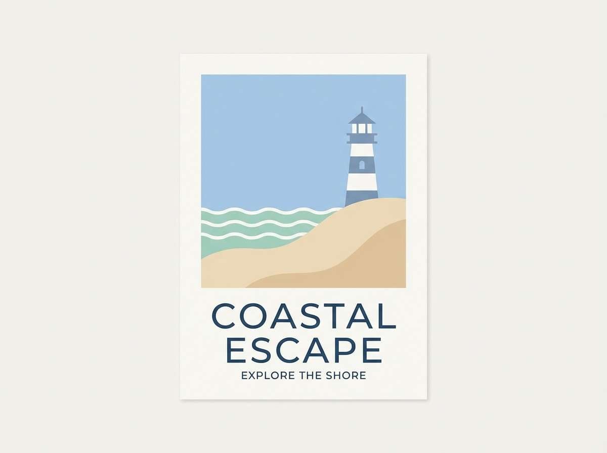
Breezy and sun-washed, it feels like a quiet shoreline morning with salt air and pale skies. Use the light blues for big backgrounds and reserve the deep slate for headlines and logos. Pair with sandy neutrals for warmth and a more natural, premium look. Tip: add subtle grain or watercolor texture to keep the softness from feeling flat.
Image example of coastal haze generated using media.io
Media.io is an online AI studio for creating and editing video, image, and audio in your browser.

2) Cloudy Minimal
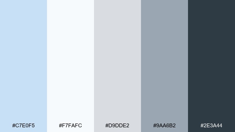
HEX: #C7E0F5 #F7FAFC #D9DDE2 #9AA6B2 #2E3A44
Mood: clean, modern, understated
Best for: SaaS dashboards and product UI
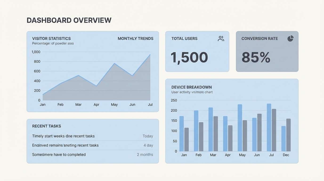
Clean and quiet, like overcast daylight hitting matte surfaces. The near-white and light blue make an easy base for cards and tables, while the charcoal anchors navigation and data labels. Keep accents minimal and rely on spacing and hierarchy for clarity. Tip: use the mid gray-blue for borders and dividers so the interface stays soft, not stark.
Image example of cloudy minimal generated using media.io
3) Baby Blue Linen
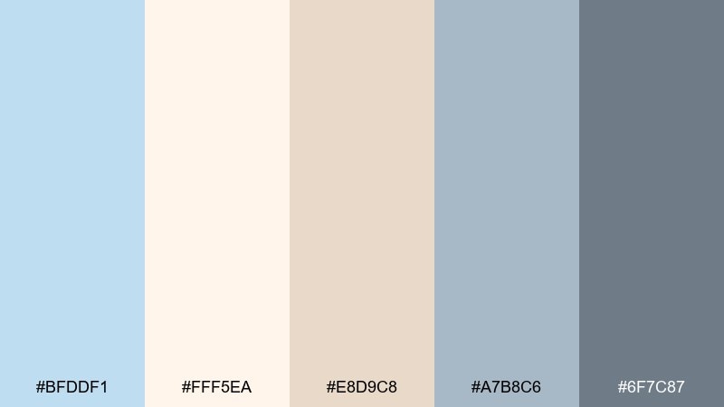
HEX: #BFDDF1 #FFF5EA #E8D9C8 #A7B8C6 #6F7C87
Mood: cozy, natural, soft
Best for: lifestyle blog headers and handmade shop branding
Cozy and natural, it evokes folded linen, warm light, and a gentle blue tint in the air. The cream and beige tones keep the look grounded, while the blue stays delicate rather than icy. Pair with serif typography and tactile materials like paper, cotton, or kraft packaging. Tip: use the deeper gray-blue for small details like icons and price tags to maintain readability.
Image example of baby blue linen generated using media.io
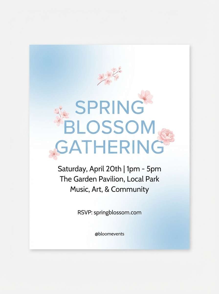
4) Arctic Bloom

HEX: #BCE0FA #DFF5F0 #FFFFFF #F6C6D0 #5C7EA6
Mood: fresh, uplifting, airy
Best for: spring event flyers and skincare social ads
Fresh and uplifting, it feels like early spring blossoms against crisp sky. The blush pink adds charm without overpowering the cool base, and the deeper blue keeps it polished. Pair with clean sans-serif type and plenty of white space for a light, modern vibe. Tip: limit the pink to calls-to-action or highlights so the overall tone stays airy.
Image example of arctic bloom generated using media.io
5) Iced Lavender Drift
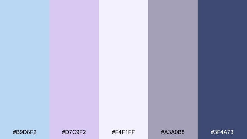
HEX: #B9D6F2 #D7C9F2 #F4F1FF #A3A0B8 #3F4A73
Mood: dreamy, calm, slightly romantic
Best for: wellness apps and meditation landing pages
Dreamy and calm, it brings to mind twilight clouds and soft incense smoke. Lavender adds gentle contrast to the blue, making screens feel soothing without looking childish. Pair with rounded UI components and light blur effects for an ultra-relaxing finish. Tip: use the navy tone for primary buttons so actions remain obvious on pastel backgrounds.
Image example of iced lavender drift generated using media.io

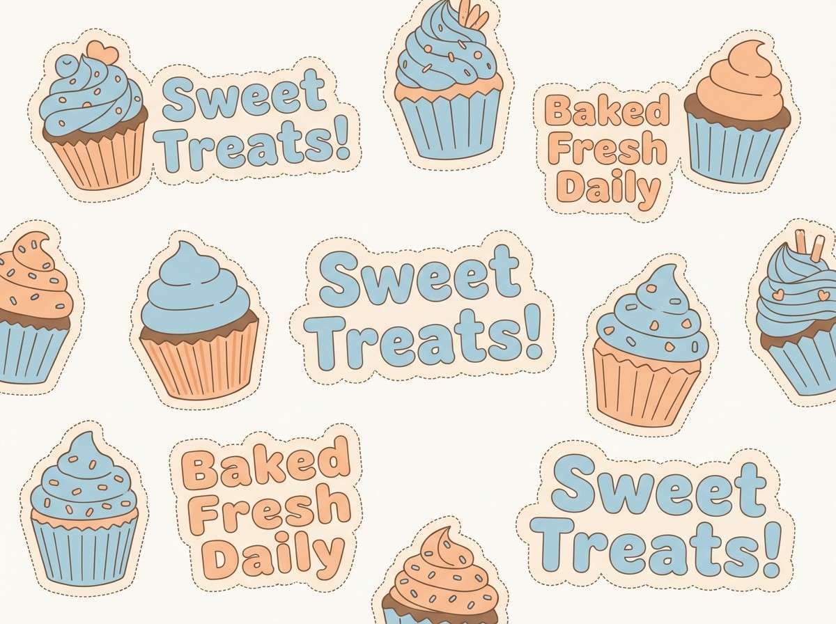
6) Powder Blue and Peach Sorbet
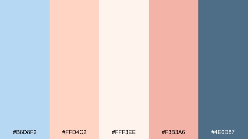
HEX: #B6D8F2 #FFD4C2 #FFF3EE #F3B3A6 #4E6D87
Mood: playful, friendly, appetizing
Best for: bakery packaging and cafe promo posters
Playful and sweet, it feels like pastel gelato under soft daylight. These powder blue color combinations work best when blue leads and peach is used as a tempting accent for badges, prices, or highlights. Pair with rounded shapes and a hand-drawn illustration style to keep it approachable. Tip: add the deeper steel-blue to improve contrast on menus and small text.
Image example of powder blue and peach sorbet generated using media.io
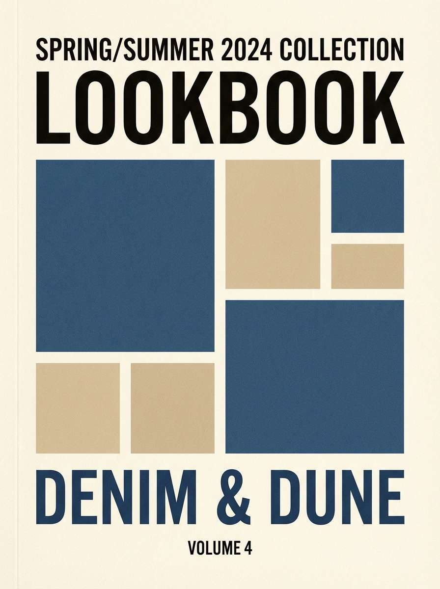
7) Denim and Dune
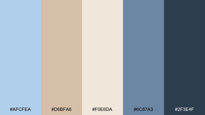
HEX: #AFCFEA #D6BFA8 #F0E6DA #6C87A3 #2F3E4F
Mood: earthy, timeless, confident
Best for: outdoor lifestyle branding and lookbooks
Earthy and timeless, it suggests worn denim, sunbaked trails, and canvas textures. The tan and cream tones keep the blues from feeling too cold, making it a strong fit for rugged-yet-clean brands. Pair with bold photography and simple, classic type. Tip: keep the darkest shade for logos and section headers so the palette stays readable on beige backgrounds.
Image example of denim and dune generated using media.io
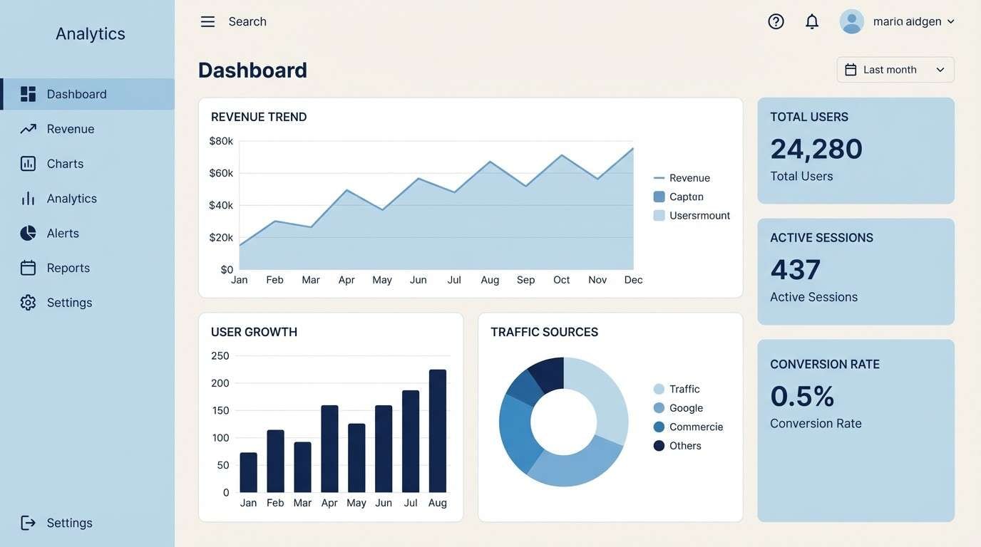
8) Winter Sky UI
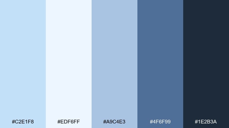
HEX: #C2E1F8 #EDF6FF #A9C4E3 #4F6F99 #1E2B3A
Mood: crisp, focused, professional
Best for: finance apps and analytics dashboards
Crisp and focused, it recalls a clear winter sky with sharp, reliable contrast. Use the pale tones for background panels and bring in the darker blues for chart legends and key metrics. Pair with subtle line icons and consistent spacing for a refined, trustworthy UI. Tip: reserve the deep navy for primary actions and error states to avoid visual noise.
Image example of winter sky ui generated using media.io
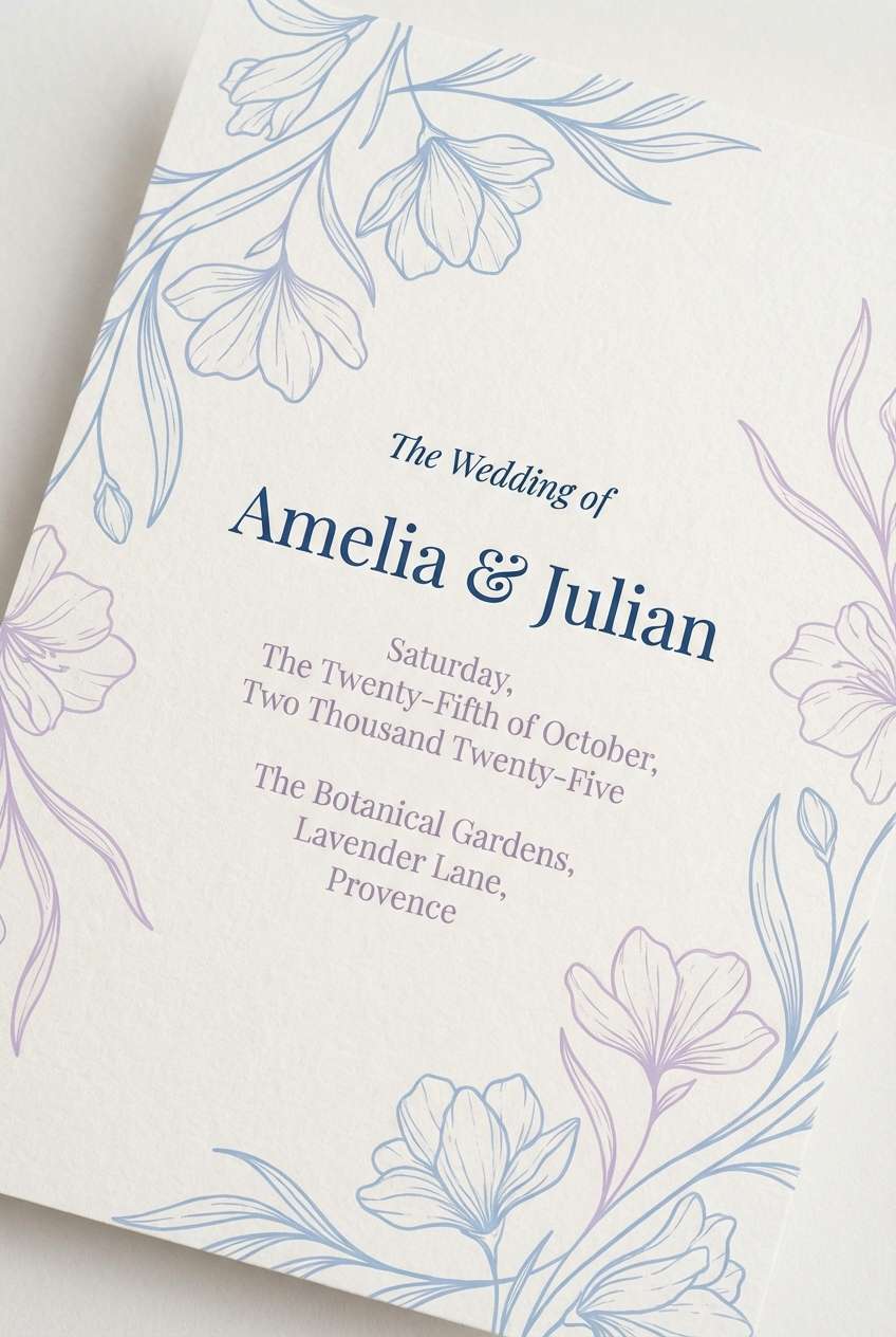
9) Bluebell Wedding
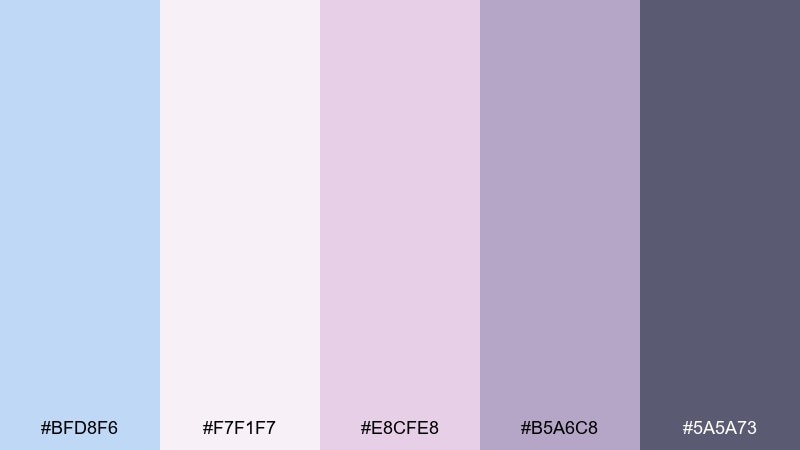
HEX: #BFD8F6 #F7F1F7 #E8CFE8 #B5A6C8 #5A5A73
Mood: romantic, delicate, elegant
Best for: wedding invitations and bridal shower stationery
Romantic and delicate, it brings to mind pressed flowers and satin ribbons. The lavender notes soften the blue and make the design feel intimate and elevated. Pair with thin line florals and graceful serif type for a timeless look. Tip: use the deeper mauve-gray for names and dates so key details stay legible on pastel paper.
Image example of bluebell wedding generated using media.io
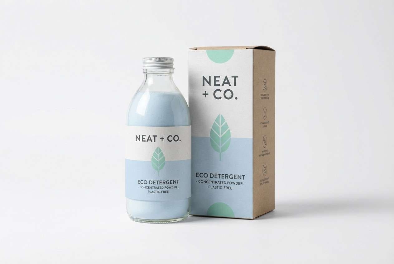
10) Fresh Laundry Brand
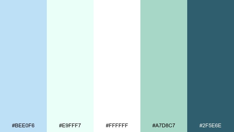
HEX: #BEE0F6 #E9FFF7 #FFFFFF #A7D8C7 #2F5E6E
Mood: fresh, hygienic, light
Best for: cleaning products and eco home branding
Fresh and hygienic, it feels like sunlit sheets and a cool breeze through open windows. This powder blue color palette stays bright when you let white and mint carry the background, then add the deep teal for trust and clarity. Pair with simple iconography and lots of breathing room on labels. Tip: keep gradients subtle so packaging still reads clean from a distance.
Image example of fresh laundry brand generated using media.io
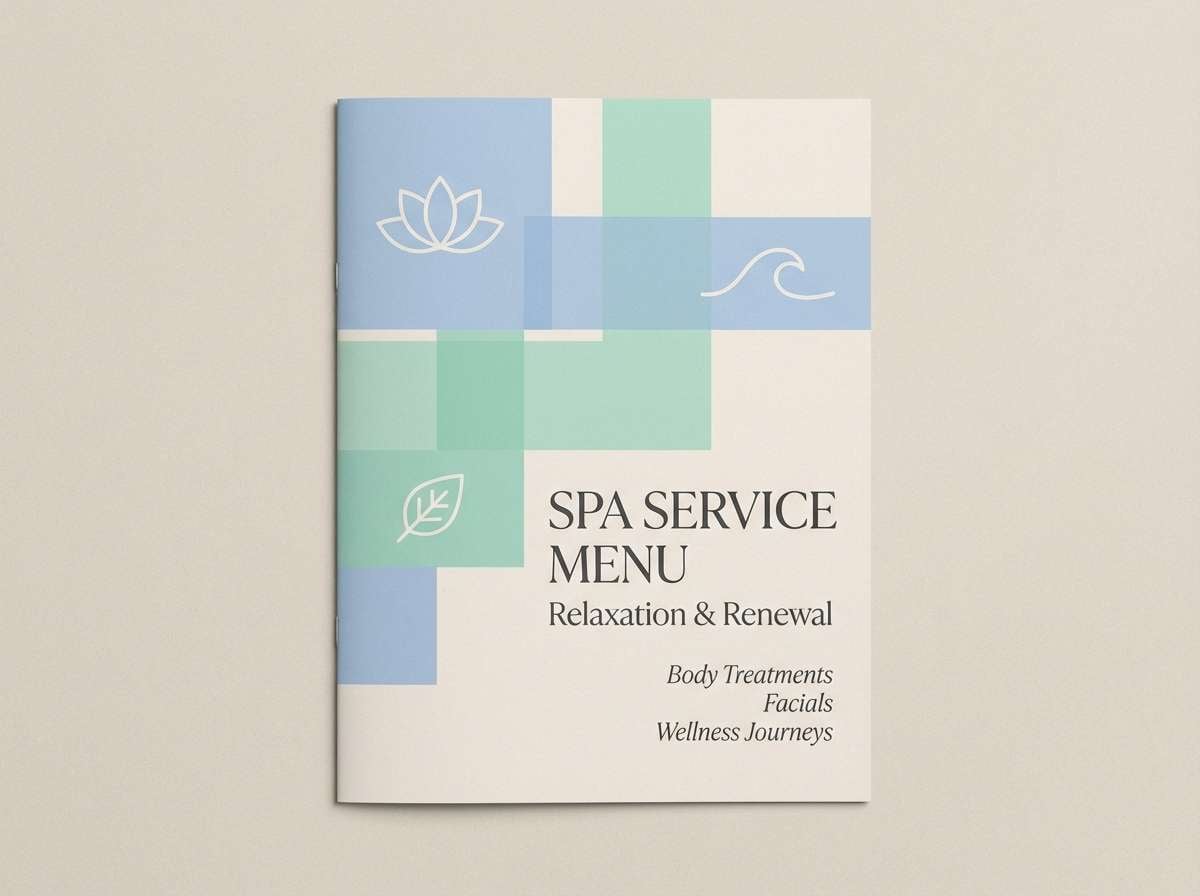
11) Spa Serenity
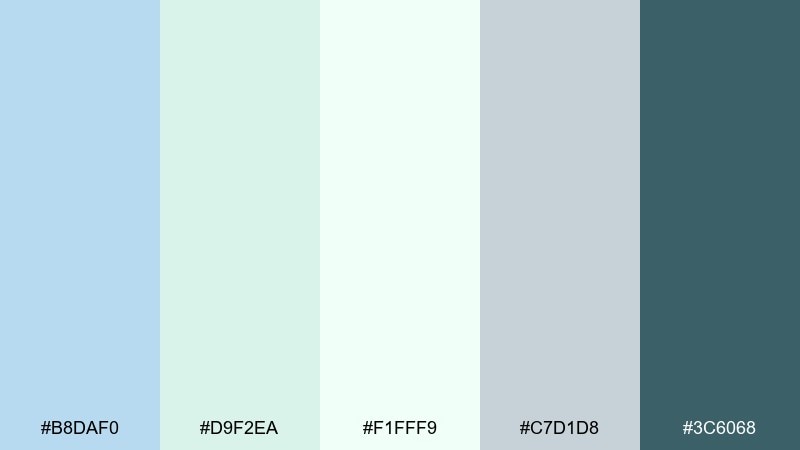
HEX: #B8DAF0 #D9F2EA #F1FFF9 #C7D1D8 #3C6068
Mood: soothing, restorative, airy
Best for: spa menus and wellness brochures
Soothing and restorative, it suggests steam, eucalyptus, and quiet water. Soft blue and mint keep the mood cool and clean, while the darker teal provides just enough structure for text. Pair with minimal photography and plenty of whitespace for a premium spa feel. Tip: print on uncoated stock to preserve the gentle, calming finish.
Image example of spa serenity generated using media.io
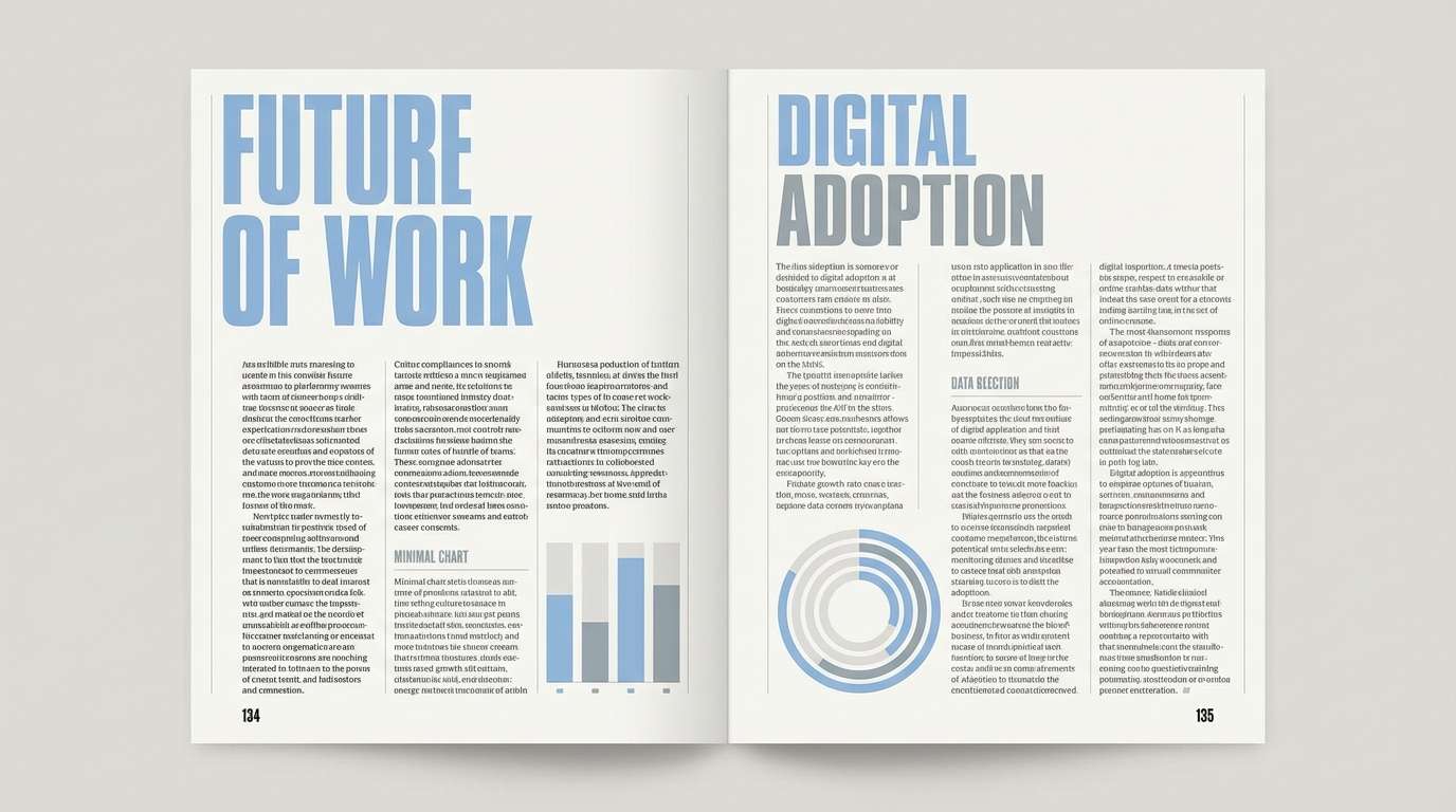
12) Blue Steel Editorial
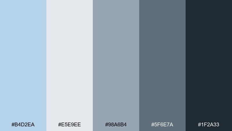
HEX: #B4D2EA #E5E9EE #98A6B4 #5F6E7A #1F2A33
Mood: smart, structured, editorial
Best for: magazine layouts and corporate reports
Smart and structured, it feels like polished steel under cool daylight. The grays give the blues a business-ready backbone, perfect for data-heavy pages. Pair with a tight grid, strong headlines, and restrained accent color usage. Tip: use the light gray-blue as a column backdrop to separate sections without harsh boxes.
Image example of blue steel editorial generated using media.io
13) Sea Glass and Sand
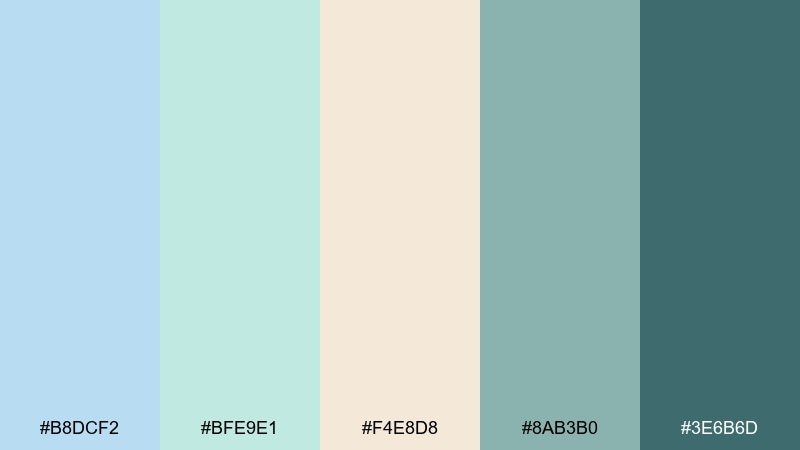
HEX: #B8DCF2 #BFE9E1 #F4E8D8 #8AB3B0 #3E6B6D
Mood: coastal, organic, calming
Best for: boutique hotel branding and interior moodboards
Coastal and organic, it brings sea glass, driftwood, and soft sand to mind. The blue-green tones feel relaxed while still looking curated and upscale. Pair with natural materials, woven textures, and warm lighting in photography. Tip: use the darker teal for wayfinding and signage so it stays readable against pale walls.
Image example of sea glass and sand generated using media.io
14) Minted Breeze
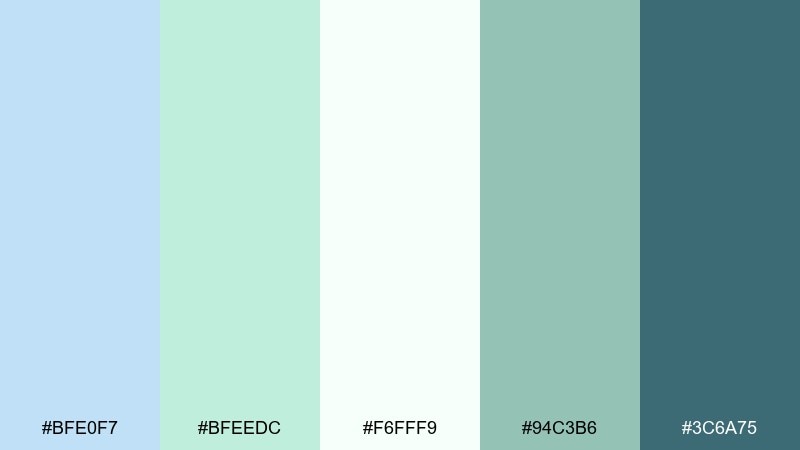
HEX: #BFE0F7 #BFEEDC #F6FFF9 #94C3B6 #3C6A75
Mood: refreshing, light, optimistic
Best for: health startups and newsletter templates
Refreshing and optimistic, it feels like a cool drink on a bright day. Mint and powdery blue create a friendly, modern balance that works well for email headers and simple illustrations. Pair with rounded buttons and soft drop shadows for approachable UI. Tip: keep body text in the darker teal to maintain accessibility on pale sections.
Image example of minted breeze generated using media.io
15) Retro Pastel Pop
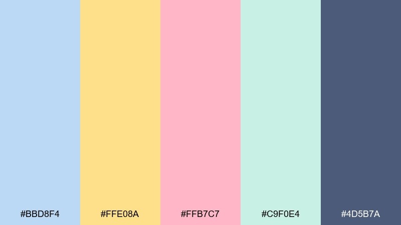
HEX: #BBD8F4 #FFE08A #FFB7C7 #C9F0E4 #4D5B7A
Mood: fun, nostalgic, bold-pastel
Best for: social media promos and playful posters
Fun and nostalgic, it channels retro candy colors with a modern, tidy finish. The yellow and pink bring instant energy, while the deeper blue keeps everything anchored. Pair with chunky typography and simple geometric patterns for a statement look. Tip: use yellow sparingly as a highlight so it pops without overpowering the softer tones.
Image example of retro pastel pop generated using media.io
16) Nightfall Contrast
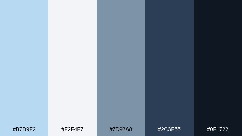
HEX: #B7D9F2 #F2F4F7 #7D93A8 #2C3E55 #0F1722
Mood: moody, confident, high-contrast
Best for: tech branding and hero sections
Moody and confident, it feels like dusk settling over a city skyline. These powder blue color combinations shine when you place the pale blue against deep navy for dramatic, premium contrast. Pair with sharp sans-serif type and minimal iconography to keep it sleek. Tip: add subtle gradients only in large areas so the dark tones stay clean and modern.
Image example of nightfall contrast generated using media.io

17) Classroom Calm
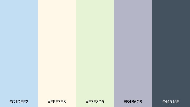
HEX: #C1DEF2 #FFF7E8 #E7F3D5 #B4B6C8 #44515E
Mood: friendly, calm, approachable
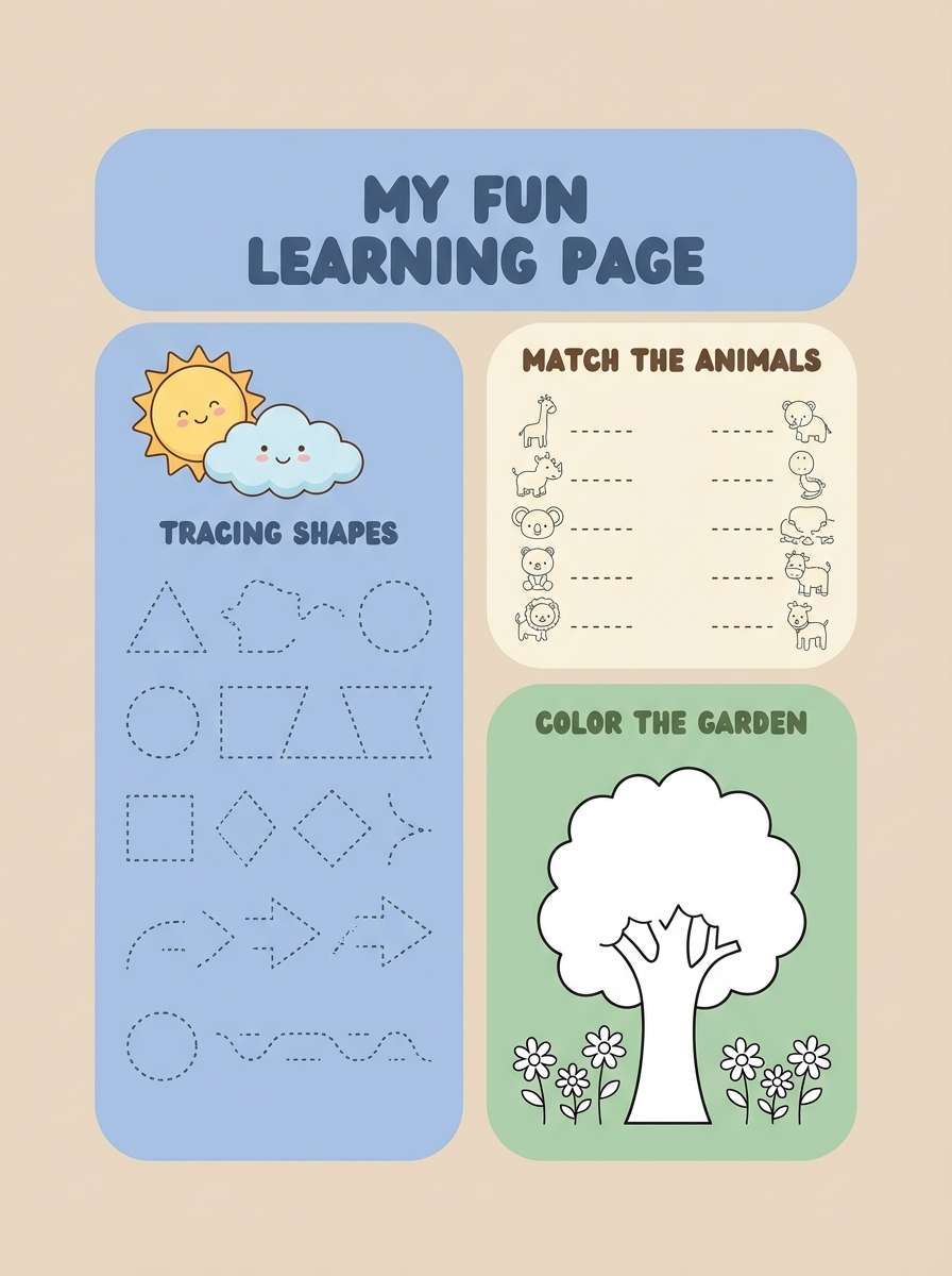
Best for: education platforms and kid-friendly worksheets
Friendly and calm, it feels like a bright classroom with soft posters on the wall. The warm cream and gentle green prevent the blues from feeling too clinical. Pair with rounded illustrations and clear, accessible typography for all ages. Tip: keep the darkest tone for instructions and headings so pages print well.
Image example of classroom calm generated using media.io
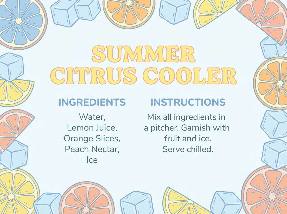
18) Frosted Citrus
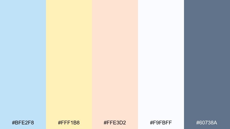
HEX: #BFE2F8 #FFF1B8 #FFE3D2 #F9FBFF #60738A
Mood: bright, cheerful, soft-sunlit
Best for: summer launches and food blog graphics
Bright and cheerful, it evokes lemonade on ice with a cool blue tint in the glass. The buttery yellow lifts the palette, while the peach keeps it warm and inviting. Pair with simple flat illustrations and airy photography to maintain the sunny mood. Tip: use the slate blue for captions so text remains crisp on light backgrounds.
Image example of frosted citrus generated using media.io
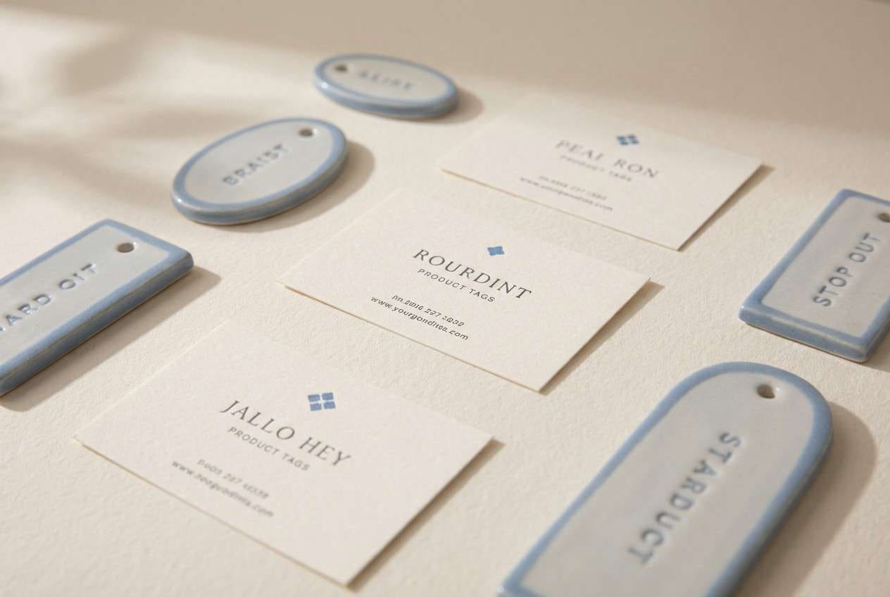
19) Ceramic Studio
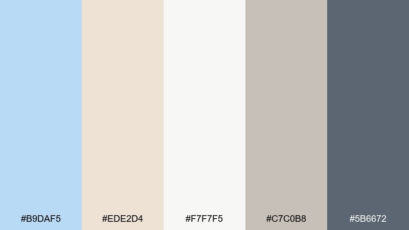
HEX: #B9DAF5 #EDE2D4 #F7F7F5 #C7C0B8 #5B6672
Mood: artisan, calm, gallery-like
Best for: portfolio sites and craft product tags
Artisan and calm, it feels like a pottery studio with pale glaze, clay dust, and quiet light. The warm neutrals soften the blue and create a refined, gallery-ready balance. Pair with minimal layouts, generous margins, and high-quality product closeups. Tip: keep the gray as your main text color so the page stays gentle but readable.
Image example of ceramic studio generated using media.io
20) Aurora Gradient
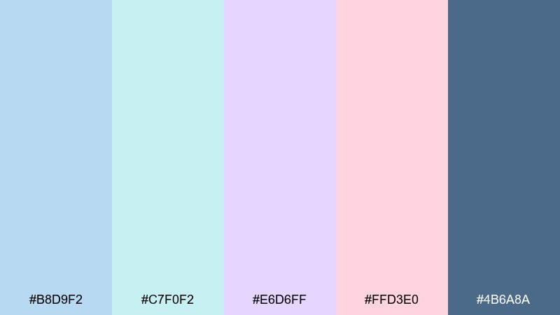
HEX: #B8D9F2 #C7F0F2 #E6D6FF #FFD3E0 #4B6A8A
Mood: ethereal, creative, modern
Best for: music posters and creative agency branding
Ethereal and creative, it suggests an aurora glow drifting across a cool night sky. The pastel transitions feel modern when used as large gradients, while the deeper blue keeps typography grounded. Pair with bold type and abstract shapes for a clean, contemporary edge. Tip: use the pink only as a highlight so the palette stays airy rather than sugary.
Image example of aurora gradient generated using media.io
What Colors Go Well with Powder Blue?
Powder blue pairs beautifully with warm neutrals like cream, ivory, sand, and light taupe—these keep the palette inviting and prevent the blue from feeling cold. For a premium look, add one deep anchor like slate, navy, charcoal, or deep teal for headings and key UI elements.
For playful palettes, try soft peach, blush pink, buttery yellow, or mint as accents. If you’re building gradients or modern posters, lavender and pale aqua blend smoothly with powder blue while still feeling fresh.
When you need readability, treat powder blue as the background and choose a darker text color (deep teal, navy, or charcoal). This preserves the calm mood while meeting contrast expectations in real designs.
How to Use a Powder Blue Color Palette in Real Designs
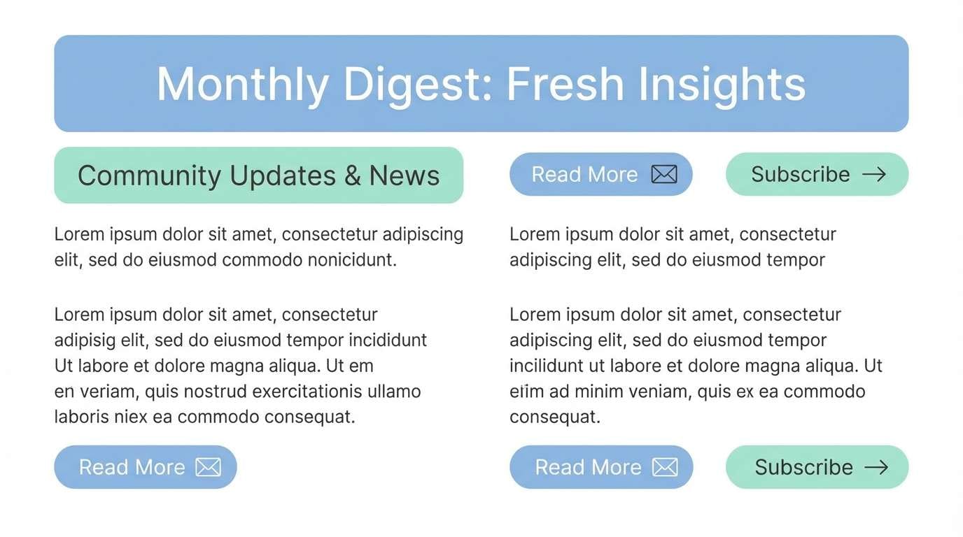
In UI, use powder blue for page backgrounds, section headers, empty states, and subtle highlights. Keep interactive states (primary buttons, links, critical alerts) in a darker anchor color so users don’t miss actions.
In branding, powder blue works well for wellness, lifestyle, education, and eco-forward products. Pair it with tactile neutrals (paper-like creams, warm grays) to make the system feel human and premium instead of overly “digital.”
In interiors and print, powder blue is excellent for large surfaces and calm visual hierarchy. Combine it with warm lighting, sandy textiles, and darker accents (frames, signage, typography) to keep the look balanced and legible.
Create Powder Blue Palette Visuals with AI
If you already have HEX codes, the fastest way to validate a powder blue color scheme is to generate a few realistic mockups or flat design examples. Seeing the palette in context helps you decide which shade should lead (background) and which should anchor (text and actions).
Start with a simple prompt (poster, UI dashboard, packaging, or invitation), then iterate by adjusting mood words like “coastal,” “minimal,” “spa,” or “editorial.” Keep prompts consistent so you can compare variations fairly.
Use Media.io’s text-to-image generator to create on-brand visuals from your powder blue palette in minutes.
Powder Blue Color Palette FAQs
-
What HEX code is considered “powder blue”?
“Powder blue” can vary, but common HEX values fall around pale, desaturated blues like #B7D9F2 or #BFDDF1. In practice, powder blue is defined more by its soft, airy saturation than a single exact code. -
Is powder blue warm or cool?
Powder blue is generally a cool color, but it can feel warmer when paired with cream, beige, peach, or sandy neutrals. The surrounding colors and lighting (especially in print/interiors) strongly influence its temperature. -
What colors pair best with powder blue for a modern look?
For modern design, pair powder blue with white, cool grays, and one deep anchor like navy, charcoal, or deep teal. Add a restrained accent (mint or lavender) if you want more personality without losing the clean feel. -
How do I keep powder blue designs readable?
Use powder blue as a background or secondary tone, then set body text and key UI actions in darker colors (navy/charcoal/deep teal). Avoid light gray text on powder blue, and test contrast before finalizing. -
Does powder blue work for professional brands?
Yes—when supported by structured neutrals and strong typography. Palettes that include slate, steel gray, and deep navy can make powder blue feel polished and corporate rather than playful. -
What is a good accent color for powder blue?
Peach and blush add warmth, mint adds freshness, and buttery yellow adds cheerful energy. For a sophisticated accent, use muted lavender or a refined deep teal. -
Can I use powder blue in dark mode UI?
Yes. Use powder blue as a highlight or illustration color on deep navy/charcoal backgrounds, and keep large surfaces dark for comfort. Powder blue works especially well for charts, badges, and hero accents in high-contrast layouts.


