Coral is a warm, flattering color that instantly adds energy without feeling as intense as pure red. It’s a go-to for modern branding, UI accents, and print pieces that need a friendly, sunlit tone.
Below are coral color palette ideas with HEX codes, plus practical tips for pairing coral with cool blues, greens, and grounding neutrals.
In this article
- Why Coral Palettes Work So Well
-
- sunset reef
- blush seaside
- tropical punch
- coral sage studio
- vintage apricot paper
- modern minimal coral
- neon coral nights
- coastal cottage
- desert bloom
- coral and navy classic
- sorbet ui kit
- rose gold packaging
- coral mint gelato
- botanical coral wash
- coral charcoal editorial
- kids party pop
- mediterranean market
- autumn coral spice
- soft bridal bouquet
- tech coral accent
- What Colors Go Well with Coral?
- How to Use a Coral Color Palette in Real Designs
- Create Coral Palette Visuals with AI
Why Coral Palettes Work So Well
Coral sits between pink, orange, and red, so it reads warm and human while staying softer than true red. That makes it excellent for attention-grabbing moments like CTAs, headers, badges, and key highlights.
It also pairs naturally with cool counterparts (teal, aqua, navy) for clean contrast, and with neutrals (white, cream, charcoal) for a modern, minimal look. This flexibility helps coral work across brand identity, UI, and print.
Most importantly, coral can shift in personality depending on its neighbors: playful with sunshine yellows, elevated with gold and ink tones, or calm with sage and off-whites. The palettes below show how to control that mood intentionally.
20+ Coral Color Palette Ideas (with HEX Codes)
1) Sunset Reef
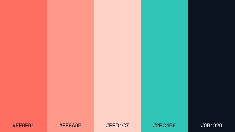
HEX: #ff6f61 #ff9a8b #ffd1c7 #2ec4b6 #0b1320
Mood: sunlit, coastal, energetic
Best for: brand identity and social media graphics
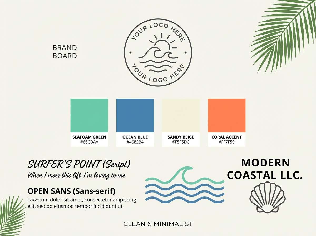
Sunset heat meets ocean spray, giving this mix a bright, vacation-ready vibe. It works beautifully for lifestyle brands, event promos, and punchy social posts where warmth needs to feel clean, not loud. Pair the coral tones with the teal for contrast, then anchor layouts with the deep navy for legibility. Usage tip: keep coral for headers or hero blocks and let the pale blush act as breathing room in your grid for a polished coral color palette.
Image example of sunset reef generated using media.io
Media.io is an online AI studio for creating and editing video, image, and audio in your browser.

2) Blush Seaside
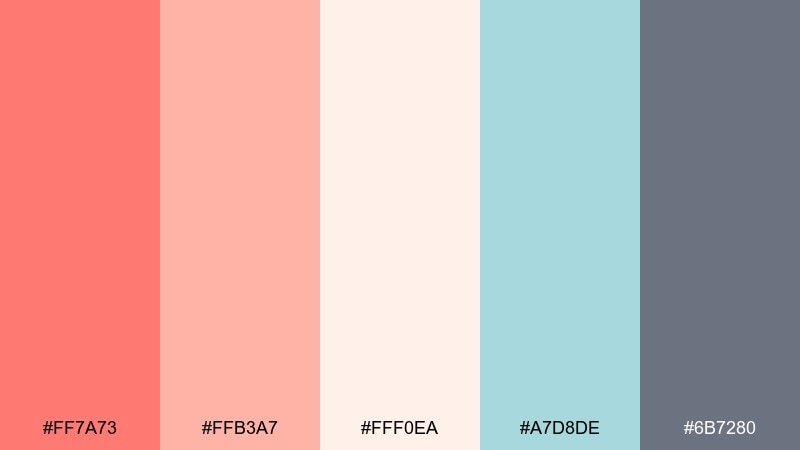
HEX: #ff7a73 #ffb3a7 #fff0ea #a7d8de #6b7280
Mood: soft, airy, calming
Best for: wedding stationery and gentle lifestyle branding
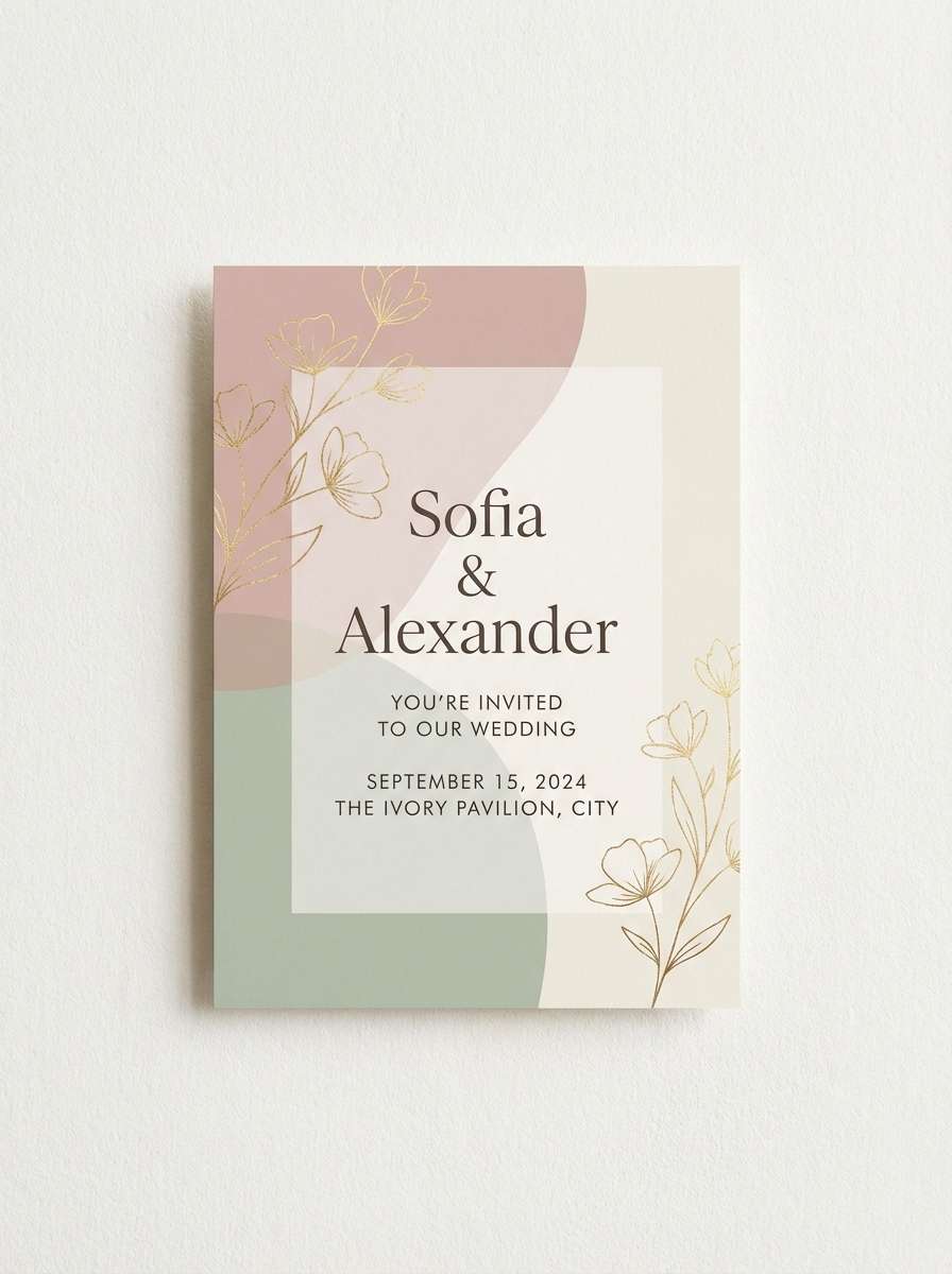
A breezy blush-and-saltwater feel that reads romantic without being sugary. These tones suit invitations, beauty labels, and calm landing pages where you want warmth with lots of light. Pair the powdery neutrals with the muted aqua to keep the look fresh, then use the cool gray for text and fine lines. Usage tip: print designs look best when the light peach is the background and the coral is saved for names and key details.
Image example of blush seaside generated using media.io
3) Tropical Punch
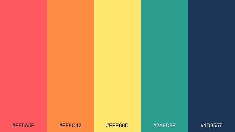
HEX: #ff5a5f #ff8c42 #ffe66d #2a9d8f #1d3557
Mood: playful, bold, sunny
Best for: summer campaign posters and event flyers
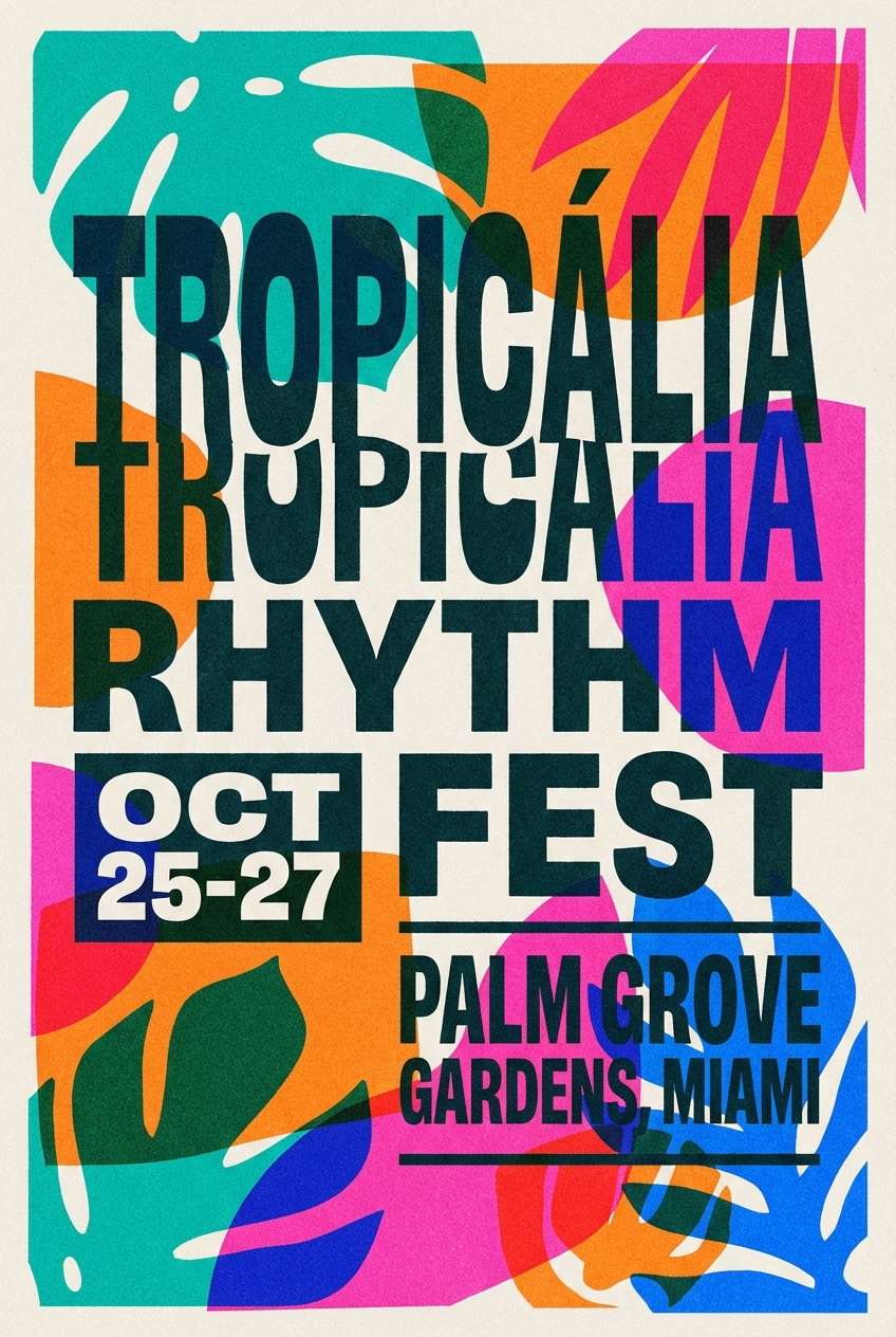
Juicy, high-energy tones that feel like fruit markets and beach festivals. This coral color combination shines on posters, promo banners, and merch where you need instant punch from a distance. Pair the warm hues with the deep blue for structure, and use teal as a secondary accent to avoid a flat warm-only look. Usage tip: keep the yellow as a highlight color for prices, dates, or CTA badges so it pops without overwhelming the layout.
Image example of tropical punch generated using media.io
4) Coral Sage Studio
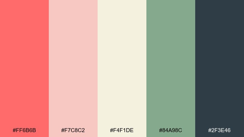
HEX: #ff6b6b #f7c8c2 #f4f1de #84a98c #2f3e46
Mood: grounded, modern, natural
Best for: home decor brands and wellness packaging
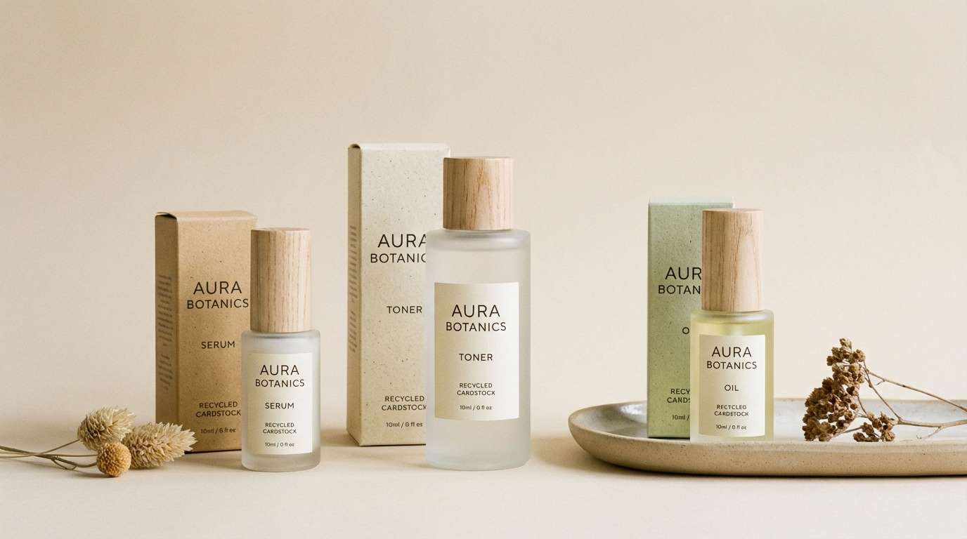
Warm studio light and leafy calm come through in this balanced mix. It fits wellness goods, ceramics, and interior-focused content that needs softness with a confident backbone. Pair the coral accents with sage and off-white for a relaxed, organic feel, then lean on the deep slate for typography and icons. Usage tip: use the off-white as the main canvas and introduce coral in small, repeatable details like seals, buttons, or pattern dots.
Image example of coral sage studio generated using media.io
5) Vintage Apricot Paper

HEX: #f26a5a #f7b7a3 #f2e8cf #c9ada7 #22223b
Mood: nostalgic, warm, editorial
Best for: book covers and retro-inspired print design
A faded-apricot warmth that feels like aged paper and classic ink. These colors are ideal for book jackets, café menus, and retro posters that need charm without looking kitschy. Pair the creamy beige with the dusty mauve to keep the palette textured, and reserve the near-black for sharp type. Usage tip: add subtle grain or halftone patterns to help the soft midtones feel intentional in print.
Image example of vintage apricot paper generated using media.io

6) Modern Minimal Coral
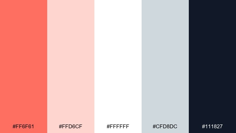
HEX: #ff6f61 #ffd6cf #ffffff #cfd8dc #111827
Mood: clean, sleek, confident
Best for: startup landing pages and SaaS branding
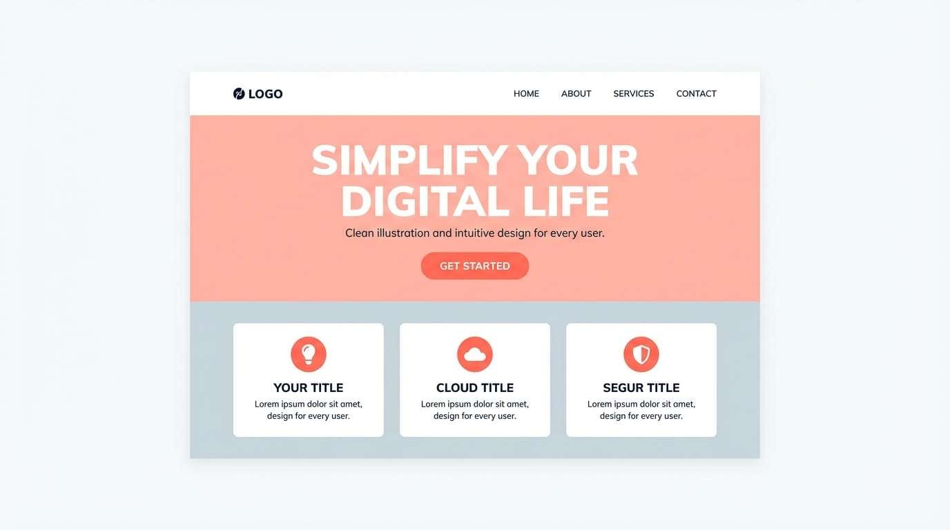
Crisp neutrals with a single warm spark make this feel modern and easy to read. It works well for SaaS sites, portfolios, and product pages where clarity matters as much as personality. Pair the coral accent with lots of white space and cool gray UI surfaces, then use the near-black for headings and primary text. Usage tip: apply coral to one primary action per screen so the hierarchy stays obvious.
Image example of modern minimal coral generated using media.io
7) Neon Coral Nights
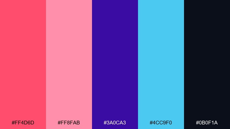
HEX: #ff4d6d #ff8fab #3a0ca3 #4cc9f0 #0b0f1a
Mood: nightlife, electric, futuristic
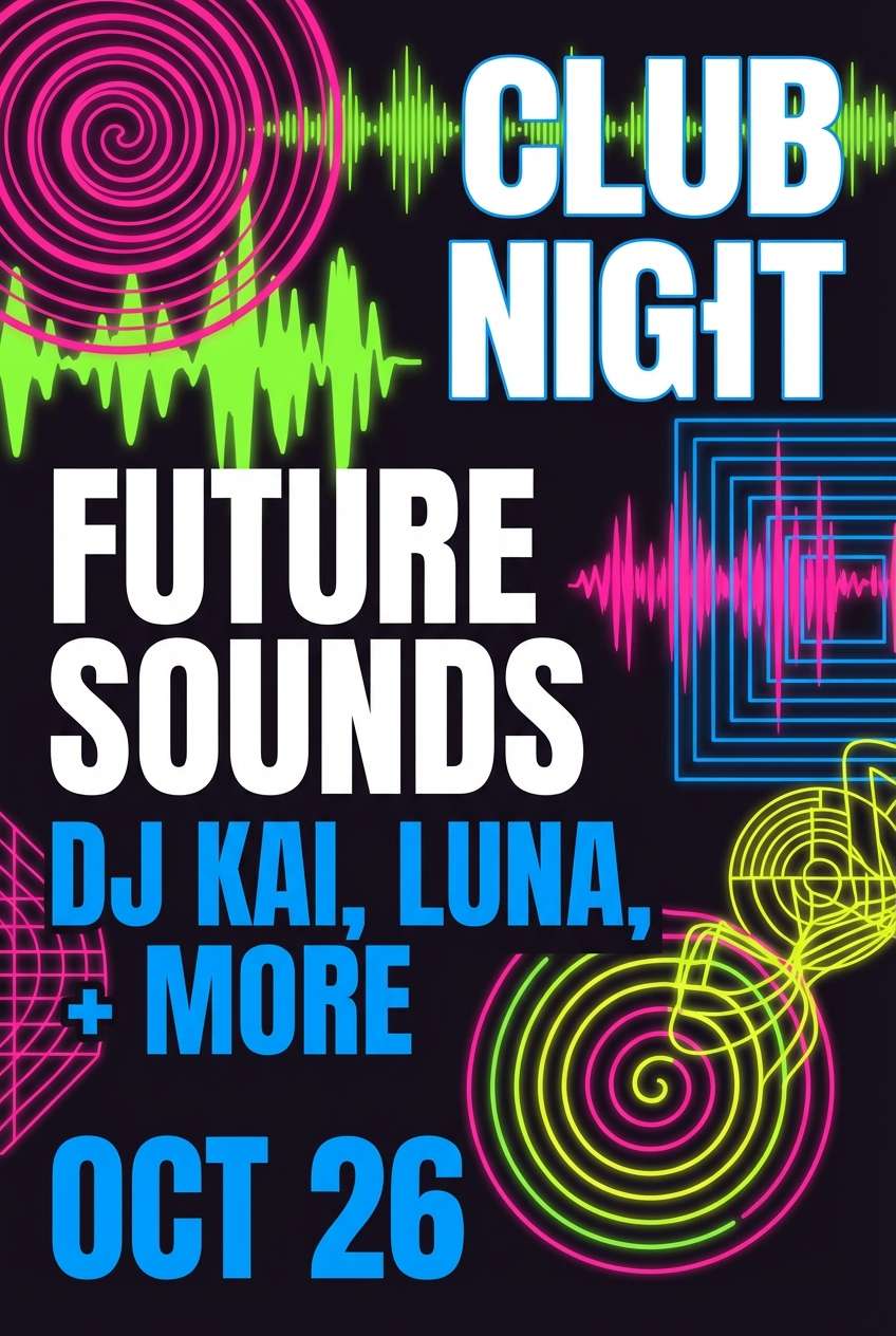
Best for: music promo visuals and nightlife posters
Electric nightlife vibes glow through these saturated pink-coral and cyan notes against deep midnight. Perfect for DJ lineups, album art, and motion social posts that need instant energy. Pair the bright accents with the dark base to keep readability high, and let the violet bridge between warm and cool. Usage tip: use the cyan sparingly for outlines or highlights so the coral remains the main spotlight.
Image example of neon coral nights generated using media.io
8) Coastal Cottage

HEX: #ff7f6a #ffd3c4 #f6f7f9 #9ad1d4 #2d3142
Mood: homey, breezy, welcoming
Best for: interior mood boards and lifestyle blogs
Soft seaside warmth with crisp linens and painted shutters in the mix. These tones suit interior mood boards, blog headers, and cozy shop branding that wants to feel inviting. Pair the pale coral with airy off-white, and bring in the blue-green for a coastal twist that still feels calm. Usage tip: keep large surfaces light and use the darker navy only for small text or trim elements to avoid heaviness.
Image example of coastal cottage generated using media.io
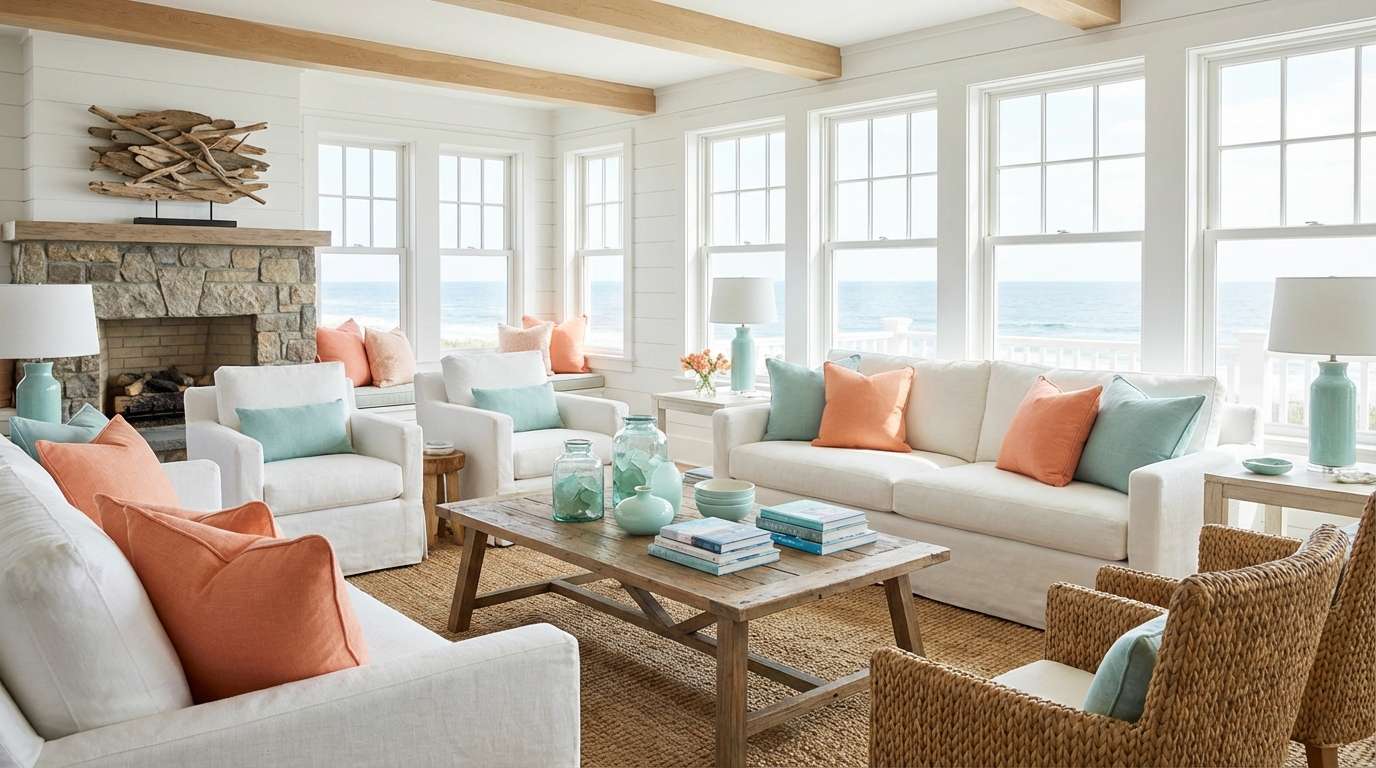
9) Desert Bloom
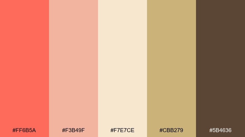
HEX: #ff6b5a #f3b49f #f7e7ce #cbb279 #5b4636
Mood: sunbaked, earthy, relaxed
Best for: boutique product labels and artisan packaging
A warm, sunbaked feel like clay walls, dried grasses, and late-afternoon light. Great for artisan goods, candle labels, and handmade packaging that leans natural and tactile. Pair the coral with sandy neutrals and straw gold, then use the brown for type and stamp-style marks. Usage tip: choose matte finishes and slightly textured paper so the earthy tones feel premium and grounded.
Image example of desert bloom generated using media.io
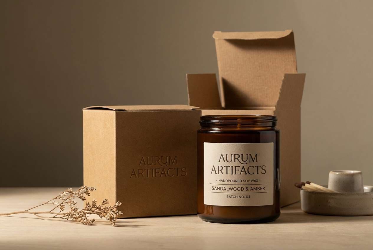
10) Coral and Navy Classic
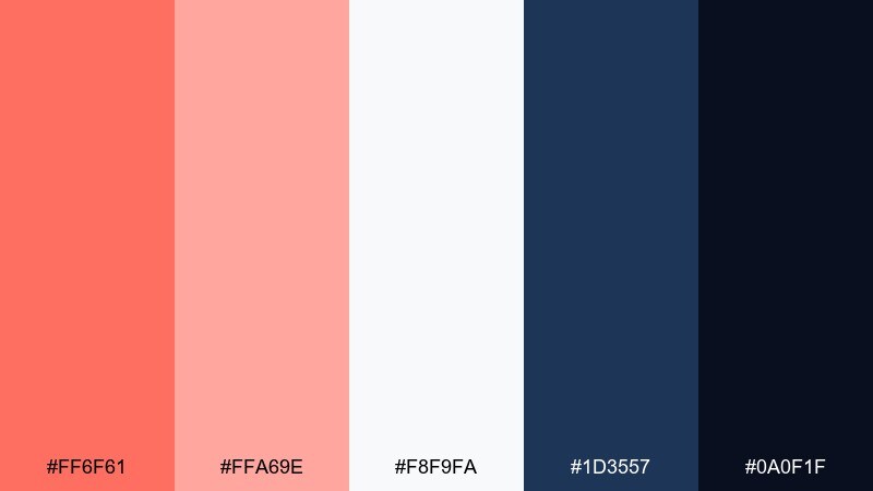
HEX: #ff6f61 #ffa69e #f8f9fa #1d3557 #0a0f1f
Mood: classic, polished, high-contrast
Best for: corporate decks and professional branding
Polished contrast that feels both friendly and authoritative. These coral color combinations work well for pitch decks, service brands, and clean websites where you need warmth without losing professionalism. Pair coral with navy for headlines and key charts, then use the soft blush for backgrounds and section breaks. Usage tip: reserve the darkest tone for text and icons to keep accessibility strong on light surfaces.
Image example of coral and navy classic generated using media.io

11) Sorbet UI Kit
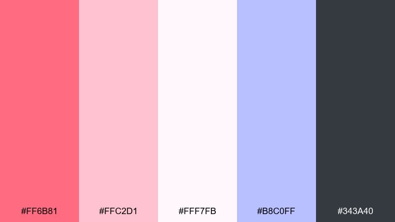
HEX: #ff6b81 #ffc2d1 #fff7fb #b8c0ff #343a40
Mood: sweet, light, app-friendly
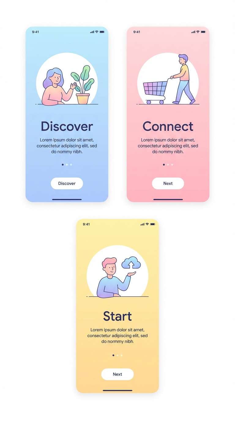
Best for: mobile app UI and onboarding screens
Sorbet-soft tones feel friendly, approachable, and easy on the eyes. Ideal for onboarding flows, wellness apps, and ecommerce UI where you want warmth without visual fatigue. Pair the coral buttons with pale pink surfaces, then add the periwinkle for secondary actions and highlights. Usage tip: keep body text in the charcoal tone and limit pure white to cards for a layered, modern UI.
Image example of sorbet ui kit generated using media.io
12) Rose Gold Packaging
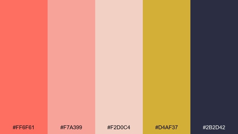
HEX: #ff6f61 #f7a399 #f2d0c4 #d4af37 #2b2d42
Mood: luxurious, warm, glossy
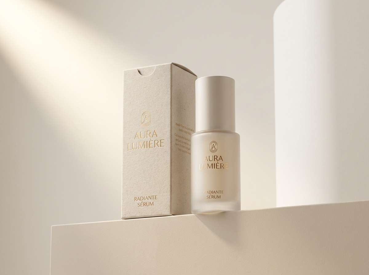
Best for: beauty product ads and premium packaging
Warm glam with a rose-gold glow and a hint of metallic shine. Perfect for cosmetics, fragrance campaigns, and premium gift boxes that need a soft but upscale presence. These coral color combinations look best when the gold is used as a foil accent and the dark ink tone handles typography. Usage tip: keep coral as the main surface color and add gold only to borders, logos, or small seals for a refined finish.
Image example of rose gold packaging generated using media.io
13) Coral Mint Gelato
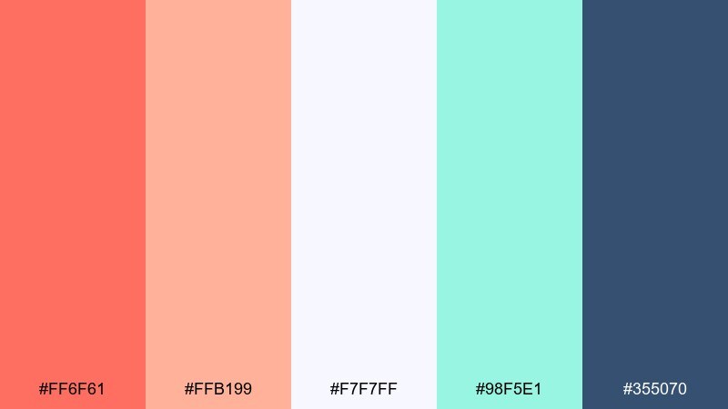
HEX: #ff6f61 #ffb199 #f7f7ff #98f5e1 #355070
Mood: fresh, fun, upbeat
Best for: cafe menus and food branding
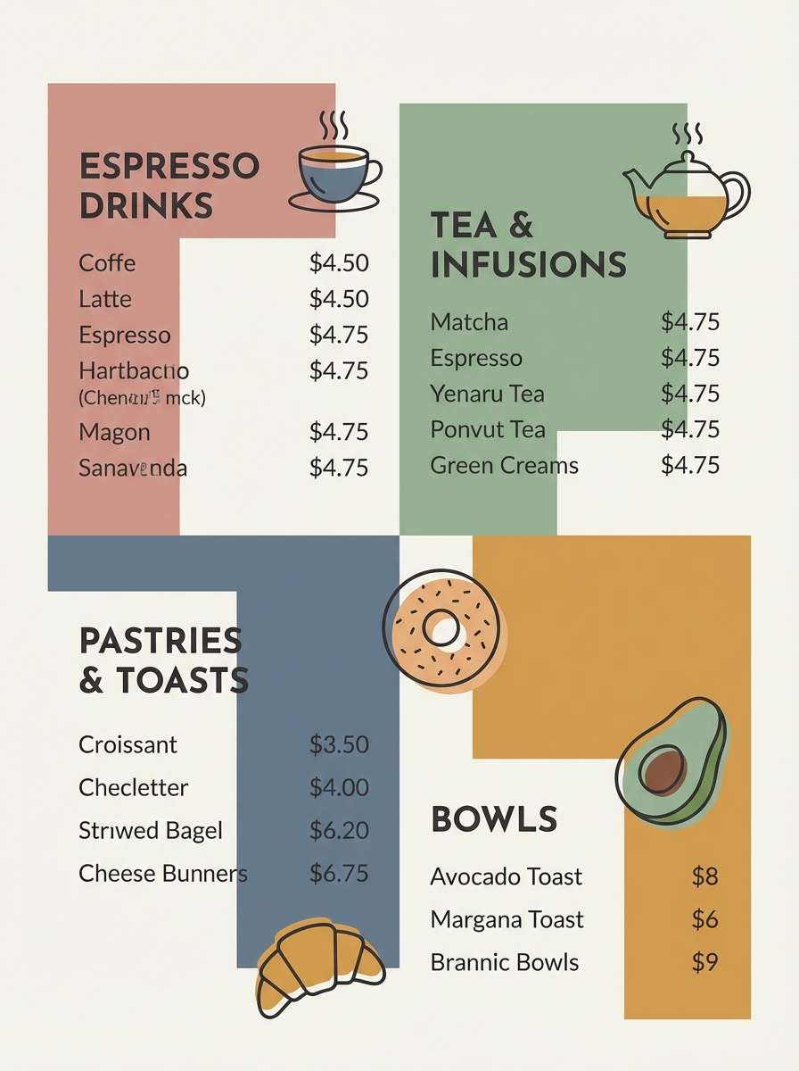
Fresh gelato vibes with a cool mint twist that keeps the warmth feeling crisp. Great for café menus, dessert packaging, and playful brand systems that need a clean pop. Pair coral with mint for accent sections and use the navy-blue tone for readable type and icons. Usage tip: make the off-white your primary background so food photos and illustrations stay the star.
Image example of coral mint gelato generated using media.io
14) Botanical Coral Wash
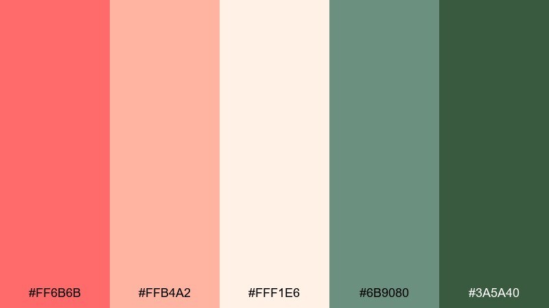
HEX: #ff6b6b #ffb4a2 #fff1e6 #6b9080 #3a5a40
Mood: fresh, botanical, gentle
Best for: spring illustrations and eco-friendly branding
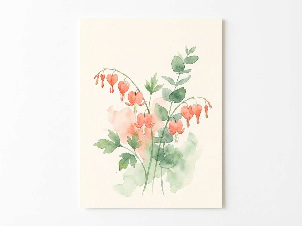
A watercolor-like softness that feels like spring petals and new leaves. Ideal for eco brands, garden events, and packaging that benefits from a hand-crafted touch. Pair coral blossoms with leafy greens, and keep the light cream as the base to maintain an airy look. Usage tip: use coral for focal flowers and save the darker green for stems, labels, and small text blocks.
Image example of botanical coral wash generated using media.io
15) Coral Charcoal Editorial
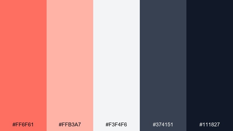
HEX: #ff6f61 #ffb3a7 #f3f4f6 #374151 #111827
Mood: editorial, sharp, modern
Best for: magazine layouts and content-heavy websites
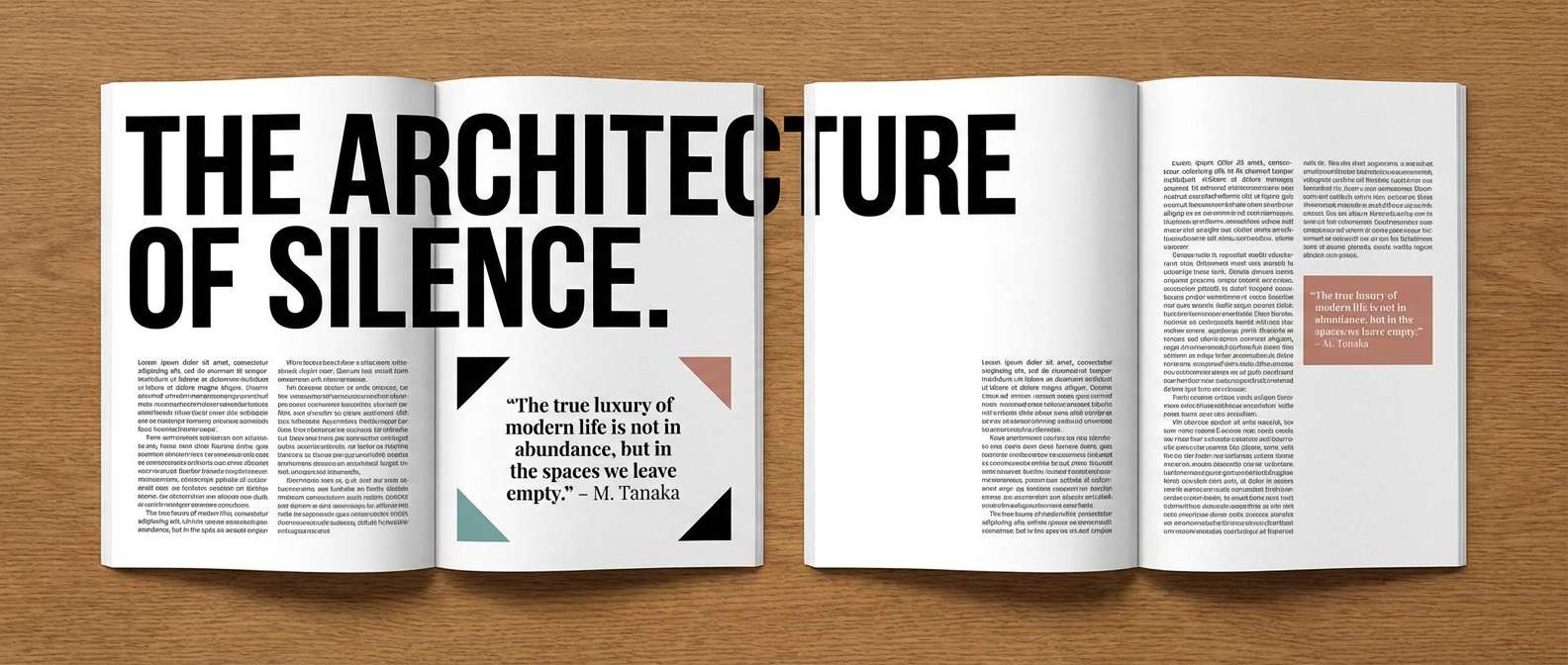
Bold editorial energy with clean neutrals that keep reading comfortable. It fits magazine spreads, reports, and content hubs where hierarchy and rhythm matter. Pair coral as a highlight for pull quotes, section labels, or data points, then let charcoal and near-black do the heavy lifting for typography. Usage tip: keep coral usage consistent across components so the coral color palette feels intentional rather than decorative.
Image example of coral charcoal editorial generated using media.io
16) Kids Party Pop
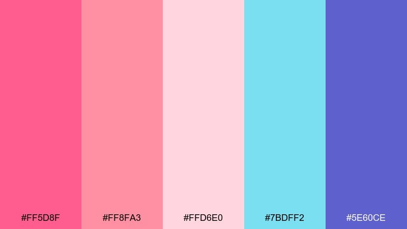
HEX: #ff5d8f #ff8fa3 #ffd6e0 #7bdff2 #5e60ce
Mood: cheerful, bubbly, bright
Best for: kids birthday invitations and party posters
Candy-bright tones bring instant fun, like confetti and balloon arches. These colors are perfect for kids invites, classroom posters, and playful social templates. Pair the coral-pink shades with aqua for a clean pop, and use the purple for outlines, icons, or bold headings. Usage tip: stick to large rounded shapes and simple type so the palette stays friendly, not chaotic.
Image example of kids party pop generated using media.io

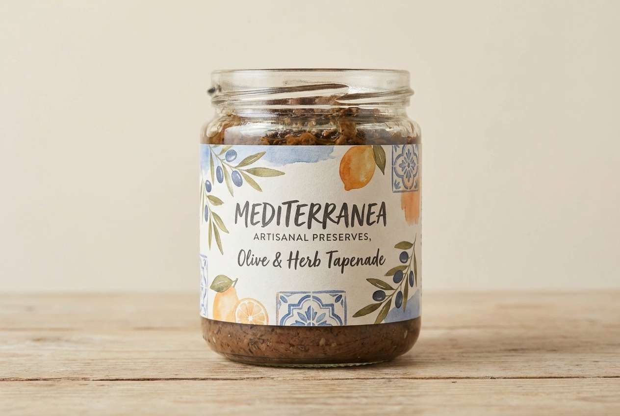
17) Mediterranean Market
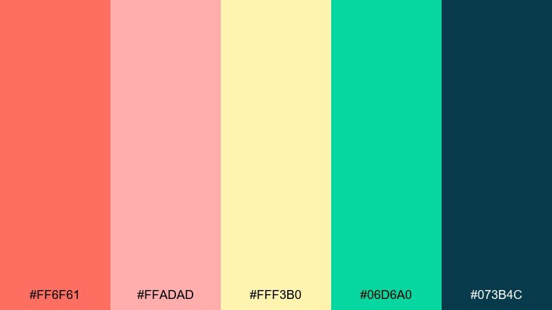
HEX: #ff6f61 #ffadad #fff3b0 #06d6a0 #073b4c
Mood: vibrant, sunny, artisanal
Best for: food labels and market-style branding
A lively market feel with sun-warmed fruit, herbs, and painted tiles. Great for food labels, deli packaging, and brand systems that want to feel handmade but modern. Pair coral with the deep teal to create strong contrast, then use the yellow as a cheerful highlight for badges or prices. Usage tip: introduce simple tile patterns or stripes using two colors at a time to keep the look cohesive.
Image example of mediterranean market generated using media.io
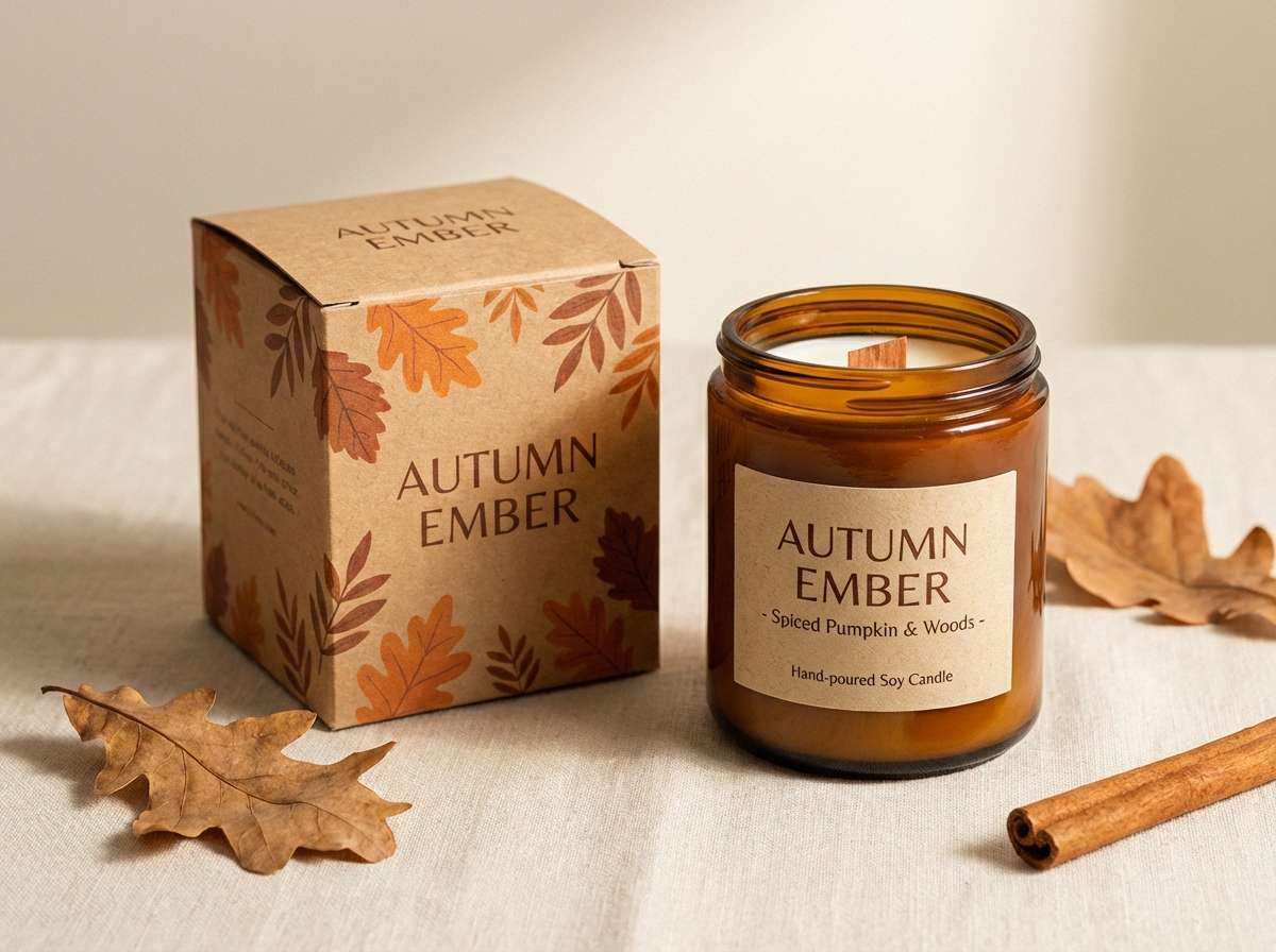
18) Autumn Coral Spice
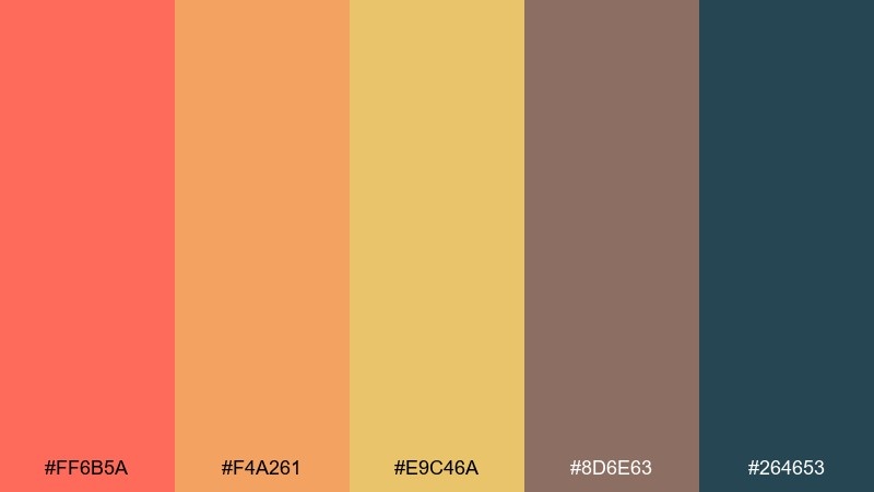
HEX: #ff6b5a #f4a261 #e9c46a #8d6e63 #264653
Mood: cozy, spiced, seasonal
Best for: fall promotions and cozy product photography
Spiced warmth with a late-season glow, like cider, cinnamon, and knit textures. It suits fall promotions, seasonal landing pages, and cozy product styling for handmade goods. Pair coral with amber and golden tones, then use the brown for grounded details and the deep teal for strong contrast. Usage tip: keep backgrounds light and warm so the darker accents feel intentional rather than heavy.
Image example of autumn coral spice generated using media.io
19) Soft Bridal Bouquet
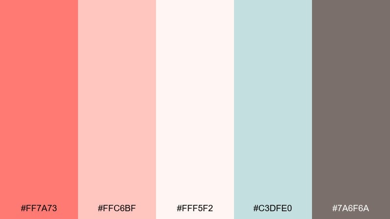
HEX: #ff7a73 #ffc6bf #fff5f2 #c3dfe0 #7a6f6a
Mood: romantic, delicate, timeless
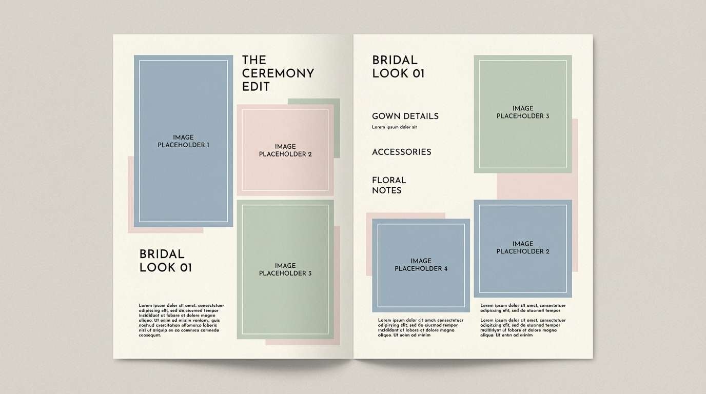
Best for: bridal lookbooks and wedding websites
Delicate bouquet tones feel airy, intimate, and timeless. They work well for bridal lookbooks, wedding websites, and photography brands that want a soft signature. Pair the blush and cream as backgrounds, then sprinkle in the cool aqua for freshness and use the warm gray for readable text. Usage tip: use coral only for key accents like buttons, date markers, or monograms to keep the mood elegant.
Image example of soft bridal bouquet generated using media.io
20) Tech Coral Accent
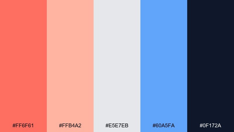
HEX: #ff6f61 #ffb4a2 #e5e7eb #60a5fa #0f172a
Mood: modern, focused, tech-forward
Best for: dashboard UI and product marketing pages
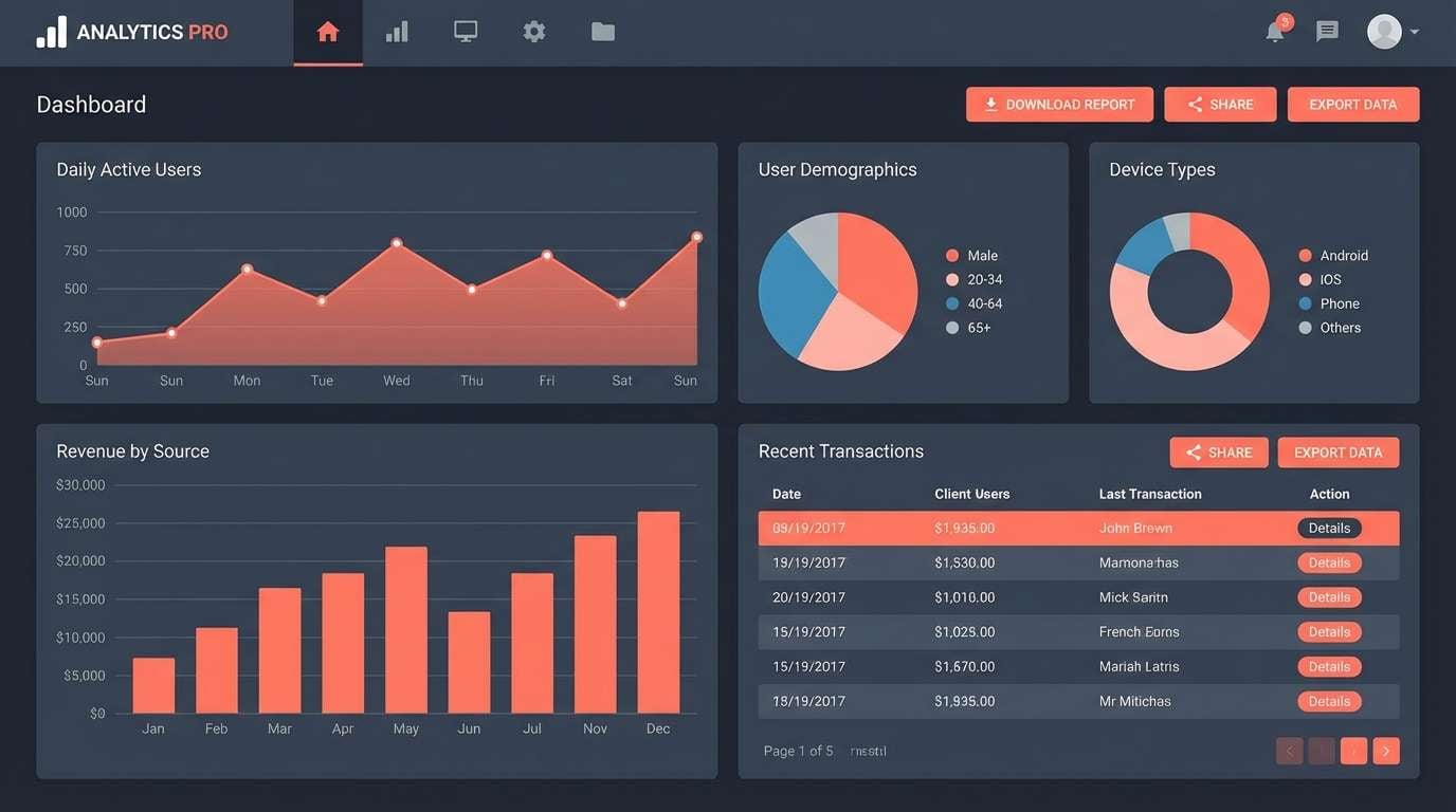
A confident tech feel where warm coral acts like a smart highlight instead of the whole story. Great for dashboards, analytics tools, and product pages that need clear hierarchy and crisp contrast. Pair the cool grays and deep navy for structure, then use coral and blue for status, CTAs, and key metrics. Usage tip: assign coral to one meaning, like primary action or alerts, so the system stays predictable.
Image example of tech coral accent generated using media.io
What Colors Go Well with Coral?
Cool blues and blue-greens are some of the strongest pairings for coral because they create crisp, balanced contrast. Try teal, aqua, cyan, or a deep navy to keep coral looking clean and modern.
For softer, nature-inspired coral tones, pair coral with sage, olive, or muted greens, then add a cream or off-white background to keep the palette breathable. This approach is especially popular for wellness, interiors, and eco branding.
To make coral feel more premium or editorial, use grounded neutrals like charcoal, slate, or near-black for typography, plus metallic-style accents (gold) or dusty mauves for texture. The key is letting coral remain the warm highlight rather than the whole canvas.
How to Use a Coral Color Palette in Real Designs
In branding, coral works best as a recognizable accent: use it for logos, badges, highlights, or packaging details, while relying on neutrals for primary backgrounds and type. This keeps the system versatile across digital and print.
In UI design, treat coral as a hierarchy tool. Assign it to one main role (primary CTA, key metric, or alert) and keep other interactive states in cooler tones like blue or teal to avoid confusion.
For print, consider paper and finish: coral often looks richer on matte stocks, while creams and blushes benefit from subtle texture. Always test contrast for small text, and lean on navy/charcoal inks for legibility.
Create Coral Palette Visuals with AI
If you want to preview a coral color scheme quickly, generate mockups like brand boards, posters, packaging scenes, or UI screens. Seeing coral next to its supporting colors makes it much easier to confirm contrast and mood.
With Media.io’s text-to-image tool, you can paste a prompt (like the examples above), adjust style and aspect ratio, and produce consistent visuals for presentations or client reviews.
Once you find the right look, reuse the same palette and prompt structure to build a cohesive set: social posts, product shots, landing sections, and ad creatives that all feel like one brand.
Coral Color Palette FAQs
-
What is the HEX code for coral?
Coral can refer to several close shades, but a common coral HEX used in modern palettes is #ff6f61. Other popular coral-leaning options include brighter pink-coral like #ff4d6d or softer peach-coral like #ffa69e. -
Does coral work better with navy or black?
Both work, but they create different vibes. Coral and navy feels classic and professional with high contrast, while coral and near-black/charcoal feels modern and editorial—great for content-heavy layouts and minimal brands. -
What colors complement coral on the color wheel?
Coral’s complement sits in the blue-green range, which is why teal, aqua, and cyan pair so well. These cooler hues balance coral’s warmth and help it pop without looking overly saturated. -
Is coral a good color for UI buttons?
Yes—coral is excellent for primary CTAs because it draws attention quickly. For best results, use coral for one primary action per screen and pair it with neutral surfaces and dark text to maintain clear hierarchy and accessibility. -
How do I make a coral palette look more “luxury”?
Use coral with refined neutrals (cream, soft blush, deep ink tones) and add a small amount of gold-like accent. Keep layouts spacious, limit bright secondaries, and let dark typography provide the premium structure. -
What’s the difference between coral and peach?
Peach is typically lighter and more yellow/orange-leaning, while coral has stronger pink/red influence and usually reads bolder. In palettes, peach often works as a background tone and coral as the accent. -
What’s a safe background color to use with coral?
Off-white, cream, very light blush, or pale gray are reliable backgrounds for coral. They keep the warmth intact while leaving enough contrast for navigation, text, and icons.


