

Sky blue brings instant clarity: it feels open, light, and trustworthy, making it a go-to for modern brands, calm UIs, and clean print layouts.
Below are 20 curated sky blue color palette ideas with HEX codes, plus practical tips and AI prompts you can reuse to generate matching visuals fast.
In this article
Why Sky Blue Palettes Work So Well
Sky blue sits in a “safe” visual zone: it reads as clean, calm, and modern without feeling cold when paired with white, soft grays, or warm accents.
In UI, sky blue helps create clear hierarchy because it supports both gentle backgrounds (tints) and strong actions (deeper blues) without fighting typography.
For print and branding, sky blue scales well across materials and finishes, from airy minimal stationery to bold promos with high-contrast navy anchors.
20+ Sky Blue Color Palette Ideas (with HEX Codes)
1) Cloud Harbor

HEX: #7EC8E3 #EAF6FF #FFFFFF #B6C7D6 #2F5D7C
Mood: airy and dependable
Best for: clean SaaS landing pages and hero sections
Airy and dependable like a bright marina morning, these tones feel open but grounded. Use the light tints for spacious sections and keep the deep blue for headings and CTAs. Pair with cool grays and plenty of white space to avoid a washed look. Tip: reserve the darkest shade for one action color to improve scanability.
Image example of cloud harbor generated using media.io

Media.io is an online AI studio for creating and editing video, image, and audio in your browser.

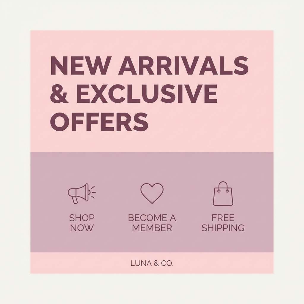
2) Seaside Pastel
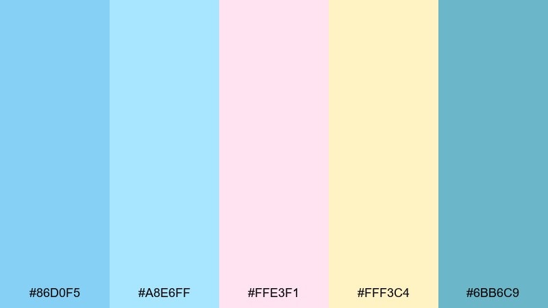
HEX: #86D0F5 #A8E6FF #FFE3F1 #FFF3C4 #6BB6C9
Mood: playful and soft
Best for: social posts and lifestyle branding
Playful and soft like beach towels and sorbet, this mix adds warmth to cool blues. Let the pink and butter tones act as small accents so the overall look stays calm. It works especially well with rounded typography and friendly illustrations. Tip: keep accent coverage under 15 percent for a polished feed.
Image example of seaside pastel generated using media.io
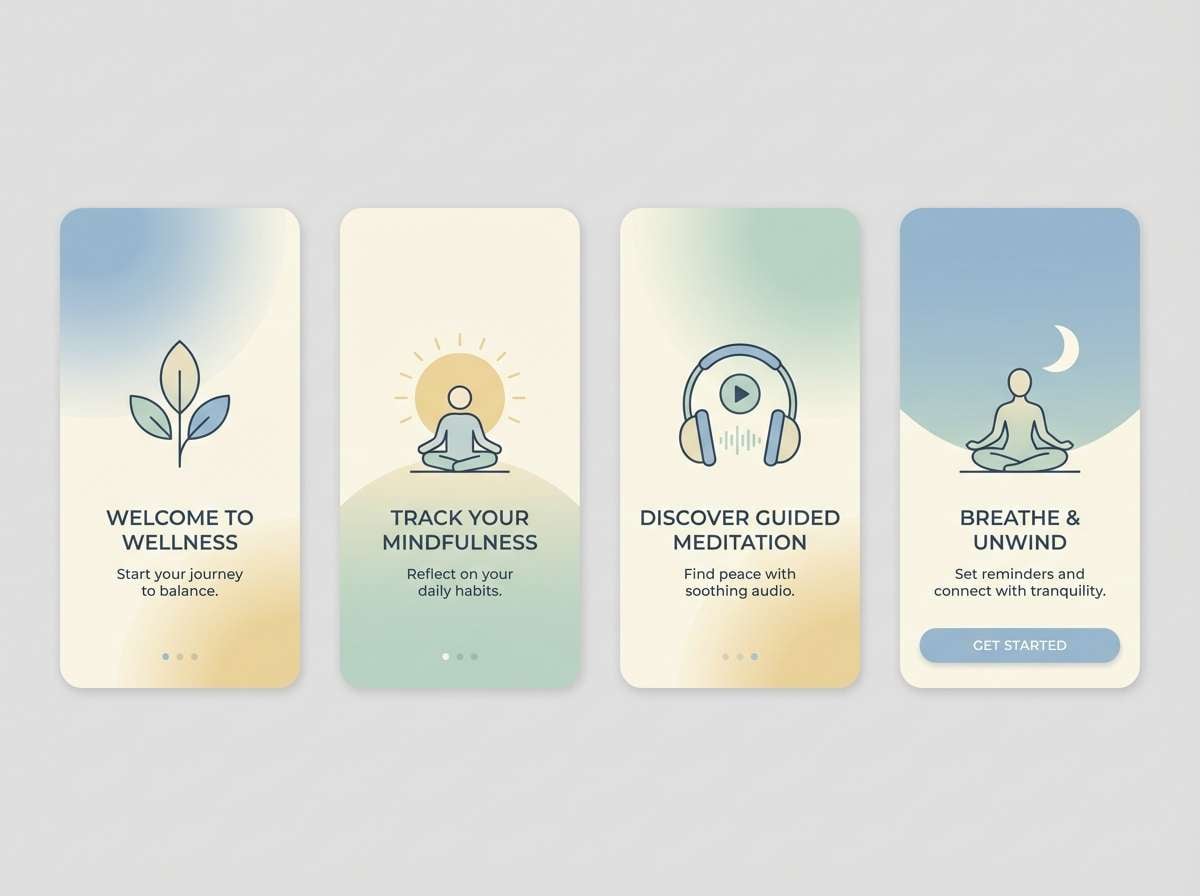
3) Alpine Morning
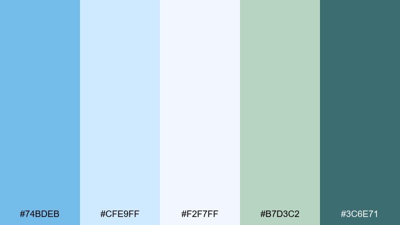
HEX: #74BDEB #CFE9FF #F2F7FF #B7D3C2 #3C6E71
Mood: fresh and outdoorsy
Best for: wellness apps and nature-forward brands
Fresh and outdoorsy like crisp air over a mountain lake, these hues feel restorative. The soft blue base with sage-green support creates a balanced sky blue color scheme for calm interfaces and packaging. Pair with natural textures, matte paper, or subtle grain to keep it organic. Tip: use the teal as a progress or success color instead of bright neon green.
Image example of alpine morning generated using media.io
4) Poolside Pop
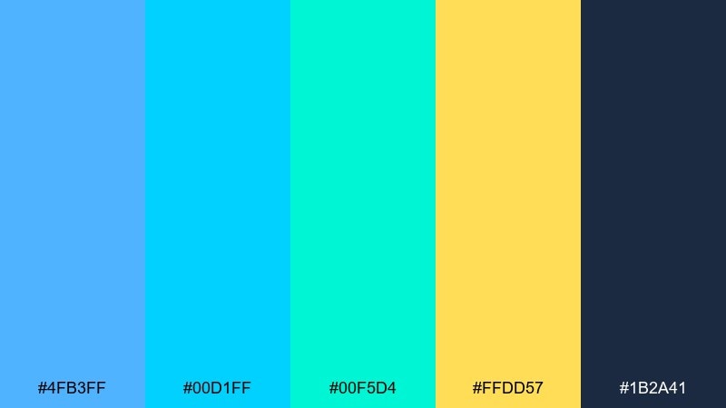
HEX: #4FB3FF #00D1FF #00F5D4 #FFDD57 #1B2A41
Mood: energetic and sunny
Best for: summer promos and event posters
Energetic and sunny like reflections on a pool, this set brings instant punch. Use the yellow as a highlight for dates, prices, or key benefits while the navy anchors readability. It pairs nicely with bold sans-serifs and simple geometric shapes. Tip: avoid placing cyan text on bright blue blocks to keep contrast accessible.
Image example of poolside pop generated using media.io
5) Denim & Driftwood
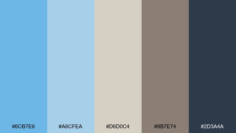
HEX: #6CB7E6 #A6CFEA #D6D0C4 #8B7E74 #2D3A4A
Mood: relaxed and earthy
Best for: interior mood boards and home goods
Relaxed and earthy like worn denim beside sun-bleached wood, this palette feels lived-in. The sandy neutrals soften the blues and make layouts feel warm instead of clinical. Pair with linen textures, kraft packaging, and warm photography. Tip: use the taupe as a background alternative to pure white for a calmer look.
Image example of denim & driftwood generated using media.io
6) Minty Breeze
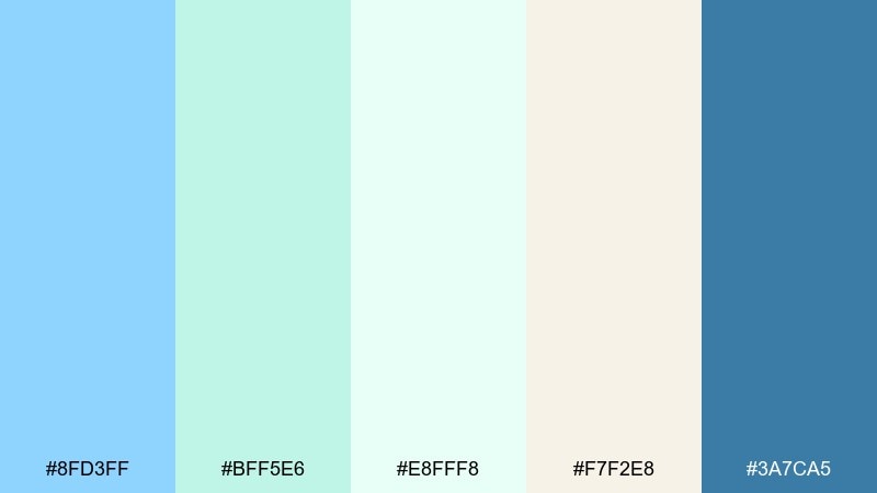
HEX: #8FD3FF #BFF5E6 #E8FFF8 #F7F2E8 #3A7CA5
Mood: clean and spa-like
Best for: skincare packaging and minimalist labels
Clean and spa-like like cool towels and eucalyptus steam, these tones signal freshness. The mint and near-white shades keep the look light, while the deeper blue adds authority for ingredients and claims. Pair with simple line icons and lots of breathing room. Tip: print on uncoated stock to maintain the soft, natural feel.
Image example of minty breeze generated using media.io
7) Coral Kite
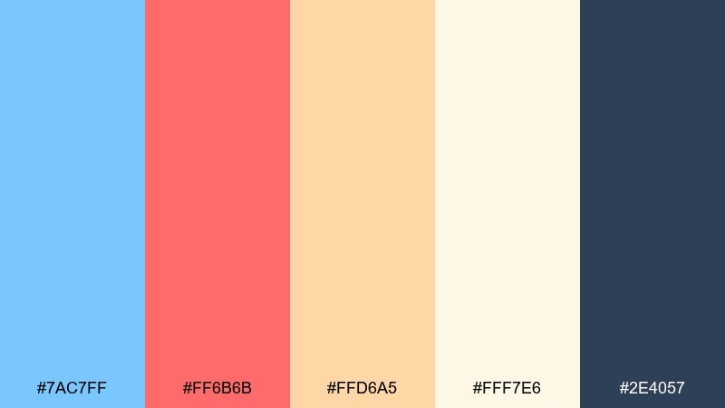
HEX: #7AC7FF #FF6B6B #FFD6A5 #FFF7E6 #2E4057
Mood: cheerful and bold
Best for: DTC ads and playful brand campaigns
Cheerful and bold like a kite against a clear afternoon, this mix thrives on contrast. The warm coral instantly adds personality, making these sky blue color combinations great for punchy banners and short-form ads. Pair with clean navy text and keep the cream shade as negative space. Tip: use coral for buttons and badges, not body text, for cleaner hierarchy.
Image example of coral kite generated using media.io
8) Lavender Horizon
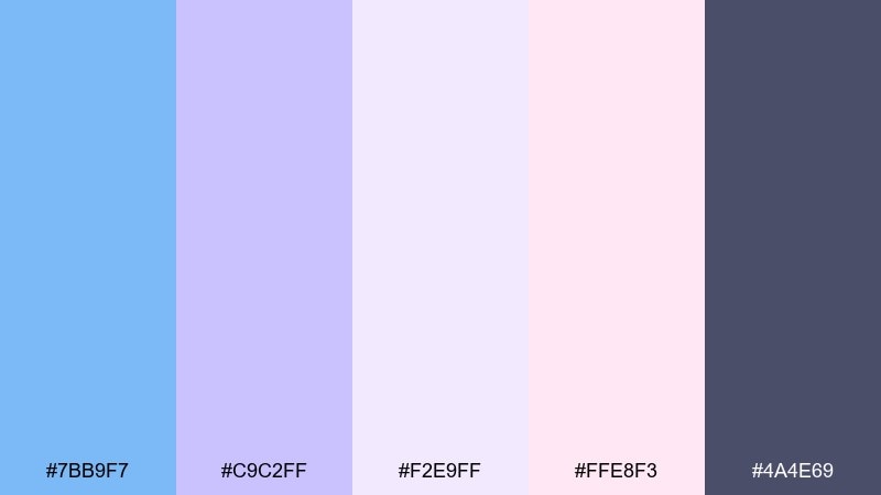
HEX: #7BB9F7 #C9C2FF #F2E9FF #FFE8F3 #4A4E69
Mood: dreamy and gentle
Best for: beauty lookbooks and soft rebrands
Dreamy and gentle like dusk clouds fading into violet, this set feels romantic without going sugary. Use the lavender as a secondary backdrop and keep the deep slate for text-heavy areas. It pairs well with editorial serif headlines and soft-focus imagery. Tip: add thin dividers in the slate tone to keep pastel layouts structured.
Image example of lavender horizon generated using media.io
9) Steel Blue Office
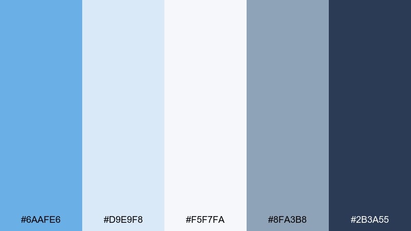
HEX: #6AAFE6 #D9E9F8 #F5F7FA #8FA3B8 #2B3A55
Mood: professional and focused
Best for: B2B dashboards and reports
Professional and focused like a tidy desk by a window, these blues feel trustworthy. The gray-blue neutrals keep charts and tables readable while still looking modern. Pair with strong typographic hierarchy and subtle shadows instead of heavy borders. Tip: use the medium gray-blue for inactive states to avoid visual noise.
Image example of steel blue office generated using media.io
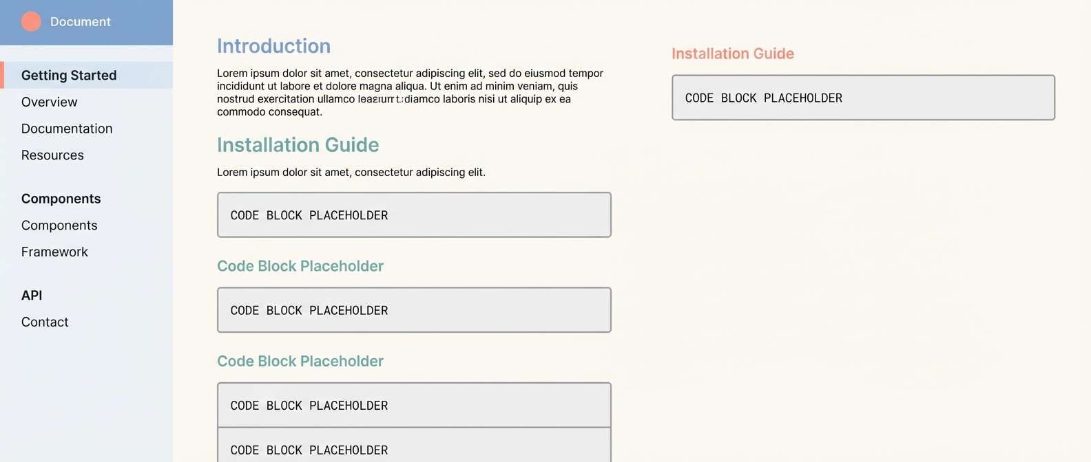
10) Arctic Minimal
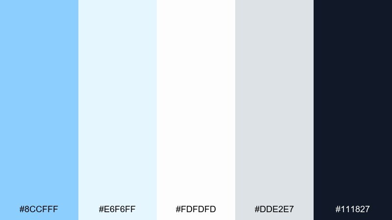
HEX: #8CCFFF #E6F6FF #FDFDFD #DDE2E7 #111827
Mood: crisp and minimal
Best for: product UI and documentation sites
Crisp and minimal like ice light in a white room, this set is built for clarity. The near-white blues create gentle sectioning without obvious color blocks. Pair with charcoal text, thin rules, and a single bright accent if needed. Tip: keep shadows very soft to preserve the clean, airy feel.
Image example of arctic minimal generated using media.io
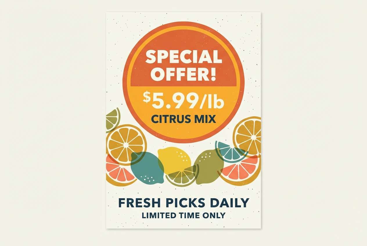
11) Citrus Splash
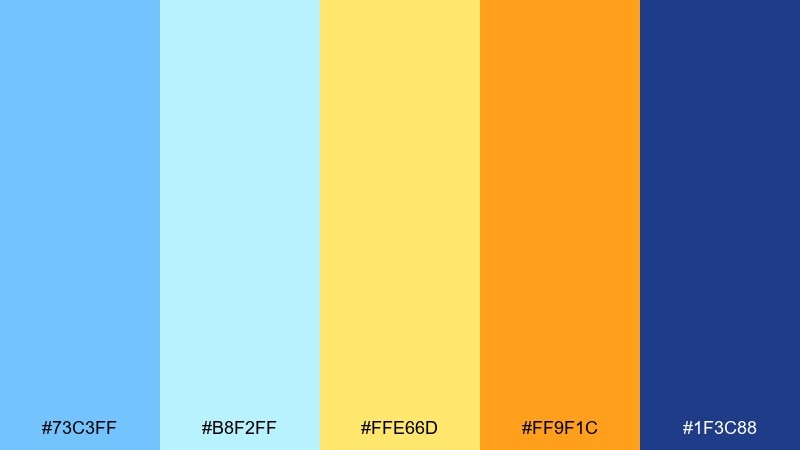
HEX: #73C3FF #B8F2FF #FFE66D #FF9F1C #1F3C88
Mood: bright and optimistic
Best for: food brands and seasonal campaigns
Bright and optimistic like citrus in sparkling water, these colors feel refreshing and friendly. The oranges work best as energetic accents against cool blues, especially for price tags and promo badges. Pair with high-contrast navy type and simple iconography. Tip: use the pale aqua for backgrounds so the warm accents pop without glare.
Image example of citrus splash generated using media.io
12) Nautical Classic
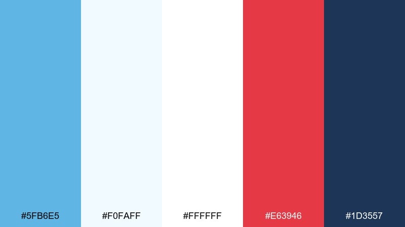
HEX: #5FB6E5 #F0FAFF #FFFFFF #E63946 #1D3557
Mood: classic and spirited
Best for: sports branding and nautical themes
Classic and spirited like a sail flag in fresh wind, this mix balances tradition with punch. The red accent adds urgency while the navy keeps everything crisp for logos and typography. Use it when you want a sky blue color palette that still feels bold and premium. Tip: limit red to highlights and icons so the overall look stays clean.
Image example of nautical classic generated using media.io
13) Sandbar Neutrals
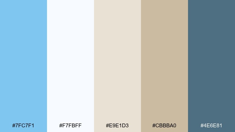
HEX: #7FC7F1 #F7FBFF #E9E1D3 #CBBBA0 #4E6E81
Mood: calm and grounded
Best for: travel blogs and resort websites
Calm and grounded like pale sand under clear water, these neutrals keep blue feeling relaxed. The beige range works beautifully for backgrounds, while the slate tone handles body text and navigation. Pair with warm photography, soft shadows, and natural materials. Tip: use the darker slate for links to improve contrast on sandy sections.
Image example of sandbar neutrals generated using media.io
14) Retro Ice Cream
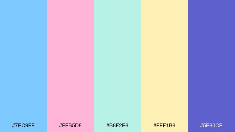
HEX: #7EC9FF #FFB5D8 #B8F2E6 #FFF1B6 #5E60CE
Mood: nostalgic and fun
Best for: sticker packs and playful packaging
Nostalgic and fun like a neon-lit ice cream shop, this palette leans into sweet pastels with a bold purple twist. Use the purple for outlines and headings so the softer shades stay legible. Pair with chunky type, simple doodles, and rounded UI components. Tip: add a thin purple stroke around light elements to prevent them from blending into the background.
Image example of retro ice cream generated using media.io
15) Midnight Pier
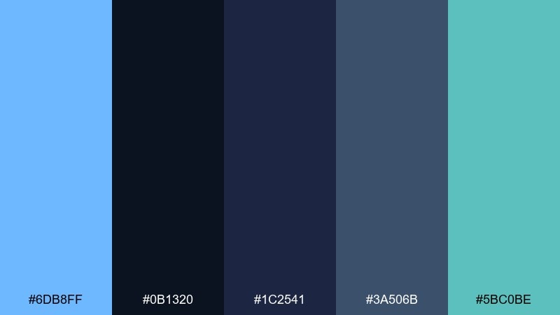
HEX: #6DB8FF #0B1320 #1C2541 #3A506B #5BC0BE
Mood: moody and modern
Best for: music promo visuals and night mode UI
Moody and modern like lights over dark water, these shades are built for dramatic contrast. The bright blue reads as electric against the near-black base, making it ideal for highlights and active states. Pair with subtle gradients and minimal line icons to keep it sleek. Tip: use the teal as a secondary accent for charts and toggles to avoid a single-color look.
Image example of midnight pier generated using media.io
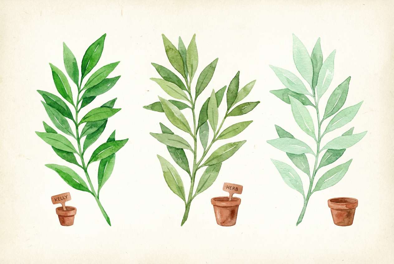
16) Botanical Sky
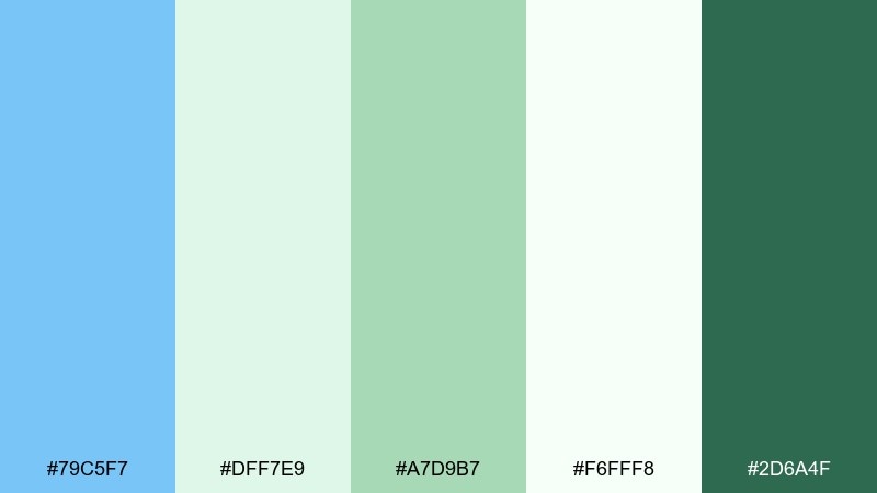
HEX: #79C5F7 #DFF7E9 #A7D9B7 #F6FFF8 #2D6A4F
Mood: fresh and botanical
Best for: spring illustrations and eco campaigns
Fresh and botanical like new leaves after rain, this mix feels clean and hopeful. The greens keep the blues from feeling too icy, which works well for sustainable messaging and seasonal launches. Pair with watercolor textures, light paper grain, and soft brush lettering. Tip: keep the darkest green for small details like stamps and icons to avoid overpowering the airy base.
Image example of botanical sky generated using media.io
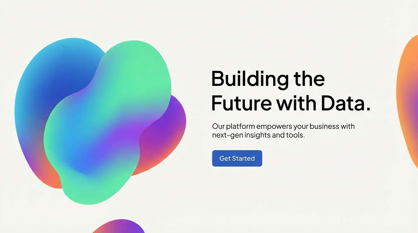
17) Tech Gradient
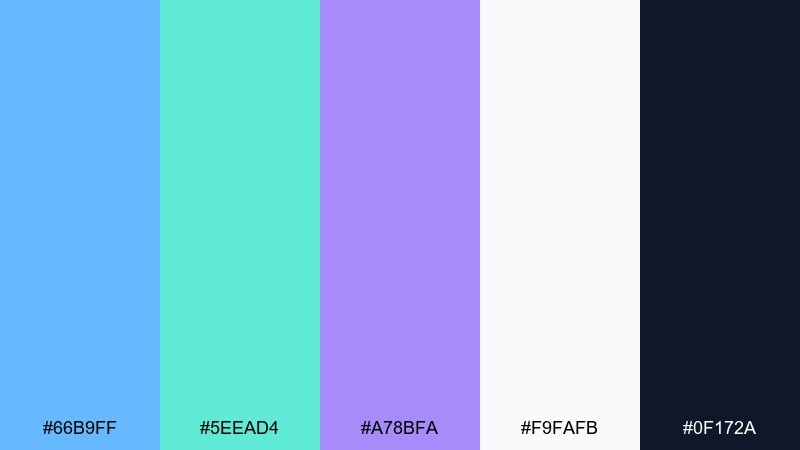
HEX: #66B9FF #5EEAD4 #A78BFA #F9FAFB #0F172A
Mood: futuristic and sleek
Best for: startup branding and app marketing
Futuristic and sleek like a soft aurora over a city skyline, these colors shine in gradients. Use the blue-to-teal blend for hero areas, then keep surfaces near-white for readable content. Pair with geometric illustrations and a bold display font for headlines. Tip: apply the purple sparingly as a premium accent for pricing tiers or key stats.
Image example of tech gradient generated using media.io
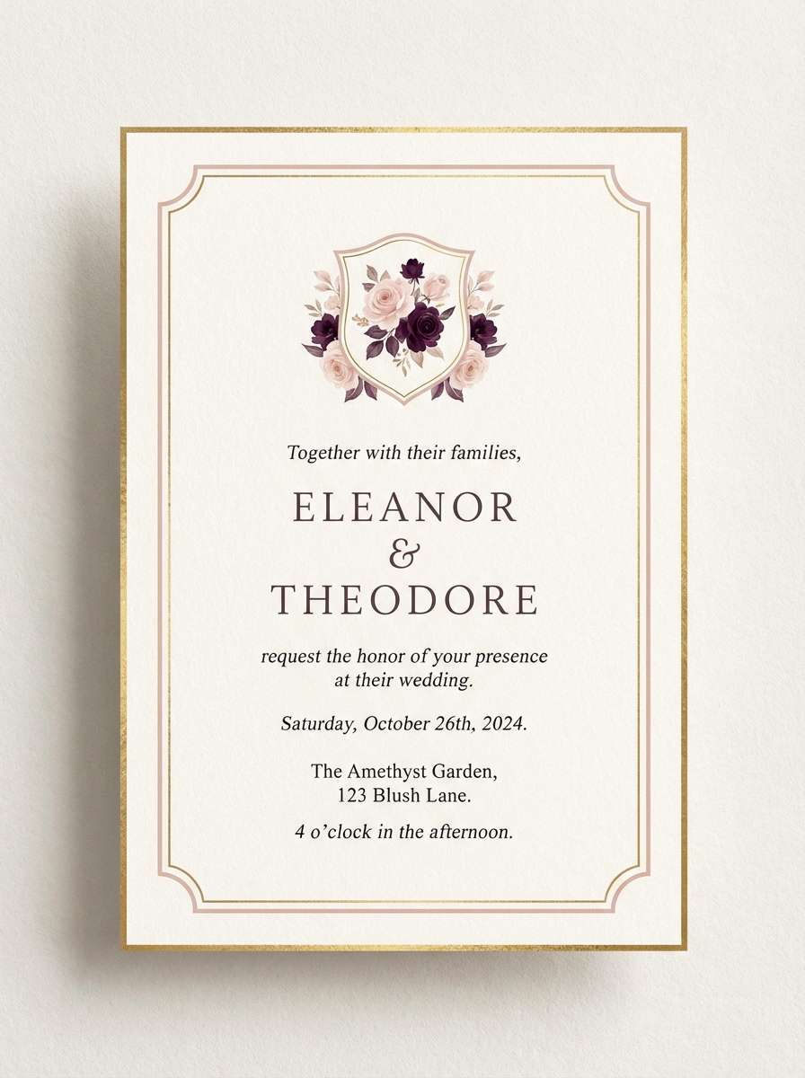
18) Wedding Whisper
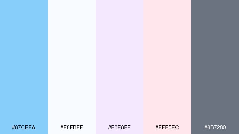
HEX: #87CEFA #F8FBFF #F3E8FF #FFE5EC #6B7280
Mood: romantic and airy
Best for: wedding invitations and stationery
Romantic and airy like soft tulle in daylight, these pastels feel elegant and calm. The gentle gray keeps typography readable while the blush and lavender add a delicate finish. Pair with thin serif fonts, subtle floral line art, and lots of margin. Tip: print the lightest tones as background washes, then set text in the gray for crisp results.
Image example of wedding whisper generated using media.io
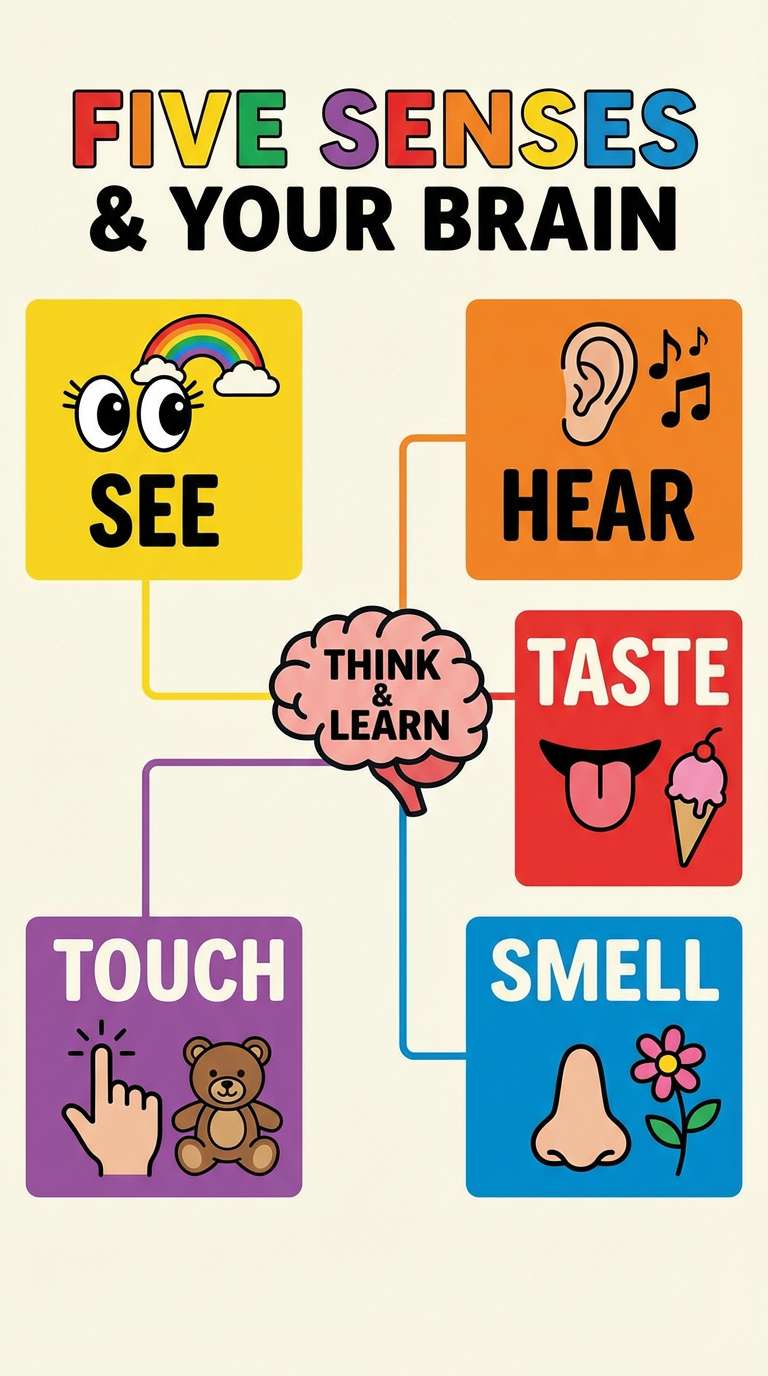
19) Kids Playroom
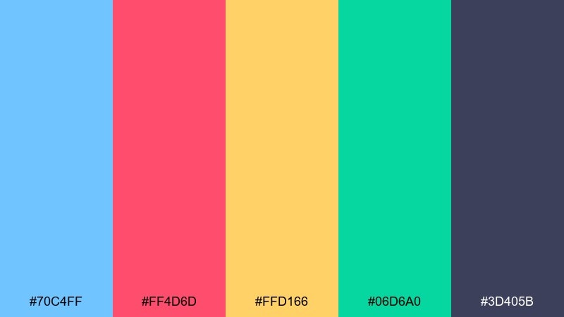
HEX: #70C4FF #FF4D6D #FFD166 #06D6A0 #3D405B
Mood: bright and friendly
Best for: kids apps and learning posters
Bright and friendly like building blocks on a sunny floor, these colors feel energetic but organized. Use the dark slate for text, then rotate the warm accents for categories and callouts. Pair with simple icons, rounded corners, and playful headings. Tip: keep backgrounds light so the saturated accents do not tire the eyes.
Image example of kids playroom generated using media.io
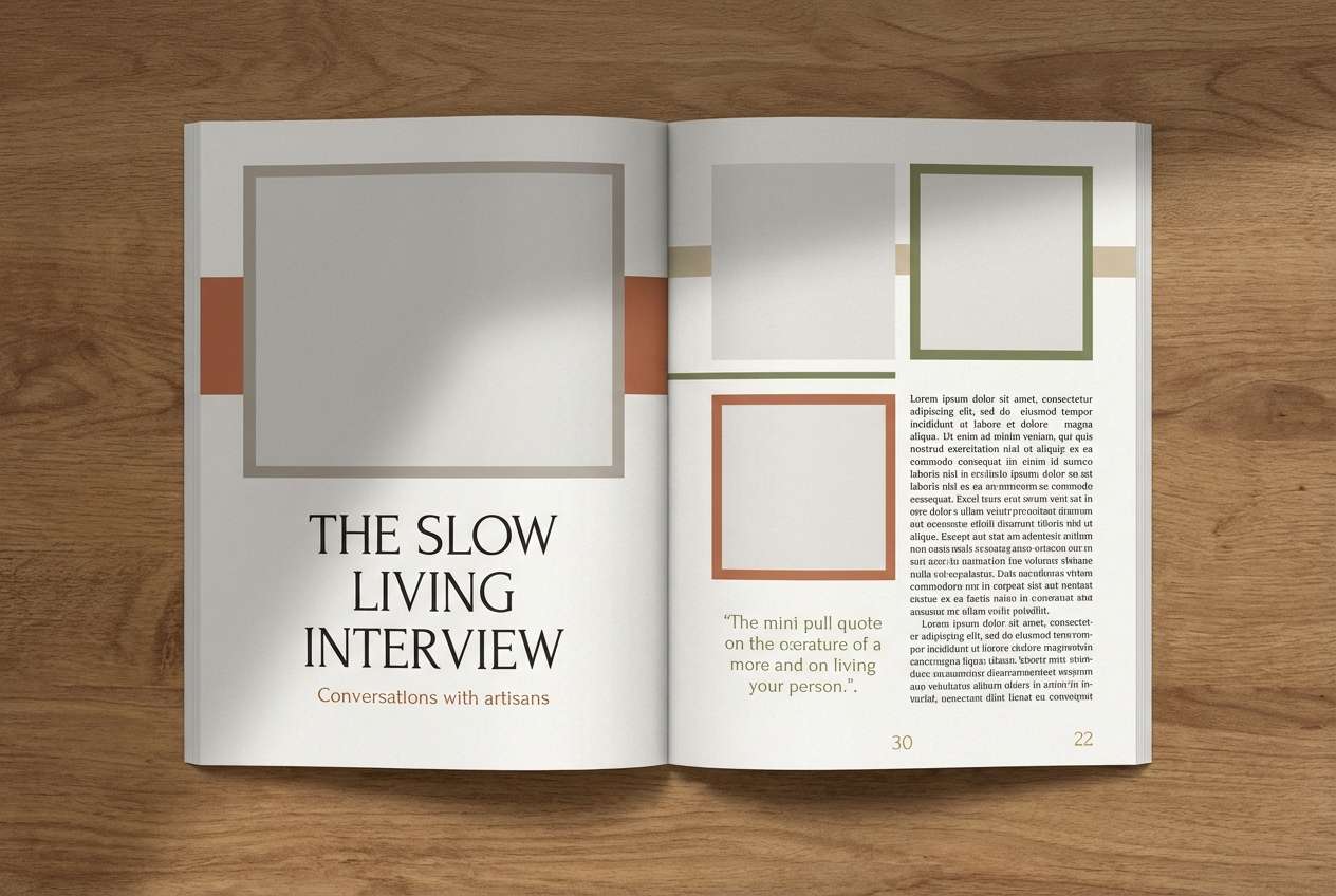
20) Editorial Calm
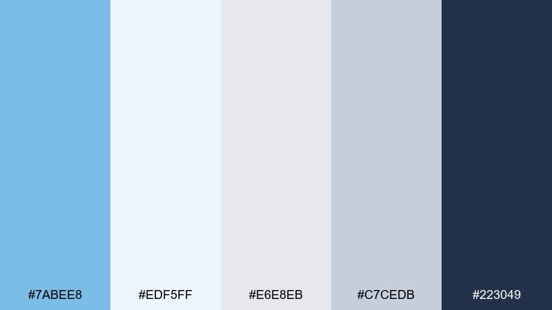
HEX: #7ABEE8 #EDF5FF #E6E8EB #C7CEDB #223049
Mood: calm and refined
Best for: magazine layouts and corporate storytelling
Calm and refined like an overcast day in a modern gallery, these tones feel mature and balanced. The blue works best as a section color, while the grays support long-form reading and clean grids. Pair with strong serif headlines and restrained photography. Tip: use the darkest navy for captions and pull quotes to keep hierarchy consistent across pages.
Image example of editorial calm generated using media.io
What Colors Go Well with Sky Blue?
Sky blue pairs naturally with crisp neutrals like white, off-white, cool gray, and charcoal, which help it look clean and readable in both UI and print.
For contrast and energy, add warm accents such as coral, orange, butter yellow, or red in small amounts. These complementary pops prevent a light blue palette from feeling flat.
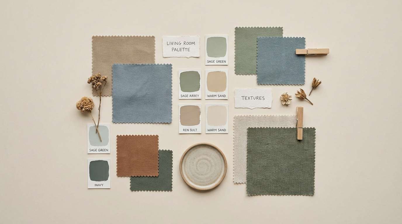
For a nature-leaning feel, combine sky blue with sage, mint, and deep forest green; for a premium look, anchor it with navy and add one refined accent like lavender or teal.
How to Use a Sky Blue Color Palette in Real Designs
Start with a role-based approach: pick 1 primary sky blue, 1 dark anchor (navy/charcoal) for text and CTAs, and 2–3 light tints for backgrounds and sections.
Keep large surfaces light and let saturated colors do “small jobs” (buttons, badges, chart highlights). This maintains the airy sky-blue vibe while preserving contrast and hierarchy.
In print, test your lightest tints early—very pale blues can disappear on uncoated paper. Use the darker shade for key type and thin rules to keep layouts crisp.
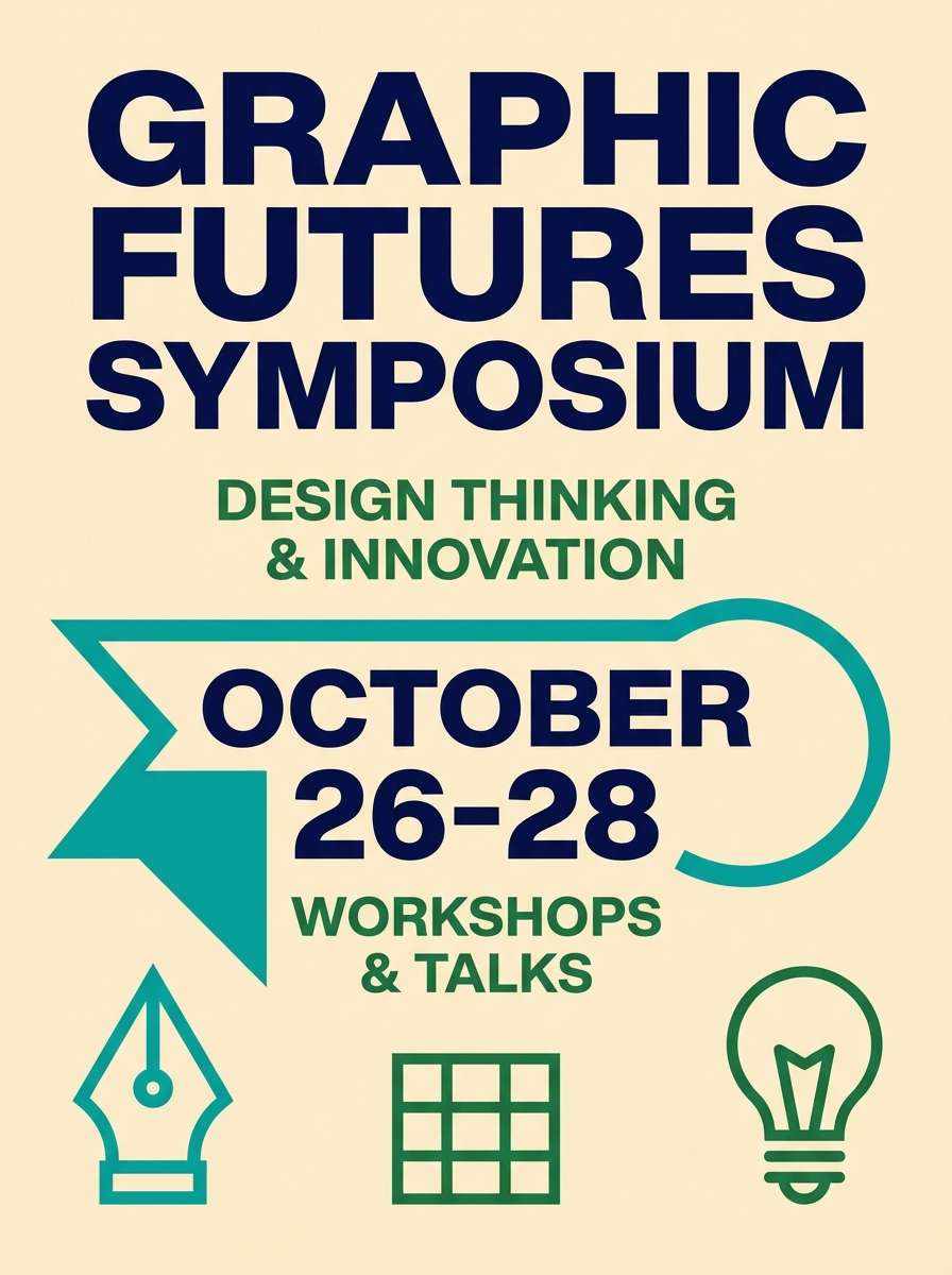
Create Sky Blue Palette Visuals with AI
If you already have HEX codes, you can turn them into on-brand visuals by generating UI mockups, posters, packaging, and identity boards that follow the palette.
Reuse the prompts above, then tweak the subject (dashboard, ad, invitation) while keeping the palette-driven direction and aspect ratio for consistent outputs.
With Media.io’s Text to Image, you can iterate quickly—generate a few variations, pick the strongest layout, and refine typography, spacing, and contrast.
Sky Blue Color Palette FAQs
-
What hex code is “sky blue”?
A common web sky blue is #87CEEB (and a lighter, airier variant is often #87CEFA). In real palettes, “sky blue” can range from soft pastel tints to brighter cyan-leaning blues. -
Is sky blue good for branding?
Yes—sky blue is widely associated with clarity, trust, and friendliness. It works especially well for SaaS, wellness, travel, and lifestyle brands when balanced with neutrals and one strong anchor color. -
What color complements sky blue best?
Warm accents like coral, orange, and butter yellow complement sky blue strongly. For a cleaner, more corporate contrast, pair sky blue with navy or charcoal instead of warm hues. -
How do I keep a light blue palette from looking washed out?
Add a dark anchor (navy/charcoal) for text and CTAs, then limit bright accents to small areas. Also increase whitespace and avoid placing pale blue text on pale blue backgrounds. -
What are good sky blue palette choices for UI?
Pick palettes with clear neutrals and a dark text color, such as Cloud Harbor, Steel Blue Office, or Arctic Minimal. These support readable tables, forms, and states (active/inactive) without heavy borders. -
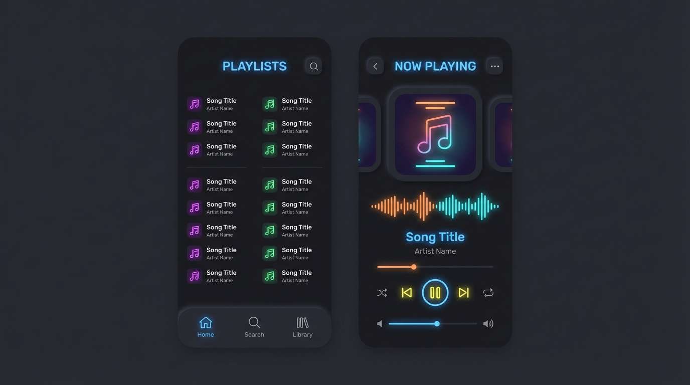
Can I use sky blue for dark mode?
Yes—use sky blue as an accent on near-black surfaces and keep large areas dark for comfort. Palettes like Midnight Pier are designed for high-contrast highlights, toggles, and charts. -
How can I generate images that match my sky blue color scheme?
Use an AI image generator and specify “palette-inspired colors” plus the design type (poster, UI, packaging). Media.io Text to Image makes it easy to iterate with prompts and keep a consistent look across assets.
Next: Ocean Color Palette


