Dark academia palettes blend deep shadows with paper-soft highlights, creating a look that feels literary, vintage, and intentional.
Below are 23 curated dark academia color palette ideas (with HEX codes) you can use for branding, interiors, UI, print layouts, and social posts.
In this article
- Why Dark Academia Palettes Work So Well
-
- oxford library
- candlelit seminar
- velvet blazer
- parchment notes
- gothic courtyard
- espresso ink
- antique globe
- rainy quad
- tweed and tea
- mahogany desk
- dusty manuscript
- ink and ivy
- brass telescope
- midnight stacks
- stone chapel
- poetry society
- herbarium press
- leather satchel
- chalkboard lecture
- archivist blue
- cornflower margins
- old lecture hall
- thesis binding
- What Colors Go Well with Dark Academia?
- How to Use a Dark Academia Color Palette in Real Designs
- Create Dark Academia Palette Visuals with AI
Why Dark Academia Palettes Work So Well
Dark academia color schemes rely on grounded neutrals (ink blacks, espresso browns, charcoal grays) paired with paper-like creams and parchment beiges. That contrast feels readable, classic, and instantly “bookish.”
Because the palette family is naturally muted, it tends to look cohesive across mediums—print, UI, photography overlays, and interior styling—without fighting your typography or imagery.
Finally, these palettes carry built-in storytelling: materials like leather, wood, stone, and aged brass are easy to reference visually, which helps brands and creators communicate mood with fewer elements.
20+ Dark Academia Color Palette Ideas (with HEX Codes)
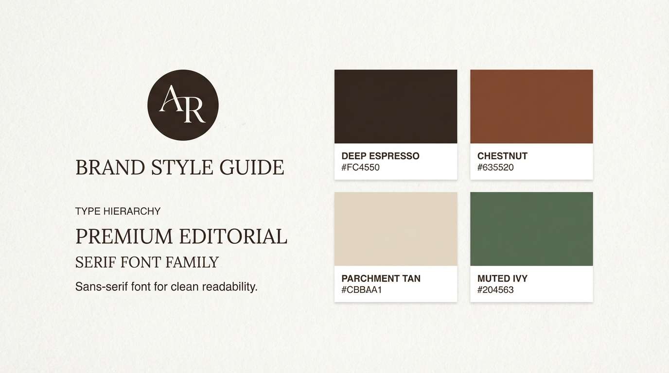
1) Oxford Library
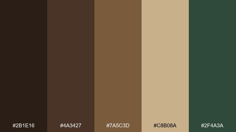
HEX: #2B1E16 #4A3427 #7A5C3D #C8B08A #2F4A3A
Mood: scholarly, warm, grounded
Best for: brand style guide and logo system
Scholarly and warm, it feels like worn leather bindings, oak shelves, and a faint trace of dust in sunbeams. Use the deep browns for headers and marks, and let the parchment tan carry backgrounds and negative space. The muted green works as a restrained accent for seals, buttons, or highlights. Pair with classic serif typography and generous spacing for a timeless finish.
Image example of oxford library generated using media.io
Media.io is an online AI studio for creating and editing video, image, and audio in your browser.

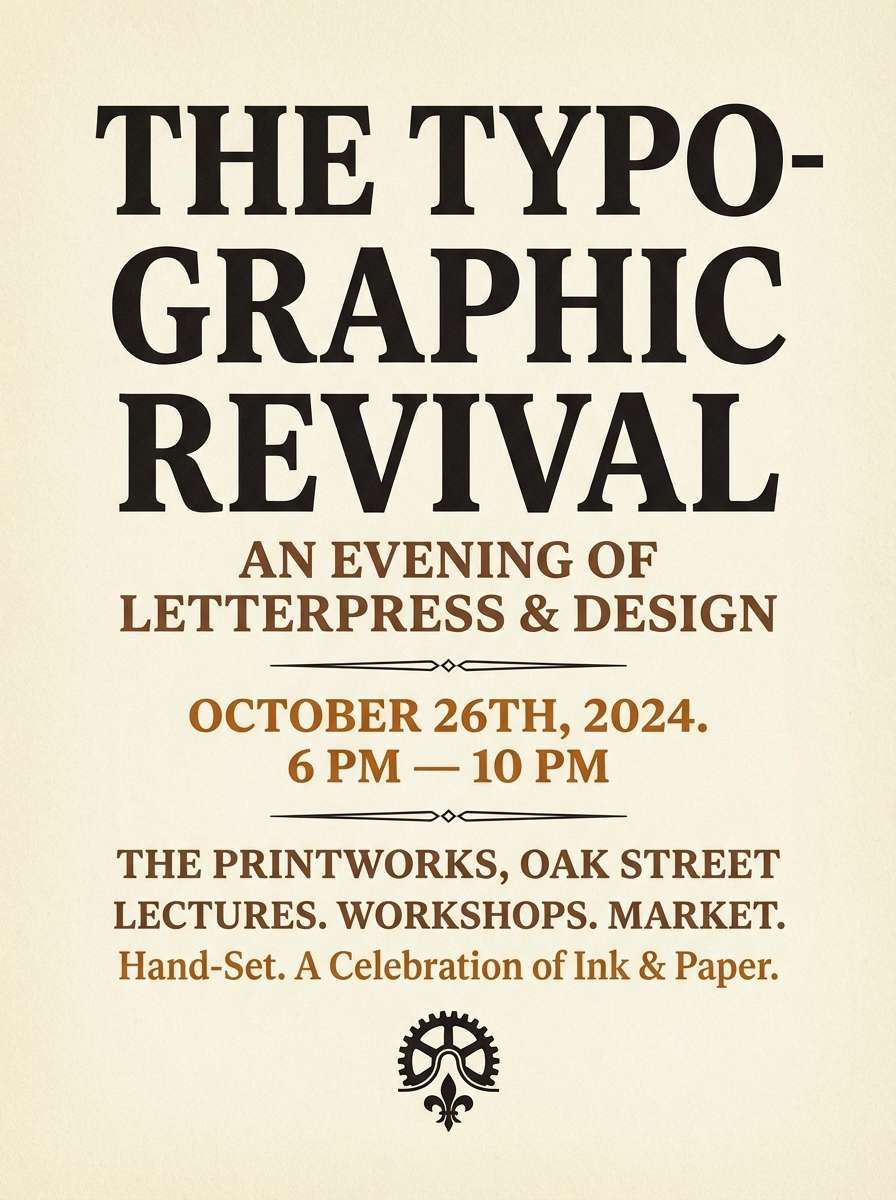
2) Candlelit Seminar
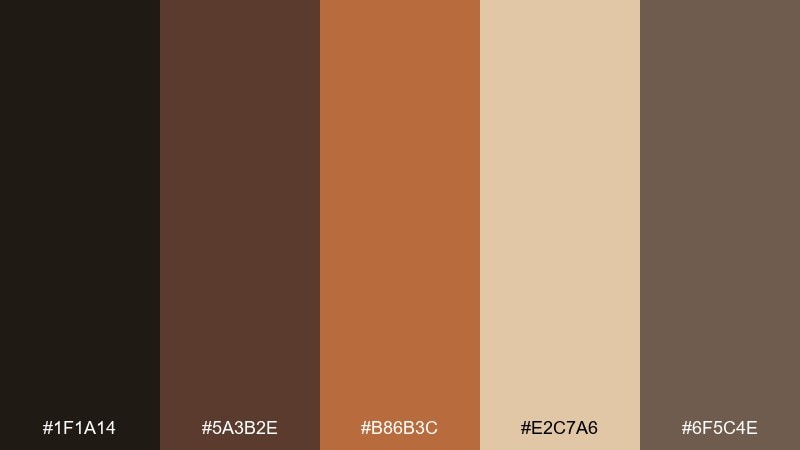
HEX: #1F1A14 #5A3B2E #B86B3C #E2C7A6 #6F5C4E
Mood: intimate, amber, conversational
Best for: event flyer poster
Intimate and amber-toned, it brings to mind candle wax, late debates, and warm light on handwritten notes. The burnt orange reads best as a focal element for titles, dates, and callouts. Keep the near-black and taupe for body text and supporting blocks, then use the soft cream to prevent the layout from feeling heavy. A subtle grain texture makes the poster feel printed and period-appropriate.
Image example of candlelit seminar generated using media.io
3) Velvet Blazer
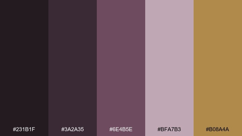
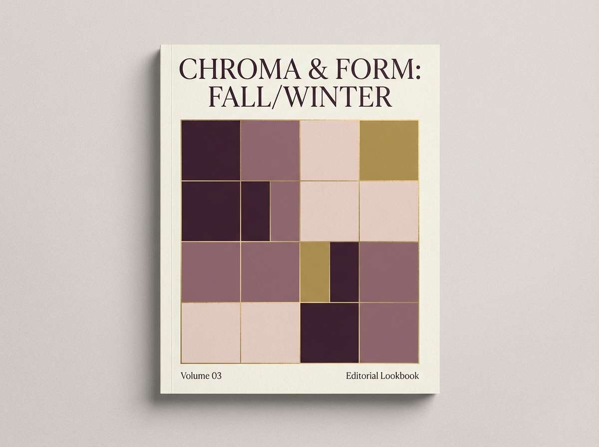
HEX: #231B1F #3A2A35 #6E4B5E #BFA7B3 #B08A4A
Mood: dramatic, refined, tactile
Best for: fashion lookbook cover
Dramatic and refined, these tones evoke plum velvet, soft powder, and a glint of old brass. Use the dark aubergine shades for large fields and photography frames, then pull the mauve and blush for captions and dividers. The antique gold is best as a sparing highlight on rules, icons, or a foil-style title. Keep contrast crisp so the purples stay rich rather than muddy.
Image example of velvet blazer generated using media.io
4) Parchment Notes
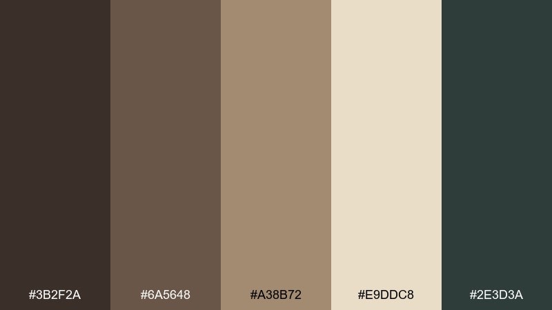
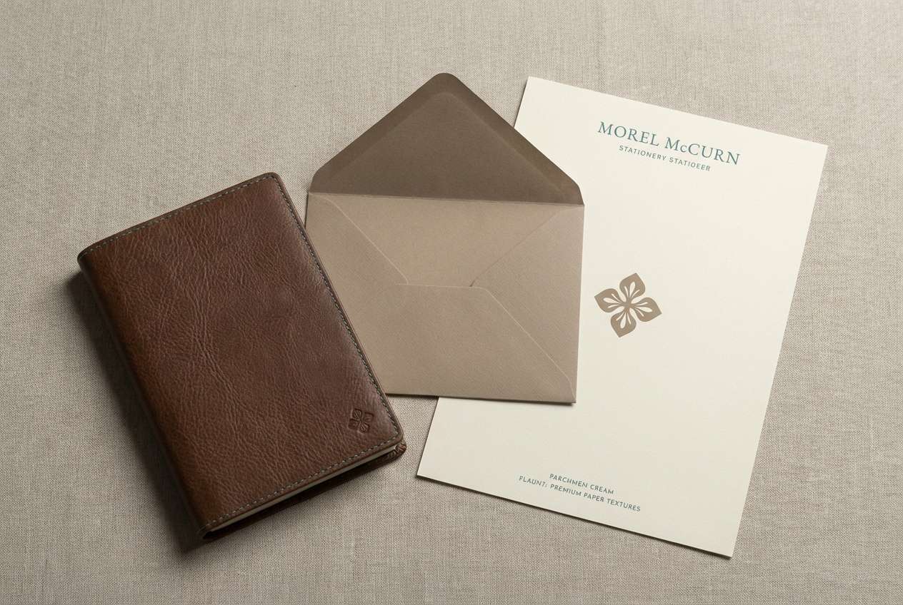
HEX: #3B2F2A #6A5648 #A38B72 #E9DDC8 #2E3D3A
Mood: soft, vintage, studious
Best for: notebook and stationery set
Soft and vintage, it suggests creamy paper, graphite shadows, and tidy margins. The pale parchment is ideal for main surfaces, while the mid browns add structure for covers, borders, and labels. A muted teal-green gives a smart academic accent without feeling bright. Add a tiny repeating rule pattern to reinforce the stationery feel.
Image example of parchment notes generated using media.io
5) Gothic Courtyard
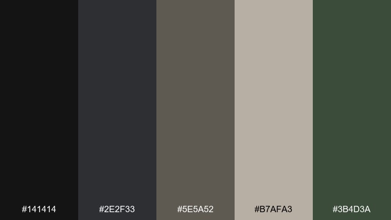
HEX: #141414 #2E2F33 #5E5A52 #B7AFA3 #3B4D3A
Mood: stone-cool, quiet, atmospheric
Best for: architecture blog hero banner
Stone-cool and quiet, it feels like shadowed arches, wet steps, and ivy against old walls. Use the near-black and slate for strong contrast in headers and navigation. The warm greige and pale stone keep content areas readable without losing the mood. Let the green show up in small interactive states like links and tags to mimic ivy creeping in.
Image example of gothic courtyard generated using media.io
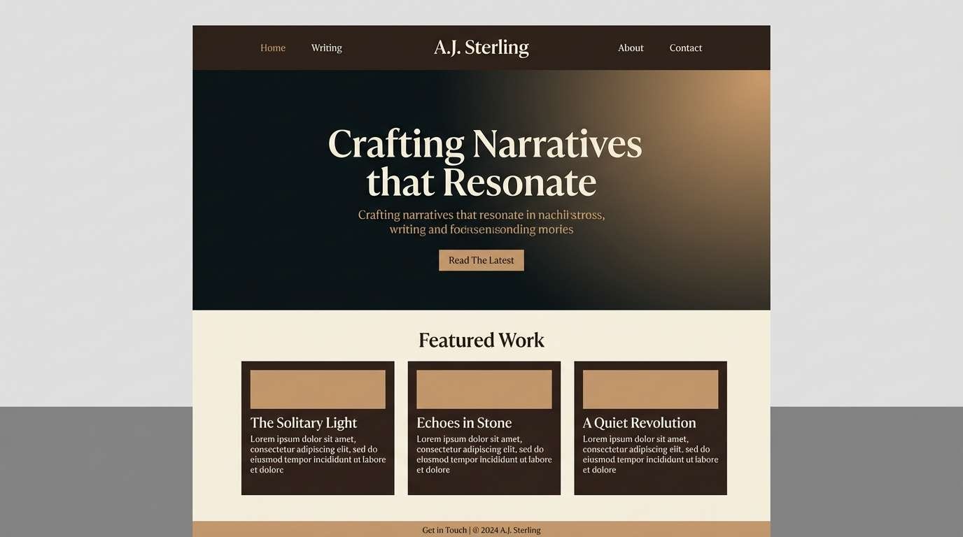
6) Espresso Ink
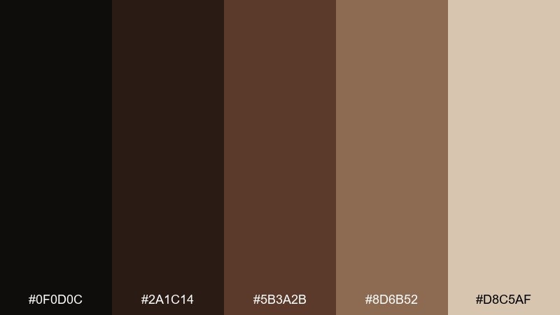
HEX: #0F0D0C #2A1C14 #5B3A2B #8D6B52 #D8C5AF
Mood: bold, inky, high-contrast
Best for: writer portfolio website UI
Bold and inky, it reads like fresh espresso, fountain pen strokes, and crisp margins. This dark academia color scheme works best with big type, generous line-height, and clear hierarchy. Use the near-black for headers and nav, and reserve the lighter tan for cards and reading areas. A single warm brown accent on links keeps the interface literary rather than techy.
Image example of espresso ink generated using media.io
7) Antique Globe
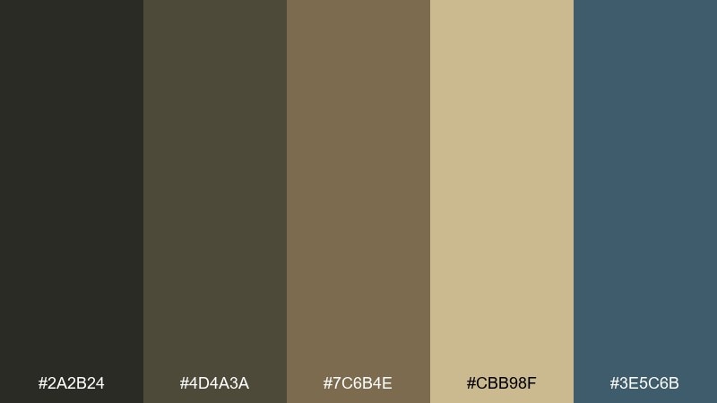
HEX: #2A2B24 #4D4A3A #7C6B4E #CBB98F #3E5C6B
Mood: curious, worldly, timeworn
Best for: travel journal cover design
Curious and timeworn, it calls up sepia maps, brass meridians, and a quiet blue ocean tint. Put the sandy golds on titles and ornamental lines, while the darker olive tones anchor the cover. The muted blue is perfect for a compass rose or small stamp detail without breaking the vintage vibe. Keep ornamentation minimal so it feels collected, not cluttered.
Image example of antique globe generated using media.io
8) Rainy Quad
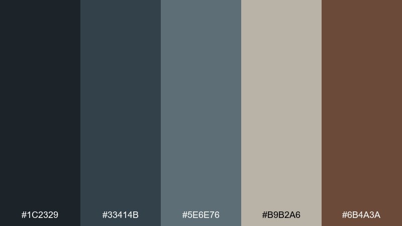
HEX: #1C2329 #33414B #5E6E76 #B9B2A6 #6B4A3A
Mood: cool, reflective, slightly melancholic
Best for: moody social media carousel
Cool and reflective, it feels like rain on stone, overcast skies, and a warm coat collar. Use the blue-grays as the base for panels and typography, then bring in the soft oatmeal for breathing room. The chestnut brown works best as a recurring accent for numbers, bullets, or small icons. Add subtle gradients to mimic mist without washing out readability.
Image example of rainy quad generated using media.io
9) Tweed and Tea
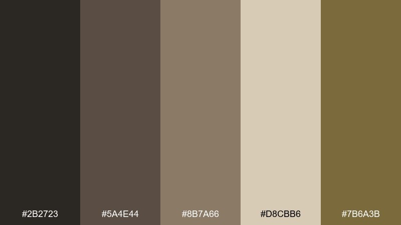
HEX: #2B2723 #5A4E44 #8B7A66 #D8CBB6 #7B6A3B
Mood: cozy, rustic, nostalgic
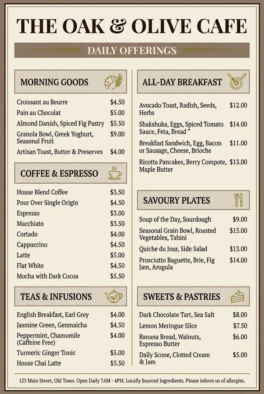
Best for: cafe menu design
Cozy and nostalgic, it evokes tweed jackets, tea steam, and wooden tables worn smooth. Keep the darkest browns for headings and section dividers, and let the creamy beige carry the menu body for legibility. The mustard-olive makes a great accent for prices, icons, or special items. If you add illustrations, stick to simple line art to preserve the rustic calm.
Image example of tweed and tea generated using media.io
10) Mahogany Desk
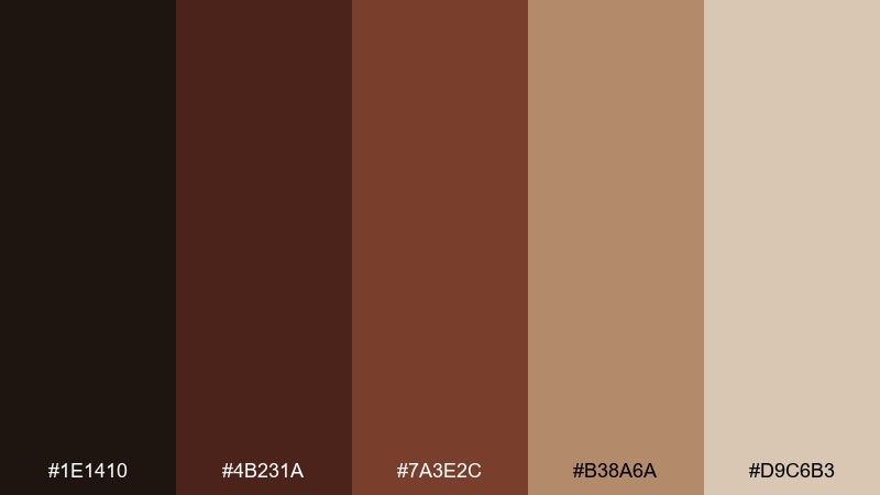
HEX: #1E1410 #4B231A #7A3E2C #B38A6A #D9C6B3
Mood: rich, traditional, confident
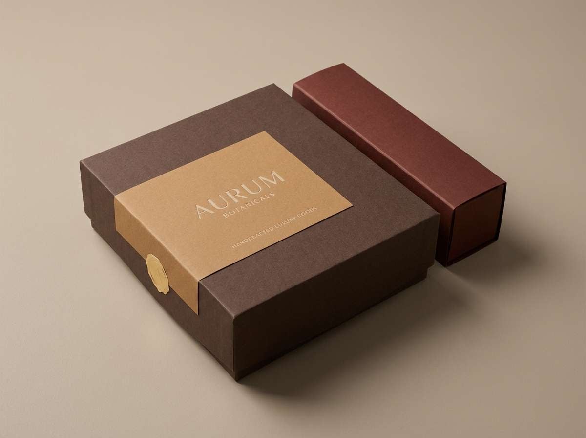
Best for: premium product packaging
Rich and traditional, it suggests polished mahogany, leather blotters, and warm lamplight on wood grain. Use the deep brown as the primary pack color for a premium feel, then layer the reddish mahogany for depth. The lighter tan and beige are best for label areas, ingredient lists, and quiet space around logos. A matte finish with a small spot gloss detail makes the palette look even more luxurious.
Image example of mahogany desk generated using media.io
11) Dusty Manuscript
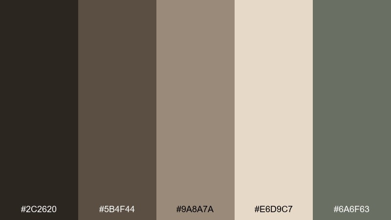
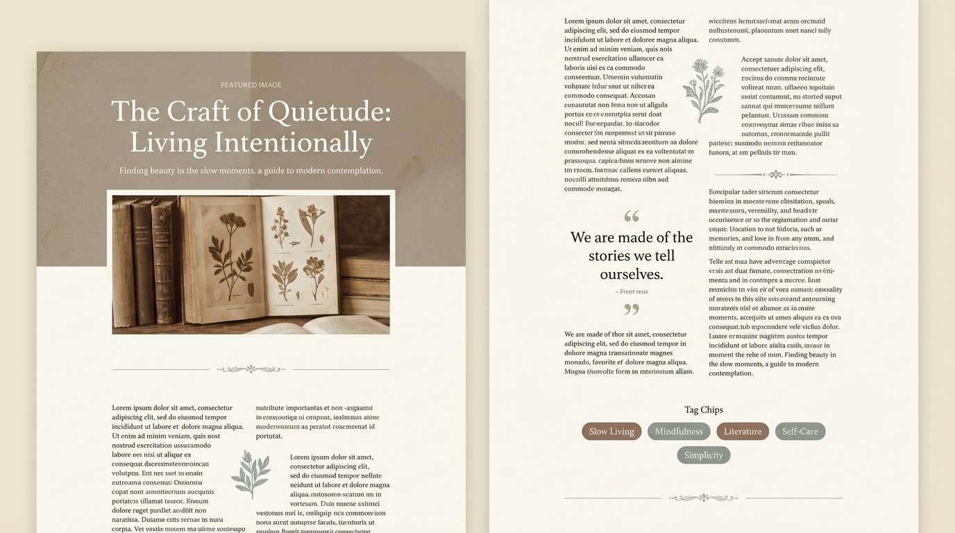
HEX: #2C2620 #5B4F44 #9A8A7A #E6D9C7 #6A6F63
Mood: faded, gentle, archival
Best for: blog article template
Faded and archival, it feels like a well-loved manuscript with softened edges and quiet ink. Use the cream as the reading canvas, then introduce the warm taupes for sidebars, pull quotes, and section breaks. The desaturated sage-gray helps buttons and tags stand out without looking modern or glossy. Keep line lengths moderate to maintain that calm, library-like rhythm.
Image example of dusty manuscript generated using media.io
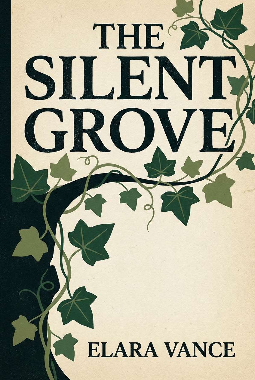
12) Ink and Ivy
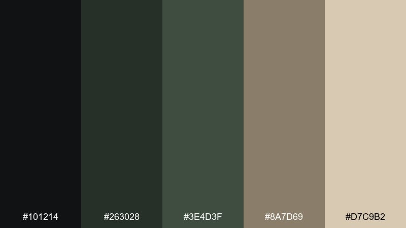
HEX: #101214 #263028 #3E4D3F #8A7D69 #D7C9B2
Mood: moody, botanical, disciplined
Best for: book cover design
Moody and botanical, it conjures ink-dark pages and ivy climbing a campus wall. These dark academia color combinations shine on book covers where contrast matters from a distance. Use the near-black for the background, set the title in warm parchment, and add ivy greens for a single motif or border. A touch of beige texture can make the cover feel printed, not digital.
Image example of ink and ivy generated using media.io
13) Brass Telescope
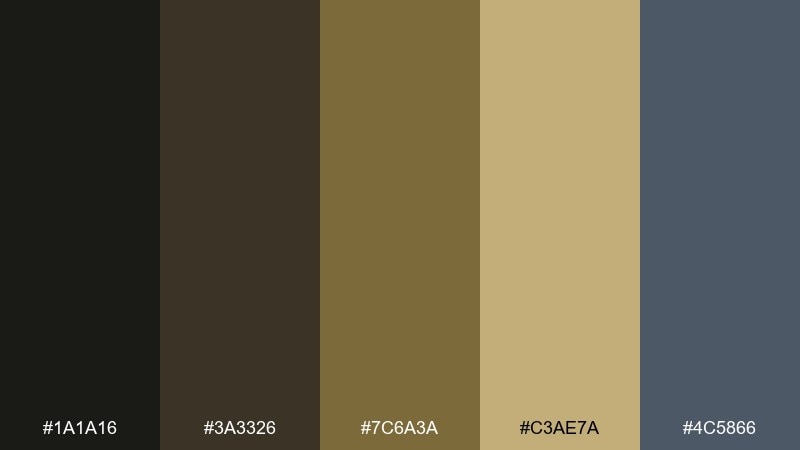
HEX: #1A1A16 #3A3326 #7C6A3A #C3AE7A #4C5866
Mood: curious, nocturnal, polished
Best for: museum exhibit poster
Curious and nocturnal, it recalls brass instruments, dark velvet skies, and quiet galleries after hours. Let the gold tones frame key information and icons, while the charcoal shades keep the poster grounded. The muted steel-blue works nicely for secondary headers or diagram lines. Try a thin border and plenty of negative space to make the metallic colors feel intentional, not loud.
Image example of brass telescope generated using media.io
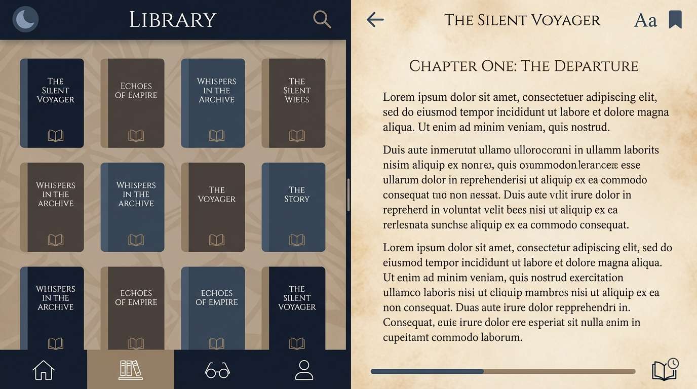
14) Midnight Stacks
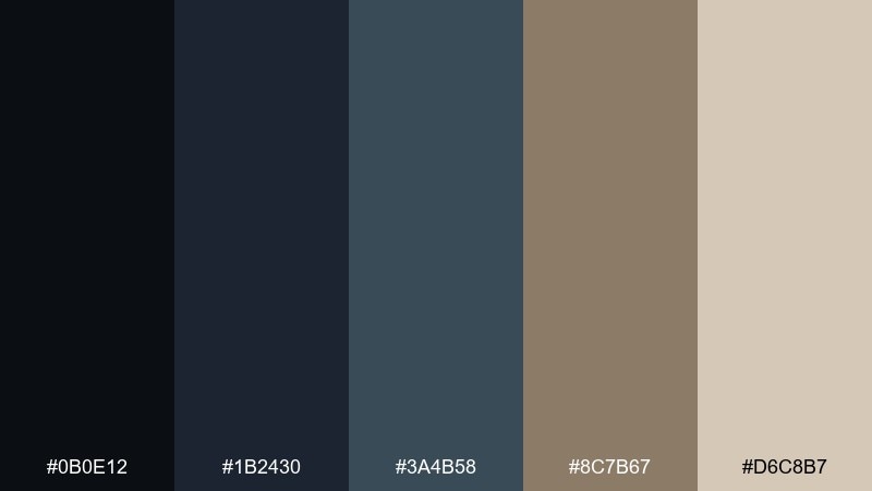
HEX: #0B0E12 #1B2430 #3A4B58 #8C7B67 #D6C8B7
Mood: nighttime, focused, cinematic
Best for: reading app UI
Nighttime and cinematic, it feels like stacks after closing and a single desk lamp in the distance. Use the deep navy-blacks for the main UI shell, then bring in the soft parchment for reading surfaces and controls. The muted blue-gray helps tabs and toolbars separate without harsh lines. Keep the warm taupe for highlights like bookmarks or progress states so the interface stays cozy.
Image example of midnight stacks generated using media.io
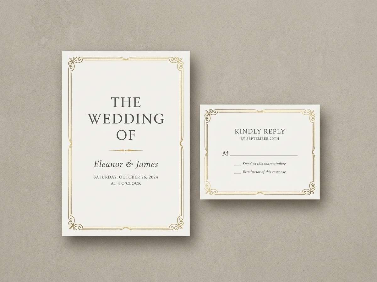
15) Stone Chapel
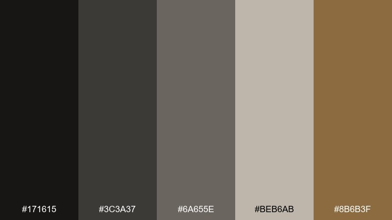
HEX: #171615 #3C3A37 #6A655E #BEB6AB #8B6B3F
Mood: solemn, historic, composed
Best for: wedding invitation suite
Solemn and historic, it suggests quiet stone, candle shadows, and a hint of aged gold. Use the light stone for the paper base, then set type in charcoal for elegant readability. The antique gold works best for a monogram, thin border, or small ornament rather than large blocks. Choose a classic serif and keep embellishments minimal for a chapel-like calm.
Image example of stone chapel generated using media.io
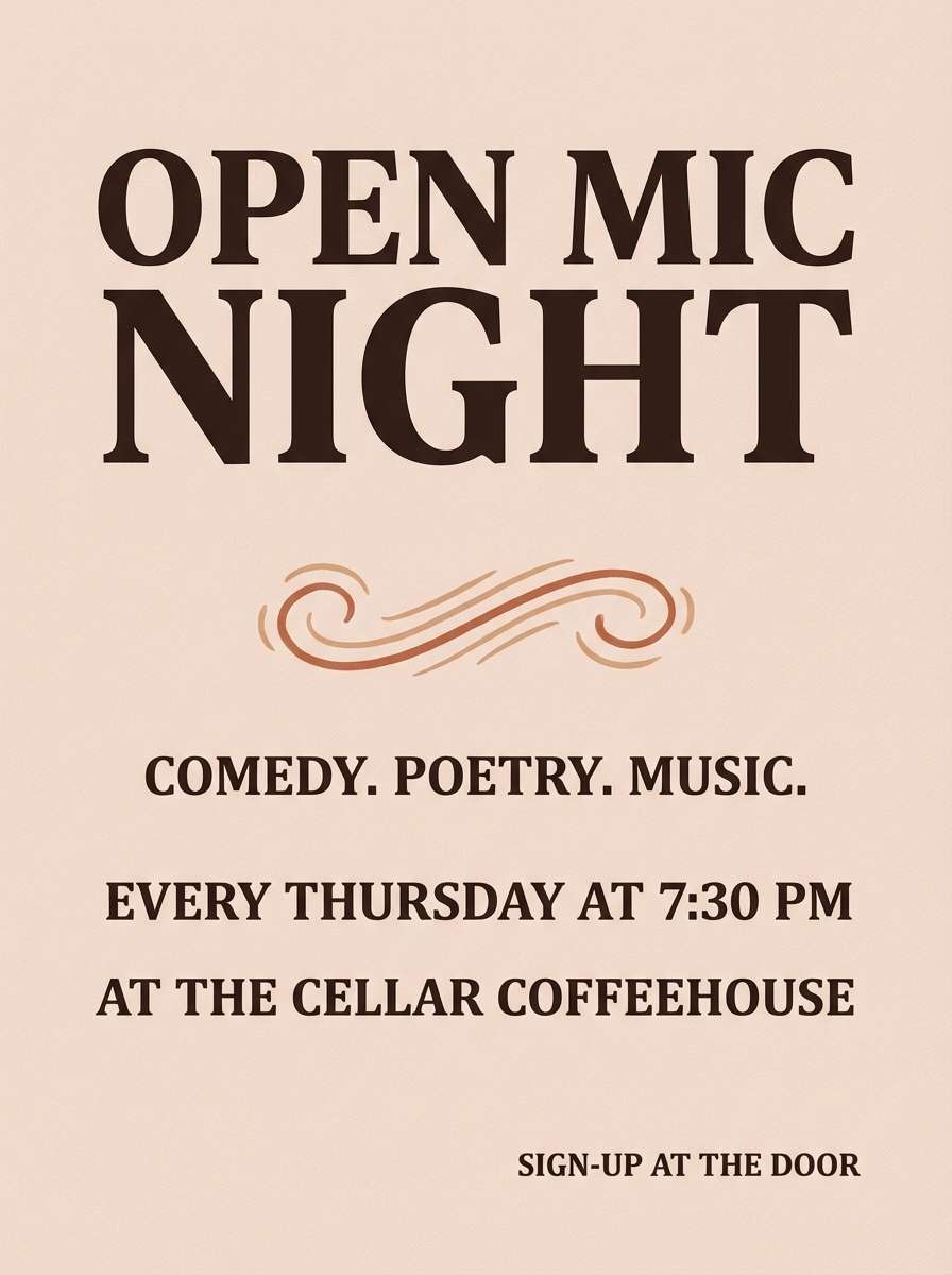
16) Poetry Society
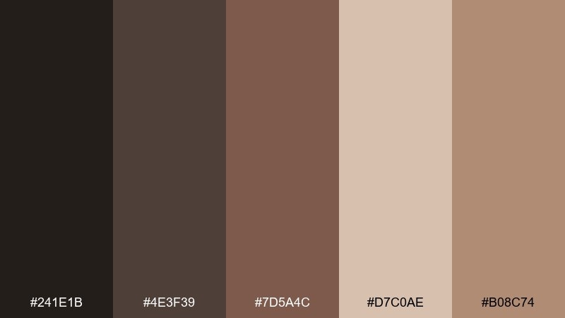
HEX: #241E1B #4E3F39 #7D5A4C #D7C0AE #B08C74
Mood: romantic, intimate, warm
Best for: open mic poster
Romantic and intimate, it feels like whispered poems, soft lamplight, and rose-brown ink. The deeper browns are great for bold headings, while the blush-beige keeps the layout inviting. Use the warm clay tone sparingly for emphasis on time and venue details. Add a subtle paper texture to make it feel like a poster pulled from a community board.
Image example of poetry society generated using media.io
17) Herbarium Press
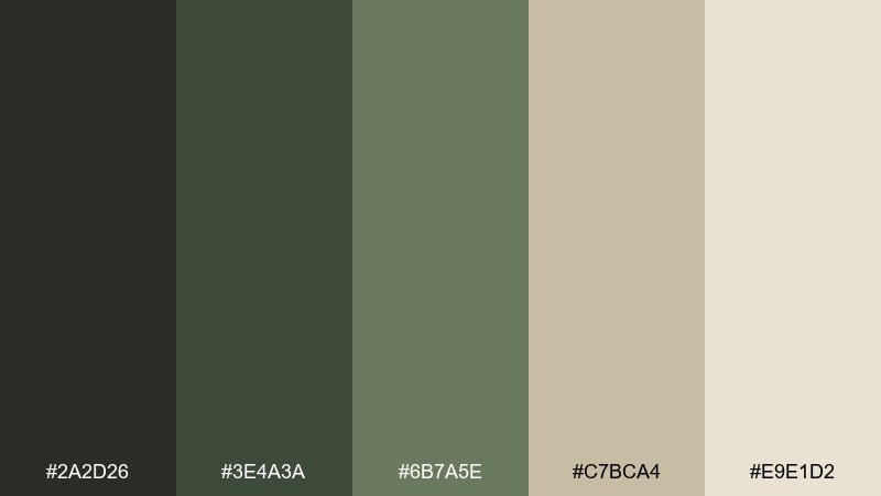
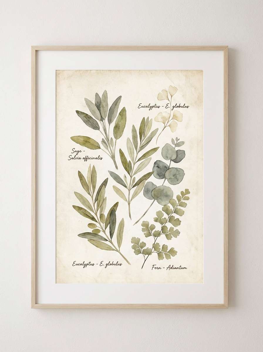
HEX: #2A2D26 #3E4A3A #6B7A5E #C7BCA4 #E9E1D2
Mood: natural, calm, archival
Best for: botanical art print
Natural and archival, it brings to mind pressed leaves, field notes, and calm green shadows. Let the creamy tones carry the paper look, then layer the sage and olive for stems, labels, and borders. The darkest green works best for small type and linework so it stays readable. Keep the illustration airy, with lots of blank space like a specimen sheet.
Image example of herbarium press generated using media.io
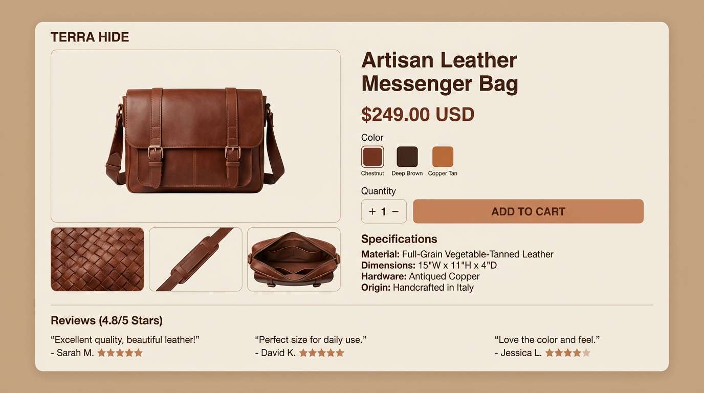
18) Leather Satchel
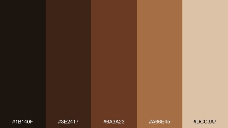
HEX: #1B140F #3E2417 #6A3A23 #A66E45 #DCC3A7
Mood: rugged, warm, classic
Best for: ecommerce product page UI
Rugged and warm, it evokes broken-in leather, stitched edges, and a well-packed satchel. Use the darkest brown for navigation and key CTAs, and keep the light beige for product descriptions and trust details. The coppery midtones add depth to badges, ratings, and price callouts. Favor simple product photography framing so the color story stays the hero.
Image example of leather satchel generated using media.io
19) Chalkboard Lecture
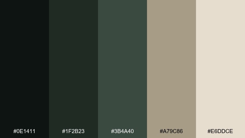
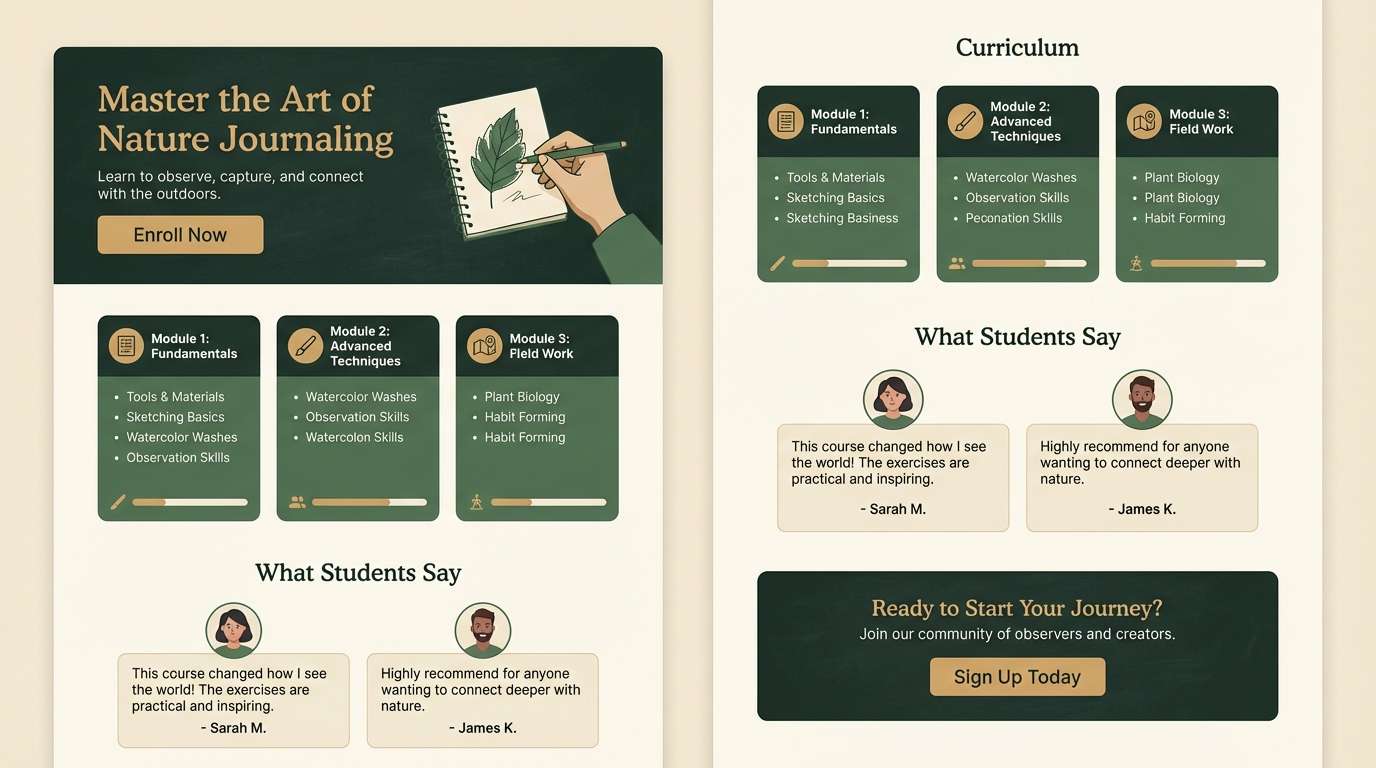
HEX: #0E1411 #1F2B23 #3B4A40 #A79C86 #E6DDCE
Mood: academic, structured, quiet
Best for: online course landing page
Academic and structured, it feels like a chalkboard after class with faint dust and tidy diagrams. The deep greens are ideal for headers and section blocks, while the soft cream keeps long-form content readable. Use the warm sand tone for badges, progress markers, and small icons. These pairings work especially well when you keep the UI minimal and typography-led.
Image example of chalkboard lecture generated using media.io
20) Archivist Blue
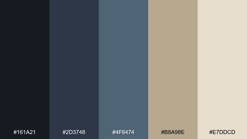
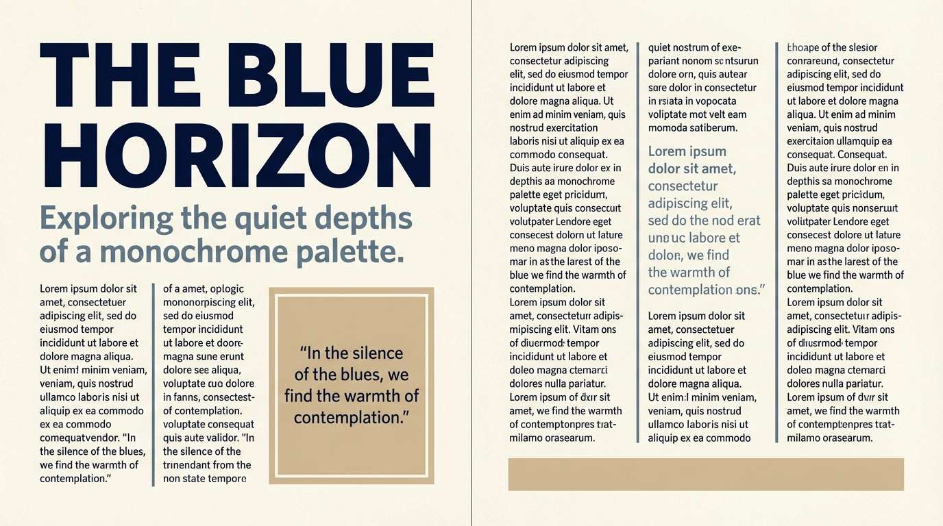
HEX: #161A21 #2D3748 #4F6474 #B8A98E #E7DDCD
Mood: cool, precise, quietly modern
Best for: editorial magazine spread
Cool and precise, it suggests blue-black ink, crisp citations, and calm editorial restraint. Build the grid with navy and slate for structure, then use the warm beige as a counterbalance for captions and whitespace. The soft cream keeps long blocks of text comfortable. For a modern academic edge, keep images monochrome and let the blue tones do the talking.
Image example of archivist blue generated using media.io
21) Cornflower Margins
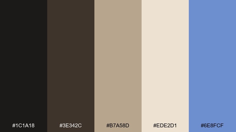
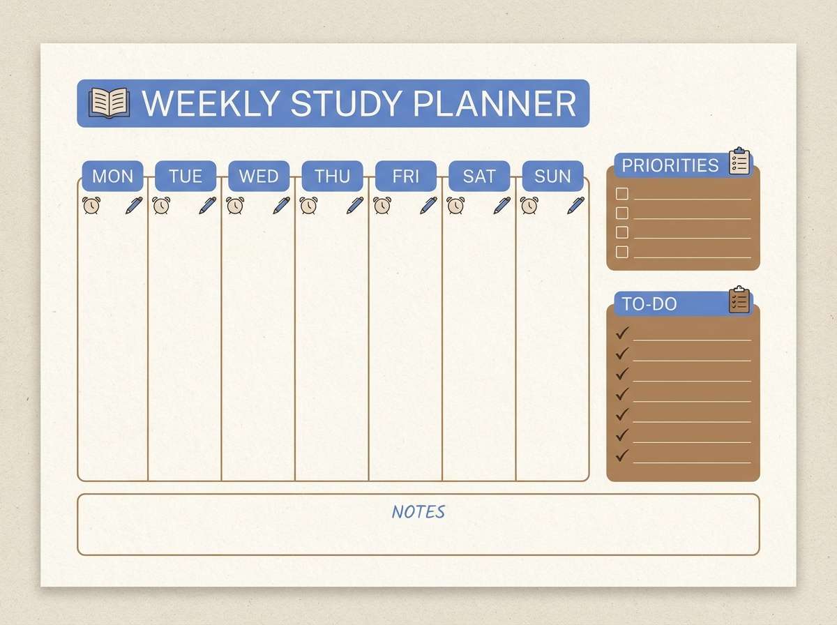
HEX: #1C1A18 #3E342C #B7A58D #EDE2D1 #6E8FCF
Mood: bookish, gentle, unexpectedly bright
Best for: study planner printable
Bookish and gentle, it feels like cream paper and pencil lines with a cornflower note tucked in the margin. These dark academia color combinations benefit from using the blue as a small, deliberate accent for headings, tabs, or priority markers. Keep the deep brown for text and structure, and let the light cream carry most of the page. Tip: limit the blue to one system role so the planner stays calm and cohesive.
Image example of cornflower margins generated using media.io
22) Old Lecture Hall
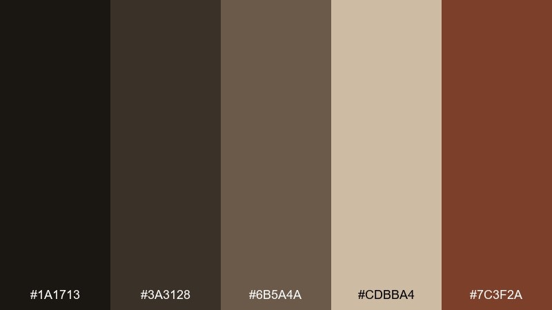
HEX: #1A1713 #3A3128 #6B5A4A #CDBBA4 #7C3F2A
Mood: warm, nostalgic, intellectual
Best for: podcast cover art
Warm and nostalgic, it evokes creaking seats, old wood paneling, and notes scribbled fast. The dark brown anchors the cover and keeps text readable on small screens. Use the brick-red as a single accent for the show name or a small emblem, and let the beige soften the overall contrast. For a crisp finish, keep the composition simple with one bold title and one subtle texture.
Image example of old lecture hall generated using media.io

23) Thesis Binding
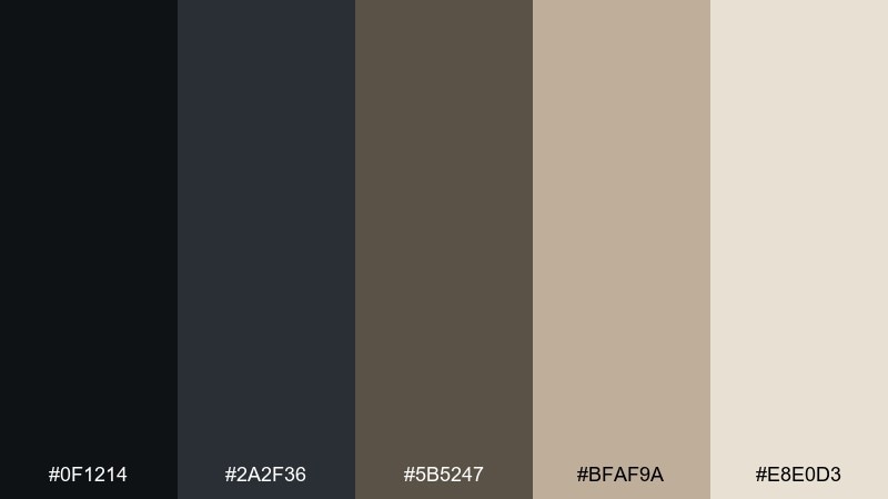
HEX: #0F1214 #2A2F36 #5B5247 #BFAF9A #E8E0D3
Mood: formal, crisp, understated
Best for: professional document template
Formal and understated, it recalls a thesis bound in dark cloth with clean, confident typography. Use the near-black and graphite for titles, rules, and numbering, and keep the warm beige for page backgrounds to reduce glare. The mid greige is ideal for tables and callout boxes. If you want the full dark academia color palette feel, add one thin header rule and keep the rest minimal.
Image example of thesis binding generated using media.io
What Colors Go Well with Dark Academia?
Dark academia pairs best with warm neutrals (espresso, walnut, camel, parchment, oatmeal) because they reference materials like leather, wood, and paper. These tones keep the mood cozy instead of harsh.
Muted greens and blue-grays (ivy, sage, slate, steel blue) add a scholarly coolness that still feels period-appropriate. Use them as restrained accents for links, tabs, stamps, or small motifs.
If you want a single “surprise” highlight, choose an aged-metal tone (antique gold, brass) or a dusty blue (like cornflower) and limit it to one UI role or one print element for cohesion.
How to Use a Dark Academia Color Palette in Real Designs
Start with a readable foundation: set backgrounds in cream/parchment, then use near-black or deep brown for text. This preserves the dark academia mood while keeping long-form layouts comfortable.
Designers get the strongest result when they assign each color a job (primary, background, support, accent, highlight) and stick to it across components like headings, buttons, dividers, and tags.
Texture helps: subtle grain, paper noise, or a soft vignette can make digital work feel printed and archival—just keep it light so contrast and accessibility don’t suffer.
Create Dark Academia Palette Visuals with AI
If you want to preview these palettes on posters, covers, UI mockups, or brand boards, you can generate consistent visuals from prompts and iterate fast.
With Media.io, you can turn a palette idea into styled image examples—then refine typography, layout, and accent color usage until it feels authentically dark academia.
Dark Academia Color Palette FAQs
-
What defines a dark academia color palette?
Most dark academia palettes are built on deep neutrals (near-black, espresso, charcoal) balanced with paper tones (cream, parchment, beige), plus a muted accent like ivy green, slate blue, or antique gold. -
Is dark academia the same as “moody neutrals”?
They overlap, but dark academia usually leans more vintage and scholarly: warmer browns, parchment highlights, and classic accent colors inspired by libraries, campuses, and archival materials. -
What accent color works best with dark academia?
Muted ivy/sage greens and steel/slate blues are the most natural fits. If you want a brighter accent, use it sparingly—cornflower blue works well for small labels, tabs, or priority markers. -
How do I keep dark academia designs readable?
Use cream or warm beige for large reading areas, and reserve the darkest colors for headings, navigation, and key frames. Maintain strong contrast for body text and avoid stacking multiple dark tones together. -
Can I use dark academia colors for UI design?
Yes—dark shells (nav, header, footer) with parchment reading surfaces work especially well for writing apps, portfolios, and editorial layouts. Keep accent colors limited to links and states. -
What typography matches dark academia palettes?
Classic serifs, editorial-inspired type systems, and restrained small caps pair beautifully. Combine a serif headline with a highly readable serif/sans for body text and keep spacing generous. -
How can I generate dark academia palette mockups quickly?
Use a text-to-image tool to render brand boards, posters, covers, or UI samples from a consistent prompt, then iterate by swapping one accent color at a time to keep the look cohesive.
Next: Cornflower Color Palette
