

Dark pastel blue is one of those rare shades that feels modern and calm at the same time. It brings the stability of navy, but with a softer, more approachable edge that works beautifully in digital design and interiors.
Below are 20+ dark pastel blue color palette ideas (with HEX codes), plus practical tips for pairing, hierarchy, and real-world use.
In this article
- Why Dark Pastel Blue Palettes Work So Well
-
- coastal dusk
- quiet harbor
- bluebell smoke
- slate and sand
- rainy window
- vintage sailcloth
- nordic nightfall
- ink and blush
- tea room blue
- gallery wall
- mountain haze
- soft tech ui
- candlelit navy
- stormy botanicals
- bookshop calm
- ceramic blue
- minimal workspace
- winter wool
- retro transit
- evening orchid
- cloudy denim
- lantern festival
- orchard twilight
- What Colors Go Well with Dark Pastel Blue?
- How to Use a Dark Pastel Blue Color Palette in Real Designs
- Create Dark Pastel Blue Palette Visuals with AI
Why Dark Pastel Blue Palettes Work So Well
Dark pastel blue sits in a “safe” visual zone: it’s muted enough to feel calm, but deep enough to create contrast and structure. That makes it ideal for layouts that need clarity (navigation, titles, UI components) without the harshness of pure navy or black.
Because it’s slightly desaturated, it pairs smoothly with warm neutrals (cream, sand, taupe) and also with cool companions (misty blue, slate, soft gray). This flexibility is why muted blue color palettes show up everywhere from modern branding to interior design.
In practice, dark pastel blue also helps maintain a premium, modern tone. It reads as intentional and refined—perfect when you want trust, quiet confidence, and a contemporary feel.
20+ Dark Pastel Blue Color Palette Ideas (with HEX Codes)
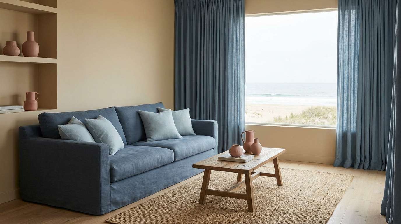
1) Coastal Dusk
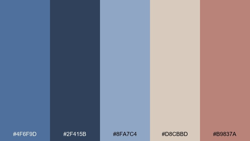
HEX: #4f6f9d #2f415b #8fa7c4 #d8cbbd #b9837a
Mood: calm, airy, nostalgic
Best for: beach house living room interior
Calm twilight blues and sun-warmed neutrals evoke a quiet shoreline after sunset. Use the deep denim tone for feature walls or large textiles, then soften it with misty blue accents. Sandy beige keeps the look relaxed, while the muted clay rose adds a lived-in warmth. Tip: repeat the rose tone in small decor pieces to keep the room from feeling too cool.
Image example of coastal dusk generated using media.io
Media.io is an online AI studio for creating and editing video, image, and audio in your browser.

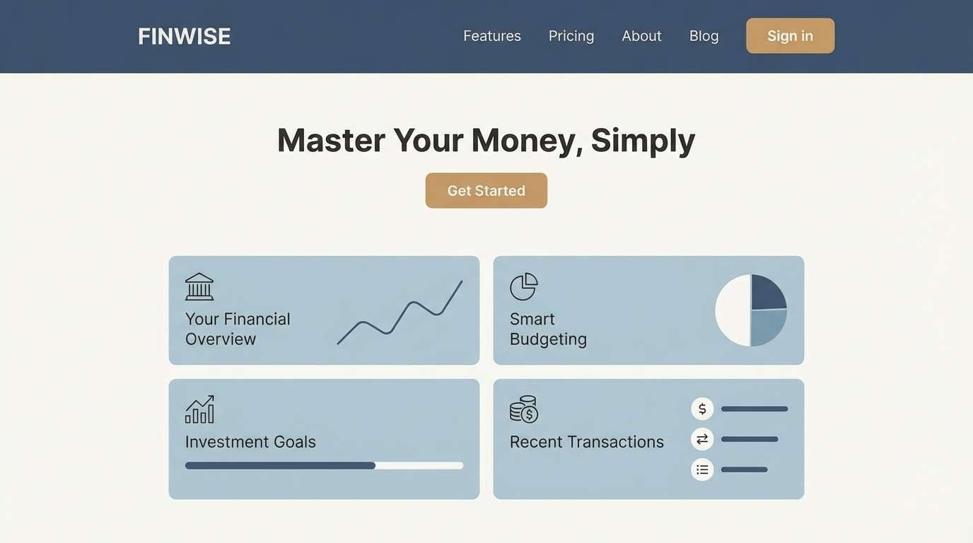
2) Quiet Harbor
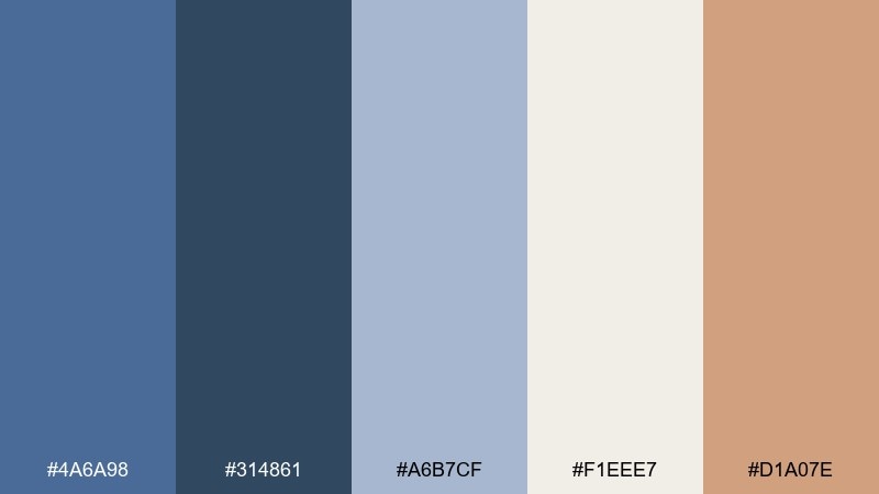
HEX: #4a6a98 #314861 #a6b7cf #f1eee7 #d1a07e
Mood: clean, professional, reassuring
Best for: financial app landing page UI
Steady harbor blues feel dependable, like a well-run dashboard at a glance. These dark pastel blue color combinations work best when the deepest tone anchors navigation and headings. Use the icy blue for cards and dividers, and keep the off-white background spacious for readability. Tip: reserve the warm tan as a single call-to-action color so conversion moments stand out.
Image example of quiet harbor generated using media.io
3) Bluebell Smoke
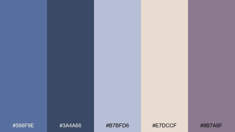
HEX: #566f9e #3a4a66 #b7bfd6 #e7dccf #8b7a8f
Mood: soft, romantic, thoughtful
Best for: spring wedding invitation design
Smoky bluebell tones read like pressed flowers tucked into an old book. Pair the dark blue with warm parchment for elegant contrast, then sprinkle in lavender-gray for a gentle, romantic note. Use the lighter blue as a secondary background wash to keep the layout airy. Tip: print with matte paper and minimal foil so the muted shades stay sophisticated.
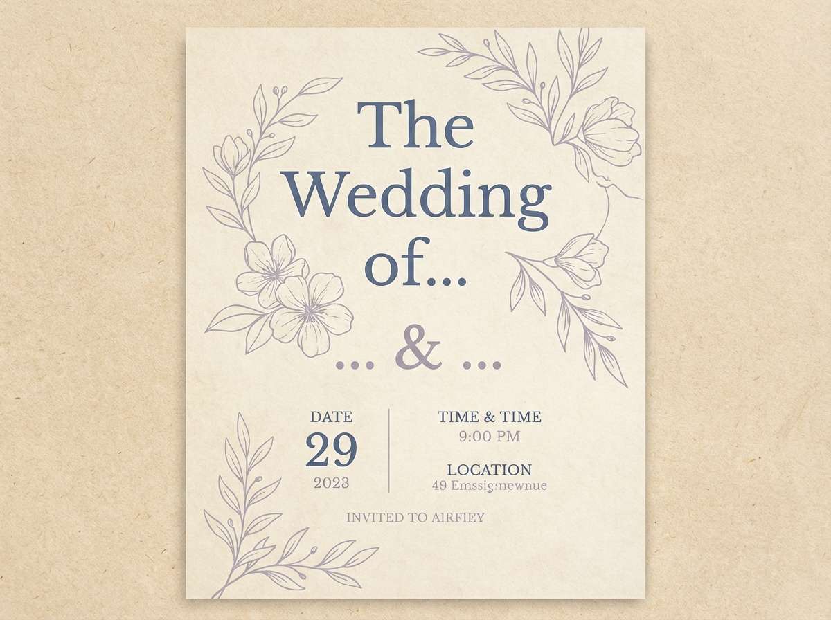
Image example of bluebell smoke generated using media.io
4) Slate and Sand
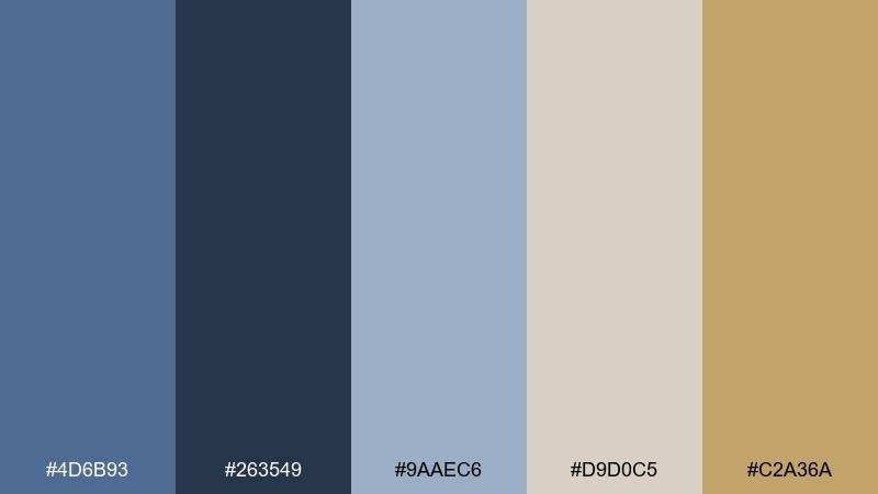
HEX: #4d6b93 #263549 #9aaec6 #d9d0c5 #c2a36a
Mood: grounded, modern, architectural
Best for: real estate brochure layout
Stone-slate blues meet sandy neutrals for an architectural, gallery-like feel. Keep the darkest shade for titles and section dividers, and let the pale blue support photo captions or icons. Sand and warm gold tones add an upscale touch without feeling flashy. Tip: use lots of whitespace so the palette reads premium and calm.
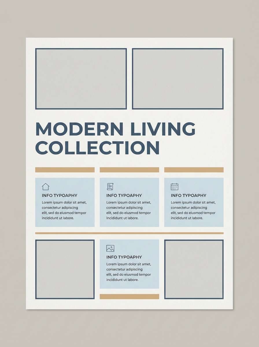
Image example of slate and sand generated using media.io
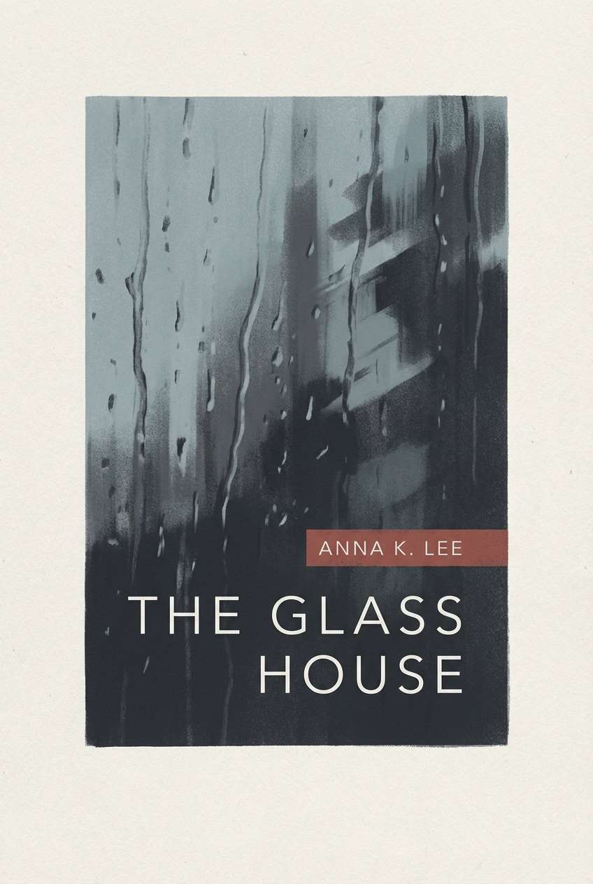
5) Rainy Window
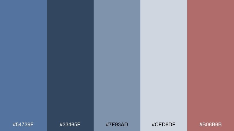
HEX: #54739f #33465f #7f93ad #cfd6df #b06b6b
Mood: moody, cozy, introspective
Best for: book cover design
A rainy-day blue set with soft grays feels like looking through glass streaked with mist. Use the deeper tones for the title and spine so it stays readable from a distance. The gentle gray-blue range supports atmospheric illustration or photography without overpowering it. Tip: add the muted brick accent sparingly for one focal element, like the author name or a small motif.
Image example of rainy window generated using media.io
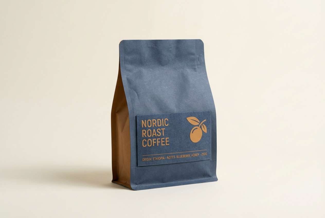
6) Vintage Sailcloth
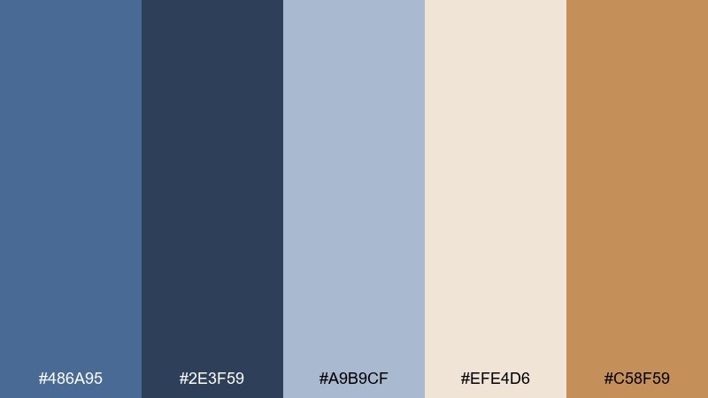
HEX: #486a95 #2e3f59 #a9b9cf #efe4d6 #c58f59
Mood: classic, warm, sun-faded
Best for: coffee bag packaging
Sun-faded sailcloth blues and creamy paper tones give a handcrafted, heritage vibe. A dark pastel blue color palette like this works beautifully for premium packaging when you want quiet confidence. Use the navy-leaning shade for bold type, then let the cream lead the background for a clean shelf presence. Tip: add the toasted caramel as a small seal, stripe, or roast indicator for quick scanning.
Image example of vintage sailcloth generated using media.io
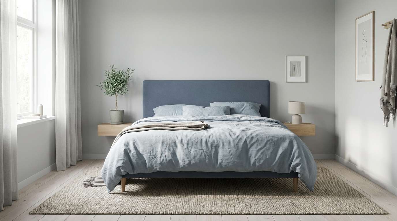
7) Nordic Nightfall
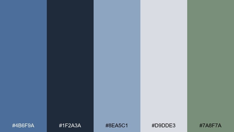
HEX: #4b6f9a #1f2a3a #8ea5c1 #d9dde3 #7a8f7a
Mood: minimal, cool, serene
Best for: scandinavian bedroom styling
Nordic night blues feel crisp and quiet, like winter light in a tidy room. Use the near-charcoal blue for one anchor element such as a headboard or rug, then layer pale steel blue in bedding. Light gray keeps everything airy while the muted sage adds a natural counterpoint. Tip: stick to simple textures like linen and wool so the tones do the work.
Image example of nordic nightfall generated using media.io
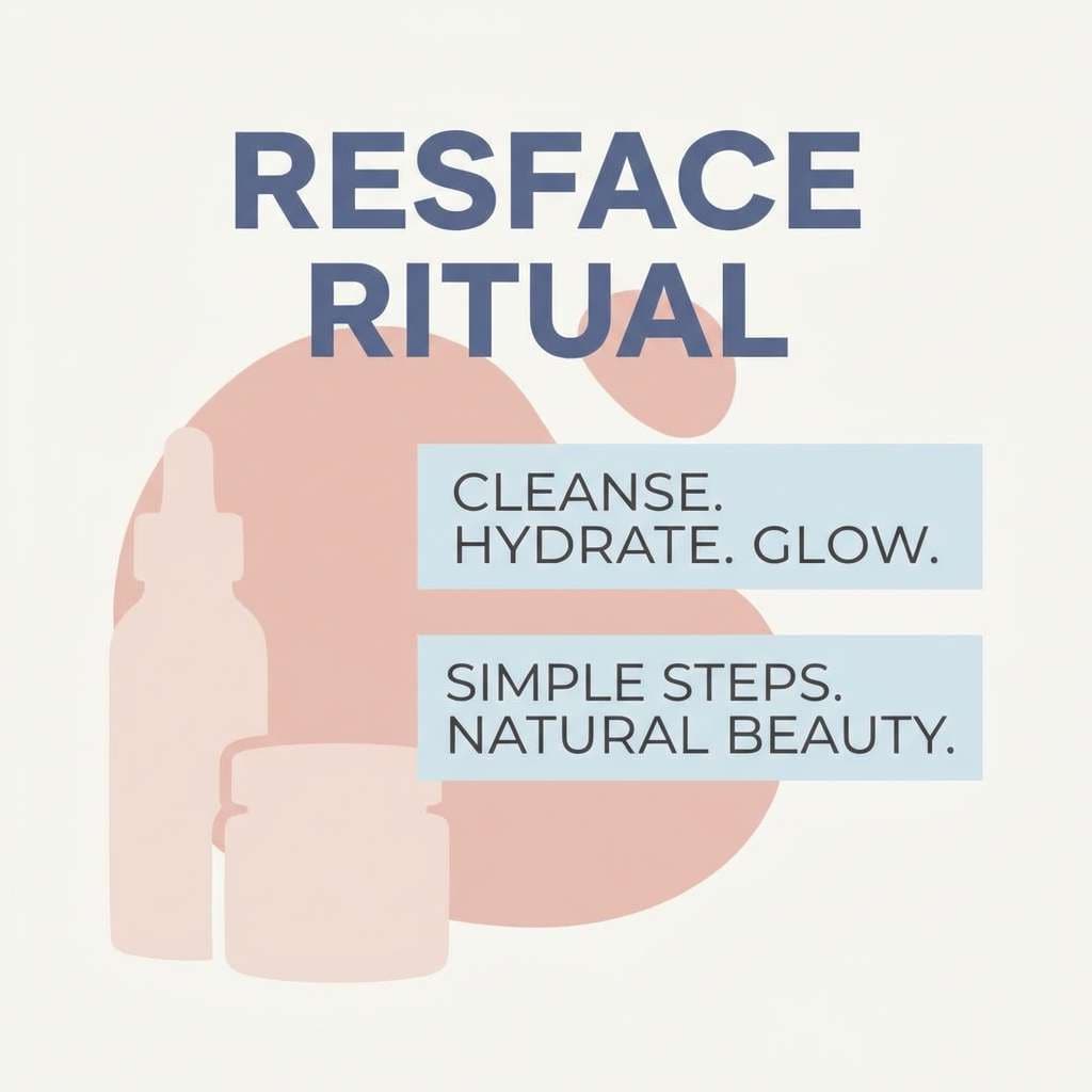
8) Ink and Blush
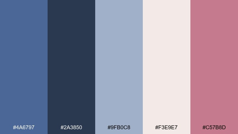
HEX: #4a6797 #2a3850 #9fb0c8 #f3e9e7 #c57b8d
Mood: stylish, intimate, modern romantic
Best for: beauty brand social post
Inky blue and soft blush read like satin and lipstick in a dimly lit studio. Let the dark blue carry the headline for high contrast, then use blush blocks to frame product messaging. The pale blue supports secondary text and keeps the layout from turning too sweet. Tip: use a single blush gradient rather than multiple pinks to stay refined.
Image example of ink and blush generated using media.io
9) Tea Room Blue
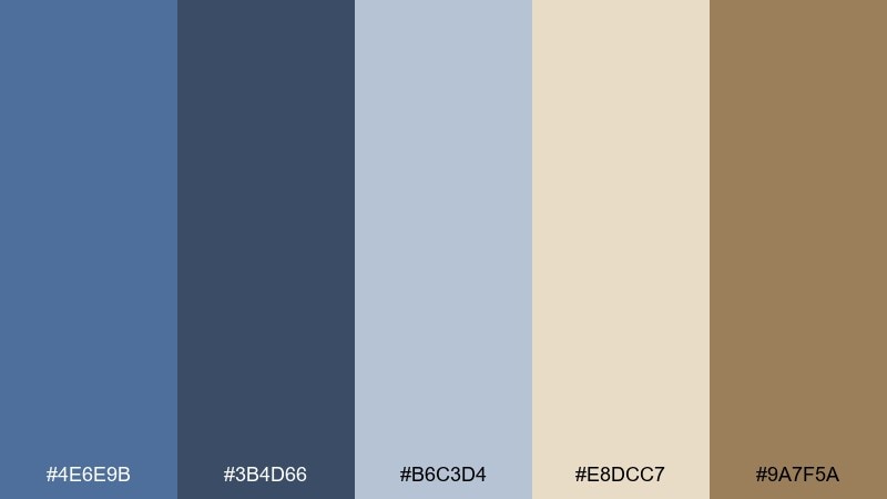
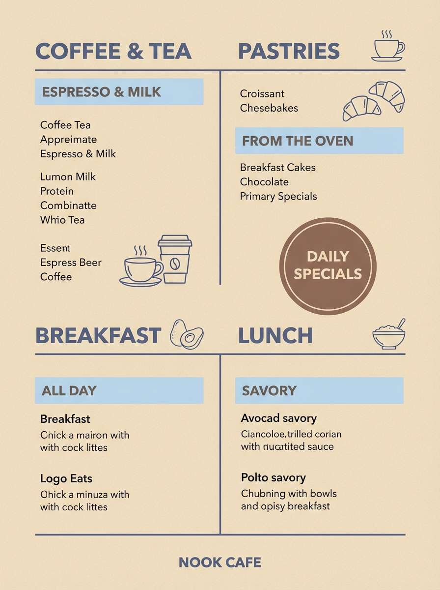
HEX: #4e6e9b #3b4d66 #b6c3d4 #e8dcc7 #9a7f5a
Mood: welcoming, vintage, understated
Best for: cafe menu design
Muted tea-room blues with creamy oat tones feel like porcelain cups and quiet conversation. Use the deep blue for section headers and pricing to keep the menu easy to scan. Warm beige works well as the main background, while the cocoa tone can highlight seasonal specials. Tip: keep illustrations thin and minimal so the palette stays the star.
Image example of tea room blue generated using media.io
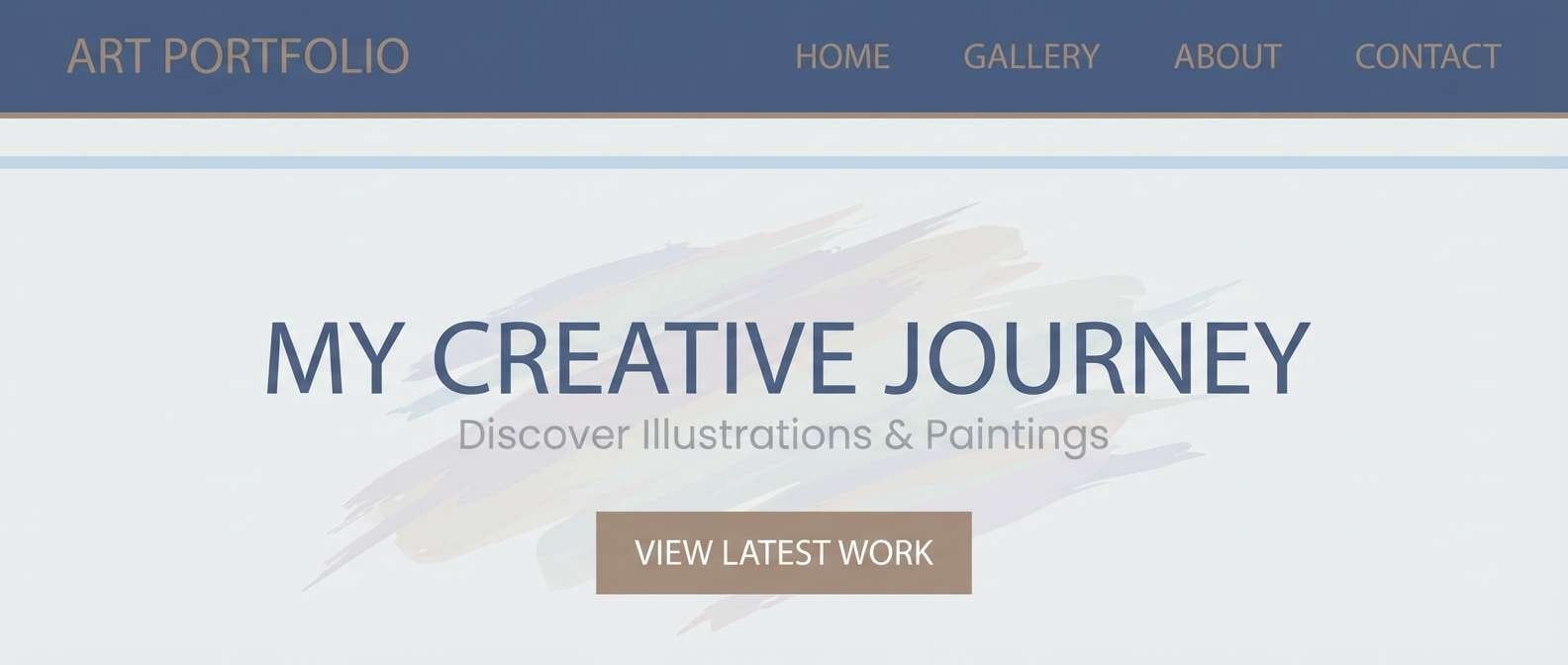
10) Gallery Wall

HEX: #4c6d96 #2f3d52 #9fb2c9 #e6e2dc #a88f76
Mood: curated, calm, editorial
Best for: art portfolio website header
Curated gallery blues feel composed, like a quiet exhibit with warm spotlights. Let the dark slate-blue anchor the header and navigation, then use the pale blue to separate sections and thumbnails. The soft gray and warm taupe keep images from looking overly cool on screen. Tip: choose one accent for links and hover states and keep everything else neutral.
Image example of gallery wall generated using media.io
11) Mountain Haze
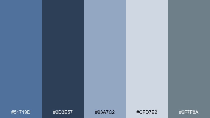
HEX: #51719d #2d3e57 #93a7c2 #cfd7e2 #6f7f8a
Mood: fresh, outdoorsy, reflective
Best for: travel blog hero banner
Hazy mountain blues suggest distance and clean air, perfect for an adventurous but calm look. Use the darkest tone for the headline overlay so it stays legible on imagery. The mid and light blues work well for tags, category chips, and subtle gradient overlays. Tip: keep photography slightly desaturated to match the soft, misty range.
Image example of mountain haze generated using media.io
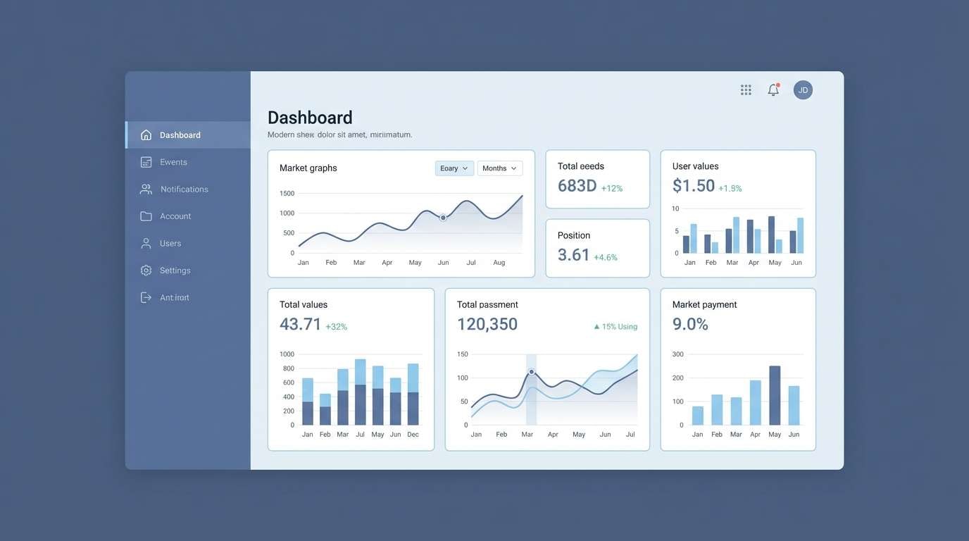
12) Soft Tech UI
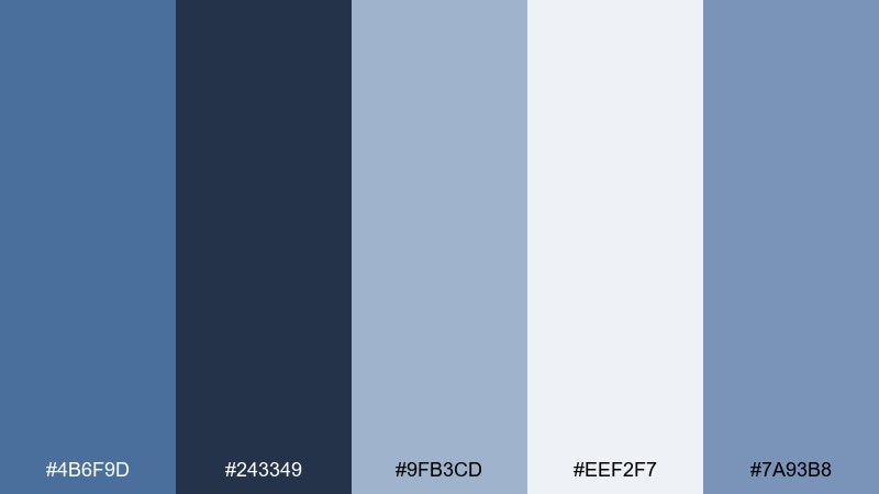
HEX: #4b6f9d #243349 #9fb3cd #eef2f7 #7a93b8
Mood: modern, precise, soothing
Best for: analytics dashboard UI
Soft tech blues feel focused and friendly, like a dashboard that reduces stress instead of adding it. This dark pastel blue color scheme shines when the darkest shade defines hierarchy for nav, charts, and key metrics. Use the light gray-blue as the canvas, then bring in the brighter steel-blue for selected states and highlights. Tip: keep chart palettes monochrome so the interface stays cohesive.
Image example of soft tech ui generated using media.io
13) Candlelit Navy
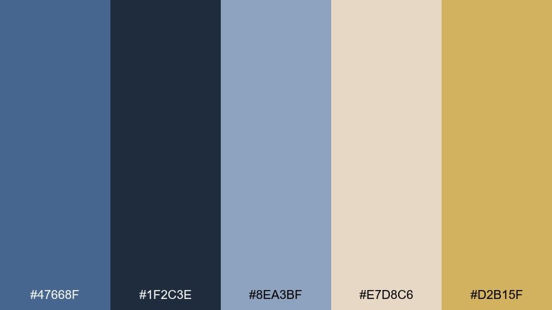
HEX: #47668f #1f2c3e #8ea3bf #e7d8c6 #d2b15f
Mood: luxurious, warm, evening-ready
Best for: restaurant poster design
Candlelit navy with warm gold feels like a late dinner reservation and soft jazz. Use the deepest blue for the background and set type in cream for crisp contrast. The gold works best for small accents like stars, dividers, or a reservation callout. Tip: keep the poster mostly two-tone and let gold be the finishing touch.
Image example of candlelit navy generated using media.io
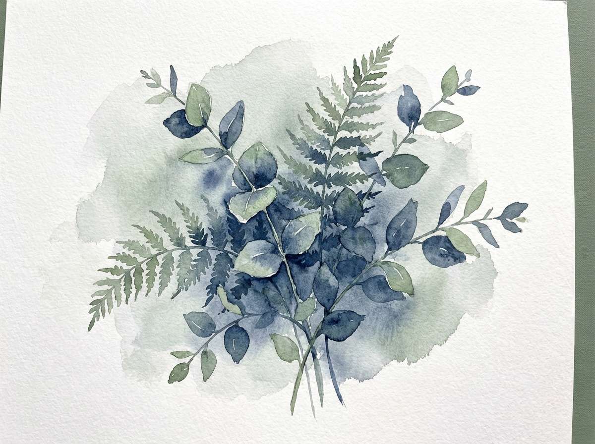
14) Stormy Botanicals
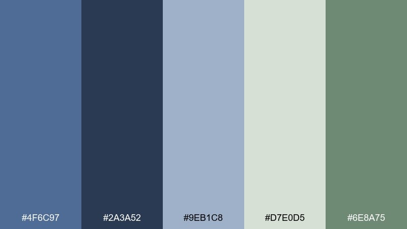
HEX: #4f6c97 #2a3a52 #9eb1c8 #d7e0d5 #6e8a75
Mood: organic, cool, calming
Best for: watercolor botanical illustration
Stormy blues mixed with muted greens evoke leaves after rain and cloudy skies. Use the deep blue for shadows and stems, then layer pale blue washes to create depth. The soft green-gray and sage give the illustration a natural balance without turning overly bright. Tip: keep edges loose and let the washes blend to maintain the misty mood.
Image example of stormy botanicals generated using media.io
15) Bookshop Calm
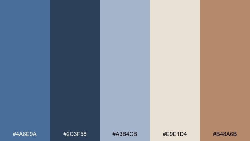
HEX: #4a6e9a #2c3f58 #a3b4cb #e9e1d4 #b48a6b
Mood: cozy, intellectual, timeless
Best for: library event flyer
Bookshop blues and warm paper tones feel like worn spines and quiet corners. Use the dark blue for the main headline and event details to keep everything readable on a bulletin board. The creamy background and soft blue blocks support longer text without strain. Tip: add the warm brown as a small badge for date or location so the key info pops.
Image example of bookshop calm generated using media.io
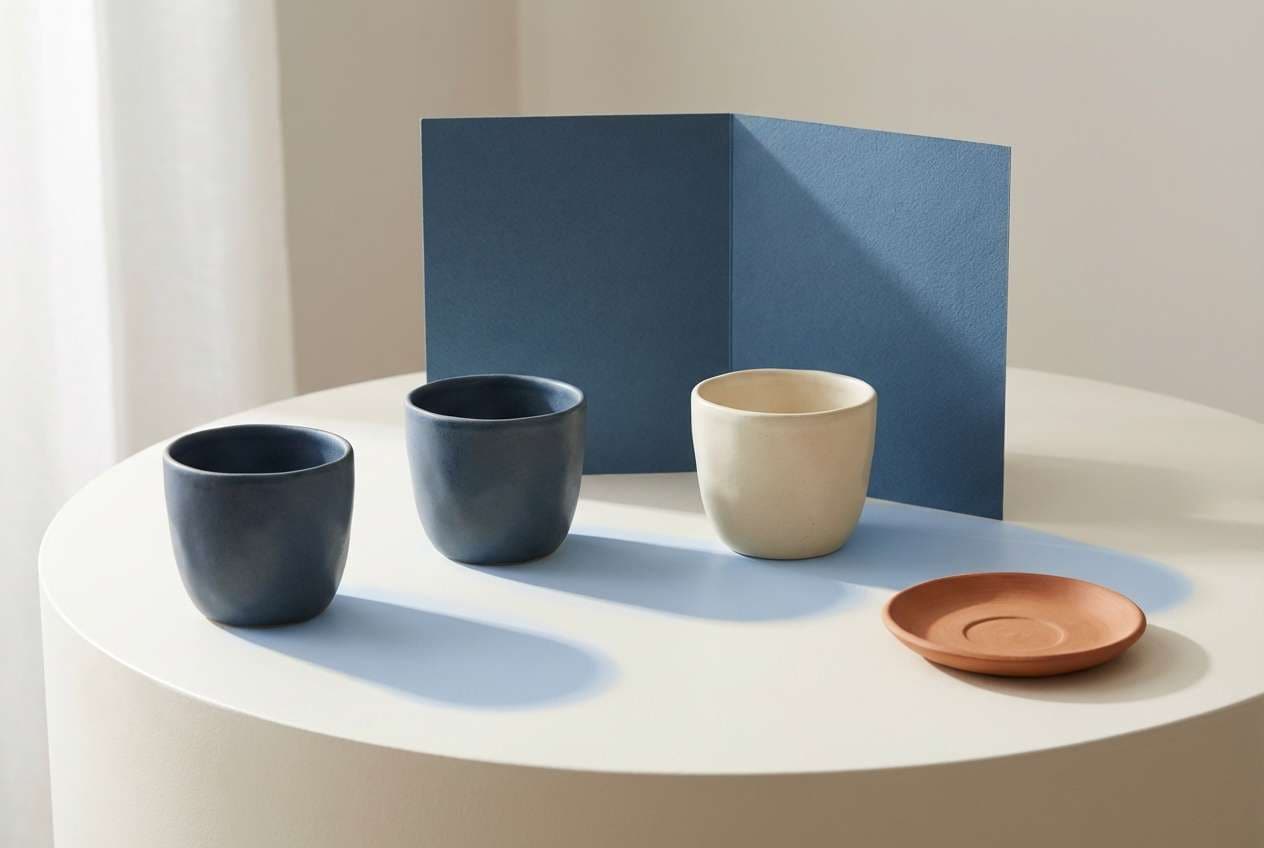
16) Ceramic Blue
HEX: #4d73a1 #364a65 #9db0c9 #f2eee8 #c48a78
Mood: artisanal, gentle, curated
Best for: handmade ceramics product ad
Ceramic blues with soft clay accents feel handmade and thoughtfully imperfect. Use the darker blue as the backdrop or shadow tone to make product shapes stand out. Keep the off-white for negative space and typography so the ad remains clean and premium. Tip: echo the clay accent in one small prop only, like a ribbon or stamp, to avoid clutter.
Image example of ceramic blue generated using media.io
17) Minimal Workspace
HEX: #4a6a92 #28364a #8ea3bb #dfe6ee #8b9b8b
Mood: focused, tidy, low-stress
Best for: notion-style productivity UI
Quiet workspace blues feel organized, like a desk cleared for deep work. Use the dark tone for the sidebar and primary labels, then apply the light gray-blue as the main canvas. The muted sage-gray is ideal for subtle status pills or secondary buttons. Tip: keep borders thin and rely on spacing to separate sections.
Image example of minimal workspace generated using media.io
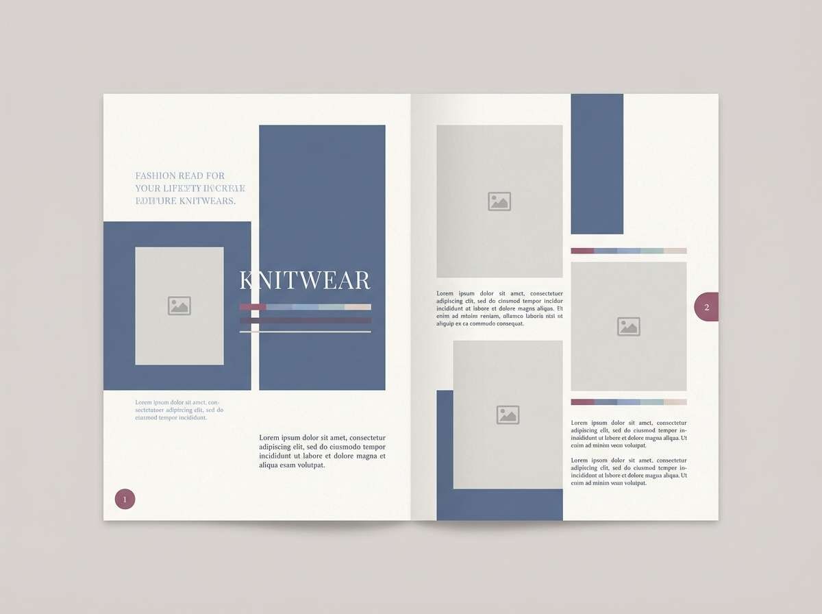
18) Winter Wool
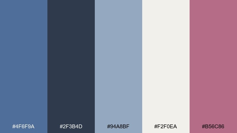
HEX: #4f6f9a #2f3b4d #94a8bf #f2f0ea #b56c86
Mood: soft, wintery, comforting
Best for: knitwear lookbook spread
Winter wool blues feel like thick knit textures and cold air softened by warmth indoors. A dark pastel blue color palette here works best when the deep shade frames imagery and the lighter tones support captions. Keep the off-white dominant for a breathable, editorial look. Tip: use the muted berry sparingly as a single highlight, like a page number or pull quote.
Image example of winter wool generated using media.io
19) Retro Transit
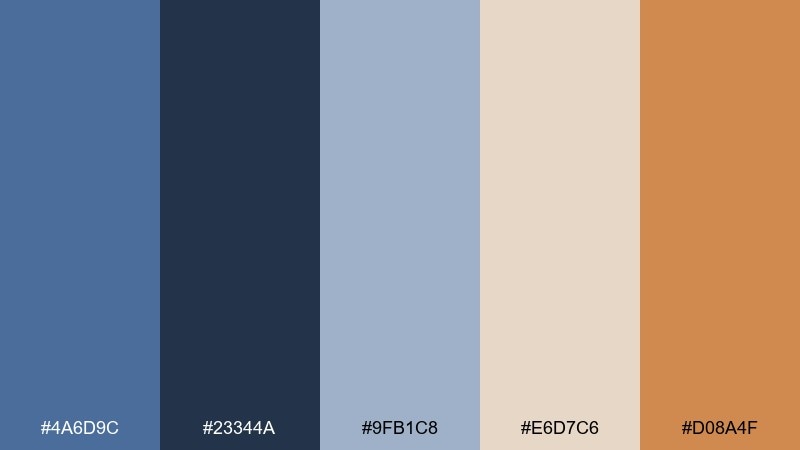
HEX: #4a6d9c #23344a #9fb1c8 #e6d7c6 #d08a4f
Mood: playful, retro, structured
Best for: travel poster graphic
Retro transit blues and warm ticket-stub tones bring back the charm of vintage timetables. Use the darkest shade for bold geometry and type, then let the pale blue fill large shapes for a layered look. Cream keeps the poster readable, while the orange works best as a single focal badge. Tip: stick to simple shapes and thick lines for an authentic retro feel.
Image example of retro transit generated using media.io
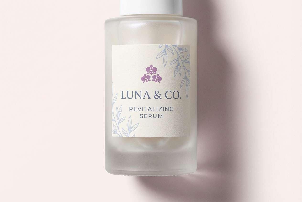
20) Evening Orchid
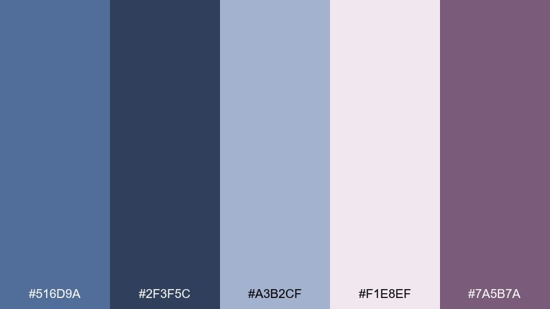
HEX: #516d9a #2f3f5c #a3b2cf #f1e8ef #7a5b7a
Mood: dreamy, elegant, slightly dramatic
Best for: luxury skincare label
Evening orchid purples tucked into muted blues feel like a dusk garden with velvet petals. The dark blue grounds the label and keeps the look premium, while the blush-white background adds softness. Use the orchid tone for a brand mark or pattern detail rather than large text blocks. Tip: choose a single serif headline font to match the refined mood.
Image example of evening orchid generated using media.io
21) Cloudy Denim
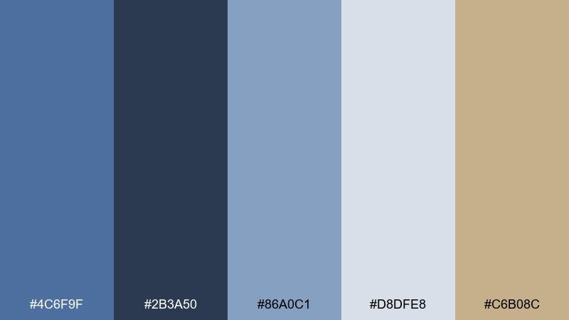
HEX: #4c6f9f #2b3a50 #86a0c1 #d8dfe8 #c6b08c
Mood: relaxed, contemporary, approachable
Best for: shopify fashion homepage
Cloudy denim blues feel casual and modern, like a well-loved jacket under soft daylight. Use the deepest tone for navigation and category labels, and keep the pale gray-blue for the page background. Warm khaki adds a subtle retail friendliness when used for buttons or promo tags. Tip: keep product photos slightly cool-toned so the interface and imagery feel unified.
Image example of cloudy denim generated using media.io
22) Lantern Festival
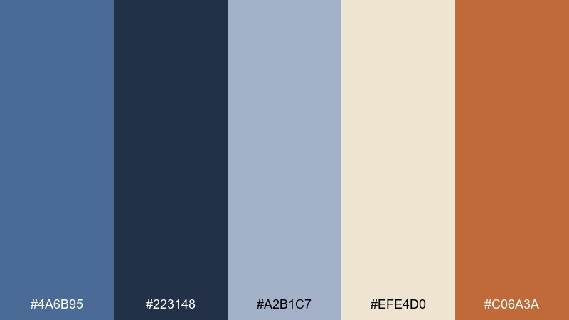
HEX: #4a6b95 #223148 #a2b1c7 #efe4d0 #c06a3a
Mood: festive, warm, evening glow
Best for: community event poster
Lantern-lit orange against muted blue feels like a night market with soft light and gentle shadows. These dark pastel blue color combinations stay balanced when blue dominates and orange is used only for the main callout. Use the warm cream as the base so text remains legible and friendly. Tip: add small orange icons as a rhythm element across the layout rather than one big block.
Image example of lantern festival generated using media.io

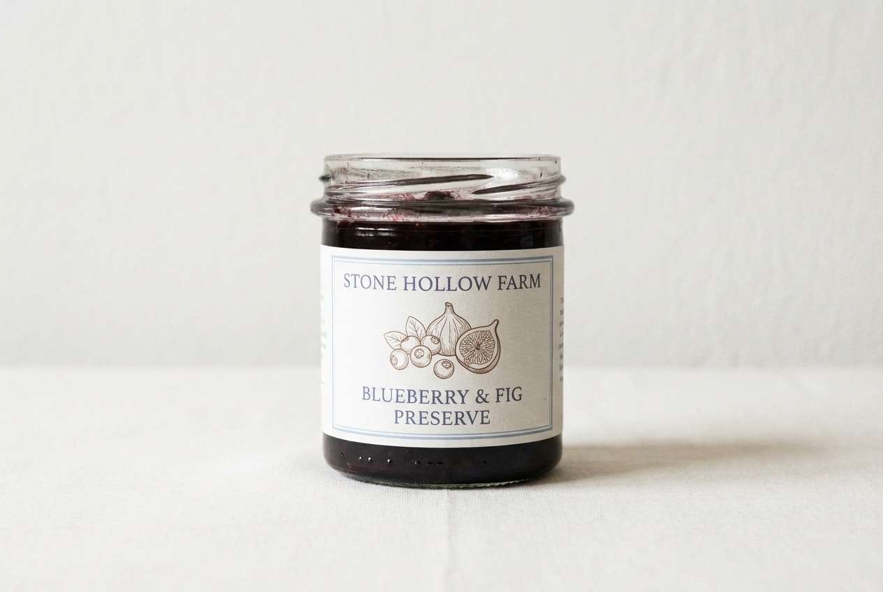
23) Orchard Twilight
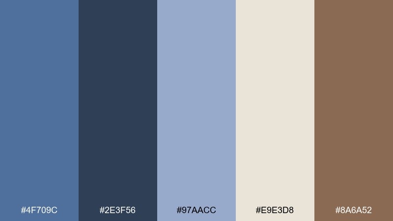
HEX: #4f709c #2e3f56 #97aacc #e9e3d8 #8a6a52
Mood: earthy, quiet, balanced
Best for: packaging for artisan jam
Orchard twilight tones feel like fruit skins, wooden crates, and a cool evening breeze. A dark pastel blue color combination like this looks premium when the blue is used for typography and the warm brown supports small illustration details. Keep the soft off-white as the main label field for clarity on shelves. Tip: use the mid blue as a subtle border so the label feels finished without getting busy.
Image example of orchard twilight generated using media.io
What Colors Go Well with Dark Pastel Blue?
Dark pastel blue pairs especially well with warm neutrals like cream, oat, sand, and taupe. These soften the “cool” feeling of blue and make layouts or rooms feel more welcoming and balanced.
For a clean, modern look, combine it with light gray-blues, misty blues, and slate tones. This creates a cohesive monochrome range that’s perfect for UI color palettes, dashboards, and editorial layouts.
If you want contrast, add one warm accent (clay rose, caramel, gold, muted orange) and keep it limited to CTAs, badges, or small decor items. The result is calm overall, with clear focal points.
How to Use a Dark Pastel Blue Color Palette in Real Designs
In branding, use dark pastel blue as the “trust anchor” for logos, headlines, and navigation—then build breathing room with off-white backgrounds and soft secondary blues for panels, cards, or packaging space.
For UI, treat the darkest shade as your hierarchy tool: sidebar, key labels, and chart emphasis. Reserve a single warm accent for primary actions so buttons and conversion moments are unmistakable.
In interiors, apply dark pastel blue to one large element (feature wall, sofa, rug) and repeat it subtly through textiles. Pair with warm neutrals in wood, linen, or ceramics to keep the palette from feeling too cold.
Create Dark Pastel Blue Palette Visuals with AI
If you already have HEX codes, you can quickly turn them into real-looking scenes, UI mockups, posters, and product-style visuals. The key is describing materials (linen, matte paper, ceramic), lighting (soft daylight, candlelit), and the role of each color (background, text, accent).
With Media.io’s text-to-image, you can generate consistent concept images for branding presentations, moodboards, and client previews—without needing a full photoshoot or design system upfront.
Start with one palette above, reuse its prompt style, and swap the subject (menu, landing page, packaging) to create a cohesive set of visuals.
Dark Pastel Blue Color Palette FAQs
-
What is a dark pastel blue color (and how is it different from navy)?
Dark pastel blue is a muted (desaturated) blue with a softer look than navy. Navy is typically deeper and more saturated, while dark pastel blue keeps contrast but feels calmer and more modern. -
Is dark pastel blue good for UI and app design?
Yes. It’s strong enough for navigation, headings, and key UI hierarchy, but muted enough to reduce visual fatigue. Pair it with off-white backgrounds and use one warm accent color for primary buttons. -
What’s the best accent color for dark pastel blue?
Warm accents usually work best: tan, caramel, muted gold, clay rose, or muted orange. Use the accent sparingly (CTAs, badges, highlights) to keep the palette calm. -
How do I keep a muted blue color palette from looking “too cold”?
Add warm neutrals like cream, oat, sand, or warm gray, and introduce texture (paper grain, linen, wood). Even a small warm accent can make the whole scheme feel more welcoming. -
Can I use dark pastel blue for a brand that needs to feel premium?
Definitely. Dark pastel blue reads as refined and trustworthy. Combine it with lots of whitespace, understated neutrals, and a restrained accent (gold, taupe, blush) for a premium finish. -
Which backgrounds work best with dark pastel blue text?
Off-white, warm cream, very light gray-blue, and pale parchment tones tend to provide excellent readability and a softer contrast than pure white. -
How can I generate images that match my dark pastel blue HEX codes?
Use an AI image generator like Media.io and describe the scene plus the palette’s role (e.g., “dark pastel blue for headline/nav, cream background, tan CTA”). Then iterate by keeping lighting and materials consistent across versions.


