

Dark magenta sits in that sweet spot between bold and sophisticated—richer than classic magenta, but still vibrant enough to feel modern in digital layouts and premium in print.
Below are dark magenta color palette ideas with HEX codes you can use for branding, UI, packaging, invitations, and editorial designs—plus AI prompts to generate matching visuals fast.
In this article
- Why Dark Magenta Palettes Work So Well
-
- velvet orchid night
- plum noir luxe
- berry & brass atelier
- mulberry mist
- magenta & sage studio
- cabernet rosewood
- fuchsia ink minimal
- amethyst dusk
- raspberry cream
- velvet theater poster
- modern wine ui
- midnight peony ceremony
- garnet clay interior
- electric magenta circuit
- cocoa berry packaging
- dusty orchid editorial
- fig & stone neutral
- aubergine silk gradient
- rose jam market
- night bloom botanica
- studio plum stationery
- What Colors Go Well with Dark Magenta?
- How to Use a Dark Magenta Color Palette in Real Designs
- Create Dark Magenta Palette Visuals with AI
Why Dark Magenta Palettes Work So Well
Dark magenta reads as expressive without feeling loud. It carries the emotion of pinks and berries, but the deeper value adds maturity—great for premium brands, editorial layouts, and modern product visuals.
It’s also naturally versatile with neutrals. Pair it with near-black for structure, off-white for breathing room, and warm grays or greige for a more corporate, grounded tone.
Finally, dark magenta plays beautifully with metallic accents (gold/brass) and soft pastels (blush/lilac). That mix makes it easy to build depth and hierarchy across UI, print, and packaging.
20+ Dark Magenta Color Palette Ideas (with HEX Codes)
1) Velvet Orchid Night
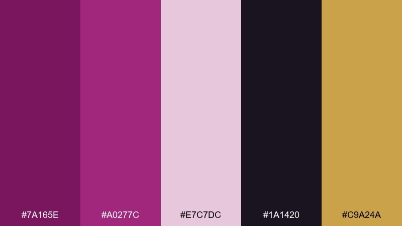
HEX: #7a165e #a0277c #e7c7dc #1a1420 #c9a24a
Mood: dramatic, velvety, elegant
Best for: luxury brand hero banner
Dramatic velvet tones evoke a late-night lounge with orchid blooms and warm brass glints. Use the deep magenta as your primary block color and let the near-black add structure for headlines and dividers. The pale blush keeps layouts breathable, while gold works best as a tiny highlight, not a fill. Tip: reserve metallic accents for CTAs or thin line icons to keep the look premium.
Image example of velvet orchid night generated using media.io
Media.io is an online AI studio for creating and editing video, image, and audio in your browser.

2) Plum Noir Luxe
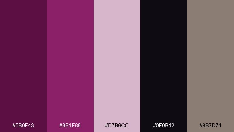
HEX: #5b0f43 #8b1f68 #d7b6cc #0f0b12 #8b7d74
Mood: moody, polished, modern
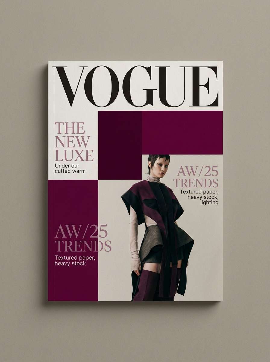
Best for: editorial magazine cover layout
Moody plum and noir feel like satin shadows under gallery lighting. Pair the darkest shade for mastheads with soft mauve for pull quotes to maintain readability. The warm greige gives you a neutral base for margins and caption boxes without turning cold. Tip: keep body copy on the light mauve and use noir only for display type.
Image example of plum noir luxe generated using media.io
3) Berry & Brass Atelier
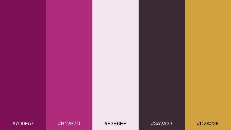
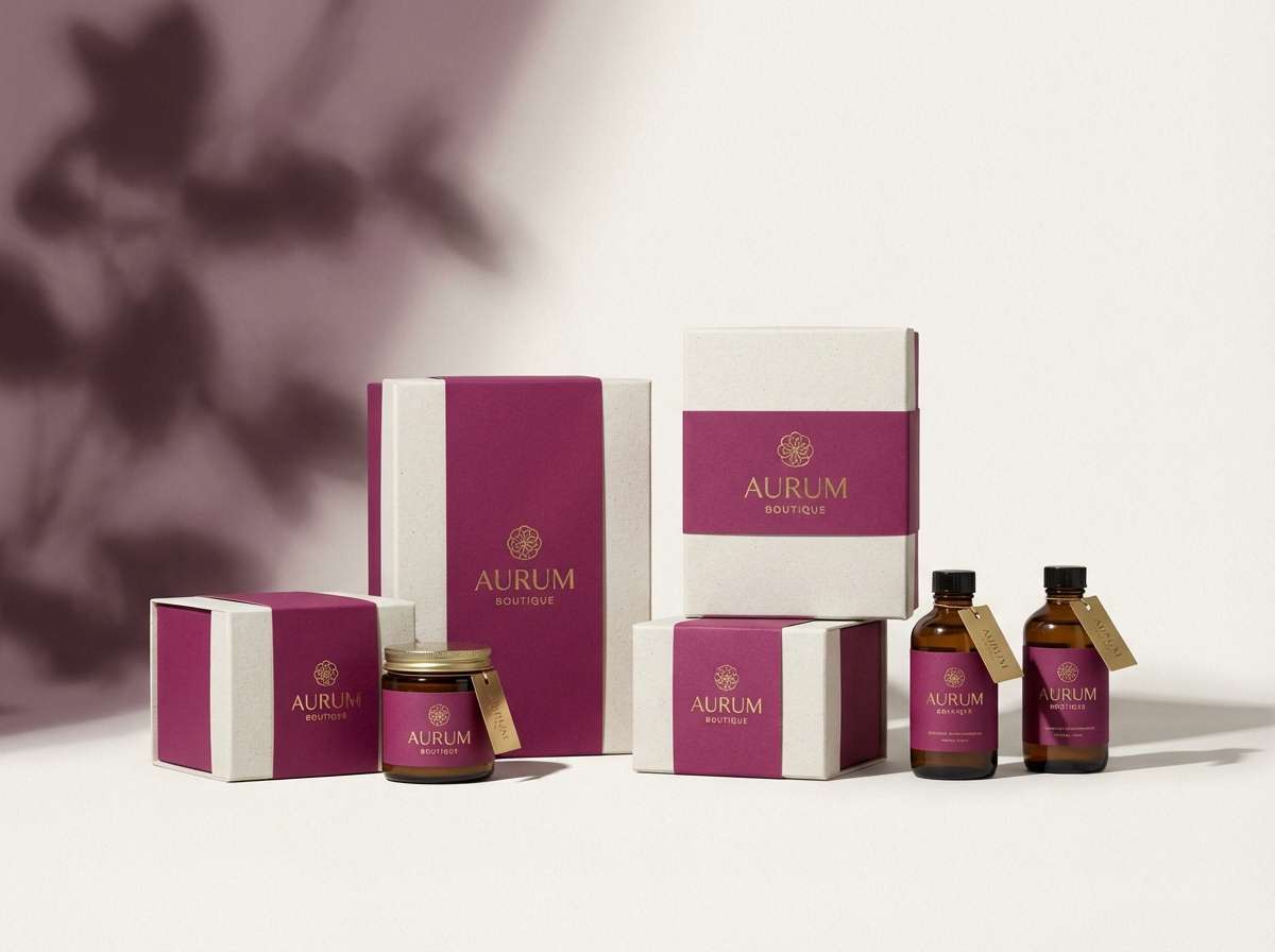
HEX: #7d0f57 #b12b7d #f3e6ef #3a2a33 #d2a23f
Mood: artisanal, luxe, inviting
Best for: boutique product packaging
Artisanal berry tones with brass warmth suggest hand-finished details and boutique craftsmanship. This dark magenta color scheme works best when the off-white takes the largest surface area and the deep shades handle typography and seals. Use the smoky plum for shadows and secondary text to avoid harsh contrast. Tip: foil-stamp the brass accent sparingly for logos or borders.
Image example of berry & brass atelier generated using media.io
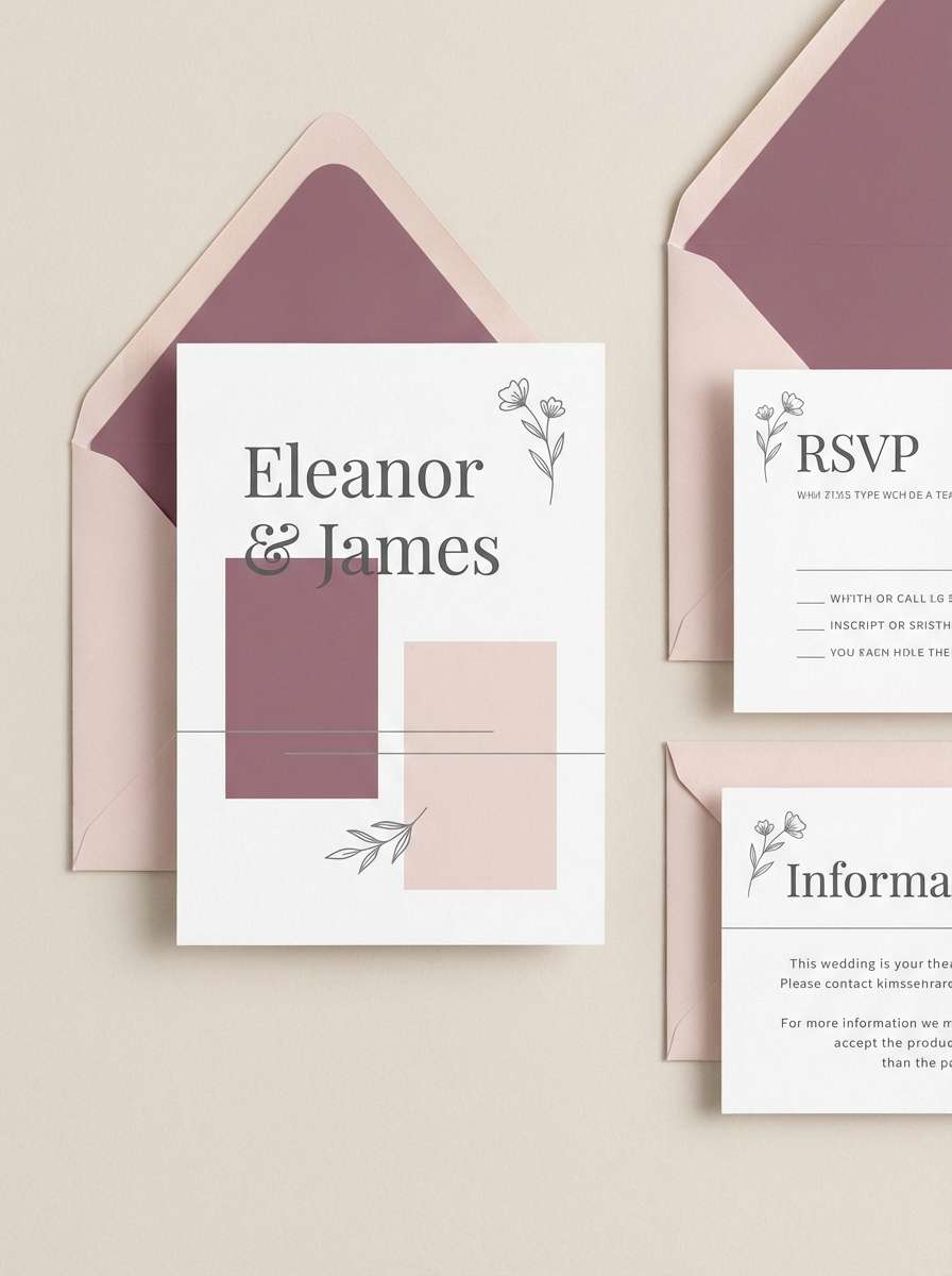
4) Mulberry Mist
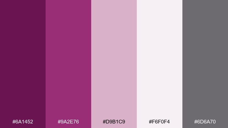
HEX: #6a1452 #9a2e76 #d9b1c9 #f6f0f4 #6d6a70
Mood: soft, airy, romantic
Best for: wedding invitation suite
Soft mulberry with misty pastels feels like pressed petals on textured paper. Let the lightest tones carry the background so the typography stays crisp and elegant. The cool gray is ideal for fine lines, monograms, and small print without fighting the florals. Tip: use the deepest shade only for names or key headings to keep the suite delicate.
Image example of mulberry mist generated using media.io
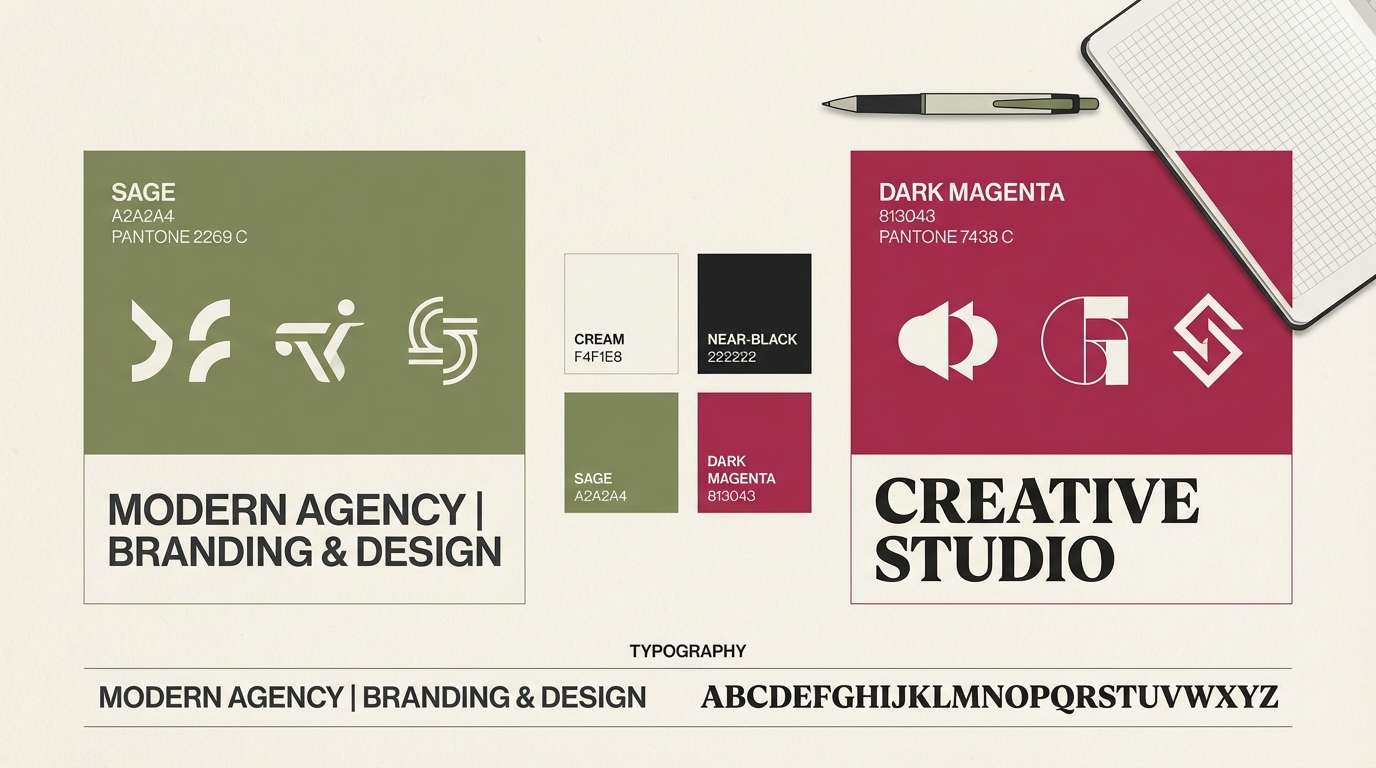
5) Magenta & Sage Studio
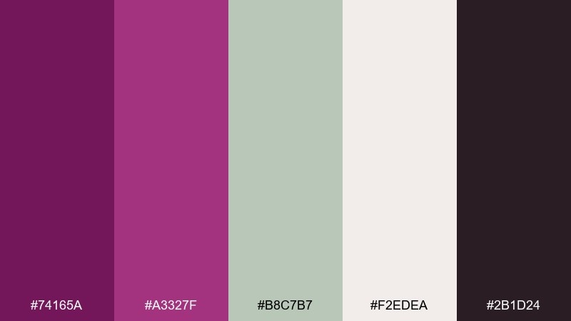
HEX: #74165a #a3327f #b8c7b7 #f2edea #2b1d24
Mood: balanced, fresh, design-forward
Best for: creative agency brand kit
Balanced magenta and sage feel like a modern studio with plants, paper, and ink. Use sage as the calming counterweight for large sections, while the deep tone anchors logos and headings. Cream softens the contrast and keeps it friendly for social templates and stationery. Tip: keep your accent usage consistent by reserving the brighter magenta for highlights and links.
Image example of magenta & sage studio generated using media.io
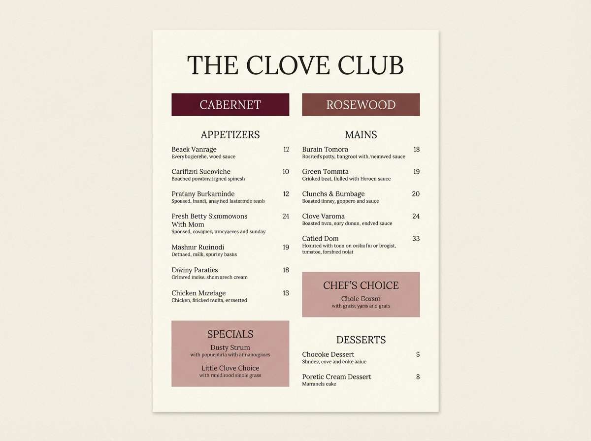
6) Cabernet Rosewood
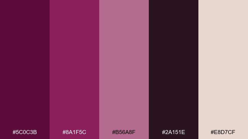
HEX: #5c0c3b #8a1f5c #b56a8f #2a151e #e8d7cf
Mood: warm, intimate, classic
Best for: restaurant menu design
Warm cabernet and rosewood evoke candlelit dining and aged wood. Use the cream as the main menu background and bring in the darker shades for section headers and separators. The dusty rose is perfect for callouts like chef specials without screaming for attention. Tip: print on slightly textured stock to amplify the cozy, classic feel.
Image example of cabernet rosewood generated using media.io
7) Fuchsia Ink Minimal
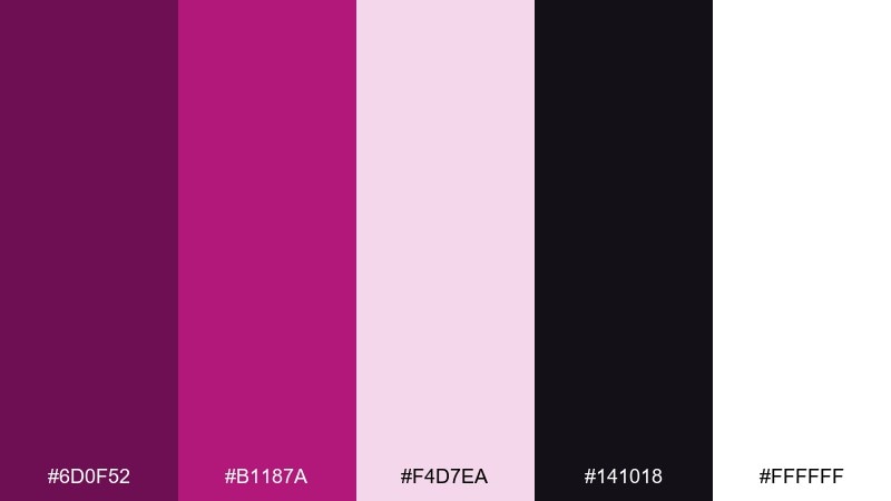
HEX: #6d0f52 #b1187a #f4d7ea #141018 #ffffff
Mood: minimal, crisp, high-contrast
Best for: 2d ui dashboard mockup
Crisp ink-dark contrast with a flash of fuchsia feels like modern UI under studio lighting. Keep white as the main canvas and use the darkest tone for navigation, labels, and chart axes. The pale pink works well for hover states and subtle cards, avoiding the harshness of pure gray. Tip: limit fuchsia to one primary action color so the interface stays calm.
Image example of fuchsia ink minimal generated using media.io
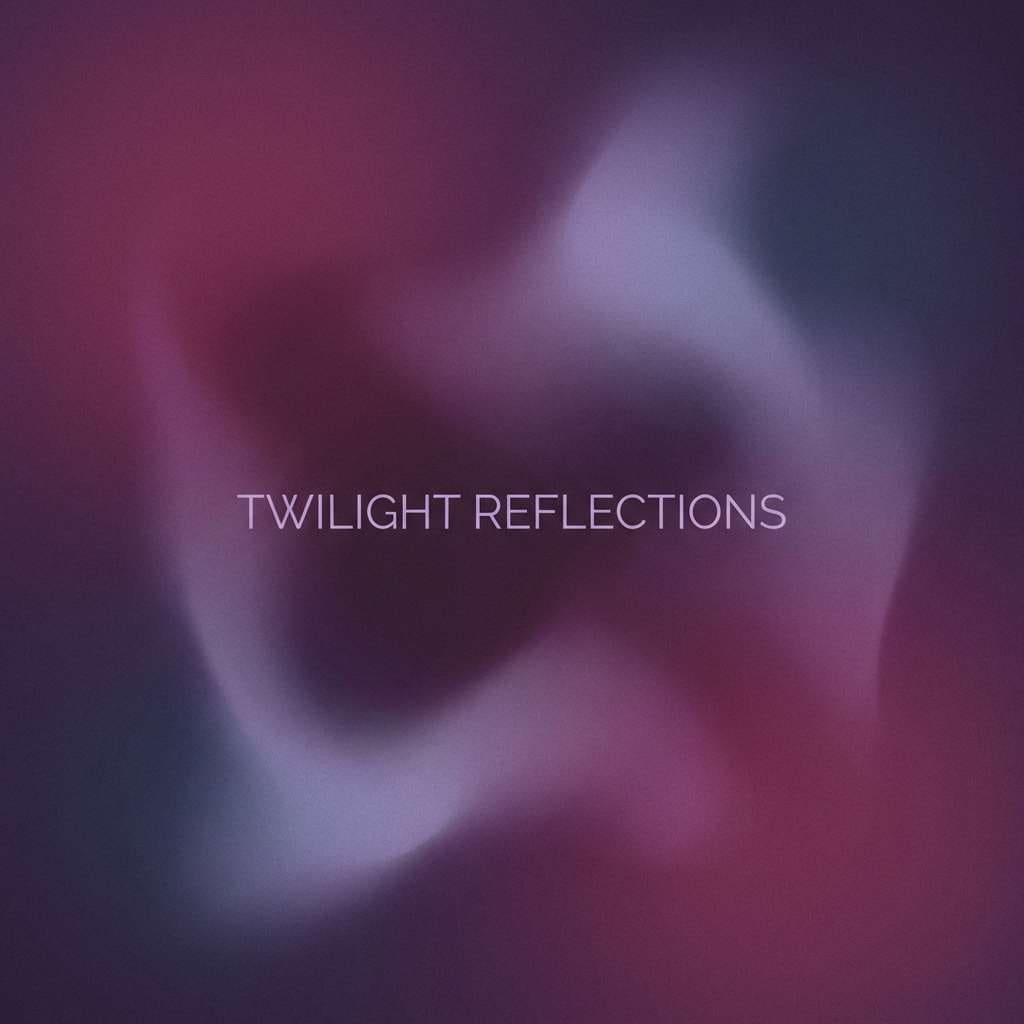
8) Amethyst Dusk
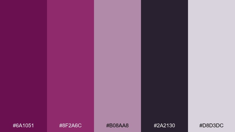
HEX: #6a1051 #8f2a6c #b08aa8 #2a2130 #d8d3dc
Mood: dreamy, twilight, refined
Best for: album cover artwork
Dreamy dusk purples feel like city lights blurred into twilight. Use the deep shade for the title and the mid-tone for gradients or soft glows. The lavender-gray and pale lilac help you add depth without needing bright accents. Tip: add subtle noise or grain to make the twilight transitions feel cinematic.
Image example of amethyst dusk generated using media.io
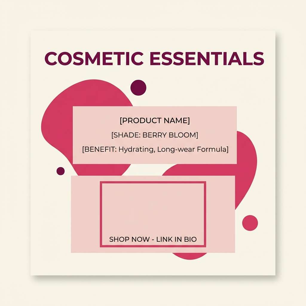
9) Raspberry Cream
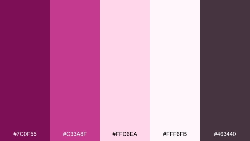
HEX: #7c0f55 #c33a8f #ffd6ea #fff6fb #463440
Mood: playful, sweet, trendy
Best for: cosmetics social post template
Playful raspberry and cream feels like whipped frosting with a bold berry swirl. Use the lightest cream for most of the canvas, then layer pink panels for text blocks and pricing. The deeper plum is a strong choice for legible type and icon outlines. Tip: keep gradients subtle so the post stays fresh instead of overly candy-like.
Image example of raspberry cream generated using media.io
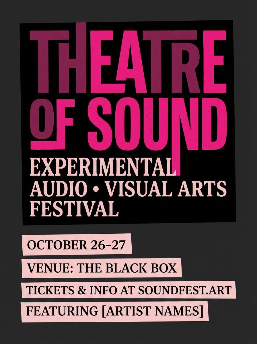
10) Velvet Theater Poster
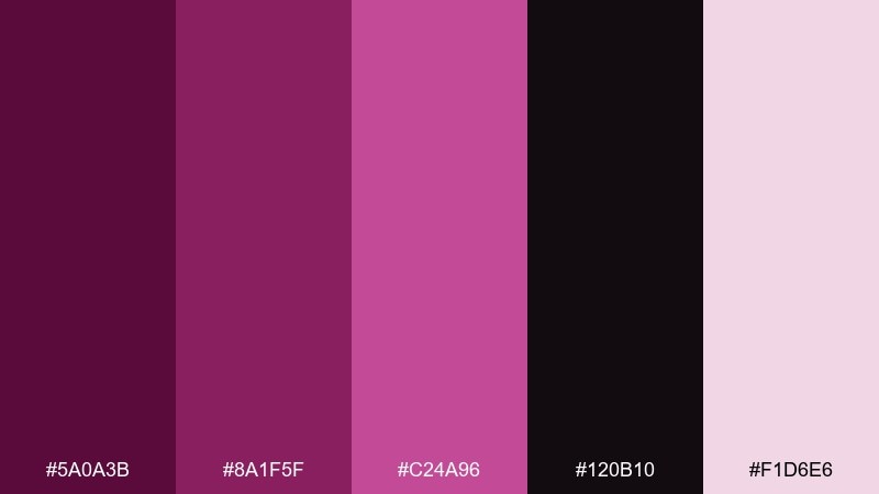
HEX: #5a0a3b #8a1f5f #c24a96 #120b10 #f1d6e6
Mood: dramatic, theatrical, bold
Best for: event poster design
Theatrical velvet hues evoke stage curtains, spotlights, and late-night applause. Use the near-black for large negative space and let the brighter magenta hit key details like date and venue. Pale blush works well for small text blocks without losing the dramatic mood. Tip: keep the brightest tone to one or two typographic elements for maximum punch.
Image example of velvet theater poster generated using media.io
11) Modern Wine UI
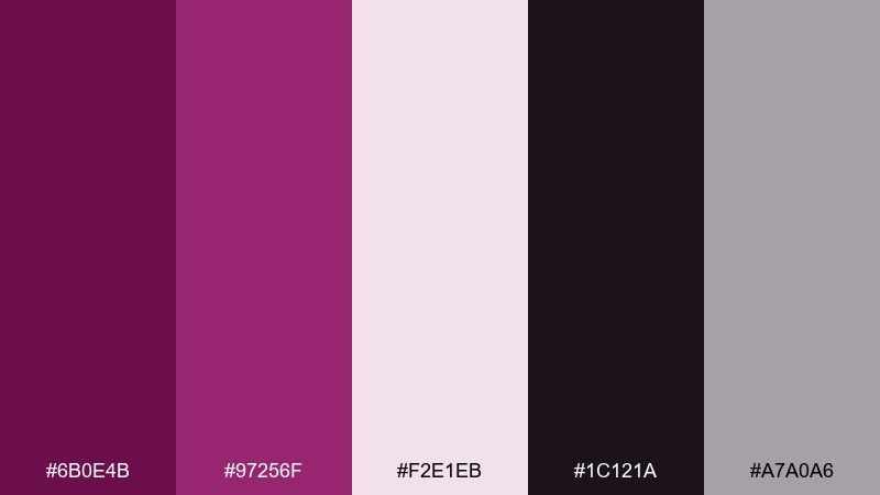
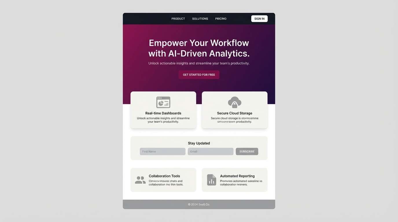
HEX: #6b0e4b #97256f #f2e1eb #1c121a #a7a0a6
Mood: sleek, confident, tech-luxe
Best for: saas landing page ui
Sleek wine tones create a confident, tech-luxe vibe with just enough softness for friendly onboarding. This dark magenta color palette shines when used as a hero gradient paired with off-white sections for features. Add the muted gray for form borders and secondary buttons to avoid visual noise. Tip: test contrast on small text and keep the deepest shade for headings and nav.
Image example of modern wine ui generated using media.io
12) Midnight Peony Ceremony
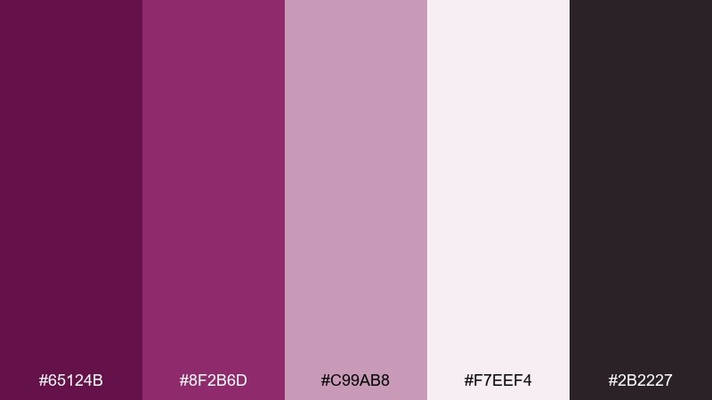
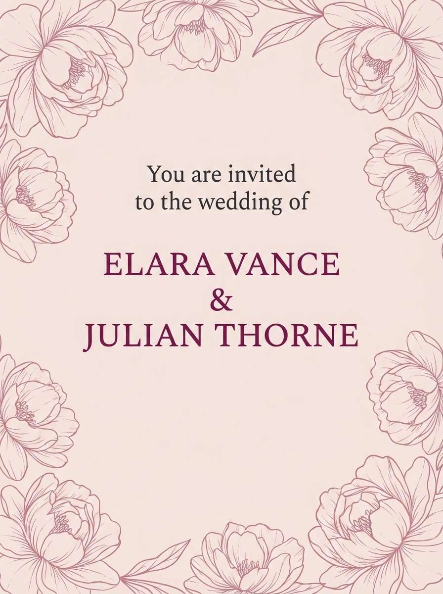
HEX: #65124b #8f2b6d #c99ab8 #f7eef4 #2b2227
Mood: romantic, evening, graceful
Best for: formal wedding invitation
Romantic peony tones feel like an evening ceremony with soft florals under string lights. This dark magenta color palette looks especially refined on matte paper with the light blush as the main background. Use the near-charcoal for small typography and the mid magenta for names or monograms. Tip: add a thin border in the dusty rose to frame the layout without overpowering it.
Image example of midnight peony ceremony generated using media.io
13) Garnet Clay Interior
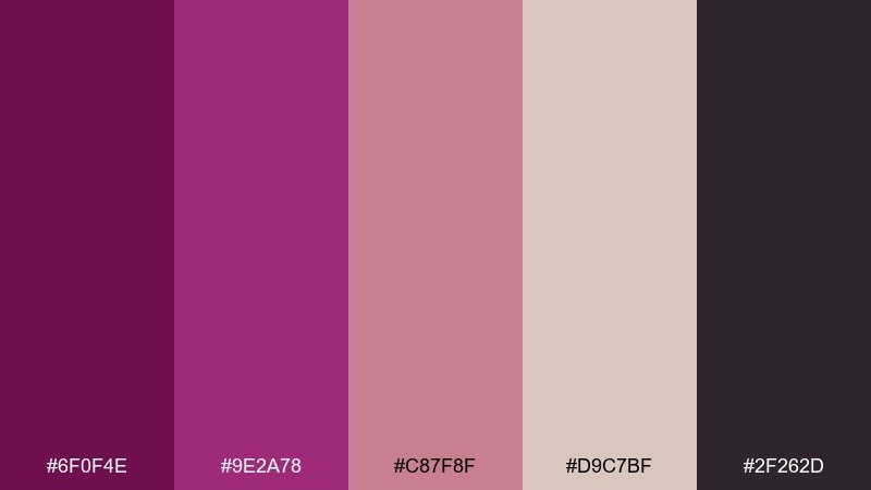
HEX: #6f0f4e #9e2a78 #c87f8f #d9c7bf #2f262d
Mood: earthy, cozy, curated
Best for: living room mood board
Earthy garnet with clay neutrals feels like a curated living room with ceramics and soft textiles. Use the warm beige as your wall or upholstery base, then add deep accents through pillows, art, or a statement chair. The rosy mid-tone bridges the gap for rugs and throws, keeping it layered and livable. Tip: repeat the darkest color in at least two places so the room feels intentional.
Image example of garnet clay interior generated using media.io
14) Electric Magenta Circuit
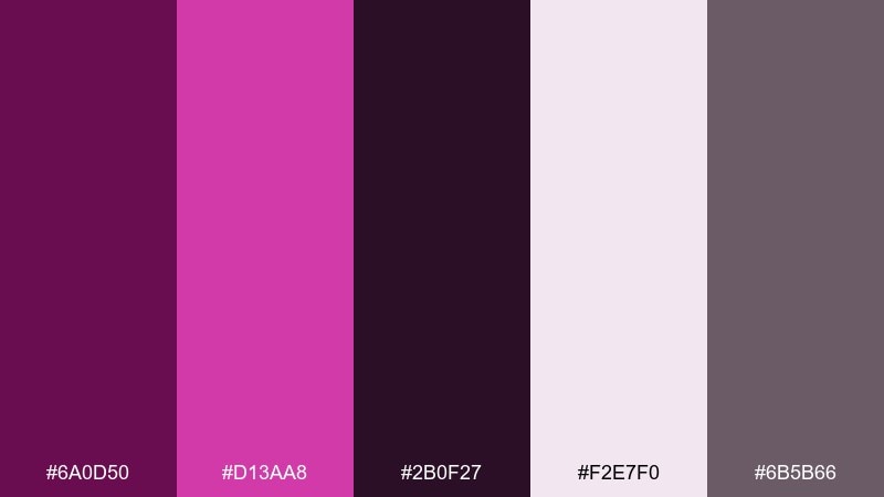
HEX: #6a0d50 #d13aa8 #2b0f27 #f2e7f0 #6b5b66
Mood: bold, edgy, futuristic
Best for: tech conference flyer
Bold electric magenta feels like neon circuits against a dark backdrop. Use the deepest purple as the canvas and let the bright accent carry the headline and key callouts. The pale tint keeps secondary details readable without introducing stark white everywhere. Tip: pair thick headline type with thin line icons for a clean futuristic contrast.
Image example of electric magenta circuit generated using media.io

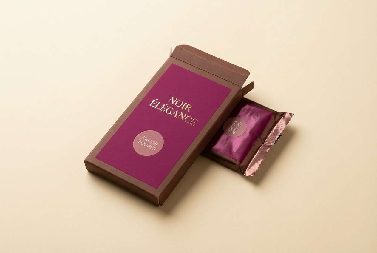
15) Cocoa Berry Packaging
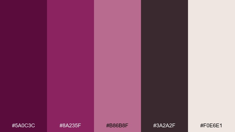
HEX: #5a0c3c #8a235f #b86b8f #3a2a2f #f0e6e1
Mood: rich, comforting, gourmet
Best for: chocolate bar wrapper design
Rich cocoa-berry tones evoke gourmet sweets and a cozy after-dinner treat. Let the warm cream handle nutrition and ingredient blocks while the darker shades frame the brand mark. The dusty rose supports flavor labels and small badges without looking childish. Tip: use a matte base with one glossy magenta detail to make the wrapper feel premium.
Image example of cocoa berry packaging generated using media.io
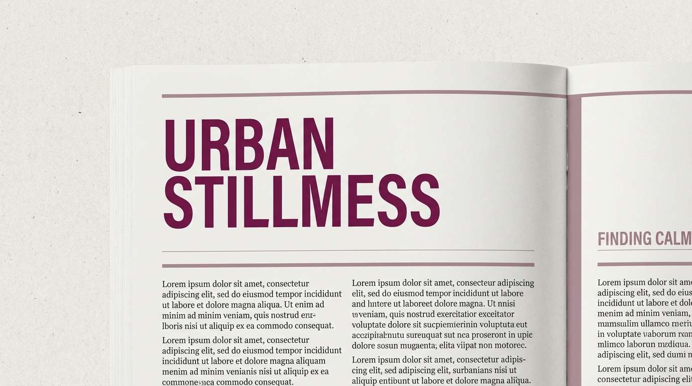
16) Dusty Orchid Editorial
HEX: #6e1555 #9c3a79 #cbb0c3 #f8f3f7 #2a2028
Mood: soft, cultured, understated
Best for: editorial article page layout
Dusty orchid tones feel cultured and understated, like a quiet art review on thick paper. Use the near-white as the reading background and save the darkest shade for headings and pull quotes. The mid mauve makes a great accent for section dividers and small callouts. Tip: keep line spacing generous so the soft palette reads clean and modern.
Image example of dusty orchid editorial generated using media.io
17) Fig & Stone Neutral
HEX: #6a0f4a #84315f #a9a0a4 #e7dfdf #2a1d25
Mood: neutral, mature, calming
Best for: corporate report cover
Fig and stone neutrals feel mature and calming, with just enough color to stand apart. Use the light greige for most of the cover and keep charts or section tags in the muted magenta. The charcoal is strong for titles and data-heavy elements. Tip: stick to one accent level of magenta so the report stays professional and consistent.
Image example of fig & stone neutral generated using media.io
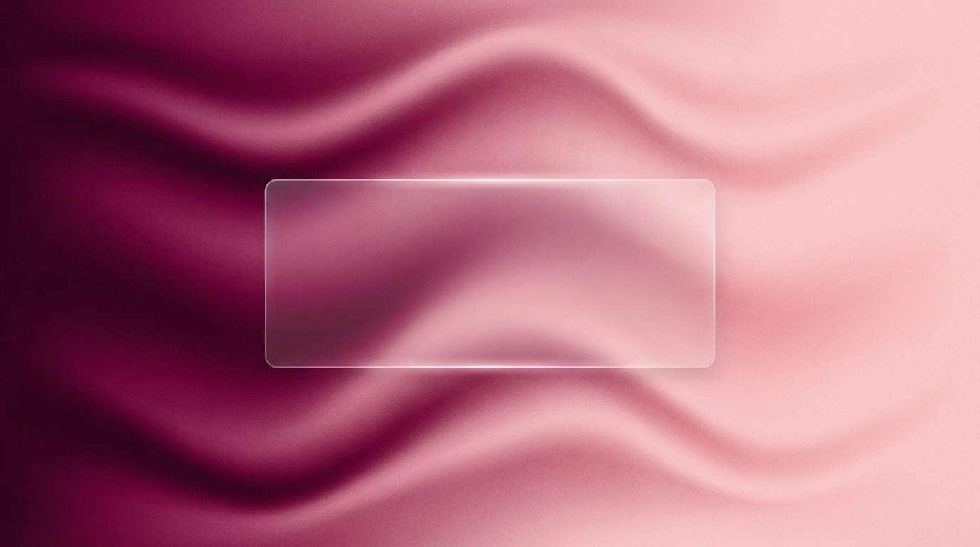
18) Aubergine Silk Gradient
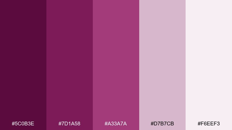
HEX: #5c0b3e #7d1a58 #a33a7a #d7b7cb #f6eef3
Mood: smooth, sensual, modern
Best for: abstract background for slides
Smooth aubergine gradients feel like silk under soft light, modern and slightly sensual. These dark magenta color combinations are perfect for presentation title slides where you want depth without harsh contrast. Use the palest tint for text boxes and speaker names so everything stays readable over gradients. Tip: keep gradients subtle and limit overlays to one translucent panel.
Image example of aubergine silk gradient generated using media.io
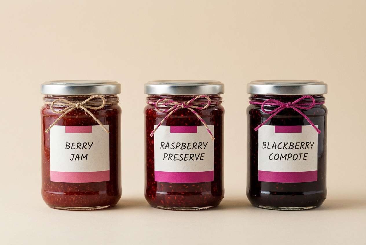
19) Rose Jam Market
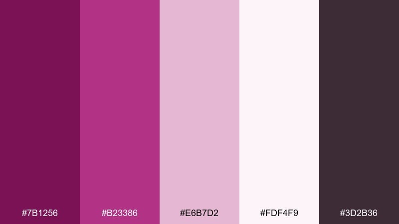
HEX: #7b1256 #b23386 #e6b7d2 #fdf4f9 #3d2b36
Mood: friendly, handcrafted, vibrant
Best for: jam label and jar mockup
Friendly rose-jam hues evoke farmers market stalls and handwritten tags. Let the off-white carry most label text while the deeper tones define borders and the brand stamp. The blush works nicely for flavor variants and small icons like fruit illustrations. Tip: keep the label background light so the jar contents remain the star.
Image example of rose jam market generated using media.io
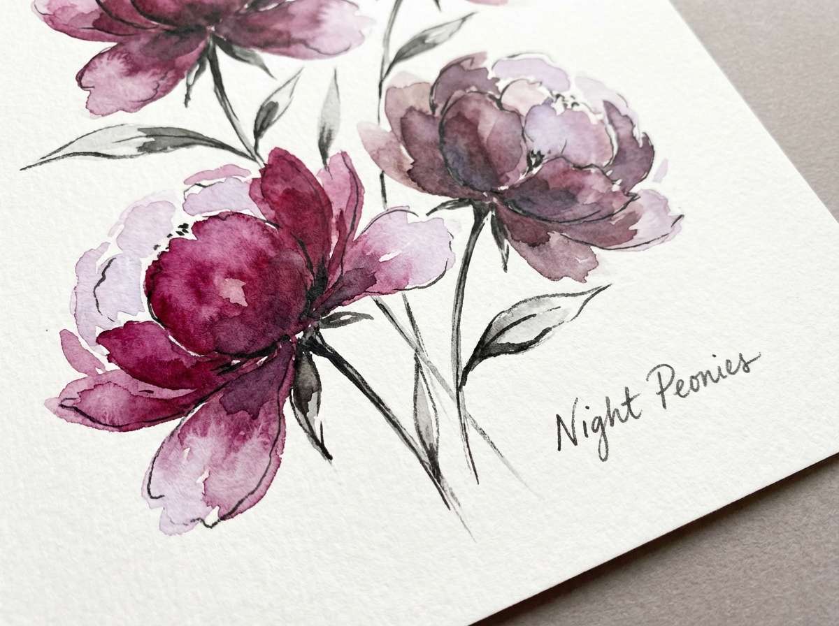
20) Night Bloom Botanica
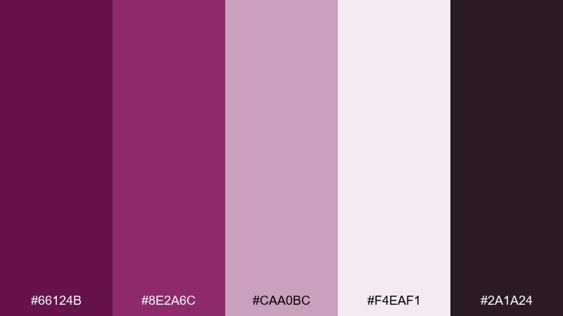
HEX: #66124b #8e2a6c #caa0bc #f4eaf1 #2a1a24
Mood: botanical, poetic, nocturnal
Best for: watercolor floral illustration
Nocturnal botanical tones feel like flowers opening under moonlight. Use the deep shade for stems and shadow petals, then build soft layers with mauve and pale lilac washes. A charcoal touch can outline focal points without overpowering the watercolor softness. Tip: leave generous negative space so the blooms look airy and refined.
Image example of night bloom botanica generated using media.io
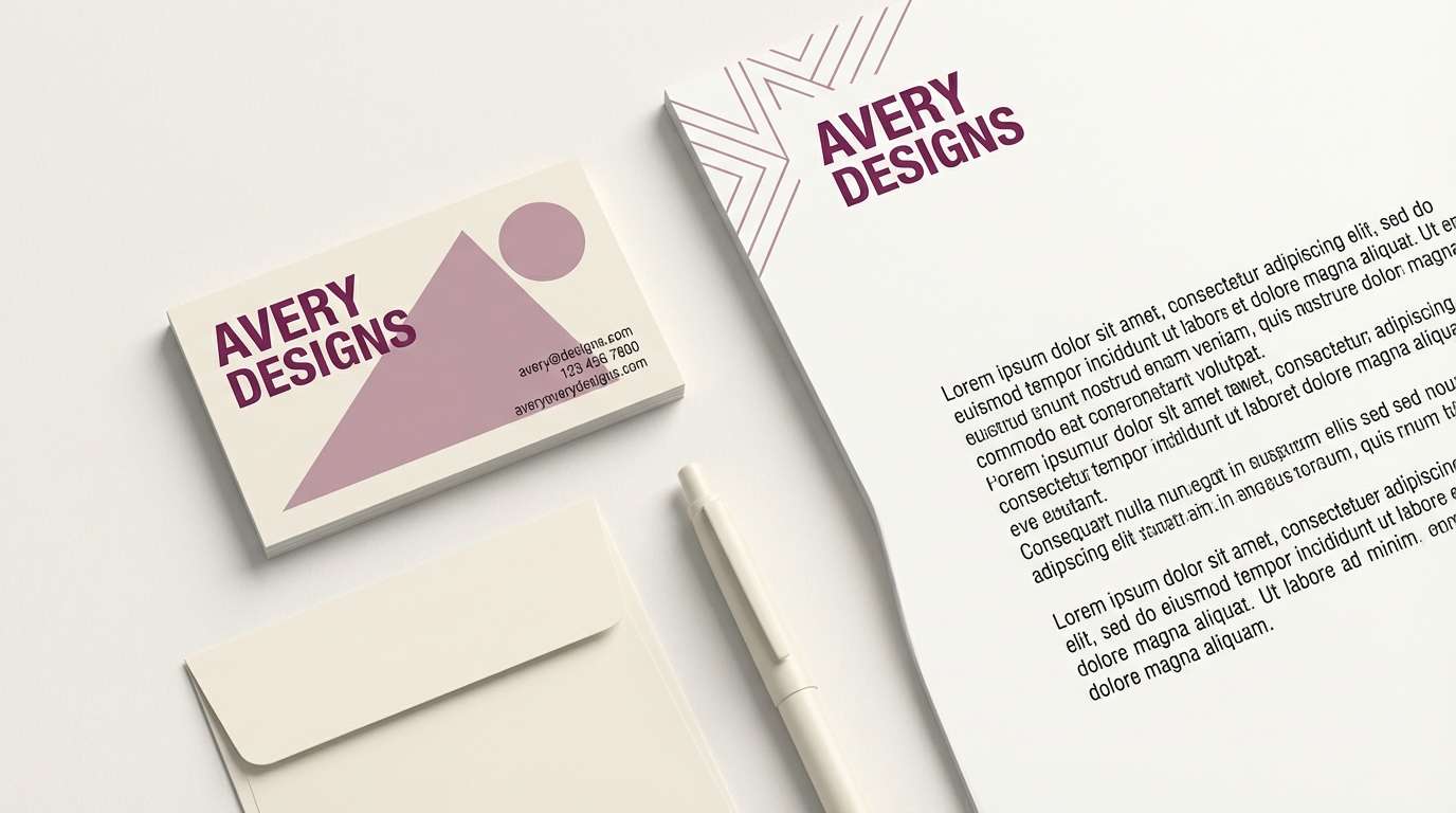
21) Studio Plum Stationery
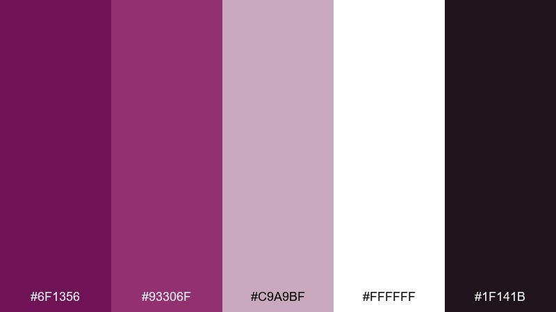
HEX: #6f1356 #93306f #c9a9bf #ffffff #1f141b
Mood: clean, smart, contemporary
Best for: business card and letterhead set
Clean studio plum feels smart and contemporary, like crisp paper with a confident ink mark. Use white space as the main design feature and apply the deep tone to names, roles, and key dividers. The soft mauve is great for back-side patterns or subtle corner shapes. Tip: print the darkest shade in solid ink and avoid heavy gradients for sharp typography.
Image example of studio plum stationery generated using media.io
What Colors Go Well with Dark Magenta?
Dark magenta pairs cleanly with crisp neutrals like white, off-white, and soft blush—these keep layouts readable and help the magenta feel more refined than loud. For structure, near-black and charcoal give you strong typography and clear UI hierarchy.
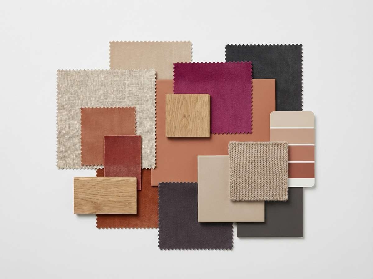
For a warm, premium look, add metals such as brass or gold in small doses (buttons, borders, icons). If you want something calmer and more contemporary, try muted greens (sage/olive) or warm greige to balance the berry tones.
For creative gradients and twilight moods, dark magenta blends well with amethyst, aubergine, and lilac-gray—ideal for backgrounds, posters, and album-style graphics.
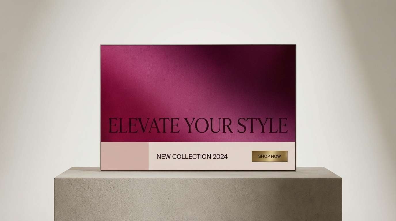
How to Use a Dark Magenta Color Palette in Real Designs
Start by assigning roles: use a deep dark magenta for primary blocks (hero, headers, packaging panels), a near-black/charcoal for text and separators, and a light tint (cream/blush) for backgrounds and cards.
In UI, treat dark magenta as your primary action color and keep secondary actions neutral to reduce visual noise. In print, lean on paper-like off-whites and save brighter magenta tones for small callouts (dates, prices, badges).
For brand systems, repeat the darkest shade consistently across key touchpoints (logo lockups, headings, labels). That repetition makes the palette feel intentional rather than decorative.
Create Dark Magenta Palette Visuals with AI
If you already have HEX codes, you can generate matching mockups (posters, packaging, UI, invitations) by describing composition, material, and lighting—and letting the palette guide the vibe.
Use the prompts above as templates: swap in your design type (banner, label, dashboard), keep the “plain background” direction for clean results, and specify where dark magenta should dominate (panels, typography, gradients).
When you need fast variations (lighter, moodier, more metallic), generate a few options and pick the one with the best contrast and readability for your use case.
Dark Magenta Color Palette FAQs
-
What is the HEX code for dark magenta?
There isn’t one single universal HEX for dark magenta, but many dark magenta shades sit around deep berry/plum values like #7a165e or #6a1051. Use a shade that matches your medium (screen vs print) and check contrast for text. -
Is dark magenta good for branding?
Yes—dark magenta signals confidence, creativity, and premium energy. It’s especially effective for beauty, boutique retail, editorial, and tech-luxe brands when paired with clean neutrals and restrained accents. -
What neutral colors work best with dark magenta?
Off-white/cream, light blush, warm greige, and charcoal are the most reliable. They preserve the richness of dark magenta while keeping layouts readable and professional. -
Does dark magenta work for UI design?
It can, as long as you manage contrast. Use dark magenta for primary buttons or hero areas, keep body text on light backgrounds, and validate small text against WCAG contrast targets before shipping. -
What accent colors make dark magenta look luxurious?
Brass/gold and near-black create a classic luxury feel. Use metallic tones sparingly (icons, borders, CTAs) rather than large fills to avoid looking overly ornate. -
Can I pair dark magenta with green?
Yes—muted greens like sage or eucalyptus are excellent counterweights. They cool down the palette and make dark magenta feel more modern and balanced. -
How do I keep a dark magenta palette from feeling too heavy?
Increase light surface area (cream/off-white), reserve the darkest tones for headings and anchors, and use mid tints (mauve/blush) for cards and supporting sections instead of adding more black.
Next: Mahogany Color Palette


