

Cornflower blue (#6495ED) is a modern classic: friendly, clear, and instantly readable across screens and print.
Below are 22 cornflower color palette ideas with HEX codes, mood notes, and practical use cases for UI, branding, invites, posters, and illustrations.
In this article
- Why Cornflower Palettes Work So Well
-
- coastal cornflower
- misty studio blue
- vintage porcelain
- spring meadow wash
- nordic minimal
- sunset accent
- lavender cornflower
- ink and ice
- clay and blue
- citrus pop
- garden invitation
- maritime deep
- sandstone calm
- electric twilight
- soft denim
- botanical watercolor
- editorial serenity
- skyline gradient
- warm cocoa contrast
- monochrome cornflower
- paper sky notes
- calm museum wall
- What Colors Go Well with Cornflower?
- How to Use a Cornflower Color Palette in Real Designs
- Create Cornflower Palette Visuals with AI
Why Cornflower Palettes Work So Well
Cornflower sits in a “safe” zone of blue: saturated enough to feel branded, but soft enough to remain welcoming. That balance makes it a reliable primary color for modern UI, marketing pages, and editorial layouts.
It pairs easily with both cool neutrals (ice whites, charcoal, slate) and warm accents (gold, terracotta, cocoa). That flexibility lets you shift the mood from calm and minimal to energetic and high-contrast without losing consistency.
In practice, cornflower also performs well for accessibility when matched with deep navy or near-black for text. Used as buttons, links, and key highlights, it draws attention without overwhelming the layout.
20+ Cornflower Color Palette Ideas (with HEX Codes)
1) Coastal Cornflower
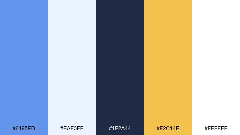
HEX: #6495ED #EAF3FF #1F2A44 #F2C14E #FFFFFF
Mood: breezy, optimistic, coastal
Best for: travel landing page UI
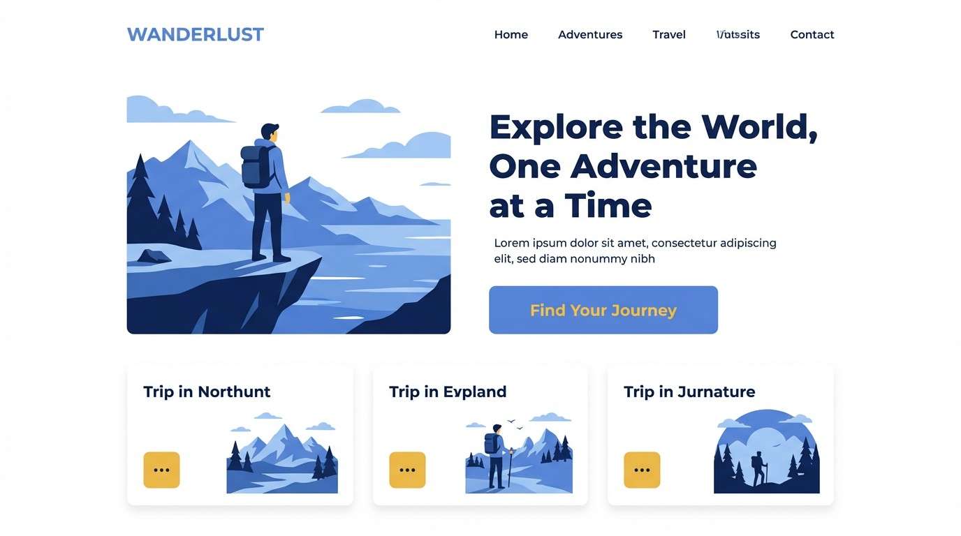
Breezy and sunlit, this mix feels like salt air, whitecaps, and a clear horizon. Use the cornflower blue as your primary UI color, then anchor layouts with deep navy for navigation and type. Golden yellow works best as a sparing call to action so it reads like sunlight, not noise. Tip: keep backgrounds mostly off-white to preserve contrast and accessibility.
Image example of coastal cornflower generated using media.io
Media.io is an online AI studio for creating and editing video, image, and audio in your browser.

2) Misty Studio Blue
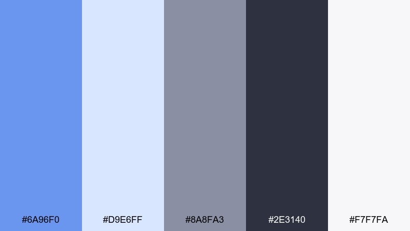
HEX: #6A96F0 #D9E6FF #8A8FA3 #2E3140 #F7F7FA
Mood: calm, modern, understated
Best for: creative agency brand kit
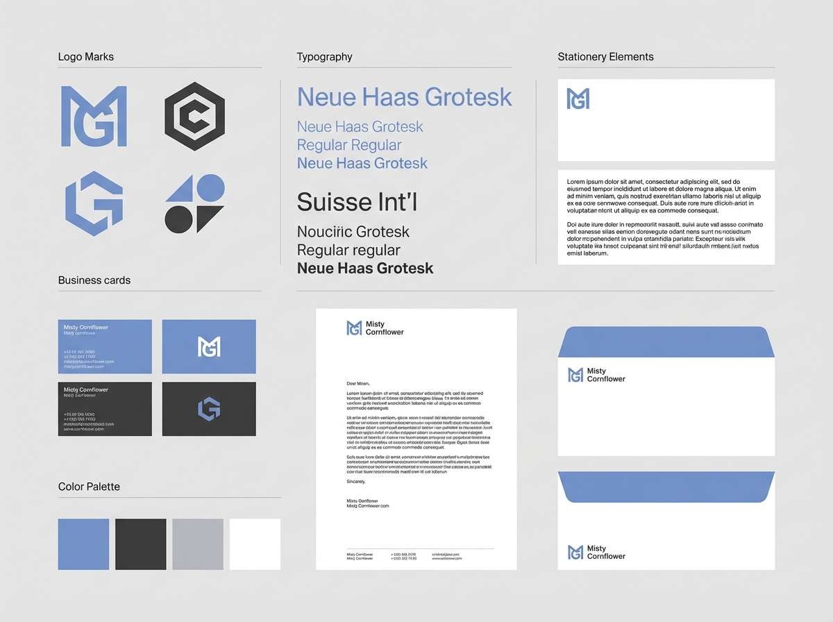
Calm and slightly foggy, these tones evoke early morning light in a quiet studio. For a cornflower color palette that stays professional, use the gray-lilac midtone for secondary surfaces and reserve the bright blue for key brand moments. Charcoal keeps headlines crisp, while the soft whites prevent the look from feeling cold. Tip: use the blue in consistent shapes or rules to build recognition fast.
Image example of misty studio blue generated using media.io
3) Vintage Porcelain
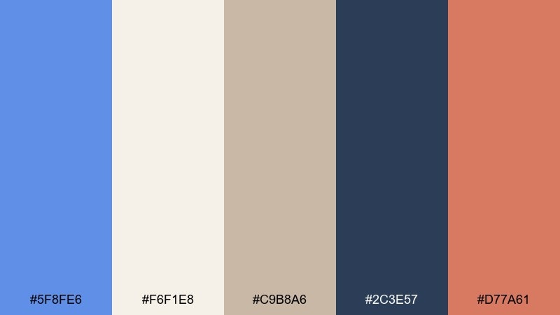
HEX: #5F8FE6 #F6F1E8 #C9B8A6 #2C3E57 #D77A61
Mood: heritage, cozy, refined
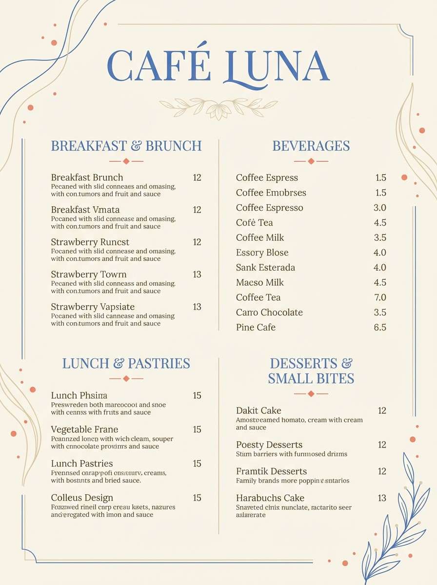
Best for: artisan cafe menu
Warm and nostalgic, this set feels like painted porcelain, linen tablecloths, and a hint of spice. Pair the soft cream and tan as the base, then bring in the blue for section headers and small decorative flourishes. The muted coral is ideal for highlighting specials or pricing without shouting. Tip: keep body text in the deep slate for a printed, timeless look.
Image example of vintage porcelain generated using media.io
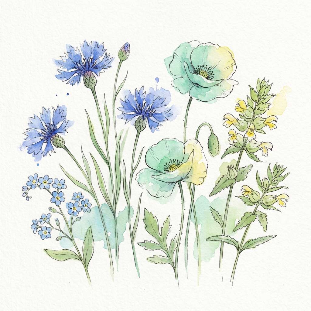
4) Spring Meadow Wash
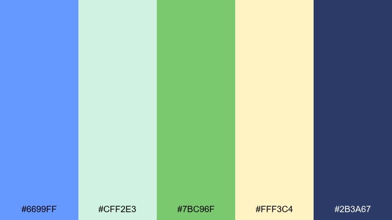
HEX: #6699FF #CFF2E3 #7BC96F #FFF3C4 #2B3A67
Mood: fresh, botanical, cheerful
Best for: watercolor floral illustration
Fresh and lively, these colors suggest new grass, soft petals, and blue sky after rain. Let the blue and mint carry the larger washes, with green reserved for stems and leaf edges. The pale butter yellow keeps the scene sunny without overpowering the cooler tones. Tip: add the deep indigo only for fine outlines or shadows to maintain a light spring feel.
Image example of spring meadow wash generated using media.io
5) Nordic Minimal
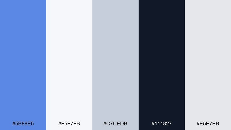
HEX: #5B88E5 #F5F7FB #C7CEDB #111827 #E5E7EB
Mood: clean, crisp, minimal
Best for: SaaS dashboard UI
Clean and quiet, this palette feels like winter light on matte paper. Use the icy whites and pale grays for panels, then deploy the blue for active states, charts, and links. Near-black text gives you reliable contrast while keeping the interface elegant. Tip: limit the blue to one primary action style so users learn it instantly.
Image example of nordic minimal generated using media.io

6) Sunset Accent
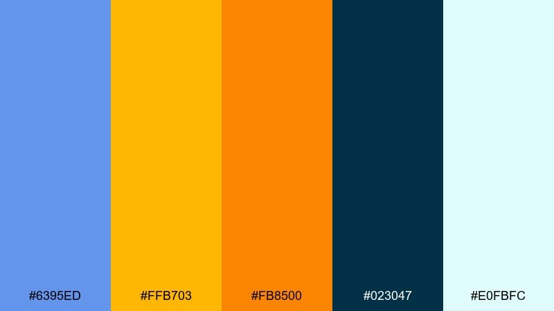
HEX: #6395ED #FFB703 #FB8500 #023047 #E0FBFC
Mood: bold, energetic, high-contrast
Best for: sports event poster
Bold and high-energy, this mix reads like late-day sky over a stadium. These cornflower color combinations work best when blue handles the main field and the oranges are kept for headlines, badges, or key dates. Deep teal-blue grounds the contrast and prevents the warm accents from feeling chaotic. Tip: add plenty of pale aqua breathing room so the poster stays readable at a distance.
Image example of sunset accent generated using media.io

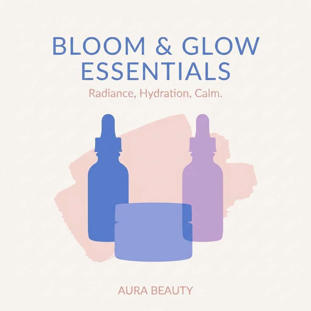
7) Lavender Cornflower
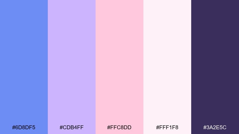
HEX: #6D8DF5 #CDB4FF #FFC8DD #FFF1F8 #3A2E5C
Mood: soft, dreamy, romantic
Best for: beauty brand social post
Soft and dreamy, these hues feel like satin ribbons and dusk-lit clouds. Let the blue and lavender do the heavy lifting, then use blush pink for small highlights like icons or price tags. The deep plum is perfect for type and outlines so the pastels stay legible. Tip: keep gradients subtle and avoid adding extra saturated colors beyond this set.
Image example of lavender cornflower generated using media.io
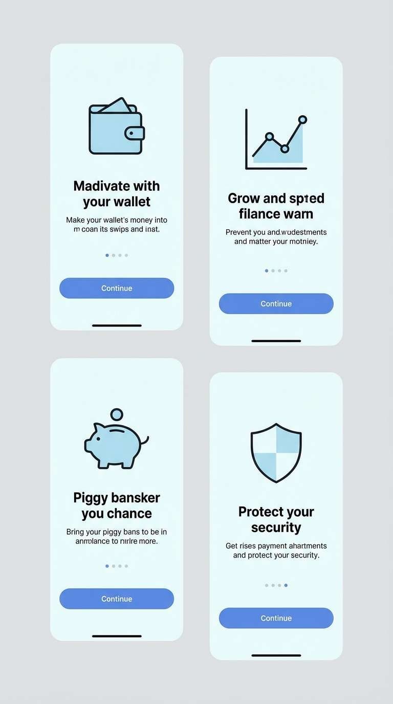
8) Ink and Ice
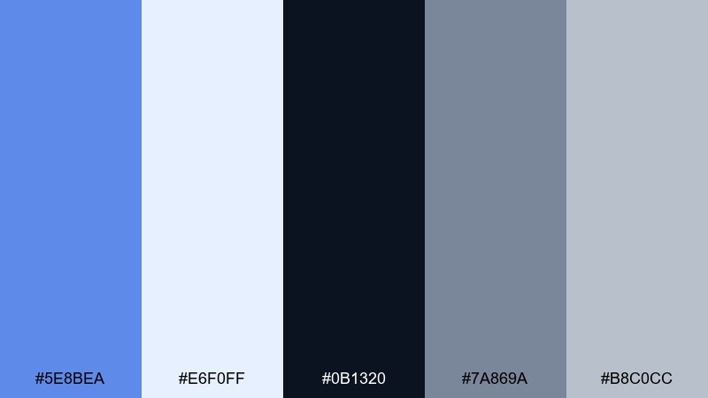
HEX: #5E8BEA #E6F0FF #0B1320 #7A869A #B8C0CC
Mood: sleek, serious, tech-forward
Best for: fintech mobile onboarding screens
Sleek and confident, this set suggests midnight ink cut with glacial light. Use the pale ice blue for screen backgrounds and the inky near-black for primary text and key numbers. Cornflower works best on buttons and progress indicators where you want immediate focus. Tip: keep gray accents consistent for dividers and secondary labels to avoid visual clutter.
Image example of ink and ice generated using media.io
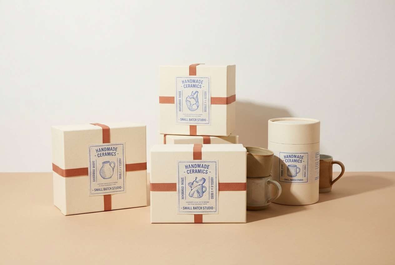
9) Clay and Blue
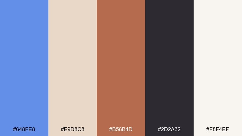
HEX: #648FE8 #E9D8C8 #B56B4D #2D2A32 #F8F4EF
Mood: earthy, artistic, grounded
Best for: handmade ceramics packaging
Earthy and artistic, this pairing feels like wet clay beside a bright studio window. Use the creamy neutrals for labels and backgrounds, then add the blue as a crisp counterpoint to the warm terracotta. The espresso tone is ideal for typography and small pattern details. Tip: try a matte paper stock so the colors keep their handcrafted character.
Image example of clay and blue generated using media.io
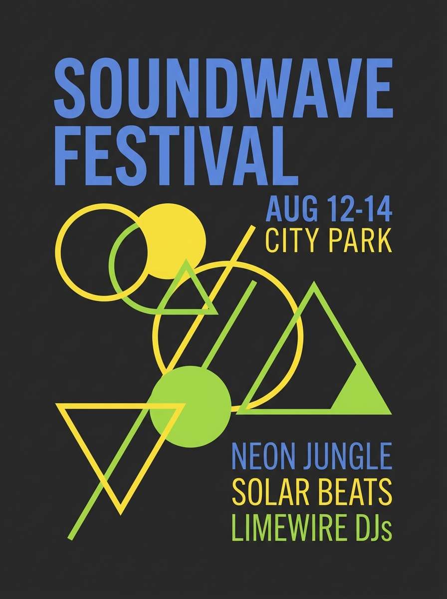
10) Citrus Pop
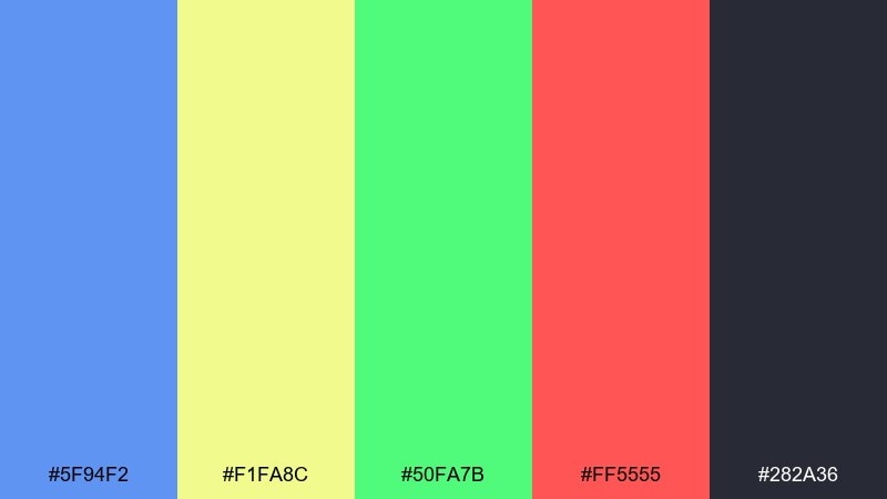
HEX: #5F94F2 #F1FA8C #50FA7B #FF5555 #282A36
Mood: playful, punchy, youthful
Best for: music festival flyer
Playful and punchy, these colors hit like synth-pop and summer fruit. Keep the dark base for type blocks and background shapes, then use the blue as the main highlight color for titles. Lime and yellow should be used as supporting pops, with red reserved for one standout element like a date or ticket note. Tip: stick to two bright accents per layout to avoid a chaotic look.
Image example of citrus pop generated using media.io
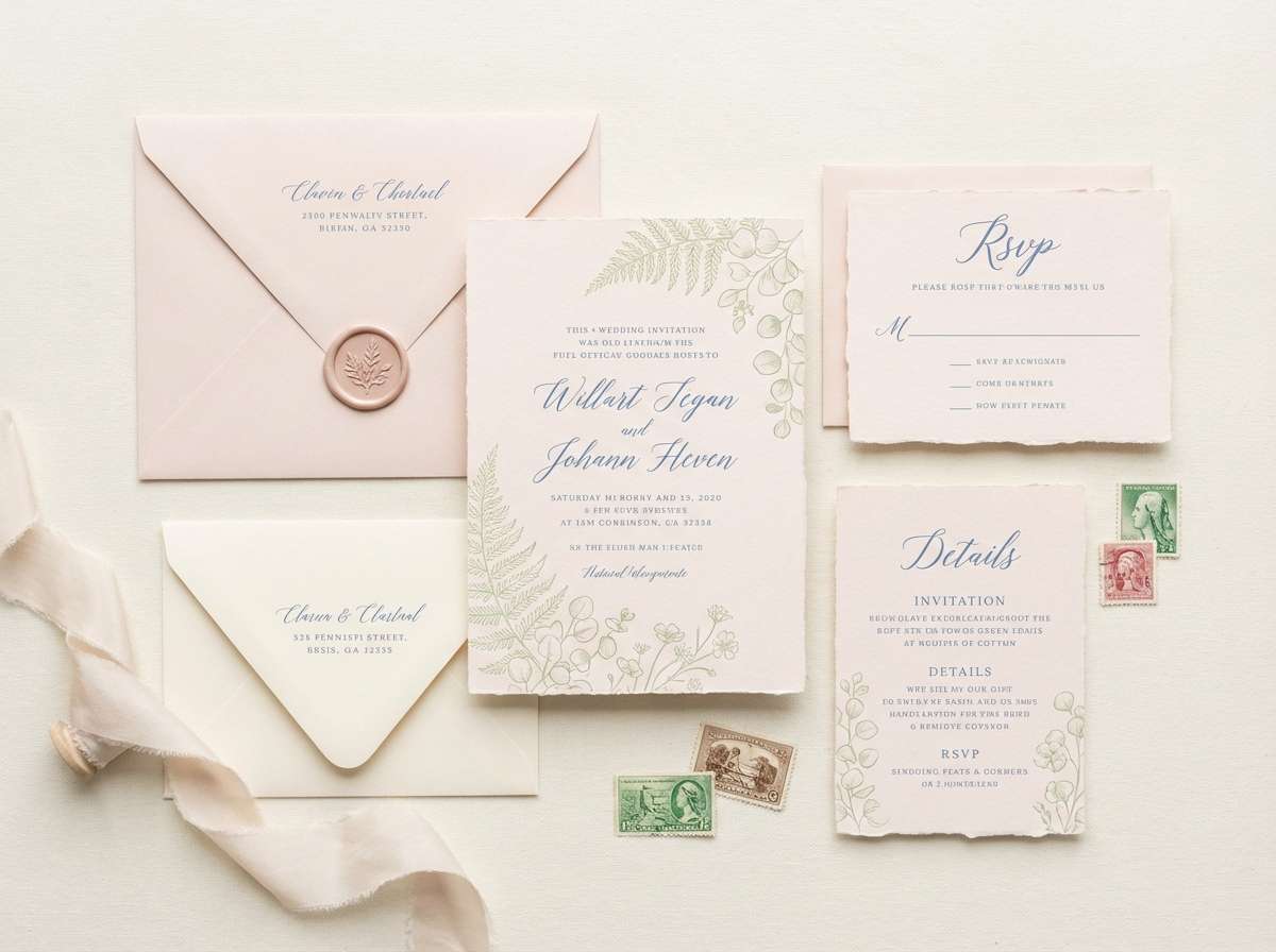
11) Garden Invitation
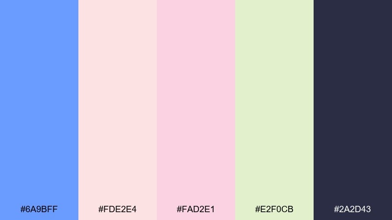
HEX: #6A9BFF #FDE2E4 #FAD2E1 #E2F0CB #2A2D43
Mood: romantic, airy, springtime
Best for: wedding invitation set
Romantic and airy, this set feels like petals pressed into a keepsake book. For a cornflower color palette that stays elegant, use the blush tones as the main paper color and bring in blue for monograms, borders, or RSVP headers. The soft green works beautifully for tiny botanical motifs and envelope liners. Tip: keep text in the deep slate so delicate pastels remain readable in print.
Image example of garden invitation generated using media.io
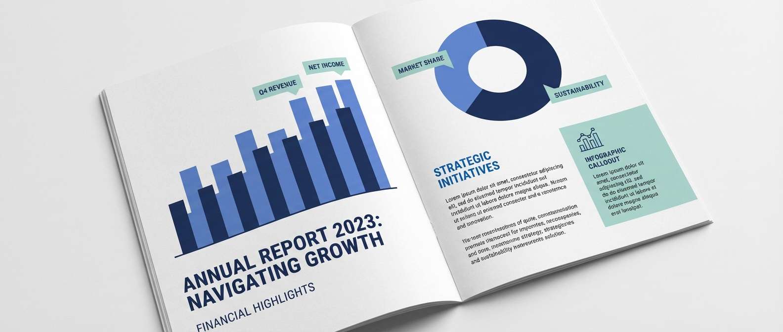
12) Maritime Deep
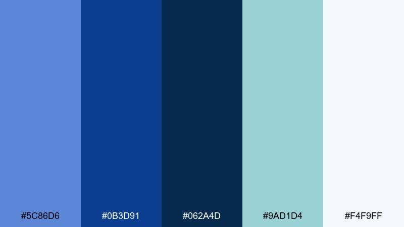
HEX: #5C86D6 #0B3D91 #062A4D #9AD1D4 #F4F9FF
Mood: nautical, confident, corporate
Best for: annual report layout
Nautical and confident, these blues feel like deep water with a cool sea breeze. Use the lightest shade for generous margins and data tables, then rely on the deep navies for headings and charts. The muted aqua is a strong secondary accent for callouts, icons, and infographics. Tip: keep graphs to two blues plus aqua so the report stays cohesive across pages.
Image example of maritime deep generated using media.io
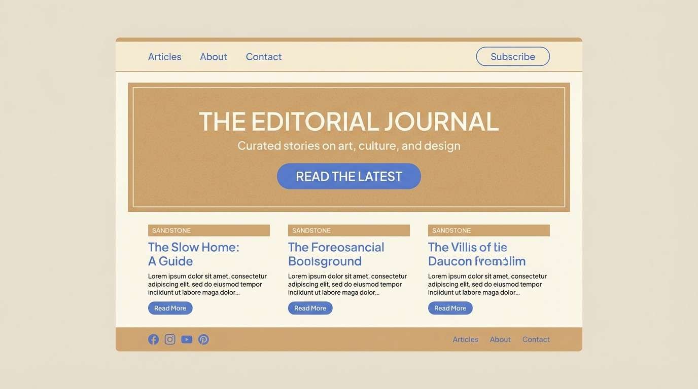
13) Sandstone Calm
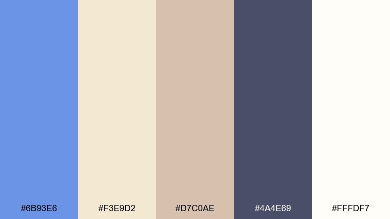
HEX: #6B93E6 #F3E9D2 #D7C0AE #4A4E69 #FFFDF7
Mood: calm, warm, welcoming
Best for: wellness blog theme
Calm and welcoming, this palette suggests sun-warmed stone and a clear blue sky. Use the creamy neutrals for long-form reading areas and let the blue guide links, buttons, and section dividers. The dusty mauve-gray keeps typography soft compared to harsh black. Tip: add generous line spacing and pair the blue with tan highlights for a soothing rhythm.
Image example of sandstone calm generated using media.io
14) Electric Twilight
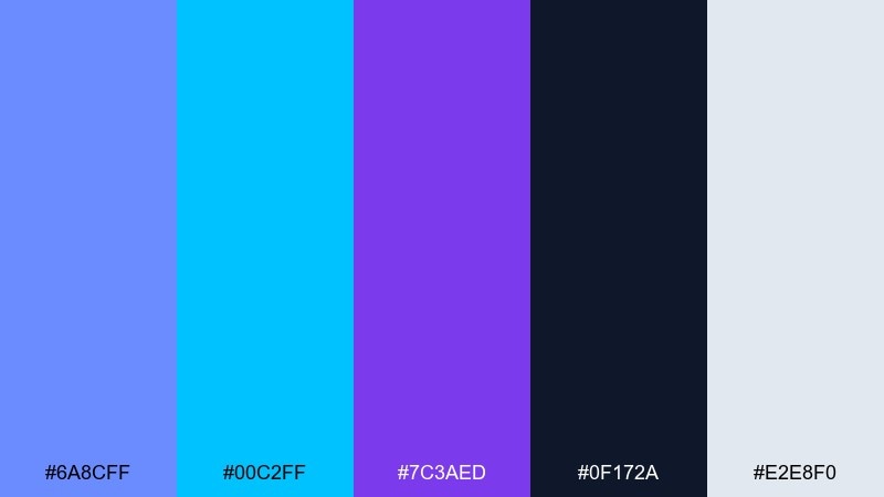
HEX: #6A8CFF #00C2FF #7C3AED #0F172A #E2E8F0
Mood: vibrant, futuristic, nightlife
Best for: tech conference hero banner
Vibrant and futuristic, these tones feel like city lights reflected in night glass. Use cornflower blue as the main hero color, then layer cyan and violet for gradients and highlight strokes. These cornflower color combinations shine on dark backgrounds, where the near-black keeps everything clean and premium. Tip: keep typography light and simple so the gradient effects do not fight for attention.
Image example of electric twilight generated using media.io

15) Soft Denim
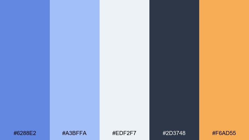
HEX: #6288E2 #A3BFFA #EDF2F7 #2D3748 #F6AD55
Mood: friendly, casual, trustworthy
Best for: education app UI
Friendly and casual, these shades feel like worn denim with a warm sunrise accent. Use the two blues for navigation and progress states, keeping the palest tone for cards and backgrounds. The warm amber is a great reward color for achievements or key reminders. Tip: reserve the darkest slate for text only, and the UI will stay light and approachable.
Image example of soft denim generated using media.io
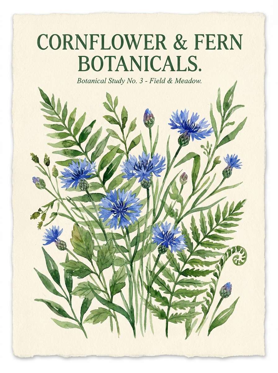
16) Botanical Watercolor
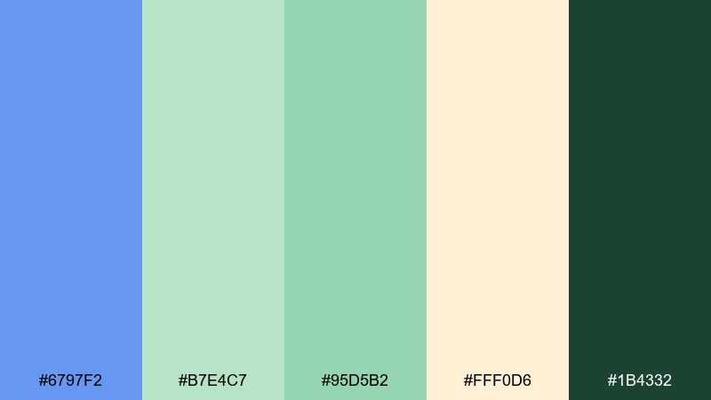
HEX: #6797F2 #B7E4C7 #95D5B2 #FFF0D6 #1B4332
Mood: natural, gentle, handcrafted
Best for: spring botanical poster illustration
Natural and gentle, this set evokes leafy shadows, light paper, and a bright blue bloom. Let the greens dominate foliage areas while the blue acts as the hero flower color or a sky wash. Cream keeps the overall piece warm, and the deep forest tone adds structure in stems and lettering. Tip: use wet-on-wet blends for soft transitions between the blue and green.
Image example of botanical watercolor generated using media.io
17) Editorial Serenity
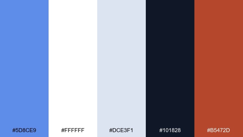
HEX: #5D8CE9 #FFFFFF #DCE3F1 #101828 #B5472D
Mood: polished, editorial, balanced
Best for: magazine feature spread
Polished and balanced, these tones feel like crisp pages with a confident blue headline. For a cornflower color scheme that reads premium, use white and pale gray-blue as the grid foundation and let the dark ink handle typography. The earthy red-brown makes a smart accent for pull quotes and section markers. Tip: keep accent usage consistent across the spread to guide scanning.
Image example of editorial serenity generated using media.io
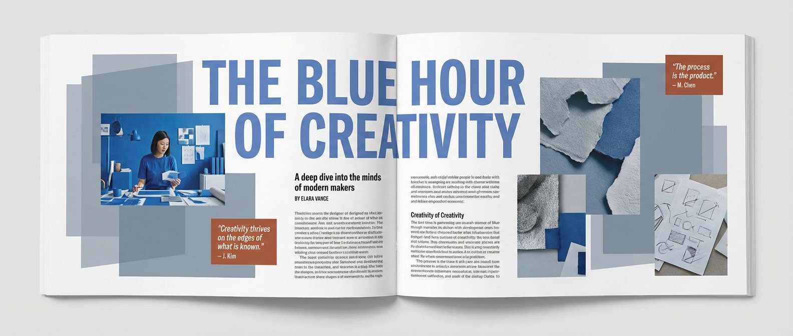
18) Skyline Gradient
HEX: #5E90FF #22D3EE #A78BFA #0B1020 #F1F5F9
Mood: modern, luminous, digital
Best for: app splash screen
Modern and luminous, this mix suggests a skyline fading into neon haze. Use the blue as the core brand color and build gradients with cyan and soft violet for depth. The near-black is perfect for a dramatic background that makes the glow feel intentional. Tip: add plenty of negative space so the gradient does not overwhelm the logo.
Image example of skyline gradient generated using media.io

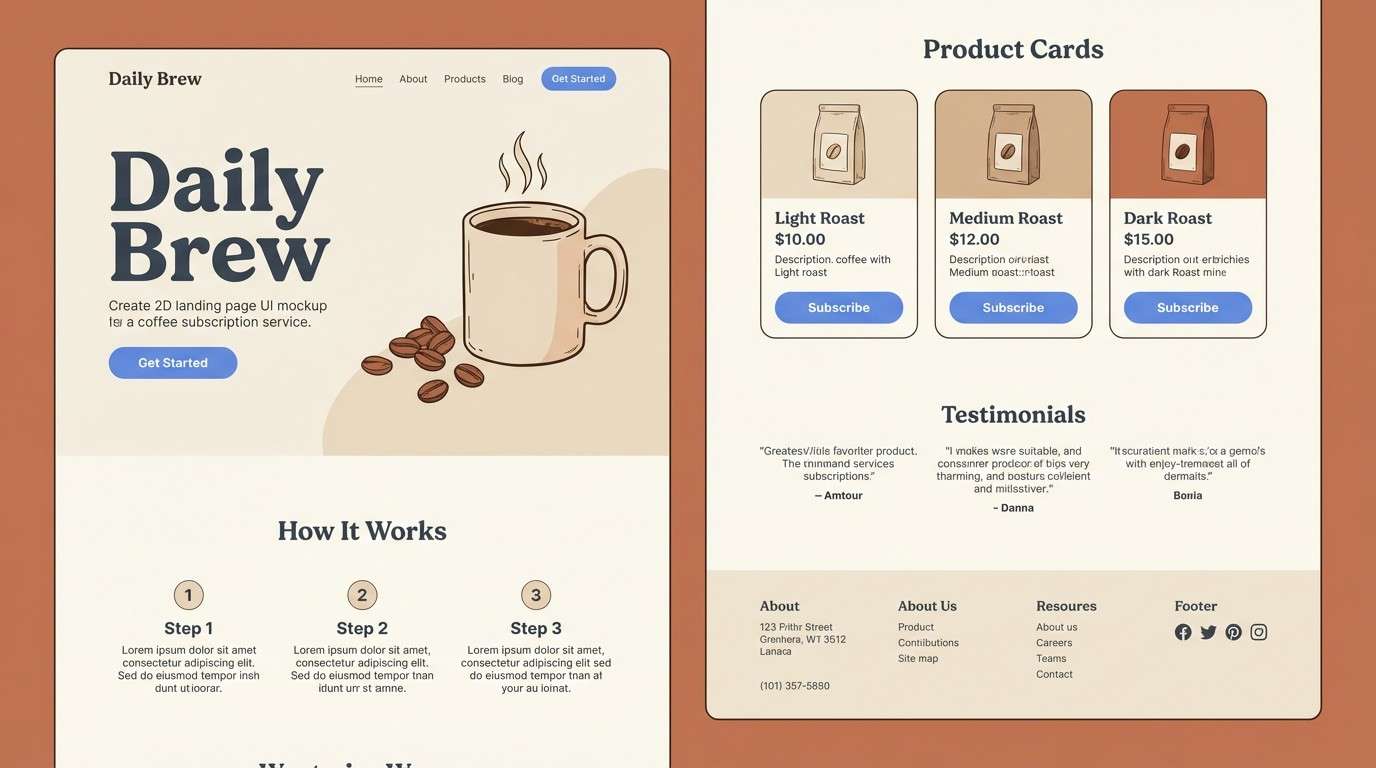
19) Warm Cocoa Contrast
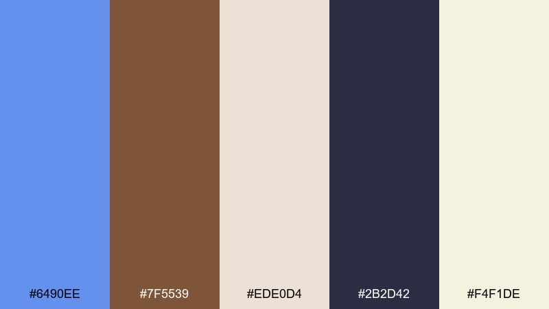
HEX: #6490EE #7F5539 #EDE0D4 #2B2D42 #F4F1DE
Mood: cozy, upscale, grounded
Best for: coffee subscription landing page
Cozy and upscale, these tones bring together cocoa warmth and a cool blue highlight. Use the creams as your primary background, then set the blue on buttons and links for a fresh, modern contrast. Brown works best in photography props or small UI details like icons and dividers. Tip: keep text in the deep slate so the page feels premium rather than rustic.
Image example of warm cocoa contrast generated using media.io
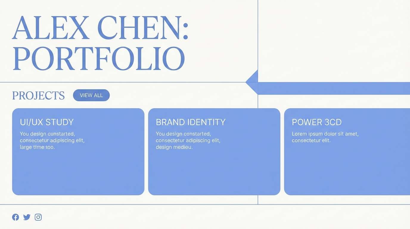
20) Monochrome Cornflower
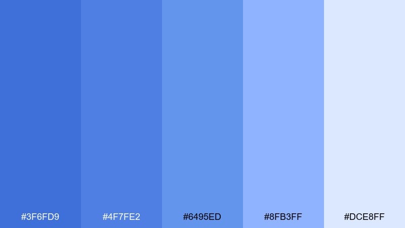
HEX: #3F6FD9 #4F7FE2 #6495ED #8FB3FF #DCE8FF
Mood: harmonious, focused, serene
Best for: minimal portfolio website
Harmonious and focused, this all-blue range feels like layered sky and calm water. Use the mid cornflower tone for primary buttons and headers, then step lighter for backgrounds and hover states. The deepest shade adds structure for navigation and footers without introducing harsh contrast. Tip: add texture through spacing and type hierarchy instead of extra colors.
Image example of monochrome cornflower generated using media.io
21) Paper Sky Notes
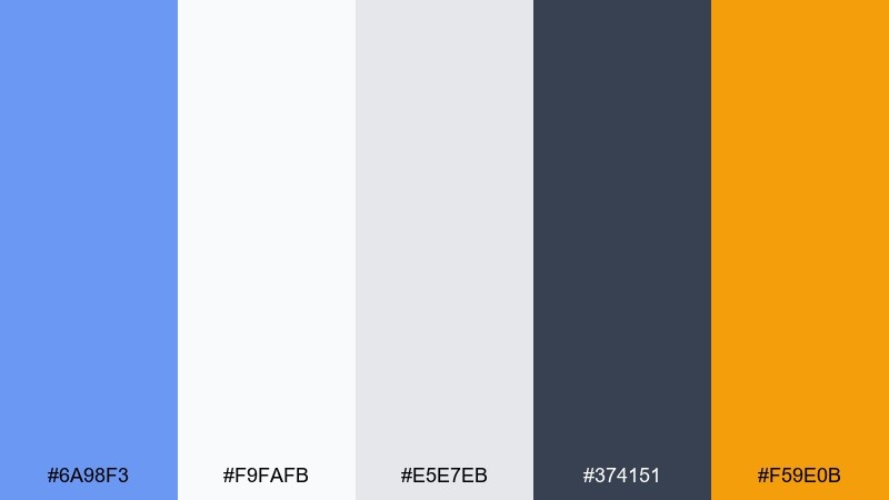
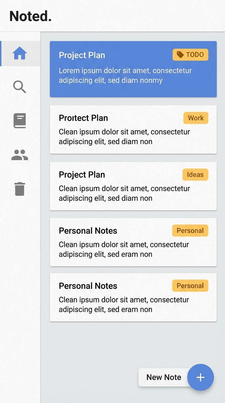
HEX: #6A98F3 #F9FAFB #E5E7EB #374151 #F59E0B
Mood: practical, bright, organized
Best for: note-taking app UI
Practical and bright, these colors feel like clean paper with a clear blue pen. Use the light grays for structure and cards, then let the blue signal active notes and primary actions. The amber accent is great for tags, reminders, or small notification dots. Tip: keep icon fills neutral and use blue only for selected states to reduce fatigue.
Image example of paper sky notes generated using media.io
22) Calm Museum Wall
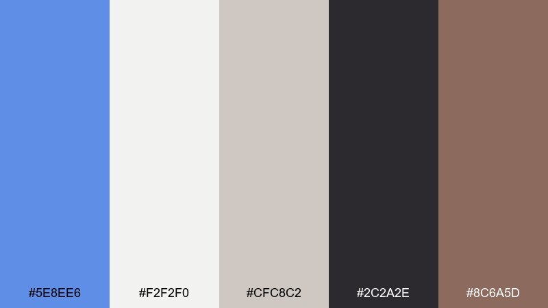
HEX: #5E8EE6 #F2F2F0 #CFC8C2 #2C2A2E #8C6A5D
Mood: quiet, cultured, gallery-like
Best for: exhibition poster
Quiet and cultured, this set evokes gallery walls, soft lighting, and one striking blue artwork. Use the off-whites as the main field, then let the blue carry the title or a single geometric element. Taupe and clay-brown make excellent supporting tones for dates, venue details, and subtle frames. Tip: embrace large margins so the design feels intentional and museum-ready.
Image example of calm museum wall generated using media.io

What Colors Go Well with Cornflower?
Cornflower blue looks especially clean with crisp whites, ice blues, and cool grays—perfect for modern interfaces and editorial grids. Pair it with charcoal or near-black for strong contrast and easy readability.
For warmer, more inviting designs, combine cornflower with cream, tan, sandstone, cocoa, or terracotta. These earthy neutrals soften the blue and make it feel premium rather than overly “tech.”
If you want bold energy, add complementary or near-complementary accents like golden yellow, amber, or orange. Keep those warm tones limited to CTAs, badges, or key headings so the palette stays controlled.
How to Use a Cornflower Color Palette in Real Designs
In UI, assign cornflower to interactive elements: primary buttons, links, toggles, progress states, and chart highlights. Use neutrals (off-white, gray) for surfaces and reserve deep navy/ink for text to maintain accessibility.
In branding, cornflower works best when it appears in repeatable, recognizable moments—logo marks, headers, rules, or icon strokes—while supporting colors stay quieter. This creates consistency across a website, social templates, and print assets.
For posters and invitations, treat cornflower as your “hero” ink, then choose one accent (gold, coral, rust, or blush) for emphasis. A restrained accent strategy keeps the design elegant and readable from a distance.
Create Cornflower Palette Visuals with AI
If you already have HEX codes, you can turn them into real mockups faster by generating styled visuals—landing pages, posters, brand kits, or watercolor illustrations—then refining composition and typography.
Start with a clear subject (UI, poster, packaging), specify the dominant color as cornflower, and mention where accents should appear (CTA buttons, headline blocks, small badges). Keeping the background “clean” or “plain” helps the palette read accurately.
Use Media.io to generate, iterate, and download cornflower palette visuals for mood boards, client previews, and production-ready inspiration.
Cornflower Color Palette FAQs
-
What is cornflower blue’s HEX code?
The classic cornflower blue HEX code is #6495ED. Many palettes use close variants for slightly warmer or cooler moods. -
Is cornflower blue a good primary color for UI?
Yes. Cornflower is saturated enough for buttons and links but still friendly. Pair it with near-black or deep navy text and plenty of light neutral surfaces for accessible contrast. -
What’s the best complementary accent for cornflower?
Warm golden tones (amber, honey, orange) create a strong, high-energy contrast. Use them sparingly for CTAs, badges, or key dates so they don’t overpower the layout. -
How do I make a cornflower palette feel more premium?
Use cornflower with white, pale gray-blue, and deep ink/charcoal typography, then add one restrained earthy accent (rust, cocoa, terracotta) for editorial balance. -
Can I use a monochrome cornflower palette?
Yes. A single-hue range works great for portfolios and minimal brands. Build hierarchy with tints/shades and rely on spacing and typography rather than extra colors. -
What colors soften cornflower for wedding or beauty designs?
Blush, lavender, soft cream, and gentle greens pair beautifully with cornflower. Keep body text dark (plum, slate, charcoal) to maintain print legibility. -
How can I generate cornflower palette mockups quickly?
Use an AI image generator and describe the layout type (UI, poster, brand kit) plus where cornflower and accents should appear. Media.io’s text-to-image tool is a fast way to iterate on color-driven concepts.


