

Coral reef palettes mix sun-warmed pinks and oranges with ocean teals and deep blues, creating color systems that feel lively, clean, and instantly coastal.
Whether you’re building a brand kit, UI theme, poster, or social layout, these coral reef color combinations help you balance warmth (coral) with clarity (aqua/teal) and structure (navy or slate).
In this article
Why Coral Reef Palettes Work So Well
Coral reef colors naturally create contrast: warm coral and mango tones advance visually, while teal and deep ocean blues recede. That push-pull makes layouts feel dimensional even with flat design.
They’re also flexible across moods. You can shift a coral reef palette toward soft and romantic with blush + cream, or go bold and energetic with neon coral + electric cyan on a dark base.
Most importantly, reef-inspired schemes are easy to systemize for branding and UI: one deep anchor for text, one bright warm for CTAs, one cool for interactive states, and a light neutral for breathing room.
20+ Coral Reef Color Palette Ideas (with HEX Codes)
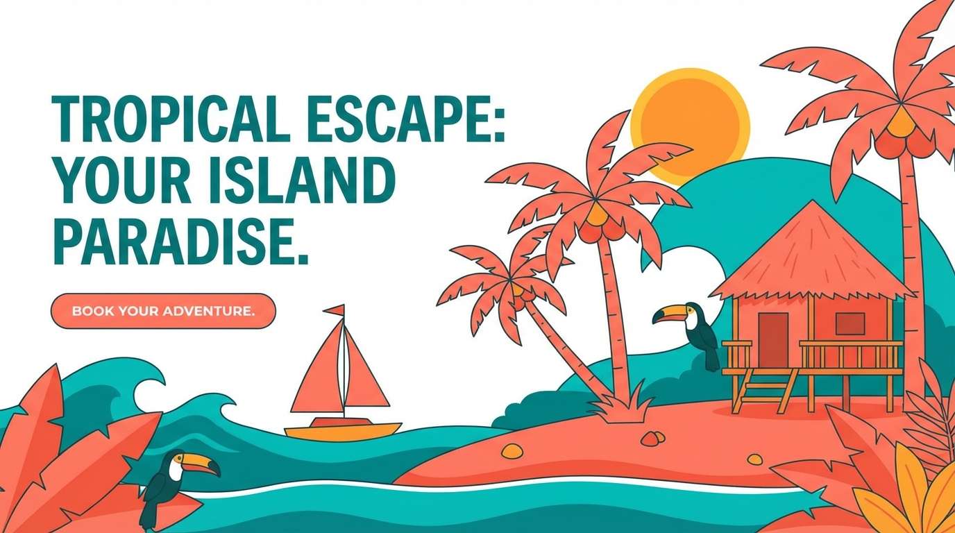
1) Sunlit Lagoon
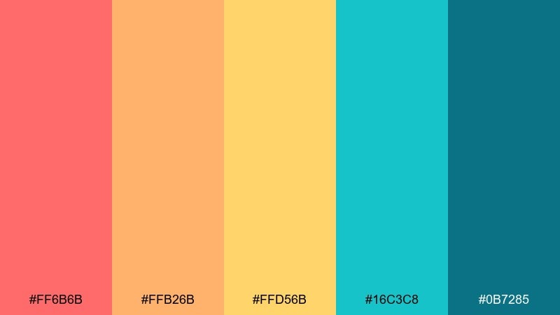
HEX: #ff6b6b #ffb26b #ffd56b #16c3c8 #0b7285
Mood: bright, tropical, optimistic
Best for: travel landing pages and summer campaign banners
Bright and tropical like sunlight cutting through shallow water, this mix balances juicy coral with cooling lagoon teal. It shines on hero sections, promos, and destination branding where you want instant warmth. Keep teal as your anchor for headers and buttons, then use coral for calls to action. Tip: let the sandy gold act as a soft divider color to avoid harsh contrasts.
Image example of sunlit lagoon generated using media.io
Media.io is an online AI studio for creating and editing video, image, and audio in your browser.

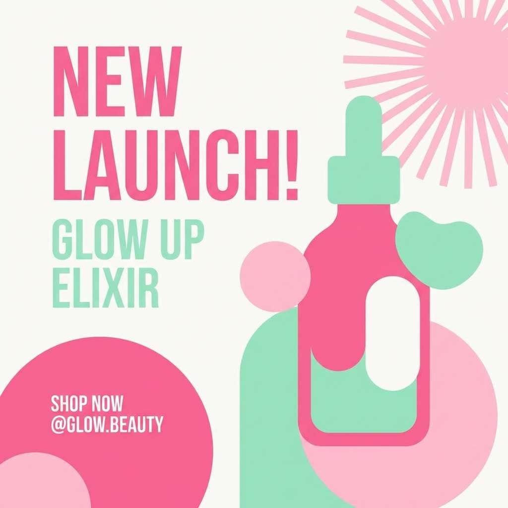
2) Anemone Glow
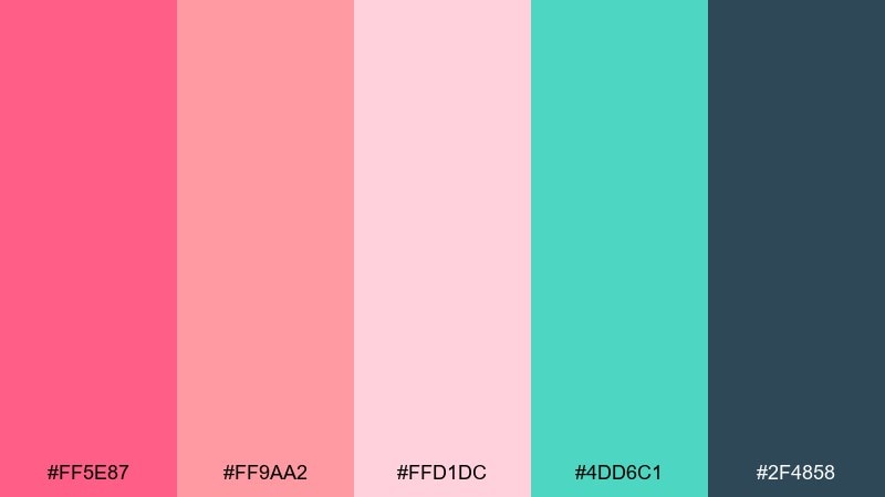
HEX: #ff5e87 #ff9aa2 #ffd1dc #4dd6c1 #2f4858
Mood: playful, modern, candy-bright
Best for: beauty brand social posts and product highlights
Playful and modern, it feels like anemones swaying in a warm current with a pop of cool mint. The deep slate gives you structure for type, while the pinks do the emotional heavy lifting. Use the mint as a selective accent on icons or price tags to keep the design crisp. Tip: reserve the darkest shade for text only so the pastels stay airy.
Image example of anemone glow generated using media.io
3) Tidepool Sorbet
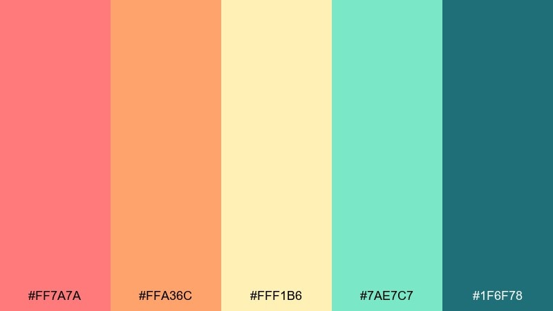
HEX: #ff7a7a #ffa36c #fff1b6 #7ae7c7 #1f6f78
Mood: fresh, sunny, welcoming
Best for: cafes, menus, and cheerful event flyers
Fresh and sunny like sorbet melting beside a tidepool, the warm fruits and minty water tones feel instantly friendly. If you need a coral reef color combination that reads upbeat without shouting, this balance of soft yellow and teal is a reliable choice. Put the deep teal behind headings, then let coral and apricot carry highlights and badges. Tip: keep the pale butter yellow as your background to make the brighter accents pop cleanly.
Image example of tidepool sorbet generated using media.io
4) Reef Sunset
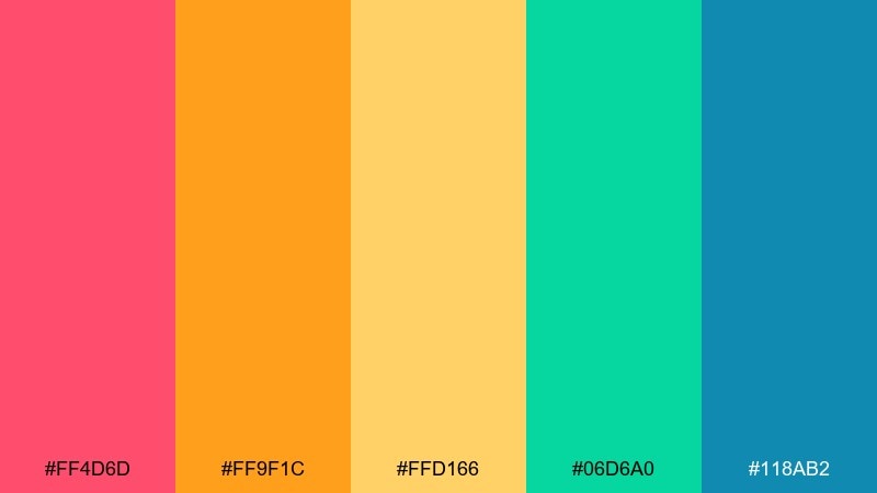
HEX: #ff4d6d #ff9f1c #ffd166 #06d6a0 #118ab2
Mood: energetic, bold, festival-ready
Best for: posters, streaming thumbnails, and punchy promos
Energetic and bold, it evokes a sunset wash over reef edges with bright citrus and electric sea tones. This set is ideal when you want strong contrast for headlines and thumbnails that must read fast. Pair the orange and coral for focal elements, then cool the design with teal blocks to avoid visual fatigue. Tip: use the yellow as a glow or highlight rather than a full background to keep legibility high.
Image example of reef sunset generated using media.io

5) Seafoam Drift
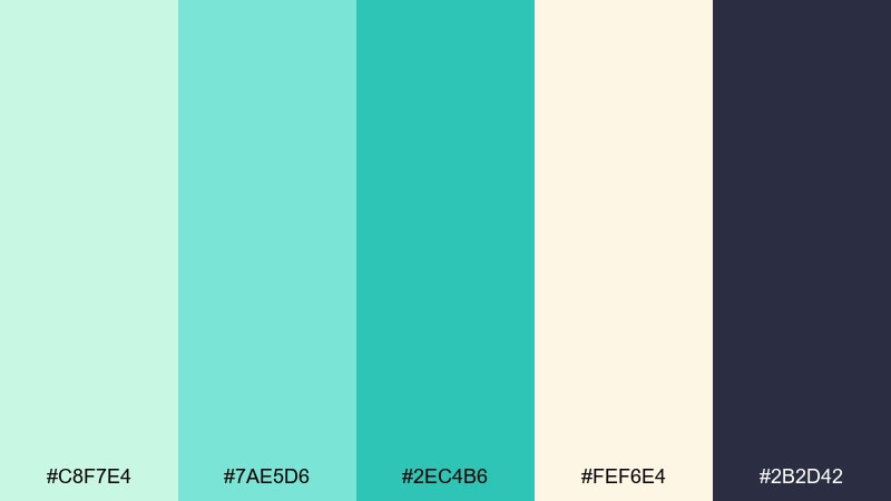
HEX: #c8f7e4 #7ae5d6 #2ec4b6 #fef6e4 #2b2d42
Mood: calm, clean, spa-like
Best for: wellness websites and minimalist packaging
Calm and clean, it feels like seafoam drifting over pale sand with a quiet inky contrast. The creamy neutral makes layouts look premium and breathable, especially for wellness and skincare. Let the dark navy handle body text and small UI elements, keeping teal for progress states and highlights. Tip: limit the deepest tone to 10 to 15 percent of the layout for a softer, spa-like finish.
Image example of seafoam drift generated using media.io
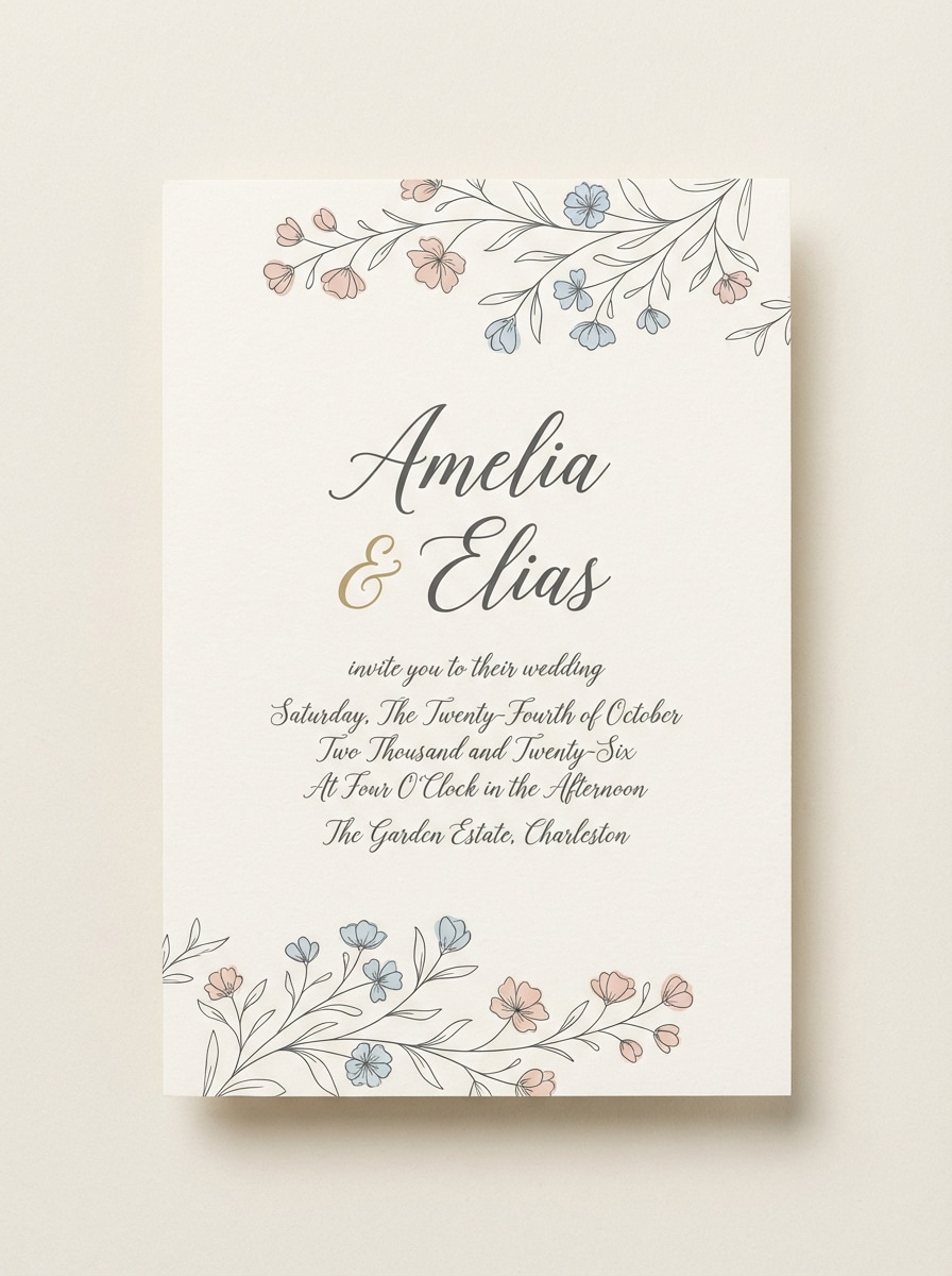
6) Coral Sandbar
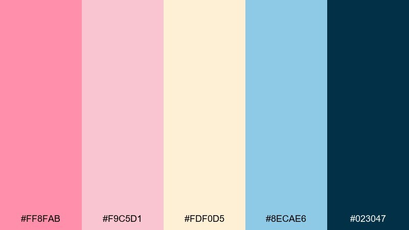
HEX: #ff8fab #f9c5d1 #fdf0d5 #8ecae6 #023047
Mood: romantic, soft, airy
Best for: wedding invitations and bridal stationery
Romantic and airy, it suggests a quiet sandbar with blush petals and a whisper of ocean blue. These gentle tones work beautifully on invitations, save-the-dates, and monograms where you need elegance without heavy contrast. Use the deep navy sparingly for names and dates, and keep most of the layout in blush and cream. Tip: add thin blue rules or icons for structure instead of large color blocks.
Image example of coral sandbar generated using media.io
7) Tropical Current
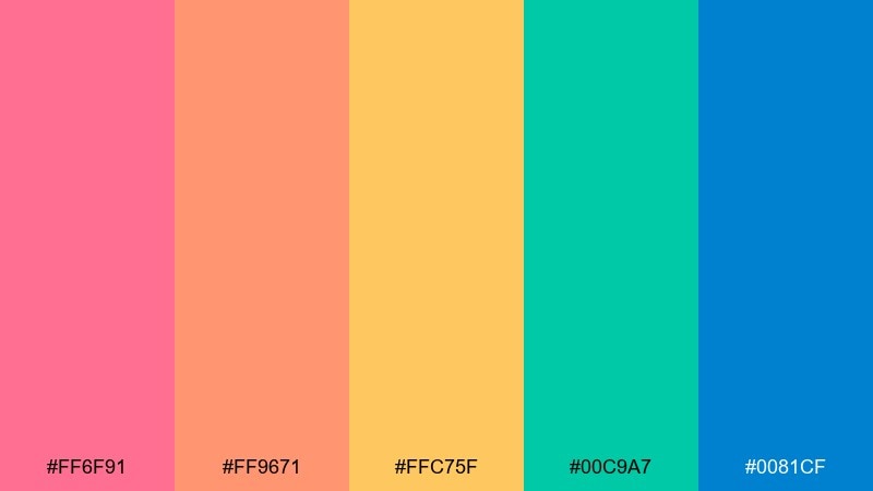
HEX: #ff6f91 #ff9671 #ffc75f #00c9a7 #0081cf
Mood: youthful, lively, high-energy
Best for: mobile story ads and creator promos
Youthful and lively, it reads like a fast tropical current with neon fruit tones and crisp ocean blues. For creators who want coral reef color combinations that feel modern, these hues give you instant momentum in vertical layouts. Keep the blue for buttons and labels, then rotate coral and mango for attention-grabbing stickers. Tip: pick one warm as the dominant color per frame so the design stays focused.
Image example of tropical current generated using media.io

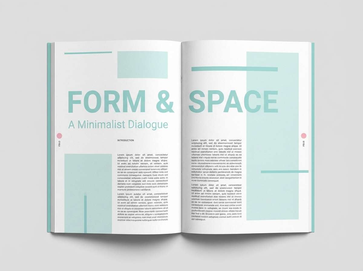
8) Pearl Diver
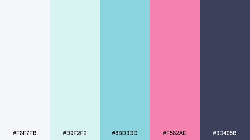
HEX: #f6f7fb #d9f2f2 #8bd3dd #f582ae #3d405b
Mood: editorial, polished, gentle
Best for: magazine layouts and lookbooks
Polished and gentle, it feels like pearls and soft seawater with a clean pop of rosy ink. The near-white and pale aqua keep spreads bright, while the slate brings serious editorial contrast. Use the pink as a controlled accent on pull quotes, section tabs, or small graphic marks. Tip: stick to plenty of whitespace so the palette reads upscale rather than cute.
Image example of pearl diver generated using media.io
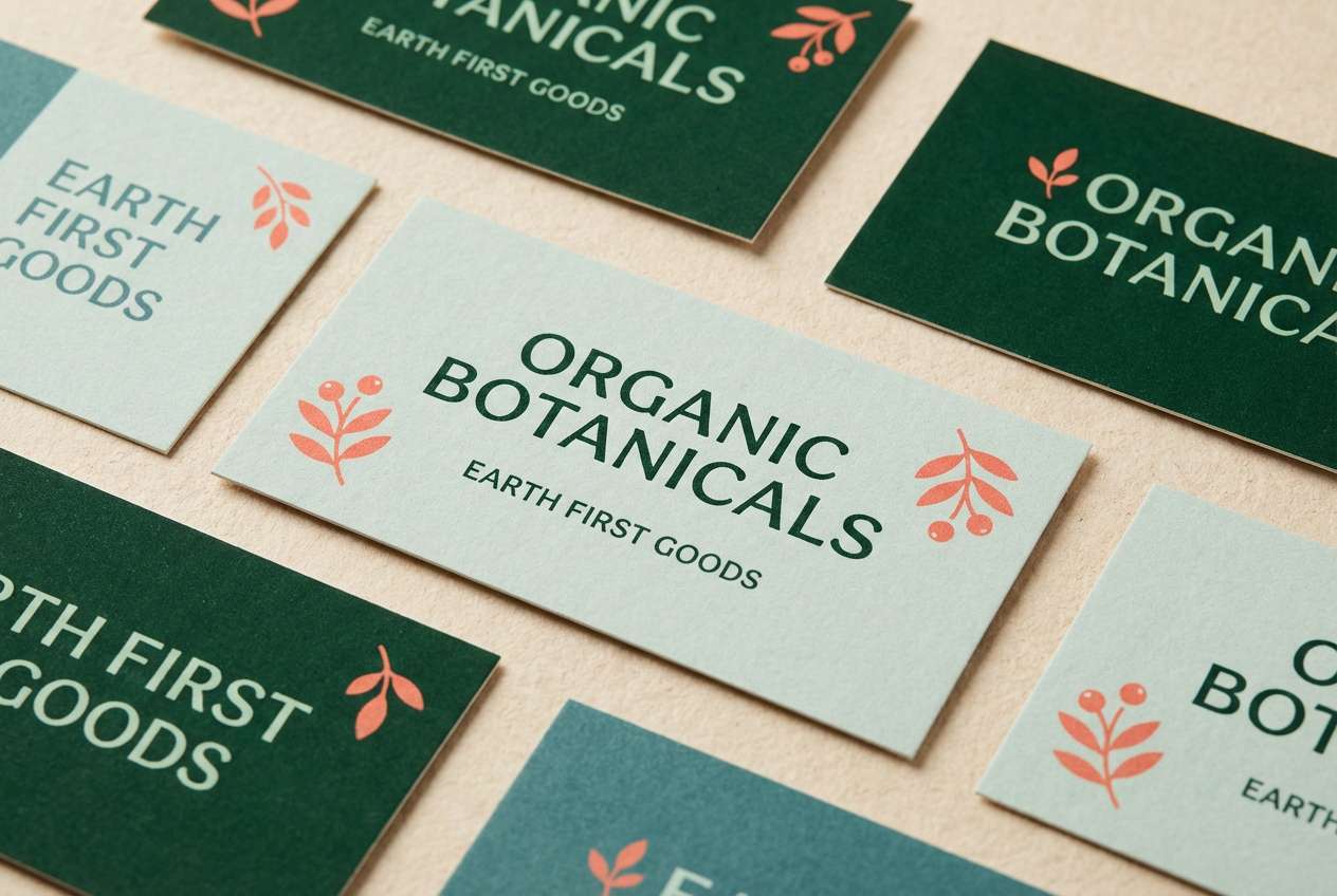
9) Kelp Garden
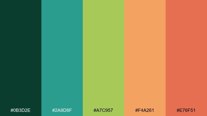
HEX: #0b3d2e #2a9d8f #a7c957 #f4a261 #e76f51
Mood: earthy, adventurous, coastal
Best for: outdoor brands and eco packaging
Earthy and adventurous, it brings to mind kelp forests, sunlit greens, and a punch of coral-orange life. It works well for eco-minded brands that want coastal energy without leaning too pastel. Let the deep green set the base for labels and backgrounds, then layer teal and lime for secondary panels. Tip: use the warm coral as a seal or stamp element to create a clear focal point.
Image example of kelp garden generated using media.io
10) Bleached Shell
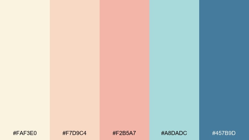
HEX: #faf3e0 #f7d9c4 #f2b5a7 #a8dadc #457b9d
Mood: soft, coastal, understated
Best for: logos, business cards, and calm brand systems
Soft and understated, it resembles sun-bleached shells with a cooled ocean breeze. The warm neutrals keep brand materials friendly, while the blue pair adds clarity for type and icons. Use the lightest cream for stationery backgrounds and the deeper blue for the mark and small details. Tip: keep saturation low across supporting graphics so the overall look stays refined.
Image example of bleached shell generated using media.io
11) Marine Pop
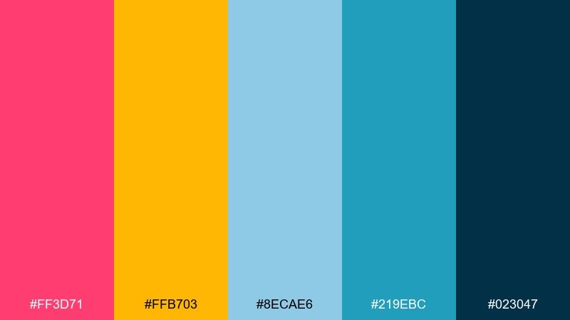
HEX: #ff3d71 #ffb703 #8ecae6 #219ebc #023047
Mood: confident, punchy, modern
Best for: presentation decks and marketing slides
Confident and punchy, it mixes hot coral-pink with crisp blues like signage on a bright marina. The navy base keeps corporate layouts grounded, while the yellow delivers instant emphasis. Use blue for charts and UI elements, then reserve pink for key numbers and CTAs. Tip: keep backgrounds mostly light and add navy in strong bars so slides remain readable from a distance.
Image example of marine pop generated using media.io
12) Calm Atoll
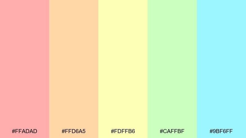
HEX: #ffadad #ffd6a5 #fdffb6 #caffbf #9bf6ff
Mood: gentle, breezy, optimistic
Best for: spring illustrations and lifestyle blog headers
Gentle and breezy, it feels like a quiet atoll morning with pastel light shifting across the water. As a coral reef color scheme for lifestyle visuals, these softened hues keep things cheerful without feeling childish. Use the mint and sky tones as the main wash, then add blush for focal blossoms or callouts. Tip: pair with thin charcoal outlines for text so the pastels stay legible.
Image example of calm atoll generated using media.io
13) Reef Luxe
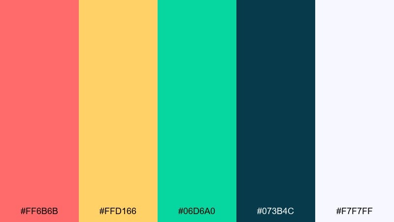
HEX: #ff6b6b #ffd166 #06d6a0 #073b4c #f7f7ff
Mood: premium, bold, polished
Best for: brand mood boards and premium campaign creative
Premium and polished, it combines deep ocean ink with a clean pearl white and confident reef accents. The dark teal instantly elevates layouts, while coral and gold add a lively, high-end spark. Use white space generously, then drop coral in small doses for buttons, badges, or short headlines. Tip: keep gradients subtle, and let solid blocks do the heavy lifting for a luxury feel.
Image example of reef luxe generated using media.io
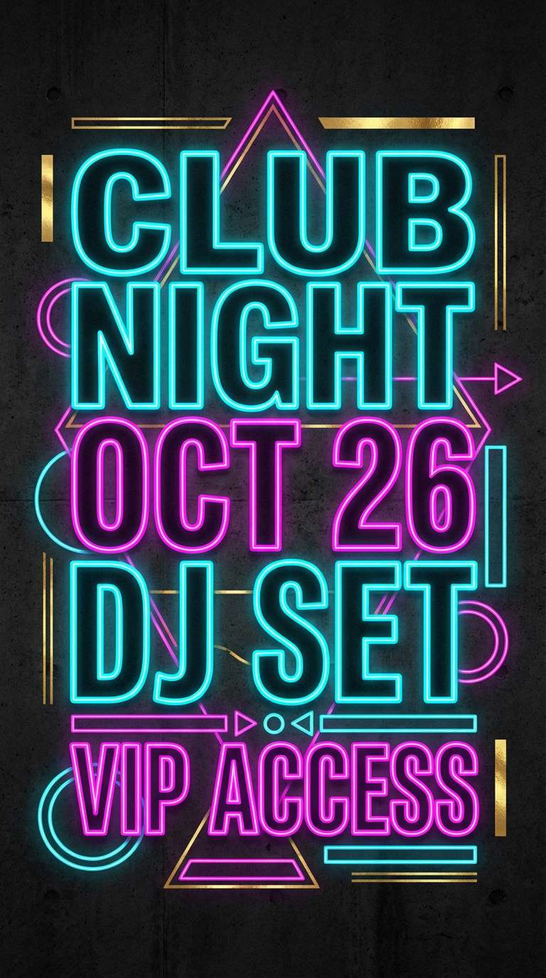
14) Seaside Neon
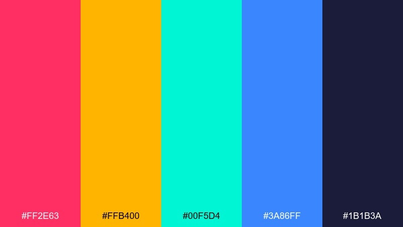
HEX: #ff2e63 #ffb400 #00f5d4 #3a86ff #1b1b3a
Mood: electric, nightlife, energetic
Best for: club posters and bold digital ads
Electric and nightlife-ready, it looks like neon reflections bouncing off dark water. The midnight base keeps the bright accents sharp, perfect for ads that need instant attention. Use cyan and pink as your main duo, then bring in gold for dates or pricing. Tip: keep text in near-white or cyan to avoid muddy contrast on the dark background.
Image example of seaside neon generated using media.io
15) Lagoon Minimal
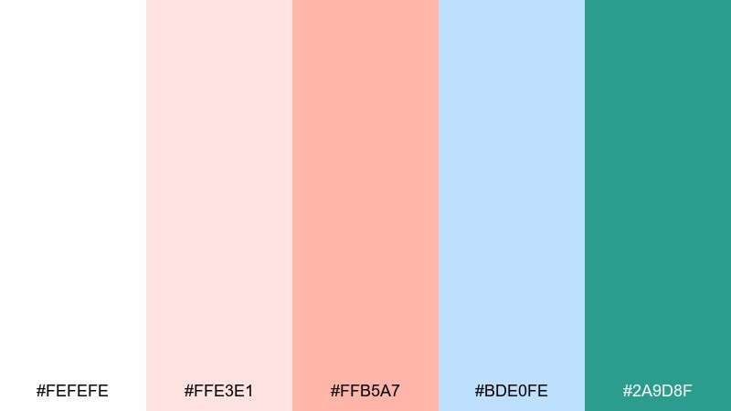
HEX: #fefefe #ffe3e1 #ffb5a7 #bde0fe #2a9d8f
Mood: minimal, friendly, airy
Best for: app onboarding screens and simple UI kits
Minimal and friendly, it suggests a clean lagoon morning with blush highlights and a calm teal anchor. If you want a coral reef color palette that stays subtle in UI, this mix gives you soft surfaces with enough contrast for states and buttons. Keep teal as the primary action color, then use blush for success moments or illustration accents. Tip: avoid using blush for body text; reserve it for backgrounds and chips.
Image example of lagoon minimal generated using media.io
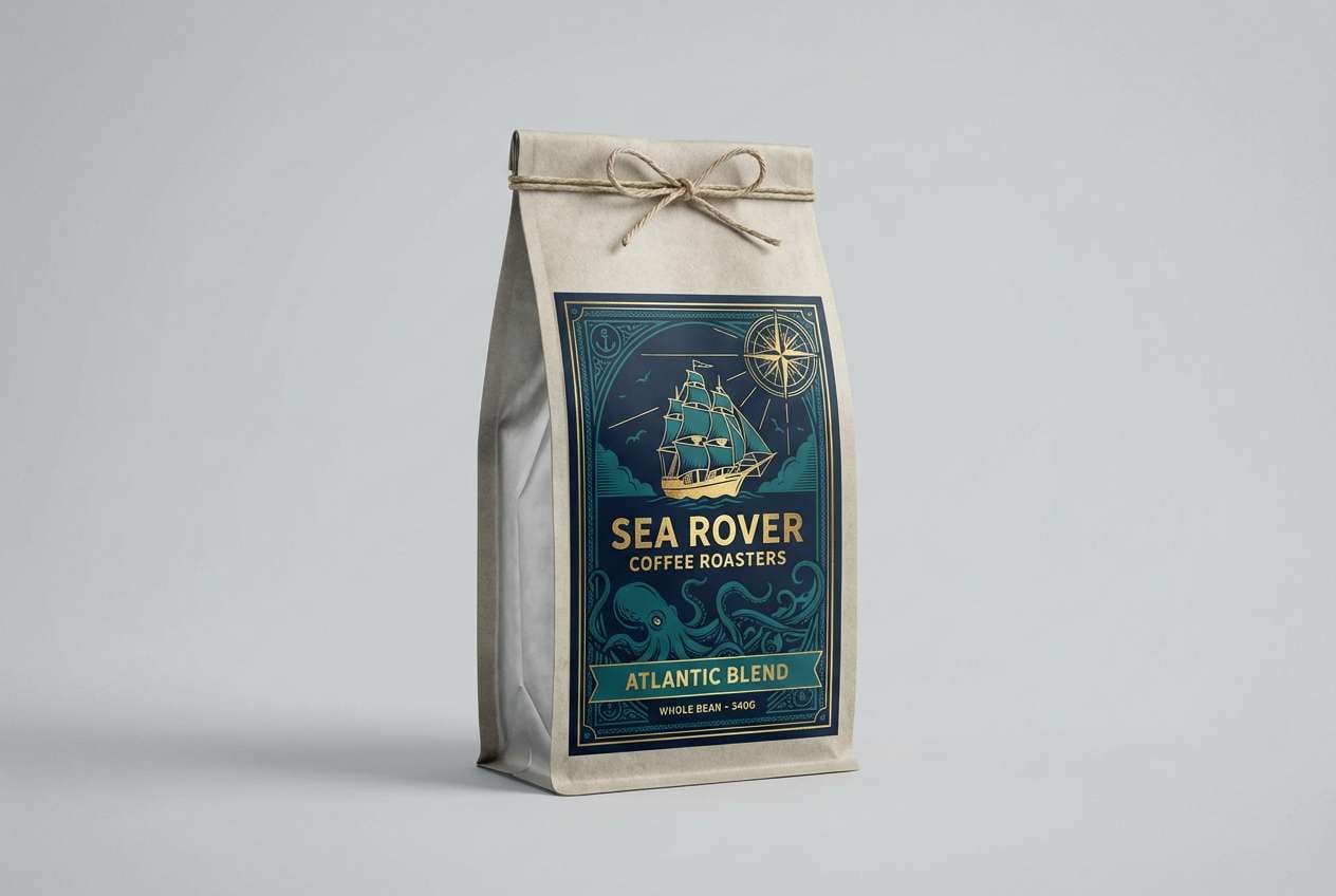
16) Octopus Ink
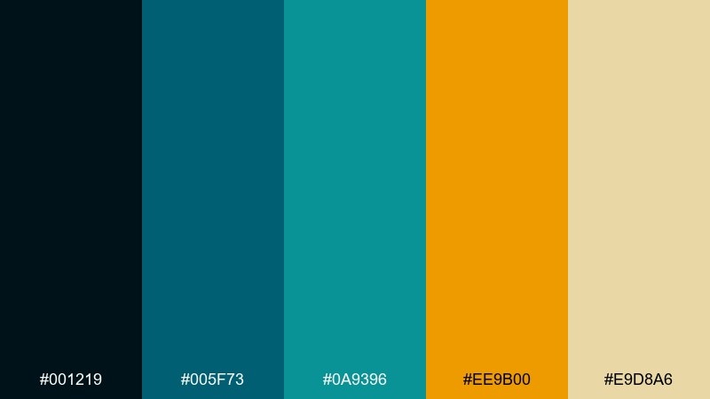
HEX: #001219 #005f73 #0a9396 #ee9b00 #e9d8a6
Mood: moody, nautical, sophisticated
Best for: coffee packaging and artisan labels
Moody and nautical, it feels like ink in deep water warmed by a golden beacon. The dark-to-teal run gives your design depth, while sand-gold keeps it approachable. Use the darkest shade for the label field, then print typography in the pale sand for a tactile, premium contrast. Tip: add small gold line work for borders and icons to make the palette look intentionally crafted.
Image example of octopus ink generated using media.io
17) Manta Mist
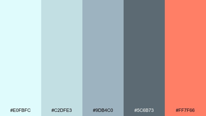
HEX: #e0fbfc #c2dfe3 #9db4c0 #5c6b73 #ff7f66
Mood: cool, modern, calming
Best for: SaaS headers and product feature sections
Cool and calming, it looks like manta shadows gliding through misty blue water with a coral flare. The blue-grays create an easy tech-friendly foundation for dashboards, landing pages, and documentation. Use coral only for primary actions and key highlights so it stays special. Tip: keep gradients within the blue family and use the coral as a flat accent for clarity.
Image example of manta mist generated using media.io
18) Staghorn Bloom
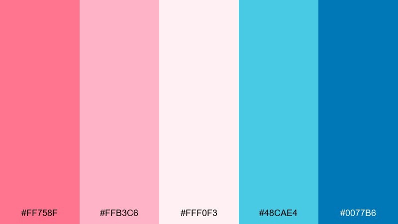
HEX: #ff758f #ffb3c6 #fff0f3 #48cae4 #0077b6
Mood: fresh, romantic, coastal
Best for: skincare labels and boutique product ads
Fresh and romantic, it brings staghorn coral blossoms to life with airy pinks and crisp lagoon blues. These coral reef color combinations are especially strong for beauty packaging because the tones feel clean but still playful. Let the lightest pink be your background, then use the deeper blue for ingredient hierarchy and small icons. Tip: keep the bright cyan as a micro-accent on seals or dots to avoid overpowering the blush base.
Image example of staghorn bloom generated using media.io
19) Deep Reef Night
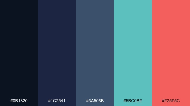
HEX: #0b1320 #1c2541 #3a506b #5bc0be #f25f5c
Mood: cinematic, deep, dramatic
Best for: album covers and moody campaign art
Cinematic and dramatic, it feels like a night dive where teal bioluminescence meets a coral flare. The layered navies give you rich depth for backgrounds and typography, while teal and coral create the hook. Use coral for the title or one focal shape, and keep everything else in cool blues for tension. Tip: add subtle grain to the dark areas to avoid banding and keep the look organic.
Image example of deep reef night generated using media.io
20) Coral Carnival
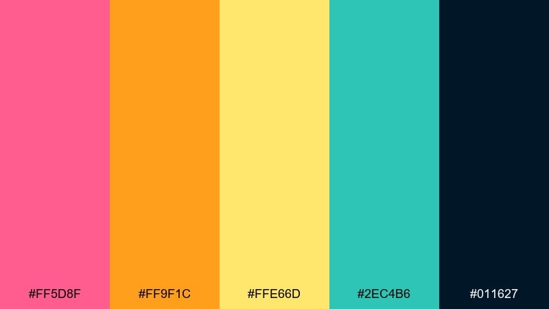
HEX: #ff5d8f #ff9f1c #ffe66d #2ec4b6 #011627
Mood: fun, festive, high-contrast
Best for: party invitations and playful posters
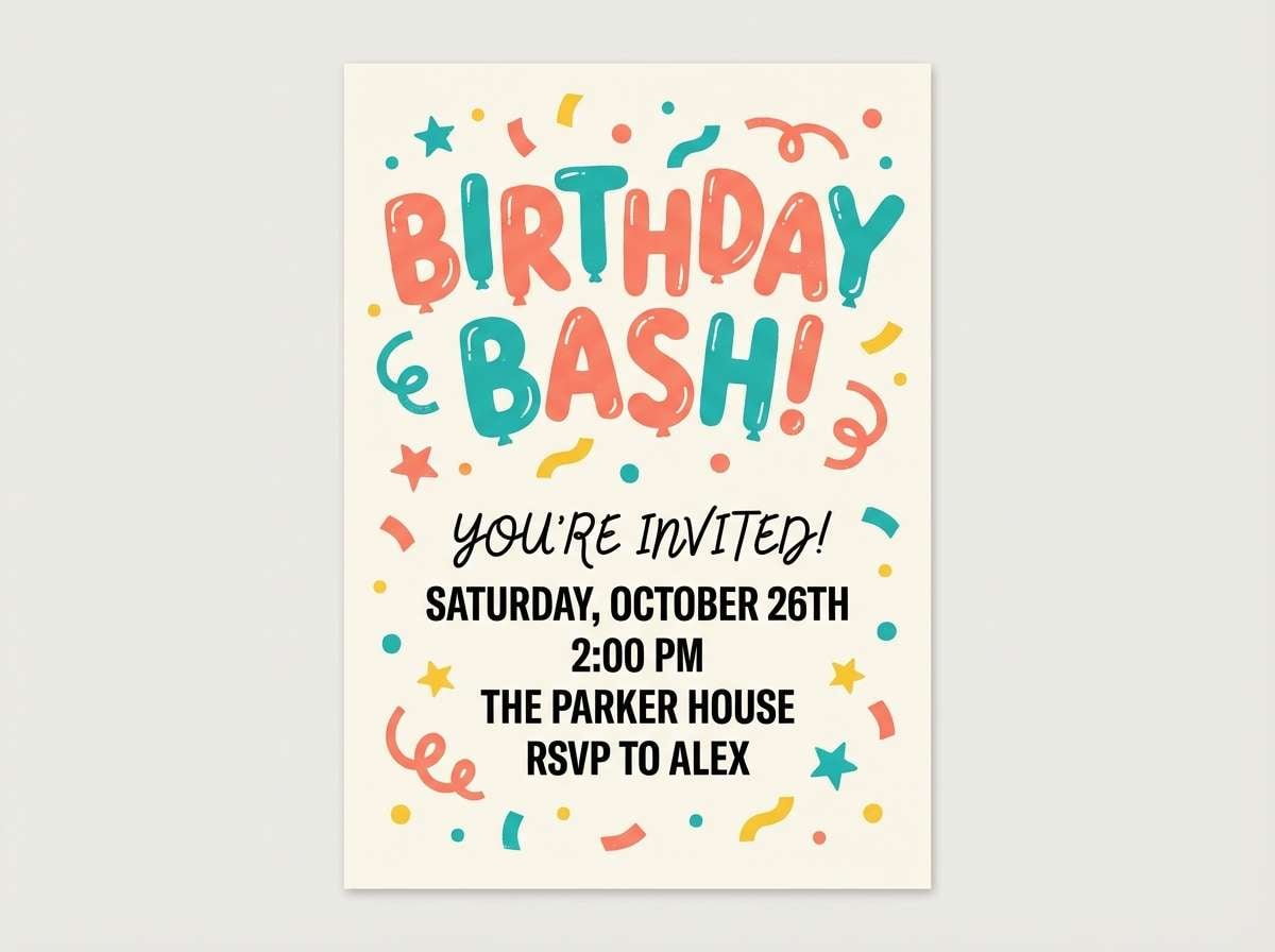
Fun and festive, it's like a reef carnival with bright coral, citrus orange, and a teal splash against a dark base. The contrast makes it ideal for party invites, kids events, and punchy promo posters. Keep the dark navy as your type color on light areas, and switch to yellow or teal type on dark blocks. Tip: pick two dominant brights per design and let the third act as a small accent to prevent visual overload.
Image example of coral carnival generated using media.io
What Colors Go Well with Coral Reef?
Coral reef tones pair best with oceanic cool colors (teal, aqua, seafoam, and deep navy) because they balance coral’s warmth and keep designs feeling fresh rather than overly sweet.
For a softer look, add coastal neutrals like cream, sand, and pearl white. For bolder contrast, introduce a midnight base and use coral as a spotlight accent for CTAs, titles, or key data points.
If you need more variety, muted blue-grays and slate work well as typography and UI structure colors, while gold or mango can act as a highlight without fighting the coral.
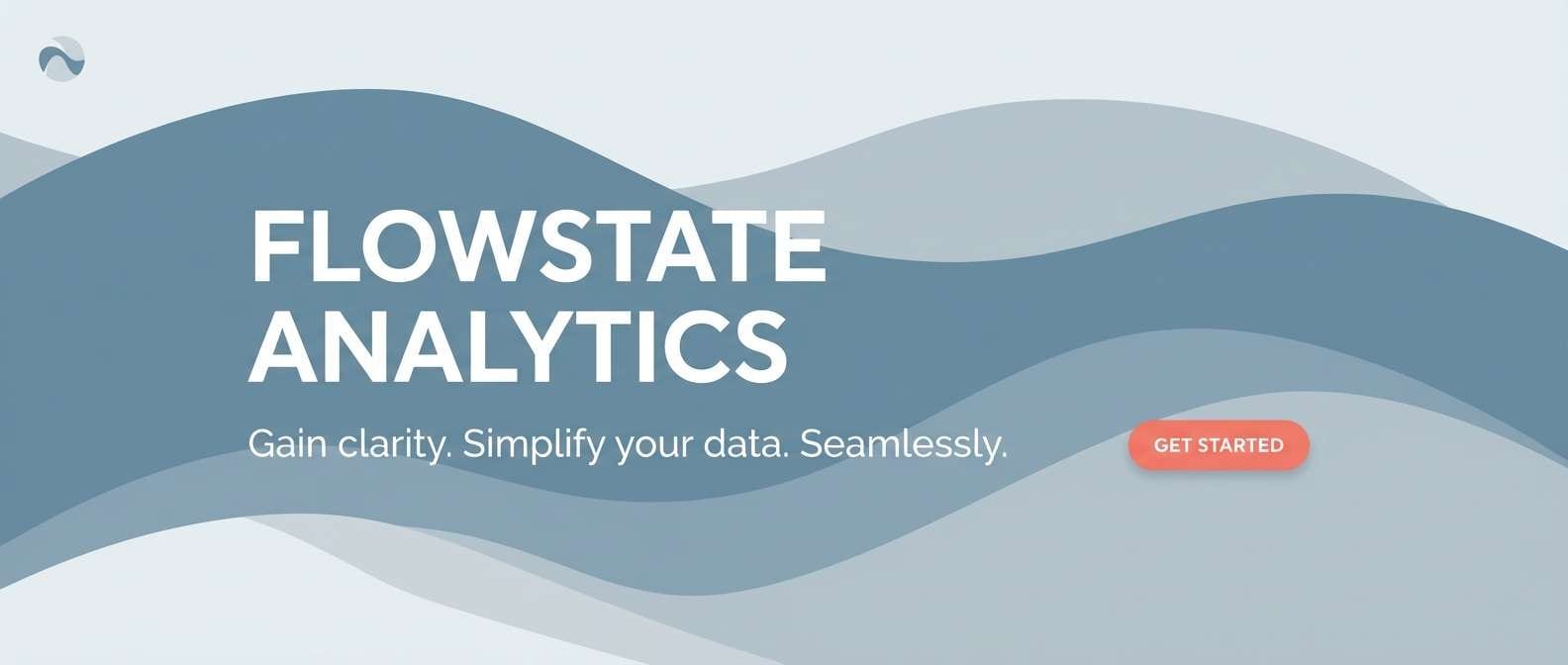
How to Use a Coral Reef Color Palette in Real Designs
Start with one dark anchor (navy/ink) for text and navigation, one light neutral for backgrounds, and one warm coral for primary emphasis. Then add teal or aqua for secondary actions and interactive states.
In posters and social creatives, use coral for the focal object or headline and keep larger background blocks cooler (teal/blue) to reduce visual fatigue. This also helps readability when you need fast scanning.
For branding systems, keep coral usage consistent: one coral shade for CTAs and badges, one teal for links and icons, and a restrained neutral set for layout spacing so the palette stays premium.
Create Coral Reef Palette Visuals with AI
If you’re pitching a concept or building a quick mood board, generating palette-based images is an easy way to show how coral and teal will actually look in context (UI, packaging, posters, or social templates).
With Media.io’s text-to-image tool, you can paste a prompt, reference your coral reef HEX direction, and iterate fast on compositions, lighting styles, and aspect ratios.
Use the palette ideas above as a starting point, then tweak one dominant warm and one dominant cool to match your brand’s energy.
Coral Reef Color Palette FAQs
-
What is a coral reef color palette?
A coral reef color palette is a set of warm coral/pink/orange hues balanced with cool aqua, teal, and deep ocean blues—often supported by sand or pearl-like neutrals for clean spacing. -
What are the best HEX codes for a coral reef look?
Popular coral reef HEX choices include vivid coral (#ff6b6b), bright teal/aqua (#16c3c8), and deep ocean teal (#0b7285). Pair them with warm golds (like #ffd166) or soft creams for balance. -
What colors go well with coral and teal?
Cream, sand, pearl white, navy, and slate blue-gray pair especially well with coral and teal. Neutrals keep the palette breathable, while navy/slate provide readable contrast for text. -
How do I keep coral reef palettes from looking too loud?
Use a light neutral background, keep coral as an accent (buttons, badges, short headlines), and let cooler teal/blue tones cover larger areas. Limiting your brightest shades to 10–20% of the layout also helps. -
Are coral reef color schemes good for UI design?
Yes—use deep navy/slate for text, teal for links and active states, and coral for primary CTAs. Avoid using coral for long body text; it’s best as a highlight color. -
What’s a good coral reef palette for luxury branding?
Choose a dark ocean ink base, add generous white/pearl space, and use coral plus muted gold sparingly. A set like Reef Luxe works well because it feels premium while still vibrant. -
Can I generate coral reef palette images for presentations or posters?
Yes—use Media.io’s AI image generator to create palette-driven mockups (posters, slides, packaging, or UI headers) by describing the layout and constraining colors to coral + teal + neutrals.
Next: Luxury Color Palette


