A complementary color scheme pairs hues from opposite sides of the color wheel to create instant contrast, clarity, and visual energy. When balanced with neutrals, it can feel modern, premium, playful, or cinematic—without sacrificing readability.
Below are 20+ complementary color palette ideas with HEX codes, plus quick usage tips and AI prompts you can copy to generate matching visuals in Media.io.
In this article
- Why Complementary Color Schemes Work So Well
-
- coral and teal pop
- saffron and indigo studio
- mint and magenta glow
- navy and tangerine contrast
- forest and rosewood
- plum and chartreuse edge
- sky and copper balance
- aqua and crimson energy
- lavender and lemon softness
- sand and cobalt minimal
- olive and fuchsia modern
- charcoal and peach lift
- cerulean and apricot daylight
- pine and blush wedding
- eggplant and lime neon
- slate and marigold editorial
- turquoise and brick heritage
- ice blue and burnt orange
- red and green classic
- beige and violet calm
- sunset blue and amber glow
- rose and seafoam garden
- cyan and rust workshop
- What Colors Go Well with Complementary?
- How to Use Complementary Color Schemes in Real Designs
- Create Complementary Palette Visuals with AI
Why Complementary Color Schemes Work So Well
Complementary colors create high contrast because they sit opposite each other on the color wheel. That contrast helps important elements—like buttons, headlines, or offer tags—stand out quickly and clearly.
They also build visual hierarchy naturally: one color can be your dominant base, while its complement becomes the accent that signals action or emphasis. With a few supporting neutrals, the design stays clean instead of chaotic.
When you control saturation and add dark/light anchors, complementary schemes remain readable across UI, print, and social layouts—even at small sizes where contrast is everything.
20+ Complementary Color Palette Ideas (with HEX Codes)
1) Coral and Teal Pop
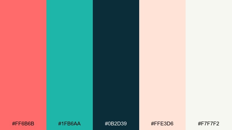
HEX: #ff6b6b #1fb6aa #0b2d39 #ffe3d6 #f7f7f2
Mood: playful, energetic, modern
Best for: social media ad creative for a summer sale
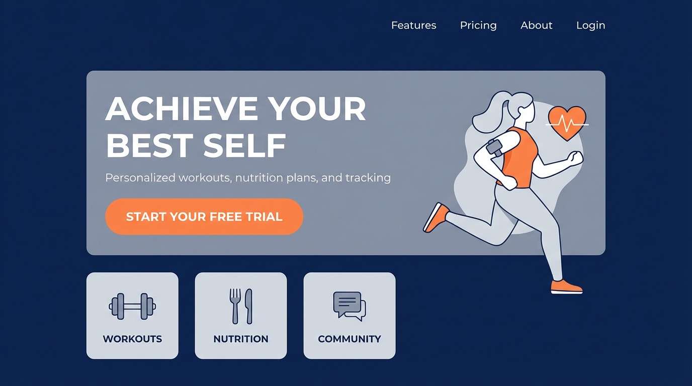
Playful beachy energy comes through with coral warmth against cool teal, like a postcard from a seaside market. Use the darker navy tone for headlines so bright accents stay readable. Pair this complementary color scheme with soft cream space to avoid visual fatigue and let buttons feel tappable. Tip: keep coral for primary calls to action and teal for supporting highlights to maintain clear hierarchy.
Image example of coral and teal pop generated using media.io

Media.io is an online AI studio for creating and editing video, image, and audio in your browser.

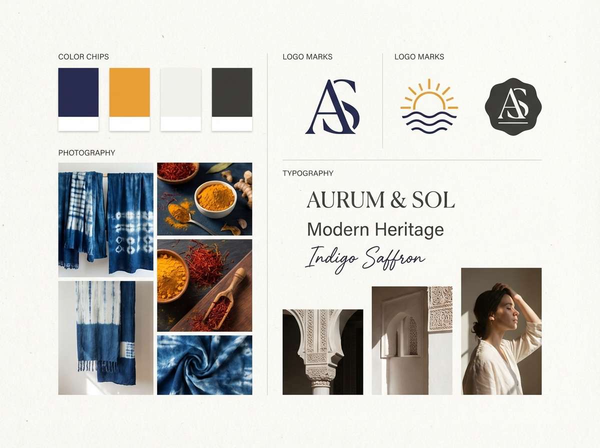
2) Saffron and Indigo Studio
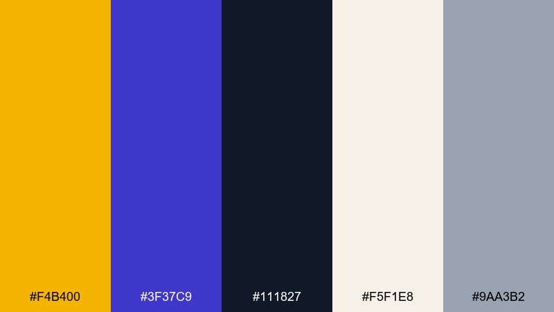
HEX: #f4b400 #3f37c9 #111827 #f5f1e8 #9aa3b2
Mood: confident, premium, creative
Best for: brand identity moodboard for a design studio
Confident studio polish shows up in saffron highlights over deep indigo, like spotlights in a gallery. Let indigo and near-black anchor the logo and typography, then use saffron for badges and key moments. Warm off-white keeps the mix refined rather than loud. Tip: reserve the brightest yellow for small shapes so it feels premium, not cartoonish.
Image example of saffron and indigo studio generated using media.io
3) Mint and Magenta Glow
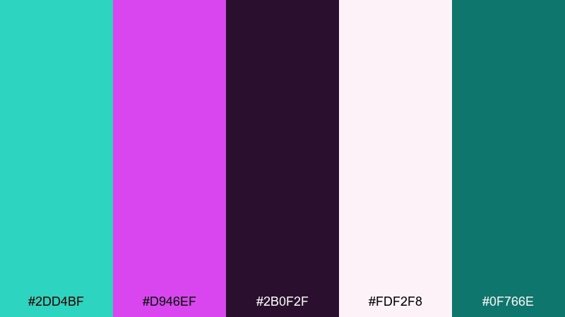
HEX: #2dd4bf #d946ef #2b0f2f #fdf2f8 #0f766e
Mood: vibrant, youthful, nightlife
Best for: music event poster on a plain background
Vibrant club-light contrast pops with neon mint against electric magenta, like a late-night lineup reveal. Use the deep plum as the base so bright tones feel intentional instead of chaotic. A pale pink background can soften the edge while keeping the energy high. Tip: set small text in plum or dark teal and keep the neon colors for shapes and titles.
Image example of mint and magenta glow generated using media.io
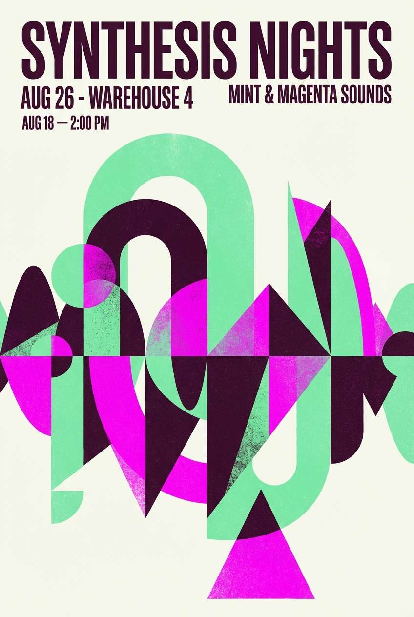
4) Navy and Tangerine Contrast
HEX: #0b1f3b #ff7a18 #1f2937 #f3f4f6 #ffcf9a
Mood: bold, sporty, high-contrast
Best for: landing page hero section for a fitness app
Bold and athletic, this mix feels like stadium lights against a midnight sky. It works as a complementary color palette when you keep navy as the canvas and let tangerine lead the actions. Light gray and soft apricot help spacing and card surfaces feel clean. Tip: use orange sparingly for one primary button per screen to avoid competing focal points.
Image example of navy and tangerine contrast generated using media.io
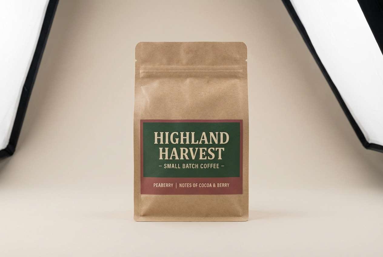
5) Forest and Rosewood
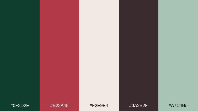
HEX: #0f3d2e #b23a48 #f2e9e4 #3a2b2f #a7c4b5
Mood: earthy, romantic, artisanal
Best for: coffee packaging label design
Earthy romance shows up like a woodland walk with a rosewood scarf. Use forest green for the main label blocks and rosewood for seals, origin stamps, or roast notes. Cream and dusty sage keep the design feeling handcrafted rather than heavy. Tip: add texture through grain or paper stock, then keep ink coverage moderate so the colors stay rich.
Image example of forest and rosewood generated using media.io
6) Plum and Chartreuse Edge
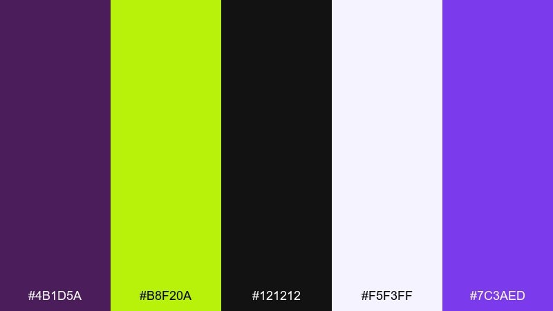
HEX: #4b1d5a #b8f20a #121212 #f5f3ff #7c3aed
Mood: edgy, experimental, futuristic
Best for: album cover artwork on a plain background
Edgy and electric, plum shadows meet chartreuse sparks like laser light in a dark room. Keep black and deep purple as the dominant field so the green reads as intentional energy. The pale lavender tint can be used for tracklist text blocks or subtle gradients. Tip: avoid mid-tones between the two extremes to preserve that sharp, futuristic punch.
Image example of plum and chartreuse edge generated using media.io
7) Sky and Copper Balance
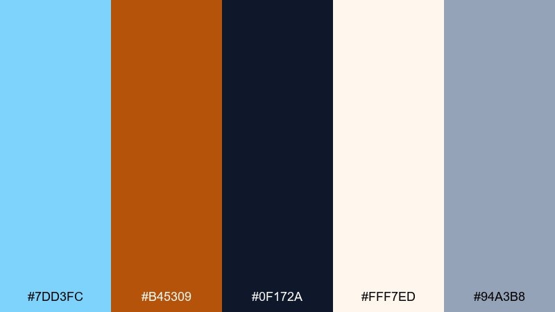
HEX: #7dd3fc #b45309 #0f172a #fff7ed #94a3b8
Mood: calm, grounded, approachable
Best for: SaaS dashboard UI with data cards
Calm sky blue feels airy while copper adds grounded warmth, like sunlight on architecture. Use the dark slate for charts and text so the interface stays crisp and accessible. Cream works well for card surfaces, with copper limited to key highlights and warnings. Tip: keep data visualizations mostly blue-gray and reserve copper for one meaningful signal state.
Image example of sky and copper balance generated using media.io
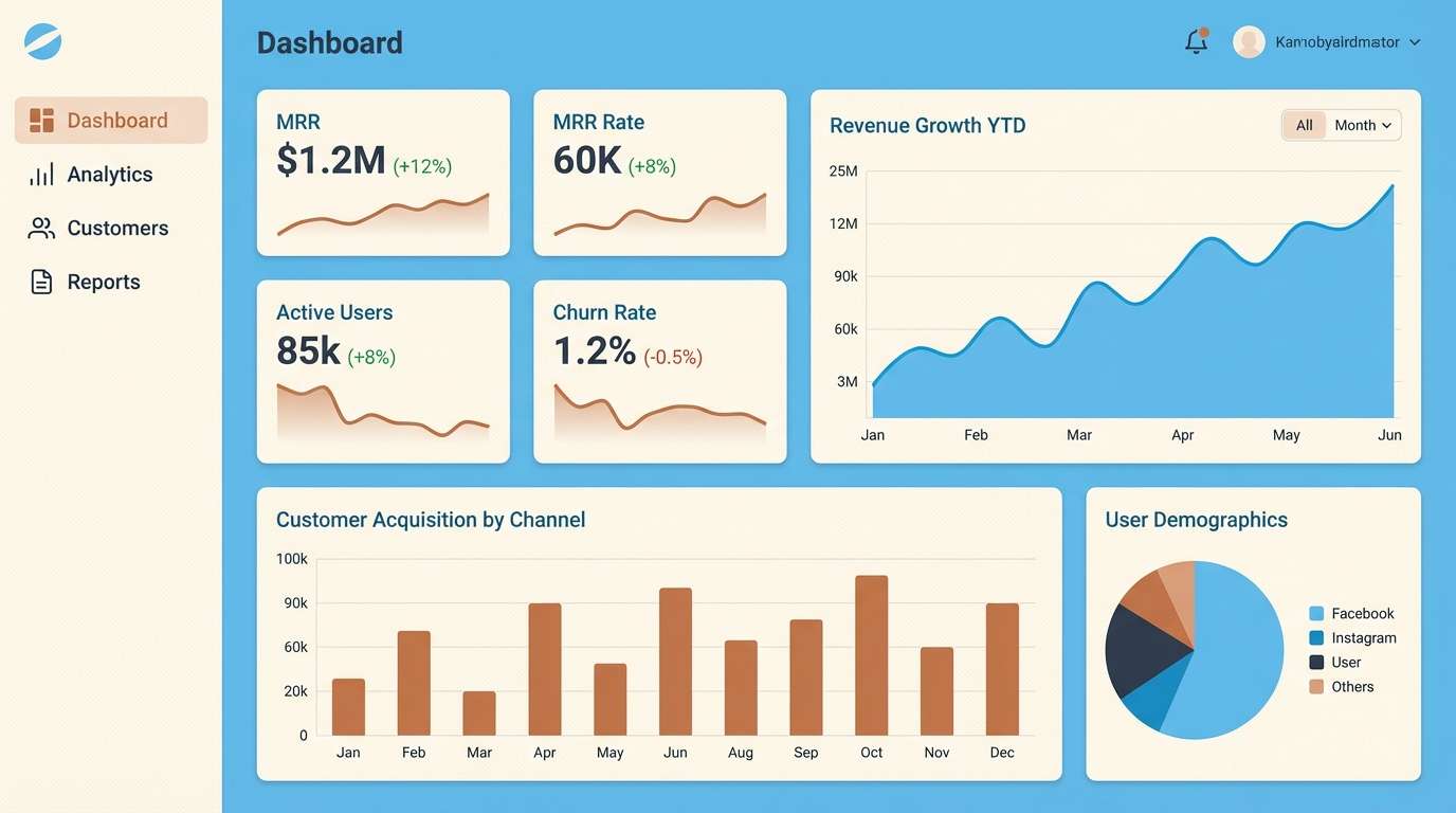
8) Aqua and Crimson Energy
HEX: #06b6d4 #dc2626 #0b1320 #f8fafc #fecaca
Mood: energetic, bold, attention-grabbing
Best for: YouTube thumbnail graphic layout
High-voltage contrast hits fast, like flashing signage in a busy city. Use aqua for main shapes and crimson for the one element you want viewers to notice first. Keep backgrounds dark or near-white so the colors do not fight each other. Tip: outline text in the opposite tone to boost legibility at small thumbnail sizes.
Image example of aqua and crimson energy generated using media.io

9) Lavender and Lemon Softness
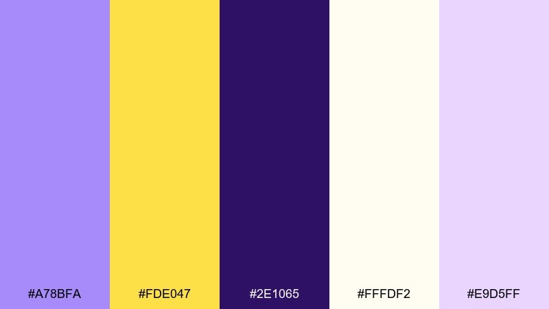
HEX: #a78bfa #fde047 #2e1065 #fffdf2 #e9d5ff
Mood: cheerful, gentle, dreamy
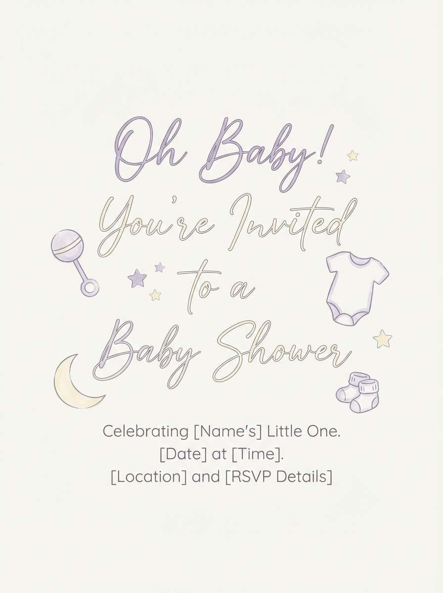
Best for: baby shower invitation design
Dreamy and cheerful, lavender haze meets lemon sunlight like a spring morning. Use lavender for headings and borders, then add lemon for tiny icons or a single ribbon element. Soft cream keeps the invitation airy and print-friendly. Tip: choose a deeper purple for small text so it stays readable on pale backgrounds.
Image example of lavender and lemon softness generated using media.io
10) Sand and Cobalt Minimal
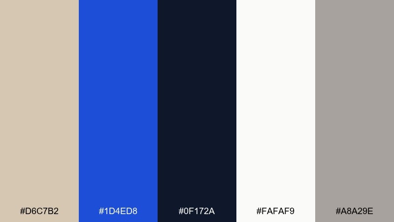
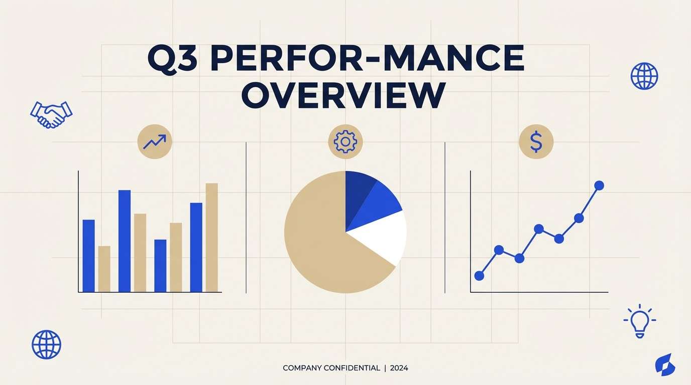
HEX: #d6c7b2 #1d4ed8 #0f172a #fafaf9 #a8a29e
Mood: minimal, modern, trustworthy
Best for: corporate presentation slide template
Minimal and confident, sandy neutrals make cobalt feel sharp and purposeful. Use off-white as the slide base, sand for sections, and cobalt for charts and key numbers. Dark navy keeps titles crisp without looking harsh. Tip: keep icons in one tint and let cobalt appear only on the most important slide elements.
Image example of sand and cobalt minimal generated using media.io
11) Olive and Fuchsia Modern
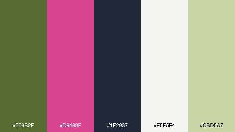
HEX: #556b2f #d9468f #1f2937 #f5f5f4 #cbd5a7
Mood: modern, stylish, slightly retro
Best for: fashion lookbook editorial layout
Stylish and a little retro, olive grounds the look while fuchsia adds runway drama. Use olive for large blocks and captions, then drop fuchsia into pull quotes or section dividers. Warm off-white keeps the layout print-friendly and easy on the eyes. Tip: keep body text in charcoal and let fuchsia appear at predictable intervals to feel intentional.
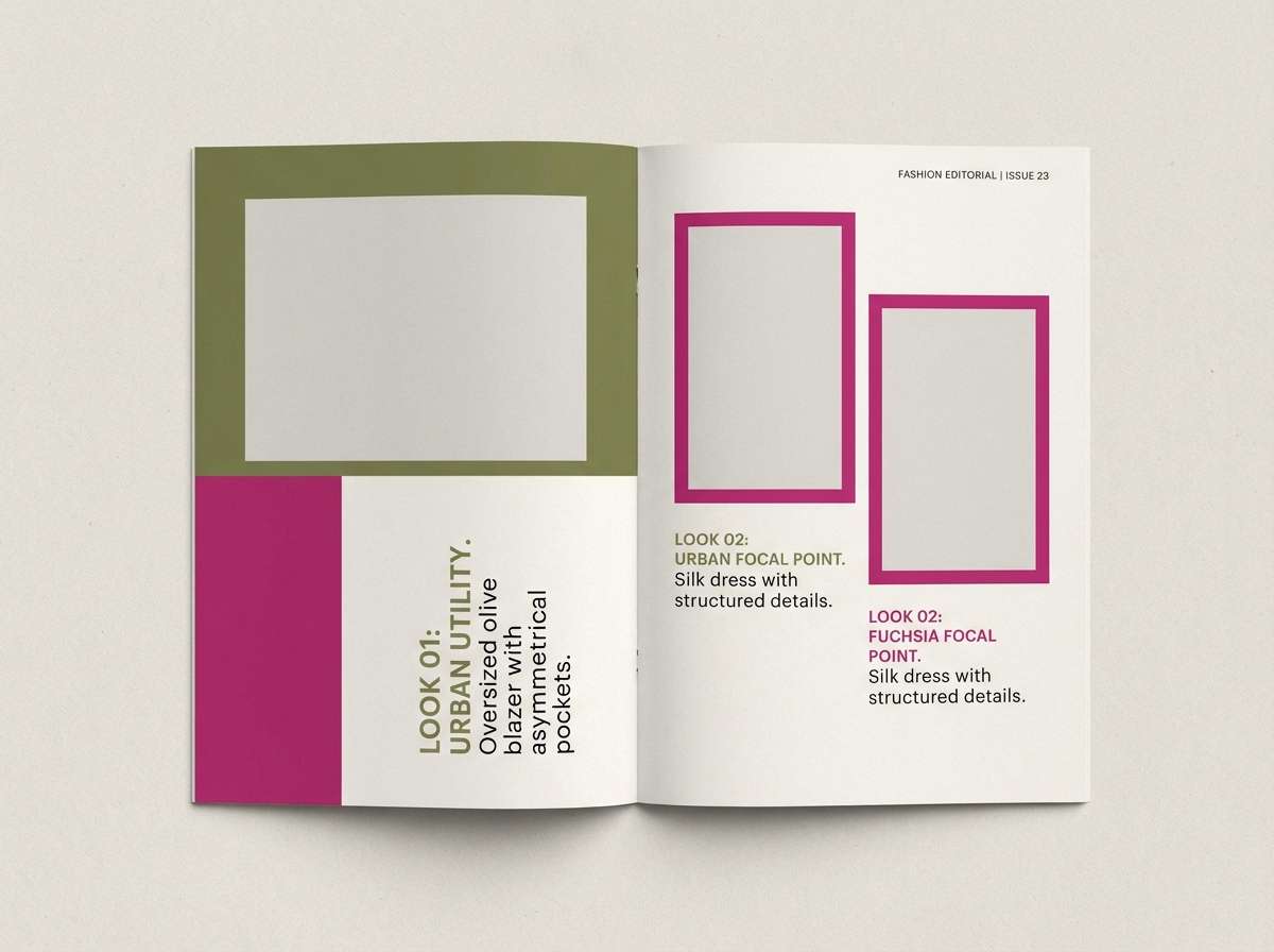
Image example of olive and fuchsia modern generated using media.io
12) Charcoal and Peach Lift
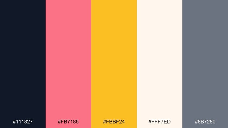
HEX: #111827 #fb7185 #fbbf24 #fff7ed #6b7280
Mood: friendly, warm, professional
Best for: startup homepage UI with pricing cards
Friendly warmth lifts a serious charcoal base, like soft light on matte metal. These complementary color combinations work well for pricing cards when peach is saved for highlights and badges. Cream keeps whitespace inviting while gray handles secondary text. Tip: use the golden accent only for a single standout plan to avoid confusing the hierarchy.
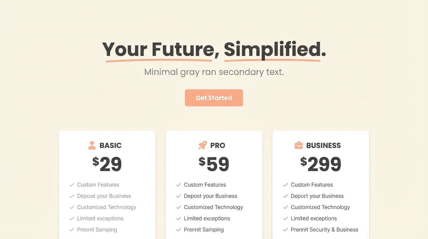
Image example of charcoal and peach lift generated using media.io
13) Cerulean and Apricot Daylight
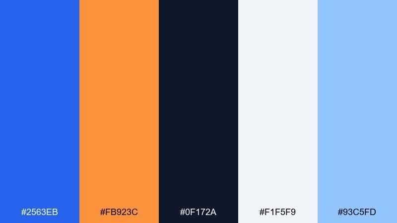
HEX: #2563eb #fb923c #0f172a #f1f5f9 #93c5fd
Mood: optimistic, clear, energetic
Best for: conference flyer design
Optimistic daylight contrast feels like clear skies paired with warm sunrise. Cerulean is strong for structure and navigation, while apricot makes dates, tickets, and highlights jump forward. Use the light slate tone for breathable spacing around dense information. Tip: keep apricot in solid shapes rather than gradients so print output stays consistent.
Image example of cerulean and apricot daylight generated using media.io

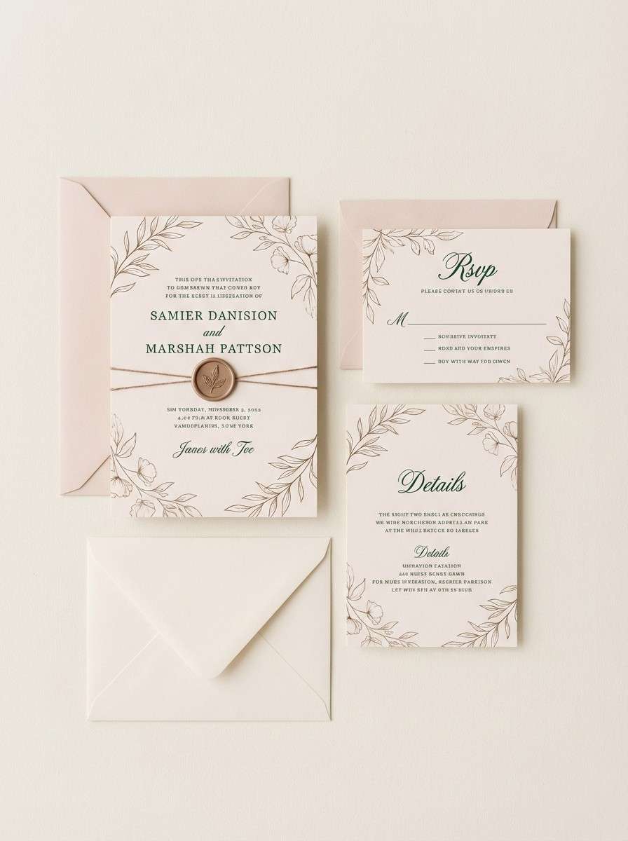
14) Pine and Blush Wedding
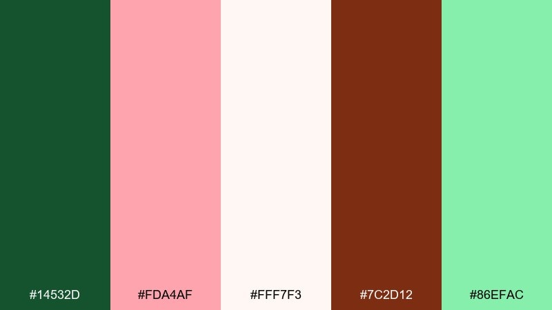
HEX: #14532d #fda4af #fff7f3 #7c2d12 #86efac
Mood: romantic, natural, elegant
Best for: wedding invitation suite
Romantic and natural, pine greens feel like evergreen branches against soft blush petals. Use blush as the background wash, then place pine on typography and thin borders for a classic invitation look. A touch of warm brown adds an elegant vintage note without stealing focus. Tip: for printing, keep blush lighter and increase pine contrast so fine script stays legible.
Image example of pine and blush wedding generated using media.io
15) Eggplant and Lime Neon
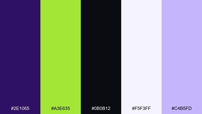
HEX: #2e1065 #a3e635 #0b0b12 #f5f3ff #c4b5fd
Mood: neon, dramatic, techy
Best for: gaming stream overlay UI panels
Neon drama hits with lime bursts against deep eggplant, like glow sticks in a dark arena. Keep eggplant and near-black for panels so lime reads as a clean status or live indicator. Soft lavender helps create secondary states without adding new hues. Tip: apply lime only to interactive or live elements so the overlay stays readable during motion.
Image example of eggplant and lime neon generated using media.io
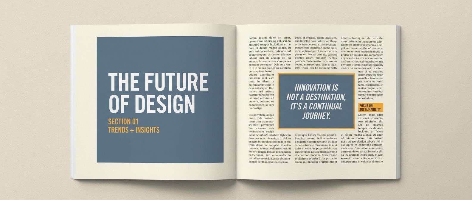
16) Slate and Marigold Editorial
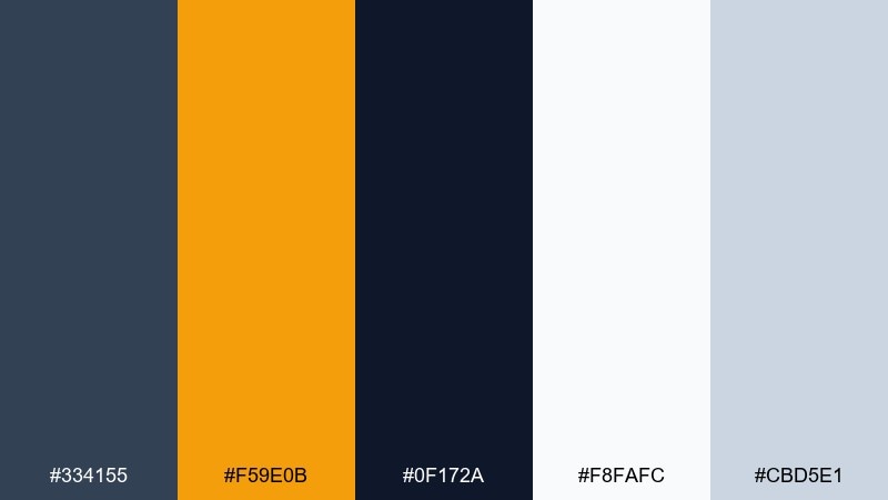
HEX: #334155 #f59e0b #0f172a #f8fafc #cbd5e1
Mood: editorial, smart, refined
Best for: magazine feature spread layout
Smart editorial contrast feels like ink on paper with a marigold highlighter. Slate and near-black carry headlines and body text, while marigold makes pull quotes and section markers pop. Light grays keep the grid orderly and calm. Tip: avoid coloring large backgrounds in marigold, and instead use it to guide the reader through the spread.
Image example of slate and marigold editorial generated using media.io
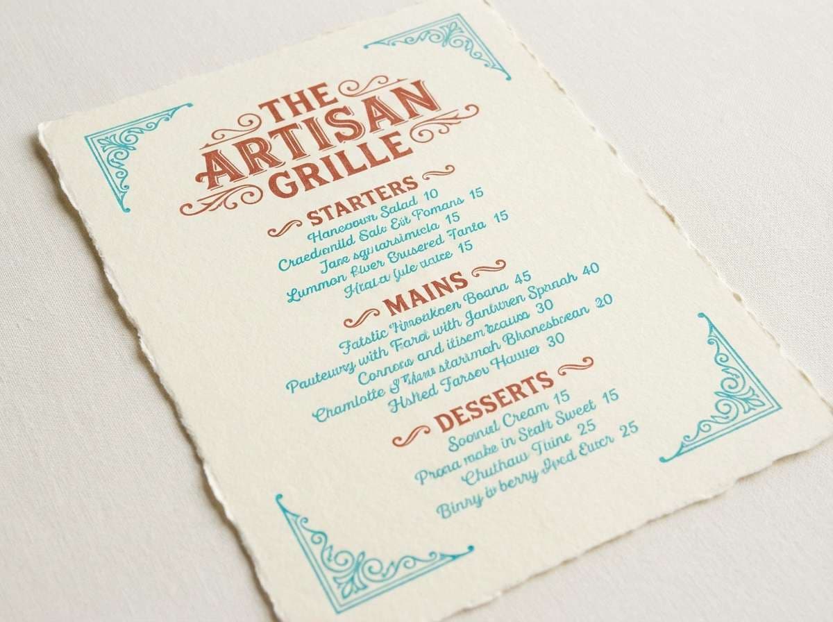
17) Turquoise and Brick Heritage
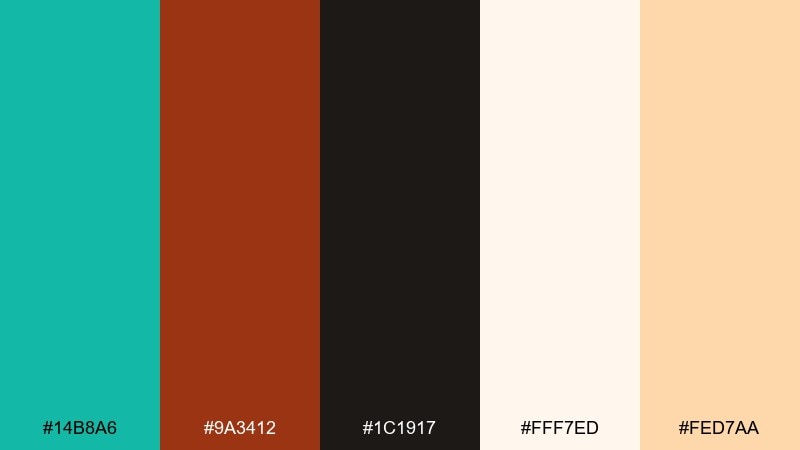
HEX: #14b8a6 #9a3412 #1c1917 #fff7ed #fed7aa
Mood: heritage, handcrafted, warm
Best for: restaurant menu design
Heritage warmth comes through like glazed tile beside brick and wood. Use turquoise for section headers and small icons, while brick leads on key dishes and specials. Cream paper tones keep the menu friendly and easy to read under warm lighting. Tip: print on uncoated stock and keep turquoise in flat fills for a timeless look.
Image example of turquoise and brick heritage generated using media.io
18) Ice Blue and Burnt Orange
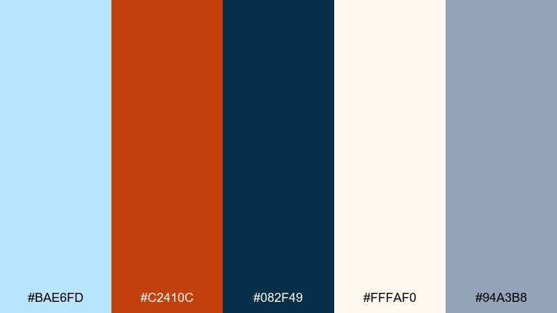
HEX: #bae6fd #c2410c #082f49 #fffaf0 #94a3b8
Mood: crisp, outdoorsy, balanced
Best for: travel blog header illustration
Crisp air and campfire warmth meet in this mix, like winter sky over glowing embers. Use ice blue for open areas and airy gradients, then bring burnt orange in for badges or location pins. Deep teal anchors headlines and keeps contrast strong. Tip: limit orange to one or two focal elements so the header feels calm, not busy.
Image example of ice blue and burnt orange generated using media.io

19) Red and Green Classic
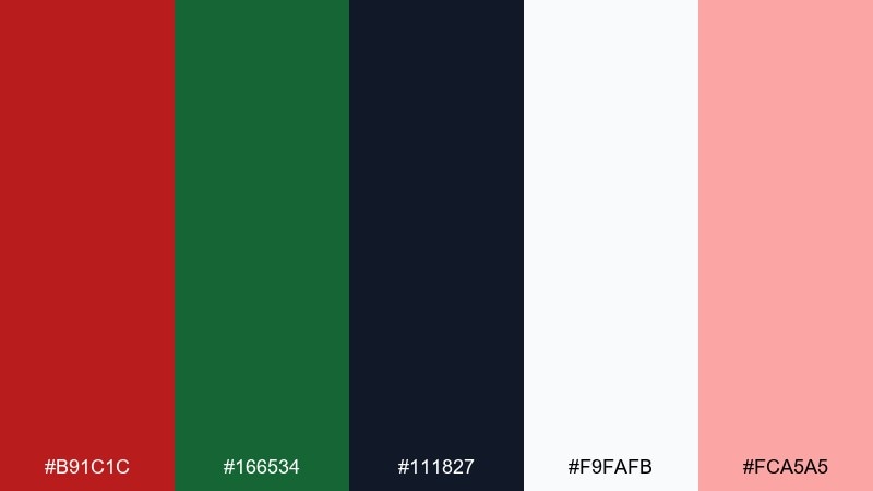
HEX: #b91c1c #166534 #111827 #f9fafb #fca5a5
Mood: classic, festive, bold
Best for: holiday promo banner design
Classic contrast feels festive and bold, like wrapped gifts against evergreen branches. Use green as the primary field and bring red in for discounts and limited-time tags. Neutral white and charcoal keep typography clean and prevent the banner from looking dated. Tip: soften the red with a light tint for backgrounds, and reserve the deepest red for the main offer.
Image example of red and green classic generated using media.io

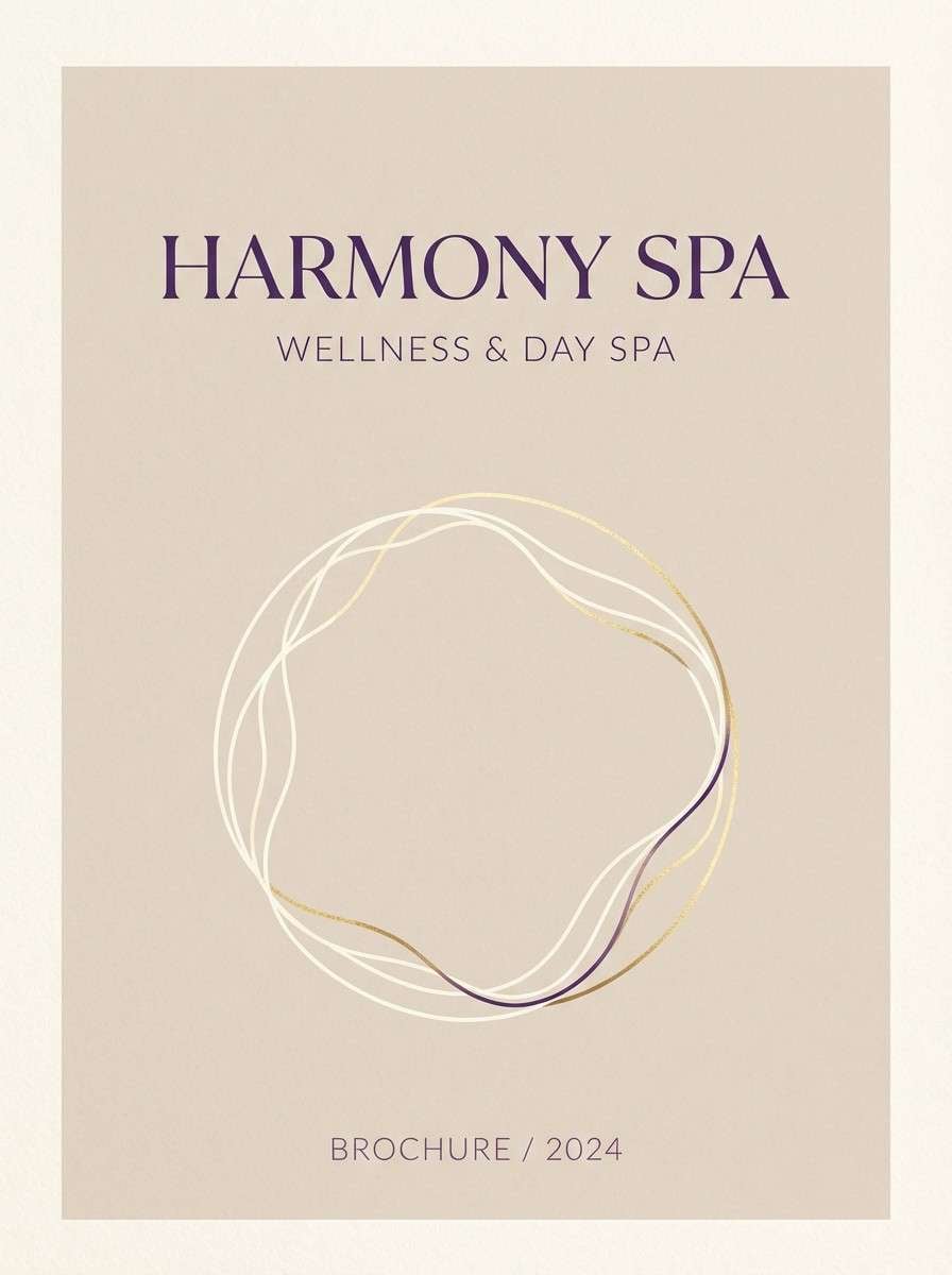
20) Beige and Violet Calm
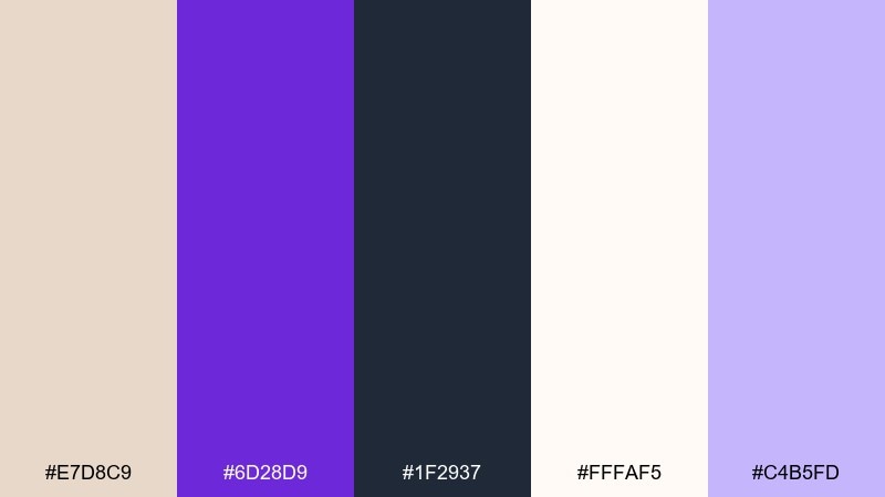
HEX: #e7d8c9 #6d28d9 #1f2937 #fffaf5 #c4b5fd
Mood: calm, cozy, elegant
Best for: spa brochure cover
Calm and cozy, beige reads like linen while violet adds a quiet touch of luxury. Use beige and soft cream for the cover background, then set violet for titles and small decorative lines. Charcoal keeps any fine print sharp without harshness. Tip: keep the violet saturation moderate and lean on spacing and typography for the premium feel.
Image example of beige and violet calm generated using media.io
21) Sunset Blue and Amber Glow
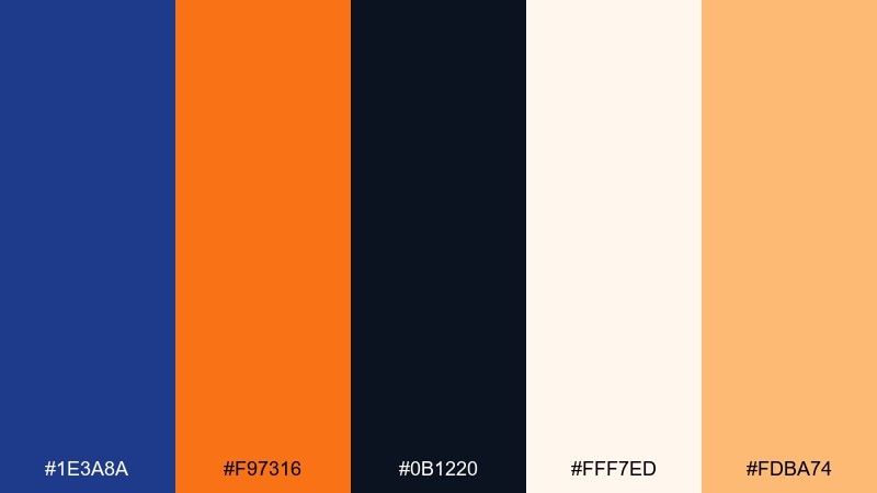
HEX: #1e3a8a #f97316 #0b1220 #fff7ed #fdba74
Mood: warm, cinematic, confident
Best for: podcast cover art
Cinematic warmth lands like sunset light against a deep blue sky. Use the navy as the main backdrop and let amber handle the title word you want remembered. Soft cream can frame badges or episode numbers without adding clutter. Tip: for a strong complementary color palette look, keep the type large and use amber only on one primary text layer.
Image example of sunset blue and amber glow generated using media.io

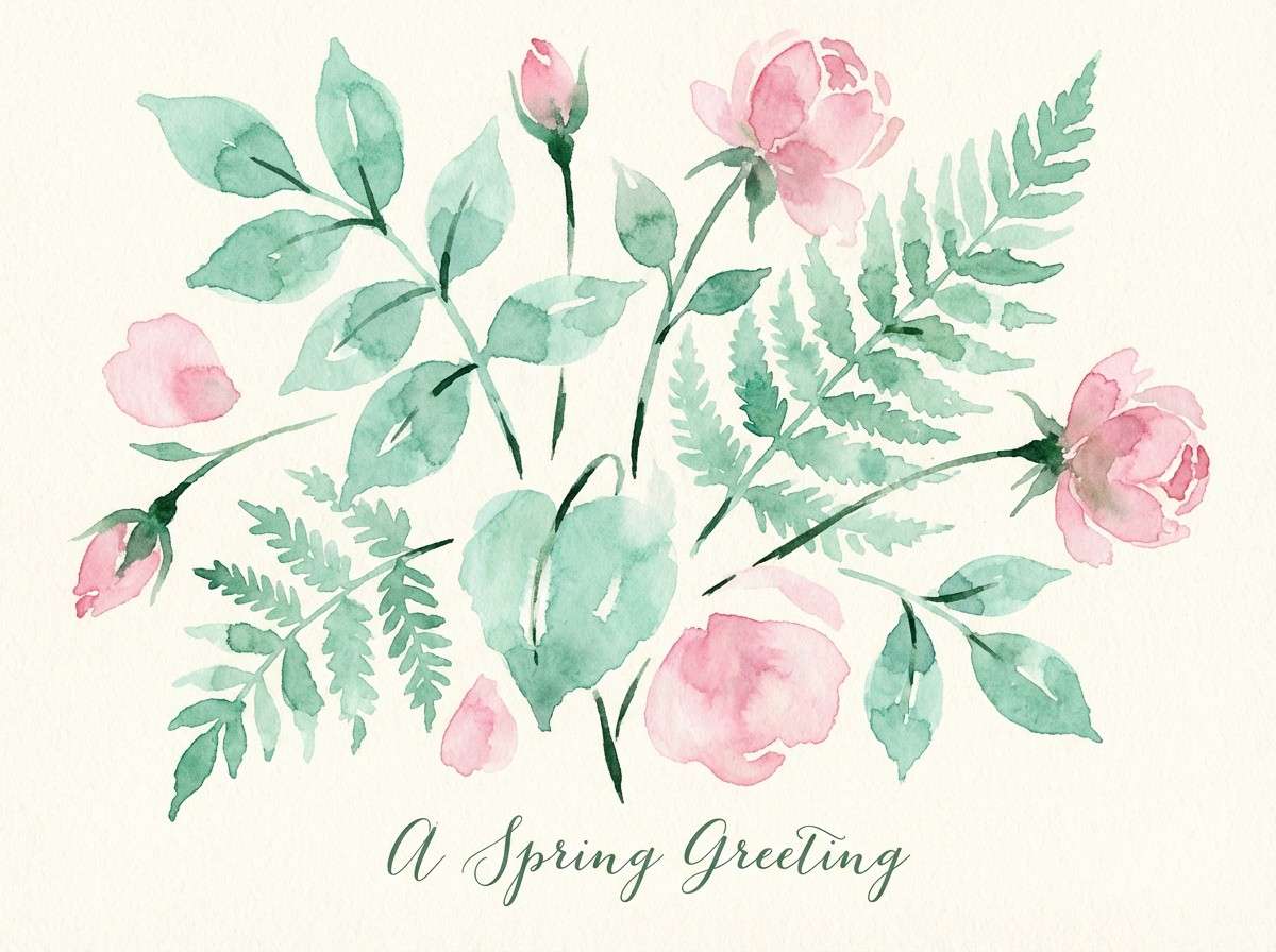
22) Rose and Seafoam Garden
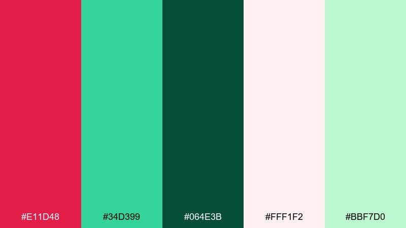
HEX: #e11d48 #34d399 #064e3b #fff1f2 #bbf7d0
Mood: fresh, botanical, uplifting
Best for: watercolor botanical illustration for a spring card
Fresh garden contrast feels like rose petals tucked into seafoam leaves after rain. Let seafoam and pale pink take the larger washes, with deeper green for stems and shadows. A small hit of rose makes the focal bloom feel lively and dimensional. Tip: keep edges soft and use the darkest green sparingly so the illustration stays airy.
Image example of rose and seafoam garden generated using media.io
23) Cyan and Rust Workshop
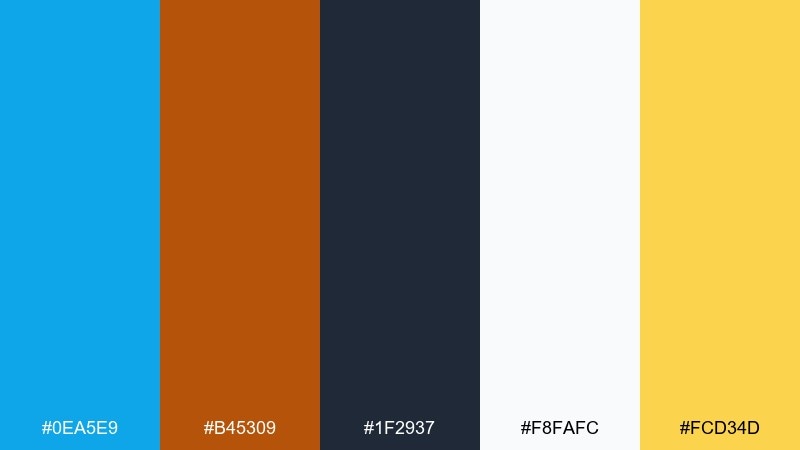
HEX: #0ea5e9 #b45309 #1f2937 #f8fafc #fcd34d
Mood: practical, industrial, upbeat
Best for: tool brand product ad packaging mock
Practical workshop energy comes through like painted steel next to worn leather. Cyan feels modern for brand blocks, while rust adds grit and credibility in labels or feature callouts. Use white and charcoal to keep the layout structured and easy to scan. Tip: balance the warmth by keeping cyan as the largest color field and rust as the accent for key specs.
Image example of cyan and rust workshop generated using media.io

What Colors Go Well with Complementary?
Complementary color pairings become easier to use when you add “buffer” tones: off-whites, warm creams, cool grays, and deep charcoals. These neutrals reduce eye strain and give your main colors a clean stage.
Deep anchors (navy, near-black, dark plum, dark green) are especially helpful for typography and UI components. They keep contrast consistent when your complementary accents are bright or saturated.
Soft tints of your main hues also work well—like pale pink with deep teal, or lavender with deep purple—because they preserve the palette relationship while improving readability and spacing.
How to Use Complementary Color Schemes in Real Designs
Start with a dominant color (often the darker one) for backgrounds, large panels, or brand blocks. Then use the complementary color as the accent for CTAs, badges, highlights, and focal shapes so attention lands exactly where you want it.
Keep contrast “clean” by limiting how many saturated areas touch each other. If both complements are bright, separate them with white space, thin borders, or a dark anchor to prevent vibrating edges and visual fatigue.
For accessibility, test text on backgrounds at realistic sizes. In many cases, the best approach is to reserve the bright complementary hue for shapes and buttons, and keep body text in charcoal or near-black.
Create Complementary Palette Visuals with AI
If you already have HEX codes, you can turn them into on-brand visuals fast by generating sample layouts—posters, UI heroes, packaging mocks, or cover art—using a consistent prompt style and a plain background.
Use the prompts above as templates: swap in your subject (poster, invitation, thumbnail), specify the dominant color and accent color, and add a note like “no photos” to keep results clean and graphic.
Once you like the composition, iterate by adjusting only one variable at a time (accent size, background tone, typography weight) to keep your complementary palette consistent across assets.
Complementary Color Palette FAQs
-
What is a complementary color palette?
A complementary color palette uses two main colors opposite each other on the color wheel (plus supporting neutrals/tints) to create strong contrast and clear visual emphasis. -
Are complementary colors always red and green?
No. Red/green is one complementary pairing, but so are blue/orange, purple/yellow, and many variations like teal/coral or indigo/saffron depending on the exact hues. -
How do I keep complementary colors from looking too harsh?
Lower the saturation of one color, add plenty of neutral space (white/cream/gray), and use a dark anchor for text. Also avoid placing two fully saturated complements edge-to-edge. -
Which color should be dominant in a complementary scheme?
Typically, make the darker or less saturated color dominant (backgrounds, large blocks) and use the brighter complement as an accent for CTAs, tags, and key highlights. -
Do complementary palettes work for UI design?
Yes—especially for CTA clarity and hierarchy. The key is to keep body text in dark neutrals and reserve the bright complementary hue for interactive states and primary actions. -
What neutrals pair best with complementary colors?
Off-white, warm cream, light gray, charcoal, and deep navy are reliable. They reduce color “vibration” and improve readability while letting your complementary accents pop. -
Can I generate complementary palette examples with AI?
Yes. Use a prompt that specifies a plain background, your dominant and accent colors, the layout type (poster/UI/packaging), and typography notes—then iterate for consistency.
Next: Dystopian Color Palette
