

Cerulean is a modern, sky-meets-sea blue that instantly feels clean, optimistic, and trustworthy. It’s a favorite in UI, branding, and print because it reads crisp at small sizes and stays calm even when saturated.
Below are cerulean color palette ideas with ready-to-use HEX codes, plus quick guidance on pairing, contrast, and where each combo works best.
In this article
- Why Cerulean Palettes Work So Well
-
- ocean glass
- coastal minimal
- cerulean coral pop
- tech dashboard night
- poolside pastels
- nordic sky
- vintage travel poster
- botanical blue hydrangea
- sunset pier
- ink and seafoam
- mediterranean tile
- kids learning app
- luxury spa packaging
- editorial blue note
- winter harbor
- retro surf
- soft wedding invitation
- architectural render
- espresso and azure
- neon arcade blue
- What Colors Go Well with Cerulean?
- How to Use a Cerulean Color Palette in Real Designs
- Create Cerulean Palette Visuals with AI
Why Cerulean Palettes Work So Well
Cerulean sits in a “safe” visual zone: it feels energetic without the urgency of red, and it’s more contemporary than many classic navies. That balance makes it flexible for both brand-led design systems and expressive campaigns.
In digital interfaces, cerulean often performs well for hierarchy because it can carry buttons, links, or navigation while still leaving room for neutrals. In print, it stays recognizable across coated/uncoated stocks and pairs cleanly with warm accents.
Most importantly, cerulean has strong pairing range—from airy whites and cool grays for minimal layouts to corals, ambers, and neon magentas for high-contrast, high-impact visuals.
20+ Cerulean Color Palette Ideas (with HEX Codes)
1) Ocean Glass
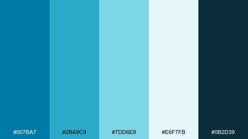
HEX: #007BA7 #2BA9C9 #7DD6E8 #E6F7FB #0B2D39
Mood: fresh, airy, aquatic
Best for: website hero banners and travel landing pages
Fresh and aquatic, these tones feel like sunlight hitting clear seawater and glassy waves. Use the deep navy-teal as a grounding base, then let the lighter blues carry the main visuals. Pair with white space and thin dark typography for a crisp, modern look. Tip: reserve the brightest cyan for buttons and key links so it reads as intentional, not noisy.
Image example of ocean glass generated using media.io

Media.io is an online AI studio for creating and editing video, image, and audio in your browser.

2) Coastal Minimal
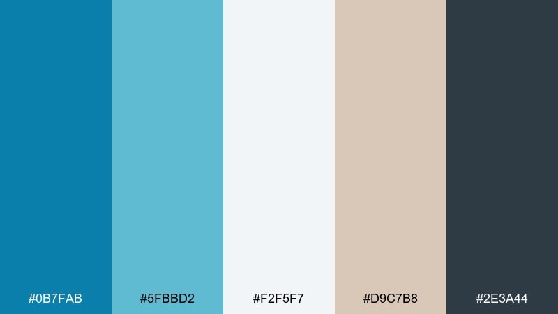
HEX: #0B7FAB #5FBBD2 #F2F5F7 #D9C7B8 #2E3A44
Mood: calm, clean, beachhouse
Best for: minimal brand identity and stationery
Calm and understated, this mix evokes driftwood, foggy mornings, and tidy coastal interiors. Keep the soft off-white as your primary background and use the blue as a confident brand anchor. The sandy beige works beautifully for secondary blocks, labels, and packaging textures. Tip: choose charcoal for type instead of pure black to keep the look gentle and premium.
Image example of coastal minimal generated using media.io
3) Cerulean Coral Pop
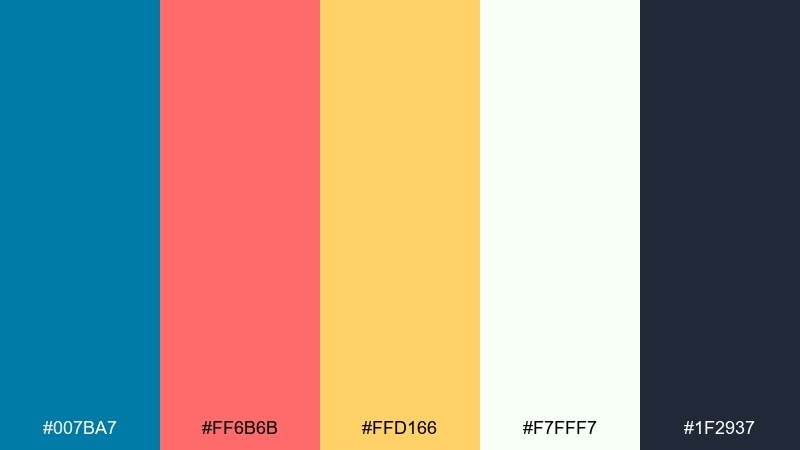
HEX: #007BA7 #FF6B6B #FFD166 #F7FFF7 #1F2937
Mood: playful, sunny, energetic
Best for: social ads and campaign graphics
Playful and sunny, this pairing feels like a beach festival poster with bold shapes and upbeat headlines. These cerulean color combinations shine when you let the blue hold the background and use coral as the attention grabber. Add the warm yellow as a highlight for badges, price tags, or small icons. Tip: keep text in the deep slate to protect legibility against the bright accents.
Image example of cerulean coral pop generated using media.io

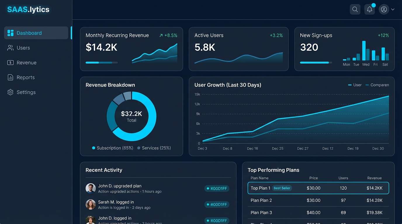
4) Tech Dashboard Night
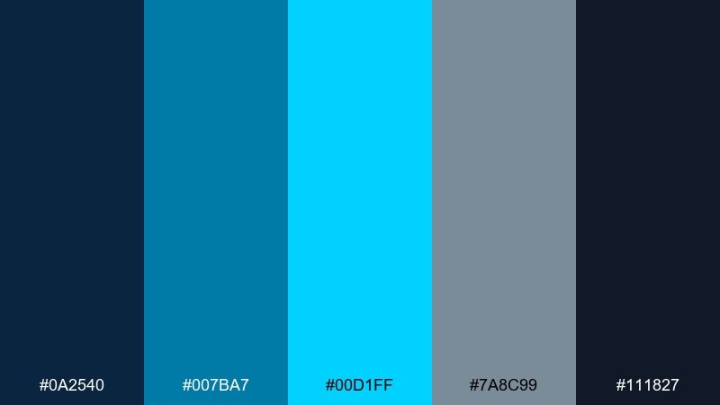
HEX: #0A2540 #007BA7 #00D1FF #7A8C99 #111827
Mood: sleek, technical, night mode
Best for: saas dashboards and analytics UI
Sleek and technical, this set reads like a late-night control room with glowing indicators. Use the two dark blues for surfaces and panels, then bring in the bright cyan for active states and charts. The cool gray helps separate sections without adding visual clutter. Tip: limit the neon accent to one UI role (primary action or selected tab) to avoid competing highlights.
Image example of tech dashboard night generated using media.io
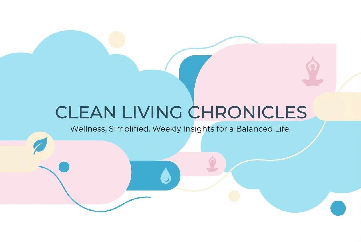
5) Poolside Pastels
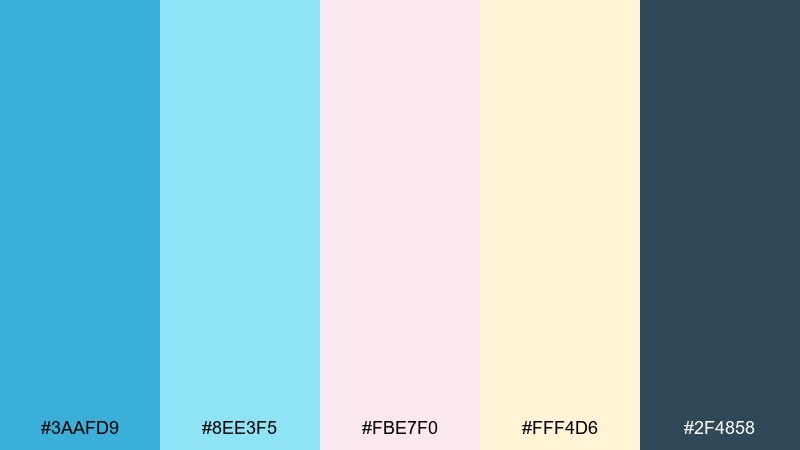
HEX: #3AAFD9 #8EE3F5 #FBE7F0 #FFF4D6 #2F4858
Mood: soft, cheerful, summery
Best for: wellness newsletters and lifestyle blogs
Soft and cheerful, these pastels feel like pool tiles, sun lotion, and breezy towels. Use the lighter aqua as a roomy background and layer the stronger blue for headings and section bars. Blush and butter tones add warmth to icons, stickers, and callouts. Tip: keep body text in the muted navy so the pastel surfaces stay readable on mobile.
Image example of poolside pastels generated using media.io
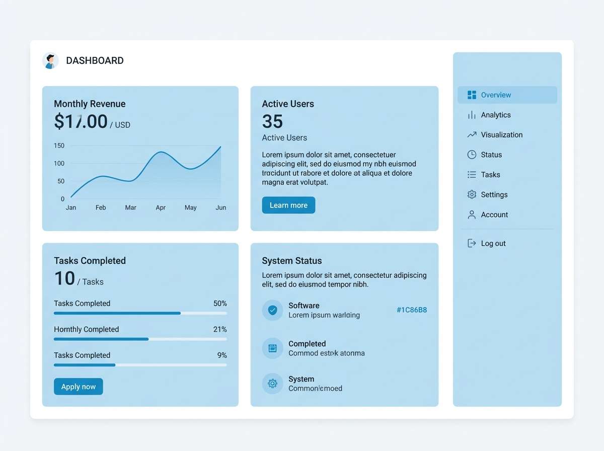
6) Nordic Sky
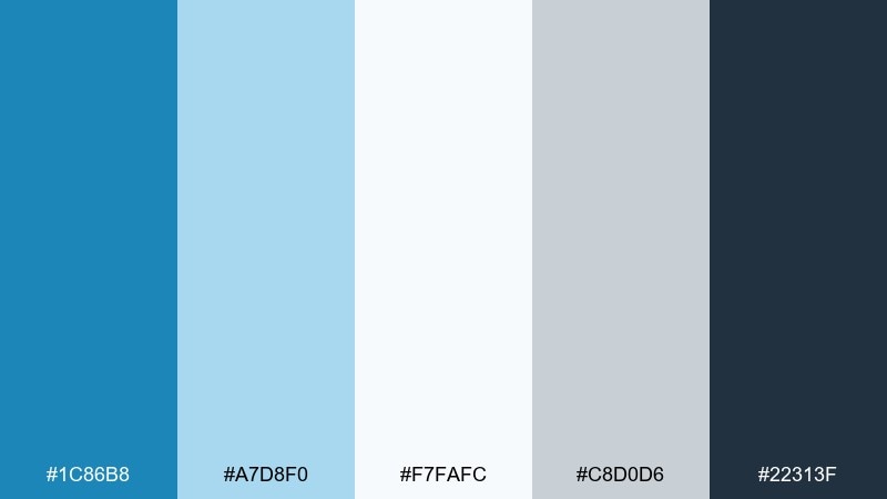
HEX: #1C86B8 #A7D8F0 #F7FAFC #C8D0D6 #22313F
Mood: crisp, airy, Scandinavian
Best for: product UI and minimalist branding
Crisp and airy, this cerulean color palette evokes winter light, pale skies, and clean Scandinavian interiors. Let the near-white and misty blue do the heavy lifting for backgrounds and spacing. Use the deeper blue for navigation, icons, and clear hierarchy, while gray supports dividers and form fields. Tip: add generous padding and thin lines so the cool tones feel calm rather than cold.
Image example of nordic sky generated using media.io
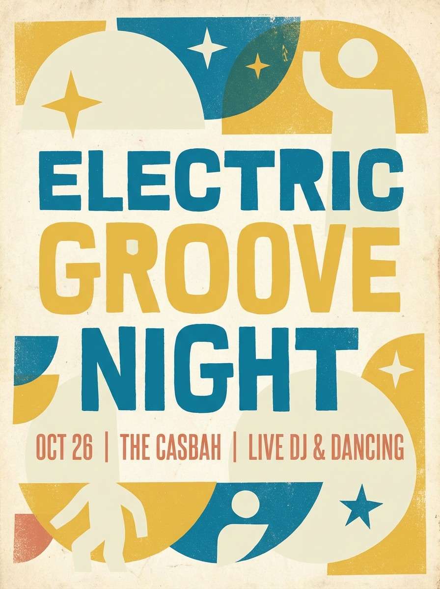
7) Vintage Travel Poster
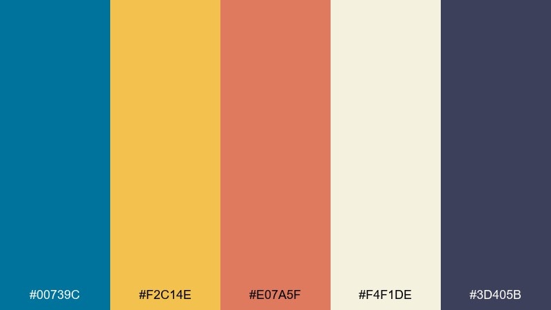
HEX: #00739C #F2C14E #E07A5F #F4F1DE #3D405B
Mood: nostalgic, warm, cinematic
Best for: event posters and retro promos
Nostalgic and cinematic, this mix brings to mind sun-faded paper, seaside rail trips, and classic poster inks. Put the warm cream down first, then build contrast with the deep indigo for titles and borders. The golden yellow and clay coral make strong spot colors for dates, tickets, and badges. Tip: use grain textures and simple shapes to sell the retro vibe without sacrificing clarity.
Image example of vintage travel poster generated using media.io
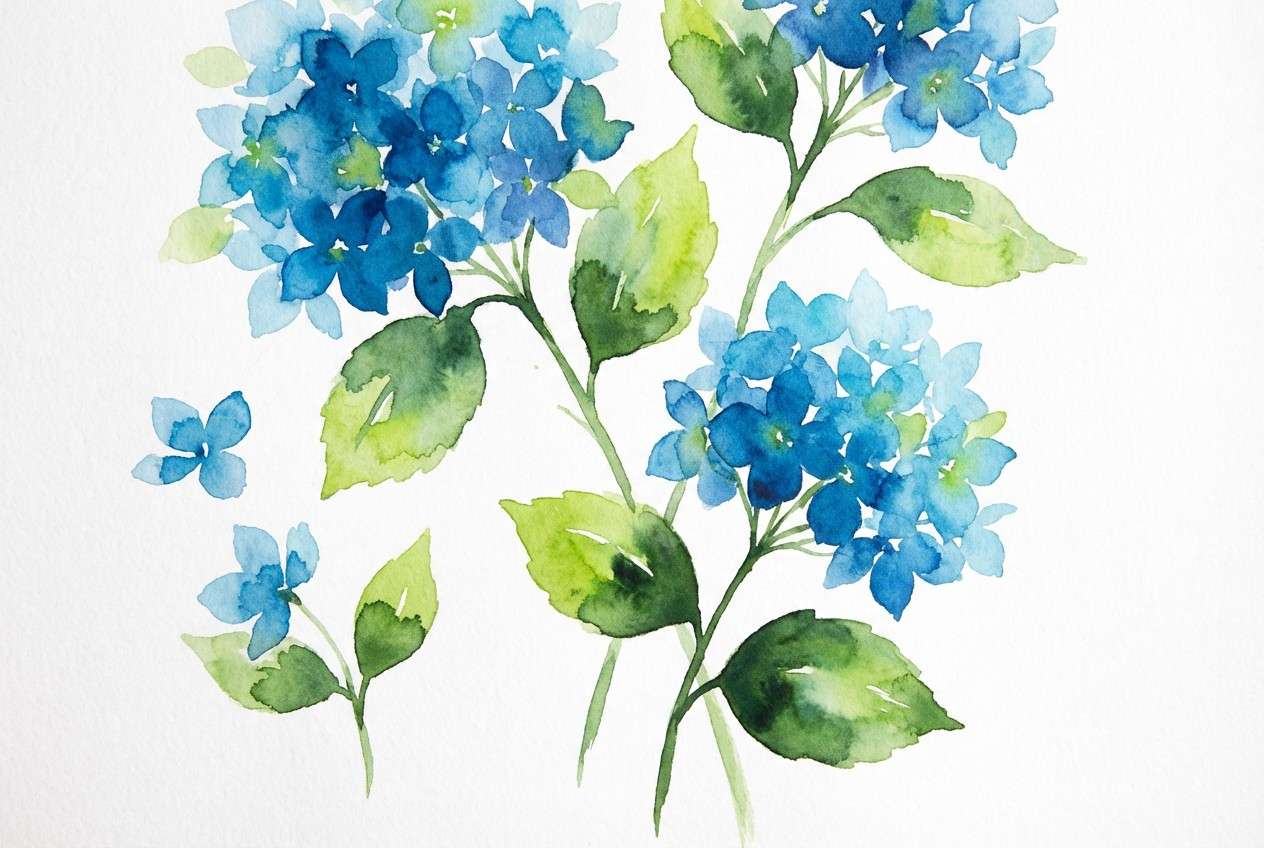
8) Botanical Blue Hydrangea
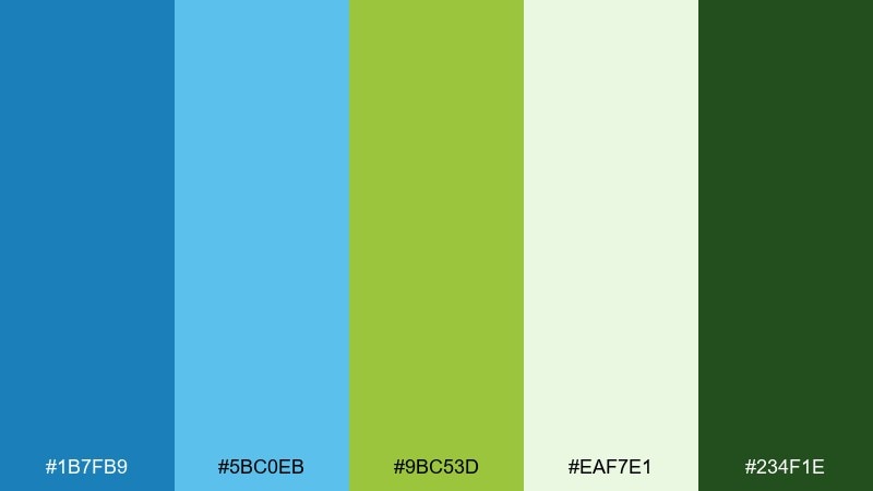
HEX: #1B7FB9 #5BC0EB #9BC53D #EAF7E1 #234F1E
Mood: garden-fresh, bright, natural
Best for: botanical illustrations and eco branding
Garden-fresh and bright, these colors feel like hydrangea blooms against crisp spring leaves. Use the soft green-white as a paper-like base and layer blues for petals, headers, or packaging panels. The lively green makes a natural accent for icons, seals, and sustainability claims. Tip: keep the dark forest tone for small text and outlines so the palette stays light and friendly.
Image example of botanical blue hydrangea generated using media.io
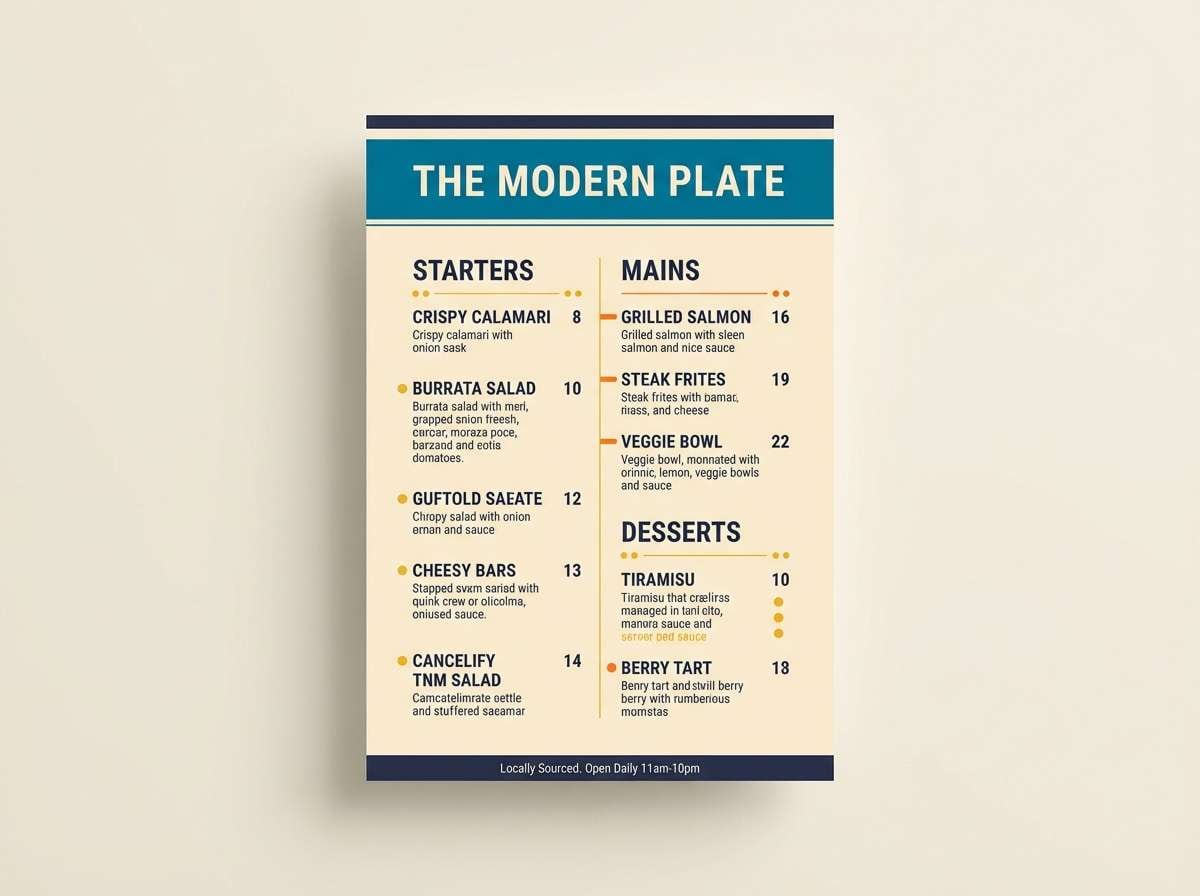
9) Sunset Pier
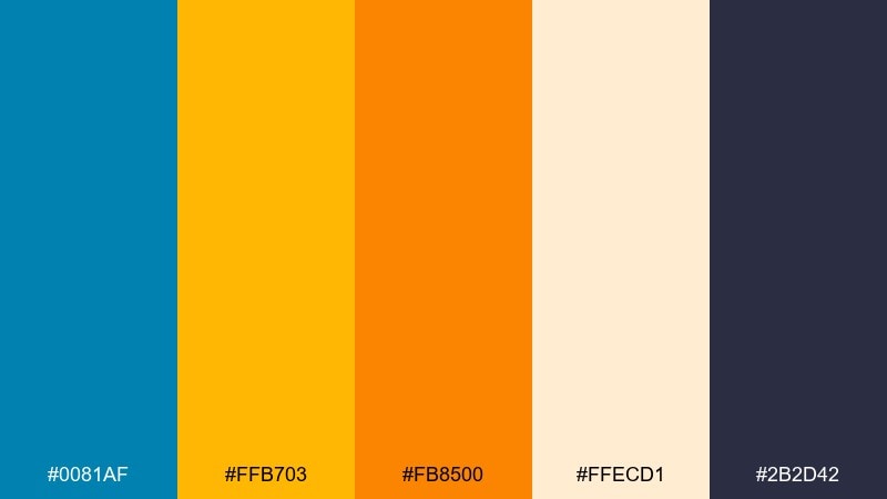
HEX: #0081AF #FFB703 #FB8500 #FFECD1 #2B2D42
Mood: warm, upbeat, seaside evening
Best for: restaurant menus and summer promos
Warm and upbeat, this set captures the moment the sun drops behind the pier and everything turns golden. Use the soft cream as a menu background and lean on the deep navy for readable text. The orange and amber pair well for highlights like specials, badges, and section headers. Tip: keep orange to small areas so it stays appetizing and not overpowering.
Image example of sunset pier generated using media.io
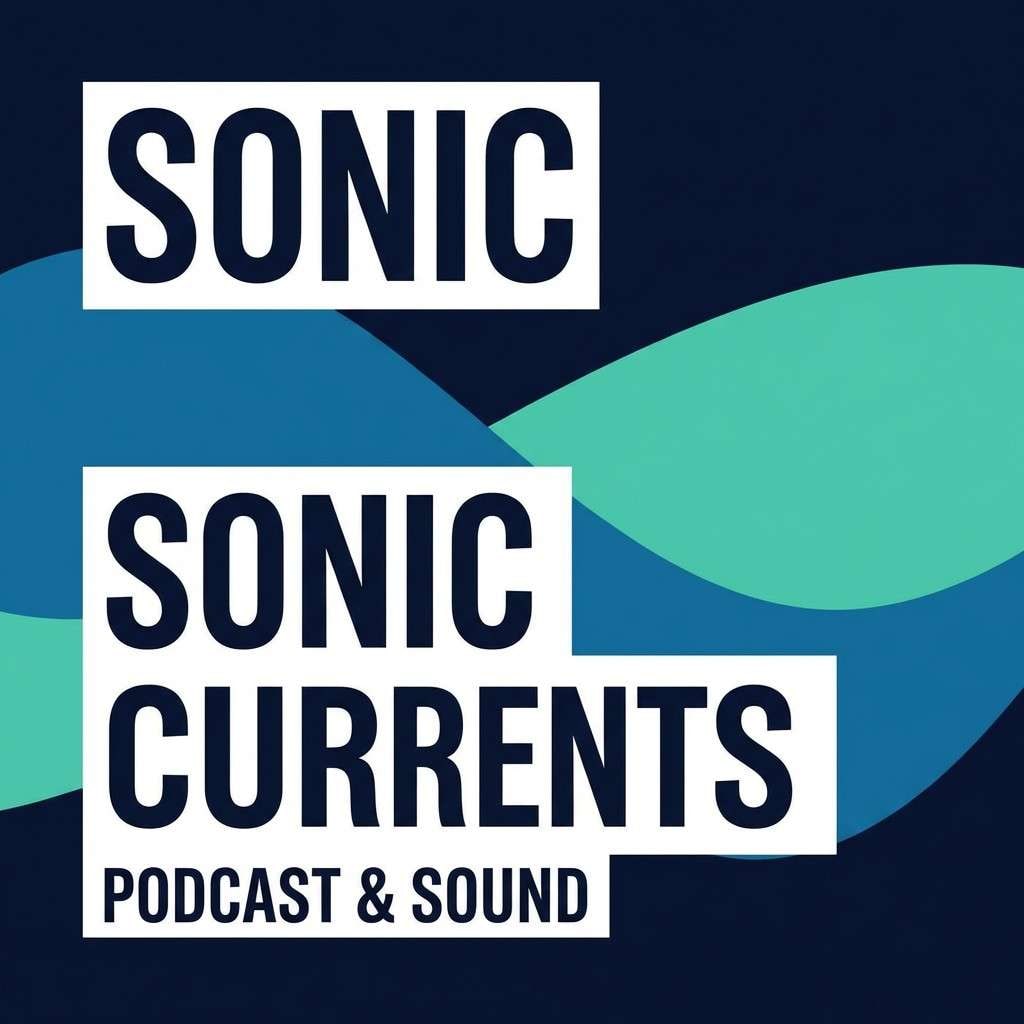
10) Ink and Seafoam
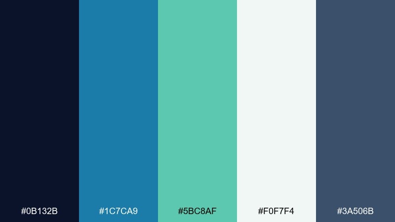
HEX: #0B132B #1C7CA9 #5BC8AF #F0F7F4 #3A506B
Mood: moody, modern, oceanic
Best for: podcast cover art and music branding
Moody and modern, these tones suggest deep ink, sea spray, and late-night coastal air. Use the near-black navy as the backdrop to make the blues glow, then bring in seafoam for small highlights and icons. The pale mint-white works well for typography blocks and negative space. Tip: add one bold typographic element in seafoam to create a focal point at thumbnail size.
Image example of ink and seafoam generated using media.io
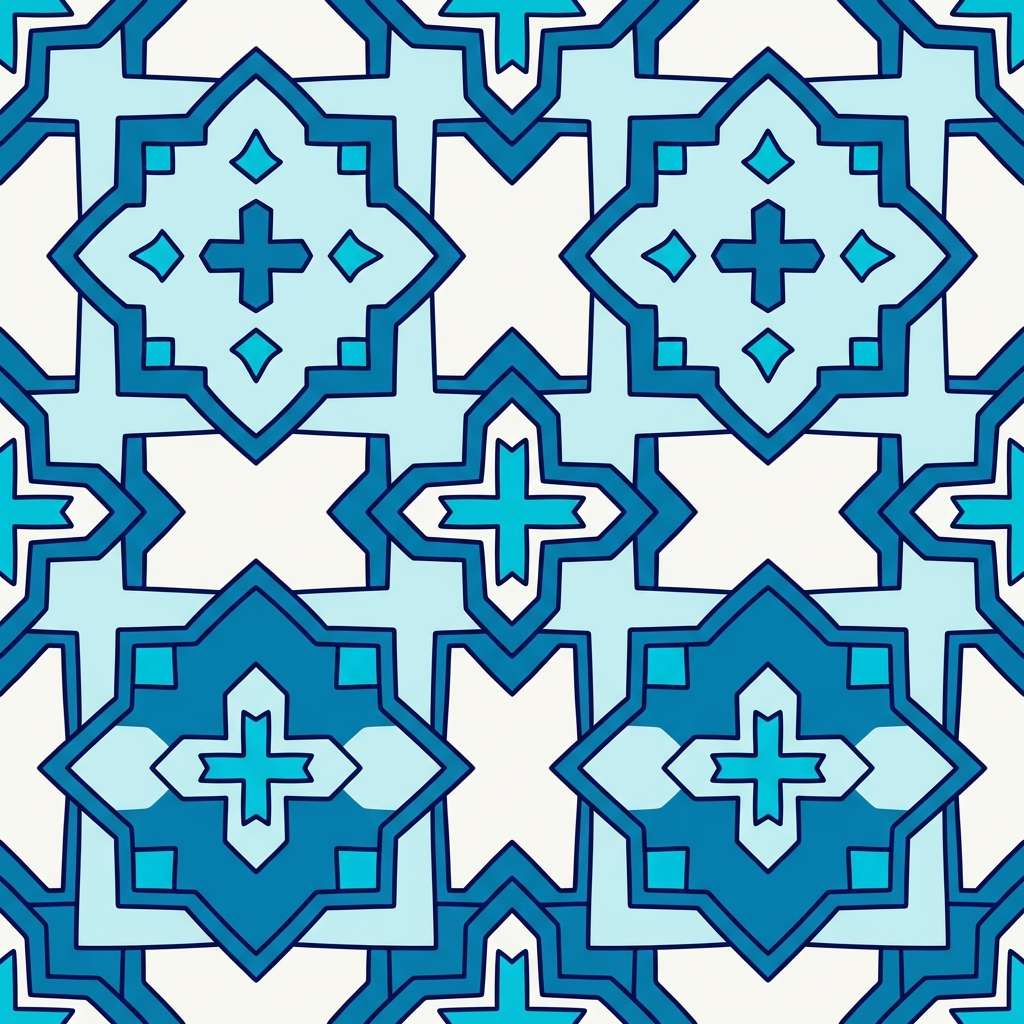
11) Mediterranean Tile
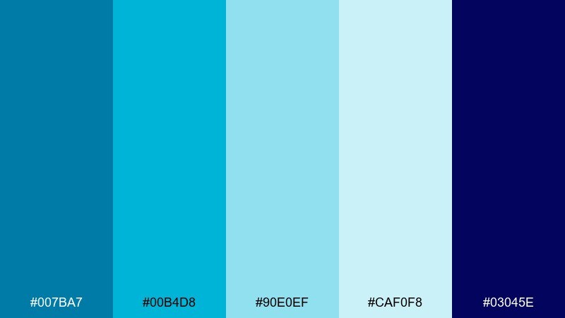
HEX: #007BA7 #00B4D8 #90E0EF #CAF0F8 #03045E
Mood: sunlit, patterned, coastal chic
Best for: pattern design and home decor mockups
Sunlit and patterned, this set feels like painted tiles, whitewashed walls, and clear water in a harbor. Make the palest blue your background so the mid and bright blues can form repeating motifs. The deep indigo is perfect for outlines that keep patterns crisp at small scales. Tip: stick to two blues per motif and use the others as alternating border bands for a clean rhythm.
Image example of mediterranean tile generated using media.io
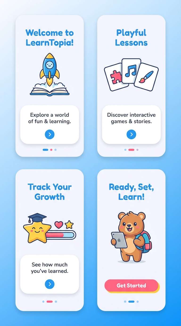
12) Kids Learning App
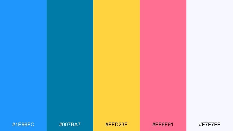
HEX: #1E96FC #007BA7 #FFD23F #FF6F91 #F7F7FF
Mood: friendly, bright, playful
Best for: education app UI and onboarding screens
Friendly and bright, these colors feel like stickers, rewards, and cheerful classroom posters. Use the near-white as a soft base and let the two blues organize navigation and cards. Yellow and pink should be reserved for rewards, progress states, and playful illustrations. Tip: apply pink only to one element type (like badges) so the interface stays easy to scan.
Image example of kids learning app generated using media.io
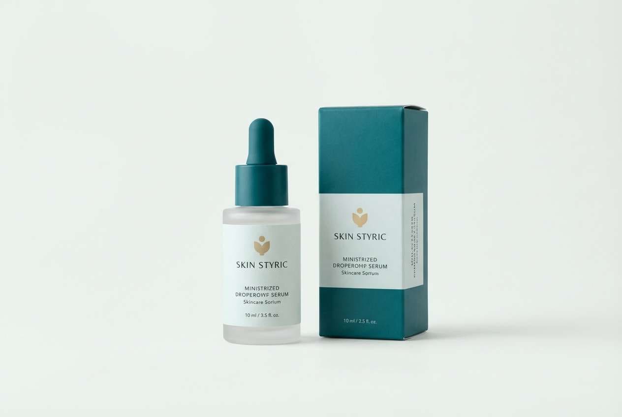
13) Luxury Spa Packaging
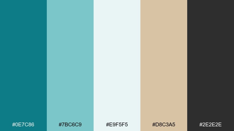
HEX: #0E7C86 #7BC6C9 #E9F5F5 #D8C3A5 #2E2E2E
Mood: serene, premium, restorative
Best for: skincare labels and product ads
Serene and premium, these tones suggest steam, clean towels, and quiet spa lighting. Use the pale aqua as the label base and bring in the deeper teal for brand marks and key claims. The warm beige adds a subtle luxury note, especially for foiled accents or caps. Tip: keep typography mostly charcoal and use teal sparingly so the packaging feels calm, not clinical.
Image example of luxury spa packaging generated using media.io
14) Editorial Blue Note
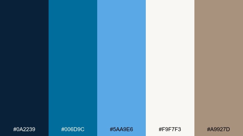
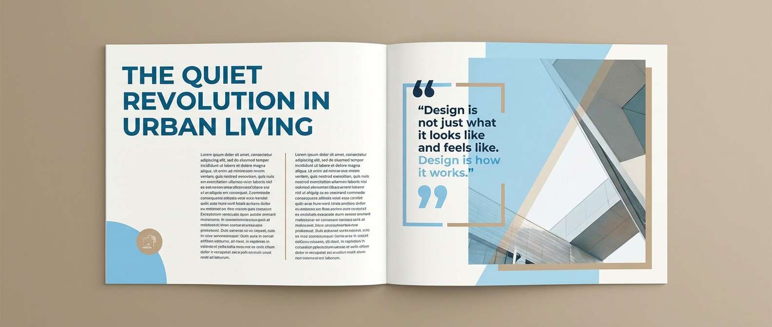
HEX: #0A2239 #006D9C #5AA9E6 #F9F7F3 #A9927D
Mood: refined, editorial, modern classic
Best for: magazine layouts and reports
Refined and editorial, these hues feel like ink on textured paper with a crisp blue headline. Use the warm off-white for page backgrounds and let the darker blues define grids, rules, and section headers. The soft tan works well for pull quotes and small callout boxes without stealing attention. Tip: keep imagery cooler in tone so it harmonizes with the blues and avoids clashing warmth.
Image example of editorial blue note generated using media.io
15) Winter Harbor
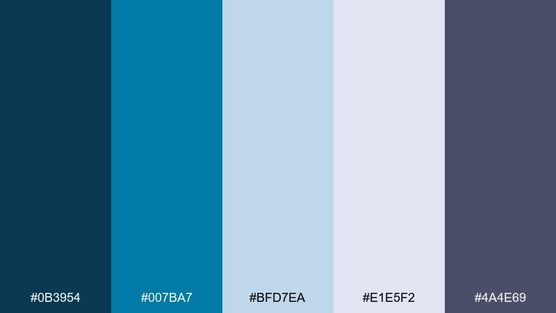
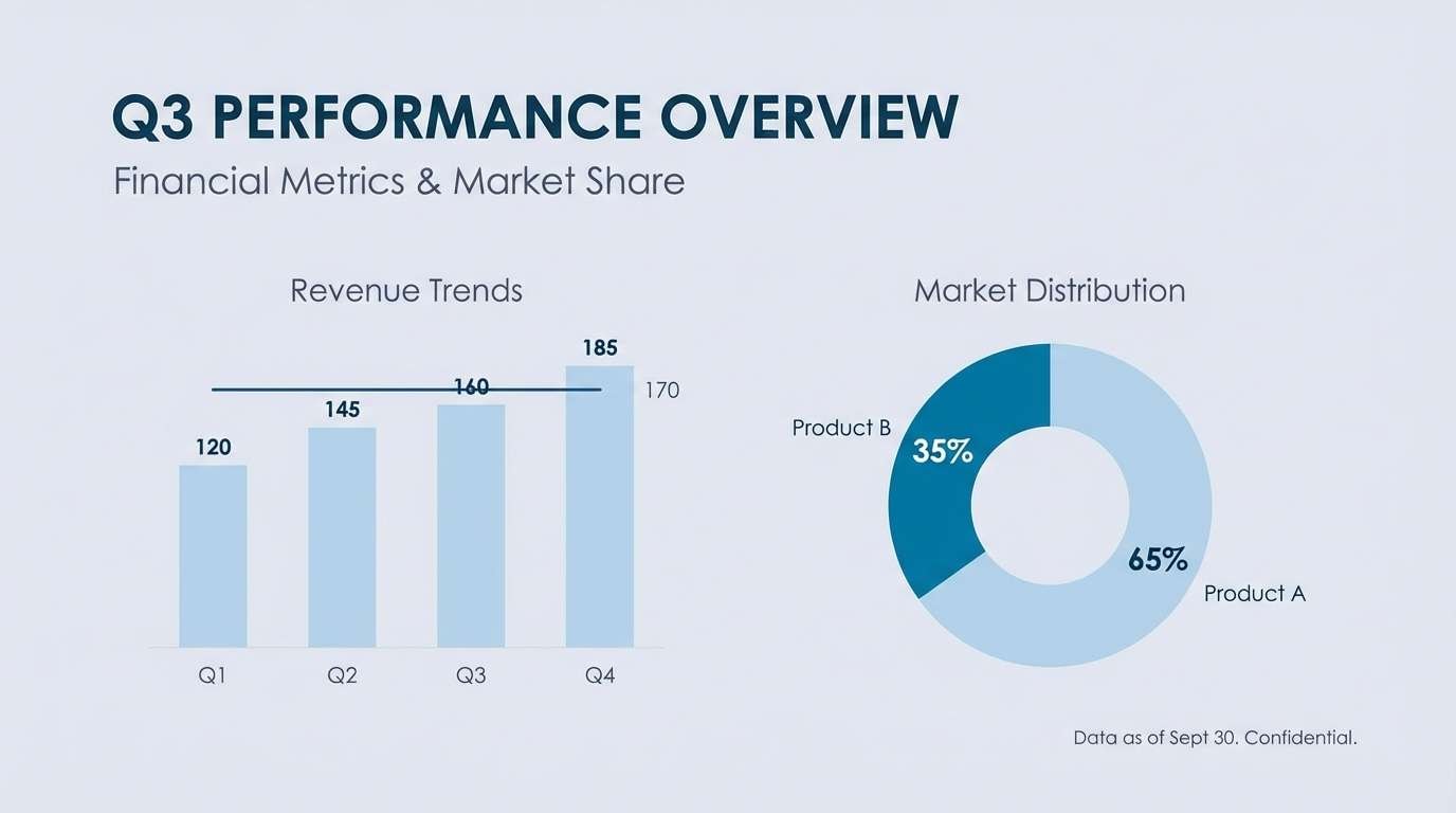
HEX: #0B3954 #007BA7 #BFD7EA #E1E5F2 #4A4E69
Mood: cool, quiet, contemplative
Best for: presentation decks and fintech branding
Cool and quiet, this set feels like calm water under a cloudy winter sky. Use the pale lavenders and light blue as slide backgrounds to keep content breathable. The deep harbor tones work best for headlines, charts, and confident navigation elements. Tip: use the medium blue for data highlights only, so trends and key numbers are immediately visible.
Image example of winter harbor generated using media.io
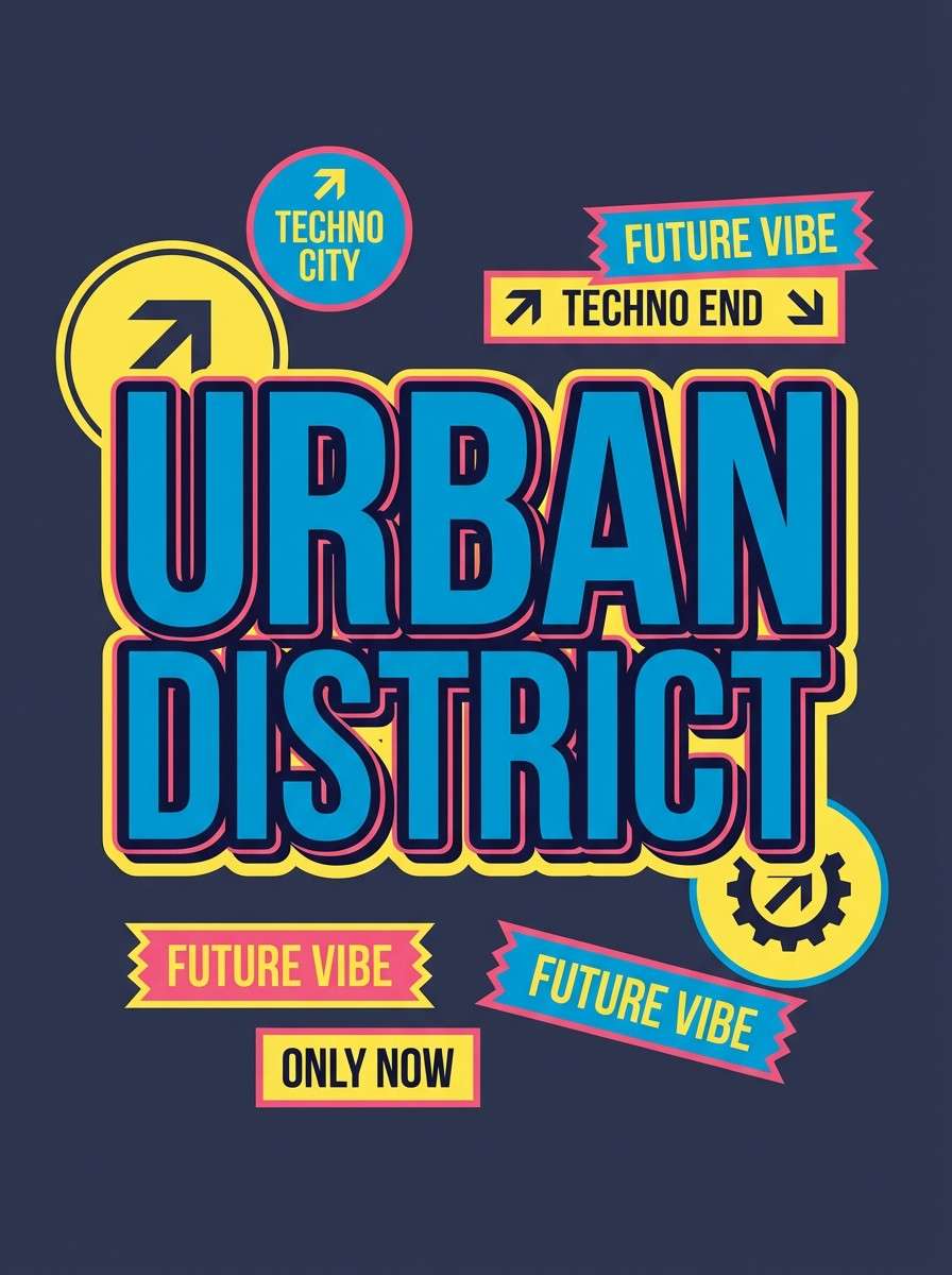
16) Retro Surf
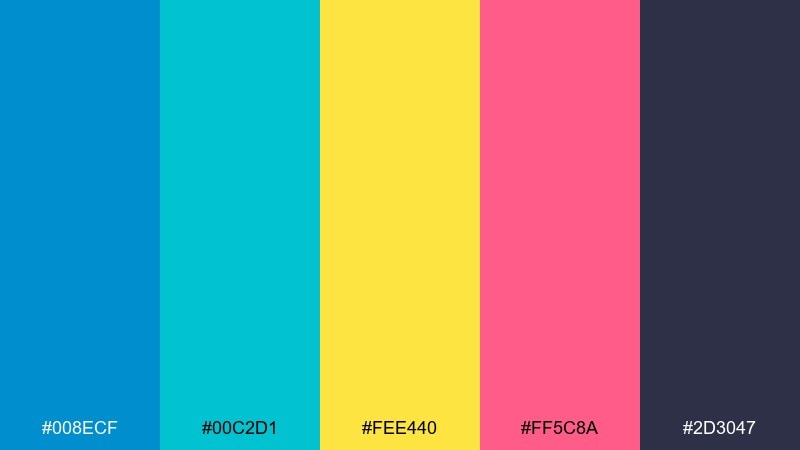
HEX: #008ECF #00C2D1 #FEE440 #FF5C8A #2D3047
Mood: bold, fun, sporty
Best for: streetwear graphics and posters
Bold and fun, this mix hits like neon wax, surf stickers, and a loud summer soundtrack. These cerulean color combinations work best with the dark slate as a backdrop to keep the brights controlled. Use yellow for highlights and pink for one punchy focal element like a logo stamp. Tip: try halftone dots or thick outlines so the high-energy colors still feel designed, not chaotic.
Image example of retro surf generated using media.io
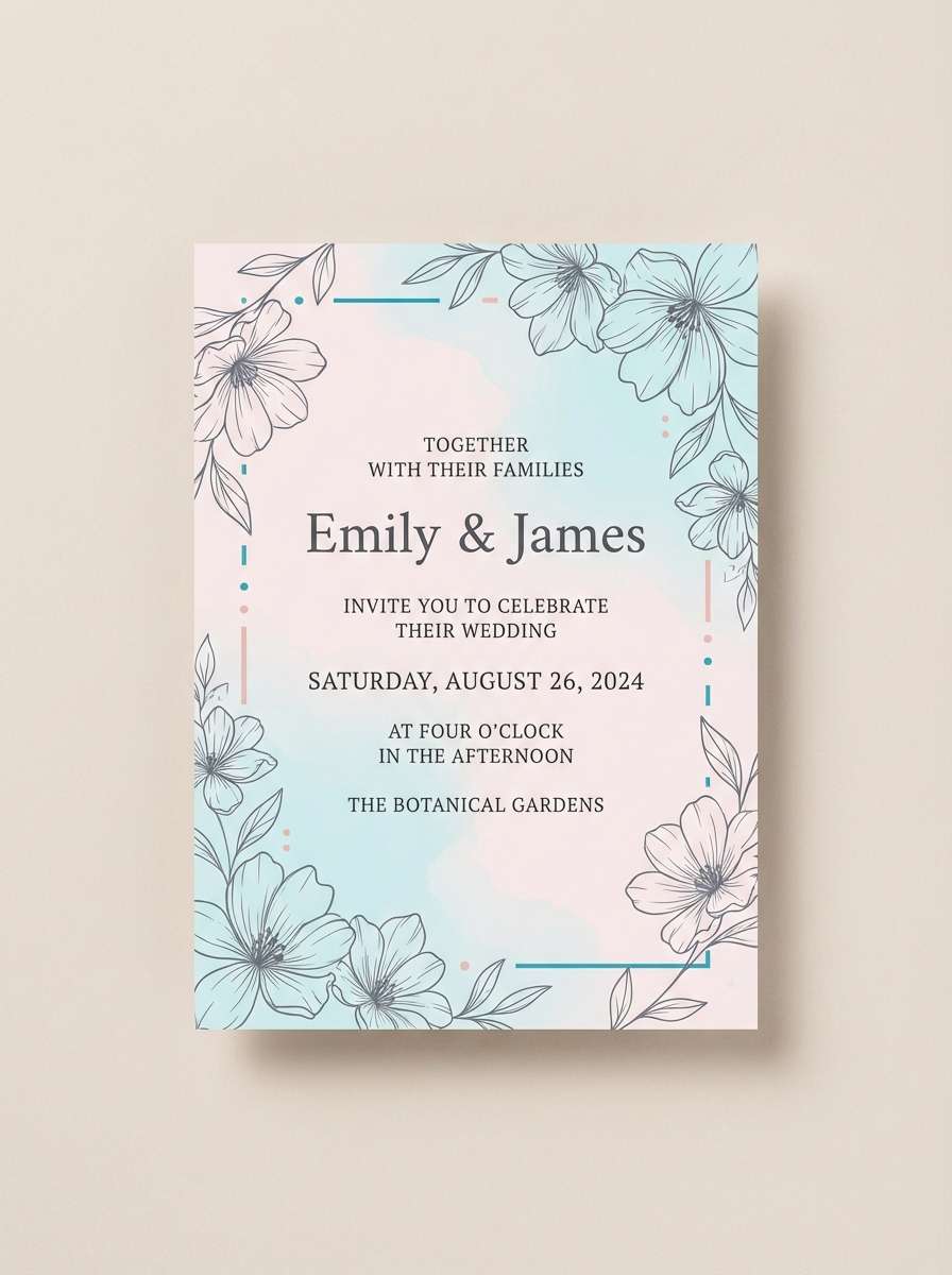
17) Soft Wedding Invitation
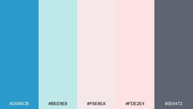
HEX: #2A9BCB #BEE9E8 #F6E8EA #FDE2E4 #5E6472
Mood: romantic, airy, delicate
Best for: wedding invitations and event stationery
Romantic and airy, these tones feel like watercolor washes, silk ribbons, and a bright spring venue. Let blush and soft mint create the paper mood, then use the blue for monograms, borders, or small floral details. The muted gray keeps type elegant and readable without harsh contrast. Tip: keep the blue to fine lines and headings so the invitation stays soft and timeless.
Image example of soft wedding invitation generated using media.io
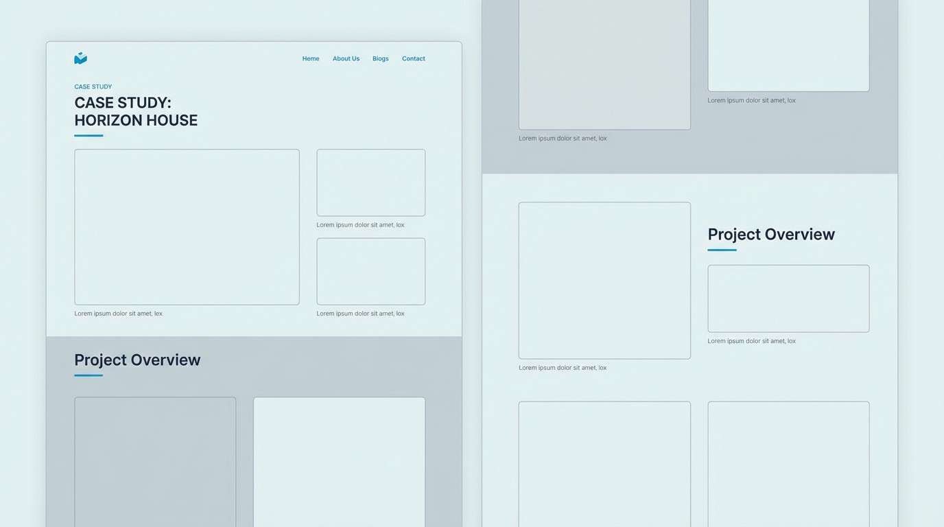
18) Architectural Render
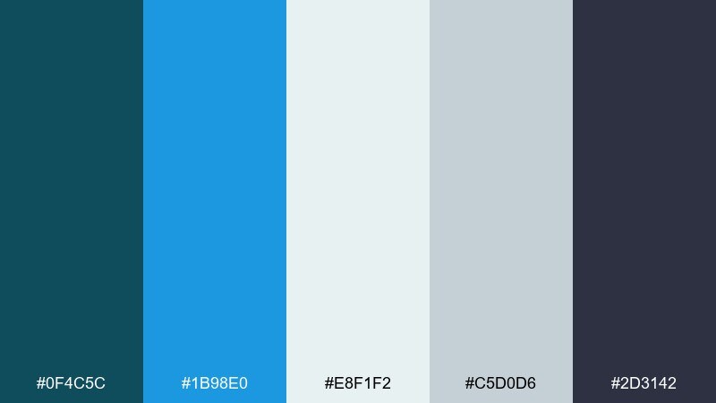
HEX: #0F4C5C #1B98E0 #E8F1F2 #C5D0D6 #2D3142
Mood: structured, modern, professional
Best for: architecture portfolios and case studies
Structured and modern, this set feels like blueprint lines over bright daylight concrete. Use the light cool grays for generous negative space and let the vivid blue call out key facts or project metrics. The deep slate works well for headings, captions, and section dividers. Tip: apply the vivid accent consistently for links and highlights so the portfolio reads like a system.
Image example of architectural render generated using media.io
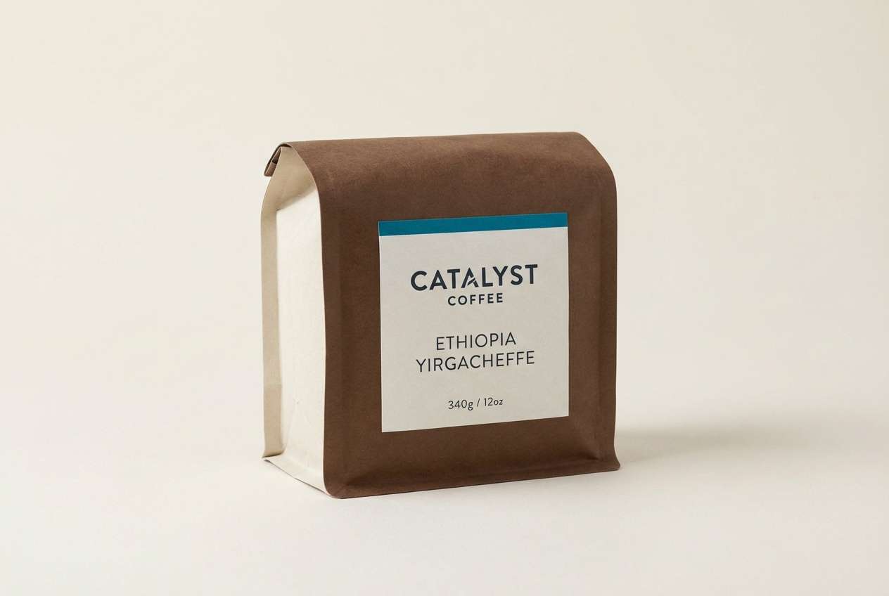
19) Espresso and Azure
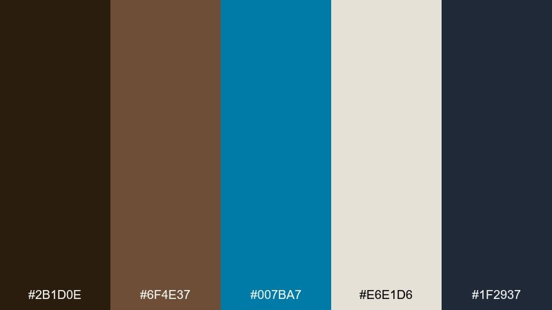
HEX: #2B1D0E #6F4E37 #007BA7 #E6E1D6 #1F2937
Mood: cozy, grounded, modern cafe
Best for: coffee packaging and cafe branding
Cozy and grounded, these shades evoke espresso crema, dark wood, and a pop of blue ceramic. This cerulean color palette is strongest when the warm browns lead and the blue acts as a signature accent. Use the soft oat tone for labels and menus to keep everything approachable and legible. Tip: put the blue on one repeatable element, like a seal or stripe, to make the brand instantly recognizable.
Image example of espresso and azure generated using media.io
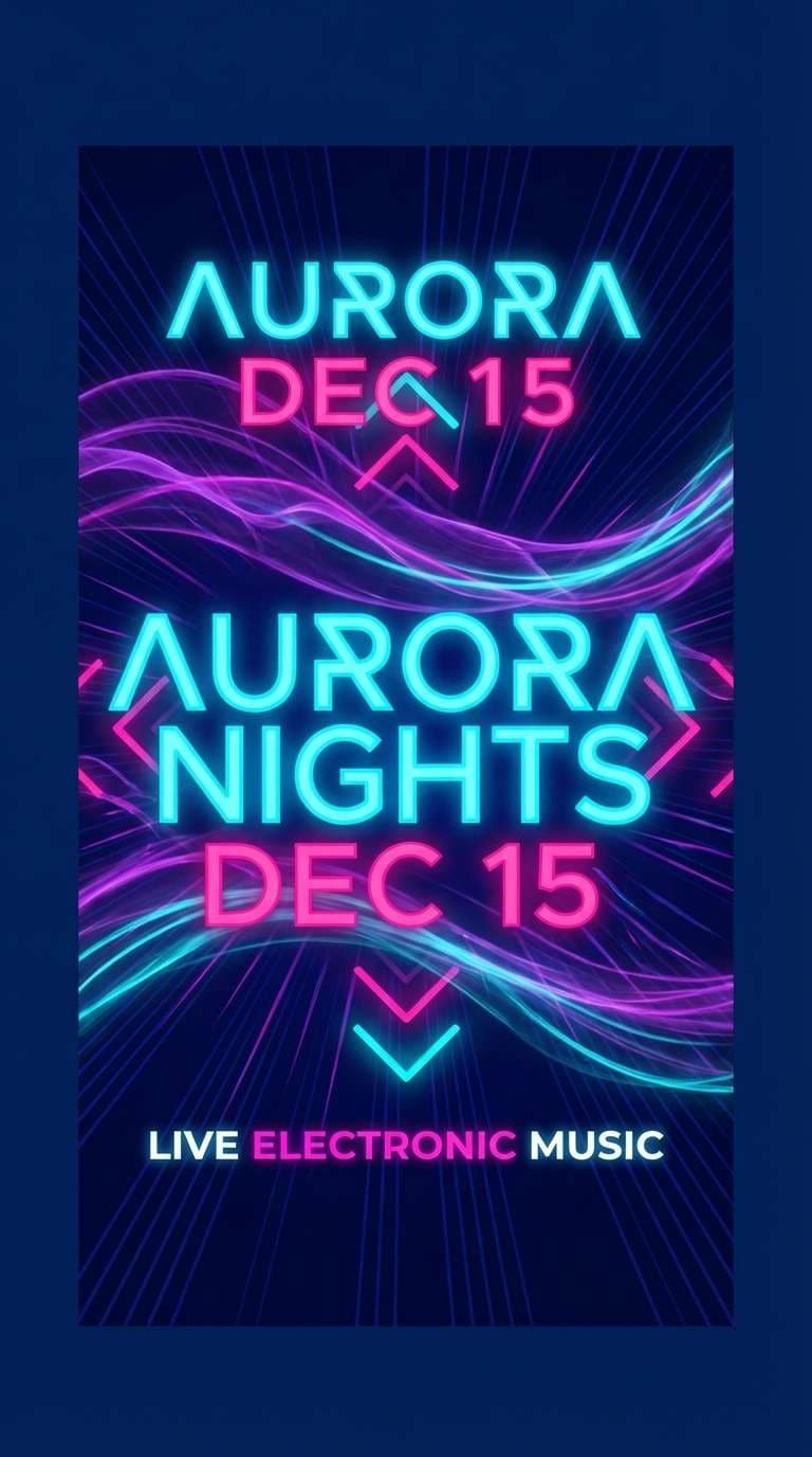
20) Neon Arcade Blue
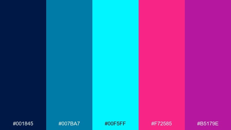
HEX: #001845 #007BA7 #00F5FF #F72585 #B5179E
Mood: electric, futuristic, nightlife
Best for: music flyers and gaming promos
Electric and futuristic, this palette feels like arcade glow, laser lights, and midnight energy. Use the deep navy as the stage, then layer the bright cyan and cerulean for luminous gradients and UI-like lines. Magenta and violet are best as small, high-impact accents for titles and key dates. Tip: add plenty of dark breathing room so the neon colors stay sharp instead of overwhelming.
Image example of neon arcade blue generated using media.io
What Colors Go Well with Cerulean?
Cerulean pairs naturally with clean neutrals like soft white, cool gray, and charcoal, which helps it feel modern and readable in web and UI. For a more premium look, try cerulean with warm neutrals like sand, oat, tan, or antique brass-style metallics.
For contrast, lean into complements and near-complements: coral, peach, and warm orange create instant energy against blue. If you want a brighter, futuristic direction, combine cerulean with neon cyan accents and small doses of magenta or violet.
For nature-forward palettes, add leaf and herb greens (from sage to fresh lime) and keep the darkest color reserved for text and outlines to maintain clarity.
How to Use a Cerulean Color Palette in Real Designs
Start by assigning roles: one cerulean as the brand anchor (navigation, headers, or key shapes), one light tone for backgrounds, and one dark neutral for type. This prevents “all-blue” layouts from looking flat and keeps hierarchy consistent.
In UI, use cerulean for primary actions and interactive states, but limit neon-like cyans to one purpose (selected tab, active chart line, or CTA) so attention doesn’t split. In print, test cerulean on your paper stock; slightly deeper blues tend to hold contrast better on uncoated paper.
When pairing with warm accents (coral, amber, brass), keep accents smaller and repeat them predictably—badges, tags, icons—so the composition feels intentional rather than noisy.
Create Cerulean Palette Visuals with AI
If you have HEX codes but need real visuals (hero banners, posters, packaging mockups, or UI screens), AI can speed up concepting. The key is to describe the layout, style, and where each cerulean tone should appear (background, buttons, outlines, highlights).
Use one prompt per use case and keep color roles consistent—especially with bright cyans or warm accents—so the results look designed. You can iterate quickly by changing only the mood or the format (1:1, 16:9, 9:16) while keeping the palette stable.
Generate cerulean palette images in seconds, then refine your favorite direction into a repeatable brand system.
Cerulean Color Palette FAQs
-
What is the HEX code for cerulean?
Cerulean is commonly represented as #007BA7. In real projects, “cerulean” may vary slightly depending on brand needs, screens, and print profiles. -
Is cerulean a warm or cool color?
Cerulean is a cool blue with a clean, slightly green-leaning (cyan) freshness. It tends to feel airy, modern, and calming. -
What colors complement cerulean best?
Warm accents like coral, peach, amber, and orange contrast beautifully with cerulean. For a more minimal look, pair it with off-white, cool gray, and charcoal. -
What text color is most readable on cerulean backgrounds?
For strong readability, use very dark neutrals like charcoal or deep navy, and use white only when the cerulean is dark enough to maintain contrast. -
How do I keep a cerulean palette from looking too “clinical”?
Add a warm neutral (sand, oat, tan) or a soft accent (blush, butter yellow). Also consider using charcoal instead of pure black and leaving generous white space. -
Can cerulean work for luxury branding?
Yes—cerulean can feel premium when paired with muted neutrals and metallic-like warm tones (beige, tan, antique brass), and when used with restrained accents and refined typography. -
How many colors should I use from a cerulean palette in one design?
A practical approach is 3–5 colors: one main cerulean, one light background, one dark text color, and one or two accents. This keeps the design cohesive and easy to scan.


