

A dystopian color palette is built on tension: gritty neutrals, polluted pastels, and high-alert accents that feel industrial, controlled, and slightly uneasy.
Below are 20+ dystopian color palette ideas with HEX codes—plus practical notes for UI, posters, and branding, and AI prompts you can reuse to generate matching visuals.
In this article
- Why Dystopian Palettes Work So Well
-
- ashfall concrete
- rusted neon
- bunker khaki
- smog violet
- radioactive moss
- surveillance slate
- night curfew
- broken signage
- cold pipeline
- wasteland sunrise
- reactor core
- static fog
- quarry dust
- acid raincoat
- riot siren
- blackout terminal
- urban decay teal
- desaturated carnival
- muted warning tape
- exile coast
- cinder blossom
- What Colors Go Well with Dystopian?
- How to Use a Dystopian Color Palette in Real Designs
- Create Dystopian Palette Visuals with AI
Why Dystopian Palettes Work So Well
Dystopian color schemes feel believable because they mimic real materials and lighting: concrete, fog, oxidized metal, sodium streetlights, and screen glow. That realism makes designs feel grounded even when the concept is futuristic.
They also create instant hierarchy. Deep charcoals and blue-grays give structure, while a single hazard accent (amber, toxic green, siren red) directs attention without needing extra decoration.
Most dystopian palettes are naturally “brand-safe” for serious products: they’re controlled, minimal, and high-contrast. You can push them toward cyberpunk, military, or cinematic just by changing one accent color.
20+ Dystopian Color Palette Ideas (with HEX Codes)
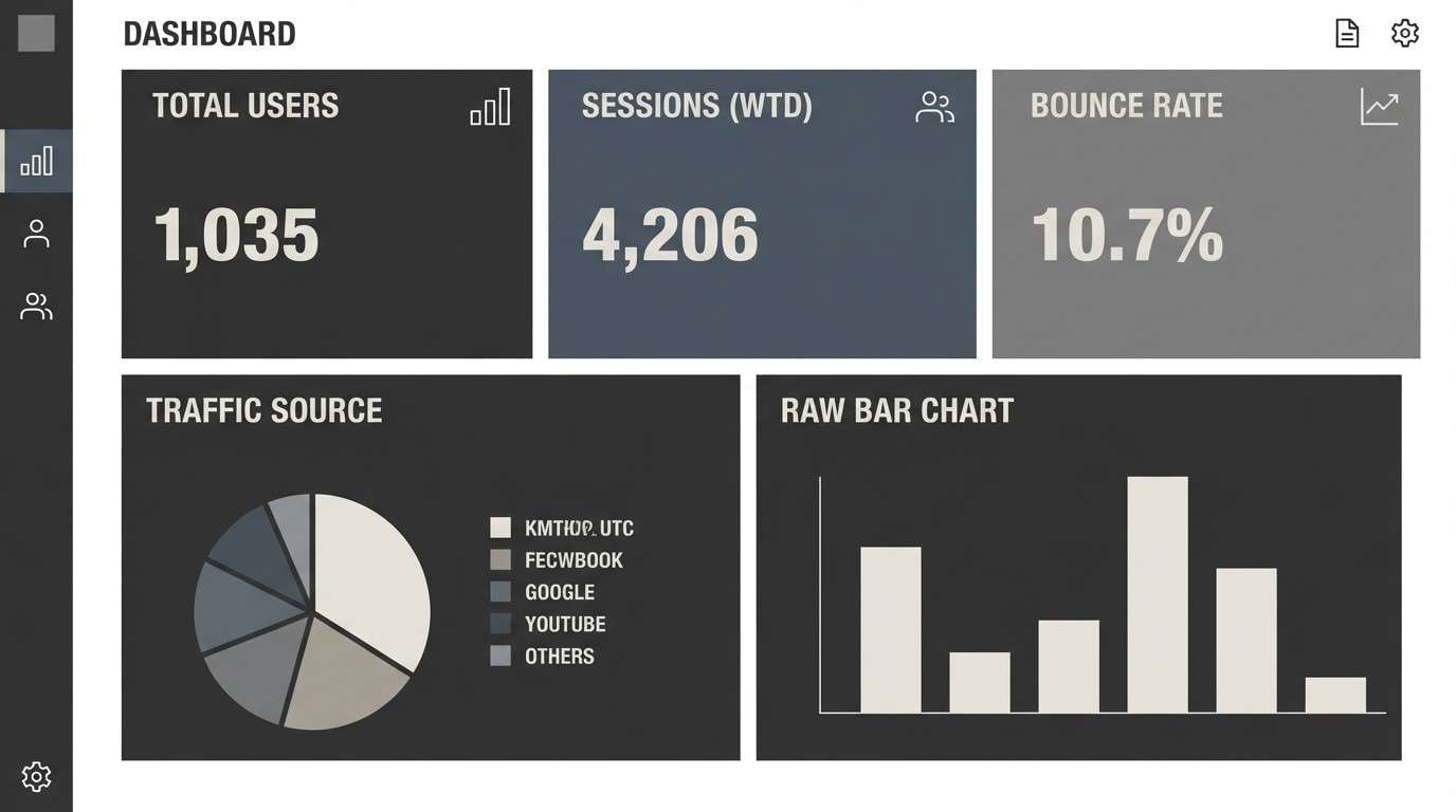
1) Ashfall Concrete
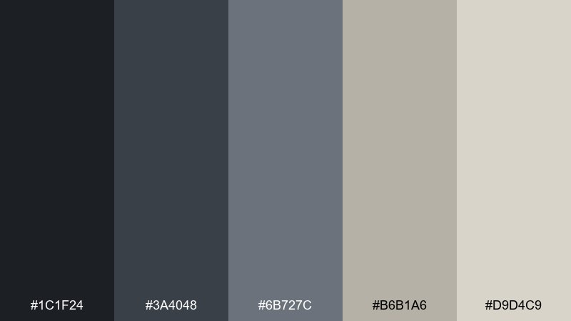
HEX: #1C1F24 #3A4048 #6B727C #B6B1A6 #D9D4C9
Mood: gritty, cold, minimal
Best for: brutalist UI dashboards
Gritty and quiet like a city after the sirens fade, these cement grays and chalky neutrals feel controlled and tense. Use it for admin panels, data-heavy dashboards, and system screens where clarity matters. Pair the lightest tone with plenty of whitespace and reserve the darkest shade for nav and headers. Tip: keep accent color to icon states only so the interface stays severe, not noisy.
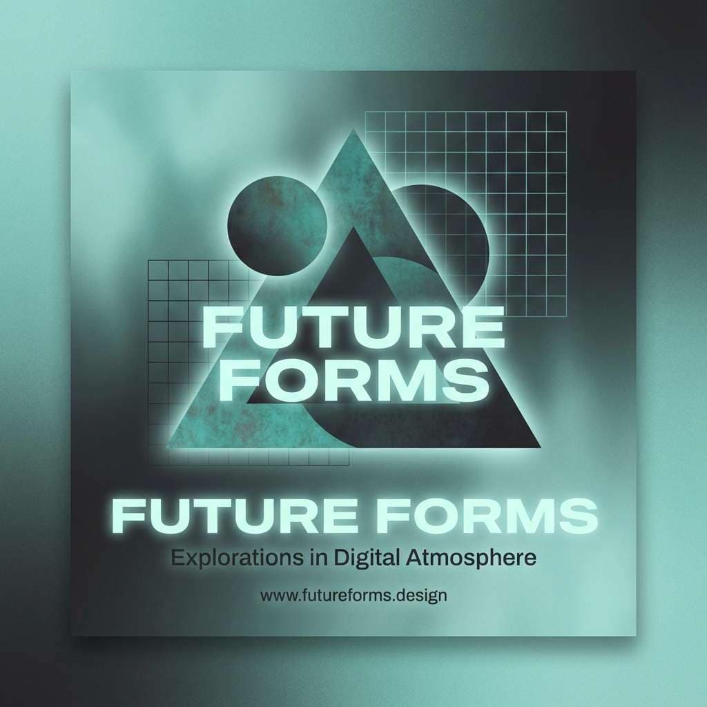
Image example of ashfall concrete generated using media.io
Media.io is an online AI studio for creating and editing video, image, and audio in your browser.

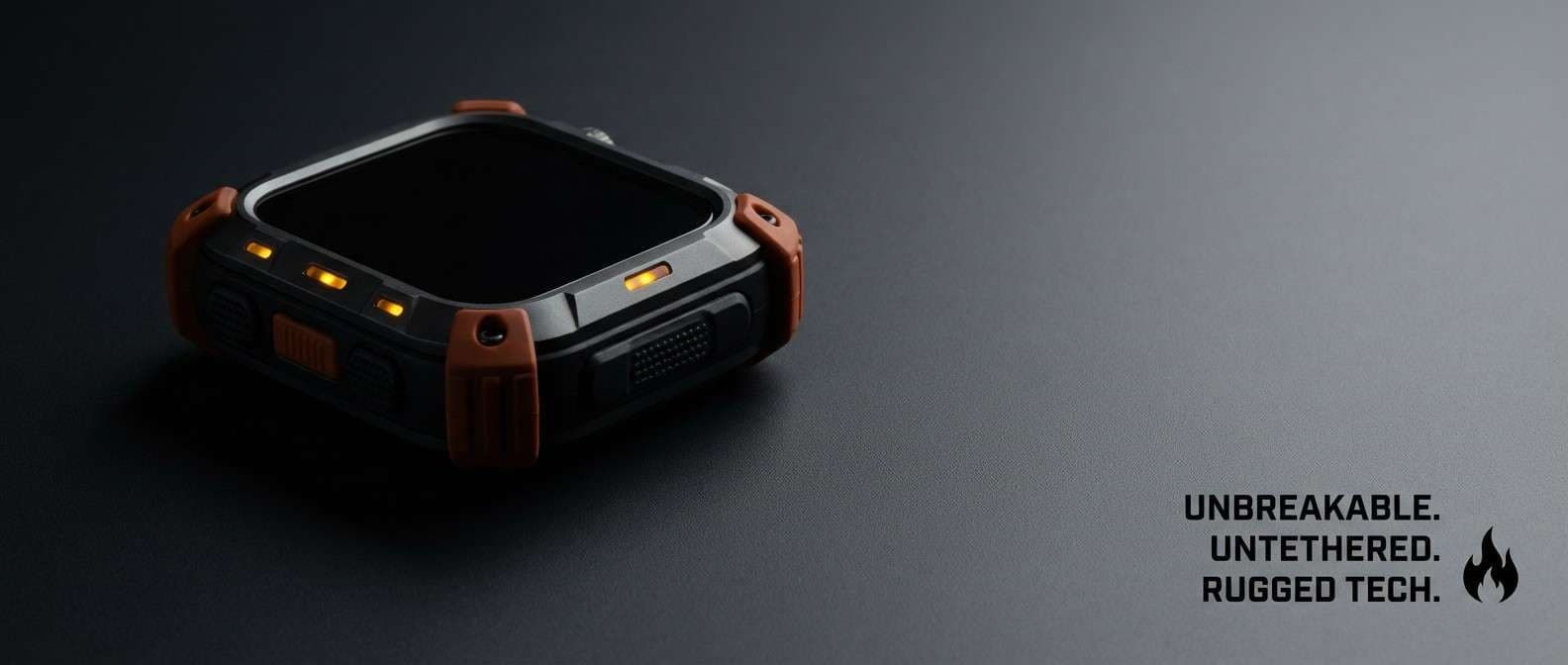
2) Rusted Neon
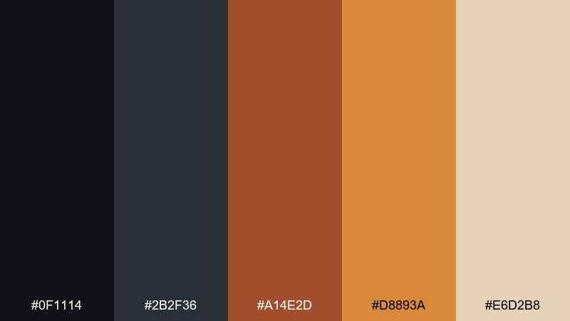
HEX: #0F1114 #2B2F36 #A14E2D #D8893A #E6D2B8
Mood: industrial, urgent, heat-hazed
Best for: tech product ads and hero banners
Industrial and urgent, it reads like oxidized steel lit by a dying sign. The rust and amber tones pop best on deep graphite backgrounds for hero banners and feature callouts. Use the pale sand as negative space to keep type readable and premium. Tip: apply the bright amber only to one primary button to avoid a hazard-tape overload.
Image example of rusted neon generated using media.io
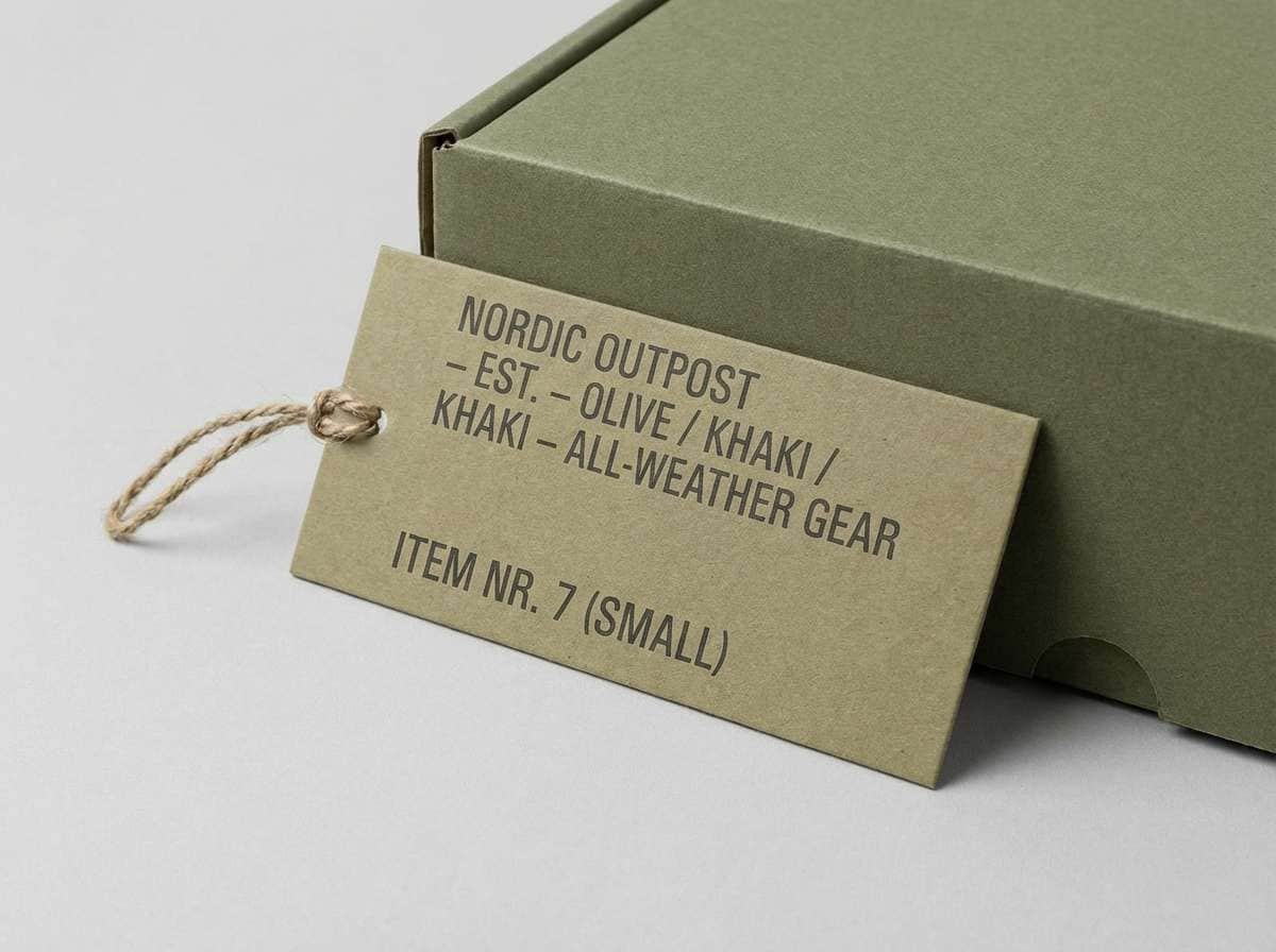
3) Bunker Khaki
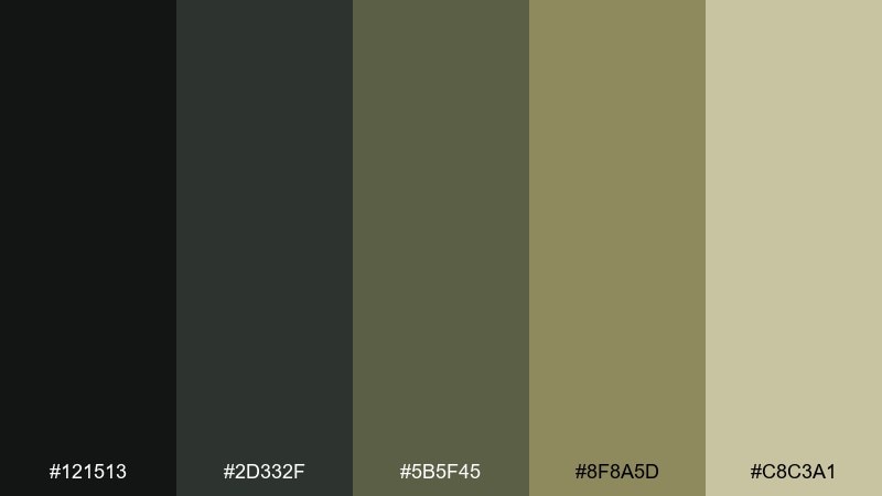
HEX: #121513 #2D332F #5B5F45 #8F8A5D #C8C3A1
Mood: military, subdued, grounded
Best for: outdoor brand identity and labels
Subdued and grounded, these bunker greens feel like canvas, dust, and worn field gear. They work well for outdoor branding, utilitarian packaging, and label systems that need a disciplined tone. Pair the light khaki with black typography for maximum legibility and a no-nonsense look. Tip: use the olive midtone for secondary badges so the hierarchy stays calm.
Image example of bunker khaki generated using media.io
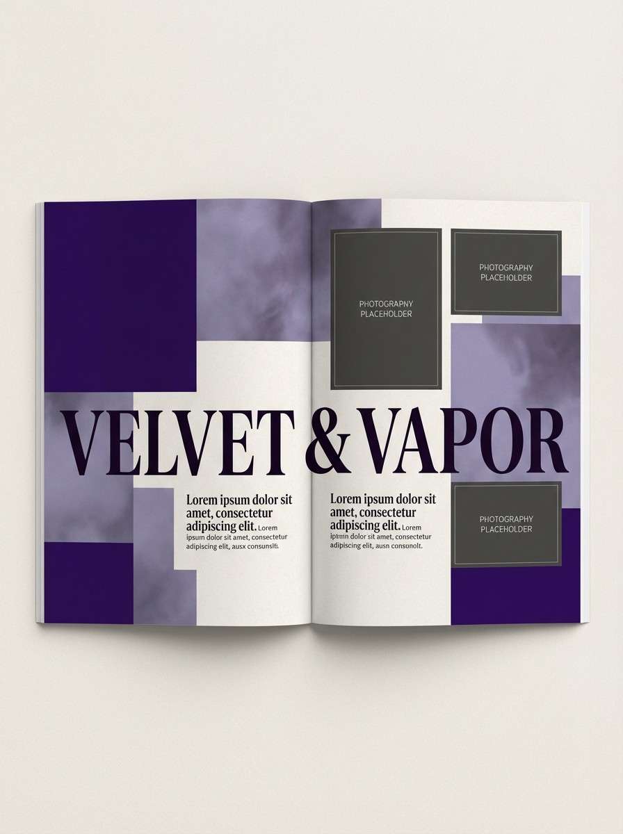
4) Smog Violet
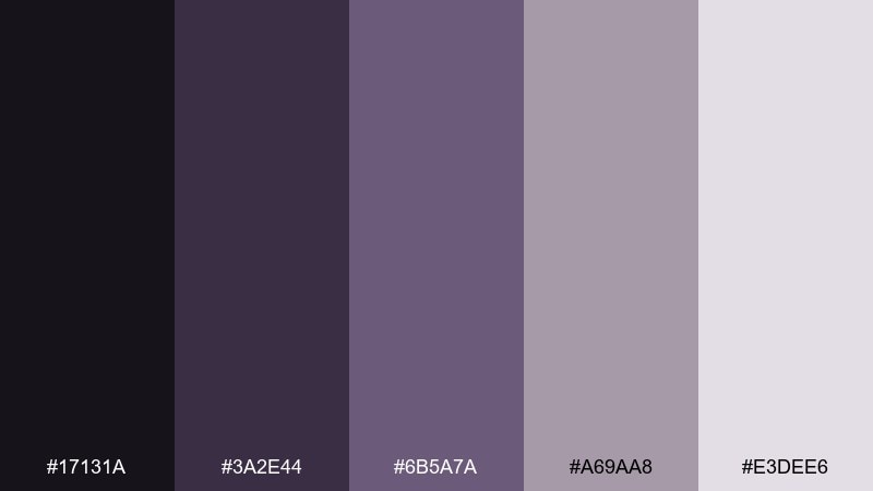
HEX: #17131A #3A2E44 #6B5A7A #A69AA8 #E3DEE6
Mood: moody, nocturnal, introspective
Best for: album covers and editorial layouts
Moody and nocturnal, the violets feel like streetlights diffused through heavy smog. Use them for album art, long-form editorial, or poster typography where atmosphere matters as much as contrast. Pair the soft lavender with a deep ink background to keep the palette elegant instead of gothic. Tip: add subtle grain to backgrounds to make the gradients feel cinematic.
Image example of smog violet generated using media.io
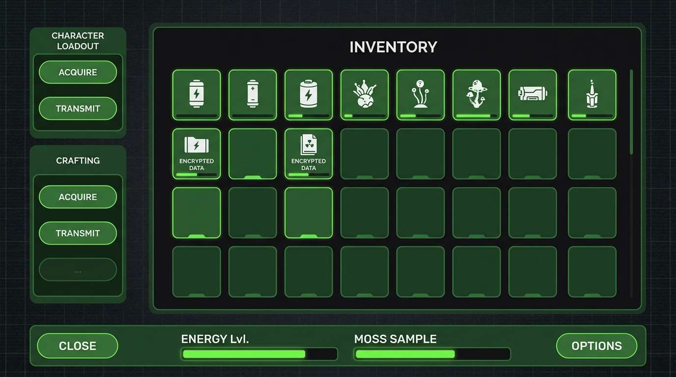
5) Radioactive Moss
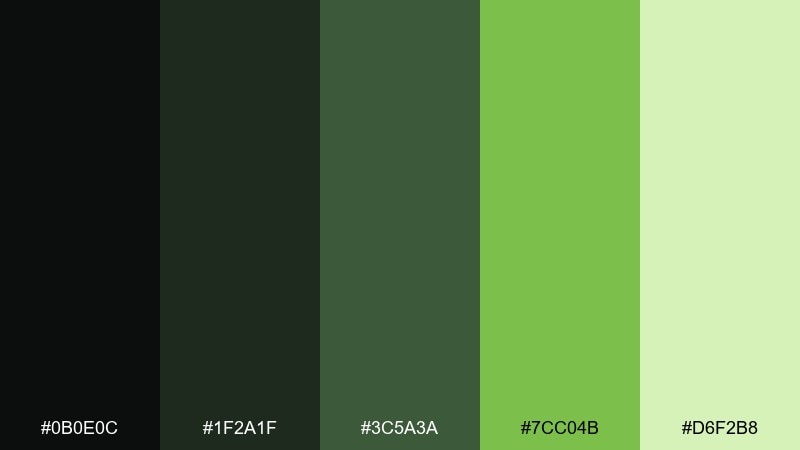
HEX: #0B0E0C #1F2A1F #3C5A3A #7CC04B #D6F2B8
Mood: toxic, alive, high-contrast
Best for: gaming UI and sci-fi thumbnails
Toxic and alive, it evokes moss glowing under blacklight in an abandoned tunnel. This set is built for gaming UI, sci-fi thumbnails, and status indicators where green needs to read instantly. Keep the neon moss as a highlight, not a background, and let the deeper greens carry most surfaces. Tip: use the pale mint only for small text and icon strokes to prevent washout.
Image example of radioactive moss generated using media.io
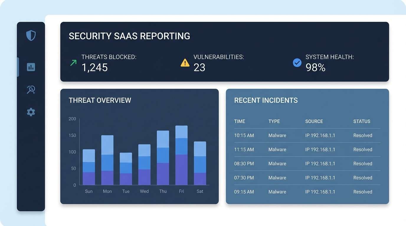
6) Surveillance Slate
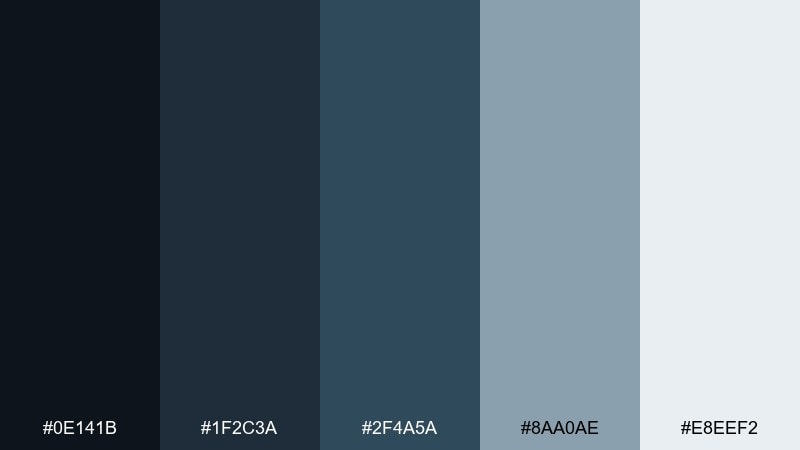
HEX: #0E141B #1F2C3A #2F4A5A #8AA0AE #E8EEF2
Mood: clinical, watchful, techy
Best for: security SaaS UI and reports
Clinical and watchful, these blue-grays echo CCTV glow and server-room light. They suit security dashboards, audit reports, and enterprise SaaS where trust and restraint matter. Pair the icy off-white with strong spacing to avoid a cramped, surveillance-wall feel. Tip: use the mid slate for table rows and the darkest tone for sidebars to keep scanning fast.
Image example of surveillance slate generated using media.io
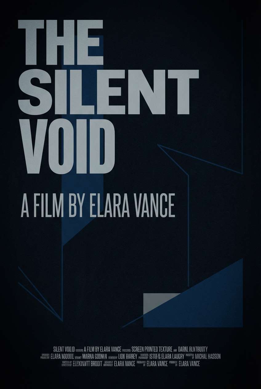
7) Night Curfew
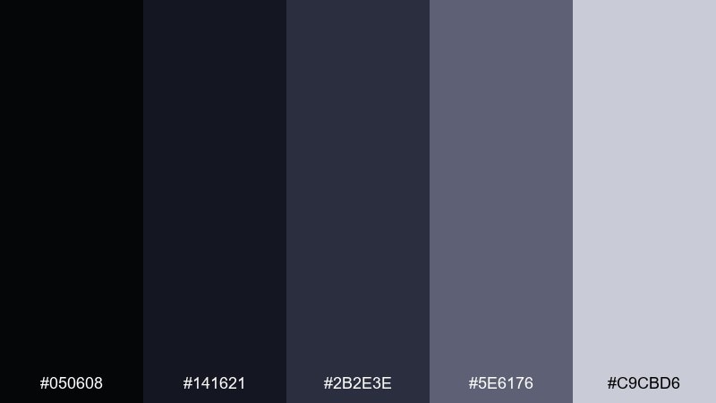
HEX: #050608 #141621 #2B2E3E #5E6176 #C9CBD6
Mood: silent, tense, nocturne
Best for: film posters and title cards
Silent and tense, these midnight blues feel like empty streets under curfew. The range is perfect for title cards, film posters, and dark-mode layouts that need depth without pure black. Pair the pale gray with condensed type to sharpen the cinematic vibe. Tip: introduce a soft vignette using the midtone to guide focus toward the headline.
Image example of night curfew generated using media.io
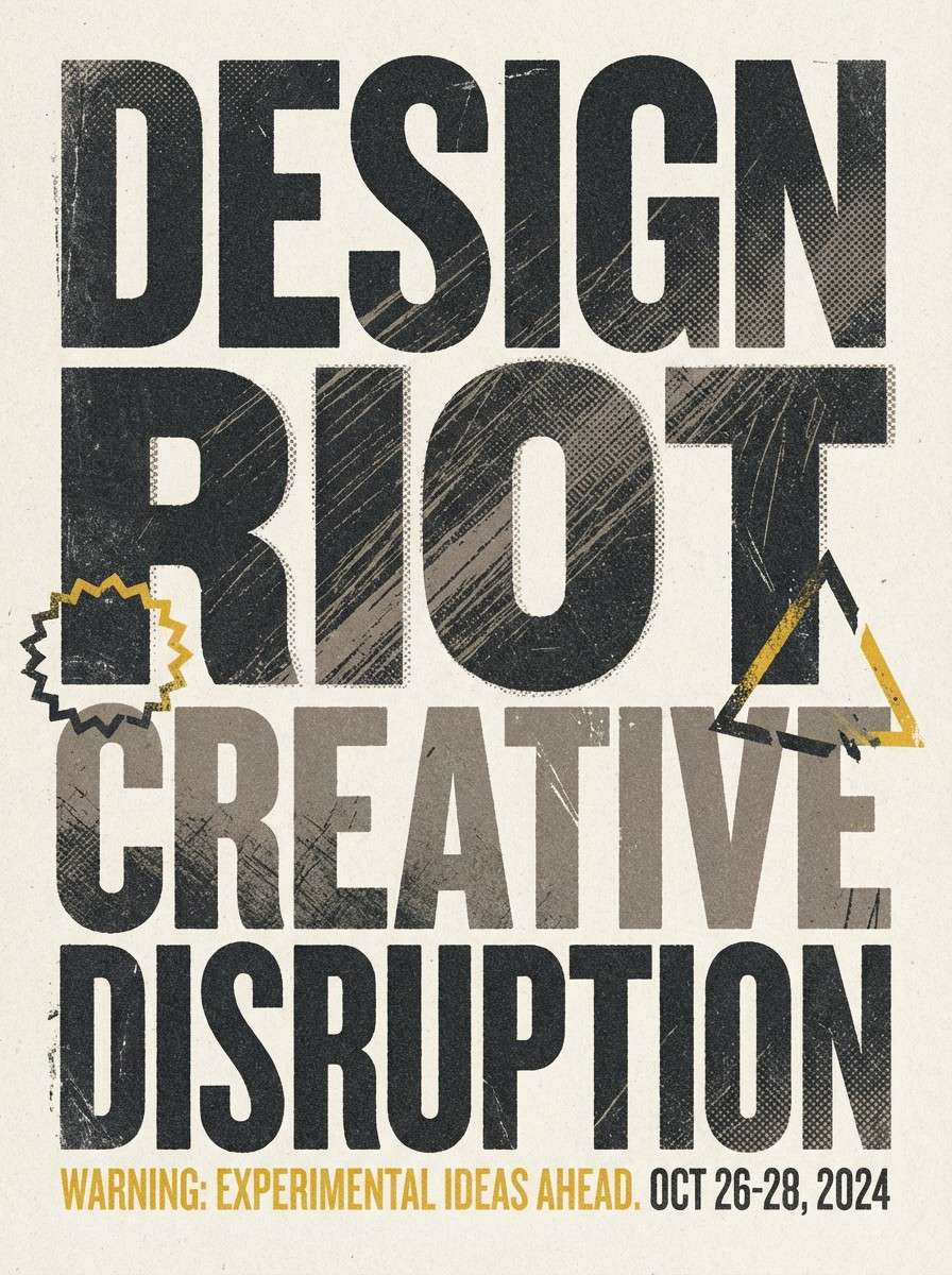
8) Broken Signage
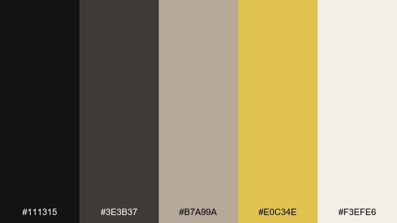
HEX: #111315 #3E3B37 #B7A99A #E0C34E #F3EFE6
Mood: weathered, cautionary, urban
Best for: event flyers and gritty posters
Weathered and cautionary, it looks like faded billboards and cracked street paint. These tones make strong dystopian color combinations for flyers, protest-style posters, and grunge editorial graphics. Pair the warning yellow with coarse textures or halftone patterns, but keep it to small blocks and underlines. Tip: lean on the warm off-white for readability when you add distressed type effects.
Image example of broken signage generated using media.io
9) Cold Pipeline
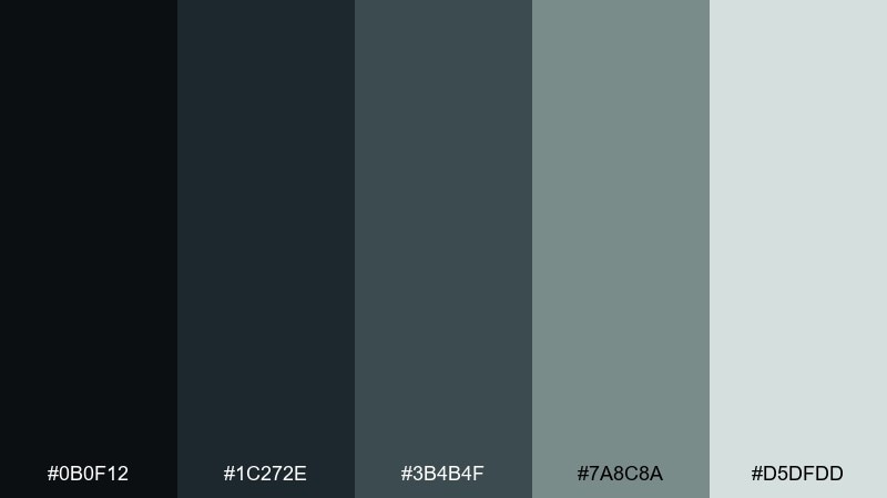
HEX: #0B0F12 #1C272E #3B4B4F #7A8C8A #D5DFDD
Mood: mechanical, chilly, utilitarian
Best for: infographics and technical docs
Mechanical and chilly, these blue-green grays recall pipes, valves, and fogged steel. They are reliable for technical documentation, infographics, and systems diagrams where you need calm contrast. Pair the pale mist tone with crisp line icons and let the deeper shades define structure. Tip: keep charts to two dominant tones so the data reads before the mood.
Image example of cold pipeline generated using media.io
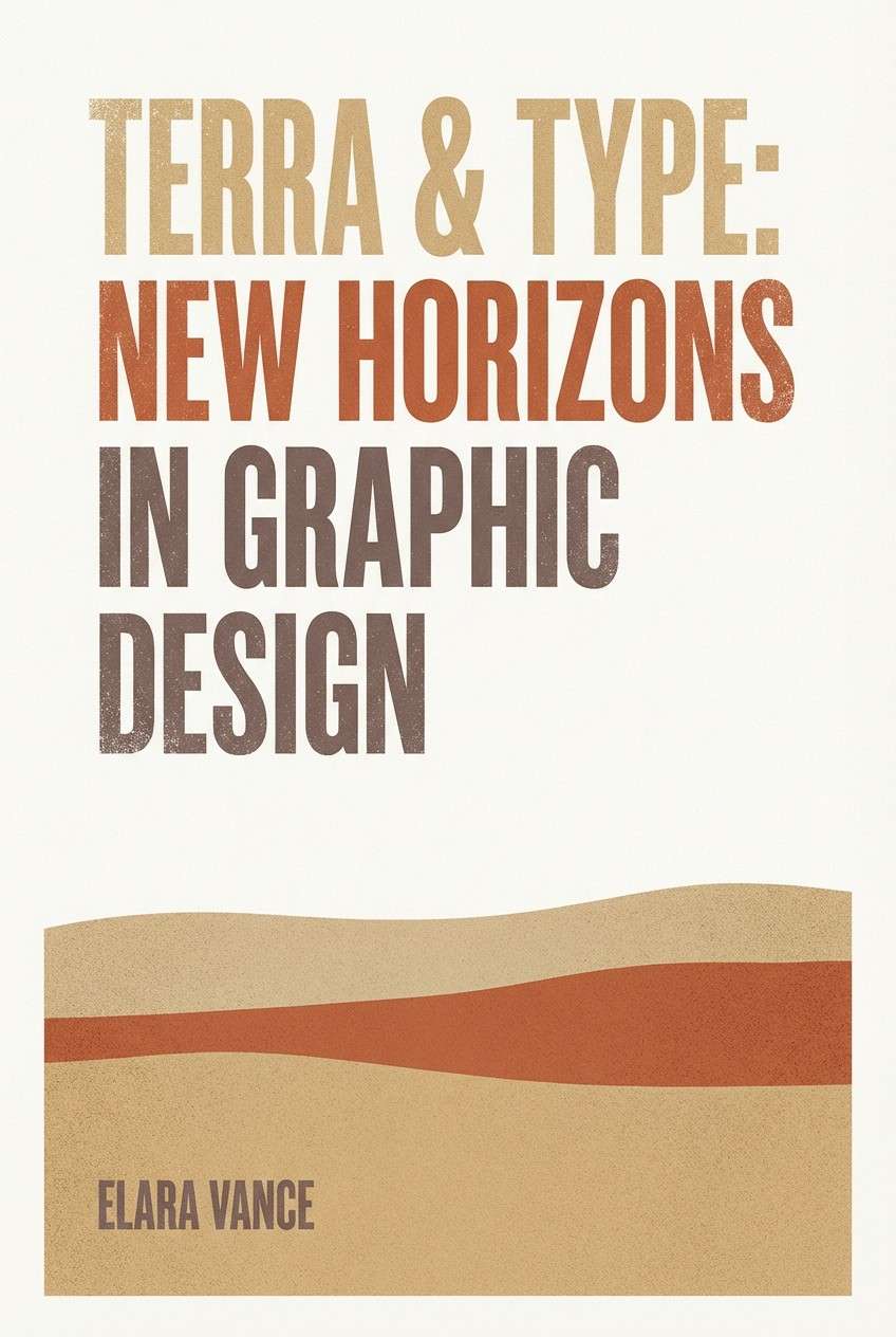
10) Wasteland Sunrise
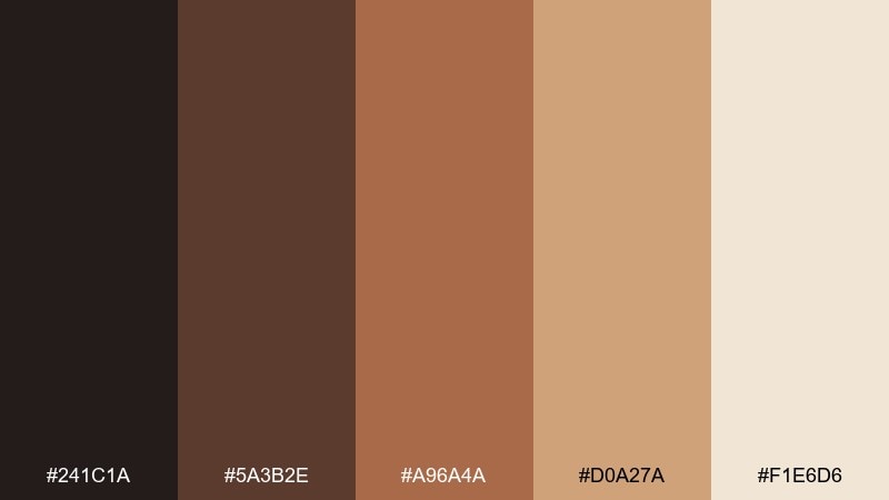
HEX: #241C1A #5A3B2E #A96A4A #D0A27A #F1E6D6
Mood: dusty, hopeful, cinematic
Best for: book covers and cinematic key art
Dusty but hopeful, it feels like a sunrise cutting through sand and smoke. Use this palette for book covers, cinematic key art, and landing pages that need warmth without looking cheerful. Pair the deep umber with generous margins and keep the peach-sand tones for large gradients. Tip: add a single hard shadow in the darkest shade to make compositions feel sunbaked and real.
Image example of wasteland sunrise generated using media.io
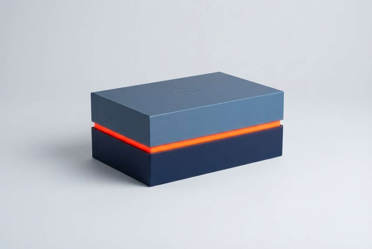
11) Reactor Core
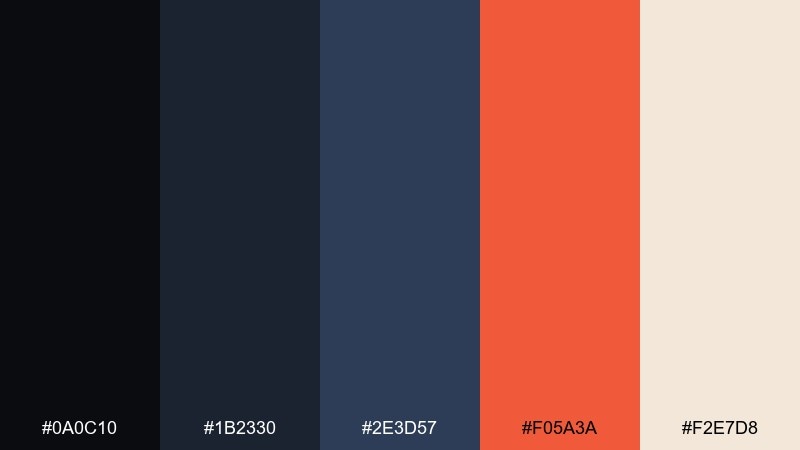
HEX: #0A0C10 #1B2330 #2E3D57 #F05A3A #F2E7D8
Mood: charged, dangerous, high-tech
Best for: startup branding and call-to-action sections
Charged and dangerous, it suggests hot metal inside a cold machine. The contrast between steel blues and heated orange creates dystopian color combinations that excel in startup branding and CTA-heavy pages. Pair the orange with the light cream for buttons and badges, then keep backgrounds in deep blue to hold the drama. Tip: avoid using the orange for body text; save it for interaction states and highlights.
Image example of reactor core generated using media.io
12) Static Fog
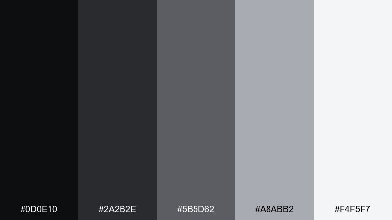
HEX: #0D0E10 #2A2B2E #5B5D62 #A8ABB2 #F4F5F7
Mood: bleak, modern, airy
Best for: minimal websites and typography systems
Bleak and modern, these grays look like static rolling across a foggy screen. They fit minimal websites, typography systems, and portfolios that want drama without color. Pair the near-black with the almost-white for crisp type and use the mid gray to soften separators. Tip: introduce micro-contrast by slightly tinting cards with the light gray to avoid a flat slab.
Image example of static fog generated using media.io
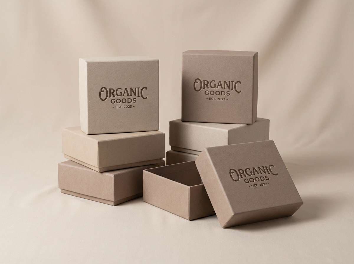
13) Quarry Dust
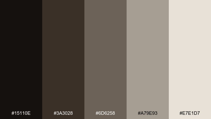
HEX: #15110E #3A3028 #6D6258 #A79E93 #E7E1D7
Mood: earthy, worn, understated
Best for: artisan product packaging and catalogs
Earthy and worn, it resembles crushed stone, dry soil, and weathered leather. These tones are great for artisan packaging, catalogs, and brand systems that need texture without bright color. Pair the lightest shade with plenty of breathing room and bring in the darkest brown for logo marks. Tip: a subtle paper grain will make the neutrals feel intentional rather than bland.
Image example of quarry dust generated using media.io
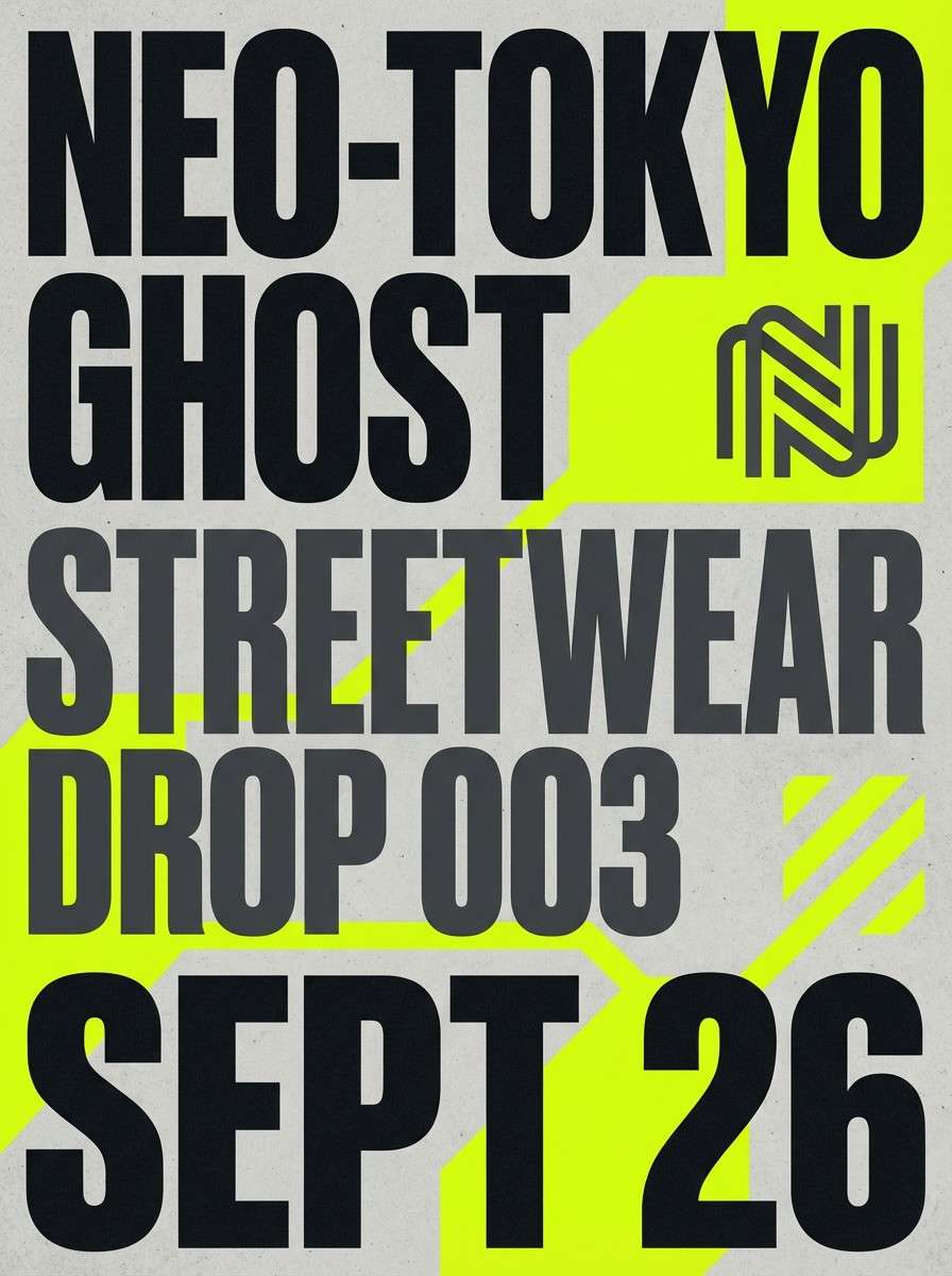
14) Acid Raincoat
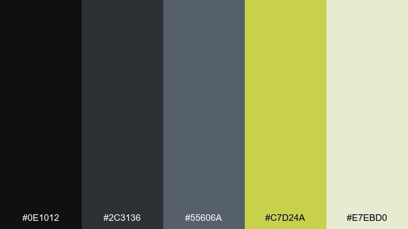
HEX: #0E1012 #2C3136 #55606A #C7D24A #E7EBD0
Mood: wet, urban, caution-bright
Best for: streetwear drops and lookbooks
Wet and urban, it feels like asphalt reflections under a neon raincoat. Use these tones for streetwear lookbooks, drop announcements, and bold typographic layouts. Pair the acidic yellow-green with charcoal for punchy contrast and keep the pale tint for breathing space. Tip: make the accent a repeating micro-detail, like a tag line or size label, rather than a full background.
Image example of acid raincoat generated using media.io
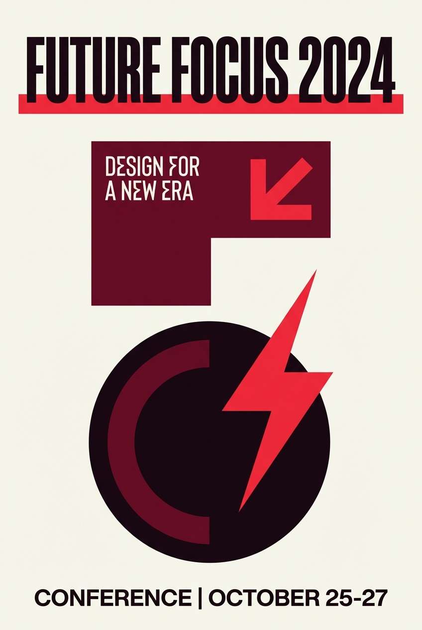
15) Riot Siren
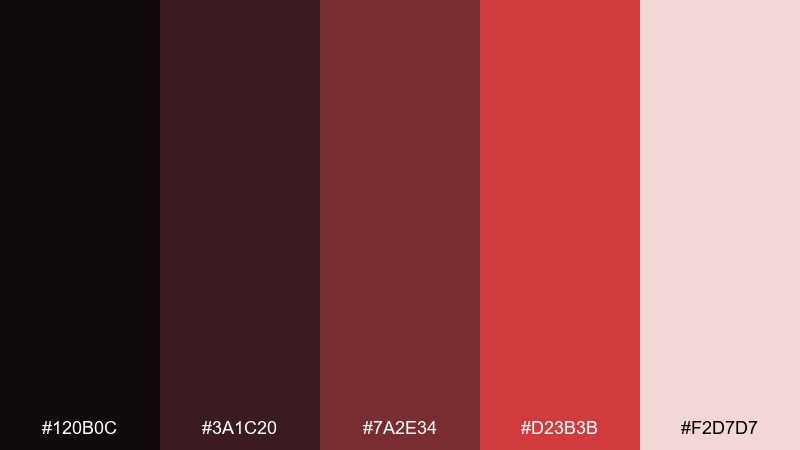
HEX: #120B0C #3A1C20 #7A2E34 #D23B3B #F2D7D7
Mood: aggressive, urgent, dramatic
Best for: campaign graphics and bold headlines
Aggressive and urgent, it echoes siren light cutting through dark smoke. This pairing is ideal for campaign graphics, punchy headlines, and announcement banners that must stop the scroll. Pair the hot red with deep maroon for depth, then use the pale blush only as a contrast panel behind text. Tip: keep gradients minimal so the red stays sharp and authoritative.
Image example of riot siren generated using media.io
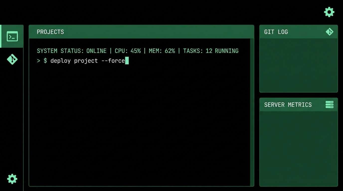
16) Blackout Terminal
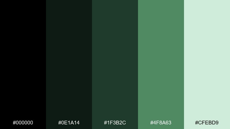
HEX: #000000 #0E1A14 #1F3B2C #4F8A63 #CFEBD9
Mood: hacker, coded, nocturnal
Best for: terminal-style UI and developer tools
Hacker-calm and nocturnal, it channels a glowing terminal in a dark room. These greens make a convincing dystopian color combination for developer tools, terminal-style UIs, and login screens. Pair the mint highlight with pure black for crisp code-like contrast and keep mid greens for panels. Tip: use the brightest green only for active cursor, success states, and short numeric readouts.
Image example of blackout terminal generated using media.io
17) Urban Decay Teal
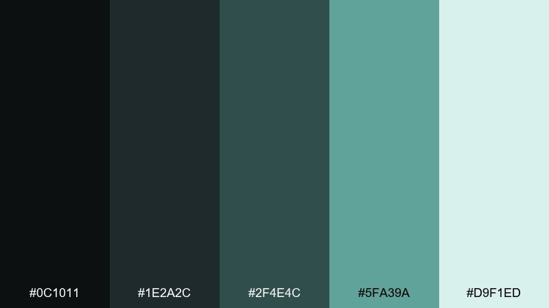
HEX: #0C1011 #1E2A2C #2F4E4C #5FA39A #D9F1ED
Mood: corroded, cool, atmospheric
Best for: music visuals and social posts
Corroded and cool, these teals feel like oxidized metal and damp concrete. They work for music visuals, social posts, and motion backgrounds where you want mood without heavy darkness. Pair the sea-glass tone with charcoal for text and keep the pale aqua for soft glows. Tip: add subtle blur or bloom effects so the teal reads like reflected light rather than flat color.
Image example of urban decay teal generated using media.io
18) Desaturated Carnival
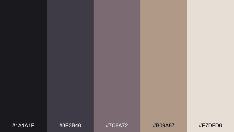
HEX: #1A1A1E #3E3B46 #7C6A72 #B09A87 #E7DFD6
Mood: eerie, nostalgic, faded
Best for: editorial collages and zines
Eerie and nostalgic, it resembles faded paint on old rides after a long shutdown. The desaturated mauves and dusty beige are great for zines, editorial collages, and art prints. Pair the warm beige with deep charcoal to keep layouts readable, then use the mauve tones for cutout shapes and captions. Tip: a slightly off-register print effect makes the palette feel intentionally unsettling.
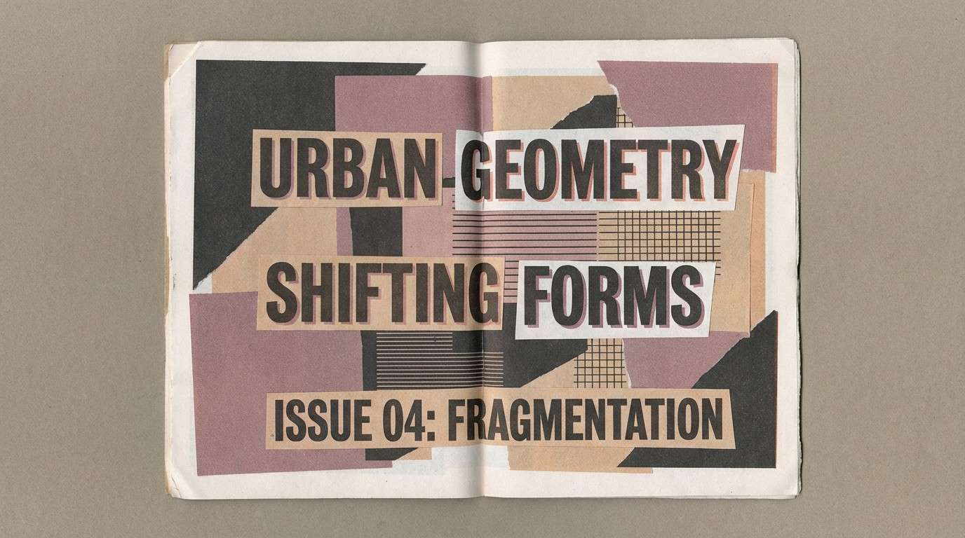
Image example of desaturated carnival generated using media.io
19) Muted Warning Tape
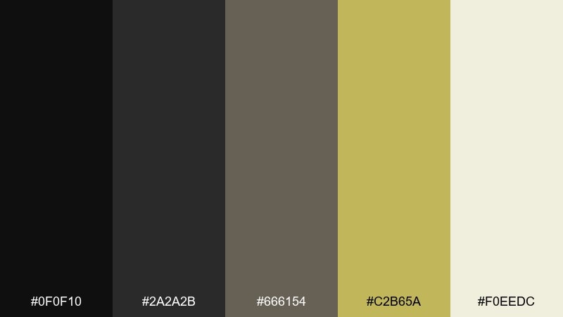
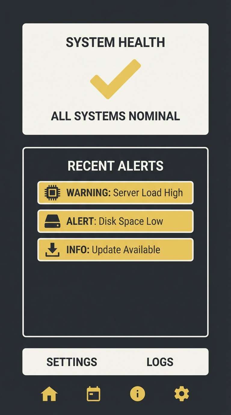
HEX: #0F0F10 #2A2A2B #666154 #C2B65A #F0EEDC
Mood: caution, dusty, utilitarian
Best for: UX alerts and system status screens
Caution-heavy and dusty, it looks like warning tape left out in sun and grit. These hues are perfect for UX alerts, system status screens, and onboarding tips where you need attention without neon. Pair the muted yellow with charcoal for icons and keep the cream tone for message panels. Tip: reserve the yellow strictly for warnings so your hierarchy stays trustworthy.
Image example of muted warning tape generated using media.io
20) Exile Coast
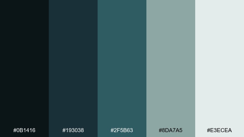
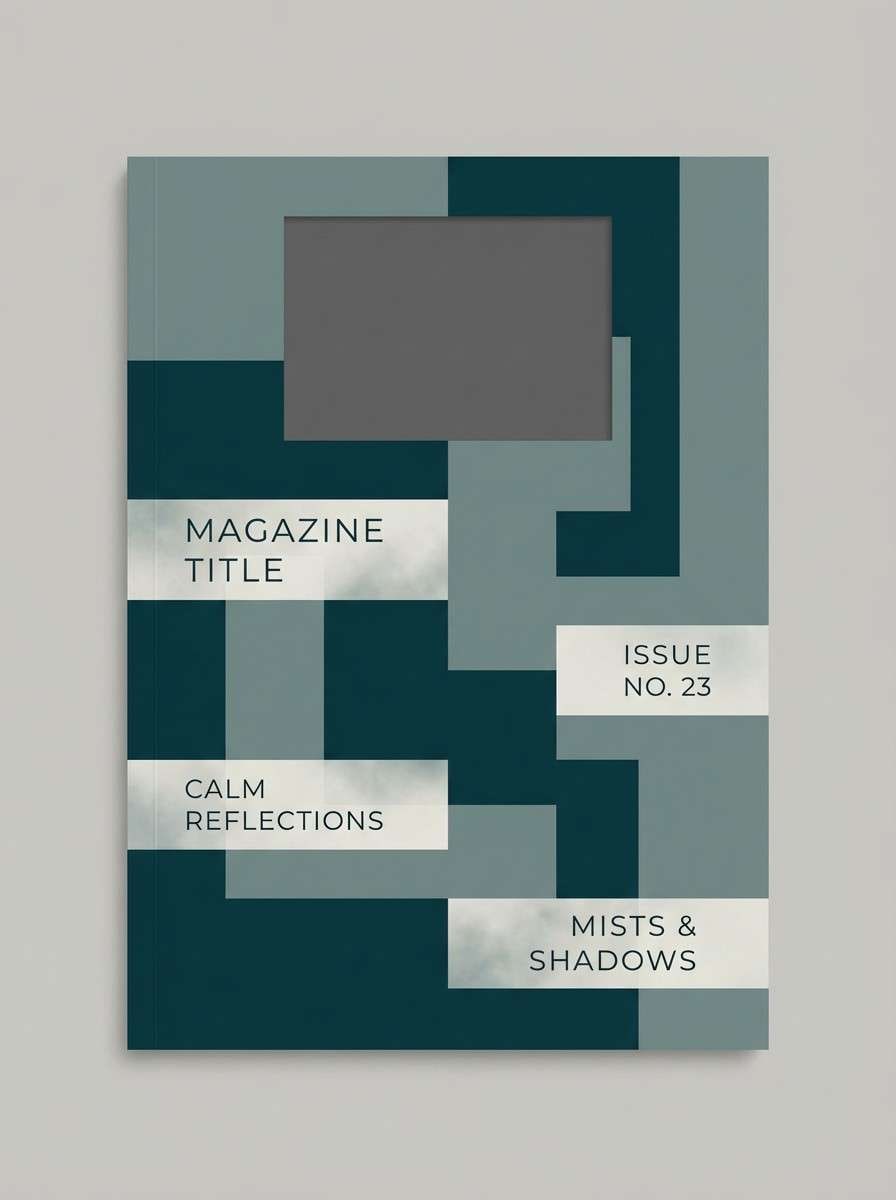
HEX: #0B1416 #193038 #2F5B63 #8DA7A5 #E3ECEA
Mood: windy, distant, melancholic
Best for: travel editorials and photo overlays
Windy and distant, it evokes cold sea spray and empty docks at dawn. Use it for travel editorials, photo overlays, and web sections that need a calm, uneasy atmosphere. Pair the deep teal with light mist tones for readable overlays and let the blue-gray midtone shape UI components. Tip: if you add imagery, keep photos desaturated so the palette remains the hero.
Image example of exile coast generated using media.io
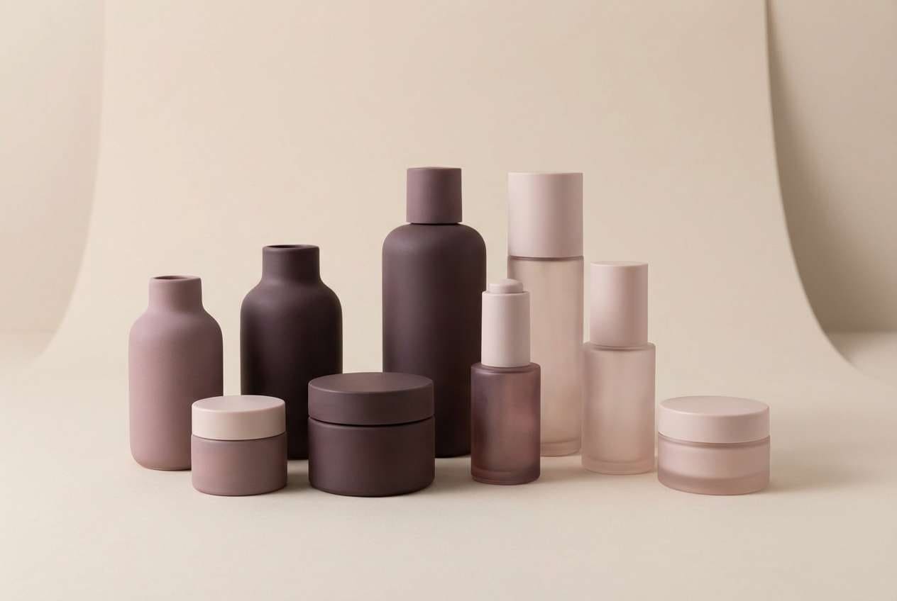
21) Cinder Blossom
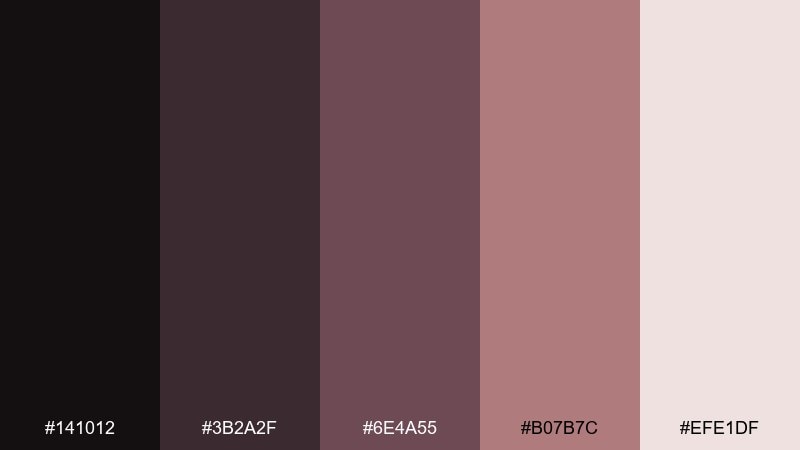
HEX: #141012 #3B2A2F #6E4A55 #B07B7C #EFE1DF
Mood: romantic ruin, soft, smoky
Best for: beauty branding and packaging
Romantic ruin and smoky softness meet in these dusty rose-browns. They suit beauty branding, fragrance packaging, and boutique landing pages that want warmth with an edge. Pair the blush tones with deep plum-brown for logos and headings, and keep the pale tint for clean product space. Tip: use satin finishes or subtle gradients to make the mauves feel luxurious, not flat.
Image example of cinder blossom generated using media.io
What Colors Go Well with Dystopian?
Dystopian palettes pair best with restrained neutrals: charcoal, graphite, concrete gray, dusty beige, and off-white. These tones feel material and functional, making the overall look believable.
For accents, choose “signal” colors that read as warnings or system states—amber, toxic yellow-green, hot orange, siren red, or icy cyan—then use them sparingly to keep the mood tense instead of playful.
Desaturated purples, teals, and blue-grays are ideal bridge colors. They add atmosphere (night, fog, surveillance glow) while preserving legibility in UI and editorial layouts.
How to Use a Dystopian Color Palette in Real Designs
Start with a dark base (near-black, navy slate, or deep green) and build surfaces using two midtones. Then reserve the lightest tone for type areas, cards, and spacing so your design doesn’t collapse into a single dark mass.
Keep accents purposeful. Use one highlight color for primary actions or alerts, and a second (optional) for secondary states like hover, selected, or progress—anything more can feel like cyberpunk noise rather than dystopian restraint.
Texture helps sell the world. Subtle grain, paper fibers, halftone wear, or soft vignettes can make neutral-heavy combinations feel cinematic and lived-in without sacrificing clarity.
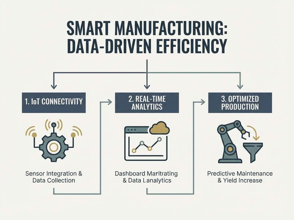
Create Dystopian Palette Visuals with AI
If you need matching visuals (posters, UI mockups, packaging shots, or social creatives), generate them from text prompts and lock the look with your chosen HEX colors and lighting cues (fog, neon spill, harsh side light, or CRT glow).
Reuse the prompts under each palette and swap subject matter (dashboard → landing page, flyer → album cover) while keeping the color words and mood descriptors consistent for a cohesive series.
Media.io makes it easy to create dystopian-style images in your browser—then refine results with quick edits so the palette stays consistent across assets.
Dystopian Color Palette FAQs
-
What is a dystopian color palette?
A dystopian color palette is a set of muted, gritty, or industrial colors—often dark neutrals plus one warning-like accent—used to create a tense, controlled, futuristic, or post-apocalyptic mood. -
Which dystopian colors work best for UI design?
Charcoal, slate blue, and off-white are reliable foundations for UI, with a single accent like amber, toxic green, or hot orange for primary actions, alerts, and active states. -
How do I keep a dystopian color scheme readable?
Use an off-white or light mist tone for text panels, keep body text in high-contrast neutrals (not accents), and limit saturated colors to small components like buttons, badges, and icons. -
What’s the difference between cyberpunk and dystopian palettes?
Cyberpunk usually leans neon and high saturation (magenta/cyan), while dystopian palettes are more restrained—concrete neutrals, foggy midtones, and hazard accents used sparingly. -
Can a dystopian palette work for branding?
Yes—especially for tech, security, outdoor, editorial, or cinematic brands. Choose neutral-heavy sets (like concrete, slate, or khaki) and use one accent color to define your brand’s “signal.” -
What accent color should I pick for a dystopian design?
Pick one “signal” accent based on the emotion you want: amber for caution, toxic green for sci-fi energy, red for urgency, or orange for heated industrial intensity. -
How can I generate dystopian visuals that match my palette?
Use a text-to-image tool and include material + lighting cues (fog, concrete, oxidized metal, CRT glow) along with your key color words; then iterate while keeping composition and contrast consistent.
Next: Duke Blue Color Palette


