

Cardinal is a rich, confident red that instantly adds focus and emotion to a design. It can feel regal, romantic, sporty, or modern depending on what you pair it with.
Below are cardinal color palette ideas with HEX codes, plus practical tips for branding, UI, posters, and packaging—so you can get the vibe right fast.
In this article
- Why Cardinal Palettes Work So Well
-
- cathedral crimson
- berry velvet
- city cardinal pop
- heritage hall
- desert brick
- winterberry night
- noir garnet
- rosewood minimal
- tomato market
- tech cardinal accent
- orchard picnic
- museum label
- spiced cocoa
- coral chapel
- crimson relay
- clay and cardinal
- cherry soda retro
- garnet and graphite
- botanical cardinal ink
- scarlet studio lights
- cardinal sunrise gradient
- wine and linen
- What Colors Go Well with Cardinal?
- How to Use a Cardinal Color Palette in Real Designs
- Create Cardinal Palette Visuals with AI
Why Cardinal Palettes Work So Well
Cardinal sits in that sweet spot between classic red and deeper crimson, so it reads bold without feeling overly bright. It naturally attracts attention, making it ideal for headlines, logos, and primary calls to action.
Because it has depth, cardinal also pairs well with grown-up neutrals (ivory, charcoal, slate) and warm metallics (gold, bronze). Those supporting tones help the red feel intentional and premium instead of loud.
In digital design, cardinal is especially useful for hierarchy: you can reserve it for key actions or emphasis while keeping the rest of the UI clean. With the right contrast checks, it stays powerful and accessible.
20+ Cardinal Color Palette Ideas (with HEX Codes)
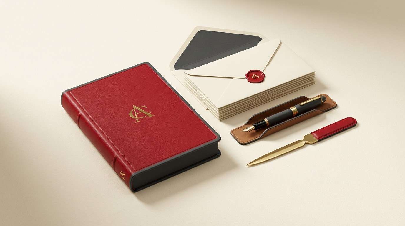
1) Cathedral Crimson
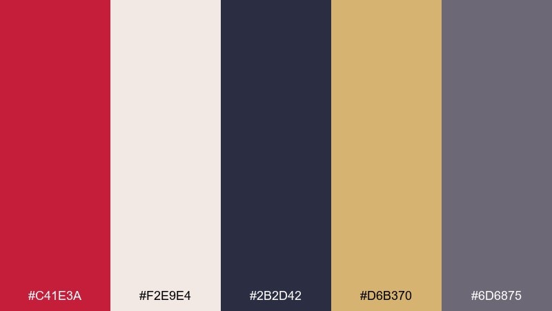
HEX: #C41E3A #F2E9E4 #2B2D42 #D6B370 #6D6875
Mood: regal, classic, polished
Best for: luxury branding and stationery
Regal and candlelit, these tones feel like velvet drapes, gilded edges, and quiet confidence. Use the cardinal red as the hero for logos or monograms, then keep layouts calm with warm ivory. Charcoal adds modern structure, while antique gold works best as a restrained accent. Tip: reserve gold for small details like rules, stamps, or foil to avoid a busy look.
Image example of cathedral crimson generated using media.io
Media.io is an online AI studio for creating and editing video, image, and audio in your browser.

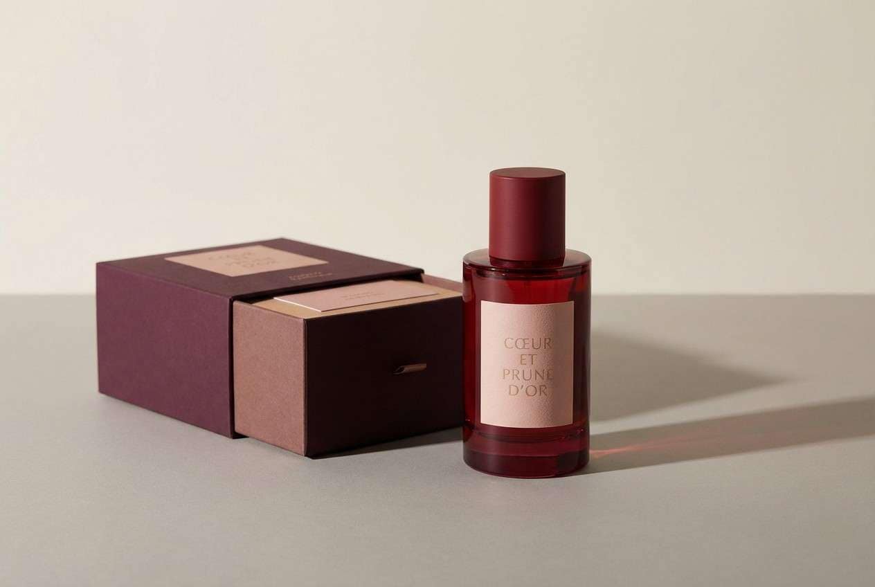
2) Berry Velvet

HEX: #B31B34 #F7D6D0 #4A2545 #C7A27C #1F1D2B
Mood: romantic, rich, intimate
Best for: beauty packaging and fragrance ads
Romantic and plush, this mix evokes berry compote, satin ribbons, and soft evening light. Keep cardinal and plum as your dominant duo, then bring in blush as breathable negative space. The sand tone reads like warm skin and helps product labels feel premium rather than heavy. Tip: use the near-black only for type and tiny shadows to maintain that velvety softness.
Image example of berry velvet generated using media.io
3) City Cardinal Pop

HEX: #C41E3A #0F0F14 #F4F4F6 #FFB703 #3A86FF
Mood: bold, urban, energetic
Best for: event posters and social graphics
Bold and street-smart, it feels like neon signage and high-contrast typography. These cardinal color combinations shine when you keep the canvas simple: black, white, and one loud accent. Use cardinal for headlines, then punctuate calls to action with the amber or electric blue. Tip: limit yourself to two bright accents per layout so the message stays sharp.
Image example of city cardinal pop generated using media.io

4) Heritage Hall
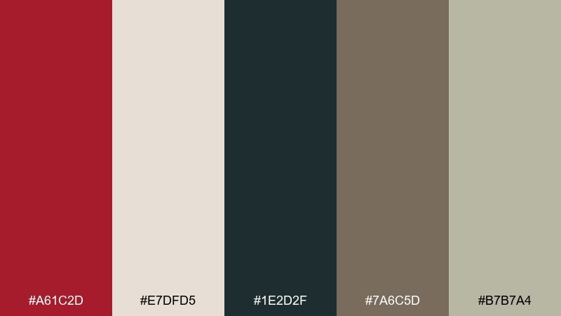
HEX: #A61C2D #E7DFD5 #1E2D2F #7A6C5D #B7B7A4
Mood: scholarly, warm, timeless
Best for: university brochures and alumni pages
Scholarly and steady, these hues suggest old libraries, worn leather, and quiet tradition. Pair cardinal with parchment for headings and section breaks, then let deep teal handle body text and navigation. The taupe and sage-gray soften the palette and make long-form layouts easy to read. Tip: use cardinal sparingly for highlights like pull quotes, badges, or key stats.
Image example of heritage hall generated using media.io

5) Desert Brick
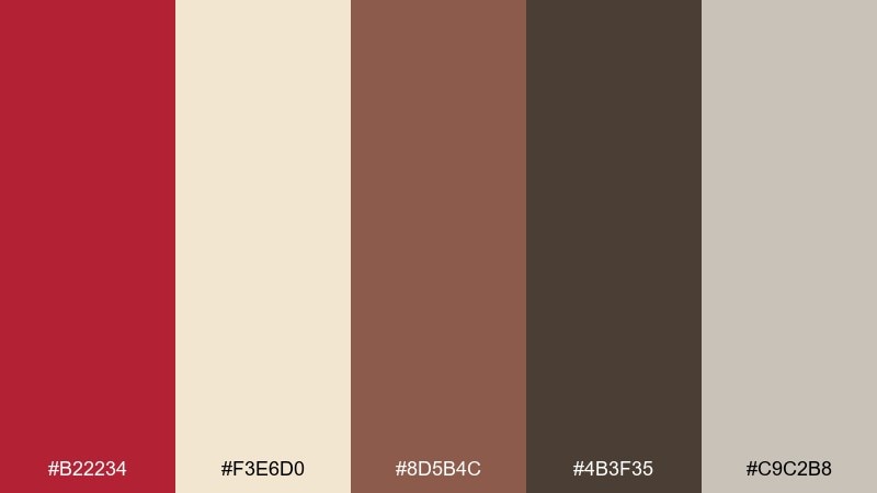
HEX: #B22234 #F3E6D0 #8D5B4C #4B3F35 #C9C2B8
Mood: earthy, grounded, artisanal
Best for: cafe menus and craft labels
Earthy and sun-baked, it brings to mind adobe walls, roasted beans, and handmade pottery. Use the brick-toned cardinal as a warm anchor, then let cream create a friendly menu canvas. Cocoa brown is ideal for readable type, while stone gray keeps borders and dividers subtle. Tip: add texture like kraft paper or grainy backgrounds to enhance the artisanal feel without changing the colors.
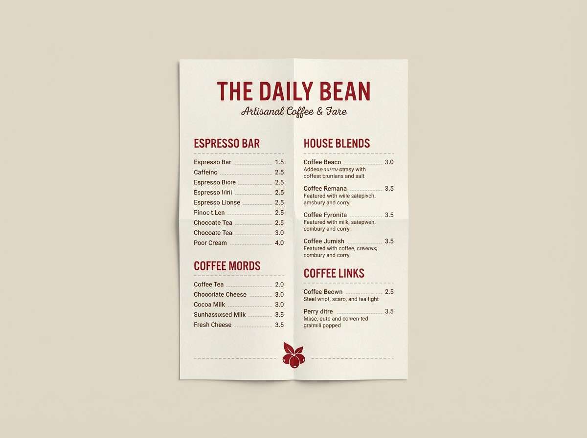
Image example of desert brick generated using media.io
6) Winterberry Night
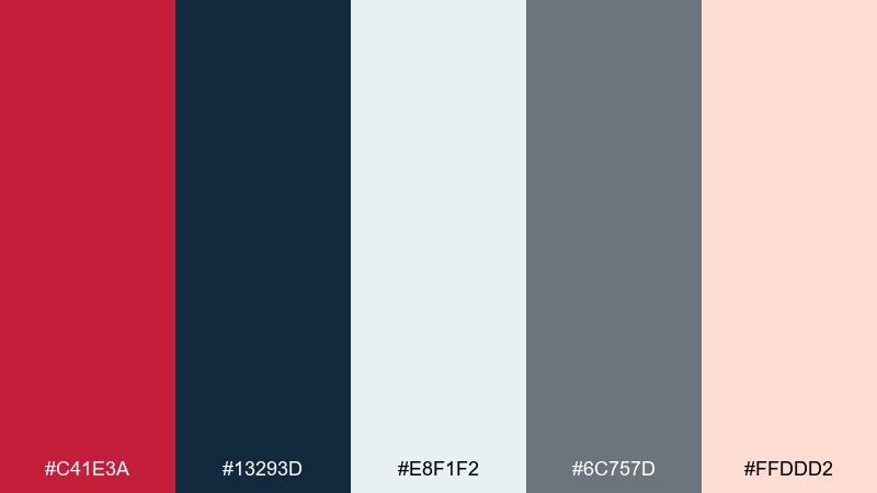
HEX: #C41E3A #13293D #E8F1F2 #6C757D #FFDDD2
Mood: crisp, cozy, festive
Best for: holiday email headers and landing pages
Crisp and cozy, it feels like winter air, berry garlands, and soft porch lights. This cardinal color palette works best when navy takes the background role and red becomes the bright focal point. Use icy off-white for spacious sections and blush for gentle secondary buttons or tags. Tip: keep gradients minimal and lean on solid blocks for a clean seasonal look.
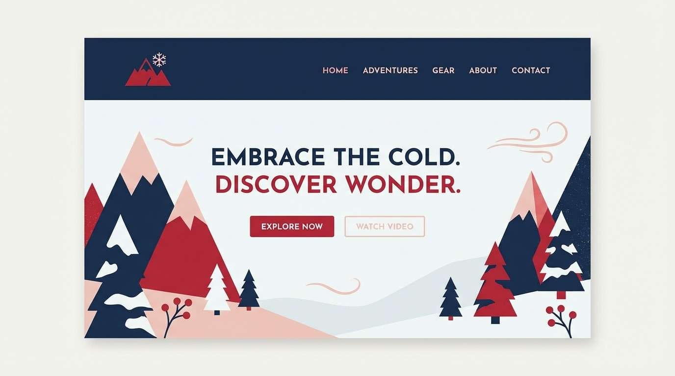
Image example of winterberry night generated using media.io
7) Noir Garnet
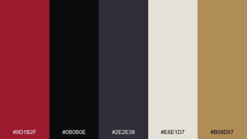
HEX: #9D1B2F #0B0B0E #2E2E38 #E6E1D7 #B08D57
Mood: dramatic, high-end, cinematic
Best for: watch ads and premium product pages
Dramatic and cinematic, it evokes glossy black surfaces and a deep garnet glow. Let near-black dominate backgrounds, then use cardinal for one striking element like a headline or product highlight. Warm ivory keeps copy legible, and muted gold is perfect for micro-details like pricing or icons. Tip: increase letter spacing slightly on light text for a sleek, premium finish.
Image example of noir garnet generated using media.io

8) Rosewood Minimal

HEX: #B11D34 #FAF7F2 #3D2C2E #DDBEA9 #A5A58D
Mood: calm, modern, editorial
Best for: wellness brands and minimalist blogs
Calm and airy, these tones feel like rosewood furniture, linen fabric, and slow mornings. Use off-white for wide margins and let cardinal appear as a refined accent rather than a wall of color. The deep brown is a natural choice for body text, while blush and olive-gray add gentle variety to cards and badges. Tip: choose one accent role for the red, such as links or primary buttons, and keep it consistent.
Image example of rosewood minimal generated using media.io
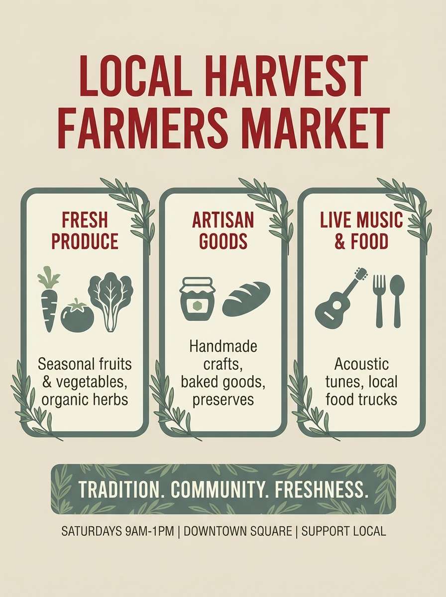
9) Tomato Market

HEX: #C41E3A #2F3E46 #E9C46A #F4F1DE #84A98C
Mood: fresh, friendly, approachable
Best for: grocery promos and farmers market flyers
Fresh and inviting, it brings up ripe tomatoes, handwritten signs, and sunlit produce stands. Use cardinal for price tags and key offers, balanced by creamy white for readability. The slate green and soft herb tone keep the reds from feeling too intense and add a natural vibe. Tip: pair bold sans type with simple icons to keep the design cheerful and easy to scan.
Image example of tomato market generated using media.io
10) Tech Cardinal Accent
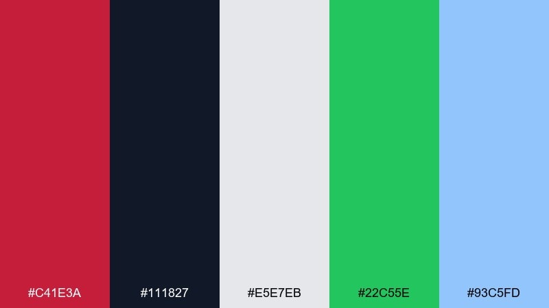
HEX: #C41E3A #111827 #E5E7EB #22C55E #93C5FD
Mood: clean, confident, modern
Best for: dashboard UI and SaaS pricing pages
Clean and confident, it feels like a sharp interface with a punchy highlight. A cardinal color scheme like this works well when red is reserved for primary actions and status emphasis. Use the dark slate for navigation, light gray for panels, and let green or soft blue appear only for success states or secondary charts. Tip: verify contrast on red buttons against both dark and light surfaces for accessibility.
Image example of tech cardinal accent generated using media.io

11) Orchard Picnic
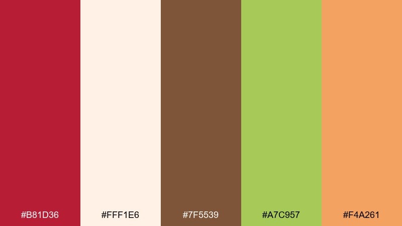
HEX: #B81D36 #FFF1E6 #7F5539 #A7C957 #F4A261
Mood: sunny, rustic, playful
Best for: spring invitations and picnic posters
Sunny and rustic, it evokes apple orchards, gingham blankets, and homemade pies. Let the creamy tone carry most of the space, then use cardinal for headings and dates. Leafy green and warm caramel create a friendly, outdoorsy balance, while apricot works well for small illustrations or borders. Tip: add simple line art fruit motifs to reinforce the picnic vibe without overwhelming the type.
Image example of orchard picnic generated using media.io

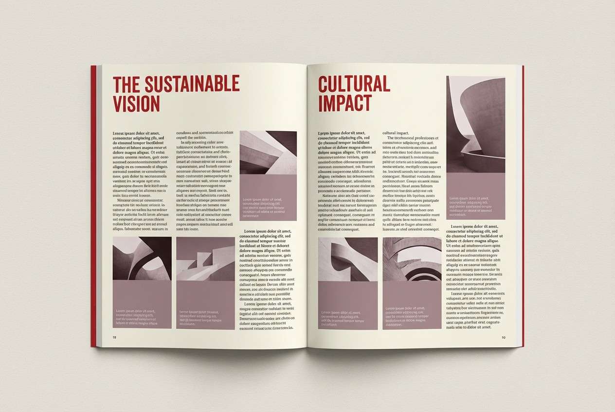
12) Museum Label
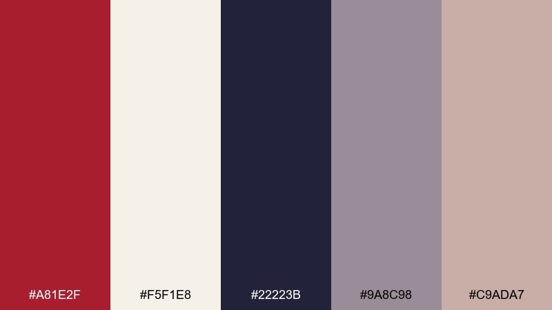
HEX: #A81E2F #F5F1E8 #22223B #9A8C98 #C9ADA7
Mood: refined, quiet, curated
Best for: editorial layouts and exhibition graphics
Refined and quiet, it suggests gallery walls, curated captions, and slow-looking moments. Use soft ivory for the page, then set headlines in cardinal to guide the reader through sections. Charcoal-navy handles long text elegantly, with mauve-grays for pull quotes and captions. Tip: keep cardinal at one hierarchy level, such as H1 and key labels, to maintain a museum-clean rhythm.
Image example of museum label generated using media.io
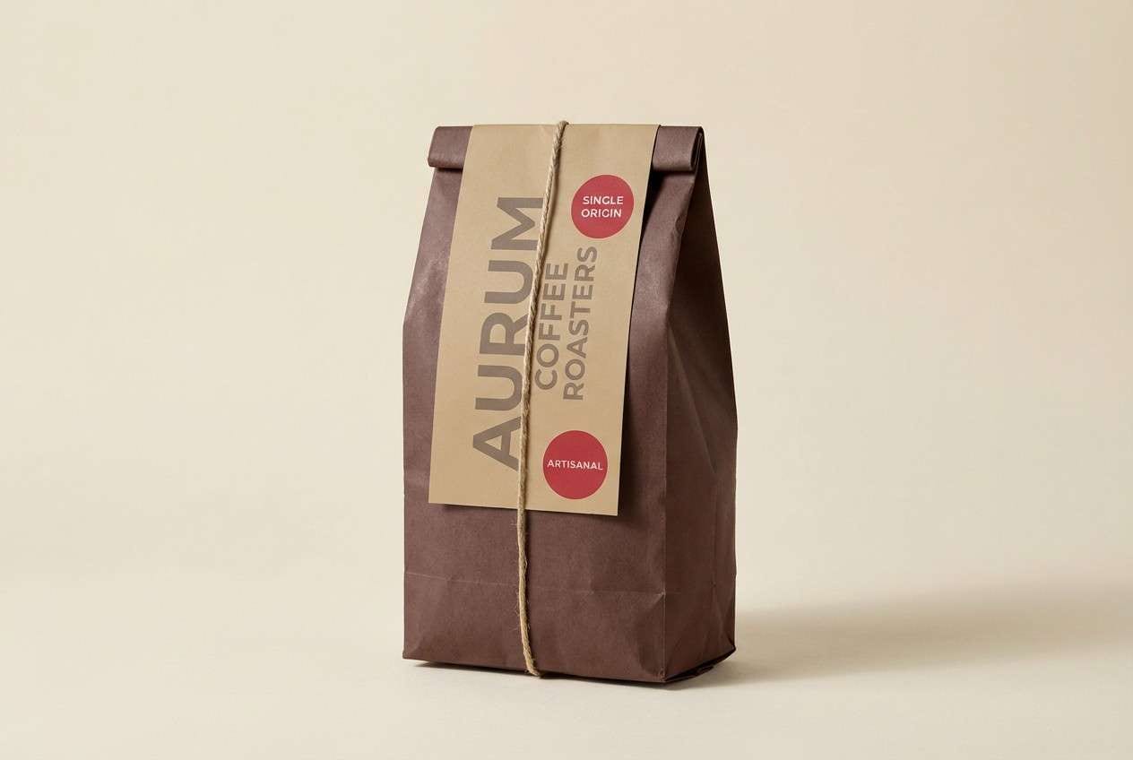
13) Spiced Cocoa
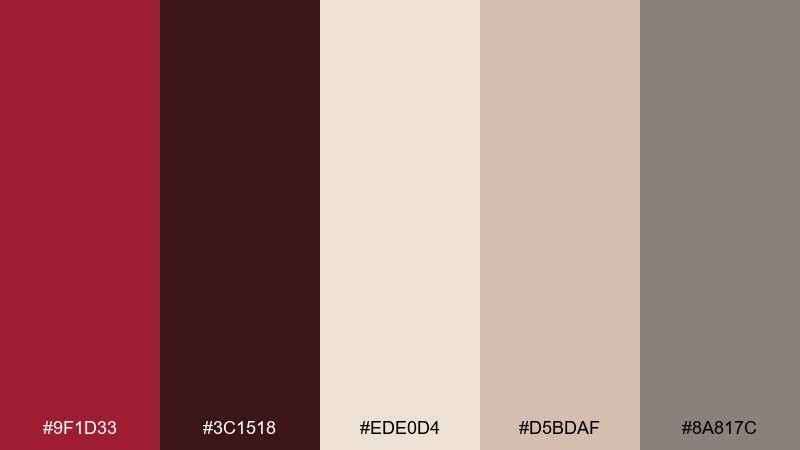
HEX: #9F1D33 #3C1518 #EDE0D4 #D5BDAF #8A817C
Mood: cozy, warm, comforting
Best for: coffee packaging and autumn promos
Cozy and aromatic, it feels like cocoa dust, cinnamon sticks, and warm wood tones. Use the deep brown as a grounding base and let cardinal add warmth to stamps, badges, or flavor notes. Cream and tan keep labels readable and make the palette feel handmade rather than heavy. Tip: try a matte finish with simple iconography to match the comforting vibe.
Image example of spiced cocoa generated using media.io
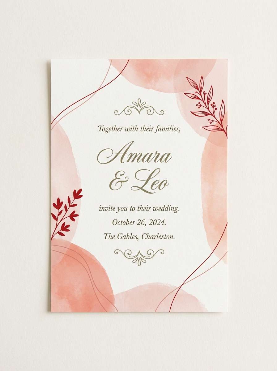
14) Coral Chapel
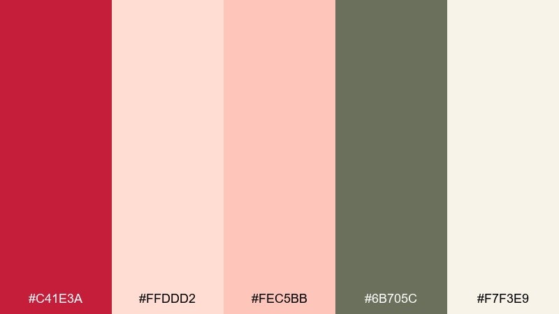
HEX: #C41E3A #FFDDD2 #FEC5BB #6B705C #F7F3E9
Mood: soft, romantic, airy
Best for: wedding suites and bridal social posts
Soft and romantic, it brings to mind coral petals, airy fabric, and gentle light. This cardinal color palette feels modern when you keep red as a small accent and let blush tones dominate. The muted olive adds a grounded, botanical note that works beautifully for monograms and details. Tip: use an off-white background and avoid pure black text to maintain the dreamy feel.
Image example of coral chapel generated using media.io
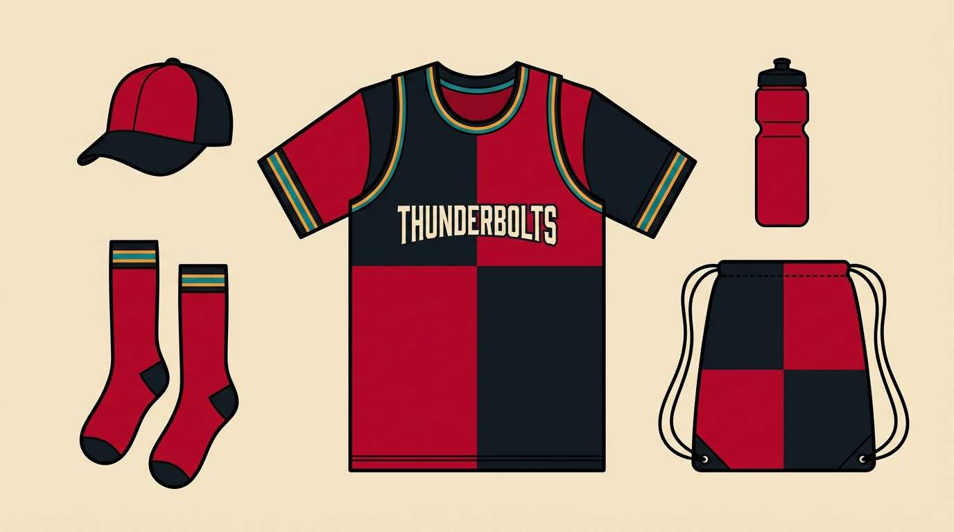
15) Crimson Relay
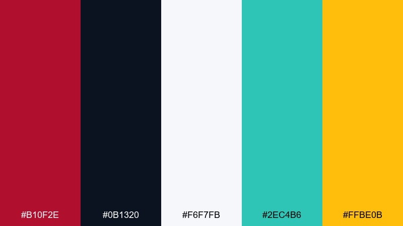
HEX: #B10F2E #0B1320 #F6F7FB #2EC4B6 #FFBE0B
Mood: sporty, fast, high-contrast
Best for: sports graphics and team merch mockups
Sporty and high-contrast, it feels like stadium lights and bold number lettering. Use cardinal for the main jersey color, backed by deep midnight for toughness and clarity. Teal and amber are best as small supporting accents for stripes, icons, or highlight stats. Tip: keep backgrounds mostly dark or white so the red reads strong and consistent across prints.
Image example of crimson relay generated using media.io
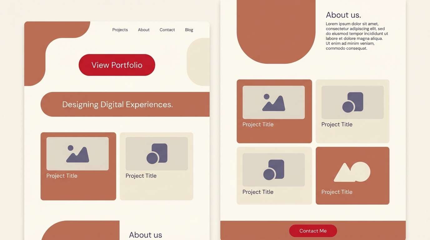
16) Clay and Cardinal
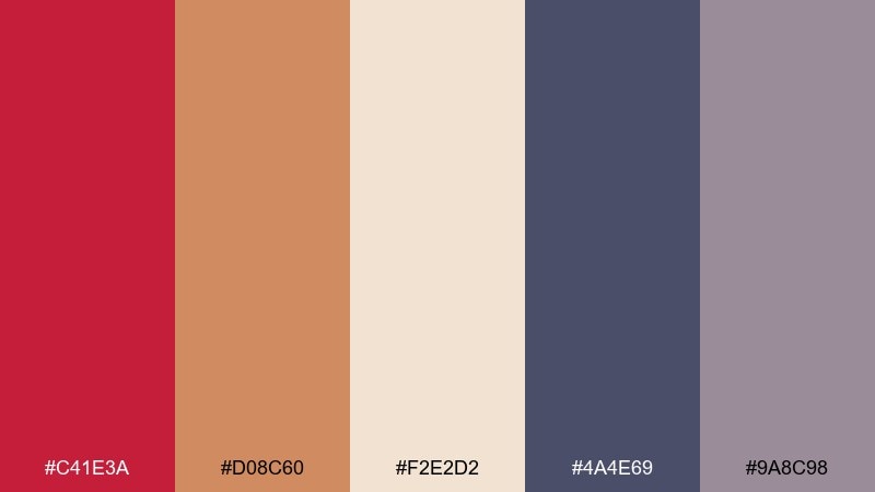
HEX: #C41E3A #D08C60 #F2E2D2 #4A4E69 #9A8C98
Mood: artful, warm, contemporary
Best for: ceramics brands and portfolio sites
Artful and warm, these tones evoke terracotta clay, studio shelves, and brushed pigment. Keep the clay and cream as the main field colors, then use cardinal to spotlight buttons, tags, or key project titles. Slate violet and dusty mauve create a tasteful bridge between warm and cool elements. Tip: combine large color blocks with plenty of whitespace to let the red feel intentional, not loud.
Image example of clay and cardinal generated using media.io
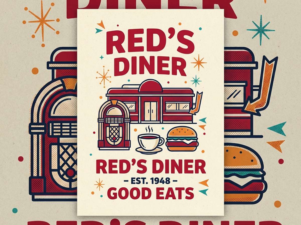
17) Cherry Soda Retro

HEX: #B9152F #FFF4E6 #1D3557 #F77F00 #2A9D8F
Mood: retro, playful, punchy
Best for: diner posters and vintage-style ads
Retro and punchy, it feels like cherry soda labels and classic diner signage. Use cardinal and cream for the base, then add navy for bold outlines and type. Orange and teal are best used like vintage spot colors for shapes, stars, and small callouts. Tip: try a halftone texture and chunky type to push the nostalgic energy without clutter.
Image example of cherry soda retro generated using media.io
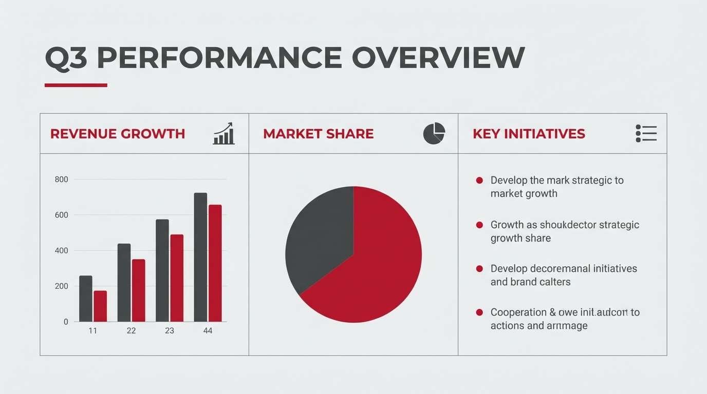
18) Garnet and Graphite
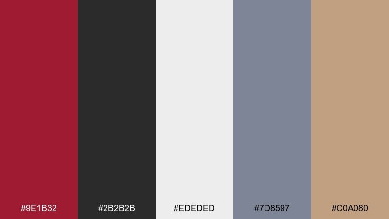
HEX: #9E1B32 #2B2B2B #EDEDED #7D8597 #C0A080
Mood: professional, restrained, confident
Best for: B2B decks and corporate reports
Professional and restrained, it suggests crisp suits, clean charts, and confident messaging. These cardinal color combinations work best when graphite and light gray do the heavy lifting in layouts. Use the garnet red only for emphasis like section tabs, chart highlights, or key numbers. Tip: keep accent usage under 10 percent of the page to maintain a disciplined, executive feel.
Image example of garnet and graphite generated using media.io
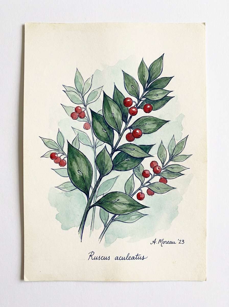
19) Botanical Cardinal Ink
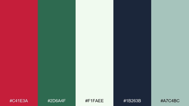
HEX: #C41E3A #2D6A4F #F1FAEE #1B263B #A7C4BC
Mood: fresh, natural, sophisticated
Best for: botanical illustrations and garden brands
Fresh and inky, it feels like pressed leaves, botanical plates, and handwritten labels. Keep the greens dominant for a natural base, then let cardinal show up as blossoms, berries, or key highlights. Off-white and soft seafoam give you room for detail without turning muddy. Tip: use fine linework and watercolor washes so the red reads like a botanical accent, not a warning color.
Image example of botanical cardinal ink generated using media.io
20) Scarlet Studio Lights
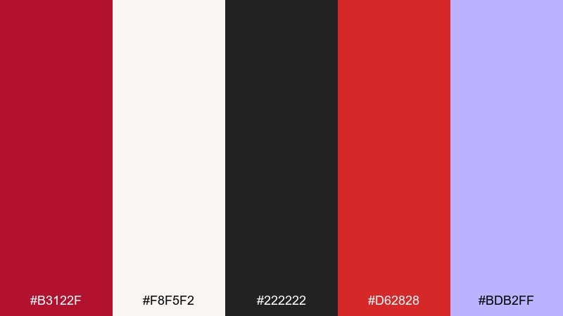
HEX: #B3122F #F8F5F2 #222222 #D62828 #BDB2FF
Mood: creative, modern, gallery-ready
Best for: creator posters and music cover art
Creative and stage-lit, it evokes spotlight glare, crisp type, and a modern gallery vibe. Use cardinal as the main block color, with black for high-contrast titles and credits. The soft violet is a surprising accent for secondary text or graphic shapes that keeps the red from feeling too traditional. Tip: set one large red shape and build the composition around it to avoid visual noise.
Image example of scarlet studio lights generated using media.io

21) Cardinal Sunrise Gradient
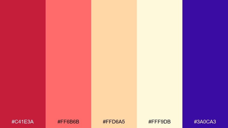
HEX: #C41E3A #FF6B6B #FFD6A5 #FFF9DB #3A0CA3
Mood: optimistic, bright, modern
Best for: app onboarding screens and hero banners
Optimistic and bright, it feels like a sunrise glow with a confident red core. A cardinal color palette like this shines in gradients that move from red into peach and butter-cream. Use the deep violet as a grounding counterpoint for headings or icons so the warm tones stay readable. Tip: keep gradients large and smooth, and use solid violet for text to prevent banding issues.
Image example of cardinal sunrise gradient generated using media.io

22) Wine and Linen
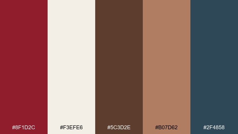
HEX: #8F1D2C #F3EFE6 #5C3D2E #B07D62 #2F4858
Mood: elegant, rustic, mature
Best for: wine labels and restaurant menus
Elegant and rustic, it brings to mind cellar wood, linen napkins, and a deep red pour. Use wine-cardinal for the label name or menu section headers, supported by linen for an upscale, breathable base. Brown and warm tan add tactile depth, while blue-slate is ideal for small-print details and icons. Tip: print on textured stock so the neutrals feel intentional and the red looks richer.
Image example of wine and linen generated using media.io
What Colors Go Well with Cardinal?
Cardinal looks strongest with calm neutrals: warm ivory, cream, light gray, and charcoal help it feel refined and readable. For a more dramatic look, pair it with near-black or deep navy so the red becomes the focal point.
To soften cardinal, add blush, dusty rose, or muted mauve—these create a romantic, modern warmth without losing contrast. If you want a natural vibe, bring in botanical greens like deep forest, sage, or seafoam.
For energetic designs, a small dose of bright accents (amber, orange, electric blue, teal) can make cardinal pop. The key is restraint: keep extra brights to one or two supporting roles so the palette stays cohesive.
How to Use a Cardinal Color Palette in Real Designs
Start by deciding cardinal’s job: hero background, headline color, or action color (buttons/badges). Because it carries strong attention, it’s usually best as an accent or a single dominant block rather than everywhere at once.
Use neutrals for layout and readability, then apply cardinal to the highest hierarchy elements—H1s, key numbers, sale tags, or primary CTAs. In print, try texture (linen, kraft, matte coatings) to make cardinal feel deeper and more premium.
For UI, run contrast checks on red buttons and red text, especially on dark surfaces. If you need states, reserve green/blue for success/info and keep cardinal for primary actions or emphasis to avoid mixed signals.
Create Cardinal Palette Visuals with AI
If you have a palette you like, you can quickly turn it into poster concepts, packaging mockups, or UI headers using AI. It’s a fast way to test “does this feel luxe, sporty, cozy, or modern?” before committing to a full design system.
Try feeding your palette mood plus usage (e.g., “cardinal + ivory luxury stationery” or “cardinal + navy winter landing header”) and generate a few variations. Keep prompts clear about dominance (which color leads) and how accents should be used.
With Media.io, you can generate consistent image examples for presentations, mood boards, and client approvals—without hunting for stock visuals that match your exact HEX colors.
Cardinal Color Palette FAQs
-
What is the HEX code for cardinal red?
A common digital “cardinal” used in palettes is #C41E3A. Some designs shift it slightly darker (wine/garnet) or warmer (brick) depending on the brand mood. -
Is cardinal more like crimson or scarlet?
Cardinal typically sits between them: deeper and more classic than bright scarlet, but often a bit cleaner and more modern than very dark crimson. -
What neutral colors pair best with cardinal?
Warm ivory/cream, soft light gray, charcoal, and near-black are the easiest pairings. They control intensity and keep typography and layouts clean. -
What accent colors look good with cardinal?
Muted gold, amber, teal, and electric blue can all work—choose one or two accents and keep them small so cardinal remains the main focus. -
How do I use cardinal in UI without overwhelming the interface?
Reserve cardinal for primary buttons, key highlights, or top-level headings, and let neutrals do most of the layout work. Always check contrast on red text and red buttons across light and dark panels. -
Does cardinal work for luxury branding?
Yes—especially when paired with warm ivory, charcoal, and restrained metallic accents (gold/bronze). Use cardinal as a hero mark or a single strong block to keep it premium. -
Can I use cardinal for festive or seasonal designs?
Absolutely. Pair cardinal with navy and icy off-whites for winter/holiday looks, or with blush and soft greens for romantic spring themes.


