

Burnt sienna is the warm, earthy sweet spot between terracotta and rust—rich enough to feel premium, but soft enough to stay modern. It’s a go-to base color for branding, interiors, and UI when you want warmth without visual noise.
Below are 20+ burnt sienna color combinations with HEX codes, plus AI image prompts you can reuse to generate consistent visuals for mood boards, mockups, and marketing assets.
In this article
- Why Burnt Sienna Combinations Work So Well
-
- desert clay & cream
- terracotta sage studio
- sunset adobe pop
- canyon nightfall
- rustic farmhouse neutrals
- spiced mocha minimal ui
- copper & teal contrast
- clay rose wedding
- warm brick editorial
- autumn orchard poster
- desert bloom watercolor
- vintage leather & gold
- mediterranean clay house
- cozy cabin knitwear
- burnt sienna lilac studio
- espresso citrus brand
- claystone landscape
- modern museum signage
- sunbaked surf retail
- festive spice kitchen
- What Colors Go Well with Burnt Sienna?
- How to Use a Burnt Sienna Color Combination in Real Designs
- Create Burnt Sienna Palette Visuals with AI
Why Burnt Sienna Combinations Work So Well
Burnt sienna brings instant warmth and approachability, which is why it shows up in everything from clay ceramics to modern SaaS branding. It reads as natural, human, and crafted—without feeling overly seasonal when paired with clean neutrals.
It’s also a flexible anchor color. You can push it luxe with gold and espresso, fresh with teal and mint, or soft with blush and cream—while keeping the overall scheme cohesive.
From a UI standpoint, burnt sienna performs well as an accent: it’s saturated enough to guide attention for CTAs and highlights, but not so harsh that it dominates long-scrolling layouts.
20+ Burnt Sienna Color Palette Ideas (with HEX Codes)
1) Desert Clay & Cream
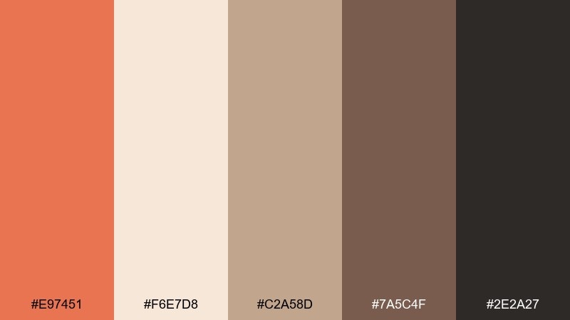
HEX: #E97451 #F6E7D8 #C2A58D #7A5C4F #2E2A27
Mood: sunbaked, cozy, grounded
Best for: living room interior mood board
Sunbaked clay and creamy sand tones evoke desert light, linen textiles, and warm stone. Use this burnt sienna color combination for earthy interiors, lifestyle branding, or calm hero sections that still feel inviting. Pair the sienna with the cream for high readability, then bring in the deep charcoal for anchors like headings or frames. Tip: keep large surfaces light and reserve the darkest tone for contrast points such as icons and borders.
Image example of desert clay & cream generated using media.io
Media.io is an online AI studio for creating and editing video, image, and audio in your browser.

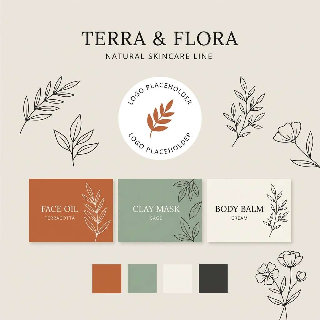
2) Terracotta Sage Studio
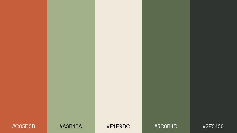
HEX: #C65D3B #A3B18A #F1E9DC #5C6B4D #2F3430
Mood: artisan, botanical, modern rustic
Best for: natural skincare brand identity board
Handmade pottery vibes meet fresh herb greens, like a studio shelf lined with clay jars and dried leaves. It works beautifully for wellness brands, eco packaging, and calm social templates. Let the warm clay lead, then use sage as the balancing accent for buttons, seals, or pattern details. Tip: keep typography dark and slightly softened, using the deep green-black instead of pure black.
Image example of terracotta sage studio generated using media.io
3) Sunset Adobe Pop
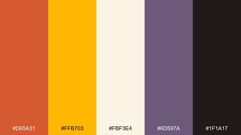
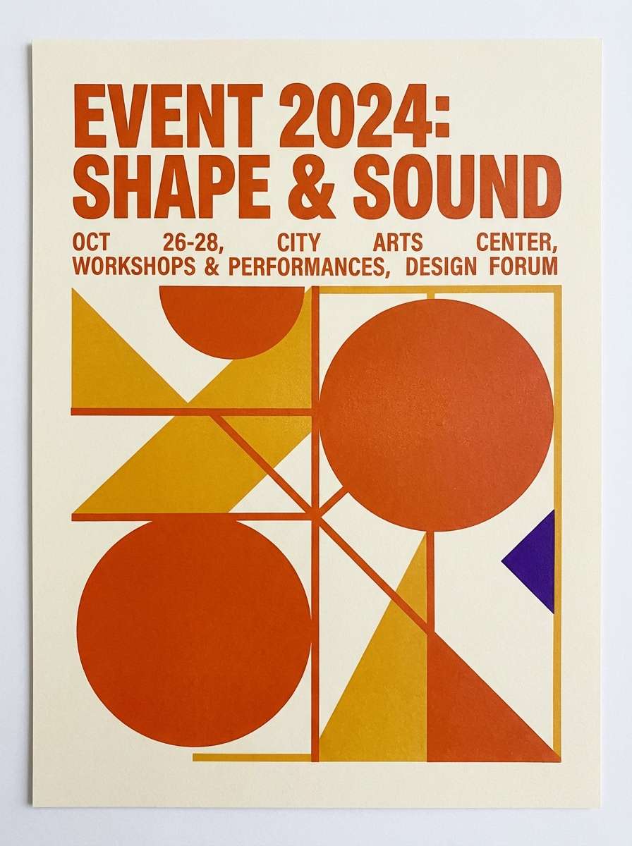
HEX: #D65A31 #FFB703 #FBF3E4 #6D597A #1F1A17
Mood: playful, punchy, creative
Best for: event poster graphic design
A golden-hour glow with a surprising violet twist, like street murals catching the last sun. Use it for posters, music events, or creator merch where you want warmth without looking dated. Keep the cream as the breathing space, then push the orange and gold for headlines and shapes. Tip: use violet sparingly as a signature accent for dates, icons, or a single bold stripe.
Image example of sunset adobe pop generated using media.io
4) Canyon Nightfall
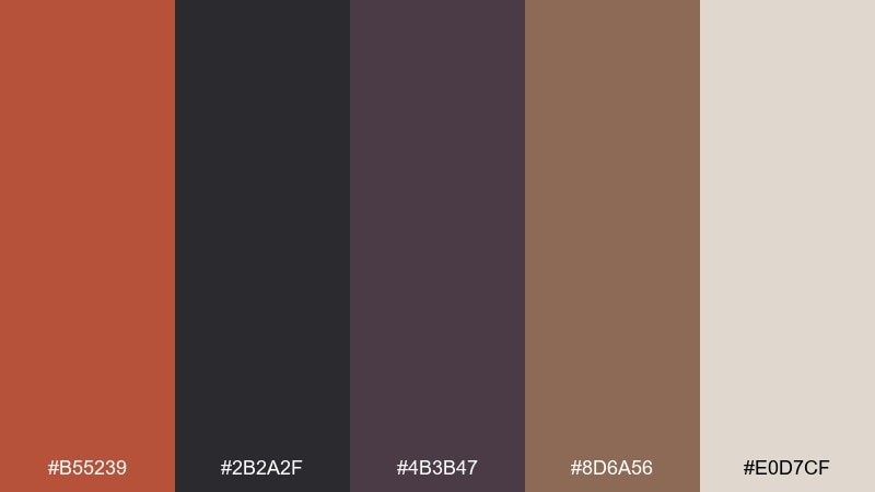
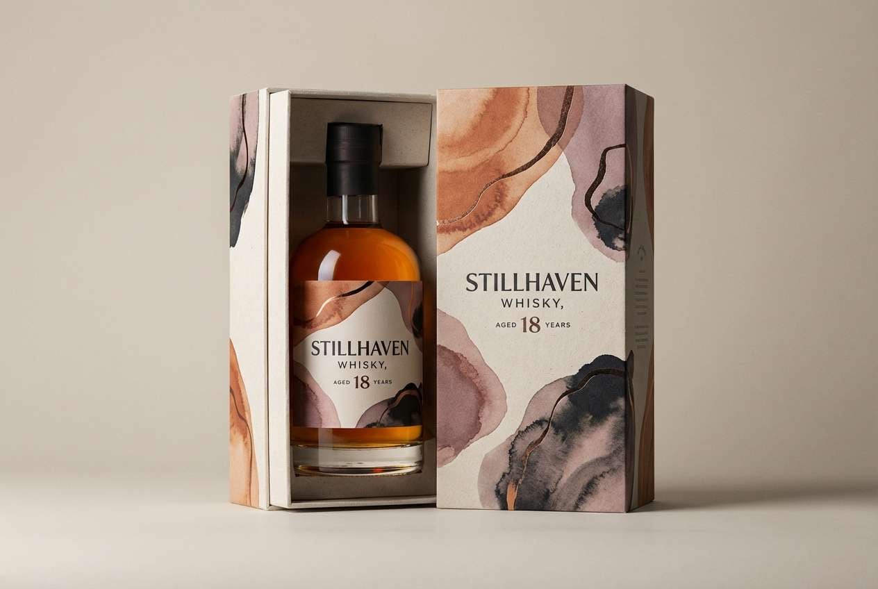
HEX: #B55239 #2B2A2F #4B3B47 #8D6A56 #E0D7CF
Mood: moody, cinematic, grounded
Best for: premium whiskey packaging concept
Dusky canyon shadows and smoky stone create a cinematic, late-night warmth. This burnt sienna color palette fits premium packaging, men's grooming, or any brand that wants rugged elegance. Use the pale stone for label space, then layer the sienna and mauves for depth and texture. Tip: add subtle matte finishes and keep the darkest tone for type and borders to maintain clarity.
Image example of canyon nightfall generated using media.io
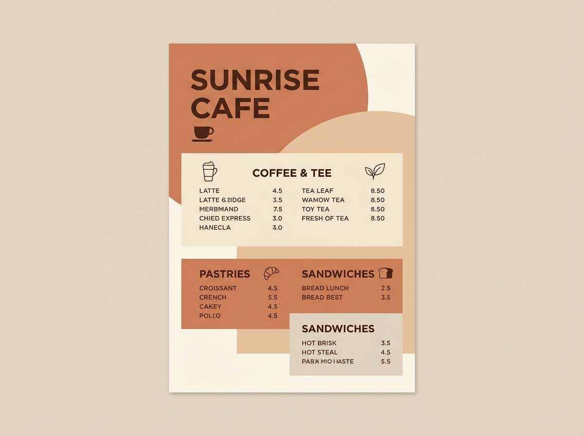
5) Rustic Farmhouse Neutrals
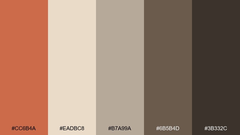
HEX: #CC6B4A #EADBC8 #B7A99A #6B5B4D #3B332C
Mood: homey, timeless, natural
Best for: cafe menu layout
Warm baked clay and weathered wood neutrals feel like a farmhouse table set for brunch. It suits cafes, bakeries, and menus that need comfort without visual noise. Build the layout on the cream, then use sienna for section headers and the dark brown for prices and dividers. Tip: stick to one display font and let spacing do the heavy lifting for an upscale look.
Image example of rustic farmhouse neutrals generated using media.io
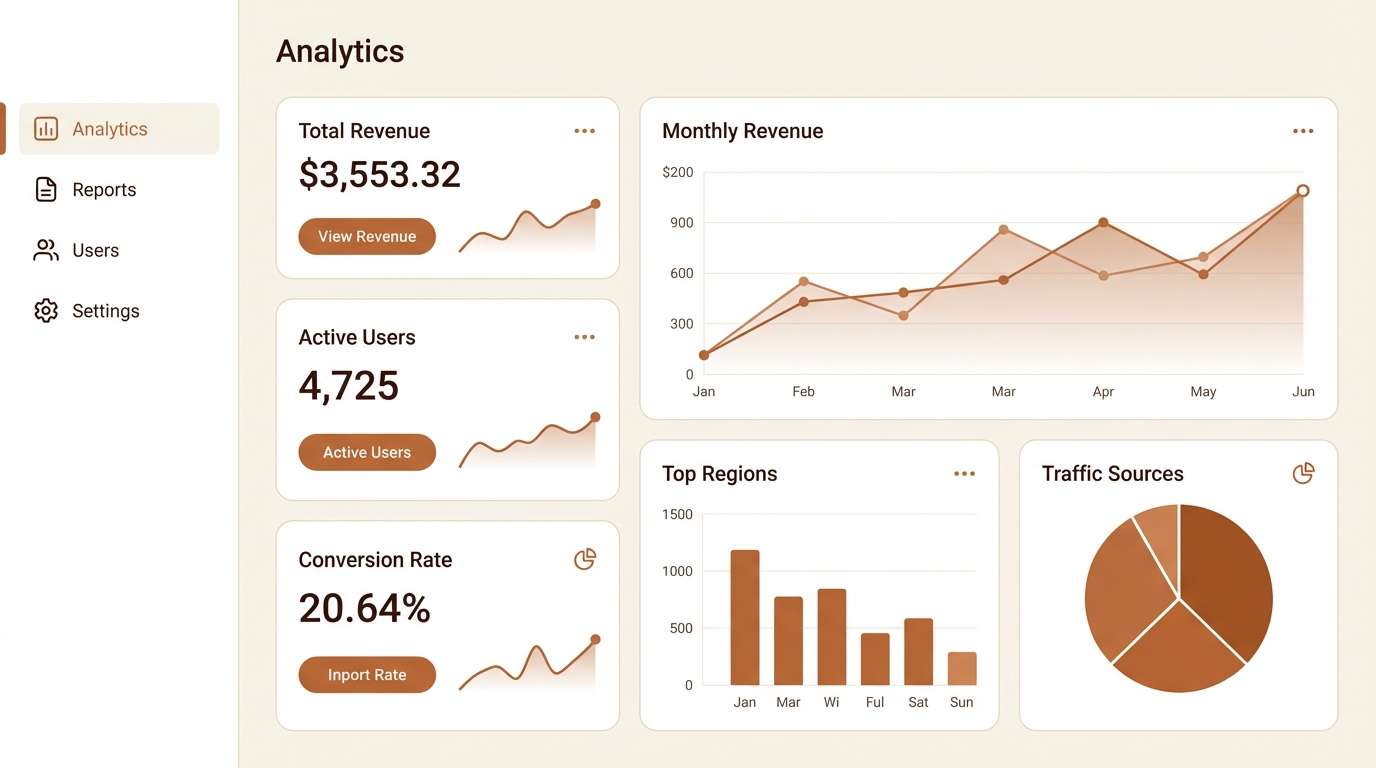
6) Spiced Mocha Minimal UI
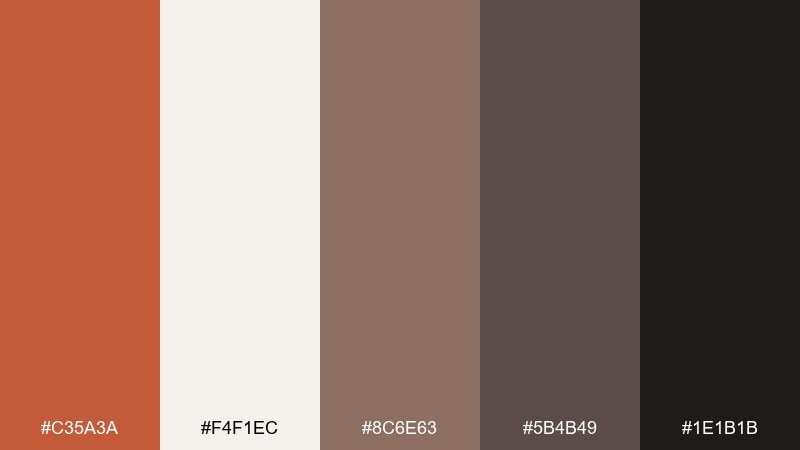
HEX: #C35A3A #F4F1EC #8C6E63 #5B4B49 #1E1B1B
Mood: minimal, warm, professional
Best for: analytics dashboard UI mockup
Smooth espresso and spiced clay tones give a sleek, quiet confidence, like a boutique coffee bar at opening time. This burnt sienna color palette is ideal for dashboards that want warmth without sacrificing focus. Use the off-white as the primary canvas, then apply sienna to highlight key metrics and active states. Tip: keep charts mostly neutral and reserve the accent color for one data series and key CTAs.
Image example of spiced mocha minimal ui generated using media.io
7) Copper & Teal Contrast
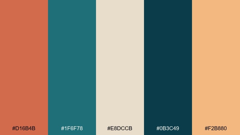
HEX: #D16B4B #1F6F78 #E8DCCB #0B3C49 #F2B880
Mood: bold, modern, high-contrast
Best for: tech startup landing page hero
Burnished copper against deep teal feels like metal meets ocean, energetic but still polished. These burnt sienna color combinations shine on modern landing pages, especially for fintech, SaaS, or creative tools. Keep the cream for whitespace, then alternate copper and teal for sections and CTA states. Tip: choose one dominant accent per screen so the contrast stays intentional, not chaotic.
Image example of copper & teal contrast generated using media.io

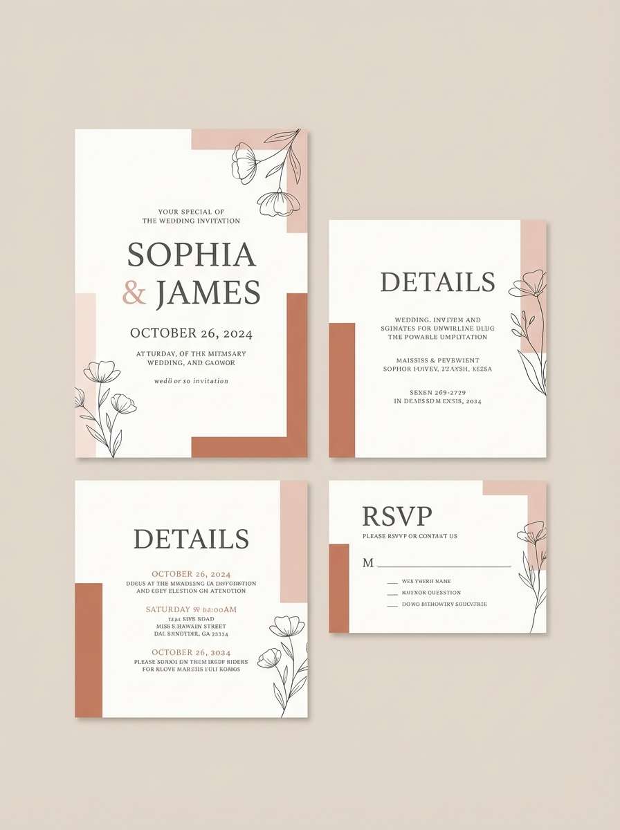
8) Clay Rose Wedding
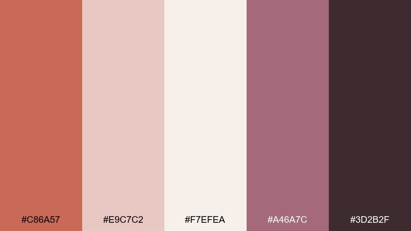
HEX: #C86A57 #E9C7C2 #F7EFEA #A46A7C #3D2B2F
Mood: romantic, soft, elegant
Best for: wedding invitation set
Blushed clay and dusty rose create a gentle romance, like dried florals and silk ribbons. It works best for weddings, stationery suites, and intimate event design. Use the light blush and cream for the main paper feel, then add the deeper plum for names and RSVP details. Tip: pair with delicate line illustrations and keep borders thin to preserve the airy mood.
Image example of clay rose wedding generated using media.io
9) Warm Brick Editorial
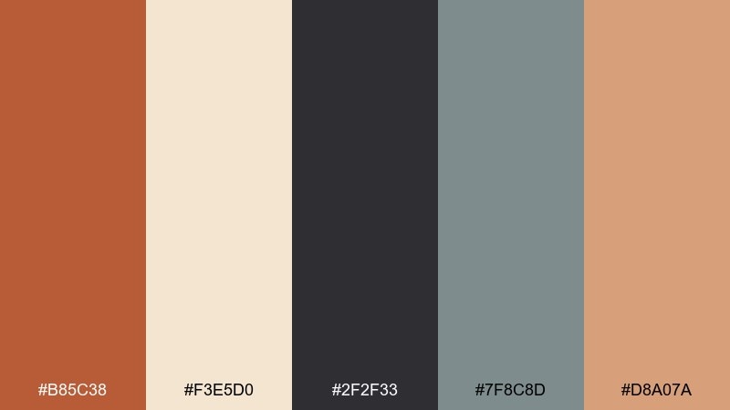
HEX: #B85C38 #F3E5D0 #2F2F33 #7F8C8D #D8A07A
Mood: editorial, refined, urban
Best for: magazine feature layout
Warm brick and soft paper tones feel like a well-loved journal with city grit. Use it for editorial layouts, lookbooks, and long-form blog designs where readability matters. Let the cream act as the page, then use brick for section openers and pull quotes. Tip: keep imagery warm and desaturated so the palette stays cohesive across spreads.
Image example of warm brick editorial generated using media.io
10) Autumn Orchard Poster
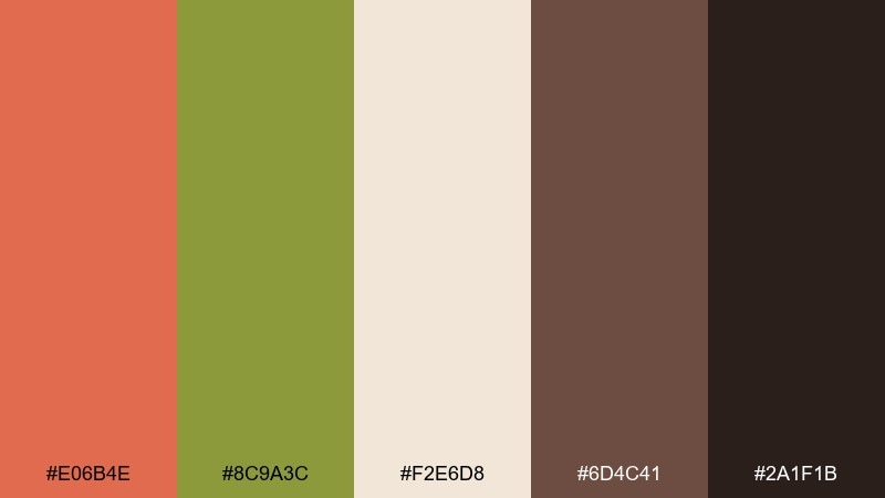
HEX: #E06B4E #8C9A3C #F2E6D8 #6D4C41 #2A1F1B
Mood: harvest, outdoorsy, nostalgic
Best for: farmers market poster
Harvest warmth with a hint of orchard green evokes apples, fallen leaves, and crisp air. For seasonal promotions, these burnt sienna color combinations feel friendly and high-energy without turning neon. Use the cream for the background, then let sienna handle the headline while olive supports icons and callouts. Tip: add simple produce illustrations and keep shadows minimal to maintain a clean print look.
Image example of autumn orchard poster generated using media.io
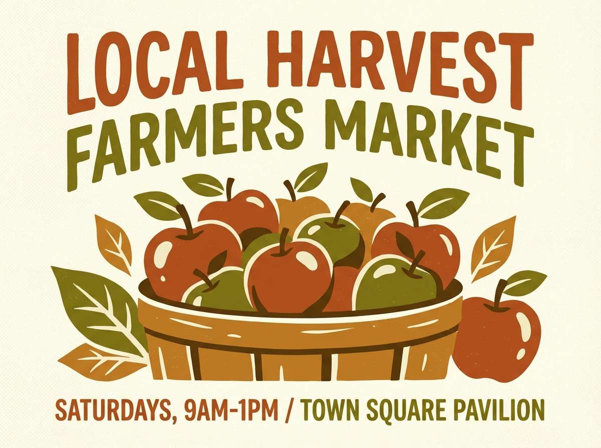
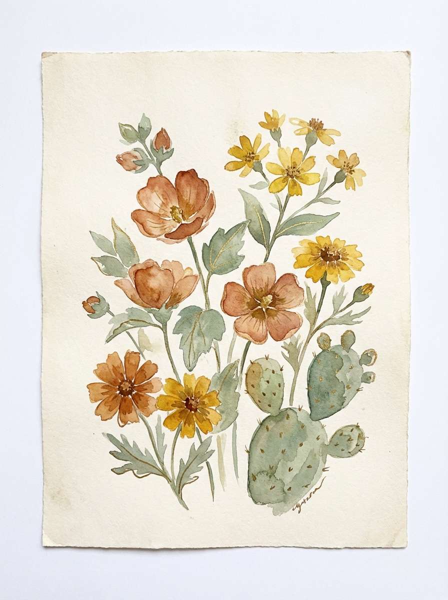
11) Desert Bloom Watercolor
HEX: #D86A4A #F5D6C6 #E9B44C #7D8F69 #3C3A2F
Mood: artsy, sunny, botanical
Best for: watercolor botanical illustration
Sunlit petals and warm sand washes feel like a desert garden in bloom. It's a natural fit for botanical prints, spring promos, and gentle lifestyle content. Use the golden tone for highlights and keep the green muted for stems and leaves so the warmth stays dominant. Tip: leave plenty of unpainted space to let the cream act like textured paper.
Image example of desert bloom watercolor generated using media.io
12) Vintage Leather & Gold
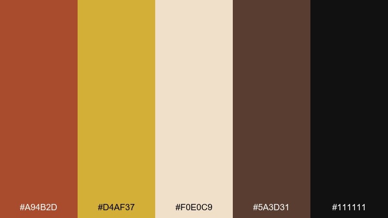
HEX: #A94B2D #D4AF37 #F0E0C9 #5A3D31 #111111
Mood: luxury, vintage, dramatic
Best for: premium product ad poster
Aged leather and antique gold feel like heirloom craftsmanship and dim gallery lighting. Use this burnt sienna color palette for premium ads, boutique packaging, or membership cards where you want instant richness. Keep the cream as the backdrop, then use gold for small highlights like rules, seals, and icons. Tip: avoid large gold blocks and lean on thin lines to keep the luxe effect believable.
Image example of vintage leather & gold generated using media.io
13) Mediterranean Clay House
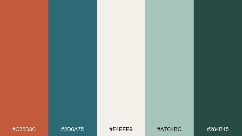
HEX: #C25B3C #2D6A75 #F4EFE9 #A7C4BC #284B45
Mood: coastal, airy, crafted
Best for: travel blog header design
Coastal teal and sun-warmed clay evoke painted shutters, terracotta roofs, and salty air. It's great for travel branding, resort content, and upbeat editorial headers. Use the light stone for negative space, then alternate teal and clay for headings and navigation states. Tip: keep photos slightly warm so the clay tones connect naturally to the imagery.
Image example of mediterranean clay house generated using media.io
14) Cozy Cabin Knitwear
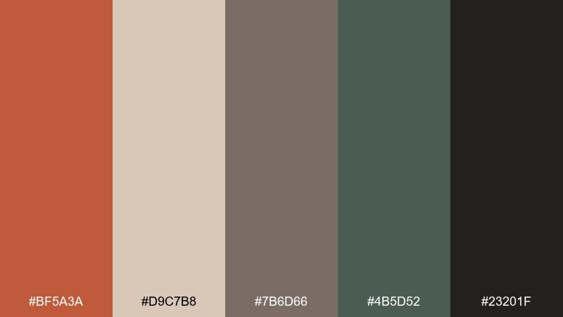
HEX: #BF5A3A #D9C7B8 #7B6D66 #4B5D52 #23201F
Mood: cozy, outdoors, understated
Best for: fall fashion lookbook page
Knit textures, pine shadows, and warm firelight come through in this muted mix. It's ideal for fall fashion, outdoor brands, and cozy product stories. Use the beige as the base and layer sienna in headings, tags, or small blocks to keep the vibe soft. Tip: pair with warm, grainy photography and avoid bright whites that feel too stark.
Image example of cozy cabin knitwear generated using media.io
15) Burnt Sienna Lilac Studio
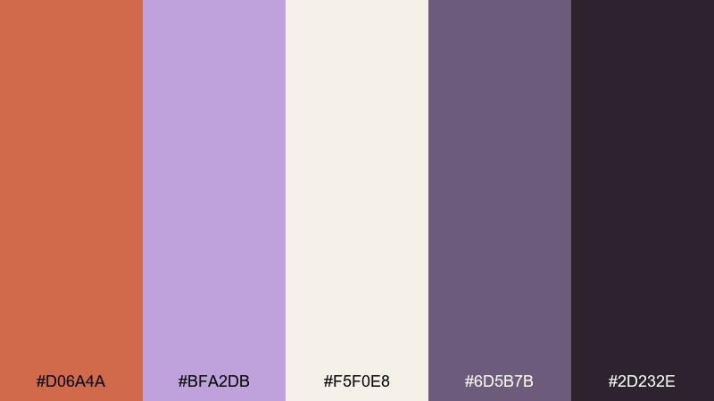
HEX: #D06A4A #BFA2DB #F5F0E8 #6D5B7B #2D232E
Mood: creative, trendy, expressive
Best for: creator portfolio website UI
Warm clay with lilac feels like a modern studio wall painted for inspiration. This burnt sienna color palette works well for portfolios, design agencies, and personal brands that want softness with edge. Use the cream for the layout foundation, then alternate sienna and lilac for buttons, chips, and hover states. Tip: keep the deep purple for typography so the warm accents can stay playful and readable.
Image example of burnt sienna lilac studio generated using media.io
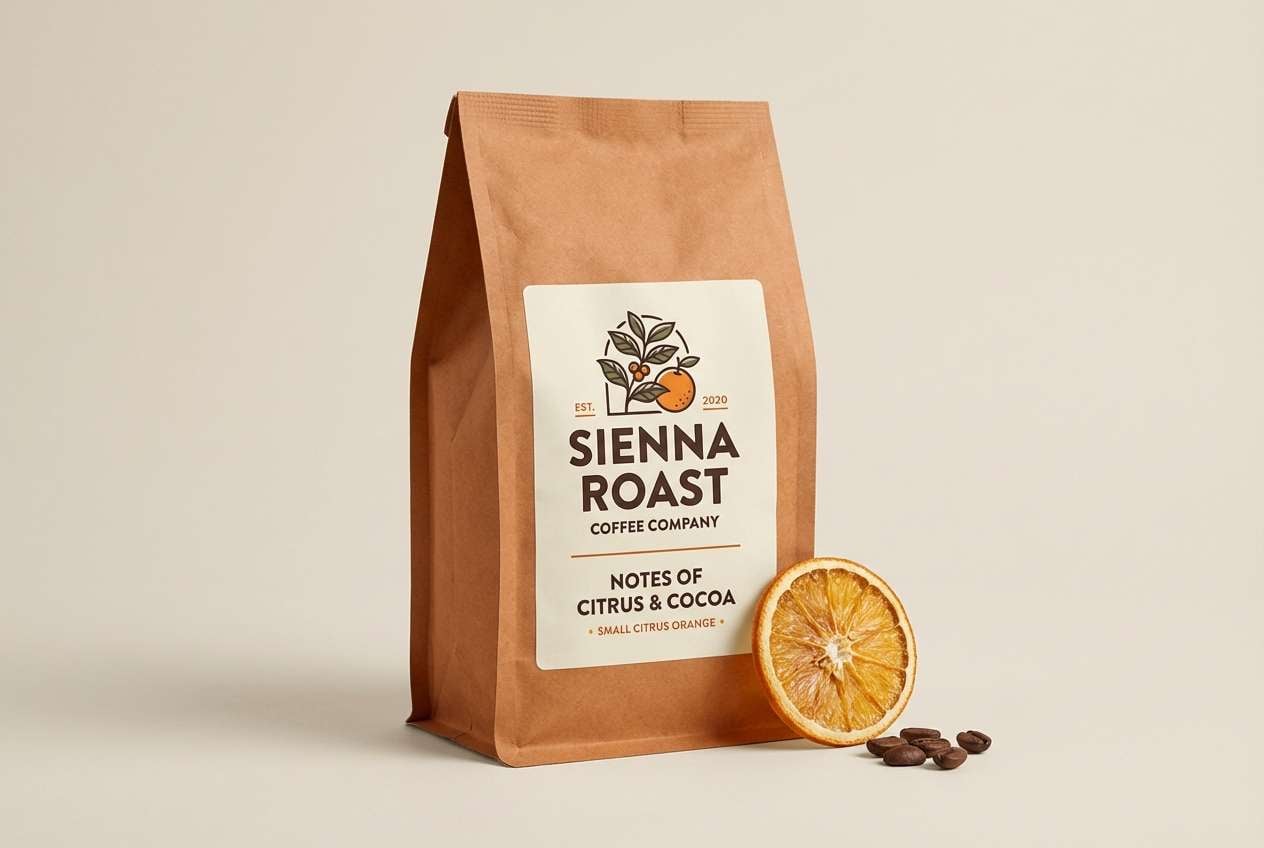
16) Espresso Citrus Brand
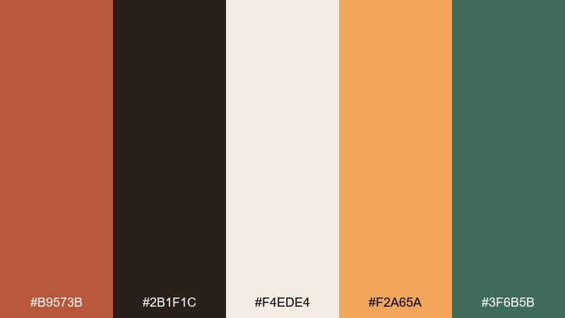
HEX: #B9573B #2B1F1C #F4EDE4 #F2A65A #3F6B5B
Mood: energetic, premium, flavorful
Best for: coffee packaging label design
Rich espresso with a citrus kick feels bold, aromatic, and a little adventurous. It's perfect for coffee bags, specialty foods, and punchy brand accents. Use the cream as label space, then push the sienna and citrus for flavor cues while the green stays secondary. Tip: limit the bright orange to small bursts like roast level badges or callout icons.
Image example of espresso citrus brand generated using media.io
17) Claystone Landscape
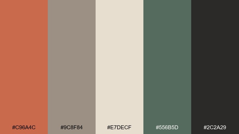
HEX: #C96A4C #9C8F84 #E7DECF #556B5D #2C2A29
Mood: natural, calm, balanced
Best for: outdoor brand social post template
Stone, clay, and muted forest green bring to mind trail maps and weathered rock faces. Use it for outdoor brands, sustainability messaging, and calm campaign templates. Keep the light neutral dominant, then apply the clay tone for headers and the green for badges or category tags. Tip: add subtle grain or paper texture to reinforce the earthy feel without cluttering the design.
Image example of claystone landscape generated using media.io
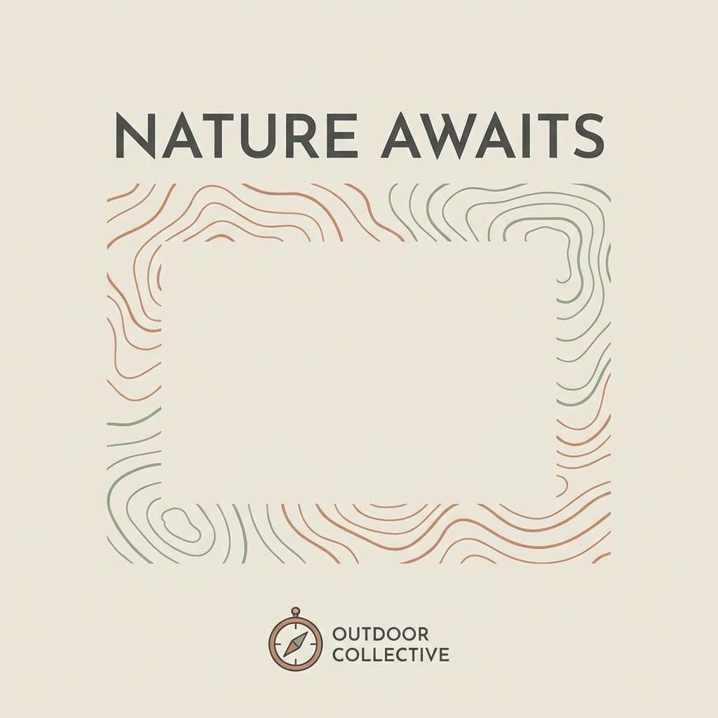
18) Modern Museum Signage
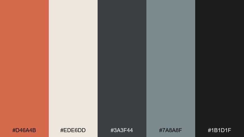
HEX: #D46A4B #EDE6DD #3A3F44 #7A8A8F #1B1D1F
Mood: modern, structured, gallery-clean
Best for: wayfinding signage system
Clean gallery neutrals with a warm clay highlight feel curated and architectural. A burnt sienna color combination like this is great for signage, public spaces, and minimalist brand systems. Use the light tone for fields and the charcoal for type, then reserve the warm accent for arrows, section IDs, and priority markers. Tip: keep icon strokes consistent and test legibility at distance with the mid-gray as your secondary text.
Image example of modern museum signage generated using media.io
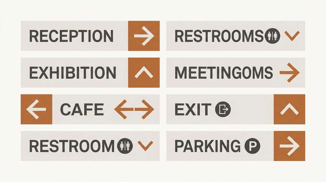
19) Sunbaked Surf Retail
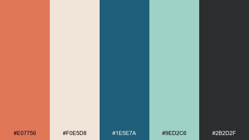
HEX: #E07756 #F0E5D8 #1E5E7A #9ED2C6 #2B2D2F
Mood: fresh, coastal, youthful
Best for: summer sale banner design
Warm sand-clay meets surf blues for an easygoing, sunlit vibe. It's a strong fit for retail promos, travel offers, and summer collections that need both warmth and freshness. Use the clay for the main headline and let teal handle buttons and discount tags. Tip: keep the mint as a soft supporting highlight so the teal stays crisp and readable.
Image example of sunbaked surf retail generated using media.io

20) Festive Spice Kitchen
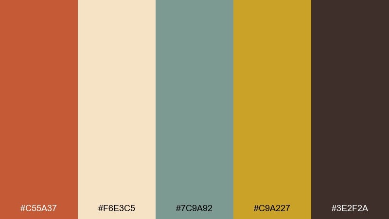
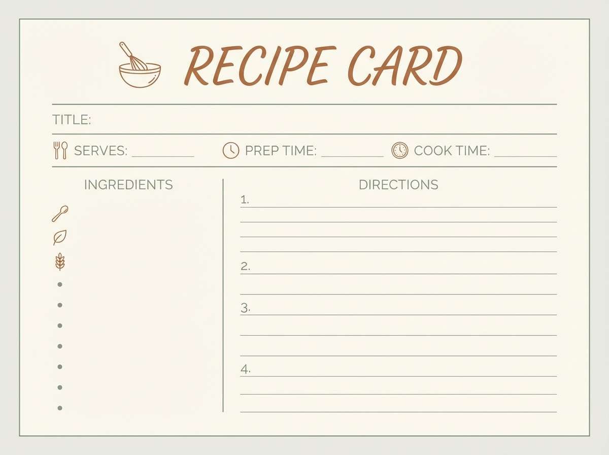
HEX: #C55A37 #F6E3C5 #7C9A92 #C9A227 #3E2F2A
Mood: festive, warm, inviting
Best for: recipe card template
Spiced clay, buttercream, and a hint of evergreen feel like a holiday kitchen in full swing. It's great for recipe cards, food blogs, and seasonal packaging. Use the cream for the card background, then highlight titles in sienna and add golden accents for icons or star ratings. Tip: keep the teal-gray subtle so it supports ingredients lists without competing with the warm tones.
Image example of festive spice kitchen generated using media.io
What Colors Go Well with Burnt Sienna?
Burnt sienna pairs beautifully with light neutrals like cream, sand, and warm off-white because they amplify its clay warmth while keeping layouts airy and readable. For typography and structure, espresso browns and soft charcoals give contrast without the harshness of pure black.
For modern, high-energy contrast, try cool complements like teal, dusty blue, or blue-green—these make burnt sienna feel sharper and more contemporary. If you want a softer, trend-forward look, mix it with blush, mauve, or lilac for a warm/cool balance that still feels refined.
How to Use a Burnt Sienna Color Combination in Real Designs
In branding, use burnt sienna as the primary brand color (logos, headers, packaging panels) and let cream or stone act as your main background. Then assign one cool accent (sage, teal, or muted blue) to CTAs, badges, or small illustration details for visual rhythm.
In interiors, treat sienna like a material: use it in smaller “touch points” (pillows, ceramics, art) and keep large surfaces neutral to avoid heaviness. In UI, apply sienna to interactive states—active nav, highlights, and one chart series—while keeping cards and tables mostly off-white for clarity.
Create Burnt Sienna Palette Visuals with AI
If you’re building a mood board, landing page concept, packaging mockup, or social template, generating visuals from a consistent palette helps your designs feel intentional. Start with one palette above, reuse the prompt style, then swap the subject (poster, UI, label, signage) to create a cohesive set.
With Media.io, you can quickly turn these prompts into on-brand images for presentations, client reviews, and marketing assets—without hunting for stock that “almost” matches your colors.
Burnt Sienna Color Palette FAQs
-
What is the HEX code for burnt sienna?
A common digital reference for burnt sienna is #E97451, though many palettes shift it warmer (more orange) or deeper (more brick) depending on the intended mood. -
Is burnt sienna closer to terracotta or rust?
Burnt sienna usually sits between the two: more refined and clay-like than rust, but often deeper and slightly browner than classic terracotta. -
What colors complement burnt sienna best?
Teal and blue-green accents complement burnt sienna strongly, while cream, sand, and warm gray keep it soft and modern for backgrounds. -
Can I use burnt sienna in a modern UI color palette?
Yes—use it as an accent for CTAs, active states, and highlights on an off-white canvas, and keep text in espresso/charcoal for comfortable contrast. -
Does burnt sienna work for luxury branding?
It can, especially when paired with espresso black/brown, cream, and small gold accents. The key is using gold sparingly and leaning on clean spacing and typography. -
How do I keep a burnt sienna scheme from looking too “fall”?
Use cooler balancing accents (teal, sage, slate) and modern neutrals (off-white, stone, charcoal), and avoid overly saturated oranges across large areas. -
What’s a safe background color with burnt sienna?
Warm off-white or cream (like #F4F1EC or #F6E7D8) is usually the safest background choice for both print and digital because it preserves warmth and readability.


